Search the Community
Showing results for tags 'italic'.
-
Hi, I currently have two Parker 75 pens, and I love them. I am thinking of buying a factory-italic nib to use in them (or perhaps another 75 that has a factory italic nib). My handwriting is rather small, so I am conscious that I won’t be able to use an italic nib if its width is as broad as that of e.g. the ‘fine’ italic nib in the Vector ‘Calligraphy’ set. I expect that only a 75 ‘FI’ or ‘MI’ nib will be narrow enough to suit my cramped handwriting. As replacement 75 nibs are no longer made, they are not cheap. I don’t want to spend a lot of money to buy one, only to then find that it is too wide for me to be able to write with it. So, I would like to ask the FPN ‘Hive Mind’ for any information that you can let me have about these nibs. I don’t expect anyone to be able to measure the nibs’ widths, and then tell me that a ‘Fine Italic’ 75 nib is e.g. 0.34mm wide, or that a ‘Medium Italic’ 75 nib is 0.45mm wide, but I would be very grateful to receive any guidance that you can offer to me. So, would you say that the 75 ‘FI’ nib is ground to a similar width as a ‘normal’ 75 ‘F’ nib? Or perhaps that its grind would be nearer to - or wider than - that of a ‘normal’ 75 ‘M’ nib? Is a 75 ‘MI’ nib ground as wide as the ‘fine’ italic nib in a Vector calligraphy set? Or is it considerably narrower? Can anyone perhaps show me pictures of cross-hatching #### that they have drawn with their ‘FI’ or ‘MI’ nib, alongside comparison cross-hatches that they have drawn with a ‘normal’ 75 ‘F’ or ‘M’ nib, or the ‘normal’ ‘M’ nib of any modern Parker, or the ‘fine’ nib from a Vector ‘calligraphy’ set? My thanks to you in advance! Slàinte, M.
-
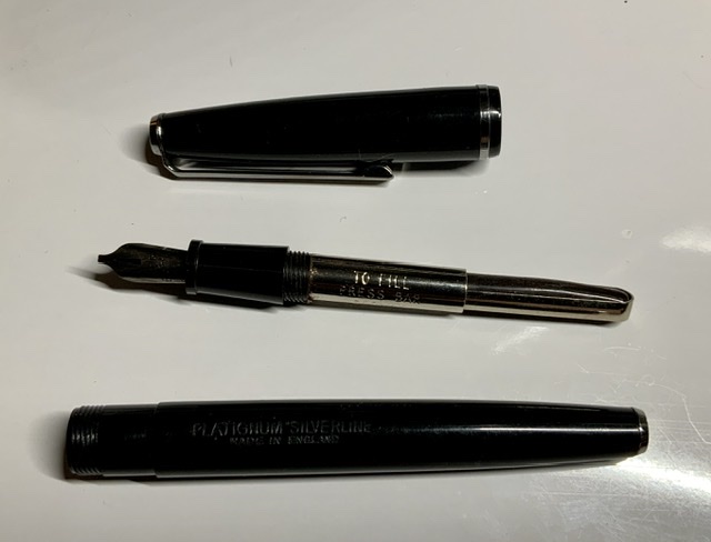
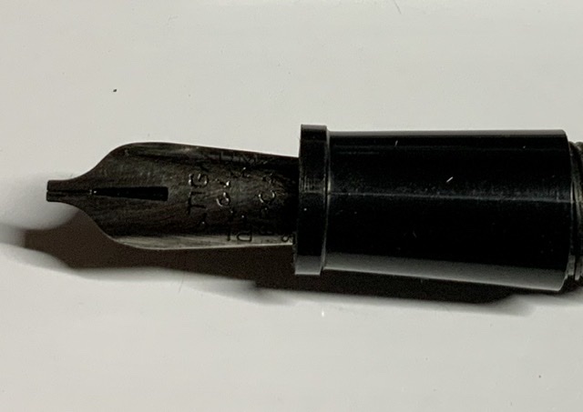
I just purchased 2 Platignum Silverline pens off the internet. Both are in excellent shape. One pen has a broad italic, and the other one has an oblique italic for a left hand people. They both work fine. I am absolutely impressed by the broad italic and how well it writes, and the beautiful Thick and thins it produces. My question concerns whether the nibs can be removed. It almost appears that these nibs are permanently attached to the pen. I have tried to unscrew the nibs, But I have not been able to get them out. I am not using very much strength because I dont want to break anything. Can anyone tell me if these particular pens have removable nibs, or are the nibs meant to be permanently attached? I would like to search for some other nibs to use with these pens, But maybe that is not possible. Im including a couple photos.

-

Montblanc X Fritz Schimpf Special Edition Italic 100 Fountain Pen
Fritz Schimpf posted a topic in The Mall
We, Fritz Schimpf, have shared our passion for the art of writing since 1880. One of our main distinctive points is that we are always trying to offer our clients the best fitting writing instrument for their type of handwriting and hand size. Especially fountain pens and their ability to have a positive influence on the handwriting as well as the writing comfort they offer are our favorite writing instruments. While the existing variety of different forms and sizes of pens nearly always makes it possible to find a fitting pen for each client, the variety in nibs has decreased over the last years. Due to our experience with clients we have wanted to bring back part of the variety in nibs thus enabling us to offer the perfect nib for every client. Thanks to the cooperation with Montblanc we have managed to widen the offer with an exclusive collaboration. The Montblanc x Fritz Schimpf Sonderedition Italic 100 is based on the Montblanc Meisterstück LeGrand Platinum Line fountain pen (146P). The nib, the heart of the fountain pen, is a 14-K gold nib with a special cut we defined together with the excellent nib masters at Montblanc. This special cut enables the nib to offer different stroke widths. Nibs like that are called Italic nibs. Over 50 years have passed since the last time Montblanc had an Italic nib in its assortment. Due to the different widths, Italic nibs enhance the individual characteristics of each handwriting and create a unique and distinctive typeface. Thanks to the chosen width, the vertical stroke is around 0,7 mm, the horizontal stroke is around 0,3 mm the Montblanc x Fritz Schimpf Sonderedition Italic 100 fountain pens are ideal for small and medium handwriting. In order to get the maximum stroke difference effect it might be necessary to adapt the way one holds the fountain pen. Please have a look at the different writing samples which have been written with Fritzrot (our special ink) on our DIN A5 correspondence paper. The Montblanc x Fritz Schimpf Sonderedition Italic 100 fountain pen is recognizable by the engravings on both sides of the nib (Italic 100 and Fritz Schimpf). Once one gets accustomed to the nib the writing properties are fascinating. The Italic 100 fountain pen seduces the writer to playfully form letters, perceive their form, change it and rediscover the own handwriting anew. We are expecting the arrival of the Montblanc x Fritz Schimpf Sonderedition Italic 100 fountain pens by mid October 2017. They will be available exclusively at our shop and are limited to 100 pieces. Should you wish any further information or to pre-order please send us an email to service@fritz-schimpf.de.
-
desaturated.thumb.gif.5cb70ef1e977aa313d11eea3616aba7d.gif)
How-to: Set, or change, personal info that others can see about me
A Smug Dill posted a blog entry in Sus Minervam docet
It helps to explore this yourself, revisiting once in a while if need be, and keep in mind where each of those personal info fields are entered. Don't leave it until the urge to change something specific to come upon you, and only then bother to ask the question! Invest the time surveying upfront, instead of waste it later waiting for an answer from nobody in particular. Most of the fields shown above are self-evident as to what they are. I think the only ones that could do with explanation are: Security and Privacy: There is only one setting under there, and that is a toggle for whether your online status (including ‘last active’ date or time) is visible to others Content View Behavior: That has nothing to do with what others can see about you, but only where you would like to start reading when accessing content Enable status updates: This toggle enables/disables the public feed on your profile page; if you disable it, then nobody (including you) can post publicly visible ‘status updates’ or any other message against your profile, but if you enable it, then anyone — friend, foe, or complete stranger — can post something there whenever, without waiting for you to initiate and then only reply to what you wrote Notification Settings have nothing to do with what others can see about you, and so is out of scope for this article, and I'm not going to delve into those right now. (You can look here, here, and here to wrap your head around how notifications work with respect to followed content.) N.B. There is a possibility that some of the above settings and data fields may not be available to Bronze members and/or Silver members, but I have no way of testing that or scoping it out. — • — Another way of getting to the Edit Profile dialog, and the way to change your profile photo (or ‘avatar’), is here: — • — Freeform, custom member titles that one enters for oneself are long gone, and have not been a thing since FPN came back from a long hiatus and platform upgrade late in 2020. -
Pelikan M600 Vibrant Orange with EF Italic[DS] nib
A Smug Dill posted a gallery image in FPN Image Albums
![Pelikan M600 Vibrant Orange with EF Italic[DS] nib](https://www.fountainpennetwork.com/forum/fpngallery/monthly_2022_01/small.168997007_PelikanM600VibrantOrangewithEFItalicDSnibwritingsample20220125(photo).jpg.9e28887b8bfd0983685bd0071a9cc6e2.jpg)
-
Aurora Optima Cappuccino with F Italic[DS] nib
A Smug Dill posted a gallery image in FPN Image Albums
![Aurora Optima Cappuccino with F Italic[DS] nib](https://www.fountainpennetwork.com/forum/fpngallery/monthly_2022_01/small.1121473166_AuroraOptimaCappuccinowithFItalicDSnibwritingsample20220125(photo).jpg.6e4d2b18aaa2b51ee6b581a04821df22.jpg)
-
.thumb.jpeg.47f173ee8fe9d484879ca6ad049f3ff3.jpeg)
how far can one go regarding to variation in a fountain pen?
El-Haqq posted a topic in Fountain & Dip Pens - First Stop
I look forward to own a fountain pen and I would like it to have certain features. I would like it to be cartridge refillable, and I would like it to be oblique and triple broad at the same time (O3B). I am an orthodox person and I wouldn't like to grind it, because of personal concerns. I have also been told that italic pens have good variation in lines and I would like to add that feature to the nib. If all of this is not possible together, I would love to receive any feedback for a close pen to what I have in mind, I like thick lines and I love variation too. So it could be also OBB, BB, or any italic with good wide. I don't want to spend too much money in a pen but if I have to do it I will, please drop any recommendations you may have for this not to be that expensive. I really would like to have a pen that is easy to go, that's why I prefer cartridges instead of pistons. I know that really good fountain pens don't come cheap, modern, or some even in cartridge versions but I would like to know every option so I can make a good choice. My last question is: what do converters are, and when to use them and when they cannot be used? Thanks for all the advices you might have! -
Hello everyone! I'm brand new to the world of fountain pens, and have a couple beginner's questions regarding my new Retro 51 Tornado. It came with a medium nib, which writes nicely, but I'd like to purchase a nib that allows me to vary my line stroke and write more calligraphically and personally. Before I look into flexible or italic nibs, however, I was wondering if my pen can even take replacement nibs; the nib doesn't seem to come apart from the nib assembly/ feed, so even if I knew the correct size to buy I'm not sure if my pen could take it. Do I have to purchase an entire new nib assembly (in which case, where should I look to buy them?) or does the nib disconnect in a way I'm unaware of? Thank you all, Alec
-

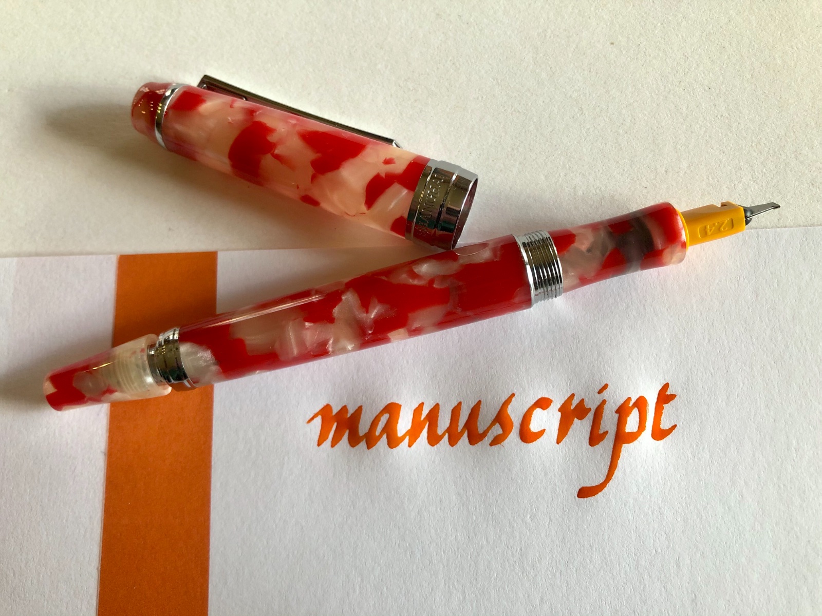
Manuscript Master Italic - Copperplate Flex Next?
Scribble Monboddo posted a topic in Fountain Pen Reviews
Manuscript have received quite a bit of attention here in the past for their very crisp italic nibs, which are much favoured by calligraphers it seems - and also some brickbats for putting them in poor-quality bodies. Now they have a new body out, marketed as the Master, which provides these British nibs with a German-engineered home. It's a pretty good pairing, and if you get one at 'street price' (which you don't do by buying direct from the manufacturer in this case), quite a bargain I'd say - I found one for £15 on Amazon here in Blighty, and it's got a lot more character than anything Lamy could rustle up at that price point I'd say. This doesn't mean I can lay claim to any great calligraphic prowess with it myself, mind - you can see my experimental scribbles and a pic of the pen here: http://scribbledemonboddo.blogspot.co.uk/2014/05/manuscript-master-11-italic-nib-2014.html I'd be interested to hear what other FPN users think of the Master, if anyone else picks one up (and if you're an italic fan, they seem a good bet). It has also got me thinking about how interesting it would be to have some of Manuscript's copperplate nibs served-up in a handy converter-fed body a bit like this... which is an idea I can put directly to Manuscript if there's interest. What do you think? Something they should try? -
Pilot Parallel italic nibs perform wonderfully in italic calligraphy applications, and they can be successfully ground, hacked, and shaped for a variety of effects. With simple shrink-wrap tubing usually used for electronic connections, the diameter of the nib unit can be expanded to fit snugly into the section of a Penbbs 456 fountain pen. This enables calligraphers to place the high-performing Pilot Parallel nib in a more elegant pen, and to add wide italic functionality — from 1.5 mm to 6 mm — to the Penbbs 456. Use scissors to create a 5-mm-long “collar” from 7-mm heat-shrink tubing. Then, use a hair dryer to shrink the tubing tightly around the Pilot nib unit. The additional diameter enables the modified nib unit to fit snugly into the Penbbs 456 section. The interior diameter of the Penbbs section is about 5 mm, and the interior diameter of the Pilot Parallel is about 4.5 mm, so the tubing needs to increase the diameter only slightly. Because heat-shrink tubing is slightly elastic, it also serves as a type of extended o-ring in this application. My first attempt, with a 10-mm-long collar that covered all of the Parallel feed’s fins, proved too difficult to insert into the Penbbs section. But 5 mm is about right. There is plenty of room within the Penbbs 456 cap for the Parallel italic nib, and the nib starts up quickly after two days of non-use. The Penbbs 456 is a vacuum filler, and it’s also still possible to vacuum ink into the barrel through the Parallel nib. These photographs display the 2.4 mm Parallel nib in a Penbbs 456 in the koi material, described in English as “tiny happiness.” The ink is Diamine marigold.
-
Pilot Plumix nibs comparison writing in Noodler's Aircorp Blue Black
A Smug Dill posted a gallery image in FPN Image Albums
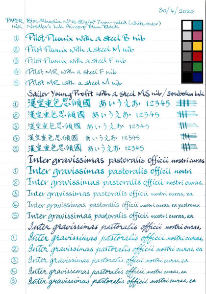
From the album: Nib comparisons
Pilot Plumix, Penmanship, Kakuno, 78G, Prera and Cocoon/MR (including but not limited to the MR Metropolitan) pens all use the same type of interchangeable, friction-fit steel nibs, so getting a Pilot Enso Plumix hand lettering set means I get three italic nibs (of F, M and B width grades) that will fit into any of the other models. They also fit the PenBBS 494, Pali 013/Wing Sung 3013, and a number of other Chinese fountain pens. N.B. The CM nib option available for some Pilot Prera and MR models is effectively the same as a Plumix M nib.© A Smug Dill
- 0 B
- x
-

Ideas To Explore Various Nib Types In Indian Pens..
antarmukhee posted a topic in India & Subcontinent (Asia)
I never used flex, broad, BB, stub, oblique or italic nibs in any pens so far. And I want to try out. I want to select a pen model that is relatively inexpensive that will fit these nib types. I will keep my options restricted to nib manufacturers in India or nibs that are available for purchase in India. Just to clear my confusion around nib size, and nib width - I understand that the size (with numbers like #5, #6) refers to the dimensions of the nib. And if I understand correctly there is no uniform size comparison and it varies between pens. Correct me if I am wrong. The only comprehensive nib catalogue that I got hold of was from Kanwrite. If we look at Kanwrite nib catalogue, the stub, italic and oblique options are available only for large (#35) nibs. Is it the case that smaller nibs (#4, #5) do not come with stub/oblique/italic options for width? Is it the case with all nib manufacturers? If anybody has a catalogue that visually shows different Indian nibs, please share with me. It seems like there are 2 options to explore different nibs: Get a fountain pen that can fit # 35 size nib. Fit and try each nib one at a time. When wanting to write with a different type of nib, change the nib. The problem is that each time I will be changing the nib and I am not very confident whether I will fit them correctly etc. Get multiple fountain pens that are pre-fitted with each type of nib that I want to explore (eg. B, BB, sharp stub, oblique etc). If nibs are pre-fitted they can be tested beforehand and it is easier for me to deal with. But, it comes at the disadvantage of having to buy multiple fountain pens just for the sake of exploring nibs.Is it a good idea to buy relatively inexpensive pens (eg. Camlin 36 or Camlin Elegante or Click Aristocrat) and fit the different nib types from Kanwrite in separate pens to try them out? Thanks in advance.. -

Italic Pens On Tomoe, Midori, Clairefontaine, Rhodia, Etc
bbbdco posted a topic in Paper and Pen Paraphernalia
First a disclaimer…I am fairly new to the forums…joining only in March. And perhaps this topic has already been written to death. But I’ve been writing cursive italic for 40 years. Everyone seems to rave about Tomoe paper for writing with fountain pens. But it’s not my favorite writing paper. I know this can vary from person to person, depending on many different things, the pen, the nib, the ink, whether you prefer some “tooth” or not. Today, I was writing a letter on Tomoe 68 gm paper. I often use an italic fountain pen for my writing….and I write in cursive italic. But I seem to find it difficult to write on Tomoe paper with my italic pens. I was wondering if others had as difficult a time writing on Tomoe as I do. The paper is super thin, which doesn’t particularly bother me. But I think it is the extreme smoothness (almost slipperiness) that gives me trouble. It is so slick that it is difficult to form proper italic letter shapes (I’m talking quickly written cursive…NOT formal italic) and I am not able to get the nice thick and thins that I get with a “toothier” paper. So I got out 6 different types of writing paper that I have on hand: 1. Strathmore Series 400 Calligraphy writing paper 75 gm 2. Rhodia High Grade Vellum Paper 90 gm 3. Tomoe 68 gm paper 4. Triomphe Clairefontaine Vellum paper 90 gm 5. Md Midori Loose leaf paper 70 gm 6. Strathmore Premium Writing Paper 25% cotton 90 g I took out several different pens with different nibs…from extra fine to medium regular nibs to italic extra fine to double broad. I wrote the same sentence on all the papers with all the various pens and nibs. I would say both Tomoe and Rhodia paper produced the most “saturated” colors with a higher sheen. Both are very smooth papers. It is difficult for me to control the uniformity of my handwriting as well on these papers. I just don’t have the control of my pens that I would like to have…especially my italic pens. They simply just don’t “feel” as nice to write on as some of the other papers. The ink lines are slightly thicker on both of these papers. The next smoothest paper was the Triomphe Clairefontaine. I felt I had more control over my pens on this paper. It is slightly “toothier” than the Tomoe and Rhodia. My pens grabbed the paper better, so I had more controll over my pens. The italic pens seemed to work much better on this paper also, providing nice thicks and thins. Next for me was the MD Midori paper. Very similar to Triomphone Clairefontaine, but just slightly toothier. Writing on this paper was perhaps the best for both regular fountain pens and my italic pens with italic cursive. The ink flowed very well, it was nice and saturated. Next was the Strathmore Premium Writing Paper 25% cotton. Actually, I really liked writing on this paper also, especially with my regular nibs. The “toothiness” made control of my regular nibs very easy. My italic nibs did not write as well on this paper, since it is rougher than the other papers. Formal italic would work fine but cursive italic handwriting is a little more difficult. My regular fountain pen nibs worked well on this paper. Nice saturated ink and dried quickly. The last paper, Strathmore Series 400 Calligraphy Writing Paper 75 gm is a bonded paper. So there are very small ridges running through it. Regular fountain pens again worked very well on this paper. But italic cursive writing was the most difficult on this paper because of the ridges in the paper. This paper would be OK for formal italic. The paper itself is the prettiest paper of all 6 that I tried. Since ALL of the paper I tried is “writing paper,” I really did not have any major problems with bleeding or feathering. Comparing the ghosting from best (least show through) to worse (most show through): Best: MD Midori Rhodia Strathmore Calligraphy Paper Triomphe Clairefontaine Strathmore Premium Writing Paper 25% Cotton Worst: Tomoe 68 gm paper My conclusions regarding these papers for the way that I write, and the pens that I use: For both regular nib fountain pens and italic nibs, I prefer both the Midori and Clairefonatine. These 2 papers work the best (FOR ME) as all around writing paper. For formal italic, I would normally use specialty papers….but the strathmore calligraphy paper, as well as the Midori and Clairefontain could also be made to work okay for formal italic. If I’m only using regular fountain pen nibs (not italic), then all of them EXCEPT Tomoe and Rhodia. The Tomoe and Rhodia paper are simply to slick for me. I don’t like how my pens feel when I write on these papers, and I am not able to control my pens well. I suppose you could say they are “too buttery” for my taste. Sorry about the pun. I like to be able to have control and “feel” my pens working on the paper. And I do NOT have a heavy hand when I write. I know most people will probably disagree with me, but that’s just my opinion based on my experience with these papers. In time and with more writing experience, this could change. I’d be curious about how others feel; especially in regard to using italic nibs for cursive handwriting. What paper do you prefer? Which nibs on which paper. And why? -
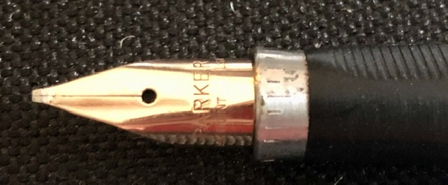
Just Discovered A Parker 75 With 14K Fine Italic Nib
bbbdco posted a topic in Fountain & Dip Pens - First Stop
With the current COVID-19 crisis, I have been spending a lot of time at home. I have rediscovered all my old calligraphy pens and have been relearning the art of fine writing. I was still missing a few items, and I came across an old box in my basement. I found several old items of ink, nibs, etc. In one of the boxes I found my old Parker 75 14k fine italic fountain pen. I remember purchasing it about 1985. So it is 35 years old. It was hardly used as it had the original cartridge still in the barrel. I hoped that the pen was not ruined because it had been left with the ink inside. I spent about an hour cleaning it up. Removed the nib and feeder, then pit it back together. I re-inked the pen and it works like a charm. I dont know how much these things are worth today, but I did a quick check on my particular nib, and a new old nib would cost $125. I remember spending $50 for the pen in 1985, a lot of money for me back then. Anyway I was just excited to find this old treasure in my basement. I am including a few images of the pen. The pen itself is extremely slim and quite small. It has to be posted in order to use it. Any interesting comments about the Parker 75 would be appreciated.
-
Hello everyone. I can rarely find a lot of information about factory italic Pelikan nibs, except them being seemingly quite rare. Are they good or do/did you have good experiences with them? I’m especially interested in those for the M400 or M200, since I stumbled over some offers and have a M200, which I could theoretically equip them with. I only have Lamy an Kaweco Callihraphy nibs and some stubs so far. I know I could order a regrind from Fnibs if I wanted to, but I’m curious nonetheless. I’m looking forward to hearing your experiences J
-
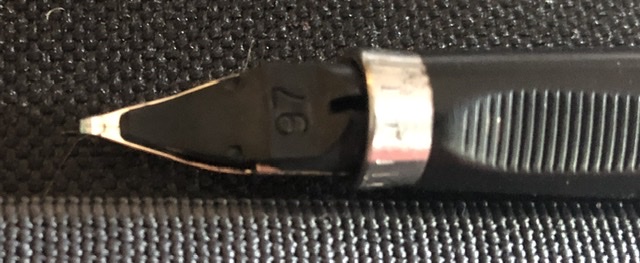
Shadow nibs - broad nibs that have had a groove ground in their tip, usually asymmetrically - are fun to play with and also very good learning tools for anyone working on broad-edged calligraphic scripts. I have some old shadow nibs from late model Osmiroid pens. Kaweco currently makes #5 Bock shadow nibs, but I am not aware of any others producing them commercially. Last year, at the San Francisco Pen Show, one of the Bay Area "Friends of Calligraphy" calligraphers had a Pilot Parallel that had been ground to a shadow nib by a friend. Just recently, Salman Khattak (smk on FPN) has offered customized Pilot Parallel shadow nibs for sale, and I bought one made from the 3.8mm model. Here are a couple photos. (No affiliation, blah, blah, blah) Enjoy! David
-
I'm fairly new to the world of fountain pens, and would like some advice on the topic of an italic nib. A little background first. I studied calligraphy and italic handwriting quite intensely about 30 years ago from an artist Benedectine Nun, who is now deceased. I completely changed my handwriting from the old Palmer to Italic, which I continue to use. Eventuallly, I even went on to teach a course in college on beginning calligraphy. After 20 some years, I have rediscovered my old artistic interest in fountain pens, calligraphy, and italic. I have 3 old Osmiroid pens (two 65s and one 75) I have all the nibs from extra fine up through B4. All the nibs and pens work fine after 30 years. I've recently purchased some beginning Fountain pens: Pilot Metropolitan, TWSBI ECO, Lamy Safari, and the Pilot E95S....all with either fine or extra-fine nibs. Now I'm thinking of investing in a good italic cursive nib. I've been re-learning to write with my old Osmiroids. I guess my main question at this point is: would getting a specially ground cursive italic nib produce a better writing pen than my old Osmiroids? I know there are places that will grind nibs for you. I have discovered Marc Bacas at Nibgrinder.com. I'm debating whether I should purchase a pen from him, and have him grind a cursive italic for me. Would a custom ground pen like this work better, more smoothly than my old plastic Osmiroid? Or is the Osmiroid considered a pretty good writing pen? And then there is the question: if I do decide to have him produce a nib for me...there are so many nib options: JoWo, Bock, gold, amongst others. He makes 3 different italic nibs...one for formal italic, one regular cursive italic, and a very smooth cursive italic. I'm thinking I want something along the lines of a fine nib. (something between the Osmiroid extra fine and fine.) I see that I can send pens in. Waiting time is 2 months. Or if I purchase a pen from him, it is expedited. He mostly stocks TWSBI pens. Any thoughts you can share with me on this topic would be appreciated. I know there are other options also. I've heard of Franklin-Christoph nibs. And Goulet Pens also sells some italic nibs. Or I could get a Jinhao and experiment on grinding my own. Don't know how tough that is. Just not sure what I should do and would love any input from anyone. Thanks. Dan Mueller
-

Italic Versions Of The Minuscule 's' And 'd'
bobje posted a topic in Broad (or Edged) Pen Calligraphy
What are guidelines for use of these alternate versions of the italic minuscule 's' and 'd'? Only at the end of words? When you're feeling it?
-
What is the difference in writing experience between an M1000 nib, which is supposed to be semi-flex vs. using a M800/805 F ground to a cursive italic? i.e. in the line variation experience? I understand that the writing feel will be quite different on the semi-flex M1000 vs the soft rigid M800 nib. Also understand that the M1000 is heavier and thicker, so overall experience will be quite different. I don't own any italics or semi-flex, but in the distant future when I get to buy one of the above, I want to consider options. I tried a stub, and love it.
-

Advice Needed On Nibs - Newbie Search For Line Variation
Cursive Child posted a topic in Of Nibs & Tines
I've only been using round nibs, and principally write cursive (right handed) during the course of a workday, which is not a lot of writing. I've been thinking about getting a stub or a cursive italic for my next pen - love the line variation. My handwriting is not great, and am a little hesitant about getting a sharp edged, not forgiving nib. So thinking of a (Italic) Stub or Cursive Italic, both of which, according to Richard Binder's essays on nibs, are supposed to be smoother and easier to use than a pure Italic nib. I don't want to spend a lot of money getting a custom nib at this point until I am sure this will work for me. Thinking of getting a Pelikan M805 / M800 or Montblanc 146 as my next pen (when I can reward myself and justify it ) I read in several threads that Pelikan used to sell Broad Italic nibs as an option from the factory, but may no longer do so. Someone posted a link from Cult Pens which is selling an M800 with a Broad Italic. - I write with a Medium Pelikan M605, and the line is just thick enough to suit my lettering. Will a Broad Italic Pelikan be too wide for medium sized cursive handwriting? - Is the Pelikan Broad Italic as smooth and easy to write with as a round nib? I am no calligrapher, and need a tolerant nib. - Does the MB 146 come with a CI or Stub? I'm going to buy used, so maybe the question is moot. Thanks! -
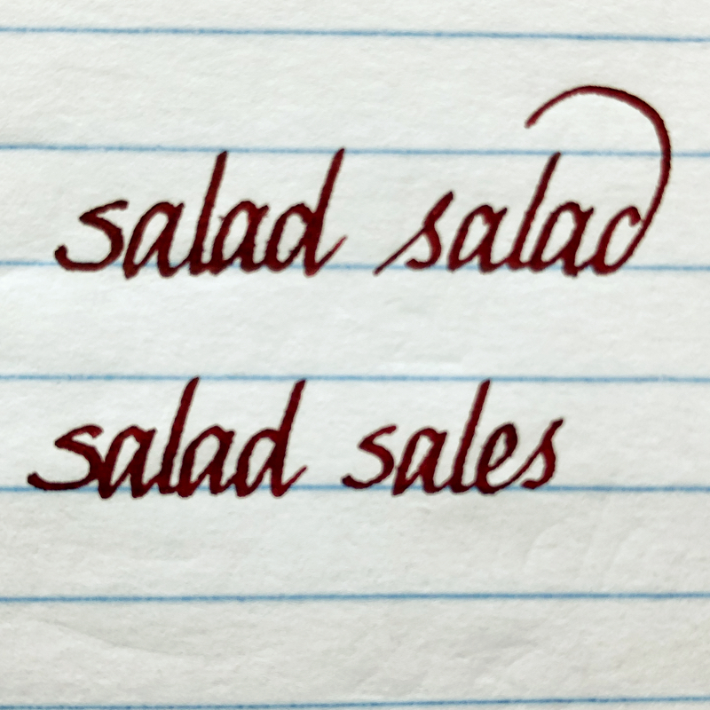
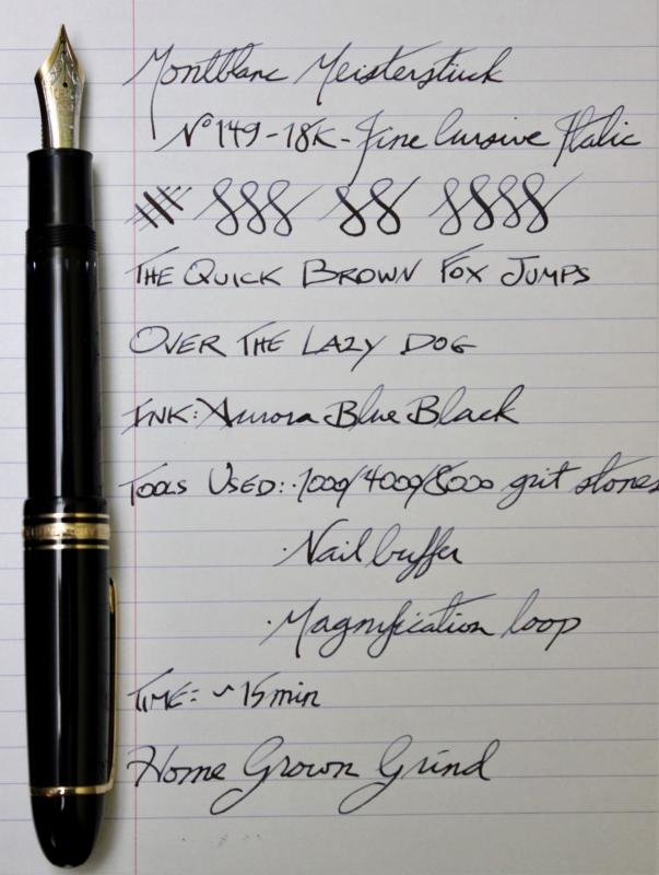
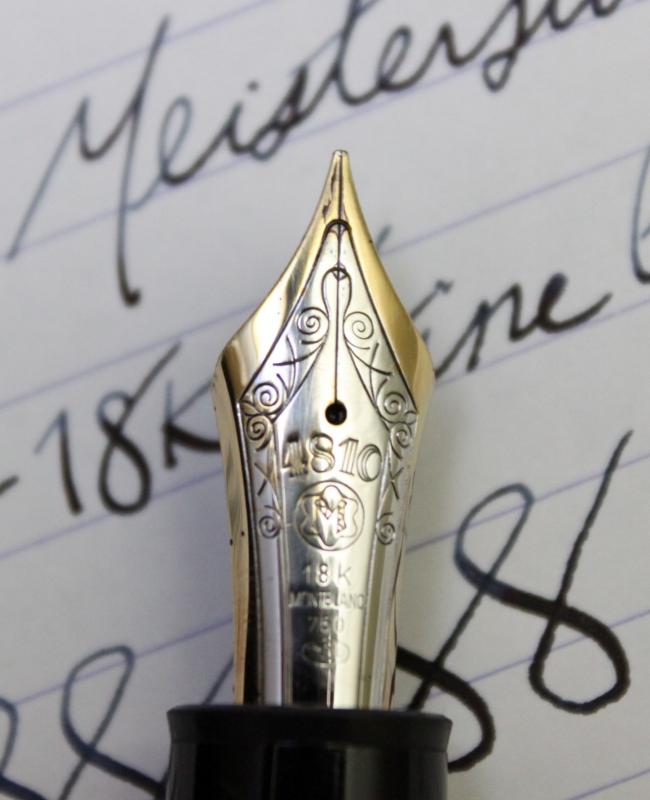
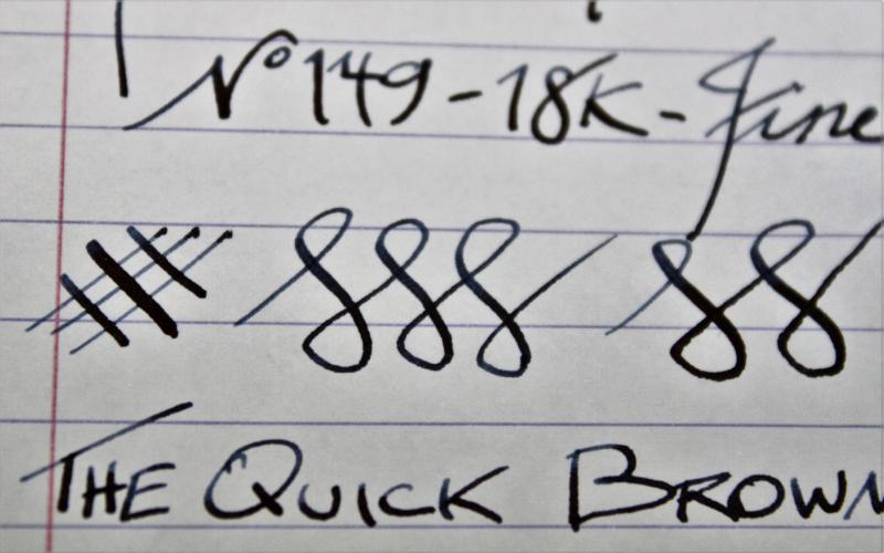
Thought I would post my DIY home nib grind I did on my newly purchased Montblanc 149. I bought the pen on auction for a great price ($300 USD). It was a new old stock (W. Germany made so from 80s-early 90's) never used and in great condition. The nib was a fine & ran VERY dry. I wanted something unique and fun with this pen as I have (too) many fine nib pens. I fixed the flow issues first to get it to write wetter (not too wet as I have some of those too), but it was still just a plain fine nib and was a bit scratchy. I smoothed it to be nice and smooth every which way, but again nothing special. So wanted to make it a fine cursive italic but when I looked into getting it done, there really any places around Vancouver (Canada) that grind nibs. Also, there seems to be a big backlog of pens in the queue for any nibmeisters in the US so pondered doing it myself. I restore & sharpen straight razors as another hobby, and get kitchen knives shaving sharp (I have actually shaved with my Japanese Nakiri knife before). So I looked into how the nib is actually ground and as I have tools to remove material. After doing some reading and watching I thought I would first try it on an super cheap pen that I never used. First up was a Wingsun Hero 590 that I got on eBay for $3.31. The pen had a band fall off right away when I got it and was super cheap. It wrote but nothing special - what can you expect for $3 anyways. So I took it too my stones and within a couple minutes I had a very crisp italic. Then got rid of the smooth edges with a nail buffer and voila, the pen was super fun to write with and performed very well! So then I decided to give the Montblanc a go since this one turned out so well. I spent a little more time on the pen, made sure to go nice and slow and it tuned out great. I had to remove a bit more off the tip as the variation wasn't much at first. But it didn't take much to get it to where I wanted it. Did the same process as on the cheap pen, stones + nail buffer to remove sharpness, and it writes great! Check out the writing samples below of the Wingsun & Montblanc 149. You might not want to grind a high-end pen, but if you've been wanting to play around, order a few cheap pens and see what you can do. I just ordered a Jinhao X750 in broad that I'm going to grind to an italic to see how it goes! Wingsun Hero 590 Writing Sample Montblanc 149 Pen + Writing Sample Nib close up Writing close up
-
Dailyitalic 0.5 Mm Custom Grind Of Vanishing Point Nib
peroride posted a topic in Fountain Pen Reviews
Hi, This is a quick review of the DailyItalic custom grind from Indy-Pen-Dance of the Pilot Vanishing Point (VP) nib I received recently. The nib is the usual rhodium 18K gold that the VP line is known for. Some respected pen person (RPP) named Susan Wirth suggested that an Italic grind is game changer of an upgrade to one's pen enjoyment. Having only seen videos of her enthusiasm, I researched and found more RPPs in Mike and Linda at Indy-Pen-Dance whose work in nibs was well received and respected in the community. I've never had a nib ground and all my pens with exception of a few ebay vintage ones, have wrote out of the box to my liking. Nevertheless my endeared Pilot Fermo F seemed like the perfect candidate as the capless system ingeniously allows easy exchanges with the whole housing of nib, feed, ink holder between units. No screwing around, pulling of tines and what not. Indy-Pen-Dance DailyItalic appealed to my beginner sensibilities as it allows an easy transition from normal to slight line variation. I fully understood that a fine grind would be subtle as I tend to run/enjoy that line range. Indeed the line variation is subtle but perfect for my needs since I have many fine nibs already. The feel is even more smooth than the original untouched Vanishing Point nib. DailyItalic is described as a grind between cursive and stub italic On magnification, the DailyItalic appears similiar to Mike Masuyama Rounded Nose Cursive Italic. Is it worth it? For me, yes, a great intro to grinds. Would I do it again? Yes, but maybe to a nib that needed tuning and I would hold off on ordering now as the vendor is recovering. Overall, I am very pleased by the smooth forgiving writing experience with the subtle line variation that the DailyItalic offers. It really is a daily writing italic. -
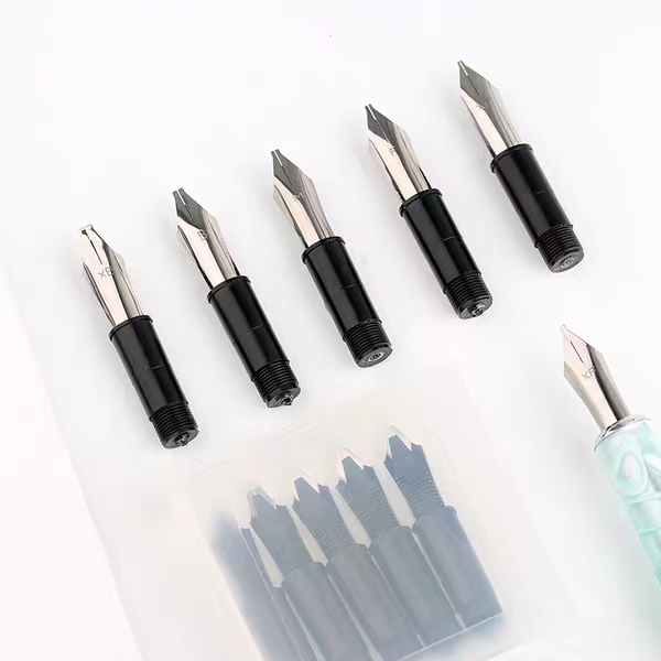
Calligraphy lovers rejoice! Today Shanghai Jingdian started offering sets of five italic nib units that will screw into Delike pens and a few models of Moonman pens. These are currently in their Taobao store, but keep your eyes peeled for them to start showing up on eBay soon. http://m.tb.cn/h.37htpcP?sm=9758e2
-
Hello Everyone. It has been a while since my last post, and my pilot VP with cursive italic nib brings me back to here! I was looking for cursive italic example (as I am sure there is a lot on FPN) but most of the photos were deleted. Could anyone generously share his/her writing of cursive italic again please? I am planning to find some examples which are elegant but they can also be "tweaked" when I need to write faster (i.e. at work, etc) Many thanks for your help Gordon
-
I posted the method in the Esterbrook Forum. Here's a link: https://www.fountainpennetwork.com/forum/topic/339597-new-estie/page-3?do=findComment&comment=4114185 David