Search the Community
Showing results for tags 'jacques herbin'.
Found 17 results
-
Jacques Herbin - Gris de houle La Société Herbin, Maître Cirier à Paris, was established in 1670. This makes J. Herbin probably the oldest name among European ink makers. Today, Herbin produces a range of beautiful fountain pen and calligraphy inks, writing instruments, gift sets and accessories. Herbin inks are made in France, and the finishing touches on the bottles are still done by hand in Paris. Recently, the company jumped on the premium product bandwagon, and started to release more high-end inks under the Jacques Herbin "Les encres essentielles" label. Nicer boxes, nicer packaging, much higher price (18,50 EUR versus the 7,50 EUR for the J. Herbin inks from the "La perle des encres" series). Nevertheless, I couldn't resist and decided to test these new offerings - are they really better than the standard J. Herbin inks? In this review, I take a closer look at Gris de houle, a cool grey from the Jacques Herbin line. First impression: a good-looking cold grey with some green and purple undertones. The ink has a pencil-like appearance when writing with fine nibs. It looks quite nice on the paper. Gris de houle writes really wet, and is well-saturated - all this even with my dry-writing Lamy Safari test pens. Shading is very prominent, even with finer nibs. Being a grey ink, the contrast between light and dark parts never gets shocking, and the effect is quite aesthetically pleasing. I really like the looks of this ink on paper. The ink has quite satisfactory lubrication, even in drier pens like my Lamy Safari. With my wetter Pelikan pens the ink is very saturated, and produces a much darker grey colour. Gris de houle has quite a broad colour span, ranging from a wispy light-grey with a purple haze beneath the surface, to a really dark, almost black grey. To illustrate this, I did a swab on Tomoe River paper where I really saturated portions of the paper with ink. This clearly demonstrates the ink's wide colour span. On the smudge test - rubbing text with a moist Q-tip cotton swab - the ink behaved perfectly, with no visible smearing. Water resistance is also very good, both with a 15-minute exposure to still water, and with running tap water. Some of the ink gets flushed away, but a very readable grey residue remains. I have no issue whatsoever to read what's left on the page. Very well executed! This is also apparent from the lower part of the chromatography, which shows that the grey components of the ink firmly remain on the paper. Unfortunately, Gris de houle is a slow-drying ink. Depending on the paper, I got drying times from 10 to 20 seconds with a dry Lamy Safari with M-nib. In my book, this slow drying time makes the ink unsuitable for use at the office. A pity, because I like the way it looks on paper. I've tested the ink on a wide variety of paper - from crappy Moleskine to high-end Tomoe River. On each scrap of paper I show you: An ink swab, made with a cotton Q-tip 1-2-3 pass swab, to show increasing saturation An ink scribble made with a Lamy Safari M-nib fountain pen The name of the paper used, written with a Lamy Safari B-nib A small text sample, written with an M-nib The source of the quote, written with a wet M-nibbed Pelikan pen Drying times of the ink on the paper (with the M-nib Safari) Gris the houle looks best on pure white paper. In my opinion, it doesn't look good on more yellowish paper. What really surprised me is that this premium ink only works well with premium paper. The ink doesn't like the lower quality papers in my test set. On printing paper, generic notepad paper and Moleskine, I noticed quite some feathering, which gets worse the wetter your pen. With the wet Pelikan pen, there is even some feathering with OCM vellum paper and GvFC 100 gsm paper. Ouch! Another reason not to use this ink at the office (where the paper in reach is often simple printing paper). Fortunately for me, Gris de houle looks beautiful on Paperblanks journal paper, no feathering, good contrast, smooth writing and reasonable drying times. So this ink will be great for my personal journaling. But objectively speaking, the ink disappointed me at the technical level. I had expected better from a premium ink. The J. Herbin inks from the classic series I've tried so far performed better than this one. Writing with different nib sizes The picture below shows the effect of nib sizes on the writing. All samples were written with a Lamy Safari, which is typically a dry pen. I also added a visiting pen - a wet Pelikan M101N Lizard with an M-nib. Here the ink leaves a very saturated dark grey line. As you can see, Gris de houle manages to look really nice in all nib sizes, with great contrast and elegant shading. Nice. I really appreciate the pencil-like appearance with the EF/F nibs, which still shows enough contrast to remain effortlessly readable. Related inks To allow for a good comparison with related inks, I employ my nine-grid format, with the currently reviewed ink at the center. Each grid cell shows the name of the ink, a saturation sample, a 1-2-3 swab and a water resistance test - all in a very compact format. Inkxperiment - naïve portrait of mother and child As a personal challenge, I try to create interesting drawings using only the ink I'm reviewing. These single-ink pieces often present a real challenge, and are a fun extension of the hobby. They also give you a good idea of an ink's capabilities in a more artistic setting. For this drawing I started with a sheet of 300 gsm rough watercolour paper. I then painted in the background with Q-tips, using different water/ink ratios. Next I drew the portrait of mother and child with a glass pen dipped in pure Gris de houle. As you can see, I have zero talent for drawing realistic images. So I designate this as a naïve portrait, that could just as easily have been drawn by a five year old ;-) I added some framing with the glass dip pen and pure ink. Finally I used my M-nibbed Lamy Safari to add some texture to the background. This little piece shows quite well the broad colour span of this grey ink, ranging from wispy light grey to almost black. Gris de houle definitely shows promise as a sketching ink for black & white drawings. Conclusion Jacques Herbin Gris de houle is a nice-looking cool grey premium ink, that unfortunately requires premium paper for writing. I was disappointed by its behaviour on lower quality paper. Water resistance is brilliant, but drying times are quite long. All this translates to an ink that is not well suited for use at the office. But given the right paper, the ink looks beautiful - I really enjoyed it for personal writing in my Paperblanks daily journal. Gris de houle also has quite a broad colour span, which makes it an interesting ink for more artistic activities. Overall not a bad ink, but I had epected more from the brand's premium product. Technical test results on Rhodia N° 16 notepad paper, written with Lamy Safari, M-nib Backside of writing samples on different paper types
-
Jacques Herbin – Violet boréal La Société Herbin, Maître Cirier à Paris, was established in 1670. This makes J. Herbin probably the oldest name among European ink makers. Today, Herbin produces a range of beautiful fountain pen and calligraphy inks, writing instruments, gift sets and accessories. Herbin inks are made in France, and the finishing touches on the bottles are still done by hand in Paris. Like so many others, the company jumped on the premium product bandwagon, and started to release higher-end inks under the Jacques Herbin “Les encres essentielles” label. Nicer boxes, nicer packaging, much higher price (18,50 EUR versus the 7,50 EUR for the J. Herbin inks from the “La perle des encres” series). Nevertheless, I couldn’t resist and decided to test these new inks – are they really better than the standard J. Herbin inks? In this review, I take a closer look at Violet boréal, a violet purple with a spring-time feel to it. A wet and well-saturated ink, that works with all nib sizes. There is some nice shading, especially in drier pens. With a wet pen, the ink has a serious tendency to oversaturate, drowning out the shading. With Violet boréal, I recommend using a dry pen – it will definitely enhance the ink’s appearance on the page. The ink has quite satisfactory lubrication, even in drier pens like my Lamy Safari. With my wetter Pelikan pens the ink is actually too saturated for my taste, it loses its depth and becomes one-dimensional, diminishing its appeal. With stronger saturation, the colour also shifts from a light violet to a much darker purple. Violet boréal has a medium colour span that ranges from a light violet to a darker violet-purple. Contrast between light and dark parts is fairly low, which translates to subtle shading. To illustrate this, I did a swab on 52 gsm Tomoe River paper where I really saturated portions of the paper with ink. This clearly demonstrates the ink’s colour span. On the smudge test – rubbing text with a moist Q-tip cotton swab – there was lots of smearing. The text itself remains very readable though. Water resistance is fairly low. There remains some text on the page, and with lots of patience you might be able to reconstruct your writing. But if this aspect is important to you, simply choose a different ink. The ink’s chromatography suggests that some ink remains on the paper, but that’s only partly true: what remains on the page is a smudgy mess, not easily readable text. Drying times for this Jacques Herbin ink are around the 10 second mark with my Lamy Safari M-nib. The ink prefers the better-quality paper in my test set. With lower quality paper, I see a small amount of feathering, and quite some see-through with a bit of bleed-through. But overall, the ink behaved really well. Violet boréal looks good on both white and creamy paper. One thing to note is that this ink’s colour is crazy difficult to capture. Scans show it too blue-violet – while in reality it’s more a red-violet. And the photos show it darker than it appears in real life. To my eye, the photos are closest to its real-life appearance. I’ve tested the ink on a wide variety of paper – from crappy Moleskine to high-end Tomoe River. On each scrap of paper I show you: An ink swab, made with a cotton Q-tip 1-2-3 pass swab, to show increasing saturation An ink scribble made with a Lamy Safari M-nib fountain pen The name of the paper used, written with a Lamy Safari B-nib A small text sample, written with the M-nib Lamy Safari The source of the quote, written with my F-nib Yard-o-Led Viceroy Drying times of the ink on the paper (with the M-nib Safari) Since scans alone don’t tell the complete story, I’ve added some photos of the same writing samples to give you another view on the ink. Writing with different nib sizes The picture below shows the effect of nib sizes on the writing. All samples were written with a Lamy Safari, which is typically a dry pen. I also added a visiting pen – a wet-writing Yard-o-Led Viceroy with F-nib. With the wet pen, the ink leaves a very saturated violet-purple line, and loses much of the shading. I personally prefer this ink in combination with a dry pen – it simply looks nicer: a light-violet with subtle shading. The wetter the pen, the darker and more one-dimensional the ink becomes. Related inks To allow for a good comparison with related inks, I employ my nine-grid format, with the currently reviewed ink at the center. Each grid cell shows the name of the ink, a saturation sample, a 1-2-3 swab and a water resistance test – all in a very compact format. Callifolio Violet from L’Artisan Pastellier looks fairly close – I might do a shoot-out between these two in the near future. Inkxperiment – multiverse As a personal challenge, I try to create interesting drawings using only the ink I’m reviewing. With these monochromatic pieces, I get to explore all the colour-range nuances that are present in the ink. And I really enjoy creating these little pieces – pure quality time spent with my hobby! Inspiration for this painting comes from an astronomy book I’ve been reading lately, which also covered the concept of a multiverse. This somehow stuck in my head, and I used it as the concept for this drawing. For this drawing I used a textured Fellowes binding cover. I started by painting the different quadrants using a piece of cardboard and pure Violet boréal. The world circles were created with a small glass bottle: I dipped the bottom of the bottle in ink, and used it as a stamp to create the circles. I next painted in the scenes using water-diluted ink. For the stardust in the background, I splashed some ink on the paper with a toothbrush. I finally added some extra detail to the world circles using a glass dip pen. The resulting piece gives you an idea what can be achieved with Violet boréal in a more artistic setting. Conclusion Jacques Herbin Violet boréal is a good-looking violet that I find quite enjoyable. But… you really need a dry pen to make the best of this ink. With wet pens, the ink tends to over-saturate, shows a too dark violet-purple colour, and becomes really one-dimensional. I don’t like the ink in that incarnation (my opinion of course). Overall not a bad ink. But, for a so-called premium product, I had higher expectations. Technical test results on Rhodia N° 16 notepad paper, written with Lamy Safari, M-nib Backside of writing samples on different paper types

-
desaturated.thumb.gif.5cb70ef1e977aa313d11eea3616aba7d.gif)
Opened bottles of ink with no place in my desk as of 5Feb2022
A Smug Dill posted a gallery image in FPN Image Albums

From the album: Odds and ends
150 opened bottles of inks now have no place in my (wife's work-from-home) desk's main storage space, which is absolutely chockers, so most of these now live inside clear, stackable Daiso plastic storage boxes under the spare bed in the same room. Then there are also the 25 Diamine Inkvent Red Edition inks, although technically I can squeeze this into one of the desk's shallow drawers:© A Smug Dill
- 0 B
- x
-
How-to: Set, or change, personal info that others can see about me
A Smug Dill posted a blog entry in Sus Minervam docet
It helps to explore this yourself, revisiting once in a while if need be, and keep in mind where each of those personal info fields are entered. Don't leave it until the urge to change something specific to come upon you, and only then bother to ask the question! Invest the time surveying upfront, instead of waste it later waiting for an answer from nobody in particular. Most of the fields shown above are self-evident as to what they are. I think the only ones that could do with explanation are: Security and Privacy: There is only one setting under there, and that is a toggle for whether your online status (including ‘last active’ date or time) is visible to others Content View Behavior: That has nothing to do with what others can see about you, but only where you would like to start reading when accessing content Enable status updates: This toggle enables/disables the public feed on your profile page; if you disable it, then nobody (including you) can post publicly visible ‘status updates’ or any other message against your profile, but if you enable it, then anyone — friend, foe, or complete stranger — can post something there whenever, without waiting for you to initiate and then only reply to what you wrote Notification Settings have nothing to do with what others can see about you, and so is out of scope for this article, and I'm not going to delve into those right now. (You can look here, here, and here to wrap your head around how notifications work with respect to followed content.) N.B. There is a possibility that some of the above settings and data fields may not be available to Bronze members and/or Silver members, but I have no way of testing that or scoping it out. — • — Another way of getting to the Edit Profile dialog, and the way to change your profile photo (or ‘avatar’), is here: — • — Freeform, custom member titles that one enters for oneself are long gone, and have not been a thing since FPN came back from a long hiatus and platform upgrade late in 2020. -
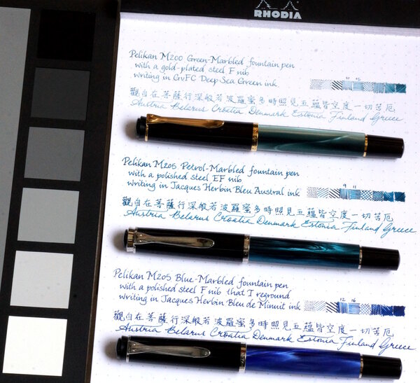
Matching inks to Pelikan Classic M20x pens - shortlist
A Smug Dill posted a gallery image in FPN Image Albums
From the album: Shades of colour
Shortlist of inks with which to fill some of my Pelikan M20x pens© A Smug Dill
- 0 B
- x
-
-
Jacques Herbin – Bleu austral La Société Herbin, Maître Cirier à Paris, was established in 1670. This makes J. Herbin probably the oldest name among European ink makers. Today, Herbin produces a range of beautiful fountain pen and calligraphy inks, writing instruments, gift sets and accessories. Herbin inks are made in France, and the finishing touches on the bottles are still done by hand in Paris. Like so many others, the company jumped on the premium product bandwagon, and started to release more high-end inks under the Jacques Herbin “Les encres essentielles” label. Nicer boxes, nicer packaging, much higher price (18,50 EUR versus the 7,50 EUR for the J. Herbin inks from the “La perle des encres” series). Nevertheless, I couldn’t resist and decided to test these new inks – are they really better than the standard J. Herbin inks? In this review, the spotlight is on Bleu austral, a strong blue leaning teal. The colour is really nicely done, and looks great on paper. The ink itself is wet-flowing and heavily saturated – in broad nibs it can even turn into a gusher. In my opinion, this is more of an ink for finer nibs and/or dry pens. Technically, the ink disappointed: it has a tendency to feather on more absorbent paper (even the one of high quality). You really need hard-surface paper for acceptable writing performance. Bleu austral is a heavy shader, and this in all nib sizes. Shading is never harsh and always looks aesthetically pleasing, due to the fairly small contrast range between light and darker parts. With wet pens, the ink really tends to oversaturate, which pushes away the shading. I therefore recommend using Bleu austral in combination with drier pens and/or fine nibs. To illustrate the ink’s colour span, I did a swab on 52 gsm Tomoe River paper where I really saturated portions of the paper with ink. This clearly demonstrates the ink’s dynamic range. On the smudge test – rubbing text with a moist Q-tip cotton swab – there was lots of smearing. The text itself remains very readable though. Water resistance is fairly low. There remains a greyish residue of the text on the page, that is still easily readable, but most of the colour disappears. This is clearly visible in the chromatography: the blue colour dissipates with the water, leaving only a grey residue behind. Not what I would call a water-resistant ink. Drying times for this Jacques Herbin ink vary with the type of paper, ranging from less than 5 seconds on absorbent paper to 10-20 seconds on hard-surfaced paper (all with my Lamy Safari M-nib test pen). With the absorbent paper, I see quite some feathering – even on higher quality paper. You also get a fair amount of see-through and bleed-through. This ink is definitely picky in the type of paper it prefers. I’ve tested the ink on a wide variety of paper – from crappy Moleskine to high-end Tomoe River. On each scrap of paper I show you: An ink swab, made with a cotton Q-tip 1-2-3 pass swab, to show increasing saturation An ink scribble made with a Lamy Safari M-nib fountain pen The name of the paper used, written with a Lamy Safari B-nib A small text sample, written with the M-nib Lamy Safari The source of the quote, written with an Edison Collier with 1.1 stub Drying times of the ink on the paper (with the M-nib Safari) Bleu austral looks equally good on white and more creamy paper. For my personal taste, it is way too saturated though – I definitely prefer a softer look in my inks. Since scans alone don’t tell the complete story, I’ve added some photos of the same writing samples to give you another view on the ink. Writing with different nib sizes The picture below shows the effect of nib sizes on the writing. All samples were written with a Lamy Safari, which is typically a dry pen. I also added a visiting pen – a wet-writing Edison Collier with a 1.1 stub. With the wet pen or with broad nibs in dry pens, the ink leaves an overly saturated line, and loses much of the shading. I personally prefer this ink in combination with a dry pen (M-nib or below) – it simply looks nicer: a blue-heavy teal with subtle shading. The wetter the pen, the darker and more one-dimensional the ink becomes. Related inks To allow for a good comparison with related inks, I employ my nine-grid format, with the currently reviewed ink at the center. Each grid cell shows the name of the ink, a saturation sample, a 1-2-3 swab and a water resistance test – all in a very compact format. As you can see, there is quite some competition in this colour segment. Personally, I would rather avoid the technical issues of this Jacques Herbin ink, and go for one of the other options. Inkxperiment – river goddess As a personal challenge, I try to create interesting drawings using only the ink I’m reviewing. With these monochromatic pieces, I get to explore all the colour-range nuances that are present in the ink. This is my favourite part of the review: experimenting with the ink, and trying to be creative… pure quality time! We recently had some severe flooding in our part of Europe. Rivers, that are normally leisurely meandering in a peaceful landscape, turned into wild and angry monsters that threatened lives and property on their shores. In ancient times, such behaviour was usually attributed to the whimsical mood of the river goddess. Wild waters were a sure sign that the goddess was displeased with her people. I tried to capture this idea in the inkxperiment, that shows the goddess against the background of a wild and choppy river. For this drawing I used an A4 piece of HP photo paper, which is my favourite medium for doing inkxperiments. The photo paper really brings out the best from the ink. I first created the river background with the wood flotsam. I used painter tape to cover up the flotsam part, and used a cut-out piece of kitchen towel to paint in the choppy river. For this I sprinkled different water/ink ratios on top of the kitchen towel, which then pressed through to the underlying photo paper. I then used a piece of cardboard and pure Bleu austral to paint in the flotsam. Next, I painted in the river goddess with a fine brush, and used a small triangular potato cut-out to stamp in the different triangles. I finally used my B-nibbed Safari pen to add some finishing touches. The resulting piece gives you an idea of what can be achieved with Bleu austral in a more artistic setting. Conclusion Jacques Herbin Bleu austral is a nice blue-leaning teal. The ink is very saturated though, and – in my opinion – too much so in wet pens or with broad nibs. The ink also has technical shortcomings, and doesn’t cooperate with more absorbent paper. For a premium product, I had higher expectations. In my opinion, this ink is not really worth the premium price: there are lots of other inks to choose from in this colour spectrum. Technical test results on Rhodia N° 16 notepad paper, written with Lamy Safari, M-nib Backside of writing samples on different paper types
-
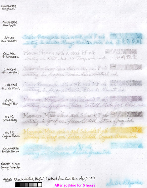
From the album: Ink performance testing
I didn't really set out to test the water resistance of these inks; I'd wanted to compare the paper in two different Rhodia dotPad No.16 notepads ordered a couple of years apart, and these inks just happen to be in pens that are on hand and ready to write. Graf von Faber-Castell claims its inks are indelible. Well, I guess the water resistance of the three I tested here aren't bad. Even though it'd be a struggle to read what was written in GvFC Cognac Brown after a long soak, I must say what's left of the marks on the page are distinct enough to make the text legible if one really tries. I am pleasantly surprised by the water resistance of the two Jacques Herbin inks, even if they aren't are good in that regard as GvFC. I'm disappointed to the same extent that the two Monteverde inks were washed away without leaving a trace.© A Smug Dill
- 0 B
- x
-
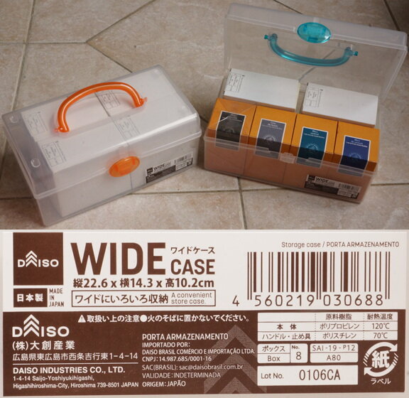
Daiso Wide Case good for storing GvFC and Jacques Herbin inks
A Smug Dill posted a gallery image in FPN Image Albums
From the album: Odds and ends
These standard-priced, Japanese-made Daiso stackable clear carry cases with handles are pretty neat for storing up to eight 50ml bottle SKUs (i.e. inclusive of retail packaging) of Jacques Herbin ink or four 75ml bottle SKUs of Graf von Faber-Castell ink.© A Smug Dill
- 0 B
- x
-
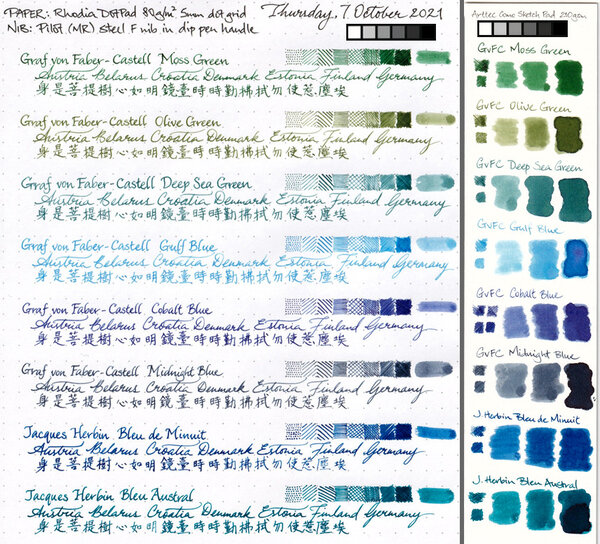
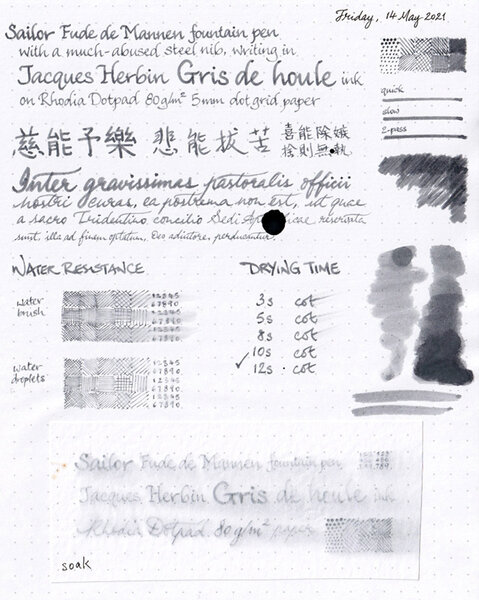
Jacques Herbin Gris de Houle review sheet overview
A Smug Dill posted a gallery image in FPN Image Albums
-

From the album: Ink review
On Rhodia Dotpad 80g/m² paper, using a Sailor Fude de Mannen pen with a bent nib.© A Smug Dill
- 0 B
- x
-
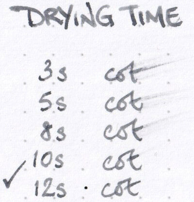
Drying time for Jacques Herbin Gris de Houle ink
A Smug Dill posted a gallery image in FPN Image Albums
-
Water resistance of Jacques Herbin Gris de Houle
A Smug Dill posted a gallery image in FPN Image Albums

-
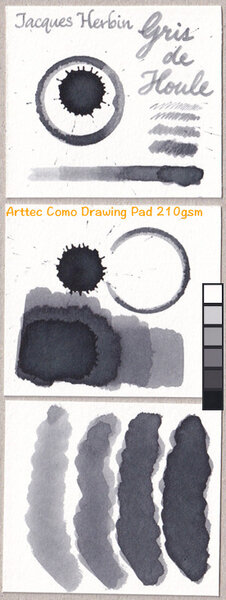
From the album: Ink review
On Arttec Como Drawing Pad 210gsm paper for mixed media art.© A Smug Dill
- 0 B
- x
-
I find this ink mesmerizing, even though my first thought with interior lighting was: oh no, another green! In sunlight it seems to sit precisely at the border between green and blue. It's expensive, luckily it was a gift, there are probably quite a few alternatives. If you need an excuse: sure, similar, but never quite the same... http://i68.tinypic.com/ev99oi.jpg I really appreciate thorough reviews but I think writing samples are more useful (to me!). Wetness? Well, it's an ink... Not as thick as say Rouge Hematite or Verde Muschiato, on par with everything else I have tried. Does it dry quickly? As slowly as other inks, particularly on better paper. Don't write with swabs either, sorry. Tissue paper splotches look cool but I use this for writing. The bottle is quite elegant, but there is no indentation at the bottom like on Iroshizuku bottles to hold the nib in place (groans of exasperation allowed). http://i68.tinypic.com/2gw8d4p.jpg The pen does have the cellophane hack as described here, just because I'd had enough of my blue inks ending up way darker; Lamy Vista with an M nib. The ink was originally for sale only at Le Bon Marché in Paris but might be available elsewhere now, at least in France. So for those of us not there, it's a bit of unobtanium, like those Japanese special editions. What comes to mind when I look at it is: depth, elegance. It does what it says on the tin, in the sense that it looks like the label on the bottle (while say Ina Ho looks green, not brown like on its label).
-
From the Jacques Herbin site: "To celebrate the 350th anniversary of Jacques Herbin’s original brand, we are letting the people who know us best, our fans, choose the new colour of our next anniversary ink. This will form part of the official Jacques Herbin collection. Our ink experts have designed four very distinct shades. The range varies from pastel to dark, soft to flamboyant and tender to lively, each with shimmering and radiant reflections. Each one unique. And to mark this vintage in an even more spectacular way, we decided to create a unique Jacques Herbin ink with both silver and gold glitter that will add sparkle to your writing! So what do you need to do? You have until 16th March to vote and let us know your favourite below. The result will then be verified, and we will reveal the results by email in early April. As if you needed more of a reason to vote, the Jacques Herbin team will then randomly select FIVE voters to exclusively preview the new ink in the luxury of their own home. The winning ink will be available from selected stationery retailers, ink specialists and boutiques for purchase from September 2020." https://www.jacquesherbin.com/en/new-anniversary-ink-survey.html
-

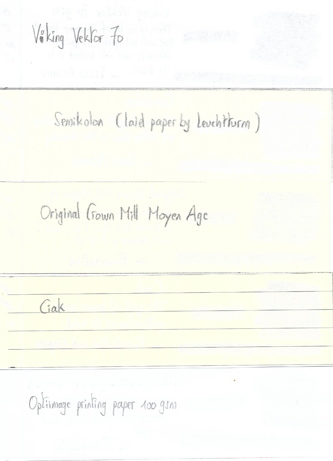
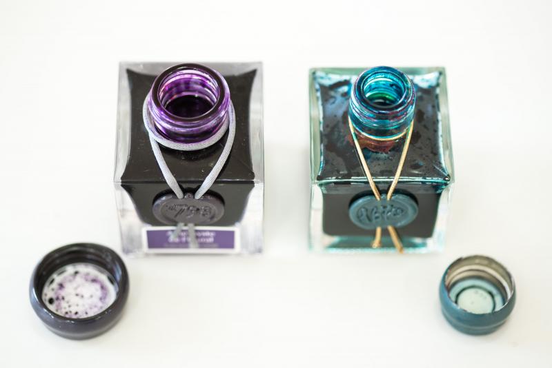
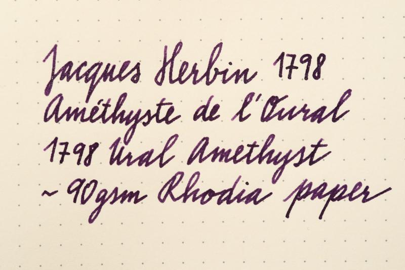
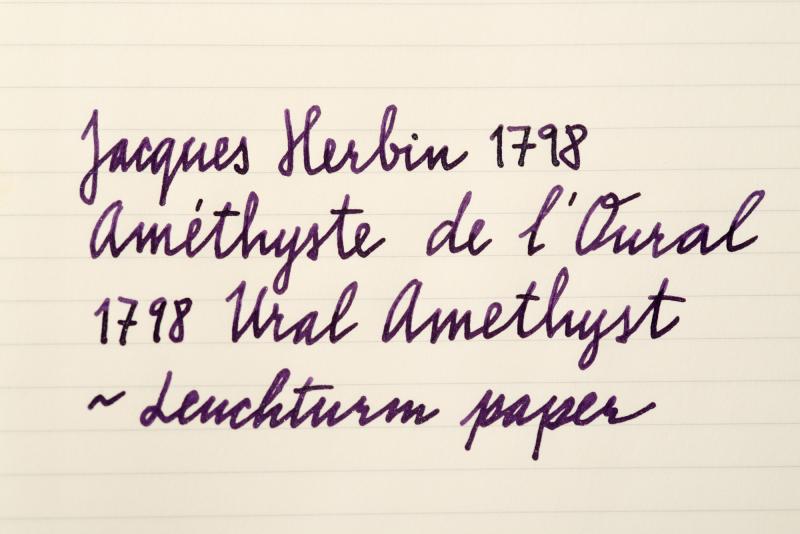
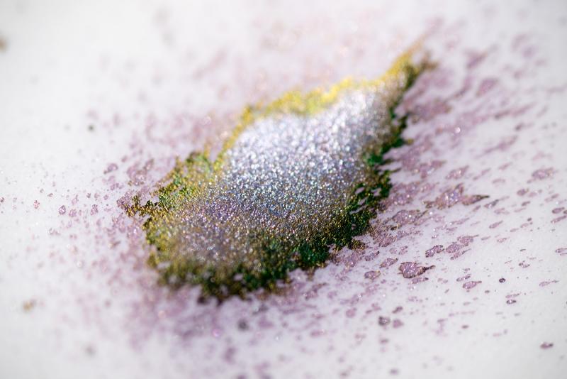
Jacques Herbin 1798 Amethyste De L'oural / Ural Amethyst
bureaudirect posted a topic in Inky Thoughts
Hi folks, It's 2nd of August and we can finally talk about this amazing new anniversary ink I'll start it all off with official info first: The box is now a smart grey with purple label and white writing. It does stand out nicely on plain background. Overall design looks more mature and reminds me of perfume bottle packaging. Capacity stays the same - 50ml of silver sheen enhanced ink aka superink. J Herbin listened to feedback and changed the bottle neck - it has new, wider, 2cm opening. Thumbs up! The new bottle is slightly bigger, but the shape remains the same. Cap is covered in purple wax. A shiny looking scarf goes around the bottle neck and suits it very well. I wonder if Jacques himself was so lavishly dressed! On the front there's the 1798 stamp which ties up the scarf and a colour label underneath with the ink name - Améthyste de l'Oural. To finish it all off, the glass on the bottom of the bottle is embossed with Jacques Herbin and his mighty ship. ....And now for the ink itself Colour of Ural Amethyst is everything we wanted - regal, majestic, dark, mysterious purple. This is the first time J Herbin used silver particles - previous 1670 range of inks used only gold. The ink is amazing - the more I use it, the more I love it. I have left it in the pen for a week or so - there were no hard starts, pen started writing immediately. The particles move quickly and distribute very well. That said, the bottle needs shaking before inking (as usual) and turning the pen in hand before writing will make a huge difference to the shimmer. Now to the main point, how it writes... I did some comparisons with other purple inks and paper from Rhodia, Leuchtturm and Tomoe River. You will hardly notice the green sheen, that is mainly just eye candy from using special paper. As always, the shine does depend on the viewing angle and light source etc but the silver effect is superb though - highlighting the dark tones of the deep purple body beautifully. I think I've fallen in love again... Official release day is 1st September 2017. What do you think? Will this ink top the popularity of Emerald of Chivor?? Enjoy