Search the Community
Showing results for tags '1798'.
-
Jacques Herbin 1798 Diamant Bleu Ink Review # 213 --- 🧾 Description This is gorgeous, well-lubricated, wet navy ink with silver shimmer. Dry times are quite short on Rhodia. It’s excellent on copy paper with most nibs, but there’ll be some bleed-through with wet pens. The 1798 series celebrates the date Herbin started making inks. The shading is most striking on all the Japanese papers shown below. --- 🧪 Chroma --- ✍️ Writing Samples (scan) Rhodia / Iroful The quotes are: “The blue of the sky is wider than our dreams.” — Victor Hugo “Beauty is a promise of happiness.” — Stendhal “Blue has no dimensions.” — Yves Klein “The real voyage is to see with new eyes.” — Marcel Proust “The heart has its reasons which reason does not know.” — Blaise Pascal Midori /Tomoe River 68gsm Hammermill 20lb 📸 Photo (artificial light) Rhodia/ Iroful Midori / Tomoe River 68 gsm Hammermill 20 lb copy paper Close-up 🔍 Comparison Col-o-Ring paper. Scans are approximate. --- 💧 Water Test --- 🎨 Artwork The curse of the blue diamond Mouse's ancestors lived in the Louvre Palace when it was just a castle. Over the centuries, they amassed many shiny objects during the intrigues, duels, and the Liaisons dangereuses. On one of his explorations, Mouse came upon a unique diamond, the Diamant Bleu. Some say it was a gift brought by Louis IX during the Crusades, that it was cursed, as attested by Nostradamus, Catherine de Medici’s secret soothsayer: when the brilliant blue leaves the darkness, red will follow after. Was it the end of the Valois dynasty under her regency or was it the red of St. Bartholomew’s massacre? Some point to the recent heist of the Crown Jewels of France from the Louvre. Mouse thought that by bringing it to the cat jeweler, he might change the course of history; after all blue is the colour of calm. Jacques Herbin 1798 - Diamant Bleu, 1670 - Opal Nocturne, Tintenlabor Basalt Irongall ink, Talens Mixed Media Notebook. INKTOBER52 PROMPT NO.46 - Sneaker It has been said that when the Portuguese court absconded to Brazil during the Napoleonic Wars, there was no one to care for the many orphans. So when an orphaned Kitty (assuming a Scottish sailor as a father) cried itself out at the shores of Belém Tower in Lisbon and lamented its fate, one of the monks sneaked out a Pastéis de Nata, reserved only for monks and kings. The sweetness of the pastry forged a friendship and changed their fate (fado). Inspired by @catbert's João V! drawings. 🙏 Jacques Herbin 1798 - Bleu Diamant Shimmer ink, J Herbin Bouton d'or, Tintenlabor Basalt iron gall ink. Talens Mixed media notebook. --- - Pens Used: Pilot Kakuno EF, Kaweco Sprt (EF/F/M/B/BB/Stub 1.9) , Noodler’s Nibcreaper fited with a Waterman M2 flex nib. - What I Liked: Wetness, lubrication, colour on most papers, price. - What I Did Not Like: Shimmer, colour on other papers. - What Some Might Not Like: Price, shimmer. - Writing Experience: Excellent. - Pros: Wetness, lubrication, colour. - Cons: Not waterproof, shimmer, price, 🧷 Ink Characteristics - Shading: Good on most papers. - Ghosting: With wet/ wide nibs. - Bleed Through: With wet/ wide nibs. - Flow Rate: Wet - Lubrication: Excellent. - Nib Dry-out: Did not notice. - Start-up: Excellent - Saturation: Saturated. - Sheen: Very faint red sheen where ink puddles. - Spread / Feathering / Woolly Line: Did not notice. - Nib Creep / Crud: Did not notice. - Staining (Pen): - Clogging: No. - Cleaning: I used a pen jacuzzi to clean my pens. But I’m guessing it should be easy to clean. - Water Resistance: None. --- 🛒 Availability - Available in 50 ml bottles worldwide. --- 💬 Closing I’m not a fan of shimmer inks. However, I enjoyed writing with this one, there’s something subtle about silver and navy. And writing with it on Iroful was like a dream in heaven. No fountain pens were hurt in preparing this review. Please don’t hesitate to share your experience, writing samples, or any other comments — the more the merrier.
- 21 replies
-
- jacques herbin
- diamant bleu
-
(and 4 more)
Tagged with:
-
Am I the only one who noticed that many inks are dirt cheap at Cult Pens? I can’t be, right?
collectorofmanythings posted a topic in Fountain & Dip Pens - First Stop
I haven’t heard many people talk about this, so I just wanted to make those who are unaware now aware. Here is just a quick thing on some price comparisons. “Retail” price was taken from online fountain pen and ink retailers: DIAMINE 30ml Cult Pens- $2.47 Retail- $7.50 PELIKAN 4001 30ml Cult Pens- $4.82 Retail- $11.75 ROHRER & KLINGNER 50ml Cult Pens- $5 Retail- $11.95 PARKER QUINK 57ml Cult Pens- $5.21 Retail- $11.02 DIAMINE 80ml Cult Pens- $6.21 Retail- $14.95 WATERMAN 50ml Cult Pens- $6.51 Retail- $12 PELIKAN 4001 62.5ml Cult Pens- $7.52 Retail- $16.50 DIAMINE 150th ANNIVERSARY 40ml Cult Pens- $8.15 Retail- $15.50 HERBIN 30ml Cult Pens- $8.40 Retail- $12.95 KAWECO 50ml Cult Pens- $8.41 Retail- $12 CROSS 62.5ml Cult Pens- $9.47 Retail- $16 LAMY CRYSTAL 30ml Cult Pens- $9.99 Retail- $16 JACQUES HERBIN 1670 50ml Cult Pens- $18.39 Retail- $29.50 JACQUES HERBIN 1798 50ml Cult Pens- $21.02 Retail- $29.50 MONTBLANC AROUND THE WORLD IN 80 DAYS BLUE 50ml Cult Pens- $33.66 Retail- $40 I just wanted to tell all of you who weren’t aware. Have a nice day, W. Major -
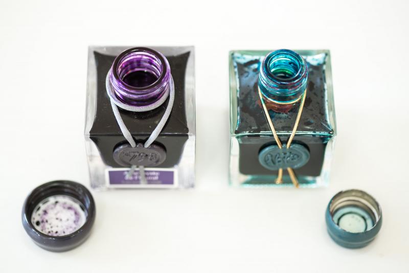
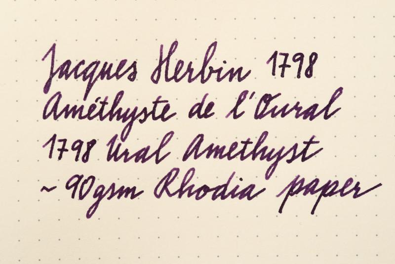
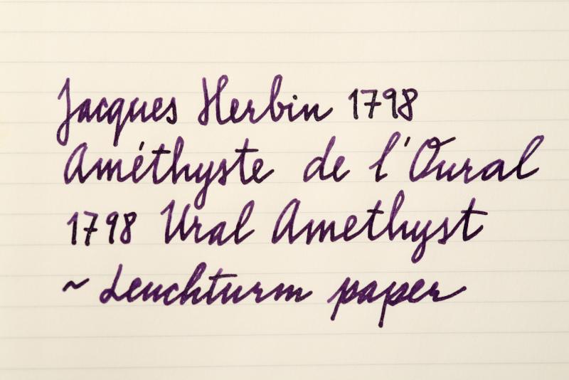
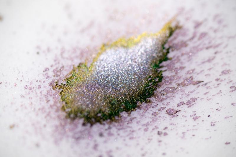
Jacques Herbin 1798 Amethyste De L'oural / Ural Amethyst
bureaudirect posted a topic in Inky Thoughts
Hi folks, It's 2nd of August and we can finally talk about this amazing new anniversary ink I'll start it all off with official info first: The box is now a smart grey with purple label and white writing. It does stand out nicely on plain background. Overall design looks more mature and reminds me of perfume bottle packaging. Capacity stays the same - 50ml of silver sheen enhanced ink aka superink. J Herbin listened to feedback and changed the bottle neck - it has new, wider, 2cm opening. Thumbs up! The new bottle is slightly bigger, but the shape remains the same. Cap is covered in purple wax. A shiny looking scarf goes around the bottle neck and suits it very well. I wonder if Jacques himself was so lavishly dressed! On the front there's the 1798 stamp which ties up the scarf and a colour label underneath with the ink name - Améthyste de l'Oural. To finish it all off, the glass on the bottom of the bottle is embossed with Jacques Herbin and his mighty ship. ....And now for the ink itself Colour of Ural Amethyst is everything we wanted - regal, majestic, dark, mysterious purple. This is the first time J Herbin used silver particles - previous 1670 range of inks used only gold. The ink is amazing - the more I use it, the more I love it. I have left it in the pen for a week or so - there were no hard starts, pen started writing immediately. The particles move quickly and distribute very well. That said, the bottle needs shaking before inking (as usual) and turning the pen in hand before writing will make a huge difference to the shimmer. Now to the main point, how it writes... I did some comparisons with other purple inks and paper from Rhodia, Leuchtturm and Tomoe River. You will hardly notice the green sheen, that is mainly just eye candy from using special paper. As always, the shine does depend on the viewing angle and light source etc but the silver effect is superb though - highlighting the dark tones of the deep purple body beautifully. I think I've fallen in love again... Official release day is 1st September 2017. What do you think? Will this ink top the popularity of Emerald of Chivor?? Enjoy
