Search the Community
Showing results for tags 'pelikan'.
-
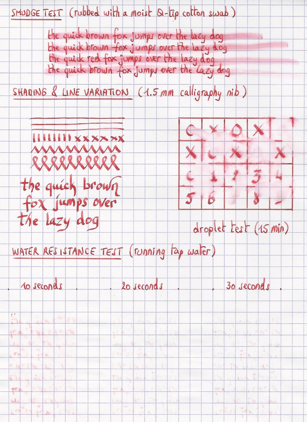
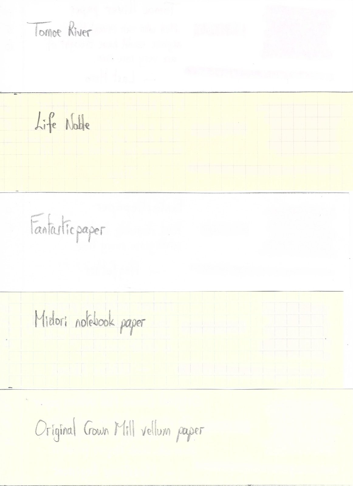
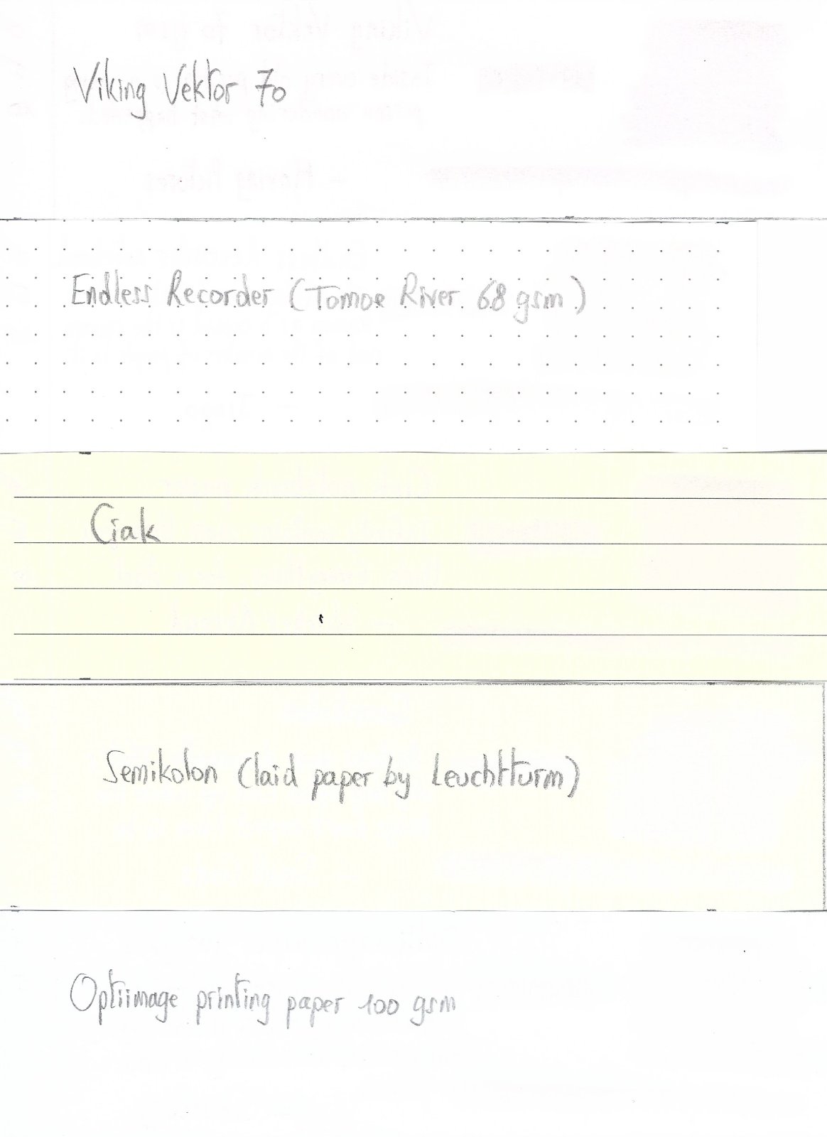
Pelikan Edelstein Golden Lapis Ink of the Year 2024 In 2011 Pelikan introduced the Edelstein series of high-end inks, available in a variety of colours. The theme of the Edelstein concept is the gemstone – each ink corresponds to the beautiful colour of a gem. The Edelstein line of inks is presented in 50 ml high-value bottles, that are truly beautiful, and worthy of a place on your desk. In this review the spotlight shines on the shimmering presence of Golden Lapis, the Edelstein Ink of the Year 2024. This is a limited edition glitter ink, that will most probably be gone in the near future. At heart, Golden Lapis is a bright light-blue ink with added golden shimmer particles. I’m not a fan of shine & shimmer, so will mostly ignore this aspect of the ink. Just one word of warning: the gold particles tend to accumulate at the surface, and will easily come off the paper when the ink has dried. It’s almost unavoidable. The ink’s colour is quite enjoyable. My first thought was: “Oh, this is Topaz with shimmer”. But that’s not really the case. Topaz is a lighter turquoise blue, while this Golden Lapis definitely is a touch darker. Still a light & bright blue though. Most Edelstein inks work well across the nib size range, and can handle all types of paper. This one is a bit more finicky. It mostly has problems with absorbent paper: the ink gets sucked right in and through the paper, with bleed-through as a result. Yikes! On hard-surface coated paper, the ink looks great, but it needs its time to dry… for a long time. In return, you get strong and truly nice shading, and a bit of a purple-reddish sheen. Overall, a good-looking ink with some technical issues. The chromatography shows a light-blue dye with some purple component in the mix that darkens up the ink a bit. Water resistance is fairly good: although a good deal of the dyes are washed away, enough is left to easily reconstruct your writing. Not bad. Golden Lapis writes well in all nib sizes. A nicely lubricated and well-saturated ink that always leaves a strong and contrast-rich line on the paper. I like it best with the broader nibs, where the shading really comes into play. I’m not usually a big fan of heavy shading, but for this ink I make an exception. Golden Lapis looks at its best when the shading is strongest – the contrast between light and darker parts is really well balanced, and looks just darn good. But you only get this lovely and aesthetically pleasing shading on the hard-surface paper. On absorbent paper, shading is just barely there and the ink loses much of its appeal. To show you the impact of saturation on the ink’s look & feel on paper, I made some scribbles where I really saturated portions of a piece of 52 gsm Tomoe River paper with ink. This gives you a good idea of what the ink is capable of in terms of colour range. Golden Lapis has a medium colour span, gradually darkening as saturation increases, but always keeping true to its light-blue nature. The light-to-dark ratio in writing is just right, with really great aesthetics. You get prominent shading, not too extreme, which looks absolutely gorgeous – but only on the hard-surface paper. Technically, the ink has the typical Edelstein feel: well lubricated, good saturation. It’s a shame it doesn’t work well with absorbent paper, and that includes all types of copy paper. The ink then gets sucked into and through the paper, making a mess of the opposite side. For some reason, it also didn’t work well with the paper in my Paperblanks journal, which usually is not that fussy about the inks I use. Looks like the Paperblanks paper is just a touch too absorbent to work well with this ink. Below you’ll find photos of the writing samples on loads of different paper types. This should give you a good feel for the ink. On each scrap of paper I show you: An ink swab, made with a cotton Q-tip 1-2-3 pass swab, to show increasing saturation An ink scribble made with an M-nib Safari fountain pen The name of the paper used, written with a B-nib Safari A small text sample, written with the M-nib Safari Title of the quote, with a Pelikan M120 with M-nib Drying times of the ink on the paper, with the M-nib Lamy Safari I’ve also added a scan of some writing samples to give you another view on the ink. Scanned images and photos often capture different aspects of the ink’s colour & contrast. That’s why I present them both. The ink swabs look closest in colour in the scanned image. The character of writing shows best in the photos. Below you also find some blow-ups on coated paper to really show you that beautiful shading. Writing with different nib sizes The picture below shows the effect of nib sizes on the writing. The top samples were written with a Lamy Safari, which is typically a dry pen. I also added a few visiting pens. What is really visible here is the wide range of blue hues the ink produces in the different pens & nib sizes. That’s quite some variety for a single ink. Cool! Related inks To show off related inks, I use my nine-grid format, with the currently reviewed ink at the center. This format shows the name of related inks, a saturation sample, a 1-2-3 swab and a water resistance test – all in a very compact format. Golden Lapis’ base colour is fairly similar to several other inks. Iroshizuku kon-peki comes close, but is a tad lighter. In the Pelikan Edelstein line-up, Topaz would be my alternative of choice. It’s technically a better ink, and looks amazing on any type of paper. Inkxperiment – Pythagoras I’ve put myself a challenge to try to produce interesting drawings using only the ink I’m reviewing. I find this to be a fun extension of the hobby, and have found these single-ink drawings ideal for experimenting with different techniques. And creating these monochrome paintings is simply fun, and always good for a couple of hours well spent. Inspiration for this inkxperiment comes from the world of mathematics. Recently I came across an article on the internal structure of protons, which captured my attention. So I grabbed a book on particle physics, and on page 10 or so I got lost in the math... a bit embarrassing 😉. So I’m refreshing my math now, starting from the basics. And right there at the very beginning is that Greek philosopher genius of about 2500 years ago who had that great insight into the geometry of triangles. I tried to capture his wisdom into this little inkxperiment. I started with an A4 sheet of 300 gsm watercolour paper, and painted in the temple background, using Golden Lapis with multiple water/ink ratios. I then used pure ink and lots of glitter to frame the sky. Next I added the visualization of the Pythagorean theorem, and our philosopher sitting at the temple wall. The end-result gives you an idea of what can be achieved with Golden Lapis as a drawing ink. Inkxpired – computational art I love experimenting with pen/ink/paper and have added another layer as part of the hobby. I’m exploring computational art, inspired by the ink drawings I do during ink reviews. Another fun offshoot of the hobby… and all that starting with a few drops of dye-coloured water on paper. I started by using a duo-tone colour filter and added a graph paper backdrop. I then used a “tiny world” filter with focus on our philosopher. Next I used a grid-filter which also added colour to the image. The end result shows the mathematical lens through which Pythagoras viewed the world. Conclusion With this Ink of the Year, Pelikan continues to present us with a shimmer ink (please stop doing that 😉). This time with a nice bright-blue base colour that looks gorgeous on hard-surface, good-quality paper. Unfortunately, the ink suffers badly when using it on absorbent paper, with loss of shading and quite some see-through and bleed-through. A nice enough ink to try, but not one that falls in the must-have category (my opinion). Technical test results on Rhodia N° 16 notepad paper, written with Lamy Safari, M-nib Backside of writing samples on different paper types
-
I'm trying to find out more about the difference between a Pelikan EF and F. The pen in question is the M800. The threads I found were all 10 years old or older. Most cited inconsistencies in the nibs. There were mentions of there being no discernible difference between the EF and F and sometimes even the EF writing thicker than the F. Some have stated that the EF nibs are scratchy. Others have cited misaligned tines out-of-the-box. There were suggestions to find and use reputable nib tuners throughout. This thread is intended to document whether that sentiment of inconsistency still holds true or whether it has since been corrected. Was it just a bad time for Pelikan nibs? Have they since tightened up their manufacturing process and quality control, some ten years later? Are both nibs now distinguishable, smooth, and aligned?
-
Pelikan has just announced the upcoming Pelikan Toledo M910 Special Edition White fountain pen. In our opinion one of the nicest Toledo released so far, on the same level as its black brother the M910 Black, which was released many years ago. We offer this pen, which should arrive by mid October at our brick and mortar store, for pre-order in our online shop at a special price. Standard nib sizes EF, F, M and B cost € 1.427,73 including insured shipping via DHL and local post to all available countries outside the European Union. We also offer our Fritz Schimpf italic grind for this pen. Our offer: https://www.fritz-schimpf.de/Neuheiten/Pelikan-Toledo-M910-Special-Edition-Weiss-Kolbenfuellhalter.html Happy writing, Fritz Schimpf Tübingen

-

pen cases A utilitarian review of a few pen cases
sannidh posted a topic in Paper & Pen Paraphernalia Reviews and Articles
PRELUDE A search loop for the perfect ONE and then the more perfect OTHER With great fountain pens comes an even greater responsibility of carrying them around in this mortal world, where inadvertent scratches, dents, and corrosion become inevitable. Thus begins my search for sheaths and containers to protect these fine instruments, which have earned a reputation for being mightier than the sword; at least for the past 175 years. I digress; I wonder why the keyboard was never celebrated in the same way when it emerged around the same time as the original quote. If you like a pictorial blogger view, here is the link: A utilitarian review of my pen cases BACKGROUND AND OPINIONATED TRUTHS Experiments, measures and opinion I like to use a few fountain pens during my travels for note-taking and journaling. While I could use the original boxes for my limited collection, they tend to take up unnecessary space in my cupboard. Some of these cases are beautifully made, while others are more ordinary. That's where a storage pen case comes in handy. One advantage is that you can see multiple pens together to help with selection, or perhaps just to avoid making a choice. For example, I often tell my Opus 88 Jazz to just lie there, which has been my unfortunate treatment of that pen ever since I got it. In my case, the search has usually been for a value-for-money options. It’s rare to find a case that costs as much as a pen, but this highlights the absence of worthy alternatives. Another aspect is that in India, leather goods are available at a fraction of the cost compared to the West, although there is less general understanding of the premium quality of higher-grade leather materials. By a stroke of luck, a couple of us met Michael, a leather importer based in California, who sources leather from India, China, and Thailand. He supplies leather to some well-known premium brands, with the final products ranging from premium car seat covers to women’s bags. He explained what typically gets exported versus what is consumed domestically in these countries. Michael also described the leather qualities and grades he looks for when evaluating a shipment from the tanneries. By the way, you can check out some interesting expositions on leather grades and types , and here’s a brief write-up on leather quality if you’re short on time or patience: Full Grain: The highest quality. A cut of leather consisting of the outer layer of hide, left unsanded and unbuffed to retain its natural imperfections. It has a strong and durable surface. Top Grain: The top layer is sanded to remove imperfections, which reduces some of the strength and water-repellent qualities of full grain leather. It is commonly used in handbags, wallets, and shoes. Corrected: A broader term often referred to as genuine leather. It can be any layer of hide that has been treated to create a uniform surface. Commonly used in belts, wallets, bags, gloves, and shoes. Split Grain: A layer cut from the lower levels of top grain leather. It is not as dense, tight, or durable as full grain or top grain leather. Reconstituted & Recycled: Leather scraps are bonded together using polyurethane or latex. Here are a list of leather finishes: Aniline: Dyes allow natural surface of leather to show through. Semi-Aniline: Similar to aniline but with added pigments. Faux: Also known as PU, Vegan or Vinyl leather. Is made of polyurethane and made to mimic real leather. There are many more types (12+), but they may not be relevant to our search for pen cases and sleeves. Leather tanning is the process of treating hides to clean them of dirt, blood, and hair. This process alters the protein structure of the hide to make the leather durable and less susceptible to decomposition. Vegetable tanning: This method uses natural materials or tannins derived from plants and bark, which are astringents. It’s an ancient, environmentally friendly process. Chromium tanning: Chromium sulfate is used for a faster and cheaper tanning process, offering more color options than vegetable tanning. The hair and flesh are removed before the tanning process. Leather hides are graded as 1, 2, 3, or non-tannable, depending on the imperfections in the hide. The top-of-the-line branded pen cases are made from full grain cowhide leather with an aniline or semi-aniline finish. The case proliferation in my situation is rather proportional to the larger pen dimensions rather than the number of pens in my relatively limited collection. I found it increasingly inconvenient to carry flagship pens like the Wahl-Eversharp Decoband, Pilot Custom Urushi in the Pelikan TG32 three-pen case. While the Decoband fits inside Visconti Dreamtouch comfortably, the Custom Urushi does not. These pens could be a part of an everyday carry unlike a Namiki Emperor, unless you of course dare to carry it. In this situation, the Cross Leather Pen Box came to my rescue, but its dimensions pose a problem for my laptop bag if I want to carry two or three more standard pens. Given the rapid progress in design, manufacturing and evolving human desires, here are my standard set of guidelines, refined over the years, while looking for pen cases (YMMV): OBSERVATIONS & EXPERIENCE In Context Here are the pen cases I have acquired over the years: Single pen cases The Black Canvas Pen Capsule: Soft case. I got the English Violet variant which is made of top-grain chrome-tanned leather. The inside of the pouch is soft and velvety. Endless Companion Pen Pouch: Hard case. The company uses the term genuine leather which may indicate corrected leather. However, it seems well-made for standard pen sizes (such as a Lamy 2000, and it can stretch to fit a regular Montblanc 146) and has a matte buffed finish. The pen itself rests in a felt-like soft compartment, and the case is fastened by two buttons. They ensured that there is a felt-flap covering the exposed parts of a pen where it's buttoned. Cross Men's Leather Single Pen Box-Black: Hard case. Again corrected leather, but with ample space inside to house a Custom Urushi or WE Decoband. The flap is fastened with a magnetic closure, which is a nice touch. I have noticed some leather coming out off the edge of the flap from the newer of the two boxes, but this is what it is. Custom pen case for Namiki Emperor sized pen: Soft case. This was custom-made by fellow fountain pen collector Dr. Ashish Wakhlu for my Namiki Emperor pen. It’s good enough to protect the pen from minor scratches. From the texture, it seems like top grain or full grain leather with an aniline finish. It has some protection at the back. Multi pen cases Arista Leatherette Case for 6 pens: Hard case. I have two of Arista pen cases that I got from Amazon, primarily for storage. They’re lined with felt and have a partial over-layer to protect the finials from brushing against the zipper. It’s somewhat partial towards the pens in the first and last slots. Made of polyurethane, it closely mimics Saffiano leather and has a nice touch with bumpers at the base. The Black Canvas Jotbox: Soft case. A nice box for keeping pencils, parallels, and rulers reminiscent of the good old school days. It’s made of top-grain leather, and is pretty well made. Aegean Leather Case for Namiki Emperor/Pilot Custom Urushi: Hard case with pen tray. This is the most expensive case I own and it’s excellently made from Italian buttero leather. Full-grain, vegetable-tanned, aniline finish - this case checks all the boxes. I bought it to carry the Custom Urushi in my bag, may be sometimes the Emperor too. Pelikan Leather 3 Pen Case: Hard case with soft flap. Top notch full-grain, vegetable-tanned leather with aniline finish, but for medium sized pens. It’s good enough for a Pelikan M800/1000 or a MB 149. Visconti Dreamtouch Case for 3/6 Pens: Hard case with zippered flap. Felt inner lining. This is my favorite case and checking all boxes for full-grain, vegetable-tanned, aniline finish leather. The one with 6 pens hasn’t seen much motion, but it’s absolutely defies ageing, even after 10 years. I occasionally use a standard neutral shoe cream to polish them. Brown Bear Classic Pen Case for 2 Pens: Hard case with magnetic closure. By the looks of it, the case seems to be full-grain with an aniline finish. Its pretty sturdy and well made, with a single soft divider. The dimensions are good enough to hold a Pelikan M8XX sized pen. Their men’s wallets made of nappa leather hold well too. Essart Pen Case for 10 Pens: Hard Case with magnetic button for the flap. The lid has a transparent portion to get a quick account of pens inside. The frame is wooden and sturdy, with each pen slot lined with felt. It’s pretty & perfect for storage. Methodology The pictures below depict the way in which I have measured the inner length and available versus total width of these pen cases. MY TOP PICKS If I had to pick one It would be the Visconti Dreamtouch Pen case. Thank you for going through the review. You can find other pen and paraphernalia reviews here. REFERENCES Leather grade and types
-

Pelikan 400 in green & black - barrel transparency & nib slit
Mercian posted a gallery image in FPN Image Albums

From the album: Mercian’s pens
I took this photo to demonstrate the transparency of the areas of my 1954 Pelikan 400’s barrel that are between its chatoyant green stripes. I uploaded here because I realised that it also shows what the gap between the tines of a perfectly-set nib looks like; i.e. a narrow gap between the tines, with them just touching one another at the writing tip.© Mercian
- 0 B
- x
-
I did my first really negative review of a fountain pen just in time for April Fools, but I am not fooling! The inexpensive Pelikan Jazz, looks great but it is the most uncomfortable pen I have ever used. It has a very slippery metal section. It is very long, but very thin. The nib is actually pretty nice, but I found it painful to write with the pen for more than 30 seconds. The only way I could actually bare it was to put some electrical tape around the section so my fat hands wouldn't slip. This is sad, because Pelikan makes my favorite pen: the M800, but it is too expensive to use everyday or take to work. I hoped they might make a pen that I could use and not worry about losing. You can see my review here:
-
Tl;dr ‘Executive Summary’: The ‘PF’ stamp on Pelikan nibs is a mark that was required by French Customs/Assay regulations, to indicate that the company responsible for importing the 18k gold nibs to France was Pelikan. Full post: I have, dear reader, been taking part in a discussion on the Parker board about the origin of the (14k) gold nibs on modern Parker Duofold pens. We were debating the meaning of the ‘Eagle-head’ marking on nibs for sale in France, and I looked-up the French law concerning Customs/Assay hallmarks, which can be found at https://www.douane.gouv.fr/fiche/regles-de-marque-pour-la-garantie-des-metaux-precieux. Having read the definition on that site, it turns out that French law (like British law) requires items made of precious metal to be assayed, and to then be stamped with TWO marks: if an 18k gold item passes the assay, it gets the ‘Eagle-head’ stamp; The second mark that is required by French law is a ‘mark of responsibility’ (equivalent to the ‘Sponsor’s mark’ in the British assay system). But: the French system is more-subtle than the British system, and it indicates more information than the British system does, as follows: If the item is made in France, the ‘responsibility mark’ that indicates the manufacturer must be enclosed within a losange - a diamond/straight-sided polygon. If the item is imported to France, the ‘responsibility mark’ that indicates the importer is to enclosed within an oval. So, the ‘PF’ stamp that appears on Pelikan nibs that are stamped with a French ‘Eagle-head’ mark are - as they enclosed within an oval - another French Customs/Assay stamp; one that is a ‘responsibility mark’ for Pelikan. Perhaps the letters indicate ‘Pelikan Fabrik’? Anyway, support for this explanation can be seen on the following two photographs. Firstly, a photo of the ‘PF’ stamp on the 18k nib of my ‘W.-Germany’ M800: As it is stamped inside an oval, it is a French mark to indicate the identity of the importer. Secondly, a photo of the mark for ‘Parker Pens’ on the 14k nib on my Parker 75 that was made in Méru, France, in 1984 Q1: As you can see, the ‘PP’ (separated by an upward-pointing arrow) for ‘Parker Pens’ is enclosed within a straight-sided losange, so it is a French mark that identifies the French manufacturer. I hope that this solves the ‘mystery’ of these stamps. Slàinte, M.
-
Hello! I have this Pelikan Toledo, presumably from the 80s. as you can see from the pictures attached, the piston mechanism is partially disassembled. When I assemble it, the back knob doesn’t contract fully. If am I right, the only way to get it right is remove the thread black part attached to the barrel, then to assemble the piston mechanism outside the barrel (considering get the fully contactin of the back knob) and then insert the fully assembled mechanism into the barrel. Is that correct? If yes… what the right way to do it? Are that thread part friction fitted into the barrel or thread into it? Left or right thread? Should I apply dry heat and or DW40? if it is friction fit… should I apply pressure from the section extreme using a wood bar o apply pull tracción from the back thread part? Piston contracted or extended? thanks a lot!!!
-
Greetings all. I am new to the group and the hobby. Please let me know if this is not the right place to post such a question. I recently purchased a new Pelikan m805 Stresemann with Fine nib. I have read that Pelikans are wet writers (and can confirm this by two other Pelikans I recently acquired in different configurations). But my m805 with Fine nib writes extremely dry. When I apply no pressure to the nib, there is barely a line that comes out. When I apply more pressure, it writes but the writing experience is not particularly pleasant. I use Irochizuku ink. I was wondering if you could give me some advice on how to increase the ink flow and make the pen a wetter writer. An ideal writing instrument for me produces a thin, wet line. Any advice welcome. Thanks in advance.
-
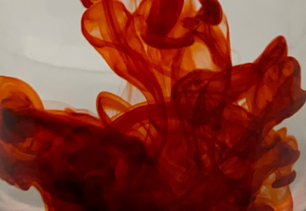
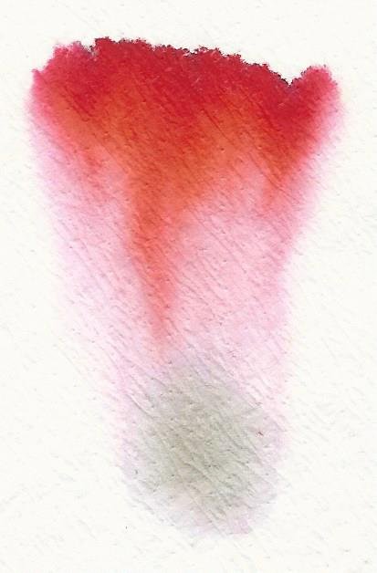
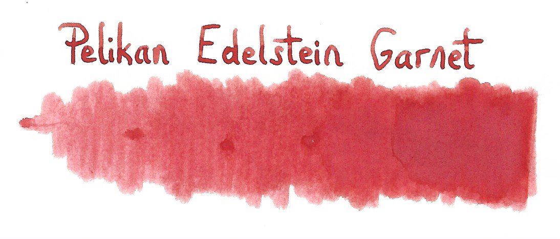
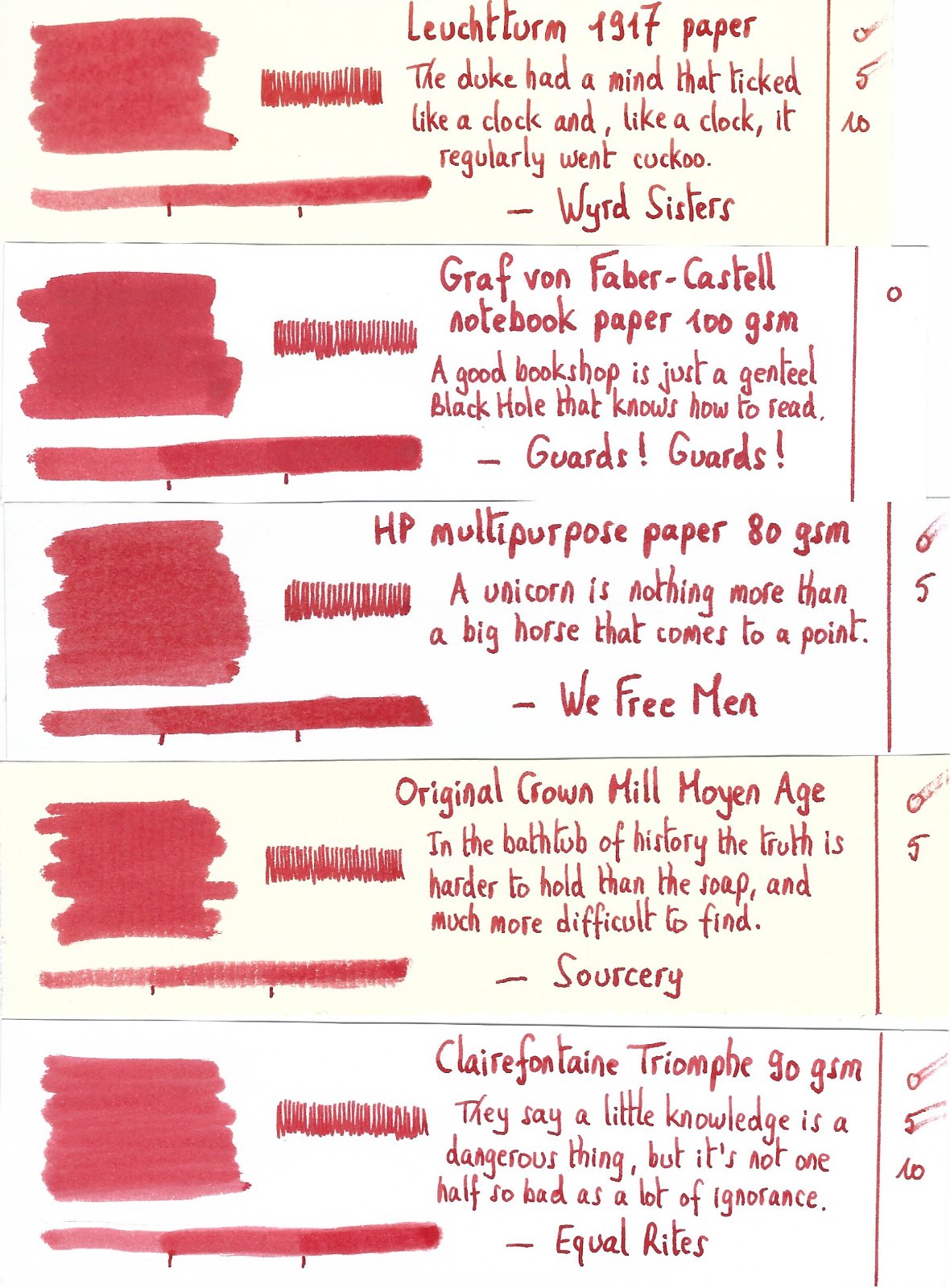
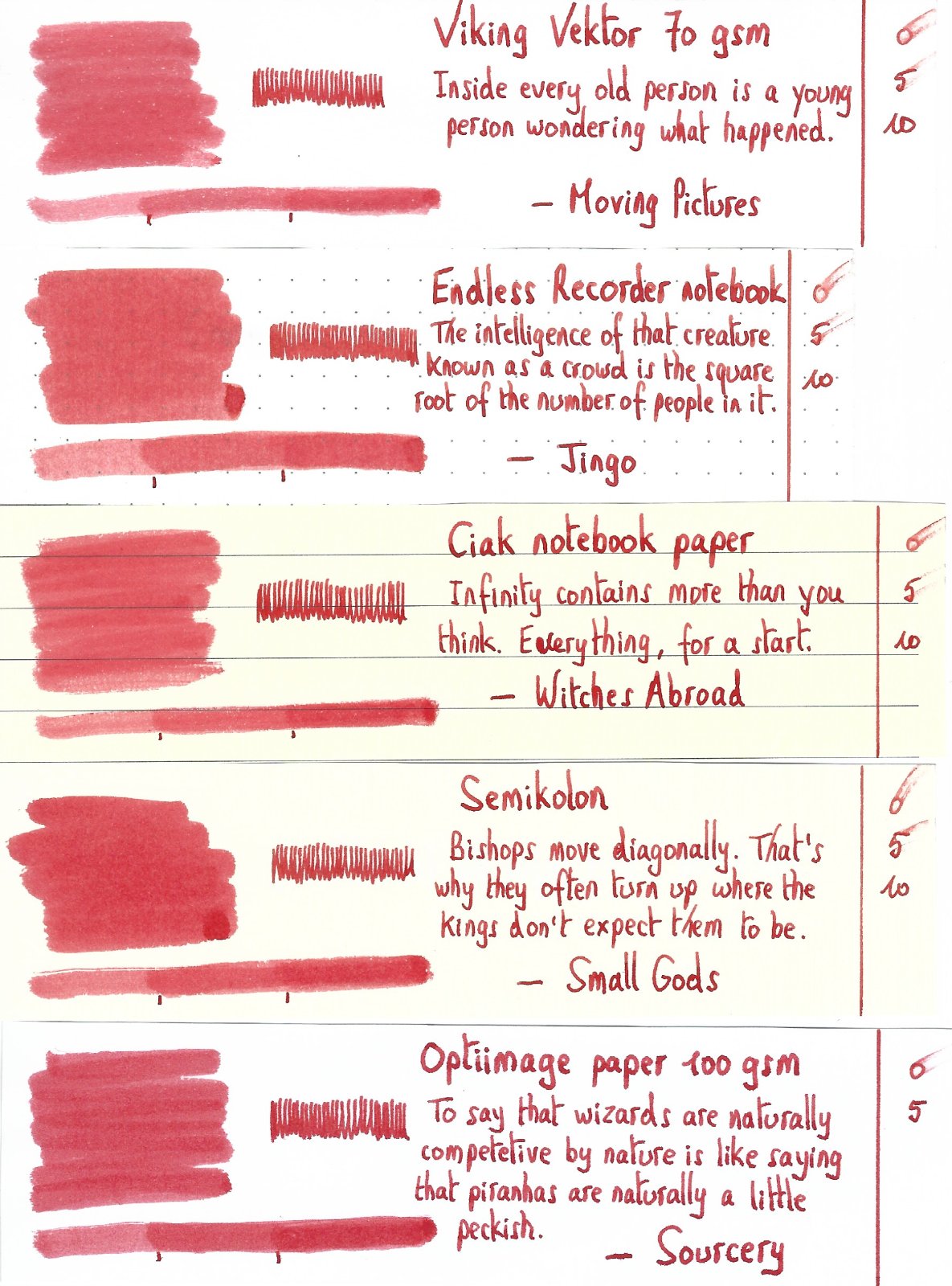
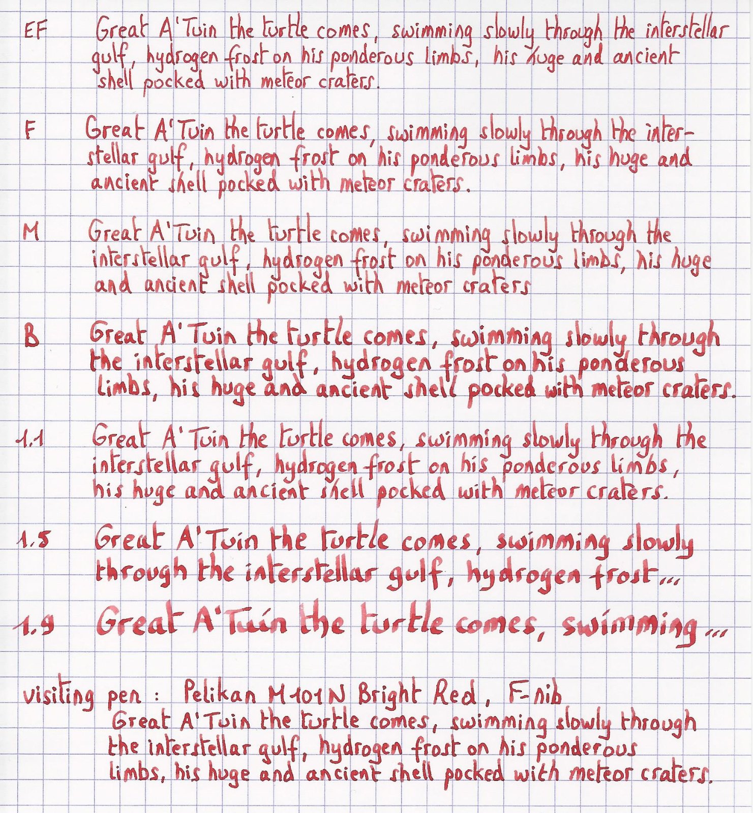
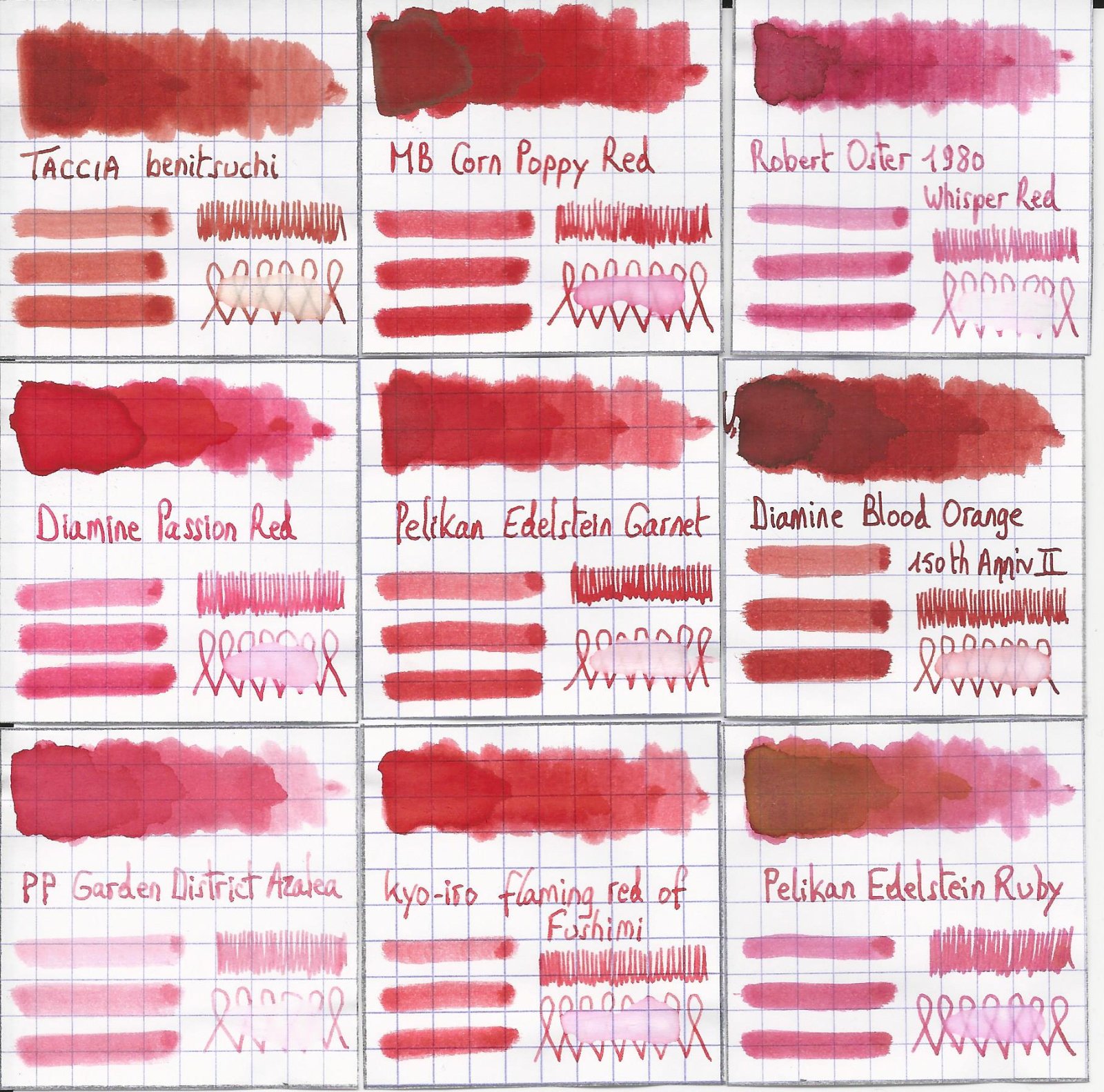
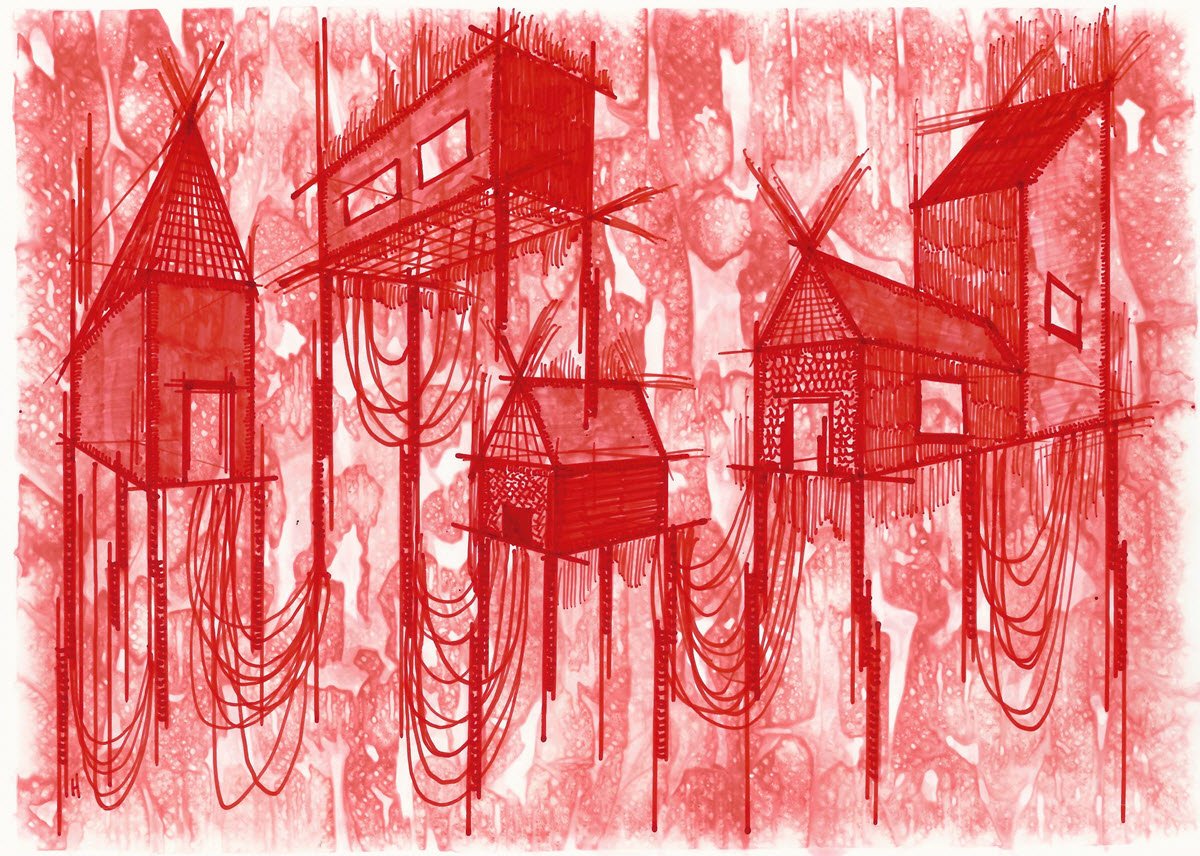
Pelikan Edelstein Garnet In 2011 Pelikan introduced the Edelstein series of high-end inks, available in a variety of colours. The theme of the Edelstein concept is the gemstone – each ink corresponds to the beautiful colour of a gem. The Edelstein line of inks is presented in 50 ml high-value bottles, that are truly beautiful, and worthy of a place on your desk. In this review I take a closer look at Garnet, the Edelstein Ink of the Year 2014, which is now part of the regular Edelstein line-up. Garnet is a fairly bright and well-saturated orange-leaning red. In daylight and in scans the ink’s red tones dominate, but under warm artificial light Garnet definitely shows its orange-leaning nature. This is a decent red ink, that works well in all nib-sizes and on all types of paper. But that’s about it… personally I think there are lots of similar reds about, and there is little to lift Garnet above the pack. Below I give you enough background information to let you make up your own mind. The chromatography shows orange-red dyes and a bit of grey in the mix. The grey tones down the ink a bit, making Garnet appear less vibrant. For red inks, this can be a good thing: a full page of vibrant red might be a bit too much for some. From the bottom part of the chroma, you can already deduce that Garnet is not a water resistant ink. This Edelstein ink can handle all nib sizes with ease, always showing a well-saturated line. I actually prefer this ink with the finer nibs (EF/F), where its presence on the paper is less overwhelming. My personal opinion is that red inks are ok for occasional notes when reviewing/correcting a document, but are too loud for regular writing/journaling. A full page of Garnet hurts the eyes. To show you the impact of saturation on the ink’s look & feel on paper, I made some scribbles where I really saturated portions of a scrap of Tomoe River paper with ink. This gives you a good idea of what the ink is capable of in terms of colour range. Garnet has a low dynamic range, with little difference between the light and darker parts. Not a lot of shading with this ink! The little shading you get is most apparent when using Garnet in dry pens with broader nibs (like the 1.5 / 1.9 calligraphy nibs for a Lamy Safari). I’ve tested the ink on a wide variety of paper – from crappy Moleskine to high-end Tomoe River. On every small band of paper I show you: An ink swab, made with a cotton Q-tip 1-2-3 pass swab, to show increasing saturation An ink scribble made with an M-nib Lamy Safari fountain pen The name of the paper used, written with a B-nib Lamy Safari A small text sample, written with an M-nib Lamy Safari Origin of the quote, written with an F-nib Pelikan M101N Bright Red Drying times of the ink on the paper (with the M-nib Lamy) The ink copes well with a wide variety of paper – it even works well with Moleskine paper: just a tiny bit of feathering, and only a bit of bleed-through. This is an ink that can tolerate even crappy copier paper at the office. I like Garnet just a touch more on the yellow papers in my test set. The yellow background accentuates the orange undertones of the ink, and reduces the contrast between ink and paper, making a page of red writing less loud and in your face. Scanned images alone are not enough to give you a good view of the ink - they tend to exaggerate contrast, and sometimes have difficulty capturing the colour of an ink. I’ve therefore added a few photos to give you another view on the ink. Writing with different nib sizes The picture below shows the effect of nib sizes on the writing. As you can see, Garnet works well in all nib sizes, even the finest ones. I actually prefer using it with the EF/F nibs – the fine line you get tames the ink a bit, and makes a full page of Garnet look a little more palatable. Related inks To show off related inks, I use my nine-grid format, with the currently reviewed ink at the center. This format shows the name of related inks, a saturation sample, a 1-2-3 swab and a water resistance test – all in a very compact form. This allows you to easily compare the ink with its eight direct neighbours, which I hope will be useful to you. Garnet sits somewhere between MB Corn Poppy Red (which is a bit more vibrant) and kyo-iro Flaming Red of Fushimi (which looks a bit softer and more delicate). Inkxperiment – stilt village I’ve put myself a challenge to try to produce interesting drawings using only the ink I’m reviewing. For me this is an incredibly fun extension of the hobby, that continuously challenges my drawing skills. Red inks often have a low dynamic range, and are a real challenge for single-ink drawings, and Garnet is no exception. I therefore decided on a simple pen drawing. I started with an A4 piece of HP photo paper, on which I painted the background using a water-soaked kitchen towel on top of which I painted with water-diluted Garnet. This always produces a nicely textured background on which to paint the subject. In retrospect, I should have diluted the ink quite a bit more… the background turned out to be a bit too prominent. I then drew in the village buildings using a 2-point perspective, and added the stilts and netting with my Lamy Safari fountain pen. Final touches to the buildings were done with a felt-tip pen and fountain pen. The resulting drawing shows what can be achieved with Garnet in an artistic context. Due to its limited colour span, Garnet is best used for line drawings. The stilt village turned out quite well. A pity about the background that should have been softer… well, lesson learned for a next time 😉 Conclusion This Edelstein ink of the year 2014 (which is now part of the regular line-up) has no real technical shortcomings: well-saturated, works with all nib-sizes and paper types. It does lack water resistance though, if you care about such things. All in all a decent red, but personally I’ve seen better ones that I liked more. Technical test results on Rhodia N° 16 notepad paper, written with Lamy Safari, M-nib Back-side of writing samples on different paper types
-
From the album: Mercian’s Miscellany
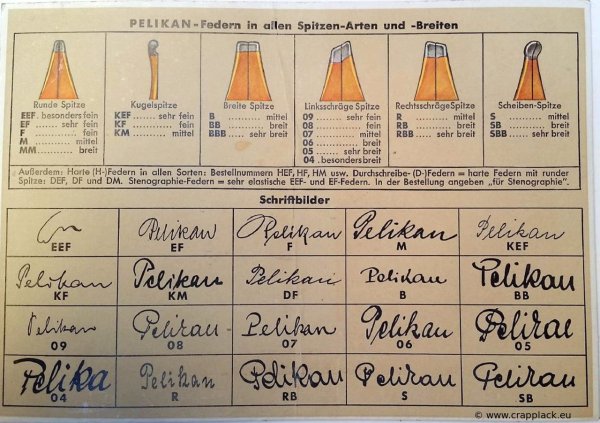
This is a picture that shows - and explains - the sizes and grind-styles of the various nibs that were made by Pelikan during the 1930s and 1940s. Many of these nib types were still being produced by Pelikan in the 1950s. Pens are no longer produced with nibs in this many sizes/grinds by any major manufacturer. An example of the ‘benign hand’ of ‘Market Forces’ in action. I copied this photo from: https://www.pelikan-collectibles.com/en/Pelikan/Nibs/Nibs/index.html At time of my uploading this image to this Gallery on FPN (2024-04-23), the url that appears on the bottom right of this picture no longer works.
- 0 B
- x
-
Pelikan M400 Brown Tortoiseshell from early 1980s.jpeg
Mercian posted a gallery image in FPN Image Albums

From the album: Mercian’s pens
My Pelikan M400 in Brown Tortoiseshell, in its clamshell box. It has a 14k ‘M’ nib, and is in very nice condition. It has a screw-in nib, not one of the earliest friction-fit nib units, but its nib design shows that it is from the earlier part of the production run of these pens. This picture shows how very brown its cap and piston-turning knob are. The grip-section is also this colour. In less-bright light they can seem to be black, but they’re the colour of dark chocolate (nom nom nom!).
- 0 B
- x
-
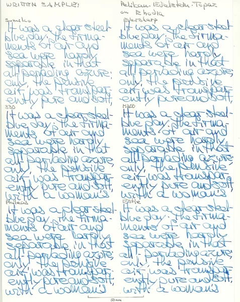
Sandy1 review Pelikan Edelstein Topaz - glossy card, smear test, water test.webp
Mercian posted a gallery image in FPN Image Albums
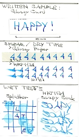
From the album: Sandy1
Sandy1’s scan of her tests of Pelikan Edelstein Topaz on glossy card; for smearing; and for water resistance.© Sandy1
- 0 B
- x
-
Sandy1 review Pelikan Edelstein Topaz - grocery list on pulp.webp
Mercian posted a gallery image in FPN Image Albums
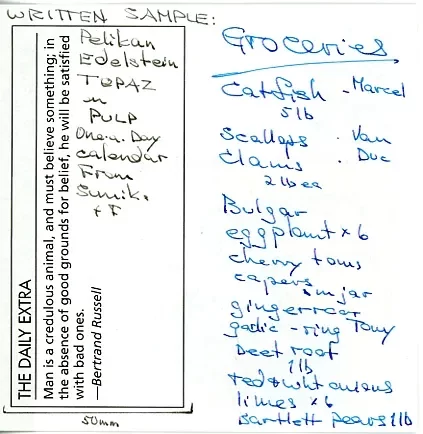
From the album: Sandy1
Sandy1’s scan of a grocery list she wrote in Pelikan Edlestein Topaz on a page of pulpy paper from a one-day-per-page calendar© Sandy1
- 0 B
- x
-
Sandy1 review Pelikan Edelstein Topaz -sample text on Royal paper.webp
Mercian posted a gallery image in FPN Image Albums
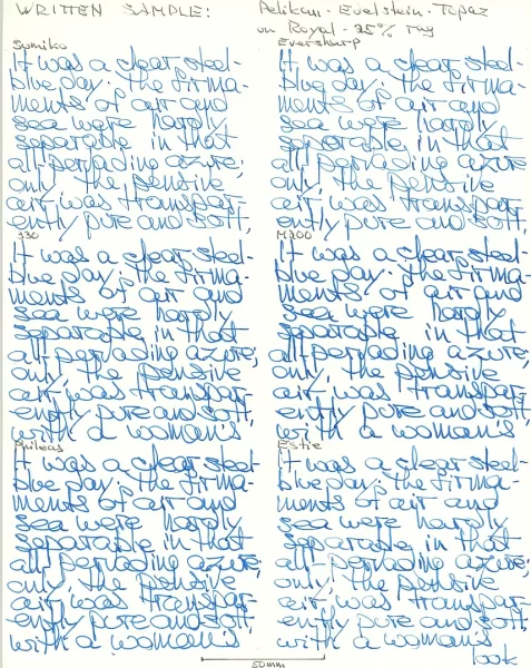
From the album: Sandy1
Sandy1’s scan of her sample text written in Pelikan Edelstein Topaz written on Royal 25% rag paper.© Sandy1
- 0 B
- x
-
Sandy1 review Pelikan Edlestein Topaz - sample text on G Lalo Verge de France.webp
Mercian posted a gallery image in FPN Image Albums
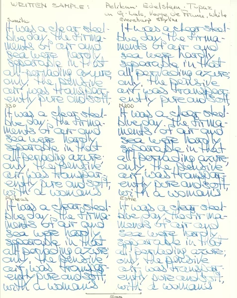
From the album: Sandy1
Sandy1’s scan of her sample text written in Pelikan Edelstein Topaz on G. Lalo Verge de France paper.© Sandy1
- 0 B
- x
-
Sandy1 review Pelikan Edelstein Topaz - sample text on Rhodia.webp
Mercian posted a gallery image in FPN Image Albums
From the album: Sandy1
Sandy1’s scan of her sample text written with Pelikan Edelstein Topaz on Rhodia paper.© Sandy1
- 0 B
- x
-
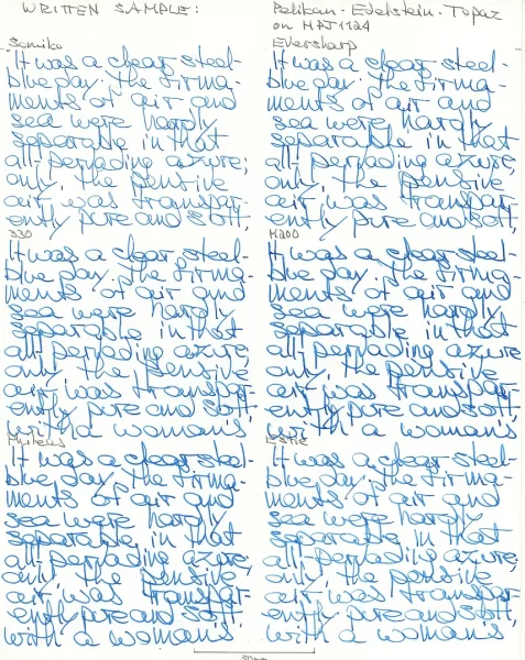
Sandy1 review Pelikan Edelstein Topaz - sample text on HPJ1124.webp
Mercian posted a gallery image in FPN Image Albums
From the album: Sandy1
Sandy1’s scan of her sample text written in Pelikan Edelstein Topaz on HPJ1124 paper.© Sandy1
- 0 B
- x
-
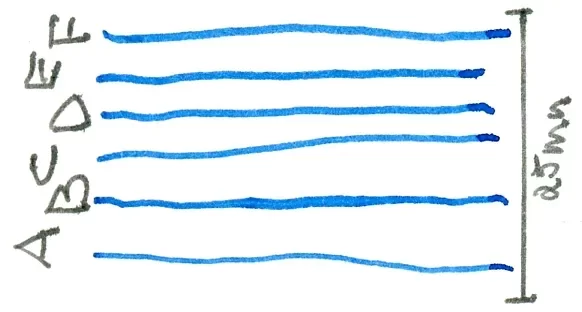
Sandy1 review Pelikan Edlestein Topaz nibism.webp
Mercian posted a gallery image in FPN Image Albums
From the album: Sandy1
Sandy1’s image to show the relative nib-widths of the pens she used for her review of Pelikan Edelstein Topaz.© Sandy1
- 0 B
- x
-
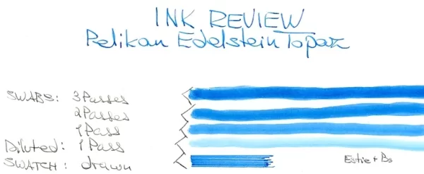
Sandy1 review Pelikan Edelstein Topaz swatch & swabs.webp
Mercian posted a gallery image in FPN Image Albums
From the album: Sandy1
The ‘heading’ image for Sandy1’s review of Pelikan Edlestein Topaz, showing her swatch and swabs of the ink.© Sandy1
- 0 B
- x
-
1-1.5 years ago there was an uproar about Pelikan and the QC problems with their nibs. In short, the nibs weren't always the size the stamping said they were. Is this still a problem?
-
Hi, I know that we have a thread here for posting our latest additions to our flocks but I think we could also use a thread where fine folks here could show off their collection by posting family photos of their flocks in their entirety and in their most recent state. I will start with mine dated today... the posted ones are my EDC and desk pens.
-
Ink Review : Pelikan Edelstein Olivine --- Ink of the Year 2018 --- In 2011 Pelikan introduced the Edelstein series of high-end inks, available in a variety of colours. The theme of the Edelstein concept is the gemstone - each ink corresponds to the beautiful colour of a gem. The Edelstein line of inks is presented in 50 ml high-value bottles, that are truly beautiful, and worthy of a place on your desk. In this review I take a closer look at Olivine, the Edelstein Ink of the Year 2018. This is a limited edition ink, that could be gone in the near future, although it's not unheard of for Pelikan to change its mind. Be sure to check out lapis's review for an excellent and highly detailed discussion and comparison with other greens. To clear the field: Olivine is not the kind of green that people anticipated based on the pre-release pictures and the images of the mineral circulating on the web (see the thread in lapis's review for a thorough discussion of this aspect). This review will totally ignore this topic, and simply evaluate the ink on its own merit. Olivine is a dark green ink, with very visible blue undertones. I wouldn't go so far as calling it a teal ... the green clearly dominates. But the blue undertones do give it a certain complexity that is quite apparent when writing or drawing. The chromatography of this ink shows a complex mix of dyes, clearly indicating the bright blue undertones hidden within the ink. The result is a very fine writing ink, that can handle all nib ranges without a problem. The ink has excellent contrast with the paper, even when using EF nibs. Olivine also shows of some impressive but still elegant shading, which even shows up in finer nib sizes. Well executed! Overall, I really like what I see on the paper. To show you the impact of saturation on the ink's look & feel on paper, I made some scribbles where I really saturated portions of the paper with ink. This gives you a good idea of what Olivine is capable of in terms of colour range. The ink shows quite some variation between light and darker parts. This probably explains why it's such a good shader. Technically, the ink behaved perfectly, with exceptionally good flow and saturation, and a good contrast with the paper even in the finer nibs. Overall a pleasurable ink to write with. Drying times are quite reasonable in the 10 second range with M-nibs. Olivine copes well with a wide variety of paper - and can even tolerate the crappy ones. Only on Moleskine, the ink looks sickly and pale, and has noticeable feathering and bleed-through. On other papers the ink behaved impeccably, looking good on both white and more yellowish paper. Unfortunately, Olivine shows a total lack of water resistance. Even the slightest touch of water obliterates your writing - see the water test at the end of this review. As such, I don't consider this an ink you can use in the workplace. I’ve tested the ink on a wide variety of paper – from crappy Moleskine to high-end Tomoe River. On each scrap of paper I show you: An ink swab, made with a cotton Q-tip1-2-3 pass swab, to show increasing saturationAn ink scribble made with a Lamy Safari M-nib fountain penThe name of the paper used, written with a Lamy Safari B-nibA small text sample, written with an M-nibDrying times of the ink on the paper (with the M-nib) Inkxperiment – Swamp Lake CastleI've put myself a challenge to try to produce interesting drawings using only the ink I'm reviewing. I find this to be a fun extension of the hobby, and have found these single-ink drawings ideal for experimenting with different techniques. When using Olivine for drawing, the complexity and colour range of the ink can be used to great effect. For this drawing I used 300 gsm rough watercolour paper. For the sky, I diluted the ink with lots of water, which brings forth the blue undertones. For the swamp lake, I used mildly water-diluted ink giving a darker green colour. The yellow/blue highlights were obtained by applying some bleach to the partly-dried ink. Olivine reacts really well with bleach, leaving a beautiful light-blue colour. For the foreground, the castle and the tree accents, I used pure Olivine, painted in with a small brush. The end result gives you a good idea of the colour span the ink is capable of in a more artistic setting. And it must be said, I'm very pleased with the drawing capabilities shown by this ink. ConclusionOlivine might not have been what you expected, but viewed objectively, this certainly is a very good ink. One that writes very smoothly and with beautiful shading. Personally, I also like the colour - the blue undertones add extra depth and complexity to what is in essence a dark-green colour. A pity this ink has zero water resistance. Finally, I was really impressed by the expressiveness of Olivine in a more artistic setting, the colour range that can be obtained is unbelievable! Overall, I'm glad I got myself a bottle of this ink. Technical test results on Rhodia N°16 notepad paper with Lamy Safari, M-nib Backside of writing samples on different paper types Backside of writing samples on different paper types
-

Some pics of very rare vintage Pelikan accessories from the late 1930s
mana posted a topic in Pelikan
Lucked out and was able to purchase two very rare items for my vintage Pelikan collection: a retail luxury pen case meant for the 100 or very early (1938) 100N and the accompanying mechanical pencil set (Etui R), and a NR. 4 pen stand, both in matching silver-mottled black bakelite. Since their manufacturing was limited to just few years (or perhaps to 1938 only) they are exceedingly rare finds. Those silvery bits do not translate that well in photos but they do glimmer in light very nicely. I already had three different variants of the pen stand in black, so this was a really wonderful, and functional addition to my desk (yes, I like to keep them in use). -
Pen Pit Stop : Pelikan M600 Tortoiseshell Red Welcome to the Pen Pit Stop. Here you will find reviews of pens that already have some mileage on them. More specifically, these reviews are of pens that are in my personal collection, and that have been in use for at least a year. I thought it would be fun to do it this way - no new & shiny pens here, but battered vehicles that have been put to work for at least a year. Let's find out how they have withstood the ravages of time. The fountain pen that arrives at the pit stop today is the "Pelikan M600 Tortoiseshell Red". Pelikan is one of the best-known European pen-makers, with a long history dating all the way back to 1832 when the company was founded in Hannover, Germany. The brand offers both semi-entry-level pens (like the M200 series) all the way up to their flagship M1000 model. All Pelikan pens adhere to the same classical style, and as such are immediately recognisable. I bought this particular pen in January 2021. This Red Tortoise beauty with its rich coral red body and gold trim accents is usually paired with a nice red ink. It is one of my favourites, together with its smaller red cousins from the 101N series – see family picture below. Pen Look & Feel The M600 series are Pelikan’s in-between pens – right in the middle between the smaller M200/M400 and the more bulky M800/M1000 series. I love the entry-level M200/M400 pens: there are some lovely barrel colours to choose from, and although these pens are tiny, they are very comfortable when posted. At the other end of the range are the M800/M1000: for me personally these pens are simply too big. I own one M800 (the Brussels inspired Grand Place), and that pen is definitely too large & bulky for me (which means I don’t even want to consider an M1000). But the M600 has the right size, the right weight, the right feeling in the hand... just perfect! The M600 range didn’t get much love from Pelikan the last decade. OK, there where these yearly variations on white, but those didn’t resonate with me, and I simply ignored them. And then in 2021, Pelikan came out of nowhere with this totally unexpected beauty! The Tortoiseshell Red comes close to perfection for me: a very rich-looking dark coral-red background palette on cap and body, that has a classic feel to it. The tortoiseshell barrel flawlessly extends this colour-scheme with a more-or-less striated pattern of orange-red-black stripes that fits the base colour really well. And finally, the gold trim and the duo-tone 14C-585 gold nib add the finishing touches to this M600’s outfit. The result is totally enthralling, and one of the best designs I’ve seen from Pelikan in recent years. There’s only one thing missing from this pen: the ink window. The pen’s cousins came with an amber ink window that fit nicely into the design. With this M600 I’m unsure about Pelikan’s intentions: did they exclude the ink window for aesthetic reasons (so as not to detract from the barrel’s beauty)? Or did they want to simplify the production process, and cut some costs? I can understand the aesthetics argument, but nevertheless would have preferred an ink window. Without it, you simply have no clue about the amount of ink remaining in the pen, which I personally find a bit inconvenient. Like all Pelikans, the cap unscrews with about three quarters rotation, so it's quickly ready for action. The M600 is a large enough pen for me, but can be posted if you want to – if you have large hands, it might be more comfortable this way. I've got smaller hands myself, and typically use the pen unposted. For me, this M600 is just the right size and weight (i.e. featherweight). The pictures above illustrate the size of the M600 Tortoiseshell Red in comparison with a standard Lamy Safari. The pen is a bit smaller in size than the Lamy when using it unposted, but still a really comfortable writer that is a perfect companion for longer writing sessions. Pen Characteristics Build Quality : build quality is excellent. The pen withstood the passing of time without any problem. After almost two years of use, it looks good as new. One thing I have noted with all my Pelikans is that the piston can develop some friction over time. That’s normal, and easily fixed by applying some silicon grease. Once a year, I unscrew the nib unit and apply some silicon grease with a wooden toothpick to the inside of the barrel. That’s more than sufficient to guarantee smooth gliding of the piston within the barrel. Weight & Dimensions : about 133 mm when capped - and as such still a fairly small pen. It's also definitely a featherweight. If you prefer pens with some heft to them, the M600N model will not be your thing. Posted - the pen becomes about 155 mm long, and fits even larger hands. Filling System : this is a piston-filler that holds quite some ink. The piston is made from plastic, but works really well. Pelikan are known for their excellent piston mechanism. Nib & Performance : the M600 pens come with gold nibs. This one comes with a duo-tone 14C-585 gold nib, that really suits the aesthetics of the pen. The nib unit can be exchanged quite easily, which is a big plus. If you damage your nib or want to use a different size, you can simply buy a replacement nib unit. Beware that these gold nibs are not cheap: a replacement unit costs about 158 EUR (taxes included). Price : I got this pen for 327 EUR, including taxes. A very reasonable price for this stunningly beautiful pen with its golden nib. Conclusion My Pelikan Souverän M600 Tortoiseshell Red is one of the most beautiful Pelikan designs I’ve seen in recent years. A true joy to write with, and certainly a conversation starter wherever you use it. A great addition to my flock, and I’m truly glad that I bought it.


.jpeg.d9b84c320165352bff858f239b0d078a.jpeg)