Search the Community
Showing results for tags 'm800'.
-

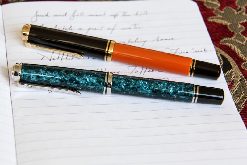
Pelikan Edlestein Aquamarine from M800M and Smoky Quartz from M400M on Oxford Optik.jpeg
Mercian posted a gallery image in FPN Image Albums
From the album: Mercian’s Miscellany
In response to a request for a picture of these inks and pens. Apologies for the very low angle of the watery English sunlight! And for my hastily-rushed scrawl too!© Mercian
- 0 B
- x
-
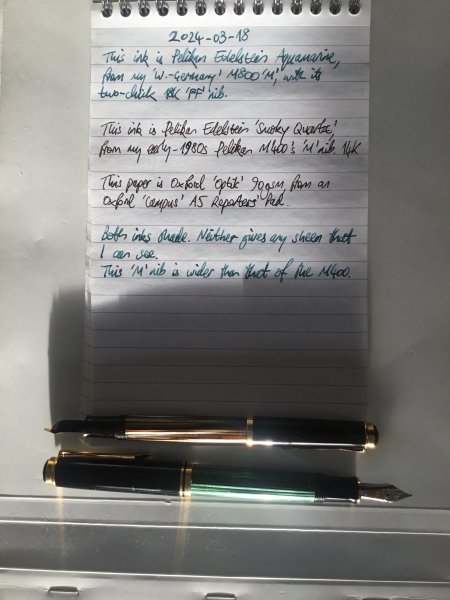
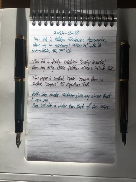
Edelstein Aquamarine M800M & Edelstein Smoky Quartz M400M on Oxford Optik v1.jpeg
Mercian posted a gallery image in FPN Image Albums
From the album: Mercian’s Miscellany
In response to a request for a picture of these inks in these pens.© Mercian
- 0 B
- x
-
I’m wondering if M800 barrels are interchangeable between the old/early West German models (i.e., from late 1980s and early 1990s) and newer/contemporary models. I think that the evolution of M800 didn’t necessarily affect its dimensions over the years but I’d like to check. Namely, my old W. German M800 has some issues with its barrel and I wanted to change it but I keep finding only the newer barrels available. Any advice is helpful. Thanks.
-

-
At least Shappire & Glass are not ideal materials for Pelikan M800
VonPG posted a topic in Fountain & Dip Pens - First Stop
This Pelikan Pen M800 is made of Optical Borosilicate Glass in body and Shappire in cap. However, after I made this pen within 48 hours it just broken(I am a very careful people who never drop a pen on the ground for 10 years) Maybe the only reason to explain it is that thread stroke was too long. At least I know that Shappire & Glass are too fragile to make a endurable fountain pen. So I remove those materials in my transparent pen making :{ Luckily, a friend made a optium museum acrylic pen body with sterling silver clip for me as “backup”. Some good transparent materials list in pen making PEI(Pure) Acrylic(Optium Museum Rate) Pasmo Special Amorphous Polymer Resin(Speical Polycarbonate and it is totally different from normal PC plasitc) Corning ULE Glass/SCHOTT Zerodur(Can be machined with diamond or other superhard tool knife)
-
Normally I’m a fan of italian fountain pens. I started off with a Pelikan M800 though – the benchmark of a good, full-size piston filler. I was very satisfied with the Pelikan, it seemed to be everything I ever wanted from a fountain pen, I would never need another one. But later, after falling in love with the looks of it, I ordered a Delta Dolcevita and completely changed my point of view for what fountain pens are about. Handling the Dolcevita was like holding a Faberge egg in my hand, the Pelikan reminded of a free merchandise pen in comparison. The Italian culture has a profound feel for the exquisite, stemming from old tradition and masters like Bernini, Michelangelo and Leonardo da Vinci. The Germans have great composers and philosophers, but let’s face it; they have no one even close to the Italian masters of fine arts. For some time it seemed I would never buy any other pens but Italian. Then I happened to read this article on Diplomat pens: http://www.fieldnotesblog.com.au/search/label/diplomat. Until then I had always considered Diplomat pens a bit boring; traditional design, no nonsense, heavy and solid – in other words extremely German. But after reading the article in Field Notes, I couldn’t wait to order one. Now, after two weeks with my Diplomat Excellence A with a 14 Kt gold medium nib, it seems the Germans have turned the tables on fountain pens again. What a fantastic pen this is! Plain and modest in comparison to most Italians, yes, but what a performer it is, and some value for money! The pens come in several colours and finishes. Mine is a Marrakesh; a brown metallic lacquer – just one colour but thousands of nuances depending on light and environment. Fine pens are a lot about material and finish. Several makers of expensive pens can perform the same (high) level of finish as Diplomat, but this utmost feeling of everlasting quality I haven’t experienced in any other pen. The sense of solidness when unscrewing the barrel, the weight of the all-metal body, the smoothness of the beautiful in-house nib, all make a combination that is hard to describe – it’s not a feeling of luxury, but something more subtle, maybe what the Germans call “Ausgewogenheit”, a kind of fine balance, a balance between utility and beauty. If this pen was a car, it would be a Mercedes W123; the durable, yet slightly gilt-edged workhorse from the 70’s and 80’s. Writing with the Diplomat Excellence, the nib is quite “present” between your fingertips. In comparison, the Delta Dolcevita feels more like a unity of nib and barrel. With the Diplomat you really feel that you’re writing with a fairly large nib, fitted to a heavy, solid barrel. I haven’t yet decided which writing experience to prefer, I like them both. Guess it’s a matter of writing technique and personal preferences. The nib is wet and smooth, and I haven’t experienced even the slightest disturbance of ink flow. This is a first class writing instrument at all levels! I hope these pens will remain on the market for years to come. They are reminders of a time when people cared for their handwriting, and for accessories that would stay with them for a lifetime. (Sorry about the pics, I'm a lousy photographer...)
-
desaturated.thumb.gif.5cb70ef1e977aa313d11eea3616aba7d.gif)
Broad-Nibbed Pelikan Souverän Pens In La Couronne Du Comte's Winter Sale
A Smug Dill posted a topic in Market Watch
La Couronne du Comte has just put up several premium Broad-nibbed pens on its specials board for its "Winter Sale". Considering that there are no drop-down options for nib selection, from my experience it means these units are in clearance (or closeout) stock and should be ready to ship. Pelikan Souverän 800 Brown Black €329.75 ex VAT (25.4% off the list price)Pelikan Souverän M1005 Stresemann €379.34 ex VAT (26.5% off the list price)Pineider La Grande Bellezza Gemstones Lapis Blue €263.64 ex VAT (25.8% off the list price)As far as I'm aware, multi-use discount codes (some of which you could find on certain well-known reviewers' web sites) can still be applied to further bring down the effective prices. It's almost a no-brainer to get at least an additional 10% off these prices. All of the items qualify for free international shipping, even when each is ordered on its own. Alas, I have no use for any Broad-nibbed pen. <EDIT> A little more than eight hours after I posted this originally, LCdC finally got around to sending marketing email to notify newsletter subscribers of this sale. The pens listed above are all gone now. -
Clash Of The Titans: M800, Homo Sapiens, 146, Justus95
TheDutchGuy posted a topic in Fountain Pen Reviews
Following the discussion if someone's best pens are also their favourite pens I decided to compare my highest-pricepoint* pens: -Montblanc 146 EF ('90s pen and feed with a much earlier 14C EF nib); retails for appr. 550 euros -Pelikan M800 F ('80s pen with 18C nib); retails for appr. 500 euros -Visconti Homo Sapiens Lava Steel Midi F (23k Pd dreamtouch nib); retails for appr. 450 euros -Pilot Justus 95 M (14k nib); retails for appr. 300 euros I bought the MB146 from a local collector at a very attractive price. The M800 was a gracious gift from a friend who bought it new in the '80s and who stopped using the pen some years ago. The Homo Sapiens and the Justus were bought new in local brick and mortar stores, but with appreciable discounts. As a "challenger pen" that retails for 1/3rd to 1/2 of these pens, I added the Sailor Pro Gear Slim 'Ocean' 14k H-MF to the comparison. ^--From large to small: Justus, 146, M800, Homo Sapiens, Pro Gear Slim. Totally different design philosophies. The 146, the M800 and the Homo Sapiens are staples of pen design, the 146 and the M800 being established classics, each with its own legacy, and the Homo Sapiens already being a modern classic. The Justus and the Pro Gear Slim are more utilitarian pens where the focus is on the nib, feed and quality of writing and not so much on eye-catching design or high-end materials. ^--Uncapped size comparison. ^--Posted size comparison. The different philosophies behind these pens are also reflected in their business ends: the nibs and feeds. The 146 and the Pro Gear Slim are relatively rigid (but certainly not nails), the Homo Sapiens and the Justus are soft (but certainly not flex) and the M800 is somewhere in between. ^--Writing sample (apologies for darkness of image). A 1cm scale is included for reference. The 146 downstrokes are 0.25mm wide. Distinguishing factors As writing instruments, obviously these five pens are objectively of very high quality. All five are top-notch pens and I'd be lucky to own just one of them. Each pen does have certain positive aspects that make it unique compared to the others: -the Justus has a soft nib with variable softness control which also controls its wetness; the Justus is the largest pen in this group and it houses the much-liked CON70 converter. -the 146 EF is an architect, which was common for MB 146 EF nibs during a certain period of time. -like most Pelikan pens, the M800 has a removable nib/feed unit making it super easy to change nibs or to clean the pen. -the Homo Sapiens is made of the unique basaltic lava material from Mount Etna, which feels fantastic, and the soft 23k Palladium nib is also a distinctive element of this pen. I deliberately chose the Midi version which is still a fair-sized pen which can be used posted or unposted and fits in shirt pockets. -the Pro Gear Slim offers the unique Sailor feedback and outstanding nib/feed quality. If I were to look for objective negatives, then the following comes to mind: -my Justus had a nib that needed serious after-care, but to be fair I knew that beforehand, it explains the discount and it allowed me to tune the nib exactly to my liking; -the architect nib of the 146 isn't for everyone, nor for every style of writing: with cursive italic, the result is far, far removed from an EF line and is actually on the B-side of M. -my M800 suffers from slight baby's bottom which sometimes leads to skipping, especially on the lower half of the page (due to hand oils); -my Homo Sapiens Midi is quite sensitive to which inks it likes (and it dislikes some very common and well-behaved inks); you cannot unscrew the nib unit, nor the piston unit (at least not easily) so cleaning the pen can be cumbersome. Last but not least the ridges of the cap lock mechanism rub against my fingers sometimes. -the smallish Pro Gear Slim needs to be posted. Personal (subjective) pros and cons The M800 is my least-favourite pen in this group. There is no objective reason for this; I simply do not feel any emotion with this pen (apart that it was graciously given to me by a friend). The striped Pelikan design is not something that revs my engine, it's not my cup of tea. The nib is very smooth but devoid of character and the writing experience strikes me as somewhat clinical and sterile. Next-up is the 146 EF, which is delightful under controlled circumstances (such as journaling or correspondence) but unsuited to circumstances where you might change the writing angle (such as quick notes at work). That's how it is with architects. I like the 146 much more than the M800, I admire it as a quality pen with a timeless design and I adore the old 14C nib. But I do not grab it all that often. Next-up is the Pro Gear Slim. It was perfect out of the box and it is still perfect to this day. Spot-on, constant flow. Consistent, spot-on performance. No fuss, no maintenance. I don't care much for how it looks and the MF writes a very fine line by western standards, which makes it less suitable for quick jots at work - I need to concentrate a bit, slow down a bit, to prevent wavering and sloppiness. Fantastic pen that puts a smile on my face every time I use it. The Visconti and the Justus are so close that it's hard to pick a favourite. If you put a gun to my head then I'd pick the Visconti because its design and materials are totally unique, it writes like a dream and offers almost the same softness and line variation as the Justus. If the house burned down, the Visconti is the one I'd save. Having said that, the Justus is much lighter and fits into the hand much better. Best vs favourite The M800 is top-tier pen that I just don't care for as a writing instrument (apart from how it came to me; I'll always cherish it for that). The Visconti has some drawbacks, as mentioned, but I'm extremely attached to it. And given its price point, it's hard not to declare the Sailor as the "winner". *I have about 20 pens, the remaining 15 being in lower price brackets. Some of those I love as well, such as my Leonardos or trusty Kaweco AL Sport. I restricted myself to the five most high-end pens that I own, realizing full well that I do not own "real" high-end pens like Scribo, Nakaya, Namiki, etc.) -

So Far Who Can Be Able To Make Pelikan M800 Titanium Version?
WillyVanDerKuijlen posted a topic in Pelikan
http://www.penbbs.com/woshangdetu/penmaterial/133.jpg http://www.penbbs.com/woshangdetu/penmaterial/130.jpg I saw an old topic in a fourm said that Pelikan M800 can be modify into titanium body. It attracted me a lot so I directly find that who can made it. Actually, the 3rd one is made by Grayson Tighe. However, he told my brother said that he is no longer modify Pelikan Pen anymore. But the first and the second one is not made by him. So I want to know who can make Titanium M800 now so that I am willing to buy it. -
Hi all, I am about to go after a Pelikan M800 with a Medium nib. Does anyone have some writing samples to show of the Medium nib (ideally compared with the Broad nib, in case you have both pens)? That would really help me move forward with this purchase.
-
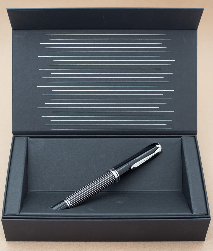
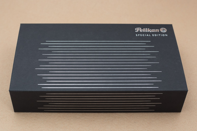
Pen Pit Stop : Pelikan Souverän M800 Grand Place Welcome to the Pen Pit Stop. Here you will find reviews of pens that already have some mileage on them. More specifically, these reviews are of pens that are in my personal collection, and that have been in use for at least a year. I thought it would be fun to do it this way - no new & shiny pens here, but battered vehicles that have been put to work for at least a year. Let's find out how they have withstood the ravages of time. The fountain pen that enters the pit stop today is the "Pelikan M800 Grand Place", a 2016 Special Edition. Pelikan is one of the best-known European pen-makers, with a long history dating all the way back to 1832 when the company was founded in Hanover, Germany. The brand offers both semi-entry-level pens (like the M200 series) all the way up to their flagship M1000 model. All Pelikan pens adhere to the same classical style, and as such are immediately recognizable. I bought this pen in June 2017, and it remains my most expensive pen purchase ever. But I had four good reasons for buying it, which together pulled me over the line. First, I wanted to own at least one M800 pen. Second: Grand Place ... Brussels ... Belgium ... a pen that references my country. Third: my birthday was coming up ... always a perfect excuse to splurge a bit ;-). And fourth and foremost, this pen simply enthralled me with its swirling beauty. Pen Look & Feel The M800 Grand Place is a beautiful pen with a unique finish - the body is constructed from a swirly material with multiple shades of brown, and some blue accents. The black grip section & piston nib elegantly complement the body, giving the pen an aesthetically pleasing look. The swirly material captures the light in a dramatic way - giving the impression that light is sucked into the pen, and reflected back from the depths of the body. A stunning view - one you have to experience, and that is difficult to capture in a photograph. In contrast with the traditional striped Pelikans, this is definitely not a pen for formal occasions. This is a pen for use at home in intimate writing sessions. With this pen, my thoughts wander to a dimly-lit New Orleans café, with a seducing sax and jazzy tunes. This lady dances like a flame, has no cares, she shakes, swirls and snakes (if you've got access to a streaming music service - put on "The Girl in the Yellow Dress" from the album Rattle That Lock by David Gilmour - that perfectly captures the atmosphere of writing with this pen). In weight and dimension, this is your typical M800 pen. A big pen (almost the same size as a Lamy Safari), with a substantial weight. For me personally - this pen is a borderline case: a bit too large and heavy for my taste. I prefer the smaller M400 pens, which I find more comfortable to write with. Like all Pelikans, the cap unscrews with a bit less than one rotation, so it's quickly ready for action. The pen posts securely, but then becomes really large. It's already a large pen in its own right when used unposted. This is also a rather heavy pen, due mainly to the brass piston mechanism. The gold nib on my pen is an F-size, which writes really wet. This is an 18C two-toned gold nib, that looks beautiful and has a decent size that nicely complements the large body. The nib unit is replaceable, but quite expensive (about 189 EUR). If you like to experiment with different nib sizes, this is not a good choice of pen. Be aware that the Grand Place lacks an ink window - in my opinion, Pelikan made the right choice here: an ink window would not look good on this pen. The body's material is semi-transparent though, so it is still possible to judge the ink level by holding the pen up to the light. To be completely honest - you will need strong backlighting to do this (but it works, and you probably don't need to check your ink level every 5 minutes). If you want loads more of detailed info on this pen, there's no better place than the Pelikan's Perch. Be sure to take a look at Joshua's superb review! The pictures above illustrate the size of the M800 Grand Place compared to a standard Lamy AL-star. The pen almost exactly matches the AL-star capped & uncapped. The Pelikan posts more deeply though, and is a bit smaller than the Lamy when posted. Pen Characteristics Build Quality : build quality is excellent. The pen looks really polished and refined. The pen also withstands the passing of time without any problem. After two years of use, it looks good as new. Of course - I treat it like the queen it is. Also I don't use this pen as a daily worker, but only at my home desk for personal journaling. Weight & Dimensions : about 140 mm when capped - and as such a rather large pen. It is also definitely a fairly heavy pen. If you prefer lighter pens, the M200/M400 model will probably suit you better. Filling System : this is a piston-filler, that holds quite some ink. The piston is made from brass, adding to the weight of the pen. Pelikan are known for their excellent piston mechanism. Nib & Performance : the M800 Souverän pens have 18C gold nibs. The one on my Grand Place is a beautiful two-toned F-nib, that is a fairly wet writer. You should be aware that Pelikan nibs are typically a size larger than their designation. My F-nib definitely writes more like an M. I quite like that you can buy the Pelikan nibs separately. If you accidentally damage your nib, you can simply buy a new one. The M800 nib units are rather expensive though and cost about 189 EUR. Price : the Grand Place is a Special Edition pen, and as such substantially more expensive than the regular M800. It set me back 599 EUR, including taxes (a regular M800 is 440 EUR). That easily makes it my most expensive pen. Conclusion My Pelikan Souverän M800 Grand Place is a jazzy beauty with tons of flair. This is a pen to admire, and to use for intimate writing sessions (just you and your pen). The Grand Place is expensive - no doubt about it. But you get a truly unique writing instrument for your money, that will serve you for years to come, and one that will probably retain its value (in the unlikely case you should be willing to part with it). So the answer to the question "would I buy this pen again"? Well - the conditions were right, and given these circumstances, I would not hesitate to buy it again. But for me personally, the pen is a bit on the large side. I'm glad I got me this particular beauty, but it will almost certainly remain my only larger-sized Pelikan.
-
Hello I am a newbie to the fountain pen world, but since the first sight of M800 tortoise even I already have a dozen of FP now, it's still on my mind. I've done some research, but it was two years before, https://www.fountainpennetwork.com/forum/topic/317433-value-of-m800-tortoiseshell-brown/ so as the topic says, what's the acceptable / latest buying price of you??? also would like to know about the price of GvFC Intuition Pernambuco (I just can't resist brown color
-
Hi everyone, I just got this pen in the mail. It seems to be working well, and looks great for the most part, but the barrel has this defect, an area of discoloring or different degree of translucency I tried to show in the pics below. Are two layers of the barrel becoming separated? Can this be fixed and can it get worse? Any advice is welcome. Thank you!
-
Pelikan Souverän M815 Metal Striped I did not plan to buy it. Only when Pelikan announced M1005 I got more into M805 Stresemann and M815. And so it is. On pictures it is very similar to Stresemanns – black, silver stripes on barrel, palladium plated rings and clip. But to naked eye it is a different species. Or maybe an alfa-male example of the species. It is like Stresemann but on steroids. It is not the first M815 – the previous one was M815 Wall Street, released in 1995, and was a limited edition. The difference between Special and Limited edition ? “Limited” is limited in NUMBER of pieces (ie. Wall Street was limited to 4500 worldwide). Special Edition is also limited but in TIME – it is produced only in a certain year or period. So it is hard to say how many copies was produced. M815 is one of Pelikan 180 Anniversary line– “180 years of passion Speccial Edition”. BASICS (10/10) Well, it is a modern Pelikan and M8xx and Souverän series. A rather large pen, 141.5mm long capped, and 127.2mm uncapped, rather light but due to brass piston mechanism (and size) slightly heavier than other Mxx Souveräns. And heavier then MB 146 too (M800 is 5g heavier then MB 146 and M815 ads even more - 12g total difference). A lot was written about those pens in many different reviews - filling mechanism, ease of nibs removal, general design etc. so I concentrate on differences. PACKAGING and DESIGN (9.5/10) Souverän M815 comes in a striped box (surprise . It is a paper/carton box, nothing more sophisticated. After opening a flap held by tiny magnets the pen is presented diagonally, “hovering” in the box. Initially unboxing was slightly different as the pen was in a plastic sleeve and with price/model tag on the clip, but of course, I removed it for pictures. As mentioned before, it is similar to Stresemann but only In general design and on pictures. I do not have a Stresemann now, but compared them side by side in my local ( and very friendly) pen shop “Pióroteka”. Stripes on M805 Stresemann are very different: more subdued, not as sharp and shiny, grey stripes on Stresemann are wider then black stripes. M815 is the other way round – silver stripes are thin, black space between them wider. Stripes are sharper, metallic, and elegant. The difference is really much bigger to the naked eye then on any picture I saw before. The stripes on the barrel are brass and palladium coated. One cannot feel them with touch – after fusing them with barrel material it is coated with lacquer, and gloss finished. As in other Mxx5 trimmings are obviously “silver” – in this case palladium plated. Nib exactly the same as in M800 but rhodium plated. In my case it’s medium. A difference with other M80x series pens is ink window. The barrel is not translucent so just before the threads, there is an ink window. In my opinion, it complements the pen both practically and visually. WEIGHT and HANDLING (9,5/10) It is heavier. Heavier than M800/M805. To be exact – the barrel is heavier. Cap weights exactly the same as in my M800 – 9g. The barrel (without ink) weights 27,6g and is 7g heavier then M800 and even heavier then M1000 (2,5g). Weight difference is obviously due to brass stripes. Wight is distributed differently than in M800 – a centre of gravity is moved 3 to 4 mm to the front. And that is why it handles perfectly. If you have a M800 and wondered if a heavier M815 would suit you – the answer is YES. It is very comfortable even in long runs. Of course, it is a big pen so could be pain for someone with small hands. NIB and WRITING (8,5/10) Another area without real differences to M80x series. 18c-750, monotone, rhodium plated nib, available in F, M and B, and EF with additional charge. Very slight spring but do not expect line variation. In my pen there is a medium nib and its very reliable, very smooth, rather wet and slightly broader than typical medium, and I like it. I have M800 with a fine nib and it is one of my workhorses but I usually skipped it then wanted to write for pleasure, for “steam of consciousness” writing etc. This one will be much better. Other Pelikan nibs I’m using are gold fine in M250 “old style”, gold OB in M250 “old style”, fine in M400 (modern) and bunch of vintage nibs – most of them with different levels of flex. And I do like them all, sometimes due to differences. SUMMARY Well it is my first review on FPN. And I’m glad that is a review of a pen not yet reviews (according to review index and search). And I’m glad that it is a Pelikan review and a pen I really wanted, and it did not disappoint me at all. It is great Pelikan, a great pen. At the same time it is elegant and bold. Its realizable as all Pelikans, VERY comfortable (for me even more then M800). I do recommend it - grab it while it is still available in some places. (PRICE: well it is expensive. But I will not discuss money I got a good deal and I’m happy. I would probably buy it even for a full price.)
-

12 New Pens In One Go - Would Like Your Thoughts, Please.
Penjamin Franklin posted a topic in Fountain & Dip Pens - First Stop
Hello all, I was lucky enough to nab 12 pens in one go recently. All 12 are by Pelikan, with 7 being fountain pens and 5 being rollerball. I believe the larger pen is an M800 (18kt nib, about 29 grams empty), which is nice. There also appear to be a few pens that are quite old, perhaps 50s/60s? A few say "W. Germany" and I believe those must be sometime between 70s and late 80s, but I am not certain - would love some input from those with much more experience. This acquisition has made my collection significantly larger, and for that I am thrilled. Please note: first 5 pens below (first 2 images) are rollerball. Last 7 pens (last 4 image) are fountain.
-

Weird Stains “Under The Skin” (M805 Stresemann)
Comapedrosa posted a topic in Fountain & Dip Pens - First Stop
Hi, I was pretty happy with my new Pelikan M805 Stresemann (my second M800 - I couldn't resist the grey stripes!!). But very unfortunately it has developed some nasty stains, apparently *within* the walls of the barrel. I've attached a photo that shows the problem. This is a *completely full* pen. If they were regular ink stains, then I don't think that they would be visible with a filled barrel. This is only the 3rd time I've ever filled the pen. And the only ink I've ever used is Aurora Black!!! Weirdly the ink seems to creep up in the celluloid material..? You can see that especially at the base of the barrel, where it meets the black section. Frustrating... I got the pen for a good price from Cult Pens, and did email them about this, but have never gotten any response. Would much appreciate your advice! Has anyone ever witnessed anything similar?
-

Very Disappointing Experience With A Pelikan M805 Stresemann
John545 posted a topic in Fountain & Dip Pens - First Stop
Hi Guys. I have been into fountain pens for a while now, but I hadn't bought any expensive pens until now. My collection mainly consisted of TWSBIs which I have been very happy with. I worked really hard this year for my 2nd-year exams, and I worked pretty hard over the summer in an internship so I decided I would reward myself with my first "expensive pen". I decided on the Pelikan M805 Stresemann for a couple of reasons. 1 - It looks brilliant. I really like the look of the grey stripes down the barrel. I haven't seen a pen that I like the look of so much. 2 - I had heard that Pelikan nibs are some of the best nibs around and write brilliantly out of the box. However, I opened up my new pen this morning and sadly I have never been so disappointed with a purchase. As I was opening the pen it was somewhat clear that I had been sent a pen that was previously a return. For example, the little plastic bag that the pen comes in was all screwed up. (I bought this pen from cultpens in the UK by the way). Now I'm wondering if someone else had a bad experience of this pen, sent it back, and now I've ended up with it. On the barrel, it appears that one of the grey stripes is missing. There appears to be a dark gap where it is missing. I have tried to get a picture of this but it is quite difficult to pick it up on camera! This is something that wouldn't bother me in the slightest on a much cheaper pen, but at £300 I'm not impressed by this. I decided to forget all this as the writing experience is the most important thing. So I inked up the pen with some Iroshizuku Ku-Jaku and began to write with it. The writing experience is extremely disappointing! It's almost as if I am writing with a different pen to that of the reviewers online. The nib is very dry, and not smooth at all. Also, it feels very stiff which I was surprised by as a lot of people say the Pelikan nibs have some spring to them. I grabbed my TWSBI Eco to compare the writing experience, and the eco is the clear winner. Smoother and wetter, at less than a tenth of the cost. A lot of people say that the Pelikan nibs are quite broad. For example, the medium M805 nib in the pen habits review looked more like a broad or even a double broad. So I decided I would go with a fine nib as opposed to the medium nib I usually go for. So I'm wondering, would you guys recommend returning the pen and swapping it for the same pen with a medium nib? Or do you think I would be better getting a refund and buying a different pen altogether? If you think there is a better alternative pen out there I would appreciate any recommendations - I'm looking for a pen with a really wet and smooth nib for the best writing experience possible. Around £300 or less. -
Coming from my home base in California, USA - A new discount from paperinkpen.com: Today through next Wednesday I'm offering 20% Off Regular Pricing on all Pelikan Souveran Fountain Pens in Stock Please use code: fpn20 to receive your discount. Discount is taken during checkout. As always California Residents: We Pay Your Sales Tax! Thanks for peeking in. I look forward to serving you. Dave macaddicted Paper, Ink, Pen is a California based authorized Pelikan reseller. Not responsible for typographic errors. Offer is subject to change without notice. Have a nice day!
-
Call me crazy.. is it possible to swap a Montblanc nib onto a Pelikan nib unit? did some research without any findings. Looking at the Pelikan M1000, the nib looks awfully disproportionate while the Montblanc 149 nib looks asthetically more pleasant. My question is.. has anyone tried to swapping a 149 nib in a M1000? or a 146 nib in a M800? I know it's a sacrilege to do/ask that ):
-

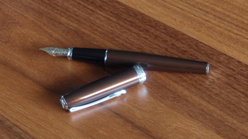
Pelikan Souveran M800 “ Renaissance Brown” Special Edition Review
MingLau posted a topic in Fountain Pen Reviews
(Pasted from the original passgae from my blog: http://minglau.blogspot.hk/2017/06/pelikan-souveran-m800-renaissance-brown.html) Pelikan Souveran M800 “ Renaissance Brown” Special Edition Review I always tell myself that I don’t need so many fountain pens, I always tell myself that some very cheap Chinese Fountain Pens actually write quite well especially after I fine-tune them to my liking, and I always tell myself that a piston-filler pen is just a springe with a nib attached. I even always tell myself that while I like big fat pens, the M800 is too fat for my small hands. But it turned out that when Pelikan announced the release of this M800 Special Edition, I was attracted by the promotional-photo and immediately pre-ordered it.There’re many reasons for people to love a Pelikan, but I got my own special reason for not being able to deny this pen: The guys from Pelikan set the pen on a high-quality, classic picture frame and shot the promotional-photo! We’re in the professional Photo Printing & Framing business, that photo just made me mentally attached to this particular pen - it looks like this is THE PEN for a picture framer, the theme of this pen matches our business very well. Moreover, we do a lot of our art/photo printing jobs on Germen papers with customers’ great satisfactions. It’s natural to love German pens when we love German papers. “German-engineering”, what else? For those who are new to the fountain pen world, here is some of my brief knowledge about Pelikan, Pelikan is the family symbol of one of the early owners, and the firm started as ink manufacturer and later switched to the production of fountain pen with a patented differential piston-filler mechanism. Like many other pen manufacturers, Pelikan underwent up and down throughout the history, and the ownership was transferred several times, but nowadays it still be able to maintain its reputation as one of the best German-quality pen manufacturers. I think one of the formula of success of Pelikan is the periodically release of a special edition pen, and the special editions are usually based on the familiar existing models with the change of body material or colour schemes, so they don’t need to completely redesign a pen or incorporate new tooling, additional cost (and selling price) is kept low while the careful choice of the special edition materials are always stunning and impressive, and give significant differentiation to the standard product line and more importantly, maintain existing customers’ royalty, very clever. This M800 Renaissance brown is one of those. PackingSo here we go into the actual pen, though it’s a special edition, there’s nothing special with the packing, it’s exactly the same as the standard Souveran line. The pen is protected inside a white pen porch, but this is just part of the packing and nothing more than a good looking bubble-wrap replacement, the elastic band is cumbersome and won’t last long if it’s really used as a pen porch. Body/DesignThe basic shape of this special edition is the same as the standard M800, just that the standard black cap and the strapped celloid barrel are changed into the stunning brown acrylic. Some people argued that the beauty of an acrylic material is nowhere comparable to celluloid, I think if one’s willing to invest, one may get elegant acrylics, such as what Pelikan demonstrated in its great-looking special edition pens. The M800 is the second largest pen in the Souveran line-up, many people suggested that it’s already too fat to grip comfortably and too back-heavy for a long writing session. I got the same feeling especially as my hands are small even for Asian’s standard. I like heavy pens, but back-balance can be a problem even if the pen is not really heavy, interestingly, the balance with the cap unposted is already bad enough that posting it doesn’t create additional badness for me. If you prefer a daily writer or a work-horse pen, perhaps stop at the M600. As with all Souveran pens, the M800 has a golden ring at the tip of the section, it looks nice but I’m worried that the plated gold will flake off over time due to ink corrosion, it is a common problem for golden rings located that close to the nib. To slow down ink corrosion process, Iron-gall inks should be avoided, clean and dry the pen thoroughly and don’t leave it inked when you don’t plan to use it for a long time, I know, it’s easier said than done specially if you’re an ink-holic. Additional information about iron-gall inks, quite a lot of them are blue-black inks, they are at least slightly acidic and can corrode the metal parts of a pen faster than PH neutral ink (sadly I learnt it from experience but not a book). If it’s that bad, why people like iron-gall inks? They are quite archival-safe and water resistant, together with the blue-black colour they can be the best ink for business purpose. Filling MechanismPelikan manufactured the first differential piston filler fountain pen, if a piston-filler is a must-have in your collection, the Pelikan is a must-buy. The black finial (it’s actually a very dark brown) is the piston knob, a quarter of anti-clockwise turn will trigger the brass piston mechanism. This brass piston is robust and should last for many years, it adds heft (some people including me translate a bit of heft into quality) to the M800 over its smaller siblings with plastic pistons, but it is a double-edged sword for people like me with small hands, the back-balance problem gives me some less than peasant feeling when writing. It’s interesting to operate the piston, but the truth is, I dislike wiping a pen after dipping it into an ink bottle (and this pen is too fat form some bottles), I prefer syringe-fill me pens with no exception even for a Pelikan which is one of the best piston-fillers. Am I wasting a piston-filler in this regard? May be not, the Pelikan’s nib-unit can be screwed out easily for a quick syringe-fill. With a C/C pen, I’ll have to remove the barrel, then remove the convertor before I can do a refill, which is more troublesome.The barrel is slightly translucent, it’s ok to hold the pen under strong back light to check the approximate ink level. NibThe pen comes with a standard M800 medium-grade 18K gold nib, with beautiful 2 –tone nib-work. It’s a hard nib but not to the extent of a nail, It’s easy to get a bit of line variation and ink shading with ease, there is a slightly stub-characteristic for this nib. It seems to be well-known that Pelikan pens write a bit wider and wetter than many other pens of the same nib-grade, it is not the case here, I think the flow’s just average or even slightly on the dry side, for example it’s dryer than a Parker Duofold M and even a Pilot C74 F. I even compare it with a MB144 B as well, I know it’s unfair to compare M and B nibs, but the 144 is much wetter to an out-of-proportion extent. Forgot to mention, I inked it with 2 of my familiar J.herbin inks which are also in my other pens for fair comparison, I didn’t try it with Edlestein ink yet as I received mine just a week ago. My conclusion The Pelikan M800 may be a bit fat and back-balance for some people to write comfortably, nevertheless it is an iconic fountain pen to be respected, and by throwing in a bit more money at the right timing, you’ll be able to avoid the standard, mass-produced M800 and get a special edition which is more unique and exciting due to the eye-catching material used. It’s not only a writing tool, but a jewel as well. If you ever come across a SE(or even a LE) and you know you want it badly, don’t wait as they will be sold out real fast. Contact: minglau@trailstudio.com.hk -
The M805 Ocean Swirl is a stunning yet controversial 2017 Special Edition from Pelikan. While my initial view was ambivalent, in actual use, the pen has moved into the same vaunted category as the understated, equally variable, City Series San Francisco. I was fortunate enough to see seven copies among the local DC/MD stores and two additional copies from Pen friends; 9 in total. Particular thanks goes to Pen Boutique for helping me land mine. Pattern and Color Distribution: Some posts seem to hint that some pen copies may have "nearly" 100% blue-green and others verging on total black. Not what I saw and may be due to range in perception. All 9 copies had clear bands of fluorescent blue-green swirls alternating with darker bands of shimmering deep blue-black occurring in approximate quarters as a constant. None of them were nearly one color, and certainly not pitch black (see a true black pen comparison side-by-side below). Granted, as a matter of degree, two copies leaned toward the darker side a tad more, but most were ~50/50 distribution, or close. The fluorescent bands are striking when light hits them and depending on the warmth there is a bit of green peaking through, but to me its a blue-leaning teal or brilliant turquoise in most instances (Yama Dori calls!). Pattern Alignment: Much has been made of the alignment or the lack there of between the fluorescent and darker bands in some copies. This is true. Not all the pens had aligned-patterns, but most seemed to have at least one vibrant band that aligned upon choosing the right cap-thread. I am sure there are some cap/body combos out there that do not align at all, along any thread. If this is important, seeing pens in person, or getting pics may help, but unaligned patterns look quite nice to my eye when in actual use. My copy does align, but when misaligned purposefully, the darker cap still looks elegant to me (pic below). YMMV. Work-appropriateness: almost black, but not quite My Ocean swirl saw more use simply because it was not a pen that immediately attracted attention, but still had a subdued elegance about it. In conservative settings, pulling out even a marginally showy pen, may go without comment but not without notice. This pen is work appropriate. In comparison, the Burnt Orange frequently invites comment (lovely nonetheless). Dr Jekyll and Mr Hyde Two's Company: Here's the Ocean Swirl next to the somewhat showy Burnt Orange Nib: I chose a Fine nib. Luckily, it turned out to be a true fine, not "Pelikan- Fine". My take on it: The color pattern is truly beautiful and unique. The pattern alignment issue can't be helped unless there is a way to nail down each body to a specific cap all the way through the supply chain and retail counters: fairly a tall order once it leaves the Pelikan factory given the number of hands that may handle them. Also when misaligned, the black cap contrast actually looks ok to me in actual use, YMMV. There are scores of pens out there that cover the whole pen with a single mosaic pattern from countless manufacturers including Pelikan (M620 Chicago anyone?). What's novel in that? This is more of a brave choice from Pelikan that is fairly subtle and renders a different look from one lighted room to another. Yet I doubt they will ever try this again. Cheers!
-
A quick piece of information for any Pelikan lovers in or near Atlanta. I visited Artlite a couple of days ago, on 9 August 2017. It's at the Lindberh Plaza, a 10-minute walk from the Lindbergh Center transit stop (and of course there's lots of parking). The store has a number of Pelikan pens at reduced prices - particularly including one M800 Blue Ocean with a medium nib. It is pre-owned, but looked in perfect condition. No affiliation: I encounted the store whilst visiting the US for a conference and found them to be friendly, with a decent selection. I was very, very tempted by the Blue Ocean, but I couldn't justify the expense (I have one already). Note to moderator: Given the particular Pelikan interest, I put this in the Pelikan forum rather than in Market Watch.
-
I purchased a new Pelikan M805 last week with Broad nib and is the most expensive pen i have ever bought. When i received it, the pen wouldn't write. Once i managed to get the ink flow by priming the feed, it started writing with out any issues. There were few skips in the horizontal strokes some times. But every time i cap the pen, it would refuse to start again. And i also thought the nib wrote dry for a Broad nib. Since the nib had this very Glassy feeling on Rhodia paper, i thought it could be over polishing. I am always reluctant to take any nib to micromesh because i always manage to get bad result. I used a brass sheet to slightly increase the twine gap over 2 days very very slowly and now the pen writes wet and very nice. Horizontal strokes skips are gone. But i still have issues with the nib starting some times. Is that a case of babies bottom? Can few pass on micromesh solve that problem? Thanks, Pradeesh
-
The day before yesterday news broke about a new M800 Release, the Renaissance Brown. The Pelikanperch has a interesting article about the new release and is quoting some sources. Just wanted to add that The Couronne du Comte has an interesting offer until April 12 using KINGPELIKAN. For us outside of Europe (no VAT) it boils down to EURO 335.- (or around 360.- USD) shipping included. No affiliation
-
Hi All, I noticed recently that my M800 Renaissance Brown doesn't have an inner cap, which I suppose makes it more prone to ink drying. All my other M800's including the Grand Place have it. So is this normal, or is it a defect on mine? Thanks in advance