Search the Community
Showing results for tags 'justus 95'.
Found 13 results
-
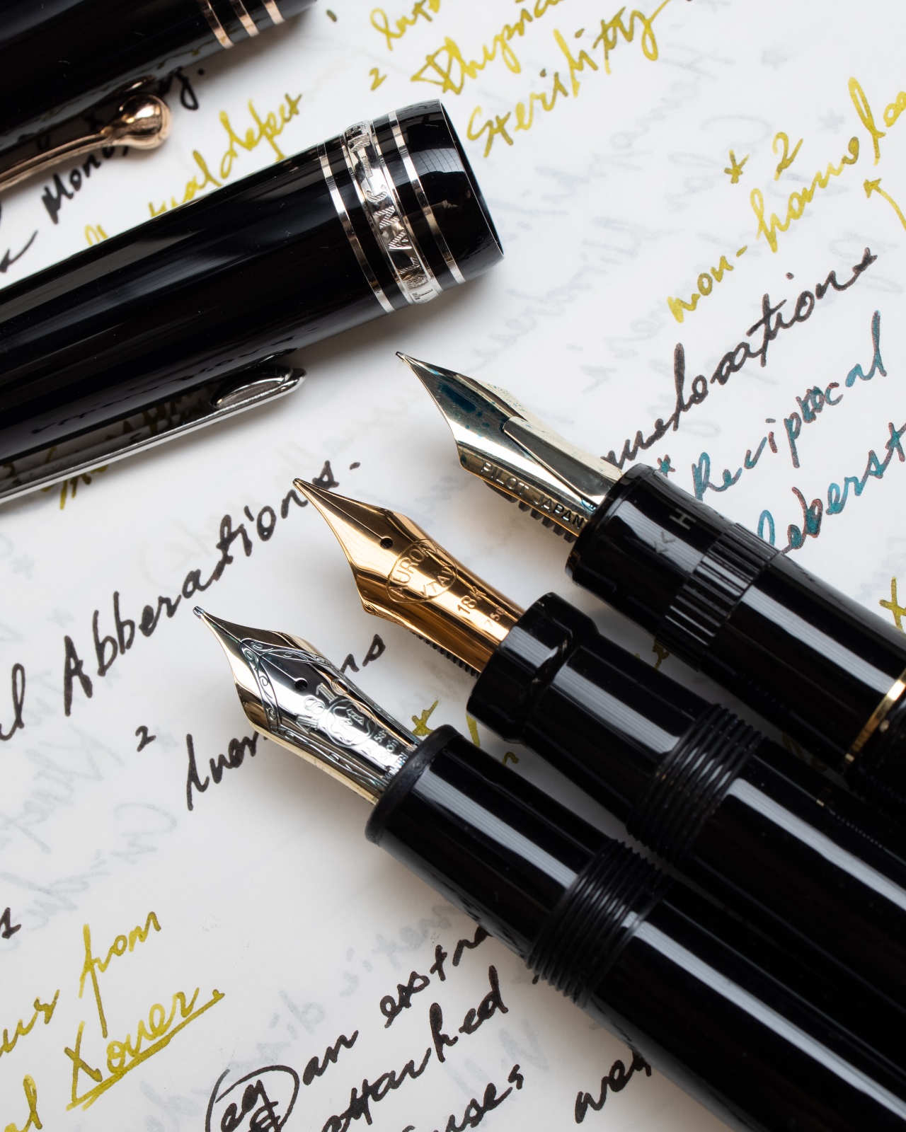
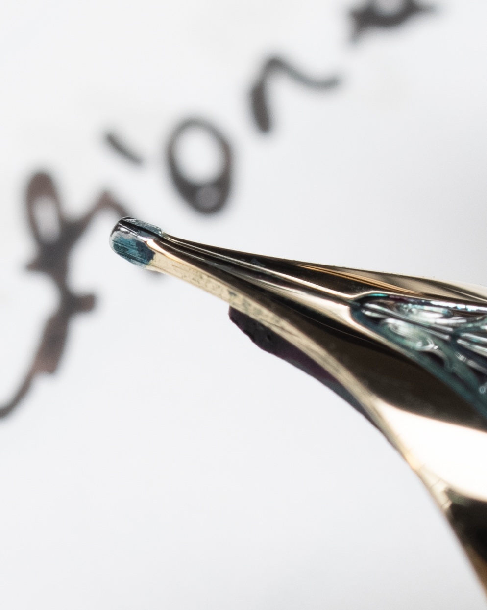
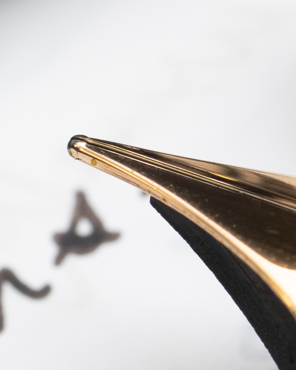
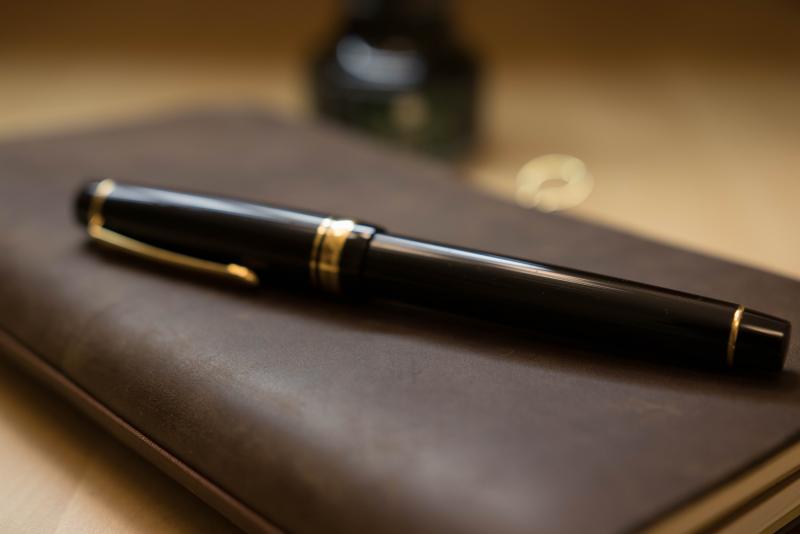
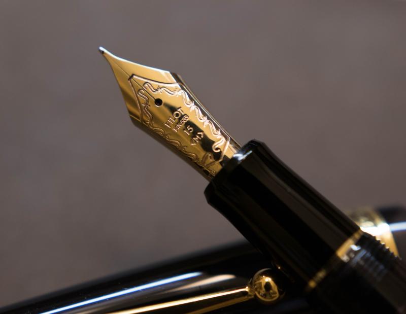
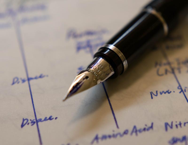
From the album: OldTravelingShoe's Random Pics of Japanese Fountain Pens
© (c) 2024 by OldTravelingShoe. All rights reserved.
- 0 B
- x
-
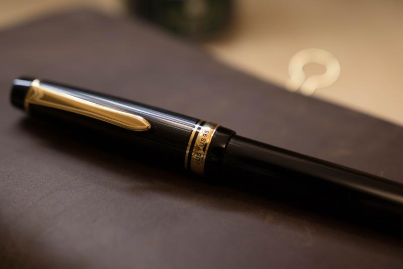
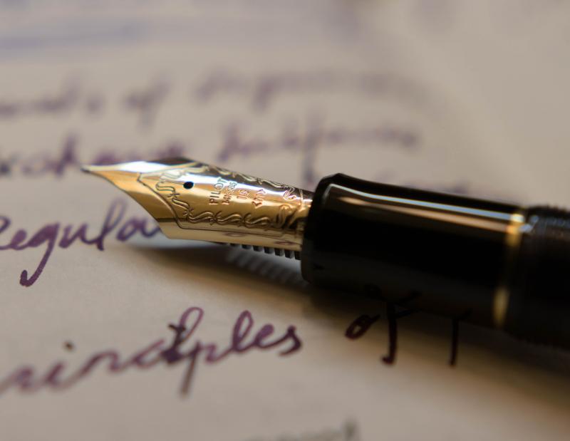
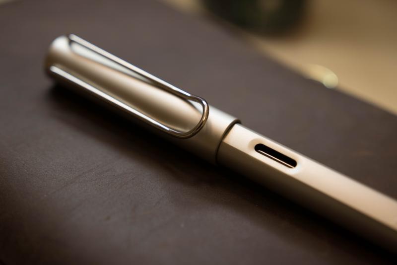
From the album: OldTravelingShoe's Random Pics of Japanese Fountain Pens
© (c) 2024 by OldTravelingShoe. All rights reserved.
- 0 B
- x
-
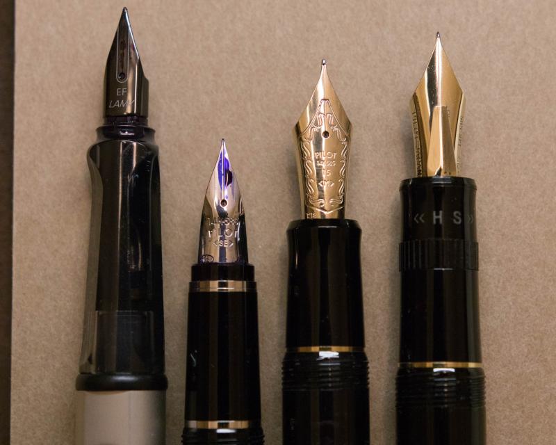
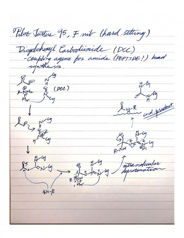
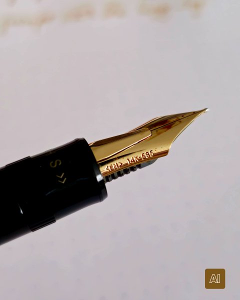
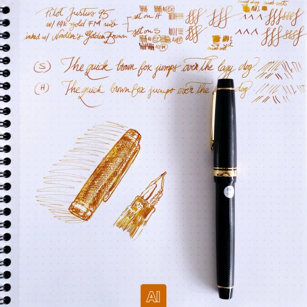
Here are some of my favorite fine/extra fine nibs, which I use to take notes daily. What is/are your favorite fine nib(s)? 1. Montblanc EF, 14K (as I heard a recently updated grind). Precise, sharp, and smooth at the same time. Feel like a simi-italic. I wish it could be a bit wetter (I prime it once in a while with most inks. Sailor Kobe #7 Kaikyou Blue, however, write as wet as I wish it to be). 2. Aurora F, 18K. “Responsive” to slight variations in pressure, giving a very subtle amount of line variation that won’t ruin its purpose for taking notes. Aurora pens also have the best weight-and-size balance for me, which just adds on to my love for their nibs. 3. Pilot Justus 95 F, 14K. Smooth and bouncy. Extremely reliable and present to write with. My dream pen would have a nib like this and a piston filling mechanism.

-

Pilot Elabo/falcon , Justus 95 , Fa Nib #15
The-Thinker posted a topic in Fountain & Dip Pens - First Stop
I am considering buying one of these pens, i like pens that could be used daily (at the same time doodle with it from time to time) , I love very wet and consistent writer , which one of these do you recommend and why ? -
Clash Of The Titans: M800, Homo Sapiens, 146, Justus95
TheDutchGuy posted a topic in Fountain Pen Reviews
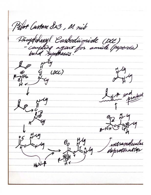
Following the discussion if someone's best pens are also their favourite pens I decided to compare my highest-pricepoint* pens: -Montblanc 146 EF ('90s pen and feed with a much earlier 14C EF nib); retails for appr. 550 euros -Pelikan M800 F ('80s pen with 18C nib); retails for appr. 500 euros -Visconti Homo Sapiens Lava Steel Midi F (23k Pd dreamtouch nib); retails for appr. 450 euros -Pilot Justus 95 M (14k nib); retails for appr. 300 euros I bought the MB146 from a local collector at a very attractive price. The M800 was a gracious gift from a friend who bought it new in the '80s and who stopped using the pen some years ago. The Homo Sapiens and the Justus were bought new in local brick and mortar stores, but with appreciable discounts. As a "challenger pen" that retails for 1/3rd to 1/2 of these pens, I added the Sailor Pro Gear Slim 'Ocean' 14k H-MF to the comparison. ^--From large to small: Justus, 146, M800, Homo Sapiens, Pro Gear Slim. Totally different design philosophies. The 146, the M800 and the Homo Sapiens are staples of pen design, the 146 and the M800 being established classics, each with its own legacy, and the Homo Sapiens already being a modern classic. The Justus and the Pro Gear Slim are more utilitarian pens where the focus is on the nib, feed and quality of writing and not so much on eye-catching design or high-end materials. ^--Uncapped size comparison. ^--Posted size comparison. The different philosophies behind these pens are also reflected in their business ends: the nibs and feeds. The 146 and the Pro Gear Slim are relatively rigid (but certainly not nails), the Homo Sapiens and the Justus are soft (but certainly not flex) and the M800 is somewhere in between. ^--Writing sample (apologies for darkness of image). A 1cm scale is included for reference. The 146 downstrokes are 0.25mm wide. Distinguishing factors As writing instruments, obviously these five pens are objectively of very high quality. All five are top-notch pens and I'd be lucky to own just one of them. Each pen does have certain positive aspects that make it unique compared to the others: -the Justus has a soft nib with variable softness control which also controls its wetness; the Justus is the largest pen in this group and it houses the much-liked CON70 converter. -the 146 EF is an architect, which was common for MB 146 EF nibs during a certain period of time. -like most Pelikan pens, the M800 has a removable nib/feed unit making it super easy to change nibs or to clean the pen. -the Homo Sapiens is made of the unique basaltic lava material from Mount Etna, which feels fantastic, and the soft 23k Palladium nib is also a distinctive element of this pen. I deliberately chose the Midi version which is still a fair-sized pen which can be used posted or unposted and fits in shirt pockets. -the Pro Gear Slim offers the unique Sailor feedback and outstanding nib/feed quality. If I were to look for objective negatives, then the following comes to mind: -my Justus had a nib that needed serious after-care, but to be fair I knew that beforehand, it explains the discount and it allowed me to tune the nib exactly to my liking; -the architect nib of the 146 isn't for everyone, nor for every style of writing: with cursive italic, the result is far, far removed from an EF line and is actually on the B-side of M. -my M800 suffers from slight baby's bottom which sometimes leads to skipping, especially on the lower half of the page (due to hand oils); -my Homo Sapiens Midi is quite sensitive to which inks it likes (and it dislikes some very common and well-behaved inks); you cannot unscrew the nib unit, nor the piston unit (at least not easily) so cleaning the pen can be cumbersome. Last but not least the ridges of the cap lock mechanism rub against my fingers sometimes. -the smallish Pro Gear Slim needs to be posted. Personal (subjective) pros and cons The M800 is my least-favourite pen in this group. There is no objective reason for this; I simply do not feel any emotion with this pen (apart that it was graciously given to me by a friend). The striped Pelikan design is not something that revs my engine, it's not my cup of tea. The nib is very smooth but devoid of character and the writing experience strikes me as somewhat clinical and sterile. Next-up is the 146 EF, which is delightful under controlled circumstances (such as journaling or correspondence) but unsuited to circumstances where you might change the writing angle (such as quick notes at work). That's how it is with architects. I like the 146 much more than the M800, I admire it as a quality pen with a timeless design and I adore the old 14C nib. But I do not grab it all that often. Next-up is the Pro Gear Slim. It was perfect out of the box and it is still perfect to this day. Spot-on, constant flow. Consistent, spot-on performance. No fuss, no maintenance. I don't care much for how it looks and the MF writes a very fine line by western standards, which makes it less suitable for quick jots at work - I need to concentrate a bit, slow down a bit, to prevent wavering and sloppiness. Fantastic pen that puts a smile on my face every time I use it. The Visconti and the Justus are so close that it's hard to pick a favourite. If you put a gun to my head then I'd pick the Visconti because its design and materials are totally unique, it writes like a dream and offers almost the same softness and line variation as the Justus. If the house burned down, the Visconti is the one I'd save. Having said that, the Justus is much lighter and fits into the hand much better. Best vs favourite The M800 is top-tier pen that I just don't care for as a writing instrument (apart from how it came to me; I'll always cherish it for that). The Visconti has some drawbacks, as mentioned, but I'm extremely attached to it. And given its price point, it's hard not to declare the Sailor as the "winner". *I have about 20 pens, the remaining 15 being in lower price brackets. Some of those I love as well, such as my Leonardos or trusty Kaweco AL Sport. I restricted myself to the five most high-end pens that I own, realizing full well that I do not own "real" high-end pens like Scribo, Nakaya, Namiki, etc.) -

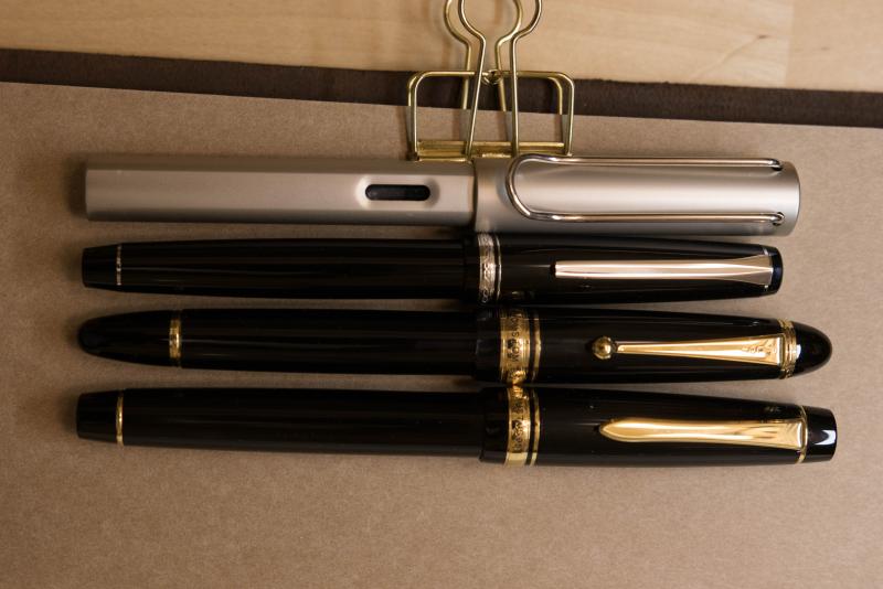
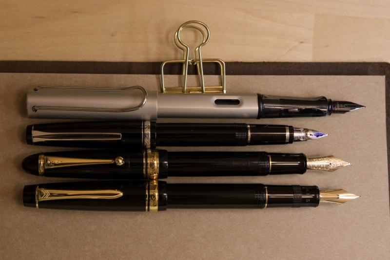
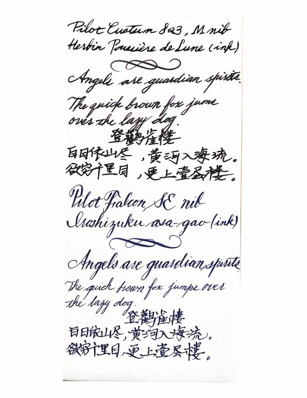
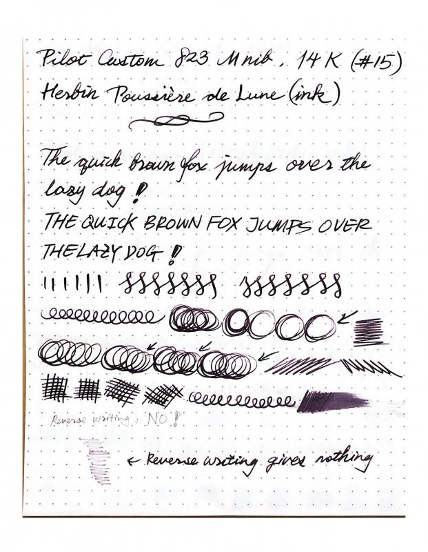
A Comparative Review - Pilot Custom 823, Justus 95, And Falcon
Zlh296830 posted a topic in Fountain & Dip Pens - First Stop
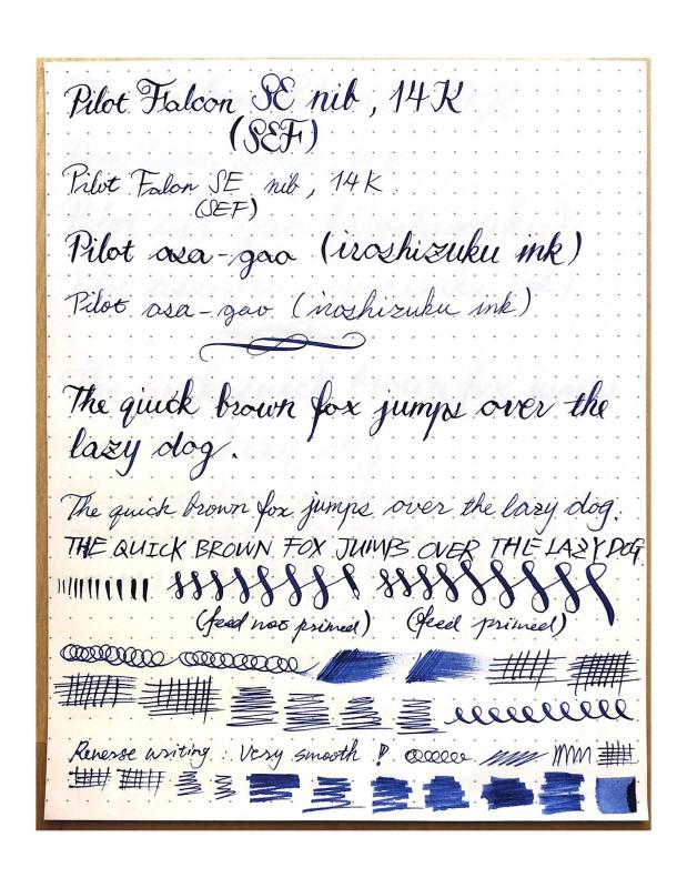
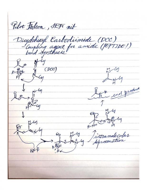
I recently posted two topics requesting suggestion for a new pen and I finally decided to get a Pilot Justus 95, with a F nib. I promised to do a comparative review after I get my hands on the Justus, and here it is. Here are the links to those two reviews just incase if you want to see all the great suggestions I received: 1. https://www.fountainpennetwork.com/forum/topic/345205-seeking-suggestions-for-my-next-pen/?do=findComment&comment=4189695 2. https://www.fountainpennetwork.com/forum/topic/345550-which-pen-should-i-get-justus-95-or-custom-743/?do=findComment&comment=4195283 Here are some pictures of my Justus 95 (F), currently inked with Monteverde Jade Nori: First, let me talk about the appearance of this pen. I like the design. The black body and the gold clips/rings of this pen is a perfectly classic design that I enjoy very much. I enjoy classic style and I don't like any thing with a big brand logo on it. When it comes to the nib, I enjoy its clean and sharp design. In short, i t is elegantly understated. As mention in my other topics, a very big reason that I don't want to commit to a Montblanc is because of that white star. Since I am a college student, I will not feel comfortable taking it out to take notes with. Next, let me talk about the writing experience. I was specifically looking for fine nib that can be used as a daily driver and this nib certainly fulfills my recrements. 1. The hardness can be adjusted for a different writing experience. I find the hardness adjusting nob very interesting to use. I agree that you will get approximately the same line variation no matter you set the pen all the way to hard or soft. However, you will also need different amount of pressure to flex the nib - it requires much less pressure to flex when set to soft, and the hard setting is really helpful when you don't want to have too much line variation in the writing. Also, the ink flow is directly proportional to the hardness setting - soft setting gives a much wetter nib and the hard setting restrict the ink flow. Both of the extreme points of the settings gives very pleasant writing experience and it allows me to switch "the feel" after a long writing session so that I can always find it interesting to write with. 2. If you are concerned that this is too soft a nib and it is hard to control therefore not good for daily (fast) notes taking - please don't. It is not meant to be a flex pen. It is really just giving you a very springy writing experience - more springy than a Pilot Custom 823 (M) but definitely much easier to control when compered to a Pilot Falcon (SEF). Yes, if you slow down (Iroshizuku ink makes it much less prone to railroading), then you can get some decent line variation to make things looks fun once in a while. Please remember though, this is NOT a FLEX pen. In my opinion, its is a fantastic BOUNCY academic (science oriented) notes writer/daily driver. 3. Smoothness. It is not as smooth as the Custom 823 (M) but much smoother than the Falcon (SEF). It has a very slight feed back that I enjoy very much. This also makes it not having any hard-starting issue. 4. Thanks to the Con-70 converter, the ink capacity of this pen is great! I always have enough ink in it, and I do not have worry about running out in the middle of my writing session. I had problem with the Falcon, when falcon was my only gold nib pen, I had to carry additional Con-40 (not 50) converter filled with ink(sealed with a little cap I made out of a used Muji roller ball refill). 5. Love the size and weight!! It is a perfect fit in my hand, so is the Custom 823. Now I want to show you my current daily carries with some beautiful pictures of them: 1. Pilot Custom 823 (M) 2. Pilot Falcon (SEF) 3. Lamy Al-Star (EF) 4. Finally, some comparative pictures: 5. Writing samples (sorry that the color of the ink is inaccurate since my scanner is my iPhone) I will include generic writing samples and things I writes a lot. These pictures will explain to you why I enjoy finer nibs. REMARK ON PILOT FALCON: It is a fun pen to use but I will not recommend using it as a daily driver for science oriented writing. It is too flexible that I always get distracted from the things I am trying to learn. I had to put a lot of attention on controlling the nib. You might noticed that I did not talk about the Lamy steel nib. I also go two Pilot Kakuno pens (F & M). They are both great pens but . I find the Kakuno M nib to be as thick as the Lamy EF by much wetter than it. The Lamy is smoother than both Kakuno, though I enjoy the pencil-like feed back of Kakuno very much. I believe they are all great entry level pens. I have to say, though, that I enjoy a 14k gold nib much more than any the steel nibs I have (I also had a lot other steel nib pens throughout my academic career). This is probably because that I started with fountain pen very early (elementary school) but never had my own gold nib pen until college. I am just kinda tired of the steel nibs. This is what holds me back from the Italian pens that are in the same price range as the Japanese pens. Please PROVE to me if you think I am worrying too much. I am also not sure about the how quality of the pens differ between a Japanese pen and an Italian pen in the same price range. I do care about the design (appearance) of the pen. But as I said in the beginning, I actually love the classical understated design! Therefore the design of Italian pens will not be an excuse that can let me ignore how they differ in writing. For me, WRITING EXPERIENCE OVERRIDES EVERYTHING. Now, I am officially looking for suggestions for my future pen. Should I try Sailor? should I go with Custom 742/72 for more varieties in nibs and cheaper in price? or should I go for an Italian pen? Which pen do you think will fulfill my needs the best? Please let me know if you have any question! I would love to answer them. Thank you all! -
A Comparative Review - Pilot Custom 823, Justus 95, And Falcon
Zlh296830 posted a topic in Fountain & Dip Pens - First Stop
I recently posted two topics requesting suggestion for a new pen and I finally decided to get a Pilot Justus 95, with a F nib. I promised to do a comparative review after I get my hands on the Justus, and here it is. Here are the links to those two reviews just incase if you want to see all the great suggestions I received: 1. https://www.fountainpennetwork.com/forum/topic/345205-seeking-suggestions-for-my-next-pen/?do=findComment&comment=4189695 2. https://www.fountainpennetwork.com/forum/topic/345550-which-pen-should-i-get-justus-95-or-custom-743/?do=findComment&comment=4195283 Here are some pictures of my Justus 95: First, let me talk about the appearance of this pen. I like the design. The black body and the gold clips/rings of this pen is a perfectly classic design that I enjoy very much. I enjoy classic style and I don't like any thing with a big brand logo on it. When it comes to the nib, I enjoy its clean and sharp design. In short, it is elegantly understated. As mention in my other topics, a very big reason that I don't want to commit to a Montblanc is because of that white star. Since I am a college student, I will not feel comfortable taking it out to take notes with. Next, let me talk about the writing experience. I was specifically looking for fine nib that can be used as a daily driver and this nib certainly fulfills my recrements. 1. The hardness can be adjusted for a different writing experience. I find the hardness adjusting nob very interesting to use. I agree that you will get approximately the same line variation no matter you set the pen all the way to hard or soft. However, you will also need different amount of pressure to flex the nib - it requires much less pressure to flex when set to soft, and the hard setting is really helpful when you don't want to have too much line variation in the writing. Also, the ink flow is directly proportional to the hardness setting - soft setting gives a much wetter nib and the hard setting restrict the ink flow. Both of the extreme points of the settings gives very pleasant writing experience and it allows me to switch "the feel" after a long writing session so that I can always find it interesting to write with. 2. If you are concerned that this is too soft a nib and it is hard to control therefore not good for daily (fast) notes taking - please don't. It is not meant to be a flex pen. It is really just giving you a very springy writing experience - more springy than a Pilot Custom 823 (M) but definitely much easier to control when compered to a Pilot Falcon (SEF). Yes, if you slow down (Iroshizuku ink makes it much less prone to railroading), then you can get some decent line variation to make things looks fun once in a while. Please remember though, this is NOT a FLEX pen. In my opinion, its is a fantastic BOUNCY academic (science oriented) notes writer/daily driver. 3. Smoothness. It is not as smooth as the Custom 823 (M) but much smoother than the Falcon (SEF). It has a very slight feed back that I enjoy very much. This also makes it not having any hard-starting issue. 4. Thanks to the Con-70 converter, the ink capacity of this pen is great! I always have enough ink in it, and I do not have worry about running out in the middle of my writing session. I had problem with the Falcon, when falcon was my only gold nib pen, I had to carry additional Con-40 (not 50) converter filled with ink(sealed with a little cap I made out of a used Muji roller ball refill). Now I want to show you my current daily carries with some beautiful pictures of them: 1. Pilot Custom 823 (M) 2. Pilot Falcon (SEF) 3. Lamy Al-Star (EF) 4. Finally, some comparative pictures: 5. Writing samples (sorry that the color of the ink is inaccurate since my scanner is my iPhone) I will include generic writing samples and things I writes a lot. These pictures will explain to you why I enjoy finer nibs. REMARK ON PILOT FALCON: It is a fun pen to use but I will not recommend using it as a daily driver for science oriented writing. It is too flexible that I always get distracted from the things I am trying to learn. I had to put a lot of attention on controlling the nib. You might noticed that I did not talk about the Lamy steel nib. I also go two Pilot Kakuno pens (F & M). They are both great pens but . I find the Kakuno M nib to be as thick as the Lamy EF by much wetter than it. The Lamy is smoother than both Kakuno, though I enjoy the pencil-like feed back of Kakuno very much. I believe they are all great entry level pens. I have to say, though, that I enjoy a 14k gold nib much more than any the steel nibs I have (I also had a lot other steel nib pens throughout my academic career). This is probably because that I started with fountain pen very early (elementary school) but never had my own gold nib pen until college. I am just kinda tired of the steel nibs. This is what holds me back from the Italian pens that are in the same price range as the Japanese pens. Please PROVE to me if you think I am worrying too much. I am also not sure about the how quality of the pens differ between a Japanese pen and an Italian pen in the same price range. I do care about the design (appearance) of the pen. But as I said in the beginning, I actually love the classical understated design! Therefore the design of Italian pens will not be an excuse that can let me ignore how they differ in writing. For me, WRITING EXPERIENCE OVERRIDES EVERYTHING. Now, I am officially looking for suggestions for my future pen. Should I try Sailor? or should I go for an Italian pen? Which pen do you think will fulfill my needs the best? Thank you all!
-
Which Pen Should I Get? Justus 95 Or Custom 743?
Zlh296830 posted a topic in Fountain & Dip Pens - First Stop
I am currently a college student and I love using fountain pens. They just make writing much more enjoyable for me. Currently my everyday pens are Pilot Custom 823(M), Pilot Falcon(SEF), and Lamy All-Star(EF). I have them inked with different colors which is great for me to take clear notes. I love, love, love using the 823 and it is the pen I that use the most. I have a medium-heavy hand and I really enjoy the springy but not-too-soft nature of the 823 nib since it allows me to take notes with very fast hand writing (it is also very smooth!). Harder bibs are not bad writing by any means, but they are certainly not my favorites: Lamy All Star, Pilot Kaküno (F, M). I have them in the pen box simply to have more colors and to use them once in a while to switch the feel a little bit. I am currently looking at Justus 95 and Custom 743 because the size and weight of them are very similar to the 823. I have tried the Justus 95 in store with dipping ink, and I find the hard setting very practical for taking notes on even cheaper paper while the soft setting gives more room to flex since it requires less pressure to spread the tines. I am aware that the 743 probably have a silightly bigger nib than the Justus 95 just like the 823 do, and has a lot more nib to choose from, such as SFM, SF, and of course the regular Fine nib. You might noticed that I am not considering the broader nibs since Japanese M is the broadest nib to be practical for everyday acdemic notes, and I already got it on my amazing 823. Im only considering F-FM. The F nib I tried on Justus 95 is close to what Im looking for. After the long explanation about my situation, let ask some specific questions I wish you could address. I will give a comment for each of the questions I ask to let you know what Im looking for specially. Also, please dont use price as a criteria. 1. Should I just get an 823 in F? (I kinda want to branch out a bit, I dont know whether it would be worth the investment to stay with the same model). 2. Does the nib options of 743 significantly better than the Justus 95? (Comparing the #15 SFM SF of the 743 to the Justus 95 F nib) 3. Is the 743 FA even worth me looking at? (I think it will be a fun nib, but Im concerned about its practiality for my every day use. I am also concerned about the railroading issue it potentially have) 4. I heard Sailor has great nibs. But I am concerting about the size/weight of 1911 L or pro gear L (I am not considering the King of Pen) and their ink capacity. With this in mind, should I shift my focus to Sailor? 5. What are some other pens with very similar size and weight has a springy (but not-too-soft) nib I should consider? (I care nothing about a flourished look, practicality is the most important thing. Its not that I dont enjoy a more colorful look, I just dont think it worth the money for me to just buying the look of the pen for my purpose) Thank you all and I hope to hear from you guys soon!! -
I am fairly new in the fountain pen collection world but I have been using fountain pen since very young. Im currently a college student and Im looking for suggestions for my next pen. Heres a short list of the pens I uses quite often: 1. Pilot Kaküno M nib 2. Pilot Kaküno F nib 3. LAMY All-Star EF nib 4. Pilot Falcon M nib 5. Pilot Custom 823 M nib Here are some of the pens that I am interested in: 1. Pilot Custom 742 FA nib 2. Pilot Custom 743 FA nib 3. Pilot Justus 95 F nib 4. Sailor 1911 realo F or M nib 5. Sailor Profesional Gear realo F or M nib 6. Montblan 146 F or M nib Which one should I get first?
-
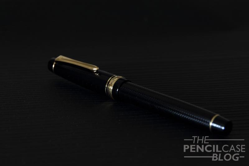
-This review is an adapted version of the one that can be found on my personal blog (www.pencilcaseblog.com). Visit my blog for more pictures, a copy of the written review and of course many other pen, pencil, paper and ink reviews. Enjoy the review! (Pilot Justus 95 review: http://www.pencilcaseblog.com/2014/10/pilot-justus-95.html )- The Pilot Justus 95 is what looks like a pretty simple, typical Japanese fountain pen. The design can be found -more or less- on a couple of other Japanese pens, such as the Sailor Pro-Gear. Or at least, that's what it looks like at first! Take a closer look, and you'll see that this Japanese beauty is far from mainstream! Not only are there a few design elements that really stand out, what's found under the cap is like nothing I've seen before! The overall shape is pretty much exactly the same as the previously mentioned Sailor Pro-gear. But the barrel and cap feature a very nice, classic-looking engraved pattern, something you'd expect on a vintage pen. The pattern is fairly subtle, you won't notice it from afar, but look closely and you'll see how intricate the line pattern is! The Justus is a pretty big pen, coming close to what I would call oversized! The nib is very narrow, but long, I guess it can be categorised as a number six size. It's also quite a well-weighted pen, though this time it's not the cap that takes care of the weight. The section seems to be the heaviest part, it has metal threads, so I guess most of it is metal, with a resin layer on top. The weighted section makes it very well-balanced, even when posted (which makes it ridiculously long) it stays perfectly balanced and very comfortable to use! The Justus is incredibly well-built and feels very solid. I know this sounds vague, but some resin pens feel brittle and cheap. This one definitely doesn't! I couldn't find any seams at all, which deserves a thumbs up! Yay! I really like the design of this pen, I actually even like the gold trims (Which I normally never do!). The pen has a retro feeling to it, due to the engraved barrel and cap, so the gold accents fit the overall style perfectly! But enough about the design, because let's face it: you won't buy this one for the looks! The main attraction is the 14k gold adjustable nib. The general principle is to have a nib that acts both as a non-flex and as a semi-flex writer. The desired effect is created by twisting the ring in the grip section to the left or the right. The small clip-like piece of metal will either extend or retract into the section. In extended position, it pushes down on the tines of the nib, giving it a bit more rigidity. On paper, it all looks very promising. But you shouldn't expect a whole lot of difference between the two options. In fact, there's no real difference at all! The semi-flex nib doesn't actually get stiffer, it just requires a bit more pressure to flex. The writing performance does change ever so slightly though, mainly the flow is affected. It writes a hair wetter when in 'flex mode', which also results in a slightly thicker line width (even without any pressure! You can probably see the difference in the written review, where the first few lines of the 'overall' paragraph are written in 'flex mode') In flex mode, you can get quite a decent amount of line width variation, however in my eyes the Pilot Falcon (Another pen that can be considered semi-flex) has a bit more springyness to it. Other than that, the nib is very enjoyable to write with, it's smooth, though with a noticeable amount of feedback. The flow is excellent, not as wet as I expected, but still capable of keeping up with ease. It never skipped or had a hard start. The line width of the medium nib seems to be comparable to western mediums, maybe even a hair thicker at times ( probably because of the soft nib). I might have preferred a fine nib because it would most likely show more line width variation, but I really can't complain as this medium performs extremely well! Is this a pen you should get? Yes! Pilot managed to deliver a very nice, extremely well-built pen with an equally nice and interesting nib. If you have the 300 Euros/ 315 USDollars to spend, this is a great way to enlighten your wallet! Dries ThePencilCaseBlog http://www.pencilcaseblog.com
-
Hello there, fellow FPNers, This idea has been in my mind for a while, but I have had doubts: Is there enough tipping in a medium nib? Is the nib thick enough? Your opinion is very welcome! I don't own a Justus just yet, but this would definitely be a strong incentive. Thanks!
-
This is my first fountain pen review. Hope you enjoy it!
-
Some other things. The design for me gets a Solid A+. The Nib is an A- with some down marks for railroading under pressure. The cost is a C. It's an expensive pen. It is however a VERY solid pen. The nib is a joy to write with. It can be had for around 312 in the states and if you want to roll the dice on an japan ebay import, 270 to 290 shipped. You will not regret the purchase. Overall a Solid A-