Search the Community
Showing results for tags 'italian'.
-
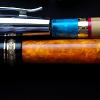
Hey there, Wondering if anyone has any additional info about this Omas Ogiva Blue Urushi - I'm fairly certain it's from the early 2000's, but don't know much else. There looks to be a green one listed on eBay, but there's not much info in the listing either. It looks like there a bit of dried ink leakage around the top of the cap, wondering if it has permanently damaged the lacquer - any thoughts? Thanks in advance!

-
The penco 53 junior is the smaller version of the 53. It's a piston filler. The section is screwed on the barrel wit a LEFT-HANDED thread (righty loosey, lefty tighty). The material is also prone to shrinking, so you'll have to apply dry heat abundantly both during disassembly and assembly (also lubricate the threads with silicon grease). Note that the gold band between the barrel and section is normally part of the barrel, in my specimen it's broken. The piston head is made of casein (it has the characteristic smell) and looks quite brittle, but fits well and seems to be functional. The feed is cilindrical and you'll have to gently push it from the rear. Alignment of the feed with the nib is made easy by a slot at the rear end of the feed. The nib has a fine tip, it's elastic, with moderate feedback. The clip is spring loaded. Overall it's a nice pen, but it was quite frustrating to service.
-
SCRIBO FEEL I should begin this review by acknowledging the elephant in the room; I was (and still am) an Omas fan. There are two aspects of Omas that I really enjoy. The first, most practical, is the nibs. They are truly in a class of their own, right up with custom work I’ve had the pleasure to receive from Oxonian. They just suit my hand and my writing “style.” The second aspect is the relatively small company behind them. I never really got into the fancy pens produced during the LVMH years, though I understand why a small company had to make the decisions it did. But Omas always produced a line of relatively affordable and beautifully crafted pens. So when considering what might make for a “new Omas” I was looking for great nibs and the sense of a small company/workshop; who doesn’t love the romance of a pen made by an atelier in Bologna, just round the corner from the oldest university in Europe? So it’s fair to say I have been a little hesitant to explore some of the claimants to the Omas crown. They either were producing different nibs or were aiming to create companies that would fill the same space in the market and allude to their Italian roots, sometimes when their claim to being related in any real way to Omas was perhaps a little thin. For example, I am not completely sure that simply using the same body materials really establishes a line of descent. Scribo (Scrittura Bolognese) was created by folk who actually worked at Omas. They claimed to be using the same nib manufacturing jigs used for Omas, and they certainly count as a small atelier. The central team is Luca, Elena, and Flaminia! Luca is an excellent, funny, and warm correspondent whom I knew slightly from Omas days, and so I decided to give their first production (as opposed to custom) pen a go. That pen is the Feel. I will not be referring to Omas again in this review (except for once). This review is an assessment of the first real product of a small shop in Italy, created by a new design and marketing team and, perhaps, destined to take its place among the legendary European manufacturers. I really like to support start-ups, so when the pen became available for purchase in Fall 2018 I held my breath and ordered two, one for myself and one for my long-suffering partner to acknowledge an anniversary and her patience. We received them early in December 2018 and saved opening them until 25 December. I really enjoyed the experience of opening the big white boxes. The packing was simple but lovely, and ALL RECYCLABLE! That’s wonderful. As you can see below, the pens come in a leather and fabric wrap. Now, usually I’m not a fan of such things, but this one has a sort of mediaeval vibe that I quite enjoy. There is room for two pens and a pocket for a cleaning cloth. I’m going to try slipping the back cover of a midori travel notebook into that pocket and see if I can make it up a handy travelling kit. My partner, for whom I will use the pseudonym Her Majesty (HM), thought that the experience of unwrapping her pen was “really luxurious.” I think this is absolutely accurate. Despite the simplicity of the packaging, there is a Mont Blanc-like satisfaction of unwrapping the pen. I’m not a big fan of MB as a brand, but they do make their pens feel special in a way I believe only Nakaya really match. Scribo is right up there in terms of the “this feels special” factor. I'm sorry for the photos, but I'm not Christof! Still, they do give a "real-world" feel for the pens :-) I’m not going to give ratings out of ten for the factors below, since they are really just a form of disguised subjectivity. But you’ll know what I think! ______________________________________________________________________ Appearance & Design The pen is available in two colour ways, and we received one of each. Mine is grey-blue with ruthenium trim, while HM’s is dark blue with rhodium trim. Both are very attractive, and we each prefer our own! The plating on both is flawless, with the ruthenium seeming perhaps a tone or two darker than I’ve seen it in other applications. The ruthenium works beautifully with the grey-blue, and the dark blue and rhodium is a classic combination. Both versions would work well in a professional environment, with the grey-blue being perhaps more quirky/designy in appearance. The pen, as should be obvious from the pictures, has two unusual design features. The first is the swells, giving it a Mae West sort of look. HM calls my PFMs Rita MacNeil after a well-endowed Canadian songstress, but considers the Feel much more like Claudia Cardinale- a compliment indeed! The curves have a practical purpose. The Feel is a big pen, about MB149 size (see comparison shot below, with a Parker 51 and M805). It does not feel too big in the hand though, because the section is narrow. The wide part of the barrel sits in the web of the thumb, and balance the pen very nicely. It’s an interesting and unusual approach. The other design feature is the facets, of which there are 12. They are rounded but obvious on the body and cap, and fall away to a gentle ridged effect on the section. They improve grip and angle unobtrusively. They also align from one end of the pen to the other, not an easy feat with 12 facets and two screw threads to get right. As seen in the photos, the cap finial has the Scribo logo (a quill) set into it. The cap does not post. The cap band says “SCRIBO Feel the writing” Overall, this is a lovely full-sized to large pen with lots of presence and terrific manufacturing standards. There is literally nothing to complain about here. Construction & Quality This is an expensive pen, so it’s fair to expect great construction and quality, and the Feel delivers. It’s not a super fancy pen, it hits the point where the curves of utility and luxury cross. My view is that it’s better put together than an M800 (or M1000 in strict terms of size) with better flow in the design and absolutely perfect execution. This pen really does feel special. I cannot see where a single corner has been cut. HM says that the pen gives the exact opposite feeling from renting a cheap car! Weight & Dimensions This is a big pen. Weight capped is 36g, and uncapped but full of ink it’s 21g (This is the same as a M800 posted, for easy reference). Length is 147mm capped, and around 136mm uncapped. Due to the design it’s surprisingly easy to handle. I’m not usually a fan of huge pens, but as dapprman says on his video, this one just seems to work very nicely. Nib & Performance This is where it all gets interesting. The Feel comes equipped with a very nice ebonite feed. I know the science that says it doesn’t make a difference, but I have to admit in my experience I’ve often perceived that it does. My Feel has an EF Flessibile (bearing the phrase “Feel the flex”) and HM’s has a regular F (“Feel the writing”). Both are very, very good nibs indeed. The flessible has a slightly wetter flow, and provides plenty of character to one’s writing without trying at all, even for those of us with a very light touch. The regular fine nib is a little drier but works extremely nicely. HM gets some line variation from this nib (it is a soft nib) but has less of a light touch than I do. This is where the final Omas reference comes in. It’s just unavoidable. These pens write just like my Omas when the Omas are properly set up. They have that indefinable feel of a “real” nib, not too smooth, not scratchy at all, but just the presence of the nib on the paper. They were both absolutely perfect out of the box, no baby bottom silliness or mis-aligned tines. If you told me these nibs were just back from a nibmeister, I would believe you. I’m really impressed. Line width is slightly thinner than Pelikan using the included ink sample, in my opinion. Fine is a good all around width a tiny bit thinner than a Lamy 2000 Fine, while ExtraFine is visibly thinner than a Pelikan M120 EF. To be honest, though, I’ve only used the included ink in the pen. It’s a cool misty grey-blue-black which is lovely, both vintage and ultra-modern, somehow. However, the nib widths should be treated with a slight pinch of salt since I don’t know how dry this ink is. I expect that nib widths will be consistent with Omas, if folks need a reliable reference. So which nib to choose? I’d say the EF is a great nib, and not at all temperamental. The regular Fine is a terrific nib with quite different characteristics. I don’t think you can really go wrong, it comes down to use. If you have a heavier hand, it might be too much for the flessibile, but you’ll see some nice variation from the regular nib and I suspect you won’t miss the flessibile. The top sample is the EF Flessibile, the bottom is the Fine Regular. You may note that HM and I do not spend our spare time in calligraphy classes . . . Filling System & Maintenance This is a really nice smooth piston. No problems whatsoever and a pleasure to use. Cost & Value These are not cheap pens, being €530 to those of us living outside Europe (just over $600US). But that tells us very little about value. For me, I feel (heh) they give good value. I got to know Luca a little better and felt that I was supporting a small scale start-up, and in return I got an excellent product with an outstanding writing experience. I can compare this with buying Nakayas and Pelikans. Nakaya produce pens for the same price (and way, way up) that feel more personalised, but the overall experience doesn’t give you a story, and they are part of a corporation. Pelikan M1000s are around €100 cheaper right now on Amazon.de, but again no story, and no personalisation at all. Taking these prices into account, my personal view is that the Feel hits a sweet spot where you are getting a great experience and a terrific, beautifully-made pen for a small price premium. For somebody like me, who enjoys a bit of “special-ness” in the tools of everyday life, and who is lucky enough to have the choice, this is an easy decision. Also worth noting-- a three year guarantee . . . Conclusion I really like this pen, and look forward to using it for years to come. The fact that HM has its sister in memory of a special event, and that it does feel like an artisanal product, just add to that. It is going to take me a couple of weeks to adjust to the size, but I’m up for the challenge. HM is very happy with hers, which makes me happier still. This is a terrific first pen for the general market, easily placing among the best European pens available, and suggesting that there really is a small new Italian company with all the history and values we associate with that beautiful part of the world. Thanks to the Scribo team for giving this venture a go, and good luck to them! Pros - Presentation is outstanding - The writing experience is superb - It’s a big, comfortable pen - Flawless construction and set-up Cons - It is expensive for a new brand - It may be too big for the smallest hands
-
This is my first review, so if you can think of any part of the pen I did not cover then please ask questions below. This is the beautiful Magnifica Amalfi from Delta. The pen has a 14k extra-fine nib and comes with a gorgeous olive wood barrel with prominent grain. The rest of the pen is constructed from a variety of resins: two shades of blue, white, and red. 18k plating trims the pen. The filling mechanism is a captured converter - one which is highly efficient and takes ink all the way up to the seal. Fond, as Delta are, of basing their pens on locations and features of landscapes, this pen is made in honour of the coastal city of Amalfi: the olive wood barrel representing land; the resins representing the sparkling sea, sky, and mountains near the city. This is a numbered edition pen. The nib itself is a true EF. I mention this because the last time I used a Delta EF it was a steel nib and wrote as a medium. I purchased this pen expecteing a very 'liberal' EF nib and was pleasantly surprised to discover that it wrote as finely as my Faber-Castell EF (more on that in the writing sample). Initial inspection under a loupe showed the tines to be strongly misaligned, however I also noticed the feed was fractionally misaligned as well. After giving the feed a slight nudge it audibly 'clicked' into its correct setting and this had the effect of aligning the tines as close to perfect as-makes-no-difference. After looking at all angles through my loupe the tipping material makes a smooth sphere at the contact point, no tinkering needed. Although not visible in the photograph there is a healthy slit of light between the tines. The resins are simply beautiful. Let me get the obligatory "no camera can capture the beauty of... " sentiment out of the way, and tell you that I firmly believed the blue sections of the pen to be celluloid. I found it difficult to believe that resin could have such subtlety in its chatoyance and interaction with light - even my Dolcevita cannot match the glimmer and sheen of these resins. Although the following images do not do the effect justice, compare these two: now imagine the highlights in the second image emerging from the deep blue, curving into visibility like a shoal of fish. Here is a deliberately underexposed shot of the cap to show that even the white resin band has some subtle marbling effect, albeit barely discernible And here is a view of the red band, again some texture is visible. Another comparison of the way the resin reacts to light can be seen by comparing the light blue resin of the blind cap in the above photograph with the full length horizontal shot at the beginning of the review: the latter appearing very subdued, the former catching light from a new angle. A closer view of the section. The threads are not sharp. The seal of Amalfi and a maritime compass form the ends of the pen. Hopefully my appreciation of this pen is evident, so I will now deal with a couple of niggles. The gold ring separating the section and barrel is loose enough to create a slight rattle if you tap the area (handing the pen to someone, placing the pen down uncapped etc.) and though it does not slide forward or come off, this bothers me. Not a big deal, but I'd rather it wasn't there. Another small detail is that the word "Amalfi" beneath the number on the cap is not centred with the exact rear of the cap (the number is). It is however centred between the word "MAGNIFICA". This means that the gold band was not centred when it was affixed to the cap. Again, it's a tiny detail, but worth mentioning. Those of you who find the rattle of converter tips inside tapering pens annoying are, unfortunately, going to notice an issue with this pen. To make sure that the gold plated captured converter does not scratch after inserting though the barrel there is some leeway in the fit. This means that the user operated twist section has a fraction of a millimetre of space around it, causing the occasional rattle when tapped. I fixed this in mine with an accurately measured shim of paper. This will only fall out when the entire barrel is removed, not when filling up each time.It is an invisible and quick fix for those of us who are pernickety enough to care. As for the feel of the pen - it is very light by my standards. The uncapped body with a full load of ink is 22g, the cap 18g. This is however an EF and so I can accept a pen this light. The section has a very pleasant concave taper, comfortable and natural. The transition between the different materials is also very good. The three resins on the cap are all flush, as is the wood -> red resin -> metal -> blue resin combination at the rear of the pen. However the fortifications detailed on the gold band are raised slightly, and this does occasionally catch on my hand. Not too egregious, but enough to remind you that the pen is there. Posting the cap doesn't change anything either as the "MAGNIFICA" gold band falls in the same place. It also has raised detail. Speaking of posting - the pen certaily feels more substantial and not too back-heavy, but I have a dislike of posting pens and doing so always makes the pen I am using feel wrong, so I am not the best to judge this. The pens writes very smoothly. I'm used to EF nibs so my hand is accustomed to the gentle touch required to creat smooth contact with EF nibs. YMMV. The blue ink below is from the bottle in the first image. It is not named so for all I know it clould just be normal Delta Blue. I refer to it as "Amalfi Blue". The Amalfi Blue ink lays down vibrantly, yet significantly fades on drying. The green ink is from my Faber-Castell E-Motion EF. That was previously the finest nib I had, much finer than other EF nibs by various companies. And here is a medium nib with the same blue ink, the Amalfi pen writing underneath. Thank you for reading. This review was written in one continuous stream without editing or revision, so if you have any questions about something I missed, please ask.
-
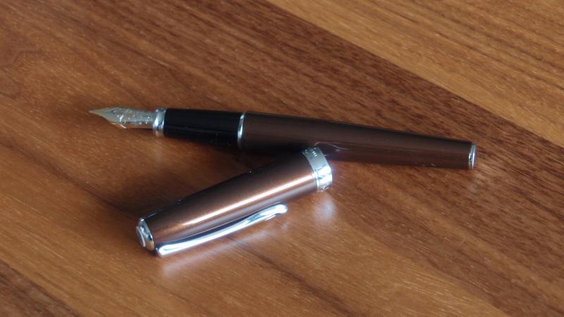
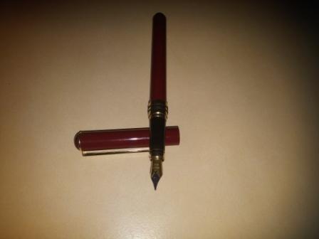
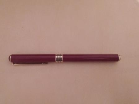
Normally I’m a fan of italian fountain pens. I started off with a Pelikan M800 though – the benchmark of a good, full-size piston filler. I was very satisfied with the Pelikan, it seemed to be everything I ever wanted from a fountain pen, I would never need another one. But later, after falling in love with the looks of it, I ordered a Delta Dolcevita and completely changed my point of view for what fountain pens are about. Handling the Dolcevita was like holding a Faberge egg in my hand, the Pelikan reminded of a free merchandise pen in comparison. The Italian culture has a profound feel for the exquisite, stemming from old tradition and masters like Bernini, Michelangelo and Leonardo da Vinci. The Germans have great composers and philosophers, but let’s face it; they have no one even close to the Italian masters of fine arts. For some time it seemed I would never buy any other pens but Italian. Then I happened to read this article on Diplomat pens: http://www.fieldnotesblog.com.au/search/label/diplomat. Until then I had always considered Diplomat pens a bit boring; traditional design, no nonsense, heavy and solid – in other words extremely German. But after reading the article in Field Notes, I couldn’t wait to order one. Now, after two weeks with my Diplomat Excellence A with a 14 Kt gold medium nib, it seems the Germans have turned the tables on fountain pens again. What a fantastic pen this is! Plain and modest in comparison to most Italians, yes, but what a performer it is, and some value for money! The pens come in several colours and finishes. Mine is a Marrakesh; a brown metallic lacquer – just one colour but thousands of nuances depending on light and environment. Fine pens are a lot about material and finish. Several makers of expensive pens can perform the same (high) level of finish as Diplomat, but this utmost feeling of everlasting quality I haven’t experienced in any other pen. The sense of solidness when unscrewing the barrel, the weight of the all-metal body, the smoothness of the beautiful in-house nib, all make a combination that is hard to describe – it’s not a feeling of luxury, but something more subtle, maybe what the Germans call “Ausgewogenheit”, a kind of fine balance, a balance between utility and beauty. If this pen was a car, it would be a Mercedes W123; the durable, yet slightly gilt-edged workhorse from the 70’s and 80’s. Writing with the Diplomat Excellence, the nib is quite “present” between your fingertips. In comparison, the Delta Dolcevita feels more like a unity of nib and barrel. With the Diplomat you really feel that you’re writing with a fairly large nib, fitted to a heavy, solid barrel. I haven’t yet decided which writing experience to prefer, I like them both. Guess it’s a matter of writing technique and personal preferences. The nib is wet and smooth, and I haven’t experienced even the slightest disturbance of ink flow. This is a first class writing instrument at all levels! I hope these pens will remain on the market for years to come. They are reminders of a time when people cared for their handwriting, and for accessories that would stay with them for a lifetime. (Sorry about the pics, I'm a lousy photographer...)
-

Necessity Ignites Invention: A Review Of The Filcao Atlantica
bobje posted a topic in Fountain Pen Reviews
FILCAO Atlantica, a Chilton-type pneumatic filler I'll save you some time. The FILCAO Atlantica writes smoothly, feels balanced in the hand, and is carefully constructed from an elegant material. These are fine qualities, but they aren't the reason you should write with one, if you get the opportunity, because they aren't made any more. You should write with one because it's interesting, and it's interesting for three reasons. First, this particular Atlantica uses a filling system you've probably never heard of, and it's slick, quirky, and makes a lot of sense. It's called a Chilton pneumatic filler, and you can read about it in one of Richard Binder's authoritative pen encyclopedia entries. To fill the pen, you remove a blind cap, pull out a chrome rod, place your finger over the hole, immerse the nib in ink, push the rod in, and take your finger off the hole. Then you replace the cap. The system holds a lot of ink, maybe 1.2 milliliters, though I haven't measured, and because it takes me a week or so of regular writing before the ink gets depleted, I'm not planning on measuring it. Second, the material used in the pen isn't just elegant. It is mahogany-paneled-private-library elegant, and could serve as a dictionary illustration for what the Italians call catarifrangente and the French call chatoyant. The material is deep, shimmering, and glowing, and it looks like a lucky day for an amateur geologist/pen collector hiking in the Alps west of Torino. Finding a boulder of gray-green granite laced with mother of pearl and curly black mica flakes, illuminated from the inside by fading candlelight, the collector made a mental note--"that rock will do very nicely.” Then it was made into a Goldilocks-sized, understated pen for people who need to mark up contracts, describe the inner thoughts of characters, write prescriptions, draw circuit diagrams, or correct the improper grammar of students, and who actually enjoy the tactile quality of the writing process. Last, the pen was made by a Torinese pen designer who combined two uniquely Italian qualities – the genius that sometimes stems from economy -- as anyone who has eaten fettuccine alla Genovese could tell you. Pesto is made from basil leaves, a few stray pieces of cheese, some olive oil, and pine nuts that require considerable amounts of labor to dehusk. Combined in a sauce, these ingredients are sublime and satisfying, but one has the feeling that, on one very bleak day, they were what was in the pantry of a brilliant grandmother who needed to feed her family. Necessity ignites invention. As Italian-American pen distributor Giovanni Abrate tells the story, the late founder of FILCAO, Francesco Grisolia, built relationships with the Italian manufacturers of resin used in pens and eyeglasses. In comparison to the market for eyeglass frames, pens are a tiny market, so if you're a boutique pen manufacturer trying to make handsome but reasonable products for stationery stores throughout Italy, occasionally your business relationships need to score gorgeous material at a good price. In the late 1990s, Grisolia found some material in northern Italy that had been evaluated for Montblanc special editions. Montblanc appears to have used a slightly different version for the Oscar Wilde. Grisolia used what he found to create the Atlantica, this eccentric Chilton pneumatic filler. I am fairly certain that the Oscar Wilde is a gorgeous pen. For $1,500, give or take a few hundred, it ought to be. But I am absolutely certain that the Atlantica is as satisfying and delicious as a plate of fettuccine alla Genovese, served with a deep red Nebbiolo, on a table with a white linen tablecloth. Now that I've saved you some time, you can choose. For $1,500, you can have an Oscar Wilde, or an Atlantica and a flight to Milano. Buon viaggio. Chilton-type pneumatic filler Medium steel nib Dictionary illustration for what the Italians call catarifrangente and the French call chatoyant. Section Writing Sample. First poem in Italian by a female writer, attributed to "Compiuta." Rough English translation Photograph of writing sample, Sailor Jentle doyou ink -
At the risk of sounding like SBRE Brown...I'm interested in a written Shootout of the Italians! I'd like to hear from people who have tried both the Montegrappa pens (especially the Elmo) and the Leonardo Officina Furore, both with steel nibs. I am keen to give myself incentive to finish a book proposal, and a lovely new pen awaiting my future might do the trick. https://www.gouletpens.com/collections/montegrappa-elmo-fountain-pens/products/montegrappa-elmo-fountain-pen-blue-cross-gentian?variant=30719087771691 https://goldspot.com/collections/leonardo-furore/products/leonardo-furore-fountain-pen-emerald-blue-rhodium-trim-medium-steel-nib https://pen-venture.com/products/leonardo-officina-italiana-furore-blue-emerald-blue-smeraldo-1?_pos=7&_sid=ef604aa17&_ss=r I've got an average sized woman's hand (a 7+), and a history of tendon issues, so I prefer thick grips, though not heavy pens, with wet nibs and lots of ink capacity. (Current favs are Ranga ebonite in the 3 (although my other Rangas are bone dry), Opus 88 demonstrator and any of my 6 TWSBI Ecos (if I could marry into the TWSBI family, I would). I do not like thin or heavy metal pens (ejected all Jinhao's.) I love italic nibs, but might opt for a bold. Looking forward to hearing from you all.
-

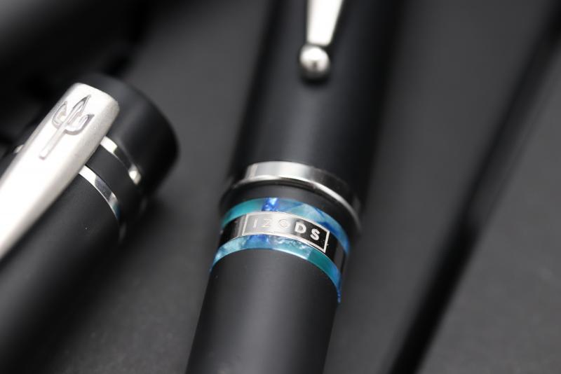
Just Launched - The Third Pen In The Izods X Nettuno Naples Trilogy
Royvdbb posted a topic in The Mall
Hello All, Hope you're all doing well in these strange times! We're delighted to confirm that the third and final pen in our izods x nettuno Naples trilogy is now available. This one is known as the 'Terra di Napoli'... this edition consists of only 20, individually numbered pens. This glorious Terra di Napoli Edition features smooth matte black resin, with vibrant contrasting blue and green coloured bands, reflecting the countryside and famous waters around the city and bay. A subtle engraving of the izods logo can be found on a metal ring between two of the bands. We've included a few images for you and if you'd like to take look at more details, then just click this link https://izods.ink/product/nettunotdn/ Thanks, Roy and the izods team
-
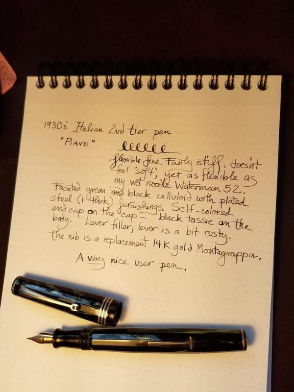
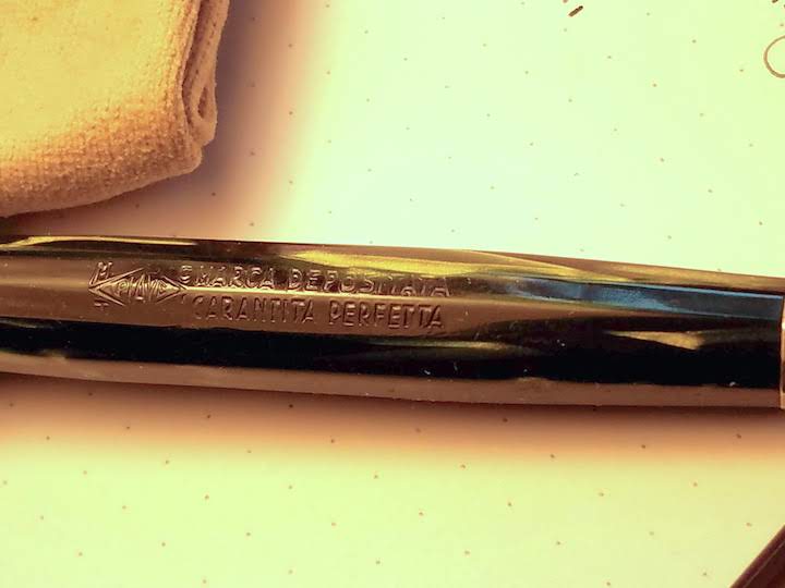
I just got this handsome pleasant Italian celluloid pen from Rick Propas aka The PENguin. He couldn't find any information on it and of course neither could I. But it is an interesting pen. Rick placed it somewhere in the 1930's, a second-tier pen of what appears to be a very obscure make. It's a lever fill, celluloid. The photos don't really capture the color very well. It's green on black, faceted. The nib is a replacement Montegrappa, an example of a very flexible but not particularly soft nib. You need to press to get the flex, but there is a whole lot of it. Without pressure it is a fine. A great user pen! The lever is a bit rusty, and at some point in its career it got a couple tiny what look like burn spots on the cap. Otherwise though it is in excellent shape for a pen in its eighties.
-
Hi all, Here is a quick look at the Leonardo Momento Zero Hawaii. A shout out to Roy from Izod Ink for the quick delivery and beautiful packaging. (The pen came wrapped with a hand written note from Roy. Appreciate the personal touch!) This pen very beautifully captures the feeling of being on a beach, with the resin designed to look like water, sky and sand. I've lived close to a beach for most part of my life, before moving to London a few years back, and using this pen reminds me of all the wonderful years spent there. The Leonardo is also built with good precision and feels like a quality instrument. It is fitted with a M steel nib that is smooth with a hint of feedback. Disclaimer - I did face a few hard starts when using the Sailor Souten ink. But when using various J Herbin inks, the nib seems to flow much better and I haven't faced any hard starts either. Overall, I enjoy it more than many luxury pens that cost many times over. I'm really happy with this purchase and I would highly recommend it whether your budget for a new pen is $100 or $1000.
-

A Cheap Italian Pen From The Late 80's; The Wilson Super Smooth
basterma posted a topic in Italy - Europe
This is a test for posting images from behind the Great Firewall in China. So here is a pen from the bottom of the Italian Barrel. It was purchased in Egypt in 1989, and is one of the smoothest writers in my collection. It has no tipping. The nib is rolled, so the tines are folded over to touch the bottom of the nib, instead of the crimped nibs seen on other cheap pens. http://i64.tinypic.com/2nl74f8.jpg http://i65.tinypic.com/bex5hi.jpg http://i66.tinypic.com/a3zerr.jpg The rolled nib and finish give it the smoothness that is incredible. However, the rolled nature of the nib does not tolerate rotation well, so you have to write carefully to keep the pen in its sweet spot. The plastic finish is textured and prone to cracking. http://i66.tinypic.com/fpa34o.jpg A full view of the pen along with a sample of my poor print. http://i64.tinypic.com/2drfofa.jpg The pen cost about 3 USD and is the first of three Wilson pens I have. The others show a development in the design, with a metal clip, then transparent "demonstrator" cap and section. I have not seen any of their pens in a few years, but one still finds packets of fresh International Cartridges today in Egypt, suggesting that the company still exists. Can anyone in Italy verify this? -

Shot In The Dark Old Lamy Id? (1930S–1940S) - First Post, Sorry If I Dun Goofed
tbuddy posted a topic in Lamy
First time poster. Longish time lurker. Picked up an old Lamy a bit ago and was hoping maybe someone with some vintage Lamy knowledge could lend some insight. Ran into a gentleman by the name of Osman at the Ohio Pen Show who said it was Italian. He fixed the sac for button filling and thought it was quite uncommon and most likely of Italian origins in the early Artus transitional period into Lamy. Sorry in advance for lack of savvy with FPN posting convention. Attached one photo and have a small gallery at the imgur address below. Had some friends take some more pictures for me that are better than iPhone quality, but I don't have them yet to share. https://imgur.com/a/JRB6FMS
-
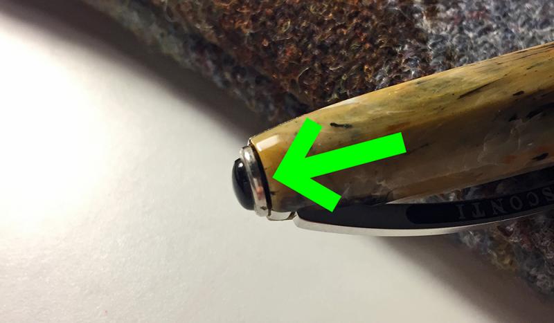
Visconti - My Pen System .... Bumfuzzeled Strangeness!
Stephen Lee Ogden posted a topic in Italy - Europe
I've got the itch to customize my Van Gogh Shoes FP and bought an Onyx jewel. Logo MPS comes right off, no problem. New jewel goes right on ... wait .... problem. In the middle of the magnet is a raised polymer dot that seems to go through the magnet. Since the new onyx magnet is smooth / flat on the bottom (the logo medallion is convex) it will not rest flush with the cap inset and can easily fall off / be removed with my fingers without a magnet tool. Looking for assistance here. Should I drill a small recess to accommodate? Should I razor off the dot? Couldn't find anyone with the same problem. Thanks FPN!
-
Heres an interesting little thing which I snagged on eBay, a Brevetto 599/600, possibly an OMAS pen although I cant be sure. Perhaps it looks familiar? I doubt its a coincidence, whomever designed it seems to have drawn their inspiration from the iconic Parker 51, if it were an OMAS, it wouldnt be the first time theyve looked to a Parker pen for inspiration. There are subtle differences, such as the extent to which the feed protrudes beneath the nib, and less subtle ones, such as the section of transparent bands in the hood. Another notable difference is that the clutch ring has been reduced to As somebody with a preference for hooded and integrated nibs, for both their form and function, this pen caught my eye at first glance. I was convinced that I knew of every pen which I wanted, that there was nothing left for me to see, yet there it was. But it doesnt surprise me that I hadnt heard of the 599/600 before. Ive scoured the internet for any trace of its existence, and found nothing at all, absolutely nothing. Ive established that 599/600 should be a patent number, something which OMAS often engraved onto their pens, whilst brevetto, the Italian word for patent, followed by 599/600, is etched into a gold band around the plunger. The seller believed this to be the manufacturers name, and that the pen was number 599 of 600 produced. Unfortunately, my example is well and truly buggered and may be beyond repair. Im certain that the nib has fractured, whilst I cannot see for the mass of dried ink which has accumulated beneath the hood, one of the tines moves freely and loosely. For a minute or two I was able to keep them together long enough to write with the pen, I found it to be remarkably smooth and a pleasure to write with. The tines have since parted whilst the pen was capped and I havent been able to coax them back together again. Whilst the cap posts smoothly and snugly, it is far to tight on the hood. So much so that it not only scratches, but that I dont feel comfortable forcing it into position. Lastly, the aperture though which the nib and feed protrude is strangely deformed, as though softened at some point. I imagine the 599/600 was produced whilst the Parker 51 was in production, and probably nearer the beginning of this period than its end. I wonder whether the design entered mass production? Seemingly not for very long if it ever did. I was hoping that somebody might know more about it.
-

Delta Colosseum Problems - Pen Won't Write After Couple Minutes
mol_lon posted a topic in Fountain & Dip Pens - First Stop
I recently bought a Delta Colosseum with lever filling system. I had to return the pen because the pen wouldn't write. I cleaned the pen with water. I submerged the pen in ink and pulled out the lever. Kept the pen submerged to allow the pen to fill up. I cleaned the nib and started to write with it. I was able to write for maybe 1 minute. After 1 minute of writing, ink wouldn't come out of the nib. I tested the filling system by emptying the pen using the lever. I used a paper towel to catch all the ink. I filled, wrote, and emptied the pen five times. Each time the pen would fill up and write for 1-2 minutes max. What's the problem with the pen? Unfortunately, I don't have the pen because I returned it. The seller tells me there is nothing wrong with the pen. He tells me that I might be putting too much pressure on the nib. If I am putting too much pressure on the nib then why was I able to write with it for couple minutes. What could have been an issue with the pen? Feed problems? It would be great if someone with a Colosseum could respond. -
Leonardo Officina Italiana Now Exclusively Available In The Uk At Izods
Royvdbb posted a topic in The Mall
Hello All, We're absolutely thrilled to announce that izods are now the exclusive UK retailer (don't worry you can still order if you're further afield!) for the amazing Leonardo Officina Italiana! We've admired their pens for a long time and in agreement with Salvatore and the team we're delighted to be offering both the Momentum Zero Resin and Celluloid offerings. The detailing and quality of these pens has to be seen to be appreciated and they're incredibly keenly priced. For full details please visit http://www.izods.ink/leonardo We're going to have physical stock around the middle of September, so place your pre-orders now and you'll be amongst the first to receive your pen(s) once they've arrived. If you've any questions then please get in touch either via the messaging service or email at roy@izods.ink. If you need a really quick reply then send me a message on WhatsApp to 07464 637772. Thanks, Roy -
Hi Everyone, I stumbled upon this and thought I'd share: The Mosaic Italian Napa 24-pen case retails for $145, but is currently only $59.95. https://www.airlineintl.com/product/mosaic-italian-napa-24-pen-portfolio There is even free name engraving. Downside is it's only available in black.
-
A reputable guy says it's a limited edition Italian pen for the 50th anniversary of movies. His words not mine. I like it but want to know more about it. Any ideas? Thanks in advance!
-
Stipula Pen Company originates from Florentine, Italy and was established in 1973. Stipula is a historic term used by the ancient Romans to indicate faithfulness to an obligation. Stipula’s has accepted the obligation to its customers to produce quality pens utilizing ancient themes, designs, techniques and traditions. It sounds nice but from my limited experience with their pens it seems they doesn't really deliver what they promise. Happily Stipula pens come with a limited lifetime warranty so the buyers are covered in case the pen fails. Additionally there are rumors that Stipula has some problems and may cease operations. I'm not sure if it's the case but it seems their products availablility on the market (especially european) is limited and only few retailers carry their pens and inks. If anyone has some news / insights about Stipula situation I would appreciate the insights so that this review provides sound informations. Stipula offers a line of eight inks sold in nice glass 2.4 oz bottles. Interesting feature of the bottles is the fact they have light polyethylene seal pushed in the neck of the bottle, visible when you unscrew the cap. The seal (is it correcy english term?) is rather hard to remove without splashing some of ink onto desk, wall, closest entourage. The colors are: Blu della Robbia (Blue) Borgogna (Red) Nero (Black) Rosso Fiorentino (Florentine Red) Terra di Siena (Brown) Verde Muschiato (Musk Green) Violet (Violet) Zafferano (Saffron) Terra di Siena is rather pleasant ink. On the other hand it's surprisingly light. I've bought a bottle and comparted to the ink I tired three years ago it's much lighter. I believe guys from Stipula buy some base ink and then mix it so the result is not always consistent. Here however the difference is quite striking. ANyway the ink flows nicely and doens't cause any feathering or bleedthrough. The color is ok but it's niot the kind of brown I'm crazy about. Drops of ink on kitchen towel Software ID Color range Tomoe River, Kaweco Classic Sport, broad nib Leuchtturm 1917, Kaweco Classic Sport, broad nib Clairefontaine Triomphe, Kawecop Skylibe Sport, double broad Rhodia DotPad, TWSBI 580, stub 1.1 Water resistance
-
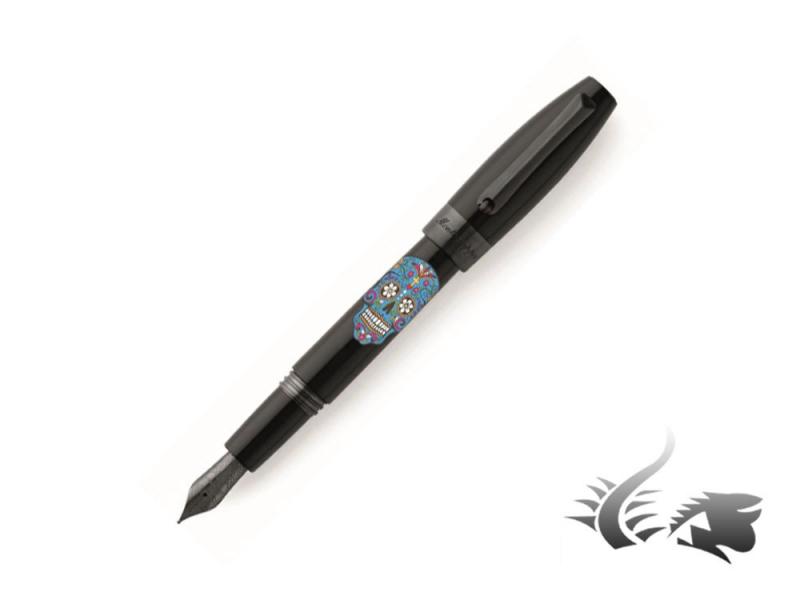
Meet the new Montegrappa Dia de los Muertos writing instruments! Montegrappa launches a new edition full of Mexican heritage. The brand has been inspired by the famous Mexican holiday and tradition: Day of the Dead. The instruments' body is made of black resin with brushed ruthenium trims. All writing instruments feature an enamel hand-made decoration. Fine engravings create the beautiful and iconic Mexican skull drawing. After this, several caps of pearled enamel are applied giving the final touch to this masterpiece. Pearled enamel can be chosen in white, blue or red! Available in fountain pen (EF, F, M, , ballpoint and rollerball the collection is already available at Iguana Sell! Be the first to celebrate the Day of the Dead! Check out the whole collection: https://www.iguanasell.com/search?type=product&q=montegrappa+dia+de+los+muertos
-

Visconti Millionaire L.e. Marble Empire Honey Review
ICantEvenDecideAMajor posted a topic in Fountain Pen Reviews
Hi all! Glad to be here to share with you all my new pen, the Visconti Millionaire Marble Empire in the honey finish. This cool pen from Visconti is by all means a looker with its 2 tone palladium nib, beautiful ivory resin and the stunning marble finish (actual marble). First Impressions: Visconti Millionaire by Kevin Guo, on Flickr The pen comes in the standard higher end Visconti lacquered box (which I heard is wood underneath but not sure at all) that is very heavy and feels nicely made. I use these boxes as display boxes and they work perfectly. Bravo Visconti! Appearance and Design: Visconti Millionaire by Kevin Guo, on Flickr Just look at this beautiful marble. Feels cold and solid yet durable, it's got a greenish-grey background with red, yellow, orange green, blue-ish green and some white streaks going all over the place. And every pen is different! There are four different kinds of finishes; I personally like the black one the most but there's a special reason why I bought the honey finish... (to be unveiled later!). Visconti Millionaire by Kevin Guo, on Flickr The cap has a large gold coloured top which I think is brass. Because this is much larger and wide than the caps compatible with the my pen system, I'm quite sure that it's not removable (nothing you can replace it with even if you remove it). Pretty good nonetheless. The Visconti clip is filled with a off-white enamel of the same colour, a rather thoughtful touch. I was rather upset when the Florentine Hills had only a black enamel. Visconti Millionaire by Kevin Guo, on Flickr The section, cap top and barrel end are made of the best feeling resin I've ever held. White resins are tricky -- they're very likely to feel cheap if not top quality. But this Visconti ivory resin is just glorious: it's a little off-white, the colour feels rich and even the slightest shade of rose colour. Just beautiful. The nib is of course the Visconti 2 tone palladium nib, which in my opinion is only second to the Pelikan two tones when it comes to beauty. Visconti Millionaire by Kevin Guo, on Flickr Now here comes the most amazing part of the pen --- THE WHITE FEED!!! Isn't it just beautiful? I tried it briefly with Lamy turquoise and Waterman green (both very reliable inks famous for NOT staining), and it washes right off. And boy does it look good with ink on it! The versions with black resins have black feed, thus less interesting in my opinion. (side note: my dream pen is the modern Wahl Eversharp Decoband with the gorgeous red feed like Louboutin shoes; you can tell I'm a sucker for coloured feeds). Dimensions and Weight The pen is about as long as a Delta Dolcevita oversize, but the grip is much more usable. I don't have a scale but I'm guessing the pen is around a little over 40g, with probably half the weight in the cap, so the pen body itself is surprisingly light. It is postable but super top heavy and it doesn't seat too deeply. Suitable for hands large and small despite the look of it being magnanimous. It should be around 140mm roughly estimated by me Nib Performance Visconti Millionaire by Kevin Guo, on Flickr Nothing to see here. We all know Visconti palladium nibs. Mine wrote just as expected: smooth, overpolished, skips a lot. I'm going to have mine sent to Dan Smith for a tuning. (Hence why I cleaned it out and couldn't provide a writing sample, sorry). But it was a little skippy on Leuchtturm and skips a LOT on Clairefontaine. But I actually quite like the feel of this medium nib; it's wet, juicy, and very soft velvety feeling without being mushy. I think I'm going to love this pen once it's back from Dan! Filling System Visconti Millionaire by Kevin Guo, on Flickr The filling system is pure genius. And I am NOT be sarcastic. Whoever decided to use this filling system on this pen deserves a Nobel Peace Prize for making my life easy. It's a....... Plunger! To ink, you unscrew the barrel and pull the plunger out; to expel, you push it in. Like a syringe. It's so simple yet effective; acceptable ink capacity (about the same as a C/C), literally no risk of malfunction. My only grudge is that the converter joints don't seem to be the tightest in the world; after inking with Waterman green, you can kind of see a green tint on the joints of the converter; nothing to worry about but definitely less than perfect. Cost: I bought this pen for $550 brand new, without the roller ball convert. To collectors this is probably an issue, but a roller ball section worth at most two dollars to me. I couldn't care less! For five hundred dollars, this is a steal. Pure steal. Buy it in a heart beat. Even with the costs of getting it adjusted by Dan, it's still a steal. But for its most often seen price of $1500 - goodness-knows-what retail.... ugh... I can see how it's worth that, and it is rational to buy one for that. But personally with $1500 I'd probably get myself a Divina AND a Decoband.... (yes it can be done if you shop smartly), All in all, it's a good pen; I'll have a hard time choosing between this and the Divina, but not if a Divina is half the price. And that's it for my review! As always I'm happy to know your feelings reactions feedbacks emotions rants criticisms opinions and whatever you have to say! *Edit Added a section on weight and dimensions -
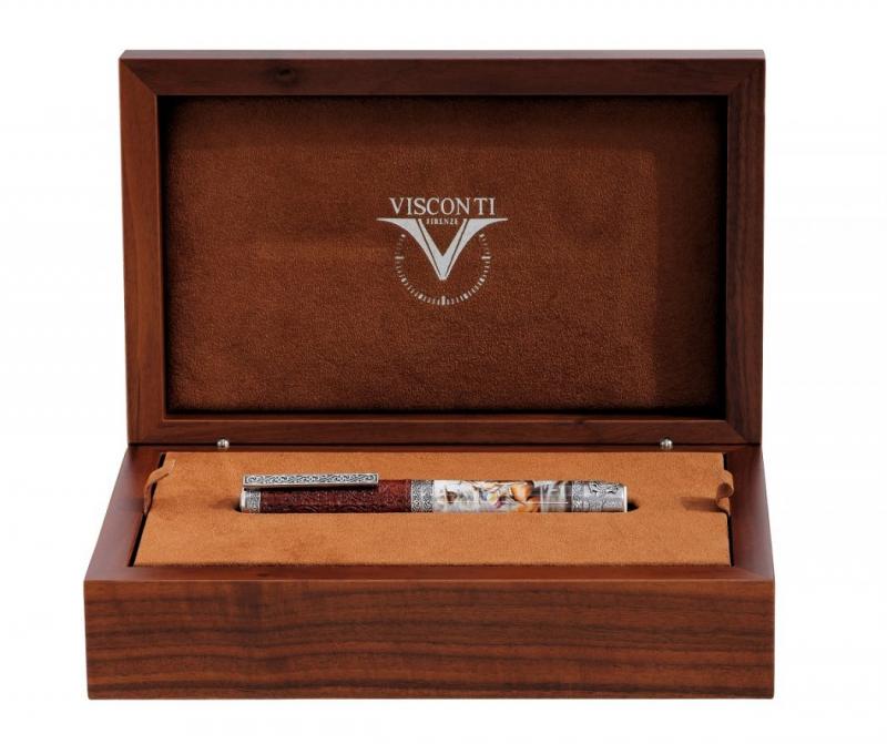
Meet Visconti Charreria, the Limited Edition fountain pen that tributes "El Charro" the iconic Mexican figure. Limited to 149 units, the pieces are based in Emilio Garcia's art work "Charrería". The design and drawings have been created with airbrush fountain pens and rollers by the artist Claudio Mazzi. The body shows a Charro with the typical Mexican Outfit. Trims are created in antique Sterling Silver customised with Charrería motifs. With a 23K Palladium nib, the cap is covered in leather. This Limited Edition comes in a special packaging: a woodern box with floral motifs. Fountain pen: https://www.iguanasell.com/products/visconti-charreria-fountain-pen-leather-silver-925-trims-limited-ed The fountain pen is available in F and M nib, with shipping within 24 hours. Do not wait to check out this amazing piece below!
-
I was planning to write a review of my now 3 week old Signum Nova. However, I loaned it to a friend of mine and he reviewed it on his blog. I certainly could not do a better review, so I'm posting it here. http://www.analogexpressions.com/ What i can do, is tell you that I like the pen so well that i have ordered 2 more Signum pens with 18k nibs. Another Nova with a F nib and a Carene with a M nib.
-
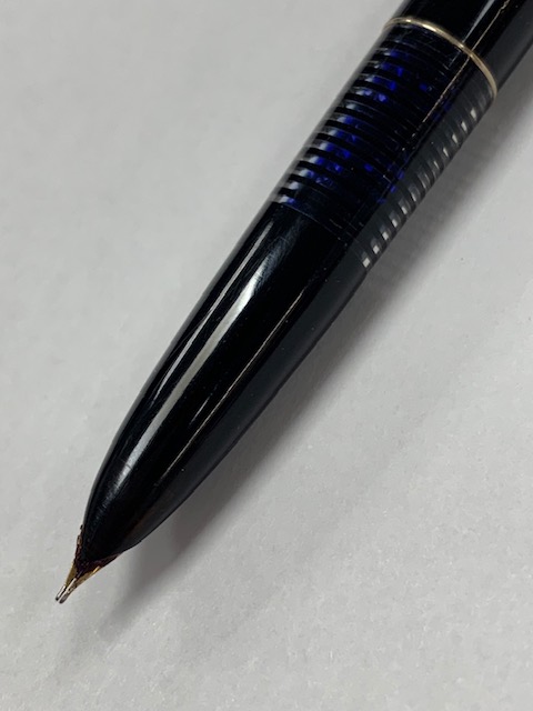
So, I acquired this nice looking pen. To my surprise, I am very satisfied with the way it writes. It is very smooth. The pen is on the heavy side, since it is made of some kind of metal (cant really identify the metal). Anyway, the reason I turned to the help of the fountain pen network is to identify it. At first I thought it was a chinese pen, but then I realized it had "ITALY" engraved on top of the clip. Therefore I hope you can help me to identify it (although I believe it will be some kind of entry level pen, since it has iridium point engraved on the nib). Thank you in advance, and here are few photos. P.S. Since I was forced to compress pictures, I doubt you will be able to see the "ITALY" on top of the clip.
-
The Filcao Roxi: Underdogs, Natalia Ginzburg, And Settimo Torinese
bobje posted a topic in Fountain Pen Reviews
Americans love underdogs. We revel in stories about how the British had their hind-ends handed to them in the American Revolutionary War, 240 years ago, and it was us – poorly clothed mongrels – who did the handing. This idea of underestimated integrity comes to me when I consider two unlikely subjects: the Italian city of Torino, and a fountain pen that originated there, called the FILCAO Roxi. When non-Italians think of Italy, four cities come first: Rome, Venice, Florence, and Milan. For a century or so, Torino came in fifth or sixth, somewhere in a tier with Naples and Bologna. Then, two things happened. First, FIAT turned Torino into the Detroit of Italy. And second, in 2006, Torino hosted the Olympic Winter Games. Suddenly, Torino had name recognition. No longer just an industrial city west of Milan, it was transformed into something much more magnetic than a Detroit. Torino was now the Italian gateway to the Alps -- the Denver, Colorado, of Italy. Naples is the undisputed home of the comic Italian underdog, but Torino is overlooked as well. You probably didn’t realize this, but the Swiss used to visit Torino in the 1700s to learn how to make chocolate and to buy chocolate-making machines. Torino is chocolate paradise, and there is a famous and elegant café called Baratti e Milano, in the center of the city, where people buy bite-sized chocolate ingots called “gianduiotti.” Like Nutella, gianduiotti are a mixture of chocolate and hazelnuts, and they are rich, smooth, and magnificent. But beyond the famous cafes, there are lesser-known, family-run, off-the-beaten-path places to buy chocolate – Peyrano, for example, or Pfatisch. The Aurora company, founded in Torino in 1919, is the oldest of Italy’s many fountain pen companies. Run by the Verona family, Aurora may be the most autonomous and financially healthy of these. But for decades, seven Roman miles east of Torino on the road to Milan, there was a cluster of small, family-run companies making pens, writing instruments, and components. In 1963 a guy named Franco Grisolia founded one of these, FILCAO, in a place called Settimo Torinese. Unfortunately, after five decades in the pen business, Grisolia died early in 2015. His was one of the last remaining pen companies in Settimo. FILCAO, like FIAT, or OMAS of Bologna, is an acronym. It stands for Fabbrica Italiana Lavorazione Cappucci Alluminio Ottone (Italian Factory for Aluminum and Brass Cap Processing). Under Franco Grisolia, FILCAO first made components, and then charted an oblique orbit in the already eccentric solar system of Italian fountain pens. That niche was pens designed for writers, in classic designs from the 1930s and 1940s, at prices that were unusually reasonable by Italian standards. Just looking at FILCAO pens evokes underdog western brands with integrity – they’re more like Esterbrook and Wyvern, than Parker and Onoto. Like Torinesi discussing a favorite ciaccolateria, we live for the chance to argue distinctions among obscure brands. Enough history. This is a review of the FILCAO Roxi, and what I can summarize briefly is that it’s a lightweight but largish resin pen that writes smoothly. The cigar-shaped design is based on the ogiva, or ogee, or pointed arch, found in architecture. When this torpedo shape is applied to pens, the fountain pen universe thinks first of Montblanc or OMAS or Sheaffer. But the designers for these companies all based this shape on something, and that something was the pointed arch. The German pen companies, the Swiss, the French, the Americans, the Japanese, the Chinese – they’re not ripping off each other. They’re ripping off Italian architects of Gothic cathedrals, who ripped off architects from ancient Persia, Greece, and China. My Roxi is the color of whipped honey, and it was also available in a Ferrari-like flame red. This resin comes from an Italian company called Sintetica, which also supplies material for Italian eyeglass companies. The Roxi is a piston filler, with a gold Fine nib marked “Iridium Point 585,” in the European style for 14-karat gold (58.5 percent gold, rather than 14/24 parts gold, 10/24 parts other). The nib is resilient – it couldn’t be called flex -- but it displays more give than the steel nibs I usually write with. In the first few hours I used it, my Roxi skipped infrequently, particularly on strokes that went from left to right. But the skipping has mostly stopped, and may have occurred simply because the feed hadn’t marinated in ink long enough. The Fine nib is one of the juiciest and widest I’ve encountered, and the wet, lubricious Aurora black ink of Torino may have something to do with this. A pen review presents a rare opportunity to use the word “lubricious,” and I’m taking it. I like several things about the Roxi. First, it writes well. Second, the design is simple, classic, and symmetrical. It’s almost modest, an unusual trait for an Italian pen. Black ogee finials and a black section bookend the honey-colored cap and barrel, and a two-toned nib balances rhodium trim. Third, Franco Grisolia named the pen “Roxi” after his son, Rosario. People who write with this pen have a connection not just with a company, but with one of the last pen-making families of Settimo. And last, the Roxi was created and launched in 2007, shortly after the Olympic Winter Games, at a high point for Torino’s visibility and confidence. What do I dislike about the pen? Well, there’s the infrequent skipping issue, but that will be easily sorted. There’s a little bit of play in the black ogee cap that turns the piston filler. But what I really miss is an imprint on the barrel. One of the most celebrated FILCAO pens, an even more understated lapis blue model designed by the American pen expert Richard Binder and named, immodestly, “Columbia, the Gem of the Ocean,” proudly displays “Filcao” in an oval on the barrel. I love that imprint. The Roxi sparks one last story from Torino. There is an Italian author named Natalia Levi Ginzburg who grew up in Torino, and whose father was a professor at the city’s university. She wrote a beautiful book called Lessico Famigliare, or Family Lexicon, which was published in 1963 and is still taught in Italian schools. Foreign students of Italian also read Lessico Famigliare because Natalia Ginzburg’s language is simple, modest, familiar, and understandable. Her family lived on the Piazzetta Donatello, across the street from a municipal bathhouse and the Church of Mary Sacred Heart. In 2006, when I searched for her childhood home, the Italians I encountered on this piazza were amazed to learn that Natalia Ginzburg had once lived there and embarrassed to learn this trivia from an American. Fortunately, in 2011, a tree was planted there in her honor. In this neighborhood I like to think of the schoolgirl Natalia of the 1920s, and of a small shop a few blocks away where her parents might have taken her and her brothers and sister to buy chocolate on special occasions. Like FILCAO and Peyrano and many other family-run Italian companies, the future of that store, Pfatisch, is complicated, just as families are complicated. I don’t know what pens Natalia Ginzburg used to write Lessico Famigliare. But in my imagination she uses modest pens for writers, made by families in Settimo Torinese. It’s possible to acquire a FILCAO Roxi, in New Old Stock, from Giovanni Abrate, an Italian American who acquired remaining inventory and rights to the FILCAO brand from the family of Franco Grisolia. I have no affiliation with Giovanni -- Tryphon on FPN -- other than buying the Roxi and the Columbia, and spending time in Torino in 2005 and 2006. More evidence of Torinese integrity: it’s one of the most ecumenical of Italian cities. The city’s most prominent landmark, the Mole Antonelliana, was originally a Jewish temple, and the Italian Protestant church – the Waldensians – was founded and headquartered in Torre Pellice, west of Torino.