Search the Community
Showing results for tags 'urushi'.
-
This is an old pen from the 1990's that is new to me. Condition is outstanding. The workmanship is really beyond. This is a Sailor Long Profit model, likely from the Koshyu Shitsugei series. It is called the 清照 - "Kiyoteru" or "Seiteru". The totally amazing maki-e work was evidently done by Otomaru Koda, the inventor of the choshitsu engraved lacquer technique used on the pen, and a National Treasure. The urushi is composed of many thick layers that is carved down to reveal concentric multi-colored layers. The carving is deep, it can be seen and felt. It is beautiful to say the least. The pen next to the Sailor is a Wancher Dream Pen in midori urushi. IMG_5022 by Ja Ja, on Flickr IMG_5023 by Ja Ja, on Flickr IMG_5026 by Ja Ja, on Flickr Also pictured is my Danitrio with kamakura-bori carving. Compared to the Sailor the carving on the Danitrio is simple. IMG_5025 by Ja Ja, on Flickr IMG_5024 by Ja Ja, on Flickr The nib was made by Nagahara Sr. It is his invention, the naginata-togi with emperor overfeed. The nib is perfect, sublime. Perfect writing with typical feedback. IMG_5036 by Ja Ja, on Flickr Packaging is a Paulowina wood box typical of Japanese craft items. IMG_5031 by Ja Ja, on Flickr
-
Hello and as usual I am looking for help, in this case to identify the finish on a Parker 88. The pen was made in the UK and has a IIL date code, so second qtr 1993. The pen has a green lacquer finish over a metal barrel and the gold splash is sitting on top of this finish and is not, as has been suggested to me, breaking through from underneath the green. This is not 'brassing' as the gold is three dimensional and under 10X magnification this can clearly be seen. If anyone knows what the finish is called or has seen it it before I would be very pleased to be advised Many thanks in advance for any information you may have.

-
Hi, I've put into one article some information how to start with urushi on fountain pens. - tools you will need (from surface to brushes and abrasives) - materials, types of lacquer - basic practice advice - "recipe" for basic tamenuri https://tamenuri.com/how-to-start-with-urushi/ I hope you will find it useful. Right now due to COVID it may be tricky to order some of these products. In Europe all of them are available at DICTUM. Japanese shops (Watanabe Shoten, Kato Kohei) will not deliver right now to most destinations (Japan Post suspended deliveries).
-

A Review Of Namiki Yukari Royale In Vermillion(Red) Urushi
sannidh posted a topic in Fountain Pen Reviews
A wait longer than words can define, an Emperor in Red singing a glistening rhapsody, and then a Yukari dazzling in Royale Red glory. The pens, an encompassment of elegance of words, combined with precision of maki-e artisans have been unsurpassed. The Yukari did anxiously waited in my hands to have it's first sip of ink and I had same thoughts with what if clauses! Before getting the Yukari, this is a must read-review by FPNer shuuemura, which is a rather poetic series of pictures with practical words, comparing two pilot beauties in black urushi. This pen, one can find ideal for everyday carry to write or to keep admiring the marvel it is! The doubly magnified and magnificent emperor would be more suitable for the latter though. Having said that, when both are together, it’s more fulfilling than a sumptuous meal. PS. Google says Yukari in Japanese means Affinity (上記) and is feminine by gender. In case you are looking for a review of the Yukari Royale or the Emperor (sized pen), the below links redirect to the necessarily ‘unnecessary’ eye-candies on a blogger optimized view The Yukari Royale Review The Namiki Emperor Review A BRIEF HISTORY The Namiki Yukari Royale more or less derives itself from the 80th Anniversary fountain pen (with only 1918 produced) aka the ShiSen, which was launched in 1998. The cap band was then imprinted with four mythical creatures - Dragon, Phoenix, Tiger and XuanWu (Tortoise). The band decorated with the Shijin (four gods) was finished in Togidashi maki-e. The Chinese fable of these creatures goes like this - Each mythical creature is supposed to guard one particular Earth direction and is Harbinger of a particular season. They are respectively, Shujaku - the red phoenix of the South (Summer), Byakko - the white tiger of the West (Autumn), Genbu - the black tortoise of the North (Winter) and Seiryu - the blue dragon of the East (Spring). The latter four are the Buddhist guardians of the four directions who serve Lord Taishakuten (who represents the center), and are associated with China’s Theory of Five Elements. The 80th Anniversary pen is rather excellently reviewed here by RLD. And later, in 2005, another 50 Seki Shun LE pieces (branded as Dunhill Namiki) were made by Pilot/Namiki for the Elephant & Coral Store which are still available. The clip matches the colour of the main finish in the earlier editions, something which may or may not appeal to all of us. URUSHI Urushi as you may know is the otherwise poisonous sap of the urushi or lacquer tree (Toxicodendron Vernicifluum) which grows in Japan, China, and Korea and is primarily brown in colour. The sap of this tree polymerises to form a hard, durable, plastic-like substance, when exposed to moisture/air. Liquid urushi can be applied to multiple materials like wood, metal, cloth, resin, ceramics or ebonite as opposed to the best available synthetic lacquers. When it solidifies, it turns into a very hard coating that is waterproof and protects the coated object from effects of fungus, ambient chemical reactions at surface due to heat or humidity or even from caustic acids. By mixing pigments into cured urushi, colored urushi such as black or shu (red) are made. With natural exposure to air and ultraviolet light (extended UV exposure ends up in discolouration), the urushi layers gradually increase in transparency and the material gradually unveils shades of original bright colours within. Like the Emperor, the Yukari Royale also comes in a spacious wooden box, made of traditional Paulownia wood. The box is protectively packaged inside a cardboard box. I had to let go of the box, while someone hand-delivered the pen, along with the accessories! The model number of the pen, in this case FNK-128S-<R/B>-<F/FM/M/B> contains the launch price, colour and nib width. The 128 refers to the list price of JPY 128,000 whereas the third digit R/B refers to the red/black urushi. THE TORPEDO This Lacquer No.#20 model comes in two standard finishes - Black & Vermillion (Urushi) with gold plated clips. The brass body feels comfortable in hand, from dual perspectives of dimensions and weight. The torpedo shaped pen in Vermillion/Red is adorable in both light and shadow, and when light reflects through layers of urushi, it renders itself an electric red appearance. I believe the brass substrate is partly responsible for its bright hues compared to a relatively darker scarlet hue off the Emperor’s ebonite. The expected fit & finish seem impeccable. The simplistic yet elegant design comes with two golden accents, provided deftly by the traditional triangular shaped tension fit clip with a sphere and a thin gold ring at the cap lip. Again there is a marked absence of any other decoration like a cap band or ring or anything else on the entire pen, extending infinity to modes of artistic convergence. Vermillion is considered as an auspicious colour throughout East Asia, where it’s culturally imbibed. It has four synthetic & natural shades as of today: Red-Orange[sRGB (255, 83, 73)], Orange-Red[sRGB (255, 69, 0)], Plochere[sRGB (217, 96, 59)] and Chinese Red[sRGB (170, 56, 30)]. The shades/hue of the pens in red urushi might vary. The cap finds itself after two turns, revealing a nib with the modern Mt.Fuji inscription. The seamless grip shows a pronounced taper starting from the barrel and ends up with a smoothly carved out bump, rendering continuity. The cap threads on the barrel are carved out with artistic finesse, deftly spaced and carved out of brass. The barrel at the other end leads leisurely to the smoothest tail. The brass cap again displays the most subtle art, sans any discernible extravagance. It carries the same perseverance and focus with a fluid like finish. The finish is impeccable with a parabolic finial and with colours hovering between bright and dark red, with the play of light. The clip is traditional triangular Pilot with a sphere at the end, inscribed with Namiki with the ‘Isosceles Triangle within a Pentagon’ logo. There is a thin gold ring at the cap lip, the only adornment than the golden clip. There is a alphanumeric code inscribed on the upper base of the clip, where it delves into the cap. FILLING SYSTEM - ‘CON-70 ZINDABAD’ The section unscrews from the barrel with three and half turns, with a metallic clink, given the metallic threads on both the section and the barrel. This exposes the golden metallic threads of the section, which would otherwise remain ever hidden! A special CON-70 converter, in black, is pushed inside. The inner barrel carries the opposite metallic threads. With a short black coating near the threads which contacts with the section, the rest of the brass barrel is all exposed metal on the inside. The pen can take all pilot converters CON-20/40/50 (0.4-0.5 mL) & CON-70 (1 mL) along with pilot proprietary cartridges (0.9 mL). I have used the included ‘special black’ CON-70 converter, which has a push button filling mechanism. Mind you, the ink bottle with have some froth during the otherwise fun filling exercise. Although, for Yukari I have always directly filled the converter from an eye dropper! NIB WITH THE ‘OVAL’ BREATHER HOLE The nib with the Yukari Royale is 18k, Size#20 (similar to Pilot#15) and it comes in four stock widths - F, FM, M & B, across Japan and other distribution countries. Inscribed upon it, is the symbol of Mt. Fuji and the upper part does seems symbolic of the snow caps! Comparatively the nib weighs a tad more than a usual pilot#15 nib (0.78g vs 0.70g), but at the same time it is much less wide at the shoulders. The oval breather hole rests within the snow caps. Below the snow, etched are the Namiki Logo (Isosceles triangle inside a Pentagon), Namiki, gold alloy specs (18k-75%) and Nib width <M> On the left the #20 nib carries the Namiki Logo with Ste PP-F hallmark and on the right it carries a simple date stamp. The red plastic feeder does converge with the overall color of the pen, though I would have preferred a similarly urushi coated feeder, which only the Emperor has! May be it’s a feed size limitation, may be Pilot doesn't want to spend more money, I have no idea. The moderately spaced fins ensure levelling ambient air pressure and give you a good buffer, my experience says it’s a tad better than the usual pilot feed. You can see the three different feeds, Size#50 Emperor, Size#20 Yukari Royale & the Size#15 Custom 823, side by side. PHYSICS AS RELATIVELY IT IS The lacquer somewhat helps in keeping the pen warm which is otherwise metallic, and renders it comfortable for writing. The pen is deftly balanced for writing, even for extended use. The grip, smooth & soothing, showcases both utility and elegance at the same time. I do not post the pen as the cap is not as inlaid with as much felt/velvet as the Emperor. Figures for weight and dimensions run below for the technically minded ones. Length closed ~ 14.9 cm Length open ~ 13.4 cm Grip Diameter ~ 1.1 cm Nib Leverage ~ 2.4 cm Weight (without ink) ~ 45 g Weight (without cap) ~ 27.4 g Capped, uncapped pictures with a Pilot Custom 823 run below for your reference. There is an Emperor posing, just to highlight its relative significance The uncapped Emperor without weighs around 31 grams and the Yukari with an unfilled converter weighs around 27 grams. And this is one of the most comfortable pens, I found. ECONOMIC VALUE The Yukari Royale retails at around USD 1200 in the US, and you can find it at similar prices in Japan. I was able to source the pen at a good bargain. Logically the economic value should be equal to salvage value of the pen after a few years of use and I don't think the price will vary by much even after few years of use, given that someone finally decides to sell it off. Having said that, even though the pen is one of its kind, you should give it a serious thought. It will result in a fair amount of money trapped within the urushi layers! FINAL WORDS IN WRITING The medium nib is graced with a super wet flow, which might put a few of my Pelikans to utter shame! The nib is as smooth as I want it to be, with a slight hint of control, evident in all pilot gold nibs, strictly speaking. I feel that there is some characteristic spring and softness because of the size & shape of the nib, and it does open up with a bit of pressure. The verticals grow thicker with pressure, and this nib runs a tad thicker than a usual pilot medium nib. No skips with fast or normal writing. It writes pretty similar at whether held at a high angle or a low angle. A relatively wet Sailor Nioi-Sumire ink takes around 55 seconds to dry completely on Tomoe River paper with the #20 medium nib. Thank you again for going through the review. You can find other pen and paraphernalia reviews here. REFERENCES Urushi FPN Thread on Care for Urushi lacquered pens Pilot Custom 823 Review The Namiki #50 Emperor Review -
This is my first Namiki Nippon Art series pen. I like my Pilot Seirei-nuri pen so much I went for the Namiki branded sibling in the Nippon Art Golden Pheasant. This pen is billed as being hira maki-e and is produced, and is signed by the Pilot/Namiki workshop. For the price somehow I doubt this is 100% hand done, but it does not really matter. It is an urushi craft, I like the big beautiful design, and it writes very nicely indeed. The writing experience is very similar to the preternaturally perfect Seirei-nuri but the Namiki comes with a CON-70 converter and a Namiki branded nib. Otherwise, at heart it is essentially identical to the Pilot. FWIW I purchased the pen from Pilot's Amazon listing for a good price and Prime shipping. IMG_1910 by Ja Ja, on Flickr IMG_1907 by Ja Ja, on Flickr IMG_1911 by Ja Ja, on Flickr IMG_1912 by Ja Ja, on Flickr Medium nib writes and unvarying line the first time every time with just slightly more ink flow than is absolutely necessary. Luxury is about getting more than you need and in this case lux is a pen that just writes a beautiful line. IMG_1909 by Ja Ja, on Flickr Felt in the cap for safe posting (?). I don't post urushi pens. IMG_1913 by Ja Ja, on Flickr IMG_1914 by Ja Ja, on Flickr Will see about getting more pens from the series.
-
Urushi Studio India Goldfish pen impressions and comparisons
jandrese posted a topic in India & Subcontinent (Asia)
I collect urushi and maki-e pens some of which are from India. Here is my Urushi Studio India Goldfish pen impressions and comparisons. First, I show below photos of the pen by itself then photos alongside Japanese pens with the same theme. 398CB59A-8CF7-4757-86E2-23AC7032FC21 by Ja Ja, on Flickr DDD9A3DA-A5A4-482E-87B8-EB2F9251CDF4 by Ja Ja, on Flickr 0AB601B8-1C2D-4B71-8201-AAB972792F21 by Ja Ja, on Flickr 2BE10825-8A09-4EE9-AE61-0F210CF727A9 by Ja Ja, on Flickr D0113742-49BC-4DC8-B125-F1D9C168B868 by Ja Ja, on Flickr Overall, the Urushi Studio India pen is an attractive and unique take on the traditional kingyo (goldfish) theme. The blue base color is remarkable for both the seeming obviousness of using blue when the Japanese use black, and for the difficulty of producing blue urushi. The rocks and goldfish are pleasantly raised urushi especially so the goldfish—the technique is subtle reminding one of the shishiai-togidashi maki-e oft used by Japanese artists when painting kingyo. Comparing the work to three examples of kingyo theme pens from Japanese manufacturers provides some informative contrasts. The three Japanese works are a Danitrio Hyotan by Yusai, a Stylo Art pen featuring Wajima-nuri, and a Namiki Emperor by Seiki. In ascending order of retail price the pens are Urushi Studio India, Stylo Art, Danitrio, and Namiki. The Stylo Art pen is priced only about 15% more than the Urushi Studio India pen whereas the Danitrio is ~2-fold the price and the Namiki tops the scales at nearly 10-fold. 1ED931C6-FA40-4F1A-B873-B8AC7EBE52B5 by Ja Ja, on Flickr The base color of all three Japanese pens is black, that is, polished black oil-free urushi (kuro roiro). The polished black base is highly traditional, glossy, and has a preternatural sense of depth. The Danitrio pen makes this finish a feature, which works well with the curvy shape of the pen, showcasing the perfection of the finish. The other two Japanese pens make use of the black surface more as backdrop for subsequent maki-e work. The black contrasts with the colorful maki-e work but being black does so equally for all colors. Black and gold can also combine to look brown-ish or form a stunningly rich contrast. The polished blue of the Indian pen immediately signals a non-traditional approach while the glossiness of the finish advances its quality. It is said that obtaining consistent blue urushi finishes are difficult so those in the know may appreciate some added difficulty in the preparing the base finish. There are, however, spots of inconsistency in color/gloss speed throughout the blue base coat that are apparent on close inspection. The blue color suggests a realistic depiction of an underwater scene although a more naturalistic color scheme would make use muted earth tones. Being opposite on the color wheel from orange the blue base forms a strong color contrast with the colors used on the goldfish. This is simultaneously attractive and sharply obvious. 21646BA8-3343-4208-9435-A29197FC664D by Ja Ja, on Flickr A bed of rocks are key elements on both the Urushi Studio India pen and the Namiki Emperor. On the Namiki the results are splendid with a multilayered, multicolored believably realistic depiction of a rocky bottom interspersed with foliage. Many maki-e techniques are on display including raised and polished work, multiple metal powder gradients, colored urushi, nashiji, and kirigane (inlaid gold foils). The Urushi Studio India pen also uses multi layered maki-e to depict the rocks yet has a comparative lack of details. The rocks are thickly layered rendered in black with a simple gradient of silver metal particles the texture of which can still be felt. The Namiki better integrates foliage amongst the rock and extends the subsurface to the very end of the pen with nashiji whereas the Urushi Studio India pen leaves a tip of blue at the end of the pen. 2A355D6C-A762-4827-8F2D-92AFAD973A7B by Ja Ja, on Flickr All four pens employ depictions of aquatic plants with the Namiki and Danitrio elevating the work to the highest levels. This is especially so on the Namiki but the clever placement of the plants on the Danitrio along with the the thickness of the lines as well as their subtle color shifts indicate high quality workmanship. The plants are more two dimensional on the Stylo Art pen but the shapes and colors are in keeping with the Namiki and Danitrio pens. The Urushi Studio India pen takes some liberties with its depiction of aquatic plants. The centerpiece looks more like a coral than a freshwater species and the overall color scheme is not as cohesive. The plant colors include silver, red, green, pink, and yellow that lack a sense of being clearly freshwater species that live in the same environment. Two of the pens use bubbles to enhance the underwater scene whereas the other two use gold particles. The bubbles on the Danitrio are rendered with raden, which adds to the visual and textural complexity. On the Urushi Studio India pen the bubbles are silver circles. Rendering the bubbles on the Danitrio is both a higher skill and a more time consuming process. On the Stylo Art and Namiki pens gold particles are used to indicate sand, texture, particles suspended in the water column, and light (the Namiki adds silver particles to enhance the sense of light). The maki-e work on these two pens adds a great deal of dimensionality and dynamism to the scene that is lacking on the less complex pens. 5A787263-2B46-4780-836B-A4F92E5238E5 by Ja Ja, on Flickr Now for the main attraction, the goldfish or kingyo. These pens depict Wakin kingyo, which is the most common kind of Japanese goldfish and the one that forms the basis for all the other types. Kingyo traditionally symbolize wealth, prosperity, and abundance. The red and shimmering gold colors of the goldfish are Summer colors as is green and blue. All four pens offer different depictions of the goldfish. Namiki’s is the most complex visually and artistically. The color scheme of the Danitrio goldfish matches that of the Namiki, and the artwork is similarly delicately raised but the overall approach on the Danitrio is less involved. The fish on the Stylo Art and Urushi Studio India pen are similar to each other although the Stylo Art proves the richer and more complex execution. FF8D6A9A-7FBF-4C15-8031-14E482642850 by Ja Ja, on Flickr Focusing just on the Urushi Studio India pen the goldfish are not shiny as they are on the other three pens. At the risk of anthropomorphizing the goldfish the expression is a frown on the Urushi Studio India pen whereas the others have a neutral expression. The scale lines and the lines on the fins are not regular, which affects the flow of the design causing the eye to wander. The Japanese work is typified by precise, regular, and delicate line work. The micro surface of the Urushi Studio India fish is uneven, which contrasts with the smoothly polished surface of the fish on the other pens. Diffuse and gradient gold particles are used on the Japanese pens to give texture and increase the color depth of the fish. The Urushi Studio India pen does not make use of gold particles except on the lines. The delicate flow of the goldfishes fins are rendered splendidly on the Namiki pen followed closely in effect by the Danitrio then the Stylo Art. The Urushi Studio India pen gives a large surface area to the fins, which is in keeping with the Namiki design but lacks the textural complexity and wispy sense of motion imparted by the Namiki and Danitrio depictions. Uniquely, the Stylo Art pen uses raden for the goldfish eyes, which is an inspired choice that elevates the artwork that otherwise lacks some of the complexity shown by the Danitrio and Namiki fish. In summary, Danitrio goes for simplicity and executes to perfection. Namiki uses complexity and executes to perfection. Neither are easy to accomplish. The Stylo Art and Urushi Studio India pens are in between those extremes although in design terms the Stylo Art is most akin to the Namiki whereas the Dantirio and the Urushi Studio India take a similar similar approach. That the Urushi Studio India pen can comfortably sit beside the Japanese works is impressive. Taken on its own, and seen with the eye not an unrelenting macro lens, the Urushi Studio India pen is a vibrant joy to behold. It has all the visual and textural appeal of good raised maki-e. Given time and increased experience no doubt the relative unevenness in design and execution will improve. It is exciting to see the development of new urushi and maki-e artists outside Japan that are creating new works in their own styles using these traditional techniques. -
-

3D Printed Pen And Urushi? New Colab With William Shakour
MichalK posted a topic in Fountain & Dip Pens - First Stop
Several thousands yoers separated these two "technologies". Urushi and 3D printing. We are merging them in one project - William Shakour x Tamenuri Studio Willianm printed for me two Faceted Titans with 38 nibs, and now I am lacquering them with urushi. I am going to document this project on Youtube and Instagram, and invite you to join -
Hello everyone, I've been back on FPN for one or two weeks now, and am really loving the knowledge that's still being shared here. I'm currently learning more about urushi pens, and surprisingly, there is one topic I haven't seen explicitly discussed on this forum (or elsewhere). What inks are more "safe" for urushi on temporary contact? I understand that leaving ink (or any liquid) on urushi for a prolonged period of time will likely damage it, regardless of its composition. However, I suspect there certainly are inks that will create staining and other issues more quickly than others. I'm therefore trying to find out which inks are the least dangerous for urushi. My initial guesses on unsafe inks are pigment (as opposed to dye) based inks, Noodler's lubricated inks, and "permanent" inks of any kind. My initial guesses for safe inks are the standard fare: Pilot/Namiki, Waterman's, Pelikan, etc. (However, I have heard iroshizuku can cause problems -- is this true?) I'm looking forward to what people with experience in the matter have to say. Thanks in advance!
-
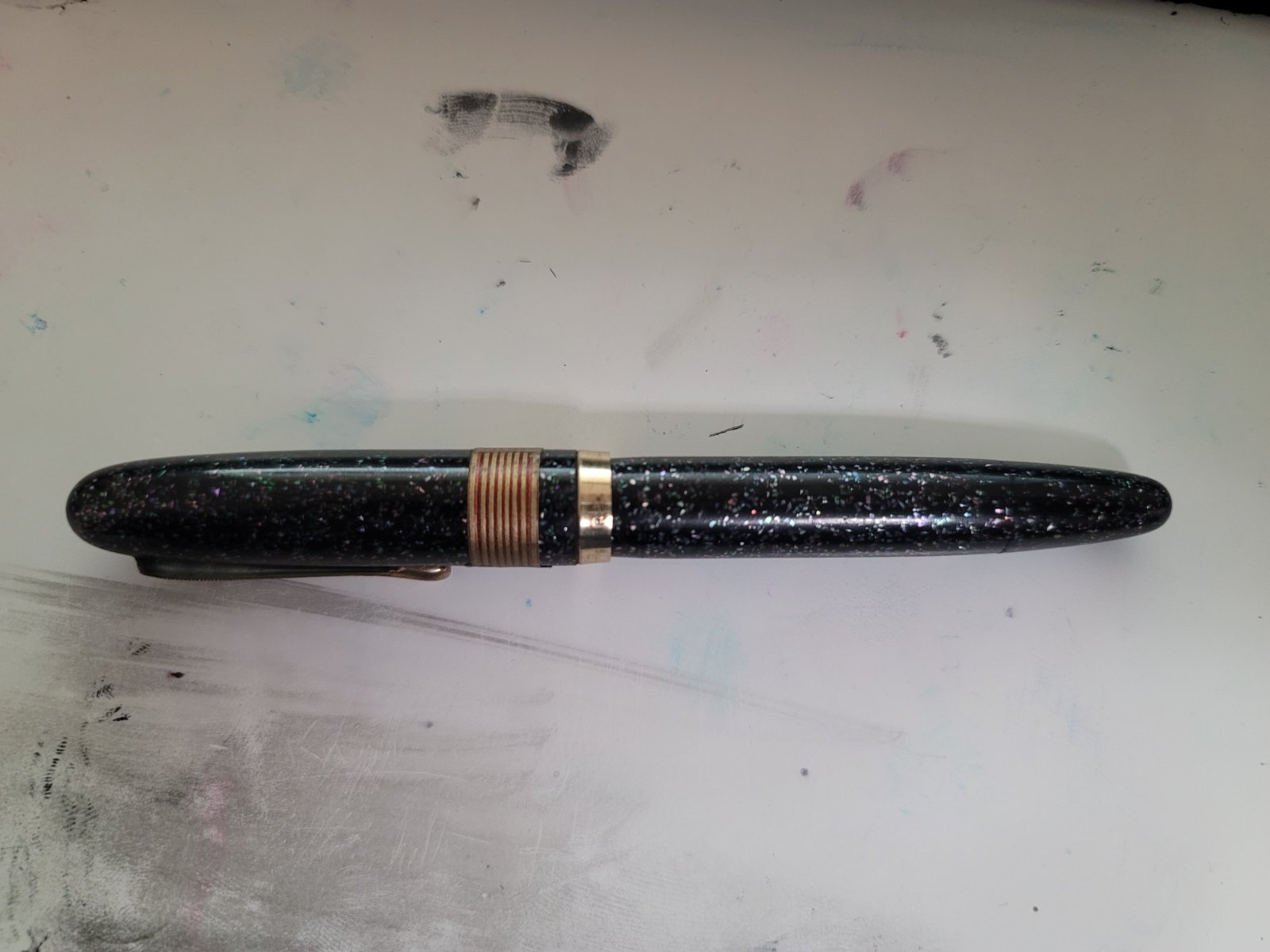
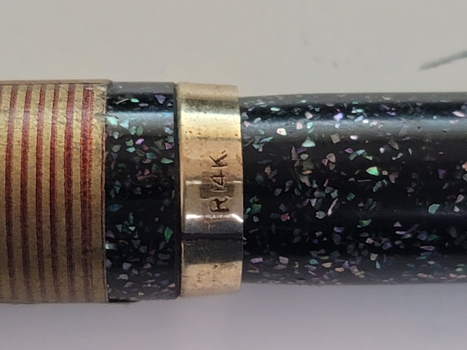
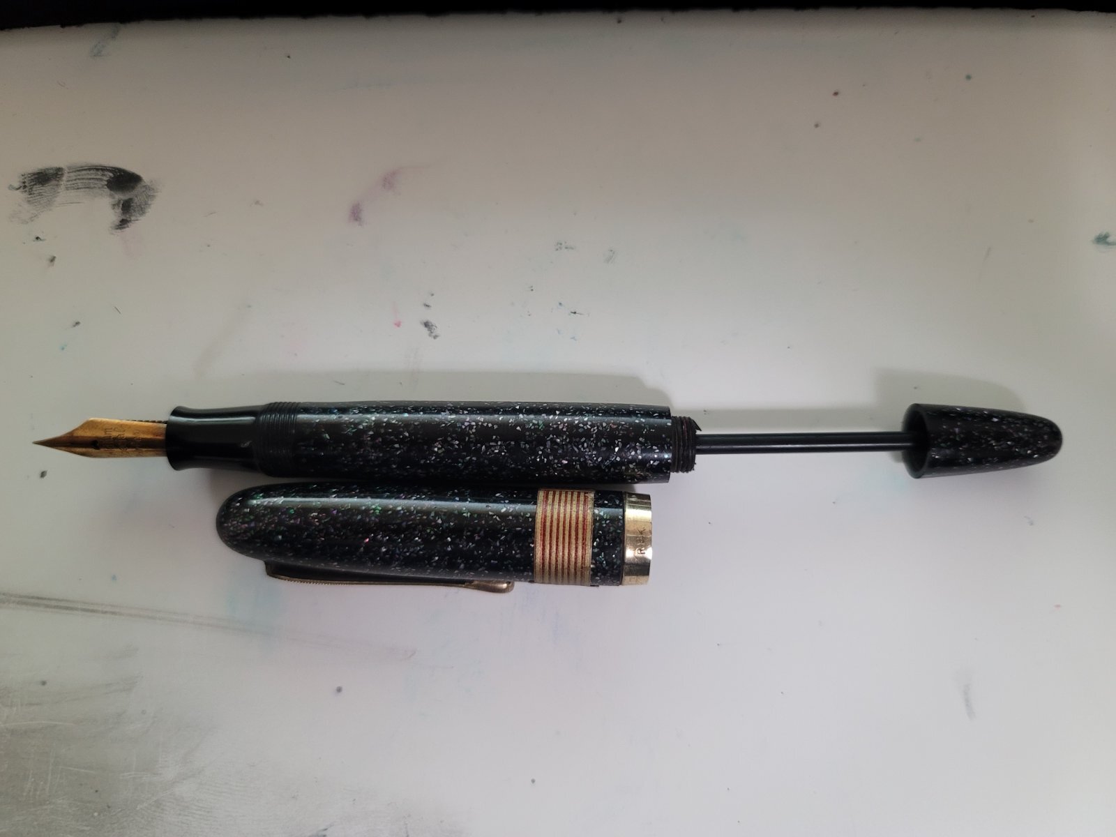
Hi everyone! I received a lot of old Japanese fountain pens that appear to be old plunger fillers, all of which appear to need new seals as they do not vacuum in any ink (the pen pictured leaked from the blind cap end when I syringed some water into the body). The blind cap unscrews, but the plunger has no resistance when pulled up and can be shifted around to various angles. I can see inside the pen with the section removed that there is a small bulb attached to the end of the rod with a small rubber washer not too far behind it. I did some looking around but had trouble finding a lot of information regarding how to fix these types of pens. Any help would be greatly appreciated! P.S. If anyone knows anything about what this pen is, I'd appreciate any help identifying it. The label reads "shiruba" or Silver
-
Here is the Pelikan M1000 Raden Sunrise LE from 2016. Difficult pen to photograph but a beauty to behold. Untitled-1-stacked-working-file-brightness-bosted by Ja Ja, on Flickr
-
Here is a focus stacked macro of the Platinum Izumo Kurikara-Ken in sumiko taka maki-e. This pen is subtly amazing. The mix of texture and contrasting finishes all in black is super cool. Best seen and felt to understand its intricacies. f2point8 stacked logo by Ja Ja, on Flickr
-
Here in full focus stacked macro glory is the limited edition Taccia Miyabi Imperial Koi. The background is, I think, byakudan-nuri whereas the fish are in rankaku with mother of pearl raden eyes. Usually, koi are not usually represented this large but Taccia made the specific choice to render them this way to good effect. Sailor nib so it writes well. focus stacked logo by Ja Ja, on Flickr focus stacked koi closeup logo by Ja Ja, on Flickr cap logo by Ja Ja, on Flickr
-
Sailor King of Pen Battle of Itsukushima LE pen and box details
jandrese posted a topic in Japan - Asia
This is the incredible Sailor King of Pen Battle of Itsukushima LE in full focus stacked macro glory. The artist is Ikki Moroiki and the total number of pens is 33. The presentation box is also incredible in black lacquer and maki-e. Details of the maki-e on the box are shown below. 8E7EBA7F-D2BE-4748-B5AF-EFB645A9EBC9 by Ja Ja, on Flickr 4FDBB95A-F8C8-4497-8026-D63CF7B90898 by Ja Ja, on Flickr 358CEAD5-FDD5-4C92-9B49-AE9CCEC83717 by Ja Ja, on Flickr -
Some Japanese pens (and a Montegrappa) with custom maki-e by Morgan Wisser
jandrese posted a topic in Japan - Asia
I shot focus stacked macros of all these pens for Dromgooles. As far as I know they are all still currently available. Good, high relief maki-e by the French craftsman, Morgan Wisser. I have several pens customized by him and have been happy with the work. Let me know what you think or if you have any questions. focus stacked yes logo by Ja Ja, on Flickr focus stacked yes logo by Ja Ja, on Flickr focus stacked yes logo by Ja Ja, on Flickr focus stacked yes logo by Ja Ja, on Flickr turtle side focus stack yes logo by Ja Ja, on Flickr shark side focus stack yes logo by Ja Ja, on Flickr -
Yesterday, I stopped at my local Danitrio fountain pen dealer and stumbled upon a parade of stratospheric pens. I just had to snap some pictures. Unbelievably, these pens represent but a fraction of the hyper pens available in the same trays. First up is the Genkai style 100 Kids design--it is truly extraordinary. I have several from the same artist but none like this! Next a Kaijin style Ebisu (A god of seven) design by Kogaku Then a Yokuzuna aka kyokuchi style emperor dragon design--indescribable beauty and technical prowess The self described #50 gigantic nib, which looks like custom work.
-
This is the Namiki Yukari Royale Frog in full focus stacked macro glory. Namiki calls this motif Frog. There is more than one frog but more importantly the dynamism and joy of the piece jumps off the pen. Note the different colors of urushi and raden to depict the water. I'd call this pen Happy Frogs. Focus stacked curves up color shift yes logo by Ja Ja, on Flickr frogs focus stacked with logo by Ja Ja, on Flickr
-
Danitrio Mikado eyedropper pen leaked-a comparison with a Namiki Emperor
jandrese posted a topic in Japan - Asia
One of my Danitrio Mikado (eyedropper filling model) pens leaked on me at work. That is Noodler’s Navy you see on the section in the first image. I collect Danitrio and this sort of thing happens more often than I care to admit on their eyedropper filling pens. I still collect Danitrio but stopped buying eyedropper models a couple of years ago. At this point I know all the potential ways in which a Danitrio can leak. This one leaked at the junction between the section and the barrel. Naturally, with a leak like this you don’t know it’s happening until you look at your inky hand so that’s nice. There is no obvious reason for the leak, which led me to investigate further. To do so I thought a comparison to a Japanese eyedropping pen that has never leaked on me was in order. Thus, I cleaned out the Namiki Emperor I had with me at work and set about comparing the two pens. What have I learned? 1) That even compared to a Namiki Emperor the Danitrio Mikado is a big pen and looks great. Feels good to hold and to write with and that stub nib is extra nice. Seems to be on par with the Namiki on looks and feel but… 2) The section engineering and machining execution is different between the two pens. The concept is the same—eyedropper with shutoff valve—but the Namiki has some advantages. a. The Namiki threads are finer pitched and better machined inside the barrel and on the section. This can be felt when screwing in the section; there is a smoother feel and less play. b. The threaded portion of the section has a bigger diameter on the Namiki. The overall diameter is 10% greater and but the ratio between the diameter of the grip portion and the threading is also 10% greater on the Namiki. c. The o-ring on the Namiki is more precisely seated, that is, it has no room to move about. d. Both o-rings fit into a slot in the barrel that is flat and smooth before the threads start up. The slot on the Namiki is not as deep. I have a gang of Danitrio pens that fill by eyedropper. One or two have never leaked on me at the section. This pen used to be one of them. The problem is at the level of the o-ring. There is too much potential for the o-ring to move about, get twisted, or otherwise compressed in an uneven fashion. It only takes an infinitesimal gap for ink to leak. Water always finds the path of least resistance. A little side pressure from your grip and the heat from your hand is all it takes to set the leak in action. Part of loving Danitrio seems to be leak mitigation. Changing o-rings has helped in the past on other pens but o-rings that fit are not easy to come by. Danitrio themselves does not seem to have consistently sized, readily available replacement o-rings. That bit about consistently sized o-rings may make more sense knowing that there is more variability between Danitrio pens of the same model than Namiki pens of the same model. I reckon Namiki buys only one size of o-ring that always fits like it is supposed to. I admit that it all is a bit frustrating, but I press on. IMG_8517 by Ja Ja, on Flickr IMG_8529 by Ja Ja, on Flickr IMG_8535 by Ja Ja, on Flickr IMG_8539 by Ja Ja, on Flickr IMG_8541 by Ja Ja, on Flickr IMG_8543 by Ja Ja, on Flickr -
This is the new LE from Sailor, the Bespoke Maki-e King of of Pen Shika to Gekkou or Deer in Moonlight. The artwork is amazing and emotive. Feast your eyes on this focus stacked macro capture of a wonder. Untitled-1 watermarked by Ja Ja, on Flickr
-
This is my Danitrio Hyotan Special edition Maki-e F-49 Blue Dragon LE. There are only 30 of these pens produced by the artist Yuji. This dragon does, however, appear on another pen, a Mikado model with more involved maki-e that retailed for far more than this pen. Untitled-1 yes logo by Ja Ja, on Flickr closeup yes logo by Ja Ja, on Flickr
-
Danitrio Maki-e Ancient Dragon with Flowers by Kogaku on Hyotan
jandrese posted a topic in Japan - Asia
I've had this pen for awhile. Since it's attractive I thought I'd capture a good picture of it. Danitrio really does tamenuri well and the curvy shape of this pen lets the light play off of the tamenuri. working image full yes logo by Ja Ja, on Flickr -
Here are two limited edition Taccia pens from the Hyakko-Hisho lineup. The Hyakko-Hisho is a compendium of craft techniques from the Edo period including lacquer styles. Taccia has been pulling from that for the past two or three years. Pictured first is the Hakumei or twilight from last year, which is primarily green. Second, is this year's Hakumei or starlight/star shine, which is primarily blue. Both make nice use of blended urushi colors and raden. I thought they made a nice pair. Untitled-1 with logo by Ja Ja, on Flickr Untitled-1 yes logo by Ja Ja, on Flickr together with logo by Ja Ja, on Flickr caps together with logo by Ja Ja, on Flickr tails together with logo by Ja Ja, on Flickr
-
I photographed these Sailor King of Pen pens for Dromgooles. Very interesting and unique urushi technique that I did not appreciate until I was able to study them. I especially like the color range in the green version. together yes logo by Ja Ja, on Flickr texture zoom crop yes logo by Ja Ja, on Flickr
-
The Taccia Hyakko-Hisho II collection Sango. The Hyakko-Hisho is a collection of 100 urushi styles, a type of reference work that artists have drawn on since the Edo period. Sango means coral and this pen in kawari-nuri captures the essence of coral. A unique addition to the collection. Fitted with a Sailor Zoom nib. AC7FC6BB-687B-4FAA-A81B-A3EAC71B0CB4 by Ja Ja, on Flickr 233884EA-F18B-4476-B23D-236FA60821C8 by Ja Ja, on Flickr
-
Shooting the Sailor Bespoke KOP Chinkin Owl for Dromgoole’s inspired me to pull out my Namiki Emperor Chinkin Dragon and run it through the focus stacked macro ringer. I’d say it availed itself. F8B88398-F81A-4B6A-A5F5-C981F315526F by Ja Ja, on Flickr EE178EB1-23E4-4056-B7BB-80B3EDD2E062 by Ja Ja, on Flickr


desaturated.thumb.gif.5cb70ef1e977aa313d11eea3616aba7d.gif)