Search the Community
Showing results for tags 'montegrappa'.
-
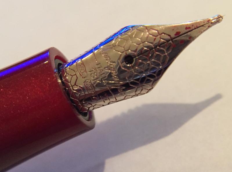
Shortly after I read a review of the Montegrappa Desiderio here: https://www.fountainpennetwork.com/forum/topic/327241-montegrappa-desiderio-review/?p=3916037 I acquired one myself, in the brown/red color: I thought it would be interesting to compare it to an original-generation Montegrappa Espressione, to which I feel it bears some resemblance. Note that there was a later edition of the Espressione that looks somewhat different from the original, and substitutes the 18kt gold nib of the original for a steel nib (at a reduced price), but here I'm only comparing the Desiderio to the original Espressione. Montegrappa has always had pens with resin and celluloid barrels, and for each material, pens with faceted versus circular cross-sections. To me, the (original) Espressione was meant to be the resin-bodied counterpart of the celluloid-bodied Miya. Both pens have cylindrical non-faceted caps and barrels, but otherwise both have 18kt nibs (though the Miya's is two-tone) with ebonite feeds and sterling-silver sections and trims. The Espressione's section bears the sterling silver hallmark but appears to have been further plated with rhodium in order to keep it from tarnishing, whereas the Miya's section has the characteristic matte sterling silver appearance and requires regular use of the polishing cloth that Montegrappa helpfully included in the box. But enough about the Miya. Let's get back to the Espressione (and the Desiderio, of course). With the Espressione no longer made, I guess Montegrappa figured on filling the present opening for a resin-barreled, circular cross-section pen with 18kt nib with the new Desiderio, but built it to a price point (not the original absurd list price but the later much more reasonable one). This entailed the following compromises: 18kt nib on the Desiderio all right, but the tiny #4 size (top) instead of the #6 size 18kt nib on the Espressione (bottom) Plastic feed on the Desiderio, ebonite feed on the EspressioneResin section on the Desiderio, sterling silver section on the EspressioneLittle rolling ball on the sterling silver Desiderio clip is made of the resin barrel material (looks cute, though), whereas it is also sterling silver (like the rest of the clip) on the EspressioneEspressione barrel has sterling-silver threads on bottom to post cap securely, Desiderio barrel has no threads at all. This makes the Desiderio shorter than the Espressione when posted (top), though when capped both are almost exactly the same length (bottom) Unkindest cut of all, in my opinion: the lovely raised "1912" (the year the company was founded) on the top of the Espressione cap (bottom), and a feature on lots of Montegrappa pens including steel-nibbed ones like the Parola, has been dropped in favor of a new abstract design on the top of the Desiderio cap (top) that means nothing and looks cheap. On the other hand, the Desiderio nib, incongruously small though it is compared to the general dimensions of the pen, wrote smoothly and wet right out of the box. This is (unfortunately) a big deal, because both my Espressione and Miya nibs refused to write when they first came to me, and they both needed work by a nibmeister before they would write (they both write splendidly now). If you can find an original Espressione in good condition today, you should expect to pay no more for it than for the Desiderio on clearance, but the Espressione is definitely the better-made pen. On the other hand, the Miya (which is the celluloid-bodied counterpart to the original Espressione) seems to have a true heir: the celluloid-bodied Passione, which was also initially priced just as absurdly as the Desiderio (but even more expensive), then re-priced at a slightly less ludicrous level.
-
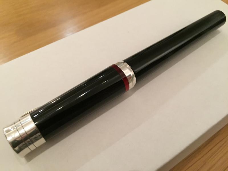
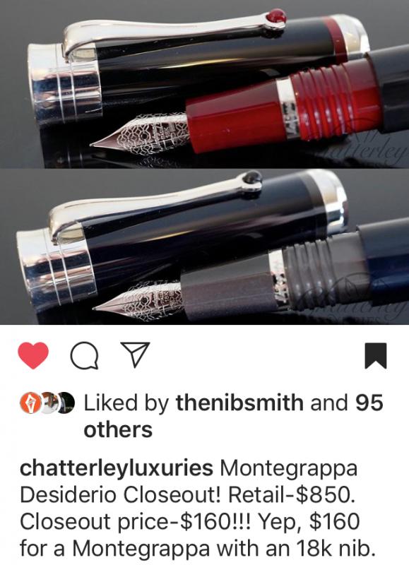
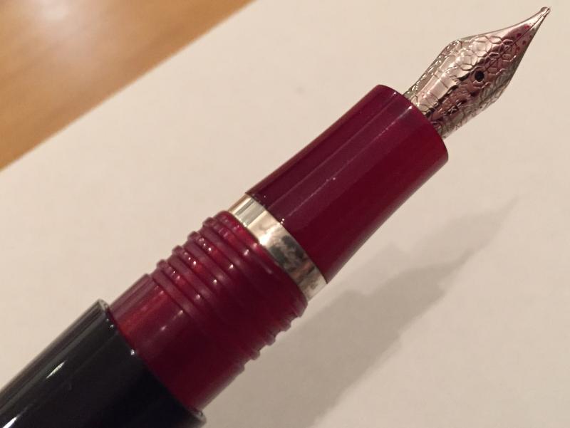
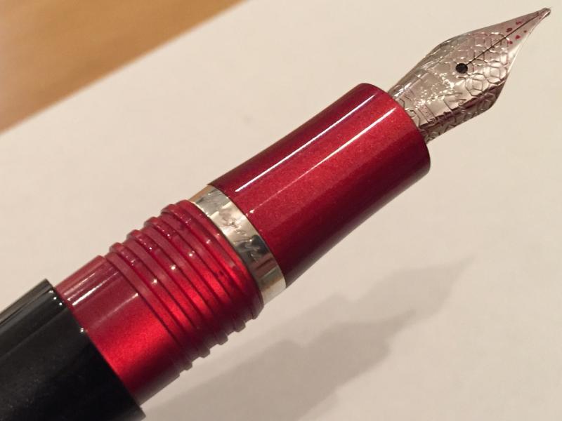
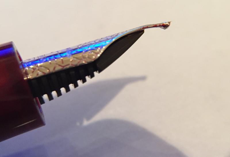
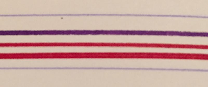
This is my own pen. I did not receive any compensation for this review. This pen is available for hire from me through pensharing.com. Looks, description, build quality, dimensions The Montegrappa Desiderio has a resin body, cap and section. Clip and finial are sterling silver (with another small sterling silver band within the section). The number 4 nib is 18k and features the octagonal Montegrappa motif and name. Yes, you read that right – a number 4 nib. More of that later. The feed is ebonite. The Desiderio comes in a choice of finishes: Black body & cap; red section, cap band and clip roller ballNavy blue body & cap; grey section, cap band and clip roller ballChocolate body & cap; dark orange-ish section, cap band and clip roller ball The cap takes about one-and-a-half turns to unscrew and the finial has the octagonal Montegrappa motif. The black resin has four distinct “sections” as you rotate the pen in your hand: on two of those, the black is solid; on the other two, a delightful sparkly pearlescence appears. Before you open the cap it appears to be quite a classic, understated pen: predominantly black with sterling silver trim, with only the red sliver on the cap and the red roller on the clip giving you any clue that there might be something more to this pen… Then when you unscrew the cap – POW! The red section hits you right between the eyes. It’s gorgeous and mirrors the effect on the barrel: in a couple of places it’s solid red, then in others it appears to catch fire…. Build quality is generally excellent and the materials are lovely. However – the red sliver above the cap band is not quite flush with the cap; when you run your finger across it you can feel (and see) a slight misalignment. Which is disappointing. Dimensions are: Capped 135mm, 32g (Lamy Safari 139mm, 18g)Uncappped 124mm, 17g (Lamy Safari 128mm, 10g)Posted 154mm (Lamy Safari 164mm)Other: barrel width 13mm (at its widest point just behind the threads), section width 9mm (at its narrowest point just above the nib), section length 31mm (including threads), nib length 17mmStory behind the pen By the time I purchased the Desiderio, I had the midnight blue celluloid Miya, red resin Harmony and Copper Mule in my collection so was already well invested in the Montegrappa brand and constantly on the lookout for the next purchase. I follow lots of retailers on Instagram and one day the following post from Chatterley Luxuries in the US popped up: Photo courtesy of Chatterley Luxuries Instagram feed @chatterleyluxuries At that price I had to have it and also put the word out to a few buddies in the community. It was a tough choice between the black and the blue. Blue is my favourite colour and I figured I could easily end up with an entire collection of blue pens so opted for the black. The fiery contrast of the red section also attracted me more than the grey. I agonised between M and F nibs and eventually played it safe with M. Bryant answered a stream of questions both speedily and kindly – his customer service was first class, and the pen arrived with a nice handwritten note from Tiffany. Feel in the hand The resin feels lovely to the touch, wonderfully smooth. The section tapers towards the nib and is a nice comfortable size to hold (I generally feel comfortable when my thumb and three fingers which hold the pen are almost touching all the way round) The threads are well back near the barrel and are “square” threads meaning no sharp edges, if you do happen to hold your pen that far back (I don’t – I like to hold the pen as close to the paper as possible). Filling / refilling It’s a cartridge converter. But it’s a screw-in converter which gives some extra peace of mind against leakage. Nib feel on the paper / ink flow OK I can’t avoid the issue any more – the number 4 nib is teeny. Those who love number 8 nibs need not apply! I didn’t think you could even get a nib this small! And when you look at it in profile, it is slightly curved, dare I say droopy and a bit sad looking? So first impressions aren’t great but thankfully the “size isn’t everything” cliche comes to the rescue because it’s actually a really interesting nib. Ink flow is generous. I keep it paired with Diamine Red Dragon, to match the section. (I initially paired it with Diamine Matador but the ink flow was shockingly bad) Is it smooth? There is certainly quite a lot of feedback and the sound is completely unique amongst my pens, a bit squeaky actually, but it’s certainly not scratchy. Line width / variation In normal writing the line is probably slightly finer than a Lamy Safari M. But here’s the ace up the sleeve: the nib actually has some flex. Not a lot. But when you apply some pressure, the tines do move apart and you do get a wider line. It’s lovely. I’ve taken care not to apply too much pressure – I don’t want to overdo it in case I damage the nib. Top – Lamy Safari M; Middle – Desiderio unflexed; bottom – Desiderio flexed A bit flexy.. How does it make your handwriting look I’ll start by saying I’m no flexpert so I don’t usually use the Desiderio that way. In hindsight I wish I had chosen the F nib, possibly in the belief that you would get even more line variation. (It’s only relatively recently I’ve come to prefer F nibs. Kinda wish I knew that at the start of my fountain pen journey…) Because of the smaller nib, I can hold the pen close to the paper which gives me the feeling of greater control. Unposted, (and I usually use my pens unposted) possibly because of the element of flex I feel there’s a bit more wildness when I write. I’ve only recently tried the pen posted, despite having it for over a year. The cap is quite heavy but it posts about 30mm down the barrel so it’s really nicely balanced. That bit of extra weight higher up helps to calm the wildness I referred to above and it becomes a genuine delight to write with. Value for money At USD 850 there is absolutely no way I would have considered this pen. Sure it’s got an 18k nib and sterling silver trim but there’s no celluloid and there’s the flaw on the cap (maybe it’s just mine). But at USD 160 it is a complete steal! I genuinely can’t imagine what made Bryant virtually give his last ones away (he did have all three colours still in stock), but I’m glad he did.. Conclusion / recommendation The Desiderio has a lot going for it – the “surprise” section (rather like the Louboutin red sole I suppose), the 18k flexy nib, the nice pearlescent effect as you revolve the pen, the sterling silver trim. I still do find the nib too small aesthetically – I wish they had used a number 5. However in use the size doesn’t matter, and when posted, it becomes a really lovely writer. Price wise I got a genuine absolute bargain. If you could find yourself one at the same price, I wouldn’t hesitate to recommend it.

-
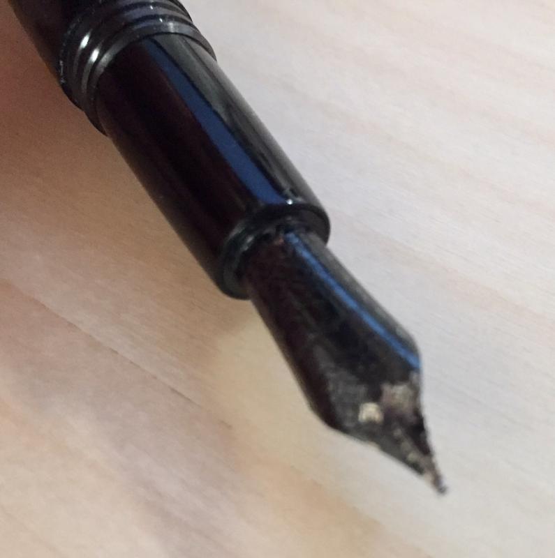
I have a Montegrappa Fortuna Skull that I purchased in 2013. It has been a reasonably good pen, performance-wise. Not the greatest. Not the worst. The important note is that I have not used it much (since it is not the greatest performer) and it has remained happily capped and in a secure box most of its life. In fact, I only remember inking it two times (with normal standard inks that everyone uses, nothing weird, alien or BSB) and have only written with it probably a total of two-hours during its cushy little life. And I have cleaned it carefully and properly, as I clean all of my pens after some period of use. It has never been dropped. I have never lent it to someone else. I haven't stirred my coffee with it. Bottom-line, this pen has been treated like a princess (pencess?). So I went to visit this Fortuna this morning since I haven't caressed it for awhile. And upon removal of the cap, I see that the black finish on the nib has somewhat deteriorated - bits of silver shining through the black here and there. I rub the nib and no more comes off -- so it doesn't seem to be just flaking away. It just seems to have dissolved away into space. And it is now an ugly nib. I have a note into the store that I bought it from -- haven't heard back, yet. But has anyone else had this issue with Montegrappa Fortuna Skulls? Is this a known issue that in someone's similar experience the manufacturer or place of purchase might be willing to rectify? I did a search on the forums here, but did not uncover anything. I attached a photo. Cheers! Joe
-
Montegrappa advertises that it was founded in 1912 and is the oldest Italian pen manufacturer. Aurora advertises that it was founded in 1919 and is the oldest Italian pen manufacturer. To the subtle Italian mind there may be no contradiction here. But to me, an American, having a simple, childlike mind, there does seem to be a contradiction. Can anyone help me resolve my confusion about this?
-
Hi, everyone! I wanted to introduce myself to this network. I have been a long-time pen enthusiast, and am the owner of luxury pen retailer Truphae, Inc. We specialize in high-end luxury pens from companies like Aurora, Montegrappa, ST Dupont, Visconti, etc...and have great relationships with them as well. We also carry brands such as Pelikan, Cartier, and many others. Our goal is to find the coolest pens around, particularly rare ones that many other people would have a hard time sourcing. We not only sell, but buy and consign as well. Looking forward to getting to know you all better! ~Chris
-
With the recent Stipula Etruria thread that was posted in this sub, I thought it was high time we had a dedicated photo thread for the Montegrappa Extra. This can include the earlier Classica and Historia models, along with the more modern variants including the Extra, Extra 1930 and Extra Otto. The key here is to share what you have no matter the size of your collections or your photography skills, so that we may appreciate, discuss and enjoy the variety of trims, nibs and colours these exquisite pens are available in. My hope is that this will breathe a little more passion into this model and to see our own interpretations of how we use them in the 'real world'. This will also provide a valuable resource for those looking to research the model and perhaps make their own decision to one day acquire an Extra or two. Let me kick us off with two of my favourite Extra's in my collection; an Extra Otto in Lapis Blue with a Fine nib, and an Extra is midnight blue celluloid with the older style barrel imprint and a Medium nib. I am soon to add another one when it arrives from Italy, will post a group shot then. I hope that others will follow with their shots
-

Where Can I Find Replacement Nibs And Feeds For A Fountain Pen With Hooded Nib?
EdwardM posted a topic in Repair Q&A
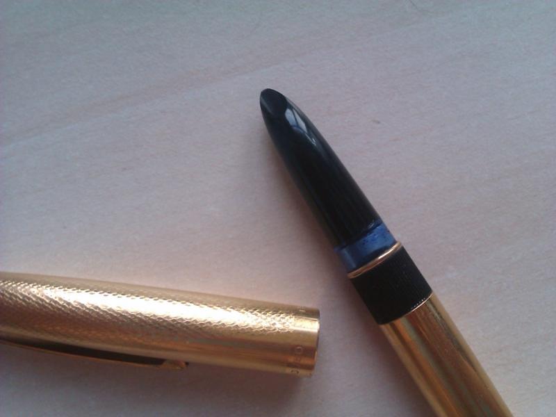
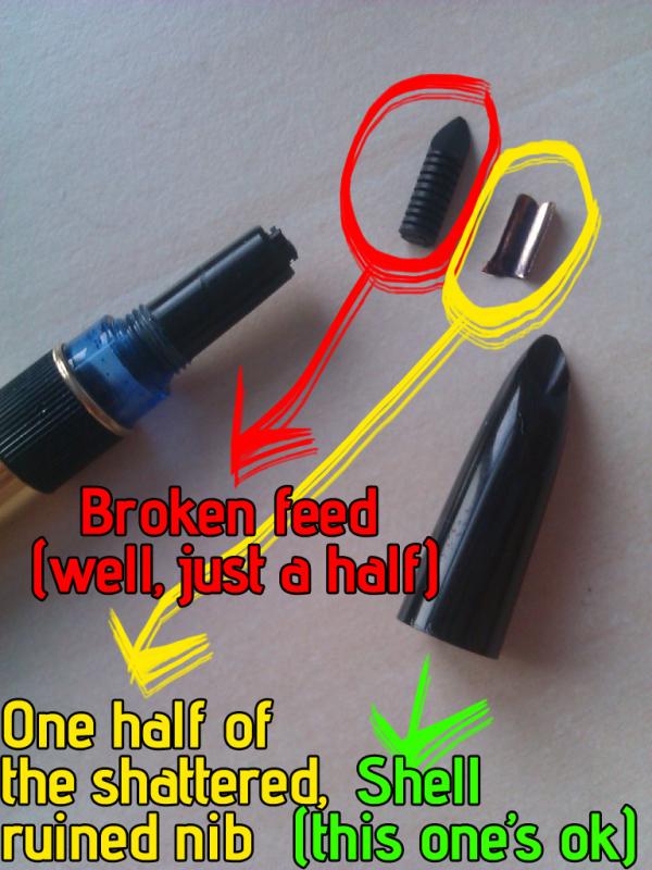
Hello FPN, This is my first post here, although I've been reading the forums since a few weeks. I have a Montegrappa pen, about which I don't know much: just that it is over 20 years old and used to write heavenly. I started using it a few weeks ago, when I began liking fountain pens. I have lots of them, but all of them cheap (none from plastic though), except this Montegrappa pen (if someone can identify it I'd be very thankful). The problem was that, although it wrote better than a phoenix's feather, it was scratched and bitten by me when I was very little, and also had its nib crooked. How I ruined the nib & feed Being an idiot, I tried to straighten the nib even if it worked perfectly. After lots of hard work I managed to shatter the nib and break the feed in half. And now I can't find a replacement nib and feed for it. The rest of the pen is PERFECT, I just need new nib & feed. So where can I find replacement feed and nib for it? I tried to use nibs and feeds from other pens, but I have no other pen with hooded nib, and all the nibs are feeds are GIGANTIC compared to what it had, they obviously will never fit. Is there a universal feed and nib size for fountain pens with hooded nibs? What should I do? I have already punished myself by writing with this thing, but I don't think I can stand it much more, it's not a bad fountain pen but it bears no comparison with the Montegrappa. Attached photos.
-
In the last few months, I have purchased: Aurora 88P, black (1950s) Aurora 98, black (1960s?) Aurora Duo Cart, green (modern) Aurora Optima Auroloide, Rossa (modern) Montegrappa Zero Chrysocolla Pen Venture Exclusive (limited edition of 30) Leonardo Momento Zero, Blue Hawaii (2021) And, I just placed an order for a Momento Zero Coral from Pen Venture, as that color is not as easy to find as it used to be - and I have wanted it for awhile. I didn't expect this of myself. Apart from Leonardos, I have always kind of looked the other way on most modern Italian pens, pretty as they are. All the Visconti horror stories, I guess. But at this point, I am even considering giving a Van Gogh a shot, as long as I order from somewhere that will tune it first.
-
Some Japanese pens (and a Montegrappa) with custom maki-e by Morgan Wisser
jandrese posted a topic in Japan - Asia
I shot focus stacked macros of all these pens for Dromgooles. As far as I know they are all still currently available. Good, high relief maki-e by the French craftsman, Morgan Wisser. I have several pens customized by him and have been happy with the work. Let me know what you think or if you have any questions. focus stacked yes logo by Ja Ja, on Flickr focus stacked yes logo by Ja Ja, on Flickr focus stacked yes logo by Ja Ja, on Flickr focus stacked yes logo by Ja Ja, on Flickr turtle side focus stack yes logo by Ja Ja, on Flickr shark side focus stack yes logo by Ja Ja, on Flickr -
Currently there are many excellent pens being made in Italy and modern Italian pens have captured my heart. I have been a fan of the beautiful Aurora pens for some time and lately the uniquely special offerings from Scrittura Bolognese have enthused me even more. I have a few Leonardos and even two (!) of the very first Radius 1934 pens. I have been delighted with them all because of their beauty, the quality of the nibs and overall manufacture, and most of all the pleasure of writing with them. I didn’t have a Montegrappa, however. Today I set that right and it is truly extraordinary and, I hope, worth sharing here. I am not personally enamoured of sterling silver - the feel and weight of it or the tarnishing - and I hesitated for a long time over the brand, even though the celluloids are very beautiful and the styles of the Extra 1930 and Extra Otto appeal to me very much. And of course the prices for these pens are extremely high, so you have to be sure the pen is for you. Finally I gave in to the temptation, but I ordered a custom design through their website in the Extra Otto model but with gold-plating and a celluloid section. It cost a little more but in my mind the changes to the pen would be more than worth it to me. It is an expensive pen anyway, so to pay a little more to have it exactly the way I prefer made sense rather than paying so much for a pen that may be great but with a few reservations. I chose the zebra celluloid for my pen, which is my favourite of their materials - although I also find the butterfly, lapis, and shiny lines celluloids very compelling too. The custom configurator offered fewer options for the Extra Otto than for the Extra 1930, but the zebra celluloid was available for all parts of the pen and it looked like it would work nicely with gold-coloured trim. Exactly ten days after I submitted the order (which was the quoted production time) I received an email saying that the pen was made and had shipped. The shipping box is marked “handle with love” and the pen arrived in the Extra Otto wooden presentation box along with a nice letter from the CEO telling of his early experience receiving a one-off customised pen as a gift from his father. Montegrappa also supplied a gift, for which I selected a pair of onyx cufflinks. It all made for a nice and special experience to receive this pen. I normally do not care for such fanfare or presentation boxes, but in this case it felt really nice. After such a preamble you want to see the pen, I assume... I chose an extra-fine nib. The pen writes absolutely wonderfully out of the box. It is a true extra-fine line and nicely smooth with just the right touch of feedback to make it feel good in writing. It writes really effortlessly, with good ink flow. You know how sometimes you see the way a really well-tuned fountain pen can put down ink and you are reminded why you love them so much? It is like that. The build quality appears to be perfect. The pen design and materials in real life are stunning to my eye and they surpass even my high hopes for this pen. The celluloid feels great - seriously high quality and unquestionably a premium material. Just as importantly the size of the pen, section width, weight and balance all absolutely match my preferences and it is superbly comfortable, natural and a true joy in-hand. It feels weighty and solid enough to feel special, but is still light enough to be nimble and effortless to control. Opting for a metal section would have front-weighted the pen and given a slightly different balance - but I like it very much the way it is and the slight back-weighting from the piston mechanism makes it rest on my hand very solidly as I write, and the pen is not long. I would not want to swap the feel of the celluloid section for metal and I think my choice was right for me. It is only my first day with the pen, of course, but everything augurs well so far. I am so, so pleased with this pen. I think it may be the most beautiful pen I have and the fact that everything about it also fits my hand so well and it writes so wonderfully is not only a great relief but even a pleasant surprise. Even acknowledging the price I would definitely consider a custom Montegrappa again some day. As Sir Henry Royce famously said, “the quality will remain long after the price is forgotten”.
-
In these reviews I attempt to be as to-the-point as possible to give the reader a quick idea about the aspects of the pen that stood out to me. The Good: Montegrappa has been spot on when it comes to the overall build quality of the pen. A lot of attention has been paid to details and everything feels polished and refined. The cap threads are very smooth. The nib writes really well out of the box. It is smooth and wet and I did not have to tune it whatsoever. I believe the nib is made by JoWo. The size and weight of the pen make is feel like a robust and substantial pen in the hand. The design is timeless. The Not-so-Good: Since this is a metal pen, it isn't light. I find it comfortable un-posted but when posted, it becomes a bit top heavy for me. The cap has a plastic liner inside making it safe for posting without scratching the barrel. The Bad: The pen surface scratches easily. To protect the brushed metal finish, Montegrappa has used a clear coat on most parts of the pen. But this coating seems pretty thin and I'm seeing some scratches and wear (which weren't present on the new pen) after a few days of normal use. The copper mule may not have this problem because the copper on that pen is untreated/un-coated. The silver mule is also not an inexpensive pen. The Bottomline: It's a great pen and I like it a lot just because of the way it writes and feels in the hand. If you like heavier and larger pens, this pen fits the bill perfectly. But for the price, it is a bit too easy to scratch. So don't carry it in a pocket with keys and coins. The Fortuna model comes in a variety of finishes. If this is not the pen for you, there are other finishes to choose from. http://i66.tinypic.com/2j1rhuq.jpg http://i67.tinypic.com/5jwmbs.jpg http://i64.tinypic.com/5uiyza.jpg
-
At the risk of sounding like SBRE Brown...I'm interested in a written Shootout of the Italians! I'd like to hear from people who have tried both the Montegrappa pens (especially the Elmo) and the Leonardo Officina Furore, both with steel nibs. I am keen to give myself incentive to finish a book proposal, and a lovely new pen awaiting my future might do the trick. https://www.gouletpens.com/collections/montegrappa-elmo-fountain-pens/products/montegrappa-elmo-fountain-pen-blue-cross-gentian?variant=30719087771691 https://goldspot.com/collections/leonardo-furore/products/leonardo-furore-fountain-pen-emerald-blue-rhodium-trim-medium-steel-nib https://pen-venture.com/products/leonardo-officina-italiana-furore-blue-emerald-blue-smeraldo-1?_pos=7&_sid=ef604aa17&_ss=r I've got an average sized woman's hand (a 7+), and a history of tendon issues, so I prefer thick grips, though not heavy pens, with wet nibs and lots of ink capacity. (Current favs are Ranga ebonite in the 3 (although my other Rangas are bone dry), Opus 88 demonstrator and any of my 6 TWSBI Ecos (if I could marry into the TWSBI family, I would). I do not like thin or heavy metal pens (ejected all Jinhao's.) I love italic nibs, but might opt for a bold. Looking forward to hearing from you all.
-
Tibaldi Rinascita? The First And Most Important Italian Manufacturer Of Fountain Pens
peroride posted a topic in Italy - Europe
Or lifestyle brand for the new millenials? https://www.tibaldi.com/it/homehttps://www.instagram.com/tibaldi.official/ Plastic is the new Celluloid Sadly, not a gray hair in sight Tibaldi N60 Blu Samarkand fountain pen courtesy of Novelli The steel on ebonite c/c filler does have me weak in the knees with aching pang of a Modello Transparente facade Kinda doing a Leonardo Momento Zero play with classic line and affordable price. https://youtu.be/fU1taIo_P4g -
Sarah, Duchess of York has released 1 fountain pen model in 3 colours (blue, yellow, orange) with Montegrappa. It's a limited edition and only 100 pens are available of each colour. From the website: "Duchess of York - Visions of Nature Brilliant colours and joyous detailing evoke the natural kingdoms of Ocean, Forest and Garden. In these places of solace and inspiration, beauty lies idly… awaiting discovery. Writer and humanitarian, Sarah, Duchess of York, reflects on nature’s wonders in a rare collaboration. Pretty, sterling silver friezes fuse with effervescent celluloid in a silhouette abundant with lively, feminine charm." Costs 1,995€. Nib sizes: EF F M B BB STI 18k nib, 925 sterling silver trim, celluloid, piston filler, fairly heavy at 66g. Looks actually nice, especially for Montegrappa (some of the pens they've released are not very... pretty...). https://www.montegrappa.com/en/collections/edizionilimitate/duchessofyork-1191.html https://www.instagram.com/p/B9OsA4AFGM8/ https://www.dailymail.co.uk/femail/article-8066261/Sarah-Fergie-Ferguson-announces-designed-fountain-pens-cost-1-742.html
-

Pen Pit Stop : Montegrappa Game Of Thrones - House Stark
namrehsnoom posted a topic in Fountain Pen Reviews
Pen Pit Stop : Montegrappa Game of Thrones – House Stark Welcome to the Pen Pit Stop. Here you will find reviews of pens that already have some mileage on them. More specifically, these reviews are of pens that are in my personal collection, and that have been in use for at least a year. I thought it would be fun to do it this way - no new & shiny pens here, but battered vehicles that have been put to work for at least a year. Let's find out how they have withstood the ravages of time. The fountain pen that arrives at the pit stop today is the "Montegrappa Game of Thrones - House Stark". In 2017, Montegrappa released the Game of Thrones pens, inspired by the well-known television series based on the "A Song of Fire and Ice" novels by George R.R. Martin. There are four pens in this series, representing the four most important Houses of Westeros: Baratheon, Lannister, Targaryen and of course House Stark. Each pen captures the essence of its House in the pen's design details. I got me the House Stark version, which is a nice sliver & white fountain pen. I bought this House Stark pen in May 2017. I was fully enjoying the television series at that time - and I must admit that this was more or less an impulse buy. The pen arrived in a beautiful box, that reflects the Game of Thrones Theme. Nicely done. Within the box comes the fountain pen, with design details that capture the essence of the corresponding House. Pen Look & Feel The details on this pen capture the spirit of House Stark quite well. The Stark family reigns in the snowy North of Westeros, which is reflected in the white colour of the pen, complemented with silver ornaments. The clip symbolizes the House sigil and shows the head of a powerful direwolf. Norse runes form the inspiration for the scrollwork on the cap and body, done very nicely in grey-on-white. On the cap finial you find the picture of a direwolf together with the House Stark motto: "Winter is Coming". This Montegrappa pen is a cartridge-converter, with a screw-on cap and a nicely decorated steel nib. The nib wrote flawlessly right out-of-the-box. The grip section is a shiny metal... I'm personally not a fan of these smooth metal grip sections, finding them a little bit too slippery to hold. The pictures above illustrate the size of the House Stark pen in comparison with a standard Lamy Safari. Capped, both pens are roughly equal in size. I prefer to use both pens unposted - the Montegrappa pen is about the same size as the Safari, and quite comfortable in the hand. Posted, the pen is much too big and it feels a bit top-heavy. Pen Characteristics Build Quality : the pen is well build, and still looks great after close to three years. The pen also has some weight to it (owing to the metal parts used in its construction - parts of the cap, plus the threads where the barrel screws into place). Personally I don't like the direwolf clip, which looks a bit cheap and toy-like. In my opinion, the pen would look much better without the clip. Weight & Dimensions : about the same size as a Lamy Safari, but with a bit more girth. This is definitely a heavy pen, but when writing with the pen unposted, the weight is well-balanced, and the pen feels comfortable to write with even for longer writing sessions. Filling System : this is a cartridge convertor pen, that uses standard size cartridges or convertors. I've never used a convertor with the pen. I find it much more convenient to just syringe-fill standard-size cartridges with my favourite ink of the moment. Nib & Performance : the pen has a decent-sized steel nib, decorated with beautiful scrollwork. The nib on my pen is a wet-writing medium, that wrote flawlessly right out-of-the-box. I was pleasantly surprised by this - my previous Italian pens were Visconti's, both of which came with horrible nibs. Price : being Special Edition pens, these cost 245 EUR including taxes. Quite expensive for a steel-nibbed cartridge convertor. You basically pay the premium price for the Game of Thrones theme. Conclusion These Montegrappa pens are obviously targeted at the Game of Thrones fan, and they succeed in capturing the spirit of the different Houses of Westeros. At the same time, this make them a bit of a gimmick. These are definitely not classic-looking pens - I'm highly doubtful that they will keep their value once the Game of Thrones hype has passed. For my personal taste, these pens also look too rococo with too many details in the finish. I much prefer more simple elegance. As such, this pen hardly gets any ink time. A good writer, but it doesn't give me any pleasure using it. The big question is: would I buy this pen again? To this, my answer is: DEFINITELY NOT. As I said, this was a spur of the moment buy... you know... Woow! Nice pen. Clicking "Buy Now" without thinking it through. It got me an overpriced pen that writes well, but that doesn't really fit my taste. I have learned my lesson. These days, I always leave at least a couple of weeks before deciding to actually buy a new pen. -
Holy Nazionale! Get A Grip On Montegrappa From Chatterley Luxuries
peroride posted a topic in Market Watch
Ready, set, go... https://chatterleyluxuries.com/product/closeout-montegrappa-nazionale-flex-indian-rainbow-limited-edition-fountain-pen/ I'd was sorely tempted and have gotten good Aurora from Bryant plus this looks like a deal o da year but i haz many pens and pens and penz Plus the Nazionale flex looks a bit heavy with all the sterling silver furniture -
Hi everybody! Does anyone know how to disassemble Montegrappa(piston or piston emulated filler) from a limited edition series? This is MG La Traviata Sterling Silver. The piston does not work(don't move by knob), probably a broken stem. The knob rotate is very easy. There is no access from the pen unit hole - there is a steel thin hole. I don't know how to remove the piston knob, there are no keyhole slots like on Pelikan/Aurora/TWSBI and there are no wedges like on Omas or vintage pens. Anyone got any good ideas? Thanks! https://images.vfl.ru/ii/1567439176/e7cb6aeb/27738321.jpg https://images.vfl.ru/ii/1567439177/977feaf4/27738322.jpg https://images.vfl.ru/ii/1567439177/1fb4c035/27738323.jpg
-
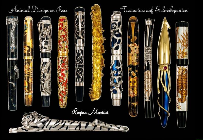
Dear forum members, I would like to introduce my new book to you. It shows in word and picture over 550 pens, all in connection to the animal kingdom. You will find pens from 80 companies. The book weighs over 1.5 kilo, has more than 200 pages. The attached pages show how the book is structured. Described is also a number of pens that are not shown. Also 100 pens that were sold by well-known auction houses. The book price is USD 150; (euro 124) including shipping. Many thanks for your interest. We do accept paypal (regina.martini@t-online.de). best regards Regina Martini
-
Hi! I would like to know if the nib and feeder of the Classica are the same size than those of the Symphony. Thanks
-
I came across this online article from a publication I was not familiar with (inside Hook) about Montegrappa offering pen customization options from their web site. Very strangely, the author who had some knowledge of fountain pens and collecting, made no mention of the many smaller pen manufacturers who have been doing this for some time. The piece made it made it sound like this was an entirely novel business concept. Perhaps it is for large pen companies (I have no idea how big Montegrappa is in comparison to other manufacturers) but it's not a new idea. I looked for a way to contact the author, but saw no easy method to do so. An odd and unfortunate omission in the article.
-
We started a new series on our Youtube channel where we visit manufacturies of fountain pens and take a look at how they produce their products. The first in this series is Montegrappa. https://www.youtube.com/watch?v=a4IdVjrksMc
-
During my summer visit to Montegrappa in Bassano, Italy, I took the opportunity to have one of my Extra 1930 medium nibs swapped for an extra-fine. My insider friend, Peter, had told me that they had a last EF nib of the previous generation, a beautiful two-toned nib with the gold hallmark reading *1140MI, made in Milano during the Richemont governance of Montegrappa. I know that Montegrappa nibs differs from most other Italian siblings being in general narrower than you expect from their nominal width, in a way more similar to eastern nib grades. I have two F nibs (none in the 8 size of the Extra), and they really are on the very fine side of a F. So I hoped to have a "real" extra-fine nib from Montegrappa. My hope was well placed. Michele, Montegrappa's technician, installed on my Extra a fantastic, extra-extra-fine nib that I really like a lot. The nib is firm, but no unpleasantly so, as it has some responsiveness, and literally glides on the paper for how much it is smooth. The grade of the nib is perfect for taking notes and writing with small characters: This was written using all the lines of a Moleskine journal. It can also be used with larger characters, using every other line: A great nib!
-
Hello fellow Italian pen friends! We went to Italy to meet with the director of Montegrappa and talked with him for a little while. Since there was a camera in the room, we recorded it and we can show it to you! https://www.youtube.com/watch?v=sYoOZlyPR9E Enjoy watching!
-
Hi, does anyone have one of these? I like the idea but there doesn't seem to be much information about this model. Thanks!
-
what is the best replacement for a 1942 Montegrappa extra 4 nib? The one I have is beyond repair, but the Atlantica 1942 pen. is came with is such a beauty I'd start using it immediately when I can find a suitable nib.