Search the Community
Showing results for tags 'gold'.
-
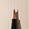
Hi everyone, A few weeks ago I bought a used Waterman DG (Directeur General) in the gold plated spec. When I received the pen, I didn't expect it was that used. The area round the nib is very corroded ( I guess because it's a brass body). So much it is unsuitable to write with I think. Then there's the nib... I truly feel sorry for it. It is an 18kt gold nib so that's that 😅. Writing with it will be impossible as I'm too inexperienced to repair this kind of damage. Nonetheless I think it is a wonderful and quit rare pen I saved from permanent death. I also found some documents in the original box of the pen, I don't know if they are correlated. It's an original French pen I bought on a holiday in France (I'm Belgian). I discovered the document later at home. Any ideas on what I could do with this pen? After feeling this pen, I feel very tempted to buy a silver one, but they are even rarer. For context, see photos :). Keep on writing, Lars

-
Hi, Recently purchased this button filler Columbus pen. Looking at the clip my guess is that it's from round 1950. Any info will be appreciated, especially about the barrel and cap gold pattern which i have never seen before. Eric
-
Kaco Master 14k Fountain Pen- Best Chinese Pen Ever with a great Soft Springy Gold Nib
punjabi posted a topic in Fountain Pen Reviews
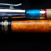
This is a review of “Kaco Master”. It’s the best Chinese Fountain pen I have come across till now.Kaco is a young company which makes some great products. Kaco since its inception in 2011 have launched many pens & accessories . This “Kaco Master” is among their most premium offerings .This has German Made Gold Nib , it doesn’t feel like it’s made by Jowo or Bock. It feels a bit different from those both. I think they are made by special order or made by some other company ! Pros- – Great 14k Gold Nib – Well Tuned Out Of The Box – Soft & Springy Nib – Minimalistic Design – Top Notch Construction – Great Price – Great Packing & Presentation – Hourglass Shaped Section – Have Premium Look – Suitable For Long Writing Sessions Cons- – Only comes in one colour i.e. Black for gold nib. Although the steel nib version comes in many colors. – Don’t post securely. – I can’t expect anything more at this price !!! Packing- Great, The pen comes with a great grey metallic case, which comes in a black box over which “Kaco” is engraved. The metallic oval case has a foam insert in it where the pen can rest. This foam ensures that the pen doesn’t get scratched with the sides of the metal case. Specifications- – Nib Size -Fine Nib 0.5mm – Filling Mechanism: standard cartridges and converter – Capped Pen length: 154mm – Section Length: 25mm – Section Diameter: 12.5 mm – Uncapped Pen Length : 133mm – Diameter: 16.5 mm – Pen weight: 27.5g Appearance & Design- Good, The pen has a classic design. It’s made of great quality black resin which has been highly polished. The clip is of gold color & fit into a clip-shaped recess in the cap & almost aligns with the cap of the pen .The clip is strong & is very functional. It is unique & looks good in my pocket. The clip has a small logo of “Kaco” over it .The pen size is around 133 mm uncapped & 154 mm capped. It doesn’t cap securely.This pen is made in very nice black resin, it is super shiny & feels premium in hand . I wish they had other colors too. It has an hourglass-shaped section & a number #6 14k nib in Fine with “Kaco” logo engraved over. It has a plastic feed. The section is long & threads of the cap are precise. This nib looks good & is similar to JOWO nib but it’s not JOWO. The nib suits the pen size & looks good. This pen is very comfortable for long writing sessions too. Construction- Very Well Made, The construction of this pen is top notch.The pen has been polished well & has been given a mirror like finish on both clip as well as body. It looks pleasing to the eyes , but as a result it attracts dust & micro scratches may be noticeable. The pen is elegant & is a perfect minimalistic office pen. Filling System- This is a simple C/C pen. The converter is interchangeable with a Schmidt K5 converter. It has metal reinforcements in the mouth & it is perfectly functional. You can use standard international cartridges too Nib Performance- Amazing , Kaco Master has #6 nib which is very springy and relatively soft.It is surely better than JOWO/BOCK nibs. This nib has a slight forward curve which makes a different writing angle which is different from others, I think it’s some unique Chinese grind. This is very smooth & gives a distinctive feel while writing. The nib is similar to European Fine Nibs.On the box, it’s written the nib is made in Germany but nib doesn’t look like common nibs i.e. JOWO or BOCK . Conclusion- True Master, This is the best Chinese pen I have ever used & one of the best pens available at this price. I bought it for around $120. The pen is very well made & has a great 14 k gold nib. It has a minimalistic look,which is amazing. The glossy black color looks good but I feel there should be more color options in this pen. I really can’t expect anything more at this price. It is true value for money given the quality, ergonomics and writing experience. It’s a masterpiece about which most people don’t know about !
-
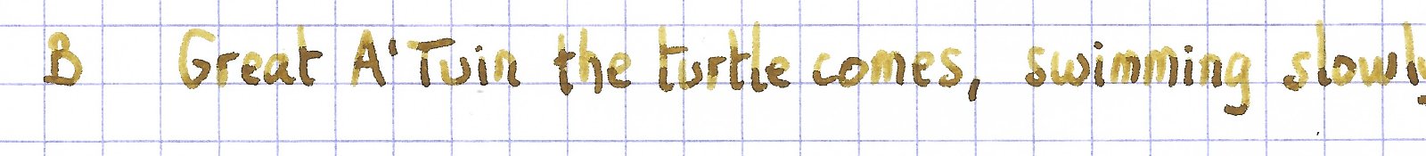
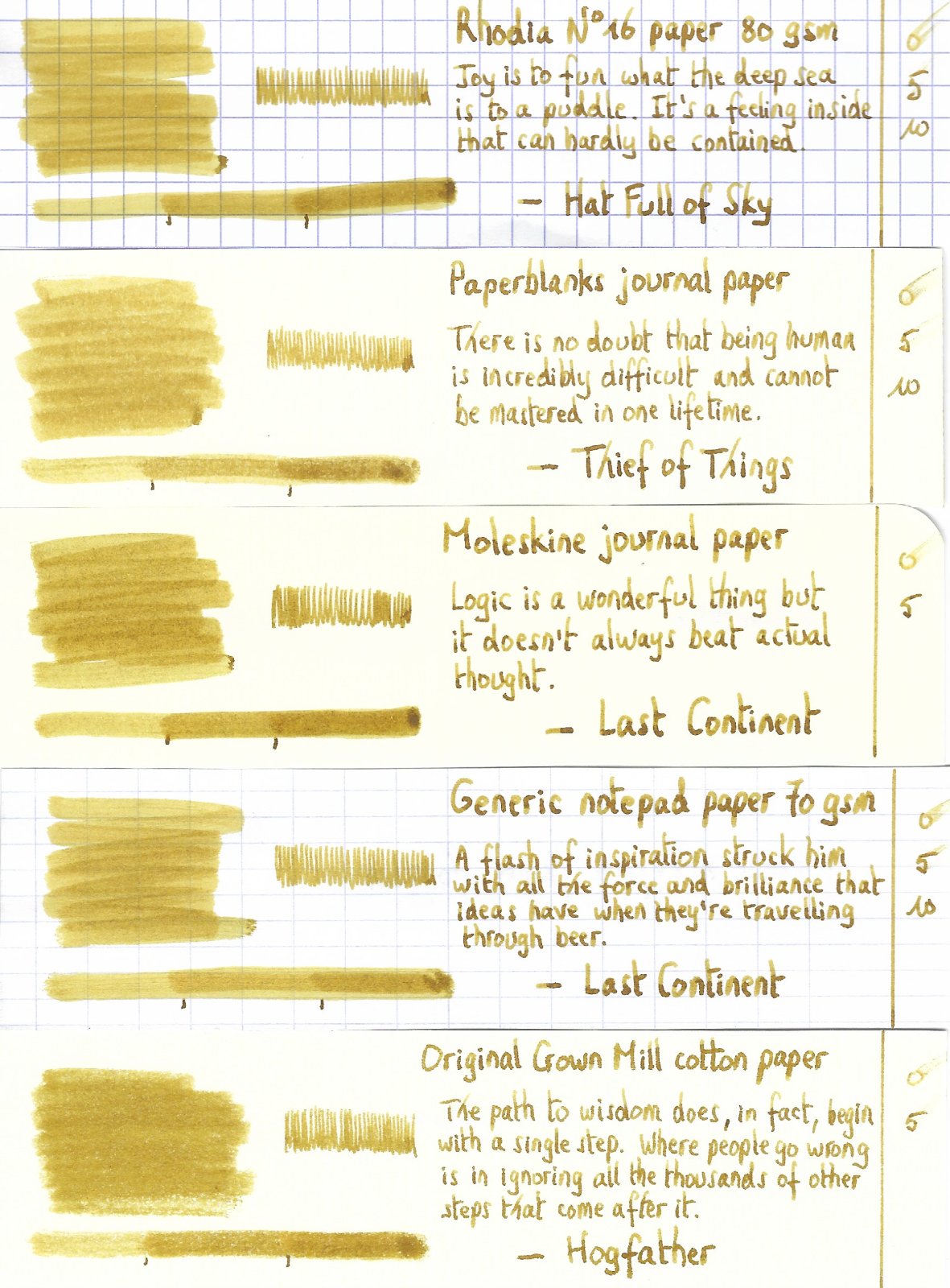
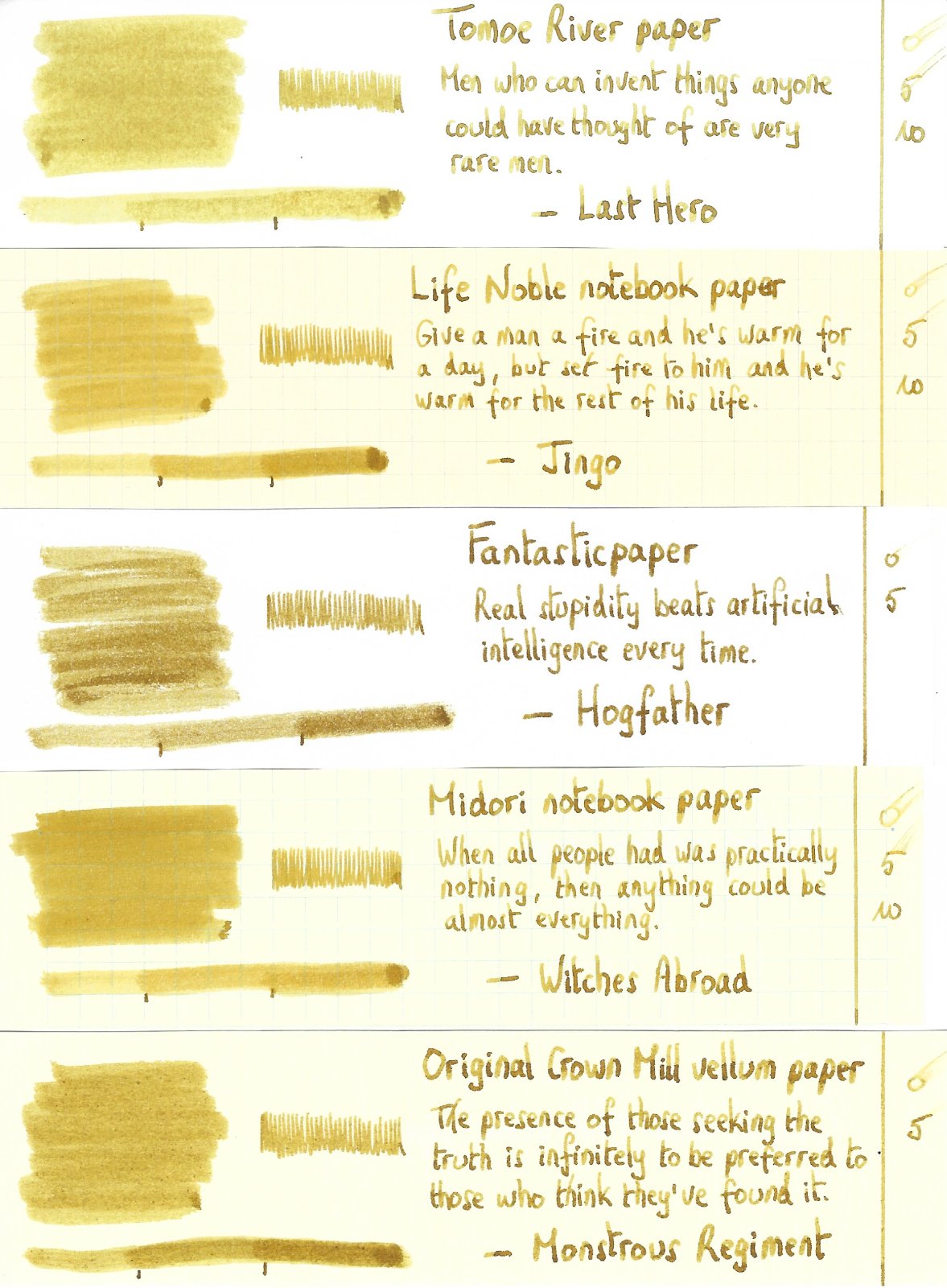
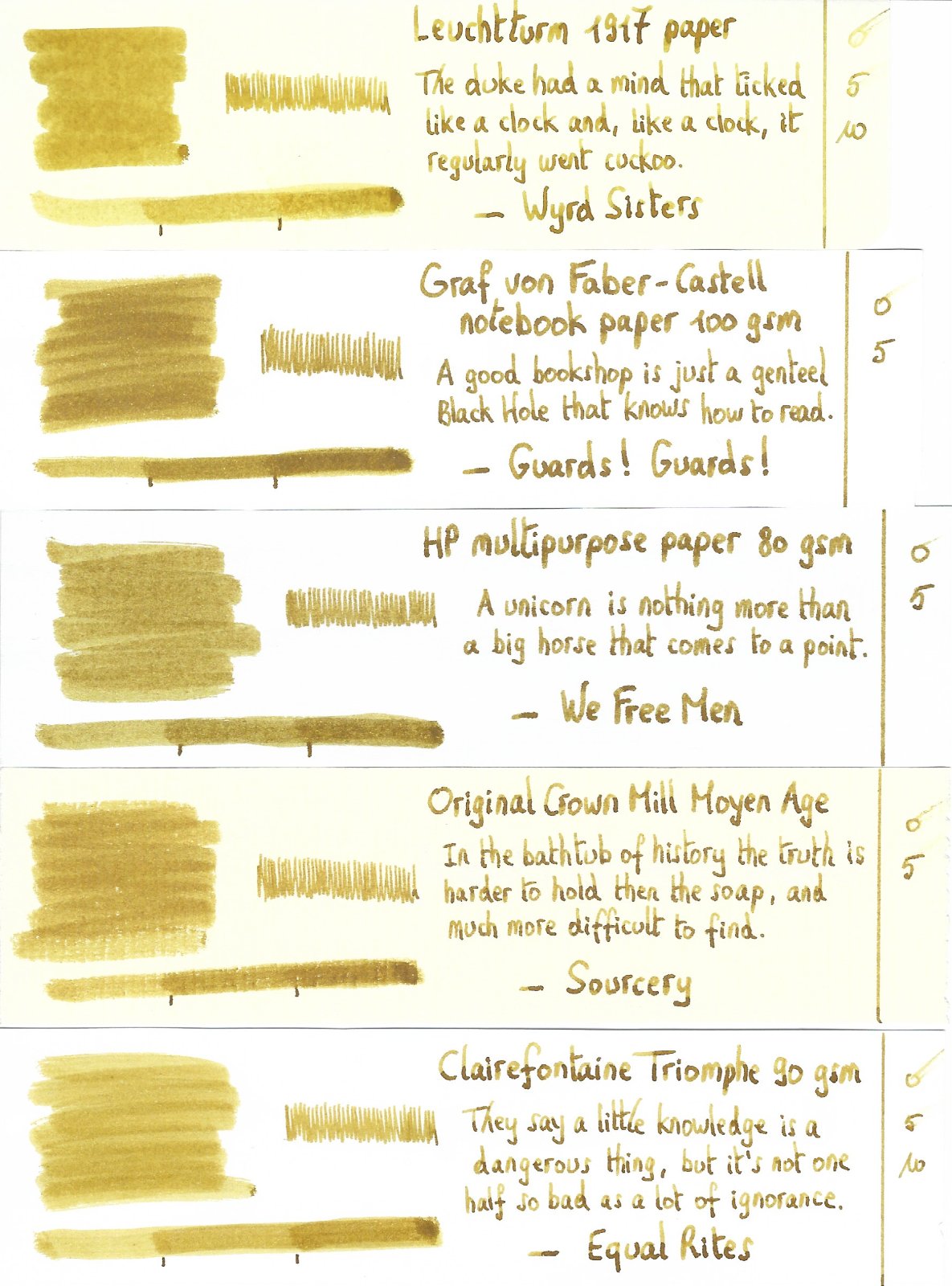
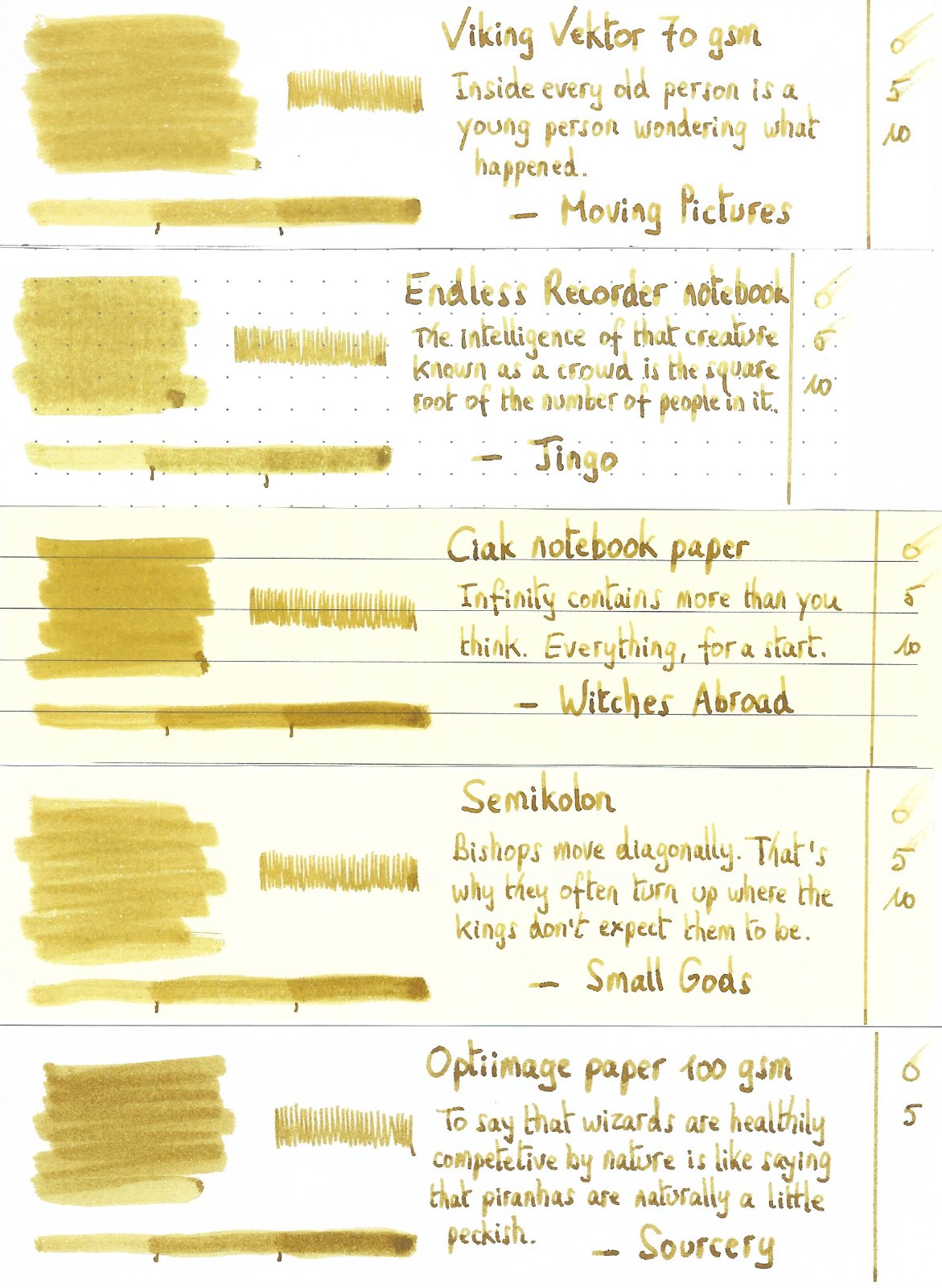
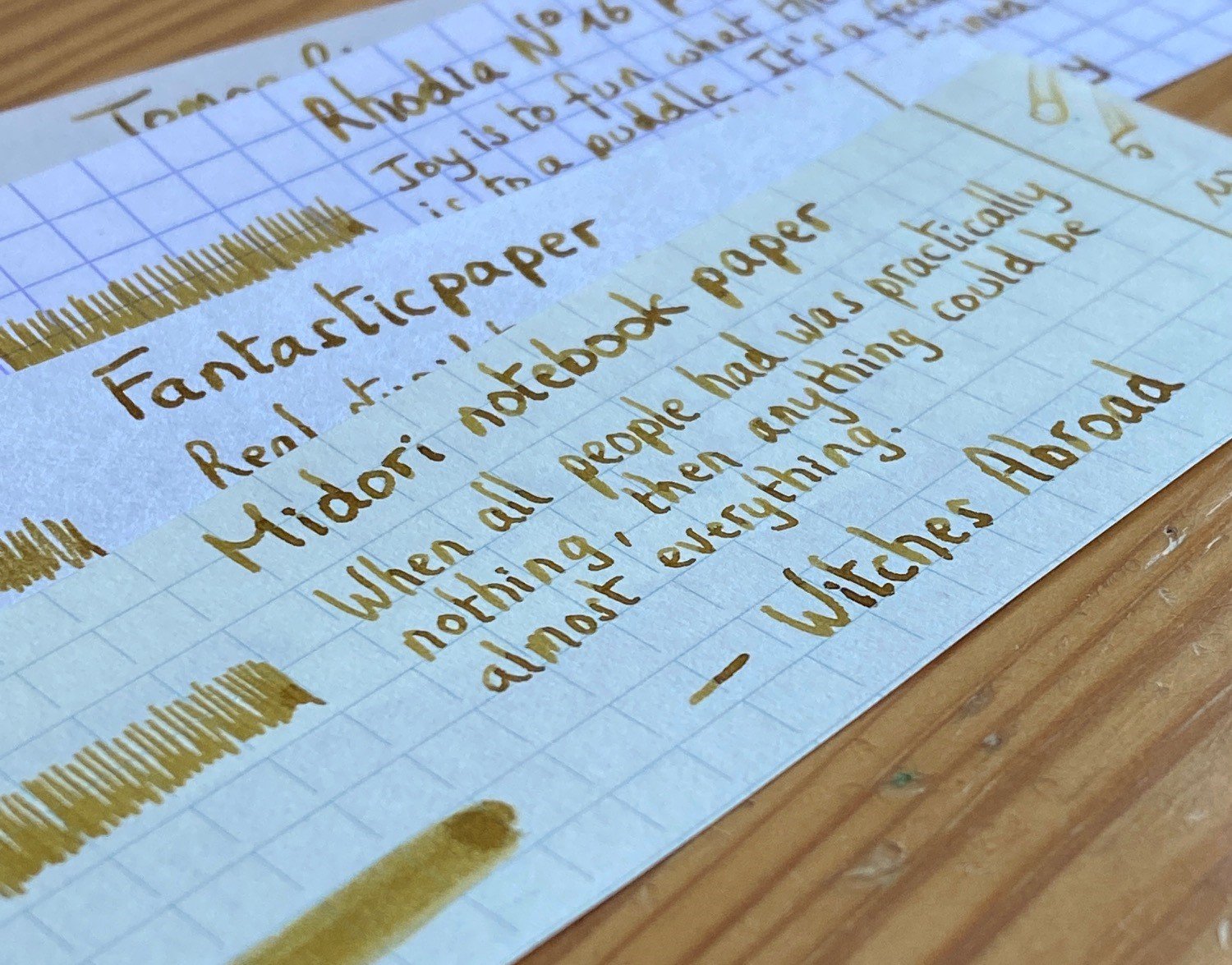
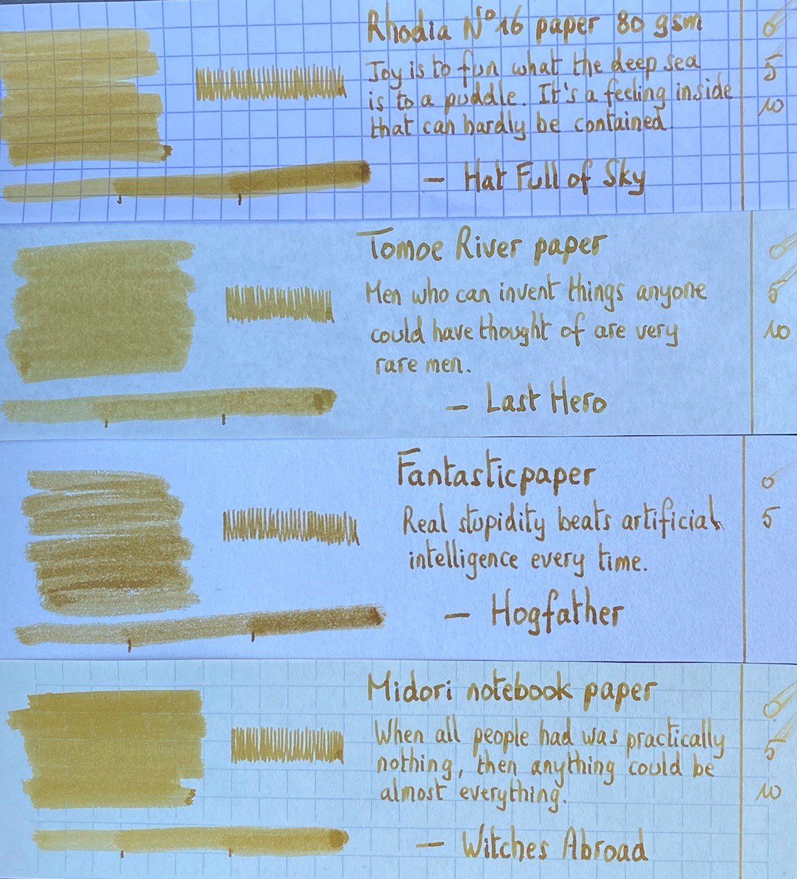
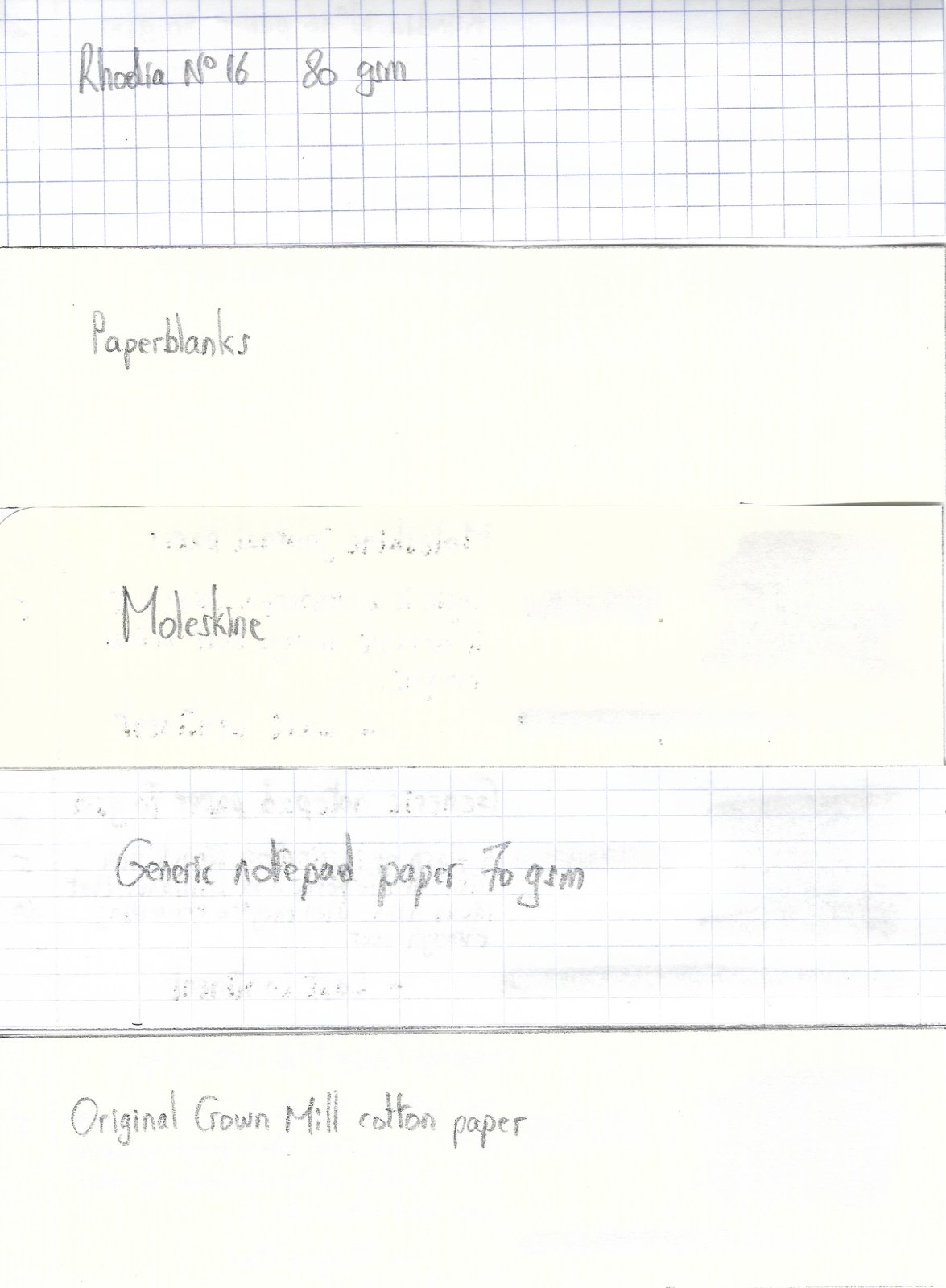
TACCIA Ukiyo-e Syaraku natane TACCIA is a Japanese stationery company, that - as far as I know - is now part of the Nakabayashi group. They offer high-quality fountain pens, inks, pen-rolls, notebooks, etc. More specifically, TACCIA produces a line of inks, inspired by the unique look of Ukiyo-e prints from Japan’s Edo period (1603-1868). Ukiyo-e prints are woodblock prints where the work of an artist is carved into wood by woodworkers, and pressed onto paper by printers. This allows for the production of multiple prints of an artwork with some different colours as well. In this review, the star of the show is natane, a golden-yellow ink with a hint of green undertones. The ink is inspired by the colour that appears in the kimono from “Segawa Kikunojyo III as Oshizu, Wife of Tanabe Bunzo.” This print of the actor Segawa Kikunojyo III is one of the most celebrated portraits of the onnagata (male actor in a female role) by the late eighteenth-century artist Tousyusai Syaraku. It portrays a character in the Genroku era play Hanaayame Bunroku Soga (The Iris Saga of the Bunroku Era), a drama that retells the true story of the vengeance of ten brothers for their father's assassination in 1701. The play was performed at the Miyako-za theater in the city of Edo in May 1794. For writing, this ink disappointed me. It writes really dry with a serious lack of lubrication. Also – yellow is a difficult colour to write with: not so good for dry pens / fine nibs, and definitely unsuitable for use on cream-coloured paper. Furthermore, the ink suffers from see-through / bleed-through on many paper types. And the list goes on… lines are smeared out instead of crisp with most nibs, except the fine ones. Overall, not a fantastic ink to write with. On the other hand, there is that lovely golden-yellow colour, that seems to shine of its own. When saturated, natane shows a beautiful green undertone that sets this ink apart from others I own in this tonal range. This is an ink that’s made for drawing! The ink comes in a 40 ml bottle, that is packaged in a beautiful box showing the corresponding Ukiyo-e painting. To show you the impact of saturation on the ink’s look & feel on paper, I made some scribbles where I really saturated portions of a strip of 52 gsm Tomoe River paper with ink. This gives you a good idea of what the ink is capable of in terms of colour range. Natane has a fairly wide dynamic range, while keeping a pleasant contrast between light and darker parts. This translates to soft shading, that is most evident in wet pens with wide nibs that can cover the complete expressive range of this ink. I like the writing in my Edison Collier with 1.1 stub nib, which is used in the scan below. The ink’s chromatography shows a truly diverse mix of dyes, with light-blue, rose and yellow tones appearing. This already hints at the green undertones that blossom up where the ink gets saturated. The resulting colour is really beautiful: an old gold-yellow with an antique vibe that seems to shine from within. I really like this ink’s colour. As can be seen from the bottom part of the chromatography, natane shows a bit of water resistance. The yellow dyes disappear, but a light-blue residue remains that makes it possible to reconstruct your writing. I’ve tested the ink on a wide variety of paper – from crappy Moleskine to high-end Tomoe River. On every small band of paper I show you: An ink swab, made with a cotton Q-tip 1-2-3 pass swab, to show increasing saturation An ink scribble made with an M-nib Lamy Safari The name of the paper used, written with a Pelikan M400 with gold M-nib A small text sample, written with a Parker Sonnet with F-nib Source of the quote, written with an Edison Collier with 1.1 stub Drying times of the ink on the paper (with the M-nib Safari) Natane is too unsaturated to play nice with my usual Safari test pens. That’s why I used wet pens for my writing samples. These wet pens push the colour range to the saturated part of its spectrum, where you get that golden hue with a green undertone – which I consider the goldy-locks zone for this ink. As mentioned above, the ink has lots of technical shortcomings: low lubrication, absorbs too fast into the paper, resulting in wide lines and a fair amount of see-through and even bleed-through. You also get a tiny amount of feathering on many of the more absorbent papers. Overall, natane is a poor performing writing ink (my opinion). I liked the ink best with my Parker Sonnet with F-nib – the Sonnet tends to write more saturated (it evaporates water like crazy with that breather hole in its cap), which accentuates the golden-green end of natane’s colour spectrum. And the fine nib keeps the wide-writing tendency of this ink under control. Below are photos that show the ink on the different papers in my test set. My scanner has difficulties capturing natane’s colour well. The ink shows too yellow, and that inner golden light gets lost. For the sake of completeness, you can find an example of a scan below. Writing with different nib sizes The picture below shows the effect of nib sizes on the writing. Natane is too unsatured with my Lamy Safari test pens, which results in a light yellow that is barely readable. Also, the dry-writing Safari is definitely unpleasant to use with this under-lubricated ink. But I really like the ink with wet writers, and especially with my Parker Sonnet. Related inks To compare natane with related inks, I use my nine-grid format with the currently reviewed ink at the center. This format shows the name of related inks, a saturation sample, a 1-2-3 swab and a water resistance test – all in a very compact format. The ink is different from other yellow-toned inks in my collection. The yellow dominates, but that barely-visible green undertone sets natane apart from its neighbours. Inkxperiment – hunter-seeker With every review, I try to create an interesting drawing using only the ink I am reviewing. These small one-ink pieces are an excellent way to show the colour-range nuances that are hidden within the ink. And I totally enjoy the fun couple of hours these inkxperiments provide me. Yellow-toned inks are usually great for drawing, so I had high hopes for this inkxperiment. Inspiration for the drawing comes from the novel “The Kraken Project” by Douglas Preston. A light read, where the plot centers around Dorothy, an AI program that escapes to the internet. At a certain point, virus-bots are sent out hunting for Dorothy’s signature. The drawing captures the moment where the virus-bots zoom in for the kill, with Dorothy desperately hiding behind her firewall. For this drawing, I started with a piece of A4 HP photo paper. I first drew the background, using some cotton pads and water-diluted ink, with parts of the scene taped out using washi tape. Next I drew the firewall using pure natane and a plastic card, and painted in the figure of Dorothy. I finally added the hunter-seeker virus-bots executing their attack. The final picture turned out quite well, and gives you a good impression of what can be achieved with this TACCIA ink in a more artistic setting. Inkxpired – computational art I love experimenting with pen/ink/paper, and have added another layer as part of the hobby. I’m exploring computational art, inspired by the ink drawings I do during ink reviews. Another fun offshoot of the hobby… and all that starting with a few drops of dye-coloured water on paper. For this computational derivation, I first abstracted the drawing, and then used a filter that overexposed the scene. Finally I added a lens blur filter – keeping Dorothy in focus, but seriously blurring out the image of the killer-bots. I quite like the end-result, which emphasizes Dorothy’s despair when the hunter-seekers initiate their attack. Conclusion TACCIA Ukiyo-e Syaraku natane is a difficult ink. Not really suited for writing and with lots of technical issues. You really need to hunt for the right combination of pen and paper when working with this one. But it’s also an ink with a beautiful golden-yellow colour that works great for drawing. I will continue to use it in my Parker Sonnet, but will probably use most of my bottle for doing ink paintings. Technical test results on Rhodia N° 16 notepad paper, written with Lamy Safari, M-nib Back-side of writing samples on different paper types
-
Hello! First of all, this is only my third review on FPN, so if you can please leave constructive criticism below! I would love to improve the quality of my reviews. The Pilot E95S seems to be like the least expensive gold nib pen that is consistently offered here in the U.S. . The only cheaper one I can think of is the Platinum PTL-5000A, which I would love if it was consistently offered in the U.S., but they seem to constantly discontinue it. So, this is a very popular first gold nib pen. It was my second gold nib, so I did get it relatively early in my fountain pen hobby. For a quick summary of the review, I like this pen. I don’t love it, but it’s is great value, and I definitely recommend it. Design and Build Quality (8.5/10) For the most part, this design is great. It is slim, but comfortable, has a great inlaid nib (which I love), is compact, but bigger when posted, and the feeling of capping and uncapping is great. But, Pilot’s black resin does not hold up to the little metal things on the inside of the cap that hold it on. It has fine scratches on it, which are pretty apparent. Now, I am one of those people who sort of like that, and don’t really want pens to look brand new, I want them to look like I used them. But I can understand how this can annoy some people. That’s why it’s a 8.5/10, instead of a 10/10. Nib Performance and Writing Experience (9/10) This nib is great. I have a fine nib, which is 14k gold and inlaid. It is smooth, and quite soft. I would call this a flex, semi-flex, or soft nib, but a quite soft nib. By that I mean that you can get some line variation, but not that much where you can use it for calligraphy, just a bouncy writing experience. The only thing is it is just a bit particular with inks. Both Noodler’s Walnut and Diamine Chocolate Brown were just a bit too dry for it, and it had some skipping. But all Herbin, Jacques Herbin, and Iroshizuku work great with it from my experience. With them the pen is not especially wet, but I wouldn’t call it dry either. With the writing sample, I used Jacques Herbin Terre d’Ombre, which is currently my favorite ink but might be replaced by Robert Oster Caffe Crema when that ink sample gets to me, and on 52gsm cream Tomoe River Paper. Conclusion This a great pen, and a great value! I highly recommend it. It’s really great! Little Note- It seems like every place I go to except for JetPens sells it as the Pilot E95S for $136, but JetPens sells it as the Pilot Elite 95S for $136 as well. Just a little thing. Edit- It was to commemorate the 95th anniversary of Pilot, but is not a limited edition. It also comes with the Pilot CON-40, but can fit the discontinued CON-20. Now the pictures: The second to last photo shows scratches on the barrel, and the last one shows the metal things on the inside of the cap.
-
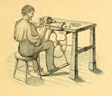
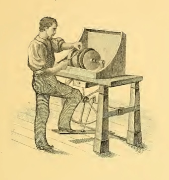
Making Gold Flex Nibs; From A Victorian Pen Catalogue
Lunoxmos posted a topic in Fountain & Dip Pens - First Stop
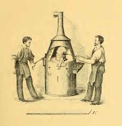
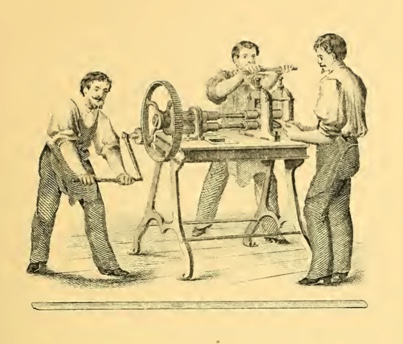
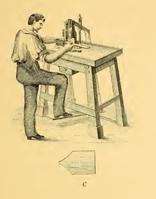
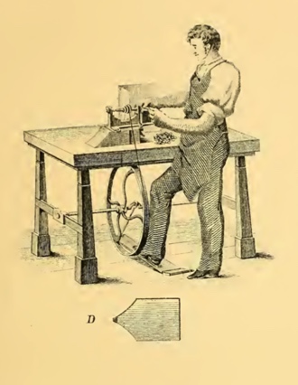
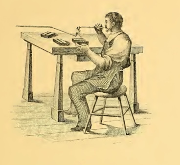
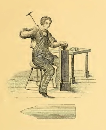
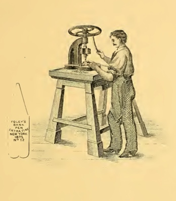
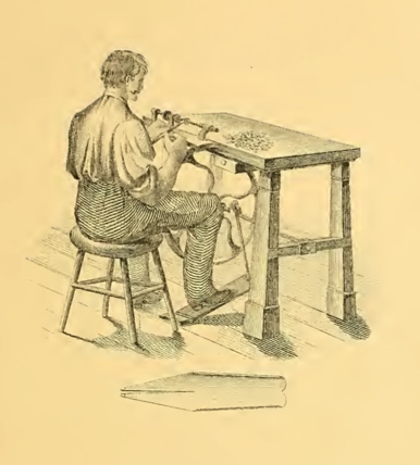
Credit given to David Armstrong from The Restorers Art Original article found here Copy of the catalogue found here Recently I came across a Victorian Era pen catalogue called the: "History of the invention and illustrated process of making Foley's diamond pointed gold pens" It starts off with a catalogue of the various products that the company offered, such as gold dip pens, and mechanical pencils, along with other bizarre combinations such as an instrument with a toothpick on one end and an ear spoon on the other. The main interest of the document, however, is that in the second half it details the history of the development of the Gold pen (or nib, as we would say these days), as well as the process in how these pens were made. After reading the catalogue myself, I along with David Armstrong and probably many other people as well, have concluded that the level of modern nib manufacturing is, though in my opinion, not exactly plagued by poor workmanship (a good nail nib is still a good nail nib), but has instead become complacent, perhaps unaware of the potential profits which could be obtained from the enthusiastic, albeit rather niche consumer group. (have a look at some of the prices that vintage flex fetches on eBay!) We have not really lost the technology or the method of producing flexible gold nibs. If you read the below copy-and-paste of the text, you can see that the only thing that was required to make the gold "flexible" was to hammer it; something that I believe with a little bit of will and determination we can replicate in a mechanical form, using machinery instead of a blacksmith, to make each one as precisely and accurately manufactured as the one before. "The nib of each Pen, as shown above, is hammered on a small anvil or stake, of curved surface, until the required spring or elasticity is secured, so that the nib of the Pen will bend almost double and again return to its proper position." Of course there are many things in the detailed process which can be automated due to our large advances in technology. For example, I believe that we have improved our tipping process, compared to when the Victorians were still figuring it out. Much of the tipping of the period was liable to falling out. In addition, we have automated much of the process of making nibs, the only part requiring human expertise being possibly the grinding, smoothing and inspecting, making the process faster and more consistent. I believe that if those high end companies, which probably have the money to invest in these sorts of things, decide to produce machinery which can hammer the nibs (tines), and strike upon the certain points with an exact pressure to produce the flexibility, then it is very possible that we will be able to produce modern flex nibs which will rival, or even better the flex nibs of the past. Here is a copy of the text which you may read at your own leisure. I have linked to the catalogue at the top of the post ( it's a big file so I recommend you look at it on a reasonably powerful device). (note that the use of the word "pens" is the Victorian equivalent of our "nibs", and the word "nibs" is the Victorian equivalent of our "tines") FORGE FOR MELTING THE GOLD. In this the Alloyed Gold is melted. It is fine Bar Gold (see page 43), and the quantity of alloy added is prepared with much care, and consists of pure Copper and Silver. A small quantity of each is added to the fine bar of gold. Pure Gold being too soft, the alloy is added to make it hard and durable and of a uniform elasticity. The alloyed gold is put into a sand crucible and placed in a charcoal fire, melted to a liquid and then poured into an iron ingot which produces a bar of the required width and thickness according to the size of Pen it is intended for, generally about half inch thick, 20 inches long, 1&1/2 inches in width (see E). After the bar is cooled it is removed from the ingot, the rough edge is filed smooth and hammered, and it is then ready for the ROLLING MILL, OR STOCK ROLLS. This machine rolls or stretches the bar of gold to perhaps ten times its original length, reducing it to a ribbon about 1/32 of an inch thick. Its width ought to be just enough to cut out two blank Pens. The machine is propelled by steam or hand power. It is complicated, very heavy, made and finished in the finest and most expensive manner, and regulated by two screws on each end. Each time the bar passes through the screws are turned down, until the required thickness is attained, and it is then ready for the BLANK PRESS AND DIE. After the bar of gold is rolled into a long thin ribbon, the blank Pen " C " is cut from it in two rows. One long strip or ribbon will cut from five hundred to a thousand blanks. The cutter is a lever press — with die set. The blank as it is cut drops through into a drawer underneath. This blank Pen is now ready for the BURRING MACHINE. This is used to mill out a recess across the point end of the blank "D" to receive the " Iridium " which is the celebrated Diamond Point of the Gold Pen. This done, the blank is now ready to have the Iridium set in, as is shown in the next Engraving. SELECTING AND PUTTING ON THE DIAMOND POINTS. This is done by placing a number of blanks in a row on a strip of wood made for that purpose. The diamond points being carefully selected, a small pencil brush is dipped into liquid borax and with it the points are picked up and set into the recess. The workman uses a microscope to enable him to place the points properly. When this is done, the " blank " is sent to the next man, who fixes the points permanently : SWEATING ON THE DIAMOND POINTS. A lot of blank Pens are placed in rows as above, on a flat piece of charcoal ; the blow pipe is then applied to the gas burner and a flame is directed steadily upon the point of the blank until the gold is thoroughly melted around the diamond or Iridium point. This is the " sweating" process (no solder being used) in making Foley's Pens. Hence it is that the points never come off. It requires much care and experience, for if the heat is applied a moment too long the whole Pen is melted and made useless. The point is now applied to the copper lathe (see 73) and brought to a square even face upon both sides and end. It is then ready for the blank rolls. The fine quality of Gold, over 16-karat fine, used in the manufacture of FOLEY'S Solid Gold Pens cannot be affected in the slightest degree by the strong acid with which most of the good inks are now made. Many of the Pens in the market at the present time are made of 10, 12 and 14-karat Gold and the points are put on with solder. The acid of the ink will turn the cheap Pens black and separate the points, which will soon fall off, and make the Pen worthless. Again, many Pens are made so light, being almost as thin as paper, that they soon wear out. A poorly made Gold Pen, no matter how cheap, is the most expensive in the end. THE BLANK ROLLS. With this machine the blank Pen is rolled down or stretched to the length shown above. This is done by placing the blank between the two rolls. The under roll has a recess in which the point is protected, and the pen is passed through the rolls several times until the required length is attained. The blank as shown above is now ready to have the Springiness or Elasticity hammered into it. HAMMERING TO PRODUCE THE SPRING OR ELASTICITY. The nib of each Pen, as shown above, is hammered on a small anvil or stake, of curved surface, until the required spring or elasticity is secured, so that the nib of the Pen will bend almost double and again return to its proper position. It is now in a rough and uneven shape and prepared for the second cut to give the Pen its proper form; by the SECOND CUTTING DIE AND PRESS. This operation takes off a narrow strip all around except at the point, and gives the Pen its proper even form in the flat state as above shown and it is then ready for the STAMPING PRESS. This is a screw press. The name stamp is set, and the pen, still flat, is placed on a hard steel plate with a guide to slide the pen into, so that every Pen is lettered uniformly and in exact position. Nearly one thousand Pens can be stamped in an hour. The Pen as above shown is now ready to have the sides raised up into shape, which is done in the RAISING UP MACHINE. This is a screw press of great power. With this, the Pen from its flat shape is bent into the round or partially cylindrical form. To insure perfect shape and per- manent set to the new curve, only a press of great power and dies of extreme exactness can be used successfully. This press is very heavy and complicated with many parts and very expensive fittings. The principal parts are the half round bed on which the flat Pen rests ; and the plunger, half round also, to fit exactly, which is struck down with great force by the action of the screw. This blow rounds the back and sides of the Pen. The plunger is brought up by an excentric and lever acting on two jaws, one on each side of the machine. This completes the perfect shape of the Pen as above shown in its well known form. This machine was invented by an ingenious Frenchman, John Countis, a machinist, while employed in Mr. Foley's factory. It is the most perfect and successful Raising Machine ever devised for Gold Pen making, and is capable of raising and shaping fifty Pens an hour. The next operation is to cut or divide the point in the Point, Cutting Lathe. CUTTING THE DIAMOND POINT. With this Point Cutting Lathe, after the Pen is carefully adjusted in a swing frame, the diamond or Iridium point is brought centrally upon the edge of a thin copper disk, about three inches in diameter, kept in rapid motion. The edge of the disk is charged with fine emeiy and oil. The Iridium is soon slit into two points, and thus is laid the foundation for the slit of the Pen. The Pen is next placed in a pen holder and passed over to the SLITTING LATHE. With this the slit is extended from the points to the full length of the nib. A very fine circular steel saw is used, and the skillful workman uses no guide. He simply places the Pen in a holder and with both hands and an experienced eye will slit, perfect and straight, one hundred Pens an hour. A fine hand-saw is used to perfect the end of the slit, which must end exactly perpendicular to both sides. This prevents the slit or Pen from cracking further up, and destroying the Pen. After slitting as above, the Pen is ready for BURNISHING THE NIBS. This is done with a hammer, burnisher and stake. Slitting the Pen removes more or less of the gold. The two edges must now be brought together again by hammering the outer edges of the nibs on the stake. The Pen is burnished on both sides to remove all unevenness ; and the nibs are set even by the fingers. After leaving the burnisher the Pen is ready to receive the most important part of its construction — from the GRINDING LATHE. This consists of one large and two or three smaller copper wheels and one tin slitter fitted on a steel spindle, running on true centers and finely finished. The tin slitter is charged with fine emery and oil. Now begins the most important work. After the Pen leaves the hand of the burnisher it goes at once into the hands of the GRINDER who should be not only an experienced workman and a good mechanic, but a man of intelligence, for he must understand thoroughly and practically what is necessary to finish a perfect Pen. The Grinder at once applies the Pen to the slitter so as to make the inside surfaces of the slit and points exactly flat, and set them easy together. Unless this is well understood by the workman and carefully done, a perfect writing Pen is impossible, for he will leave it with a crooked or an uneven slit. The great object in having the inside edges of the slit square and flat is to prevent the nibs from crossing or slipping by each other. The slit being made straight and perfect, the Pen is next fitted into the grinding holder, made of steel, with the diamond point alone projecting. It is then applied to the copper wheel (as shown in the cut which gives the exact operation), and the points are ground on the sides, back and end, while on the small copper wheels the face of the point is ground until the proper shape is secured. Here the skill and brains of the grinder are displayed, for if the correct shape is not given to the point it would be impossible to smooth and make it a good writing Pen. This is the most difficult part of Gold Pen making. A good workman cannot grind and smooth over two hundred good Pens in a week, though the men employed by the cheap manufactories claim to do as many in 7 or 8 hours. There are only a few excellent Pen grinders in the trade, and during the great demand for Gold Pens at the commencement of the war in 1861, and to 1865, the supply was not at ail equal to the demand. While grinding, the Pen is carefully examined with a strong lens, and finally fitted into a desk-holder and applied to paper and ink and thoroughly tested. Thus every defect is removed by the judgment and experience of the grinder. When that is done the Pen goes to THE POLISHING LATHE. This lathe consists of four wheels, two broad ones for polishing and rougeing the Pen on the back, and two very narrow ones for polishing the Pen on the inside. The wheels are covered with cloth of felt charged with rotten stone or tripoli ; and for the rougeing buckskin is used. The Pen is now " nibbed" on the inside of the nibs, with Scotch stone. This roughens the nibs so as to hold ink and prevent it from flowing too freely. This done the Pen goes again to the grinder — who re-adjusts and carefully examines it to see if any injury was done while in the hands of Polisher. The points are delicately touched up; the nibs carefully adjusted so that they will not cross or lap over; and the Pens are then placed in strong alcohol which removes the oil and other polishing materials and makes the Pen perfectly clean. After drying them in line box-wood sawdust, the Pens are put up in boxes and sent to the office, where the Manufacturer personally examines every Pen thoroughly, not only as to its writing qualities, but every part of the work and finish is carefully examined with the aid of a strong lens. If the slightest imperfection is discovered the Pen is returned to the Factory. The perfect Pens are finally counted and weighed and entered upon the stock book and are then ready for sale and delivery. [edited post to add pictures and to change some wording]
-
The PenBBS store on Etsy is offering a few 14kt Gold nibs in RF, REF, No.4 and N.15 calligraphy. $115 each. Only a handful left. They look impressive and I am severely tempted.
-
desaturated.thumb.gif.5cb70ef1e977aa313d11eea3616aba7d.gif)
Brief Comparison Of Various Lamy Extra Fine Nibs' Output
A Smug Dill posted a topic in Of Nibs & Tines
These are writing samples using just a single unit of each model of LAMY EF nib I have, without any claim or implication that one unit of (say) Z55 EF nib will be identical or comparable with a different unit of such. The first six nibs were all fitted in turn onto the same feed on the same pen drawing from the same reservoir (i.e. converter) of LAMY Benitoite ink. Each nib was cleaned in a dilute solution of ammonia and detergent and patted dry on a paper towel immediately before fitting on the LAMY cp1 pen used, then pressed against a paper towel until the ink being drawn through is dark enough, then written with on another sheet of Rhodia Dotpad 80g/m² paper until the colour and flow appear stabilised. The last of the nibs listed is the EF nib that came fitted on my LAMY 2000 blue Bauhaus pen. There are discernible but relatively minor differences between the ink flow and output of the first six nibs; the LAMY 2000's EF nib is what stood out as glaringly different, and incidentally I find its output the least pleasing. The first nib is somewhat scratchy, to the point that it ripped and picked up fibres from the paper surface from time to time. I don't suppose every Z50 EF nib is equally as damaging, but I didn't feel like either going through my other Z50 EF nibs to find a better, smoother unit to test, or modifying the nib such that it is significantly different from factory condition (or at least as it was supplied to me by the retailer) by smoothing it with micro-mesh. The Z52 and Z53 nibs are both harder than the Z50 nib, but can put down lines that are at least equally as broad when pressed. The gold nibs feel softer than the steel nibs, and I can physically see more elastic deformation in the body when they are pressed, but their tines don't spread as far apart and thus the "maximum" line widths are not as broad. Even though there has been several reports that the EF nibs on LAMY Dialog 3 pens — which use Z55 nibs — exhibit the characteristic of an architect's grind, in that lines left by downstrokes are narrow and cross-strokes wider, the one I tested proves not every Z55 EF nib is like that. (I have two Z55 EF nibs, but I haven't looked at the other one yet; it's on a new pen that only arrived on the weekend.) The Z57 EF nib tested had more of the Sailor Zoom nib-like quality, in that the incident angle between nib and page changes the line widths of cross-strokes notably. The Lamy 200 EF nib is wettest and broadest of them all, and has the least potential for delivering line variation through hand pressure moderation or fluctuation. Ugh. <EDIT> I just tested another Z50 EF nib, and it was as scratchy as the one used above. Alrighty then, micro-mesh it is. All better now. -
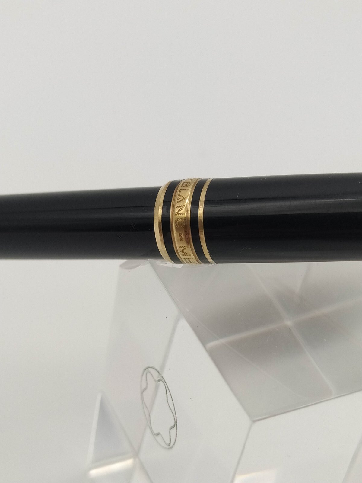
Hi All! I am a student who wrote with the same FP for many years. However, I wanted something new, so I decided to trade pens so that I could afford it and switch pens more often. I recently bought two Montblancs 144s. The price was good, but I have a few questions regarding the age, nib size and serial number. 1. How can I determen how old my pen is, even if there is no serial number. 2. I want to clean the pen a bit better, but I am not sure how to remove the nib. There is also not a good Youtube video that shows me that. Any ideas? 3. My pen has no serial number. I don't directly suspect the pen to be fake, but I am also not sure what the reason could be and if it's normal. Attached some pics for reference and age determination. Thank you all very much for your help in advance!
-

Please help with info on gold Cross fountain pens?!
Aholick3 posted a topic in Fountain & Dip Pens - First Stop
Hello my name is Ashley. I just became a member today so I’m new to this. A friend of mine gifted me these 2 Cross pens. I love how they write! I have always wanted a calligraphy pen because my writing looks so pretty when using one. I just don’t know anything about them. So one of the pens has cross 10kt On the top part of the lid and it’s a little lighter in color than the other one that just says cross with Ireland right underneath. I can’t find anything else it’s just a little bit darker in color. Also wondering if they are both 10kt. If you guys can please help me. I may sale one or both and I don’t want to short myself. I appreciate any help in advance! https://photos.app.goo.gl/pgBYZZBSSkCN9N5M7 -
I recently inherited a gold-filled Waterman pen from my grandfather's collection, but I'm struggling really hard to ID it. I initially thought the pen was a C/F, but it doesn't have the classic clip design that is typical of a C/F, and I'm at a loss for what else it could be. The pen has an inlaid 18k gold nib with minimal markings, just a Waterman W, 18k, and 750. It was manufactured in France and has "plaque or g" written on the cap. Anyone have any ideas?
-
Hi all, I'm curious about where Lamy Scala stands in the grand scheme of Lamy pens in terms of popularity. I know it's not as popular as the 2000 or Safari, but really, how popular or unpopular is it? And what about the one in pianoblack with gold nib? Feel free to express your views.
-
Hi All, Just a quick curiosity. I was looking on Bock's website earlier, and they appear to make Platinum nibs labelled Platinum 950(95% platinum). I can't seem to find any info online about them, and there aren't any manufacturers that seem to use Platinum nibs in their pens. Can you purchase these nibs anywhere, and has anyone used them ? If so, what are they like ? I'd be greatly appreciative if anyone could share their knowledge. Cheers
-
Conway Stewart Dandy Opinions
collectorofmanythings posted a topic in Fountain & Dip Pens - First Stop
Hello! I’ve been looking into possibly getting a modern Conway Stewart. I personally prefer gold nibs, and like the look of their Dandy model. I was wondering if any of you have any opinions on modern Conway Stewarts and/or this model. I haven’t seen really any review for it anywhere. Thanks, W. Major -
Do You Agree With This Statement: People Always Love Their First Gold Nib Better Than Other Pens That Work Better
collectorofmanythings posted a topic in Fountain & Dip Pens - First Stop
Like Brian Goulet loves his Custom 74 and Kerry from Pens and Tea loves her Platinum 3776 Century and I personally love my Sailor Pro Gear Slim Mini. Do you personally like your first gold nib more than other pens that write, look, feel, etc. better? Thank you for your responses! W. H. Major -
Can I Put A Gold #5 Size Nib in a Esterbrook JR Pocket Pen?
collectorofmanythings posted a topic in Fountain & Dip Pens - First Stop
Hello! I was wondering if any of you know or have ever tried to put a JoWo #5 size gold nib in an Esterbrook JR Pocket pen, specifically one from fpnibs.com. Thank you for your help! W. H. Major -
This is my first review, so if you can think of any part of the pen I did not cover then please ask questions below. This is the beautiful Magnifica Amalfi from Delta. The pen has a 14k extra-fine nib and comes with a gorgeous olive wood barrel with prominent grain. The rest of the pen is constructed from a variety of resins: two shades of blue, white, and red. 18k plating trims the pen. The filling mechanism is a captured converter - one which is highly efficient and takes ink all the way up to the seal. Fond, as Delta are, of basing their pens on locations and features of landscapes, this pen is made in honour of the coastal city of Amalfi: the olive wood barrel representing land; the resins representing the sparkling sea, sky, and mountains near the city. This is a numbered edition pen. The nib itself is a true EF. I mention this because the last time I used a Delta EF it was a steel nib and wrote as a medium. I purchased this pen expecteing a very 'liberal' EF nib and was pleasantly surprised to discover that it wrote as finely as my Faber-Castell EF (more on that in the writing sample). Initial inspection under a loupe showed the tines to be strongly misaligned, however I also noticed the feed was fractionally misaligned as well. After giving the feed a slight nudge it audibly 'clicked' into its correct setting and this had the effect of aligning the tines as close to perfect as-makes-no-difference. After looking at all angles through my loupe the tipping material makes a smooth sphere at the contact point, no tinkering needed. Although not visible in the photograph there is a healthy slit of light between the tines. The resins are simply beautiful. Let me get the obligatory "no camera can capture the beauty of... " sentiment out of the way, and tell you that I firmly believed the blue sections of the pen to be celluloid. I found it difficult to believe that resin could have such subtlety in its chatoyance and interaction with light - even my Dolcevita cannot match the glimmer and sheen of these resins. Although the following images do not do the effect justice, compare these two: now imagine the highlights in the second image emerging from the deep blue, curving into visibility like a shoal of fish. Here is a deliberately underexposed shot of the cap to show that even the white resin band has some subtle marbling effect, albeit barely discernible And here is a view of the red band, again some texture is visible. Another comparison of the way the resin reacts to light can be seen by comparing the light blue resin of the blind cap in the above photograph with the full length horizontal shot at the beginning of the review: the latter appearing very subdued, the former catching light from a new angle. A closer view of the section. The threads are not sharp. The seal of Amalfi and a maritime compass form the ends of the pen. Hopefully my appreciation of this pen is evident, so I will now deal with a couple of niggles. The gold ring separating the section and barrel is loose enough to create a slight rattle if you tap the area (handing the pen to someone, placing the pen down uncapped etc.) and though it does not slide forward or come off, this bothers me. Not a big deal, but I'd rather it wasn't there. Another small detail is that the word "Amalfi" beneath the number on the cap is not centred with the exact rear of the cap (the number is). It is however centred between the word "MAGNIFICA". This means that the gold band was not centred when it was affixed to the cap. Again, it's a tiny detail, but worth mentioning. Those of you who find the rattle of converter tips inside tapering pens annoying are, unfortunately, going to notice an issue with this pen. To make sure that the gold plated captured converter does not scratch after inserting though the barrel there is some leeway in the fit. This means that the user operated twist section has a fraction of a millimetre of space around it, causing the occasional rattle when tapped. I fixed this in mine with an accurately measured shim of paper. This will only fall out when the entire barrel is removed, not when filling up each time.It is an invisible and quick fix for those of us who are pernickety enough to care. As for the feel of the pen - it is very light by my standards. The uncapped body with a full load of ink is 22g, the cap 18g. This is however an EF and so I can accept a pen this light. The section has a very pleasant concave taper, comfortable and natural. The transition between the different materials is also very good. The three resins on the cap are all flush, as is the wood -> red resin -> metal -> blue resin combination at the rear of the pen. However the fortifications detailed on the gold band are raised slightly, and this does occasionally catch on my hand. Not too egregious, but enough to remind you that the pen is there. Posting the cap doesn't change anything either as the "MAGNIFICA" gold band falls in the same place. It also has raised detail. Speaking of posting - the pen certaily feels more substantial and not too back-heavy, but I have a dislike of posting pens and doing so always makes the pen I am using feel wrong, so I am not the best to judge this. The pens writes very smoothly. I'm used to EF nibs so my hand is accustomed to the gentle touch required to creat smooth contact with EF nibs. YMMV. The blue ink below is from the bottle in the first image. It is not named so for all I know it clould just be normal Delta Blue. I refer to it as "Amalfi Blue". The Amalfi Blue ink lays down vibrantly, yet significantly fades on drying. The green ink is from my Faber-Castell E-Motion EF. That was previously the finest nib I had, much finer than other EF nibs by various companies. And here is a medium nib with the same blue ink, the Amalfi pen writing underneath. Thank you for reading. This review was written in one continuous stream without editing or revision, so if you have any questions about something I missed, please ask.
-
I am interested in Ratnam Pens because of all the Indian fountain pen creators they seem to be the only ones who make things "from scratch", including the nibs. I dropped a message on Ratnam's WhatsApp number asking whether they make gold nib pens today. Surprisingly I got back a "No" for an answer. IIRC the person who made those pens (Mr. Ratnam) is quite old. Does he no longer work?
-
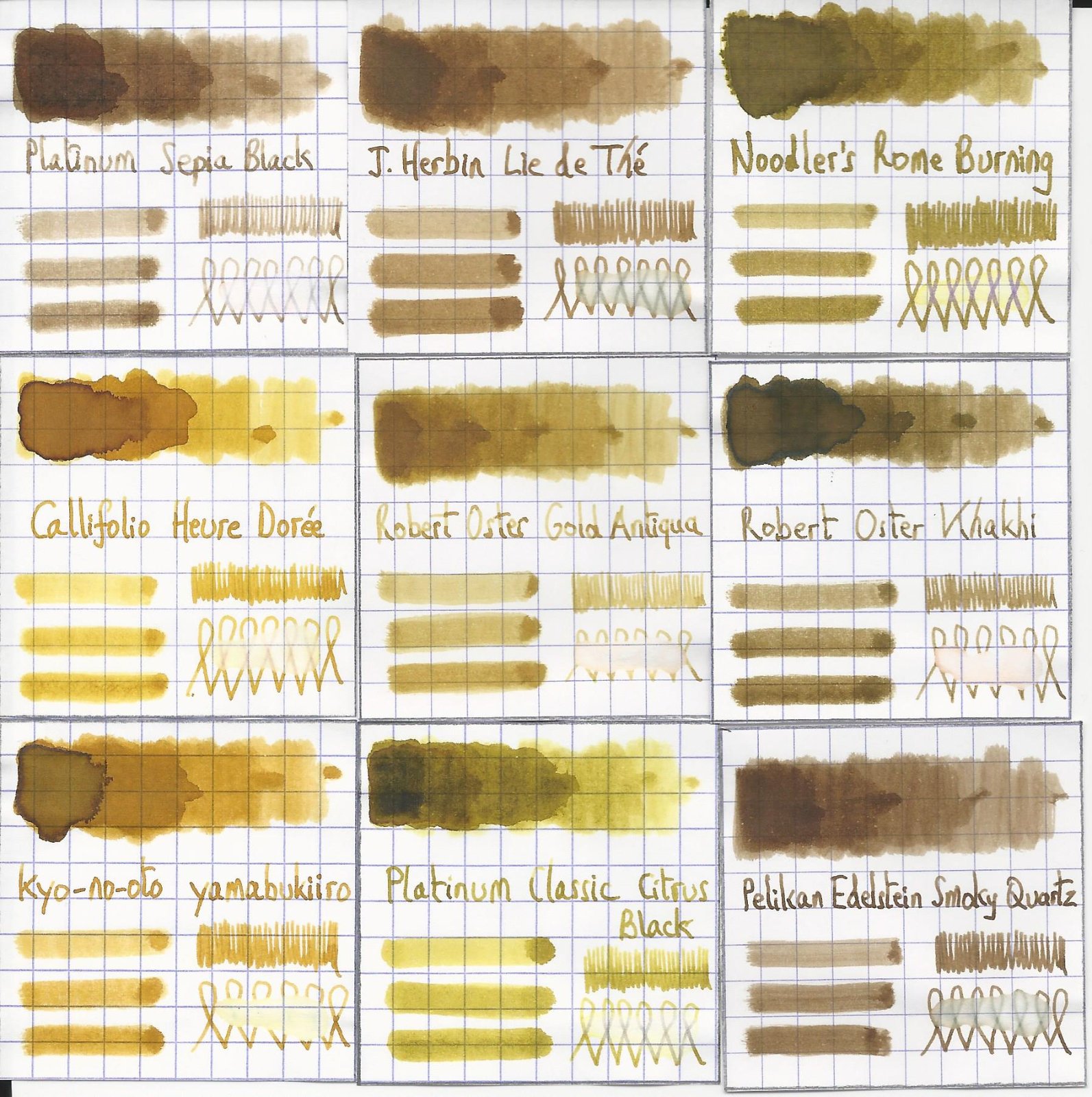
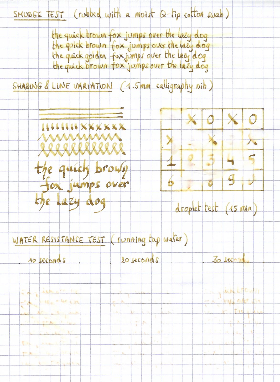
Robert Oster Signature - Gold Antiqua Robert Oster is an Australian ink maker that is well-known for its unique range of colours. On his website, he describes our shared love quite eloquently: “Robert Oster Signature originates from one of the most famous wine producing regions of the world, the Coonawarra district of South Australia, an idyllic setting with great influence on the senses. There is my inspiration. It’s a joy to share it with you.” Well, we are certainly fortunate to have inspiring ink makers like Robert Oster to satiate our thirst for glorious inks. In this review I take a closer look at Gold Antiqua – a yellow-gold-brown with a very pleasing appearance. Yellow-leaning inks often suffer from insufficient contrast with the paper, making them less suitable for writing. But this Gold Antiqua also leans towards brown, which enhances the contrast. As it turns out, this makes it a very pleasant-looking colour that looks great on paper. A playful ink for happy times. Gold Antiqua came to my attention through one of LizEF’s excellent Efnir video reviews. Turns out I had a small sample I received from Catherine of Sakura – just enough to give it a test drive. To show you the impact of saturation on the ink’s look & feel on paper, I made some scribbles on Tomoe River where I really saturated portions of the paper with ink. This gives you a good idea of what the ink is capable of in terms of colour range. As you can see, Gold Antiqua has a rather broad tonal range, with quite a bit of contrast between the light and dark parts. This translates to a strong shading ink. Like most Robert Oster inks there is zero water resistance. Short exposures to water completely obliterate the text, leaving next to nothing on the page. The chroma for this ink is definitely interesting, and shows some amazing complexity. I see a multitude of component dyes, that miraculously combine to form the ink’s golden glow. Master mixer at work! I’ve tested the ink on a wide variety of paper – from crappy Moleskine to high-end Tomoe River. On every small band of paper I show you: An ink swab, made with a cotton Q-tip 1-2-3 pass swab, to show increasing saturation An ink scribble made with an M-nib Lamy Safari fountain pen The name of the paper used, written with a B-nib Lamy Safari A small text sample, written with an M-nib Lamy Safari Origin of the quote, written with the B-nib Safari Drying times of the ink on the paper (with the M-nib Lamy) Gold Antiqua behaves well on most paper types. I didn’t notice any feathering, and only a tiny bit of show-through and bleed-through on the Moleskine. Drying times are quite low in the 5-second range with the Lamy Safari M-nib. The strong shading is very present on all papers, but a bit less pronounced on more yellow paper. The yellow paper seems to reduce the contrast between light and dark parts of the writing – the yellow background darkens up the light parts a bit. As a result, I personally like this ink best on the more yellow paper. I’ve also added a few photos to give another view on the ink. In the scanner samples above, the shading contrast in the written text is a bit exaggerated, making it look too harsh. The photos below show a more realistic view of the ink’s shading. Writing with different nib sizes The picture below shows the effect of nib sizes on the writing. All samples were written with a Lamy Safari, which is typically a dry pen. I also added a visiting pen: a wet-writing Lamy Dialog 3 with M-nib. I personally find the ink a bit weak in the EF/F nib – if you use fine nibs, you’re advised to use a wet pen (the dry-writing Safari is no good match). The ink is clearly a very heavy shader. Normally, I don’t like this, but with Gold Antiqua the interplay between light and dark gold works, and results in an interesting look. It makes for a great ink to use on greeting cards – my guess is it will look just stunning in a wet pen with a broad stub. Related inks To compare Gold Antiqua with related inks, I use my nine-grid format with the currently reviewed ink at the center. This format shows the name of related inks, a saturation sample, a 1-2-3 swab and a water resistance test – all in a very compact format. Inkxperiment – In Flanders Fields With every review, I try to create an interesting drawing using only the ink I’m working on. Limiting myself to one ink allows me to showcase its colour-range nuances. For me, this is the fun part of every ink review. Having only a 2.5 ml ink sample meant that I had to make every drop count. So I reused the Q-tips from the text-sample swabs to paint the drawing. I started with a 10x15 cm piece of HP photo paper, and used the Q-tips to draw the sky and Flanders Fields. A Q-tip with my last drop of pure Gold Antiqua was used for the sun. The trees and the accents in the field are added with the M/B nibbed Lamy Safari. Yellow inks are often amazing for drawing, and Gold Antiqua is no exception. This one is born for creating your own greeting cards. I enjoy the way it looks on the photo paper – add a “Happy New Year” and you’ve got a greeting card with a personal touch that beats any you can buy in stores. Conclusion Robert Oster Gold Antiqua truly is a beautiful golden ink, with good contrast on paper and very strong shading. Although I’m not in general a fan of strong-shading inks, this one manages to pull it off. A fine ink for personal correspondence or for use on greeting cards. I really liked this ink for drawing – it just looks amazing! A playful ink that I loved experimenting with. Technical test results on Rhodia N° 16 notepad paper, written with Lamy Safari, M-nib Back-side of writing samples on different paper types
-
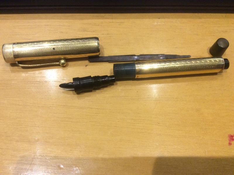
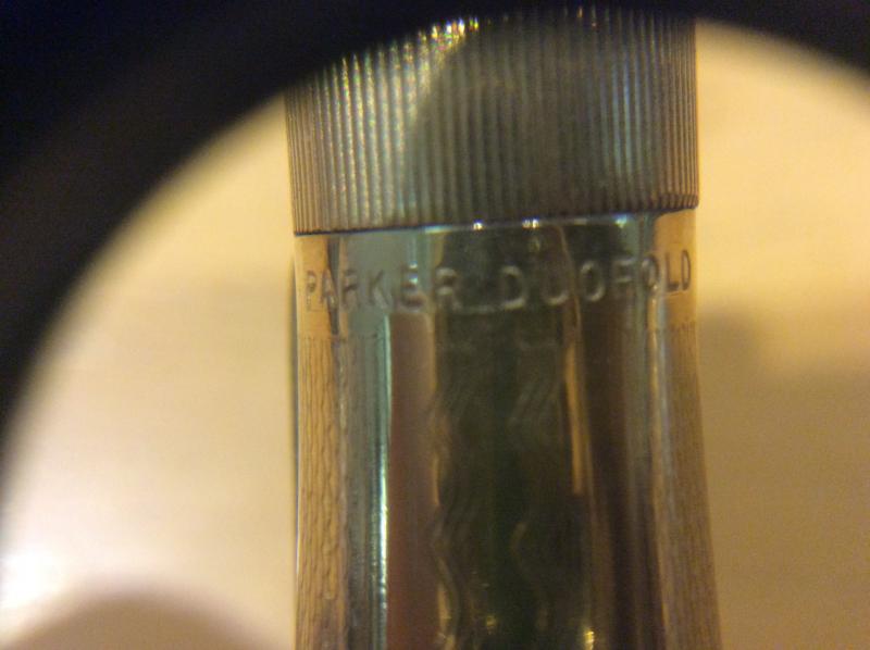
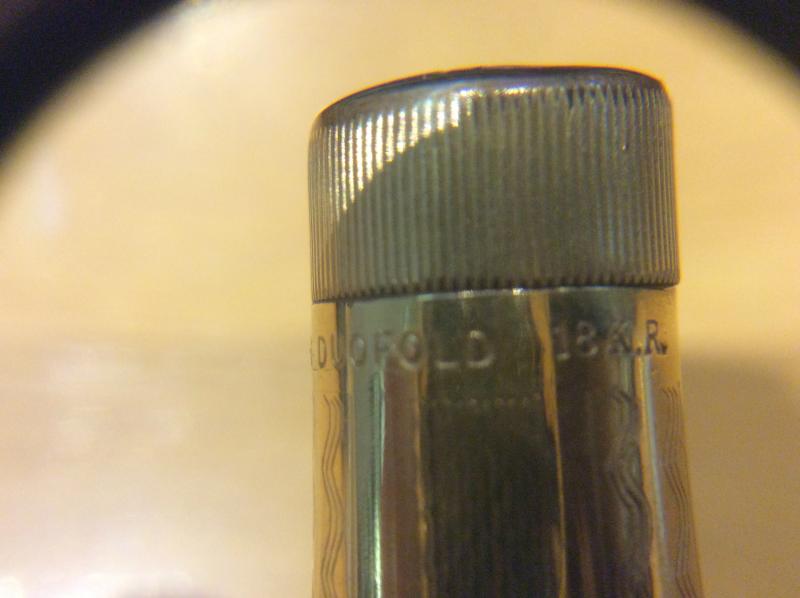
Hello fine folk of the forum! I found this at the flea market, it apears to be a vest pocket duofold, it is only slightly longer than my kaweco sport but I haven´t been able to find pictures of this pattern anywhere. I have seen some jack-knife models with these gold waves but this one has breather holes, an inner cap and the christmas tree feed. It came with a "Warranted 14k USA" nib which seems to be too small for the pen thouh it fits the feed nicely. The green section and brown tail cap would sugest they aren´t from the original pen buit they fit perfectly. Have you seen these before? Any aditional info is apreciated
-
I posted this in the Italy forum, but I think this is a better place... I've heard that Visconti are going to phase out the Dreamtouch Pd nibs...the relaunched watermark series and the Voyager 30 all have 18K nibs. Flipside? The newer nibs are insanely expensive. I queried getting one for my watermark feom 2017 to swap out the Pd nib, and they are EUR315+VAT for F, M and B and the EF and Stub will be EUR363+VAT I'm not sure whether they're just meant to replace the Pd nibs or are simply another tier up...Considering they're a good EUR125 (ex-VAT) more expensive than the Pd nib units, this could mean the refreshes of the HS series could go up by as much as US$200(!) Your thoughts?
-
For a possible pending purchase the nib will be a Bock #8. Any user experience on the difference between the gold one and the titanium nib of that size? How do they relate on size (M to B , flex (and perhaps stub or not)? Currently I have a Bock #6 titan B in daily rotation. The new one can use some extra caracter (titan M stub, gold B,...) I suppose it will be possible to testwrite the nibs, but some user experience might be very usefull of course.
-
Hello from Boston. Does anyone happen to know anything about the company that manufactured Winsor & Mason gold dip nibs? I'm giving one away as a Christmas gift and would love to tell the recipient something beyond "it was probably manufactured between 1850 and 1900...". Many thanks. Nick
-

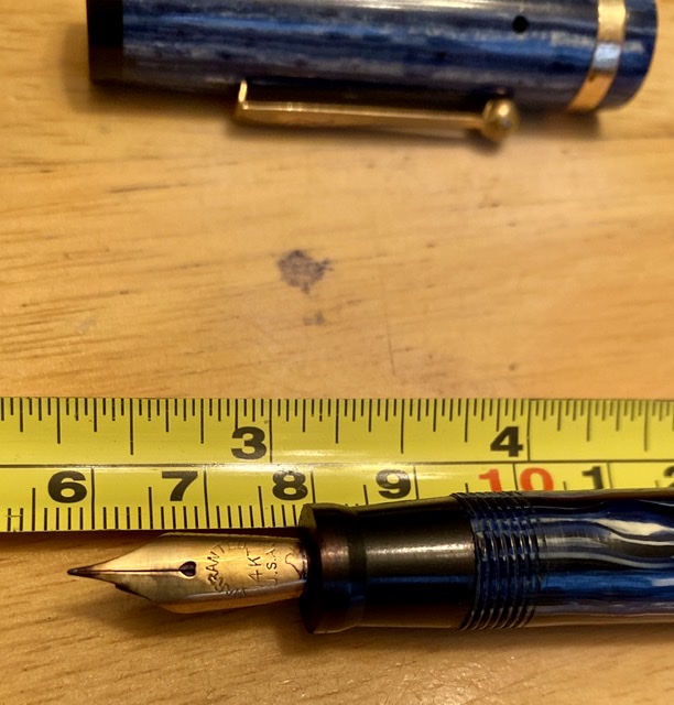
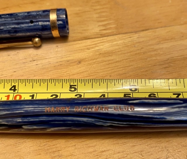
Mystery - Large Blue Ford “Harry Richman Club” Fp
svorg posted a topic in Fountain & Dip Pens - First Stop
I would love to find more info on this pen I bought years ago. It’s a good-sized blue 1920’s-ish FP with a 14k gold nib, the FORD logo on the clip, and “Harry Richman Club” stamped in orange or red on the barrel. Only recently I saw a pen like this on eBay but without the Richman stamp. Harry Richman was a singer/actor who sang the famous song “Putting on the Ritz” and owned his own namesake club in NYC for a time in the 20’s/30’s. I would love to know the connection between FORD and Richman and any estimated worth or value. Thanks! Scott
-
I've heard that Visconti are going to phase out the Dreamtouch Pd nibs...the relaunched watermark series and the Voyager 30 all have 18K nibs. Flipside? The newer nibs are insanely expensive. I queried getting one for my watermark to swap out the Pd nib, and they are EUR315+VAT for F, M and B and the EF and Stub will be EUR363+VAT I'm not sure whether they're just meant to replace the Pd nibs or are simply another tier up...Considering they're a good EUR125 (ex-VAT) more expensive than the Pd nib units, this could mean the refreshes of the HS series could go up by as much as US$200(!) Your thoughts?


1.jpg.07d484179df18eb04c572da04cc9d663.jpg)
1.jpg.16620da25747e5eef54032209bafd676.jpg)
1.jpg.02236ba4b249ea1fae7abb0462cc7e6c.jpg)