Search the Community
Showing results for tags 'fountain pen'.
-
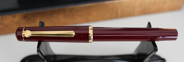
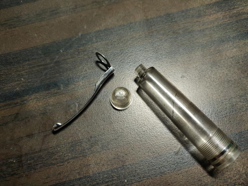
Recently I won a lot in eBay that included a black A.W. Faber-Castell “Value Fountain Pen” (Wertfüllhalter). Lambrou’s book has this as model 36/56 produced in 1936, around the time when Faber-Castell was buying into Osmia. These are not easy to find and mine came with a manifold D nib, which I understand are even less common. The pen works on the same principle as the Vacumatic. There is a short rubber sack attached to the end of an inner chamber and when this sack is compressed (by a short pressure bar attached to a button) and let to expand, it draws ink via a long breather tube attached to the feed. I could not find any diagrams of how this pen looks like inside or how it is disassembled. Old posts in penexchange.de mention that is a difficult pen to repair. Thanks to an old brouchure I could find in Paolo’s Pen Post, I had a vague idea that there should be an inner chamber to which the rubber sack was attached and that this most likely was attached to or part of the section. So, without much information but just intuition and patience, I tried to see if I could get this apart. The easiest thing to disassemble was the rear. The blind cap is made of hard rubber (as is the top of the cap above the clip) and this removes to reveal an enamelled button attached to a black painted aluminium screw base. The button pulls easily, together with the pressure bar which is bent outwards (more on this later). A Vacumatic pump extraction tool would fit the aluminium screw assembly (but just about) and this also comes off easily to reveal the rubber sac. When you pull the remnants of this you can see the upper end of the inner ink chamber, and what appears to be a circular channel cut inside the barrel. At first I thought the sac would fit into this channel, but that was not the case. The front end is where the complication of repairing this pen lies. The nib / feed is mounted on a collar that screws into the section, very much like the MB or Pelikan design. There are some holes for a tool, but none of the ones I had worked and in the end, it required a lot of soaking (about a week) for the nib assembly to come off. I was hoping that the inner chamber was attached to the feed, but that is not the case. One has to remove the section to get to that. The section is also made of hard rubber and is clearly a separate part from the rest of the barrel, which is made from celluloid. Unlike Pelikan’s design of a unibody barrel / section, this should come off. The problem is that it wouldn’t! After much soaking I got the section to move, but it was not screwed, and all it did was rotate around the barrel end. No amount of pulling force would make it move out even a millimetre. I assumed for a while this operated in the same manner as the Pelikan pistons for the 400 series, which have to be knocked from inside the barrel after soaking and heating. I tried to hammer it out from inside and while it moved out ever so slightly, the moment I tried to grab it from the section it went back to its original position! As a last resort, I tried to heat the barrel as much as it could take, bearing in mind this was celluloid, and using a spark plug removal tool I pulled with force from the section grip and after a couple of tries, the part finally came off! It turns out the inner chamber has some ridges which were filled with shellac or other type of cement and were grabbing the barrel. Once this came out, the pen was now fully disassembled! These are all the parts, ready for ultrasonic cleaning: From there, repairing the pen was largely uneventful. I used a size 20 rubber sack and measured it against the old one to make sure it was not coming against the button screw assembly which, as you can see from the picture above, is essentially a cap with a small opening just to allow the pressure bar to come through. This seems like a good design, as the cap prevents the button being pressed too much, potentially breaking the mechanism. After measuring twice to be sure and ensuring the sac was cut clean, I just glued it with shellac to the lip of the inner chamber. Once dried and powdered with talcum, I screwed the nib/feed assembly back into the section and reinserted the whole thing into the barrel. It required generous heating of the barrel on the way back, as the inner chamber is really a tight fit. I did not deem necessary to add any shellac to this. The ridges outside the inner chamber create enough friction for the section not to move at all once the plastic hardens in place. So far it has not moved at all. At the other end of the barrel, the aluminium blind cap screw could be inserted back by hand without much problem. The final step was re-inserting the pressure bar-button assembly. The pressure bar bends outwards, towards the barrel’s walls, and the sharp end comes to rest into a ridge which is cut from inside the barrel, about half-way through. This coincides with the end of the inner ink chamber. Therefore, when the button is actioned, there is no pressure on the inner chamber but actually on the barrel wall. This way the section is unperturbed and would not come out of place accidentally by pushing the button. That’s also why I thought it was unnecessary to shellac it into place. Despite the name “value” implying the pen was inexpensive (these were sold for 15RM, or about 100€ in today’s money), the pen feels well designed and quality made. The thickness of the celluloid barrel is very generous, and the rubber section quite sturdy, surviving unscathed my various attempts to wiggle it out of place. What I don’t understand is why Faber-Castell did not go for a screw-in section. The pressure-fit design with the ridges works well but is a bit nerve-wrecking to disassemble, and one has to be careful to either leave the feed and nib in place when removing it, or inserting a pencil in its place to avoid breaking the hard rubber grip. The most interesting part was the feed / nib assembly. The breather tube had a moveable piece of hard rubber with a channel going through it, like a sort of inner feed that stops against a narrower section of the inner chamber. I am not quite sure why this was needed and in subsequent pictures I have found of other similar pens, this part appears to be missing. I am not sure what would be the impact of not having it. When inserting this back, I placed it carefully on top of the feed, aligning the channels to ensure capillarity works its magic, and so far I have not found any flow issues with it Here is how the pen looks fully restored, with a writing sample. As expected, the nib is stiff but smooth and yields a very generous flow, even with dry ink (I was using Pelikan 4001 Violet).

-
Kaco Master 14k Fountain Pen- Best Chinese Pen Ever with a great Soft Springy Gold Nib
punjabi posted a topic in Fountain Pen Reviews
This is a review of “Kaco Master”. It’s the best Chinese Fountain pen I have come across till now.Kaco is a young company which makes some great products. Kaco since its inception in 2011 have launched many pens & accessories . This “Kaco Master” is among their most premium offerings .This has German Made Gold Nib , it doesn’t feel like it’s made by Jowo or Bock. It feels a bit different from those both. I think they are made by special order or made by some other company ! Pros- – Great 14k Gold Nib – Well Tuned Out Of The Box – Soft & Springy Nib – Minimalistic Design – Top Notch Construction – Great Price – Great Packing & Presentation – Hourglass Shaped Section – Have Premium Look – Suitable For Long Writing Sessions Cons- – Only comes in one colour i.e. Black for gold nib. Although the steel nib version comes in many colors. – Don’t post securely. – I can’t expect anything more at this price !!! Packing- Great, The pen comes with a great grey metallic case, which comes in a black box over which “Kaco” is engraved. The metallic oval case has a foam insert in it where the pen can rest. This foam ensures that the pen doesn’t get scratched with the sides of the metal case. Specifications- – Nib Size -Fine Nib 0.5mm – Filling Mechanism: standard cartridges and converter – Capped Pen length: 154mm – Section Length: 25mm – Section Diameter: 12.5 mm – Uncapped Pen Length : 133mm – Diameter: 16.5 mm – Pen weight: 27.5g Appearance & Design- Good, The pen has a classic design. It’s made of great quality black resin which has been highly polished. The clip is of gold color & fit into a clip-shaped recess in the cap & almost aligns with the cap of the pen .The clip is strong & is very functional. It is unique & looks good in my pocket. The clip has a small logo of “Kaco” over it .The pen size is around 133 mm uncapped & 154 mm capped. It doesn’t cap securely.This pen is made in very nice black resin, it is super shiny & feels premium in hand . I wish they had other colors too. It has an hourglass-shaped section & a number #6 14k nib in Fine with “Kaco” logo engraved over. It has a plastic feed. The section is long & threads of the cap are precise. This nib looks good & is similar to JOWO nib but it’s not JOWO. The nib suits the pen size & looks good. This pen is very comfortable for long writing sessions too. Construction- Very Well Made, The construction of this pen is top notch.The pen has been polished well & has been given a mirror like finish on both clip as well as body. It looks pleasing to the eyes , but as a result it attracts dust & micro scratches may be noticeable. The pen is elegant & is a perfect minimalistic office pen. Filling System- This is a simple C/C pen. The converter is interchangeable with a Schmidt K5 converter. It has metal reinforcements in the mouth & it is perfectly functional. You can use standard international cartridges too Nib Performance- Amazing , Kaco Master has #6 nib which is very springy and relatively soft.It is surely better than JOWO/BOCK nibs. This nib has a slight forward curve which makes a different writing angle which is different from others, I think it’s some unique Chinese grind. This is very smooth & gives a distinctive feel while writing. The nib is similar to European Fine Nibs.On the box, it’s written the nib is made in Germany but nib doesn’t look like common nibs i.e. JOWO or BOCK . Conclusion- True Master, This is the best Chinese pen I have ever used & one of the best pens available at this price. I bought it for around $120. The pen is very well made & has a great 14 k gold nib. It has a minimalistic look,which is amazing. The glossy black color looks good but I feel there should be more color options in this pen. I really can’t expect anything more at this price. It is true value for money given the quality, ergonomics and writing experience. It’s a masterpiece about which most people don’t know about !
-
 Recently an online shop in my area started to sell Kakimori fountain pens. The shop started to sell the Kakimori Frost fountain pen and the Kakimori Aluminium. These pens are sold as "made in Japan" but also "with a nib and converter from Germany". The nib and converter are made by Schmidt. There seems to be not many reviews about these pens and the inks from Kakimori seems to be better known than their pens. Are these pens worth the money? How do these compare with comparable (in size and price) pens from TWSBI, Pilot, Platinum, Sailor or Caran d' Ache?
 -
Pen bought around 2014. Fine nib. Thoroughly flushed with distilled water overnight, inked for the first time today with KWZ "Spacer nad Wisłą" ink. No skipping, just shaky hands.
-
CALICUT CITY- SOME UNTOLD STORIES I don’t how many could believe that Calicut, a city of Kerala, have such a rich heritage in fountain pens- so that it may be called as the pen city of Kerala. Probably as the only man in FPN from Calicut, I take the responsibility to present our city in this forum. The pen productions have started in early 1950s. By 1955-1960, there are four major firms of pen making. Don’t think that these are big companies producing pens and marketing in wide areas. Actually these are four pen shops, and each shop produced pens for their own shops only. And because of this poor marketing strategy, they are almost unknown to the outside world. As the healthy competition continued, many beauties have born. The pen history can be roughly be divided into 6 phases. 1950 - 1955 PEN PRODUCTION begins . 1955 - 1960 CONSOLIDATION PHASE – By this period all the 4 pen shops came into existence and production started at full swing. 1960 - 1970 THE GOLDEN ERA. This period have witnessed these shops running in full glory, churning out the maximum number and variety of pens. 1970 - 1980 THE DECLINE STARTS 1980 - 1990 THE BIG DECLINE 1990 - PRESENT. All the things happened right here- in the SM Street. The most busy street of Calicut. SM stands for Sweet Meat. Wondering what’s sweet meat ? . It’s nothing like meat. A hard rubbery confectionary -or Calicut Halwa- as known outside Calicut. You can see a lot of shops selling this here. They are available in a variety of colours and flavors—atleast twenty I think- more that what colours you are getting for a Sheaffer Skrip or Waterman range of inks! ABOUT CALICUT For those who don’t know, Calicut ( or KOZHIKODE) is a city situated in the coastal Malabar area of Kerala, India. It’s the only place in Kerala where fountain pens are made. Calicut is also known as the Biriyani capital of Kerala. Wonder why .. all pen cities are famous for their biriyanis also ..!? the Malabari biriyani is made in process were all the rice, meat and the spices are cooked in a closed container where the soft aromas and infused to rice in a slow process of around 5-6 hrs. Now, coming to the story part - The whole credit of fountain pens of Calicut goes to one and only person- Mr. M. Haneefa Rawthar- for without him the story would not have happened. People called him Haneefa Saheeb. He came from somewhere in Tamil Nadu in around or before 1950. At that time ( and now also) many people comes from other states to Calicut as merchants. His first visit was somewhere around 1950. He came with a huge collection of fountain pens- used and new, along with a lot of spare parts. Usually persons coming to Calicut are attracted by the hospitality and friendliness of natives and most of the merchants and traders later decided to settle here. Haneefa Saheeb was no different. Don’t think that there was no pens at all before Haneefa Saheeb. Imported pens like Waterman, Black bird, Swan were there. These were costly and not afforded by all. Apart from regular pens, dip pens were also popular. Ink tablets were also popular at that time. For making ink, you have to dissolve tablet in water! For dip pens, thicker inks were made with tablets dissolved in lesser water. Also they were available at very cheap rate compared to an ink bottle. Any ink manufacturer reading this? Coming back to Haneefa Sahib, a man with no formal education, but lot of experience from worldwide travelling and visiting so many countries, now at his fifties or sixties, toying with the idea of starting a pen shop at Calicut. FIRST PEN SHOP OF CALICUT The first pen shop of Calicut opens in SM street in 1950. As expected the shop flourished very quickly. This shop later became Kim and Co pens, as known today. As he sold new and old pens, he provided them with good service, as he had a huge collection of spares. Kim and Co shop at Calicut.( at present)
-
Can you imagine which of your pens may still be in use or rotation in five years time? What may be like your relation with fountain pens in general in the future? What is it like now? Is it likely to change or evolve significantly? A bigger or more defined collection or just a few selected pens you may fall in love with on your way? I hope you don't mind me asking.
-
Dear Fellow Penthusiast, I would like to introduce you with Scrikss 419 fountain pen. Scrikss is a Turkish brand which made its production in Turkey about 70's. It was very popular back then. Nowadays they have the production mostly in China. 419 is considered a vintage pen since it is hard to find right now. The pen is quite similar to Pelikan M150 and M200. A piston filler, screw capped, daily workhorse. It is a light pen with a smooth nib. Works out of box immediately. Has a medium flow. There is no indication on the nib. But it writes just between Medium and Fine For more photos and comparison to Pelikan M200 and M150 please click here http://www.banasikcayaz.com/2013/08/scrikss-419-fountain-pen-review-scrikss.html Hope you enjoy!
-
I request all fellow users to show off the Ebonite only pens here.... Show us your ebonite beauties here .... Would really love to know what all we have....
-
My biggest complaint about the Scribo Feel is that it doesn't post. Does anyone know if Scribo's Piuma model posts? There is another model called the La Dotta that looks (and is priced) similar to the Feel. What's the difference? Thanks!
-
Hello my Pilot friends, I have a couple of Vanishing Point fountain pens I’ve owned for years. One is the slightly smaller size called, I believe, “Decimo.” The other is the type with a plastic barrel that’s sort of faceted in texture, if that’s the right word. I’m planning to sell both of these. What’s the model name of that faceted version? Also, where is the best place to sell these now? I’d love to avoid eBay if possible. Thanks, Gary
-
Kanwrite as a pen holds a special place for me, a pen that reignited my desire to look for Indian pens over staple of other well established FP manufacturers. Kanwrite in itself are not a small name from India in our little world of fountains but it certainly was big step for me to get this in my hand mostly due to lack of general awareness and issue of availability locally. As sad it is, the reality is most Indian markets are either dominated by cheapo china or full-blown Luxor. Quite ironic, in a place where so many masters of this craft of making a pen are hidden in plain sight, we get mostly whats rather pale imitation of same product in maybe better looking package. Thus is my title beginning of a journey to look again and broaden my view……...its been a couple of year since then but I only managed to get a desire for myself after a while almost a year ago to be exact. So I thought what better way to start a review on FPN with the pen that restarted it all for me. A small disclaimer; This is my first review so please do ask for anything I missed and apologies for mistakes upfront. Also my experience may differ from other fellow users so do share them would love to hear from everyone. Also pen has ink stains inside cos of using multiple permanent inks in a demonstrator as ED….yeah I know. This will be my take of desire with honest opinion after using for almost a year now and its long. Looks and design: The most subjective of all the aspects of anything so lets take it down first. The pen is classic cigar shaped with no surprises to go with. There is tapering at end but its practically negligible. Now color options are a lot really including 4 demonstrator, solids and marbles so there is something for everyone. The pen has a simple clip so no surprise here either. Its not ball ended as such there is no visible ball on end but the pen does has ball shaped tapering for easy slides in pocket and it works with no issues no complain here and I in general prefer understated designs. Clip is secured via screw on top which can be removed to get change clip or change the positioning or anything else. It has good springiness to it as well. Its also the only part in my pen with kanwrite written on it.The pen posts quite nicely and securely so no issues here either. Marble color options taken from kanwrite brochure there are more marble options than this in brochure. Body and construction: The pen is made of acrylic, it was once CAB but that was changed along the way with other change being new threaded screw type converter by kanwrite from earlier plunger type design more on that later. The body being acrylic is welcome step from plastic and sure feels sturdier in hand but, and this is important, its by no means a pen that you want to fall with. The pen should survive but I have my doubts on this point, at the very least I suspect a crack may happen if fallen on hard surface from decent height. Best case avoid it. I have demonstrator version so it could be that too (I feel demonstrators require more care in this aspect). The pen is light overall which is to be expected of acrylic so no surprise here either. Pen needs 1+3/4 turn to unscrew the cap. Threads are fine and have no issues in either closing or opening this applies for all threads from barrel, cap and nib housing which was nice to see. Nib housing will be a bit tight but that is to be expected here. a pic of cap and clip Filling mechanism and converter: Desire is a 3 in 1 pen so no surprise here…….well there is though. The converter is the point. This will be interesting as it was for me at least. The pen has threaded screw converter developed in house by Kanwrite (that's what I think correct me if wrong) and it performs well…....until it does not. See the converter has silicon grease at end to offer extra layer of seal and it works great until the grease is there. In my case the grease was cleaned by me while cleaning the converter and that caused a leak from end section of converter…...solution is simple though just apply some grease and done. Also the pen accepts standard international converters and cartridges so its fine to just replace the thing if its having issue or not interested in hassle. Nib, feed and writing: This is the party piece of the pen. First what is what. The nib is Kanwrite steel nib while feed is plastic and both are friction fit so easy to replace the nibs when one wants to. The entire assembly is screwed in and can be removed by turning anti-clockwise so replacing nib housing is also very easy. The nib options are #6 (35mm) and #5 (27mm) nibs with fine, medium, broad, stub Regular and Fine Medium Flex on the table. I went for fine nib for daily use of pen. The pen is wet writer which I personally prefer so this was great for me. No skips or hard starts either with very consistent flow. The nib has a bit of feedback which is characteristic of Kanwrite nibs its not scratchy by any means and will feel like very fine pencil. In fact take a 0.7mm pencil and use it for a while after this put very gentle force to write….that's the feedback you will get (a very crude way to judge but that closest I can think without comparing to other nibs). If compared then closest feeling among my lot is lamy safari with shin-kai ink in my case. Overall its very smooth and wet nib to write with. Width is Indian fine which is between western fine and medium. Once combined with wet ink the pen will become really wet writer, no leaks but still very wet. Eye Dropper conversion is easily possible. Reverse writing is possible and lines will be very fine but pen will feel a bit scratchy. nib comparison with different pens. pen order from left to right- Camlin trinity, platinum preppy, Kanwrite Desire, Pilot Metropolitan and Lamy Safari pen size comparison- from left to right Camlin trinity, platinum preppy, Kanwrite Desire, Pilot metropolitan and Lamy safari feed comparison with Kanwrite Heritage which has ebonite feed. side image Line variation is possible but its not a flex nib so don’t try to get too much out of it, a little is possible but go for flex version otherwise. On the note of lines I do feel that nib is quite forgiving and allows for errors in angle for holding to great extent which is really good for those new to Fountains and I personally appreciate on long writing sessions as mistakes there are possible and can break flow of writing easily (at least for me). Inks that I have tested are waterman serenity blue (my staple testing ink): result was wet and smooth lines and nib on wetter side. ED conversion shows burping at standard 3/4th mark. R&K Sallix: Iron gall ink, a dry ink and will make feedback more visible, no scratchy feel just more feedback. No skips or flow issue seen. ED conversion possible and dry ink shows bit more resistant to burp but it will still occur sooner or later (it managed to cross 3/4th mark in my case abide by small margin). Iroshizuku murasaki shikibu: wetter side of spectrum the feedback will still be present but lesser then dry inks. No issue in flow and no skips seen. No leaks and ED is very much possible with burp at standard 3/4th mark it good. Platinum Carbon ink: a very wet ink, feedback is fallen by a several notches but flow sees a big rise no leaks or over release of ink the flow is still managed nicely, wont recommend ED for this type of ink though as in my case it left permanent stains and ink burp issue was seen earlier then usual ED case (earlier than standard 3/4th mark). A small writing sample, ink used is platinum carbon black. Final thoughts and price: For the price of Rs 650 (~$ 9) plus delivery I feel its a great deal considering what one gets, simply put good pen and for those who go for long writing sessions or for those who are new to fountain pens and are aiming for such price ranges or just about anyone looking to add another one. Yes there are minor issues but for me they were easy to overlook and that made the pen great from good for me. Honestly I felt the flaw were mostly nitpicking for this price. Also I would say that the customer service from kanwrite was excellent in my eyes. The contact was established on watsapp after a direct call and order was done there, mails sent received the replies withing 3 days so I am quite satisfied with that aspect as well. These are strange times so keep yourself healthy and happy, wishing you all a long inky and colorful days ahead.
-

ROTRING 600 fountain pen with rollerball cap, the crack on the cap just grew?
ANOTHER MIND posted a topic in Other Brands - Europe
Last year I found a beaten up a black Rotring 600 fountain barrel (of course with the mandatory crack), section, nib but with no cap. After some time I tried my luck and bought a seemingly NOS 600 rollerball cap that had an almost invisible crack. Fastworded around 2 months and the crack on cap grew considerably. I never dropped it, it was kept in a drawer, it had no exposure to higy humidity, extreme low / high temperatures, it was constantly at around 22 grades C. I have a video (link here: Rotring 600 fp review) where I have the unboxing of the cap when I received it and the rest of the video where the crack is much larger. Did anything like this happened to your black 600? My first impression was: was I so sleepy that I was not able to see this crack or did it really just grew in a couple of weeks? In my case the rollerball cap fits perfectly the fountain pen. Even though it is sort of a frankenpen pen, I like it even better. I do not own 5 or more black 600 fountain pens that are all inked up and I need to remember the nib size. It makes much more sense to remember the ink color rather than the size, like in the case of the 600 mechanical pencils, the lead thickness is marked on the cap, and the selector is for the lead grades B, 2B, H, ... Is this happening only to the black version or also to the silver one? The majority of black ones have the cracks on ebay while the silver ones seem to have no issue with this. -

Does touching the bottom of the ink bottle hurts the nib?
penworrymaster posted a topic in Fountain & Dip Pens - First Stop
Greetings to all! My ink ran low today, so when I was filling (using a vacuum filling), my nib is touching the glass bottom as I depress the plunger, I do support the pen to counter the downward force, however. Should I worry that this hurts the nib? Or it is fine and nibs are not as fragile as I think? Thank you! -

How To Pay Customs Duty (If Applicable) For Pens/inks
amondalju posted a topic in India & Subcontinent (Asia)
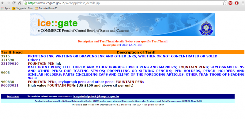
Dear All, This is my first post in FPN. Being a fountain pen lover, I have tried to buy pens from different sources. I found that ebay is a good place to get a fair deal on pens. I use credit card for payment via paypal account. Till now I've got around 8-10 pens from abroad as of now. These costs upto maximum upto 25 USD. In order to buy premium pens, I checked the govt portal for customs. Which says customs duty is applicable for fountain pens above 100$. I would like to know your experience while importing a premium pen from abroad. 1. Did you have to pay any customs duty for any pen? 2. How did you pay such customs duty 3. Please mention the original price of pen and customs duty so that they can be compared. 4. Please share if any bad experience happened. This will help newbies like me to add some romance to the love for FP. Thanks, Aniruddha
-
Frustrated in having to cap and uncap fountain pens every time I put it on the desk
penworrymaster posted a topic in Fountain & Dip Pens - First Stop
Are fountain pens truly these delicate--one wrong move and the nib's gone; one roll away and it is rougher than sandpaper--like we are told? Like would it break if I just let it roll off (like fan blows the paper under it and push it) in my desk, assuming that it wont fall and just, say have the nib bump in pen holder (plastic), earphone case, or whatever plastic or book in my desk? -
Below is a photo of my Cross pen collection. Pens 1-3 are Century ballpoints, 4-6 are Century rollerballs, and 7-8 are Century fountain pens. These are trios of matte black, burgundy, and navy blue with gold trim. The one pen I can't seem to find is a matte navy blue (with gold trim) version of the fountain pen to complete the FP trio, and match the other trios. Did Cross ever make such a pen? Am I searching in vain?
-
Bril is a company based in South India known for producing very good inks. They generally do not produce pens(Somebody can correct me if this is wrong). So, I was pleasantly surprised when I had an opportunity to buy a Bril Pen and immediately grabbed it. I bought it from Sreekumar, who is a nibmeister with a bunch of other pens. The price of this pen is just 50 INR(<1$). At this price range, I was blown away at how smooth the nib performs and how pleasantly it writes. The Bril pen is a all plastic body pen and the plastic is sort of cheap looking. It comes with 2 Bril catridges filled with Bril Royal Blue. It does not fit an international converter, but a parker piston converter fits rather well. The pen is rather small at 12cm capped and 15cm posted. The weight of the pen must be less than 20gms. The nib is a steel nib, rather plain looking with just F written on it. It draws a fairly dry western F line. But the nib is very smooth with no feedback and worked well outside the box with no tweaking. The pen cannot be eyedropper converted as there is a hole in the bottom. Some more pictures: [url=https://www.fountainpennetwork.com/forum/uploads/imgs/fpn_1430210527__img_20150428_133429584.jpg][/url] Verdict: For 50 Rs, the pen has performed beyond my expectations. I do not know whether it is still available or not. I am very happy with this pen. If you want this pen, you have to contact Sreekumar(he goes by S-K on FPN) [EDIT: Bril does produce a lot of office stationaries. The pen is mentioned here:http://www.brilindia.com/school_product_list.php
-

Review Of Kanwrite Heritage - In Medium And Fine
TheVintagelife posted a topic in Fountain Pen Reviews
So here are some thoughts on my two Kanwrite Heritage pens - One in Green marbled pattern and the other in Blue marbled. One with a Fine nib (currently the blue, but it changes), and one with a medium. I will also talk a bit about writing with the KW Fine Flex nib which had brought separately for another pen (this is I think the same nib as the Noodler's flax pens). TLRD: the pens are great value for a price of under $30; the nibs (and feeds) and ergonomics are the real stars. Filling mechanism is dependable. The body is pleasing to the eye albeit without feeling premium (but acceptable quality for this price). Review: Intro and Choices available. The Kanwrite Heritage is a largish piston filler pen from Kanwrite or Kanpur Writers, a pen nib manufacturer based out of Kanpur, India. The pens come into a huge variety of colors, solids, translucents and certain marbled patterns. I find the marbled patterns the most pleasing to the eye, and out of a shortlist which also included the excellent looking red marbled variant, I chose the green and blue marbled versions (mainly because I have an OCD of matching inks to pens, and I have (and write with) a lot more of greens and blues than red. Another combination that I personally would wish to see would be one with a black cap and burnt-orange body - I think it would look great on this pen. I haven't seen one around, but if you wish, the there are black pens and burnt-orange pens readily available for a cap-swap (if you are willing to be stuck with another pen with the reverse combination...). Kanwrite makes their own nibs, and as I will talk in detail below, they are generally very good. They have a huge variety of nibs, not only the usual F,M and B, but unusually for the sub INR 2000/USD 30 market, they also offer EF, BB, Fine flex, and an extra-fine flex also. All choices, however, may not be available with all retailers. They also have a 14K gold nib which looks very similar to an Aurora 88 and is excellent (however, I find the gold nib an overkill for a pen in this range - I would get it for a custom hand turned pen (as I have), for which there are lot of good options in India. To make matters easier, Kanwrite will send you the nib, on your request, pre-fitted into a Bock or JoWo housing. Appearance & Design (1-10) – 8 The pens come in marbled plastic bodies with gold accents. there is a thick cap ring, a clip supported by a visible clip ring and a ring between the barrel and the cap protecting the piston knob. Uncapping the pens, one finds an ink window (very useful since its an opaque body piston filler) rimmed by two more gold rings, cap threads and a girthy and reasonably long section that slopes down gently and flares slightly, but abruptly near the nib. Both the marbled patterns are quite attractive, to say the least. These are injection moulded CAB plastic though, not PMMA/ acrylic, let alone hand turned, so lacks the visual depth and chatoyance of marbled resin. The marbling is on the surface itself and does not glow from within like the latter material. That said, I find it very pleasing to the eye on its own right. The marbled patterns are multi-colored (not just white, but veins of other colors too) and this creates various points of interest while looking at the pen. From a design perspective, whether consciously or otherwise, there are some similarities wit the Aurora Optima family of pens; especially the shape of the clip and clip ring, the cap band and bands on both sides of ink window and above the piston knob, and, the size and placement of ink window itself. These are not unique design concepts however, and the pen retains enough individuality to stand apart as a unique design. For one, it is more than a full centimeter (about half an inch) larger than the Aurora (coming in at 140cm closed to the Aurora's 127) - a much nicer size for my preference. Also the piston knob cap and top finial have the same color as the rest of the body. But the most 'interesting' departure is the shape of the top of the cap - instead of a regular softly squared off design, Kanwrite has gone for a slightly weird reverse cone top sitting rather awkwardly over the clip ring - I am not sure it works as a design choice - it seems stuck on as an afterthought. Nevertheless this is a substantial looking, attractive pen. Apart from that off-putting cap-top, everything comes together very well. the choice of gold accents work well with the marbled colors. the nib is perfectly proportional to the body. the proportions of the various segments and the angles and slopes are spot on from any angle. Interchanging the caps makes for a fun look too! 2. Construction & Quality (1-10) – 8.5 Coming back to the CAB plastic material, it doesn't feel as dense and premium as resin, but it is indeed sturdy and durable. At this price point, you are not likely to get premium materials - though some stuff out of China can feel as though they are)The same can be said of the metal trims - well if they are metal at all - apart from the clip, I am not sure. But the plating seems well done and likely to last. The pen looks like it can take rough use and that is the most important thing at this price range. None of the components or the pens as a whole, feel 'cheap' (though you probably couldn't fool anyone its high end either - unlike the case with some Moonman/PenBBS pens in the same range. opening the cap reveals a plastic knob to activate the piston. The knob and the piston itself are clear(ish) plastic - again nothing fancy, but feels solid and up to the task. Weight Dimensions & Ergonomics (1-10) – 9 This is a largish pen without stepping into the oversize territory. To get the numbers out of the way, these are: Length capped = 140-141 mm (5.5") Length uncapped = 129-130mm (5.1") Length Posted = 161 cms (6.3") Ink window = 5mm (0.2") diameter at section = 11-12mm (0.4 - 0.5") weight capped/posted = 21gms weight uncapped = 15 gms Here is a comparison of the pens posted and unposted: I like pens which I can comfortably use unposted, and this usually means a sweet sweet between (capped/ uncapped) 125/135mm and 150/160mm - so this is right in the sweet spot for me. Here is a comparison with some other pens of this price range range that I find very comfortable to hold (well, probably a stretch including the TWSBI in this price range, but what the hell!) the pens are also very light and the caps do not add much to the weight if you are fond of posting. Ergonomics is one area, where, at least for me, the pens really excel. They just has that right combination of length and light-weight to act as an EDC. The pens balance well in the hand, whether un-posted or posted (which they do securely) and the section shape and girth are comfortable for me also. Well to nitpick, I'd have have preferred a more gentle upward curve to the rim (nib-side) instead of the slightly abrupt ridge; but this is relevant only for those, like me, who hold the gen very low. Even then, its not uncomfortable as such (since the ridge is not sharp), but you know its there. Nib & Performance (1-10) – 9.25 The nibs are broad shouldered understatedly attractive Indian #35 (#6 type) nib and is perfectly swappable into Bock or JoWo housings (and vice versa, I would assume). In fact the same KW nibs are offered pre-fitted in Bock or JoWo housing by Kanwrite. Since there are two nibs on review, I will discuss them in turn: The fine is about a half a size finer than a typical Jowo or Bock fine (though some Bock fines I have used are similar) - its similar to a sailor MF. It has a pleasant sort of feedback but is not scratchy or unpleasantly toothy. with very dry inks (like my Krishna Ghat Green), the sense of toothiness may increase so better to use with well lubricated inks. I really do like this KW fine very much - with a Pilot Iroshizuku or Sailor Shikiori inks, it really shines. the nib has is quite hard, though it has slightly more spring than a jowo - about same as a bock. the feedback this nib gives is excellent for a controlled handwriting. The medium is closer to a JoWo medium but probably a hair finer; hence a more typical medium line width. It is smooth and tuned very well right out of the box. There is nothing to dislike about the medium nib Between the two, I personally prefer the fine by a hair's width, but that is just down to writing preference. Many will prefer the medium. Both nibs wrote well out of the box. Both pens were tuned very well for optimum wetness. The feeds are thick ebonite ones which seems to regulate flow quite well; though there are very occasional overly wet starts when the pen has been moving around int he bag (this is common and not a problem) Nibs are easy to change out as the whole housing disengages by unscrewing it from the section. Kanwrite nibs, where available, are quite affordable. As a case in point - I had also (earlier) separately procured a KW 'Fine Flex nib'. It is probably the same as used in Noodler's flex nibs. I wouldn't use it for these pens as it steel colored (though these are also available in two tone) while these pens have gold trims. I am currently using it in a Moonman T1 where it performs very well (though only after I adjusted the Moonman feed to supply the extra flow required). In hindsight say the extra-fine flex would have been preferable for exploring the full breadth of line variations possible... Filling System & Maintenance (1-10) - 8.75 It is a piston filler; which while (thanks to the Chinese) is not exactly unheard at this price point these days, is nice to have. The piston works smoothly. I get about about 2ml ink into it per fill (give or take) which I think is quite optimal - more than that is probably not ideal for someone like me who has more than one, couple of, quite a few pens inked at one time! Cleaning thoroughly is possible as disassembly is quite easy. the plastic knobs feels a little flimsy but its protected, and not something would need heavy handling. Cost & Value (1-10) – 8.5 In India, the KW Heritage is likely to cost around INR 1700-1800 (about USD 25); but expect to pay about $5-10 more if buying outside India, which is understandable because of customs, logistics and shifting exchange rates etc. While at this price, it is most certainly a 'good' value, the exact score is a little tricky, because, frankly, getting a great value pen at around $30 is no longer unheard of (as it was a few years ago) due to the introduction was several great models at this (or even lower) price points by the likes of PenBBS, Moonman and Wing Sung (among others). For example: 1) Moonman T1 is a piston filler made of attractive anodized aluminium which feels more premium in build but is cheaper 2) The materials in PenBBS piston, vac fillers and other special-filler pens (especially the quality of acrylics used; and also metal pistons, vacuum plungers etc) such as the 309, 456, 355 and 500 feel more premium and 'high-end' So, as a value proposition, it would not be fair to say that the KW Heritage is miles ahead of the competition. However, and this is a big point, at least for me, I feel that the nibs in these pens are at a different class from all the Moonman & PenBBSnibs I've tried. I've had to change the nib on every, but one, of my PenBBS+Moonman pens into JoWos/ Bocks (or in the case of the T1 - the KW Fine flex!) . I found those pens to generally have dry and less than satisfactory feeds as well - no comparison to the one the one on the KW (ebonite or otherwise) in terms of flow regulation. Some may like these pens out of the box, but for those opting for a nib change, that's an added cost to be factored for these Chinese pens. Another thing is that Kanwrite provides various nib options from EF to BB as well as F and EF in flex. Most Chinese pens at this range come only in a couple of widths (F and one of EF or M). So, overall, considering the writing quality and nib options, this is still an extremely good value. Conclusion (Final score, xx/6) - 8.55 I find these pens to be good looking, sturdy and comfortable to write with. They are dependable and affordable. They write very well every time. So overall, I would recommend these pens heartily as an EDC or for your collection. Some writing samples showing the line widths of the various nib sizes I have are below: -

Waterford Powerscourt Fountain Pen early review
donnweinberg posted a topic in Other Brands - Europe
I recently purchased on Ebay for USD$150 a gold-plated Waterford Powerscourt fountain pen with a fine 18K/750 nib and have used it for a week, writing with it at least twice each day. Here are photos, to be followed by my impressions at this relatively early stage. The pen is very attractive and feels nice in the hand. It has a solid feel and nice weight; the pen is of average length and weighs 41 grams. It fills easily with its included converter. I used Noodlers Green ink. It took awhile for the pen to write consistently; at first, it skipped a bit. The fine nib writes with a relatively dry line. The nib is on the firm side and makes an easily audible sound when writing on decent quality paper. My "gut" feeling is that the Powerscourt is an attractive pen that feels nice in the hand but writes in an uninspiring manner. I gather that for my tastes, a medium or broad nib (which I generally prefer) would feel better. However, my guess is that the Waterford line is more about looks than about the writing experience. What are the experiences and impressions of others who have written with this pen or other Waterford pens? Am I being unfair to this pen and brand?
-

-

-

-

-

Fritz Schimpf by Scribo Limited Edition Piuma Passione fountain pen
Fritz Schimpf posted a topic in The Mall
Fritz Schimpf by Scribo Limited Edition Piuma Passione cartridge/converter fountain pens exemplify the Italian word for passion. This passion for the designs, colours and nibs of the highest quality writing instruments, is shared by Scribo and Fritz Schimpf, resulting in the Piuma Passione. The elegance of form is reinforced by the gracefully shaped, silver-coloured clip and the subtle Scribo logo on the cap. Crafted using a refined acrylic resin, the contours of the Piuma Passione provide a fascinating depth effect with harmoniously warm reddish tones. The flexible nib is fully rhodium-plated, crafted from 14-K gold in nib size "F" (fine), which has received the widely respected Fritz Schimpf Italic grind. The combination of nib flexibility with our Italic grind results in exceptional writing characteristics. Due to the exquisite rounding of the writing edge and the lateral corners, the pen’s comfort zone is wide, therefore rapid writing is accomplished with ease. When written without pressure, the nib offers a vertical stroke width of approx. 0.60 mm and a horizontal stroke width of approx. 0.20 mm. With pressure, the vertical stroke width may be increased to a stroke width of approx. 1.20 mm. Flexible italic nibs are ideal due to their ability to make emotions visible, expanding handwriting, conveying a writer’s passion with visual flair. Engraved on the nib’s upper surface is our historic Fritz Schimpf Tübingen (FST) seal logo. This seal was used daily in our shop from the early 1950s until 2010 to officially seal insured letters, parcels and love letters, before they were delivered to the local post office to begin their journeys to those in all corners of the world. We are deeply grateful to Scribo for their magnificent cooperation and shared dedication to the highest quality. The Fritz Schimpf by Scribo Limited Edition Piuma Passione fountain pens are limited to 50 pieces worldwide, which are exclusively available from us, Fritz Schimpf in Tübingen. https://www.fritz-schimpf.de/Neuheiten/Fritz-Schimpf-by-SCRIBO-Limited-Edition-Piuma-Passione-Patronenfuellhalter.html
-
Taylor Swift Tortured Poets Department Fountain Pen
donnweinberg posted a topic in USA - North America
Does anyone know what type of ink cartridge corresponds to a description of “2.6mm inner diameter” ink cartridge? On eBay, as a gift to my daughter-in-law, I purchased a new Taylor Swift Tortured Poets Department (TPD) fountain pen. It came with a single cartridge and no documentation of the type of cartridge to be used. I asked my eBay seller, who asked TPD customer service, which provided the “2.6mm inner diameter” information. Frustrating. Just to experiment, I used my own Diamine short cartridge, which is an International Standard type cartridge. It fits, but the portion that goes into the barrel, although it fits into the section, fits snugly, and I’m concerned that in warm conditions it might detach when unscrewing the barrel from the section. It took a good amount of time for the pen to write. The cartridge that came with the pen has an overall slimmer and longer profile, although not as long as, say a Levenger long cartridge that has two different puncture ends. I am unable to fit an International Standard converter into the pen. In any case, it appears that any standard size converter is too long for the pen. Help!