Search the Community
Showing results for tags '18k'.
-
PRELUDEThe search for a delectable nib After a brief hiatus from fountain pens, and a seemingly eternal interlude from reviewing pens, I was somehow on a lookout of a novel pen, which harnessed the excellence of this modern material age while preserving the flair of vintage brilliance. When zaddick posted this excellent review on FPN long long back (2015), the charismatic pattern of the rosewood ebonite caught my eyes, perhaps like many of you. And then, the frosted flourish on the nib itself (ah! slightly reminiscent of the sold-out Pilot Bamboo) coupled with a lustrous red-urushi feed! My primary concerns apart from the price point of 850, were the unconventional size, girth and weight of the pen. Then, I waited….and waited…and waited. Three years passed by, before I could order the Decoband from Bryant (I would happily recommend Chatterley Luxuries). Ah yes, the same one in that bewitching rosewood ebonite, how oft the rosewood pattern is adorable! Then a month later, it finally landed into my hands. I then inked the pen with an available one (probably pelikan blue) and after writing with it for a while as a desk pen, it was boxed. It wrote about a western medium and the ink did not seem to last long. It stayed in the cupboard for quite a while. And another year passed by! Other hobbies, nonetheless little interesting like machine learning, took much of the time. And then, I felt like there was something missing, concerning with writing with the SUPERFLEX nib. And in the end, the pen has been inked up multiple times, since last year. So, here goes my review of the same. If you like a pictorial blogger view, here is the link:WE Decoband Oversize Review PRESENTATION (5/6) Elegantly Utilitarian Presentation is modern and spotlessly utilitarian. These days, it comes in a fair-sized black cardboard box with the Wahl-Eversharp name & the trademark double-check logo on it. And within it, sits another deep green cardboard box patterned with the W (double-check) logo, secured with a magnetic clasp. And within it (end of 'withins'), a clamshell presentation box with transparent laminate halves cushions the pen. Perhaps, I would have been able to love the modern presentation completely, had there been no precedents set! Then, there comes a little nag reminding you of having missed the lacquer box along with its accouterments, in those three years. I bought the Wahlberry ink later. The box, nonetheless carries an anti-oxidant sleeve and a booklet and a warranty card, placed below the separator. DESIGN (6/6) Larger than ‘Vintage’ Life The Decoband Oversize Gold Seal Collection as of today comes in multitude of finishes - around twenty probably in varying combination of materials - ebonite, celluloid and acrylic along with gold or rhodium plated trims. Perhaps, a ruthenium finish will be a nice addition to the line. The nibs now have two categories - SUPERFLEX and a more stiff GOLDFLEX nib, in 18k gold. Some versions are still available in 14k as earlier. I had been rather mesmerized by the rosewood finish long time back, so that was the finish eventually ordered. The effusively striped contours of burgundy and black, give the cylindrical structure, a remarkable semblance to actual finishes in rosewood. The metallic appointments at the centre, clip and either ends of the finial, are coated with (14k) gold and the golden dazzle well dances with the rhythms of the lustrous rosewood finish.The finish appears brighter with ambient light. I would also want to preserve the finish for long and would happily avoid carrying the pen in sunlight. Coming back to the pen, there is a slight taper is at the filler end of the barrel converging the rosewood silhouettes with the golden ring and the thin black acrylic appointment of the filler rod. You would notice a little hole in the acrylic end, to compress out air of the sac.The cap is cylindrical and one thing you will notice is that the rosewood contours of the cap, well-align with the ones on the barrel. You can almost see its inner threads and the insert in some light. The finial is another thin (2-3 mm) polished black acrylic disk which discerns itself from the rest of the cap, with a golden ring. Then you would perhaps notice the inlaid metal disk - the gold seal with the customary double check logo. These seals earlier denoted Wahl’s top of the line products, like Sheaffer’s white dot. The V-shape tension fit clip with a broad cylinder albeit normal in terms of length, appears remarkably short, given the overall heft of the pen. One the clip, the name of WAHL-EVERSHARP is imprinted, where comes my little qualm like a few others, of not being crisp enough. The center band consists of three concentric rings, with some space for the lip to reflect the crimson silhouettes. The ring in the middle is etched with the Greek Key, much like the vintage one. The same design is present in Omas pens, with branding etched in the middle. I later learnt that the Greek Key symbolizes flow of infinity. The cap comes off in 1.5 turns, which consequently reveals the dazzle of golden threads of the section and a never to be missed, large #8 mesmerizing nib. The threads are nevertheless charming, to both eyes and fingers. The acrylic glossy black section slightly tapers towards the business end before bumping off towards golden hues of the loop. Quite some eloquent detailing! FILLING & CLEANING SYSTEM (5/6) One-touch “Chilton Style” Pneumatic filler! The supply end of the barrel, i.e the little black glossy disk takes around 6 turns to unravel another Greek key adorned long brass sleeve of the pneumatic filler. This one doesn't have a branding, unlike the one released initially. The filling process is actually quite simple, but for me it took a bit of practice and observation, to have an acceptable level of fill. Once you pull out the metal sleeve, the nib needs to be completely submerged in the ink bottle, then with the air hole (in the finial end), covered with your finger/thumb, you need to press the sleeve back inside completely, which in turn releases the air inside the barrel and then eventually the air inside the latex sac. Typically, you would count till 10 or 12, before the sac expands and draws ink up. Then you can push in the sleeve, without covering the air hole and finally screw on the glossy finial end. I have observed that the ink fills really well, once you see a lot of bubbles of air released inside the ink bottle. The stated capacity in the website is 2.1 ml, but in my experience, I have got variable levels of ink fills depending on the ink brand (all with deep inkwells). It seems to work better with Wahlberry and GvFC inks. It is also recommended by the company, to use slightly acidic inks (pH between 4.5 to 6.5, Japanese inks are usually alkaline), else it could damage the metal components. Also, you might prefer a drier ink, since the nib lays out a wet & juicy line. This link from Edison pen company does a better justice to the whole ink-filling process. From a cleaning perspective, it’s easy. It seems to fill better with thinner liquids, that includes water apart from inks! One thing I found after unscrewing the section is that, some ink still remains in the sac and the lower threads of the inner section, which is directly attached to the sac (a little ink seems to go in, as we dip the nib & section to draw ink). NIB - ALL THAT MATTERS (6/6) The frosted stunner, the vivid red enchantress Now comes the business end of the pen. All I can say is that, it's elegant and stunning. The frosted appearance from a distance, along with a symphonic texture renders the nib as a work of art, rather. I have not seen many (or shall I say any?) manufacturers put this kind of effort in making a nib glorious (even at much higher price points, Ouch! Namiki). They kind of concentrate on the pen, polish the nib (probably with a Ford assembly line attitude) and then shift the entire attention towards the presentation. A circular breather hole runs among the sandy grains along the body of the nib. The process of removal of gold and subsequent plating to get this frosted appearance (as mentioned in FPN comments) is called debossing, which is done in Switzerland. The nib albeit sourced from Germany, seems to get the flex by this debossing. Below the breather hole, the hallmark double check logo is embossed within a circle within a little imperfect snowflake (okay, I discovered it only after taking the photo, probably like schwarzschild discovered his radius)! The brand name and the words SUPERFLEX are imprinted towards the base with the 18k gold content indicator. A side view of the nib imbibes even a more regal structure with the feed and the section, in a single frame. The marriage of the nib and feed, promises joy and happiness for a long long time. Then once you turn the nib, you would be beholding a vivid red urushi feed. The split ebonite feed has closely spaced fins on the underside, which allows to run the nib wet with flexing the tines, while maintaining the ink buffer. The nib hasn't skipped at all. Below is a little comparison with a red urushi lacquered feed of a Namiki Emperor. It's plastic against ebonite, and you can see the grainy finish of the Decoband's feed compared to the smoothly machined feed of the Emperor. PHYSICS OF IT (5/6) – RELATIVELY SPEAKING The Newtonian Laws The overall capped length is around 15 cm. I use the pen un-posted as it balances the size, girth and more importantly the weight, for my writing style. The section has a comfortable grip diameter of about 1.2 cm, before it bumps off towards the gleam of the golden ring of about 1.5 cm diameter. The pen is comfortable from an overall perspective, given that you spend some time getting used to it. It balances well for a large oversized pen with brass fittings. Below are the pictures along with a MB149 and a Namiki Emperor for comparative reference.Uncapped Length ~ 14.5 cmTotal Length ~ 15 cmOne piece of staggering engineering around the pen is that the cap screws on quite deep, so there is minimal difference (0.5 cm) with the length of the uncapped pen.Exposed Nib Leverage ~ 3 cm (#8) Now this pen is bold and solid in terms of heft. It took me a little while to get used to it. Having said that I was amazed at its weight distribution and overall balance.Overall Weight ~ 57 g (without ink, cap weight~13.5 g, Gosh! almost a uncapped Lamy 2000) I used a Pelikan three pen pouch and it nestles the pen well. Also, just on sheer impulse, I had got a leather pen box with enough inner cushion, from Cross (it was selling at $ 7 or something, I assume it's locally sourced). Thankfully, it turned out to be perfect fit for the Decoband.The leather pen box from Cross. ECONOMIC VALUE (4/6) Demand & Supply While an expensive retail price of around $ 850 is steep, I have seen a few selling in second hand market below $ 600, from time to time. For me, the exceptional work on the nib, feed along with materials, make this pen effortlessly matchless. For the filling mechanism, I would have probably preferred a piston/vacuum filler, rather than a pneumatic one. There is rather a vintage appeal with the pneumatic one, I guess. Add to this, somehow the exceptional make must have been a sourcing nightmare, given that the parts belong to France, Germany, Switzerland and Italy, with the final machining & assembly done in Italy & US. (as quoted in The original FPN review) WRITING & FINAL COMMENTS (5.1/6) Writes like a rainy writer The SUPERFLEX nib graces a wet and juicy flow, and writes like a western medium. I usually do not flex nibs with my regular writing, but an added springy flourish comes automatically with the downstrokes. I tested the nib on a relatively better paper of a growing Indian brand. It's a Nightingale A4 notebook, and it does pretty well. The Wahlberry ink however doesn’t seem to be good friends with Tomoe river paper, while it does make the line variation more noticeable on TR. Given the wet flow, a hint of feedback isn’t quite noticeable until you consume most of your ink. The ink took around 25 secs + to dry on this particular paper, although it has dried quicker, in other papers. The ink itself seems to be well formulated and on the drier side for the overly generous super flex nib. The nib has never skipped and always laid a wet juicy line, and seems to be one of the best nibs in my relatively small collection. Another hesitation on my side is that, if the pen stays unused for a few days, then the ink possibly dries up and it's a task to get it to write again with the same panache. The balance & girth of the pen is something, I have gotten used to and never looked back since then. I feel the pen needs a separate carrying box (like the cross one) if you wish to take it in your backpack or bag. I am not very keen on the pneumatic filler as mentioned earlier, a piston/vacuum would have perhaps better worked in my opinion, given the ink-demands of the feed. And perhaps, the ink should be packaged along with the pen like earlier. Since it runs quite wet out of the box, so you might not be able to appreciate the nib with many of your inks.Thank you for going through the review. You can find other pen and paraphernalia reviews here. REFERENCES WE Decoband Collectionzaddick's review on fpn pH levels of inksPneumatic filling - Edison Pen Company
- 77 replies
-
- chilton style
- pneumatic filler
-
(and 3 more)
Tagged with:
-
I have a Homo Sapiens Bronze Age with a broad nib that I love. Am now being tempted by a Magma and was considering the 1.3 stub nib - this would be recent production. What I am interested in are actual experiences (again more recent production) with the nib. How was it out of the box? How well does it write? Are the edges sharper and more prone to catch than other similar stub nibs? Any comparison to their broad nib would be appreciated as well. FYI - I own a number of stub nibs including many 1.1's and a 1.5. But these are steel nibs (Jowo & Bock). Many thanks in advance for your insight!
-
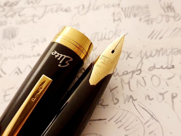
From the album: OldTravelingShoe's Random Pics of Japanese Fountain Pens
© (c) 2023 by OldTravelingShoe. All rights reserved.
- 0 B
- x
-
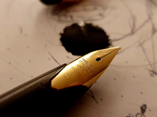
From the album: OldTravelingShoe's Random Pics of Japanese Fountain Pens
© (c) 2023 by OldTravelingShoe. All rights reserved.
- 0 B
- x
-
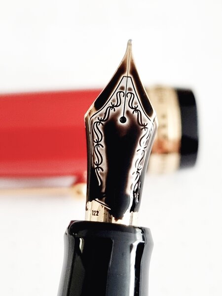
From the album: OldTravelingShoe's Random Pics of Japanese Fountain Pens
© (c) 2022 by OldTravelingShoe. All rights reserved.
- 0 B
- x
-
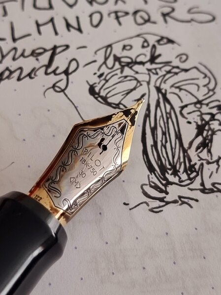
From the album: OldTravelingShoe's Random Pics of Japanese Fountain Pens
© (c) 2022 by OldTravelingShoe. All rights reserved.
- 0 B
- x
-
From the album: OldTravelingShoe's Random Pics of Japanese Fountain Pens
© (c) 2022 by OldTravelingShoe. All rights reserved.
- 0 B
- x
-
As most of you would know, Pelikan is a 180 year old maker of fountain pens and paraphernalia. It had launched its first fountain pen in 1929. Prior to that Pelikan manufactured dyes, inks and office-supplies. This Swiss-incorporated German pen maker is also credited with the genesis of piston filling mechanism with a differential spindle gear, which endeavoured to address the problem of limited ink capacity in fountain pens of that period. Here, the piston knob is also threaded so that it is able to unscrew itself automatically, when the piston is unscrewed, in an outward direction, thus delivering a greater and efficient ink-suction. Hungarian engineer Theodor Kovacs is credited with the invention of the original filling mechanism before selling off the patent to Günther Wagner (the man who established the company) in 1927. By the way, here goes the review of an M1000 on my blog: The M1000 Review In the earlier years, Montblanc is said to have manufactured nibs (especially the one with a heart shaped breather hole in 1929/30) for Pelikan, while Pelikan made inks for MB. Pelikan had already built a brand awareness in the writer’s mind, being one of the major ink suppliers (starting with Iron Galls Inks) in Europe. They eventually launched the 4001 line (non-Iron Gall) line of inks in 1898, which is still produced today. I was introduced to Pelikan with a m200 model pen long back. And yes, I am heavily biased towards two of my Pelikans - one is the M400 white tortoise, other is the blue striated M805. The M1XXX is considered to be the next step to M6XX/8XX, once most of your cerebral logic is destroyed! As with the model numbers, there is a general increase in nib size, dimensions and price of course, when you move from M4XX to M1XXX. Again, I do love the Souverän M 625 with dazzling sterling silver trims (Ag 92.5%). Having said that, the serene green-striated M1000 reflects and adorns the 1929 classical green-striped design. The green "transparent Pelikan fountain pen" was launched in 1929 by Wagner. It was named so, to reference the transparent ink window. The logos have changed over the years starting from a mother pelican with four chicks to a mother-single chick combination from 2003 onwards. I have learnt something form FPNer sirach’s excellent review of the m805. Incidentally, both of us had posted reviews of our m805s the same day, around the same time on FPN . The mother pelican and chick logo is symbolic of Christ, as when there is no food, the mother pelican is believed to pierce its own breast with its beak, to feed its young of its blood. It is symbolic of Christ sacrificing himself for Man, and is often represented in Christian art. I have taken the liberty to share the picture used by sirach in his review. DESIGN - THE STRIPED TRANSLUCENCY (6/6) The M1000 comes in two standard gold-trims - Green Striped and Classic Black (Green Ink Window), across four different nib widths - EF, F, M and B. The M1005 also came in silver trims of Black/Green Ink Window design, albeit with a dual tone nib. There is nothing like the allure of the M1005 demonstrator, but then there are Raden Sunlight & Starlight models too. The pen hints at a subtle piece of craftsmanship associated with building this writing instrument. Its balance somehow ensures all the necessary weight and nib leverage for comfortable writing. My hand sometimes varies from a light to moderate touch and the m1000 adapts to the change with deft, compared to a m800, partly perhaps because of a more responsive nib. The barrel is made up of highly polished pelikan famed ‘cellulose acetate’ with its diamond cut contours, which partially reveal the necessities like the piston end or ink level, while concealing the unnecessary ones. I feel that this green stripes reveal the ink levels quite well. The pinstripe pattern in the Souverän series is nicknamed Stresemann derived from Gustav Stresemann, the Chancellor of Germany for his famous striped trousers. The green stripes innately reflect both light and dark while preserving a formal appearance of the souverän as the gold plated trims continue to stand out. The translucency is subtle but useful at the same time to note ink levels. The dazzling green stripes reflect back greens between pine & emerald with ambient light, soothingly to your eyes.. The barrel is silky smooth. The golden gleam is matched throughout the pen starting from the famed finial and the clip, through those concentric bands in the cap, before finally converging with the dual piston rings. While the white tortoise plays with light with phenomenal efficiency, the green & blue stripes seem to have held their own conservative thoughts. The cap feels quite substantial and unscrews with a single turn, revealing a dazzling two-tone nib. The grip reveals another knot of golden glitter, towards the section end, where the big dazzling nib unit is screwed in. Two concentric golden bands with a gold plated crown embossed with the pelikan logo, adorn the cap with a signature pelican beak-shaped clip. The thicker bottom band carries the brand imprint of PELIKAN SOUVERÄN GERMANY. The logo on the finial is the one embraced by Pelikan post 2003, that of a mother pelican and one chick, gleaming in brushed gold. The staged pillars of M400, 605, 805 & 1000 glitter with light. FILLING SYSTEM (6/6) A piston filler with a sturdy knob is embellished with two concentric golden loops. Like any other pelikan, it’s imbibed with a system which is usually hassle-free and needs minimal maintenance. The piston end unscrews with three to four rotations and ink is drawn into the pen with remarkable efficiency without any fuss, once the piston is screwed back on. And of course, you can observe some of the live action through the striped windows. A brass spindle connector in the M1XXX provides weight and balance. Everything is glistening gold as you can see the connector nut in the picture. M1XXX fills upto 1.9-2 mL (similar to M800) of ink. These brass piston mechanisms can be dismantled using a 7mm wrench (TWSBI wrench would fit) on the connector nut, in a clockwise direction. On finding the piston mechanism quite snug while filling ink, I did dismantle it to lubricate the piston lip/seal. Although for any other problem, it is advisable to send the pen to Pelikan Germany/Country Authorized Service Center. Also, Pelikan International is quite responsive to facebook messages. NIB - ALL THAT MATTERS (5/6) The nib/feed section is screw-fit and comes in a standard 18k two-tone design across four stock widths - EF, F, M & B. It has the standard pelikan design with the usual convenience of a screw-fit section. Like the cousins, the tall & slender nib is efficient. With a big feed, and a spread out nib it looks forward to propel your writing imaginations and moods. The silver of two-tone finish does converge with the golden trims in terms of glitter and glimmer. The tail end specifies the nib-width and composition (18 C, 75% Au) of the gold-alloy used. Three arabesques diverge along the shoulders of the nib with two of them converging near the circular breather hole. The third curve runs across the tines towards the shoulders ending with the tail end of the nib, outside of which a golden decor runs along the shoulders across the tines, before converging onto the iridium tip. There is of-course the dazzling golden mother-baby pelikan logo, resting above the tail. This one in the picture is a Extra Fine nib and writes smooth and is decently wet. No complaints for this piece on out of the box performance. A big black plastic feed (earlier ones had ebonite feeds) with closely spaced fins ensures a good ink buffer and promises wet and even smoother starts. Even with a dipped nib section, it would write a page. In my experience with Pelikan nibs (both with earlier Bock & now in-sourced), the good nibs usually after running 80 pages of my usual B5 notebook, break in to my liking. This nib being a little different with a characteristic spring and a bit of flex, did break in within a month to fit my writing style. I feel that these days these nibs have started to lay a finer line, owing to user recommendation of the Pelikan community. Fortunately some of the mylars & buff-sticks are saved, thanks to these birds. PHYSICS OF IT (5/6) – RELATIVELY SPEAKING The pen has got the heft in it and I use it without posting. The overall capped length is around 14.6 cm. The total weight of M100X has slightly less than a third of contribution from the cap. The grip diameter is around 1.2 cm and the bit of tapering renders comfort to the fingers. The cap threads are higher up on the section and are non-intrusive for me, since I do not hold the pen very high. It is not a light & small pen and may not comfortable to you at first, I gradually became used to it. The motivation if not anything else, was the Kingsized #8 nib. Uncapped Length ~ 13.5 cmPosted Length ~ 17.7 cmNib Leverage ~ 2.8 cmOverall Weight ~ 35 g (Cap ~ 10 g) Capped and uncapped comparisons with a few of the flock go below for your reference. Top to bottom (m1000, m805, m605 & m400) With an MB149 And an Emperor with the Entire Flock ECONOMIC VALUE (4/6) The M1000 retails these days at around GBP 380 (discounted), although it might be available at lower street prices. I strongly feel that this acquisition was a result of an impulse driven bid on the bay, since I had a low expectation of winning the bid in the first place. Even though it’s one of the phenomenally efficient pens with a high degree of nib appeal, I would still value it as a standardised-good value buy. A part of me which loves Pelikan for the great pens they make, rationally feels that the m1000 being a flagship pen, they need to build up its image akin to an Meisterstück 149, to command a high price and appeal, for it sells much below its RRP across internet/offline shops. May be Pelikan can start with a body/barrel combination solely made for m1000 with a custom designed nib. Then again, I would not be able to buy it OVERALL (5.2/6) Historically for me, I did not like the weight/balance of the M1000 pen. However, with frequent use, I found the balance acceptable and then comfortable!! These 18k nibs have a smooth and wet flow. The m1000 nib has a fair bit of flex (modern bit!) with an inherent softness, since with the bigger size of the nib, there is more room for it to move. Being nice and wet writers out of the box, the Extra-Fine nib puts down a fine line, which takes around 35 seconds to dry Visconti Blue Ink on MD Paper. The pen feels balanced for my hands both with or without pressure and given the tapered profile of the section, it has a good grip. This nib runs a tad finer than say a #3776 medium nib, and with some pressure it leaves a wider line. I have used single fills of Sailor Sky High (now Souten), Montblanc Toffee Brown, Visconti Blue, Iroshizuku Yama Budo/Tsuki Yo inks in rotation, and the pen has performed gracefully with all these inks. Thank you for going through the review. You can find some more pen and paraphernalia reviews here and in the below links section. Comments & feedback are welcome. So, what is your favourite Pelikan? REVIEWS & LINKS Pelikan M1000 Pelikan M805 Pelikan M605 Marine Pelikan M625 Pelikan M4XX Pelikan M200 Cognac Pelikan Nibs Patent Ink Capacities
-
From the album: OldTravelingShoe's Random Pics of Fountain Pens
© (c) 2022 by OldTravelingShoe. All rights reserved.
- 0 B
- x
-
- pilot capless
- pilot vp
-
(and 4 more)
Tagged with:
-
From the album: OldTravelingShoe's Random Pics of Japanese Fountain Pens
© (c) 2022 by OldTravelingShoe. All rights reserved.
- 0 B
- x
-
- pilot
- pilot custom
-
(and 3 more)
Tagged with:
-
From the album: OldTravelingShoe's Random Pics of Japanese Fountain Pens
© (c) 2022 by OldTravelingShoe. All rights reserved.
- 0 B
- x
-
- pilot
- pilot custom
-
(and 3 more)
Tagged with:
-
From the album: OldTravelingShoe's Random Pics of Japanese Fountain Pens
© (c) 2022 by OldTravelingShoe. All rights reserved.
- 0 B
- x
-
- pilot
- pilot custom
-
(and 3 more)
Tagged with:
-
From the album: OldTravelingShoe's Random Pics of Japanese Fountain Pens
© (c) 2022 by OldTravelingShoe. All rights reserved.
- 0 B
- x
-
- pilot
- pilot custom
-
(and 3 more)
Tagged with:
-
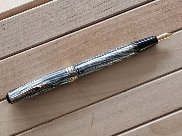
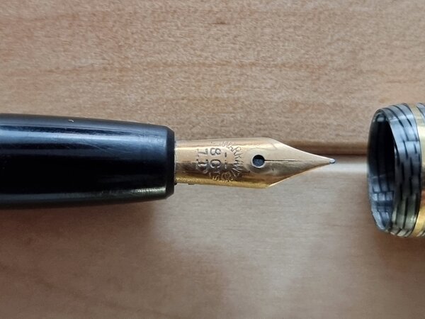
FP Akkerman 18K F nib 02b Nib Side-View.jpg
OldTravelingShoe posted a gallery image in FPN Image Albums
From the album: OldTravelingShoe's Random Pics of European Fountain Pens
© (c) 2022 OldTravelingShoe
- 0 B
- x
-
- akkerman
- p w akkerman
-
(and 2 more)
Tagged with:
-

FP Akkerman 18K F nib 02c Feed and Nib.jpg
OldTravelingShoe posted a gallery image in FPN Image Albums
From the album: OldTravelingShoe's Random Pics of European Fountain Pens
© (c) 2022 OldTravelingShoe
- 0 B
- x
-
- akkerman
- p w akkerman
-
(and 2 more)
Tagged with:
-
From the album: OldTravelingShoe's Random Pics of European Fountain Pens
© (c) 2022 OldTravelingShoe
- 0 B
- x
-
- akkerman
- p w akkerman
-
(and 2 more)
Tagged with:
-

FP Akkerman 18K F nib 03 Unpack upward.jpg
OldTravelingShoe posted a gallery image in FPN Image Albums
From the album: OldTravelingShoe's Random Pics of European Fountain Pens
© (c) 2022 OldTravelingShoe
- 0 B
- x
-
- akkerman
- p w akkerman
-
(and 3 more)
Tagged with:
-

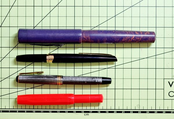
FP Akkerman 18K F nib 01c Size Comparison.jpg
OldTravelingShoe posted a gallery image in FPN Image Albums
From the album: OldTravelingShoe's Random Pics of European Fountain Pens
© (c) 2022 OldTravelingShoe
- 0 B
- x
-
- akkerman
- p w akkerman
-
(and 3 more)
Tagged with:
-
From the album: OldTravelingShoe's Random Pics of European Fountain Pens
© (c) 2022 OldTravelingShoe
- 0 B
- x
-
- akkerman
- p w akkerman
-
(and 3 more)
Tagged with:
-

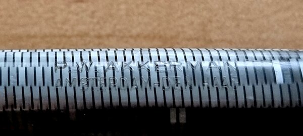
FP Akkerman 18K F nib 04 Body Engraving.jpg
OldTravelingShoe posted a gallery image in FPN Image Albums
From the album: OldTravelingShoe's Random Pics of European Fountain Pens
© (c) 2022 OldTravelingShoe
- 0 B
- x
-
- akkerman
- p w akkerman
-
(and 3 more)
Tagged with:
-

FP Akkerman 18K F nib 01b Size Posted.jpg
OldTravelingShoe posted a gallery image in FPN Image Albums
From the album: OldTravelingShoe's Random Pics of European Fountain Pens
© (c) 2022 OldTravelingShoe
- 0 B
- x
-
- akkerman
- p w akkerman
-
(and 3 more)
Tagged with:
-
From the album: OldTravelingShoe's Random Pics of European Fountain Pens
© (c) 2022 OldTravelingShoe
- 0 B
- x
-
- akkerman
- p w akkerman
-
(and 3 more)
Tagged with:
-
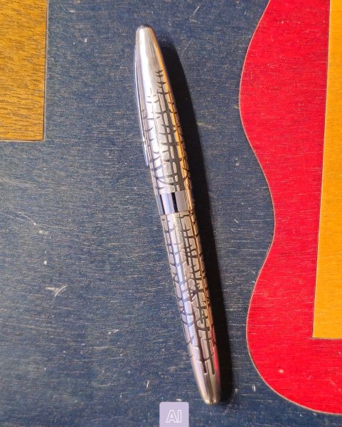
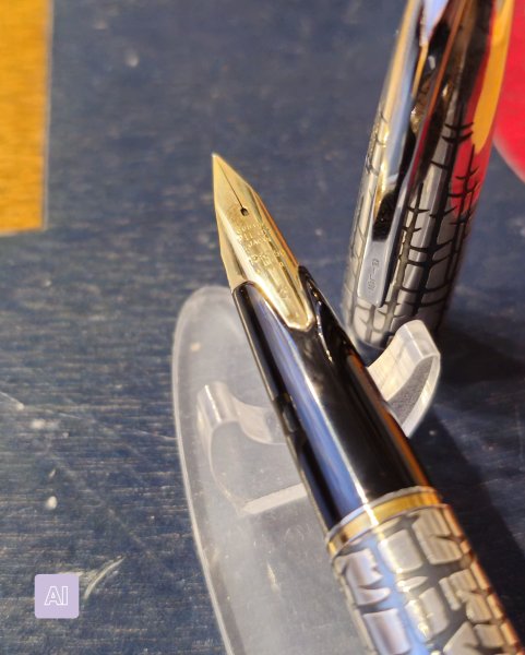
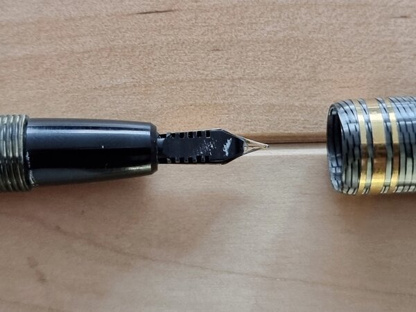
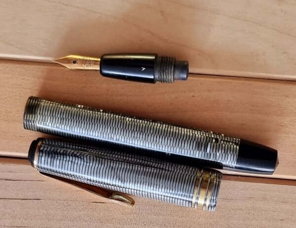
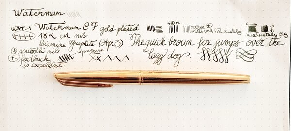
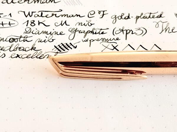
TL;DR: I acquired a Waterman fountain pen that I believe to be a Cartridge/Filled (C/F). The complete nib looks like it (see Figure 1). The nib unit corresponds to the typical C/F (Figures 2, 3). The other photos are also consistent with a Waterman C/F made in France (e.g., Figure 4). However, I cannot find the type of C/F that a finish without any lines, stripes, etc. Could you please help identify this pen? Especially a specific model identifier or a link to a catalog that includes it would help. Thank you. Details: The problem: I cannot find anywhere a reference to a gold-plated Waterman C/F that has a plain finish, without striations, curves, grain-patterns, fish- or crocodile-scales, etc. I read carefully various entries about the Waterman C/F, among which Dirck De Lint's / Raven March Fountain Pens, FPN's various entries on the CF and especially @donnweinberg's (thanks, everyone who contributed), and the entries I could find in the German and French versions of Lambrou's book. I searched eBay and gopens, both current and past listings. It seems to me the nib unit fits the 1970s Waterman C/F made in France. It seems to me the shape of both pen and cap also fit the 1970s Waterman C/F. The barrel is golden and shiny, and does have "WATERMAN" and "MADE IN FRANCE" engraved on it. However, I could not find an engraving indicating gold-plating, i.e., there is no "750" or "23[K]" engraved, as I've seen some of the Waterman pens from the 1960s and 1970s have. (Sorry for the quality of the photos; I took them last evening with my phone and could not find a way to remove the yellow-ish tint.) Figure 1. Full body of the fountain pen. Figure 2. Zoom on the nib. Figure 3. Nib unit attached to the pen body. Figure 4. The engraving reads "WATERMAN" and "MADE IN FRANCE". Cap and body seems to have plain gold-plating, no lines or other finishing. Many thanks for your help!
-

20220404_170535 Waterman CF + 18K M nib.jpg
OldTravelingShoe posted a gallery image in FPN Image Albums
From the album: OldTravelingShoe's Random Pics of European Fountain Pens
© (c) 2022 OldTravelingShoe
- 0 B
- x
-

20220404_170521 Waterman CF + 18K M nib.jpg
OldTravelingShoe posted a gallery image in FPN Image Albums
From the album: OldTravelingShoe's Random Pics of European Fountain Pens
© (c) 2022 OldTravelingShoe
- 0 B
- x

