Search the Community
Showing results for tags 'stub'.
-
 I have a Homo Sapiens Bronze Age with a broad nib that I love. Am now being tempted by a Magma and was considering the 1.3 stub nib - this would be recent production. What I am interested in are actual experiences (again more recent production) with the nib. How was it out of the box? How well does it write? Are the edges sharper and more prone to catch than other similar stub nibs? Any comparison to their broad nib would be appreciated as well. FYI - I own a number of stub nibs including many 1.1's and a 1.5. But these are steel nibs (Jowo & Bock). Many thanks in advance for your insight!
 -
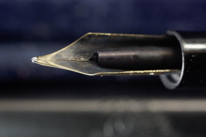
All, I bought a stub as a spare nib for my Pilot Vanishing point. But it seems to me that it wants to write at pretty much a 90-degree angle - nearly perpendicular to the paper. Is this how they're supposed to be? Below are pictures, if a different angle will help, please let me know. (Sorry, they're not all the greatest... I could take pictures of my other stubs to show their more-rounded bottom-to-tip areas...) My questions: 1) Is this normal? Is it really supposed to be used at basically 90-degrees? Or is that little sliver of the edge (see a couple pics below, with comment) really supposed to be the writing area? Am I missing something? 2) Does anyone see any problem (other than the obvious risk of screwing it up) with me trying to adjust the nib (via micromesh) to essentially create a sweet spot at an angle that's comfortable to me? Side of the nib (so you can see it looks rather boxy - my other stubs are sort of rounded from the bottom toward the tip of the nib, so that you write at about a 45-degree angle): http://paradoxcommunity.com/vps/side.jpg http://paradoxcommunity.com/vps/side2.jpg Bottom of the nib: http://paradoxcommunity.com/vps/bottom2.jpg ...(above) I suppose that little tiny edge reflecting all the light could be intended to be the sweet spot, but it's nothing like the other stubs I have, and it's impossible to find / maintain while writing... http://paradoxcommunity.com/vps/bottom3.jpg http://paradoxcommunity.com/vps/bottom45degree.jpg ...I suppose that little tiny edge reflecting all the light could be intended to be the sweet spot, but it's nothing like the other stubs I have, and it's impossible to find / maintain while writing... Tip of the nib: http://paradoxcommunity.com/vps/tip.jpg http://paradoxcommunity.com/vps/tip2.jpg http://paradoxcommunity.com/vps/tip-angle.jpg
-
David

-

nibs Seeking /a/ vac fillers which have 1.5mm nibs and/or /b/ 1.5mm nibs which fit TWSBI vac fillers
KateGladstone posted a topic in Of Nibs & Tines
I’m seeking vac fillers which have 1.5mm stub or italic nibs (do they exist?) and/or 1.5mm stub or italic nibs which fit TWSBI GO and/or SWIPE vac fillers. Do these exist? (They need not be from TWSBI — I enjoy Frankenpenning.) Also, what chance is there of anyone being able to persuades TWSBI to resume making their 1.5 mm stub nib? Oh — by the way — what does TWSBI stand for, anyway? I assume that it abbreviates something, and that it may be abbreviating something in Chinese. I don’t know much Chinese, but I do know that a word which sounds like “bee” Is the Chinese word for a pen or pencil, So I wouldn’t be surprised to find that the company name is short for something Chinese. -
From the album: OldTravelingShoe's Random Pics of Fountain Pens
© (c) 2022 by OldTravelingShoe. All rights reserved.
- 0 B
- x
-
From the album: OldTravelingShoe's Random Pics of Fountain Pens
© (c) 2022 by OldTravelingShoe. All rights reserved.
- 0 B
- x
-
From the album: OldTravelingShoe's Random Pics of Fountain Pens
© (c) 2022 by OldTravelingShoe. All rights reserved.
- 0 B
- x
-
From the album: OldTravelingShoe's Random Pics of Fountain Pens
© (c) 2022 by OldTravelingShoe. All rights reserved.
- 0 B
- x
-

From the album: OldTravelingShoe's Random Pics of Fountain Pens
© (c) 2022 by OldTravelingShoe. All rights reserved.
- 0 B
- x
-

Conklin Duragraph Screw In Nib Unit, Replacement Options?
rogerbikeswim posted a topic in Of Nibs & Tines
Conklin Duragraph Fountain Pen, Amber - 1.1 MM Steel Stub Nib Hello, I recently purchased this pen recently for $32 on Amazon. I'd love to know what my options are for swapping between the screw-out nib units for this pen. I obviously know that I can get the Conklin replacements. I'm wondering if it uses a standard size that can be swapped out for those of different manufacturers. I tried my Franklin Christoph nib - no joy there. It the FC unit just spun in place. Also, I looked for this information before hitting you guys up. I'm also interested in how to find this out for myself next time. Where can I find what nib units are swappable. Thanks.
-
A Note About My Ink Reviews: All of the images in my reviews are scanned at 1200dpi on a Brother MFC-J6720DW in TIFF format, converted to A4 at 300DPI in Photoshop CC, and saved as a compressed JPEG. All scans were edited on a color calibrated ASUS PA248Q with aΔE<3 to ensure maximum color accuracy. TL;DR: The colors should be as accurate as is possible. Not having a suitable green (well, any green at all) in my ink collection, and not having any Montblanc ink to speak of, I decided to pull the trigger on a full bottle of Irish Green from Amazon. Rarely do I ever feel like buying a full bottle sight unseen (aside from such reviews as I can find on the internet), but in this case I liked the color enough and the price wasn't awful, so I bought it, along with Lavender Purple (also Montblanc) at the same time. I usually prefer blues to anything else, with my go-to being Diamine ASA blue, with the backup of Noodler's Midway Blue for the times I need something more water resistant. I have a single black, Noodler's X-Feather, and then Noodler's Apache Sunset, J.Herbin Stormy Grey, and Diamine Oxblood, and those have been my only inks for ~18 months, and I felt like I needed something new and more exciting. Enter Irish Green. So let me delve into the properties of this ink for a moment. Scores, where applicable, are represented on a 10-point scale, with 10 being better/larger than 1. Flow: When I tested this in my Edison 1.1 Stub, which is quite the wet pen, I found the flow to be wet, as expected, but not so wet that I found it difficult to use on lesser papers. What I did find, however, on lesser paper, is that the ink loses some of this flow and becomes a bit dryer when writing, and this is a noticeable difference, but should not be troublesome to most potential users. 7.5/10 Saturation: This ink is what I'd describe as a very saturated shader, but this could be due to the properties of the test pen. Stubs (at the very least the ones which I have had the pleasure of using) seem to have both a darker, more saturated output, but also seem to encourage shading. Lubrication: Better than most of the ink I own, but I have tried a sample of the Noodler's eel series and can say that it is similar. Very smooth, very much like glass, but not uncontrollable like some I've tried in a stub. Show-through: Virtually none on any of the Clairefontaine paper's I've tried, but quite a lot (as expected in a wet stub) on cheaper paper. Rhodia 90gsm as well as 80gsm Rhodia and CF Triomphe etc. handle it very well. Copy paper (which is what I did the review on) shows significant show-through, and the back of cheaper papers is simply not usable. Shading: It varies with the nibs used (also tried this ink in a Visconti Rembrandt M, and got almost no shading), but is usually enough to be noticed, but not enough to qualify it as one of those inks that is nothing but shading. Also varies with the paper used, CF and Rhodia papers which are less absorbent exhibit more shading. Bleed-through: None, even on cheap papers. Spread: None noticed on any of the tested papers. (Rhodia, CF, and #22 copy paper) Smear (dry): None on any of the tested papers. (Rhodia, CF, and #22 copy paper) Feathering: Extremely slight (not noticeable unless you look for it) on less-than-FP friendly paper, but none on higher quality papers. Water resistance: While it wasn't sold to me as water proof or resistant, and I fully expected it to wash off the page, I could not get it to rinse off. *Dry time for the water test was roughly 12 hours after it was applied to the paper, if immediate water resistance is your primary concern. (In which case I recommend X-Feather, from personal experience.) Other: The color is nice, but not so vibrant to be in your face and scream at you, but rather it is more of a muted plant green. It reminds me of foliage, to be honest, which isn't a bad thing, but it isn't light like Gruene Cactus Eel or dark like Diamine Sherwood green. It has quickly become one of my favorite inks for annotations and some general notes, but I don't think it fits for general writing, simply due to the fact that it is green. I have experienced no startup issues or nib creep. On another note, I really like the bottles, as they are both a significant design departure from Noodler's, Diamine, and J.Herbin bottles that I've owned. Overall, I am highly impressed by my first Montblanc ink, Irish Green.
-
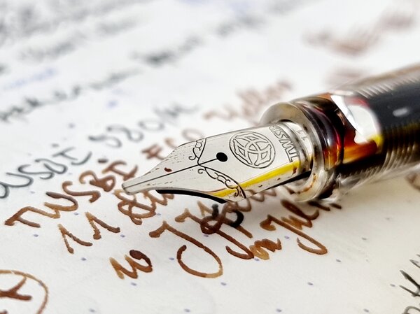
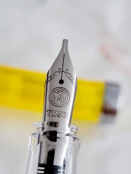
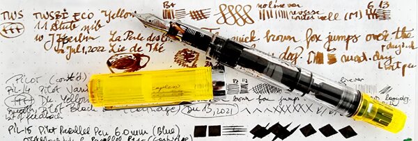
Some people can wield a big, fat stub and get amazing results. Not me. I'm a sloppy writer and still learning basic penmanship. I rotate my pens and stubs don't like that. I write fast, and stubs don't always forgive me for it. Just for fun, I made a quick comparison of the stubs that I have in my collection at the moment. ^---normal writing speed at left, slow in the middle, fast at right The TWSBI 1.1 stub I've personally got three of those, in two pens: the Eco and the Go. One is nice (in the Eco), one is okay (in the Go), one is sharp, scratchy, dry, unusable and out of rotation. They're the only ones in this comparison that have a small amount of bounce and they're not very sensitive to rotation (which is good news for me). They're dry-ish when writing at speed, as can be seen in the writing sample. In terms of line thickness, both their vertical and their horizontal strokes are the widest of the 1.1 nibs in this comparison. Crispness is OK but not exceptional. No hard starts (good). No railroads (good). Pens: TWSBI Eco with 1:1 mixture of J. Herbin Rouge Caroubier and Diamine Sunshine Yellow and TWSBI Go with Noodler's Burgundy. Verdict: a nice, all-round, rather forgiving stub. The Lamy 1.1 italic Lamy offers cheap 1.1, 1.5 and 1.9 replacement nibs that you can slide on to your Safaris and such. I can't even wield a 1.5 (see below under Kaweco) and therefore a 1.9 is way out of my league, so I bought the 1.1. This nib, which is an italic, offers you a hard deal: absolutely wonderful crispness at the cost of rotation sensitivity and scratchiness. I love the look of the text on paper, it's so nice, so crisp, so disctinctive... But with my unsteady hand, I can only use it with pleasure when writing slow. At normal writing speeds, I can tolerate it. When writing fast, it feels like an abomination. This nib could be a true gift to people who have a steady hand and good penmanship. No hard starts (good). No railroads (good). Pen: Lamy ABC with Lamy Blue ink, but it will also fit the Safari and some other Lamy pens (and supposedly even a Platinum Preppy!) Verdict: amazing crispness at the cost of forgiveness... Choose, because you can't have your cake and eat it too. Kaweco #2 1.1 stub One of the many charms of the Kaweco family is that the Liliput, the Sport, the Dia2 and the Special all sport the same #2 screw-in nib/feed collar, so instead of buying a dedicated pen for each nib size you can buy one nice pen and swab nibs in under 60 seconds. I'm not exaggerating: pull out the converter, unscrew the nib/feed collar, screw in the new one, pop in the converter, prime the feed and you're off to the races. Among other models I have a Dia2, which in my opinion is one of the best modern pens being sold today around its price point, and I've got several nibs to use with it, including the 1.1 stub. Its line width is slightly less than that of the TWSBI 1.1, in both directions. It's also slightly more crisp than the TWSBI, which I like, especially since this crispness does not come at the expense of smoothness or rotation sensitivity. Compared to the Lamy, the downstroke is slightly wider and the sidestroke slightly more thin. This is a nib that offers both smoothness and good crispness (though nothing near the exceptional crispness of the Lamy). In fact, it's smoothness is incredible and needs to be felt to be believed. Performance is flawless: it always starts, it doesn't railroad. The TWSBI stub seems to offer more shading, though. Pen: Kaweco Dia2 GT with Iroshizuku Shin-Kai. Verdict: an amazingly smooth and forgiving stub without sacrificing too much crispness, solid performance, a good mix of qualities and clearly a notch above the TWSBI. Kaweco #2 1.5 stub This stub matches the smoothness of its smaller cousin, but that's where the similarities end. Perhaps it's me; perhaps I'm not ready to play with the grown-ups yet. After all, I also couldn't really befriend the Pineider La Grande Bellezo stub, nor the Leonardo 1.5 stub. To me, 1.5 feels as wide as the Grand Canyon and I really struggle to get something nice out of it. This Kaweco 1.5 is no exception to that, despite its amazing smoothness. Personal shortcomings aside, I do notice less crispness in the lines (the worst of this sample) and it's a severe hard-starter. To be specific, after capping the pen and putting it away, it doesn't write when you want to continue, especially on smooth paper. Not just on downstrokes either, it just doesn't write at all after a pauze and takes quite some effort to get going again. In terms of line width, this stub is wide enough to make standard line spacing in a notebook too small (in this case an Oxford 90 g/m^2 notebook with 8 mm line spacing). This is one big nib and it requires lots of space - that's how it was designed, so no criticism there. Pen: Kaweco Dia2 GT with Iroshizuku Shin-Kai. Verdict: very smooth and forgiving stub, but at the expense of crispness (at least when writing at normal and fast speeds). Obnoxious hard-starter, prefers rough paper. Should not be confined to the limitations of ordinary notebooks - this nib really wants to do calligraphy. The outsider: 1948 Onoto 5601 with #3 ST nib I added this Onoto for the sake of reference and comparison, not as a contender. This is a wonderful, narrow stub and they just don't seem to make 'em like that anymore. This is one of the few stubs that make me forget about the pen so that i can just focus on writing. Ink: J. Herbin Lierre Sauvage, Summary: Those who can handle the Lamy 1.1 italic will be highly rewarded by its amazing crispness. As an all-round, forgiving, wonderfully smooth steel stub that does not sacrifice much in terms of crispness, Kaweco's 1.1 is a thing of beauty and as such is the overall "winner". The TWSBI 1.1 is a solid all-round stub that lacks some of the finesse and smoothness of the Kaweco 1.1. The Kaweco 1.5 might be the ticket for those who require a really smooth nib for calligraphy purposes. (When I find the ultimate stub for me, I'll let you know. At the moment the chase seems to be even better than the catch.) EDIT: corrected the text about the Lamy 1.1, which is an italic.
-
Wow...it's been a whole season plus since I've posted any reviews. Best to get back at it then!
-

Ideas To Explore Various Nib Types In Indian Pens..
Savit posted a topic in India & Subcontinent (Asia)
I never used flex, broad, BB, stub, oblique or italic nibs in any pens so far. And I want to try out. I want to select a pen model that is relatively inexpensive that will fit these nib types. I will keep my options restricted to nib manufacturers in India or nibs that are available for purchase in India. Just to clear my confusion around nib size, and nib width - I understand that the size (with numbers like #5, #6) refers to the dimensions of the nib. And if I understand correctly there is no uniform size comparison and it varies between pens. Correct me if I am wrong. The only comprehensive nib catalogue that I got hold of was from Kanwrite. If we look at Kanwrite nib catalogue, the stub, italic and oblique options are available only for large (#35) nibs. Is it the case that smaller nibs (#4, #5) do not come with stub/oblique/italic options for width? Is it the case with all nib manufacturers? If anybody has a catalogue that visually shows different Indian nibs, please share with me. It seems like there are 2 options to explore different nibs: Get a fountain pen that can fit # 35 size nib. Fit and try each nib one at a time. When wanting to write with a different type of nib, change the nib. The problem is that each time I will be changing the nib and I am not very confident whether I will fit them correctly etc. Get multiple fountain pens that are pre-fitted with each type of nib that I want to explore (eg. B, BB, sharp stub, oblique etc). If nibs are pre-fitted they can be tested beforehand and it is easier for me to deal with. But, it comes at the disadvantage of having to buy multiple fountain pens just for the sake of exploring nibs.Is it a good idea to buy relatively inexpensive pens (eg. Camlin 36 or Camlin Elegante or Click Aristocrat) and fit the different nib types from Kanwrite in separate pens to try them out? Thanks in advance.. -
A Swan 3202 Eye Dropper With Stub Nib
SchaumburgSwan posted a topic in Mabie Todd Research/Special Interest Forum/Group
Hi, I've been looking for a second Swan eye dropper and so this one made it's way from England. It is a 3202 MED with stub nib made ca. 1915 to 1920 with an original leather pouch. I think it was good luck to find such a nice pen... Some photos, the Swan as it came, not much to do for restauration, needs some reallignment of the tines. Best wishes Jens
-
Hello everyone. Can you help me? I have a Pilot 912 with a music nib. I am tempted to buy another with a stub nib. What is the difference between the Pilot #10 stub nib on the 912 and 742 and the #15 stub on the 743? Has anybody compared the two? I should be only too pleased to benefit from your experience. Thank you Adrian
-
This is a Parker 75 medium stub ciselé of around 1968-1971. Writing sample: The line thickness it produces is about 0.9 mm in width. This width is comfortable for writing characters of medium size (see also the writing comparison). The pen’s triangular section is thin, but it is very comfortable to hold. The pen as a whole is on the smaller side, but the nib is big. Since the pen is of some vintage it is a stub proper rather than cursive italic, i.e. the tipping is noticeably thick with the writing edge noticeably but not drastically rounded (see schematic). The side edges are not rounded so as to be visible with the naked eye; the Artpen is also like that whereas the bottom of the Dostoevsky’s tipping has no corners but only smooth curves. It will not tear paper however. All three pens are extremely forgiving with the Artpen being the one most able to be held entirely carefree as if it did not have a broad edge. The 75’s stub nib does not like very much smooth paper, either of the good (Rhodia) or of the cheaper (many modern notepads) variety. On Rhodia the 75 stub flies off the paper surface, often leaving no ink behind. Skipping on downstrokes is usual when writing at my usual speed, which is rather fast. By comparison, the Artpen iceskates on Rhodia leaving a thin film on ink behind and the Dostoevsky swims in its own ink. On school notebooks and on paper with cotton content the stub 75 performs consistently without problems and is definitely wet (the Dostoevsky and the Duofold are wetter, as can be seen on the comparison sheet). Some closeups of the nib: The pen feels light but with a perceptible substance in the hand. Overall, this is a gorgeous pen allowing some very expressive writing.
-
This is a long-term review meaning that it is based on roughly 18 months experience with the particular pen. Pilot 78g Broad (stub): After enjoying playing with my 1.1mm Lamy Joy, I thought it would be nice to add some other italic pens to my collection. The Lamy 1.1mm nib is smooth and pleasant to write with, but lacks sharp line variation and is, perhaps, a touch too broad for extensive notetaking. Based on my experience with Japanese nibs running thinner than western, I gambled that the Pilot 78g might serve this purpose better. So I bought a green one from Speerbob (great eBay seller, no affiliation) for $20 hoping that I would be happy. The pen arrived in a Pilot labeled cardboard box enclosed in a ziploc bag, also labeled Pilot. This is about what I was expecting, so I was not fussed by the utilitarian packaging. The pen did not come with a cartridge but did come with a Con-20 converter--a very nice touch for a pen at this price point. The Con-20, as most know, is not one of the better converters on the market, but it works well enough. Rant: Why are western pen companies so stingy with converters? It drives me nuts that when I buy a Safari, Vista, or Joy I have to plunk down an extra $6 for a converter--more than the cost of many Chinese pens that come with converters. To me, a converter is an essential part of the pen. I want to use bottled ink and that requires a converter. It's like selling a car and not including headlights since, after all, you don't have to drive at night. Lamy is not the only company guilty of this. Pelikan provides no converters for their inexpensive pens, nor does Parker or Sheaffer. The worst offender is Cross: I recently bought their Special Edition Year of the Dragon pen. It's a beautiful pen and not especially cheap, but they didn't bother to include a converter!! End of Rant The moment of truth--inking the pen up and taking it for its maiden voyage--was something to look forward to. I filled it with Pelikan Konigsblau and gave it a go. The 78g broad is a wonderful pen. It produced a finer line than the 1.1mm Lamy and good variation. Smooth and effortless to use, it is a medium writer in terms of wetness and worked well for the cursive italic style that I favor. (Thank goodness for the Dubay and Getty book Write Now that taught me how to do this as my previous handwriting was spectacularly awful.) I also tried out foundational and half-uncial with good results as well. What I want out of italic pens is the ability to use them to liven up my everyday handwriting. This means they must work when writing at speed, and they cannot be too fussy about the location of the sweet spot nor too sharp that paper gets torn when writing quickly. In those terms, the 78g is masterful. Of course, the compromise is that the thin part of the line is not as thin as what one can achieve with dip pen nibs nor are the wedge serifs in half-uncial as crisp as they might be, but for someone looking to pretty up their basic handwriting, it is excellent. This pen took its place in the #1 slot of my travel rotation. These pens live in a small case in my backpack and travel with me wherever I go. To be effective in this role, a pen needs to be cheap enough that it can be replaced if lost, which occasionally happens. It needs to be tough enough to get bounced around. It also needs to be continent enough that it does not leak when jostled. An ideal pen for the role should also be able to fly without problems. The 78g has performed well in all of these dimensions. It does not leak when jostled and flies extremely well--I've never had an ink explosion while flying with it many times and at various levels of fullness. It does, however, have one drawback for traveling: because it uses proprietary Pilot cartridges, it requires its own supply of cartridges for long trips apart from the usual supply of international carts I regularly carry. Having used the pen for more than a year, it has acquitted itself extremely well. No signs of surface wear or other problems. The plating is still fine both on the furniture and on the nib itself. No functional problems with the nib or converter despite active use of both. The pen shows no tendency to dry out or become a hard starter even with weeklong periods of lack of use. For $20, the pen is an exceptional value for those looking for an easygoing italic/stub nib and some modicum of classiness. Cheaper italics, including the Pilot Pluminix can be had, though the weird shape and design of the Pluminix make it questionable for business use. The biggest drawback will be felt by those looking for extreme line variation, say running from EF to BBB. The 78g cannot supply this variation--it is more like F to BB (i.e. a stub). For those looking for the ultimate in fit and finish, the pen will also disappoint. The plastic is neither the most lustrous nor the highest grade. The furniture is functional but not spectacular. At its core, it is a utilitarian pen, comparable to the Lamy Safari and the like. Finally, for those who want their pens to have heft, it will disappoint, The all light-plastic construction makes the pen feather light. I find this to be perfectly fine and, indeed, a design plus for long writing sessions without fatigue. But others may prefer something a bit heavier.
-
Mabie Todd Swan L212/52 In Lapis Lazuli
SchaumburgSwan posted a topic in Mabie Todd Research/Special Interest Forum/Group
Hi, I restored a vintage Mabie Todd Swan L212/52 in lapis lazuli colored celluloid made ca. 1936. This one has a longer section and a flatter turning knop than my L212/60, so I suspect it to be an early version... It's nib is a medium stub with nice flex. A turned up nib. Best Jens -
I'm considering trying something new here but unsure whether it will really suit my liking or not. I am starting to look for the next addition to my collection and I'm looking for a new brand and a new writing experience (though hopefully one I like, not one that's just different). I'm wondering about stub nibs, knowing that they have quite a following in the FP world. I'm also looking at a few new brands I haven't tried yet (mainly Visconti but unfortunately their steel nibs as the gold/palladium are a bit out of my price range, so it would be the Rembrandt). One of my favorite pens so far is a Geha Oblique soft medium nib I have which is probably the closest I have to a stub/flex. I realize full well that the experience of a steel stub will be different than a gold semi-flex but I'm curious what you guys think - whether I should go for it and whether I will like it or if it will just feel kind of cheap. Alternatively I could also just go with a regular nib from one of these brands but at that point is it worth the cost if its just a steel nib? I do like the idea of a Visconti and even at the cheaper price point of the Rembrandt, the colors of the pen are gorgeous. One last notable thing - I underwrite and also rotate my paper such that when I write, my pen is perpendicular to the direction of my writing - there is almost no slant/angle to my writing. I feel like with a 1.5mm stub this would be very thick in all of my writing, especially if I am not writing very large, am I wrong? (Ultimately I realize that I won't know until I try it, but I want to see what some others with more knowledge/experience think) Thanks guys!
-

Advice Needed On Nibs - Newbie Search For Line Variation
Cursive Child posted a topic in Of Nibs & Tines
I've only been using round nibs, and principally write cursive (right handed) during the course of a workday, which is not a lot of writing. I've been thinking about getting a stub or a cursive italic for my next pen - love the line variation. My handwriting is not great, and am a little hesitant about getting a sharp edged, not forgiving nib. So thinking of a (Italic) Stub or Cursive Italic, both of which, according to Richard Binder's essays on nibs, are supposed to be smoother and easier to use than a pure Italic nib. I don't want to spend a lot of money getting a custom nib at this point until I am sure this will work for me. Thinking of getting a Pelikan M805 / M800 or Montblanc 146 as my next pen (when I can reward myself and justify it ) I read in several threads that Pelikan used to sell Broad Italic nibs as an option from the factory, but may no longer do so. Someone posted a link from Cult Pens which is selling an M800 with a Broad Italic. - I write with a Medium Pelikan M605, and the line is just thick enough to suit my lettering. Will a Broad Italic Pelikan be too wide for medium sized cursive handwriting? - Is the Pelikan Broad Italic as smooth and easy to write with as a round nib? I am no calligrapher, and need a tolerant nib. - Does the MB 146 come with a CI or Stub? I'm going to buy used, so maybe the question is moot. Thanks! -
"Stub" nibs seem always (**) to be ground flat not only on the bottom and end, making the angle that contacts the paper and gives directional line variation, but also on the top which never (*) contacts paper. When customizing an ordinary ball-tipped nib to make a stub, why go through the extra step of grinding off the top? I know it is not necessary for writing to flatten the top/back of a round nib, nor of a CI: I have a cursive-italic nib, customized from a broad, that is an EF for writing upside-down, rather the opposite of flat. Yes, I know that a "stub" and a "cursive italic" are distinguished categories. If the distinction is relevant to my question, please elaborate on how. Otherwise not. And I also know that the "angle" I referred to above is eased or rounded on a stub nib. If that is relevant to my question, please elaborate on how. Otherwise not. I would rather not hear a bunch of guesswork answers. Those I can make up for myself. Please wait for someone who actually knows. Would it not be both less work to leave the backside of a stub round, and slightly beneficial in providing a (vey slight) extra bit of ink buffering very near the point of delivery? Why is it done? Thanks. (*) "never" in its regular use a a stub nib. The possibilities for using the reverse of a nib are interesting. That's a different set of questions I am not asking now. I just want to know why stubs have those possibilities ground off. (**) "seem always" because every stub nib I have examined, and every close-up photo of a stub nib I have seen, and the instructions I have read for grinding a stub, all show this feature. But I have not done a survey. If there are some stubs that do not have the back ground off, please show a picture. In any case my question remains for those that are ground off: Why? Thank you!
-
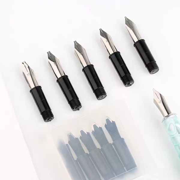
Calligraphy lovers rejoice! Today Shanghai Jingdian started offering sets of five italic nib units that will screw into Delike pens and a few models of Moonman pens. These are currently in their Taobao store, but keep your eyes peeled for them to start showing up on eBay soon. http://m.tb.cn/h.37htpcP?sm=9758e2
-
Over the years I've acquired a suite of pens with modified nibs, and I thought it would be interesting and possibly useful to show a progression of different nib sizes. These are all Nakaya nibs modified by John Mottishaw, all are loaded with Pelikan Blue Black ink, and the samples are written on Rhodia 80 gsm paper with a line spacing of 7 mm. I also included samples from a few other pens for comparison. The nib grinds vary from stub to cursive italic - the smooth cursive italics are somewhere in between. For those, I asked John to grind the nib to provide as much line variation as possible while still being smooth enough for everyday use (credit goes to dcpritch for that one). The flows are given on a scale of 1-10 with 10 being the wettest, and the values are what I requested John to set them at. Enjoy!
-
I am considering getting Lamy 2000 EF from "nibsmith" and getting it ground to left foot oblique in stub. Any idea what kind of line width and variation it would result in? My intention is to achieve a fine stub, similar to the 'Fine' stub of Pilot Plumix / Pluminix pen, which is quite fine, probably 0.5mm. It is fine enough for normal daily use and faster writing but still gives a character to the writing.


.jpg.96c09e1168ca343cf95ad203f4e781f1.jpg)