Search the Community
Showing results for tags 'resin'.
-
Hello, Recently I’ve managed to solvent-weld few resin MB 149 barrel / section hairline cracks using a 1:4 mix of two chemicals. One is the MEK, while the other is a toxic chemical prone to decompose into an even more toxic gas. Those who’ve come this far, know what I’m writing about. The mix has to be prepared in the open air, on spot, only in drops and applied immediatelly. As I’ve been asked to share the recipe, but have also read some strongly discouraging posts about sharing recipes involving naming toxic chemicals, I’m reluctant toward making irresponsible posting decisions. I hope I’m not violating some of the Forum rules by asking for guidelines / opinions if I should post it herewith at all. I don’t want to feel responsible for someone’s inexpert handling resulting in possible intoxication. Thanks in advance.

-
TL/DR version: Do knockoffs of black Montblanc pens ever have the characteristic wine red glow to the resin? Longer version: I recently bought a Montblanc at an antique store: Black with silver-toned (likely platinum) trim.13.7cm long capped; 15 cm long posted. Nib=18K, unmarked but apparently EF Cartridge/converter fill. Lousy pic quality available or I'd post. Comparing it to a current production model, it looks identical to the Meisterstuck Platinum-Coated Classique, which has a 14K (not 18K, as mine) nib. This was a one-on-one sale; the stall owner seemed to know very little about FPs. Too much detail to provide here, but everything about the interaction and her stall gave me every reason to believe that she believed this to be an authentic Montblanc. In other words: if this is a fake, she was duped; I don't believe she was trying to dupe me in any way at all. I can't identify the pen. Called Montblanc and the serial number doesn't correspond with a FP in their records (though maybe with a ballpoint). Was told I could go through the process of sending it in for authentication. After detailed review of things to watch for in knockoff Montblancs, everything about this looks legit to me (clip shape, Pix, band with engraved SN and "Germany," quality of the snowflake emblem, springiness of gold nib, weight/balance, quality of the screw-in convertor, quality of engraving of Montblanc name, and the reddish/wine-colored tint of the black precious resin). If this is a knockoff, it is of incredibly high quality. Part of me wants to know if this is authentic. Part of me doesn't care. I'm inclined not to go through the trouble of sending it in for authentication; I'd rather just enjoy it. (The feed needs another good soak, but it is in excellent condition otherwise.) It seems to me that the color of the resin would be incredibly hard to knock off. So what I'm curious about is: are there known instances of the wine-tinted black resin being present in knockoffs? Or is its presence an indicator of the real deal? Searched the forums for related info, but didn't find anything. Thanks for any info/advice!
-
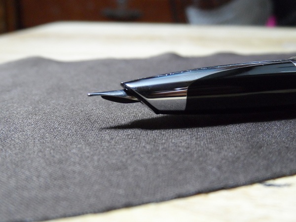
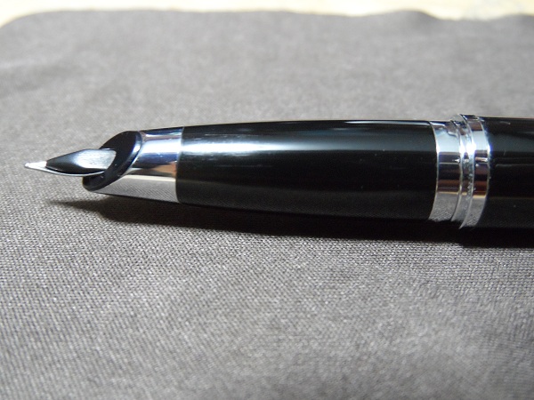
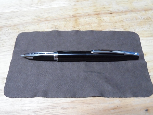
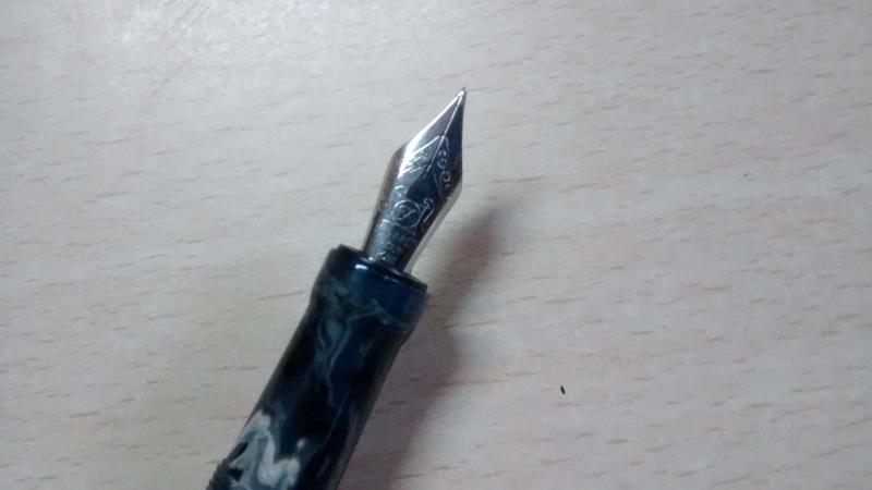
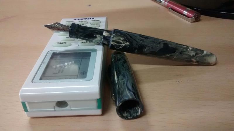
This is my first review, so if you can think of any part of the pen I did not cover then please ask questions below. This is the beautiful Magnifica Amalfi from Delta. The pen has a 14k extra-fine nib and comes with a gorgeous olive wood barrel with prominent grain. The rest of the pen is constructed from a variety of resins: two shades of blue, white, and red. 18k plating trims the pen. The filling mechanism is a captured converter - one which is highly efficient and takes ink all the way up to the seal. Fond, as Delta are, of basing their pens on locations and features of landscapes, this pen is made in honour of the coastal city of Amalfi: the olive wood barrel representing land; the resins representing the sparkling sea, sky, and mountains near the city. This is a numbered edition pen. The nib itself is a true EF. I mention this because the last time I used a Delta EF it was a steel nib and wrote as a medium. I purchased this pen expecteing a very 'liberal' EF nib and was pleasantly surprised to discover that it wrote as finely as my Faber-Castell EF (more on that in the writing sample). Initial inspection under a loupe showed the tines to be strongly misaligned, however I also noticed the feed was fractionally misaligned as well. After giving the feed a slight nudge it audibly 'clicked' into its correct setting and this had the effect of aligning the tines as close to perfect as-makes-no-difference. After looking at all angles through my loupe the tipping material makes a smooth sphere at the contact point, no tinkering needed. Although not visible in the photograph there is a healthy slit of light between the tines. The resins are simply beautiful. Let me get the obligatory "no camera can capture the beauty of... " sentiment out of the way, and tell you that I firmly believed the blue sections of the pen to be celluloid. I found it difficult to believe that resin could have such subtlety in its chatoyance and interaction with light - even my Dolcevita cannot match the glimmer and sheen of these resins. Although the following images do not do the effect justice, compare these two: now imagine the highlights in the second image emerging from the deep blue, curving into visibility like a shoal of fish. Here is a deliberately underexposed shot of the cap to show that even the white resin band has some subtle marbling effect, albeit barely discernible And here is a view of the red band, again some texture is visible. Another comparison of the way the resin reacts to light can be seen by comparing the light blue resin of the blind cap in the above photograph with the full length horizontal shot at the beginning of the review: the latter appearing very subdued, the former catching light from a new angle. A closer view of the section. The threads are not sharp. The seal of Amalfi and a maritime compass form the ends of the pen. Hopefully my appreciation of this pen is evident, so I will now deal with a couple of niggles. The gold ring separating the section and barrel is loose enough to create a slight rattle if you tap the area (handing the pen to someone, placing the pen down uncapped etc.) and though it does not slide forward or come off, this bothers me. Not a big deal, but I'd rather it wasn't there. Another small detail is that the word "Amalfi" beneath the number on the cap is not centred with the exact rear of the cap (the number is). It is however centred between the word "MAGNIFICA". This means that the gold band was not centred when it was affixed to the cap. Again, it's a tiny detail, but worth mentioning. Those of you who find the rattle of converter tips inside tapering pens annoying are, unfortunately, going to notice an issue with this pen. To make sure that the gold plated captured converter does not scratch after inserting though the barrel there is some leeway in the fit. This means that the user operated twist section has a fraction of a millimetre of space around it, causing the occasional rattle when tapped. I fixed this in mine with an accurately measured shim of paper. This will only fall out when the entire barrel is removed, not when filling up each time.It is an invisible and quick fix for those of us who are pernickety enough to care. As for the feel of the pen - it is very light by my standards. The uncapped body with a full load of ink is 22g, the cap 18g. This is however an EF and so I can accept a pen this light. The section has a very pleasant concave taper, comfortable and natural. The transition between the different materials is also very good. The three resins on the cap are all flush, as is the wood -> red resin -> metal -> blue resin combination at the rear of the pen. However the fortifications detailed on the gold band are raised slightly, and this does occasionally catch on my hand. Not too egregious, but enough to remind you that the pen is there. Posting the cap doesn't change anything either as the "MAGNIFICA" gold band falls in the same place. It also has raised detail. Speaking of posting - the pen certaily feels more substantial and not too back-heavy, but I have a dislike of posting pens and doing so always makes the pen I am using feel wrong, so I am not the best to judge this. The pens writes very smoothly. I'm used to EF nibs so my hand is accustomed to the gentle touch required to creat smooth contact with EF nibs. YMMV. The blue ink below is from the bottle in the first image. It is not named so for all I know it clould just be normal Delta Blue. I refer to it as "Amalfi Blue". The Amalfi Blue ink lays down vibrantly, yet significantly fades on drying. The green ink is from my Faber-Castell E-Motion EF. That was previously the finest nib I had, much finer than other EF nibs by various companies. And here is a medium nib with the same blue ink, the Amalfi pen writing underneath. Thank you for reading. This review was written in one continuous stream without editing or revision, so if you have any questions about something I missed, please ask.
-
Hi everyone! I recently got my first Delta Pen … I got lucky, and had the chance to get a Delta Unica pen in a very good condition, but … After I tried to draw out the nib, the grip section got loose and now I have a resin tube (formerly grip sectin) and the nibhousing with nib and feed. I do not see any rests of glue or something else, so I am thinking about, how to fix the grip to the nibhousing again, because, if I do not fix it, the grip section constantly turns around … Should I use a strong adhesive, to glue the resin tube to the nibhousing or should I just use kind of a schellack??! Perhaps, here are some Delta pros that might help … Best wishes and happy writing! Daniel
-
Hi All, I own a few modern Conway Stewarts in their various marbled/cracked ice finishes and I am wondering who makes the pen blanks for them? I know that SEM was their supplier for ebonite but I am not sure who makes the resins for them. Here are a few shots of my Conway Stewarts. If you aren't sure but you have a hunch of who is the manufacturer, please do share anyway. Thanks! Churchill in Honey Noire Belliever in Poinsettia and Duro in Cherry Red
-
I currently have a resin-exclusive collection, but I find myself increasingly drawn to the lustrous solitaire models - namely the stainless steel and platinum versions. Montblanc resin, while not exactly fragile, is of course more prone to scratches than steel. However, I consider the resin models more classy and symbolic of Montblanc heritage. For owners of both, which do you prefer and why?
-
Introduction: Ranga recently held a group buy of this new model on FPN (https://www.fountainpennetwork.com/forum/topic/351924-ranga-handmade-pens-introducing-splendour-model-in-striking-stripes-colours/). Deeming the designs and colour options attractive, I went in for a blue-pink model. I requested Ranga for a customized model which has the cap of the rounded variant and the body of the torpedo, which Mr. Kandan from Ranga was happy to accommodate (on this note, it is always a pleasure dealing with Mr. Kandan). The pen arrived in due time (with the transport time being a bit longer than usual due to onset of nation-wide lockdown). It came in a typical Ranga pen case with an extra "oliver" brand basic plastic pen. the packaging was sans frill and practical, which I like. My thoughts on the pen itself are summarized below. Appearance & Design - This is a imposingly attractive looking pen that commands attention…the stripes are striking, as is the size. The blues and pink/purples really stand out. Design is classic and sans frill – just a rounded cap design with a sensible looking gold clip and a torpedo shaped barrel [as mentioned in the intro – this is a hybrid design – the off-the-shelf designs will have either rounded or torpedo (or flat with conical top) finish on both and bottom]. No finials, cap rings or any other ornamentation. The looks are of reserved elegance letting the acrylic pattern take centerstage. Maybe Ranga could try a variant with a thick cap ring – it may work. The #6 nib does seem proportionately small given the size of the pen. Construction & Quality– It is well-finished to a soft sheen on the acrylic. The build quality is typical of the Ranga stable – sturdy and attentive to detail. There is no wobble when the cap is secured, which, as a new twist (pun completely intended) for Ranga (at least to my experience) takes only one turn to close or open. That’s awesome for something I intend to use always as a desk pen. To nit-pick, do note that since this is a completely hand turned item, you may notice some turning marks when the pen is held to harsh light, like direct sunlight. To me, this adds to the charm of the pen and makes it feel more like a handmade item. Some may find this a minor irritant compared to industrial finishes. Weight & Dimensions This is positively a very-big pen. No seriously, its huge. Right now, it’s the biggest pen I own. However, strangely enough, I wrote through 5 pages of Ginsberg’s Howl just to test for fatigue and there was none. The uncapped weight however, is very manageable given the lack of metal in the barrel (other than the nib), weighing in at much less than an ounce. I do not think it would make any sense to even consider posting (though it is very possible and secure). The dimensions are below: Length; weight (capped): 170 mm (6.7”); 37 gms (1.3 oz) Length; weight (uncapped) : 153mm (6.1”) (measured from tip of nib); 23gms (0.8 oz) Section length : 30mm (1.18”) Section diameter: 13mm to 15mm (0.5 – 0.6 inch) [this information is from Ranga directly. The rest measured by me). Some comparison pictures are below: This is what it looks like next to the TWSBI 580 AL and the Pilot Justus - both quite large pens at around 145-150 mm (5.8-6"") posted. Nib & Performance - It has a very well-tuned Bock nib (I opted for an M) that wrote well right out of the box, both in terms of smoothness (very smooth, with just enough grip on paper to control the handwriting) and flow (wet without being gushy). Only one of the several inks I tried till date - Krishna sea @ night – gave me some problems with hard starts [i badly wanted this ink to pair well since both the base and sheen colours match the pen . But may be this tiny issue will also sort out over time as these things often do]. The #6 nib does look proportionately small for the body – a number #8 would be nice; but the Bock #8s are only in gold (which I deemed too expensive) and Ti (colour whereof would not match the gold clip). Filling System & Maintenance – This is a “3-in-1” filling system (C/CC which can be eye-dropped) which is common for Indian hand turned pens with German units. It comes included with a Schmidt international cartridge which means its easily replaceable down the road, and can be swapped for a whole bunch of cartridges. The body will hold almost 5ml of ink if eye-dropped, which is insane if that’s your thing (I like to keep at least 4-5 pens inked at a time, so prefer CC for the lower ink volume). Cost & Value – I paid the equivalent of about $85 at current exchange rates on the group buy. For an oversized hand turned pen in premium resin with a bock, this was a great deal. Even with the normal (non-group buy) price, it would still be a very good deal. Conclusion – Once more Ranga hasn’t disappointed. The pen is a great addition to my collection, and is a good option for anyone who likes (a) large pens, ( thick sections © striated resin patterns and (d) understated classic designs.
-
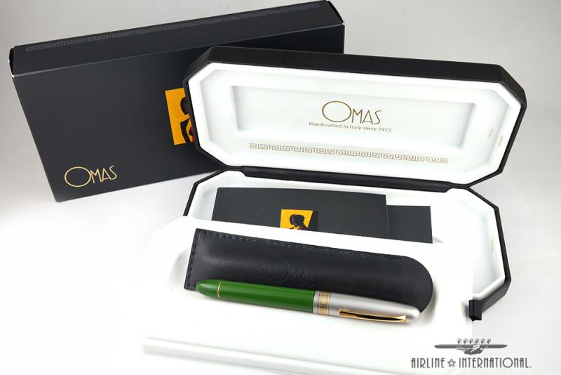
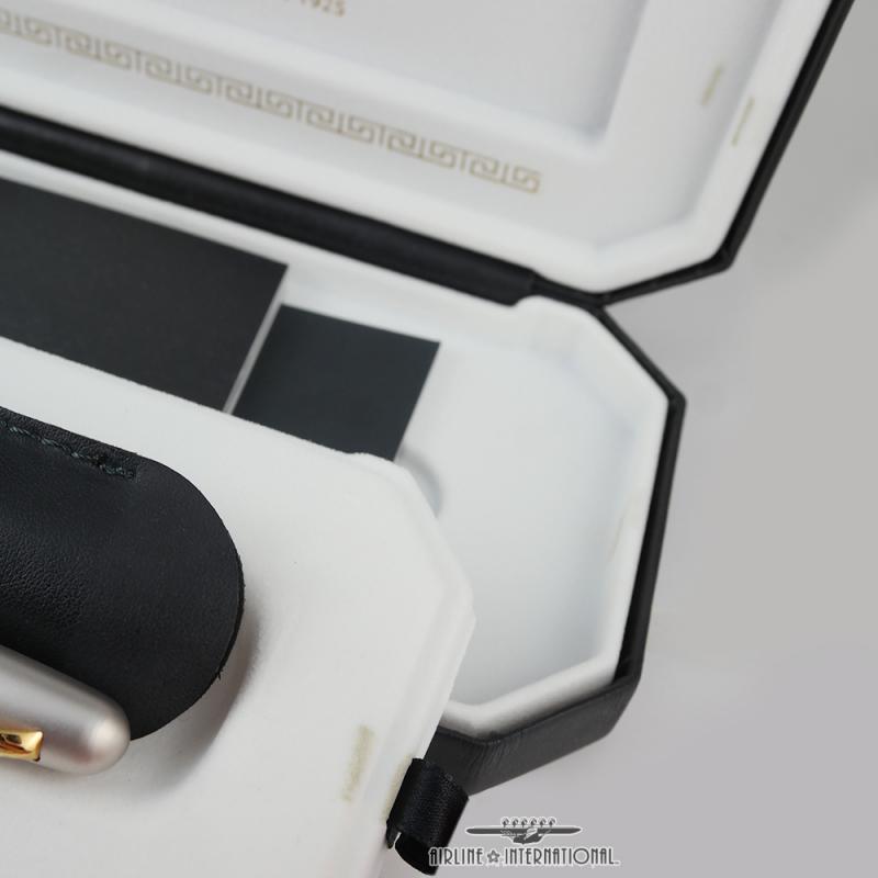
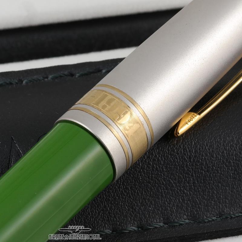
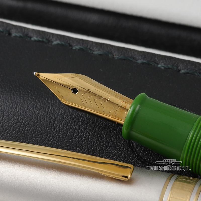
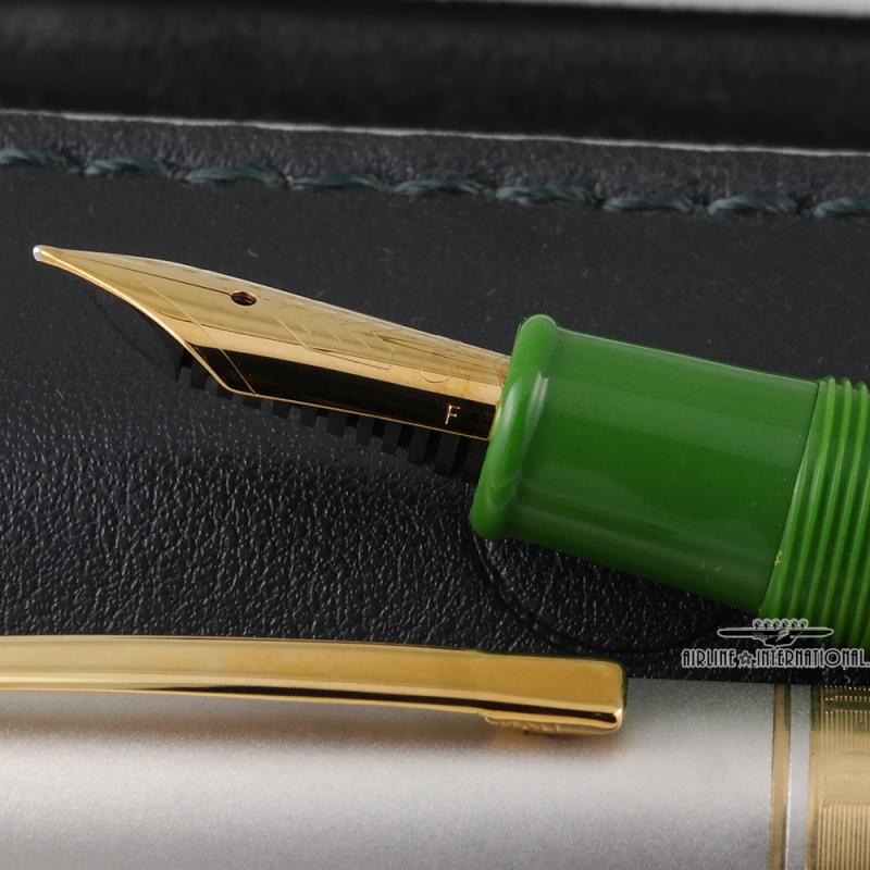
"The eyes of the world are upon you." -Dwight Eisenhower's message to the troops of the invasion force This year marks the 75th anniversary of the historical day that was the turning point for the Allied forces in World War II. Made to commemorate the 50th anniversary of D-Day at Normandy. This pen is limited to only 5300 fountain pens, signifying the number of ships that crossed the English Channel on the dawn of June 6th 1944. The body is crafted from a gorgeous military green resin with gold vermeil trimmings. This Omas D-Day Fountain pen c.1994 is in exceptional condition and has been vault kept. It comes with authentic documents and presentation boxes. It has a Fine gold plated nib. It is NOS (New Old Stock). The pen has NOT been used and is in exceptional condition. The clip has light patina and the display box does have some light discoloration which is shown in the last image. We currently have two Fountain Pens of these, one with a Medium Nib, and another one in a Fine Nib. Please feel free to contact us for more inquiries, or if you are interested. orders@airlineintl.com
-
desaturated.thumb.gif.5cb70ef1e977aa313d11eea3616aba7d.gif)
Leonardo Momento Zero (Endlesspens Exclusive) "the Devils Kiss"
A Smug Dill posted a topic in Market Watch
Endless Pens started putting Leonardo Officina Italiana pens in its (pre-order only) catalogue earlier this year, including a store-exclusive Bacio Del Diavolo ("The Devil's Kiss") limited edition of the Momento Zero model. There seemed to have been a lot of flux in its pricing of the Leonardo models since; first the prices dropped briefly for less than a week†, then went back up at the same time as free international shipping subject to a minimum spend threshold of US$149 was introduced, and then up and up again over the past couple of months (when I glanced at them occasionally; I haven't been watching and charting all the movements). During that time, the Bacio Del Diabolo was always priced at least the same as, and sometimes higher than, more commonly available models of the Momento Zero such as the Blue Hawaii. Right now Endless Pens has issued a special promotion code of 25% off that applies to pre-orders of The Devil's Kiss edition only. That brings the price of the steel-nibbed version to US$149.25, and that of the gold-nibbed version to US$267. (The text of the product listing seems to suggest that the 25%-off code will not work for the gold-nibbed version, but I tried it and it does work, at the time of writing.) For the first time, Endless Pens is offering its store-exclusive, 100-pieces-only limited edition for less than its contemporary pricing for the Momento Zero Blue Positino; I'm not going to speculate why here. However, I also note that the minimum spend threshold for free shipping has now been raised to US$250, so an order of the discounted steel-nibbed version alone will not qualify. I think it's an attractive-looking pen, and some fellow FPNers have had reported good experiences with Leonardo nibs. But then, some others have had problems with the nibs as delivered (and mostly sorted out with good customer service by European retailers from whom the pens were ordered). My own experience with the EF nib on a Leonardo Momento Zero was not great, so now I'm hesitant to buy another, especially when I either have to pay for shipping or top up the order with yet another US$100 worth of products I don't need. -
I have a blue resin Falcon. I know the model was discontinued before 2007 because I found an email to a friend stating as much. Unfortunately, my saved emails only go back that far so I can't determine when I bought it. Pretty sure I bought it from Levenger (Yikes!). I've done a couple of searches but can't seem to sort through all the recent info and what "historical" data I find seems to be more intent on discussing the Elabo v. the Falcon than anything else. Does anyone know when this pen was made/sold? Thank you. KCat
-
Over the last few months a new brand of Chinese fountain pens has been generating a lot of interest due to a combination of moderate price, interesting designs and beautiful materials. This is my second PenBBS fountain pen, my first being a 323 in the lovely blue/purple acrylic. While I liked that pen quite a bit, I really think this particular pen is definitely worth crowing about. I'm going to take a look today at the PenBBS 308 in the lovely "Hawa'ii Gradient" acrylic resin. Design 8/10: The PenBBS is modeled after the well-known Sheaffer Balance fountain pen which was first introduced in 1929. Similar to the Balance, the 308 is a long, streamlined pen with torpedo shaped ends, a single cap band, screw on cap and flared grip section. This is a pretty classic shape for a fountain pen copied by any number of fountain pen makers over the years, with the Edison Nouveau Premiere another modern interpretation. There are some differences, however. The 308 has a cap band that encompasses the entire cap lip, and the clip, instead of being inset in to the cap, is on a separate ring with the finial screwed down on top. Moving on from the basic design, the 308 is a rather large pen, utilizing a #6 sized, stainless steel nib. The nib is engraved with standard scrollwork, and the words "PenBBS" "Since 2005", "F", and "China", The engraving is clean, even and well executed. The cap band encompasses the entire bottom lip of the cap and is engraved with "PenBBS", the PenBBS logo, and "266". 266 was the model designation for the earlier version of this pen, as the threading was moved from the grip section to the barrel. The reason for the change was that there were complaints that people were having the barrel unscrew when they tried to remove the cap. Instead of junking the already engraved cap bands, the maker decided to just use them anyways. Hey, fine by me! Saves waste. Again, the engraving is clean, deep, even and well executed. The barrel tapers down to point, and is made of a single piece of resin. This pen can be used as an eyedropper, and comes with an o-ring installed, sitting in a groove machined in to the grip section. Now let's get it out of the way - the material gorgeous. The coloration starts as a bright yellow at the tip of the barrel, moves through a light green and in to a bright, almost turquoise blue, and then back to yellow. The transitions are well done, the colors go well together and I think the effect is really, really lovely altogether. The polish is perfect, and the entire body, cap and grip are all made of the same material. As I mentioned before, this is a relatively large and lightweight pen. Measurements are as follows: Length (Capped): 143mm Uncapped: 129mm Posted: 164mm Cap (Widest): 15mm Body (Widest): 13.5mm Grip (Widest): 11mm Grip (Narrowest): 9.5mm Weight Capped or Posted (Inked): 20.7g Weight Uncapped: 12.5g Fit and Finish 8/10: Considering the price, I'm quite happy with the fit and finish. The polishing is well done, the threads, while not the smoothest I've experienced, don't rub or gall in any way that would lead me to have concerns about the longevity of the pen. The body and cap are approximately 2mm thick at the joints, and thicken towards the ends. The cap band encompasses the entire cap lip and should help prevent any cracking issues. One thing that I was quite happy with was the number of quality touches on the pen, from both a design and build quality standpoint. I've mentioned before that the an o-ring was installed in the section, but there are a few other things to note. First, the barrel is quite a bit thicker towards the "tail" of the pen, so much so that the knob for the included converter fits relatively closely in to the end of the pen. Second, the converter fits quite securely in the section, and even when shaking the pen it does not rattle around in the body. Lastly, the maker took some effort to match the coloration between the different body parts. It's more noticeable in person, but the barrel section happened to end in the lightest color of the different resins used. Care was taken to ensure that the section, where it screwed in to the barrel, also started at that same, bright yellow color. This demonstrates a standard of care in construction that you simply wouldn't expect at this price. My favourite brand of fountain pen is Delta, and I own 17 of them right now. From the standpoint of fit, finish and materials I'd happily put the 308 on the same level of some of the lower end Deltas like the Unica, Virtuosa, Italiana or Vintage. I'd even go so far as to put it a half step above the Virtuosa or Unica with their laser-engraved nibs and trim. Filling System (6/10): It's a cartridge converter. Nothing special, but the included converter is of decent quality and holds a good amount of ink. It is pretty much identical to the converters that come with current Jinhao pens. The only real complaint I have here is that there's no agitator. If you don't care for C/C. PenBBS does make a piston-filled fountain pen, the 309. They are also working two styles of Vacumatic-filler fountain pens, one plunger fill (similar to a TWSBI Vac/Mini Vac), and one pump fill (similar to the classic Parker Vacumatic or modern Edison Menlo Pump Filler). Nib (7/10): The nib on this pen was really, really good. Stainless steel, smooth, well adjusted and a very reliable writer, though quite stiff. In a vacuum I'd probably give it at least another half point or so, but I'm averaging the performance between the two PenBBS pens I've received. While the nib on the 308 reviewed here was excellent straight out of the package, the nib on my 323 was overly dry and needed some work before it wrote in the way I wanted. The nib is stamped as a fine, and I'd say it matches fine nibs from my Western pen brands rather than my Japanese/Taiwanese/Chinese pens. The nib and feed are a standard #6, and the pen worked perfectly well when replaced with a few spares I had laying around. One thing to note is that PenBBS nibs has slightly upturned tipping compared to most modern pens. While I wouldn't go so far as to call it a Waverly nib, it is definitely noticeable when viewed through a loupe. Cost and Value (9/10): The "Gradient" color series of PenBBS pens are currently the most expensive pens from this brand, selling for anywhere from $27-30US. Given the fit and finish, looks, nib quality and design details, I think it's a heck of a pen.
-
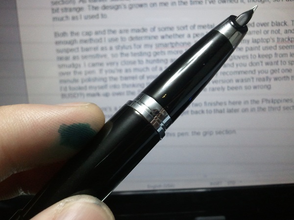
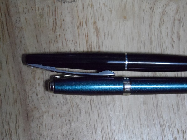
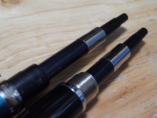
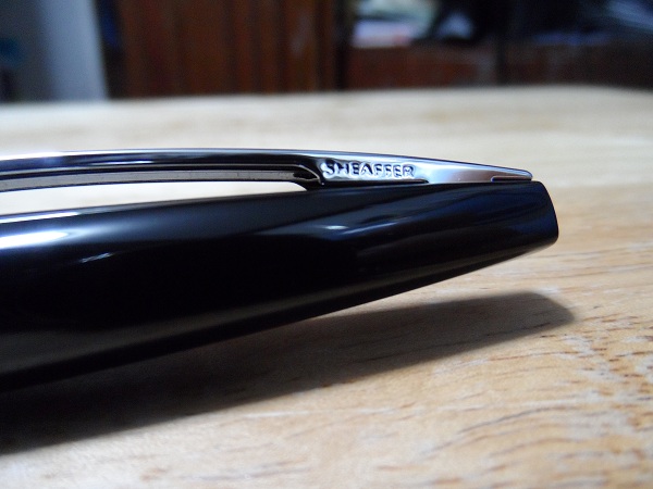
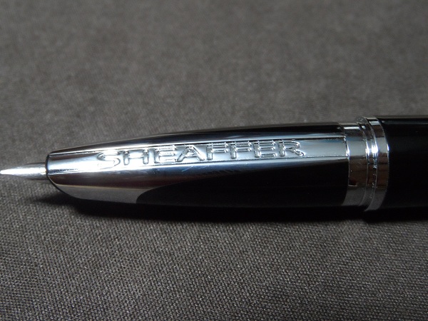
SHEAFFER TARANIS (Stormy Night) Review: Someone Had To Write One Eventually Leaving my choice in tag lines aside, I'm fairly sure that the title of this article managed to turn some heads all on its own. This is, after all, a review of an extremely interesting pen, one possessing the weight of expectations that it live up to its being released in Sheaffer's Centennial year, a polarizing (read: love-it-or-hate-it) design, and one heck of a cool name. … I'm something of a mythology freak, if that explains things. Now, I've had this pen for a while now, and have had the time to get to know it fairly well. I'm one of those crazy types who attribute personality quirks and attitudes to fountain pens, so if that sort of thing disagrees with you, then I'm proffering my apologies. And yes, “proffering” is an actual word. This review will be divided into three sections, namely: Build Quality & Design, Usability & Writing Performance, and, last but not least, a section wherein I'll give my exhaustive opinion on whether or not this pen is truly worth buying; I can't think of an appropriate enough name for it just yet, nor do I really see the need to think one up. So, I'll get right to it, then: BUILD QUALITY & DESIGN: I'll be honest here: I was one of those people that nearly gagged when I saw the first pics of the Taranis emerge online. I happened to be drinking a cup of hot chocolate at the time, as I recall, so that bit about me nearly choking isn't even close to figurative. It looked to me like Sheaffer took more than a few design cues from Lamy's line of pens, to put it nicely. Really, I'm almost a hundred percent sure that there are loads of other people who'd agree that the Taranis looks something like a Lamy 2000 wearing Sheaffer colours (er, not literally, since the Lamy 2000 is also black, albeit with a matte finish). Others, however, maintain that it looks quite a bit like Pilot/Namiki's also-prolific Vanishing Point fountain pen while posted. My opinion? They're not too far off the mark, come to think of it. After all, when viewed from straight on in just the right lighting, the strip of metal that bisects the section looks very nearly as obtrusive as the VP's clip. Considering how many people defer from using the VP simply because the clip gets in their way while, that's saying something. Ah, but I'm getting a bit ahead of myself. Sorry, it's just rather difficult to avoid talking about the grip section, which I'm fairly sure is one of the reasons Sheaffer designed it the way they did. Anyway, let's start with another, slightly less controversial design element, the first thing most people will see while the pen is pocketed: the clip. …. Wow, what a clip. The clip is by no means ostentatiously designed, but it stands out all the same. To be frank, it's just... a really large clip. By my measure, the clip is exactly 60mm, or 2 2.5/8in. long, and is roughly 4.5mm wide (I am NOT getting the Imperial measure for that, online converter or no). The base of the clip, including the lengths not really attached to the top side of the cap, is 20mm long, with the company's name emblazoned in block lettering on the right-hand side of the pen, a la Lamy 2000 (see what I mean?). Also, Sheaffer's iconic White Dot is positioned near the top of the clip, as per the norm. Speaking of the White Dot, I can't be a hundred percent certain, as this is only my second Sheaffer pen, but the Dot looks to be rather smaller. The Dot on my Prelude is 2.5mm across, while the one on the Taranis is only 2mm across, give or take a few micrometers. Whether or not the Dot's diameter changes across Sheaffer's line of pens, I have no idea. I'll remember to bring a ruler, maybe even a caliper, along with me the next time I go shopping. Regardless of its diameter, though, the White Dot looks perfectly at home on the Taranis's monolith of a clip, which in turn fits in quite well with the overall design of the pen. This is in spite of its being nearly half as long as the entire pen itself. It just works. Then again, beauty, as they say, is in the eye of the beholder. Keep that in mind, since you'll probably need to repeat that to yourself ad nauseum once we get to the grip section. The cap itself is relatively plain, but in a good way. It tapers sleekly from the base to the top, and ends in a sort of rounded square shape. I'm told that these squared -off ends (it's duplicated in the barrel of the pen) are a throwback to an earlier Sheaffer design— the Imperial, I believe. There's not much else to say about the cap, really, save for the fact that it's a slip-on cap. The manner in which the clip is attached to the cap is also noteworthy. As you can see here, barely a third of the clip's base is actually in contact with the cap, there being gaps on either end, which I assume are meant to increase the springiness of the clip, which, by the by, is really rather stiff. It's a bit difficult to flex it wide enough to accommodate denim jacket pockets, but it's very secure. I tried clipping the pen to a fairly thin dress shirt pocket, and the pen stayed safely in place even while I was jumping around. Literally. Just... don't ask if there was any ink spilled. Please. *ahem* Um, so... where was I? Oh, right, the barrel. The barrel of the pen is very nearly a repeat of the cap, minus the clip. I've placed the pen next to a ruler in this picture to illustrate my point. I probably ought to have touched upon this sooner, but what the heck: The cap itself is precisely 66mm long by my measure, while the barrel of the pen is just a tad longer, at 72mm long (that's not inclusive of the silver band that separates the barrel from the grip section). As earlier stated, the barrel tapers to a rounded square end which, at first, I thought to look a bit strange. The design's grown on me in the time I've owned it, though, so I don't mind it nearly half as much as I used to. Both the cap and the are made of some sort of metal, and painted over black. There's a simple enough method I use to determine whether a pen has a metal barrel or not, and it involves using suspect barrel as a stylus for my smartphone. I've tried using my laptop's trackpad, but it's nowhere near as sensitive, so the testing gets more than a little iffy. The paint used seems fairly durable, if a bit smudgy. I came very close to hunting around for a pair of gloves to keep from leaving fingerprints all over the pen. If you're as much of a neat freak as I am, and you don't want to spend every other minute polishing the barrel of your pen, then I strongly recommend you get one of the matte finishes. I'd fooled myself into thinking that the Icy Gunmetal version wasn't really worth the 360-peso (roughly 8USD?) mark-up over the Stormy Night finish. I've rarely been so wrong. Also, yes, there's a price gap between those two finishes here in the Philippines, despite their costing the exact same amount elsewhere. I'll definitely get back to that later on in the third section of this article, as you'll see I have good reason to. Okay, now on to the busiest part of this pen: the grip section. … Well, what can I say? Sheaffer seems to have outdone itself in sheer brashness of design here. If anything, I'm both nonplussed and in awe at their having the guts to display the company name so aggressively on the section. If you're worried about the metal portion interfering with your grip, by the way, then let me put your anxieties to rest: the section is designed in such a way that one will almost always manage hold the resin bit of the section (unless they have extremely unorthodox grips, that is), which I find very pleasant to the touch. The metal band also has the bonus benefit of helping one properly orient the nib, which neutralizes the one common problem I've found with most hooded/semi-hooded nibs. On a related note: the “ears” on the Lamy 2000 help me in much the same way, which is why I'm actually grateful for them. Hmm, what with all the references I'm making to the Lamy 2k, I may as well just follow this up with a comparison of the two pens. It's a thought. Also, as you can sort of see here, there's a gold-painted indication of the nib's grade. That single strip of gold you see was a full-fledged “F” when I first bought this pen, but apparently it rubs off rather easily. I can see why some would think that displaying the nib grade on the underside of the section would clash with the overall design lines of the pen, but I personally thought it rather pleasant to look at, and vaguely reminiscent of how older, more pragmatic fountain pens would have similar markings stamped onto their barrels or grip sections. It looked a bit retro, I suppose you could say. As of the time of this writing, the demarcation has completely vanished, leaving the resin portion of the grip section completely unmarked. It's a shame, really, and I'm going to miss it quite a bit. I can just barely make out the edges of the section's metal band, which are almost in direct contact with the resin part of the section. The edges appear to be the slightest bit rough in some areas, though it's hardly noticeable to me without the aid of a magnifying glass. That is to say, unless you're really going out of your way to look for the tiniest flaws in detailing and artifacts of the manufacturing process, kinda like what I'm doing at the moment, you'll probably not notice it at all. Of course, considering how minute the flaws, I could've just been unlucky enough to pick up a Taranis with unit-specific problems, so your mileage may vary. Also, there seem to be three very slight outward-protruding dents in the metal part of the section located just above the metal band that is visible while the pen is capped. As far as I can tell, these are what keep the cap in place, though I'm not entirely certain. They're relatively unobtrusive, but it's hard not to notice them once you know they're there. You have my apologies. With regards to the pen's durability, I have to say that I'm impressed. As earlier stated, both the cap and the barrel are made of some sort of metal (I'm not an expert in metallurgy, so I can't identify the metal with any degree of certainty), which instantly raises my estimation of a pen's durability. I can't say the same for the finish, however, as the paint— or coating, whatever you wish to call it— already seems to show faint signs of posting. I'm taking great care to avoid aggravating this by posting no deeper than is absolutely necessary, meaning that I only go so far as to keep the cap from wobbling while I'm writing. This is one of the drawbacks of a friction fit, I suppose. So far, I've had a very good impression of this pen. In point of fact, there's hardly a thing discussed that I don't like about the Taranis. Of course, no pen being perfect, there has to be a point where things have to start to going downhill, even if only for a short while. For me, this is that point. And, no, it's not a minor thing to me, either. Things deteriorated rather quickly the moment I first unscrewed the barrel. As you can see in the following picture, the threads that attach the barrel to the section are imperfect. While I'm not unduly worried about long-term wear and tear, the corresponding thread on the barrel also being made of metal, it's still sloppy work, which is inexcusable in anything save for a disposable fountain pen, which this most definitely is not. Still, that could be counted as nitpicking, since it doesn't really impede the pen's performance or durability whatsoever. What I can NOT excuse, however, is the new converter that came with the pen. Sorry, I believe I've misspoken. By “new converter”, I do not mean that Sheaffer designed a new converter that's in any way an improvement over their previous one. It does not hold any more ink than the older one in my Prelude, it is not a converter you can disassemble (trust me, that would be a huge help), nor is it any easier to operate. Essentially, it is the same proprietary converter found in other Sheaffer pens. Except that this is infinitely worse. No, really, this converter initially drove me up the wall. This part of the review has been edited several times over now, since the scathing rant that it kept on deteriorating into was in no way helpful to understanding the pen, nor was it the sort of thing that one would expect in a professional, if casually written, review. Suffice to say that it revolved around the terms “penny-pinching”, “inferior quality”, and “flashing”. By “flashing”, of course, I'm referring to the artifacts left behind by a careless or unpolished injection-moulding process. You see, though it's not immediately apparent in these photographs, there is a palpable difference between the older Sheaffer converter (above, with striations) and the one that came with the Taranis (below, without striations). For one thing, the latter feels much cheaper to the touch. Whether this is the result of Sheaffer cutting production costs by switching out the original materials with cheaper alternatives or the production process merely being, I'm sorry for the word, shoddier, I have no idea. I have suspicions towards both, really, but as earlier stated, I'm no metallurgist, so I can't be entirely sure that the former claim isn't any spurious. I'll now say that I'm only basing my theorizing on what I've seen and felt (maybe even smelled) during my scrutiny of this pen. As the issues I'm experiencing may just be the unit specific (think Murphy's Law), don't make any hasty generalizations you may regret, or could get me into trouble (haha); I still recommend that you take a look at a few Sheaffer pens for yourselves and draw your own conclusions. After all, a conclusion drawn from a sample population of one can hardly be considered a statistically significant finding. Consider the above my disclaimer. Perhaps the one thing that I really can't help but hate about the converter is the fiddly piston knob. While with most converters, even the older Sheaffer one, the piston knob essentially just rotates in place, the converter in the Taranis has a whole new dimension of movement: lateral wiggling. … For some odd reason, my use of the word “wiggling” just then seemed to take a lot of the seriousness from the paragraph. Bah. Anyway, even on a full reservoir of ink, there's an extra bit of leeway one can turn the knob with. Perhaps there's a gap in the interior of the converter's mechanism, or perhaps I actually am supposed to be able to disassemble the converter, and simply didn't try hard enough (I don't really mean that seriously, mind you). Either way, it makes the converter feel as if it's about to fall apart or spit out a huge wad of ink onto my shirt. And as shown here, there are many flashing marks present on the knob and the reservoir itself (the Taranis is the one with a chunkier knob, on the right). I scratched off a few of these, but then gave up for fear that I'd inadvertently break something. To try and be fair, though, it does its job as a converter very well, and apart from a few instances when I've had to clean the inner side of the pen's barrel of ink (by my guess, some ink had escaped via the gap between the section and the converter), I've had no troubles whatsoever with it. I still fear for the filling system's long-term durability though, and find operating the converter more unpleasant than otherwise. I haven't a camera or lighting system good enough to make this out, but looking inside the grip section, you'll find a proboscis of sorts that plunges into the aperture of the converter, which I find stabilizes the inkflow somewhat, and prevents skipping even with prolonged sessions of fast writing. The one caveat I have to offer here is that you'll want to take extra care when installing a converter here, as you may accidentally damage this proboscis or the opening of the converter. And one more note on design: You'll recall that the ends of the pen taper of into rounded square shapes, yes? To my joy, when you lay the pen flat on an even surface with the “Sheaffer” branding on the section facing right up, the ends of the pen are perfectly plumb, meaning that the bottom end of the rounded square on the barrel draws a perfectly parallel line with whatever surface you're laying it on. It's an admittedly miniscule detail, but I'm still glad that Sheaffer went out of their way to be precise here, as it makes up very slightly for their supplying a low-quality converter with the Taranis. Alright, one last thing about the converter before I lay the matter to rest: If you've a stock of older Sheaffer converters, then I recommend that you take great care with them. If the supplied converter here on the Taranis is any indication of what Sheaffer will start rolling out with the rest of their pens, then you'll really want to have several backups. Some branches here in the Philippines offer Sheaffer proprietary converters for sale individually, pricing them at around $10 (an estimation). If you think it worth the price, then I needn't say that you should go for it. Now, I've been rambling for quite a while now on how durable the pen is, and how much I like its looks. Strangely enough, this being a fountain pen and all, I've yet to refer to how well it writes! I really ought to fix that: USABILITY & WRITING PERFORMANCE I've touched upon a lot of things that should've been left for here in the previous section. As such, my including “usability” here in this section is starting to seem somewhat moot. Well, they say that it's better to learn from your mistakes than to ignore them, so I'll remember that fro when I write another review. Just to recap, though: The grip section is very nice to the touch, thanks to the utilization of resin. The metal band on the section is in no way cumbersome for its being there, but then again, I have what most people would call a standard grip, I can't really speak for left-handed hook writers and the like. The paint, or rather, coating (it's a bit hard to tell, and I don't want to have to chip the finish just to find out which it is) feels nice to the touch, and is nearly as grippy as the section itself, though I'm nonetheless still very glad for the resin. This pen would have become an instant favourite with me if both the barrel and cap had been made of resin, but that's perhaps asking for too much. Take care not to drop the pen or post too hard, as that may ruin the finish. Then again, this problem could easily be resolved, perhaps, if one were to purchase any of the four other finishes, particularly the matte-textured ones. I didn't have a black a glossy black pen, which appears to be something akin to a woman's LBD (little black dress) here in fountain pendom, so I thought that this would be a good chance to remedy that situation. My Lamy 2000 (which is, sadly, away for repairs for the next month or two) doesn't really count, I feel, as it has a matte finish. As for me, I already have a polishing cloth for my glasses handy at most times, so problem solved. The clip, while a controversial design element in its own right, is very well designed, and would have gotten something like a 9/10 from me in usability if this were a scored review. Apart from being slightly stiff, which really isn't a problem for a lot of people, there's absolutely nothing bad about it whatsoever. Also, and I failed to mention this earlier, the upper 2cm of the clip is more an aesthetic projection than anything else. Looking at the clip from the side once again, and with my Prelude for comparison, you'll see that the usable portion of the clip is just as long on the Taranis as it it in the older pen. Basically, the clip on the Taranis is long simply for the sake of being long, and possibly for making the clip somewhat sturdier. As a result, the Taranis stands out a good 2cm taller than any other pen in the same pocket while clipped. All things considered, it seems to me that Sheaffer went out of its way to make this pen one you can't help but notice. That's not a bad thing per se, but there is a limit to what can be considered in good taste. Thankfully, that's a boundary that Sheaffer, at least in my opinion, managed to respect. Now, on to the part of the review that I'm fairly certain a lot of you were looking forward to: the writing sample: As you can see, the Taranis definitely has a fine nib. I wouldn't go so far as to call it an extra-fine, though it does seem to come rather close. There's been talk of the Taranis's nib grades being different from that of other Sheaffer pens, that they're closer to the Asian nib grading than the Western grading on other Sheaffer pens. I don't know about you, but if this writing sample isn't conclusive proof to that effect, then I doubt anything will be enough to set your doubts aside. The pen wrote well out of the box, though I must admit that I have it a thorough flushing before inking it up. The tines were slightly misaligned at first, but I won't hold that against Sheaffer, really, since a lot of manufacturers ship pens with imperfectly tuned tines; I'm of the opinion that any fountain pen enthusiast ought to learn basic FP care, maintenance, and repair. Sure, it'd be great if every manufacturer thoroughly tested and tuned each of their pens prior to shipping, but that'd hardly be economic of them, what with the sheer amount of manpower required for such tasks. Besides, there's almost nothing a brass shim, an extremely fine-grit buffer, and a pair of soft-nose pliers can't fix, when they're used properly. I'd say that the nib was fairly smooth, though hardly butter-on-glass smooth. Don't expect too much smoothness out of a Fine nib, especially one as fine as this. Still, for the narrow line width it offers (and let's face it, as much fun as a BB nib is to write with, such a broad nib is hardly ideal for taking down notes or writing on lower quality paper, which students such as yours truly are often forced to resort to), the nib gives off a reasonable amount of feedback. I'd say it was a bit “talkative”, but perhaps the feedback would better be described as “whispering”, since there really is very little noise when writing. It's also a wet writer. Far from being being the Nile river during heavy rains, it nevertheless leaves a reasonably saturated line that lubricates the tipping material well, contributing to the overall smoothness of the writing experience. The feed keeps up well during quick scribbling, leaving no traces of skipping whatsoever. I messed up a bit in the first scribble, as you can see; there's a portion that looks as if the line had doubled back on itself, branching off slightly from the single scribble. That was my fault, as I'd bumped my elbow into something while scribbling, rotating the pen in my hands. I'm not certain whether this pen can keep up during prolonged shorthand writing or with grand flourishes, as I do neither, but the results look favourable, based on what I've seen so far. One thing that bothers me, though, is this: Why is the breather hole covered? SO, SHOULD YOU GET IT? Yeah... that's the title I'm sticking with. Anyway, though this review has been extensively coloured by my own experiences and opinions, I sincerely hope that you've been able to draw your own conclusions. I've done my utmost to ensure that the reader will have as thorough an understanding of this pen as possible, short of actually trying it out for themselves. In other words, I just did my best to save you a trip to the brick & mortar and the local bookstore. I had way too much free time =_= Overall, the pen is a very good writer. Apart from a few complaints regarding the materials used in constructing... some of its components, such as the easily-marked finish of this particular version or the... *cough*, and the fact that the design is about as polarizing as it comes, there's simply nothing to hate about the pen. It's a wet writer, but it plays well with thinner papers, too. You'll probably still experience bleedthrough if you use it with particularly bad paper, but that shouldn't be a problem if you're okay with sticking to one side of the page. It feels great in the hand, too, in case I hadn't stressed that enough earlier on. Before I got this pen, I thought that the people who raved about resin pens and how they were highly superior to mere plastic pens were simply being elitist. Now that I've gotten to play with good-quality resin for a significant amount of time (even if it was only used in the pen's grip section), I now feel I ought to revise my opinion of resin pens, and resin pen fans, in general. They had something going for them, after all! ************ Now, if you'll recall, I made a reference to something that bothered me regarding the Taranis's pricing earlier on (much earlier on) in this review. This is, as far as I can tell, an inconsistency unique to the Philippines, so unless you happen to live there/here or are simply curious, there's no real need to read on. The pricing for the Taranis according to Sheaffer, it's MSRP, if you will, is $145 for the Stormy Night (reviewed), Icy Gunmetal, and Sleek Chrome fountain pens, while the White Lightning and Stormy Wine fountain pens both cost $165 apiece. Here in the Philippines, however, the Stormy Night and Sleek Chrome cost PHP2,700, which is under $65 at the current exchange rate, while the Icy Gunmetal costs slightly more at PHP3,060 (approx. $73), despite there being no price difference elsewhere. The real shock lies in the prices of the White Lightning and Stormy Wine finishes, both of which come with a gold-plated trim instead of the chrome of the other three pens. They're still equally priced, but at an eye-watering PHP11,500, approx. $274. I mean, I know gold is a scarce resource and is only really used with luxury items and the like, but the price disparity is silly, bordering on insane! Even considering EVAT (a tax here in the Philippines) and shipping fees, I sincerely doubt that there's any viable reason that the total is over $100 above the SRP elsewhere. The following off-the-top-of-my-head theories are pure speculation, so remember to take them with a grain of salt. Anyway, it could be that the more economically-priced three pens here in the Philippines are of an inferior quality to the self-same models sold elsewhere, which is why Sheaffer can afford to cut down so much from the MSRP. If that is indeed the case, then that'd explain certain... things that have come to my attention regarding the build quality of the reviewed pen. I find that a bit unlikely though, due to the fact that it'd be much too cumbersome a solution to really work out. But if that indeed is the case, then I'm calling out racism (just kidding )! Another possibility that comes to mind is the fact that Sheaffer could have shaved off over half the price of the three chrome-trimmed fountain pens in an effort to attract more budget-conscious buyers, then bumped up (more like skyrocketed, really) the price of the other two pens, which would be more attractive to the image-conscious buyer anyway, in order to make up for their losses. … Yeah, I don't think that makes much sense either. ************ And there you have it, my exhaustive review of the Sheaffer Taranis Stormy Night fountain pen. I hope that I managed to help out anyone who's considering this pen, even if only somewhat, and that you all enjoyed reading this review. If any of you could contribute towards solving the price discrepancy between the chrome-trim and gold-trim models, then that'd give me one less thing to idly think about Now, time for a well-deserved nap. Cheers! Kevin
-
About a year ago, I bought a coral Nemosine Singularity. I know these are pretty cheap pens, but I was curious what kind of glue I would use to fix it or if it was worth the effort at all. As far as I can tell the material is simply "resin". The pen broke fairly cleanly at the base of the threads at the cap clip (picture attached). Thanks!
-
Faber-Castell Ambition Review (Medium In Black Resin)
a.zy.lee posted a topic in Fountain Pen Reviews
Faber-Castell Ambition Review (Medium in Black Resin) I have owned this pen for a year now, and it has been used very heavily during that time. It was the first pen I bought and chose myself and it was a sort-of grail at the time. Th pen's design is very minimalistic. It's all straight and cylindrical. The cap is made of chrome with plastic internals, but it's very heavy. The barrel is made from brushed "precious" resin. After a year, the brushing has worn away, so it looks more polished. Still doesn't look smooth and glossy, though. The pen was breathtaking when it was new. The resin could be compared to the Lamy 2000's makrolon: Makrolon on top, resin below. Before buying the Ambition, my main concerns were the resin cracking and the comfort in the hand. There are no cracks in the pen to report, and the comfort isn't perfect, but it's fine. It's not for everyone, though. The step seen above is what concerns most. I hold the pen on the chrome section, but most hands would be too large to do so. I use the pen unposted, as posting throws the balance off a lot, due to the heavy cap. It does look very nice posted, though. The writing experience is far from perfect. The nib is very smooth, but it makes a lot of sound when writing, which makes you think it's scratchy. There is some feedback on left-to-right strokes, but it's only noticeable with pressure. Speaking of pressure, the nib is definitely a nail. Very hard with almost no line variation to be had. I would rate the flow 3/5 for wetness. The feed doesn't maintain the flow perfectly, but it's not horrible. Keep in mind the pen is only £40. Compared to other pens in this price, you get a great writer. The medium nib is quite fine, so it's suitable for everyday writing. All nib units within Faber-Castell's "Design" range are the same and compatible with other pens from the range. Overall, I enjoy the pen very much but it's not without its flaws. I would highly recommend it to anyone looking for a £40 pen that's both beautiful and a good writer. This was my first pen review. How did I do?
-
This one is my all time favourite pen and one of my first fountain pens with a gold nib. The Custom 74 (C74) was released as in 1992, sporting a Pilot#5 14k nib. I was planning to review it for a long long time but thanks to all the other pens, it never got the attention it truly deserves. Here is a link of the review on my blog: The Pilot Custom 74 Review The C74 was launched 74 years after the company’s inception (i.e. 1918), and as usual it does carry the first two digits of the model number as ‘74’ and the third digit is by default ‘1’ usually refers price at launch of the pen (i.e 1 X JPY 10,000). The demonstrators were released much later with the coloured ones specifically meant for the US market. I have always felt that the C74 along with the Custom Heritage 92 are the best starter premium pens. The C74 (for the Asian market) comes packaged in a standard pilot gift box (Z-CR-GN) which is more of a protection than presentation and the pen also reverberates with this understatement. http://2.bp.blogspot.com/-CdTw8q1vIis/VdllHrQATMI/AAAAAAAAFLo/76Vr7h-W_nY/s1600/DSC_5391.jpg DESIGN - THE CLASSICAL CIGAR (5/6) The C74 comes in four standard designs of glossy resin - Black, Deep Green, Deep Red (or bordeaux), and Deep Blue, all in gold plated trims. The resin material feels strong though not heavy. There are also the clear and coloured demonstrators (blue, orange, violet and smoke) with silver trims and smoky finials, available at higher price points. I would personally prefer a piston-filling CH92 when it comes to demos. http://2.bp.blogspot.com/-7owyZpWqHFA/Vdlkli2RgeI/AAAAAAAAFLQ/j7xt6YQDpcU/s1600/3custom74.jpg The cylindrical cigar starts with rounded off finial and a gold plated clip/ring syncing nicely with concentric cap bands before concluding with a golden dazzle at the end of the barrel. The glossy red resin shines moderately under light, preserving its business like look. http://3.bp.blogspot.com/-dfpSmKIV_ck/VdllGuZxL_I/AAAAAAAAFLg/c_8AAGUCiS0/s1600/DSC_5399.jpg The cap is light and unscrews with little less than two turns, revealing a dazzling golden nib. The grip section is moulded from the same resin and a golden ring announces the beginning. But as usual the nib dazzles out from the rest of the pen. http://3.bp.blogspot.com/-dIFZH-SAprQ/VdllgLOHF8I/AAAAAAAAFMI/N4w8M93o3Wo/s1600/DSC_5413.jpg The two injection-moulding threads are somewhat visible at the threads of the barrel and grip. I would have preferred polishing them off, through there is little room for argument at this price point. http://3.bp.blogspot.com/-2DxF8tHZqyE/VdllVrd8KzI/AAAAAAAAFL4/IFuABBIT-To/s1600/DSC_5502.jpg The cap with a rounded off finial preserves a classical look. A few things etched across a lower centre band include the model name of CUSTOM 74 and PILOT MADE IN JAPAN, separated by a Star. An concentric narrow band above renders some differential aesthetics. The clip is tension-fit and has the shape of an inverted triangle, ending up with a golden sphere. PILOT is engraved vertically at the top. The design of the clip is reminiscent of Parker Big Red pens of the 70s. http://4.bp.blogspot.com/-1IH-E5yK_7g/Vdll5YY5XoI/AAAAAAAAFM4/u3fKyPHkNF8/s1600/cap74.jpg FILLING SYSTEM (6/6) The barrel unscrews from the section with four and a half turns. As you can observe the section has metal threading syncing with the resin threads of the barrel. You can also see one of the feeble lines of injection moulding on the outer threads of the barrel. http://4.bp.blogspot.com/-e6XOmkCaIkE/VdllSjI7VII/AAAAAAAAFLw/c1584Mm5kK8/s1600/DSC_5488.jpg The pen takes all pilot converters CON-20 (0.9 mL), CON-50 (0.7 mL) & CON-70 (1 mL) along with pilot proprietary cartridges (0.9 mL). I have used the included CON-70 converter with this pen with a push button filling mechanism. Mind you, the ink bottle with have some froth during the otherwise fun filling exercise. http://2.bp.blogspot.com/-Yi21VMoZFrA/VdllqqfN5lI/AAAAAAAAFMo/lXrTL-kLDqA/s1600/DSC_5515.jpg NIB - ALL THAT MATTERS (6/6) The nib is friction-fit and comes in a standard 14k design across four stock widths - EF, F, M & B. In addition to these four there are eight special widths available across SF, FM, SFM, M, SM, BB, MS & C. It’s comes rhodiated for the silver trimmed demos although the widths are limited to F, M & B. The tail end of the nib specifies the month and year of manufacture. It has a standard scrollwork where the elongated hexagonal imprint separates the design from the outer shoulders and tines, with a decor running inside its circumference, encompassing the circular breather hole. The branding and nib specifications of PILOT, 14k-585 (58.5% Au Alloy) along with the nib size and width are imprinted below the breather hole. http://3.bp.blogspot.com/-t6aCbVsp20o/Vdlll5rR7zI/AAAAAAAAFMQ/fMnBP6Y6CAw/s1600/DSC_5538.jpg A standard bluish grey plastic feed with moderately spaced fins delivers a buffer capacity and a decently sized feeder hole gives a decent ink suction. http://2.bp.blogspot.com/-y4hBDIq9FNk/Vdllm9BgJqI/AAAAAAAAFMY/Q25DT6d8D5Q/s1600/DSC_5551.jpg The only difference I find between the C74 nibs and the rhodiated nibs of the CH92, is on the softness front, which makes the C74 nib more delightful. PHYSICS OF IT (6/6) – RELATIVELY SPEAKING I do not know why but the cigar shape of a pen does give an extremely comfortable feel to my hands. The cap weighs only 8 grams. It’s a comfortable grip section with around 1 cm girth. For my hands the un-posted C74 lacks a bit of weight rather than length. Uncapped Length ~ 12.5 cm Posted Length ~ 15.5 cm Nib Leverage ~ 2 cm Overall Weight ~ 20 g Capped, uncapped and posted comparisons with a few similar pens in terms of dimension and heft like the Custom Heritage 92 and the Pelikan m605 go below for your reference. http://2.bp.blogspot.com/-SJzLYZJXINc/VZwdbOWPLMI/AAAAAAAAEvU/Cx0-Bfye-o8/s1600/DSC_4256.jpghttp://2.bp.blogspot.com/-I0dLszXTRNI/VZwdlOG5djI/AAAAAAAAEvc/vFO5zr9WD5A/s1600/DSC_4259.jpghttp://3.bp.blogspot.com/-BWLWFs_-pzM/VZwdtlyizTI/AAAAAAAAEvk/MofrsO9Twts/s1600/DSC_4266.jpg ECONOMIC VALUE (6/6) The C74 retails at around USD 160 for the rhodiated demonstrator versions in the US, although the glossy resin versions sell at USD 100 or less, in Japanese shops like Engeika or Rakuten. I had bought the first pen a long back for close to USD 100 from Engeika’s Indian Arm - Pensindia. I do find the C74, a terrific value for money. OVERALL (5.8/6) This 14k nib is the smoothest of all my nibs and it has a moderately wet flow. The nib is sturdy and does not have any variation between horizontal and vertical lines. This medium nib has an exquisite level of softness with a fair amount of spring which makes it phenomenal. These wet lines take almost 25 secs to dry a wet ink like Diamine Majestic Blue on MD paper. These grids are 5 mm squares. Overall, a must buy pen! http://4.bp.blogspot.com/-dtfShFpOBiE/Vdll_ArG4-I/AAAAAAAAFNA/lMVgIXuTKr0/s1600/DSC_5572.jpg Thank you for going through the review. You can find some more pen and paraphernalia reviews here. ADORABLE REVIEWS FPN Review Blue Demo
-
I just bought a brand-new Ruby Red M320 and I couldn't be happier with a pen. Now, I must preface my totally subjective remarks by saying I have very small hands and I love miniature anything, especially mini fountain pens. But when I ordered it, I had no idea it was such a teeny-tiny, adorable slip of a pen! I opened the box and was totally floored by how cute it looked, lying there in its full-size Pelikan container. At the same time, the classic beauty of this pen took my breath away. The finish on this pen is GORGEOUS. (I'm trying to attach photos to this review.) When I hold the pen up to the light, the pinkish flakes in its depths sparkle and shimmer in layers. It gives the rich, beautiful, ruby-red resin real depth. While writing with this pen over the last few days, I have frequently sat with it open for as much as five minutes at a time. Every time, as soon as I put nib to paper, it started right up without hesitation. This diminutive pen performs every bit as well as my other Pelikans. I had my M320 reground to a stub by the seller, and I am very happy with the results. The nib has a sweet little spring to it that adds flair to my writing. When posted, it will be plenty long for most writers. For those with very large hands, it may be a little too slim. That will depend on individual preferences. As for the amount of ink it can hold, it's about what you would expect for such a tiny pen. However, it didn't run out so often that it became irritating. And besides, when are we really so far from a bottle of ink that we can't refill a pen on demand? If I plan to take it away from home, it is a very simple matter to carry some ink in a sample vial, if I really think I'll be running out. I've done some serious writing with it over the past few days, and it's taken several hours to run dry each time. I guess you can tell I'm a little biased and I absolutely love this pen. It was not an inexpensive pen; yet, I am so happy with it, I am considering buying the Pearl M320. That's not so unreasonable when you consider that my collection has lots of minis in it. The Ruby Red M320 is the most classically beautiful and adorable pen I own. I am finding every excuse to write with it. Actually, who needs an excuse, anyway?
-
Hi, I'm getting a Montblanc Meisterstück Classique pen in either gold or platinum (can't decide!) and would be grateful for any advice regarding my concerns with Montblanc's leather pouches. I already have a Montblanc Meisterstück 1 pen leather pouch but having read through some threads on this site I'm concerned about the risk of scratching the pen (especially as the 'precious resin' appears to be vulnerable to surface marks) and possible long-term corrosion to the gold plated parts such as the clip caused by the chrome tanned leather. I checked Montblanc's website which does not disclose whether chrome tanned leather is used for the Meisterstück 1 pen pouch. However, a search on Google showed that chrome tanned leather may be used for the Boheme pouch and chrome tanned leather is used for belts. I understand that a pen won't stay mark free forever, but I wouldn't expect a protective product like a £105 pouch to inflict damage. Could the jacquard lining scratch precious resin? Has anyone noticed marks appear on an otherwise brand new pen simply from being inserted into or removed from a pouch? It's entirely possible that damage referred to in other threads may have been caused by other factors and the threads are quite old. I've looked at alternative leather pouches and whilst Lucrin's look promising they don't mention the tannage used. Similarly, Onoto's case has a felt lining but Montblanc pens may not fit. Is there any real advantage to choosing platinum over gold? Are these concerns groundless? Any feedback would be appreciated. Thanks, Martyn
-

The Feel Of Celluloid - Am I Imagining It?
CTKelly posted a topic in Fountain & Dip Pens - First Stop
All, Over the last two years I finally expanded my collection and found what feels like the ultimate pen in my hand - and Omas Special Edition Paragon in the Arco Brown Celluloid. I also have some Omas Arte de Italiana (?) a Pelikan, and several Pilot Fountain pens including a two Custom 912's. My issue is: the Omas Celluloid feels different in my hands. The plastic feels plastic. The Omas Arte de Italiana pens have metal in the grip section and get slick after a bit. The plastic gets a little slick but also just feels plasticy (new word). The celluloid never gets slick, isn't cold, always grips well, and just feels good after writing for over an hour straight. Am I just imagining this? Is this a placebo effect in that I love the pen for other reasons as well? Do others feel this way or is just me? Regards, Chris -
Below latest harverst from our studio Ivorish Fountain Pen Combination of compressed bone&ivory dust and Alternate Alabaster Resin. Ruthenium/Rhodium Plated Jowo #6 18k Solid Gold nib. 975k Silver bands and Special Edition Kilk Cap Finial. Convertor and cartridge compitable. By using silicon grease you may fill with eyedropper. Dimensions: Length:142mm Capped, 130mm uncapped Dia:13mm barrel threads, 15mm thickest point of barrel, 16.2mm Cap Retroscript Instrument Indian Ebonite with 24k gold plated brass rings, 24k gold plated steel clip. Jowo #6 Twotone Nib unit. Converter and cartridge compitable. Sealing with grease possible to use with eyedropper. Dimensions: Length: 142mm Capped, 130mm uncapped Dia: 13mm barrel threads, 13,75mm thickest point of barrel, 15,6mm Cap Smokey Horn Semi-translucent AA-Resin with smokey oak horn sample. Filling with a screwed in international converter. Jowo #6 Gold Plated Nib Unit and 24 Gold plated bands and clip. Please note that cap is not postable. This Pen can be filled with eyedropper by sealing the section threads with clear silicon grease. Compitable with 3mm international cartridges both long and short ones. Dimensions: Length: 145mm Capped, 135mm uncapped Dia: 13mm barrel threads, 15.5mm thickest barrel, 16.5mm cap
-
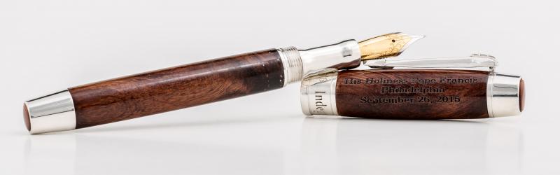
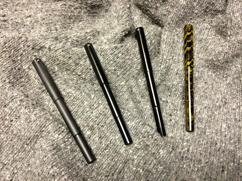
Hi folks, I wanted to share a few pieces of my work now that I've been lurking around for a while I've been a full time pen maker for about 5 years now and am proud of some of the commissions I've had. Here is some of my work: Below is a pen I was commissioned to make for the city of Philadelphia to present to His Holiness Pope Francis during his visit. It is made of custom cast sterling silver and wood removed from Independence Hall during an 1800's renovation. A sister pen I made for the city is being housed in the Philadelphia History Museum. You may have seen a short write-up on this in Pen World Magazine a couple of months ago. This was a custom ordered Lapis Lazuli fountain pen with 18k nib. This is my Palladian pen, made from Yule marble quarried from the same source as the marble for the Lincoln Memorial and Tomb of the Unknown Soldier. The hardware is custom designed solid sterling silver with a rhodium plated 18k nib. This was featured in the June 2015 Now section of Pen World Magazine. Below is the Alpha, my first series of kitless pens. Shown here in vintage cebloplast and a black oxide nib. My second series of kitless pens, the Beta, features a nickel plated tear drop clip. The material is flexigran from Richard Greenwald. I have another 5 pens in the works right now, you can find me on Instagram where I post a good amount of behind the scenes shots (search GWPens). If you're local to Pitman, NJ feel free to reach out to arrange a time to stop by my showroom. Thanks for looking!
-
Hey all, Is it possible to repair a clip that has 'brassing' on it? Is it possible to get it plated in gold or anything? And; Can you remove micro-scratches from resin pen barrels and caps? Thanks, Tom.
-
Some people say that ebonite feels warmer or somehow better in their hand. Others say that about celluloid. I'd like to propose a test, to be conducted by those of you who have pens of these various materials. (I do not own a single pen of either ebonite or celluloid, so I can't run this test). Here's the test: Assemble some test pens of ebonite, celluloid and resin, hopefully of approximately similar size. Ask blindfolded subjects to comment on the feel of each pen (capped). Do not allow the subject to smell the pen. Blindfold yourself and have a helper hand you various pens and write or record your comments. Report people's comments in this thread. Eagerly looking forward to this. Alan
-
Hi everybody, I've just seen the new video of PenChalet.com and I love the new NEFERTITI-QUEEN OF EGYPT limited edition by DELTA. 388 pens in the USA. What do you think about that? I just love this pen! https://www.youtube.com/watch?v=rZMdbdJGTH0 http://i.ebayimg.com/00/s/MTIwMFgxNjAw/z/HOgAAOSw3ydVy1j~/$_57.JPGhttp://i.ebayimg.com/00/s/MTIwMFgxNjAw/z/rF4AAOSw~gRVy1kI/$_57.JPG
-
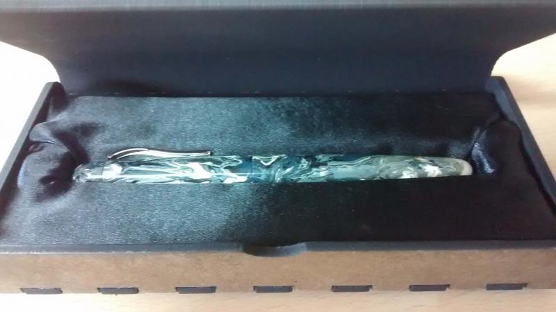
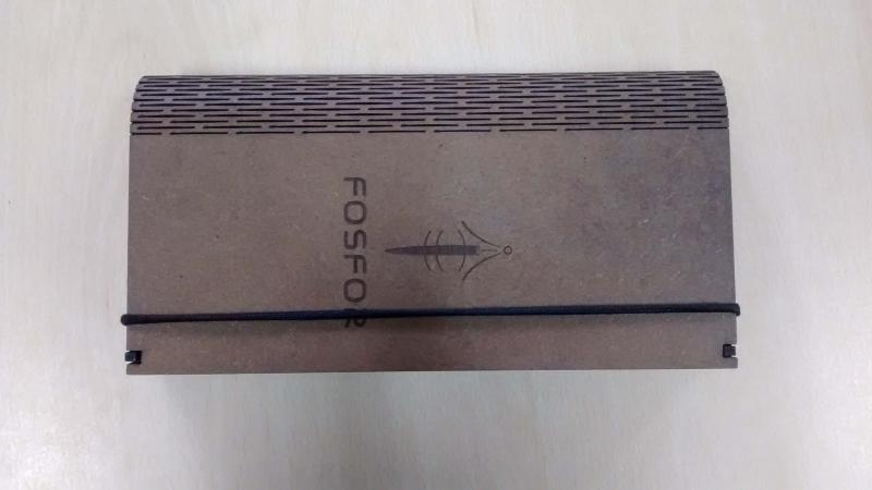
While browsing through the archives of FPN, i came across the review of Fosfor sandalwood pen by hari(https://www.fountainpennetwork.com/forum/topic/273319-my-new-chandan-sandalwood-pen-made-by-fosfor-pens/). I was intrigued by the design and was surprised that an Indian pen maker is making such beautiful pens. Since, I was neither interested in wooden pens nor I could afford them, I put it in the backburner. Then, I again visited the website and was happy to see that Manoj has been offering Polyester resin pens. I mailed him and asked for the details and decided upon a pen. The details are in http://www.fpnibs.com/en/45-fosfor-pens http://fosforpens.blogspot.in/2014/09/in-house-cast-polyester-resin-pens.html PACKAGING: The pen came in a nice box and it feels as if I ordered a much expensive pen. Such customer service is rare in India. DESIGN: The PR pens come in 2 models: Bombay and Bangalore. Within each model, there are different color variants, I chose the storm version. AFAIK, each pen blank is cast in PR and the pens are handturned on a lathe. The pen has come out nice and polished I like the round top design. The threads are well-machined and are not sharp at all. The pen has big step down from the section to barrel. While, I dont feel it, it can bother some people. Specs: Length 150mm / Length uncapped 128mm Maximum diameter 14.5mm Weight 22 g The pen has #5 Schmidt F steel nib. The pen is a C/C type pen. SInce it is a resin pen, It could be converted to an ED pen NIB: The nib is a moderately wet writer. The nib is a smooth nib with a hint of feedback. The nib has some springiness to it. SECTION: This is a big pen, slightly larger than the Lamy Safari. It doesn’t weigh as much and it is a comfortable writer and one can write long periods with it without tiring. This pen cannot be posted securely (From Left: Pilot Mr, ASA I Can, Fosfor Bombay, Hero 359 ) CONCLUSION: The pen has been priced reasonably and affordably for an Indian customer. I am not giving away the price, but lets just say it is in the same ballpark as a Lamy AL-Star(for an Indian that is). Even if the pen is priced 3-4 times the original price, it would have been worth it. At this price, you get a handturned pen with a 3-1 filling system. Leave your comments below
-

"modern Vintage" Flex Options…The Desiderata Pen Company
PrestoTenebroso posted a topic in Of Nibs & Tines
Hey Everyone, Many of you responded to my post "Win one of 7 new high performance flex pens" a while ago, and I was very pleased you took the time to reply to such an exhaustive survey. Well, I've been working like a dog making a lot of mistakes these past few months, and at last, here are a few ideas in the form of flex fountain pens I think you'll enjoy. You've probably already seen the writing samples I've posted in the poll posting, so I won't burden you with another one here. User testing was very positive so far. Now, we get to talk about design. Please go to the company Facebook page, and "Like" the pens you like the most on this photo: http://tinyurl.com/plo63t6 Otherwise, chime into this thread with what you'd like. I want to make these pens affordable, so if you're lusting after 14k gold flex, or lots and lots of metal in your pen, you'd probably be better off going vintage. That said, I have lots of ideas I want to make, and your comments will significantly help me refine my thoughts. The webstore is on its way, and if you like what you see, please comment!