Search the Community
Showing results for tags 'plastic'.
-
Hello, Recently I’ve managed to solvent-weld few resin MB 149 barrel / section hairline cracks using a 1:4 mix of two chemicals. One is the MEK, while the other is a toxic chemical prone to decompose into an even more toxic gas. Those who’ve come this far, know what I’m writing about. The mix has to be prepared in the open air, on spot, only in drops and applied immediatelly. As I’ve been asked to share the recipe, but have also read some strongly discouraging posts about sharing recipes involving naming toxic chemicals, I’m reluctant toward making irresponsible posting decisions. I hope I’m not violating some of the Forum rules by asking for guidelines / opinions if I should post it herewith at all. I don’t want to feel responsible for someone’s inexpert handling resulting in possible intoxication. Thanks in advance.

-

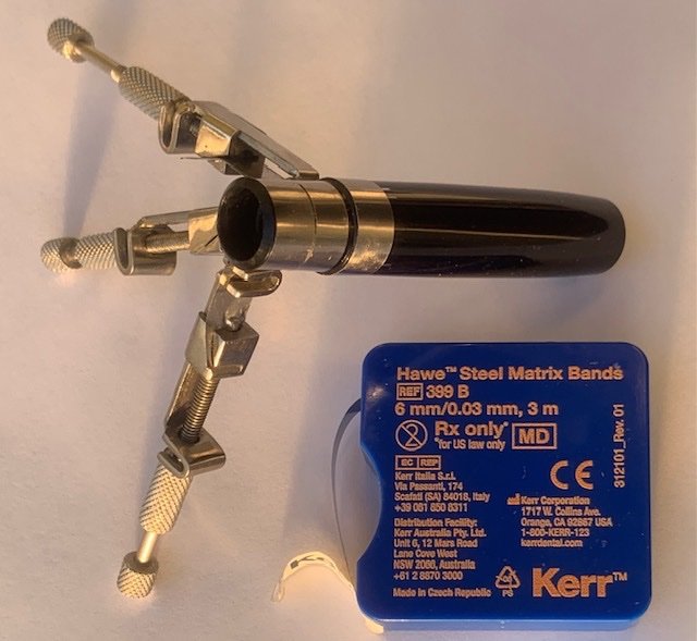
Can anyone tell me what plastic Kultur and Phileas sections are made of?
Ink Stained Wretch posted a topic in Waterman
Can anyone tell me what plastic the sections of Waterman's Kultur and Phileas fountain pens are made of? I have cracked sections in each of those fountain pens and I was advised to solvent-weld them. The problem is that I need to know what the plastic is in order to use the right solvent. I'd posted about this is the Repair forum but no one there seems to know. I'm hoping that someone here may know. Thanks for any help. -

A Cheap Italian Pen From The Late 80's; The Wilson Super Smooth
basterma posted a topic in Italy - Europe
This is a test for posting images from behind the Great Firewall in China. So here is a pen from the bottom of the Italian Barrel. It was purchased in Egypt in 1989, and is one of the smoothest writers in my collection. It has no tipping. The nib is rolled, so the tines are folded over to touch the bottom of the nib, instead of the crimped nibs seen on other cheap pens. http://i64.tinypic.com/2nl74f8.jpg http://i65.tinypic.com/bex5hi.jpg http://i66.tinypic.com/a3zerr.jpg The rolled nib and finish give it the smoothness that is incredible. However, the rolled nature of the nib does not tolerate rotation well, so you have to write carefully to keep the pen in its sweet spot. The plastic finish is textured and prone to cracking. http://i66.tinypic.com/fpa34o.jpg A full view of the pen along with a sample of my poor print. http://i64.tinypic.com/2drfofa.jpg The pen cost about 3 USD and is the first of three Wilson pens I have. The others show a development in the design, with a metal clip, then transparent "demonstrator" cap and section. I have not seen any of their pens in a few years, but one still finds packets of fresh International Cartridges today in Egypt, suggesting that the company still exists. Can anyone in Italy verify this? -
I have for some time now been thinking of writing a "Fountain Pen Pledge" in which the virtues of fountain pens are extolled and the single use, plastic, disposable biro is denounced. I would start by targetting banks that chain down their biros and suggest that they embrace the rejection of single use, plastic, disposable biros and put a lovely fountain pen on the end of their chain. Still working on the pledge but I am sure there are others more skilled in initiating a campaign to restore fountain pens to their rightful place in society! So let me see what you can write!
-
A couple of months ago now (in early October), I had to take one of my children (the youngest, and the only one who *really* likes fountain pens) for a specialist’s appointment in Sydney. We decided to make a day of it, to lessen the angst of being poked and prodded and hooked up to a bunch of machines, so… we just happened to wander past Dymocks in Sydney, which now has a fairly extensive pen and stationery section. In addition to the inks we chose together – and the 8-pack of colourful Ooly fountain pens my daughter asked to buy – I spotted a few Super 5 fountain pens going for half price. I didn’t need another fountain pen, I *really* didn’t, and yet… within a few minutes I’d picked out the yellow version with the B nib, and headed out the door. I’d seen these pens advertised in various online stores, though not recently, and hadn’t been tempted – but this has turned out to be a surprisingly good pen. ______________________________________________________________________ Appearance & Design The Super 5 pens on sale were brightly coloured – I had a choice between a bright red and a cheery yellowy-orange, and decided to go for the latter. The plastic is probably similar in quality to a Lamy Safari – sturdy, shiny, and fairly durable. You don’t feel like it’s going to fall apart in your fingers, or crack the first time you drop it. If you look closely, you’ll find the word “SUPER”, and a sideways “5” embossed on the barrel – but it’s not very visible. The snap cap comes off to reveal a surprisingly weighty metal grip section (coated in some kind of black ceramic?), and a proprietary steel “Super 5”-stamped nib. In shape it’s not too dissimilar from my Jinhao 992, though the grip section is somewhat longer and girthier. Very impressive packaging... The back end of the pen can be screwed off, to reveal the bottom of the cartridge or converter. I struggle to see the purpose of this – it’s just a weird / interesting feature. The black-coated metal clip stands out from the yellow body – I like the overall appearance, though it’s nothing “special”, just a lovely bright inexpensive pen. … Construction & Quality The pen is quite sturdy, fit and finish is great, the snap cap snaps on and off without issue – everything looks pretty good. I don’t know what kind of black coating has been used to coat the metal clip and grip section, but it’s not unduly slippery, and so far shows no signs of scratching or flaking away. My only complaint is that the clip is quite stiff – it could be a challenge to clip it onto a thicker-fabric shirt pocket. … Weight & Dimensions The Super 5 sits nicely in my ‘sweet spot’ for a standard pen – 139mm capped, 125mm uncapped, or 153mm posted. The grip section of the pen ranges in diameter from 9mm (closer to the nib) to 10.55 mm, with a ‘step up’ where the cap clips on, to 12mm. The pens weighs 24.8g capped, and 19.6g uncapped. The one big surprise is the weight of the grip section – being metal, it weights the pen significantly towards the front of the pen. This might be off-putting for some people, but I took it in my stride – I actually liked the substantial feel this gave to an otherwise insubstantial pen (at least in terms of weight!). … Nib & Performance The B nib is definitely a B nib – it lays down a fairly wide line. It’s fairly wet and very smooth – a pleasure to write with. This is not my hand. But this is my handwriting... A close up of the nib. … Filling System & Maintenance The Super 5 pens come with a single cartridge of their permanent blue ink – I haven’t yet tried this. I stuck a Kaweco standard international converter into the pen, and it worked just fine. I own a piston filler and vacuum filler pens with much larger capacities, but for most of my writing (especially with non-blue-or-black inks) I’m happy with the 0.5-0.8mm capacity of a cartridge converter. … Cost & Value I think I paid AU$15-20 for this pen (it was half-price) – a better than fair price for the quality. Would I pay full price for a Super 5 pen? Not sure – though they’re cheery and functional – but I’m *very* happy with the pen, given the price I paid. … Conclusion The Super 5 pens (and their accompanying inks) don’t seem to have done particularly well, at least in the American and Australian markets – but this is actually a pretty nice pen. Worth keeping an eye out for! …
-
Zebra Fountain Pen (un-named, plastic body) Brief Introduction/First Impressions: I bought this pen in an attempt to find a pen between the Pilot Varsity and the Platinum Preppy. I like the length and the fine point of the Preppy, but the grip drives me nuts! For some reason I always wind up gripping the Preppy really hard, and my fingers start to hurt during long writing sessions. The Pilot Varsity has a grip section that feels wonderful, but the line weight is heavier than I prefer. Good News! This pen has a Varsity-Like grippy-grip section, and a nib that puts down a line similar to the Preppy. Bad News! There are some durability issues... these are discussed below. Note: I am writing this review when the ink reservoir is at about 50%. Up until this point, I have kept the pen on my desk at work (I haven't knocked it around in an over-packed purse or otherwise abused it). PS - forgive me if I miss an obvious point of discussion, this is my first pen review. ______________________________________________________________________ Appearance & Design (6) - Colorful Plastic, Feels Good in the hand, but cheap I have not weighed or measured this pen, but it feels like it is around the same weight as a Preppy or Varsity (very light!). The plastic is colored throughout the whole pen to a color similar to the ink contained within. The cap includes a spring and inner cap that keeps the nib wet, similar to the inner cap in a Preppy. It definitely looks like a cheap plastic pen, but that is what it is! … Construction & Quality (3) - dissapointing! I still like to write with this pen, but unfortunately the cap has cracked in a way that allows the cap to become a projectile in certain circumstances. The lip of the cap has nubs that can catch onto corresponding nubs on the back of the grip section, and if these do not line up, the spring in the inner cap has enough force to eject the cap off the end of the pen if you let go of it. Entertaining, for sure, but maybe not so desirable. Even if the cap does not fly off the nib, it tend to sit a few millimeters off of where it is supposed to sit (See attached photos). Definitely not a knock-around pen. That said, the inner cap does keep the nib wet, and it never has trouble writing, even though the cap does not sit properly. … Weight & Dimensions (10) - Long, slender, and lightweight About the same weight and length as a Preppy, the girth maybe a little thinner than a Varsity. The nib is similar to a Preppy as well. … Nib & Performance (10) - Very smooth, wetter than a preppy Not as wet as a Varsity. I love it! Never a hard start or skipping. … Filling System & Maintenance (6) - "disposable" Really, there is not intended to be any maintenance on this pen - it has a feed and ink reservoir similar to a Pilot Varsity. This is good and bad in my book, as it may be a good intro pen, but encourages a lot of waste. I think it is possible to yank the nib and feed out, similar to the Varsity though, so this could be a grey area. … Cost & Value (5) - cheap, functional, not durable I picked this pen up for about $3.00 USD, which eases the disappointment I feel about the cracked cap. … Conclusion (7/10) - Worth a try? I really want to like this pen, and I LOVE the writing experience with this pen, but it is not durable enough to last even through the ink reservoir it has, let alone any attempt to refill it. Maybe hold out to see if the quality improves. Have you all had a similar experience with this pen? Do you love it? Hate it? Let me know!
-
TWSBI nib units, that is. I have an italic and a fine, just lying there pathetically, and no bodies to host them. They are from the 540 series, I believe....so, what inexpensive and easily attainable not-metal pen bodies (besides Noodler's Ahab) will these fit? Thanks for your suggestions!
-

How Have Your Metal On Plastic Threaded Pens Fared Over The Years?
DevrimJan posted a topic in Fountain & Dip Pens - First Stop
Title pretty self explanatory. I have heard that threads made of differing materials tend to have the softer threads wear out over time. I know that many pen companies do this with pretty much their entire line (such as Sailor with there metal section threads screwing into their resin/ebonite barrels). Others do it with particular models (like Visconti & OMAS with certain metal sectioned pens that screw into resin caps). Does this cause the softer material to wear out over time? Is this a poor design choice? -
Hello! I've come across these pens being sold online here where I live. The seller doesn't know a lot about fountain pens so isn't able to tell me these pens' model or year of production. Does anybody know which Platinum are these? (Photos from the seller.)
-
The Deli S677- Inspirational Squirrels And The Nib From A Pilot Varsity
phillieskjk posted a topic in Fountain Pen Reviews
This review and others can also be found at my website: www.pensinksandpaper.com At first glance, the Deli S677 might appear to be a cheap marker, a plasticky bit of mass-produced unpleasantness that has no place in the hand of a fountain pen user. One would be surprised, then, when removing the cap to find not a ballpoint tip or a marker’s felt but a nib. Appearance & Design (3/10) – I’m not entirely sure what the creators of this pen were trying to do in terms of visual appeal. They look rather unusual. The caps are a solid pastel color, with a white clip that says “deli” on it. The body of the pen is the same pastel color as the cap, but with small white hearts dotting the area. In the center of the bodies of the pens are cartoon animals, under which there is text that reads “Here is a More Lush Forest.” Your guess as to what they mean is as good as mine. Just before the section on the top of the body there is a white ring with an “inspirational” quote on it. The pink pen reads “I am to grow strong and tall”. The green pen reads “My skin is the most beautiful of all”. The most inspiring of all, though, is the blue pen, which gives us the truly beautiful line of “The squirrel is a typical arboreal mammal”. Running alongside the body of the pen is the model number of the pen and a barcode that my barcode scanning app did not recognize as a product available here in the states. Construction & Quality (6/10) – Compared to other pens of the same price level/target audience, the S677 isn’t terribly built. The plastic feels solid enough, and after some time using the pen and carrying it around in a messy backpack I have not experienced any paint chipping or scuffing. The cap posts very securely, and snaps back onto the body securely and satisfyingly. It actually feels excellent in the hand, if a bit light, as long as you don’t look down at it. The pen is about the length of a Lamy Safari, but a bit lighter and thinner, and if you removed the silly paint it looks and feels remarkably similar to a Pilot Varsity. Nib & Performance (6/10) – The nib us also suspiciously similar to that of a Pilot Varsity. Apart from the S677’s being stamped “Deli” rather than “Pilot”, the nibs are virtually indistinguishable in terms of design, size, and performance. It is smooth and reliable, but don’t expect anything except a nail. The pen writes a tad bit dry, but not dry enough to impede the smoothness or cause any skipping problems. The feed also differs from the Pilot Varsity, as I believe the S677 has a traditional plastic feed rather than a wick one like the Pilot. Filling System & Maintenance – There isn’t all too much to say here, the pen is a Cartridge/Convertor filler. The pen comes with some blue ink cartridges, which work nicely. One point of interest here: the pen does not accept international sized cartridges or convertors, but works perfectly Lamy’s alternatives. Cost & Value (8/10) – The pen was purchased from China for a mere dollar and eighty cents for a pack of three. At that price point, I think that these are a far better buy than Pilot Varsity’s if you can stand their design choices. I wouldn’t use these on a regular basis, because I have much more interesting and good-looking pens that I use and rely on. As pens to give away to people, or to lend as first fountain pens, though, they’re just about perfect. (Again, if the person receiving them can stand the design) Their nail of a nib is smooth and can withstand the pressure of a ballpoint user, and they accept cartridges, putting them a notch above the Pilot Varsity in my book. Conclusion (Final score, 5.75/10) – To be brutally honest, I will not be using these pens again for a while. I have, however, already given two of them away to first-time fountain pen users, both of whom love them dearly and are already looking at more expensive, better pens. As tools for someone who has many fountain pens already, I’d steer clear of these guys. But for a first fountain pen, or giveaway pens, at $1.80 for three these make a pretty great alternative to Pilot Varsity’s, Platinum Preppy’s, and the other cheap “disposables” on the market. -
I bought this in Aleppo Syria in 2008. I need your help identifying it. General Views: http://i64.tinypic.com/20pseqb.jpg http://i63.tinypic.com/jjqkis.jpg Nib Views: http://i65.tinypic.com/20ixdvs.jpg http://i64.tinypic.com/2ms0gvs.jpg http://i63.tinypic.com/2qlxus9.jpg Thanks.
-
I got my first P51 today and I just find out that is Mark III. I just read that this pens were not made with the same materials as the Mark I or Mark II; instead of lucite the used a softer plastic that is more propense to shrink and scratching. My pen is in excellent condition, actually I think Im the first owner, so my question is: how much time does my pen have before any signs of shrinking or finger wear marks or anything like that? I'm kind of sad because I bought this pen for its bulletproofness...
-

Differences In Feed Shapes (And Materials?)
lightless posted a topic in Fountain & Dip Pens - First Stop
I was thinking about my pens and I got to wondering about feeds and how different they all look, and how their shapes might influence performance. My Lamy Safari has a very streamlined feed, sloping up parabolically against the nib. The Vanishing Point has a tiny feed fitted to its tiny nib, Pelikans and Auroras have stout feeds that I find attractive, the Pilot Custom 823 has a kind of combination, with a very Lamy Safari looking portion with a hole near the nib's tip broadening into a flat section with fins near the section. Sailor feeds have an area which seems to be under the breather hole where a tiny cube would fit. Some feeds fill the whole underside of the nib, and others leave plenty of space in every direction. Is there a functional difference that leads manufacturers to design their feeds with so many shapes, or is it mostly aesthetic? They all do their job despite coming in so many different shapes and sizes. Are there flow differences between shapes; is it a matter of designing a feed that goes along with the nib's geometry; a feed that goes along with the design of the pen? Is there a particular design that's well suited to tolerating differences in pressure, temperature, and humidity? Ebonite seems to be very respected as a feed material - would a feed made of ebonite be preferred over a plastic feed of the same shape? -
I know this is a very basic question for you all, but can someone please tell me what this part for a rollerpoint is called? Thanks very much, James http://www.jamesburger.com/new/pen-tip.jpg
-

The Feel Of Celluloid - Am I Imagining It?
CTKelly posted a topic in Fountain & Dip Pens - First Stop
All, Over the last two years I finally expanded my collection and found what feels like the ultimate pen in my hand - and Omas Special Edition Paragon in the Arco Brown Celluloid. I also have some Omas Arte de Italiana (?) a Pelikan, and several Pilot Fountain pens including a two Custom 912's. My issue is: the Omas Celluloid feels different in my hands. The plastic feels plastic. The Omas Arte de Italiana pens have metal in the grip section and get slick after a bit. The plastic gets a little slick but also just feels plasticy (new word). The celluloid never gets slick, isn't cold, always grips well, and just feels good after writing for over an hour straight. Am I just imagining this? Is this a placebo effect in that I love the pen for other reasons as well? Do others feel this way or is just me? Regards, Chris -
Just over a year ago I purchased a brand new Montblanc 149 and almost to the day I bought another one. Why? Well, they are somewhat different. I will get my bias out of the way first. While the 149 is not my favourite pen of all time (I appreciate a bit of bling) I do recognise that it is possibly the most perfect pen ever made. It is quality without being overly blingy. The size and balance (to me anyway) is perfect, the nib; a thing of beauty. The filling system, great. The first Montblanc I bought was a medium nib but I had a little fight to get it adjusted so that it was wetter as a writer (it skipped and dried a bit). The second one is a fine nib. So, one being new and the other being from the late 60's, I thought I'd have a bit of a face off to see which is best. Below is a list of the differences and similarities with a conclusion at the end that hopefully some may find helpful. I'm no expert, so if there are inaccuracies in this, please do correct them. Number 1 is the first one I bought (the modern one) and number 2 is the recent purchase (the late 60's model). Nib. 1. Medium nib. Writes very wide for a medium, but I did have it adjusted for maximum wetness. It has a plastic feed with fins cut right across it. 18K gold with gold inner portion, then silver and then gold to the flanges. It is very firm but has a distinctive tooth that is very pleasing. 2. Fine nib. Writes nicely wet, but not overly so. It has a rounded ebonite feed that actually looks quite nice in comparison to the other, with fins either side. 14K gold with gold flanges only (maybe 'wings' is a better term than flange? Hopefully you know what I mean). The imprint on the nib seems more distinct and deeper to the eye on this one. It is soft and somewhat flexible. It's not quite a semi-flex but it is very pleasant to write with and provides nice line variation. It is very smooth and the distinctive 'toothless' is considerably less, although this may be more to do with age and use. The nib appears to be slightly wider (at the widest point), but sadly I lack the precision instrument to measure this, so it may be a trick of the eye. Cap & Barrel. 1. The gold furniture is bright, the imprint on the cap band is crisp with the 'Pix'. The cap has the snow peak. There is a gold ring at the piston nob. There are six rings for the screw on cap. The ink window is slightly smoked in appearance and not always easy to see the ink inside. The point where the nib meets the barrel has a flat section of one piece with two rectangular holes opposite each other and a matt collar up onto the barrel. 2. The gold furniture is somewhat dulled, which is to be expected of an older pen and the imprint on the cap band seems a little less crisp (although this may be age and wear) and there is no 'Pix'. The snow peak, to the eye at least, seems to be a fraction larger. The gold ring at the piston nob, again to the eye only, seems a tiny hair thinner. There are six rings for the screw on cap but they are placed much closer together, therefore less noticeable under the fingers when writing and there is a fine line directly underneath them. There is a tiny touch of play to the cap and barrel, but again this could be age and wear, but it's not significant enough to worry about. The ink window is very bright and clear, seems a little fraction longer and the faceting is much easier to see. The ink inside is clearly visible. The point where the nib and feed meet the barrel appears to have a cut section parallel to the nib and feed (possibly made of two parts?) and there is no collar, but there is a ridge on the barrel at the end of the grip. Filling System. 1. The piston mechanism is brass and feels sturdy and a small bit stiff. You can't really see the piston moving in the barrel through the ink window even when doing a flush to change inks. It adds a good bit of weight to the back of the pen, but not so much as to annoy me in any way. 2. The piston mechanism is black plastic and very smooth and easy to use. There is no stiffness and while it seems perfectly fine it does not feel as 'sturdy'. You can clearly see the piston coming down the barrel through the ink window. The weight is notably less due to the plastic piston and when posted, the balance of the pen is about as close to perfection as you could get in my book. Conclusion. I love my modern 149, but the late 60's model (at least I think it is late 60's!) just tips it to the post. Aspects of it feel a little better. I much prefer the softer nib and find the appearance of the nib a bit more satisfying, especially with the nice looking ebonite feed. The line variation and spring make it more interesting to use. The weight of the older model is perfection to me. Both of these pens are great and I would have no problem recommending it, but if you were looking to get a 149, I think I would strongly advise looking for a good older model. It is possible to get one at a quarter of the price of a new one with a bit of patience and a thorough search through various channels and you would end up with a pen that is probably as close to perfect as one can get. Certainly if price is a concern - and it should be, for a new 149 is not an insignificant purchase - then the older model is the way to go. I prefer the fine nib and find that it is a true European fine. I hope that makes sense, but if not and by way of explanation; I find American 'fines' tend to be 'medium' and Asian 'fines' to be 'EF's'. The older 149 wins in my book.
-

Cleaning My Demonstrator With Alcohol Has The Barrel Turned Cloudy
illustrator posted a topic in Repair Q&A
I am very new here. Recently, I tried cleaning the inside wall of the barrel (only on the top part) of my Sailor 1911 demonstrator with a cotton bud dipped in ethyl alcohol 70% to remove some waterproof black ink stain. At first, the stain was removed quite easily. But as I left the barrel to dry, I noticed that the once clear barrel turned cloudy on the area that was affected by the alcohol solution. I have tried washing away the layer of cloudiness with water a few times, but it did not work. I have not idea what exactly is the material of the barrel, could it be plastic or acrylic, that reacts to alcohol solution this way? So, is there anything I could do to restore the barrel to its original transparency again? Please advise, anyone?
-
Does anyone know where I can find some plastic pen cases for shipping/storage of my pens. Like the cases Montblanc uses for their repairs. See attached image/example.
-
Decided to step up from my flaking Jinhao x750. Decided on a Monteverde invincia deluxe chrome. I had read here about finish issues on the all black models so decided on chrome. All of the pics I have seen online had an all chrome grip and step down. What I received from a retailer with a black plastic step down. It is a sharp edge screw in type that has a larger diameter than the grip. Quite annoying on such a beautiful pen. Is this something new?
-
Hello, Can anyone help in identifying the following pens? http://i58.tinypic.com/20kvcl3.jpg http://i57.tinypic.com/261hjyp.jpg http://i57.tinypic.com/j67joo.jpg Best regards.
-
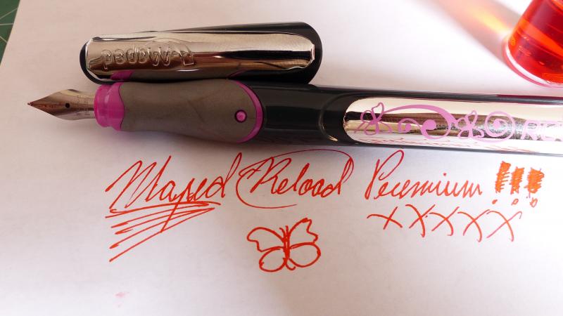
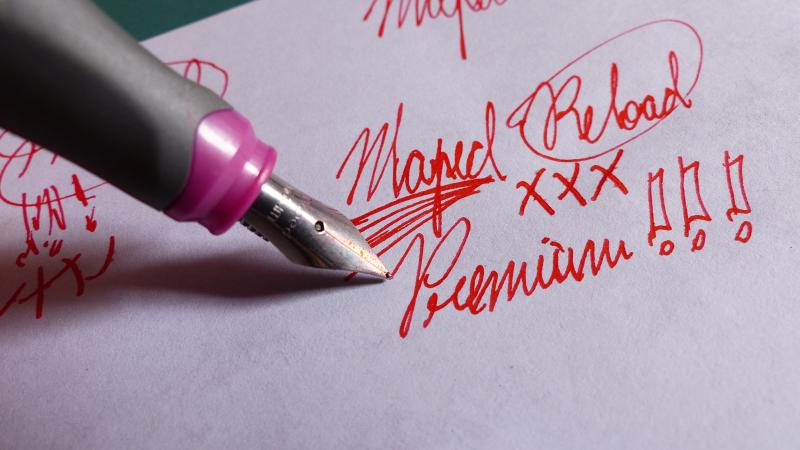
After I took up fountain-penning as a hobby (I used to just use the things before this year), I started seeing this fountain pen for R$ 29 (about 8 US Dollars) on big-box stationary stores. So I bought one! Maped is a French company that makes almost everything related to school and art that I can think of. From that maker, I've got pencil sharpeners, scissors with weird blades, pliable rulers... but didn't even know they made fountain pens. (The back of the package says it’s made, unsurprisingly, in China.) As you might expect for R$ 29, it's not the greatest of pens (as a comparison, Lamy Safaris will cost ya R$ 130 in Brazil) but I was surprised by the quality product I got for my buck. It's very light (16 g / 10 g uncapped), especially because it doesn't post, although its barrel is long enough for that not to be a problem for the largest of hands (135 mm in length, uncapped). The nib has a tiny little bit of flexibility (not unlike what you might experience with a Pilot MR) and you'll feel a lot of feedback; almost too much in fact. I wouldn't say the nib is scratchy, but the feedback is enough for me not to want this pen as my everyday writer. Using Lamy Red ink, it kept up with my most intense scribblings without skipping. Also, I forgot it uncapped for almost five minutes and it wrote right away. There’s no indication of nib size, but the line is clearly an European fine, which means it's a hair thicker than what I get with my Pilot MR medium. The pen is almost completely made of that kind of plastic that you find in little kids' toys. The section has a rubber cover that's rather comfortable, but has indentations for a three-finger "classic" grip, which you might not care for if you don't hold pens that way. The finger depressions are very slight, though, so they won't bother you too much. There's no disassembling, so cleaning it up before changing ink colors might be a little bit of a hassle. I think using a thin syringe to squirt water though the section is a feasible method, but I haven't tested it yet. The Maped Reload Premium only accepts short int'l cartridges. Here's where I think it was conceived for children, because the filling mechanism is very cool: you slide the silvery lip back until it clicks and the cartridge ejects! You just need to put a new cartridge in the opening and slide the lip forward; it'll adjust and attach the cartridge by itself. There's also a "secret compartment" in the end of the barrel for storing a spare cartridge. You won't be able to see the ink level unless you partially eject the cartridge, but it won't make a mess if you do it nib up. You should be careful when uncapping the pen, because the cap is held very tightly in place and you’ll risk opening the silvery lip a little bit depending on how you hold the barrel when uncapping. (I don’t think you’ll eject the cartridge by mistake though, as the ejecting mechanism is also kinda tough.) There’s no way to uncap the pen one-handed because, again, the cap is fastened pretty securely. The clip, on the other hand, is rather springy and will hold anywhere; it has an extra curvy piece of material on the underside to avoid snagging. I’m not sure if the clip if made of very cheap metal or just plastic painted silver. The Maped Reload Premium comes in a blister pack with three blue cartridges (one is hidden in the "secret compartment") and a cute cloth sleeve for carrying the pen around. I haven't used any of the original cartridges as I had an empty one that I filled with Lamy Red, which I judged to be a fitting ink for this pen Here in Brazil, I can find it in dark cobalt with pink details and pink sleeve or charcoal-black with yellow-orange details and black sleeve. The cobalt-and-pink version has spirals and butterflies on the silvery lip of the barrel, while the black-and-orange has a wavy/fiery thing instead. All in all, it’s a fun pen to have around and use occasionally or present a kid in your life who’s a tad too interested in your fountain pen collection. I’ll leave mine inked with a some color I don’t use very often (Lamy Red) and use this fountain pen for jutting down margin notes on scientific articles.
-
I bought a Carter's ringtop about a month ago and I've been wearing it to the office. This morning, as I was walking to my office, the pen literally fell apart: the barrel broke at the threads and a large chip fell out of the cap - all at once. I can only assume that the plastic came very suddenly to the end of its natural span, but I really like the nib. Has anyone had this happen? I imagine that people dealing with early polymers encounter this sort of thing fairly often. I don't really think it's repairable, so I may try to find a modern pen to fit the nib. Any suggestions?
-

Infrared Photography And "precious Resin"
mhphoto posted a topic in Fountain & Dip Pens - First Stop
It's been known for some time that most of the more expensive pen manufactures, or the ones who would be inclined to use the term "precious resin" to up sell a plastic pen, have been creating pens with material that is transparent when viewed in the infrared portion of the EM spectrum. And having just gotten my first dedicated IR camera, I just couldn't resist getting some of my more swanky pens out for a nice family portrait. From left to right: Namiki Falcon (SF), Pilot Falcon (SEF), Pelikan M400, Pelikan M405, Pilot Custom (14k), Platinum Century #3776, Pilot Custom 74, Pelikan M800, Pelikan M600, Pelikan 140, Pelikan 400. Here are the pens in the visible spectrum (iPhone 5): http://imagizer.imageshack.us/v2/xq90/823/1n4d.jpg And here are the pens in the near-infrared spectrum (Canon T2i at ≈ 800nm): http://imagizer.imageshack.us/v2/xq90/841/hvkyb.jpg Here's a visual aid: http://imageshack.com/a/img850/1272/dhk.gif Here are the Pelikan M400 and M405: http://imagizer.imageshack.us/v2/xq90/834/pzz6o.jpg And here's the section of the Pelikan 140: http://imagizer.imageshack.us/v2/xq90/853/q4no.jpg The two Falcons and the Pilot Custom are able to be seen through, but just not with the ease of the obvious ones. I only have one Montblanc, a 344, but I can't find it. When I do I'll take a pic and post it here. And I find it very interesting that either the Pelikan M400 or M405 has an opaque rear twist cap… -
I collected pens in a short burst about 15 years ago, gathered a nice little group of regular writers and some interesting ones, then the late 90's frenzy made collecting too expensive and I moved on. Recently I opened up my box of non-daily pens and had fun seeing what I had found way back then. One pen puzzles me as I've tried to look up information about it. It's clearly imprinted with Edward Todd on the nib as well as on the barrel. It's a combo pen/pencil and the imprint says "Todd's Duplex" [the quotation marks are in the original imprint]Edward Todd & Co. Makers N.Y. It's black and perl and is a flat-top-style ring-top with the ring missing. it's got double narrow gold bands around the end of the cap and a nice Edward Todd N.Y. 2 nib Capped, it's 5.25" long, lever filler and in generally good condition except some discoloration of the barrel where the sac was, and the missing ring at the top. I've tried to attached a pretty lousy picture, but I keep getting an error (upload skipped (Error500)). So, here is a link to where you can see it. https://plus.google.com/photos/108032537372976719434/albums/6009491603561496849?authkey=CMGziYbAmO2QnAE As I look up Edward Todd I read about only metal or overlay pens, nothing like this classic 30's-style flat-top celluloid. Anyone have any further information or examples of an Edward Todd plastic pen? I suspect they're not common, and I suspect the Todd's Duplex is even less common since I contacted a couple of well-known online vintage pen experts and none had heard of one before. Any info would be of great interest. Thanks!
-
If you use only vintage, high-quality fountain pen, please move on. This subject matter is strictly for people like me who mess around with "genuine, non-imitation" plastic fountain pens. Plastic pens can receive minor or major scratches. So can metal pens, but many metals can be polished to remove most scratches. My Waterman Phileas began life as an inexpensive student pen. No lacquer finish. No solid-gold nib (at least that I've seen). No wood, glass, or ivory inlay. It was and still is a molded plastic pen cast in one solid color (and others bear a faux-marble appearance). I shouldn't be finicky about this, but it bothers me when my favorite pen suffers cosmetic scratches or gets that hazy patina resulting from countless small scratches. I have tried buffing it back to a glossy shine using toothpaste. (Hey don't laugh—toothpaste is a very gentle polishing compound that works on certain plastics without creating new scratches.) But considerable work was required to produce any visible improvement. I have one "freebie" Phileas that shows sings of a previous owner's butchery. They must have attempted to use a coarse grit sandpaper because the "polishing" left more scratches than it could possibly have removed. I would post photos but I seem to have used up my limit of download space. Has anyone had any luck polishing or buffing scratches out of their Phileas? If so, please share. If you think it is absurd to put this much effort into a low-end plastic pen, please refer back to the first paragraph. —www.twelvedrawings.com