Search the Community
Showing results for tags 'pelikan edelstein'.
-
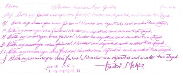
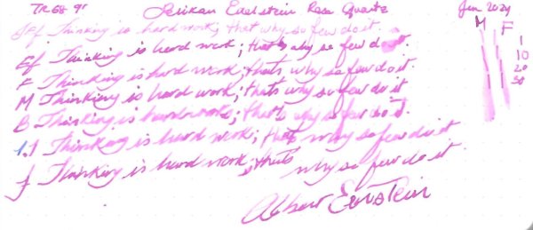
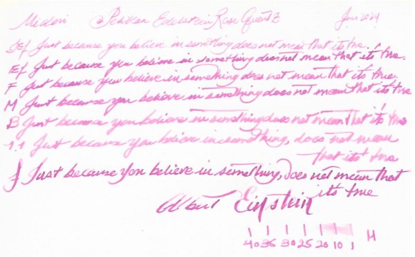
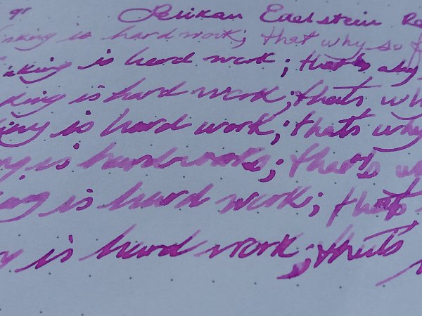
Pelikan Edelstein Rose Quartz Ink of the Year 2023 Many thanks to @Lithium466for the sample. It’s a chameleon of an ink. It has a lot of character with Ef to M nibs and gorgeous with flex, where the halo effect is accentuated. However, with Japanese Ef, B & Stub nibs it was just a plain boring pink. It doesn’t like copy paper. Ink is wet with slightly below average lubrication. You can check this excellent overview by @namrehsnoom Let's start with the chorma: Writing Samples: Quotes are at best attributed. As far as I know Mahler had only one wife. Photo: Comparison: Water test: And finally an art work, inspired by a Japanese vintage photograph and block prints: Other inks used are Platinum Carbon Black and Kuretake Shimbashi Iro · Pens used: Pilot Kakuno Ef, Lamy (EF/F/M/B, 1.1), Kanwrite with an Ahab nib. · What I liked: The halo effect and murky pink. · What I did not like: With B/ Stub nibs. Very Pale with Japanese Ef · What some might not like: The colour, paleness. · Shading: I didn’t see much. · Ghosting: Yes, on copy paper · Bleed through: Same as above. · Flow Rate: Wet · Lubrication: Below average. · Nib Dry-out: Did not notice. · Start-up: Did not notice. · Saturation: Not saturated. · Shading Potential: With flex nibs. · Sheen: Hint of halo. · Spread / Feathering / Woolly Line: Yes, on copy paper. · Nib Creep / “Crud”: Did not notice. · Staining (pen): Did not notice. · Clogging: Did not notice. · Cleaning: Should be easy. · Water resistance: Not so good. · Availability: 50 ml bottles. Please don't hesitate to share your experience, writing samples or any other comments. The more the merrier
-

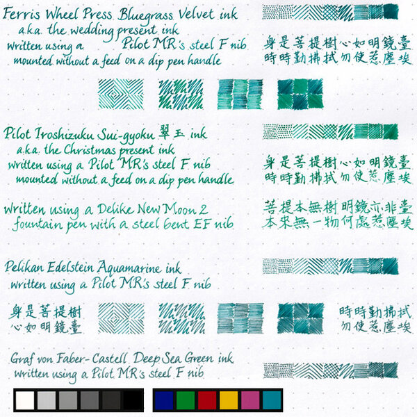
Pelikan Edlestein Aquamarine from M800M and Smoky Quartz from M400M on Oxford Optik.jpeg
Mercian posted a gallery image in FPN Image Albums
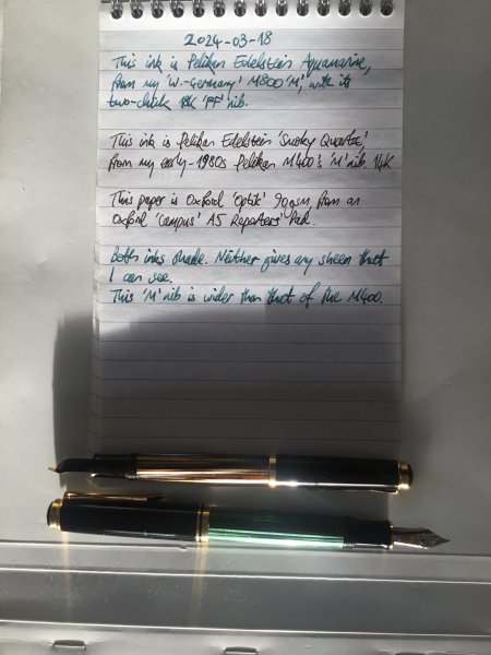
From the album: Mercian’s Miscellany
In response to a request for a picture of these inks and pens. Apologies for the very low angle of the watery English sunlight! And for my hastily-rushed scrawl too!© Mercian
- 0 B
- x
-
Edelstein Aquamarine M800M & Edelstein Smoky Quartz M400M on Oxford Optik v1.jpeg
Mercian posted a gallery image in FPN Image Albums
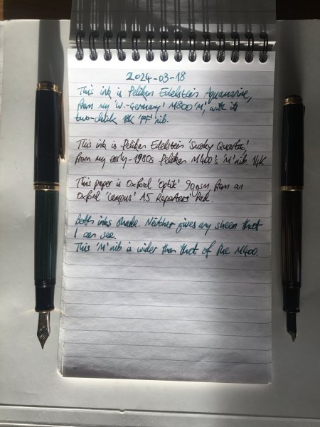
From the album: Mercian’s Miscellany
In response to a request for a picture of these inks in these pens.© Mercian
- 0 B
- x
-
-
-
-
-
-

-

-
-
Pelikan Edelstein Apatite (Ink of the Year 2022) In 2011 Pelikan introduced the Edelstein series of high-end inks, available in a variety of colours. The theme of the Edelstein concept is the gemstone – each ink corresponds to the beautiful colour of a gem. The Edelstein line of inks is presented in 50 ml high-value bottles, that are truly beautiful, and worthy of a place on your desk. In this review I take a closer look at Apatite, the Edelstein Ink of the Year 2022. This is a limited edition ink, that will probably be gone in the near future. Apatite is a blue-turquoise shade of colour, that – according to Pelikan – “leads to an association with the natural element of water, an ink colour that lets all thoughts flow…” Hmm… that sounds a bit over-the-top to me. In reality, the colour was more of a bummer (personal opinion): I don’t hate it with the same intensity as I do Edelstein Jade, but a full page of Apatite is still too much for me. Nevertheless, I collect these Edelstein inks, so I had to get this one, even if it’s not my cup-of-tea. And – as always – I will do my best to give you an honest technical review. The chromatography shows the blue & green components of the ink. It’s definitely a blue with green undertones, but I wouldn’t call it a teal. From the bottom part of the chroma, you can already deduce that Apatite is not a water resistant ink. This Edelstein ink can handle all nib sizes with ease, always showing an easily readable line. I do prefer this ink with the broader nibs (M,B), where it becomes more saturated and leaves a darker line on the paper. Regardless of nib size, a full page of text written with Apatite remains overwhelming. Too bright and in-your-face for me… this ink could use some toning down. To show you the impact of saturation on the ink’s look & feel on paper, I made some scribbles where I really saturated portions of a scrap of 52 gsm Tomoe River paper with ink. This gives you a good idea of what the ink is capable of in terms of colour range. Apatite has a medium dynamic range, with not too much difference between the light and darker parts. But the ink makes the most of it: in writing Apatite mainly uses the extremes of this spectrum, resulting in fairly heavy shading. Personally, I find this one of the few strong points of this blue-turquoise ink. The ink copes well with a wide variety of paper, both white and more creamy ones. Apatite prefers higher quality paper. With the cheaper variety, you get a tiny amount of feathering, and a fair amount of see-through and even some bleed-through. I had expected the ink too look ugly on yellow-leaning paper, but that’s not the case. The ink’s colour remains fairly consistent across paper types. Below, you’ll find the writing samples. On each scrap of paper I show you: An ink swab, made with a cotton Q-tip 1-2-3 pass swab, to show increasing saturation An ink scribble made with an M-nib Safari fountain pen The name of the paper used, written with a B-nibbed Lamy Safari A small text sample, written with the M-nib Safari Source of the quote, written with a wet-writing Laban Rosa Lilac M-nib Drying times of the ink on the paper, with the M-nib Lamy Safari I’ve also added a few photos to give you another view on the ink. Scanned images and photos often capture different aspects of the ink’s colour & contrast. That’s why I present them both. In this case, the photos capture Apatite’s colour best – the scans of the writing samples are little bit too bright, and definitely exaggerate the shading. Writing with different nib sizes The picture below shows the effect of nib sizes on the writing. As you can see, Apatite works well in all nib sizes, even the finest ones. I personally prefer using it with broader nibs, where the colour becomes more saturated, and more to my liking. With broader nibs, the shading becomes more pronounced, and can be quite good-looking. In my opinion, this prominent shading is the saving point for the ink. Related inks To show off related inks, I use my nine-grid format, with the currently reviewed ink at the center. This format shows the name of related inks, a saturation sample, a 1-2-3 swab and a water resistance test – all in a very compact form. This allows you to easily compare the ink with its eight direct neighbours, which I hope will be useful to you. Apatite sits somewhere between Kaweco Paradise Blue (greener) and Robert Oster Clearwater Rain (more blue). Personally, I prefer the Robert Oster ink over Apatite: only minute differences in the amount of green, but Clearwater Rain simply look better to me. Inkxperiment – Green City As a personal experiment, I try to produce interesting drawings using only the ink I’m reviewing. For me this is an incredibly fun extension of the hobby, and one that continuously challenges my drawing skills. Inspiration for this drawing comes from a town project in my home town. To mitigate the effect of “heat islands” in the town center, one of the central market squares will be turned into a city forest (from the current situation where it is a huge slab of concrete – a superb heat absorber that drives up air temperature with a few degrees). A fine geo-engineering project, that I fully support. I started with an A4 piece of 300 gsm watercolour paper, on which I first drew an outline of a town street leading up to the market square. I then used water-diluted ink with ever more saturation to fill in the street and buildings, using Q-tips as a drawing tool. Next I used more or less pure Apatite to draw the tree trunk. Foliage was added with the rough end of a dishwashing sponge dipped in ink. Final touches of the drawing were done with the M-nib Lamy Safari. This Apatite ink turned out to be rather difficult to draw with. Not much dynamic range, which made it fairly difficult to add texture to the drawing. Definitely not my favourite drawing ink! Inkxpired – computational art I love experimenting with pen/ink/paper, and have added another layer as part of the hobby. I’m exploring computational art, inspired by the ink drawings I do during ink reviews. Another fun offshoot of the hobby… and all that starting with a few drops of dye-coloured water on paper. For this computational derivation, I abstracted the scene a bit, and used a colour palette that adds some contrast to the drawing. The result is definitely an improvement over the original, somewhat bland, Apatite drawing. Conclusion This Edelstein ink of the year 2022 with its blue-turquoise colour is not a must-have in my book. The colour fails to convince me, and the ink has some issues with lower quality paper. Shading looks great though, and is the one saving feature of this ink – in my opinion. A decent ink, just not for me. To salvage my bottle, I already explored some ink mixes with last year’s Golden Beryl, that result in several beautiful greens. Never let a bottle of ink go to waste! Technical test results on Rhodia N° 16 notepad paper, written with Lamy Safari, M-nib Back-side of writing samples on different paper types
-
Pelikan Edelstein Golden Beryl - Ink of the Year 2021 In 2011 Pelikan introduced the Edelstein series of high-end inks, available in a variety of colours. The theme of the Edelstein concept is the gemstone – each ink corresponds to the beautiful colour of a gem. The Edelstein line of inks is presented in 50 ml high-value bottles, that are truly beautiful, and worthy of a place on your desk. In this review the spotlight shines on the sparkling presence of Golden Beryl, the Edelstein Ink of the Year 2021. Golden Beryl is a limited edition ink, that will most probably be gone in the near future. I got my bottle fairly late in the year, but the ink is still easily available if you’re thinking about buying it before it’s gone. Golden Beryl has a fairly light yellow-orange colour with some added twinkle. For the first time, Pelikan introduced a shimmering ink in the Edelstein line. This Golden Beryl has gold shimmer added to it, and quite a lot of it too. The effect is that of ornamental writing in old manuscripts. Definitely not an ink for everyday use. To be honest, I’m not impressed by this ink. The yellow-orange colour is fairly light, although with better contrast on the paper than I expected. Unfortunately, you really need wet pens and broad nibs to get the best out of this ink – dry pens or fine nibs won’t do! The added glitter is very present, and only loosely bound to the paper. Once dry, the glitter comes off too easy… rub the paper, and you’ll find glitter all over your hands. That said, the choice of gold glitter for this yellow-orange ink is a good one – they blend well together. Personally, I’m not a fan of glitter in my inks. And without the glitter, this Edelstein has not too much going for it. As it stands, this is an ink that I only see myself using for greeting cards and the like. For this purpose, the 50 ml bottle will easily last you a lifetime. The chromatography shows the yellow & orange dyes, that are very water soluble. What remains fixed to the paper is the gold shimmer, and a faint blue-grey component. Based on this info, I didn’t expect any water resistance, and the water test at the end of this review confirms this. Golden Beryl is not an ink that can survive watery accidents. Golden Beryl writes well in broad nibs, with heavy shading and lots of glitter. It did not do well at all with dry pens and finer nibs. With dry pens, the ink exhibits subpar lubrication and feels fairly scratchy. Worse though is that the gold glitter easily clogs up the ink channel, stopping ink flow. I noticed this multiple times when using finer nibs, both with dry pens (Lamy Safari’s) and even with wet Pelikans. The minimum you need is an M-nib, but ideally you use this ink with a broad nib or even wider (BB and calligraphy nibs). As said before, this is more of an ink for ornamental writing, not really usable for everyday writing & journaling. To show you the impact of saturation on the ink’s look & feel on paper, I made some scribbles where I really saturated portions of a piece of 52 gsm Tomoe River paper with ink. This gives you a good idea of what the ink is capable of in terms of colour range. Golden Beryl has a fairly wide colour span, ranging from a faint light-yellow to a much darker yellow-orange. This translates to heavy shading, which - combined with the heavy glitter - looks real good in calligraphy writing, but is much less at its place for normal journaling. I see only limited uses for this ink. Technically, the ink felt quite dry in my Lamy Safari test pens, where it writes a fairly unsaturated line. With the Safari, the ink is actually too light to be useful. For me, the ink only became tolerable when using a wet Pelikan with M nib and above. With the wet pens and broader nibs, Golden Beryl wrote smoothly, and showed its higher-contrast dark yellow-orange tone. It then becomes quite a nice ink to use, with some lovely shading. But still… not an ink I see myself using for normal journaling. For me, this Golden Beryl remains a greeting-card ink with only limited use-case scenarios. Because dry pens don’t do justice to the ink, I used alternative pens for the writing samples. On each scrap of paper I show you: An ink swab, made with a cotton Q-tip 1-2-3 pass swab, to show increasing saturation An ink scribble made with an M-nib Safari fountain pen The name of the paper used, written with a wet Pelikan with M cursive italic nib A small text sample, written with a wet Pelikan with M-nib Drying times of the ink on the paper, with a B-nib Lamy Safari I’ve also added a few photos to give you another view of the ink. Scanned images and photos often capture different aspects of the ink’s colour & contrast. That’s why I present them both. In this case, the photos capture Golden Beryl’s colour best – the scans of the writing samples are little bit too yellow, and seem to exaggerate the shading. Writing with different nib sizes The picture below shows the effect of nib sizes on the writing. The top samples were written with a Lamy Safari, which is typically a dry pen. I also added a few visiting pens – all wet-writing Pelikans. Even with these wet pens, Golden Beryl needs broader nibs. I found it best with M-nibs and above. Related inks To show off related inks, I use my nine-grid format, with the currently reviewed ink at the center. This format shows the name of related inks, a saturation sample, a 1-2-3 swab and a water resistance test – all in a very compact format. Golden Beryl’s base colour is fairly similar to several other inks. A good alternative would be Callifolio Heure Dorée… quite similar, but without the glimmer. Inkxperiment – all these worlds … I’ve put myself a challenge to try to produce interesting drawings using only the ink I’m reviewing. I find this to be a fun extension of the hobby, and have found these single-ink drawings ideal for experimenting with different techniques. Yellow-orange inks are often great for drawing, and this Golden Beryl is no exception. I could do without the glitter though… the golden shimmer adds some ornamentation when writing, but didn’t do much to enhance my drawings. Inspiration for this inkxperiment comes from the book “2010 – Odyssey Two” by Arthur C. Clarke. In this book, the planet Jupiter gets transformed into a star, and its moons become new worlds for mankind … “All these worlds are yours - except Europa. Attempt no landing there.” The drawing concept started with a little doodle in my daily journal. For the artwork itself, I used an A4 sheet of HP photo paper, and applied water-diluted Golden Beryl to paint in the background. I then used glass jars and pure ink to stamp in the world circles. Next I used cotton swaps to add the background bands. I finally painted in the worlds and star shapes to complete the drawing. The end-result gives you an idea of what can be achieved with Golden Beryl as a drawing ink. Not too bad… a nice ink to draw with. Conclusion With this Ink of the Year, Pelikan tried something new and risky: a shimmering ink with gold particles against the backdrop of a yellow-orange colour. A nice ink for greeting cards, but less well suited for everyday writing and journaling. For me personally, Golden Beryl feels like a missed opportunity. It has too many flaws: only works with wet pens and broad nibs, and glitter and more glitter… One can only hope that this was a one-off experiment, and that 2022’s Ink of the Year turns out to be a more satisfying one (personal opinion of course). Technical test results on Rhodia N° 16 notepad paper, written with a Pelikan M200, M-nib Back-side of writing samples on different paper types
-

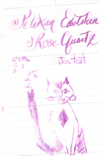
Quick Look - Pelikan Edelstein Rose Quartz (2023 Ink of the Year)
namrehsnoom posted a topic in Ink Reviews
Quick Look - Pelikan Edelstein Rose Quartz (Ink of the Year 2023) The Pelikan Edelstein Ink of the Year 2023 "Rose Quartz" is available. A full review might be coming, but I wanted to give a quick look at the ink for those of you who are wondering what it looks like. The first thing you'll notice is that the promotion pics of the ink bottle are a big lie - totally Photoshopped. In reality, the bottle looks green! Fortunately, the ink within the bottle is still the promised light rose colour. No idea why it looks green - it must have something to do with the breaking index between ink and glass (my guess). Below is a saturation picture of the ink - showing both photo and scan. The colour is best represented in the photo. The scan is definitely too purple. The ink itself is best described as a light pastel-tinted rose. The inks saturation on the page is fairly low. Not totally unusable, but for me it's borderline tolerable, especially in drier pens. The chomatography looks really delicate. Below, I show you some writing with the ink (photo), and a comparison with some other rose/pink inks I have in my collection. Overall, I like the colour - I just wish it would be a little bit more saturated. But compared to the previous two Inks of the Year, this one is definitely an improvement. -
Ink Mix – Depuydt Green 2 parts : Pelikan Edelstein Tanzanite 5 parts : Pelikan Edelstein Golden Beryl A colleague of mine is entering retirement shortly, and I wanted to present her with a personalized greeting card for this occasion. And to make it even more personal, I decided to create a special-edition green colour using a mix of the Pelikan Edelstein inks Tanzanite and Golden Beryl. I tried out some combinations in an Ink Shift experiment, and the current mix turned out to be a beautiful muted moss-green. And because it’s a personalized ink, it gets her name: “Depuydt Green.” “Depuydt Green” is brewed by mixing 2 parts of Edelstein Tanzanite with 5 parts of Edelstein Golden Beryl. This mix resulted in a stunning muted grey-moss-green colour that totally fits my taste and that is worthy of the occasion. For the writing samples in this review, I used a mix without the Golden Beryl shimmer particles. For the drawing, Golden Beryl’s golden shimmer was allowed into the mix (and I must admit that it works quite well within this Depuydt Green). See below for a swab with the golden shimmer particles included. This new ink writes fairly wet and well-lubricated in my Safari test pens. Contrast with the paper is excellent, even with EF nibs. This Depuydt Green shades nicely too – not harsh, but with a soft presence and aesthetically very pleasing. I like this mix a lot! To show you the impact of saturation on the ink’s look & feel on paper, I made some scribbles where I really saturated portions of a piece of 52 gsm Tomoe River paper with ink. This gives you a good idea of what the ink is capable of in terms of colour range. Depuydt Green has a medium tonal range. Contrast between light and dark parts is not too harsh, resulting in soft and elegant shading. For me, the sweet spot for this ink lies in the less saturated range – which translates to dry-writing pens and/or finer nibs. I prefer to use this mix with EF/F/M nibs, where the moss-green colour comes out the best. The resulting mix shows fairly good water resistance, undoubtedly inherited from its Tanzanite heritage. Short exposures to water flush away the yellow component dyes, leaving a blue-grey residue behind that remains perfectly readable. This is also clear from the bottom part of the chromatography. This added water resistance makes Depuydt Green a good ink for use at the office. I have tested the ink on a variety of paper – from crappy Moleskine to high-end Tomoe River. Below I show you the ink’s appearance and behaviour on different paper types. On every small band of paper, I show you: An ink swab, made with a cotton Q-tip 1-2-3 pass swab, to show increasing saturation An ink scribble made with an M-nib Safari fountain pen The name of the paper used, written with a B-nib Safari A small text quote, written with the M-nib Safari Source of the quote, written with a Pelikan M200 with M-nib Drying times of the ink on the paper (with the M-nib Safari) The Depuydt Green mix behaved perfectly on most of the paper types I used, with excellent behaviour all-around. It even works with the notoriously bad Moleskine paper: just a tiny bit of feathering, but you still get bleed-through (so you won’t be able to use the backside of the paper). Drying times with the M-nib are fairly short in the 5-10 second range. The ink looks good on both white and cream-coloured paper, but the muted grey-green look works best with pure white paper. The scan above shows a bit too much yellow. I therefore add a photo of the same writing, which is almost spot-on colourwise. Related inks To compare this mix with related inks, I use my nine-grid format with the currently reviewed ink at the center. This format shows the name of related inks, a saturation sample, a 1-2-3 swab and a water resistance test – all in a very compact format. Depuydt Green looks fairly similar to Graf von Faber Castell Olive Green (which has a touch more yellow in the mix). Inkxperiment – A History of ICTS I always enjoy doing a small drawing using only the ink I’m reviewing. In this case, the inkxperiment was used on the invitation card for the thank-you party we’re organizing. The drawing summarizes the history of our university’s IT department. Its origins are pictured in the circles on the left: the University Computing Centre (abbreviated URC in Dutch), the Computer Science group and the Administrative Information Processing group (abbreviated AIV in Dutch). These groups merged over time to form the current IT department (ICTS in Dutch, symbolized by the pyramid on the right – and written out in ASCII code on the pyramid), with Annemie as our CIO. With the help of all our co-workers, we built a smoothly running organization that is prepared for the future. Our department’s one-liner motto’s are enscribed in Pigpen cypher code on the drawing. Oh… and you may have noticed the little fisherman in the drawing … it’s not always work-work-work, we sometimes take a break 😉. For this inkxperiment, I started with an A4 piece of HP photo paper. I taped out the pyramid and some other parts with washi tape, and used water-diluted ink to fill in the background, with a darker region at the bottom. After removing the washi tape, I used a piece of cardboard with pure Depuydt Green (with shimmer particles) to draw in the lines – resulting in a nice shimmer effect. Next I drew the circles on the left and filled circles and pyramid with ink. I added the circuit-board lines with a dip pen and bleach (this ink mix reacts really well with bleach). Finally I drew in my co-workers, and added the capping stone to the ICTS pyramid (which symbolizes the end of a career). The result is a one-image history of our university’s IT department, that also shows what can be achieved with this Depuydt Green ink mix in a more artistic context. In my opinion, this ink is simply great for drawing! Inkxpired – computational art I love experimenting with pen/ink/paper, and have added another layer as part of the hobby. I’m exploring computational art, inspired by the ink drawings I do during ink reviews. Another fun offshoot of the hobby… and all that starting with a few drops of dye-coloured water on paper. For this computational derivation, I applied a couple of filters that zoomed in on the main subject, and added a mosaic of colours, that I toned down to a more muted pallet. The end result is not too bad, but in this case I like the green original more. Conclusion Depuydt Green is an ink mix that really impressed me: it is a stunningly beautiful muted moss-green that works well with all kinds of nibs and papers, and that is especially nice for drawing. Fabulous!
-
InkShift – Pelikan Edelstein Tanzanite to Golden Beryl Just for the fun of it, I occasionally resume my project exploring what happens when you move progressively from one ink colour to another. My hope is that some of these "inkshifts" result in interesting colours that I can use to write/draw with. And besides... it's just fun to watch one ink colour morph into another one. A colleague of mine is entering retirement shortly, and I wanted to present her with a personalized greeting card for this occasion. For this, I am on the look-out for a moss-green style colour. And to make it even more personal, I decided to mix my own. So I turned to my ink-stash looking for some blue and yellow inks. I had a hunch that the blue-black Pelikan Edelstein Tanzanite would mix well with Golden Beryl to create a fairly dark green. Well, only one way to find out, and that is to do the inkshift experiment. In the span between the two starting inks some nice moss-green colours appear. Up to the 1:2 Tanzanite:GoldenBeryl mix there is still too much blue in the mix (not immediately obvious from the scan, but absolutely noticeable to the naked eye). The mixes with 1 part Tanzanite and 2.5/3/4 parts Golden Beryl are more or less alike. I decided to go with the 1:2.5 mix which looks like a nice moss-green colour. This mix is not too dark a green, and has good contrast between the light and darker parts, which translates to an aesthetically pleasing soft shading. And it doesn’t use up too much of the Golden Beryl, which is a useless ink on its own, but a great one for mixing. Above, you can see the progression of the chromas from Tanzanite on the left to Golden Beryl on the right (2:1, 1:1 and 1:2 mixes between the original inks) . It’s quite clear that Tanzanite dominates the spectrum. I continue to enjoy these ink morphing experiments. Fun adventures in ink-land, and more often than not you are rewarded with a mix that beats the original inks. Fun guaranteed!
-
Ink Mix – Kung Fu Caine 2 parts : Pelikan Edelstein Golden Beryl 1 part : Pelikan Edelstein Apatite Pelikan Edelstein Apatite is the new Ink of the Year 2022. I knew it wasn’t my type of colour, but I collect these Edelstein inks, and so didn’t want to miss this one. Apatite is a really bright and in-your-face blue… a full page of it is just too much for me. I got the feeling though that it might be a nice base colour for some ink mixes. So I resurfaced Edelstein Golden Beryl – a golden yellow that works well with wet & broad nibs, but not so well with my usual F and M pens. I tried out some combinations in an Ink Shift experiment, and the current mix turned out to be a really beautiful yellow-green. This yellow-green reminded me of the long grass in the garden, that is populated by those small green grasshoppers – almost invisible until they jump away. Grasshopper… that brings back memories... it was the nickname of Kwai Chang Caine in the 70’s TV series Kung Fu (played by David Carradine). As a kid, I really enjoyed this series, so I decided to name this ink mix “Kung Fu Caine”. “Kung Fu Caine” is brewed by mixing 1 part of Edelstein Apatite with 2 parts of Edelstein Golden Beryl. The resulting mix is a really beautiful yellow-green colour … a substantial improvement over the parents’ colours. This new ink writes fairly wet and well-lubricated (inherited from Apatite) in my Safari test pens. Contrast with the paper is good, even with EF nibs. Like Apatite, this Kung Fu Caine mix is a strong shader – not too harsh though, but aesthetically pleasing. I like this mix a lot! To show you the impact of saturation on the ink’s look & feel on paper, I made some scribbles where I really saturated portions of a piece of 52 gsm Tomoe River paper with ink. This gives you a good idea of what the ink is capable of in terms of colour range. Kung Fu Caine has a medium tonal range. Contrast between light and dark parts is not too harsh, resulting in well-defined and elegant shading. The resulting mix has zero water resistance. Short exposures to water flush away all colour, leaving only some yellow-green smudges. This is also clear from the chromatography : at the bottom part, you can barely see where the original dyes were put on the coffee filter paper. A good ink for journaling, but not one for use at the office. I have tested the ink on a variety of paper – from crappy Moleskine to high-end Tomoe River. Below I show you the ink’s appearance and behaviour on different paper types. On every small band of paper, I show you: An ink swab, made with a cotton Q-tip 1-2-3 pass swab, to show increasing saturation An ink scribble made with an M-nib Safari fountain pen The name of the paper used, written with a B-nib Safari A small text quote, written with the M-nib Safari Source of the quote, written with a Pelikan M120 Green-Black with F-nib Drying times of the ink on the paper (with the M-nib Safari) The Kung Fu Caine mix behaved perfectly on most of the paper types I used, with only a tiny bit of feathering on the lower quality papers. Bleed-through was only present with the Moleskine paper, but even there it was not too bad. Drying times with the M-nib are mostly paper-dependent ranging from 5-10 seconds on absorbent paper to 10-20 seconds on paper with a hard surface. I quite enjoy the way it looks on the Paperblanks paper, which is what I use for daily journaling. The scan above greatly exaggerates the contrast in the shading. Below you’ll find a photo of the same writing samples, that gives a truer impression of reality. A difficult ink to capture... the colour is more in the direction of the scan, the contrast is more like in the photo. The colour is best captured in the more zoomed-in scans: B-nib detail, saturation swab, related inks... Related inks To compare this mix with related inks, I use my nine-grid format with the currently reviewed ink at the center. This format shows the name of related inks, a saturation sample, a 1-2-3 swab and a water resistance test – all in a very compact format. Kung Fu Caine looks very similar to kyo-no-oto moegiiro and Diamine Meadow. Inkxperiment – Embracing Diversity I always enjoy doing a small drawing using only the ink I’m reviewing. Inspiration for this little piece comes from some pics I saw on Pinterest. People come in all kinds of hardware & software configurations… big & small, multiple skin tones, many belief systems, a multitude of personalities. On an individual level, I embrace this diversity, and I mostly enjoy my interactions with other people, regardless of inevitable differences. But scale up the group, and individuality is quickly wiped out and replaced by mob dynamics with binary thinking and loss of nuances. This never ceases to amaze me! Oh… and you may have noticed that I included a cat in the drawing… cats have personalities too! For this inkxperiment, I started with a piece of 300 gsm rough watercolour paper and a 4x3 grid. I used water-diluted ink to fill in the background, and added some texture with Q-tips dipped in ink. I then used a piece of cardboard with pure Kung Fu Caine to draw the borders of the 12 rectangles. Next I drew in a variety of people (and the cat) with a glass dip pen. Final accents were done with my B-nib Lamy Safari. Yellow-green inks are usually very rewarding to draw with, and this ink mix is no exception. The resulting drawing gives you a good idea of what can be achieved with Kung Fu Caine in a more artistic context. Inkxpired – computational art I love experimenting with pen/ink/paper, and have added another layer as part of the hobby. I’m exploring computational art, inspired by the ink drawings I do during ink reviews. Another fun offshoot of the hobby… and all that starting with a few drops of dye-coloured water on paper. For this computational derivation, I zoomed in a bit on the inkxperiment picture, and used a colour scheme that adds some extra contrast to the drawing. Conclusion Kung Fu Caine is an ink mix that really impressed me, and that’s definitely ways better than the original Apatite and Golden Beryl. It is a stunningly beautiful yellow-green that works well with all kinds of nibs and papers, and that is especially nice for drawing. Another great thing: you’re at the controls here: do you want the colour to be a bit more yellow or a bit darker green… just add a drop of Golden Beryl or Apatite to steer the mix in the direction you want. Fabulous! Backside of writing samples on different paper types
-
InkShift – Pelikan Edelstein Apatite to Golden Beryl Just for the fun of it, I occasionally resume my project exploring what happens when you move progressively from one ink colour to another. My hope is that some of these "inkshifts" result in interesting colours that I can use to write/draw with. And besides... it's just fun to watch one ink colour morph into another one. Pelikan Edelstein Apatite (review coming shortly) is the new Ink of the Year 2022. I knew it wasn’t my type of colour, but I collect these Edelstein inks, and so didn’t want to miss this one. Apatite is a really bright and in-your-face blue… a full page of it really is just too much for me. I got the feeling though that it might be a nice base colour for some ink mixes. So I resurfaced Edelstein Golden Beryl – a golden yellow that works well with wet & broad nibs, but not so well with my usual F and M pens. Could there be some nice looking greens in there? Who knows… only one way to find out, and that is to do the inkshift experiment. In the span between the two starting inks some interesting greens appear, that certainly cater more to my taste than the bright blue Apatite original. The 1:1 mix results in a fresh spring green that looks quite nice. And the 1:2 and 1:3 mixes of Apatite with Golden Beryl are more of a delicate lemon grass green. Overall, a few very appealing greens in the mix. Above, you can see the progression of the chromas from Apatite on the left to Golden Beryl on the right (with the 2:1, 1:1 and 1:2 mixes in between). From these, you can already see that none of these mixes show any water resistance. It’s also clear that the mixes with a stronger presence of the yellow ink show a bit more complexity. I continue to enjoy these ink morphing experiments. Fun adventures in ink-land, and more often than not you are rewarded with a mix that beats the original inks. Fun guaranteed!
-
From the album: Shades of colour
Since I just did this for my wife to select ink colours with which to fill her pens, I may as well scan and post it.© A Smug Dill
- 0 B
- x
-
InkShift – Pelikan Edelstein Jade to Onyx Pelikan Edelstein Jade is one of the few inks that I really hate – I simply cannot stomach its colour. So time to get creative and try to salvage my bottle. The Platinum Classic Black series gave me the idea to darken up the ink by adding some black. So I set out to try different ratios of two Edelstein inks: Jade and Onyx, shifting from one to the other. Below is a set of progressive mixes I used while looking for an interesting combination. Works great, and this is a technique I will surely use more often in the future. I liked the 1:1 and 2:1 Jade/Onyx mixes most, and finally added a final one in between with a ratio of 3 parts Jade and 2 parts Onyx. That became my favourite – a dirty dark blue-green - and I have named it “Murky Waters”. I will do a more comprehensive test of it in the coming days, which I will post here on this forum.
-
Pelikan Edelstein is the proof of Pelikan employees marketing efficiency. Beautifully packaged inks bear promise of amazing writing experience. The line is popular all around the world and concurs with the likes of Pilot Iroshizuku or Graf von Faber-Castell. http://imageshack.com/a/img540/2076/YtmFPx.jpg The packaging is really impressive. The outer cardboard box is, more or less, standard. It's not overisized and made from cardboard.The front panel has a slightly slanted extra facet with a colored panel that corresponds to the ink color inside. Care was also taken to keep ink secure in the box - the pair of styrofoam pads rest between the neck of the bottle and the box. The bottle itself is really, really nice. The glass is thick, heavy and rectangular but with slightly concave sides. The lettering fits the design. I believe Caran d'Ache Chromatics inks bottles are more interesting, Iroshizuku probably nicer but Edelstein offers great and solid cap. The inks can be bought in 12 colors, seven standard. Aventurine Jade Mandarin Onyx Sapphire Ruby Topaz And 5 LE inks of the year Turmaline Ink of the Year 2012 Amber Ink of the Year 2013 Garnet Ink of the Year 2014 Amethyst Ink of the Year 2015 Aquamarine Ink of the Year 2016Sapphire form standard Edelstein line is, in my opinion, the least interesting og the group. It behaves well and has reasonable drying times. However I can't help but notice it's incredibly boring and generic. When I look at this ink I just can't see anything interesting. Sometimes and for some people it can be an asset. For me though it's unforgiveable sin Frankly if you like such colors Diamine Sapphire Blue or J. Herbin Eclat de Saphire will be much cheaper and more interesting choices. Drops of ink on kitchen towel Software ID Tomoe River, Kaweco Classic Sport, B Leuchtturm 1917, Kaweco Classic Sport, B Kokuyo Campus, Diplomat Depeche, B
-
InkShift - Pelikan Edelstein Mandarin to Aventurine Just for the fun of it, I decided to do a project exploring what happens when you move progressively from one ink colour to another. For now, I'm restricting myself to inks from the same manufacturer - mainly to avoid nasty chemical surprises. My hope is that some of these "inkshifts" result in interesting colours that I can use to write/draw with. And besides... it's just fun to watch one ink colour morph into another one. Mandarin (orange) and Aventurine (green) are regular Edelstein inks. Nice inks, but not really exciting. I decided to explore the territory in between to find out if something interesting turns up. As always, I start with 1:1 and 1:2 mixes to see what areas to explore. In this case, Aventurine clearly is the dominating ink, so I decided to zoom in more on the Mandarin side of the spectrum. In the span between these two inks, there are some interesting colours to be found. My personal favourites are:15 parts Mandarin / 1 part Aventurine : a nice sepia type colour3 parts Mandarin / 1 part Aventurine : an appealing moss greenI really enjoy these morphing experiments. You never know what surprises will turn up, and the resulting colours are often a lot more interesting than the standard ink colours you start with.
-
Pelikan Edelstein Smoky Quartz Back in the days When I attended primary school in Holland in the end of the 70s a Fountain Pen was obligatory. Since I had some troubles with my fine motor skills my parents decided to buy me a Pelikano Fountain Pen which in those days was top of the bill and a serious investment back then. I always remember what I loved most about that pen. It not only had a nice blue colour, but I really loved the blue ink window. I thought it resembled the blue flashing light on police cars AWESOME Here is a link to the history of the Pelikano Fountain Pen https://www.pelikan.com/pulse/Pulsar/en_US.CMS.displayCMS.220931./the-history-of-the-pelikano-from-1960-until-now School boys fantasies… Maybe it is that boys never grow up or simply that early youth memories impress… But I am still in love with Pelikan and I am now the proud owner of 2 Pelikans, the M800 Green and the M800 Stresemann on the left. My wife was infected with my love for Fountain Pens and is the owner of the M600 and the M400 with 14kt nib on the right Well and since my wife and I both love Birds and Fountain pens we cannot guarantee that these are the last Pelikans that enter our house Before I get to the review I want to let you know that I will enter the links to my previous reviews of Pelikan inks at the bottom of this review Pelikan Edelstein Smoky Quarz Pelikan is famous for it’s 4001 range Which was introduced as in 1901 as an Iron Gall ink. This Iron Gall ink is still available but today there is also a range of Non-IG 4001 inks which all perform well… Just like a good wine ripens and gets better the 4001 Inks still are a joy to use even after 20 years… A thing I pointed out in my comparison of a matured and e brand new bottle of 4001 Royal Blue ink https://www.fountainpennetwork.com/forum/index.php/topic/264220-pelikanss-royal-battle-battle-of-the-blue-kings/ In 2011 Pelikan introduced the Edelstein ink Collection. A more exclusive line of fine inks following the trend of i.e. Iroshizuku Graf von Faber-Castell which already brought more high end inks in luxury bottles. https://www.pelikan.com/pulse/Pulsar/en_US.Pelikan.showTimeline.221778./history Well I am glad to tell that Pelikan stayed loyal to his principles. Same as in the 4001-Range where Pelikan brings highest quality at fair prices. It did so in its Edelstein Range… Giving you finest quality combined with refined luxury … at fair prices https://www.lacouronneducomte.nl/webstore/main/inkt-vullingen-merk-c-161.html Well and yes all bottles contain 50 ml. Pelikan Smoky Quartz The Ink The colour is a lovely medium dark brown. Shading is very nice so is the flow. If there is a small minor, it is the drying time: The ink is wet and stays in this condition for 10 seconds. That is a thing you must consider if you’re a left-hand writer. My advice in that case: Bind your Bottom to a drone and hoover over your writings…. This ink worth the extra effort… Even if your texts contains a lot of “Male Cows Feces” (sorry I cannot write BullS..t here), your writing will be beautiful when using this beautiful ink Technical specifications own here are some of the technical specs (as suggested by Ann Finley 2007) (not copied in but for this ink) points 1-5 1 = 5= Fountain Pens: , Kaweco Calligrapy Classic Sport 1,5 Italic, Lamy Safari B nib Paper: Vleveka Classic Line Paper and ordinary copying paper Drying time Slow points 2 Flow: very smooth points: 5 Lubrication: wet points: 5 Feathering : None points 5 Bleeding: nada points 5 Shading: very good points: 4 Waterproof: good points: 3 Package: robust yet elegant points 4 Please have a look at the Water test I tested it with an very wet Q-tipp and look at the result. Still very legible. Maybe it does not survive a wet monsoon… but hey it s not a Document ink. So I will call it Waterproof Availability This is one of those inks that are even available on the moon. But since it is pretty hard to go to the moon you might consider following adresses La Couronne du Comte I guess Dennis and Rik would even travel to the moon to get it for you (just pay them a million or 2 ) Well it is safe to say that they do almost everything to satisfy their customers… Considering http://www.lacouronneducomte Bankers have Rothshield Ink lovers have the Goulet Pen Company. Rachel and Brian carry the almost* largest assortment of ink on earth an it's near surroundings http://www.gouletpens.com (*almost Dear Amberlea Davis carries the largest assortment in the universe but is not a seller Larry Post of Australia is a Great Supplier of Stationary and Artist Equipments. They carry a lot of De Atramentis Inks http://www.larrypost.com.au/ The same applies to Singapore based Arters of the utterly friendly Yitpeng and WeetekOng http://arters.com.sg Conclusion For me this ink is spot on. The colour is lovely, in fact together with De Atramentis Ebony and Sailor Jentle Brown this Smoky Quartz is belongs to my favorite browns. It is an saturated shading ink that writes very smoothly. Drying time may be a bit long but since I am a right-hand writer this does not bother me much. The Bottle is lovely, it is a bit like yin & yang robust yet elegant. An pleasure to my eye when I visit my Ink Cellar, and so is this ink Links to my reviews of Pelikan inks (work in progress) https://www.fountainpennetwork.com/forum/topic/291420-pimp-my-ink-comparison-pelikan-edelstein-aventurine-vs-pelikan-4001-brilliant-green/ https://www.fountainpennetwork.com/forum/topic/266092-pelikan-4001-brilliant-green/ https://www.fountainpennetwork.com/forum/topic/291416-pelikan-edelstein-aventurine/ https://www.fountainpennetwork.com/forum/index.php/topic/264220-pelikanss-royal-battle-battle-of-the-blue-kings/ https://www.fountainpennetwork.com/forum/topic/266286-pelikan-4001-violett-violet/
-
InkShift - Pelikan Edelstein Topaz to Ruby Just for the fun of it, I decided to do a project exploring what happens when you move progressively from one ink colour to another. For now, I'm restricting myself to inks from the same manufacturer - mainly to avoid nasty chemical surprises. My hope is that some of these "inkshifts" result in interesting colours that I can use to write/draw with. And besides... it's just fun to watch one ink colour morph into another one. In this experiment, I started with Pelikan Edelstein Topaz and Ruby as base inks. My hope was to find some interesting purples. But no... I'm not impressed with the purples that appeared. I do like some of the blues though. Now I'm wondering if a more vibrant red like "Star Ruby" would have been a better choice... I'm hoping for more of a violet colour to turn up.
-
InkShift - Pelikan Edelstein Topaz to Star Ruby Just for the fun of it, I decided to do a project exploring what happens when you move progressively from one ink colour to another. For now, I'm restricting myself to inks from the same manufacturer - mainly to avoid nasty chemical surprises. My hope is that some of these "inkshifts" result in interesting colours that I can use to write/draw with. And besides... it's just fun to watch one ink colour morph into another one. This particular combo is a follow-up to the Topaz-to-Ruby InkShift. I had a hunch that the more vibrant Star Ruby might result in more interesting purples. As far as I'm concerned that hunch turned out to be correct. This inkshift produced quite some interesting colours, even a few violets. This morphing project really is great fun... I am thoroughly amusing myself. Below is a side by side with the Topaz-to-Ruby InkShift. What a difference a "star" makes

desaturated.thumb.gif.5cb70ef1e977aa313d11eea3616aba7d.gif)