Search the Community
Showing results for tags 'medium'.
-
From the album: Poems copied out by Mercian
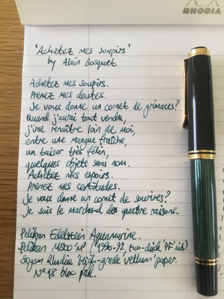
This is my hastily-copied-out record of ‘Achetez mes soupirs’ by Alain Bosquet, in its original language. French. I wrote this with my 1990-92 Pelikan M800. It has an ‘M’ nib with a two-chick logo, and ‘PF’ and eagle’s head stamps. The shape of its grind is slightly more interesting than that of the post-September 1997 nibs, which are more-round, and more-‘monoline’. The ink is Pelikan Edelstein Aquamarine. The paper is a sheet from a Rhodia No.18 bloc pad.© Mercian
- 0 B
- x
-
From the album: Poems copied out by Mercian
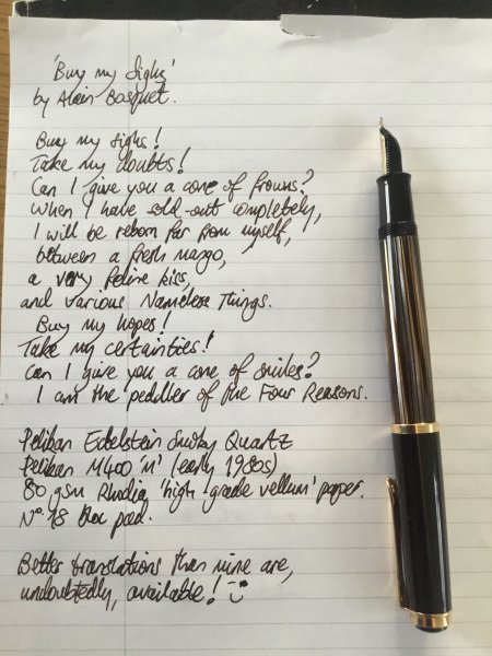
This is my own translation of ‘Achetez mes soupirs’ by Alain Bosquet. Better - more competent, more-poetic - translations are, undoubtedly, available! I wrote it out rather hurriedly with my early-1980s Pelikan M400 in the ‘Brown Tortoiseshell’ finish. The pen has a mono-colour 14k gold nib, marked ‘M’. The ink is Pelikan Edelstein Smoky Quartz. The paper is a sheet of 80gsm Rhodia ‘High-grade vellum’ from a No.18 bloc pad. I wrote this right after writing out the poem in its original French, with my M800. I have some tension in my shoulders today, and this has made my handwriting with this pen really awful - far worse than that with the larger-&-heavier M800.© Mercian
- 0 B
- x
-
I recently purchased a brand new Pelikan M600 (Blue) with a fine nib, which I love, but I’m also interested in trying the medium nib in this pen. What reliable, affordable retailer would you recommend to sell me that medium nib? I’d be open to buying a used one in great condition, as well. Thanks! Gary
-
I love everything about the Triple Tail. The largeness. The clearness. The non-smellyness. The plunger filling system. The 308 cartridges I can use. Everything, that is, but the nib itself. It's just too darn much for me. It's finicky, which is bad enough. But even when it does work after heat setting, etc -- and even with an ink as simple as 4001 Royal Blue or Waterman Serenity Blue -- it's like writing with a paint brush. And that's before flexing! Before I return it for a partial refund, I thought I would see if anyone has managed to trade it out for a #6 nib? And it not a basic #6, then something else? I saw someone asked Goulet, and the answer was: "Maybe". Have you done it? How'd it go?
-

Is this Parker 51 a Medium or a Broad? Or something else?
Aelia posted a topic in Fountain & Dip Pens - First Stop
Hi folks, I got this Parker 51 from Ebay for a total of $70 including shipping. I'm trying to figure out of the nib is a medium or a broad. The pen is Made in England. If it's a Medium, it's quite a bit broader than my Made in England Parker 45 medium nib. What do you folks think? I am writing on Mnemosyne paper. Thanks! The nib says "14K" "585" "Parker" "Made in England" and I believe that's about it. I'm interested because I never thought I would love a nib that's this broad. It works well for speech outlines because it's easily legible.
-

Newbie Thoughts On Pilot Kakuno (Medium Japanese Nib)
PenGal17 posted a topic in Fountain Pen Reviews
Let me start of by saying..... I LOVE this pen. You may think that the Kakuno is a child's pen but honestly? It writes amazing! So smooth and wet that it is perfect for a beginner and seasoned as well. All around pleasure to write with! If you don't want to write with it in public (i.e. Its childish looks) at 14$? Get one for home! No start up issues even without flushing. Right out of the box its ready to write. Id suggest a pilot CON-50 converter and bottled ink (sold separate) if you want lots of color options (why not? 😁) and if not you can get refill pilot cartridges on amazon .com or jetpens .com as far as I know. All in all at 14$ this pen is a steal! Happy Writing everyone! PenGal17
-
I recently acquired two Sheaffer Sagaris fountain pens, one with a fine nib, the other with a medium. I decided that I preferred the fine nib so I went looking for a fine nib unit to purchase to replace the medium. Since it's the entire unit, it should just screw into the barrel, right? I found a replacement fine nib unit from a seller in England, purchased it, and it has arrived. It won't screw all the way into the barrel that came with the medium nib unit. Hmm... So let's try the fine nib unit from the other pen from the original purchase. It won't screw all the way in either! Oh, futz... It's not due to the length of the converter (or shortness of the barrel.) I tried screwing in just the nib unit; no joy. The gap left between the barrel and the unit flange that nestles up against it is about 1mm. If I can find a flat washer with the proper i.d., o.d., and thickness I can fill the space, but that's a big if (and a big, ugly kludge.) I might have a better result with an o-ring (see ugly kludge.) Time to get out the vernier calipers and take some precise measurements. I suspect that the medium barrel was not threaded to the same depth as the fine barrel, hence the fine nib unit coming up short. It strikes me as very odd that Cross/Sheaffer would manufacture different barrels for different nib units because a more complicated manufacturing process is a more expensive and error-prone process. Can anyone shed some light on why the nib units are not interchangeable or suggest any alternatives for dealing with my situation? thanks, richard -- - You can’t get enough minimalism.
-
Hi all, I am about to go after a Pelikan M800 with a Medium nib. Does anyone have some writing samples to show of the Medium nib (ideally compared with the Broad nib, in case you have both pens)? That would really help me move forward with this purchase.
-
Once again, I have so send my MB purchases to Germany for new nibs. They came standard with Medium nibs, but I need a fine nib. I just don't understand how Medium can be the most popular MB nibs. These nibs write broader than typical Japanese nibs. I assume the Medium gets better shading, but whenever I try writing with them, all my "e"s and "o"s get filled in. It's much harder to read my writing. When using standard ruled paper, I don't understand why others wouldn't have this problem as well. So, MB Medium Nib lovers, what's your secret? Do you just write very large? Do you not care if your letters get filled in? Do you have "wider" letters as part of your penmanship? Do you just use them for signatures? I just can't figure it.
-

Fountain Pen Review: Monteverde Invincia - Stealth Black (M Nib)
nmcnick posted a topic in Fountain Pen Reviews
Monteverde Invincia - Stealth Black (M Nib) Review To start this review off, keep in mind it is my first review; and as all reviews, is at least somewhat subjective. Also, for perspective, I have used this and 4 other fountain pens, which are: Pilot Varsity Lamy Al-Star Lamy Safari Conklin Duragraph and I have been using this pen for around 1 month. Overall Appearance: Measurements: 5.35" / 136mm long capped 5.30" / 134.7mm long uncapped 6.10" / 154mm long posted 1.10" / 28mm long nib 0.55" / 14mm body diameter 0.35" / 8.9mm grip diameter 1.40 oz/ 39g weight overall Monteverde makes some amazing looking pens and this is no exception. This pen is downright edgy. From it's shiny, reflective all black metal surface to the rounded style which makes it look sharp and artsy; this is a beautiful pen. Well.. chances are that it wouldn't be taken as a compliment it by saying it's "beautiful", so.. let's instead just say this.. it's a good looking pen. I love the little details on this pen such as the Monteverde mountain etched into the nib, the rounded body which is dynamic and changes in girth frequently throughout the pen. Also, the logo on the top of the cap is a nice touch. Pen Parts, Build & General Details The pen cap screws on securely and takes about 2 rotations to pop off. In posting the pen, the cap just slides on securely and really feels sturdy and macho even in the way it does this. There are many things about this pen that just feel so edgy and make me feel as if I am the coolest person on the planet. The grip of the pen is probably the biggest turn off for me. I have very large hands, but with the grip being skinny and having a pretty quick cut off to the body, combined with it being metal makes it a tough pen to hold for a long time at least for me. I prefer to hold my pens further back then most anyway, so maybe this is what causes the issue. Adding to this, the clip is EXTREMELY tight, its hard to even slide onto a pocket. This isn't a huge deal for me since I never clip my pens, but it may be for you. It has a standard international converter and cartridge filling mechanism. It comes with your standard run of the mill piston converter (standard international) and as such isn't remarkable but works as it should. I haven't encountered any problems with filling the Invincia. You are going to be getting 1.07ml of ink out of cartridges and 1.12 out of your converter. It should be noted that I used monteverde black ink which, once again, was a fairly standard black ink; very similar to noodler's black. The nib is a #5 steel nib, which writes well. It surprised me to find this out as most outlets say it has a #6 nib. Whether it's a change in production or something else I'm not aware of, the important thing is it fits! I'll be getting more on the writing later, however. I chose the medium nib model and it fit fantastically for me. I cannot say how it compares to other mediums very well as this is my first medium nib, however, it seems to be a broad medium with some stub properties (some, very small but more on that later) which was a surprise to me. Not a lot more to say about it's structure! I think the black look was absolutely essential and having an all black pen just looks really sleek. Writing As mentioned above, the pen feels a little strenuous on my hands and eventually causes them to cramp up. However, aside from that, this pen is an excellent writer. It's incredibly balanced unposted, and when posted is ever-so-slightly back heavy. This is the first pen I can use either posted or unposted simply because I have such large hands and most pens aren't very large until you post them. This pen isn't huge, but the length mostly subsides in the body as opposed to the cap. It's got some weight to it and feels durable. I love the metal finish in looks.. but sometimes it can be a tad slippery in writing. Putting the pen to the pad, this thing writes extremely smoothly. Its a really interesting writer and feels unlike anything else I've written with. It's smooth, with very very little feedback, but not at all glidy. It feels as if you are effortlessly carving into paper, like a butterknife into soft butter. That being said, It has a bit of a sweet spot. When you use it any way else other than right down the middle, it makes a very thin line and can feel a little scratchy. Using horizontal or diagonal lines result in a skinnier line because of this and therefore can produce really interesting results, resembling a tiny bit of a stub look, or so I've seen. Very interesting and fun nib to write with. Overall, this is a pretty great pen. It has some issues, but I like the overall look and feel of this pen. The all metal body with a black nib and nice writing comes to a pretty good conclusion for me. Final Verdict: (7.8/10) -
I have the choice between EF and M on a GvFC classic. I would probably have gone for an F normally but this is really a good opportunity so that is out of the question. I am happy with a fine line, as long as it isn't scratchy and has good flow. I hear GvFCs are on the wetter side so that pushes me towards an EF. Does anyone have any experience or comparison of an EF v M? I've again heard that GvFC, being German, tend towards a broader side of things. For comparison, I have a TWSBI EF which isn't too fine or scratchy for me (I think it's a good one though). I also have a MB 146 M which is a good thickness, although I'd like something a bit thinner here. I also have a Waterman Carene in M which is thicker than I want for my GvFC, a Nova with a Bock #6 medium which again is thicker than I'd want for this pen. That all said, if the EF is likely to be scratchy I'd rather go for a wider line to get a buttery smooth writing experience. If anyone has any samples that they could take a picture of, I would be extremely grateful. Otherwise any input is appreciated. Thanks!
-

Very Disappointing Experience With A Pelikan M805 Stresemann
John545 posted a topic in Fountain & Dip Pens - First Stop
Hi Guys. I have been into fountain pens for a while now, but I hadn't bought any expensive pens until now. My collection mainly consisted of TWSBIs which I have been very happy with. I worked really hard this year for my 2nd-year exams, and I worked pretty hard over the summer in an internship so I decided I would reward myself with my first "expensive pen". I decided on the Pelikan M805 Stresemann for a couple of reasons. 1 - It looks brilliant. I really like the look of the grey stripes down the barrel. I haven't seen a pen that I like the look of so much. 2 - I had heard that Pelikan nibs are some of the best nibs around and write brilliantly out of the box. However, I opened up my new pen this morning and sadly I have never been so disappointed with a purchase. As I was opening the pen it was somewhat clear that I had been sent a pen that was previously a return. For example, the little plastic bag that the pen comes in was all screwed up. (I bought this pen from cultpens in the UK by the way). Now I'm wondering if someone else had a bad experience of this pen, sent it back, and now I've ended up with it. On the barrel, it appears that one of the grey stripes is missing. There appears to be a dark gap where it is missing. I have tried to get a picture of this but it is quite difficult to pick it up on camera! This is something that wouldn't bother me in the slightest on a much cheaper pen, but at £300 I'm not impressed by this. I decided to forget all this as the writing experience is the most important thing. So I inked up the pen with some Iroshizuku Ku-Jaku and began to write with it. The writing experience is extremely disappointing! It's almost as if I am writing with a different pen to that of the reviewers online. The nib is very dry, and not smooth at all. Also, it feels very stiff which I was surprised by as a lot of people say the Pelikan nibs have some spring to them. I grabbed my TWSBI Eco to compare the writing experience, and the eco is the clear winner. Smoother and wetter, at less than a tenth of the cost. A lot of people say that the Pelikan nibs are quite broad. For example, the medium M805 nib in the pen habits review looked more like a broad or even a double broad. So I decided I would go with a fine nib as opposed to the medium nib I usually go for. So I'm wondering, would you guys recommend returning the pen and swapping it for the same pen with a medium nib? Or do you think I would be better getting a refund and buying a different pen altogether? If you think there is a better alternative pen out there I would appreciate any recommendations - I'm looking for a pen with a really wet and smooth nib for the best writing experience possible. Around £300 or less. -
Hi Recently, after watching a few reviews online, I decided that I'd like to get a Pilot Custom 823. I've heard they have great nibs, and I'd love to get a vac filler. The problem is that they're not available from any UK sellers that I know of. And importing from Japan would lead to import costs, and any issues with the pen/nib would be a pain to solve. Has anyone else in the UK imported the 823? If so, how much did the import duty/VAT cost you? Also, when I do figure out the best way to get one, I can't decide between broad or medium. Some people say the medium is just like a western medium, but some reviews say its more like a fine. Any advice? Thanks
-
Black Ink Of Wetness In Between Waterman Black And Aurora Black
3nding posted a topic in Inky Thoughts
Hi everyone! I have a pen that writes too wet with Aurora Black and too dry with Waterman Black, so I am looking for an ink whose wetness is somewhere in between, although a bit closer to Aurora Black in terms of wetness. Also, if it is a really dark black that's a plus! Thank you all very much in advance! -
Hi folks! I bought this pen at the flea market the other day and after disassembling it and cleaning it I still don't know what model it is, it came with the broken off clip but otherwise writes like a charm. The box it came in said "cross Calais" but I doesn't resemble the pictures of that model I found online,aybe an older version? The nib was originally golden but the paint has mostly come off
-
Hi Guys, I'm currently looking for a #6 nib that will go in my Nemosine Fission. At the moment, I'm confused between Goulet nib, Franklin Christoph and Edison nib. I would really love the nib to be buttery smooth although a hint of feedback is not a problem. And also inform me how the Goulet and Franklin - Christoph ships their nibs. The nibs should be safe right ? Ken
-
Faber-Castell Ambition Review (Medium In Black Resin)
a.zy.lee posted a topic in Fountain Pen Reviews
Faber-Castell Ambition Review (Medium in Black Resin) I have owned this pen for a year now, and it has been used very heavily during that time. It was the first pen I bought and chose myself and it was a sort-of grail at the time. Th pen's design is very minimalistic. It's all straight and cylindrical. The cap is made of chrome with plastic internals, but it's very heavy. The barrel is made from brushed "precious" resin. After a year, the brushing has worn away, so it looks more polished. Still doesn't look smooth and glossy, though. The pen was breathtaking when it was new. The resin could be compared to the Lamy 2000's makrolon: Makrolon on top, resin below. Before buying the Ambition, my main concerns were the resin cracking and the comfort in the hand. There are no cracks in the pen to report, and the comfort isn't perfect, but it's fine. It's not for everyone, though. The step seen above is what concerns most. I hold the pen on the chrome section, but most hands would be too large to do so. I use the pen unposted, as posting throws the balance off a lot, due to the heavy cap. It does look very nice posted, though. The writing experience is far from perfect. The nib is very smooth, but it makes a lot of sound when writing, which makes you think it's scratchy. There is some feedback on left-to-right strokes, but it's only noticeable with pressure. Speaking of pressure, the nib is definitely a nail. Very hard with almost no line variation to be had. I would rate the flow 3/5 for wetness. The feed doesn't maintain the flow perfectly, but it's not horrible. Keep in mind the pen is only £40. Compared to other pens in this price, you get a great writer. The medium nib is quite fine, so it's suitable for everyday writing. All nib units within Faber-Castell's "Design" range are the same and compatible with other pens from the range. Overall, I enjoy the pen very much but it's not without its flaws. I would highly recommend it to anyone looking for a £40 pen that's both beautiful and a good writer. This was my first pen review. How did I do?
-
Good afternoon, I hope everyone is doing well. I am writing to ask for advice, personal experience, and opinions regarding Pilot's VP in Fine and Medium. I am currently in the market for a VP (likely the Blue Carbonesque) and I cannot decide on a Fine or Medium nib. I do not have access to a pen shop to test out nibs so I am asking for your help in deciding. Below is a list of a few of my favorite pens that I currently own and use (maybe you can advise based on what I like/currently use). TWSBI VAC 700- Fine TWSBI Mini- Fine Pilot Metro- Medium Thanks! Sam Knoxville, TN
-
The #3776 is a marvellous piece of writing instrument that any passionate fountain pen lover would consider absolutely essential, for building up a collection. Sometimes, it’s one of the top five must haves for people like us, available perhaps at the lowest price given the gold nib. As for me, I never sensed any urgency to get one, as there were a few similar shaped pens (Pilot Custom 74, Sailor 1911 & MB 146) with me. I liked the wide flattish nib and had decided to take a Naka-ai writer later, which would address my desires of getting an urushi lacquered pen in Tamenuri finish. With time however, a few #3776s of my friends passed through my hands and then one fine day the wine red Bourgogne seemed to be unavoidable. I didn't like few of the nibs which I had encountered previously, given their low tolerance to even moderate pressures resulting in higher feedback. The similarly sized and shaped Pilot Custom 74 albeit with a smaller nib, wrote like a dream with just the softness and responsiveness one would ideally want in a fountain pen. The pluses were many if I ended up with the right kind of nib, given a great balance, an unique colour and a air-tight sealing mechanism of the cap. Below links redirects to the same review on my blog with additional eye-candy Platinum #3776 Century in Bourgogne PRESENTATION (6/6) The pen comes in a blue faux-leather gift box, packed with one blue cartridge, a converter, a warranty card and an user manual. I like the simple, no-fuss design of the box with the right amount of protection necessary for the pen. The model number of the pen, in this case tagged to the clip in a small plastic sleeve, PNB-10000 #71, encompasses both the launch price and colour within it. The 10000 refers to JPY 10,000 as the launch price and #71 to Bourgogne, in this case. DESIGNED - CLASSICAL CIGAR (5/6) The #3776 comes with plethora of names and materials ranging from resin to wood to ebonite & celluloids. The ones most commonly purchased across #3776 Century Collection is either the Chartres Blue or the Bourgogne one. The original #3776 series was designed by Japanese playwright Haruo Umeda who was incidentally also known as Mr.Fountain Pen, along with the designers at Platinum, with the intention of creating an ideal fountain pen. The first of the #3776s were made available to general public in 1978. They sold over 150,000 pens in the first six months, gaining popular use. As you might already know, #3776 expresses the height of Mt. Fuji (3776 meters), the highest peak in Japan. This new model however represents the first full model change in over 33 years. You can find a more detailed historical interlude with an amazing review of the Chartres Blue version by Garden Man on FPN. This classical cigar starts with a rounded off finial and a gold plated clip & ring combination, syncing well with concentric cap bands and concluding with a golden dazzle at the end of the barrel. The relatively dark wine red or Bourgogne coloured resin allows light to dazzle through the entirety of the pen. Bourgogne (or Burgundy) is one of France's main wine producing areas. The region is well known for both its red and white wines, mostly made from Pinot noir and Chardonnay grapes, respectively. The pen incidentally gleams in revealing wine red and striking golden hues with ambient light and these effects proliferate with light. The converter shines within, revealing the ink-levels inside. The transparency doesn't give in to all ambience of light, and keeps pacing up with the intensity of red wine. The cap disengages in less than two turns. revealing a golden glaze of the 14k nib. The grip does reveal another knot of glitter, at start of the section here. The barrel further steps down to the section, however it did not affect my writing experience. Injection-moulding threads are somewhat visible at the threads of the barrel and grip, which could have been polished off. Compared to the President nib, the #3776 nib poses serious competition in terms of size and of course flexibility. The cap with a rounded off finial preserves a classical look. A few things etched across a thicker centre band include the symbol p for brand name of PLATINUM, model number #3776 and of course MADE IN JAPAN. An concentric narrow band above renders some differential aesthetics. The simple clip is tension-fit and has a traditional shape, with a faint western resemblance. From top, you can also observe part of spring & screw of the Slip & Seal mechanism inside the finial. This new air-tight screw on cap is supposed to completely seal off the nib tip from outside air, preventing any escaping vapours. The inner cap ‘Slip & Seal’ mechanism was originally designed for the pull-on caps on lower models. In the current design, the forward upraised edge of the section pushes up against the inner cap, the inner cap rotates independently of the outer cap till a spring at the end of the inner cap pushes back the distance, thereby removing the ambient air and achieving an air-tight seal, as seen in this video. This last bit of threads on the barrel (almost the last quarter turn) which activate the air-tight seal in the inner cap, keep the nib from drying out for more than a year, according to Platinum. Overall, the building materials (resin) and the quality of gold plating seem to have improved. The resin seems reasonably resistant to scratches compared to older models but I do see a cap mark on the end of the barrel as I consistently happen to post the pen. FILLING SYSTEM (4/6) As a cartridge converter filler, the supplied convertor is limited by a volume of 0.6 mL although platinum cartridges have an advantage with capacity of more than 1 mL. Unfortunately enough, Platinum stopped manufacturing piston-fillers long back and the last one (70th Anniversary) was released way back in 1989. The #3776 takes in proprietary converters and like all other current Platinum pens and there is an adapter available for international cartridges/converters, whose production is currently stopped. The barrel disengages from the grip section with less than three turns, exposing metallic threads of the section (thus removing the eye dropper possibility). The resin barrel carries the opposite threads inside. The proprietary converter looks cool with its golden trims matching the overall trims of the pen and you can observe the ink levels through streaming transparency of red wine. As you can see, almost the entire converter capacity(albeit limited), remains exposed to your eye. NIB - ALL THAT MATTERS (5/6) The nib #3776 is made up of 14k gold alloy and it comes across in several Japanese widths - EF(Extra-Fine), F(Fine), M(Medium), B(Broad), UEF(Ultra extra-fine), SF(Soft Fine) & C(Double broad). Inscribed within the nib is the symbol of Mt. Fuji’s peak. A hearty breather hole lies above the imprint of a relatively flatly styled nib. Below the etching of #3776 and the brand symbol p, along with nib alloy (14k), width (M) and gold content(585), rest at the far end of the tail. The peaks of Mt. Fuji start parallel to the tines and achieve their summit towards the iridium tipping. These scrollwork are limited to the tines. JAPAN is engraved on one of the faceted shoulders. The nib lays a wet and smooth line and is a tad forgiving to pressure. The black plastic feed for the has spacey and stylish fins and even with the cap open for a while, it does not take an effort to lay a consistently wet line. A small feeder hole at the section end provides ink suction for the converter. This is a redesigned feeder which is wider and thicker than the 1978 one, resulting in a stronger nib alignment. The nib and feed are heat fitted and you are advised not to pull out the unit just for fun. PHYSICS OF IT – RELATIVELY SPEAKING (6/6) The cigar shape of a pen renders comfort and balance for usage. The cap weighs around 10 grams, and I prefer to post the pen to get necessary heft even for extended writing. To take notes or scribble here & there, I don't usually post the pen. The section with around 1 cm girth is another desirable element for longer writing sessions. Along with the converter, the weight and balance are what you would pretty much expect in most of the nicer pens. Length closed ~ 14 cmLength open ~ 12 cmLength posted ~ 16 cmGrip Diameter ~ 1 cmNib Leverage ~ 3.3 cmWeight (with inked converter) ~ 23-24 gWeight of cap ~ 10 g Some snaps of capped, uncapped & posted #3776 with Sailor Pro Gear, Pilot Custom 74 and Pelikan m605 go below for your reference. ECONOMIC VALUE (6/6) The pen retails at around USD 176 in the US or around Rs 10,000 in India, although you can find it significantly lower prices in Japan. I bought the pen at around the street price plus shipping which hovers around USD 80-90. The pen reached me from Pensindia Pune office next day, after placing an order. Honestly, if you are end up with the right kind of nib, this pen is the steal of a deal. It cannot get better than this, given the 14k better-sized gold nib, along with a good body in a comfortable shape. OVERALL (5.3/6) The medium nib lays a width somewhere between a western extra fine and western fine, graced with a wet and consistent flow. With free flowing inks like Waterman, Pilot Standard ones or specific Iroshizukus, the nib glides over paper with great panache. You may feel a bit of resistance, in case of more viscous/shading inks (say MBTB or even Sailors). I did feel some characteristic spring and a hint of softness with the 14k nib. It felt rigid initially, but with constant writing the nib has started to accommodate my pen-pressure with incremental reflexes. The verticals are almost as thick as the horizontals, showing an absence of any unforced line variation. With a decent buffer capacity of the plastic feed and remarkable sealing off mechanism of the cap, the nib starts like a star and glides over the paper with Iroshizuku Yama-budo ink. The ink takes around 20 seconds to dry completely on MD paper, which also points to efficiency as well as economy of Japanese manufacturing. Overall, I am glad that I have finally bought this pen for myself. Thank you for going through the review. You can find other pen and paraphernalia reviews here. REFERENCES Air-Tight Seal of Cap Platinum #3776 Century Website Platinum Izumo - President Nib Review
-

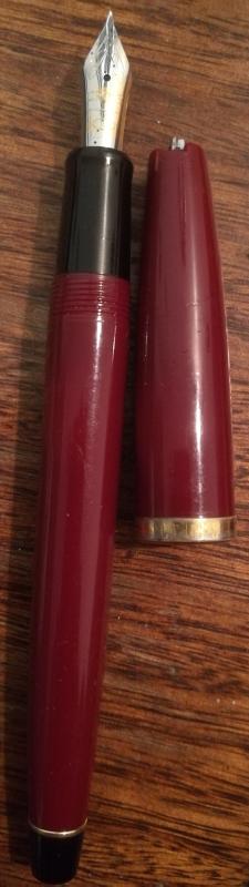
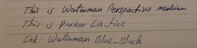
Significantly Different Ink Color With New Fine Parker Im, Normal?
lordfkiller posted a topic in Of Nibs & Tines
Today I bought a new Parker IM with a fine nib. This is the first time I buy a fine pen, hence the question. Using the same ink in my new pen and my Waterman Perspective medium (Waterman Mysterious Blue ink, from the bottle for Parker and cartridge for Perspective), I compared the two pens. The Parker creates a very different color that is unusually light. It gets even lighter after writing a line or two. It's also as dry as they come. Comparison sample attached. As I said, the color can get lighter at times. The camera is making it look sharper as well.
-
Hi everyone! Is there anyone who would like to exchange medium (M)/Fine Medium (FM) or Fine (F) nib for a Broad (? I decided that I'd have more use of a finer line. I've had this nib since last month and it is in perfect condition.
-
Pif - Cross Aventura - For Newbies
Runnin_Ute posted a topic in Pay It Forward, Loaner Programs & Group Buys
Recently I was looking at some of my pens, and realized I have a few I don't use a whole lot. After giving it some thought, I thought I would give a chance to some of the newer members here a chance to acquire this. This is for my Cross Aventura, with a Medium nib and converter. It is a very nice writer and looks good, it just doesn't get the use it deserves. Like I said, I want this to go to a newer member here. Requirements: Must be a Gold Member (minimum of 30 posts and here at least 30 days) but have less than 100 posts when it closes. However it will be open worldwide - CONUS gets free shipping, elsewhere pays the difference between the two. Entries will be open until 8:00 pm MDT July 15/2:00 am UTC/GMT July 16. I will use a random number generator to pick the winner and announce that weekend. http://i1016.photobucket.com/albums/af283/Runnin_Ute/Fountain%20Pens/Aventura_zpsbby00tm0.jpg (photo from Cross website) -
Hope everyone is ready for the weekend! I am just about to list this beautiful vintage Visconti Royal Brown Fountain Pen on our eBay store and thought I would share it with everyone. Now some of you may be thinking, is this really a Visconti pen (its the first thought that crossed my mind), it sure is! Not only is it definitely unique to many of the Visconti writing instruments you see today but the certificate is signed by Dante Del Vecchio the founder and president of Visconti. I am pretty sure many of you, after viewing the photographs, can quickly guess what I am about to say next. For those who enjoy the style of the Namiki Impressions will definitely enjoy this writing instrument. The pen has a lovely brown and black mosaic design with gold-plated trim. Though the pen is a little on the wider side, about 2.25cm width for the barrel and 2.5cm for the cap, it has a nice comfortable weight of 30g. Dimensions: Approx. 5.5" length capped, 4.6" uncapped, 2.75" Cap The pen comes with an 18k gold nib, Medium in size and uses cartridge/converter (converter not included). It is brand new, never used and comes with the boxes and certificates. (The nose section is a little difficult to unscrew but nothing is wrong with it, just a tight fit.) Our price $2,500 Please feel free to call 855-565-1818 or email orders@airlineintl.com for further information! P.S Trying different ways of posting on FPN. If you prefer the way I listed this item feedback would be greatly appreciated. Hope everyone has a great weekend!
-
Dear all, Here's my review of the Twsbi Vac 700 with M nib. I have seen another very comprehensive review on here since going to the trouble to write mine, but I feel that the more perspectives are available the better it is for all. Without further ado, here is my review of this pen. http://i.imgur.com/XD5TyEf.jpg http://i.imgur.com/DYdgC9k.jpg http://i.imgur.com/D2e7yvE.jpg http://i.imgur.com/Z0Scpqs.jpg http://i.imgur.com/s6ck6dA.jpg http://i.imgur.com/GQthaXW.jpg http://i.imgur.com/o9dD20G.jpg http://i.imgur.com/CvYIZkX.jpg http://i.imgur.com/DJWCn0b.jpg http://i.imgur.com/jjv83EY.jpg http://i.imgur.com/m1Q1iDW.jpg http://i.imgur.com/BeLhFA6.jpg Some additional notes, I think I had the pen in the wrong way wrong in the case, but you get the idea. Nicely presented. Also you can write with this pen posted even with the shut off open as it posts to the barrel, not to the knob. Personally I feel it's a bit too top heavy to write with posted for prolonged periods of time, but you certainly can do it. Another little thing was that the nib tines were not aligned properly, but I checked this myself before inking the pen up and it was not big deal. I'm looking forward to getting some different nibs for this pen, and also the Vac 20 or Vac 20A ink well. That would really come in handy come exam time. Also the fact that they supply you with the wrench, spare o-rings and silicone grease is a really nice touch. Cheers! [/img]
-
Hope the upload works this time. Kindly bear with me. I am new to this upload tool.


.jpg.0a4e2c107fb3372b65143fca89f0e890.jpg)
.jpg.4eb93e6a073eb2fc2cf5aea7b4e2d38b.jpg)