Search the Community
Showing results for tags 'custom'.
-
Hi Everyone, I always use fpnibs.com as my source for JoWo nibs which they custom grind to whatever I want, but they don't offer Bock nibs. Is there anyone out that that not only sells Bock nibs but will also custom grind them for you? Thanks!
-
Namiki Yukari Royale versus Pilot Custom 845 http://farm8.staticflickr.com/7346/11918876405_a4b358c5a4_b.jpg Introducing the Namiki Yukari Royale in Black Urushi (top) and the Pilot Custom 845 (bottom). Both pens are resting on a Nakaya three-pen pillow in Kuro Tamenuri Urushi on top of a Midori pad. On the right is a box of Namiki Black ink. Introduction This is a long over-due comparison between two of Pilot's arguably most luxurious mainstream pens, the Namiki Yukari Royale and the Pilot Custom 845. As you all know, the Pilot Corporation uses the Namiki brand for its premium line of writing instruments, much like Toyota uses the Lexus brand and Honda uses the Acura brand for their luxury marquees. The Yukari Royale occupies the second highest rung of Namiki writing instruments, and many people have also made a case for the Pilot Custom 845 being the "flagship" of the regular line-up of fountain pens that Pilot produces, due to its comparatively high MSRP and the superior materials used in its construction. I first acquired the Yukari Royale in 2010, and found it an ideal pen to use. Over time I found myself attracted to the Pilot Custom 845 because it was similar, yet different enough so that I could justify ownership of the pen to myself. So late last year I found an 845 making its way from the sales board into my stable of pens. Some history behind these two pens, according to Fountain Pens of Japan by Andreas Lambrou and Masamichi Sunami (2012), and I paraphrase the information from this invaluable resource here. The Yukari Royale design came from a Balance model first used for the principal pen series made to commemorate Pilot's 80th anniversary in 1998. It was smaller than the #50 FFK Jumbo pen (also known as Namiki Emperor) but bigger than the standard FK Balance model (also known as Namiki Yukari). This limited edition of 1918 pens is long sold-out, but they came in black or red urushi finishes (even the clip was lacquered), and a "four animal gods" lacquer band theme around the opening of the pen cap. See this link from Namiki's website for a picture of this pen and RLD's excellent review of the Pilot 80th anniversary pen. The 845 first debuted in 2002 and its design was derived from the Pilot 75 pen (edition of 7500 pens) made to celebrate Pilot's 75th anniversary in 1993. The Pilot 75 was designed to resemble pens made in the 1930s and it sported a Kikuza clip reminiscent of 1940s-style clips. See Rokurinpapa's extensive review of the Pilot 75 pen. So how do these two pens compare, given their distinguished lineages? First up, their prices. The Yukari Royale has an MSRP of $1500 while the Pilot Custom 845 sells for around $525. Market rates of these pens brand-new hover around $1200 for the Yukari Royale and mid-to-high $400's for the 845. Fortunately, I managed to acquire both pens for much less. Are they worth their suggested retail prices? This will be up to the individual, but for me hunting for a good price is part of the fun in the pen chase. Packaging and Pen Presentation http://farm4.staticflickr.com/3716/11921486675_9a296dfab1_b.jpg The Namiki Yukari Royale pictured in its paulownia wood box. http://farm6.staticflickr.com/5473/11916545376_e7e6dbba02_b.jpg Another picture of the Namiki Yukari Royale in its box. The Yukari Royale comes in a box made of paulownia wood. Included is a bottle of Pilot Blue ink as well as some literature describing the operation of the pen. Notable is a certificate attesting to the authenticity and quality of the urushi finish (not shown). According to the Namiki website, the Yukari Royale comes with a lifetime guarantee: it is "unconditionally guaranteed against failures due to faulty materials or workmanship throughout [its] life with the original owner." http://farm4.staticflickr.com/3818/11916544816_10ee357512_b.jpg The Pilot Custom 845 in its box. The 845 comes in a faux suede-covered box with a velvety-lining inside. One ink cartridge and some literature describing operation of the pen are included. A short card emphasizing the history and excellence of the urushi finish is pictured above. http://farm6.staticflickr.com/5532/11919204383_8d23bbf501_b.jpg The two pens uncapped. Pen Construction and Urushi Finish On to the real comparison. The Yukari Royale is torpedo-shaped and has a underlying body of brass. Conforming to the Japanese aesthetic ideal, it is unadorned, save for a clip as well as a thin gold ring to protect the cap lip from impact. The 845, on the other hand, is styled in the tradition of the Montblanc Meisterstück series but with squared-off ends. There are five trim rings on this pen (including the one on the section) and the cap jewel has a golden ring around it as well. The 845 is made of hard rubber (ebonite), the material traditionally used to make fountain pens. The cap and barrel ends, as well as the section, are made of plastic, however. In his review, MYU had noted that the 845 is a cross between a Montblanc 149 and a Sailor Professional Gear (which itself debuted in 2003), and I concur. I first happened across the 845 in a Hong Kong shop called Winner Pens Collection (you can read my Hong Kong trip report here), and I was taken with its large, yet comfortable size. Both pens have triangular-shaped clips which terminate in a ball, making them highly usable. The Yukari Royale's clip is attached to the cap in a seamless fashion, while the 845's clip is clearly part of the gold trim at the cap end. The Yukari Royale's clip measures 41 mm in length/8 mm at the top while the 845's clip measures 38 mm in length/6 mm at the top. There are four numbers at the top of the Yukari Royale's clip, which might serve as the pen's serial number. More measurements for the statistically-minded here: the Yukari Royale is 46 g capped/29 g uncapped while the 845 is 29 g capped/18 g uncapped. Weights were measured with the converter completely filled. Dimensions: the Yukari Royale is 150 mm capped/134 mm uncapped/179 mm posted, with a diameter of approximately 14 mm, while the 845 is 146 mm capped/132 mm uncapped/165 mm posted, with a diameter of approximately 12.6 mm. Both pens are very well-balanced in the hand, no problems with comfort here. Both pens initially appealed to me because of their urushi finish. I was impressed as well with the history and legendary in-house expertise of Pilot/Namiki in urushi lacquering. The entirety of the Yukari Royale - including the section - is flawlessly lacquered in jet-black urushi lacquer. After four years of hard use, the finish remains impeccably shiny, a testimony to the durability of the lacquer finish. When I first received my 845 last year, I noticed two tiny specks in the lacquer finish towards the barrel end, which are only visible from certain angles and lighting. These specks are probably dust or imperfections in the underlying ebonite body. In any case, these defects did not bother me very much after I inked up the pen and discovered how good of a writer it was. Note that only the ebonite parts of the 845 are lacquered with urushi; the plastic cap and barrel ends, as well as the section, are not. The transition between the urushi and plastic bits of the 845 is seamless - with only the tiny and subtle "URUSHI" gold letters above the cap trim ring serving to remind one of the special lacquer finish. Peering inside the caps of both pens reveals a thin ring of felt that serves to protect the barrel end from marring, should one choose to post the cap on these urushi pens. The felt ring inside the Yukari Royale cap tends to wear away with time, but I haven't found this to affect the urushi finish during normal use. The Yukari Royale comes in both Black and Vermilion urushi finishes, as well as a variety of exquisite maki-e designs. The 845 normally comes in a Black urushi finish, but certain shops in Japan have managed to procure a special Vermilion edition (see here and here and also kmpn's blog for some absolutely breathtaking comparison photos of the Black and Vermilion edition 845 pens, amongst other pens). http://farm4.staticflickr.com/3677/11921489765_1be37c4ca4_b.jpg Comparison of the two sections with attached CON-70 converters. The Yukari Royale is inked with Pilot Blue-Black while the 845 is inked with Pilot Black. Both pens use the superior CON-70 piston converter, arguably the best converter on the market today. I shall not belabour the obvious, except to say that I have had no problems using this filling system. The urushi section of the Yukari Royale tends to stain with Pilot Blue-Black ink but can be cleaned off with some elbow grease. I have had no issues with ink staining the 845 plastic section. http://farm4.staticflickr.com/3774/11916555726_8945294163_b.jpg Close-up of the two nibs: the 845's #15 nib is two-tone while the Yukari Royale in plain urushi finishes come with monotone #20 nibs. The #20 nibs on maki-e Yukari Royale pens are two-tone (the stylized Mount Fuji on the nib is rhodium-plated), however. Writing Experience My Yukari Royale in Black Urushi has a medium #20 nib while the 845 is equipped with a broad #15 nib. The #20 and #15 are approximately the same in length, but have different shapes and feeds. Initially the Yukari Royale nib was a hard-starter. I persisted in using it for approximately six months without much improvement. While cleaning the pen one day, the centre channel rod in the feed came out (also see Richard Binder's page on feeds for more information). Naturally the pen went back to Pilot USA for warranty repair. After it returned, the pen wrote like a dream. I'm not sure what the service centre did but over the course of the last four years, this pen has become my absolute favourite to use. The nib on this pen is springy and extremely responsive, and will lay ink down at the slightest touch to paper. The date code on the nib reads "A809", indicating that it was made by the "A" machine in the Pilot Hiratsuka factory in August of 2009. See kmpn's blogpost for more information on dating Pilot nibs. My 845 pen's broad #15 nib came to me pre-adjusted by Yukio Nagahara of Sailor Pen Company during a pen clinic in India. It writes very well too, requiring absolutely no pressure to put ink onto paper. The date code on this nib is 1210, indicating that it was made in December of 2010 (Since 2010, Pilot has stopped using the "A" and "B" designations on their nibs). In comparison to the Yukari Royale nib, however, the 845 nib is rigid. I have another Yukari Royale with a broad #20 nib ( date code 712 - made in July of 2012), and the nib is inflexible as well. To me, it appears that Pilot broad nibs tend to be more rigid than their finer brethren, perhaps to cater for heavy-handed people? http://farm3.staticflickr.com/2831/11915941023_b990a2faeb_b.jpg Another close-up of the two nibs. http://farm4.staticflickr.com/3732/11916114524_8da4105d9e_b.jpg Side-profiles of the two nibs. The 845's nib tends to stick out more beyond the feed, giving the impression that the user is wielding a brush rather than a pen. http://farm3.staticflickr.com/2810/11915944563_405e387c83_b.jpg See how different the two feeds are! The Yukari Royale's feed is more finned than the 845's feed. Both feeds are made of injection-moulded plastic, however. From this picture, it is apparent that the two nibs are shaped differently as well. The shoulders of the 845 nib tend to flare out a bit more. Conclusions These two pens have excellent construction, an impeccable urushi lacquer finish, write well, and fly under the radar for most people. Either pen is definitely worthy of "grail" status. As might already be apparent from the following pictures, I have chosen the Yukari Royale as my favourite pen to own. Anyway, I hope that you have enjoyed reading this review! Size Comparison to other well-known pens Because more eye-candy is always welcome IMHO. Why would I take photos of all these pens and not share them? http://farm8.staticflickr.com/7369/11916119674_78a7fc57a0_b.jpg Both pens depicted with the Namiki Yukari Royale in Vermilion Urushi. http://farm6.staticflickr.com/5520/11915945783_b74755a931_b.jpgBoth pens depicted with the Namiki Emperor in Vermilion Urushi. http://farm4.staticflickr.com/3682/11915661975_5cf6eec826_b.jpg Both pens depicted with the Sailor King of Pen in Crimson Urushi, reviewed here. http://farm3.staticflickr.com/2873/11915945153_d82eccab9b_b.jpg Both pens depicted with the Sailor Professional Gear Kanreki. http://farm8.staticflickr.com/7319/11916118974_82b36dc5a6_b.jpg Both pens depicted with the Montblanc 149. http://farm8.staticflickr.com/7343/11915937543_41a3e08573_b.jpgBoth pens depicted with the Pelikan M800 in Green. http://farm4.staticflickr.com/3834/11916118674_f73a8ea1ca_b.jpgBoth pens depicted with the Pelikan M800 in Tortoiseshell Brown. http://farm6.staticflickr.com/5547/11923905185_93af11c485_b.jpg Both pens depicted with the Parker Duofold Centennial in Black. http://farm6.staticflickr.com/5477/11916119294_a1a38c6d05_b.jpgBoth pens depicted with the Nakaya Portable Writer in Shobu. A non-exhaustive listing of FPN reviews for the individual pens (Apologies in advance for any omissions) Namiki Yukari Royale: pmrogers, Archimark, enlasombra, enlasombra (again), rhk (comparison between four pens), Mkim, Painterspal, Brian. Pilot Custom 845: J-san, MYU, Hari317, Hari317 (again), seikoguy, Pen2009.
-
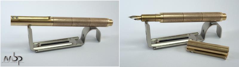
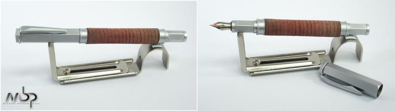
I've used fountain pens for years now but didn't get "the bug" until the beginning of this year when I found this dangerous-for-my-wallet site. I started exploring and lurking heavily and discovered the world of custom pens. I read about the pens Shawn Newton was making, found about his scholarships and all those other factors that made him the right person to attempt to produce the idea I had at the time. There's a few things that I wanted in a pen: One was no clip, my pens always travel in a case and I never clip them or carry them in my pocket. Because the pen didn't have a clip I decided on the flat so the the pen wouldn't roll off the table when resting. The second one was that as a norm I find the traditional cigar shape boring. Don't get me wrong most of my pens have that shape and they're ok but I wanted something completely different to that standard. The third was that I thoroughly enjoyed the matte look of ebonite after I saw a Ken Cavers bamboo pen. The fourth thing I decided was that the pen wouldn't post. I prefer long pens that don't require posting because I've usually found that the balance changes for the worse when posting. So with those specs in mind I started drawing what I wanted in Illlustrator. The first idea I sent Shawn to see if it was even possible was this: http://i112.photobucket.com/albums/n200/Inguz72/PenDiagrams-01.png Shawn seemed amenable to the challenge, he said that he had never done a straight cylinder and he would have to figure out a way to make the flat facet which he had never done before either. He quoted me a price and told me there was time to make revisions to the pen before placing the order. I thought about other materials for the end caps, other colors of acrylic, etc. But the more I looked at it the more I wanted to something even stealthier. So I revised it to this: http://i112.photobucket.com/albums/n200/Inguz72/PenDiagrams-02.png I called it the Shinobi, which is the japanese word for Ninja because it's stealthy but it ends in a bloody surprise. I also elongated the body and the proportions so it would fit well in hand. I placed the order in February but Shawn is highly in demand. By the time my number came up he had received a new metal lathe and this was one of the first pens that came out of that lathe. His communications at this point got very detailed which was awesome because I could see progress and make slight adjustments. His first attempt had a more translucent red acrylic and although it wasn't ideal I was ok with it but then his threads for that one were a bit tight and in fixing them he ruined the cap so he asked me if there was anything I would like different so I chose a more vibrant "ferrari" red acrylic and after a week for the acrylic to arrive he started on a second pen which was almost done but the dremel ate through the pen on the flat. D'oh! Third time was the charm and he let me know the pen was done and sent me photos to show me. So here goes: Pen closed: http://i112.photobucket.com/albums/n200/Inguz72/_MG_2181Closed.jpg This is exactly what I had in mind so obviously I can't complain, it's after all the exact shape and size I asked for when I first designed the pen. The pen came well wrapped in a large USPS box. He included a lovely grey and black wrap his wife made for it that works beautifully with the pen. If you want to see the wrap he has a photo of them here. The bonus was that he sent me one of the destroyed models and his working sheet with dimensions, little sketches, measurements and details. It gave me an idea of the process and made me feel a part of it. The pen is a cylinder with a flat bottom in matte ebonite. It's extremely understated except for the thin red line where the cap meets the body. Very stealthy and smooth. Matte ebonite has a distinct, very organic and warm feel in the hand. New ebonite smells of brimstone and eggs, the smell will dissipate in a couple of week I'm told but phew! The cap takes two and a quarter turns to unscrew, quad threads would have been incredibly difficult in this pen to make the cap and the body match the facet which this one does perfectly. If it wasn't for the red line I have feeling the two parts would blend into each other seamlessly. That's the kind of precision with which he manufactured the pen. So kudos for Shawn for that as well as for the sharpness of the ends and the facet. They're all very precise and all the surfaces on the pen are smooth. The pen uncaps to a vibrant red section. http://i112.photobucket.com/albums/n200/Inguz72/_MG_2238Open.jpg The flat rests on the web between my index and thumb finger and holding it by the section or the threads are both comfortable since the pen is long enough for either. It's a light pen since there are no metal parts except for the nib. Shawn uses the same nib units that Edison, Franklin Christop and others use. This one is vested with a steel nib in fine with the letters "NP" on it. It is perfectly dependable with no skipping or flow issues, it produces a fine smooth western line. I have a few other units including a gold medium from FC and changing the nibs units is very easy so I have multiple grades to choose from now on. Detail of flat and section: http://i112.photobucket.com/albums/n200/Inguz72/_MG_2262Detail.jpg Size comparison: http://i112.photobucket.com/albums/n200/Inguz72/_MG_2275SizeClosed.jpg http://i112.photobucket.com/albums/n200/Inguz72/_MG_2277SizeOpen.jpg From left to right MB149, Lamy 2000, Omas and Shinobi. As you can see it's a very large pen with a hefty circumference. Perfect for my hand. I hope you enjoyed my unorthodox review for an unorthodox pen. If you've ever considered having a custom pen done I recommend Shawn, he was very easy to work with and his craftsmanship is excellent. I would also recommend that you get bold with your designs the worse a pen turner can say is no.
-
Hey everyone, I am thinking of purchasing a custom pen from Shawn Newton. But I am wondering about what the grip section is like? I am uncertain about which varieties in grip I actually like. Any Ideas\experiences with Shawn? Thanks all!
-
Hello, I saw an old post from Brian Gray saying that Edison Pens was hoping to have two 2018 LE Group Buy offers as a result of skipping 2017. Anyone know the status of these, or did I miss them already? I couldnt find anything on Google or FPN (or I just havent figured out the proper way to search on FPN yet-very likely). Thanks!
-
I was photographing pens this afternoon (getting ready to sell a slice of the collection) and took these two photos of my Customs and Capless pens. I like so many older Pilot models, but the Custom may be my favorite. If you squint, you can see I’ve added a black 18K nib to the stealth faceted VP. I am afraid to use that pen because I remember the stealth finish isn’t as tough as that used today. Please pardon the imposter that snuck in among the VPs.

-
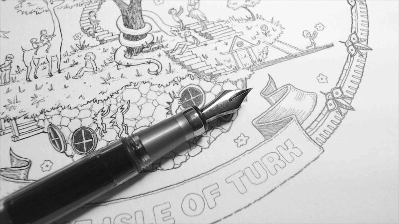
Hey guys! Normally post in the Japan pens forum but I picked up a TWSBI 580ALR from Mark Bacas with a special nib grind and I wanted to share some info about it. First off - the ALR is just like an AL except the cap band has a difference finish(?) and most importantly the grip section is 'ribbed.' The lines on the grip section feel amazing, really good to the touch. I consider it an upgrade from my AL, but you do have to be careful not to get ink in those lines because you would have to clean it out. Mark Bacas is a popular nibmeister. You can see his work at https://www.instagram.com/nibgrinder/ I got the 580ALR with a Blade Turk grind and if I had it to do over again I would send him my nicest pen because it's an amazing grind. The Blade Turk is a mini-architect grind with a gentle curve so you get a controlled gradation of line width from Platinum UEF to Japanese M. It's a really versatile tool. Anyone could just pick it up and write with it, but if you vary the angle up or down you can variation in width. An artist could probably build a whole career around this nib, as the more you use it the more you get to know what it can do and get the line widths you want without even thinking about it. Here's a video demo I made of the pen & nib: And here's an additional photoset: https://imgur.com/fpngallery/eXPLoO9 Mark Bacas deals TWSBI pens so I think you can just order a nib from him already ground to load into your TWSBI. This gives some additional options for nib types normally only found on Japanese pens, for example... or various architect grinds. Anyhow, I really love the pen and I'm considering sending him my King of Pen to work on next. This Blade Turk is just such an interesting and unique grind. I'd recommend it for any artist but also anyone who just wants an interesting fountain pen nib that is still appropriate for every day use.
-
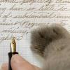
I ordered this pen at a very difficult time. My darling best friend, Sufi – a mongrel my wife rescued from a building site at the turn of the millennium – was dying of a long, debilitating illness. On the eve of what would prove to be her last stay in veterinary hospital, I decided that, already wounded and seething, I would need something to remember her by when the inevitable happened. I’ve previously ordered both from Nakaya directly and from Classic Fountain Pens (CFP) and considering past experience, decided once more to approach John and his troupe in California. Dealing with Nakaya is not necessarily an unpleasant experience, but the culture and language barrier, combined with the inevitable google translate, can cause ambiguity in communication where – for this project especially – I required absolute clarity. CFP did not disappoint: a few days of email to-and-fro-ing led to a series of pictures being sent, and the conclusion of a design aesthetic: “Sufi and Chloe chasing away a crow”, both a poignant (to me) symbol of the immutability of memory, and a literal representation of one of their favorite pass-times. A maximum budget was also proposed (be clear: in the world of custom works, the maximum budget is the final cost). The brief was passed to Nakaya, and a few weeks later a sketch was delivered. It was perfect bar the order of the dogs (Sufi always took the lead; Chloe followed) – a minute on photoshop and the design was approved. By this point, Sufi was gone; euthanised as I held her (so thin, so broken) in my arms, buried in a shady spot beneath a tree. And so the wait began, and with it the process of acceptance that feels so much like forgetting. Almost a year after the process began, I got an email to say the pen had arrived, and within a week, I was opening the box in Tel-Aviv. There is a moment of recalibration with every custom pen that comes the first time the finished article is unpacked and held, the details taken in. Unlike pens mass-produced on a conveyor belt, the end result is a complete unknown. Things that are usually taken for granted (tactility, finish, texture) are question-marks, and over the course of deciding, of tweaking, of ordering, a platonic ideal builds and grows and exists in the commissioner’s mind – the pen that is expected, the pen that is desired. Then, when the actual real physical object is something different – less, or more; different – the break occurs and the new, real relationship begins. With most pens, this reappraisal process is purely physical; here, the primary disappointment was emotional. I unpacked the pen, felt its weight, the perfectly smooth black urushi, the delicately layered maki-e – silver and gold for Sufi, silver for Chloe – the stark simplicity of the design echoing the unadorned curves of the shape . And then I repacked it and put it away. I think I cried a bit too. Sufi I had been giddy with excitement, for somehow, foolishly, I must have believed that having a pen in her likeness would bring Sufi back. But a pen is a pen and my best friend is dead; I was a fool to think otherwise. Chloe A few weeks later, I was able to start again. I was able to appreciate the fine detail of the artist, the flawlessness of the work, the eerie perfect luster of the black urushi gloss. I noticed too the shape of the paw-adorned section (slightly more grooved than the one on decapod, and slightly less comfortable for it), and how the usual irritation of the four-thread cap not lining up was not an issue in this design. I felt how the rhodium plating turned the usually soft and supple 14k gold Platinum nib into a Sailor 21k mimicking nail, and decided the the XF nib was too fine and scratchy for me, even after John Mottishaw’s fettling (it would soon be replaced by a similarly rigid rhodium F). Slowly but surely, I began to use it. First it found its way into my tertiary Sage Brown case and then into my secondary. Now, finally, after six months I feel it has been sufficiently decontaminated of that initial flush of emotional impotence, to the point where it is what it should always have been (and all it could ever have been): a beautiful momento of a passed time and a missed friend; one that happens to also be an exceptionally good pen. Thank you for reading. Following requests, I have conducted a separate comparative review of Nakaya, Romillo and Hakase in order to provide an overview of the daunting task of commissioning a custom pen. If you are interested, it can be found here.
-
Review of ASA Pens ebonite Nauka Purchased from: asapens.in Purchase date: Ordered mid-November, 2017. Arrived January 25, 2018. Cost: $55 USD for Jowo nib unit option (eyedropper and Schmidt units are cheaper), free testing and free shipping by registered mail Clicking on the photos below will take you to full-sized images. The Nauka from ASA Pens is an ebonite pen made to order by L. Subramaniam in Chennai, India. It has an elegant, streamlined shape inspired by the vintage Oldwin Classic from Mora Stylos. The placement of the cap threads right next to the nib permits a clean, uninterrupted "sectionless" line that, combined with the unique warmth and stability of ebonite, feels very comfortable in the hand. The pen is longer than average but not excessively long, and the grip diameter should be good for hands of all sizes. Although the cap can be forced to post, the pen is not intended to be used this way and becomes ungainly. Unposted, it's balanced perfectly, even in my small hands. L to R: Faber-Castell Loom, ASA Pens Nauka, Noodler's Ahab, Wing Sung 698, Platinum Century 3776, Pilot Custom Heritage 912 Size comparison with Pilot Metropolitan Size when writing, compared with Pilot Metropolitan I selected a red and tan rippled ebonite which turned out to be more beautiful than I had expected. As is usual for ebonite in this price range, there are some minor flaws in the material which are noticeable only upon very close inspection and which do not detract from my enjoyment of the pen. Likewise, a few very faint traces of tooling marks serve as an inoffensive reminder of the pen's handmade origins. I chose to forgo a clip, a decision which I feel enhances the clean beauty of the Nauka's lines. I usually grip my pens very close to the nib, so I was concerned that the location of the threads would be uncomfortable. At first, they did feel awkward, but I quickly adjusted to them. The cap threads are prominent and on the sharp side, though not painfully so. I chose the Jowo 3-in-1 option with a fine nib and requested that the pen be tested before shipping. It arrived very well-tuned: smooth but with a pleasant amount of feedback and moderate ink flow. I increased ink flow slightly to suit my personal preference, and the pen now writes perfectly for me. The cap opens in two turns, which produces a good seal without making it a chore to uncap and re-cap the pen. Unlike other ebonite-cap pens in my experience, my Nauka starts up without fail, even if I leave it unused for as long as a week (I have not left it inked but unused for a longer period that that). Inside of the cap Receipt took much longer than originally estimated. However, I did request a color option not listed on the website at the time, which Subramaniam graciously accommodated, and I made it clear that I wasn't in a hurry for the pen. We kept in communication regularly, and had no anxiety about my order. I've been using my Nauka for a little over a month now, and it has been a pleasure to have in my collection. I find myself reaching for it often, and it's one of the pens I always have inked. Excellent, tight barrel threads for secure eyedroppering. View of barrel thickness. The converter option with the 3-in-1 system is great for when I don't want to commit to a large fill of one ink.
-
Currently there are many excellent pens being made in Italy and modern Italian pens have captured my heart. I have been a fan of the beautiful Aurora pens for some time and lately the uniquely special offerings from Scrittura Bolognese have enthused me even more. I have a few Leonardos and even two (!) of the very first Radius 1934 pens. I have been delighted with them all because of their beauty, the quality of the nibs and overall manufacture, and most of all the pleasure of writing with them. I didn’t have a Montegrappa, however. Today I set that right and it is truly extraordinary and, I hope, worth sharing here. I am not personally enamoured of sterling silver - the feel and weight of it or the tarnishing - and I hesitated for a long time over the brand, even though the celluloids are very beautiful and the styles of the Extra 1930 and Extra Otto appeal to me very much. And of course the prices for these pens are extremely high, so you have to be sure the pen is for you. Finally I gave in to the temptation, but I ordered a custom design through their website in the Extra Otto model but with gold-plating and a celluloid section. It cost a little more but in my mind the changes to the pen would be more than worth it to me. It is an expensive pen anyway, so to pay a little more to have it exactly the way I prefer made sense rather than paying so much for a pen that may be great but with a few reservations. I chose the zebra celluloid for my pen, which is my favourite of their materials - although I also find the butterfly, lapis, and shiny lines celluloids very compelling too. The custom configurator offered fewer options for the Extra Otto than for the Extra 1930, but the zebra celluloid was available for all parts of the pen and it looked like it would work nicely with gold-coloured trim. Exactly ten days after I submitted the order (which was the quoted production time) I received an email saying that the pen was made and had shipped. The shipping box is marked “handle with love” and the pen arrived in the Extra Otto wooden presentation box along with a nice letter from the CEO telling of his early experience receiving a one-off customised pen as a gift from his father. Montegrappa also supplied a gift, for which I selected a pair of onyx cufflinks. It all made for a nice and special experience to receive this pen. I normally do not care for such fanfare or presentation boxes, but in this case it felt really nice. After such a preamble you want to see the pen, I assume... I chose an extra-fine nib. The pen writes absolutely wonderfully out of the box. It is a true extra-fine line and nicely smooth with just the right touch of feedback to make it feel good in writing. It writes really effortlessly, with good ink flow. You know how sometimes you see the way a really well-tuned fountain pen can put down ink and you are reminded why you love them so much? It is like that. The build quality appears to be perfect. The pen design and materials in real life are stunning to my eye and they surpass even my high hopes for this pen. The celluloid feels great - seriously high quality and unquestionably a premium material. Just as importantly the size of the pen, section width, weight and balance all absolutely match my preferences and it is superbly comfortable, natural and a true joy in-hand. It feels weighty and solid enough to feel special, but is still light enough to be nimble and effortless to control. Opting for a metal section would have front-weighted the pen and given a slightly different balance - but I like it very much the way it is and the slight back-weighting from the piston mechanism makes it rest on my hand very solidly as I write, and the pen is not long. I would not want to swap the feel of the celluloid section for metal and I think my choice was right for me. It is only my first day with the pen, of course, but everything augurs well so far. I am so, so pleased with this pen. I think it may be the most beautiful pen I have and the fact that everything about it also fits my hand so well and it writes so wonderfully is not only a great relief but even a pleasant surprise. Even acknowledging the price I would definitely consider a custom Montegrappa again some day. As Sir Henry Royce famously said, “the quality will remain long after the price is forgotten”.
-

Would Guider Make Pens If You Sent Them Your Nibs?
HartGummi posted a topic in India & Subcontinent (Asia)
I was thinking of buyiing several nibs and housings straight from Kanwrite. Their range of nibs has convinced me that they are the best option for me given my budget. This still leaves me with pens in which these could be fitted. Kanwrite's pens don't interest me as much as their nibs do. I previously bought a Guider and was satisfied by it. It made me wonder if Guider is willing to make their standard models but for nibs sent by the customer. Has any poster tried doing this? -
Who would you recommend for nib customization ? Required would be stacking gold nibs, gridding and retipping them ?
-
The pen arrived with a dried out cartridge that first signaled bad news. I waited for 2 months for this pen from Japan, and it won't write. I have soaked it for 3 evenings and run it under warm water. It's soaking as I write this now. When water is in the section, it will drain out through the nib. A fresh cartridge or a converter doesn't allow the ink to flow past a few scribbles. If this were a cheaper pen, I'd attempt to open it up, but I'm not well versed in repair and this was over $100 to acquire. Can someone make a recommendation as to who might be able to solve this issue? I'm in the NYC area but I don't mind shipping it.
-

Hello From Minneapolis, And Looking For Some Feedback/advice
benham31 posted a topic in Introductions
Hello! My name is Michael Benham and recent member to FPN. Since high school, through college and all these years past, I’ve always liked and carried nice pencils and pens. Now almost exclusively I prefer to carry and have fountain pens. In these latter few years, I’ve ramped up my collection of pens, mostly mid to low-end caliber pens, my most expensive being a Cross Century II gun metal/gold. In this time I came across a couple handmade pens on Etsy that I liked because of the nice wood and acrylic barrels. I then discovered that these were kit pens, Vertex pen kits from Penn State to be exact. I thought, because of my creative juices associated with being a graphic designer/photographer who is the son of an engineer, that I could make my own pens. To be quite honest, I didn’t, and still don’t, have the finances to commit to buying my own lathe, and even more so, don’t have the time and patience to commit to turning my own barrels and caps for these kits. I was not deterred though, and thought that there’s got to be some ready-made or easily customized materials out there that I could fashion my own pen barrels for these kits. So I bought a few of the kits that required only a barrel (Vertex, Presimo, and Raw) and went down to the local Ace hardware store and basically walked around looking for anything that I thought would work and look cool as a pen. I’ve now broaden my search to Amazon and various tubes, pipes, straws, etc. I believe I now have around 30+ unique pens made and have managed to even expand into pens that need cap material. Although, I’m not entirely sold on them yet. So basically, in a quite long-winded way, my post is in search of feedback of whether these pens would be of interest to buyers, general consumer to even fountain pen connoisseurs? If so, what would a fair price would possibly be? And furthermore, any advice, experience into how best to sell and get these out to potential consumers? Bearing in mind that this is completely something that would be on the side, and not a main source of income, on top of being a new father to twins! Thank you in advance for any help, thoughts, you may offer. Peace, Michael - Minneapolis, MN
-
I'm just curious about what your favourite Edison pen is or what it would be if you had one. From all those materials and pens. I would have a Huron in Slate Lemon/Lime(Sadly, I am still a high school student, so I am saving up for university). I think that Slate Lemon/Lime is one of my favourite materials I've ever seen. Although, I have never seen a PEN made from it, just the samples. Also, if you have pictures of what it is even better and feel free to share.
-
Hi all. With reluctance I make this post about a little conundrum I have, as I do not wish to sound negative or to affect the good business of genuine makers. This is a personal experience and I would like some advice or thoughts on what best to do. I've been after a pen to use my two Bock 8 nibs, and when the last premium-acrylic group buy by Ranga came up, I was sold on it and made a purchace. I've bought a Ranga Model 5 clipless in premium acrylic from the latest group buy. It took a bit longer than others but it arrived in the end. I asked for a Bock 8 section and a Jowo 6 section so that I can also use my many other Jowo 6 nibs on it. The pen arrived eventually and is beautiful and good in the hand. I've had a couple particular issues on it. A. The Bock 8 threads slip on the last turn. Instead of holding the nib firm, they slip and make an extra turn, and so on. This makes me worry about ink seal if nothing else, or worried to actually lose the threads after a while. B. The included Schmidt converters are IMPOSSIBLE to push in and pull out. And this worries me this would either crack the acrylic eventually, or crack the cartridge/converters. Some of the corners of the inner round edge slightly cracked already (not cracked, more like pieces from the edge fell off, but this an indication of what is possible.) One result of the combination of the above two issues is that the Bock 8 can actually only be used in eyedropper mode as it does not seem to engage the converter well. The nib only seems to take ink "spilled" into the section. I've taken a video of it and showed it to Ranga, hoping for a solution or an easy suggestion. Maybe there is somehting I could do. Maybe they are all just like that, it was my first Ranga after all. They agree they are extra tight. The first suggestion they made was unreasonable. They said they would refund the price of the extra section. That would mean I bought a pen which is only reliable with Jowo6 nibs, which isn't what I spent my money for. Their second suggestion (also something which I suggested sadly) was to send it back and get a full refund. Now to give them credit, that is great professional customer care. But I worry what would happen in the future. If I send the pen back, this first Ranga would be my last Ranga ever. It would just be awkward to order another one of the same model afterwards to see if the threads and converter cylinders are good the next time around. Let alone I'd have lost the group-buy price point. The above exchange with them was last month because after that I travelled and was away and busy for so long. Today, I got an answer from a YouTuber who just reviewed one of these pens. They say their pen has good converter fit, not an extra tight one. Now I feel awkward and don't know what to do. All in all, I like the pen if it didn't have these two (important) issues. I'd have just kept it if it didn't have the issues. Do I keep the pen with issues because it is a one-off anyway and has nice acrylic (and only use it with Jowo 6 nibs)? Do I send it back now and lose it (if they still agree to take it back) and order another one, maybe from a different maker of pens that accommodate Bock 8's? Has anybody been in a situation like this? What is the best course of action. I know the answer is personal and will rest with me in the end, but some hive mind will help me get my head straight. Thanks for reading. Best regards
-
hello my fellow FP lovers, I am not sure if this topic has been posted earlier, but my question is if its possible to get a custom Pelikan M1000 body be made or if anyone has tried this experiment, or if there is someone out there who makes custom Pelikan m1000 bodies. I know it sounds adventurous to pursue such an endeavour but I can't seem to get this idea out of my mind. Currently own Pelikan M1000 Broad nib Pelikan m400 Tortoise Shell white Pelikan 140 Medium Thanks for reading Fez
-
Greeting to everyone. This is my first post since taking up the hobby of collecting and using fountain pens. Recently, I acquired a pen at a local pen club meeting from an attendee and am unable to put it into use. Then pen in question is a Pilot 912 Custom Heritage. It has an “SF” nib. I have tried several inks and am getting the same result every time. Upon filling the pen, it works excellent until about 10-15 words are written, then goes dry and dies at the first letters in words sometimes continuing a few letters then back to dry. Using more pressure I get “railroad lines” and more ink low issues. Today while cleaning after trying another type of ink, I pulled very softly on the nib and the nib and feed Slid out. I have no idea how the feeder piece should be aligned to the part with two visible “teeth”. Something I do notice is that it takes very little pressure to put the nib and feed piece back in. Also it seams it is so loose it may rotate when writing. Inks I have tested in the 912 include: Herbin Pearl noire, Diamine Syrah, Namiki Blue, and a few others. I just bought a new Pilot 743 and it is on the way. I really hope it is without issues. Any ideas would be greatly appreciated!!!
-
Or not ~~ interesting, like beauty, is in the eye of the beholder. This custom "51" features the following: Four “quick change” threaded cap top jewels: 1) a Solid Gold Crown – ideal to have on the pen in your pocket when going to see the dentist – this one is also of course known as the Crown Jewel; 2) .45 solid lead – ideal for high caliber meetings; 3) 9mm Brass Jacket suitable for lower caliber meetings or casual writing; 4) 146/9 Mont Blanc White Star - ideal for highly pretentious meetings with status conscious individuals or groups… etc. The stainless steel cap has been bead blasted and strongly resembles titanium. The war time Vermeil Blue Diamond clip is bent in such a fashion that it would hard if not impossible to duplicate – it is definitely crooked… but, I have not ever found it to be dishonest in any respect. The hood or shell is dark blue and the barrel is black – reminiscent of two-tone cars in the ‘50s & 60’s. The filling unit and blind cap are oversized slightly. The longer than standard ink pump rod is brass and is housed in one excellent red anodized bushing. The added vacuum pressure sort of supercharges the filling system. The end of the rod contains a silver disc with the Parker Halo encased in translucent red plastic from the Parker Model Shop – the same exact red plastic used to make the Parker T-1 red jewels – it took way too long to make but that’s just hindsight. The nib is an 18k 61 nib which was made in the UK. Don’t know the reason why but 51 and 61 nibs made in the UK are just better writers and smoother than those made in the US – just a fact. Like it – Love it – or Hate it – you’ve got to at least agree it’s interesting…? Life’s too short to always take Pens too seriously. ralph prather
-
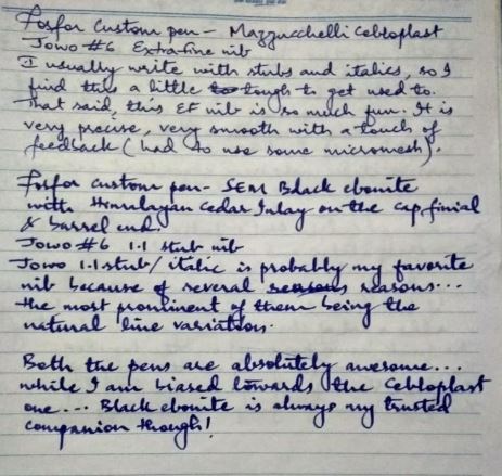
Hello FPNers, I just received my pens from Fosfor Pens. Wanted to share my first impressions with all of you! This review will not have any ratings. All I can tell you is, I simply love these pieces of art and highly recommend Fosfor Pens... Pen #1: - Parker Duofold style flat top pen with roller clip - Material : Vintage Mazzucchelli Cebloplast - Length : 138 mm capped, 128 mm uncapped, about 170 mm posted - Width : 13.6 mm at the barrel-cap threads - Nib : Jowo steel, Extra Fine The pen is beautiful, just magnificent. You can keep staring at the material, the depth is so amazing. Pictures taken by Manoj- Well, this pen, in a matter of seconds, became one of my favorites. Manoj has cut very smooth triple start threads and the cap takes just 2 turns to disengage from the barrel. It's polished so well. I asked him for a Jowo Steel EF nib and it had feedback, not scratchy, but just feedback. I smoothed it out and it is a joy to write with. It's wet and smooth, but puts down a precise line on the paper. It's a cartridge/converter filling system, but can be used as an eyedropper too. I am not used to writing with Extra Fine and Fine nibs, so I find it a bit difficult to get used to. Pen #2: - Parker Duofold style flat top pen with roller clip - Material : SEM Black Ebonite with Himalayan Cedar inlays on the cap and barrel ends. - Length : 138 mm capped, 128 mm uncapped, about 170 mm posted - Width : 13.6 mm at the barrel-cap threads - Nib : Jowo steel, 1.1 Stub (my all-time favorite) Many may brush aside this beauty thinking this is just another boring black pen...but hold on! There is something interesting, the cap finial and the barrel end have Himalayan Cedar inlaid to them. And the wood looks beautiful, it's a very good contrast. I contemplated about the inlay work, looked at some plastics with interesting patterns, but nothing enticed me more than the organic feel of the wood. But picking the type of wood to use was a challenge, because we have a very small surface area to show the grain. Manoj suggested that we use Himalayan Cedar which has good grain, some yellows, browns, pinks and reds. I am glad to have followed his suggestion. The pen is very beautiful. This has the same triple start threads like the other one has, but the threads don't feel as smooth, may be because it's ebonite. I just put some silicone grease and it helped a bit. Filling system is the same as on the other pen. Pictures taken by Manoj- This pen has my favorite Jowo steel 1.1 Stub nib. Its a great nib, smoothing it a little bit only helped. Usually the 1.1s have a scratchy diagonal upstroke (at least my experience with many of them). So I used some micromesh and it now writes like a dream. Writing Sample: My thanks to Manoj...he is an awesome penmaker, and his patience is remarkable. A lot of care has been taken while polishing, attention to detail is excellent. All my requests to him till now take numerous phone calls and emails, but he has been very patient and is always open to suggestions and challenges. If I could change something, it would be to increase the length of the cap and barrel by a couple of mm, in all make it about 145 mm. Hanging around together- Will post a review of another pen soon. Thanks for reading! Regards, Raghuram.
-
What do you do with shimmer inks that you don't like? Try to make them into shimmer inks that you do like... I was aiming for a grey here, but I got a black instead. It's still nice. I haven't noticed anything funky settling on the bottom of my mixing jar in 24 hours, with the exception, obviously, of glitter particles. 2 parts Pelikan Edelstein Sapphire 1 part Diamine Golden Oasis 1 part Pelikan 4001 Brilliant Red 1 part Caran d'Ache Cosmic Black I'm fairly sure you could replace any of these colours with a generic enough royal blue, bright orangy-red, and black ink and get very similar results to this. The green has to be Diamine for the gold particles, though. Sparkle shows up just fine, most noticably on absorbant papers like Leuchtturm and Oxford. Does well on Clairefontaine. Looks very sparse on Tomoe River. Tested with a FPR Himalaya ultra flex nib (very wet writer). Images follow: Leuchtturm 1917: Tomoe River (the heavier one. 62gsm?): Left: Clairefontaine Triomphe 90gsm Right: Oxford Optik 90gsm Oxford Optik shimmer: Clairefontaine shimmer:
-

Flex Journey - Pilot Custom 743, Fa Nib With Flexiblenibs Feed
MichalK posted a topic in Fountain & Dip Pens - First Stop
Well, I did not know where to put it - nibs&tines, pen reviews or else So this seems a good forum. I pursue flex almost from the beginning of my fountain pen journey. I was fortunate enough not starting with modern flexes, but with a vintage one. I fancied a vintage pen, and bought one just because it was cheap, looked nice and I knew the brand. Parker Slimfold - in terms of size it was a disappointment (i didn check its size or asked the seller), - but the nib was fantastic. Right away i fell in love with "flex". Bought another vintage (Wyvern) - also great. Then started looking at moder ones - Conklin Omniflex, Ahab etc but nothing compared. Alter some time I learnt more, bought and used much more pens. Realised that flex is quite a wide idea. soft, semi, regular, wet noodle, modern, vintage. Waterman 52 flex vs vintage MB 146 flex vs flexible Pelikan nibs in 140, 400 etc. Soft nibs in M1000 vs japanise SF nibs. Pilot Custom 743 with FA nib is another part of this journey. I got to know and like Japanese nibs only recently. I knew about Pilot Falcon but did not like it, then "discovered" 912, 823, 742, 743 etc. And definitely wanted one with FA nib. So I ordered one. Pilot Custom 743 to be exact. In Europe they are not sold at all, so for the first time I took a risk and ordered from Japan. The price was incredible, good seller, but he sent it with the economy not expedited as I ordered, but any way 10 days later it was home I did not pay any duty or taxes (typically for import from Japan its est 28% total, but not this time - customs missed it?) . Pen is very nice, very well built but nothing especially interesting - just another cigar shaped, black rather large pen with gold trim. And 14k gold nib, in an unusual shape - with cutouts. It is not a vintage full flex but is much better in this area than any of modern so-called flex nibs I had a chance to try. I'm not a calligrapher, I'm still working on my handwriting. But I can appreciate a good nib. With a light touch, it puts a thin line, Japanese fine, and is smooth. but even slightly pressed it goes medium, broad and double broad quite easily, but at the same time, it becomes scratchy. I'm not sure it should work like that. The only problem I had was railroading then I flexed it too much or for too long, or was writing too fast. I investigated and wound aftermarket feed at flexiblenibs.com - 4 versions to be exact for my pen !!! Actually also for 823 and probably 845 pens too. Japanese ebonite, CNC cut, two colors (black and red) and two versions (2 slits, and 3 slits one for wet inks or not to aggressive flexing, the second one for dry inks and heavy pressing. I ordered both versions in black and several days later herre they are. Fixed the problem like a dream. The feeds are PERFECT. They are super high quality, shapes matches the original with 0,2mm precision. I really recomend one for any FA nib user on 743/823 (#15 nib) pen. Pictures and writing samples below. http://gakko.pl/wp-content/uploads/2019/03/MG_3583.jpghttp://gakko.pl/wp-content/uploads/2019/03/MG_3584.jpg http://gakko.pl/wp-content/uploads/2019/03/MG_3585.jpg http://gakko.pl/wp-content/uploads/2019/03/MG_3586.jpg http://gakko.pl/wp-content/uploads/2019/03/MG_3590.jpg -
For a dying industry, there sure are a lot of people making pens. Yes, they heyday is long gone (and there are nowhere near as many makers nor nearly the same scale of production), but there are still people out there with passion making pens that fill in a few niches. These are craftspeople or fountain pen lovers who take their creative energy and channel it into something unique. While I enjoy my Montblancs, Pelikans, Pilots, Viscontis, and others, I am drawn to those makers who produce only a small amount of pens, often by hand. What I get is sometimes technically perfect, but more often feels like it was crafted instead of injection molded or stamped by some massive machine that could take away my arm without missing a beat. Sometimes it is one man (or woman), and one pen at a time. Sometimes it is a small shop of artisans, but always it is something special and unique that is the result. In this thread I am going to post little write ups and photos of the various pens I have picked up over the years that were made by the good folks in Europe. (I also plan on doing the same thing for the Americas and Asia.) My collection cannot ever be exhaustive, but I hope it is a good place to start a discussion and raise awareness of some hard working folks. Many of the pens may not be for sale or may be one-of-a-kind, but once you are aware of them you can find something similar or maybe even my pens eventually. I will add my various pens as I have time to do the write-ups and photos. I welcome comments from others about the pens. I am happy to answer most questions, though not on specific prices. (I bought many of these second hand so what I paid might not be a good representation of the current cost/market value.) I also encourage you to add any of your own pens from the same makers or others doing similar work. Let’s make this a showcase for craftspeople. (I’d prefer not to include kit pens please!) Happy reading and writing.
-
"Stub" nibs seem always (**) to be ground flat not only on the bottom and end, making the angle that contacts the paper and gives directional line variation, but also on the top which never (*) contacts paper. When customizing an ordinary ball-tipped nib to make a stub, why go through the extra step of grinding off the top? I know it is not necessary for writing to flatten the top/back of a round nib, nor of a CI: I have a cursive-italic nib, customized from a broad, that is an EF for writing upside-down, rather the opposite of flat. Yes, I know that a "stub" and a "cursive italic" are distinguished categories. If the distinction is relevant to my question, please elaborate on how. Otherwise not. And I also know that the "angle" I referred to above is eased or rounded on a stub nib. If that is relevant to my question, please elaborate on how. Otherwise not. I would rather not hear a bunch of guesswork answers. Those I can make up for myself. Please wait for someone who actually knows. Would it not be both less work to leave the backside of a stub round, and slightly beneficial in providing a (vey slight) extra bit of ink buffering very near the point of delivery? Why is it done? Thanks. (*) "never" in its regular use a a stub nib. The possibilities for using the reverse of a nib are interesting. That's a different set of questions I am not asking now. I just want to know why stubs have those possibilities ground off. (**) "seem always" because every stub nib I have examined, and every close-up photo of a stub nib I have seen, and the instructions I have read for grinding a stub, all show this feature. But I have not done a survey. If there are some stubs that do not have the back ground off, please show a picture. In any case my question remains for those that are ground off: Why? Thank you!