Search the Community
Showing results for tags 'shimmer'.
-
BOY, oh boy, this was quite the journey to figure out! I tested so many variants of devices and lost so much ink in the process. But in the end, it was worth it (at least, I think so)! Let me share why I went on this journey. I love all inks, including shimmer inks. However, sometimes I prefer the base ink without the shimmer, but the equivalent non-shimmer version isn't available from the same company. Some inks are limited editions and only come in shimmer form. As we all know, shimmer inks are beautiful but a double-edged sword—they look amazing but are a pain to clean and are usually best suited for specific pens unless you dedicate one pen to shimmer ink. So, I embarked on a journey to remove the shimmer. My first experiment involved using lab-grade filter paper, specifically Ahlstrom Qualitative Filter Paper Fast 11cm. This resulted in a lot of ink loss because the paper needed to absorb the ink to a critical point before it could start dripping when oversaturated. Initially, I thought this worked, but after leaving it for 20 minutes, the sample still had some shimmer in it. As a good scientist, I retried the method twice more before declaring it a failure. I tried using up to 10 layers of paper, but the result was the same—lots of ink loss without fully removing the shimmer. Next, I tried using an ultra-fine sieve to catch the shimmer particles, but that didn't work either. Then, I attempted vacuum filtration, hoping the mica particles would crystallize on top. While some did, others still sneaked through. I even tried densely packing the filter paper into a large syringe to use as a more contained filter, but that didn't work. Frustrated, I was about to use a centrifuge. In theory, this worked, but the mica powder shimmer is easily disturbed. If you try this method, make sure to have the steadiest hands for syringe decanting. I don't have steady hands, so this was a fail for me. Finally, I found a solution by going through my old lab notes. I used syringe filters with a 0.22μm pore size (thankfully, Amazon makes these easy to find). Using a PTFE Syringe Filter, I was able to slowly filter out the shimmer. I rigged the syringe with weights and rubber bands to keep the plunger down so it could filter slowly overnight, even while I was at work. I'm pleased to present a shimmer-free version of J. Herbin Cornaline d'Egypte not in j herbin bottle as my little jerry rigged stand fits over a pelikan much better. I'll share a writing sample once all the ink is shimmer-free, so stay tuned! Thanks for reading, and happy inky thoughts!

-
So lately I have been trying my hand at adding mica to ink. So far it’s not quite as obvious as factory shimmering ink, or ink altered with commercial ink specific shimmer additives, but I was having a hard time finding any actual measurements. I was also going for tone on tone, as opposites to just siver and gold. I did put some gold in one, to see what shows up. I tried photographing my writing samples, but the lighting was pants and maybe the paper I was using didn’t show the shimmer as much as the cards do.
-
This ink caught my eye. The link only took me to the opening page on Pinterest, not the person who posted it. I would so like to know the name & manufacturer of this ink. Is it familiar to anyone? Many thanks in advance!
-
desaturated.thumb.gif.5cb70ef1e977aa313d11eea3616aba7d.gif)
Sailor Shikiori Tsukuyo No Minamo ‘Shimoyo’ pen's cap
A Smug Dill posted a gallery image in FPN Image Albums
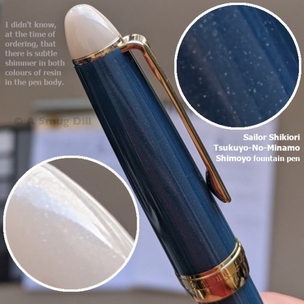
From the album: Japanese pens
A Sailor Procolor 500 model fountain pen by any other name; and, as is usual for that model, available only with steel F nib — albeit with gold-coloured ion-plating on this one — and no other nib option.© A Smug Dill
- 0 B
- x
-

Deatramentis Pearlescent Inks - Brilliant Violet
DrDebG posted a topic in Th-INKing Outside the Bottle
Dr. J. has developed a new line of pearlescent inks. I received samples of Brilliant Violet with each of the four "sparkly-effects": bronze, copper, gold and silver. DeAtramentis Brilliant Violet, dip pen, Clairfontaine paper Photos taken with iPhone For this "mini-review" of these 4 samples, I have used a Venetian dip pen and a Chinese M&G fountain pen with medium fude nib. The fude nib allows for thick or thin lines depending upon the angle of which the pen is held. The papers I used included Clairfontaine, Tomoe River and Cambridge spiral bound notebook paper. Overall, the ink flow was excellent. The ink itself is a highly saturated color with some water resistance. There was very little feathering on the inexpensive notebook paper, but the ink bleeds through on the notebook paper and the Clairfontaine paper, and even the Tomoe River paper when used heavily. For me, however, this would not be a problem, since I would likely only be using this ink for special occasions and would not write on the back of the page anyway. The ink did need to be agitated frequently to see the full effect of the sparkles. All of the four "sparkle-effects" were quite nice. The most pronounced effect came from the Gold sparkles, which I used for the rest of this review. Drops on standard paper towel DeAtramentis Brilliant Violet Gold, Chinese M&G with fude nib, Tomoe River cream paper DeAtramentis Brilliant Violet Gold, Chinese M&G with fude nib, Tomoe River cream paper I left the ink, undisturbed, in the pen for a couple of days, then began to write. The Chinese M&G pen does have a history of starting hard when not used regularly. But the ink flowed immediately from the nib. There was also no sign of clogging or "nib crud". The ink does require agitation to re-suspend the sparkly particles, however. DeAtramentis Brilliant Violet, Gold, Cyan Blue Silver and India Blue Copper ink, Cambridge spiral bound notebook paper I love the color of the ink with the copper sparkles, but all of the sparkles compliment the ink very nicely. And as a wonderful bonus, cleaning the sparkly ink from my pen was fairly easy - as easy as an highly saturated ink. This ink is made by DeAtramentis, and is worthy of that illustrious name. -
I'm not one to enjoy Red ink and I have passed along barely used bottles of Red Dragon and Momoji, but this ink has become one of my favorites despite the fact it is a more troublesome ink. The base color and tone is lovely and is perhaps a dark burgundy? possibly has brown sheen? It has gold shimmer particles which flow well in Broad/Stub nibs. I had left my Pelikan OB sitting and forgot to shake it before use, the result was a lot of shimmer and poor ink flow. With that being said, I capped shook it a little, and it wrote out perfectly. One thing I will note is that when you're down to the last 10% of the ink, more problems arise w/ startup. I find it easier to just refill or clean if changing to a new ink. Otherwise a shake before uncapping and I don't have any issues. The other two pens are a stub nib and a flex nib; I have tried it in a medium nib and it wrote well w/out clogging but I don't enjoy the ink's qualities enough. The Gold shimmer is lovely; I have it in 3 pens now and am using all three regularly on a daily basis with no issues. That being said, I would probably use it even if there were no shimmer. The ink does take a long time to dry (80seconds) and I have found some spots can still smear. There is a slight degree of water resistance but as it's prone to smearing I wouldn't count on it. There's no feathering that I've noticed on Rhodia or Tomoe River and no significant ghosting to where I'm happy to use both sides. The bottle is cute w/ a hologram (it's neat when you have to shake it before filling). Unfortunately, it's a square shape and only 30cc so I suspect you'll need an ink miser or syringe fill after half the bottle is finished. All in all, an impractical ink that's just beautiful and fun to use. The above was written on Tomoe River (old). Sadly, I'm out of copy paper/laser paper; I'll add a picture of that when I can. I don't recall a significant feathering or spread.
-
Robert Oster's Fizzy Lime vs. Diamine's Neon Lime:
-
Hello Fellow FPNers - I'm in love with J. Herbin Emerald of Chivor, not only for its gorgeous teal color but for its shimmering qualities, its saturated color and its wetness. Can anyone recommend another ink that has all these qualities but is a blue ink, rather than teal? Must be saturated, not milky or muted.
-
I am thinking about using lubricating ink on a 14k M nib 1911s model and Diamine inks is in my budget. What's your opinion? What about the shimmering inks Diamine offers?
-
Has anyone tried any of the 芸景堂 (yún jǐng táng) inks, especially those from Season Seven, which seem to be in the vein of the lighter, multi-hued colours in the Sailor Ink Studio line? Source: AliExpress At nominally US$8.80 per 30ml bottle, I think they're priced competitively against Sailor Ink Studio and Sailor Manyo inks, assuming that they are as good and/or interesting as the Japanese inks. However, shipping charges for bottle of ink (and often customs issues with exporting liquids through the post from China) and border taxes lift the effective averaged cost of acquisition to over US$13 a bottle if I were to order all three of the above at once, and still have to keep my fingers crossed that they get past Chinese Customs and get delivered here intact and without incident, so I'm not as gung-ho about just spending money on them as I usually would be. There's also this seemingly colour-shifting shimmer ink: Source: AliExpress but my confidence level is quite low in shimmer inks from China having consistently small particle size to not cause clogging in my (typically Fine-nibbed) fountain pens.
-
Hello, I've always been careful with my 61, putting some tame blue or black into it while my other pens enjoy my 'fancier' inks. It's kind of a shame since my 61's nib is really smooth and wet, and I'd love to put a high-sheen Noodler's ink or the rest of my Emerald of Chivor in there, but I was always leery of the capillary filler's sensitivity, especially with pigment or gold particulates. Has anyone had the bravery to put a nastier ink in their capillary 61's, and what has been the success rate of such an endeavor? Regards!
-
Jacques Herbin - Vert Atlantide, The 350Th Anniversary Shimmer Ink
Intensity posted a topic in Inky Thoughts
Jacques Herbin Vert Atlantide / Atlantis Green Continuing on from this discussion on voting for the new 350th anniversary J. Herbin annivarsary here: https://www.fountainpennetwork.com/forum/topic/352545-vote-on-the-new-jacques-herbin-glitter-colour/ I'm compiling some of the few available writing and drawing samples made with this upcoming ink. This will be a limited edition ink. The color appears to be a dark grayed green with both gold and silver shimmer. Looks like on Instagram, you can search for #vertatlantide https://www.instagram.com/explore/tags/vertatlantide/ There are a few posts showing actual writing and drawing samples made with this ink. Here's Nick Stewart's page for this ink: https://nickstewart.ink/2020/07/03/j-herbin-350th-anniversary-ink-vert-atlantide/ On Twitter: https://twitter.com/floatingcat_day/status/1268074480191934464?s=20 Please add what you find! -
What is a must have shimmer ink in your opinion that has the most color variation, character and safe
-
A new calligraphy ink by Manuscript with extreme shimmer. Definitely not something to use in the office but it looked interesting to write some cards with in the upcoming holiday season. This ink is clearly not meant for long notes or letters. A very dark violet or purple with heavy gold shimmer. I find it a hard to use ink. OK to use in a fountain pen like the TWSBI ECO with a stub nib, but a dip pen made the ink feather and spread, even on Clairefontaine or Crown Mill Vellum paper. On Lalo Vergé it was much better. The ink is very wet, causing considerable show-through and even some bleed-through. The drying time wasn't too bad though with 35 seconds. The shimmer smears easily for a bit longer. As can be seen even on this scan, shimmer is gold and very high. A bit of water will keep the ink readable, enough to rewrite. The violet or purple is comparable to Herbin's Améthyste de l'Oural. Diamine's Imperial Purple (no shimmer) is brighter and lighter. All in all this is a nice ink to have and it will have its use for greeting, holidays, or birthday cards.
-
What do you do with shimmer inks that you don't like? Try to make them into shimmer inks that you do like... I was aiming for a grey here, but I got a black instead. It's still nice. I haven't noticed anything funky settling on the bottom of my mixing jar in 24 hours, with the exception, obviously, of glitter particles. 2 parts Pelikan Edelstein Sapphire 1 part Diamine Golden Oasis 1 part Pelikan 4001 Brilliant Red 1 part Caran d'Ache Cosmic Black I'm fairly sure you could replace any of these colours with a generic enough royal blue, bright orangy-red, and black ink and get very similar results to this. The green has to be Diamine for the gold particles, though. Sparkle shows up just fine, most noticably on absorbant papers like Leuchtturm and Oxford. Does well on Clairefontaine. Looks very sparse on Tomoe River. Tested with a FPR Himalaya ultra flex nib (very wet writer). Images follow: Leuchtturm 1917: Tomoe River (the heavier one. 62gsm?): Left: Clairefontaine Triomphe 90gsm Right: Oxford Optik 90gsm Oxford Optik shimmer: Clairefontaine shimmer:
-
I was debating where to put this because it's a lot of pictures but not really a review. But anyway, the spouse procured a bottle of Diamine Golden Oasis, a shimmer ink. This is not really my shade of green and shimmer inks are also not my jam, but I did some writing on different papers to test it out in my FPR Himalaya ultra flex pen and thought I'd share it here. As stated in the written part, I shook the bottle gently before inking the pen, and I agitated the pen by gently rolling my wrist about every two lines for all of its. I get the feeling the gold particles settle in this ink particularly fast so if you're not vigorous about agitating them, you can reduce the glitter and see more of the green. And also probably clog your pen up a bit more, haha. Card stock, 100 bristol I think: Oxford Optik: Leuchtturm 1917, but it's an old model book with the rougher pages:
-
I own a bunch of bril, camlin and penhouse inks, but they only come in the standard colours. Are there any indian made FP inks which are different, shimmer or non shimmer, other than the Krishna inks? Diamine costs a bomb here. An issue I have with the inks I own are that they are not saturated enough, especially the bril ones. Recommendations for good solid color are also welcome.
-
Hi, I am in love with the Robert Oster signature inks and I want to them. I live in India. Where can I get Robert Oster inks in India?
-
-
-
-
First Impressions. We have already seen the colours but here is one of my 'first impression' reviews, including written examples. As usual, all of my written tests have been done using a Sailor Sapporo pen with B nib, so roughly equivalent to a Western M, and the standard Rhodia 80gsm white grid paper. I chose the Sailor for the simple reason that the pen is very easy to clean out, even taking the nib apart should it become necessary. It wasn't! Although I used a rubber bulb to speed up the flushing process between colours (just for time's sake) all the inks were easy to remove from the pen by simply using the converter for a relatively short period of time. Firstly I used cotton wool buds to give an example of just the colours. I let the bottles stand for a while and hopefully didn't have as many particles in those samples. Obviously, the bottles need to be agitated before filling a pen and to keep the suspension 'going' a gentle shake while writing is recommended. Firstly I sampled the inks with the gold particles: Firefly, Wine Divine, Cobalt Jazz and Golden Ivy. They are a very pleasant set of colours and I’m sure they will be very popular. Although hues like Firefly are not generally in my list of favourites, I’m actually quite ‘warming’ to this ink! Next, here come the written samples. I’m impressed with the whole of the ‘golden’ range and will definitely be buying Cobalt Jazz and Golden Ivy. Now, the inks with the silver particles: Citrus Ice, Electric Pink, Frosted Orchid, Arabian Nights, Arctic Blue and Spearmint Diva. I like almost all of these as well. Citrus Ice could be a little pale for some; Electric Pink just isn’t my colour(!) and Spearmint Diva is also a little pale. The colours are good though. And the written samples. Again, I’m impressed with most of the range and will be getting Arctic Blue. To sum up, this is another range that will contain favourites for many of you. Likewise, some that people will not like, but that’s the nature of the ink business. AND - it's 14th October in Helsinki!
-
Dr. J. has developed a new line of pearlescent inks. I received samples of India Blue* with each of the four "sparkly-effects": bronze, copper, gold and silver. DeAtramentis India Blue, dip pen, Clairfontaine photos taken with iPhone, no color correction For this "mini-review" of these 4 samples, I have used a dip pen and a Conklin Duragraph fountain pen with 1.1 stub nib. The papers I used included Clairfontaine, Tomoe River and Cambridge spiral bound notebook paper. This ink is a wonderfully saturated royal blue. Overall, the flow was wonderful - nicely lubricated with great flow. In addition to the sparkles, the color had some shading. The ink did need to be agitated frequently to see the full effect of the sparkles. Of the four "sparkly-effects", the most pronounced effect came from the bronze and copper samples, although the gold and, particularly the silver, were beautiful. I particularly favored (for the moment) the effect of the copper sparkles and have chosen that for the rest of my review. DeAtramentis India Blue Copper, Conklin Duragraph 1.1. stub pen, Tomoe River cream paper DeAtramentis India Blue Copper, Conklin Duragraph 1.1. stub pen, Tomoe River cream paper I left the ink, undisturbed, in the pen for a couple of days, then began to write. The Conklin Duragraph pen is a very easy pen and seems to like most inks. But the pen glided across the page with this ink. There was also no sign of clogging or "nib crud". The ink does require agitation to re-suspend the sparkly particles, however. Surprisingly, with such a saturated ink, there were no feathering, bleedthrough and even minimal showthrough on any of the papers that I used. DeAtramentis India Blue Copper, Conklin Duragraph 1.1. stub pen, Tomoe River cream paper I was surprised at how much I love the color of the ink with the copper sparkles, but all of the sparkles compliment the ink very nicely. And as a wonderful bonus, cleaning the sparkly ink from my pen was fairly easy - as easy as any highly saturated ink. I am excited to present these "mini-reviews" on the new DeAtramentis Pearlescent inks. This ink is worthy of the illustrious DeAtramentis name. * The name of the ink is DeAtramentis Indian Blue, not India Blue. My samples were labelled India Blue.
-
I just bought a brand-new Ruby Red M320 and I couldn't be happier with a pen. Now, I must preface my totally subjective remarks by saying I have very small hands and I love miniature anything, especially mini fountain pens. But when I ordered it, I had no idea it was such a teeny-tiny, adorable slip of a pen! I opened the box and was totally floored by how cute it looked, lying there in its full-size Pelikan container. At the same time, the classic beauty of this pen took my breath away. The finish on this pen is GORGEOUS. (I'm trying to attach photos to this review.) When I hold the pen up to the light, the pinkish flakes in its depths sparkle and shimmer in layers. It gives the rich, beautiful, ruby-red resin real depth. While writing with this pen over the last few days, I have frequently sat with it open for as much as five minutes at a time. Every time, as soon as I put nib to paper, it started right up without hesitation. This diminutive pen performs every bit as well as my other Pelikans. I had my M320 reground to a stub by the seller, and I am very happy with the results. The nib has a sweet little spring to it that adds flair to my writing. When posted, it will be plenty long for most writers. For those with very large hands, it may be a little too slim. That will depend on individual preferences. As for the amount of ink it can hold, it's about what you would expect for such a tiny pen. However, it didn't run out so often that it became irritating. And besides, when are we really so far from a bottle of ink that we can't refill a pen on demand? If I plan to take it away from home, it is a very simple matter to carry some ink in a sample vial, if I really think I'll be running out. I've done some serious writing with it over the past few days, and it's taken several hours to run dry each time. I guess you can tell I'm a little biased and I absolutely love this pen. It was not an inexpensive pen; yet, I am so happy with it, I am considering buying the Pearl M320. That's not so unreasonable when you consider that my collection has lots of minis in it. The Ruby Red M320 is the most classically beautiful and adorable pen I own. I am finding every excuse to write with it. Actually, who needs an excuse, anyway?
-
Does anyone know whether Diamine shimmer inks can be mixed? It seems that it might be possible to put together a CYMK set from the Diamine inks -- perhaps Blue Lightning, Golden Sands, Magenta Flash, and Sparkling Shadows. It should be possible to make other colours so long as one doesn't particularly mind whether the sparkles are silver or gold