Search the Community
Showing results for tags 'sheen'.
-
I love blue inks that sheen, but most of them don’t write wet enough for my taste. They tend to be a little “sticky.” Can anyone recommend a blue ink that sheens a lot (not necessarily to the monster level) but writes really wet?
-
I had a chance to pick up some great sheening inks from Birmingham. They arrived packaged well and I wanted to share a little bit of the experience and joy! These inks have supplanted Vinta and Wearingeul as my favorite. Organic Studios inks were too sticky and reports of the ink smearing months later turned me away. I feel there are a lot of Blue inks that sheen Red or Pink so I was happy to try a different hue. Well as these came in 100 cc bottles (Emerald Fusion and Insterstellar Bronze) and a 60cc bottle (Extradimensional Umber) it's a good thing I enjoy it! BTW, I suspect they may make their inks in small batches so it may not be unusual for the order to ship a week or so after. Their site didn't indicate the inks were in stock or in low supply, but fortunately they respond quickly to emails and questions. I have not seen much of these inks in reviews or on youtube so I wanted to share my experience. So these are monster sheeners though in my pens relatively well behaved. This is Emerald Fusion on Copy Paper w/ it's nuclear green glow sheen. To my eye, there is no feathering or spread. Despite using a heavy flowing ink in my broadest nib (outside the parralells)there was no bleed through and the backside of the page was usable. On Rhodia, the ink looks okay w/ a slightly more sheen but it was hard to capture. BTW, here is my Opus 88 demonstrator with Emerald Fusion which has a crazy purple hue! You have to brave and foolish to put this kind of ink in a clear demonstrator, but I am happy to note that it all came out after I finished taking photos. I did though add a pen cleaning soap to help swish out the green that seemed to hide behind the little plunger. Definitely don't want to leave this ink sitting around unused if you're worried about stains. Finally, we come to Tomoe River There is a bit more ghosting but again I'm using a xtra broad nib. BTW, there is hardly any water resistance (for all papers)... if you get a drop or two on the page, you can dab it and see what was written. It's the only fault, but I imagine it'd be like baystate blue levels of staining if it were resistant. I usually don't like greens, but I've taken to this and R&K Alt Gold Grun. I'll add some pictures later of the other two inks.

-
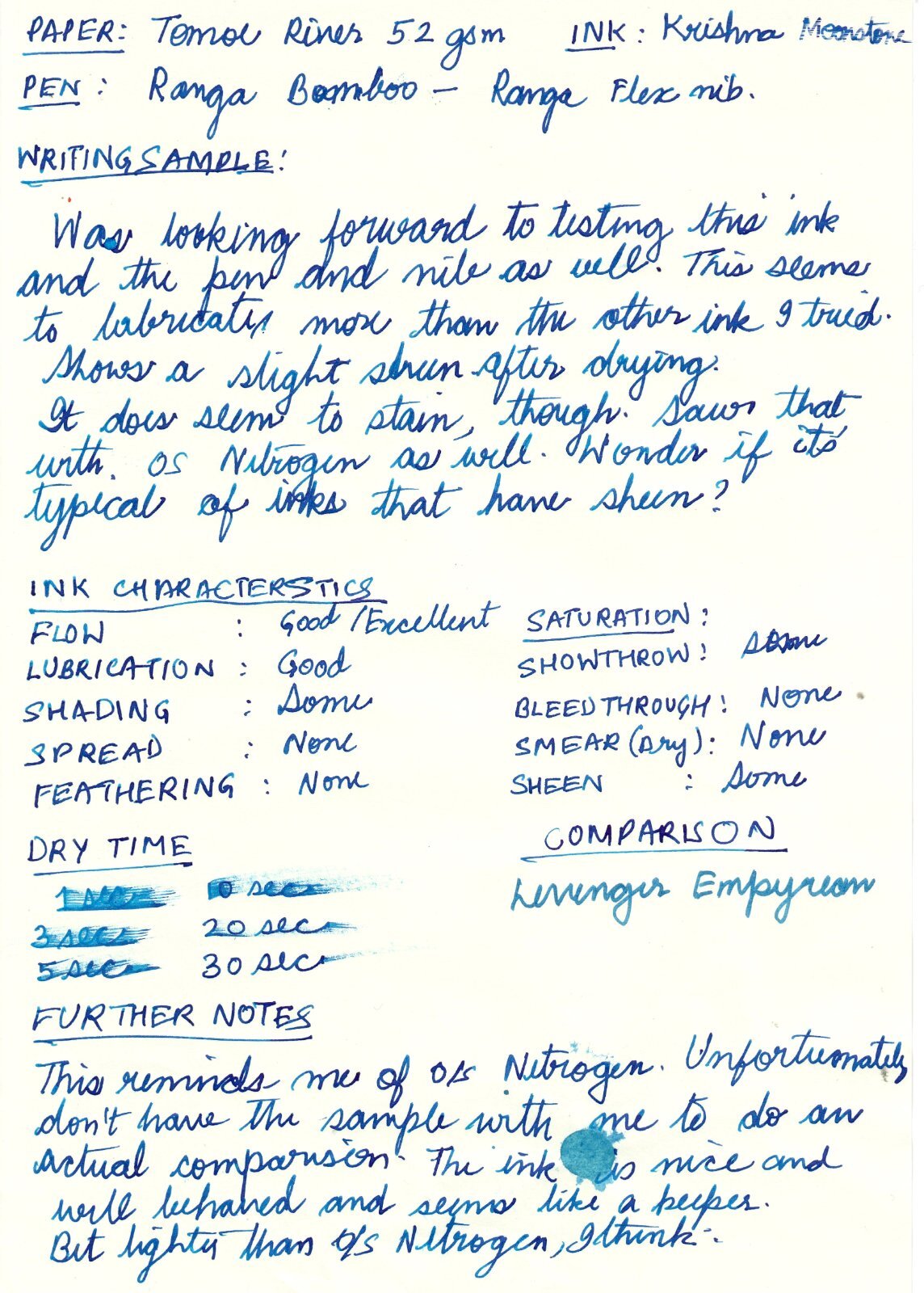
Nice ink from Kerala, India. https://krishnainks.com/ Apologies for the poor handwriting, and wrong name in the review.
-

Best Yellow- And Green-Sheening Purple Inks (Vs. Diamine Winter Miracle)?
Wistful-Ink posted a topic in Inky Thoughts
Winter Miracle was by far the standout for me from the Diamine Inkvent calendar, and now that they're going to be available in 50 mL bottles, I'm sorely tempted to buy a bottle. But I don't have many large ink bottles, and before I commit, I'd like to see if there are similar inks that are worth trying out first. I don't care that much about the blue shimmer aspect of Winter Miracle, so mostly I'm looking for recommendations for your favorite deep purple inks with crazy yellow/green sheen and, if possible, how you think they compare to Diamine Inkvent's Winter Miracle. From what I've seen online, PR Tanzanite and Waterman Tender Purple seem promising. I've tried a sample of Lamy Azurite and was fairly disappointed with the sheen. Only a little bit of sheen for a heavy swatch on Tomoe River paper, with pretty much no sheen on any of the other papers I tried. I'd love to hear your suggestions (and sample pics if you have any)! -
Here I have another winner from Krishna. This is Moonview from from their RC Series, which I believe refers to ink that sheens. And sheen it does. It's not a sheen monster like say Organics Studio Nitrogen, but it is better behaved. For example, it flows amply and does not dry out immediately in the nib. So that's nice. It's a beautiful blue composed of what appears to be a singular dye. There is a faint hint of a purple in the paper chromatography but if actually there it is minor. I believe the purple is responsible for the sheen. Lovely ink that behaves well. It flows freely and really wants to feather but even on cheap copy paper it holds back for the most part. Good water resistance too but not really water proof. This ink sheens and it shades. It is also comely. I like.
-
Good day, fellow FPN ink connoisseurs! Today I'd like to discuss the Krishna "Vaikhari" ink - a complicated orangey-reddish-brown with heaps of olive green metallic sheen. Krishna is an Indian ink brand, which is a relative newcomer--especially to the European and American markets. If I want to fault this ink in one way that irks me, it would be the pricing of the tiny 20ml ink bottles outside of India. Apparently you can buy these in India for $3 or less a piece (doing a currency conversion), but in the USA these cost $8-9 per bottle for the RC and Super Rich lines. Considering we only get 20ml of ink, it's not a particularly budget-friendly option if one wishes to use a lot of a particular color. Using this ink almost begs for a juicy writing pen with a wide nib or flexible nib, so going through 20ml may not take very long. I hope Krishna's distributors reconsider the pricing of these inks. With that said, "Vaikhari" is a very exciting ink! Everything about it is bold and complex. Firstly, the hue. My scanner just flat out refused to get it right (as well as Waterman's Absolute Brown), but I'll present scans anyway, for completeness. The photographs do a much better job representing the colors accurately. There is a further complication to the hue--it's actually quite variable in itself. I would compare this ink to something like Diamine Ancient Copper: it can look different based on lighting conditions, and how much ink you put down in a line also matters. And finally there's the sheen--lots and lots of sheen! This ink sheens at least as easily as something like Sailor Tokiwa Matsu, and perhaps even more so. Likewise with Colorverse Dark Energy. Thus the areas with more ink start shifting toward olive green, further complicating the overall appearance. Indoors with natural light, the red-brown component of the hue will be more prominent. With artificial lighting, the red takes a step back and orange-brown are much more prominent. Sheen: lots of sheen! Sheen lovers should be happy. Even on crappy paper and even without particularly juicy writers, you can see at least some sheen peeking through. The appearance of this sheen is almost identical to that of Colorverse Dark Energy in hue and to sheening Sailor inks (like Tokiwa Matsu) otherwise. It does not look like smooth metallic sheen of Organics Studio Walden Pond Blue--has more texture and almost matte appearance in transition areas. Water resistance: poor! This ink is very concentrated, and water droplets turn writing into a smeary mess. Carefully dabbing away the liquefied bits, there is reddish-pink line remaining. If one is able to carefully wash off all of the smeared portion, the writing left behind will be legible. Otherwise, the concentrated smeared portion will obscure the paler pink-red water-resistant lines. Drying times: are actually quite good, considering the high saturation and amount of sheen with this ink. Unless you are using a very wet writing pen, where you might need to wait for up to a minute for puddles of ink to dry, the writing should be fairly dry within 15-25 sec. Smearing: There is no smearing once the writing is dry, even on the highly sheening spots. I suspect there is some thickener added to the formula, because while moving a fingertip over the writing, one can feel the roughness of the surface where the ink concentrated. Not everywhere, just where a lot of ink pooled up--the texture can be almost gritty. Feathering: none on good paper! Even on crappy paper it's somewhat usable with a low amount of feathering. Scent: none while writing with my bottle. Sniffing the ink in the bottle, there's something that smells like phenol to my nose. I like it! Bleed-through: none on good paper, only where a lot of ink pools up. Phototraphs - both with natural indoor daylight and with a good quality indoor LED artificial desk light. (Natural light) (Artificial + natural light) (Natural light) (Artificial + natural light) (Artificial light) (Artificial light the night before, still drying) SCANS - SOMEWHAT INNACURATE COLOR WARNING (Waterman Absolute Brown is too magenta here and Vaikhari should be a bit less maroon. The rest look fairly close to me.)
-
Hey guys, time for another hand-written review. TL;DR: Yes it's a sheen monster. Not as much as Skull & Roses / Smoke on the Water. Yes, it's a unique color, sorta. I still would not rec because it's finicky and not THAT unique of a color. If you were waffling I'd spring for Aurora Borealis instead. Review follows!
-
I had a friend write me with Diamine "smoke on the water", produced in Liverpool but only available in Germany - go figure! It seems to be basically two colours that don't mix and come out the nib as two colours. It is described as a "sheen" ink. What is a sheen ink and how do they work?
-

From the album: Odds and ends
My hammered titanium ring, when new, that I was going to use as a colour reference of sorts in seeking a new personal ‘signature’ ink to match. Originally posted here: https://www.fountainpennetwork.com/forum/topic/350492-seeking-brown-inks-with-strong-violet-or-purple-sheen/© A Smug Dill
- 0 B
- x
-
From the album: Odds and ends
The colour reference I was going to use, in my quest for a new personal ‘signature’ ink colour (that was ultimately unsuccessful), looks very different one year on. Only the barest hint of violet sheen remains, and the base colour has greatly lightened in the meantime. I guess the shine wore off, and the honeymoon period is over? Or perhaps it's just par for the course for the year 2020? 😬© A Smug Dill
- 0 B
- x
-
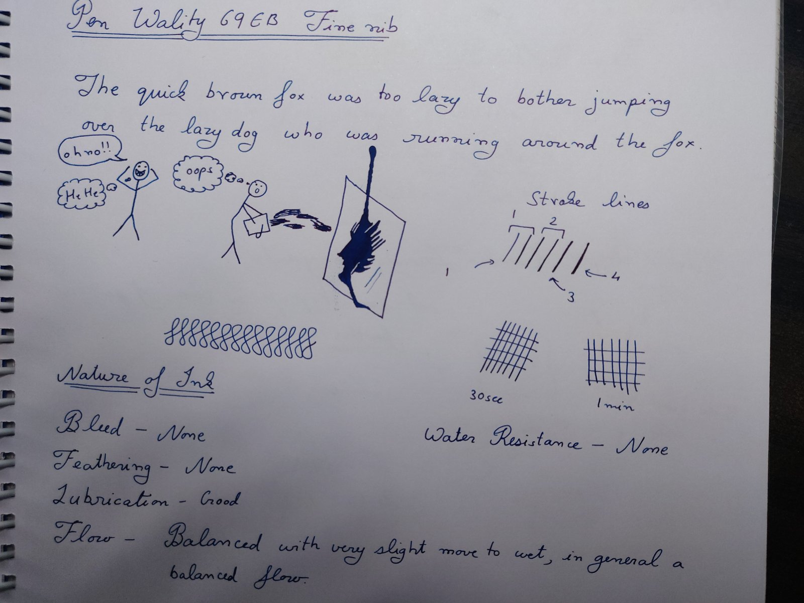
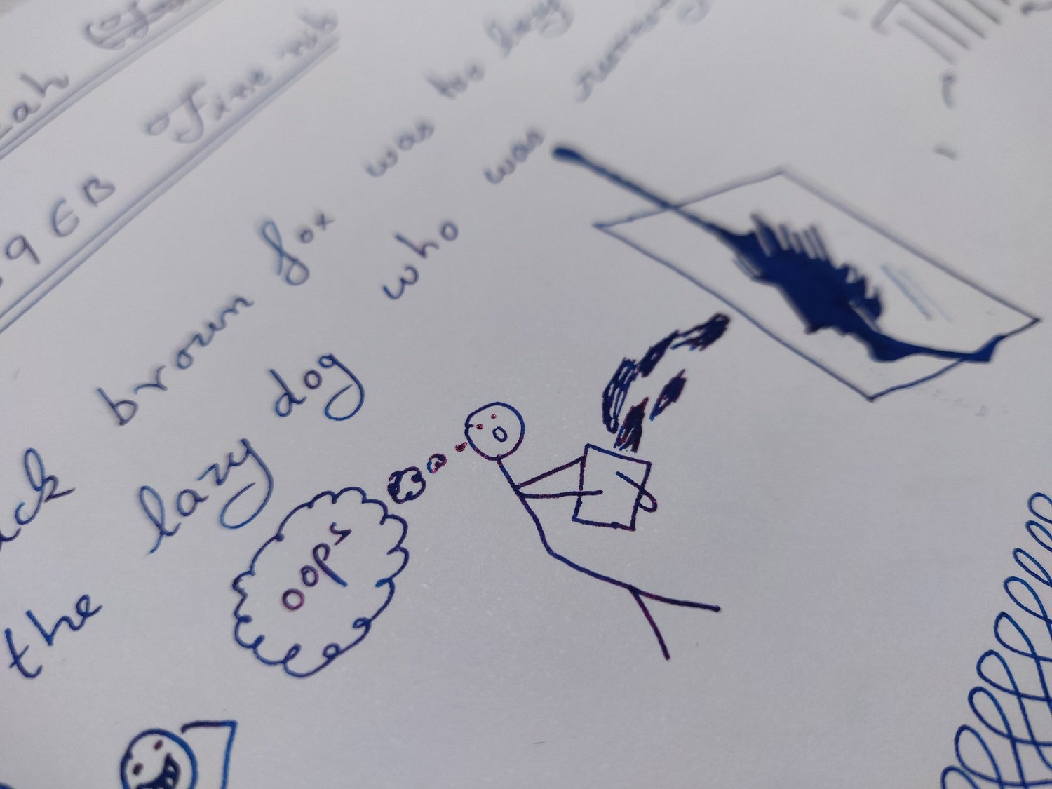
Introduction and Elephant in the room Lets take elephants out of picture. First is controversy that surrounded the bottle design which actually is a patent design of Gecko design and this was cause of issue which has been addressed since then. What happened behind the scene is of no concern to me as end result seems to be good for all. Basically ink is available to buy. Now bottle is well already quite nice looking and half of the folks (including me) would probably jump the gun for bottle over other blue ink, so before diving in ink lets clear this guy out. There are some pros and cons of this bottle design. First what the bottle was originally designed for by gecko is to be used as ink well and it works great as such, any pro and con arises from this very fact so use as you may. Ink was shipped separately outside the box to prevent mishaps during shipping so starting point is empty bottle. Pros include looks, nice design for dips and general filling of ink and well attraction factor (all those who saw the bottle ask where I got it from and if only bottle is available and if larger size is present...so yeah it attracts attention) last the separation of ink mouth and reservoir has real practical benefits when using dip pens and filling pens. There is one other from what I feel but its too vague so I won’t put here. Cons include, glass is on thinner side so be careful. There is bubble issue which happens as if reservoir has ink over channel. The issue is not really as big of deal and can be delt with by moving bottle a bit. Last is size of mouth. I have not seen problem with my pens but I have a feeling that absolute jumbo pens like ranga ganesha might not fit properly to extract the inks from mouth in respect that nib not dipping completely..can’t test it as I lack such pens. All in all its one unique bottle and sure will be liked a lot. Ink review section Paakezah in persian is a word for ‘pure’ and this ink and so the reference of ink as the complete blue on Krishna website. Ink is first in line of Krisna’s S series inks which they say is safe sheen ink for vintage pens and I agree with them on this after testing it. Test papers include 75gsm sectra copy paper 70gsm and 85gsm nightingale paper 52gsm classmate copy paper 100gsm JK Cedar bond papers. Random books back sides and some unknown real cheap papers. Ink properties Bleeding/Ghosting – None seen on any paper tested except for cheap ones. Feathering – None to minimal on very cheap ones. Saturation – Good Flow – Balanced flow with very slight tending to wet side. Dry time - varies from 12 to 20 seconds. Sheen – moderately high. Shading – Not seen as shades are pretty much sheen spots. Water Resistance – none (will not survive water). A write sample in high resolution meant to test the new limits of uploads plus general opinion of ink. The camera is pea shooter phone camera. I tried to get as accurate color as I could with phone. the image is quite accurate just tiny bit more dark then in real.... water resistance results. Paakezah shows no other color, at least in normal case I still have not tested chromatic test, other then blue and its shades. The sheen seen has metallic color and is reddish-violet. The ink show high sheen on decent papers but non-absorbing papers are preferred as with all sheen inks. I must point out though that it is by no means a sheen monster but there is enough sheen that one will not have to look for it, its simply visible on paper in all its glory when seen with naked eye and the fact that I can see such on mostly normal papers says a lot. some sheen seen in writing. The entire page has such results just hard to get photograph in one go. I feel the ink lies on darker spectrum of blue, its very blue just not light shade. All in all its interesting in respect that it manages to separate itself from usual blue lots like waterman serenity blue and lamy blue ink even without any sheen. Still sheen is the highlight and you might wanna go with decent paper on this one. screenshot if ink from Krishna inks website There were never any hard starts or skips in 3 pens that I tried with decent flow maintained in all types of writing from fast to weird. Wality 69EB, Ranga Slim Bamboo and Oliver Exam pen are 3 test lots. Now cleaning is easy and water is suffice here. As for safe..well I tried clogging the pen with the ink by letting the nib open and drying the pen for one day...still managed to clean the pens with soap water. There ware no stains left and disassembly of the pen showed no clogs or residue. So I think it should be safe for any pen. I tested these results on Oliver exam pen which is clear demonstrator and makes it easy to observe such results. other sample with full page writing. Do tell if higher resolution image is preferred over this one. All in all a nice ink even without the bottle. Conclusion For the price of Rs 949..or approx. $12.5 without delivery….its a steal especially with the bottle and by looks of it being mostly on pre-order I will say that its selling like cakes. The customer service of Krishna inks was great, all orders were placed from their website and notifications were sent via email. Any quarries and questions were replied via email and replied within 2 days. It was a pleasant experience overall. Disclaimer: entire writing seen is done on 100GSM JK cedar paper. I lack tomoe river but I am confident the ink will sheen more on that page.
-
Cult Pens has just released a fifth ink colour, Herbert (aka Little Herbie), in its Iridescink range produced by Diamine. A note on the drying time test: My scanner isn't good enough to pick up the bit of colour left of the first '30' mark in the list, but I could see that my thumb must've been moist and had some ink from earlier rubbing activity clinging to my skin. Feathering: None that I could see. Bleed-through: None that I could see. Sheen: Like the other Iridescink colours, Herbert is a monster sheener with dark red, almost brown sheen. One downside is that it is quite apt to smear even when seemingly dry. I scanned the page some five hours after I'd finished writing on it, and still some words got smudged against the scanner's dry glass surface. (The photo below was taken before the page was torn from the Rhodia Dotpad for scanning. None of the small writing appeared blue-black.) Shading: There is shading but it can be hard to see without looking really closely, not because it is subtle, but because the overwhelming sheen distracts and interferes with the onlooker's perception. Water resistance: Poor. Don't count on being able to read the faint marks left after getting the page wet; the colours that get lifted are quite staining. The piece of paper left to soak face up is more stained with blue, but the staining was more confined (only) by virtue of it being slightly concave, thus preventing the colourful mess from reaching its edges. The piece of paper left to soak face down did not fare any better with regard to legibility of the marks left behind; the blue colour that got lifted sank towards the base of the tray away from the written surface, but the grey didn't, and left dark clouds all over the page. Final thoughts: I don't think I need both Herbert and Christine in the Iridescink line, but I have yet to compare them head to head to decide which is better; and resistance to smudging when 'dry' will play a significant part in my decision.
-
Hi Everyone, DISCLAIMER : This is my Second Ink Review on this forum so please comment and any Suggestions are Most Welcomed. First of all, A Big Thanks to LIVTEK INDIA for providing me the sample of this lovely Teal Ink, Do check them out at the link given above , That being said This is an Honest Review and I DO NOT REPRESENT LIVTEK OR MONTEVERDE IN ANY MANNER WHATSOEVER. 1. Sample So, I received this sample in a Monteverde 30ml Ink Bottle and was immediately impressed with the lovely Teal Colour with some awesome Red Sheen. Shaking the bottle and seeing the beautiful teal colour is just awesome. I was also impressed with the amount of sheen this ink has right ON the bottle and cap 2. Comparison SO to understand the Colour profile, I have classified them to similar inks I Own:- You can see right out that the ink is quite similar to Jacques Herbin 1670 Émeraude de Chivor (Emerald of Chivor ) and the Monteverde D.C SuperShow Teal (2019 Special Edn from Monteverde). All three have the same Red sheen and this ink falls somewhere in between the above two colours. It is slightly light than the Monteverde D.C SuperShow Teal (2019 Special Edn from Monteverde) and comparable to the J. Herbin Emerald of Chivor less the Golden Sparkles. 3. Writing Samples I am using a DIP PEN this time as --> This would be a standardised in my future reviews, --> It puts out good amount of Ink on paper, --> and I can test the cleanliness and staining factors easily. You can see the ink on the nib as well as the beautiful red SHEEN on the macro shot of the nib. and after letting the nib Dry for 5-10 days, dipping it in water and swirling the nib for 3-5 sec, the nib comes out squeaky clean ONLY in ONE DIP, without any traces of stains. So, This ink is VERY EAST TO CLEAN AND DOES NOT STAIN ANYTHING. Following is how the ink performed on different papers. (a). Ink Resistant Paper:- Writes perfectly with NO BLEED THROUGH OR FEATHERING, It does not shade at all and leaves a lovely Reddish Sheen on paper clearly visible COOL. The ink is very well behaved and lubricated and has the Monteverde ITF Technology . Though I experienced Huge Dry times on such paper but it looked Beautiful and It has a Beautiful Reddish sheen as found on Jacques Herbin 1670 Émeraude de Chivor (Emerald of Chivor ) and the Monteverde D.C SuperShow Teal (2019 Special Edn from Monteverde). This Ink DOES NOT SHADE WELL. NOTE : -- > I am using a very thin paper with wax kinna coating/ lubrication on paper making the paper highly ink resistant, although you can see the text on reverse, It is NOT Bleed through but rather the thin nature of the paper. ( . FP Friendly Paper The Ink writes perfectly and does NOT BLEEDTHROUGH even after putting a lot of ink on paper. It is really Saturated and the Colour just Pops out. Dry Times are really good. I does sheen even on the copy paper. (c ). Recycled Paper Well frankly speaking this is a (beep) of a paper very close to a News paper but the ink performed really well, I won't talk about the Dry Time on this paper as It is close to ZERO. The ink is immediately absorbed by the paper and you can see huge Feathering and Bleed Through, but taking into account the paper, it performed really well and the text is clearly visible. 4. Additional Properties I am a curious guy so, I did chromatography using a Tissue paper and it was Awesome, You can clearly see the Blue poking out even before I soak the tissue wet and once I do that the Light Blue / Turquoise crawls on a tangent to the Subtle Green tones (I am very bad with colours so please correct me if I am wrong here). Water Resistance:- The ink is NOT AT ALL WATER RESISTANT and completely fades out. On the brighter side it is really easy to clean from the pen. It is Advertised as a safe ink to use and I did not face any issues while enjoying this ink.It behaves really well. Don't think of keeping the big nib saturate with this colour for longer (say > 10 Min or so), It will dry up but somehow not completely, If you touch it once it is dried, it will definitely stain your hands and everything you touch BEAWARE. This is a water Drop Test on cheep Copy paper This is a 10Sec running tap water test :- Sheen Test :- As mentioned before the ink sheens quite well here are some shorts of that:- 5. Final Thoughts So, for about 1100 INR for a 90ml bottle you are getting an enormous and a well performed ink for very Cheep. I would definitely recommend this ink for daily carry purpose (Provided you like the colour) and anyone interested in a Teal Saturated colour (More towards green) with a hint of Gorgeous Red Sheen. All in all an wonderful ink to work with. Once again I would like to Thank LIVTEK INDIA for giving me this opportunity to test the Ink. Do visit them for some more interesting Inks from various brands such as Stipula, Monteverde, Etc.. and do click their Awesome Fountain Pen Collection. Thanks a lot for making through, please do comment if you have any other opinions, Stay Safe, Keep Enjoying the FP Journey, and Stay Curious Thanks & Regards, GS Gill Attached Images
-
Let's cut to the chase. This ink is so beautiful and interesting I want badly to love it and use it all the time. A rich deep black with amazing purple/metallic/bronze sheen. It's not black, it's dark blue, which is all the more beguiling. It helps my adoration. that my wife has asian hair that is exactly like this color, raven black. Problem is that this ink is a problem child. It dries in the nib faster than lightening and on some paper never dries. I'm left handed too making drying issue worse. When it dries it says put, which is great for a super saturated ink that sheens like this one, but dang. It works more or less in a wet writing pen like my Pilot 823 Amber with broad nib. The ability to seal the pen up also helps. I tried diluting the ink but as you can see below at 50% or 1:1 the magic is gone. Currently, I'm trying 10% or 9:1 with a tiny drop of glycerin. Jury is still out but even the dilution being 90% ink it seems the magic is mostly gone albeit it seems to behave in the pen, and on the paper, better. I wan to conquer this ink. Oh, nurebairo, why won't you love me as much as I love you? Paper chromatography. Yeah, not waterproof at all. And not black. Maybe it isn't all blue... There seems to be a little tan or yellow fringe.
-

Diamine Bloody Brexit (Seitz-Kreuznach Exclusive), Handwritten Review
Enkida posted a topic in Ink Reviews
Not a lot of drawings this time because this ink took sooo long to dry and bled like a stuck pig. As always, YMMV! Swabs on Clairefontaine: Various Paper Tests: card stock: -
This is my first real contribution to the site- please forgive any unintentional faux-pas! A friend of mine wanted to see what Pilot Blue-Black (one of my favorite inks ever!) looks like on Tomoe River paper, so I write a thing up for her to check out in person using lyrics to one of her favorite songs. Since I can't really figure out how to make file uploads here work just yet, I've linked to an imgur album of the pictures I took here: https://imgur.com/a/q4HSckJ The pics were taken with my phone camera, with no editing done on them at all. The only light used was the evening sunlight from my window. While the demonstration was intended merely to show off the appearance of the ink, I'll include my thoughts on its performance for you all: I love this ink. It's nondescript enough to be used in a professional setting, but also quite exciting (just look at the shading, and the SHEEN that it has on Tomoe River paper!). It's easy to clean out of a pen, and is pretty darn water resistant (so much so that I use it to address envelopes to penpals, but it isn't directly advertised as waterproof of archival by any means). In terms of flow, I would define it as being wet, but not gushy. I haven't used it on a particularly broad nib as of yet, but it has behaved marvellously on all of the EF through M nibs that I've used it with. I haven't experienced any bleed or feathering with it on cheaper paper; as such it's become my daily-carry ink, along with my EDC pen, the Lamy CP1 (f nib).
-
Hey guys, I'm looking for recommendations about Iroshizuku sheeners. I've got take-sumi and yama-guri that are working wonders on tomoe river (dark copper and vibrant green sheen respectively) and would like to know your experience with other colors from the same lineup. What are the best sheeners in your opinion? Fiddling with the idea of trying a few more colours and would gladly take your input TiA!
-
Which fountain pen inks would you use to test an unfamiliar paper product for (at least some aspects of) its fountain pen friendliness? Recently I've been in a frenzy of acquiring more notepads and notebooks, on which to write with fountain inks, largely in brick-and-mortar stores with Japanese names such as Daiso, Muji and Kinokuniya. Unfortunately, it is not common practice for stores here to have samples or tester units of paper products; Daiso has none, and Muji may put out just one or two but not selected on the basis of either, "compare our premium made-in-Japan writing paper, against our 'planting tree' line sourced primarily from Indonesia, and our recycled paper line with a minimum of 55% recycled content made in either country," or, "we say this line of notebooks is show-through resistant, so have a go writing or drawing on it with your pens of choice!" Kinokuniya offers a few, but far from covering all the main brands of which it sells multiple product lines; the samples are mostly $20+ notepads and $25+ journals. Nevertheless, Daiso products on a per-item (but not necessarily per-page) basis, are cheap enough to be perhaps 'worth' just buying one as a private tester unit, if upon inspection in-store the paper seems promising; the same can be said of (only) some Muji products. Not so what Kinokuniya sells! Anyway, I'm of a mind to put together a handful of (no more than five or six) fountain pens in a carry case, as the essential test kit for writing paper, whether I do the testing on provided tester units in-store, or what I actually purchased on a punt. Obviously, the selection of pens and inks would reflect my personal writing habits and preferences, but as a limited test kit and of course limited time in which to do such testing I'm primarily interested in covering edge cases while still being 'reasonable'. (For example, as far as I'm concerned, using Noodler's Polar Green ink would be unreasonable; in my experience it feathers on and bleeds through just about every make and type of paper, so much so I had to stop using it for anything and give my bottles of it away in spite of having bought them for its purported 'bulletproof' qualities.) Here's an example of the kind of testing I have in mind: Muji 裏うつりしにくいノート B5 Notebook Set Now, I'm curious as to what you — and everyone else — would choose for testing. I hate feeling as if I have to pre-empt this, but I want to make this clear: the question is not, "What would you like to see in a paper review prepared by someone else at their expense?" I want to know what's relevant and important enough to you that you would spend the money, take risks, and/or make the effort to buy, sample and test unfamiliar paper products for their suitability for your usage with fountain pens; what enthuses you enough that, pass or fail, you'll want to share the results at your cost with other hobbyists. I'm thinking in terms of us as doers and contributors to the community, not merely takers and consumers of crowd-sourced information or frugal shoppers. I'm still refining my own list, but roughly in order of priority: Platinum Carbon Black — I love pigment inks for their permanence and waterproofness, including not changing colour when soaked or washed, when it comes to content that I want to remain legible for the lifetime of the paper (and perhaps my lifetime); and I'd want a dense, dark, 'formal' colour for testing. Sadly, Sailor kiwaguro is not waterproof, and so I prefer Platinum Carbon Black, but I do find that some papers don't take well to the latter. All the better to include that as the Number One ink in my test kit. Interestingly, problems with feathering and bleed-through of this ink are more likely to manifest with high stroke density using a very narrow nib, as opposed to writing with a broad or stub nib, so for the purposes of the test kit, the ink will be dispensed using a Japanese Fine or Extra Fine nib.Platinum Classic Ink Lavender Black — I think a paper product should be tested for how it deals with iron-gall inks, and of the three iron-gall inks I have today (but two more are on order), I like the colour and punchiness of Lavender Black the best, when delivered using a Stub nib. Not just writing with a broad nib for "showing off" the ink, but to render some semblance of Italic writing on paper; the shading is a not-unwelcome side effect, but the base colour (which would get ruined by soaking or washing) and water resistance is the reason I use this ink.Pelikan 4001 Blue/Black — This is just a very old bottle of presumably iron-gall ink I have, which is what I use with the pen that has my favourite nib, a 14K gold Pelikan EF nib that Dan Smith customised to a crisp italic for me. For the purposes of testing a paper product, I'd be primarily looking at the crispness of the pen strokes on the page.Sailor Shikiori yodaki — I love the colour but hate the wetness of this ink, and it's a relatively expensive ink to boot (as it was never offered in the round 50ml Sailor Jentle bottles the way the sixteen originally Shikisai colours were). Oh, and it sheens green and gold. In my experience, many coated and uncoated papers don't deal well with a wet line of this ink.Diamine Iridescink Robert — A highly saturated monster-sheener of an ink, that is much cheaper than Sailor Shikiori yodaki and of which I have a large bottle. At the moment I primarily use it in a Pilot Elabo with a Soft Extra Fine nib, and many papers have problems with bleed-through when I allow the nib to linger for a moment as I try to flex the nib to get swells in pen strokes.I haven't quite decided what the sixth ink should be; Noodler's Air-Corp Blue-Black is a candidate, and so is Diamine Jalur Gemilang. I use Sailor souboku and seiboku pigment inks in Fine-nibbed pens often, but they tend to be so well-behaved on most papers that they don't warrant testing when I'm unsure of a new or unfamiliar paper product. Over to you! Edit: Eleven new inks just arrived in the past 24 hours, so I may have to look at revising my list.
-
Inky folks: Looking for advice on choosing an ink. Your help will be greatly appreciated, and *will* result in a purchase! I’m nuts for purple inks. I’ve got way more of the stuff than is rational. And, until recently, I’d sworn off buying any more, because, really, I’m unlikely to go through my current stock in my lifetime. It’s that bad. But, now, I’ve decided to break my self-imposed prohibition, because I’m dying to try one (or more) of the super-sheeny inks that have come available in recent years. Other than a few conventional inks that had some sheen as an incidental property, I have never bought an ink with particular sheen. I have recently been seduced by photos on social media – mostly here and Reddit – that show some marvellous effects from inks designed for sheen. Because of my addiction to purple inks, I’m drawn particularly to the blue/red inks. The ones I’m most familiar with are: Diamine MaureenDiamine Skull & RosesOrganics NitrogenOrganics EmersonI’ve read reviews of these inks, and all seem to have puts and takes. But I’m not going to buy four inks to find out for myself. I’m going to buy one…ok, maybe two. Can you gurus weigh in on which one you’d choose if you applied the following criteria? Most noticeable sheen in normal writing, with a med or broad stub nibDominant apparent colour is purple-y – regardless of the tone of the sheenFlows well – preferring wet and lubricious to dry and finicky. No hard startsDries *reasonably* quickly. Notably slow-drying inks are off the table. I’m looking for a normal drying time.…or just let me know what your experience of any one of these inks has been, in relation to these criteria. Based on the reviews over at mountainofink, I'm leaning toward the Diamine Maureen. If there's an extant thread that addresses these questions, I apologise for doubling up, and would be grateful for a pointer to it. So many thanks, in advance. -- Houston
-
When cleaning and refilling one of my Wing Sung 3008 pens to give it to my son who wanted to use it in school I encountered a stubborn clear feed that would not want to give away all of its orange glory (Akkerman #16 Oranje Boven) after cleaning and even after refilling the pen with Lamy (Royal) Blue. So I was able to take the following pictures. Edit: (Was interrupted before I could add what I was going for, tsss ...) What do your feeds look like? Do you have unusual or unusually beautiful feeds? I am sure you have!
-
Organics Studio Ernest Hemingway Santiago's Sea Blue Master Of Writing Series No 18
jandrese posted a topic in Ink Reviews
Does not seem like this ink, Organics Studio Master of Writing Series volume No. 18 Ernest Hemingway Santiago's Sea Blue ink, has been reviewed in these pages. Perhaps that is because of the bottle it's all but unusable in a fountain pen. The ink is super saturated with dye that sheens like crazy, CRAZY SHEEN. Others have described the ink as pink sheen with teal undertone. Yeah, that's about right if you can get it out of a nib before it dries. I tried it in a Platinum 3776 Century and still had problems. It dries shut the nib just lifting the pen off the paper to move a line. Too bad, 'cause it seemed like a cool ink. Well, finally I diluted the ink 1:1 (50%) with ddH2O. Some inks won't survive this level of dilution, it would thin out the color too much or diluted additives cause a dry feeling, or maybe cause undesirable behavior on the paper. Not this ink, 1:1 dilution turned it into a usable, interesting, and beautiful ink. Not only is the dark teal color attractive, it still sheens a lot, and there is also some shading potential. Use in a broad, or even better a stub/italic nib for best effect. Very good ink now even for this lefty but I seriously doubt it will survive at water bath. Not much water resistance if that matters to you. -
This ink is a really neat brown. It flows consistently well, has no problems with cleanup, and is decent on lubrication. It's a really good all-rounder ink if you don't mind it not being permanent. Or, for that matter, water resistant at all. On a ten-point system, 10 being the best: Flow: 8 Lubrication: 6 Dry Time on Tomoe River Paper : 20-25 sec Shading: 7 (Depends largely on the pen) Bleed: None. Ghosting: Just a bit, nothing too heavy. Color: 7 - I like it a lot, especially in my Monteverde Invincia with a Pendleton BLS Nib. Its a very nice brown with good shading in this pen. Overall: 7 - This is a brown ink I could see myself returning to! Written Review: Photo: Scan: After capturing, I noticed there were bits of these really neat silvery black sheen where the ink pooled up enough. It probably won't be seen unless your pen is REALLY flowing on very ink-resistant paper, but it is there! I'll leave two pictures. One of the sheen circled and one not circled. The pictures do not do it much justice as in real life it sheens much more especially under light. I had real trouble picking up any sheen on my camera. Thanks for checking out my review! -Nick
-
-
-


desaturated.thumb.gif.5cb70ef1e977aa313d11eea3616aba7d.gif)