Search the Community
Showing results for tags 'iroshizuku'.
-

Ink Shoot-Out : Pelikan Edelstein Topaz Vs Pilot Iroshizuku Kon-Peki
namrehsnoom posted a topic in Ink Comparisons
Ink Shoot-Out : Pelikan Edelstein Topaz vs Pilot Iroshizuku kon-peki Iroshizuku kon-peki has long been my only cerulean blue ink, and I've been very fond of it. Recently, I obtained a bottle of Pelikan Edelstein Topaz and - lo-and-behold - this turned out to also be a nice cerulean blue. A great opportunity to put these inks into close comparison, and find out which of them I like the most. Here comes... the Ink Shoot-Out. A brutal fight where champion inks do battle for four rounds, to determine who is the winner. In the left corner - the challenger: Pelikan Edelstein Topaz. In the right corner - my current favorite: Pilot Iroshizuku kon-peki. Which champion will remain standing at the end of the fight ? Let's find out... Round 1 - First Impressions Both inks make a wonderful first impression. I really like their color... a fine cerulean sky-blue. These inks give me a relaxed, vacation-like feeling. They remind me of the sunny day sky-blue in late spring, with me relaxing on a tropical beach soothed by the sound of crashing ocean waves. There are some differences though: Topaz is more of a morning-sky color, while kon-peki is more of an afternoon sky-blue. Topaz is definitely a shade lighter than kon-peki, which is most obvious in written text, not so much in the ink-swabs. For me, topaz is a fresher color, which appeals to me more.Both inks shade nicely, but the shading on topaz is less prominent, and - in my opinion - more aesthetically pleasingkon-peki is a wetter and more saturated inkBoth Edelstein en Iroshizuku are the top-of-the line inks of their respective brands. And both live up to their reputation: these are seriously fine-looking inks. But for me personally, I like the morning sky-blue of Topaz better. There is no obvious win by knock-out in this round, but I will yield this round to Topaz on points. Round 2 - Writing Sample The writing sample was done on a Rhodia N°16 Notepad with 80 gsm paper. Both inks behaved superbly, with no feathering and no show-through or bleed-through. You will find that the Edelstein ink is on the dry side - this is especially noticeable with the EF nib. The iroshizuku ink had no problem with the finer nib. With broader nibs, both inks wrote just fine with a nice ink-flow. It is well-known in this community that Edelstein inks are a bit dry. I won't hold this against topaz - just use an F nib or broader, and you won't have a problem. In my opinion, both inks are evenly matched, so this round ends in a draw. Round 3 - Ink Properties Both inks have similar drying times in the 15-20 second range on the Rhodia paper. Topaz needed a tad longer to dry completely. Both inks also did fine on the smudge test, where I draw a wet Q-tip cotton swab across the text line. There is some smearing, but the text remains perfectly legible. For the droplet test, I drippled water onto the grid, and let it sit there for 15 minutes, after which I removed the water droplets with a paper towel. As you can see, these are not water-resistant inks. But if you look closely, you'll notice that kon-peki leaves a bit more ink on the paper (and with some luck, you'll be able to reconstruct the written word). The chromatographies show that both are true blue inks, that are very water-soluble (in the chromatography the dyes migrate with the water to the top of the picture, the bottom part illustrates what remains on the paper after a good soak). You also notice that kon-peki appears to stick better to the paper. The difference between these heavy-weight champions is minimal. Again - no knock-out, but this round definitely goes to the Japanese champion - on points. Round 4 - The Fun Factor Welcome to the final round. Here I give you a purely personal impression of both inks, where I judge which of them I like most when doing some fun stuff like doodling and drawing. Here I must admit that I like Edelstein Topaz a lot better than Iroshizuku kon-peki. The more subtle shading on Topaz made for more interesting effects when drawing. And I definitely like the color of Topaz a lot better - a late morning sky-blue, while kon-peki is a deeper afternoon sky-blue. This is of course a purely personal judgment, but I'm quite convinced that - in the future - I will will reach faster for the bottle of Topaz, and that my kon-peki will be used less often. For me, this round definitely goes to the German champion. No knock-out, but a definite advantage on points. The Verdict Both inks find a proud place in my collection, and both are very well-behaving inks with a lovely sky-blue color. But counting the points, I find that Pelikan Edelstein Topaz is the clear winner over Pilot Iroshizuku kon-peki. As far as I'm concerned, Topaz has convincingly won this shoot-out on points, and is my new reigning champion ! -
This is the best blue ink (or even the best among all colors) I've used so far. Aurora and Waterman and Montblanc come in next on my list. I was wondering if there are blues from other brands that are at least as well behaved as this one. I'm not looking at PR or Noodler's because I haven't had pleasant experiences with their inks for the same reasons already discussed at length in other threads. My criteria for well behaved are: - wet - saturated, I absolutely loathe washed out inks. The color should stay the way it is or darker after drying. - very low feathering and bleed through - reasonable dry times - consistent flow till the last drop in a converter without having to prime the feed Asa Gao hits it out of the park for all of the above criteria and is currently my favorite ink. I haven't used Kon-Peki but I believe it is just as good. I hope there are inks from other brands that might be cheaper with similar or better characteristics.
-
I have 2 black inks that I like a lot. Aurora Black and Pilot Iroshizuku Take Sumi. I've decided to compare them and figure out which one is my favorite, because I rarely use black ink and technically just want one. As a result of the comparison, I'm more confused than before I started. They both have their strengths and weaknesses. The posted samples below are limited to very fine nibs for writing and sketching. Take-Sumi shows more obvious shading with broader cursive italic nibs. Aurora is highly lubricated but has more conservative flow vs velvety but free-flowing Take Sumi. It's easier to control line width with Aurora. Take-Sumi washes off more easily with water / water brush, smearing off a heavier amount of loose dye. The remaining dark line is more smeary looking and also feathery with Take Sumi, whereas Aurora Black keeps a neat black line under the smeared dye. Take-Sumi can be a deeper black in the dark areas, but it's slightly blue-tealy tinted, and also there's a beautiful gentle shading gradient visible even with Extra Fine Japanese nibs! Aurora Black is pretty much just a flat black, almost no shading, looks a bit like black laser printer ink. I'm describing this qualitatively, because it's difficult to tell from the scans, but Take-Sumi definitely has a more watercolor look with deeper dark areas, where Aurora is either straight black or a grayish solid color depending on amount in a line. Take-Sumi is more difficult to wash out of a pen: takes longer, quite a few flushes. Take-Sumi sheens readily, whereas Aurora generally doesn't show sheen unless in large amounts. For writing: I love Take-Sumi For drawing and Calligraphy: Aurora might have the edge. I like that it's a bit more neutral and much easier to control with a water brush for gradients, where Take Sumi just smears off more heavily with a water brush. Pens used: Aurora Black - Pilot Vanishing Point EF Take-Sumi - Sailor Pro Gear Slim EF On Fabriano Bioprima, lightly textured uncoated paper: Tomoe River 52g in a Hobonichi Techo Cousin planner:
-
In December 2007 Pilot's created exclusive line of inks called Iroshizuku. I believe they may well be the most well known fountain pen inks in pen world. These inks are supposed to work in any pen with any nib on any paper and in any situation. I haven't tried all of them but so far the Iroshizuku inks I've tried were behaving flawlessly. The colors were created by Kiyomi Hasegawa who after fifteen years of working in a stationary shop and communicating with Clients come to conclusion that not all fountain pen users are willing to write in black and blue. Wise woman. The bottles are stunning although they have their issues: if the ink is left unused for some time the cap tends to stick and break when you try to twist it open. It happened to my bottle of Shin-Ryoku. Anyway Iroshizuku line of inks counts 24 "standard" colors. Three inks were made some time ago for Tokyo stores: Edo-Murasaki, Fukagawa-Nezu and Shimbashi-Iro.After seeing the scans over blogosphere I wish these three were accesible, because they look interesting. Edo - Murasaki looks cool while Murasaki - Shikibu is of no interest to me. Even though I kind of like Fuyu-Syogun I find Fukagawa-Nezu more compelling. Nothing indicates Pilot plans on extending the official line any time soon (if ever) so let's take a look at what's possible to obtain from dealers and online shops. http://imageshack.com/a/img538/1595/lYAayJ.jpg Ajisai Ama-Iro Asa-Gao Chiku-Rin Fuyu-Gaki Fuyu-Syogun Ina-Ho Kiri-Same Kon-Peki Kosumosu Ku-Jaku Momiji Murasaki-Shikibu Shin-Kai Shin-Ryoku Syo-Ro Take-Sumi Tsuki-Yo Tsukushi Tsutsuji Tsuyu-Kusa Yama-Budo Yama-Guri Yu-Yake http://imageshack.com/a/img540/8917/Tn63B1.jpg Ink splashes http://imageshack.com/a/img540/3220/szF0L9.jpg http://imageshack.com/a/img661/6310/wvDblc.jpg http://imageshack.com/a/img912/9563/azc5JS.jpg http://imageshack.com/a/img913/8908/v1sFAm.jpg http://imageshack.com/a/img673/9567/8UM77i.jpg http://imageshack.com/a/img661/5379/e0XVx1.jpg Swabs - Mondi 90 g http://imageshack.com/a/img901/5315/QedWwX.jpg http://imageshack.com/a/img537/185/XABogj.jpg Scribbles, Kaweco Classic Sport, stalówka B http://imageshack.com/a/img538/7656/0sG5c0.jpg http://imageshack.com/a/img908/5075/cVfvbi.jpg Kaweco Classic Sport, B - Oxford 90 g http://imageshack.com/a/img673/8838/fUiKl4.jpg http://imageshack.com/a/img537/8199/T1suHS.jpg http://imageshack.com/a/img540/492/OPzdJj.jpg Kaweco Classic Sport, B - calendar http://imageshack.com/a/img909/6023/iy1k2Q.jpg http://imageshack.com/a/img537/8879/wYEo1B.jpg http://imageshack.com/a/img912/2672/bUcEP6.jpg http://imageshack.com/a/img661/2299/TXjh41.jpg Kaweco Classic Sport, stalówka B - Rhodia http://imageshack.com/a/img537/1017/6Syt96.jpg Waterproofness - photos http://imageshack.com/a/img537/5056/cFPSNI.jpg http://imageshack.com/a/img538/268/yJ09Oc.jpg http://imageshack.com/a/img907/5439/IMf6tq.jpg Summary I mostly enjoy Iroshizuku line but I dislike they're pricing politics. Premium brand should keep the price fixed (as, for example, Caran d'Ache or Graf von Faber-Castell). Pilot however sells their inks for around 10-13 $ in Japan and for 30 - 50 $ worldwide. They must be patriots. I guiess they just want to force people to buy online from Japan and not from their retaiilers I like most of the colors and I find iroshizuku inks well-behaved except for the fading. They tend to fade rather quickly and loose the vibrancy. My favourite ones are: yu-yake, yama-budo, chiku-rin, fuyu-gaki, tsukushi, ina-ho I dislike murasaki-shikibu, ajisai, ama-iro, tsuyu-kusa, syo-ro. And what about you?
-
Here is a brief review of a double concentrated Pilot Blue-Black ink. A prelude. Or a kind of I have always been fascinated with this ink. For a bunch of reasons except one: it is rather lifeless. Then I used it in my modern Duofold (with the damn hole in the cap causing evaporation) and found out this ink can be gorgeous with a lot of gravitas, beautiful shading and some sheen... if evaporates a bit. Pilot Blue-Black standard concentration properties summary A couple of positives of this ink (in the normal 100% concentration): 1) VERY cheap if you get a 350ml bottle from Japan, it costs there roughly $12, 2) VERY water resistant, 3) (unlike most Blue-Black inks) when exposed to water it stays purely blue instead of black/grey, 4) flows well in any pen, 5) safe, 6) no strong smell, 7) while it stains, the stains disappear fully if well soaked/filled with a soapy (dish detergent) water with no other treatment required at all; it is also very easy to wash from clothes, leaving no stains. Aren't these 7 wonders of the ink? Well, yes, but despite all the positives this ink normally isn't what one would expect of a solid blue black. Honestly, it is quite dull. Say no to the dullness - let it evaporate So what did I do? I bought a 350ml bottle, filled my empty Edelstein Sapphire bottle (actually not the most lively ink either), folded a kitchen paper towel in 8 layers and fixed it with a rubber band to the bottle. Then put it in my desk (the place that is dark and dry - just like my soul). I had been checking it regularly, but cannot remember how long did it take to evaporate a half of the bottle, but roughly 2 weeks. And... see the result below. A lovely navy ink, very water resistant, with a sheen and shading. With no misbehaviour. And still very cheap. For this process the wider the open surface of the bottle is the faster is the evaporation. Sailor old style 50ml round bottle (reminding jar) would fit the best. On the contrary heating or exposing to sunlight would not be the best idea. Testing The paper used is Oxford 90g A4 optikpaper notepad (a coated paper like Rhodia etc.). The pen used is MB 146 from early 90s (1st gen. plastic feed) with M(edium) feed - a bit broadish but not the wettest. The photos were taken in a natural light (direct sunlight/2 sorts of a shadow). You can see the comparison of the ink in 100% and 200% concentrations, written with the same pen. The writing sample was kept in the notebook for 24 hours before performing the water test. It was left for 30 second under a tap. I went quite hard with cotton swabs, it even damaged the paper surface. UV resistance results (notebook vs. summer window) will be updated in 2 weeks. The inks does not bleed (except the cheapest paper in almost a toilet paper quality), does not feather. Conclusion While the standard Pilot Blue-Black is a very good ink it is not the best choice if you need a serious business ink. The double concentration will do the job. What a lovely colour, isn't it?! What a performance! And very, very cheap. As for the price, while the ink is cheap the shipping is tricky but for instance Mercari now and then offers discounts on shipping or even a free international shipping, like recently.
-

Private Reserve Lake Placid Blue Vs. Pilot Iroshizuku Asa-Gao
Antenociticus posted a topic in Ink Comparisons
I've been testing both ink samples and inexpensive Chinese pens. Yesterday I put some Private Reserve Lake Placid Blue into a Wing Sung 6359, and today I inked a Moonman 600S with some Pilot Iroshizuku Asa-Gao. I wasn't really thinking about them being similar colours. I've been working my way through the various Private Reserve blues, and today something reminded me that I'd been meaning to look at Asa-Gao. I was amazed to find the product of these two pen-and-ink combos to be virtually identical. And so I did an off-the-cuff side-by-side comparison on a page in an A6 Leuchtturm 1917. You can see some differences at the top of the page, but nothing that couldn't be explained by the Moonman laying down more ink. Both pens have F nibs, but they're different nibs from different makers. The lines of text at the bottom were written alternately with one pen and the other. I find it hard to see any difference at all. Nothing remotely scientific about this. Just a doodle for my own amusement, but I thought the result was interesting. The image is an iPhone snap under artificial light after some rudimentary photoshopping.
-
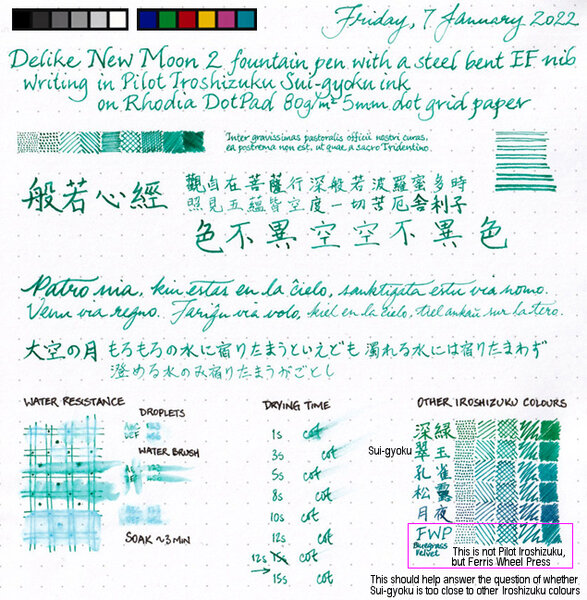
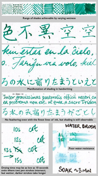
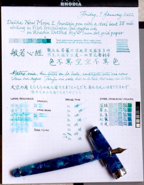
Sui-gyoku is one of three new Pilot Iroshizuku colours released late in 2021. Photo: Scan: (Some other colour comparisons can be found here.) p.s. No show-through, no bleed-through, and no sheen observed.
-
Pilot iro-utsushi: Dip pen type writing tool with a fountain pen tip
peroride posted a topic in Market Watch
Coming June 20 2022 - iro-utsushi -
desaturated.thumb.gif.5cb70ef1e977aa313d11eea3616aba7d.gif)
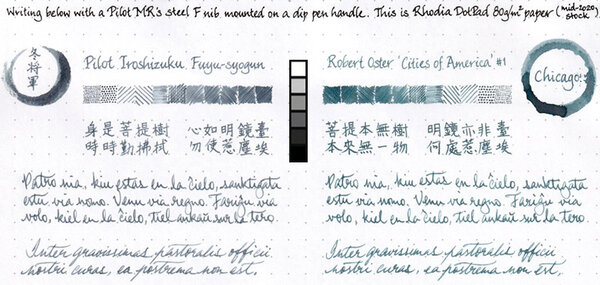
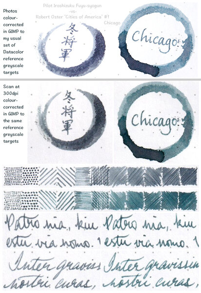
Pilot Iroshizuku Fuyu-syogun vs Robert Oster Chicago
A Smug Dill posted a gallery image in FPN Image Albums
-
Pilot Iroshizuku Fuyu-syogun vs Robert Oster Chicago
A Smug Dill posted a gallery image in FPN Image Albums
-
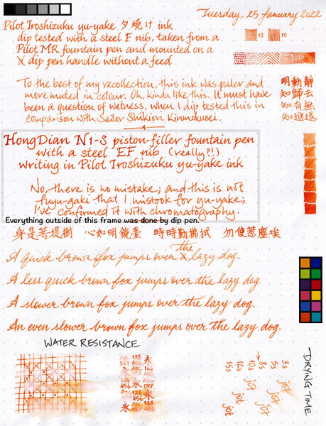
I've had this ink for years, but never gave it all that much love, because my last memory of it was that its colour is pale and muted, and thus unsuitable for use in Fine nibs. My relatively new HongDian N1-S came fitted with a steel EF nib (with no other option on offer, in case you're wondering) that is anything but fine, and so I thought it might put down pale and muted broad(er) lines of ink that make for legible writing. Imagine my surprise when the writing came out looking like blood orange! So, I just have to show you: Oh, the paper used is Rhodia DotPad 80g/m² 5mm dot grid paper (as usual for me), and there was no feathering, no show-through, no bleed-through, and no sheen observed.
-
Water resistance testing of 5 Pilot Iroshizuku inks
A Smug Dill posted a gallery image in FPN Image Albums
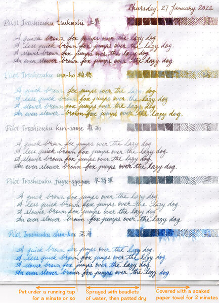
From the album: Ink performance testing
Putting the sheet found here: https://www.fountainpennetwork.com/forum/gallery/image/9273-shortlist-of-candidates-for-an-order-of-3-bottles-of-pilot-iroshizuku-ink/ through the paces.© A Smug Dill
- 0 B
- x
-
-

-
From the album: Ink review
No show-through, no bleed-through, and no sheen observed on the Rhodia DotPad 80g/m² 5mm dot grid paper used for the review sheet.© A Smug Dill
- 0 B
- x
-
From the album: Ink review
No show-through, no bleed-through, and no sheen observed on the Rhodia DotPad 80g/m² 5mm dot grid paper used for the review sheet.© A Smug Dill
- 0 B
- x
-
Hey Everyone! I was a little determined to come up with an ink the color of my husband's eyes a couple years ago, and I think I succeeded...he has a complex green iris with a golden brown ring around the pupil. I mixed some of the Iroshizuku together, along with water (counting drops from a syringe), and the combination of Shin-ryoku, Ina-ho, and Kiri-same seemed to do the trick! I was even able to get the bleeding edge to show gold-brown, like the ring around his pupil... the last image is a closeup of a swab of the ink on some grainy paper. Thought you all would enjoy... Matt
-
Delike New Moon 2 with bent EF nib writing sample in Pilot Iroshizuku Sui-gyoku
A Smug Dill posted a gallery image in FPN Image Albums
-
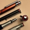
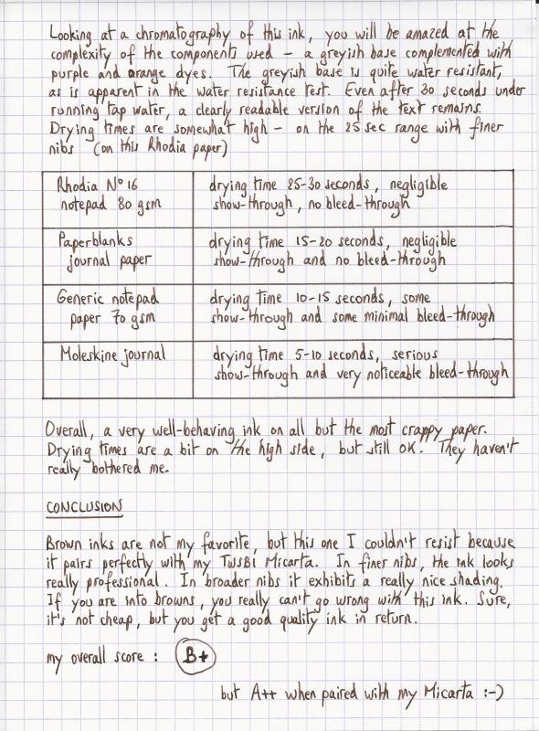
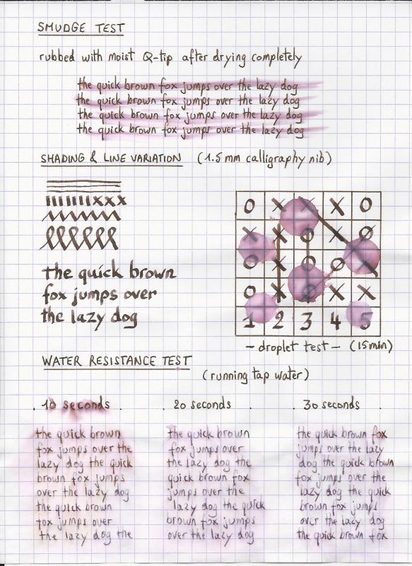
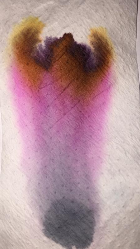
Ink Review : Pilot Iroshizuku Tsukushi (horsetail) Pen: TWSBI Micarta v2, F-nib Paper: Rhodia N°16 notepad 80 gsm "horsetail basking in sun-showered forest beautiful inkdrops" When an ink review starts off with a haiku, you just know that it will cover a Japanese ink. And you would be right ! This review examines Pilot Iroshizuku Tsukushi, a nice reddish-brown ink. As most of you know, Iroshizuku is Pilot's luxury line of fountain pen inks - read: these inks are really expensive. The name Iroshizuku is a combination of the japanese words Iro (coloring) and Shizuku (droplet). The name is meant to reflect the image of dripping water in a variety of beautiful colors. All the inks in the line are named after natural landscapes & plants, with each ink trying to capture the depth and essence of color of its namesake. For some reason, iroshizuku inks always remind me of Akira Kurosawa's movie Ran - in his castle, the Great Lord Hidetora Ichimonji writes his final will on a parchment, dividing his domain among his three sons. Iroshizuku tsukushi would have been an ink worthy of such an occasion. Tsukushi is a nicely saturated soft reddish-brown ink with some subtle shading. The shading is almost unnoticeable in finer nibs, but becomes more pronounced if you move to broader nibs. The reddish components become more visible with the wetter pens. This is a serious-looking ink that is not at all misplaced for business correspondence. It is one of my favorites for use at work. Furthermore, this reddish-brown ink is a match made in heaven for my TWSBI Micarta - these two go together perfectly. Looking at a chromatography of this ink, you will be amazed at the complexity of the components used - a greyish base complemented with purple and orange dyes. The greyish base is quite water-resistant, as is apparent in the water resistance tests I performed. Even after 30 seconds under running tap water, a clearly readable version of the text remains. Drying times are somewhat high - on the order of 25 seconds with finer nibs on Rhodia paper. Rhodia N°16 notepad 80 gsm - drying time 25-30 seconds, negligible show-through, no bleed-throughPaperblanks journal paper - drying time 15-20 seconds, negligible show-through and no bleed-throughGeneric notepad paper 70 gsm - drying time 10-15 seconds, some show-through and some minimal bleed-throughMoleskine journal - drying time 5-10 seconds, serious show-through and very noticeable bleed-throughOverall, a very well-behaving ink on all but the most crappy paper. Drying times are a bit on the high side, but still OK. They haven't really bothered me. Conclusion Brown inks are not my personal favorite, but this one I couldn't resist because it pairs perfectly with my TWSBI Micarta. In finer nibs, the ink looks really professional. In broader nibs it exhibits a really nice shading. If you're into browns, you really can't go wrong with this ink. Sure, it's not cheap, but you get a good quality ink in return. My overall rating: B+ (but A++ when paired with my Micarta ;-)
-
I'm playing around with inks, and I'm trying to figure out why Iroshizuku and Sailor are always priced the highest in most retailers I see. Does anyone know why? Guerlain's lipsticks have powdered rubies in them (I kid you not), so I can see why the're 30, 40 euros a pop. Do Iroshizuku and Sailor have similar properties? Or maybe a millennium warranty? I just can't think of any reason why. I really want to try them out, but the price tags are scaring me off! Windsor & Newton's paints are fairly pricey, but the colour-fastness shows that it's priced quite aptly. Do those aforementioned inks have similar traits?
-
I've been meaning to write up a quick review of my favorite gray ink: Pilot Iroshizuku Fuyu-Syogun, and here it is, finally. Fuyu-Syogun was not a love at first sight/write. No, in fact I thought it was just too pale, bland, and boring. Only after I kept going back to my sample periodically for sketching and doodling did I fall in love with it. And I can't get enough of this ink now, so I got a full bottle. On the photograph below, you can see my less-than-enthusiastic thoughts about this ink in the older writing in the notebook underneath. I don't have a lot of grays--only a few samples and a full bottle of Paper Plume's Oyster Grey (another great ink), but in Fuyu-Syogun I have found a gray that does not make me wish for any other of its family. It behaves perfectly in any pen and on most papers, even cheap absorbent kind (as long as you use a conservative fine nib on the worst paper). Easy to wash out of a pen, great flow, no problems! It has excellent water resistance. The hue is clearly legible and does not look like pencil writing due to the prominent blue-lavender tint, however it has a familiar kind of appearance for those who've taken a lot of pencil notes in the past, only with better shading and longevity. Due to this gray not being a pure gray but rather having a slight tint (I think lavender-blue is the closest description I can think of), the appearance of the ink changes based on the paper you use it with. For instance, on more bright, clean white paper, like Col-o-Ring cardstock rectangles, you see the pure color of this ink. On white Tomoe River (which is actually quite creamy and not pure white), the hue is warmer, and the lavender is less prominent. On Fabriano Bioprima 85g/m2, which is a pale cream, more creamy than Tomoe River White, the ink is more toward dirty bluish hue. I've added a sample card of Birmingham Pen Co.'s "Midnight Blue". It's not the same (higher saturation of blue in that one), but it from a similar family of colors. I did not photograph it, but Montblanc's old formula IG "Midnight Blue" is similar in hue to Fuyu-Syogun once dried and aged a bit, but is significantly darker. One of the properties of this ink I like a lot is the "outlining" (also sometimes called "halo-ing") effect when written with a juicy enough nib or on low-absorbency paper:
-
Well, my guess is nearly everyone has heard of Pilot Iroshizuku line of inks, if they have not had the good fortune to actually use them. Visvamitra did a review of all of those inks not so long ago. I've had this ink for some time but only recently worked through a review. Kon-peki is a fairly bright cerulean, or sky, blue. It is not light, but it is lighter in value than Asa-gao and Tsuki-yo. Some people might call this color a turquoise. I don't think it falls quite in that range, but I could understand the comparison. When I used a wetter/wider nib, I got a deeper, richer color. So this is something to consider. These inks come in both 50 ml and 15 ml bottles, and there are three bottle sets of the smaller size. Kon-peki is paired with Momiji (pink/bright red) and Yu-jake (orange) in a set. Not advertised as water resistant, so no surprise that it isn't. I've seen much worse though. This is a single dye ink. btw, dcwaites has posted a recipe for a faux PPS using Iroshizuku inks: 1 part Kon-peki 3 parts Asa-gao 0.1 part (or less) take-sumi.
-
Hi, I am looking to buy a pilot custom 74 in a fine nib(soft is preferred). My only criteria is that it writes smooth and isn't too weared out. If you have a custom 74 you'd like to sell or trade, hit me up and we can talk about the pricing!
-
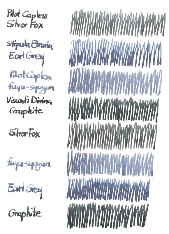
Put them next to other colours and they're just grey; put them next to each other and the differences become pronounced. In this scan you can see my current selection of grey inks next to each other: Diamine Silver Fox (my basic clear grey, the one I chose over Diamine Grey and Herbin Gris Nuage), Diamine Earl Grey (the new kid on the block that triggered this new exploration), Iroshizuku fuyu-syogun and Diamine Graphite (an ink that I had tried and abandoned but with fond memories that made me get a new 30 ml bottle). I've given up trying to correct scans and monitors concerning colour but the above scan seems alright on my computer, except for the hues of Earl Grey and Graphite, which appear too bluish. The following photograph is a bit darker but closer to the colours I see in daylight. I hope this quick comparison helps anyone looking for a grey ink. It has reaffirmed my own preference for Silver Fox as the clearest grey but I'm quite taken with the shading of Earl Grey. All four inks are well-behaved, even in my often temperamental Pilot Capless pens.
-
Colour: Hot pink, or magenta — more so than Pelikan Edelstein Star Ruby, although when Tsutsuji is laid thickly/wetly on the page it can look similar Flow: Moderate Feathering: Not observed on Rhodia Dotpad 80g/m² paper, looking closely at the thinnest hatching lines, and words/glyphs ‘reverse-written’ with the nib upside-down (i.e. the bottom of the feed facing up) Show-through: Low to nil Bleed-through: Not observed Drying time: 13–15 seconds Smudging after fully dry: None, after I rubbed my thumb on the hatching/stippling and the Chinese hanzi panels on the review sheet (ten days after writing) Water resistance: Poor Shading: Very subtle; difficult to spot along a single pen stroke with no doubling over the ink mark and no intersecting tracks Sheen: A tiny amount of orangey gold sheen can be seen in writing, but you really have to look closely and under a bright light of the right type for it Shimmer: None My thoughts: If I want to write in this colour with sheen, I'll probably use Lamy Vibrant Pink ink instead.