Search the Community
Showing results for tags 'pilot iroshizuku'.
-
It took me some time to finish this comparison but here it is. Not flawless, not pefect, but it has plenty of colors to see. To be honest I've never been violet fan. I always liked dark purples but disliked most of violets. It's hanged with time. At the moment I'm quite keen on these hues. I've included 60-63 inks here (the number differs on different papers, I didn't have enough samples of some inks, I've forgotten about one or two inks and haven't included them everywhere). There are some odd-looking inks here that aren't violet/purple like KWZI Blue L51 (I just had a small sample so I included it here). Kung Te-Cheng, Potassium, Purpillusion are more blue than purple. Alt-Bordeaux and Deepwater Obsession can be regarded as burgundy but as I'm not planning (yet) to compare burgunds / bordeaux I've included them here as well. I need to thank Cyber6 here for A LOT of samples. You trully are Ink Smuggler Extraordinaire Ink Splashes http://imagizer.imageshack.us/v2/1024x768q90/674/D57Iib.jpg http://imageshack.com/a/img911/9309/XMowa7.jpg http://imageshack.com/a/img905/9462/Dzf3fY.jpg http://imageshack.com/a/img537/121/srURhs.jpg http://imageshack.com/a/img901/3985/xcEDod.jpg http://imageshack.com/a/img537/4492/NtfODA.jpg http://imageshack.com/a/img538/2685/q8cIq7.jpg http://imageshack.com/a/img673/1967/EnAfQy.jpg http://imageshack.com/a/img674/4319/WdEf3j.jpg http://imageshack.com/a/img631/7922/1S4blW.jpg http://imageshack.com/a/img673/9114/raVPLz.jpg http://imageshack.com/a/img674/3466/vK8xaM.jpg http://imageshack.com/a/img538/7629/ivb3lB.jpg http://imageshack.com/a/img538/2456/dhwe19.jpg http://imageshack.com/a/img745/7901/pw9g05.jpg http://imageshack.com/a/img674/6609/m4k036.jpg GEMS (they were cut from photos taken on a sunny day, you may find the colors bizarre but I like to show them this way even though most of the times we're not writing in a direct sunlight) http://imageshack.com/a/img910/3417/UZX0cP.jpg http://imageshack.com/a/img674/7610/4sDPbR.jpg http://imageshack.com/a/img538/8730/osVcHA.jpg http://imageshack.com/a/img912/9997/NAgsqc.jpg
-
I loaded Pilot Iroshizuke Kon-Peki into a Pilot Custom 74 (EF) and a TWSBI 580AL (EF). The writing with the two pens on the same paper results in the Pilot's color coming out to be a darker blue -- almost blue black, while the color coming of the TWSBI is the bright blue like what I've been seeing in YouTube videos. I acquired the Pilot as a used pen. I flushed out the pen until it came out clear. It used to have black ink. I then pulled out the nib and feed and got more black ink on my fingers. I washed the converter, section, nib, and feed until clear again, and then let sit in a glass of water for an hour. No more ink seeped out of the parts while in the glass, so I just gave the parts a quick dry with a clean paper towel, and then re-assembled and then inked up the pen. On first touch of pen to paper, I got the nice bright blue. The following morning, I started seeing the blue-black. Is this normal to get different colors for the same ink while using different pens due to different flow rates and nib sizes? P.S. As I'm writing this, I've just noticed that there's black ink inside the pen cap of the Pilot. Stuffing a Q-tip in there, the Q-tip came back out all black, rather than blue or blue-black. Is it possible that I've gotten some cross contamination of the old black ink that was in the pen cap?
-

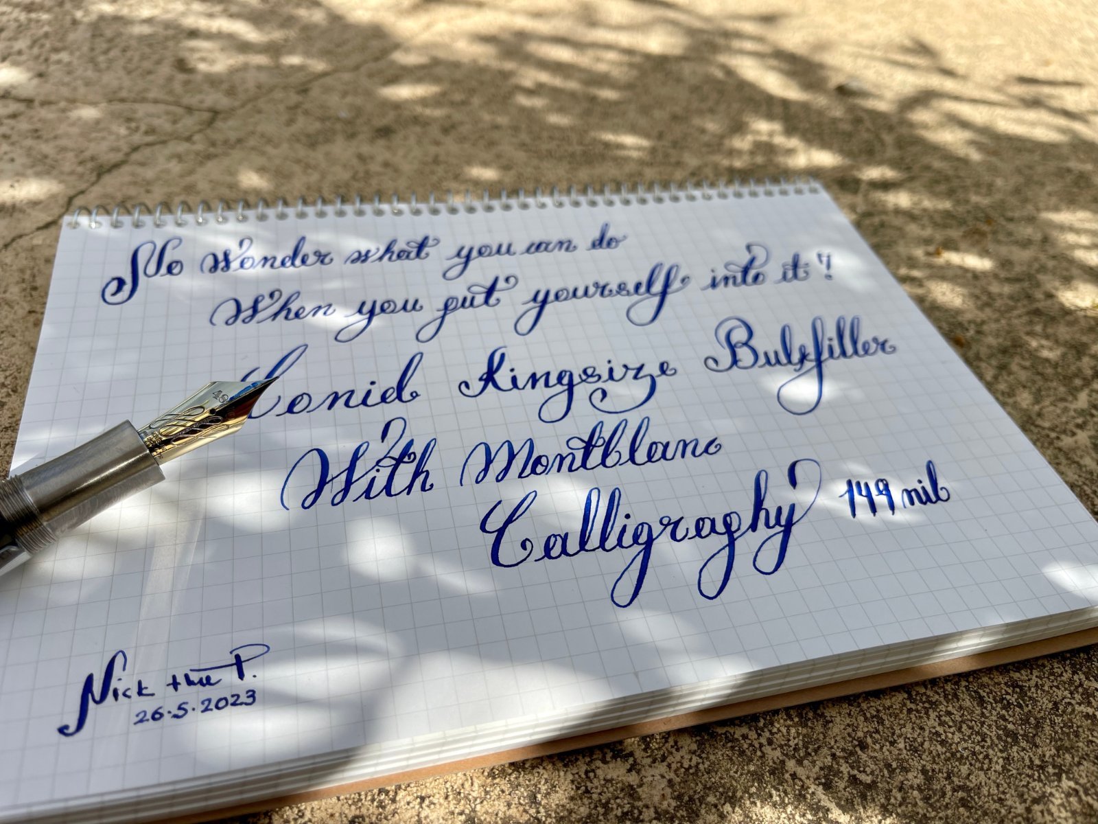
Conid Kingsize Bulkfiller with Montblanc 149 Calligraphy nib
mywatchgr posted a topic in Other Brands - Europe
My favorite modern flex nib, on my favorite pen...my grail combo, after 3 years of waiting, I was able to finally put everything together... and today they got married 🥰 What do you think? Pardon my calligraphy I am at an infant stage, but I am working on it...! Ink: Pilot Iroshizuku ASA-GAO Paper: Maruman A5 Spiral Notebook (Made in Japan) Not the ideal paper for the combo but it's inexpensive for everyday workout ☺️ @fpupulin@como
-
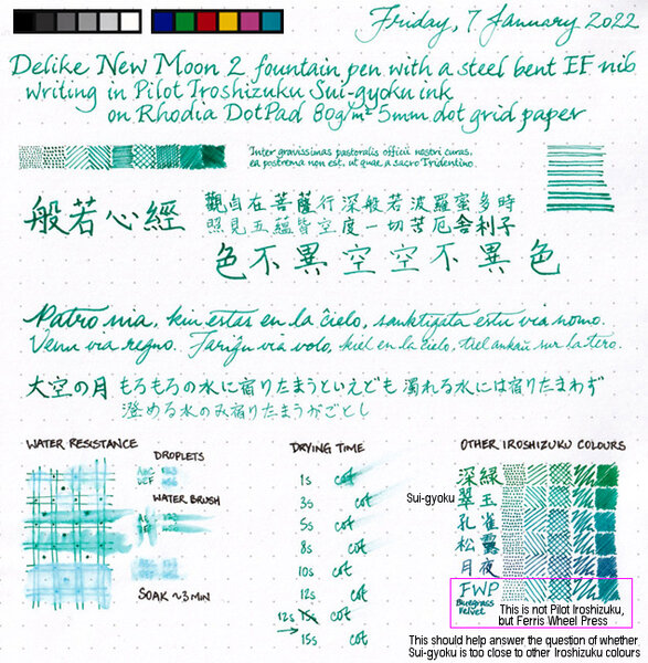
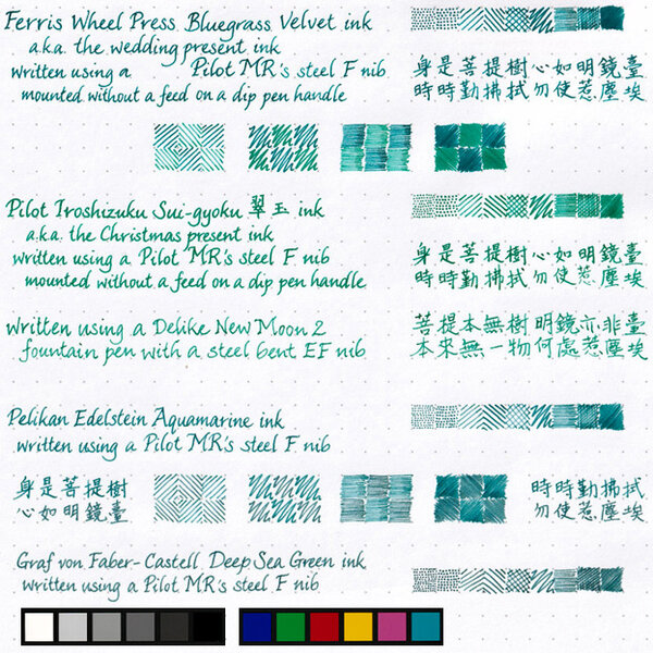
Sui-gyoku is one of three new Pilot Iroshizuku colours released late in 2021. Photo: Scan: (Some other colour comparisons can be found here.) p.s. No show-through, no bleed-through, and no sheen observed.
-
.jpg.bd8d1ac9ebd046371cfb77a354fd599c.jpg)
From the album: Shades of colour
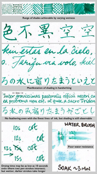
My Canon CanoScan LiDE 300 scanner does not seem to capture subtleties in green very well, and so leaves post-scanning colour-correction with not a lot to work with. Here, instead of not showing green where there should be some, there is too much green in both colours, but especially Syo-ro. It didn't help that the two ink colours are nigh indistinguishable when written very wet, and somehow the Pilot MR's steel F nib appeared to be writing increasingly wetter with time, even though I didn't see any tine misalignment under a loupe, and the tine gap while seemingly wide for a Japanese nib did not appear to be the problem. Trying to close the tine gap didn't help; and neither did swirling the nib around briefly in dilute solution of aqueous ammonia and dishwashing detergent. I ended up smearing detergent directly onto the nib and rubbing it vigorously, then dunking it into >90°C hot water. That seemed to have more of an effect in taming the wild ink flow witnessed earlier.© A Smug Dill
- 0 B
- x
-
.jpg.ebc06a65f7ea950d614402007687ef07.jpg)
From the album: Shades of colour
My Canon CanoScan LiDE 300 scanner does not seem to capture subtleties in green very well, and so leaves post-scanning colour-correction with not a lot to work with. It didn't help that the two ink colours are nigh indistinguishable when written very wet, and somehow the Pilot MR's steel F nib appeared to be writing increasingly wetter with time, even though I didn't see any tine misalignment under a loupe, and the tine gap while seemingly wide for a Japanese nib did not appear to be the problem. Trying to close the tine gap didn't help; and neither did swirling the nib around briefly in dilute solution of aqueous ammonia and dishwashing detergent. I ended up smearing detergent directly onto the nib and rubbing it vigorously, then dunking it into >90°C hot water. That seemed to have more of an effect in taming the wild ink flow witnessed earlier.© A Smug Dill
- 0 B
- x
-
.jpg.ea7a16a4a8f9ab76b4c42e083ed63203.jpg)
From the album: Shades of colour
The colours here are closer than the scanned image to how I perceive them when staring at the page, but still not quite right. I think they look too blue, while in the scanned image they look too green. The differences between the two ink colours are really subtle; Syo-ro is just ever-so-slightly bluer and a teensy bit more muted than Ku-jaku, so images that lean either blue or green would obscure the differences.© A Smug Dill
- 0 B
- x
-
desaturated.thumb.gif.5cb70ef1e977aa313d11eea3616aba7d.gif)
Pilot Iroshizuku Kiri-same vs Herbin Cacao du Brésil
A Smug Dill posted a gallery image in FPN Image Albums
.jpg.fb9f536b1a0944c4538729b10ffcff79.jpg)
-
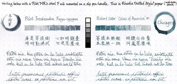
Pilot Iroshizuku Fuyu-syogun vs Robert Oster Chicago
A Smug Dill posted a gallery image in FPN Image Albums
-
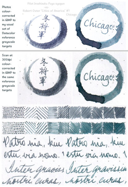
Pilot Iroshizuku Fuyu-syogun vs Robert Oster Chicago
A Smug Dill posted a gallery image in FPN Image Albums
-
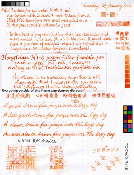
I've had this ink for years, but never gave it all that much love, because my last memory of it was that its colour is pale and muted, and thus unsuitable for use in Fine nibs. My relatively new HongDian N1-S came fitted with a steel EF nib (with no other option on offer, in case you're wondering) that is anything but fine, and so I thought it might put down pale and muted broad(er) lines of ink that make for legible writing. Imagine my surprise when the writing came out looking like blood orange! So, I just have to show you: Oh, the paper used is Rhodia DotPad 80g/m² 5mm dot grid paper (as usual for me), and there was no feathering, no show-through, no bleed-through, and no sheen observed.
-
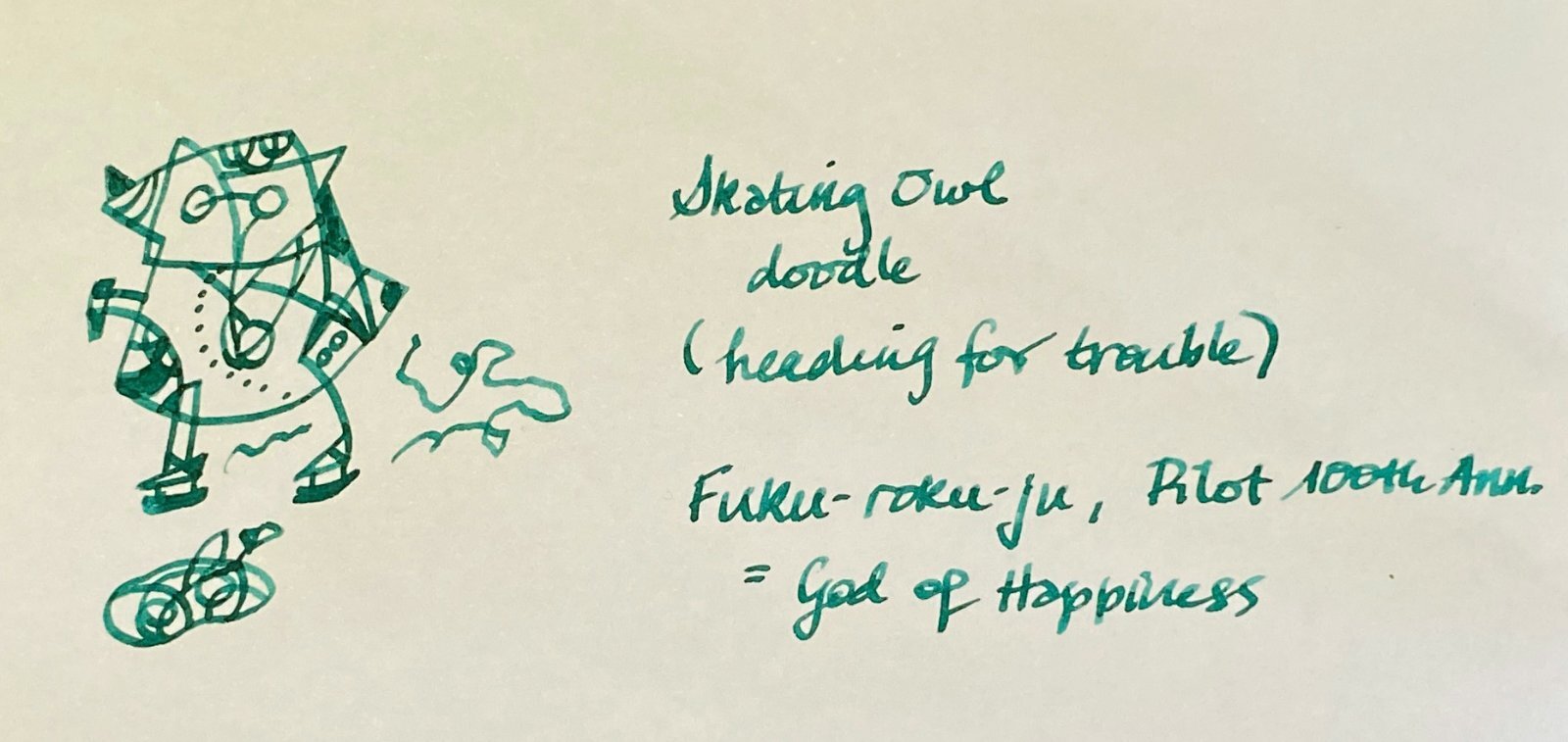
Doodle -- Skating owl coming to hole in the ice. Fukurokuju (Pilot, 100th Anniversary)
-
Water resistance testing of 5 Pilot Iroshizuku inks
A Smug Dill posted a gallery image in FPN Image Albums
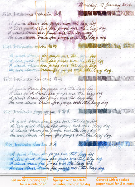
From the album: Ink performance testing
Putting the sheet found here: https://www.fountainpennetwork.com/forum/gallery/image/9273-shortlist-of-candidates-for-an-order-of-3-bottles-of-pilot-iroshizuku-ink/ through the paces.© A Smug Dill
- 0 B
- x
-
-

-
From the album: Ink review
No show-through, no bleed-through, and no sheen observed on the Rhodia DotPad 80g/m² 5mm dot grid paper used for the review sheet.© A Smug Dill
- 0 B
- x
-
From the album: Ink review
No show-through, no bleed-through, and no sheen observed on the Rhodia DotPad 80g/m² 5mm dot grid paper used for the review sheet.© A Smug Dill
- 0 B
- x
-
From the album: Shades of colour
Since I just did this for my wife to select ink colours with which to fill her pens, I may as well scan and post it.© A Smug Dill
- 0 B
- x
-
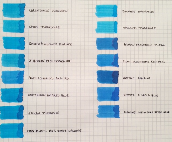
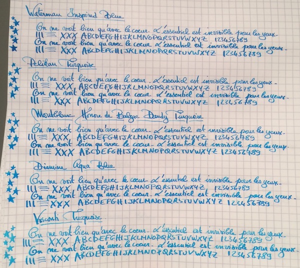
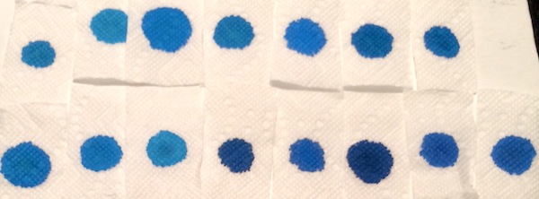
I don’t know if it’s the warm and sunny weather that just hit the northeast after a cold spell, but, more than ever, I’m not ready for summer to end! So to keep the summery vibe going, I thought why not do a comparison of turquoise and “beachy blue" inks. This is by no means a comprehensive review, because I’m missing some great turquoise inks, such as Sheaffer and Lamy Turquoise, but I saw a post come up on the boards with questions about turquoises, so I wanted to share samples of the ones I have. The 15 inks tested are: Caran d’Ache Turquoise, Omas Turquoise, Rohrer & Klingner Blu Mare, J. Herbin Bleu Pervenche, Pilot Iroshizuku Ama-Iro, Waterman Inspired Blue, Pelikan Turquoise, Montblanc Honore de Balzac Dandy Turquoise, Diamine Aqua Blue, Visconti Turquoise, Pelikan Edelstein Topaz, Pilot Iroshizuku Kon-Peki, Diamine Asa Blue, Diamine Florida Blue and Diamine Mediterranean Blue. The writing samples were done using a 1950s 146 and a Pilot Custom 74 B nib ground down to a smooth stub by Mike Masuyama. All samples were tested on Rhodia paper. Ink Swabs: Ink on Paper Towel: Top Row: Caran d’Ache Turquoise, Omas Turquoise, Rohrer & Klingner Blu Mare, J. Herbin Bleu Pervenche, Pilot Iroshizuku Ama-Iro, Waterman Inspired Blue, Pelikan Turquoise Bottom Row: Montblanc Honore de Balzac Dandy Turquoise, Diamine Aqua Blue, Visconti Turquoise, Pelikan Edelstein Topaz, Pilot Iroshizuku Kon-Peki, Diamine Asa Blue, Diamine Florida Blue and Diamine Mediterranean Blue Best Flow and Smoothness: J. Herbin Bleu Pervenche Bleu Pervenche wins hands down for me in this category and is miles ahead of every other ink in this review. With that said, although it has an excellent flow, l wish Bleu Pervenche felt a little smoother (to match the smoothness of my favorite inks). However, this is the only turquoise with a regular spot in my ink rotation. Best Turquoise Color: Rohrer & Klingner Blu Mare This is by far my favorite shade of turquoise. It offers a nice mix of blue and green that leans more towards the blue side (which I prefer). In a wet nib, it is the most vibrant of the turquoise inks tested - so vibrant in fact that it makes me want to pull out a pair of sunglasses . The ink has a good flow (though not as high as Bleu Pervenche) but is missing the high level of smoothness I look for in a go-to ink. However, I love the color so much that I did get a bottle. Best Beachy Blue Color: Pilot Iroshizuku Ama-Iro and Diamine Florida Blue (Tie) I love the color of both of these inks, but I do not own bottles of either. I consider Ama-Iro to a "beachy blue" rather than a turquoise because it needs a little more green to be a true turquoise. I really love its bright, light blue color, which screams summer fun, but didn't enjoy the feeling of writing with the ink enough in the flexy 146 to buy a full bottle especially given its higher price point. I should note that I may have been especially tough on Ama-Iro because I was expecting a higher level of smoothness from an Iroshizuku ink. Florida Blue and Mediterranean Blue are close enough in color that someone looking to keep their ink spending to a minimum wouldn't need to own both. Florida Blue has a better flow, and, since I like wetter inks, I wouldn't think twice about using it over Mediterranean Blue. (Mediterranean blue is not a dry ink but someone looking for less wetness might prefer it; it is also a little lighter and exhibits slightly more shading than its Floridian counterpart.) Highest Sheening Ink (on Rhodia): Pilot Iroshizuku Kon-Peki Kon-Peki is not a monster sheener on Rhodia (like some of the Sailor inks I’ve recently tried) but still offers a subtle and beautiful pink shimmering halo around its blue letters. Some posts have asked how it compares to Edelstein Topaz and, as others have noted, both inks are similar in that they are cerulean blues with pink sheen. (I've noticed that Topaz sheens tremendously on Tomoe River Paper, but in this comparison it barely showed any sheen around the letters.) If I had to choose only one of the two inks, it would be Kon-Peki. The color is brighter and the ink has a better flow. Lowest Performer: Caran d’Ache Turquoise I really did not like this ink and was expecting more from a $30+ ink. It was so thin that it took the fun out of writing with my favorite pen (and I almost stopped the review to change writers). Other notable mentions: Light Turquoise: Visconti and Omas Turquoise (tie) Both inks are on the lighter end of the turquoise spectrum and could be a good option for someone looking for such a shade. I prefer the flow of the Omas but like the color of the Visconti better. (I would have liked for the Visconti to perform more like its brother ink, Visconti Blue, which offers a smoother writing experience.) Dark Beachy Blue: Diamine Asa Blue Asa Blue is a beautiful and interesting color in that it is paradoxically both dark and beachy. It has a good flow but an ok smoothness. Montblanc Dandy Turquoise Alternative: Pelikan Turquoise I love this shade of turquoise and have found that with the right pen and paper combination it can offer wonderful color variation. (I've noticed much more color variation using a Visconti HS.) For anyone who was not able to get a bottle during its limited run, I think that Pelikan Turquoise is a pretty close alternative.
-
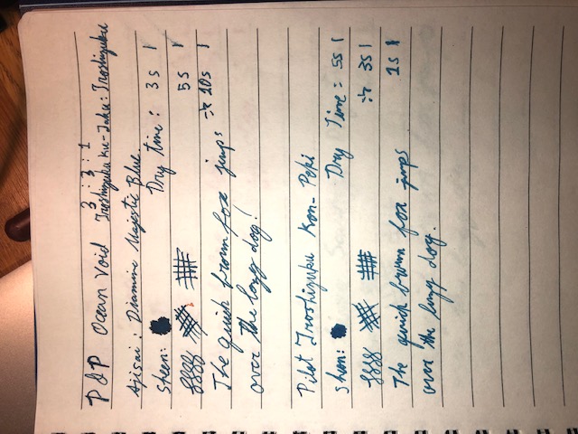
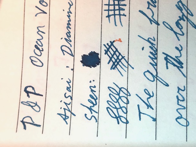
These have been sitting in my pens and bottles for months by thus point without any issues. No solid chunks, no odors or bubbling, no color loss. I especially like the golden brown and purple. I call these colors: -Golden Sands -Tanzanite -Ocean Void -Oasis (Instead of Deep Teal) Anyone like any one of them in particular?
-
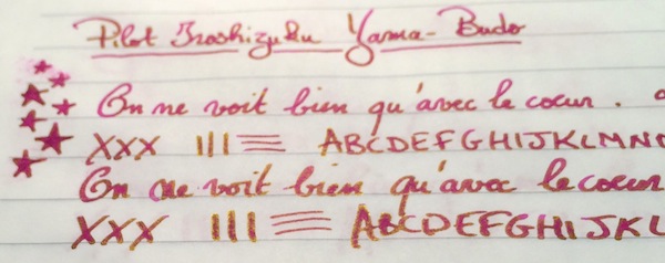
In December 2007 Pilot's created exclusive line of inks called Iroshizuku. I believe they may well be the most well known fountain pen inks in pen world. These inks are supposed to work in any pen with any nib on any paper and in any situation. I haven't tried all of them but so far the Iroshizuku inks I've tried were behaving flawlessly. The colors were created by Kiyomi Hasegawa who after fifteen years of working in a stationary shop and communicating with Clients come to conclusion that not all fountain pen users are willing to write in black and blue. Wise woman. The bottles are stunning although they have their issues: if the ink is left unused for some time the cap tends to stick and break when you try to twist it open. It happened to my bottle of Shin-Ryoku. Anyway Iroshizuku line of inks counts 24 "standard" colors. Three inks were made some time ago for Tokyo stores: Edo-Murasaki, Fukagawa-Nezu and Shimbashi-Iro.After seeing the scans over blogosphere I wish these three were accesible, because they look interesting. Edo - Murasaki looks cool while Murasaki - Shikibu is of no interest to me. Even though I kind of like Fuyu-Syogun I find Fukagawa-Nezu more compelling. Nothing indicates Pilot plans on extending the official line any time soon (if ever) so let's take a look at what's possible to obtain from dealers and online shops. http://imageshack.com/a/img538/1595/lYAayJ.jpg Ajisai Ama-Iro Asa-Gao Chiku-Rin Fuyu-Gaki Fuyu-Syogun Ina-Ho Kiri-Same Kon-Peki Kosumosu Ku-Jaku Momiji Murasaki-Shikibu Shin-Kai Shin-Ryoku Syo-Ro Take-Sumi Tsuki-Yo Tsukushi Tsutsuji Tsuyu-Kusa Yama-Budo Yama-Guri Yu-Yake Bottle http://imageshack.com/a/img855/2577/9i83.jpg http://imageshack.com/a/img855/5192/n2r6.jpg Yama - budo is named after wild grapes. I enjoy this color a lot. The problem is it fades quite significantly with time. After a month you won't see saturated stunner but rather pleasant and muted color. http://imageshack.com/a/img540/3328/saqdXg.jpg Drops of ink on kitchen towel http://imageshack.com/a/img633/5390/SYGGFM.jpg Software ID http://imageshack.com/a/img908/3164/m6pbeW.jpg Waterproofness http://imageshack.com/a/img661/7906/dVHw0f.jpg Oxford Recycled ( 90g), Kaweco Sport Classic, B http://imageshack.com/a/img540/9910/esF3u8.jpg http://imageshack.com/a/img901/7917/P6pI9c.jpg http://imageshack.com/a/img913/9336/3RYmSj.jpg TWSBI 580, 1,1 http://imageshack.com/a/img540/7941/HkrbKd.jpg http://imageshack.com/a/img538/2681/7enRkn.jpg http://imageshack.com/a/img661/55/PleChg.jpg Comparison http://imageshack.com/a/img540/2277/If8Wlp.jpg
-
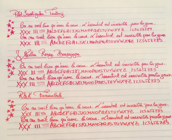
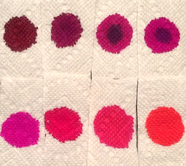
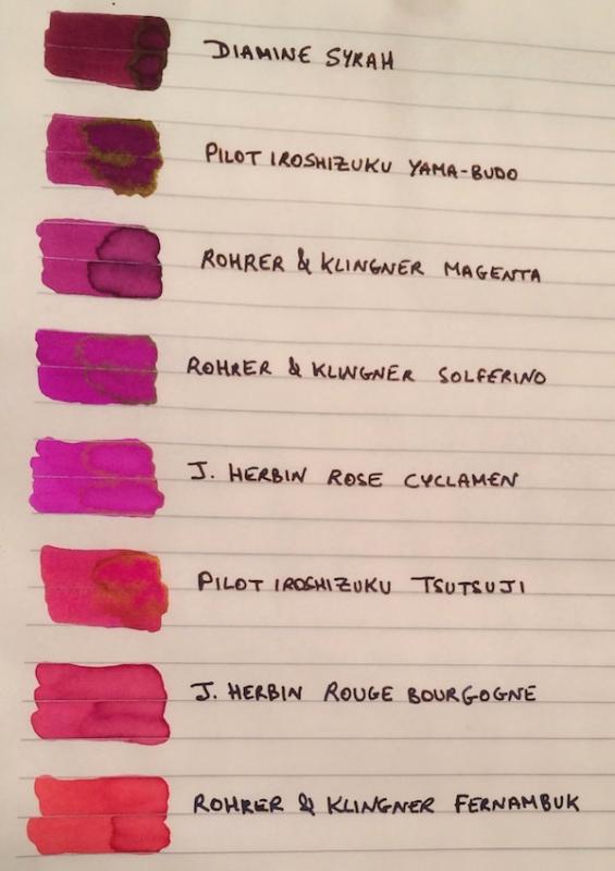
I've been wanting to try some kind of pinkish ink for a while. I didn’t want a pastel or cotton-candy pink, but other than that I was pretty open, so after going through the FPN boards and using the Goulet swatch tool, the eight finalists ranged from burgundy to magenta to purplish and reddish pinks: Diamine Syrah, Pilot Iroshizuku Yama-Budo, Rohrer & Klingner Magenta, Rohrer & Klingner Solferino, J. Herbin Rose Cyclamen, Pilot Iroshizuku Tsutsuji, J. Herbin Rouge Bourgogne, and Rohrer & Klingner Fernambuk. Although I liked some of the colors, I didn’t see myself using pink enough to warrant buying a full bottle (given that I am trying, though not very well , to stick to a stricter ink budget). I didn’t want the samples to go to waste though so I thought it might be helpful to post a comparison on here for anyone else who might also be thinking of going “pink.” The writing samples were done on Rhodia using a random steel nib pen (that I use as a dip pen) and a Pilot Custom 74 B nib ground down to a smooth stub by Mike Masuyama (also used as a dip pen to be able to test all the colors quickly). I’ve included a second set of samples on Tomoe River Paper, since some of these inks (especially given their sheen) could make for beautiful options for special letters, cards or notes on heavily "sheening" paper. PS I would need to ink a pen with it to accurately test its smoothness and flow, but if I had to pick one pink ink that I could see myself using often enough to purchase a full bottle it would be R&K Magenta. Which one of the eight would you pick? 1. On Rhodia: Closeups Ink Swabs 2. On Tomoe River Paper: Closeups Highest "Sheening" Ink Close-up Ink Swabs 3. Ink on Paper Towel: Top Row: Diamine Syrah, Pilot Iroshizuku Yama-Budo, Rohrer & Klingner Magenta, Rohrer & Klingner Solferino Bottom Row: J. Herbin Rose Cyclamen, Pilot Iroshizuku Tsutsuji, J. Herbin Rouge Bourgogne, Rohrer & Klingner Fernambuk
-
In December 2007 Pilot's created exclusive line of inks called Iroshizuku. I believe they may well be the most well known fountain pen inks in pen world. These inks are supposed to work in any pen with any nib on any paper and in any situation. I haven't tried all of them but so far the Iroshizuku inks I've tried were behaving flawlessly. The colors were created by Kiyomi Hasegawa who after fifteen years of working in a stationary shop and communicating with Clients come to conclusion that not all fountain pen users are willing to write in black and blue. Wise woman. The bottles are stunning although they have their issues: if the ink is left unused for some time the cap tends to stick and break when you try to twist it open. It happened to my bottle of Shin-Ryoku. Anyway Iroshizuku line of inks counts 24 "standard" colors. Three inks were made some time ago for Tokyo stores: Edo-Murasaki, Fukagawa-Nezu and Shimbashi-Iro.After seeing the scans over blogosphere I wish these three were accesible, because they look interesting. Edo - Murasaki looks cool while Murasaki - Shikibu is of no interest to me. Even though I kind of like Fuyu-Syogun I find Fukagawa-Nezu more compelling. Nothing indicates Pilot plans on extending the official line any time soon (if ever) so let's take a look at what's possible to obtain from dealers and online shops. http://imageshack.com/a/img538/1595/lYAayJ.jpg Ajisai Ama-Iro Asa-Gao Chiku-Rin Fuyu-Gaki Fuyu-Syogun Ina-Ho Kiri-Same Kon-Peki Kosumosu Ku-Jaku Momiji Murasaki-Shikibu Shin-Kai Shin-Ryoku Syo-Ro Take-Sumi Tsuki-Yo Tsukushi Tsutsuji Tsuyu-Kusa Yama-Budo Yama-Guri Yu-YakeMomiji is named after autumnal leaves of japanese maple. http://upload.wikimedia.org/wikipedia/commons/thumb/7/79/AcerPalmatum2.jpg/1280px-AcerPalmatum2.jpg It's too pinkish to my taste. http://imageshack.com/a/img909/2844/GgsfmW.jpg Drops of ink on kitchen towel http://imageshack.com/a/img538/6228/QcIebq.jpg Chromatografia http://imageshack.com/a/img673/5523/cyCztK.jpg Software ID http://imageshack.com/a/img537/9408/eMExUh.jpg Oxford Recycled ( 90g), Kaweco Sport Classic, B http://imageshack.com/a/img540/6919/UfHHX8.jpg http://imageshack.com/a/img661/6049/7sxdRc.jpg http://imageshack.com/a/img673/5049/QdhDLK.jpg http://imageshack.com/a/img661/7844/YvB95d.jpg Kalendarz, Kaweco Sport Classic, B i Hero 5028 1,9 stub http://imageshack.com/a/img538/442/S6eoXt.jpg http://imageshack.com/a/img537/3397/RsEiLO.jpg http://imageshack.com/a/img673/5104/PpQv8g.jpg http://imageshack.com/a/img913/4844/PlaQDb.jpg http://imageshack.com/a/img540/8200/KzvP2S.jpg
-
Do you ever visit those inks that you have hidden away in some drawer for a long time? Has your opinion changed? I have traveled back to my home after been gone for many months, and have been reunited with my ink collection here. I had forgotten, however, my ink sample collection here. I decided to fill my fountain pens with the ink samples that I had left here and compare my thoughts recorded in my "ink journal" from the first time I sampled the ink with my thoughts today. For the sake of brevity, I will omit pens and papers used, since they are the same for both samples. I also rate my inks on a scale of 1 to 10, with 10 being the best. For my first batch, I compared five J. Herbin inks: J. Herbin Bleu Pervenche: First Sample: April 2013: Wonderful ink with fantastic flow in all pens used. Moderate drying time. Little water resistance. Great shading and has a lovely red sheen to it. Love the color! Rating: 7 Today's Sample: Wonderful flow in this medium point on both papers. The color is very nice and is definitely one of my favorites. I love the shading and sheen, especially on Tomoe River paper. I am ordering a bottle today! Rating: 8 J. Herbin Rose Cyclamen: First Sample: February 2015: Vibrant but pretty pink. Flows nicely. Moderate dry time, no water resistance. Doesn't shade much. Rating: 7 Today's Sample: Nice flow in this medium point on both papers. The purply-pink is almost eye searing, and would be great for markups and writing cards. I have other inks near this shade so I don't need a bottle of this now, but will consider for the future. Rating: 7 J. Herbin Eclat de Saphir: First Sample: February 2015: Nice blue with a purple tone - definately my kind of blue. Moderate dry time, no water resistance. Rating: 8 Today's Sample: How have I overlooked this ink? I love it! The color is brilliant, yet elegant. While I have other blues in this shade, I am ordering a bottle of this today! Rating: 9 J. Herbin Rouge Bourgogne: First Sample: August 2014: Nice red with blue undertone. It dries fairly fast, with no smearing. I like the way it shades. It flows well through this nib. Rating: 7 Today's Sample: Nice red with lovely shading. No sheen, however. While I like the red, I have others that I prefer but I may reconsider when I buy my next red. Ratiing: 7 J. Herbin Terre de Feu: First Sample: June 2015: Fascinating color - fire earth. Love the rusty brown hue. Has some shading, but no sheen. I do like the way this flows through my pen. I'm not a huge brown fan, but I like this. Rating: 8 Today's Sample: Wow! I had forgotten all about this ink. This is an unusual color with a warm feel to it. I like the way it writes best, though. Most browns are a bit dry, but this seems to flow easily through my nib. I don't need a brown in this shade right now, but this one will top the list for my next brown. Rating: 8 More to come!
-
Find out what happened here: https://quinkandbleach.wordpress.com/2016/05/19/pilot-iroshizuku-and-namiki-inks-test-02/