.jpg.3be2806341167441927b7dffda09e302.jpg "Pilot Iroshizuku Syo-ro vs Ku-jaku")
.jpg.bd8d1ac9ebd046371cfb77a354fd599c.jpg)
.jpg.ebc06a65f7ea950d614402007687ef07.jpg)
.jpg.ea7a16a4a8f9ab76b4c42e083ed63203.jpg)
.jpg.7135e591c1859d73ed40ecc784b3a0a6.jpg)
.jpg.e0f4a1f97e0c19bc7be96c916ba14266.jpg)
.jpg.c447b569f53659de7c07c6f4173e011d.jpg)
.jpg.2d4100aba0468eedaecf89d8ee35947f.jpg)
Pilot Iroshizuku Syo-ro vs Ku-jaku
desaturated.thumb.gif.5cb70ef1e977aa313d11eea3616aba7d.gif)
By A Smug Dill
- 2,415 views
- View A Smug Dill's images
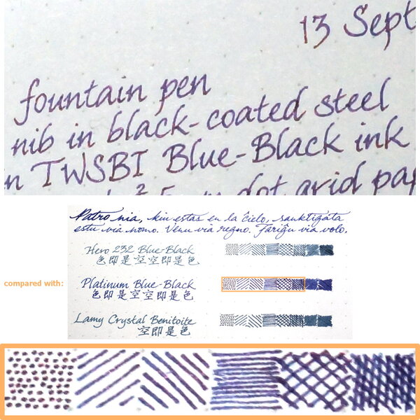
The colours here are closer than the scanned image to how I perceive them when staring at the page, but still not quite right. I think they look too blue, while in the scanned image they look too green. The differences between the two ink colours are really subtle; Syo-ro is just ever-so-slightly bluer and a teensy bit more muted than Ku-jaku, so images that lean either blue or green would obscure the differences.
Copyright
© A Smug Dill
- 265.7 kB
- 654x723
Recommended Comments
There are no comments to display.
Create an account or sign in to comment
You need to be a member in order to leave a comment
Create an account
Sign up for a new account in our community. It's easy!
Register a new accountSign in
Already have an account? Sign in here.
Sign In Now