Search the Community
Showing results for tags 'orange'.
-
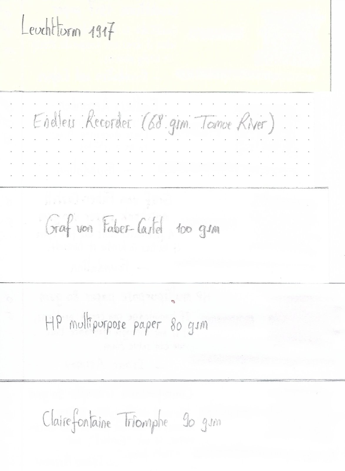
James Purdey & Sons Single Malt scented ink was released in 2018 by Montblanc as part of a series in collaboration with James A. Purdey, a gunmaker and hunting lifestyle brand. The ink surprised me! Single malt scented ink sounded at first like a (overpriced) gimmick and to some extend it is of course. But the color is a deep, beautiful orange-brown with amazing shading. Definitely a fall color which can be used in both a business environment (note taking) as well as for personal writing and correspondence. Be careful though, when opening the bottle or the pen cap the whisky scent is quite strong. It might be frowned upon at 830am when the meeting starts... The scent fades quickly though, within minutes. After 20-30 minutes the smell of the paper itself always wins. The ink behaves like most Montblanc inks I own. Perfect behavior in a broad, wide nib. A bit dry and with a strong dislike for TWSBI pens. The shading is wonderful, no feathering, and no show-through. Drying time is well below average at roughly 22 seconds. As can be seen, the ink doesn't really appreciate water. This ink is the most bright, orange-brown ink I have. SBRE brown (P.W. Akkerman) is not far off, Comte de l'Or (produced by Diamine) is much more gold (of course), Herbin's café des Îles and Caroube de Chypre have far less orange in them and are a more true brown. The ink will definitely gain some attention in the office, but I will use it for a while. I really like it. N.B. Review written on Original Crown Mill Vellum paper
-
InkFlash - Robert Oster Red Orange I've got so many ink bottles and samples in my stash, that it's totally unrealistic to give all of them the attention of a full review. Up to this point, all these inky treasures were pining away in the dark recesses of my ink cabinet. So I decided to come up with a new format to present these inks. Introducing... the "Ink Flash" - short and quick presentations of inks, that take up very little time, and that show just enough detail to get a feel for them. Rhodia DotPad No 16 A look at the chromatography Related inks And finally a quick doodle
-
KWZ Orange This is review #175. Part of the mystery ink blind testing on another website. This is a very, very joyous, wet, reddish/ coral orange (depending nib size, pen) with faint shading (M/ B dry Lamy Safari nib), zero water resistance and very long dry times on Rhodia. You need to have blow dryer nearby or live in the desert or a blotter like the good old times The colour is so bright that seeing the shading is a bit difficult. I doubt with a wet pen, much shading is seen. The ink has the typical vanilla scent of KWZ. Though I admit, despite my sensitivity to scent, I did not smell it. It couldn’t handle the Kanwrite Desire with the FPR Ultra flex nib. Either it poured ink or was ink starved. I wouldn’t put in a wet pen/ B nib combo. Will I buy it? no, did it make me happy, yes Chroma: Writing Samples: Mystery ink 65 refers to KWZ orange. Photo: Comparison: Water test: Left side (10 seconds under running water. After 24 hours) Art Work: Sphinx & the Snek Inspired by @LizEF fabulous fantasy story. It is said in the Scroll of Sphinx and the scroll of Snek, beware, when the Snek & Sphinx are bound by the Magus.. the Dragon will rise again... This crude sketch was done by one of the scribes and recoloured by modern day techniques KWZ Orange J Herbin Vert Réséda and Kala Moonlight Tide Makhabesh by Essri the Snek Essri's attempt and drawing his buddy and finally a work from this world: Balance KWZ orange Endless Alchemy Mystic Forest and Kala Moonlight Tide · Pens used: Pilot Kakuno Ef, Lamy (EF/F/M/B/ Stub 1.1), Kanwrite Desire with FPR Ultraflex · What I liked: Colour. It's happy colour. · What I did not like: No water resistance, very long dry times. · What some might not like: Long dry times, no shading, Vanilla KWZ scent · Shading: A bit with dry pen with M/ B nibs. · Ghosting: Yes, on cheap paper. · Bleed through: Yes, on cheap paper. · Flow Rate: Very wet · Lubrication: Excellent · Nib Dry-out: Did not notice. · Start-up: Good · Saturation: Reddish orange. · Shading Potential: Dismal · Sheen: No. · Spread / Feathering / Woolly Line: With a primed flex nib, zowie! · Nib Creep / “Crud”: Did not notice. · Staining (pen): No. · Clogging: Did not notice. · Cleaning: Very easy · Water resistance: Non-existent. · Availability: 60 ml bottles Please don't hesitate to share your experience, writing samples or any other comments. The more the merrier
-
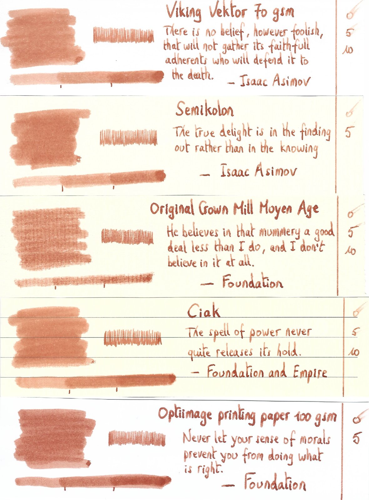
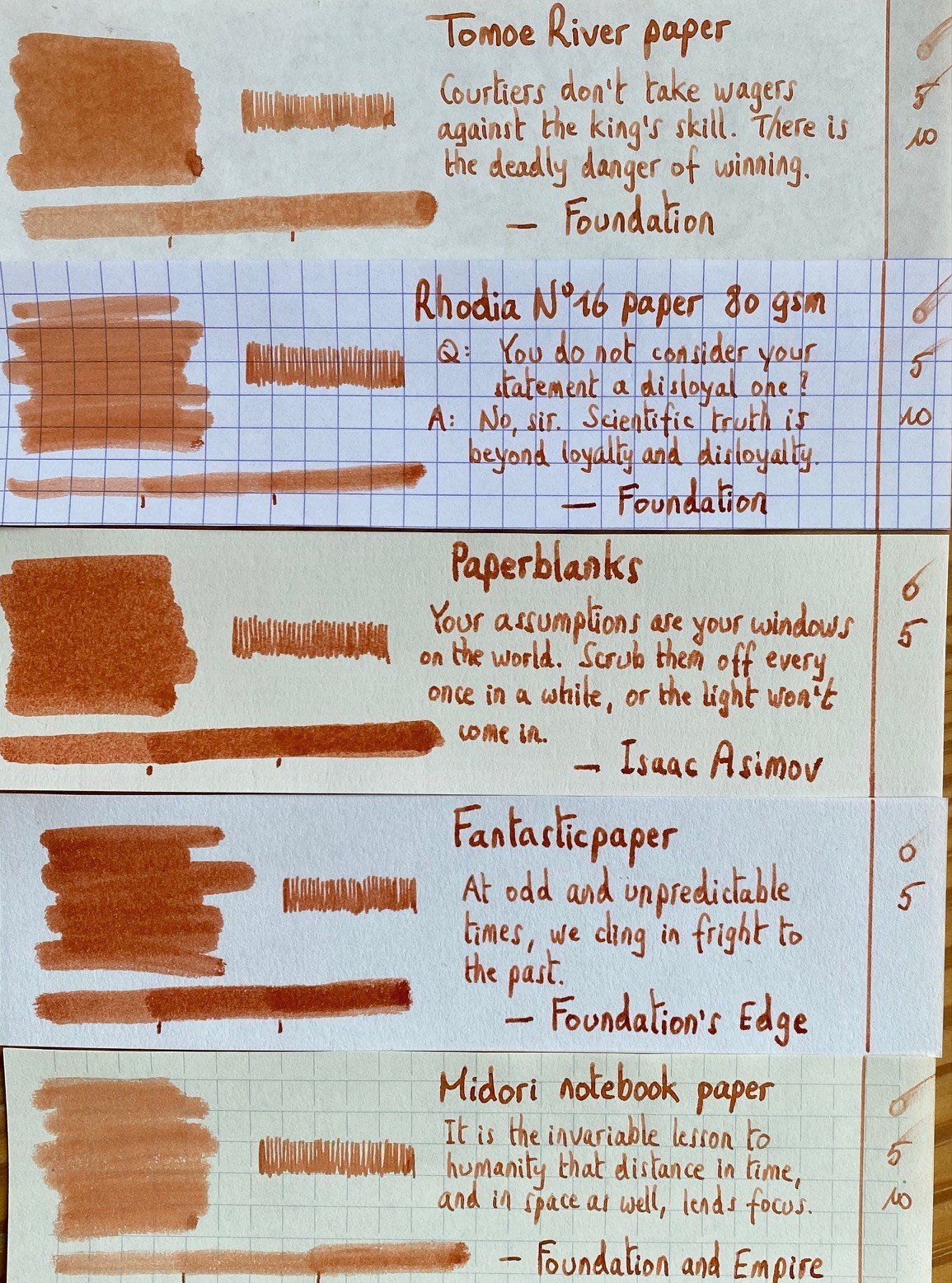
Teranishi Guitar – Orchestra Tangerine Teranishi Chemical Industries – based in Osaka, Japan – was founded during the Taisho period around 1916, and got quite some fame as one of the earlier ink producers in Japan. For their 105th anniversary, the company introduced some stylish retro-inks, hinting at this exciting start-up period. The inks come in beautiful – almost art deco – boxes, containing a nice-looking 40ml bottle of ink. I discovered the Teranishi inks in 2022, and have enjoyed them a lot. These inks are well saturated, but at the same time manage to look muted and toned-down. This combination works quite well, and I’m becoming very fond of this brand. In this review the spotlight shines on Orchestra Tangerine, a red-orange ink with heavy shading and lots of depth. Tangerine is a colour full of joy – it really brightens the day, just what is needed when it’s dark and cold and wet outside. Orchestra Tangerine is well-saturated, maybe a touch too dry, but it writes really well with most pens. Only with my dry-writing Lamy Safari EF and my Kaweco Supra F did that dryness surface – lubrication was just too low to offer a pleasurable writing experience. With wetter pens or with M-nibs and above, the ink will catch up and that touch of dryness disappears. I personally forgive the ink this minor slip up, which can easily be corrected by switching to another pen. The ink’s colour really hits the mark for me. It’s not easy to create a good orange. Use a mostly single-dye colour and the result can look flat and uninteresting. Create your orange through a mix of multiple dyes, and you need to be very careful to strike just the right balance. This Orchestra Tangerine uses a complex mix of dyes, and manages to bring the best out of that combination… lovely shading that moves from a light orange to much darker red tones, lots of depth and character, a bright colour that at the same time is not too “in your face”. To illustrate the colour span of this Teranishi ink, I did a swab on 52 gsm Tomoe River paper, where I really saturated portions of the paper with ink. Orchestra Tangerine has a medium colour span without a strong contrast between light and darker parts. This results in shading that – while still strong – is well balanced and aesthetically pleasing. On the smudge test – rubbing text with a moist Q-tip cotton swab – the ink shows lots of orange smearing, but the text itself can still easily be read. Water resistance is completely absent. Most of the dyes get washed away, leaving greyish pink & oranges smudges behind. This is also evident from the chromatography – most of the component dyes move easily with water. The chroma also shows the complex mix of dyes used to create this beautiful orange. Surprisingly, with so much rose&pink in the mix, it’s a wonder that none of that pink-ness comes to the surface. Teranishi’s ink makers succeeded in keeping the rose&pink component under tight control and bound within the ink. In writing & drawing, only orange and red tones are visible. Really well done! I’ve tested the ink on a wide variety of paper – from crappy Moleskine to high-end Tomoe River. On each scrap of paper I show you: An ink swab, made with a cotton Q-tip 1-2-3 pass swab, to show increasing saturation An ink scribble made with a Lamy Safari M-nib fountain pen The name of the paper used, written with a B-nib Safari A small text sample, written with the M-nib Safari Source of the quote, written with a Sailor 1911 with M-stub Drying times of the ink on the paper (with the M-nib Safari) The multi-paper writing test shows that Teranishi Orchestra Tangerine plays nice with both white and cream paper. It can also handle low-quality paper really well – with Moleskine, there’s only a tiny bit of feathering visible. With absorbent papers, you do get quite some bleed-through, making it impossible to use the backside of the page. Drying times are fairly short, mostly in the 10-20 second range, with the longest drying times on glossy paper. Overall, a technically solid ink. I used photos for the writing samples above to get the most accurate results. In scans, the ink looks a bit too brown to me - see the scanned image below. Below you’ll find some zoomed-in parts of writing samples. Notice the tiny amount of feathering on the Moleskine paper. With strong absorbent paper – like Peter Pauper – you lose most of the shading, the ink has no time to settle at the surface, but is sucked immediately into the paper. With hard-surface paper – like the Iroful – the ink’s shading properties are expressed at their best. Lovely! Writing with different nib sizes The picture below shows the effect of nib sizes on the writing (written on Rhodia N°16 80 gsm paper). All samples were written with a Lamy Safari. I also added a couple of visiting pens: a Piloit Capless with M-nib, a Sailor 1911 with M-stub and the dry Kaweco Supra with F-nib. This Orchestra Tangerine seems to be made for stub nibs, where the playful & strong shading gets beautifully expressed, and where the ink has the chance to show off its true potential. Related inks To compare Teranishi Orchestra Tangerine with related inks, I use my nine-grid format with the currently reviewed ink at the center. This format shows the name of related inks, a saturation sample, a 1-2-3 swab and a water resistance test – all in a very compact format. Kyo-iro Moonlight of Higashiyama has that same depth to it, but is more of a burnt-orange colour with brown-earth tones. Inkxperiment – Space Flowers : Jupiter As a personal challenge, I try to create interesting drawings using only the ink I’m reviewing. For me, that’s where the fun starts: experimenting with the ink to see how it behaves in a more artistic context. And as is often the case with orange-toned inks, this Teranishi Orchestra Tangerine seems to be born to draw with. This is part two in a short mini-series of eerie-looking space flowers. The red-orange colour of this ink made me think of the great red-spot of Jupiter, which shows those same red-oranges hues. So it’s no surprise that the flowers in this picture originate from Jupiter. I started with an A4 piece of HP photo paper, and used circular cut-outs from a kitchen towel to create the textured background. To create the effect, I cover the photo paper with the kitchen towel, and drip water diluted ink on it, which I then press onto the underlying paper using cotton pads. Next, I painted the sky with heavily water diluted ink, applied with cotton pads (keeping the sun covered with a circular piece of cardboard). Against this backdrop, I used a glass dip-pen and a felt-tip pen with pure ink to add the Jovian flowers. The resulting drawing shows quite well wat can be achieved with Orchestra Tangerine as a drawing ink. Inkxpired – computational art I love experimenting with pen/ink/paper, and have added another layer as part of the hobby. I’m exploring computational art, inspired by the ink drawings I do during ink reviews. Another fun offshoot of the hobby… and all that starting with a few drops of dye-coloured water on paper. I started by applying a lens-blur filter to the drawing that overexposed the image, and followed up with a polygon filter. I then shifted the colours to more yellow hues, which brought out more details in the drawing. Conclusion Teranishi Orchestra Tangerine is a great ink: a beautiful red-orange that looks good on all types of paper. It has some lubrication issues with fine nibs in dry pens, but that’s not the type of pen this ink is made for. This is an ink for stub-nibs where the ink can express its shading capabilities in all its splendor. And if you’re interested in using inks artistically – this Orchestra Tangerine deserves your attention. It’s a great ink to draw with. I really enjoyed experimenting with it! Technical test results on Rhodia N° 16 notepad paper, written with Lamy Safari, M-nib Backside of writing samples on different paper types
-
De Atramentis Artist Orange This is similar to the Document line but has less of its properties. inks and can be mixed and matched with either Artist or Document lines. It's an anemic orange or a punchy yellow depending how you see it. It’s wet, lubrication slightly below average and is not suitable for cheap thin papers, nor letter writing, unless you’re passive aggressive. 😛 It did weirdly stain a few spots on my already badly stained Kakuno, had flow issues with it and the Kanwrite ( I had to prime to feed) but with the Lamy Safari it worked fine. It’s almost impossible to scan. Photo shows best the colour of the ink. It’s best on Midori cream paper where the shading is most prominent. Surprisingly with B/ 1.1. nibs it becomes paler. I believe this is best used for art work and Wabbits 🐰🥕 You can use it both as yellow or orange in washes or mix it with Artist/ Document Red to give it a bit of oomph. It's slightly cheaper than Document inks (the bottles are 50 ml as opposed to the 45 ml of the documents). Let’s start with the chroma: Writing Samples: Photo: Note the difference in colour. Comparison: Note how the scanner has deformed almost all oranges. Water test: For animal lovers, no felines were hurt during this test and finally an art work, entitled September 19, 1914 It's based on the Reims Cathedral Smiling Angel statue, which was decapitated during the early days of World War I by a flaming beam. Reims cathedral is significant in French history as its were the French Kings were crowned. The statue was restored and is still smiling Inks used, De Atramentis Artist Orange, Platinum Carbon Black, J Herbin Bleu des profondeurs · Pens used: Pilot Kakuno Ef, Lamy (EF/F/M/B, BB), Kanwrite with Ahab flex. · What I liked: On Midori (Ef-M nibs), using for washes. It can pass both for yellow and orange. · What I did not like: Writing with it. I could barely read myself. · What some might not like: It’s a pigment ink, it’s pale. · Shading: Surprisingly yes. · Ghosting: Yes, on cheap paper. · Bleed through: Yes, on cheap paper. · Flow Rate: Wet · Lubrication: Slightly belove average. · Nib Dry-out: Did not notice. · Start-up: It didn’t like Kakuno or Kanwrite. · Saturation: Pastel · Shading Potential: Surprisingly quite good. · Sheen: No. · Spread / Feathering / Woolly Line: Did not notice. · Nib Creep / “Crud”: Did not notice. · Staining (pen): Yes a few spots on the Kakuno. · Clogging: Did not notice. · Cleaning: The more it stays in your pain the more difficult it’ll be. · Water resistance: Excellent · Availability: 50 ml bottles. Please don't hesitate to share your experience, writing samples or any other comments. The more the merrier
-
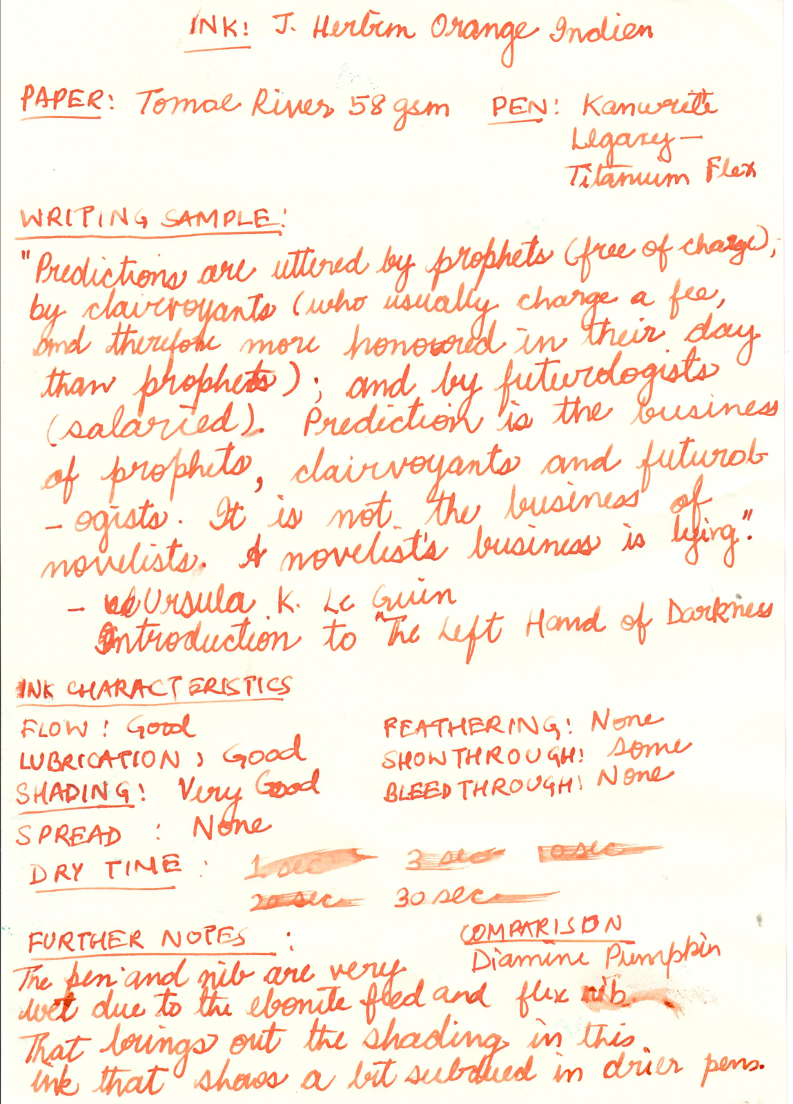
Note: The Diamine Pumpkin comparison looks very similar in the poor scan, but is actually distinct from the Orange Indien. The ink is less red and more orange in reality.

-
The Ondoro is another of my Faber-Castell Design (FCD) pens. These FCD steel nibs are common across the entire design product range - Basic, Loom, Ambition, Ondoro & e-motion and have been impeccable in my experience. My first pen from the design series was an Ambition. I feel that the Ondoro is structurally a much better pen, though it might lack a bit of aesthetic flair prevalent to the Ambition. Below is a link to this review on my blog: Faber-Castell Ondoro Review The Ondoro line comes with a fountain pen (with 4 different nib widths), a roller ball, a propelling pencil (0.7mm) and a ballpoint pen across three coloured resins - Orange, Black & White (now discontinued) and a wooden one (smoked oak) priced substantially higher. PRESENTATION The Ondoro along with the included converter was hand-delivered at my workplace by A.W Faber Castell India personnel, encased inside this moss-green cardboard box. This colour always reminds me of the Australian Baggy Green Caps. The box has a slider where the pen is placed beneath a fabric band on a felted bed, along with a warranty card and a cartridge. Like the pen, the box does portray certain elements of minimalism. http://1.bp.blogspot.com/-Fc0XQgBbg8g/VeHlxofp3nI/AAAAAAAAFVQ/cm40PCnSoYs/s1600/box.jpg DESIGN - HEXAGON & CHROME (6/6) The pen seems to have an affair with geometry, structurally constituted of two overlapping hexagonal prisms - one orange and other chrome, with domed ends. Bold and minimalistic both in terms of convergence and functionality. The barrel is glossy while the cap is shiny chrome plated metal. Unfortunately the mirror finishes have a magnetic attraction for fingerprints. Faber-Castell calls the barrel material precious resin and it does feel qualitatively substantial. http://1.bp.blogspot.com/-jwgZbMNod34/VeHl7XF8PlI/AAAAAAAAFVY/ozpam9geDiw/s1600/DSC_5717.jpg The metallic cap snaps on and off the barrel with audible clicks. While putting the cap on, the hexagonal facets of the cap need to be aligned with the ones on the barrel. There is some metal at the end of the grip which actually is part of an insert for the nib unit. And there rests the shiny FCD nib. The barrel is designed to converge with the section subtly initiating a concave taper at the end of its hexagonal facets, leading to a comfortably concave grip section. http://2.bp.blogspot.com/-UwY4iHyWtyo/VeHmMQG5zdI/AAAAAAAAFVo/_bxi6lwZDgE/s1600/DSC_5725.jpg The finials at either end have smooth and convex domes, the one at the end of a barrel carries a engraved circle or an ‘O’. http://2.bp.blogspot.com/-2bRPeFtLQrY/VeHmHqEzhMI/AAAAAAAAFVg/gflyaBVtiwU/s1600/DSC_5726.jpg A mirror finish on the hexagonal chromed cap will attract your attention while you keep resisting your instant urges to polish off finger-prints, even after the slightest touch. The dome like finial is etched with Faber-Castell logo of two jousting knights and embossed there is a traditional statement preserving antiquity - Since 1761. The spring loaded clip is shaped like an arc with a concave end. It’s engraved with GERMANY on one side of its loading point. A plastic insert inside the cap gives the snap-on friction. http://3.bp.blogspot.com/-PZkfeOy0kTQ/VeHlwGjb_LI/AAAAAAAAFVI/RXHG6CgwqS8/s1600/cap.jpg FILLING SYSTEM (6/6) The rather small resinous concavity at the end of the barrel unscrews from the barrel with seven turns and it disengages the section containing the nib and CC filling system. There is a mention of e3 on the metallic thread insert, it’s apparently a reference to their old manufacturing plants. http://2.bp.blogspot.com/-r54us3mfHlU/VeHmXs1aUxI/AAAAAAAAFVw/ccQWq8h8GSY/s1600/DSC_5755.jpg The insert for the section threads with the metallic insert in the resin barrel. http://1.bp.blogspot.com/-qscoJSXp5Ls/VeHmkJikquI/AAAAAAAAFV4/l343kFQhwS8/s1600/DSC_5757.jpg The converter says SCHMIDT on the piston along with the brand imprint of FABER-CASTELL Germany on the metallic sleeve. It has a reasonably high capacity of around 1 mL, and the ink does last for quite a while! I usually am biased towards piston fillers, but I like the capacity offered by Faber-Castell or Schmidt converters. In case of GvFC Converters, there is no mention of Schmidt on the converters themselves. This converter will snugly fit many other pens. http://2.bp.blogspot.com/-NSOno4o5b_g/VeHmlIAnTaI/AAAAAAAAFWI/lWTl-pFgC5k/s1600/DSC_5763.jpg NIB - ALL THAT MATTERS (6/6) The nib is made of stainless steel alloy with an iridium tip. The initially available nib sizes featured F, M and B nibs, though an EF was made available later. I went with an F sized nib. Right out of the box, this was a very smooth nib. The nib has a perforated imprint of dots which cover a third of its surface area. There is a subtle absence of any breather hole. The nib-size is embossed above the traditional Faber-Castell Design logo of two jousting knights near the tail. http://3.bp.blogspot.com/-GuGepiLE0h8/VeHmk2nj1EI/AAAAAAAAFWE/zimurJDHyqs/s1600/DSC_5776.jpg The feed is standard grey plastic, with a big filler hole for ink suction, which incidentally is used across the GvFC Intuition & Classic Series. http://2.bp.blogspot.com/-fDBSCfLAAE0/VeHmvEJDeYI/AAAAAAAAFWQ/PTA5tgQflgM/s1600/DSC_5778.jpg Faber-Castell Design (steel) nibs are sourced from JoWo whereas the GvFC nibs (18k except Tamitio) are made by Bock. PHYSICS OF IT (5/6) – RELATIVELY SPEAKING Sans the cap, the pen measures around 12.4 cm, which is quite comfortable for me given the wide girth. The cap can be posted easily. While the posted pen exceeds a 15 cm scale, a steel cap of 17g does make it top-heavy. Uncapped Length ~ 12.4 cm Capped Length ~ 12.8 cm Posted Length ~ 16 cm Nib Leverage ~ 1.9 cm Overall Weight ~ 32 g (Cap Weight ~ 17 g) Some capped, uncapped & posted references with a few pens like GvFC Intuition, Pelikan m205 and TWSBI 580 run below for your reference. Terracotta is much redder than the orange in an Ondoro http://2.bp.blogspot.com/-jVgRyXwdBG4/VeHm9LFmMQI/AAAAAAAAFWY/Dtwhl79Buqw/s1600/DSC_5787.jpg Uncapped the Ondoro almost matches a TWSBI 580 http://1.bp.blogspot.com/-HH2u5rSS3kI/VeHm_94vbnI/AAAAAAAAFWg/IKajNkSc5vE/s1600/DSC_5804.jpg Not really posted! http://2.bp.blogspot.com/-ZWsHc5_wH_I/VeHnGAQDFMI/AAAAAAAAFWo/3qO8OdWoej0/s1600/DSC_5815.jpg ECONOMIC VALUE (5/6) The Ondoro resin versions retail at around USD 125. I purchased it with a good discount, directly from A.W Faber Castell India, as there were some warranty issues with my other Faber Castell pen. I believe it’s a good value for money pen given such a beautiful nib, which can defeat any other. OVERALL (5.6/6) This nib is moderately wet, runs fine and smooth. There is absence of any line variation among horizontals & verticals. The nib has got some spring and a touch of softness. I find the grip very comfortable to hold the pen, you might say a little bit of barrel weight could have blessed this one. I will definitely recommend this pen to you, if you are looking at the Faber Castell Design Series. Being a moderately wet writer out of the box, the Fine nib puts a decent fine line (finer than TWSBI F) which takes around 15 seconds to dry a wet MB Toffee brown ink on MD Paper. http://1.bp.blogspot.com/-LtLB1WGbtKs/VeHnQe4ukTI/AAAAAAAAFWw/rHcuB7G_a0w/s1600/DSC_5837.jpg REFERENCES Faber Castell Ambition GvFC Intuition Faber Castell History Bock Clientele Thank you for going through the review. You can find some more pen and paraphernalia reviews here.
-
I just purchased and received on Ebay from a seller in Thailand an unusual Parker 51. The barrel and section are orange, the barrel is longer than that on a true standard 51, and the filling system is C/C, but takes International Standard("IS") C/C, not Parker versions (which are too thick). I placed an IS converter in it, and it draws in and expels water perfectly. The photos below look at bit more red-orange than under normal lighting conditions. One of the photos compares the length of the orange one to a Bexley-created standard size yellow lucite one. I have seen an orange Parker 51 on another page at FPN, and it was standard size and apparently a Kullock creation. Does anyone else have an orange 51 and/or photos of one?
-
Well said, from the Omas web site, here: OMAS is pleased to introduce the 360 SOLETERRE, a special creation realized in limited and numbered 360 pieces only, made to support education rights of children in Morocco, Ivory Coast and San Salvador, thanks to SOLETERRE.org For every 360 SOLETERRE purchased, OMAS will donate its profits to Soleterre and finance together the “education rights”. Buy your 360 SOLETERRE before October, 31st and receive your fountain pen at no delivery charge and with an ink bottle free of charge. The 360 SOLETERRE is available on OMAS.com exclusively with an Extra Fine 14carat gold nib. One of our own FPN members, Newton Pens, supports students with pen sales, and it is great to see Omas doing even a little bit, globally Free global shipping through 10/31 and what appears to be a pretty orange ink, too. I'm a big fan of demonstrators and the 360 line, and wish our dealers carried it (I checked first with Chatterly, where I've had the finest service). It's available direct only. Here's some pictures, enjoy!
-
-
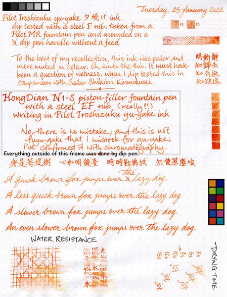
I've had this ink for years, but never gave it all that much love, because my last memory of it was that its colour is pale and muted, and thus unsuitable for use in Fine nibs. My relatively new HongDian N1-S came fitted with a steel EF nib (with no other option on offer, in case you're wondering) that is anything but fine, and so I thought it might put down pale and muted broad(er) lines of ink that make for legible writing. Imagine my surprise when the writing came out looking like blood orange! So, I just have to show you: Oh, the paper used is Rhodia DotPad 80g/m² 5mm dot grid paper (as usual for me), and there was no feathering, no show-through, no bleed-through, and no sheen observed.
-
-

-
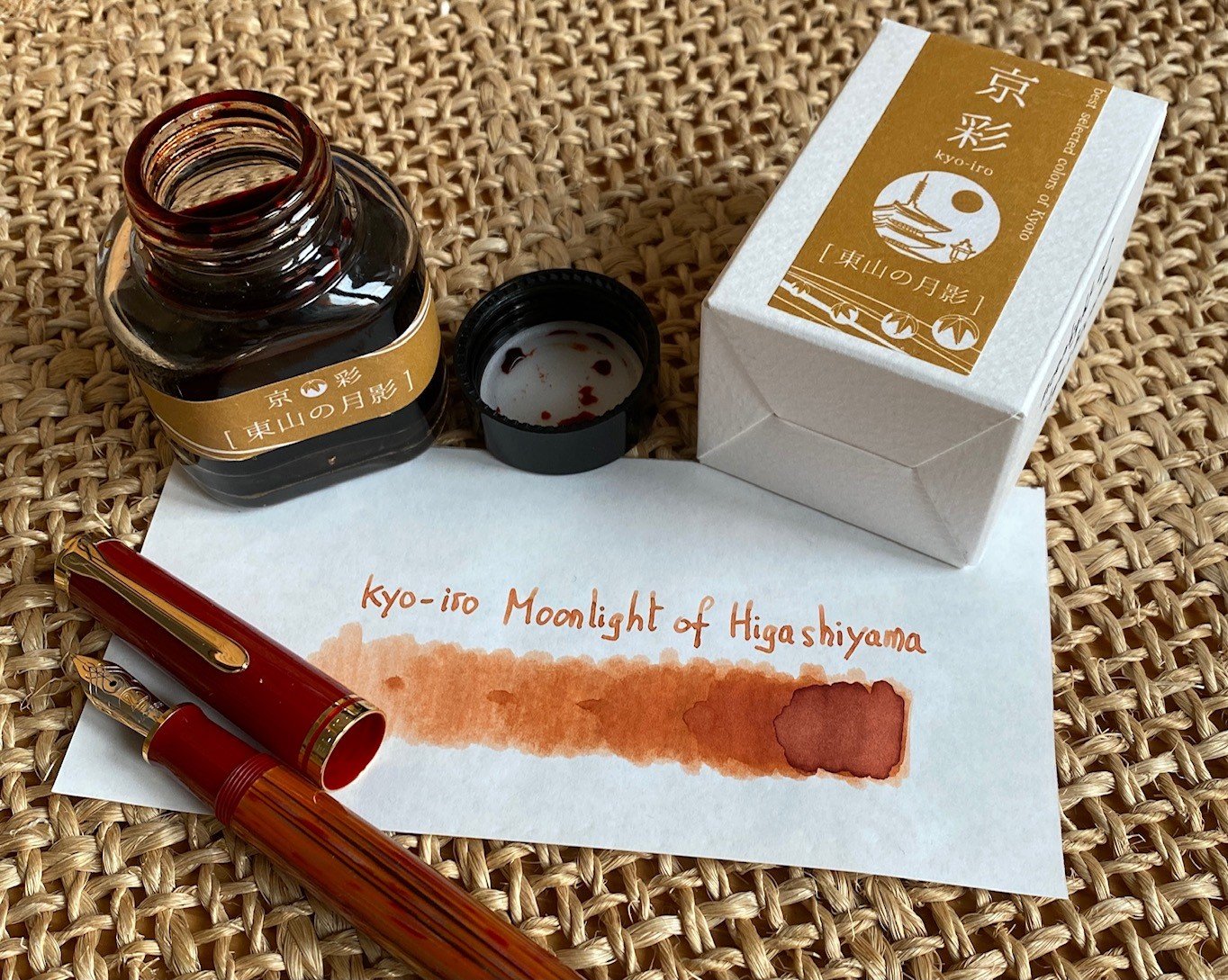
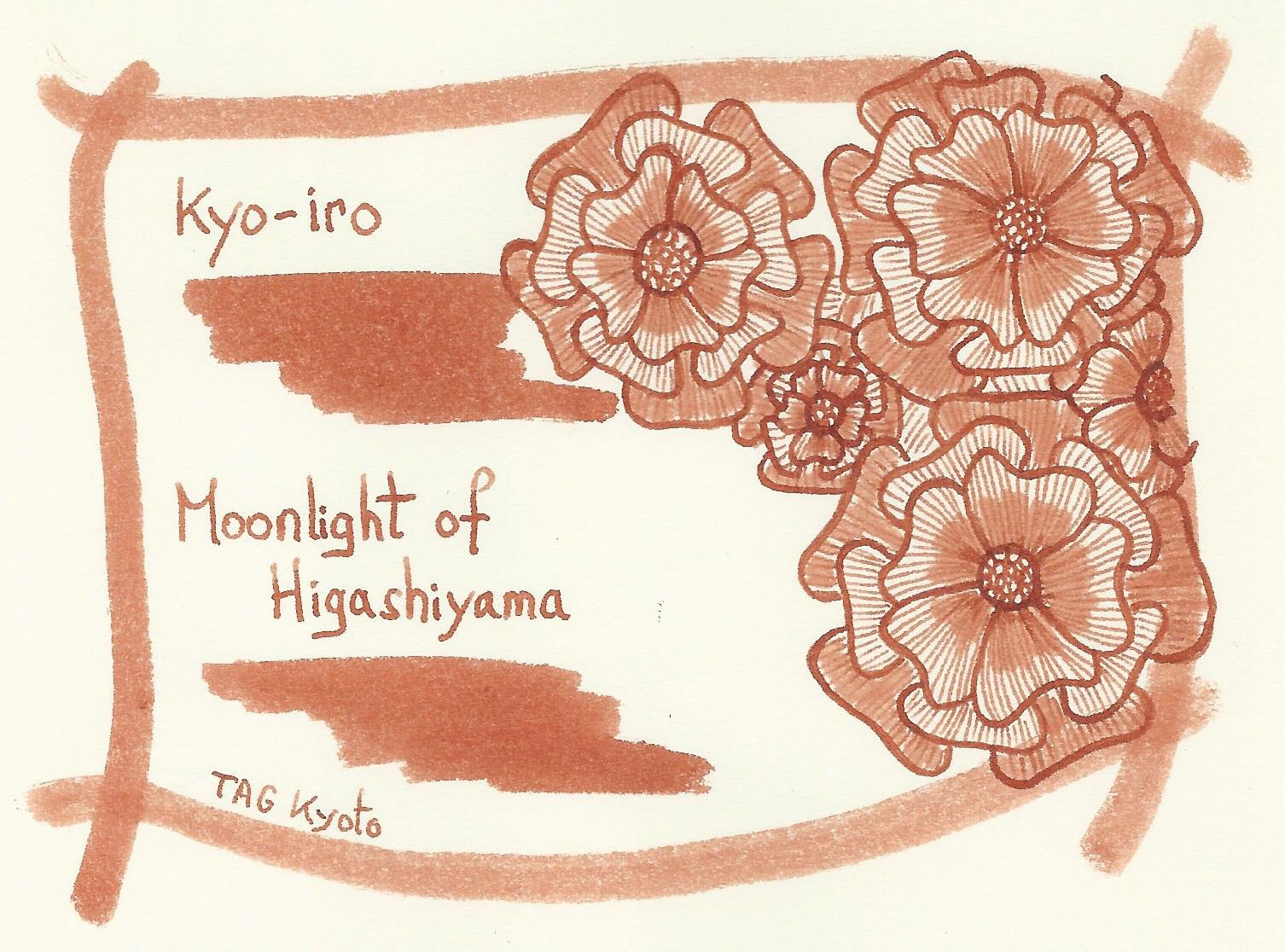
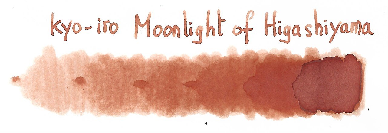
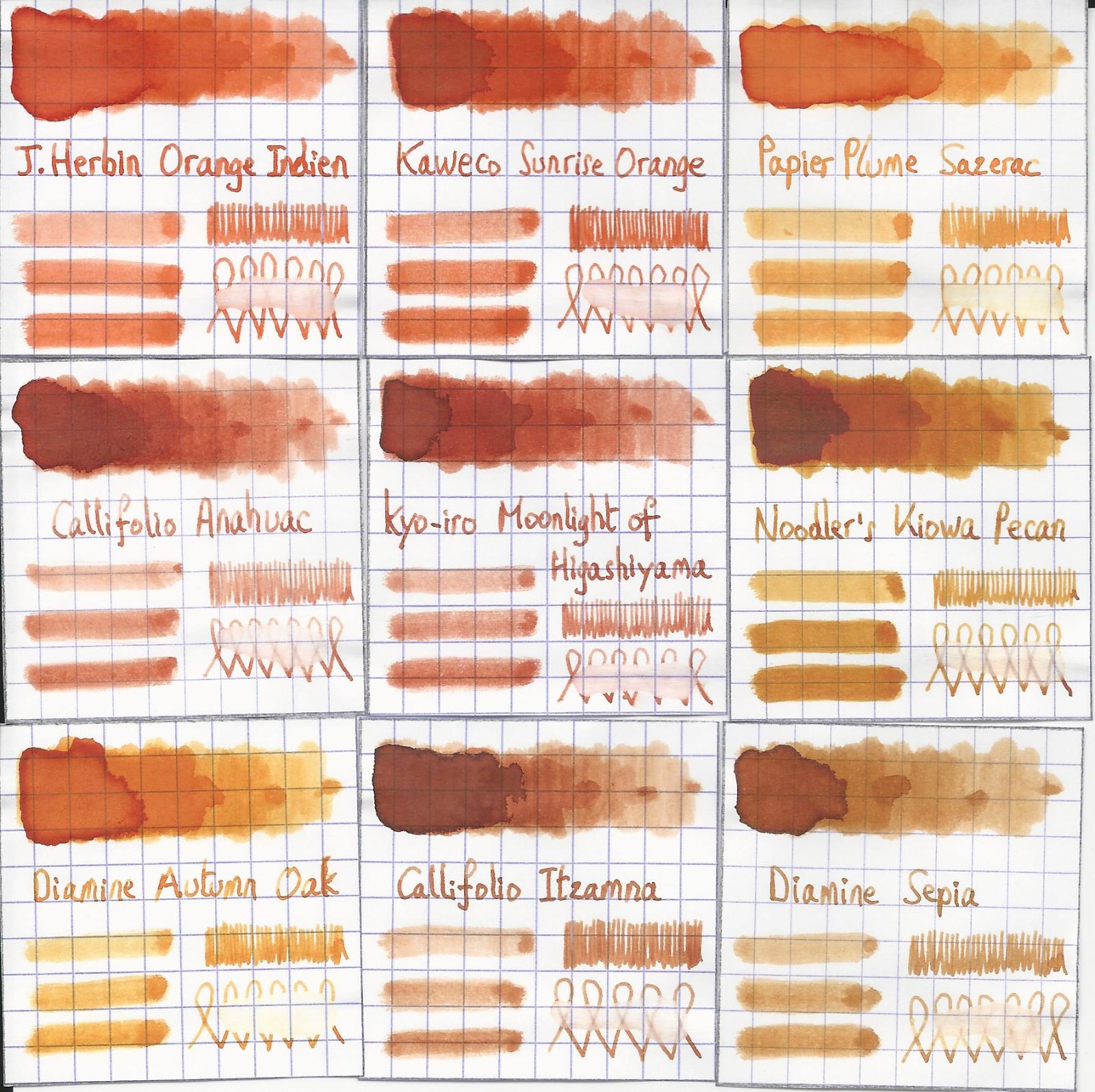
TAG Kyoto – kyo-iro – Moonlight of Higashiyama TAG is a stationary shop in Kyoto (Japan) that produces some interesting soft watercolour-style inks. With the kyo-iro series they produce a line of inks that that are inspired by the city’s many beautiful and historic sights. Each of these inks is dedicated to a specific town in the Kyoto area. The inks come in 40 ml bottles, packaged in luxurious thick paper with a texture that feels like heavy watercolour paper. In this review I take a closer look at Moonlight of Higashiyama. This ink’s colour is a warm burnt-orange, that is inspired by the traditional wooden Machiya houses in Kyoto’s historic Higashiyama district. Like many TAG Kyoto inks, this one looks subdued and delicate, with tons of shading. And the shading is really well executed: very present, but never too harsh. My first impression: a seducing beauty, that is ideally suited for wintertime journaling. There is big but though… this ink is really dry (about on par with kyo-no-oto hisoku), which will probably be a show-stopper for some. Adding a bit of flow-aid solves the lubrication problem, but also results in increased saturation which completely destroys the delicate nature of the ink’s colour. So I hunted for a workable pen/nib/ink combination, which I found with my new treasure: a Pelikan M600 Tortoiseshell Red with M-nib. Here the ink writes with quite tolerable lubrication; still dry but no longer uncomfortable. Moonlight of Higashiyama is a soft ink with moderate saturation. Still, it produces a very readable line on paper, even with the finer nibs. Bear in mind: with EF/F nibs writing is a scratchy affair due to the ink’s dryness and writing is definitely not a pleasant affair. The ink works well with both white and more yellow paper. Personally I prefer this ink on the more yellow paper – the yellow/orange combination enhances the softness of the ink. To show you the impact of saturation on the ink’s look & feel on paper, I made some scribbles where I really saturated portions of the Tomoe River paper with ink. This gives you a good idea of what the ink is capable of in terms of colour range. Moonlight of Higashiyama has a limited colour span, which translates to soft shading. Very elegant and eye-pleasing – I like this ink’s shading a lot. The ink’s chromatography shows yellow, orange and red tones. It also indicates that the ink’s dyes are only loosely attached to the paper. This is clear from the bottom part of the chroma: almost all colour dissipates with water. This already indicates that Moonlight of Higashiyama has no water-resistance to speak of. I’ve tested the ink on a wide variety of paper – from crappy Moleskine to high-end Tomoe River. On every small band of paper I show you: An ink swab, made with a cotton Q-tip 1-2-3 pass swab, to show increasing saturation An ink scribble made with an M-nib Lamy Safari The name of the paper used, written with a B-nib Lamy Safari A small text sample, written with the M-nib Safari Source of the quote, with a Pelikan M600 with M nib Drying times of the ink on the paper (with the M-nib Safari) The ink looks great on all papers, but – as I already mentioned – I prefer its looks on the more yellowish paper. See-through and bleed-through are not a problem. Only with the Moleskine paper did I get visible bleed-through. Drying times are in the 5 second range with the Lamy Safari M-nib. The ink has a tendency to feather a bit on some papers in my test set. Unexpectedly, I also noticed some feathering on the Paperblanks paper, which is usually very fountain-pen friendly. Because scans don't always capture an ink's colour and contrast with good precision, I also add a few photos to give you an alternative look on the ink. Writing with different nib sizes The picture below shows the effect of nib sizes on the writing. Moonlight of Higashiyama writes with good contrast in all nib sizes, but feels horribly dry in the EF/F nibs. I like it best in a wet Pelikan M600 with M-nib – here is still looks subtle and elegant and with beautiful shading, while also loosing enough of its dryness to make for pleasant writing (word of warning: I have a high tolerance for dryness, so what I consider pleasant may not fit your definition). Related inks To compare Moonlight of Higashiyama with related inks, I use my nine-grid format with the currently reviewed ink at the center. This format shows the name of related inks, a saturation sample, a 1-2-3 swab and a water resistance test – all in a very compact format. Callifolio Anahuac comes close in colour, but shows harsher shading. Inkxperiment – Kindergarten I love to experiment with my inks in an artistic context. With my inkxperiments, I limit myself to the single ink I’m reviewing, allowing me to explore all of its colour range nuances. This is the part where I play with the ink, experiment with drawing techniques, and just have loads of fun. For this review, inspiration comes from the drawing of a lion that the youngest member in the family brought home from Kindergarten. “Kindergarten” … the word triggered an association: a child’s drawing in a garden setting. Et voilà, this inkxperiment was born. I started with a piece of A4-sized HP photo paper. This has become one of my favourite media for ink drawings. The photo paper really enhances any ink’s colour, making it look that much more vibrant. I created the background using a piece of kitchen sponge. Next I drew in the lion’s mane, and added flower stems. As a final step I used my fountain pen and a glass dip pen to add structure to the lion’s mane of the three flowers and to draw in the lions faces. The end result is my Kindergarten, which shows what can be accomplished with Moonlight of Higashiyama as a drawing ink. In my opinion: an ink with lots of potential for artistic purposes. Conclusion TAG kyo-iro Moonlight of Higashiyama has a beautiful burnt-orange colour. A soft-looking and elegant ink, warm and glowing, and ideal for winter-time journaling. But also: annoyingly dry and with a slight tendency to feather. Hunting for the right pen/nib/paper combination is a must with this ink. But still… I personally like the looks of this kyo-iro ink a lot, and really appreciate its potential in more artistic settings. Not an ink for everyone, but for me Moonlight of Higashiyama totally works. Technical test results on Rhodia N° 16 notepad paper, written with Lamy Safari, M-nib Back-side of writing samples on different paper types
-
Pelikan Edelstein Mandarin In 2011 Pelikan introduced the Edelstein series of high-end inks, available in a variety of colours. The theme of the Edelstein concept is the gemstone - each ink corresponds to the beautiful colour of a gem. The Edelstein line of inks is presented in 50 ml high-value bottles, that are truly beautiful, and worthy of a place on your desk. In this review I take a closer look at Mandarin, one of the standard inks in the Edelstein line-up. Mandarin is a very nice orange. It's a vibrant colour, but by no means exuberantly so... and it happens to be a superb shading ink! This ink is on the dry side, even for an Edelstein - a characteristic that I have noticed more often than not with inks of the yellow/orange complexion. As such, I preferred using this ink with a wet Pelikan. It's an ideal match for my M600 Vibrant Orange! Mandarin leans heavily towards the yellow at the unsaturated end of its spectrum. In my opinion, much of the ink's shading appeal is due to the combination of yellow & orange that shows on the page. The chromatography clearly shows the yellow & orange components of this ink. From the bottom part of the chroma you can also see that there is zero water resistance... all the colour migrates away with the water. This orange Mandarin works really well as a writing ink that can handle all nib ranges without a problem. Even with fine nibs the saturation is ok, but keep in minds that it feels very dry with these nibs. With my Safari test pens, the writing experience was not nice when using the EF/F nib, but improved when moving to M and above territory. In all honesty, you should do yourself a favour and pair Mandarin with a wet pen. Much more joy! Shading is simply great, especially with broader nibs. I really like what I see, a pity about the dryness of this ink. To show you the impact of saturation on the ink's look & feel on paper, I made some scribbles where I really saturated portions of the Tomoe River paper with ink. This gives you a good idea of what the ink is capable of in terms of colour range. Mandarin moves from a faint yellow-orange to a dark almost red orange. A beautiful colour span, and one that shows great promise for drawing. Technically, the ink has its shortcomings: very dry, feels a bit unlubricated and has absolutely no water resistance. Drying times are quite short in the 5 to 10 second range with the Lamy Safari M-nib. Mandarin looks good with both white and more yellowish paper, but I personally prefer the way it looks on pure white paper. With the lesser-quality papers in my test set (Moleskine and printing paper), the ink showed some minor feathering and quite some show-through/bleed-through. The ink thus works best with wet pens and good quality paper. I love the way it looks in my Paperblanks journal. I’ve tested the ink on a wide variety of paper - from crappy Moleskine to high-end Tomoe River. On every small band of paper I show you: An ink swab, made with a cotton Q-tip1-2-3 pass swab, to show increasing saturationAn ink scribble made with a Lamy Safari M-nib fountain penThe name of the paper used, written with a Lamy Safari B-nibA small text sample, written with the Safari M-nibOrigin of the Terry Pratchett quote with my Pelikan M600 F-nibDrying times of the ink on the paper (with the M-nib Safari) Writing with different nib sizesThe picture below shows the effect of nib sizes on the writing. All samples were written with a Lamy Safari, which is typically a dry pen. I also added a visiting pen - my wet Pelikan M600 Vibrant Orange with an F-nib. My M600 was made for this ink - they make a great couple. Related inksTo show off related inks, I use my standard nine-grid format, with the currently reviewed ink at the center. It shows the name of related inks, a saturation sample, a 1-2-3 swab and a water resistance test - all in a very compact format. The grid makes it easy to compare the ink with its eight direct neighbours, which I hope will be useful to you. Inkxperiment – city sunsetWith every review, I try to produce an interesting drawing using only the ink I'm working on. I simply love this part of the review, where I can experiment with the ink in a more artistic setting. Some inkxperiments are only so-so and others work great, but all of them were fun to do. From the saturation sample with its broad tonal range stretching from yellow- to red-orange, it was already clear that Mandarin would be a great drawing ink. I started with a 18x13 cm page of HP photo paper, and applied a wet paper towel with ink to create the textured background. Next I used a Q-tip and brush to paint in the city buildings, accentuating them with pure Mandarin applied with a glass dip pen. I finally added the setting sun, and some people on the streets. I quite like the end result... the yellow and red in this orange ink make for a very interesting mix of colour tones. ConclusionPelikan Edelstein Mandarin is an ink with technical shortcomings, most obviously its dryness. But with wet pens and/or broader nibs these shortcoming quickly disappear, and you get a nice writing ink with really beautiful shading. I liked using the ink for personal journaling, and simply loved it for drawing. Technical test results on Rhodia N° 16 notepad paper, written with Lamy Safari, M-nib Back-side of writing samples on different paper types From Idea to DrawingThis inkxperiment practically drew itself. It started with a very minimal concept drawing as the main idea. Next I decided to try a new technique for creating the painting's background. I took a sheet of HP photo paper, and covered it with a paper kitchen towel. I then wetted the towel, and painted some ink on top of it with a brush. The ink migrated through the towel to the underlying photo paper, creating some very interesting-looking textures. This is a technique that I will surely use in future inkxperiments! I then used Mandarin with a few water/ink ratios, and drew in the city block with a Q-tip and brush, adding the accents with a glass pen dipped in the ink bottle. The sun and the people in the street were painted in with a brush, using ever more saturated ink. I was really impressed with this Edelstein ink... the colour range that Mandarin is capable of is really impressive. It moves effortlessly from a yellow to an almost red dark orange. Fantastic!
-
Robert Oster 1980 - Honey Bee Robert Oster is an Australian ink maker that is well-known for its unique range of colours. With this mini-series he gives us a conglomeration of colours inspired by the anything goes world of the 1980s. These inks fit my personal preferences: muted pastel-type colours with great shading. In this review I take a closer look at Honey Bee - a yellow-orange-sepia chameleon of an ink. This ink substantially changes colour depending on the type of lighting. It's more of an orange-sepia colour in daylight, but a dark yellow under artificial light. Honey Bee is not a bad name, given that honey comes in a broad colour range, that is nicely captured by this ink. The ink feels dry - and I mean really dry - in my Lamy Safari test pens, and even in wetter pens with fine nibs. Saturation is also relatively low, meaning that you need wet pens to take full advantage of this ink. All this doesn't sound very promising, I know. But pair this ink with broad nibs in a wet pen, and the result looks really nice. And for drawing, this ink simply looks gorgeous. To show you the impact of saturation on the ink's look & feel on paper, I made some scribbles where I really saturated portions of the paper with ink. This gives you a good idea of what the ink is capable of in terms of colour range. As you can see, Honey Bee is quite faint at the lower saturation end, but reaches a much darker sepia-brown colour when fully saturated. The colour remains dusty and muted across the saturation range, which I personally like. To prove the chameleon quirks of this ink, I took a photo of the same saturation sample under artificial light. Here the ink transforms into a dusty dark yellow. Compare this to the more orange-sepia tones of the saturation sample above (my scanner uses light with a daytime colour temperature). To be honest, I personally prefer its nighttime appearance under artificial light. Like most Robert Oster inks, Honey Bee has zero water resistance. Short exposures to water completely obliterate the text, leaving next to nothing on the page. This is also apparent from the chromatography. Smudging is not a problem though - which is what I typically care about. I've tested the ink on a wide variety of paper - from crappy Moleskine to high-end Tomoe River. On every small band of paper I show you: An ink swab, made with a cotton Q-tip 1-2-3 pass swab, to show increasing saturation An ink scribble made with an M-nib Lamy Safari fountain pen The name of the paper used, written with a B-nib Lamy Safari A small text sample, written with an M-nib Lamy Safari Origin of the quote, written with a Kaweco Sport with M cursive italic nib Drying times of the ink on the paper (with the M-nib Lamy) Honey Bee is a well-behaving ink on most paper types, with no visible feathering. The ink dries quite quickly around the 5 second mark (with the M-nib Lamy Safari). The ink reacts weirdly with Moleskine paper, but works just fine with the other paper types in my test set. Due to the yellow-orange colour, the ink works best with pure white paper. Personally, I don't really like its looks on more yellowish paper. As can be seen from the quote origin texts written with an M cursive italic, Hoeny Bee works best with broader nibs or wet pens, where saturation improves, and the horrible dry-ness more or less disappears. I also show the back-side of the different paper types at the end of the review. No troubles there, except with the Moleskine paper, which shows significant bleed-through. All in all, a well-behaving ink (if you avoid the Moleskine where the chemistry gets weird). Writing with different nib sizes The picture below shows the effect of nib sizes on the writing. All samples were written with a Lamy Safari, which is typically a dry pen. I also added a couple of visiting pens. The ink's shading really starts showing up once you go to M-nibs or broader. With wet pens, the ink becomes much more saturated, while still keeping its toned-down muted appearance. Personally I think Honey Bee should only be used in wet pens with broader nibs. Below is a writing sample on Paperblanks journal paper, showcasing the difference between a Lamy Safari M-nib (dry pen) and a wetter-writing Kaweco Sport with M cursive italic nib. With the wetter pens, saturation and dryness are no longer a problem. Related inks To compare Honey Bee with related inks, I use my nine-grid format with the currently reviewed ink at the center. This format shows the name of related inks, a saturation sample, a 1-2-3 swab and a water resistance test - all in a very compact format. Inkxperiment – radiant madonna As a personal challenge, I try to create interesting drawings using only the ink I'm reviewing. Limiting myself to one ink allows me to creatively showcase all its colour-range nuances. It's often quite a challenge, but always great fun. For this drawing I started off with HP Premium photo paper. I created a background by pressing the photo paper on a water-soaked kitchen towel on which I splashed some ink. Next I used pure Honey Bee to paint in the subject. The radiant halo surrounding the madonna was added with Q-tips and different water/ink ratios. The resulting mini-picture gives you an idea of what can be achieved with this yellow-orange Honey Bee as a drawing ink. Conclusion Robert Oster 1980 Honey Bee is a pastel-toned yellow-orange-sepia chameleon, that mostly excels as a drawing ink. Personally, I didn't care much for its chameleon nature, which results in a completely different look under day- or artificial light. The ink also has technical issues, being dry and undersaturated. You really need wet pens and broader nibs to get a good-looking result. Overall, I'm not impressed by this ink - I've seen nicer ones with better behaviour. Technical test results on Rhodia N° 16 notepad paper, written with Lamy Safari, M-nib Back-side of writing samples on different paper types From idea to drawing Although Honey Bee disappoints as a writing ink, I found it to be a beautiful ink for drawing. In this appendix to the review, I'd like to give you a bit of insight into my drawing setup & process. This inkxperiment was born with some doodles, started during a lazy weekend-afternoon. I liked parts of different doodles, so I decided to combine them. I'm really bad at drawing, so I put together parts of different doodles on my computer, printed out the result, and used a light-box to transfer the resulting pic to the HP photo paper. The photo paper was already prepared with a Honey Bee background, created by pressing the paper on a water-soaked kitchen towel to which I added some splashes of ink. After finishing the Madonna picture with a fine brush and pure Honey Bee, I used Q-tips to draw in the radiant halo with multiple water-ink ratios. The end result is the inkxperiment drawing. Oh... and to protect my writing desk, I use a plastic kitchen placemat (white backside up) as a drawing surface - no accidents yet ;-)
-
Going to be autumn soon, and being in New England it is something I eagerly look forward to. I am putting aside my brave adventuring into the world of murky grayish greens for the time being and going against my inner nature by exploring ORANGE. The story so far: received two samples from Goulet, Diamine Autumn Oak and Diamine Pumpkin. I like both of them, in fact cannot choose between them, so I mixed them together to fill my eyedropper, since it takes such a huge amount of ink to fill it. Both samples ended up going into it in one fill. Autumn Oak is good for me because most of my pens are wet writers and dry inks do very nicely in them. But I would like to experience others as well. All my pens are vintage (my modern eyedropper is the exception but it has a vintage nib in it). So, no saturated inks, sheening inks. I avoid Noodlers. I love shading. I don't want anything violently bright, but more autumnal, without being brown. Ancient Copper for example, which is one of my standards, is too brown for this exploration. And not washy, such as some J.Herbin inks tend to be. Suggestions?
-

Ink Shoot-Out : Papier Plume Sazerac Vs Diamine Golden Honey
namrehsnoom posted a topic in Ink Comparisons
Ink Shoot-Out : Papier Plume Sazerac vs Diamine Golden Honey For no special reason, I have been using quite some ochre & orange inks this summer. While playing around with my inks, I noticed that Papier Plume Sazerac and Diamine Golden Honey seem to be quite similar oranges. This peaked my interest... time for a detailed comparison of both inks to find out which one I like the most. Enter... the Ink Shoot-Out. A brutal fight spanning five rounds, where two inks engage in fierce battle to determine who is the winner. Tonight we have a free-form fighting tournament... anything goes... but no biting! In the left corner - from the French Quarter in New Orleans - François "La Guillotine", the killing machine that chops down his opponents. In the right corner - from London's Soho district - "Gentleman" Joe, whose jaw-crunching uppercuts are always accompanied with a "my sincere apologies". Both champions enter the ring. The crowds are cheering for what promises to be a brutal fight. The bell rings and signals the start of the first round. May the best ink win... Round 1 – First Impressions Both inks make a great first impression on me. These are nicely muted oranges, and definitely not vibrant. I like my inks this way... a good presence on the page, but not eye-searing and in-my-face. These inks have style! Both inks also exhibit subtle yellow-leaning shading, without too much contrast between the light and darker parts. This gives your writing an aesthetically pleasing look. But even in this first round, it's definitely a dirty fight! Both champions show off their elegant moves, but they also throw some heavy punches that really hurt their opponent: Golden Honey is without any doubt the master of the finer nib. Sazerac feels really dry and undersaturated with fine and medium nibs. Golden Honey writes nicely wet with much better lubrication, and leaving a more saturated line. "My apologies"... but it's clear that in this area the New Orleans champion takes some pain. Papier Plume's Sazerac on the other hand looks richer and shows a broader tonal range in the swabs and on the saturation sample. A bit more character, more elegance. That's a rib-crunching chop from "La Guillotine". Looking at broader nibs (the squiggles drawn with a 1.5mm calligraphy nib), Sazerac becomes more saturated, but - in my opinion - also loses some of its charm. Golden Honey keeps a more yellow-orange appearance, retaining more of its muted character. Both inks make a great first impression. Sazerac looks slightly better for drawing, but Golden Honey is clearly the better ink for writing. The fact that Sazerac still feels very dry in my M-nib Safari costs it points though! A fair fight with punches in both directions, but Gentleman Joe clearly dominated this round. In my book, this round is a solid win on points for Diamine Golden Honey. Round 2 – Writing Sample The writing sample was done on Rhodia N°16 Notepad with 80 gsm paper. Both inks behaved flawlessly, with no feathering and no show-through or bleed-through. With the EF nib, both inks were equally horrible... dry, scratchy, unsaturated. Yuk! With the M-nib, Diamine recovers and writes nicely wet and with good saturation. But Sazerac still suffers, and keeps feeling dry and scratchy. With broad nibs, both inks offer a pleasant writing experience. But looking closer at the broad nib, you can see that Sazerac leaves a wider and a bit over-saturated line. It almost becomes too wet, where the line left on the pages expands a bit too much. This also seems to result in a flatter and less-pleasing look. Diamine Golden Honey on the other hand retains its crispness, and shows more character and depth. I definitely like the Diamine ink better in this respect. Colourwise, both inks look quite similar. But for writing there are big differences! Here the English champion delivers an uppercut that totally floors its opponent. "My sincere apologies" indeed! Sazerac goes to the floor, totally dazed. The crowd goes nuts, and roars its approval. What a spectacle! There is no doubt at all... round 2 is a solid win for Gentleman Joe. Round 3 – Pen on Paper This round allows the batlling inks to show how they behave on a range of fine writing papers. From top to bottom, we have : FantasticPaper, Life Noble, Tomoe River and Original Crown Mill cotton paper. All scribbling and writing was done with a Lamy Safari M-nib. Both champions did well, with no show-through nor bleed-through. But this round is not about technicalities, it is about aesthetics and beauty. Are the fighters able to make the paper shine ? One thing is immediately apparent: these inks are at their best on pure white paper. Due to the yellow undertones, their presence on more yellowish paper (like the Life Noble) is underwhelming. With the M-nib, the Diamine ink is more saturated, much wetter, and offers a superior writing experience. Looking at the swabs and saturation samples, Sazerac shows more depth and character. For this round, both inks are on par with each other, both scoring some points and taking some punches. Sazerac seems to recover, and now stands up again to the English champion. But neither ink dominates, and as such this round ends in a draw. Round 4 – Ink Properties Both inks have drying times in the 15-20 second range with the M-nib in my Lamy Safari. To test their smudge resistance, I rubbed the text with a moist Q-tip cotton swab. Here, Diamine Honey shows a little bit more smudging, but the text itself remains crisp and clear. To test water resistance, I dripped water on the grid and let it sit there for 15 minutes, after which I removed the water with a paper towel. Both champions are weak! Water resistance is totally absent, and all ink simply disappears from the paper. Not good! What a disappointing display! Both champions went on the defensive, and performed very weakly in this round. The crowd gets restless, starts boo-ing. That is not what we paid for! For this round, neither champion gets points. Round 4 thus ends with a draw. Round 5 – The Fun Factor Welcome to the final round. Here I give you a purely personal impression of both inks, where I judge which of them I like most when doing some fun stuff like doodling and drawing. And for this round, both inks are simply amazing. I did the drawing on HP Advanced Photo paper. The background uses heavily water-diluted ink, which brings out the yellow. For the flowers I used 2:1 diluted ink, while the flower accents and stems use pure Sazerac and Golden Honey. I dare you the find the difference! Both inks are equally gorgeous looking when used in a more artistic setting. I really enjoyed using them. For this round, both champions recovered completely, and gave their best. Punishing kicks, solid blocks, graceful moves, loads of energy… The crowd is loving it... this is what we came to see. Round 5 totally rocks, but in the end both champions performed equally well, and no clear winner emerges. The Verdict Both inks are great-looking muted yellow-oranges, that look fantastic on paper (provided you use broader nibs). For writing, Diamine Golden Honey is without any doubt the better ink. It's still horribly dry in fine nibs, but starting with M-sizes the ink recovers and provides a smooth & pleasant writing experience. Otherwise, both inks are really quite similar. But round 2 clearly determines the outcome of this fight, and so the Belgian judge declares Diamine Golden Honey as the winner of this shoot-out. -
J.Herbin - Orange Indien La Société Herbin, Maître Cirier à Paris, was established in 1670. This makes J. Herbin probably the oldest name among European ink makers. Today, Herbin produces a range of beautiful fountain pen and calligraphy inks, writing instruments, gift sets and accessories. Herbin inks are made in France, and the finishing touches on the bottles are still done by hand in Paris. Recently, I’ve been looking into Herbin's "La Perle des Encres" series. The subject of this review is "Orange Indien" - an ink for which I had high hopes. On first impression, I liked the colour a lot: a muted orange that leans a bit towards the brown. I like my inks non-vibrant, so in this area Orange Indien did not disappoint. One thing I quickly noticed: it's almost impossible to capture this ink's colour with my scanner. It always turns out too brown. So in this review, I mostly use pictures to show off the ink, since these match much more precisely the colour I see with the naked eye. The tranquil character of this ink appealed to me - this is an ink that is quite pleasant to use for personal journaling. For writing, you do need wet pens to fully enjoy the ink. With dry pens, like the Lamy Safari, the ink feels too unlubricated and doesn't produce a line with sufficient saturation. When combined with a wet pen (e.g. a Pelikan), the ink looks great even in finer nibs. Orange Indien has a moderate colour span, with not too much of a difference between light and fully saturated parts. To illustrate this, I did a swab on Tomoe River paper where I really saturated portions of the paper with ink. This accurately illustrates the ink's colour range. The moderate colour span indicates that this is a soft-shading ink. The ink shades nicely, but without too much contrast between the light and dark parts. On the smudge test - rubbing text with a moist Q-tip cotton swab - the ink behaved perfectly, with almost no smearing. Water resistance is non-existent though - some brown-orange smudges remain, but what is left on the paper is no longer readable (well - if you're a forensics expert, you can probably reconstruct the original words, but for daily use Orange Indien should be kept away from water or other liquids). Orange Indien dries relatively quickly in my Safari test pen (M-nib), taking about 5-10 seconds to dry. I've tested the ink on a wide variety of paper - from crappy Moleskine to high-end Tomoe River. On each scrap of paper I show you: An ink swab, made with a cotton Q-tip 1-2-3 pass swab, to show increasing saturation An ink scribble made with a Lamy Safari M-nib fountain pen The name of the paper used, written with a Lamy Safari B-nib A small text sample, written with an M-nib Drying times of the ink on the paper (with the M-nib) With this test, Orange Indien shows its weakness. It is prone to feathering, even on papers where this is almost never a problem. I noticed slight feathering on Moleskine (no surprise there) and printing papers, but also on Paperblanks Paper. The latter is a bummer for me personally, since I use Paperblanks Embellished Manuscripts as my daily journals. On other papers, feathering didn't seem to be a problem. Writing with different nib sizes The picture below shows the effect of nib sizes on the writing. All samples were written with a Lamy Safari, which is typically a dry pen. I also added a visiting pen - a wet Pelikan M101N Bright Red with an F-nib. With this wet pen, the ink wrote smoothly and with much better saturation. Orange Indien loves to be combined with wetter pens and broader nibs. Nice looking ink! Related inks To allow for a good comparison with related inks, I employ a nine-grid format, with the currently reviewed ink at the center. Each grid cell shows the name of the ink, a saturation sample, a 1-2-3 swab and a water resistance test - all in a very compact format. Inkxperiment – portrait of a blushing lady With each review, I try to create an interesting drawing using only the ink I'm reviewing. This is often quite challenging, but it has the advantage of showing the ink's colour range in a more artistic setting. I enjoy doing these little drawings immensely - it's quite a fun extension of the ink hobby. For this inkxperiment, I really lacked inspiration. So I employed the random-line technique: draw some random lines on the paper, and see if some topic drifts to the foreground. I started out with HP Premium Photo Paper, and drew some random lines using a Q-tip dipped in Orange Indien with the paper completely submerged in water. This gives soft lines, and colours the background of the paper. I then lifted the image of a lady from the randomness, and painted it in with different ratios of water-diluted ink. For her hair, I used pure Orange Indien. Here the ink bled out a bit on the face, creating the blushing effect. So instead of a lady, you get the portrait of a blushing lady ;-) The end result gives you a good idea of the colour span that can be obtained with Orange Indien. Conclusion Orange Indien is a nice-looking non-vibrant orange, that looks quite well on paper. You should pair this ink with wet pens to get a nice writing experiende. The ink has a tendency to light feathering on a number of papers in my test set. Unfortunately for me, this also happens on Paperblanks paper. Personally, I really like the ink's colour, but the feathering on my daily-use paper kills this ink for me (at least as a writing ink). Technical test results on Rhodia N° 16 notepad paper, written with Lamy Safari, M-nib Backside of writing samples on different paper types
-
TACCIA DAIDAI (ORANGE) Review of a sample of Taccia Daidai received from Vanness Pens. Taccia inks are "born in California", but manufactured in Japan. This is a very nice orange color - well balanced and strong - not yellowy-orange or reddish-orange but a strong orange-orange. The ink flows very nicely from the nib, and is lubricated in much the same way as Sailor inks. This ink has no sheen and moderate shading even on Tomoe River paper. It dries fairly quickly and has some water resistance. It does not bleed through or show through except on very cheap paper. Pros: Nice flow Moderately lubricating Minimal bleedthrough, showthrough, feathering Fast Drying Moderately saturated. Some water resistance A nice orange for even fine nibs Cons: Little shading or sheen Just orange (but that might be enough) Took just a bit longer to clean from my pens Price: In the US: $12 for 40 ml at Vanness Pens, Anderson Pens, PenChalet Overall: Of the four Taccia inks I have tried, this is my least favorite only because it does not have all the "bells and whistles" of the others (i.e. sheen, strong shading, etc.) I prefer my orange inks to shade, but this does not shade as much as Yu-Yake or Sapphron (a much lighter yellow-orange). But this is the most lubricating orange I have used. In terms of other orange inks I have tried, I do like this one more for the ink quality than for the brilliant color. If you are in the market for a nice quality orange ink, this is a good value.
-
I just saw a poster on another thread comment that they wouldn't buy another Pelikan without an ink window or some translucence in the barrel to determine ink levels. In looking at the photos of the M600 Vibrant Orange it made me wonder if the ink (especially a dark one) would be visible through the barrel. This will be my first Pelikan, and I am really curious. Looking at you experienced collectors for your thoughts. Thanks in advance Rindy_Ruth
-
Hello All, I was looking on eBay and saw this Pelikanesque pen that is inexpensive and could be a good buy. Does anyone know who makes it? https://www.ebay.com/itm/NOS-PISTON-FILLER-FOUNTAIN-PEN-ORANGE-BLACK-M-NIB-MADE-IN-GERMANY-/142502157724
-
desaturated.thumb.gif.5cb70ef1e977aa313d11eea3616aba7d.gif)
Sailor Shikiori Kinmokusei (Four Seasons – Autumn: Gold Osmanthus)
A Smug Dill posted a topic in Ink Reviews
Another quickie review, on another 'four seasons' colours in the Sailor Jentle Ink line for which I came too late to the party, and missed out on getting it in a 50ml bottle at the old pricing. Colour: I love orange – especially when it's the colour of the garment I'm wearing, which means it's far more in others' faces than in mine, although that's not the case here – either bright and intense, or deep and dark, and I love the colour of Sailor kinmokusei, which certainly does not disappoint me in the way Iroshizuku yu-yake and Noodler's Operation Overlord Orange did. (I only just opened my bottle of Monteverde Topaz in the Gemstone Collection range, to scratch a couple of words on this test page with a dip pen and a mapping nib as a comparison, so I haven't got a very clear or detailed view yet of how it compares with Sailor kinmokusei over more extensive pieces of writing.) Feathering: None observed. Ghosting and bleed-through: None, either from writing or from repeated passes with a soaked cotton swab. Drying time: Very fast, for writing done with an EF nib with (usually) moderate-to-wet flow; there is almost no observable smearing in just five seconds. My zeroes with a 'broader' nib tend to leave one or two wet spots around the oval shape, and there is some smearing of the '30s' even though the '25s' mark did not smear. Water resistance: Forget about it. Shading: Very subtle, if any, along a single stroke of the pen or an unbroken line, in spite of the range of shades this ink can display. I don't have a problem with that. Sheen: None that I can see on the Rhodia paper I used, and that's fine by me. My verdict: I like this ink, it is well-behaved, but with the 'new' pricing for 20ml bottles in the Sailor Shikiori line, I'm not going to rush about to buy spare bottles just yet, especially when I haven't spent enough time using Monteverde Topaz or perhaps trying Diamine Pumpkin. -
As vis' might say, Sailor is a company that needs no introduction, at least around these parts. This ink is a member of the Jentle Four Seasons line of inks, these are ones that are fairly readily available in pens shops and online. Some explanation may be necessary regarding the Four Seasons series. Originally it was a set of eight inks, two each for representing each of the four seasons. So two for winter, two for spring, and so on. Every few years Sailor would swap out the existing lineup and bring in a new series. I don't know if this was a few years in between but it was certainly long enough for people to become attached to the ones that went away. You can imagine the sadness. In spring 2016, Sailor released eight additional Four Seasons inks, ones that had been in the line before. Cheering! Unfortunately it seemed that they were destined for Japan-only. Why did Sailor torture their devoted (Western-based) fans so much? Some people wanted the new inks so bad they ordered them from Japan. At the DC Pen Show, Sailor reps announced the new inks were coming to the US. Yea! And since then Europe will receive them as well. So this is the 2016 edition of Kin-mokusei. Many people that have Sailor Apricot say these two inks are the same. I can't vouch for that but it would sure be great. This is a fairly bright orange ink. It's definitely brighter, and has more yellow, than KWZ Orange. I have a few other oranges waiting to be tried out and we'll see how they compare. One word of caution, some Japanese websites list these inks as "limited edition". US retailers have not reported this as being the case, so my guess is these will be around for a while, but perhaps not forever. This ink seemed a bit drier than most other Sailor inks. Not dry per se, but not as wet as one might expect. I suspect this was to preserve the color and shading. I didn't get the silver sheen, but many people say it is there. Not water resistant. Pen: Pelikan M400 (F-14 kt) Papers: MvL=Mohawk via Linen, TR=Tomoe River, Hij=Hammermill 28 lb inkjet, Rhodia=Rhodia 90g ivory. Camera: iPhone 7
-
http://inks.pencyklopedia.pl/wp-content/uploads/Diamine-Amber-nazwa.png Manufacturer: Diamine Series, colour: Amber Pen: Waterman Hemisphere "F" Paper: Image Volume 80 g / cm2 Specifications: Flow rate: weak Lubrication: good Bleed through: unnoticeable Shading: noticeable Feathering: unnoticeable Saturation: good A drop of ink smeared with a nib http://inks.pencyklopedia.pl/wp-content/uploads/Diamine-Amber-kleks.jpg The ink smudged with a cotton pad http://inks.pencyklopedia.pl/wp-content/uploads/Diamine-Amber-wacik.jpg Lines http://inks.pencyklopedia.pl/wp-content/uploads/Diamine-Amber-kreski.jpg Water Resistance http://inks.pencyklopedia.pl/wp-content/uploads/Diamine-Amber-woda.jpg Sample text http://inks.pencyklopedia.pl/wp-content/uploads/Diamine-Amber-txt.jpg Ink drying time ca. 5 sec. Other tests carried out: Sample text in an Oxford notebook http://inks.pencyklopedia.pl/wp-content/uploads/Diamine-Amber-Oxford.jpg Sample letters in a Rhodia notebook http://inks.pencyklopedia.pl/wp-content/uploads/Diamine-Amber-Rhodia.jpg Ink drops on a handkerchief http://inks.pencyklopedia.pl/wp-content/uploads/Diamine-Amber-chromatografia1.jpg Chromatography http://inks.pencyklopedia.pl/wp-content/uploads/Diamine-Amber-chromatografia2.jpg