Search the Community
Showing results for tags 'amber'.
-
-
-
TAG Kyoto – kyo-no-oto – yamabukiiro TAG is a stationery shop in Kyoto (Japan) that produces some interesting soft watercolour-style inks. With the kyo-no-oto series they produce a line of inks that replicates traditional Japanese dye colours. According to available online info, the manufacturing process of the kyo-no-oto inks follows traditional dying techniques dating back to the Heian era between the years 794 and 1185. The inks come in 40 ml bottles, packaged in luxurious thick paper with a texture that feels like heavy watercolour paper. For this review, yamabukiiro takes the stage and fills it with its presence. This ink is named after the Yamabuki flower (“Mountain Breath”), that is found in abundance on Japanese mountainsides. The yellow-amber colour grabs your attention, not because it is bright and bold – au contraire – but because it is tender and soft, harmonious and elegant, and with a surprising depth of character. No ink for mundane work, but one that feels right at home for personal journaling. I guess there’s no need to tell you that I like this ink – a lot! The ink writes moderately wet in my standard Lamy Safari M-nib test pen, but with fairly low lubrication. I also found the ink to be too light and low-contrast with the dry-writing Safari. You really need a wet pen to make this ink blossom and to unlock its full potential – it works great with e.g. a Pelikan, even when using an F-nib. With the Pelikan, the ink has decent saturation, and also shows its subtle complexity with a hint of green in the undertones. The TAG Kyoto inks share a common gene-pool, which consistently delivers nicely muted, elegant, good-looking inks. They totally fit my taste, and I’m quite glad that I discovered them. To show you the impact of saturation on the ink’s look & feel on paper, I made some scribbles where I really saturated portions of a strip of 52 gsm Tomoe River paper with ink. This gives you a good idea of what the ink is capable of in terms of colour range. Yamabukiiro has a fairly broad dynamic span, ranging from a wispy light-yellow to a fairly dark amber with a touch of green. Despite this broad range, there is no harsh contrast between the light and darker parts. This translates to subtle shading, definitely present but never too strong. This aesthetic shading adds character to your writing. The ink’s chromatography shows the subtle depth and complexity of the dye-mix. The ink’s base colour derives from the yellow and orange dyes. The depth and character come from the blue component, that combines with the yellow to produce the ink's green undertone. This is without a doubt the work of a master mixer! I’ve tested the ink on a wide variety of paper – from crappy Moleskine to high-end Tomoe River. On every small band of paper I show you: An ink swab, made with a cotton Q-tip 1-2-3 pass swab, to show increasing saturation An ink scribble made with an M-nib Lamy Safari The name of the paper used, written with a B-nib Lamy Safari A small text sample, written with an F-nib Pelikan M600 Source of the quote, with a Pelikan M200 with M nib Drying times of the ink on the paper (with the M-nib Safari) Yamabukiiro looks good on all types of paper. Personally though, I like it best on pure-white paper. The ink performs well on my test papers, even on the Moleskine paper (which is quite an accomplishment). With the lower-quality paper (Moleskine, generic notepad paper) there is a certain amount of bleed-through. Drying times are mostly around the 5 to 10 second mark. Water resistance is clearly absent – this ink won’t survive watery accidents. If you are in the habit of tipping your drink over your notebook, this is no ink for you 😉 I’ve also added a few photos to give you another view on the ink. Scanned images and photos often capture different aspects of the ink’s colour & contrast. That’s why I present them both. In this case, both scanner and photo capture yamabukiiro’s golden glow fairly well. Writing with different nib sizes The picture below shows the effect of nib sizes on the writing. In my opinion, kyo-no-oto yamabukiiro really requires a wet pen. It is too light for my taste in the dry-writing Safari. With the wetter pen, the sub-par lubrication of this ink mostly disappears. Also, the ink becomes more saturated, gains more depth and brings forth its green undertones. The wet pen really shows off the ink’s golden radiance. Related inks To compare the yellow-amber yamabukiiro with related inks, I use my nine-grid format with the currently reviewed ink at the center. This format shows the name of related inks, a saturation sample, a 1-2-3 swab and a water resistance test – all in a very compact format. This kyo-no-oto ink is different from my other yellow-gold-amber inks, and as such a welcome complement to my ink collection. Inkxperiment – genesis With every review, I try to create an inkxperiment using only the ink I am presenting. Such a one-ink drawing works great to show off the colour-range nuances that are present in the ink. These inkxperiments are the favourite part of my reviews: always loads of fun and a perfect way to experiment with inks using a number of different techniques. Yellow inks are often great for drawing, and this TAG Kyoto ink is no exception! Inspiration for this drawing comes from the cycle of life – a seedling starts growing, and metamorphoses into a beautiful flower. I started with an A4 piece of HP photo paper, onto which I drew the background with water-diluted ink, spread on the paper through a kitchen towel. I also used a piece of carpet anti-slip underlay to add some background accents. I next used different-sized glass jars to stamp in the enlarging circles that represent the seed’s growth. Finally I drew in the flowers to complete the drawing. The end result is not too bad, and shows what can be achieved with this beautiful yellow-amber ink in a more artistic context. Conclusion TAG kyo-no-oto yamabukiiro is a great journaling ink – a complex yellow-amber with a unique colour that is both soft and elegant. The ink works best in wet pens, where it can express itself in full saturation, showing its golden glow with subtle green undertones. A truly beautiful ink, that makes a great impression! In my opinion, you can’t go wrong with this ink – a piece of art from the master mixer at TAG Kyoto. Technical test results on Rhodia N° 16 notepad paper, written with Pelikan M600, F-nib Back-side of writing samples on different paper types
- 10 replies
-
- tag kyoto
- kyo-no-oto
-
(and 3 more)
Tagged with:
-
I love the in-between-ness of the tertiaries; they're complex, blended, impure, not one thing, nor t'other. Those yellow-oranges, red-oranges, red-purples, blue-purples, blue-greens, and yellow-greens. So all you ink lovers out there who love the tertiary colors: let's hear / see your favorites in the in-between ranges. Here are the colors I have loaded in pens at the moment:
-
The Custom 823 pens have always been highly captivating demonstrators from Pilot Corporation (Japan), sporting the second largest nib (Pilot#15, Namiki#20 nibsize), with a vacuum plunger filling mechanism. The model number 823 refers to the price and year, of launch, although in a slightly intricate manner. Since this pen was released in the year of 2000, 82 years after the company’s inception (i.e. 1918), it carries the first two digits of the model number as ‘82’ and the last digit which is ‘3’ refers to it launch price of JPY 30,000 (3 X 10,000). Also replicated the content with additional pictures in my blog, as the images are/will be reduced to a small thumbnail after a short-while by the image hosting service. Happy reading ! Below is a link to the same: The Pilot Custom 823 Amber Demonstrator Review The Custom 823 (for the Asian market) comes packaged in a standard pilot gift box (Z-CR-GN) which might not draw much attention, quite unlike the pen. The US merchandise comes with a silver sateen lined gift box with a complementary (hey! not really folks) bottle of Pilot/Namiki Ink-70 (Blue). The pen of course is a hot star. A golden label with a model number and nib specs is tagged to the clip. The box carries a user manual for a Type P fountain pen, which does mention keeping the knob slightly unscrewed (at a 2 mm distance) relative to the metal ring, while writing. http://i1302.photobucket.com/albums/ag127/soniknitr/C823/DSC_4033_zpsn5yia4uf.jpg DESIGN - THE AMBER DEMONSTRATOR (6/6) The Custom 823 comes in three standard designs of translucency transparency - Amber, Smoke and Clear resin, all with gold plated trims. The resin material seems substantial and feels heavy. A silver trimmed version may be a nice thing for many fountain pen nerds including myself. I went for an Amber one with a medium nib and find it quite challenging to resist getting another Smoke version, with recently slashed prices in Rakuten/Ebay. The Amber demonstrator given its lightness, is capable of bedazzling you even with a tiny bit of moonlight. A golden dazzle along the three bands and the clip, subtly delivers the rest. The finials at the cap along with the piston knob conclude the design with a brownish opacity. http://i1302.photobucket.com/albums/ag127/soniknitr/C823/DSC_4038_zps59uqxwrt.jpg The cap feels substantial and unscrews with one and a half turn, revealing the elegant yet simply designed pen. The grip section is moulded from the same brown resin as the cap-final and the piston-knob, and another golden ring segregates the grip from rest of the body. The amber demonstrator translucency does reveal the steel rod with a plunger seal mechanism. http://i1302.photobucket.com/albums/ag127/soniknitr/C823/DSC_4058_zpsdj6urt8a.jpg The cap does mention a few things etched across the broader of the concentric golden bands, including the model name CUSTOM 823 and PILOT MADE IN JAPAN with six stars of separations. A thinner band above renders some more aesthetics to the overall design. The clip is tension fit and it encompasses a vertically embossed PILOT within its golden sheen. http://i1302.photobucket.com/albums/ag127/soniknitr/C823/Cap_zpsp81nns3m.jpg FILLING SYSTEM (6/6) The brown piston knob unscrews from the golden ring till an end stop, post which the plunger unit can be pulled out. The rod is made of stainless steel and is resistant to most of the commonly used inks. For IG (Iron Gall) and Pigment Inks, care must be taken to clean the pen several times, to prevent clogging or deposit accumulation inside the ink passages. The pen fills to more than two-thirds its capacity, once the nib is dipped in ink and the plunger is pushed back in. This can give a quick gush of ink inside with a comfortable volume of 1.4 - 1.5 mL, which again could last for several days. Although getting some more ink into your pen is quite possible. Cleaning the pen is a similar ritual accompanied with some shake and I suggest you do it on a regular basis, for the ink stains if left may look ugly with time, and might require a light ammonia solution to go-off. And as mentioned in the manual, while writing with the pen, you would need to keep the piston-knob slightly unscrewed (at a 2 mm distance) relative to the golden ring. This will displace a conical valve seal below the piston seal to allow passage of ink to the feed. Given the high ink capacity of these pens with plunger type filling mechanism, this has been done to prevent ink-leakage. And this is a nice thing to have, if you intend to carry the 823 in a flight. http://i1302.photobucket.com/albums/ag127/soniknitr/C823/DSC_4130_zpsjqcefo3d.jpg For a rather crazy and complete fill, you do have a workaround. With the nib pointed up, you can pull out the plunger of a partially filled 823 and then by slowly pushing the plunger inside, you would get the air-gap between the inverted ink-levels and the visible end of barrel-section minimized. Once the inverted ink-level reaches the visible end of the barrel, you can submerge the nib in the ink bottle and push the plunger in. Voila! Done. This process may result in some ink escaping to the threads of the piston knob, but again you can repeat the same process with water/cleaning solution and shake a little to wash it off. NIB - ALL THAT MATTERS (6/6) The nib is friction-fit and comes in a standard 14k monotone design across three stock widths - F, M, B (and some specially ordered custom widths of FA and WA). The nib has a standard pilot design. The tail end of the nib specifies the month and year of manufacture. An elongated hexagonal imprint separates the design from the outer shoulders and tines with an arabesque decor running inside its circumference, encompassing the circular breather hole in between. The branding and nib specifications of PILOT, 14k-585 (58.5% Au Alloy) along with the nib size and width, which are imprinted below the breather hole. http://i1302.photobucket.com/albums/ag127/soniknitr/C823/DSC_4151_zpscb3t9giu.jpg A standard bluish grey plastic feed with thin fins and a decently sized feeder hole delivers the amazing ink suction. http://i1302.photobucket.com/albums/ag127/soniknitr/C823/DSC_4152_zpswsiiokoa.jpg PHYSICS OF IT (6/6) – RELATIVELY SPEAKING With a transparent translucent resin body in form of a traditional cigar shape, it does give a comfortable feel of length. The cap itself weighs 10 grams which makes it top heavy if posted. The overall weight of the 823s have thus a significant (one-third) contribution from the cap. There is then a comfortable grip section with around 1.1 cm diameter. Uncapped Length ~ 13. 2 cm Posted Length ~ 16.4 cm Nib Leverage ~ 2.4 cm Overall Weight ~ 29 g A capped and uncapped comparison with few of the standard large pens like Visconti Homo Sapiens Maxi, Pelikan m805 and MB 146 is posted below for your reference. http://i1302.photobucket.com/albums/ag127/soniknitr/C823/DSC_4154_zpsxjd20amq.jpg http://i1302.photobucket.com/albums/ag127/soniknitr/C823/DSC_4155_zpsieq78ytb.jpg ECONOMIC VALUE(6/6) It retails at around USD 288, and as usual it’s available at lower street prices towards a band of USD 200. I had got the pen at a cost of USD 220 at that time, which I thought was a good bargain. This year Rakuten sellers made it look lamentable by selling 823s at less than USD 190, inclusive of shipping! OVERALL (6/6) This 14k nib has a wet flow, albeit a hint of softness like the custom 74. The nib is springy and lays a somewhat wider line with pressure. There is no significant variation among the horizontal and vertical strokes. These wet lines take almost 15 secs to dry a Sailor Jentle Sky High on MD paper. http://i1302.photobucket.com/albums/ag127/soniknitr/C823/DSC_4180_zpsxbepmpcf.jpg Thank you for going through the review. Sonik
- 111 replies
-
- pilotcustom
- 823
-
(and 5 more)
Tagged with:
-
Hello again to all my FPN friends, One of the interesting things for me about this hobby is how easily and suddenly my preferences for a particular design or color can change. I never use yellow for anything other than highlighting and previously would have thought something like a yellow pen to be tasteless or just plain weird. Then I saw these: WingSung 601 LE (Photo courtesy of Frankunderwater) Penbbs 308 Mango Yellow After seeing these beauties, something in my head snapped and I knew I must have an audacious and bold yellow pen! Sadly, the WS is a limited edition with an inconvenient filling system and the Penbbs 308 won't work for me for other reasons. Now the hunt is on. What's your favorite yellow pen?
-

Which Rollstopper For Penbbs 267 ‘Amber Is A Cat’?
bobje posted a topic in China, Korea and Others (Far East, Asia)
- 14 replies
-
http://inks.pencyklopedia.pl/wp-content/uploads/Diamine-Amber-nazwa.png Manufacturer: Diamine Series, colour: Amber Pen: Waterman Hemisphere "F" Paper: Image Volume 80 g / cm2 Specifications: Flow rate: weak Lubrication: good Bleed through: unnoticeable Shading: noticeable Feathering: unnoticeable Saturation: good A drop of ink smeared with a nib http://inks.pencyklopedia.pl/wp-content/uploads/Diamine-Amber-kleks.jpg The ink smudged with a cotton pad http://inks.pencyklopedia.pl/wp-content/uploads/Diamine-Amber-wacik.jpg Lines http://inks.pencyklopedia.pl/wp-content/uploads/Diamine-Amber-kreski.jpg Water Resistance http://inks.pencyklopedia.pl/wp-content/uploads/Diamine-Amber-woda.jpg Sample text http://inks.pencyklopedia.pl/wp-content/uploads/Diamine-Amber-txt.jpg Ink drying time ca. 5 sec. Other tests carried out: Sample text in an Oxford notebook http://inks.pencyklopedia.pl/wp-content/uploads/Diamine-Amber-Oxford.jpg Sample letters in a Rhodia notebook http://inks.pencyklopedia.pl/wp-content/uploads/Diamine-Amber-Rhodia.jpg Ink drops on a handkerchief http://inks.pencyklopedia.pl/wp-content/uploads/Diamine-Amber-chromatografia1.jpg Chromatography http://inks.pencyklopedia.pl/wp-content/uploads/Diamine-Amber-chromatografia2.jpg
-

Diamine Sunshine Yellow, Robert Oster Yellow Sunset, Diamine Amber, Robert Oster Peach
Jan2016 posted a topic in Ink Comparisons
Not the same, but all 4 pretty close to each other, see the chromo's- 5 replies
-
- diamine
- robert oster
-
(and 8 more)
Tagged with:
-
-
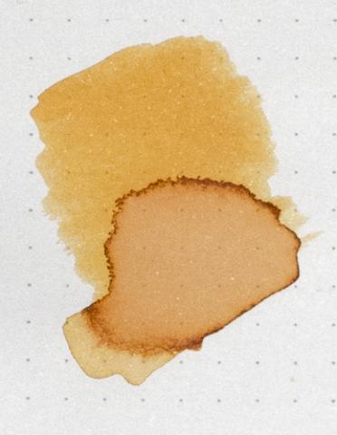
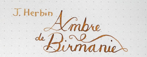
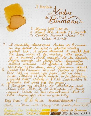
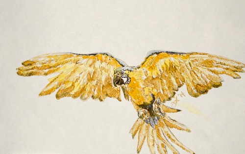
I am seriously in love with this ink. It will be in my daily carry pen for a while. Or at least until my bottle of Shin-kai arrives. This ink loves a dip pen, too. Forgive my heavy-handed example above, but perhaps you can see the promise. In better hands, this would be remarkable dipped. Sketch was done with Ambre de Birmanie, J. Herbin Bouton d'Or (the most useless ink I've ever put in a pen) and a touch of Iroshizuku Shin-kai. Not a success but that is hopefully more my total lack of experience with these three inks than anything else. I still have hope. Reasonable care was taken to ensure color accuracy.
-
http://i900.photobucket.com/albums/ac209/jasonchickerson/_FUJ0618.jpg First, I'd like to curse thank fireant for sending me a sample of this wonderful ink. Alas, it is discontinued or I'd buy a bottle today. It likely wouldn't spend much time in my pen, but I'd put it to good use sketching and it is wonderful straight out of the bottle for pointed pen calligraphy. Here's an overworked persimmon. http://i900.photobucket.com/albums/ac209/jasonchickerson/_FUJ0612.jpg Sailor Hachimitsu and Cigar on Strathmore watercolor paper. http://i900.photobucket.com/albums/ac209/jasonchickerson/_FUJ0609.jpg Hachimitsu with Zebra "G" nib on Original Crown Mill Pure Cotton paper. Reasonable care was taken to ensure color accuracy, but with an ink this complex and fluorescent, perfection is impossible. If anyone has an unwanted bottle of this ink, I will gladly buy it from you.
- 19 replies
-
- sailor
- hachimitsu
- (and 4 more)
-
I had bought the m200 cognac with its stock Italic nib to replace my old rotring ArtPen. I have to simultaneously admit that the only reason for going with an Italic and somewhat flexible nib was to try it out and learn something new. Below is a link to the review on my blog: Pelikan M200 Cognac Review So here it goes. The cognac was launched last year as a special edition and the dazzling golden hues allured me. These were quite vibrant compared to the earlier tones of a lighter Amber demo. DESIGN - LET’S DRINK TO THAT (5/6) The m200 cognac shimmers in honey gold and its golden loops dazzle in absolute harmony. Lack of ambient light makes it adorn darker hues of brown. http://3.bp.blogspot.com/-fT6xC9gIP44/VfV5UPDBKJI/AAAAAAAAFfw/MTOzjk7U__w/s1600/DSC_6208.jpg The cognac colours are remarkably darker and more vibrant than the amber hues of a Pilot Custom 823. http://2.bp.blogspot.com/-BZHCuW_rPjg/VfV5RC0HpHI/AAAAAAAAFfg/EMhA4isRrXw/s1600/DSC_6212.jpg The radiance is matched throughout the pen starting with a golden gleam from the finial area and the pelican beak through the cap band before finally converging with the piston ring. When its an m400 the loops multiply into two. http://1.bp.blogspot.com/-WMd7Hh4uVv8/VfV5TlaxUlI/AAAAAAAAFfs/3WY9Hr6GIRk/s1600/DSC_6210.jpg The cap is light and unscrews with less than a complete turn which I like very much, revealing a slightly dullish golden nib. The gold plated steel nibs somewhat lack the lustrous enchantment of a 14k souverän nib, but again a 14k nib comes at a premium. The grip is simple and reveals interior threads of a screw fit nib. The section ends with a slight bump which is usually adorned by a loop in the souverän series. The transparency reveals the plastic piston mechanism. http://3.bp.blogspot.com/-hn4Qm-fS0PE/VfV5iUnlHXI/AAAAAAAAFgI/DYqFasSQ_3Q/s1600/DSC_6216.jpg A gleaming tassie decorated with a protruding plastic jewel painted with a golden pelikan logo adorns the cap with its signature pelican beak-shaped clip. The single cap band succinctly carries an imprint of PELIKAN GERMANY, which is common across the classic series. The logo on the finial is the one embraced by Pelikan post 2003, that of a mother pelican and its chick, in golden paint. You can also see the distinctive lines of the cap insert. http://2.bp.blogspot.com/-fuZfgsxpI-o/VfV5rsgnsvI/AAAAAAAAFgg/MsD9QP16Ef8/s1600/cap200.jpg FILLING SYSTEM (6/6) A piston filler with a smooth & sturdy knob is embellished with a golden loop. Apart from its looks, it's an utterly efficient mechanism. The piston end unscrews with three to four rotations and it draws ink quite quickly once the piston is screwed back on. The best part being you observe the thing in action probably through honey gold lenses. A plastic spindle connector in the M2XX limits its overall weight. A M2XX fills upto 1.5 mL of ink. However, given the wet & wide flow especially of the Italic nib, it may not last for a long time. I have found the 14k nibs of the same width running wetter & wider than the steel ones. Keep in mind that these piston mechanisms for M2XX/M4XX/M6XX are not supposed to be dismantled as they are friction fit under heat. In case of problems other than lubricating the piston seal, it’s better to send the pen to Pelikan Germany/Country Authorized Service Center. Pelikan does have an excellent customer service. http://1.bp.blogspot.com/-121ww9XRbLk/VfV5jQpkNtI/AAAAAAAAFgU/2ZSht0LqzfQ/s1600/DSC_6220.jpg NIB - ALL THAT MATTERS (5/6) The steel nib comes in a classic m200 gold plated look across five stock widths - EF, F, M, B & I (1.1). Like all the pens in the classic series, the nib has standard pelikan logo with the usual convenience of a screw-fit section. With standard m2xx/4xx feed, the nib-section is easy to take out for swapping or cleaning. And this golden finish is meant to converge with the cognac glimmer of the pen as well as its gold-plated trims, although its shine is rather towards the dullish side of the golden spectrum. Below the circular breather hole it carries its brandname of Pelikan as well as an encircled logo of mother pelican with a chick. The nib started flexing its tines after some use and it was quite stiff at first. The nib is tipped. http://2.bp.blogspot.com/-lNgrygwghe4/VfV5a8Z73MI/AAAAAAAAFf4/z_r7-0mCIbk/s1600/DSC_6254.jpg A standard black plastic feed ensures a good ink buffer for the promised wetness and prevents hard starts. No skipping or hard starts in past few months, even if it is lying unused for weeks. http://2.bp.blogspot.com/-LI0MMDLB0DM/VfV5f6OYxlI/AAAAAAAAFgA/IIVEUYsvUH0/s1600/DSC_6274.jpg While cleaning the section area, I found some of silicone grease and water trapped between inner and outer walls. Initially I was scared at the thought of a crack, but thankfully the suspect crack-line seemed to move. There is a FPN thread on this. PHYSICS OF IT (5/6) – RELATIVELY SPEAKING It’s comfortable posted with a bit of heft and length, since the cap contributes more than a third of its weight. The capped length is around 12.5 cm. The pen does get some heft from ink inside the barrel. Incidentally, it weighs a gram less even when it shares all its dimensions closely with a m400. Uncapped Length ~ 12 cmPosted Length ~ 15 cmNib Leverage ~ 2 cmOverall Weight ~ 14 g (without ink) ECONOMIC VALUE (5/6) The m200 Cognac retails at around USD 170 with the stock gold plated steel nibs. It is also available with 14k nibs from the m400 series. As with all pelikans, the pen is dependable and could be an everyday writer. OVERALL (5.2/6) The tipped & gold plated steel nib is smooth and it’s graced with a wet flow. The Italic nib was quite stiff in the beginning, but within a month of ‘light’ use, it started flexing its tines like wings of a bird, even under light pressure. Very springy of course, the horizontal lines run thinner for the Italic nib. There is a lot of ink laid by the italic nib, which take more than 1.5 minutes to dry a wet Diamine Majestic Blue ink on MD Paper. http://2.bp.blogspot.com/-wSs7dk_LFqE/VfV5s9K6FnI/AAAAAAAAFgo/qdNLrzcdw48/s1600/DSC_6275.jpg In case you are wondering about the quote, it's by Swami Vivekananda. REFERENCES Pelikan M4XX Patent Piston mechanisms Ink Capacities Thank you for going through the review. You can find some more pen and paraphernalia reviews here.
- 23 replies
-
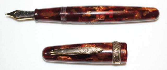
I recently bought a Stipula Etruria and I am having difficulty filling it. I tried an international converter but this does not fit. Neither did an international (short) cartridge. The problem seams to be that the barrel is too narrow inside. I notice that the barrel has metal threading way up. You can just see this in the photo below. I have read here about converters and removable pistons. Can anybody explain what I need to do? This Etruria does not have the piston nob. It has gold trim and it has an 18K nib. I have attached a few photos if that helps.
-
Does anyone know anything about this pen, how it writes, how it feels? It looks like a wonderfully made pen but I'm new to FP's so my knowege is quite limited. I've ordered a 316 since for the most part, peoiple enjoy how it writes. So now Im curious about the brand and this pen in particular. It looks like a great pen for 27 CAD. Thanks!
-
My fellow FPNers, I need some quick advice on my next ink. I want it to be lighter than brown - in color but not intensity. I use a MB toffee brown, sailor red grenade (both dark shades) and I am currently looking for a lighter shade [in red spectrum]. I use Fine to Medium (both Asian & European) nibbed pens + a few italic ones Could short list a few inks: (Want to go for a orangish - amber shade) 1) Pelikan Edelstein Amber 2) Diamine Orange 3) Diamine Amber (Does it lack intensity) 4) Sailor Apricot (A few old pieces might be left with my old shop) 5) J. Herbin Orange Indien I am leaving the iroshizuku inks for now (as shipping will take some time).. I will appreciate your experience with these inks (both bad (first) and good ) Best, Sonik
-
Evening all, I am getting two new bottles of ink (Diamine Apple Glory and the 150th Diamine Anniversary Blue Velvet) for Christmas so I only thought it right to get one new pen to put my favourite of the two in! (got the Rohrer and Klingner glass dip pen for the other ink!) There are four (relatively inexpensive) pens I am looking at to take up the next berth in my collection. The Pilot Vanishing Point in the Blue Carbonesque finish, the Lamy 2000 and a Waterman Carene in either the amber finish or the Blue Obsession colour. To give you an idea of my preferences I currently have a black Waterman Carene (love it), a MB 146 (love it), a Pelikan m800 (love it), an Edison Collier (wish it had a wider grip section) and a Waterman Expert II (don't love it, don't hate it either). All the four options are pretty much the same price in the UK and I was wondering what everyone thought would be the best option? The Lamy 2000 has been raved about ever since time began but the design seems a bit too minimalist for my taste. The VP has also been reviewed well but I'm a bit concerned about the small ink capacity in the converter, I'm a student and I (try to) take a lot of notes every day. And I love my Carene and both the blue and amber finishes are stunning but I am thinking I should branch out a bit more! And if anyone has got an recommendations for another option for £100-150 then it would be greatly appreciated! Cheers, Chris
- 20 replies
-
Hi all, I've already got a Parker 51 which I enjoy using very much. I was looking at the amber jewel that I've seen on some of the 51s and wanted to know if the amber jewel signified anything in particular, or was it's placement purely for aesthetics? Thanks, Badger
-
-
Just a quick one... I have a thing for yellow-orange shading inks even though they're not useful for most of my writing. This one is no good (well, illegible) in anything other than a really wet writer (or flex pen). No water resistance, flows almost too readily (drips out of some pens) but lovely warm colour and cleans up well.
-
Hello. Hope all are well. Not sure if I should be here or Inky Thoughts. Anyway. I purchased th Pelikan Edelstein Amber 2013 Ink of the Year and was wondering what others who may have bought this ink think of it ? I primarily bought it for two reasons: Edelstein's inks reputation for quality and it being Ink of the Year. I know: petty reason...To be honest, this ink was so-so and didn't do much for me. Yes, it wrote well, was saturated, good shading, etc...If anyone would like to share their experience with me and others, it would be greatly appreciated...Thanks again, LeRoy
-

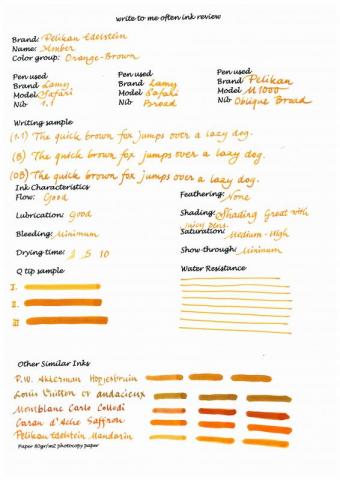
Pelikan Edelstein Amber Review (Ink Of The Year 2013)
write to me often posted a topic in Ink Reviews
Hi, This is my first ink review on FPN. I generally do them in my blog but I also wanted to share something here. I hope it can be usefull.


