Search the Community
Showing results for tags 'turquoise'.
-
Pelikan Edelstein Apatite (Ink of the Year 2022) In 2011 Pelikan introduced the Edelstein series of high-end inks, available in a variety of colours. The theme of the Edelstein concept is the gemstone – each ink corresponds to the beautiful colour of a gem. The Edelstein line of inks is presented in 50 ml high-value bottles, that are truly beautiful, and worthy of a place on your desk. In this review I take a closer look at Apatite, the Edelstein Ink of the Year 2022. This is a limited edition ink, that will probably be gone in the near future. Apatite is a blue-turquoise shade of colour, that – according to Pelikan – “leads to an association with the natural element of water, an ink colour that lets all thoughts flow…” Hmm… that sounds a bit over-the-top to me. In reality, the colour was more of a bummer (personal opinion): I don’t hate it with the same intensity as I do Edelstein Jade, but a full page of Apatite is still too much for me. Nevertheless, I collect these Edelstein inks, so I had to get this one, even if it’s not my cup-of-tea. And – as always – I will do my best to give you an honest technical review. The chromatography shows the blue & green components of the ink. It’s definitely a blue with green undertones, but I wouldn’t call it a teal. From the bottom part of the chroma, you can already deduce that Apatite is not a water resistant ink. This Edelstein ink can handle all nib sizes with ease, always showing an easily readable line. I do prefer this ink with the broader nibs (M,B), where it becomes more saturated and leaves a darker line on the paper. Regardless of nib size, a full page of text written with Apatite remains overwhelming. Too bright and in-your-face for me… this ink could use some toning down. To show you the impact of saturation on the ink’s look & feel on paper, I made some scribbles where I really saturated portions of a scrap of 52 gsm Tomoe River paper with ink. This gives you a good idea of what the ink is capable of in terms of colour range. Apatite has a medium dynamic range, with not too much difference between the light and darker parts. But the ink makes the most of it: in writing Apatite mainly uses the extremes of this spectrum, resulting in fairly heavy shading. Personally, I find this one of the few strong points of this blue-turquoise ink. The ink copes well with a wide variety of paper, both white and more creamy ones. Apatite prefers higher quality paper. With the cheaper variety, you get a tiny amount of feathering, and a fair amount of see-through and even some bleed-through. I had expected the ink too look ugly on yellow-leaning paper, but that’s not the case. The ink’s colour remains fairly consistent across paper types. Below, you’ll find the writing samples. On each scrap of paper I show you: An ink swab, made with a cotton Q-tip 1-2-3 pass swab, to show increasing saturation An ink scribble made with an M-nib Safari fountain pen The name of the paper used, written with a B-nibbed Lamy Safari A small text sample, written with the M-nib Safari Source of the quote, written with a wet-writing Laban Rosa Lilac M-nib Drying times of the ink on the paper, with the M-nib Lamy Safari I’ve also added a few photos to give you another view on the ink. Scanned images and photos often capture different aspects of the ink’s colour & contrast. That’s why I present them both. In this case, the photos capture Apatite’s colour best – the scans of the writing samples are little bit too bright, and definitely exaggerate the shading. Writing with different nib sizes The picture below shows the effect of nib sizes on the writing. As you can see, Apatite works well in all nib sizes, even the finest ones. I personally prefer using it with broader nibs, where the colour becomes more saturated, and more to my liking. With broader nibs, the shading becomes more pronounced, and can be quite good-looking. In my opinion, this prominent shading is the saving point for the ink. Related inks To show off related inks, I use my nine-grid format, with the currently reviewed ink at the center. This format shows the name of related inks, a saturation sample, a 1-2-3 swab and a water resistance test – all in a very compact form. This allows you to easily compare the ink with its eight direct neighbours, which I hope will be useful to you. Apatite sits somewhere between Kaweco Paradise Blue (greener) and Robert Oster Clearwater Rain (more blue). Personally, I prefer the Robert Oster ink over Apatite: only minute differences in the amount of green, but Clearwater Rain simply look better to me. Inkxperiment – Green City As a personal experiment, I try to produce interesting drawings using only the ink I’m reviewing. For me this is an incredibly fun extension of the hobby, and one that continuously challenges my drawing skills. Inspiration for this drawing comes from a town project in my home town. To mitigate the effect of “heat islands” in the town center, one of the central market squares will be turned into a city forest (from the current situation where it is a huge slab of concrete – a superb heat absorber that drives up air temperature with a few degrees). A fine geo-engineering project, that I fully support. I started with an A4 piece of 300 gsm watercolour paper, on which I first drew an outline of a town street leading up to the market square. I then used water-diluted ink with ever more saturation to fill in the street and buildings, using Q-tips as a drawing tool. Next I used more or less pure Apatite to draw the tree trunk. Foliage was added with the rough end of a dishwashing sponge dipped in ink. Final touches of the drawing were done with the M-nib Lamy Safari. This Apatite ink turned out to be rather difficult to draw with. Not much dynamic range, which made it fairly difficult to add texture to the drawing. Definitely not my favourite drawing ink! Inkxpired – computational art I love experimenting with pen/ink/paper, and have added another layer as part of the hobby. I’m exploring computational art, inspired by the ink drawings I do during ink reviews. Another fun offshoot of the hobby… and all that starting with a few drops of dye-coloured water on paper. For this computational derivation, I abstracted the scene a bit, and used a colour palette that adds some contrast to the drawing. The result is definitely an improvement over the original, somewhat bland, Apatite drawing. Conclusion This Edelstein ink of the year 2022 with its blue-turquoise colour is not a must-have in my book. The colour fails to convince me, and the ink has some issues with lower quality paper. Shading looks great though, and is the one saving feature of this ink – in my opinion. A decent ink, just not for me. To salvage my bottle, I already explored some ink mixes with last year’s Golden Beryl, that result in several beautiful greens. Never let a bottle of ink go to waste! Technical test results on Rhodia N° 16 notepad paper, written with Lamy Safari, M-nib Back-side of writing samples on different paper types
-

-

-

-

-
Noodler's Dostoyevsky is a bulletproof ink, belonging to the Russian series. Note Russian series are more expensive than Noodler's normal line up. After the De Atramentis Artist/ Document Cyan and Turquoise disaster reviews, I was weary of trying another permanent blue. To my surprise Noodler’s Dostoyevsky was “quite good” compared to the above, i.e. it's very usable with the good pen/ paper combo. A bit about Dostoyevsky (1821-1881). He’s one the greatest, if not greatest Russian novelist of all times. His mother died when he was young and his father, a doctor was killed by one his surfs, when he was about 17, about which time his epileptic attacks started. It marked his literature. In his youth he was condemned to death by firing squad, for belonging to a political movement. His sentence was commuted at the last moment (detailed in his novel, The idiot )to 4 years in Siberia, which were described in the harrowing The House of the Dead. Dostoyevsky was addicted to Gambling, , which inspired his Gambler. His masterpiece Crime and Punishment, about a young man who commits murder for all the good reasons, and his magnum opus The Brothers Karamazov, which I haven't read. Now for the ink. This is a legible turquoise ink. I enjoyed journaling many pages with it. I forgive a lot of things in permanent inks. What I don’t like are long dry times and bleed through. This ink fares quite well. It’s not a perfect ink. Far from that. It’s not very lubricated. So, if you don’t like feedback and use Ef/F nibs it's not for you. I enjoyed it best with Safari M/B nibs. It can create wooly lines if feed is primed, nib B/ Double broad. This ink needs good paper. There's some faint ghosting on Tomoe River but it worked flawlessly on Rhodia and Midori. However, I won't recommend it with a wet stub/ fude nib. It'll bleed through. Also, with the semi-flex, I really pushed it to the limit and there was some bleed through. Would I buy a bottle? If I wanted a permanent turquoise, maybe. Writing samples: All quotes are by Dostoyevsky. You can see it doesn't like very much Hammermill White, 20lb paper. These lines were written with EF/F/M nibs. Watertest: Left side was held under running water. A bit of ink was washed out. But most of the ink stayed put. As usual I had some fun doing a little sketch. This is done on a Fabriano Watercolor paper. It was inspired by a Gaube Lake, a high altitude Lake in the Pyrenees, France. Inks used Sky: Kakimori Karari for the sky Gutenberg Urkundentinten G!0 IG ink Kakimori Kurun And Dostoyevsky for the lake. I use a bit of bleach on Dostoyevsky. Where you see a small triangle on the right side. Under UV light, the triangle changes colour. If I get around to it, I'll post some photos and comparison with other turquoises. · Pens used: Pilot Elite (Ef) Lamy Safari (Ef/F/M/B), Soennecken Schulfuller S4, Jinhao 450 Fude nib · What I liked: Writing with a medium/stub nibs. Easy cleaning for most pens. · What I did not like: I like turquoise in general, but not for inks. · What some might not like: Woolly lines with broad nibs. Relative dryness. It needs good paper. Longish dry time. · Shading: Not much. · Ghosting: I would say, it was more than acceptable on good paper. · Bleed through: Yes, on cheap paper · Flow Rate: Excellent · Lubrication: Dryish. It’s best with Medium/ Broad nibs. · Nib Dry-out: None. · Start-up: None. · Saturation: Not saturated. · Shading Potential: Faint · Sheen: None. · Spread / Feathering / Woolly Line: Yes, a primed broad nib on some papers. · Nib Creep / “Crud”: No. · Staining (pen): No · Clogging: No. · Cleaning: Quite easy. Though, I would put it in a pen where you can take the section a part. · Water resistance: Very good. The excess ink came off, but the rest was stable. · Availability: 3 oz/90 ml bottles. Please don't hesitate to share your experience, writing samples or any other comments. The more the merrier
-
This is the review of Document Turquoise, which will be soon followed by its Artist sibling. If you were to choose one for writing purposes, get a sample of this one. I am not enamoured by this ink. I don't know if it's the colour, or it's behaviour, or simply it's lack of character. Or maybe I'm inky saturated It is decent document ink, too wet with wet/wide nib combos. With fude (bent Chinese /Japanese nibs) it wrote like flip-flops on ice Ink won't work with cheap/absorbent paper and it will feather and fly away. Colour is slightly lighter than Artist Turquoise, and less wet. Document and Artist inks can be mixed, so they are perfect for Artists or those who like to mix their own inks. Document inks are slightly “more” archival than Artist inks, in my correspondence with De Atramentis. Chroma: Writing Samples Scan for Midori is too green. And a couple of photos of Midori: Comparison: Nothing did budge the ink under running water: I wasn't really inspired to do a sketch. This is done on a Canson watercolour paper. By wetting the paper with a brush adding ink, and removing extra colour with a paper towel.... · Pens used: Pilot Kakuno (Ef /Stub) Lamy Safari (Ef/F/M/B) / Jinaho 450 with an Ultraflex nib/ and fude nib · What I liked: Writing with a broad nib only. I was taking notes and had my pen uncapped for 5 minutes, no dry outs. Very fast dry time on coated paper, especially with Fine nibs. It’s good for dry pens. · What I did not like: Very wet, no character. · Shading: none · Ghosting: This ink is best for coated paper, with Ef – Broad nibs and dry pens. Don't use it with ebonite feed. · Bleed through: Same as above. · Flow Rate: Very wet · Lubrication: Excellent · Nib Dry-out: None. · Start-up: None. · Saturation: Eh · Shading Potential: None · Sheen: None. · Spread / Feathering / Woolly Line: With a primed nib, you can have some feathers, even on coated papers. · Nib Creep / “Crud”: No. · Staining (pen): It didn't stain my convertor. But I used it only for a week. · Clogging: No · Cleaning: It was fairly straightforward, like "normal" inks. However, long term I don't know. · Water resistance: Excellent · Availability: 45 ml bottles. Please don't hesitate to share your experience, writing samples or any other comments. The more the merrier
-
This is a review of SKB Ink-220, what I call "Sky Blue" On my recent trip to Taiwan, I found a bottle of SKB Ink-220. SKB is one of the historic fountain pen manufacturers in Taiwan. The company was established in 1959 and at one time was one of the top 3 Taiwanese fountain pen manufacturers. While not widely known here in the US, they manufacture a wide range of fountain pens. While I am not certain if SKB produces their own fountain pen ink, they market it under their name. The ink comes in a number of colors. I was only able to obtain one - Ink-220. SKB Ink 220 comes in a very nice square glass bottle with a heavy plastic screw on cap. The bottle opening is a standard size, similar to DeAtramentis or J. Herbin bottles. The bottle is fairly deep and holds 30 mL of ink. I purchased the bottle for right around $7.00. According to one of my interpreters, SKB stands for: S = Smooth; K = Knowing; B = Beauty Here is my written review of the ink. The paper used for this review is Cambridge Executive spiral notebook paper - a reasonably smooth, less absorbent paper similar to HP copier paper: Positives: There is some water resistance, although the letters do spread as the paper dries. My sample was submerged for 5 minutes until the paper was fully saturated. The ink appears fairly resistant to water droplets or simple smearing. The ink dries fairly fast - even with a wet nib on Tomoe River paper. It cleans easily from the pen and converters without staining. Negatives: The color is too pale for EF nibs or possibly F nibs. There is some bleedthrough with broad or stub nibs on more absorbent papers. While SKB Ink 220 will likely not be in my regular rotation, it is well behaved, and will be an ink that I will use for special purposes.
-
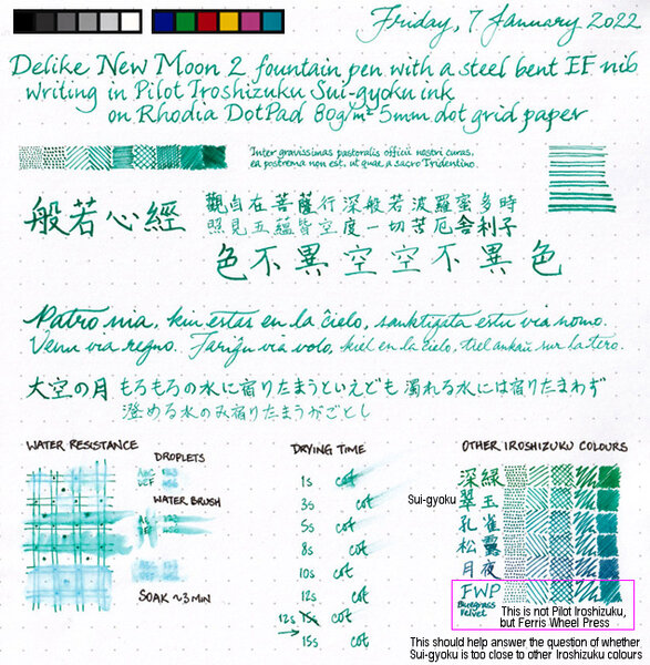
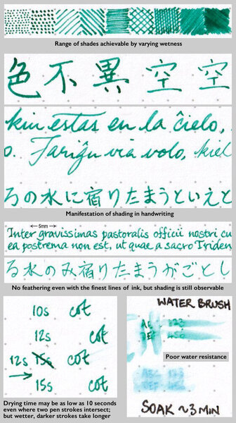
Sui-gyoku is one of three new Pilot Iroshizuku colours released late in 2021. Photo: Scan: (Some other colour comparisons can be found here.) p.s. No show-through, no bleed-through, and no sheen observed.
-
PenBBS #448 ("Waves") is a very wet seaglass-turquoise.

-
From the album: Ink review
No show-through, no bleed-through, and no sheen observed on the Rhodia DotPad 80g/m² 5mm dot grid paper used for the review sheet.© A Smug Dill
- 0 B
- x
-
From the album: Ink review
No show-through, no bleed-through, and no sheen observed on the Rhodia DotPad 80g/m² 5mm dot grid paper used for the review sheet.© A Smug Dill
- 0 B
- x
-
The brown ink from shipping made the sample label unreadable, I thought, but I have finally determined that the ink inside is MB Honore du Balzac. The se BJ page is in an Endless Notebook, the ink writes slightly wetter there (better and thicker paper). @amberleadavisplease move this to the right thread if I have it wrong. Thanks. @TheMustard, have I id'd correctly?
-
I just got the notice from Goulet that the TWSBI Eco Summer 2017 special edition turquoise pen is in stock. I ordered both an EF and a 1.1mm. Beautiful color! Now, I have to be patient until they arrive...
-
This review is part of a series of "blues reviews". Someone sent me a sample of this ink a while back. At long last I've gotten to using this lovely ink, and writing up a review. The papers are Hammermill 28lb inkjet, Mohawk via Linen, and Tomoe River. Too bad I didn't know about his ink when it was available as it's a nice turquoise. The ink appears to be a single dye. Somewhat similar to pthalo turquoise.
-
Manufacturer: Robert Oster Signature Series, colour: Turquoise Pen: Waterman Hemisphere „F” Paper: Image Volume (gramatura 80 g / m2) Specifications: Flow rate: good Lubrication: good Bleed through: possible point Shading: noticeable Feathering: unnoticeable Saturation: good A drop of ink smeared with a nib The ink smudged with a cotton pad Lines Water resistance Ink drying time Ink drops on a handkerchief Chromatography Sample text in an Image Volume (80 g / m2) Sample text in an Oxford notebook A5 (90 g / m2) Sample letters in a Rhodia notebook No 16 (90 g / m2) Sample letters in a Clairefontaine (120 g / m2) Palette of shades
-
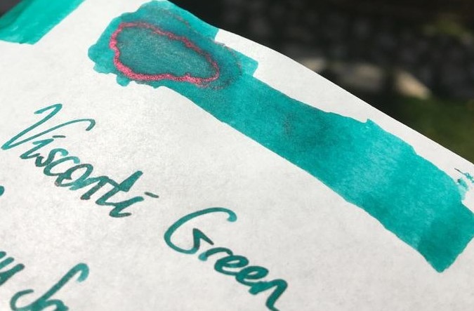
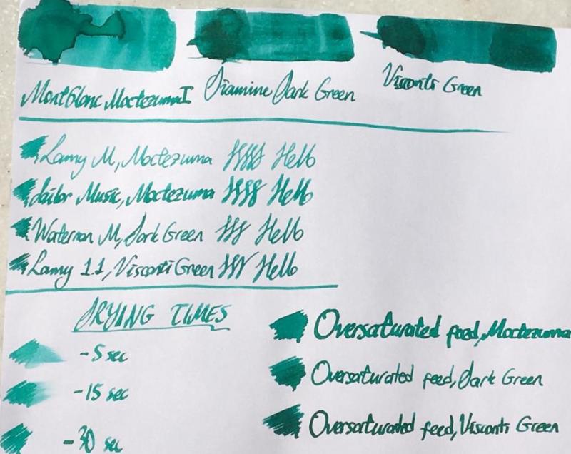
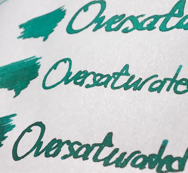
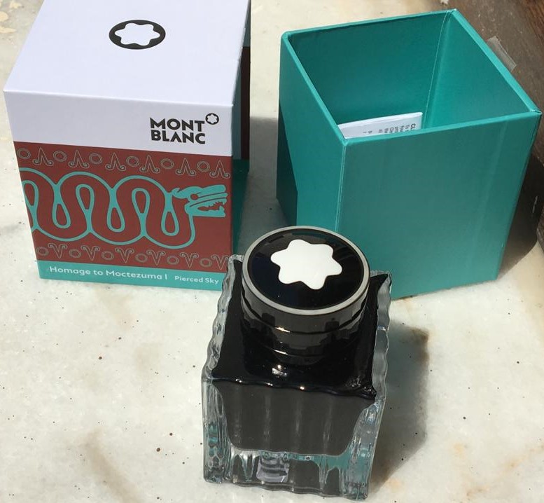
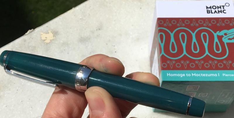
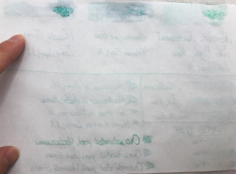
Hello dear FPNers, Today I have something new, something German, something menthol green for you: Moctezuma 1 Pierced Sky is one of the most recent inks released by Montblanc. This ink is a complementary part of new Patron of the Art series: Homage to Moctezuma 1. It is a limited edition ink, and it has a 50 ml cube shaped bottle, which is a pretty standard bottle shape of Montblanc. I suppose this ink is very close to J. Herbin Vert Reseda, but a tad darker than it. Another similar ink is Edelstein Jade. Unfortunately, I have neither of them, because this cannot be called as my favourite shade of turquoise. However, I have Diamine Dark Green and Visconti Green, both of which are also pretty close to Moctezuma, I suppose. Here is a comparison of three inks on white Tomoe paper: They are very close indeed. But before describing the differences between 3 inks' colours, maybe I should mention about some important ink properties: Saturation: Moctezuma has a medium-to-low saturation. It is not as washed out as Herbin Vert Reseda, but still lacks some saturation in my opinion. Sheen: There is definitely no sheen with this ink. Maybe only if you pour down huge amounts on Tomoe, you may see a little bit of sheen. Shading: It has a high shading capacity, I loved it. Obviously not as much as a KWZ Honey, but still very nice shading. Wetness: Moctezuma is a dry ink, as most of you could easily guess, because most Montblanc inks tend to be so (except Elixir line, they are the wettest inks I have ever seen). It is not the driest ink in the world either; not as dry as a Pelikan 4001, but definitely on the dry side of the spectrum. Unless you have a vintage pen with an ebonite feed, or a modern pen which is tuned to write wet, most people wouldn't like this dryness combined with medium-to-low saturation in EF/F nibs I suppose. Check this out again: Lamy Safari M nib's output is not amazingly washed out, but not very legible either. I am more of a BB/OBB guy. I don't use fine nibs very often, but if I do, personally I would like to see a bit darker, or brighter line. The colour choice is already dangerous: it is a pastel menthol green, not most people's first choice of colour to easily read the written, so at least it should have been a bit more saturation in my opinion. About dryness of ink: I suppose both Montblanc and Pelikan specifically keep their nibs' tippings wide, to have them larger surface area when in contact with paper, which makes them smoother. And then they need to adjust their own inks to be a bit more viscous than a regular ink to make it flow slowly through the tines, compensating the thick tipping material's large surface and making the pen write narrower, so keeping the promise of theoretical nib size. I don't know. It is a choice of company. Pilot succeeds in having narrower tippings be smooth, maybe not as smooth as their German counterparts but still quite smooth. And they see no problem in producing a much wetter ink. I suppose most people would trust in Iroshizuku line's fluid properties more than they do for Montblanc inks or Edelstein inks in an indefinite case of which ink to use in an unfamiliar pen. I remember having hard times with some Montblanc and Pelikan inks in my EF/F nibs. Whatever. Note that the pen I used for Moctezuma is Sailor Progear Ocean with 21k Music nib: Mr John Mottishaw cut its tip into a beauuuutiful cursive italic, smooth and crisp, and tuned it to be quite a wet nib: So the wetness of nib would be able to balance the dryness of ink, I thought. Same triple comparison is also done on 80 gr white Rhodia paper, which is the industrial standard of pen world, I suppose.. Let's see the differences between 3 inks above. Here are some close shots of them on Tomoe again: Moctezuma is the lightest of them. Diamine Dark Green is a bit greener than Moctezuma, with a bit more red dye, and it is more saturated. Visconti Green actually has a very similar green-blue ratio compared to Moctezuma, but it is much more saturated. And the red dye content is definitely higher in Visconti, as a result it seems darker with some nice sheen. Sometimes I love writing with over-saturated feeds. They show the full potential of an ink. Also, if you have a moderately wet nib, it gives a clue about how the colour would be seen with a wet nib, especially with a vintage nib. A close shot of writings made with over-saturated feed on Tomoe: Lovely sheen with Visconti Green to be noted. Same thing for Rhodia: It can be said that Moctezuma gives a nice colour with a very wet nib, preferably a vintage one. Some other ink properties: Feathering: Not detected, not likely to feather. In this term, quite a well behaved ink. Bleeding: Not detected, not likely to bleed. In this term, quite a well behaved ink. Showthrough: Some distinct showthrough on Tomoe but every ink has a showthrough on Tomoe, so it shouldn't be a criteria I think: On Rhodia, it has minimal showthrough. Quite well: Note that heavy swabs or parts written with over-saturated feed will of course have showthrough, and even bleedthrough. It is normal. The concentration on normal writing should be the way in judging showthrough/bleedthrough. Water Resistance: Meh. Not so much, but who cares?? Not me, definitely.. Before water test on Tomoe: And after water test: It cannot be said that the writings have gone completely, but they are not legible either. But this situation does not bother me. Actually, I like inks which are not resistant to water. In my experience, they are much easier to clean than water-proof inks. And considering that I am obsessive while cleaning pens until water comes out completely crystal clear, this ink is a nice choice for me. I haven't tried to clean it from my pens, but I am sure it will be cleaned quite fast. CONCLUDING REMARKS If you are into menthol green colour, you will definitely like this ink. Note that it is a bit pale, pastel colour, not very vivid.With very wet nibs, it has a lovely hue of an exotic lagoon at its best. I live in an inland location, but I felt like I am in Maldives.Doesn't have sheen or shimmer, but has a nice shading.Montblanc Moctezuma 1 is not the most unique colour in the world. There are some similar colours like J. Herbin Vert Reseda, Pelikan Edelstein Jade, Diamine Dark Green, Visconti Green, etc.. You may consider them also.Price is about 35 Euros, same as Montblanc Petrol Blue. It is definitely not a cheap ink, but not the most expensive one either. I am not sure if it deserves this price. I would buy it anyway since I am an ink nerd, but I may not buy the second bottle. Besides, alternatives are much cheaper, and this ink does not have amazing specifications in terms of colour.With over-saturated feed, it provides a much more distinct, vivid colour, which means if you are likely to buy it, consider using it in your wet pens, preferably gushers or vintage pens. No need to afraid of cleaning from vintage pens. Hope you enjoyed. Thank you..
-
Only my second experience with a RO ink! This is a moderately thick, saturated turquoise that exhibits good shading, decent flow, but slightly problematic dry time for southpaws. I like it anyway. It also makes a good drawing ink, especially in an italic nib. Thanks once again to amberleadavis for the PIF! http://extras.ourpatioparty.com/files/5715/9019/0851/RO_Turquoise_001-640p.jpg The chroma twins show some separation into greens and blues. Which makes sense...it's turquoise! http://extras.ourpatioparty.com/files/3115/9019/0851/RO_Turquoise_Chroma_001-640p.jpg
-
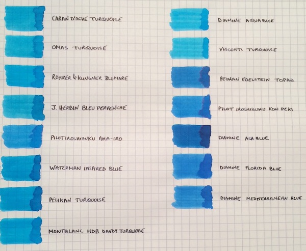
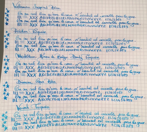
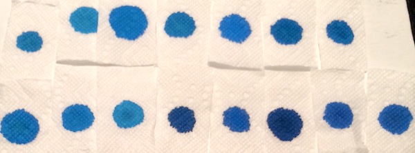
I don’t know if it’s the warm and sunny weather that just hit the northeast after a cold spell, but, more than ever, I’m not ready for summer to end! So to keep the summery vibe going, I thought why not do a comparison of turquoise and “beachy blue" inks. This is by no means a comprehensive review, because I’m missing some great turquoise inks, such as Sheaffer and Lamy Turquoise, but I saw a post come up on the boards with questions about turquoises, so I wanted to share samples of the ones I have. The 15 inks tested are: Caran d’Ache Turquoise, Omas Turquoise, Rohrer & Klingner Blu Mare, J. Herbin Bleu Pervenche, Pilot Iroshizuku Ama-Iro, Waterman Inspired Blue, Pelikan Turquoise, Montblanc Honore de Balzac Dandy Turquoise, Diamine Aqua Blue, Visconti Turquoise, Pelikan Edelstein Topaz, Pilot Iroshizuku Kon-Peki, Diamine Asa Blue, Diamine Florida Blue and Diamine Mediterranean Blue. The writing samples were done using a 1950s 146 and a Pilot Custom 74 B nib ground down to a smooth stub by Mike Masuyama. All samples were tested on Rhodia paper. Ink Swabs: Ink on Paper Towel: Top Row: Caran d’Ache Turquoise, Omas Turquoise, Rohrer & Klingner Blu Mare, J. Herbin Bleu Pervenche, Pilot Iroshizuku Ama-Iro, Waterman Inspired Blue, Pelikan Turquoise Bottom Row: Montblanc Honore de Balzac Dandy Turquoise, Diamine Aqua Blue, Visconti Turquoise, Pelikan Edelstein Topaz, Pilot Iroshizuku Kon-Peki, Diamine Asa Blue, Diamine Florida Blue and Diamine Mediterranean Blue Best Flow and Smoothness: J. Herbin Bleu Pervenche Bleu Pervenche wins hands down for me in this category and is miles ahead of every other ink in this review. With that said, although it has an excellent flow, l wish Bleu Pervenche felt a little smoother (to match the smoothness of my favorite inks). However, this is the only turquoise with a regular spot in my ink rotation. Best Turquoise Color: Rohrer & Klingner Blu Mare This is by far my favorite shade of turquoise. It offers a nice mix of blue and green that leans more towards the blue side (which I prefer). In a wet nib, it is the most vibrant of the turquoise inks tested - so vibrant in fact that it makes me want to pull out a pair of sunglasses . The ink has a good flow (though not as high as Bleu Pervenche) but is missing the high level of smoothness I look for in a go-to ink. However, I love the color so much that I did get a bottle. Best Beachy Blue Color: Pilot Iroshizuku Ama-Iro and Diamine Florida Blue (Tie) I love the color of both of these inks, but I do not own bottles of either. I consider Ama-Iro to a "beachy blue" rather than a turquoise because it needs a little more green to be a true turquoise. I really love its bright, light blue color, which screams summer fun, but didn't enjoy the feeling of writing with the ink enough in the flexy 146 to buy a full bottle especially given its higher price point. I should note that I may have been especially tough on Ama-Iro because I was expecting a higher level of smoothness from an Iroshizuku ink. Florida Blue and Mediterranean Blue are close enough in color that someone looking to keep their ink spending to a minimum wouldn't need to own both. Florida Blue has a better flow, and, since I like wetter inks, I wouldn't think twice about using it over Mediterranean Blue. (Mediterranean blue is not a dry ink but someone looking for less wetness might prefer it; it is also a little lighter and exhibits slightly more shading than its Floridian counterpart.) Highest Sheening Ink (on Rhodia): Pilot Iroshizuku Kon-Peki Kon-Peki is not a monster sheener on Rhodia (like some of the Sailor inks I’ve recently tried) but still offers a subtle and beautiful pink shimmering halo around its blue letters. Some posts have asked how it compares to Edelstein Topaz and, as others have noted, both inks are similar in that they are cerulean blues with pink sheen. (I've noticed that Topaz sheens tremendously on Tomoe River Paper, but in this comparison it barely showed any sheen around the letters.) If I had to choose only one of the two inks, it would be Kon-Peki. The color is brighter and the ink has a better flow. Lowest Performer: Caran d’Ache Turquoise I really did not like this ink and was expecting more from a $30+ ink. It was so thin that it took the fun out of writing with my favorite pen (and I almost stopped the review to change writers). Other notable mentions: Light Turquoise: Visconti and Omas Turquoise (tie) Both inks are on the lighter end of the turquoise spectrum and could be a good option for someone looking for such a shade. I prefer the flow of the Omas but like the color of the Visconti better. (I would have liked for the Visconti to perform more like its brother ink, Visconti Blue, which offers a smoother writing experience.) Dark Beachy Blue: Diamine Asa Blue Asa Blue is a beautiful and interesting color in that it is paradoxically both dark and beachy. It has a good flow but an ok smoothness. Montblanc Dandy Turquoise Alternative: Pelikan Turquoise I love this shade of turquoise and have found that with the right pen and paper combination it can offer wonderful color variation. (I've noticed much more color variation using a Visconti HS.) For anyone who was not able to get a bottle during its limited run, I think that Pelikan Turquoise is a pretty close alternative.
-
Penbbs #286 幽山向晩 (Remote Mountain By Nightfall -- not an official translation) comes in a "60±5ml" bottle with a octagonal horizontal cross-section. It's damn difficult to come by a bottle. It's isn't so easy just to come by an image of a bottle of it! Source: eBay (I'm trying to rediscover my enthusiasm for reviewing inks by doing one, and move to an easier procedure by using just one or two pens instead of five or more. Alas, no joy, but what's done is done, so here it is.) Drying time: Astoundingly fast. I don't think I've tested any other ink that almost completely dried on Rhodia Dotpad 80g/m² paper in five seconds. Lubrication: I can't comment on that, since I don't have a large number of data points as to how much friction my tester frankenpen usually generates when writing on a Rhodia Dotpad. Saturation: I haven't figured out how to test that. The ink does appear to have a moderate-to-heavy dye load. Feathering: None observed when writing on the Rhodia Dotpad or in a Leuchtturm1917 hardcover A5 journal. Ghosting: None observed from writing on 80g/m² paper of various types. Japanese paper of a lighter weight could be a different matter. Bleed-through: None observed from writing on Rhodia 80g/m² paper. Even where I did four passes with a Pilot Parallel 6.0mm pen, as long as there was no pooling of ink, there was no bleed-through. No bleed-through in this Muji A5 Notebook SKU#4550182108910 either, even when I'd written with a dip pen that was so wet the letters haloed with sheen. I did see some tiny spots on the reverse of a page in a Leuchtturm1917 hardcover A5 journal, at some (but not all) intersections of pen strokes using a wetter pen. Shading: There is shading when using either a broad enough or just moderately wet pen. Look at the mark left by one pass of the Pilot Parallel 6.0mm pen. Of course, it's up to your pen and your penmanship to distribute the ink unevenly to get visible shading. Sheen: This ink sheens a dull purplish black, usually around the edges of wet pen strokes causing a 'halo' effect. Water resistance: Some. Leaving the ink to dry for 60 minutes instead of just 10 minutes before soaking did not appear to increase the ink marks' water resistance on Rhodia 80g/m² paper, but soaking the paper for 20 minutes instead of 10 minutes made a difference. Accidental spillage or random raindrops on writing will not eradicate it from the page, provided it is treated promptly. Otherwise, the colour that escapes from the page into the droplet could settle back onto the paper and obscure the writing.
-
I have noticed over the past year or so, a significant but growing number of fountain pens produced in the teal or turquoise family of colors. Here is a listing of entries that fall under this wave. Please add others that I have missed. My guess is that this color is selling well, otherwise, all these manufacturers would not have jumped on board. This a bit of a retro color event. I believe that the last time teal was popular may have been when Parker 51's were at their height in the 1950's and blue/green teal was a frequent color choice. Pelikan 205 Aquamarine Pelikan 600 Turquoise-White Pelikan 805 Ocean Swirl Pilot Custom 74 Teal Platinum 3776 Kumpoo Sailor Pro Gear Ocean Sailor 1911 Stormy Sea Diplomat Aero Turquoise Kaweco Sport Turquoise Pilot Vanishing Point LE Tropical Turquoise Montegrappa Elmo Turquoise
-
Hello all. This is my review for the penhouse.in inks. Attached below are the swatches of violet (above), and turquoise (below). The paper I have used is the Thought Slot dotted inserts which are readily available on amazon.in. The pen I have used is the Camlin KOKUYO Trinity, which I also got from penhouse.in. The turquoise ones show some amount of feathering on the paper, while the violet does not have the issue. The ink takes about 3 seconds to dry. It is not waterproof. This isn't available in cartridges, but the ink comes in plastic bottles, and costs about Rs. 30, or ~$0.5. The turquoise was kind of disappointing, it seems to be more of a bright blue than a greenish blue shade that I was expecting. The violet is bright and lovely, and writing with it seems like a charm. Regards, Smruthi
-
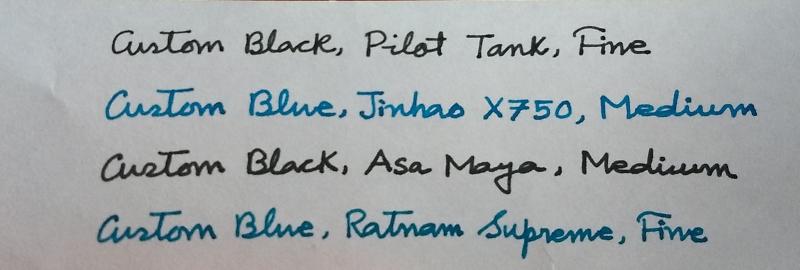
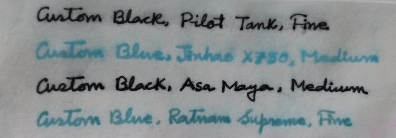
I have been thinking about mixing relatively inexpensive inks from India to produce something I can use in my writing. I have to be conservative with my choice of ink for official use- only black/blue-black, and my writing should be somewhat impervious to water damage. In my personal use, I prefer a vibrant, unusual blue ink. I have two ink mixes ready for experimentation. I. 3 parts of Daytone Turquoise Blue + 1 part of Camlin Royal Blue = Custom Blue. II. 3 parts of Daytone Calligraphy Black + 1 part of Camlin Permanent Black = Custom Black. The first photograph below is how the inks behave in different pens on ordinary 75GSM copier paper. The next photograph is the result of water resistance test done after 12 hours of writing. The paper is kept under the stream of tap water for 1 minute and then submerged in a mug of water for 30 minutes.
-
Hi, I recently went on a hunt to find the best turquoise-blue ink I could find and I landed on this ink by Krishna pens. This ink is a part of their super-saturated series and the color is a super nice azure. Here's the full review: Color: The color is a super vibrant turquoise without any green undertones. this ink is a true blue. the color is somewhat similar to Robert Oster Fire and Ice and Noodler's turquoise. Drying time: THe flow of this ink is very wet. I used a medium nib and it took about 35-40 seconds before it became completely dry. the pen I used was relatively dry flowing, so if you were to use it on a wet BB nib or a flex nib, the dry time could be higher. Drip test: The ink is not advertised as being water resistant, and it is not. most of the ink washes away with water, but the writing, for the most part, remains legible. so I would say that it is moderately water resistant. Shading: This is where it shines. The ink shades like crazy! Even on regular paper, the shading is very prominent. I don't know if this is a trend with turquoise inks, but this has to be in my list of top 10 shading inks. Saturation: The ink is a part of the super-saturated series. the saturation is very good, especially since the ink flows very wet. Ease of cleaning: Since the ink is saturated, it does tend to be a little cumbersome to clean, but nothing too difficult. I would rate the easiness to be moderate. Conclusion: The ink is super vibrant and shades really well, plus the color is a delightful shade of turquoise. My only complaint would be the tiny 20ml bottle the ink comes in. The retail price for this ink is Rs. 180, or about 3 dollars US for a 20ml bottle. It's definitely one of the best turquoise inks I've tried. materials I used: Krishna Cool Breeze ink Lamy VIsta Medium nib Tomoe RIver 68gsm A4 printer paper 75gsm
-
I've just photographed a bunch of Col-O-Ring cards with darker blue-green inks, while comparing them to a custom-mixed ink discussed in Inky Recipes: https://www.fountainpennetwork.com/forum/topic/334121-masques-mix-black-swan-in-icelandic/ I thought I'd share the photographs here, in case they will be helpful for anyone. Since display calibration and general accuracy of representation varies, the main value of these is comparative between the shades. Though I did try to make the colors appear as I see them in person (at least on my devices). I think Fire& Ice should be slightly more saturated and a tad more green. Turquoise and Eau de Nil should be a bit less saturated, more matte. Diamine Asa Blue is a slightly turquoise medium blue. Birmingham Pen Co. Fountain Turquoise is a pale greenish turquoise. Lamy Petrol is similar to Noodler's Aircorp Blue Black in regular writing: both are quite green blue-blacks. ACBB has no sheen, Petrol has unique rose gold sheen. Sailor's Yama Dori was a disappointment to me: it's a dark teal-black that's got a kind of matte washed out appearance. Granted it does sheen easily, but I just didn't care for the lackluster base color. Robert Oster Fire & Ice: ranges from dark blue-teal to very vivid glowing turquoise, depending on the pen used (dry or wet). Sheen is pretty minimal unless you let the ink concentrate sitting in a pen for a few days. Diamine Eau de Nil: nice muted blue-teal, darker, not too vivid Robert Oster Tranquility: this is a green-teal Robert Oster Aqua: more green than Fire & Ice J. Herbin Emerald of Chivor: similar to Aqua in base color. Sheen and shimmer can be hit or miss, depending on paper and concentration Organics Studio Walden Pond "Blue" : definitely a misnomer, there is almost nothing blue about it. It's strongly green, though on the bluer green side. Sheens a vivid metallic magenta so easily, it can take over the whole writing. If you use a dip pen with it and low absorbent paper like Clairefontaine or greeting cards, the metallic sheen completely covers up the green-black, and the letters look like you wrote them with a metallic magenta ink.


desaturated.thumb.gif.5cb70ef1e977aa313d11eea3616aba7d.gif)