Search the Community
Showing results for tags 'royal blue'.
-
Graf von Faber-Castell Lapis lazuli This was the 3rd ink, part of 5 ink blind test. Thanks @Lithium466 for the sample. Photo courtesy of Fasber-Castell This is a dryish, faded Royal blue, with almost no water resistance. It needs a wet pen and wider nib. It’s very well-behaved on copy paper, but the colour is boring and does not capture the depth and the beauty of Lapis Lazuli. I doubt any ink can. You’re better off, buying a similar ink, with a cheaper packing and less pretentious or buy the cartridge version. The best thing about this ink was using it for washes and cleaning it. With a few flushes and the pen was clean as a whistle. Chroma: This is the loveliest thing about it. Writing Samples: Instead of using a Japanese Ef nib, I reverse wrote with Lamy Ef. Don’t be fooled by the scan, the shading is subtle. The letter C refers to the code name, as it was a blind test Photo: Comparison: The R&K ink is Königsblau (royal blue). C is GvFC Lapis lazuli. Water test: Left side 10 seconds under running water. Sample was written with glass nib. So amount of nib is more than a normal nib. "Smoking" cats will be submitted to water test 🙀 Art Work: I really enjoyed doing washes with this ink. It’s such a pleasant colour and easy to work with. I will post a few other art works in future reviews · Pens used: Lamy (reverse EF/Ef / F/M/B, BB) · What I liked: Chroma, Drawing with and cleaning. · What I did not like: Writing experience. · What some might not like: Dryish ink. It’s a faded royal blue. · Shading: Yes there, is but not so visible as the scan makes you believe. · Ghosting: Very faint on copy paper · Bleed through: Only with a wet/wide nib, in my case a heavy-handed flex nib. · Flow Rate: Dryish · Lubrication: On the low side. · Nib Dry-out: Did not notice. · Start-up: Ok · Saturation: Pastel · Shading Potential: Meh. · Sheen: No. · Spread / Feathering / Woolly Line: Only with a primed feed with lots of flex. · Nib Creep / “Crud”: Did not notice. · Staining (pen): No. · Clogging: Did not notice. · Cleaning: Very easy. · Water resistance: Dismal · Availability: Cartridges, 75 ml bottles. Please don't hesitate to share your experience, writing samples or any other comments. The more the merrier
-
J Herbin Éclat de Saphir (Cartridge) Thanks to @Lithium466 for the cartridge. It’s difficult to review an ink which leaves your indifferent, when writing with. However, I truly enjoyed drawing and doing washes with it. It’s an happy blue It’s like most Herbin inks, it doesn’t like copy paper. I didn’t bother to ink up a flex nib for this one, and @LizEf has done an excellent review of this ink for a Japanese Ef nib. Let's start with the lovely chroma: Writing Samples: Photo: Comparison: Water test: and finally an artwork, Loving Blue The background is Éclat de Saphir, the darker blue is J Herbin Bleu Myosotis, and the outlines are done with Noodler's Polar Brown. and this one was done in homage of @LizEF new kitten, Smoke: the other inks are: Sailor Kiwa guro (Cats J Herbin Bleu Myosotis (Water) J Herbin Éclat de Saphir (Bathtub) J Herbin Bouton d'or Noodler's Polar Brown · Pens used: Kaweco (EF/F/M/B, BB) · What I liked: Chroma, Doing washes. · What I did not like: Writing with it. · What some might not like: The colour · Shading: I didn’t see much. · Ghosting: Yes, on cheap paper. · Bleed through: Yes, on cheap paper. · Flow Rate: Wet · Lubrication: A bit on the dry side · Nib Dry-out: Did not notice. · Start-up: Ok · Saturation: Pastel royal blue · Shading Potential: Nope. · Sheen: No. · Spread / Feathering / Woolly Line: Did not notice. · Nib Creep / “Crud”: Did not notice. · Staining (pen): No. · Clogging: Did not notice. · Cleaning: Easy · Water resistance: Ok · Availability: cartridges, 10 ml, 30 ml bottles. Please don't hesitate to share your experience, writing samples or any other comments. The more the merrier
-
InkShift – Mont Blanc Lavender Purple to Royal Blue Just for the fun of it, I occasionally resume my project exploring what happens when you move progressively from one ink colour to another. For now, I'm restricting myself to inks from the same manufacturer - mainly to avoid nasty chemical surprises. My hope is that some of these "inkshifts" result in interesting colours that I can use to write/draw with. And besides... it's just fun to watch one ink colour morph into another one. Mont Blanc Lavender Purple is a technically ok ink, but has that shade of red-purple that doesn’t really appeal to me. And so I ended up with a bottle that’s been collecting dust in my ink cabinet. Time for a change… I decided to see if I could morph Lavender Purple more toward the blue end of the spectrum, by mixing it with Royal Blue. Maybe there are some interesting combinations in the mix, maybe even a fairly decent violet-blue. Who knows... only one way to find out, and that is to carry out the inkshift experiment. In the span between the two starting inks more interesting colours appear, that certainly beat the original Lavender Purple (my personal opinion). The 1:1 mix is a blue-purple that looks quite nice. And the mix of 1 part Lavender Purple with 3 parts Royal Blue is my personal favourite: a soft blue-heavy violet that looks really appealing. For me, both of these mixes are a significant improvement to the original Lavender Purple. Another bottle of ink saved from oblivion! I continue to enjoy these ink morphing experiments. Fun adventures in ink-land, and more often than not you are rewarded with a mix that beats the original inks. Fun guaranteed!
-
Papier Plume - Calle Real (New Orleans Collection) Papier Plume is a stationary shop in New Orleans, that's best known on this forum for their "New Orleans Inks", that celebrate the rich colours and history of the city. One of their inks in this series is Calle Real, a nice-looking member of the royal blue family. Calle Real is named after the corresponding street in New Orleans. I won't repeat the interesting history behind the name here, but refer instead to the excellent review of Jackokun (highly recommended). Personally I'm not a fan of plain blue inks, but I liked this one. It's a vivid light blue that looks great on the page, and that shows some nice non-obtrusive shading. But the ink also has its shortcomings: a tendency to feather, and drying times that can vary wildly with paper type. The ink itself writes wet and with good lubrication in my Lamy Safari test pens. Quite a contrast with some of the other New Orleans inks. Saturation is excellent, even with EF nibs. The ink itself has a medium colour span. To illustrate this, I did a swab where I really saturated portions of the Tomoe River paper with ink, pooling it on. This beautifully illustrates the dynamics of Calle Real. The range moves from a light to a darker but still vivid blue colour, without too much contrast between both extremes. This results in elegant shading that looks aesthetically very pleasing. The shading didn't show with the finer nibs, but made its appearance starting at F/M and above. On the smudge test - rubbing text with a moist Q-tip cotton swab - the ink behaved quite badly. The inks smudges easily, even after leaving it alone for a while. Water resistance is almost non-existent. The dyes disappear quickly, leaving behind a very light purplish ghost of the text. Reconstructing your writing is possible, but you will have to put some effort into it. Not what I would call an accident-proof ink. The chromatography confirms this: some light-purple dyes remain in place at the bottom part. I've tested the ink on a wide variety of paper - from crappy Moleskine to high-end Tomoe River. On each scrap of paper I show you: An ink swab, made with a cotton Q-tip 1-2-3 pass swab, to show increasing saturation An ink scribble made with a Lamy Safari M-nib fountain pen The name of the paper used, written with a Lamy Safari B-nib A small text sample, written with the M-nib The source of the quote, written with a Parker Sonnet (F-nib) Drying times of the ink on the paper (with the M-nib) Calle Real has a slight tendency to feather, most noticeable on the lesser quality papers in my test set. Not a good choice to use on cheap office copier paper. The ink manages to look equally good on white and more yellow paper. Contrast with the paper is excellent but not overdone: even a page full of text looks pleasing to the eye. Drying times are wildly unpredictable - ranging from 0 to over 30 seconds depending on the paper. Paper with a hard surface results in super-long drying times and I mean this literally... 30 seconds and above. Forget about this ink if you're a lefty. At the end of the review, I also show the back-side of the different paper types, in the same order. Some bleed-through is present on most of the lower-quality papers. You should take care when pairing paper & ink if you want a satisfying result, i.e. avoid low-quality paper, or paper with too hard a surface. Rhodia, Fantasticpaper, Semikolon and Life Noble appeared to work the best. Writing with different nib sizes The picture below shows the effect of nib sizes on the writing. Calle Real manages to look good in all nib sizes from EF up to the 1.9 calligraphy nib. With the very fine nibs shading is quasi absent, but starting at F/M and above the elegant and eye-pleasing shading is very prominently there. I am not really into blues, but I liked the vivid character of this ink that adds character without being too obtrusive and in-your-face. Related inks To compare Calle Real with related inks, I use my nine-grid format with the currently reviewed ink at the center. This format shows the name of related inks, a saturation sample, a 1-2-3 swab and a water resistance test - all in a very compact format. As you can see, Calle Real looks quite good if you compare it to the other inks in the grid. Diamine Royal Blue and Blue Velvet come close, and show some of the same vivid-ness that I like so much in this Papier Plume ink. Inkxperiment – A Saucerful of Science With every review I try to do a single-ink drawing that shows what the ink is capable of in a more artistic setting. This is the most fun part of every ink review, and I quite enjoy brainstorming and then implementing these little pieces. Inspiration for this inkxperiment comes from the Neil deGrasse Tyson book "Welcome to the Universe" that I just finished reading. A humbling book that beautifully illustrates how small we earthlings are relative to the vastness of space and time. And my respect for the scientists that extracted this knowledge from the universe has grown substantially. So this inkxperiment is an ode to science. For this inkxperiment I started with a piece of 12x18cm HP photo paper. I applied some washi tape to divide the paper into regions that I background coloured in a number of different ways, and with different water/ink ratios. I then added some topic-specific details to some of the regions (bookcases, formulas, some mysterious-looking writing). Once dry, I removed the washi-tape to create the white dividers between the regions. The end result is not too bad, and shows what can be obtained with Calle Real as a drawing ink. Conclusion Calle Real from Papier Plume is a vivid light-blue from the Royal Blue family. A great writing ink with beautiful colour and nice shading, but only if you pair it with the correct paper. Make the wrong choice, and you'll have to deal with some feathering and really really long drying times. Make the right choice, and you'll love this ink! Technical test results on Rhodia N° 16 notepad paper, written with Lamy Safari, M-nib Backside of writing samples on different paper types
-
InkShift - Kaweco Palm Green to Royal Blue Just for the fun of it, I decided to do a project exploring what happens when you move progressively from one ink colour to another. For now, I'm restricting myself to inks from the same manufacturer - mainly to avoid nasty chemical surprises. My hope is that some of these "inkshifts" result in interesting colours that I can use to write/draw with. And besides... it's just fun to watch one ink colour morph into another one. Palm Green and Royal Blue are regular Kaweco inks, but not especially interesting. As far as I know, Kaweco has no teal inks in its line, so I decided to explore if a decent teal is in the mix. Green inks appear to be very dominant ones, so I explored on the blue side of the spectrum. Some interesting combinations arise, certainly more interesting than the plain ink versions I started with. In the span between the two starting inks, some interesting colours can be found. My personal favourites are:1 part Palm Green, 7 parts Royal Blue : a Prussian Blue style colour1 part Palm Green, 4 parts Royal Blue : a blue-leaning tealI really enjoy these ink morphing experiments, the results are often surprising and a lot more interesting than the original inks. Loads of fun! Doing an inkshift is easy. All it takes is a couple of pipettes, some receptacles, Q-tips and a fountain pen. And a couple of hours of free quality time to run the mixing experiment. You should try it... a fun experience.
-
In times of forced confinement my mixing experiments proceed. With the last Pelikan purchase (M101N Blue-grey) another 50 ml bottle of Royal blue came bundled in the box. So I'm checking out another Royal mix... This time I started with the aim to slightly darken Royal blue, but not to the extent of a blue black. Some of my Edelstein mixes have worked quite well (in terms of ink compatibilities) and I was curious to see whether mixing an Edelstein with a 4001 would maintain the same compatibility (they are both Pelikan inks after all). I used my by now standard method of two clean metered syringes to add Royal blue and the mixing ink to a small clean glass container. The chosen mixing ink is Edelstein Tanzanite. This ink is a very dark blue, with a very slight tendency to purple. On paper it can look almost black. The starting ratio was 5 parts Royal blue (2.5 ml) to 1 part Tanzanite (0,5 ml), the resulting 3 ml are about enough to fill 3 converters. I had planned to try adding further amounts of Tanzanite but I found the resulting mix to be sufficiently dark (and if one of the scopes is using up Royal blue, saving Tanzanite is a good secondary result). As always it's difficult to show colour comparisons on screen, nonetheless the comparison with the starting inks does give an indication. Essentially the resulting colour is notably darker than Royal Blue, and has a slight purple red tone that reminds me of Navy blue (difficult to spot in the photo). The paper shown here is a typical copy paper (Amazon Basics 80g which is made in France), I have a comparison on glossy paper which is quite different, perhaps will show in a next post. The resulting ink is also crystal clear. i.e. no lumps or any other type of reaction, even after several days in the bottle, which make me claim the mix as very safe to use. I am also expecting that the Tanzanite addition will limit the typical fading of Royal blue. The behaviour of the ink is in every way comparable to Royal blue, very nice flow, and some shading especially on more glossy paper.
-
I like Pelikan Royal blue. I started writing with this ink and have used it for many years without ever using any other, in the era of one pen / one ink. I still like how it behaves and looks. It's just a pity it tends to fade and on some papers more than others tends to look somewhat washed out. I like the colour shade, I know it tends slightly towards purple, but then again it would not be Royal otherwise. I also like how it flows, the fact that it's quite dry on absorbent paper, and can shade nicely especially on coated paper. Since I also like Pelikan pens, with time I have built up quite a reservoir of Royal blue, not by choice but by chance, since many Pelikan pens, especially special/limited editions, come with a complementary bottle of Royal blue. Nowadays that I've moved also to other inks, although with a great prevalence of blues, I'm often using my reservoir of this ink for experiments. Typical tentative mixes are blue + black, blue + purple. I'm not so fond of blue + green, although I have used this ink in view of its purplish tinge to make some blue-green inks look more neutral. This mix I'm showing here is a not so obvious: blue + blue. I happened to think, as this experience is already confirmed by adding either black or purple to this ink, that adding some darker, more saturated ink to Royal blue may affect it positively, and that should work also by adding another blue. I did not have to think a lot about it, I have a sample bottle of Sargasso sea, and since I like this Diamine ink, I also have a full bottle. The sample bottle is half full and the perfect available darker shade to add some character to Royal blue. I had planned to try different ratios but it also happens that I like the first tested ratio, and did not go ahead to try others. Pelikan Royal blue 4 parts to Diamine Sargasso Sea blue 1 part. I'm using a vintage bottle of Royal blue, which was unopened when I got it a few years ago, but is now in use since a while (more than 1 year surely). I do not notice much difference vs current royal blue, perhaps just a tad more greyish. The bottle I used two separate ordinary metered syringes, to avoid contaminating inks, and put 4 ml of Royal blue + 1 ml of Sargasso sea in a sample vial. I then just closed and stirred the vial. This is what it looks like, you can already see the mix is less purple than Royal blue. I then tested the resulting mix vs the two starting inks. A very quick comparison. Some brief impressions The mix is darker than Royal blue and lighter than Sargasso The mix is less purplish and more blue than Royal blue The mix has a faint turquoise hue The mix has some shading although more evident on glossy paper The mix is dry on copy paper and more wet on glossy paper, much like Royal blue The mix has no sheen compared to Sargasso The mix looks more contrasted and less faded vs Royal blue dry time is about 10 seconds on copy paper and about 25 seconds on glossy paper, when dry it does not smudge further a closer look vs Sargasso, it's still quite saturated despite being less concentrated The pen used was a Wing Sung 3008 with a Lamy B nib (don't judge the sloppy writing...) I have not tested compatibility, but I am not expecting problems with these two inks. The vial will sit there on my desk for a while in any case. Then I'll probably fill a nicer pen and take it to work.
-
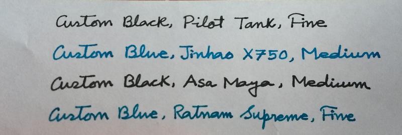
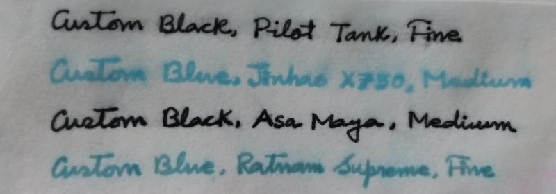
I have been thinking about mixing relatively inexpensive inks from India to produce something I can use in my writing. I have to be conservative with my choice of ink for official use- only black/blue-black, and my writing should be somewhat impervious to water damage. In my personal use, I prefer a vibrant, unusual blue ink. I have two ink mixes ready for experimentation. I. 3 parts of Daytone Turquoise Blue + 1 part of Camlin Royal Blue = Custom Blue. II. 3 parts of Daytone Calligraphy Black + 1 part of Camlin Permanent Black = Custom Black. The first photograph below is how the inks behave in different pens on ordinary 75GSM copier paper. The next photograph is the result of water resistance test done after 12 hours of writing. The paper is kept under the stream of tap water for 1 minute and then submerged in a mug of water for 30 minutes.

-
This is my first ink review, and it's going to be CAMLIN ROYAL BLUE! I saw this as one of the requested inks, so I gave it a shot! Constructive critics, are always welcome! Here you go![ attachment=466681:camlin royal blue .pdf] Right. It comes in a 60 mL bottle, and is dye based, costs around 20 INR or .30 Dollars. I have covered the rest in the attachment. SCORES: 1. Saturation: 4 / 5. It isn't the same throughout, as the colour varies over a few days. 2. Drying: 3 / 5. As you can see from the drying test, it isn't very great. 3. Smoothness: 4.5 / 5. It feels brilliant writing with this ink, it's really smooth, but not as good as PR or Waterman for example. 4. Shading: 2 / 5. It is TERRIBLE! There is zero shading! It isn't something very good, or pleasing to the eye. Final Score: 13.5 / 20. Hope you enjoyed! The file is attached here, as I couldn't figure out how to have it in the middle of the review! camlin royal blue .pdf
-
For some reason I've never been much drawn to the Pelikan inks though I know they have their fans. But I got a bottle of the 4001 Konigsblau (King's Blue) with a pen purchase, and thought I'd give it a try. There's nothing bad about this ink, but it just didn't excite me. I've heard reasonably good things about the 4001 lineup, so it could just be that I didn't have the right pen for it with the right nib. This review done with a Pelikan M201 (. This review done with a Lamy Al-Star (M). This review done with a Pelikan M201 (. Worked pretty well here. A straight up blue dye. Not very waterproof, but that wasn't expected.
-
L'Artisan Pastellier Callifolio - Bleu Azur L'Artisan Pastellier is a small company in southern France that specialises in natural pigments, and offers customers authentic and reliable products in beautiful colours based on mineral or vegetable pigments. In a collaboration with Loic Rainouard from Styloplume.net, the chemist Didier Boinnard from L'Artisan Pastellier created the line of Callifolio fountain pen inks. These pastel-coloured inks are traditionally crafted, and can be freely mixed and matched. Overall these inks are only moderately saturated, and have low water-resistance. The inks were specifically designed to work well with all types of paper, and all types of fountain pens. Being pastel-tinted, these inks have a watercolour-like appearance, and are not only fine inks for journaling, but are also really excellent inks for doodling & drawing. I only recently discovered them, and they are already the inks I gravitate towards for personal journaling. In this review the spotlight is on Bleu Azur, one of the many blue inks of the series. The blue Callifolio inks are named after rivers, lakes and oceans – in this case I think of the azure blue colour of a tropical lagoon. This is more or less a traditional royal blue ink, with a bit of a purple undertone. I'm not myself a fan of this ink style, so this one didn't exactly wow me. I found the ink to be on the dry side in my Lamy Safari test pens, with lubrication being somewhat subpar. I also find the shading a bit too pronounced to my liking. In fine nibs, the ink shows a rather bland appearance. It's only with broader or italic nibs that I start to appreciate what I see. To show you the impact of saturation on the ink's look & feel on paper, I made some scribbles where I really saturated portions of the paper with ink. This gives you a good idea of what the ink is capable of in terms of colour range. As you can see, this ink has a broad colour span ranging from a light purple-blue to a really dark royal blue. On heavily saturated parts, you get a reddish sheen. I like the ink most in the middle tones, where the purple comes to the foreground. On the smudge test - rubbing text with a moist Q-tip cotton swab - Bleu Azur shows a lot of smearing. The text remains legible though. Water resistance however is almost non-existent. The droplet test leaves only unrecognisable blue smudges. The test with running tap water washes away almost all the colour - only faint traces remain. If you need some measure of water resistance in your ink, look elsewhere. When using a water-brush with doodling & drawing, you get a nice light-blue shading effect. Like all Callifolio inks, Bleu Azur is an excellent choice for inky drawings. I've tested the ink on a wide variety of paper - from crappy Moleskine to high-end Tomoe River. With this review, I have added Viking Vektor paper to my test set - Catherine from Sakura generously gifted me a pad of this paper to try out. On every small band of paper I show you: An ink swab, made with a cotton Q-tip 1-2-3 pass swab, to show increasing saturation An ink scribble made with an M-nib fountain pen The name of the paper used, written with a B-nib A small text sample, written with an M-nib Drying times of the ink on the paper (with the M-nib) Bleu Azur behaved perfectly on all the paper types, with no apparent feathering even on the lower quality papers in my test set (with the exception of Moleskine, which is a nightmare for fountain pen writing). Drying times are mostly around the 5 to 10 second mark. The ink looks best on white paper. In my opinion, it's not a good ink for yellowish paper, where it looks underwhelming. My advice: stick to white paper with this colour. At the end of the review, I also show the back-side of the different paper types, in the same order. With the low-end Moleskine there is prominent show-through and a little bleed-through. With the other papers, Bleu Azur's behaviour is impeccable. The ink copes really well with a wide variety of paper types. Writing with different nib sizes The picture below shows the effect of nib sizes on the writing. All samples were written with a Lamy Safari, which is typically a dry pen. I also added a visiting pen - a wet-writing Pelikan M120 with a fine nib. With this wet nib, the ink writes much more pleasantly, but also shows much harsher shading, which I personally dislike. Related inks To compare Bleu Azur with related inks, I use a nine-grid format with the currently reviewed ink at the center. This format shows the name of related inks, a saturation sample, a 1-2-3 swab and a water resistance test - all in a very compact format. I hope that you'll find this way of presenting related inks useful. It's a bit more work, but in my opinion worth the effort for the extra information you gain. Inkxperiment – reach for the sky As a personal challenge, I try to create interesting drawings using only the ink I'm reviewing. For me, this brings extra fun to the hobby, and these single-ink drawings are great for stretching my creativity. With these small pictures, I try to give you an idea of what the ink is capable of in a more artistic setting. For this drawing I started off with HP Premium photo paper and a Scotch Brite dishwashing sponge. I used the soft side of the sponge with water-diluted ink to draw in the background. The rough side with less diluted ink was used to sponge in the foreground. I cut out a round section of sponge, and used this to stamp in the flower halos. Next I used a brush with pure Blue Azur to paint in the flower stems. I quite like the end result - and the dishwashing sponge has been added to my drawing toolset. This mini-picture gives you a good idea of what can be achieved with Callifolio Bleu Azur as a drawing ink. Conclusion Bleu Azur is a royal-blue style ink that looks best on pure white paper. The ink works well with all nib sizes, but is on the dry side. You need wet pens to make for a pleasing writing experience. Unfortunately, with wet pens you get contrast-rich harsh shading, with I personally dislike. Like most Callifolio inks, water resistance is almost non-existent . All in all, not an ink that I would recommend. Technical test results on Rhodia N° 16 notepad paper, written with Lamy Safari, M-nib Back-side of writing samples on different paper types
-
J. Herbin - Éclat de Saphir La Société Herbin, Maître Cirier à Paris, was established in 1670. This makes J. Herbin probably the oldest name among European ink makers. Today, Herbin produces a range of beautiful fountain pen and calligraphy inks, writing instruments, gift sets and accessories. Herbin inks are made in France, and the finishing touches on the bottles are still done by hand in Paris. J. Herbin is probably best known for their inks in the "La Perle des Encres" series. In this review, I take a closer look at Éclat de Saphir - a good-looking blue-with-a-bit-of-purple ink, that to my eye belongs to the Royal Blue / Sapphire Blue family of colours. The ink writes very purple when wet, but quickly dries to a standard royal-blue colour, with the purple still there just below the surface. The ink is quite saturated, and works well with all nib sizes and with all types of paper (white as well as more yellow ones). Shading looks best in M-nibs and broader, but remains subtle without too much contrast between the light and darker parts. Quite nice. The ink has excellent lubrication, even in drier pens like my Lamy Safari. With wetter pens like my Pelikan M120 with M-nib, the ink leaves a very saturated blue line, and in the process loses most of the shading. My guess is that with wetter pens, you need broader nibs to bring out the shading again.. To illustrate the colour span of Éclat de Saphir, I did a swab on Tomoe River paper where I really saturated portions of the paper with ink. This perfectly illustrates the ink's colour range, which moves from a fairly light to a really dark royal blue. The purple undertones surface most easily in the lighter parts of the swab. On the smudge test - rubbing text with a moist Q-tip cotton swab - the ink behaved perfectly, with only minimal smearing. Water resistance is not so good: the ink disappears quickly from the page, but leaves behind a ghost image of the original text, which can still be read when using some effort. Your writings will not be lost, but it's definitely not a water-resistant ink. Éclat de Saphir dries fast on all my test paper, typically in the 5 to 10 second range. That was a surprise, because it writes with a really wet line - I would have expected longer drying times from this ink. I've tested the ink on a wide variety of paper - from crappy Moleskine to high-end Tomoe River. On each scrap of paper I show you:An ink swab, made with a cotton Q-tip1-2-3 pass swab, to show increasing saturationAn ink scribble made with a Lamy Safari M-nib fountain penThe name of the paper used, written with a Lamy Safari B-nibA small text sample, written with an M-nibDrying times of the ink on the paper (with the M-nib)Éclat de Saphir looks great on both white and more yellowish paper. I didn't detect any noticeable feathering, only with the notoriously bad Moleskine paper some barely visible feathering is present. With the lower quality papers in my test set (Moleskine, Generic paper), there is however significant show-through and a tiny bit of bleed-through. You can check this for yourself at the end of the review, where I show the backside of the writing samples. Writing with different nib sizesThe picture below shows the effect of nib sizes on the writing. All samples were written with a Lamy Safari, which is typically a dry pen. I also added a visiting pen - a wet Pelikan M120 with an M-nib. Here the ink leaves a very saturated dark-blue line, taking away most of the shading that shows up with drier pens. The ink contrasts very well with the paper, even in my EF nibs. With run-of-the mill office paper, you typically need smaller nib sizes to compensate for the lower quality of the paper. Combine this with fast drying times, and you have an ink that is quite at home for office-related note-taking. And even though Éclat de Saphir looks like a standard Royal Blue, there remains that purple undertone that makes it just that bit more interesting. Related inksTo compare Éclat de Saphir with related inks, I use a nine-grid format with the currently reviewed ink at the center. This format shows the name of related inks, a saturation sample, a 1-2-3 swab and a water resistance test - all in a very compact format. I hope that you'll find this way of presenting related inks useful. It's a bit more work, but in my opinion worth the effort for the extra information you gain. Inkxperiment - Visit to the Lands of FaerieAs a personal challenge, I try to create interesting drawings using only the ink I'm reviewing. I find this to be a fun extension of the hobby, and these single-ink drawings often present a real challenge. It also gives you an idea of what the ink is capable of in a more artistic setting. For this abstract landscape, I experimented with using HP premium photo paper as a medium. I started off by wetting portions of the paper with water, and drawing in the horizon line with the trees and parts of the foreground. The water on the photo paper lets the ink bleed out nicely. I then applied some bleach - purely as an experiment to bring in some highlights. Next I completely submerged the paper in water, and added some drops of ink. This reacted nicely with the photo paper, resulting in the light blue-purple haze that covers most of the drawing. Once dry, I painted in the fence and little girl in the foreground. I quite like the end result, which shows off the eery magic of Faerie land. You also get a good idea of what Éclat de Saphir is capable of in a more artistic setting. ConclusionJ. Herbin Éclat de Saphir has a royal blue style colour with a definite purple undertone. The ink works great with all paper types, is well saturated, and shows good contrast with the paper even in the finest nibs. This is an excellent choice of ink for use at the office - not too extravagant, but still playful with that purple undertone just below the surface. Personally, I'm not particularly fond of this type of blue - but there's no denying that this is a very good ink. If you like the colour, you will not be disappointed if you give Éclat de Saphir a try. Technical test results on Rhodia N° 16 notepad paper, written with Lamy Safari, M-nib Backside of writing samples on different paper types
-
S T Dupont Royal Blue http://i1286.photobucket.com/albums/a617/Morbus_Curiositas/ST%20Dupont%20Bleu%20Royal/Bottlefpn_zpsa1508dc1.jpg http://i1286.photobucket.com/albums/a617/Morbus_Curiositas/ST%20Dupont%20Bleu%20Royal/STDCHRomatoFPN_zps3e619015.jpg Dear FPN Friends, This fancy looking bottled was given to me received it from the Divine Fountain Pen heros down here http://i1286.photobucket.com/albums/a617/Morbus_Curiositas/LCC/RikenDennis_zps9e771077.jpg Rik van Doornmalen (middle) and Dennis van De Graaf (right) of the Fountain Pen heaven called http://i1286.photobucket.com/albums/a617/Morbus_Curiositas/LCC/DSC01567_zps6295ed37.jpg http://www.lacouronneducomte.nl Merci Rik, Dank je Dennis.... Thanks a lot St Dupont Royal Blue specs and description The Colour is a nice blue... It is nohting special.... ...that nothing special is not meant to have a negative connotation.... It is just that Royal Blue is sort of THE standard Blue ink ..... At least in Dutch primary schools.. Well I love the colour http://i1286.photobucket.com/albums/a617/Morbus_Curiositas/ST%20Dupont%20Bleu%20Royal/stbleucolorpick_zps74e2fd8f.jpg http://i1286.photobucket.com/albums/a617/Morbus_Curiositas/ST%20Dupont%20Bleu%20Royal/STDupontbleu0002FPN_zps59b57d24.jpg check the comparison with Pelikan 4001Royal Blue Down here are some of the technical specs (as suggested by Ann Finley 2007) (not copied in but for this ink) points 1-5 1 = 5= Fountain Pens: Kaweco Calligrapy 1,4 Italic and Diplomat Excellence A M nib Paper: Leonardo Ringbuch,average quality school note book made in Austria Drying time: Faster enough 10 seconds points 4 Flow: very smooth even in both the cheap and potentally scratchy Italic points: 5 Lubrication: medium wet points: 4 Feathering : None points 5 Bleeding: nada points 5 Shading: little to medium points: 3 Waterproof: Survives a SMALL drop points: 2 Package: Very distintive luxury bottle points: 5 Availabilty: EU Go For the Magic Duo Dennis & Rick from La Couronne Du Comte... http://www.lacouronneducomte.nl ...Just write them an E-mail http://info@lacouronneducomte.nl Writing Samples Well as some of you might know I have a very broad interest.... I am a reading addict and an inkoholic .... So I will combine these interests down here in the writing samples. The Age Enlightenment (1650-1780) was andstill is of utmost importance for todays (Western) society. It lead to the French revolution, the seperation of powers (though that was Montesquieu). It gave us freedom and motivated us to be critical and reasonable.... Reason over blind Authority http://i1286.photobucket.com/albums/a617/Morbus_Curiositas/ST%20Dupont%20Bleu%20Royal/DupontscanFPN_zps1ddf8d05.jpg This is Photo taken outside.... The weather was gloomy http://i1286.photobucket.com/albums/a617/Morbus_Curiositas/ST%20Dupont%20Bleu%20Royal/STDupontbleuFPN_zpsde5738fa.jpg (scanned) http://i1286.photobucket.com/albums/a617/Morbus_Curiositas/ST%20Dupont%20Bleu%20Royal/social-contract-jean-jacques-rousseau-audio-cover-art_zps088d6dcf.jpghttp://i1286.photobucket.com/albums/a617/Morbus_Curiositas/ST%20Dupont%20Bleu%20Royal/diderot_zps79e21aea.jpg Too Conclude, http://i1286.photobucket.com/albums/a617/Morbus_Curiositas/ST%20Dupont%20Bleu%20Royal/STDupontinkvomit3_zpsa087efad.jpg I like the ink. It is not so highly saturated But I guess no Royal blue is (check comparison wiht Pelikan on the sampler sheet) I love the colour because it is a vivid happy blue Well and those wise words by the 2 Frenchies are still up to date today Warmest Regards Peter
-
I recently purchased a few standard (60ml) ink pots of the camlin royal blue ink. As soon as i laid down the first line. I noticed that the colour has been changed. I had purchased a few ink pots from Mumbai and the other from Ahmedabad. I noticed that no matter the location, the colour now is different than the previous ink. (Both have manufacturing dates of around mid-late 2014) The change is ever so mild, but it is noticeable none the less. The newer colour has become more of a uniform blue which is a bit lighter in hue. The earlier colour had a purple-grey undertone to it which made it a bit more saturated and darker. (I hope all this makes any sense!) I guess it will be better if i just showed the pictures! Here they are. The left one is the new colour. And the right one, the old colour. I suppose it is more clearly visible in the last picture. So what are your thoughts? Please share your views. If you haven't noticed it, do you think you will like the new colour? And if you already noticed this, What is your opinion?
-
Howdy folks! I am looking for a bottle of Indian Royal Blue ink which will not fade with time. I am not interested in iron gall based ink(s). I will use it primarily for taking down notes. Thanks in advance
-
Continuing my ink reviews of the Nemosine space themed inks. From what I could research, Coruscant is just a Star Wars thing with no real astrological meaning. Feel free to correct me if I'm incorrect in that regard. Thus, my quote is from Yoda. Overall this ink is very much a purple-leaning royal blue. More violet than noodlers baystate blue, but not as purple as Alpha Centauri (comparison shown) There's a very mild amount of blackish, reddish/gold sheen that is only visible on very wet writing, and the saturation is very high. Water resistance is medium - everything's legible after a 30 second soak. Flow is good, all of these nemosine inks are quite wet and smooth thusfar. They even have enough surface tension to play nice with my dip nibs. Feathering/showthrough is very little, not quite as great as alpha centauri, but solid nonetheless and this ink could easily be used in a wet F or medium/dry M on really bad paper. Would I recommend this ink? You bet. A screaming deal, these colors are fantastic, the price is excellent, the bottles are lovely and well made, if you are buying a first nemosine ink I would still recommend Alpha Centauri for its glorious golden sheen, but thusfar not a single one hasn't been really excellent. A really nice everyday royal blue with some usable amounts of water resistance. Box is simple. Raised "NEMOSINE" logo on one side. Small sticker indicating color and that the inks were brewed in Slovenia Bottle design is awesome. Large mouth, narrow bottle. J. Herbin and pelikan could learn a lot from this bottle design for small quantities of ink. bottle is quite heavy glass and the label has the geographical coordinates of the place it was bottled - Pittsburgh, PA. Lovely, high saturation violet royal blue. all nibs are lamy steel, EF to 1.1 stub. Most are quite wet, the stub is medium. Note the impressive water resistance. and quick dry times (much quicker than alpha centauri) pretty exciting smear test, lots of blue violet color. Nice saturation with good shading. the bleed/show/feathering is only on garbage paper. Rhodia and decent laserjet paper have zero issues. the sheen comes out bigtime on the drip. That's not wet nor is it smearing, that's the sheen effect. the sheen is barely visible. This would be mostly visible in extremely wet nibs and nonexistant in medium/dry nibs. These lamy nibs are medium/wet Moderate-good shading. Wetter nibs will see less. Less ink came up than I'd have expected. A wet swab from a dip nib of alpha centauri. You can see the color difference in how much more purple it is, along with the more vivid gold sheen. pretty exciting smear test, lots of blue violet color.
-
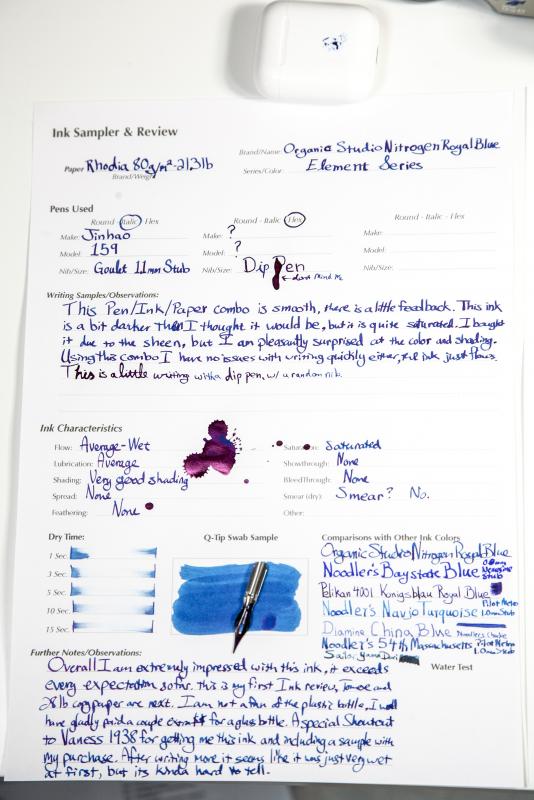
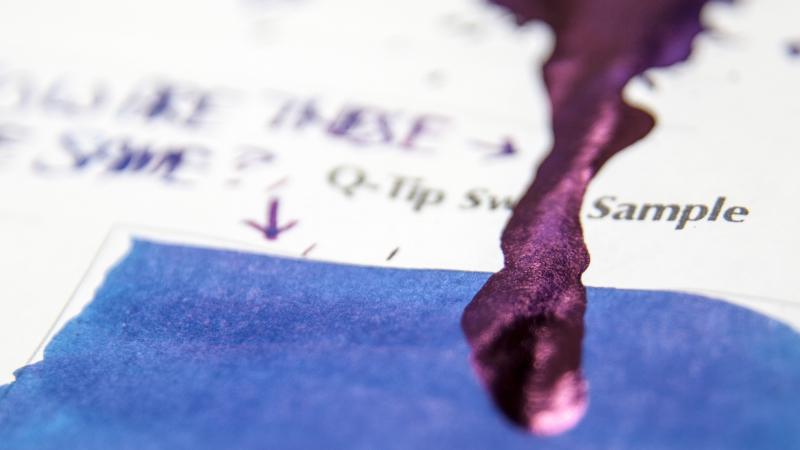
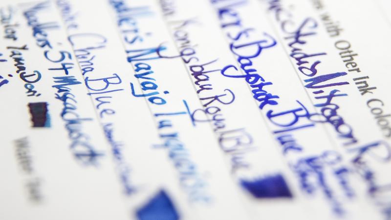
I am a fan of sheening inks, and this is the king of them. At a very reasonable price I had to try it out, and I am glad I did. On Rhodia: On Tomoe River A4 A lot of the files are too big, so I put together an album: https://imgur.com/a/73uby
-
I recently purchased a few standard (60ml) ink pots of the camlin royal blue ink. As soon as i laid down the first line. I noticed that the colour has been changed. I had purchased a few ink pots from Mumbai and the other from Ahmedabad. I noticed that no matter the location, the colour now is different than the previous ink. (Both have manufacturing dates of around mid-late 2014) The change is ever so mild, but it is noticeable none the less. The newer colour has become more of a uniform blue which is a bit lighter in hue. The earlier colour had a purple-grey undertone to it which made it a bit more saturated and darker. (I hope all this makes any sense!) I guess it will be better if i just showed the pictures! Here they are. The left one is the new colour. The right one, the old colour. I suppose it is more clearly visible in the last picture. So what are your thoughts? Please share your views. If you haven't noticed it, do you think you will like the new colour? And if you already noticed this, What is your opinion?
-
I live in Hyderabad, India. Bril Royal Blue is available in a few stores, but mostly the date of manufacture is 2009 or 2010. Is it safe to use it in Indian ebonites (ASA, Gem, Deccan) ?. I have used a batch manufactured in 2009 in ASA Athlete, ASA I Can and the Gama Raja, did not have any issues, but I am wondering if they will cause any long term damage (corrosion of feed, clogging channels, harm the ebonite). Has anyone faced any such issues with Bril's Royal Blue ink? I ask the store owners if they can pull out some new stock, but in most cases either they don't have it or they give the usual .. "Bril is no more, stock isn't coming through"... which cant be true as I still get latest batches when I visit Bangalore. Thanks Rakshit
-

Bought A 4001 Royal Blue, Got A Brilliant Brown... And Loved It!
cimmerian posted a topic in Inky Thoughts
I bought (on-line) a bottle of Pelikan 4001 Royal Blue last month but the seller contacted me after a couple of days apologising for an inventory mistake: they were fresh out of Royal Blue. He offered me Blue-Black, but I don't like blue-blacks, so we settled on a bottle of 4001 Turquoise. Also, he sent me a 62.5 ml bottle of 4001 Brilliant Brown as ways of compensation, which I think was nice. Before these bottles arrived, I kept thinking "OK, I can work with the turquoise... but what am I gonna do with brown ink!?" Well... after I inked pens with both and wrote some, I'm seeing this as the Brilliant Brown being the replacement for the Blue-Black with the Turquoise bottle as compensation! I guess I'm a fan of brown inks now.
-
http://inks.pencyklopedia.pl/wp-content/uploads/De-Atramentis-Royal-Blue-nazwa.png Present test ink De Atramentis Royal Blue with traditional shade of blue, so-called. royal blue. The ink writing poetry. Pen glides smoothly across the paper. Good drying time and you still want more? Ink recommendable. Producent: De Atramentis Series, colour: Royal Blue Pen: Waterman Hemisphere "F" Paper: Image Volume 80 g / cm2 Specifications: Flow rate: good Lubrication: good Bleed through: possible point Shading: noticeable Feathering: unnoticeable Saturation: very good Ink drying time: ~ 5 sec. A drop of ink smeared with a nib http://inks.pencyklopedia.pl/wp-content/uploads/De-Atramentis-Royal-Blue-kleks.jpg The ink smudged with a cotton pad http://inks.pencyklopedia.pl/wp-content/uploads/De-Atramentis-Royal-Blue-wacik.jpg Lines http://inks.pencyklopedia.pl/wp-content/uploads/De-Atramentis-Royal-Blue-kreski.jpg Water Resistance http://inks.pencyklopedia.pl/wp-content/uploads/De-Atramentis-Royal-Blue-woda.jpg Sample text http://inks.pencyklopedia.pl/wp-content/uploads/De-Atramentis-Royal-Blue-txt.jpg Other tests carried out: Sample text in an Oxford notebook http://inks.pencyklopedia.pl/wp-content/uploads/De-Atramentis-Royal-Blue-Oxford.jpg Sample letters in a Rhodia notebook http://inks.pencyklopedia.pl/wp-content/uploads/De-Atramentis-Royal-Blue-Rhodia.jpg Ink drops on a handkerchief http://inks.pencyklopedia.pl/wp-content/uploads/De-Atramentis-Royal-Blue-chromatografia1.jpg Chromatography http://inks.pencyklopedia.pl/wp-content/uploads/De-Atramentis-Royal-Blue-chromatografia2.jpg
-
Hi Fellow Pen Appreciators I have recently bought a bottle of Diamine Royal blue and when I opened it I notices spots or patches of oily something floating on top of the ink. It makes up a shiny reflective and very slightly rainbow-y layer. The ink itself is rather dark and the thing on the surface really reminds me of spilled oil on the seas. Is it a precursor or a warning of the feared SITB? Or is it normal I just never met it before? (I'm a newbie to bottled inks and pretty new to fountian pens as well...) Since then I've seen something a bit similar to that in my Diamine Asa blue, but I thought I'll take the careful option and ask before I put it into more precious pens and even more pronouncedly to sargasso Sea. Thank you very much for your opinion or advice
-
When I decided to review a few of my preferred inks in the Toucan range, I wasn't going to bother with this one - the first time I trialled it (about 4 months ago?) I was seriously unimpressed. To unsaturated, and too 'bluey-green', to be called a 'Royal' blue. I wasn't a great fan of the Bright Blue either, though, till someone suggested I try it in a Noodler's pen - and suddenly I discovered I was dealing with a different ink. So I thought it was worth revisiting the 'Royal' Blue - and I wasn't disappointed. It's still not my favourite ink - as you'll see in the comparisons, the three blue (or turquoise) inks are all somewhat similar, though you can certainly tell them apart. I'd like to see Tintex try to produce something closer to a 'classic' royal blue - though I guess the market in such inks is rather saturated (if you'll pardon the pun). But this is not a bad ink - having re-filled a couple of pens with it for this review, I expect I'll use it (though not for formal correspondence) until the pens are empty... Starting (again) with the photo: http://i.imgur.com/6h0I4kd.jpg And the scan: http://i.imgur.com/18yto0C.jpg
-
I tried to find my answer by doing a search, but the title of the thread tells why that failed me. I've been partial to Noodlers—why? The first bottled ink I tried was Noodlers Heart of Midnight, and I have never needed anything else. But I am expanding my palette. I want an ink that does not have bleed through problems with copy paper (my employer prints letterhead one at a time from the computer), and dries a brilliant royal blue. Is there such an ink? Thanks!
-
Looking at two ads on eBay for a Carene, one described as "velvet purple" and the other one as "velvet blue", the purple one looks more like blue to me and the blue one more like grey or even black. I know colors can look completely different in a different light and it can be hard to distinguish from photos, but which colors do you think they are?