Search the Community
Showing results for tags 'grey'.
-
Colorverse Under the shade Colorverse is a South Korean company that produces inks that are well-known for their iconic bottles and for their astronomy-related names. But they also make other inks, and this review covers one of them. “Under the shade” is part of the theme-based “Joy in the Ordinary” Earth Edition. This is a set of 6 inks that complement each other nicely. And with a brilliant creative touch, the box designers made sure that the pictures on the side of the six boxes combine to create a bigger tableau. Colorverse Under the shade is a medium cool-toned grey. The ink has a very interesting chroma, with loads of colour tones present in the mix. When doing swabs these underlying colours are clearly visible and slowly fade away when the ink dries, disappearing again under the surface. I love grey inks and had high hopes for this one. Alas… there are some fairly heavy flaws that surface when pulling the ink from the shade and examining it more closely in the bright sunlight. There’s nothing wrong with the ink’s colour… I quite like it, and the ink turned out to be an excellent one to draw with. But it’s when the writing starts that the flaws appear, and worse, these flaws re-enforce one another making the ink quite unusable for me as a writing ink. First: the ink has near eternal dry times on hard surface, high quality paper (i.e. most Japanese paper). Next, on hard surface paper the shading gets really extreme… to the point that it becomes ugly (my personal opinion – in reality, the effect is worse than the photos of the writing samples below suggest). On absorbent paper, the ink is sucked quasi instantly into the paper with near to zero drying time. Here, shading is almost absent… all the ink is drawn into and “through” the paper, resulting in quite a bit of see-through and even bleed-through. It becomes very difficult to find a pen/nib/paper combination that works well with “Under the shade”. This Colorverse ink has a fairly wide colour range, ranging from a very faint (almost invisible) grey to a more saturated medium grey. With dry pens that tend to use the left side of the saturation span, the ink is too light for writing. So definitely an ink to use with wet-writing pens. But that just means even longer drying times. Still… I like the ink best with wet and broader nibs … the colour gets a bit more saturated, and the shading – while still strong – looks less extreme. On the smudge test – rubbing text with a moist Q-tip cotton swab – there is almost no smearing. Which is a surprise, given the ink’s long drying times. On closer inspection, there is smearing of the ink, but it’s of a really light-grey colour that isn’t disturbing at all. Water resistance is remarkable good – both with the still water test (letting drops of water sit on the page for 15 minutes) as with the running water test. Most of the ink remains firmly attached to the paper, and remains very readable. This makes it useful for the office. Also, most office printing paper is absorbent, which means almost zero drying time. And to compensate for the see/bleed-through, you could use an EF or F nib (like the Pilot Capless F that I used in the nib size comparison text). I’ve tested the ink on a wide variety of paper – from crappy Moleskine to high-end Tomoe River. On each scrap of paper I show you: An ink swab, made with a cotton Q-tip 1-2-3 pass swab, to show increasing saturation An ink scribble made with a Lamy Safari M-nib fountain pen The name of the paper used, written with a Lamy Safari B-nib A small text sample, written with the M-nib The source of the quote, written with an Esterborrk Estie with 1.1 stub Drying times of the ink on the paper (with the M-nib) Colorverse Under the shade shows almost no feathering, not even on low quality paper. Again, this makes it a good candidate ink for the office, where lower quality printing paper is the norm. Just use a fine nib to keep the unavoidable see/bleed-through to a minimum. The ink looks best on pure white paper, where the medium grey looks really pretty. Unfortunately, this Colorverse ink just doesn’t work well with high quality paper: both the extreme shading and the eternal drying times ruin the experience for me. Which is a shame, because I quite like the colour. I had to use photos for the writing samples because my scanner couldn’t cope with the extreme shading present on many of the papers. Below you’ll find some zoomed-in parts of writing samples. The very heavy shading is really obvious, and looks even more extreme to the naked eye. In my opinion, the photo looks too flattering: in reality the contrast between light and dark parts of the text is more extreme, to the extent that a full written page looks harsh and angry. The aesthetics are just not right. Writing with different nib sizes The picture below shows the effect of nib sizes on the writing. With the dry-writing Lamy Safari pens, the ink’s colour is a bit too light for my taste. The B nib looks really good though. The wetter-writing visiting pens also look quite good, although the shading with the 1.1 Estie pen is already a bit too heavy for me. Related inks To compare “Under the shade” with related inks, I use my nine-grid format with the currently reviewed ink at the center. This format shows the name of related inks, a saturation sample, a 1-2-3 swab and a water resistance test – all in a very compact format. Diamine Silver Fox comes close in colour, and is – in my opinion – a better ink with a better balanced contrast range that makes for a more pleasant look on the paper. Inkxperiment – Me and My Book With every review I try to do a single-ink drawing that shows what the ink is capable of in a more artistic setting. The most fun part of the ink review, and I quite enjoy brainstorming and then implementing these little pieces. This is the first drawing in a new series – “Counting … ONE two three”. So this is number one – a simple scene with one tree and one person. In this case, an impression of my favourite pass-time: reading a book, sitting in the park while enjoying the first warm sun of spring. Life is good! For this inkxperiment I started with a piece of A4 HP photo paper. I covered the sun, and used some cotton make-up swabs to paint in the sky. I then used a fine brush and painted in the main parts of the tree using pure ink. For the finer branches, I simply used my fountain pen. At the end of each stroke, you get a more saturated dot (where I lifted the pen from the page), which works well as the budding leaves that start to appear in early spring. I finally added the person reading a book as the finishing touch. Overall, I really like “Under the shade” as a drawing ink… in my opinion a really good ink for artistic work. Inkxpired – computational art I love experimenting with pen/ink/paper, and have added another layer as part of the hobby. I’m exploring computational art, inspired by the ink drawings I do during ink reviews. Another fun offshoot of the hobby… and all that starting with a few drops of dye-coloured water on paper. For this computational derivation, I kept it really simple. All I did was applying an urban art filter to the original drawing. I like the colour scheme of this one. Conclusion Colorverse “Under the shade” is difficult ink that gets a love/hate reaction from me. I love the colour, and the expressiveness of this ink when drawing. I hate it as a writing ink – it’s just too darn difficult to find a pen/nib/paper combination that works well. If you like extreme shading, you might even like this ink for writing, but for me it just didn’t work. Still, I enjoyed exploring it for the purposes of this review. Technical test results on Rhodia N° 16 notepad paper, written with Lamy Safari, M-nib Backside of writing samples on different paper types
-
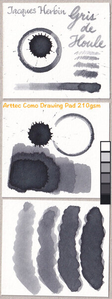
Jacques Herbin - Gris de houle La Société Herbin, Maître Cirier à Paris, was established in 1670. This makes J. Herbin probably the oldest name among European ink makers. Today, Herbin produces a range of beautiful fountain pen and calligraphy inks, writing instruments, gift sets and accessories. Herbin inks are made in France, and the finishing touches on the bottles are still done by hand in Paris. Recently, the company jumped on the premium product bandwagon, and started to release more high-end inks under the Jacques Herbin "Les encres essentielles" label. Nicer boxes, nicer packaging, much higher price (18,50 EUR versus the 7,50 EUR for the J. Herbin inks from the "La perle des encres" series). Nevertheless, I couldn't resist and decided to test these new offerings - are they really better than the standard J. Herbin inks? In this review, I take a closer look at Gris de houle, a cool grey from the Jacques Herbin line. First impression: a good-looking cold grey with some green and purple undertones. The ink has a pencil-like appearance when writing with fine nibs. It looks quite nice on the paper. Gris de houle writes really wet, and is well-saturated - all this even with my dry-writing Lamy Safari test pens. Shading is very prominent, even with finer nibs. Being a grey ink, the contrast between light and dark parts never gets shocking, and the effect is quite aesthetically pleasing. I really like the looks of this ink on paper. The ink has quite satisfactory lubrication, even in drier pens like my Lamy Safari. With my wetter Pelikan pens the ink is very saturated, and produces a much darker grey colour. Gris de houle has quite a broad colour span, ranging from a wispy light-grey with a purple haze beneath the surface, to a really dark, almost black grey. To illustrate this, I did a swab on Tomoe River paper where I really saturated portions of the paper with ink. This clearly demonstrates the ink's wide colour span. On the smudge test - rubbing text with a moist Q-tip cotton swab - the ink behaved perfectly, with no visible smearing. Water resistance is also very good, both with a 15-minute exposure to still water, and with running tap water. Some of the ink gets flushed away, but a very readable grey residue remains. I have no issue whatsoever to read what's left on the page. Very well executed! This is also apparent from the lower part of the chromatography, which shows that the grey components of the ink firmly remain on the paper. Unfortunately, Gris de houle is a slow-drying ink. Depending on the paper, I got drying times from 10 to 20 seconds with a dry Lamy Safari with M-nib. In my book, this slow drying time makes the ink unsuitable for use at the office. A pity, because I like the way it looks on paper. I've tested the ink on a wide variety of paper - from crappy Moleskine to high-end Tomoe River. On each scrap of paper I show you: An ink swab, made with a cotton Q-tip 1-2-3 pass swab, to show increasing saturation An ink scribble made with a Lamy Safari M-nib fountain pen The name of the paper used, written with a Lamy Safari B-nib A small text sample, written with an M-nib The source of the quote, written with a wet M-nibbed Pelikan pen Drying times of the ink on the paper (with the M-nib Safari) Gris the houle looks best on pure white paper. In my opinion, it doesn't look good on more yellowish paper. What really surprised me is that this premium ink only works well with premium paper. The ink doesn't like the lower quality papers in my test set. On printing paper, generic notepad paper and Moleskine, I noticed quite some feathering, which gets worse the wetter your pen. With the wet Pelikan pen, there is even some feathering with OCM vellum paper and GvFC 100 gsm paper. Ouch! Another reason not to use this ink at the office (where the paper in reach is often simple printing paper). Fortunately for me, Gris de houle looks beautiful on Paperblanks journal paper, no feathering, good contrast, smooth writing and reasonable drying times. So this ink will be great for my personal journaling. But objectively speaking, the ink disappointed me at the technical level. I had expected better from a premium ink. The J. Herbin inks from the classic series I've tried so far performed better than this one. Writing with different nib sizes The picture below shows the effect of nib sizes on the writing. All samples were written with a Lamy Safari, which is typically a dry pen. I also added a visiting pen - a wet Pelikan M101N Lizard with an M-nib. Here the ink leaves a very saturated dark grey line. As you can see, Gris de houle manages to look really nice in all nib sizes, with great contrast and elegant shading. Nice. I really appreciate the pencil-like appearance with the EF/F nibs, which still shows enough contrast to remain effortlessly readable. Related inks To allow for a good comparison with related inks, I employ my nine-grid format, with the currently reviewed ink at the center. Each grid cell shows the name of the ink, a saturation sample, a 1-2-3 swab and a water resistance test - all in a very compact format. Inkxperiment - naïve portrait of mother and child As a personal challenge, I try to create interesting drawings using only the ink I'm reviewing. These single-ink pieces often present a real challenge, and are a fun extension of the hobby. They also give you a good idea of an ink's capabilities in a more artistic setting. For this drawing I started with a sheet of 300 gsm rough watercolour paper. I then painted in the background with Q-tips, using different water/ink ratios. Next I drew the portrait of mother and child with a glass pen dipped in pure Gris de houle. As you can see, I have zero talent for drawing realistic images. So I designate this as a naïve portrait, that could just as easily have been drawn by a five year old ;-) I added some framing with the glass dip pen and pure ink. Finally I used my M-nibbed Lamy Safari to add some texture to the background. This little piece shows quite well the broad colour span of this grey ink, ranging from wispy light grey to almost black. Gris de houle definitely shows promise as a sketching ink for black & white drawings. Conclusion Jacques Herbin Gris de houle is a nice-looking cool grey premium ink, that unfortunately requires premium paper for writing. I was disappointed by its behaviour on lower quality paper. Water resistance is brilliant, but drying times are quite long. All this translates to an ink that is not well suited for use at the office. But given the right paper, the ink looks beautiful - I really enjoyed it for personal writing in my Paperblanks daily journal. Gris de houle also has quite a broad colour span, which makes it an interesting ink for more artistic activities. Overall not a bad ink, but I had epected more from the brand's premium product. Technical test results on Rhodia N° 16 notepad paper, written with Lamy Safari, M-nib Backside of writing samples on different paper types
-
Manufacturers since 1864, Diamine Inks relocated to this purpose built 'state of the art' factory in Liverpool in 1925, where they successfully carried on using the traditional methods and formulas for ink production. Over the years the company has changed hands and are now located close to the world famous Aintree Race Course http://www.diamineinks.co.uk/images/DimaineFactory.gif http://www.diaminein...uk/AboutUs.aspx I'm still looking for perfect grey ink. Caran d'Ache Infinite Grey is close, the hue is stunning but the ink is average in terms of behavior. Diamine Graphite is definitely less expensive and it has this slate hue that I enjoy a lot in grey inks. The behavior is good, the ink flows smoothly and leaves reasonably wet line. In one pen (Pelikan M805) it caused hard start after doing a pause of 30 seconds. In other pens however it writes really well. I think it's undesrvedly underrated Diamine ink. I really enjoy this one although I still believe one of these days I'll discover perfect grey ink Drops of ink on kitchen towel Software ID Color range Tomoe River - Kaweco Classic Sport, broad nib Tomoe River, Pelikan M805, fine nib Leuchtturm 1917 - Kaweco AL Sport, broad nib Linen paper, Kaweco Classic Sport, broad nib Copy paper, Lamy Al-Star, broad nib No-name notebook, Lamy Al-Star, medium nib
-
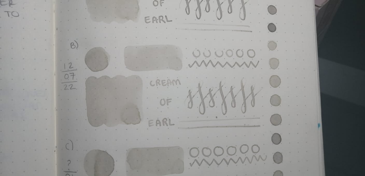
Hello! I felt the need to create this post since I can't find anyone else talking about it and maybe it's just me that I happened to contaminate two (maybe three?) different ink bottles of the same color. I hope the pictures I took serves as good reference to demonstrate what happened over the course of a year. I've been using Cream Of Earl for the past year until recently, because I thought I had contaminated my bottle of ink (fig. 3) since I sometimes use it to paint with brushes. Lucky me I had a second opened bottle at work (fig. 5), I cleaned every single piece of my pen before refilling it, to my surprise the color on that bottle also had lost its pinkish appearance. I thought maybe I had convinced myself the ink had some pink hues, so I went through my notebook to find the very first time I used the ink and it looked just as I remembered it, also found the swatch I made that year on Tomoe River's white paper (fig. 2) and compared them. As I put the ink on paper, it looks kind of green until it fully dries looks like a grey-beige-sand color, i'm not mad about it but I'm very intrigued, also Ferris Wheel Press has no info about the ink changing its color over time and people haven't talked about it, maybe everyone owning this ink think they messed it up and are too embarassed to speak about it? I also checked my other pinkish inks from Ferris Wheel Press to see if they lost their true color (Strawberry Macaron, Lady Rose & Definetely Peachy) and they look just as the first time I opened them. Anyone else has had this happened to them before with this or any other low saturated ink? fig 1. First swatch from when I first filled my pen with CoE back in 2021 fig 2. Left one is on Tomoe River's white paper, swatched back in 2021. Right ones on Leuchtturm1917 paper. fig 3. Bottle opened January 21st on 2021. fig 4. I received this ink bottle the same day as the other two, except this one I'm sure it has never been opened before nor seen daylight until past week that I opened it to compare the rest. It appears to be slightly lighter than the other two. fig 5. Can't remember the day I opened this bottle but it was around the same week I first opened A) fig 6. Swatch from FWP's page. Thanks for reading! Have a great week xx

-
Manufacturers since 1864, Diamine Inks relocated to this purpose built 'state of the art' factory in Liverpool in 1925, where they successfully carried on using the traditional methods and formulas for ink production. Over the years the company has changed hands and are now located close to the world famous Aintree Race Course http://www.diamineinks.co.uk/images/DimaineFactory.gif Diamine Grey is, in my eyes, one of the best choices for people who would luike to try grey ink. It's dependable, easily obtainable and cheap. It behaves really well on most papers (almost no feathering on crappiest paper - Moleskine) and remains legible. It has some interesting shading going on. As the ink dries (it happens quickly) the color lightens but the dark shadows remain visible. Usually where the ink pools at the end of a line. While it's neutral grey I wouldn't call it flat. It's rather enjoyable ink. Drops of ink on kitchen towel Software ID Color range Tomoe River, Caran d'Ache, broad nib Leuchtturm 1917 - Kaweco AL Sport, broad nib Moleskine, Caran d'Ache, broad nib No-name notebook manager, Kaweco Classic Sport, B Water resistance
-
Long due thread... In a page devoted to Italian pens, this topic is calling all the expressions of one of the most recognizable Italian materials ever used in fountain pens: the mythical Arco celluloid! Made worldwide famous by the Officine Meccaniche Armando Simoni (OMAS) in Bologna in their Extras and Paragons, Milords and Princesses and Damas, and proposed here and there by other brands and independent manufacturers, the Arco celluloid is the quintessence of "italianity" in pens: warm, refined, flamboyant and unique. Judging by the prices fetched by Arco celluloid pens in these days, is seems that the "Arco fever" is strongest than ever, and I can understand why... Let me begin with a few photos of some of my Arco:
-
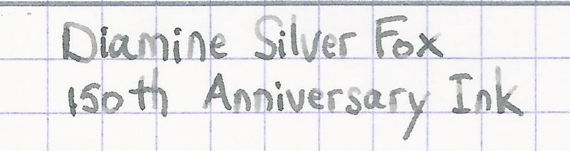
Ink Review : Diamine Silver Fox (150th Anniversary Ink) Pen: Lamy Logo, F-nib Paper: Rhodia N°16 notepad 80 gsm Review This ink is part of the 8-ink collection that Diamine released to celebrate their 150th anniversary (1864-2014). The set has a number of very interesting colors, and this is one of the better inks in this collection. Silver Fox... the name evokes the image of a snow-covered pine forest at sunrise. A black and white painting: white snow in the clearing, the almost black silhouette of the pine trees, dirty-grey snow on the forest floor. All is quiet... then movement... a shy silver fox silently appears, blending in with the landscape. The fox's fur providing perfect camouflage, with specs of white, light and dark grey, to almost black. A blink of the eye, and the stealthy canine has disappeared. All is quiet again... only paw-prints in the snow remain. This ink perfectly captures the above setting. A lovely grey with great shading properties, that covers the gamut from very light to almost black-grey tones. This is a pure grey with no colored undertones, as shown in the chromatography. A very satisfying ink with good flow and fabulous shading - even with the finer nibs. You might think that grey is dull - but not in this case ! This ink is like the playful fox... a joy to write with, and with a very eye-pleasing result on the paper. This ink is at home with all types of writing - from intimate love-letter to formal business letter. This Silver Fox adapts very nicely... I'm really fond of it. OK - but how does it behave on paper ? For this, I did some tests: Rhodia N°16 notepad 80 gsm - drying time ~35 seconds, no feathering, no show-through and no bleed-throughPaperblanks journal paper - drying time 15-20 seconds, no feathering, no show-through, no bleed-throughGeneric notepad paper 70 gsm - drying time ~20 seconds, no feathering, minimal show-through, no bleed-throughMoleskine journal - drying time ~10 seconds, no feathering, noticeable show-through but no bleed-through (with my fine nib)This is a very well-behaving ink, even on cheap paper like that of a Moleskine journal. Drying times on fountain-pen-friendly paper are on the long side, but this hasn't really bothered me. Water resistance is surprisingly good. Even with 30 seconds under running tap water, a perfectly legible light-grey text remains. All-in-all, a top-notch ink. Conclusion Silver Fox is definitely a crown-jewel in the 150th Anniversary ink collection. It is a very well-behaving ink with a beautiful grey color. And that shading... it's just phenomenal ! Excellent work from Diamine. my overall score: A+
-
Robert Oster Muddy Swamp Robert Oster is an Australian ink maker that is well-known for its unique range of colours. On his website he describes our shared love quite eloquently: “Robert Oster Signature originates from one of the most famous wine producing regions of the world, the Coonawarra district of South Australia, an idyllic setting with great influence on the senses. There is my inspiration. It’s a joy to share it with you.” Well, we are certainly fortunate to have inspiring ink makers like Robert Oster to satiate our thirst for glorious inks. It’s been a while since I reviewed a Robert Oster ink, but recently I got me a bottle of Muddy Swamp, that really impressed me. This ink’s colour is totally intriguing… a murky mix of teal, blue-black, grey and green. Difficult to describe, wonderful to experience! To me, the closest I can come is to classify it as a dark teal-grey. The ink’s name is well chosen: it definitely breathes that muddy feel of dark swamp water, with bubbling eddies of weeds swirling around, frogs croaking, dragonflies zipping around… An ink that creates a pensive mood, ideal for an intimate journaling session in the evening. A nicely saturated ink, that is at home in all nib sizes. Also an ink with strong shading, but somewhat subdued and not at all harsh on the eye. This Muddy Swamp is right up my alley – one of the best inks I tried this year! The fairly heavy shading caused some problems with my scanner, which tends to exaggerate the contrast of written text. As such, I mostly present photos of the ink that more accurately show its real looks. To show you the impact of saturation on the ink’s look & feel on paper, I made some scribbles where I really saturated portions of a strip of 52 gsm Tomoe River paper with ink. This gives you a good idea of what the ink is capable of in terms of colour range. This Muddy Swamp has a fairly broad dynamic range, ranging from a light grey-blue to a much darker teal-grey. This translates to prominent shading, but without a harsh contrast between the light & darker parts. Aesthetically very pleasing, and I like it a lot! On the smudge test – rubbing text with a moist Q-tip cotton swab – Muddy Swamp behaved really well, with only minimal smearing. Water resistance is also fairly good: a lot of the colour dissipates, but what’s left on the page is still legible without too much trouble. Even after 15 minutes of soaking, there’s still readable text left on the page. Not bad at all. The ink’s chromatography shows a complex mix of dyes: I see green and blue, grey of course but also some hints of purple. The bottom part of the chroma shows that the grey dyes are firmly attached to the paper, which explains the waterresistant properties of the ink. I’ve tested the ink on a wide variety of paper – from crappy Moleskine to high-end Tomoe River. On every small band of paper I show you: An ink swab, made with a cotton Q-tip 1-2-3 pass swab, to show increasing saturation An ink scribble made with an M-nib Lamy Safari fountain pen The name of the paper used, written with a B-nib Lamy Safari A small text sample, written with the M-nib Safari Origin of the quote, written with an Edison Collier with 1.1 stub Drying times of the ink on the paper (with the M-nib Safari) Muddy Swamp behaved perfectly on most paper types, with only a hint of feathering on the lower quality papers (like Moleskine), where you also get show-through and bleed-through, but not the worst I have seen. Drying times are mostly around the 10 second mark with the Lamy Safari. This ink is definitely made for pure white paper, where it truly shines. I personally find it a bit underwhelming on cream paper – still good looking, but the yellow tinge shines through and significantly breaks down the ink’s inherent beauty. My advice: avoid strong cream-coloured paper. I’ve also added a scanned image of some writing samples, just to give another view on the ink. The scanner captures the colour fairly well, but greatly exaggerates the contrast. That’s why I used photos to present the writing samples on different paper types. Writing with different nib sizes The picture below shows the effect of nib sizes on the writing. Muddy Swamp writes a well-saturated line in all nib sizes, showing good contrast with the paper. The EF-nib already presents hints of shading, with shading picking up with F-nibs and above. The ink looks at its best with more dry-writing pens or broader nibs. With wet writers, the ink’s shading drowns away and becomes less prominent. But no matter the pen/nib combination, Muddy Swamp delivers, and gives you a stunningly beautiful result. Related inks To compare Muddy Swamp with related inks, I use my nine-grid format with the currently reviewed ink at the center. This format shows the name of related inks, a saturation sample, a 1-2-3 swab and a water resistance test – all in a very compact format. This Robert Oster creation is different from other blue-green grey-toned inks in my collection. As such, it was a wonderful discovery. I just love grey-leaning inks with a bit of colour to them, and this teal-grey is really superb! Inkxperiment – Cityscape As part of my ink reviews, I try to create an interesting drawing that showcases the ink in a more artistic setting. I love doing this part: a real challenge at times, and a great way to improve my drawing skills. And besides, it’s just fun to use inks for more than just writing. Inspiration for this drawing comes from the original Blade Runner movie that I recently revisited. I especially love the scene at the end of the movie with Rutger Hauer sitting in the rain, uttering the unforgettable words: “… All those moments will be lost in time, like tears in the rain…” Still gives me goosebumps. Rober Oster Muddy Swamp seemed like an ideal ink to depict a gloomy dystopian cityscape. For this inkxperiment I started with an A4 piece of HP photo paper, onto which I painted a background by applying heavily water-diluted ink through a piece of kitchen towel. I then used a piece of textured carpet anti-slip material to draw the city buildings, starting with strongly diluted ink in the background and building up with more pure ink for the city blocks in the foreground. A fairly simple drawing, but the result is quite good and shows what can be achieved with Muddy Swamp in an artistic setting. Inkxpired – computational art I love experimenting with pen/ink/paper and have added another layer as part of the hobby. I’m exploring computational art, inspired by the ink drawings I do during ink reviews. Another fun offshoot of the hobby… and all that starting with a few drops of dye-coloured water on paper. For this computational derivation, I made a square cut-out of the inkxperiment drawing, and applied a negative colour filter to it. Nothing more, nothing less. The result shows the city at night and looks amazingly well. I’m really pleased with it. Conclusion Robert Oster Muddy Swamp has a very unusual dirty-looking teal-grey colour, that is simply amazing. A gorgeous looking ink that works equally well for writing as for drawing. I enjoyed this ink immensely and can definitely recommend it. I you like teal or grey-leaning inks, this is a must-have in my book. Technical test results on Rhodia N° 16 notepad paper, written with Lamy Safari, M-nib Back-side of writing samples on different paper types
-
desaturated.thumb.gif.5cb70ef1e977aa313d11eea3616aba7d.gif)
Pilot Iroshizuku Kiri-same vs Herbin Cacao du Brésil
A Smug Dill posted a gallery image in FPN Image Albums
.jpg.fb9f536b1a0944c4538729b10ffcff79.jpg)
-
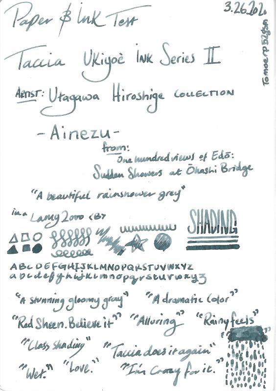
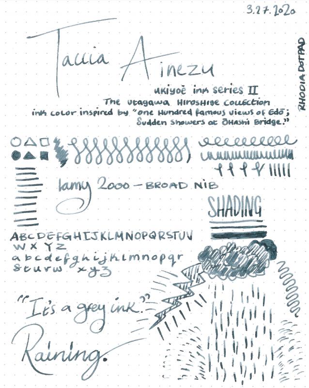
ink review : TACCIA Ukiyo-e - Hiroshige - ainezu TACCIA is a Japanese stationery company, that - as far as I know - is now part of the Nakabayashi group. They offer high-quality fountain pens, inks, pen-rolls, notebooks, etc. More specifically, TACCIA produce a line of inks, inspired by the unique look of Ukiyo-e paintings from Japan’s Edo period (17th century). Ukiyo-e prints are woodblock prints where the work of an artist is carved into wood by woodworkers, and pressed onto paper by printers. This allows the production of multiple prints of an artwork with some different colours as well. In this review, I take a closer look at ainezu, a dark and stormy grey that is inspired by the painting “Sudden Shower at Shin-Ohashi Bridge” of the artist Utagawa Hiroshige. It was published in 1857 as part of the series One Hundred Famous Views of Edo and is one his best known prints. Sudden showers are a recurring theme in ukiyo-e works and here, in what Hiroshige calls "white rain", the downpour is depicted using a large number of thin dark parallel lines in 2 directions - a difficult skill in woodblock carving. The dark clouds are produced using a gradated bokashi technique and vary significantly between prints. The rain, sheltering people and log raft at the centre of the image give the image a sense of movement. Ainezu is a dark grey with strong teal undertones, that are mostly visible in swabs or when using the ink for drawing. It’s a beautiful complex grey that lays down a wet & dark line that quickly dries to a lighter but still contrast-rich tint. A very strong shader, this one, even in fine nibs. And on top of that, it shows a fair amount of water resistance. All factors combined, this makes it an excellent choice for use at work: the dark grey colour will fit right in, and the strong shading and dark teal undertones will certainly draw the attention of your co-workers. I like this ink a lot: a great grey for writing, and one that really opens up when using it for drawing. The ink comes in a 40 ml bottle, that is packaged in a beautiful box showing the corresponding Ukiyo-e painting. Lovely packaging for an excellent ink. To show you the impact of saturation on the ink’s look & feel on paper, I made some scribbles where I really saturated portions of a strip of 52 gsm Tomoe River paper with ink. This gives you a good idea of what the ink is capable of in terms of colour range. Ainezu has a fairly wide dynamic range, ranging from a pale indigo-tinged grey to a much more saturated dark teal-grey. The contrast between the light and dark parts is not harsh though, which translates to beautiful shading – very present but not too loud. The shading appears in all nib sizes - just a hint with the EF nib, but really present with F-nibs and above. The aesthetics are superb, adding lots of character to your writing. The ink’s chromatography clearly shows the lovely complexity of this grey: grey, indigo, some sky-blue, and – to my eye – a shimmer of green. The bottom part of the chroma also indicates that this is a fairly water-resistant ink, which is confirmed during water tests. TACCIA’s ink makers Hiroshi Ishiguro and Hanse Matsumoto know their craft, and created with this ainezu a wonderfully complex grey that just looks amazing. I’ve tested the ink on a wide variety of paper – from crappy Moleskine to high-end Tomoe River. On every small band of paper I show you: An ink swab, made with a cotton Q-tip 1-2-3 pass swab, to show increasing saturation An ink scribble made with an M-nib Lamy Safari The name of the paper used, written with a B-nib Lamy Safari A small text sample, written with the M-nib Safari Source of the quote, written with a Pelikan M101N with M-nib Drying times of the ink on the paper (with the M-nib Safari) Ainezu looks good on all types of paper – both white and more creamy ones. It lays down a wet and dark line that quickly dries to a lighter tint (5-10 second range). No feathering that I can see. And it can even handle crappy paper (like Moleskine) with ease – good-looking writing, and only limited show-through and bleed-through. A good ink for the workplace! I’ve also added a few photos to give you another view on the ink. Scanned images and photos often capture different aspects of the ink’s colour & contrast. That’s why I present them both. In this case, the photos capture the ink best. The scans seem to exaggerate the teal undertones in the swabs. Writing with different nib sizes The picture below shows the effect of nib sizes on the writing. The EF-nib already shows a hint of shading. But it is with the F-nib and above that the ink’s elegant shading really comes into play. Look e.g. at the shading with the Safari M and B nib – that’s why I use a fountain pen! I personally prefer to use this ink with the drier pens where the shading is more prominent. With wetter pens (like the Pelikan M101N Lizard), the ink gets a bit too saturated and starts to drown out the shading. Related inks To compare ainezu with related inks, I use my nine-grid format with the currently reviewed ink at the center. This format shows the name of related inks, a saturation sample, a 1-2-3 swab and a water resistance test – all in a very compact format. I have lots of greys in my collection, but this TACCIA colour still looks different from all the other ones. Diamine Earl Grey has that same complexity, but is a much cooler shade (cool as in cold, but it's really cool too ;-). Inkxperiment – Ungawa, Timba With every review, I try to create an inkxperiment using only the ink I am reviewing. These one-ink drawings are great for showing the colour-range nuances that can be achieved with a single ink. And it’s great fun to experiment with inks in a more artsy context – I love doing these inkxperiments. They are one of the many things I enjoy about the hobby. During the holiday season, I re-viewed some of the really old Johnny Weismüller movies – grainy black&white cinema, but fun stories and totally uncomplicated. I really enjoyed one of the scenes where Tarzan and his elephants come to the rescue. That’s where the inspiration for this elephant drawing comes from. The picture itself is an adaptation of one I saw on Pinterest. HP photo paper usually brings out the best in inks, so I decided to use it for this drawing. In this case, it really enhances the dark teal undertones in the ink. I started by wetting the photo paper, and drawing some circles on it with pure ainezu, using a glass jar as a stamp. Next I used several passes with a paintbrush and pure ink to darken up the center of the page. After the background had dried completely, I used a glass dip pen and bleach to draw in Tarzan on his elephant. Bleach reacts nicely with ainezu, producing a golden-white colour. The picture gives you an idea of what can be achieved when using ainezu for drawing. Conclusion TACCIA Ukiyo-e Hiroshige ainezu is a near perfect writing ink – good technical properties on all paper types, fairly water-resistent, good contrast with the page and some very nice shading. Colourwise it is an intriguing dark & stormy grey with definite teal undertones. A beautiful ink that totally fits my tastes. Highly recommended! Technical test results on Rhodia N° 16 notepad paper, written with Lamy Safari, M-nib Back-side of writing samples on different paper types
-
Mont Blanc - Swan Illusion Plume When Mont Blanc brings out a new pen, you can be sure that there is an LE ink to accompany it. With the MB Patron of Art Ludwig II pen comes the mysteriously sounding "Swan Illusion" accompanying ink. A bit of digging on Wikipedia removes the mystery though: Ludwig II from Bavaria (1845-1886) is also known as the Swan King, hence the ink's name. The ink's packaging looks lovely, and shows a not so easily described colour... brown? sepia? grey? I'm not quite sure what to make of it. But for me, grey-brown best captures the mood of this ink. The box also suggests a broad colour spectrum spanning from very faint light greyish brown to a really dark grey-brown colour. Looks promising. Swan Illusion delivers on the promise: the ink has a unique colour. I would definitely classify it as a brown that leans heavily towards the grey. Quite a captivating colour, and one that I really like. The ink has relatively low saturation, which translates into a subdued and somewhat faded look. The result on the page is well-balanced though, and makes for easy reading. There is tons of shading in this ink, but this only shows up in broader nibs. This is not an ink for fine nibs, use a B or above to bring out its beauty. The ink itself lacks a bit of lubrication, especially in drier pens like my Lamy Safari. With my wetter Pelikan pens this was not a problem; here the ink writes like a dream. The ink also has a wonderfully dynamic colour span. To illustrate this, I did a swab on Tomoe River paper where I really saturated portions of the paper with ink. This beautifully illustrates the ink's broad colour range. Swan Illusion moves from a very light sepia-brown to a very dark brown-grey. Impressive! On the smudge test - rubbing text with a moist Q-tip cotton swab - the ink behaved perfectly. Water resistance is amazing - the ink effortlessly survived even longer exposures to water. Kudos! This is also apparent from the lower part of the chromatography, which shows that the grey components of the ink remain on the paper. If you need a water-resistant ink, Swan Illusion certainly fits the bill. The chromatography also shows that this is a wonderfully complex ink, with tons of undertones - orange, yellow, blue… Swan Illusion is also a fast-drying ink - with typical drying times in the 5-10 second range with my Lamy Safari (M-nib). As such, this ink is also suitable for lefties. Also: fast drying times and water resistance make it a perfect ink for the workplace. And the ink's classy looks will certainly draw attention. I've tested the ink on a wide variety of paper - from crappy Moleskine to high-end Tomoe River. On each scrap of paper I show you:An ink swab, made with a cotton Q-tip1-2-3 pass swab, to show increasing saturationAn ink scribble made with a Lamy Safari M-nib fountain penThe name of the paper used, written with a Lamy Safari B-nibA small text sample, written with an M-nibDrying times of the ink on the paper (with the M-nib)Swan Illusion looks really nice on most papers, but not on Tomoe River. Here the ink looks too washed out for my taste. On Moleskine, there is some bad chemistry going on, resulting in a hideous look. The ink looks simply gorgeous on Fantasticpaper, Paperblanks and OCM cotton paper. With the exception of Moleskine, I didn’t notice any feathering or bleed-through. All-in-all a well-behaving ink. Inkxperiment – Cubistic Dimensions As a personal experiment, I try to produce interesting drawings using only the ink I'm reviewing, keeping things simple and more-or-less abstract. I find this to be a fun extension of the hobby, and have found such single-ink drawings a nice challenge. It also gives you an idea of what the ink is capable of in a more artistic setting. For this drawing I used 300 gsm rough watercolour paper. I started off with water-diluted ink for the lighter parts in the drawing, gradually adding more ink to the mix for the darker parts. The highlights in the drawing were obtained by painting in some bleach - the ink reacts nicely with the bleach producing a golden-yellow colour. The end result gives you a good idea of the colour span that Swan Illusion is capable of. ConclusionMont Blanc's Swan Illusion LE ink is a great ink with a unique grey-brown colour, that immediately attracted me. The ink totally fits my taste: nice complexity, subdued and with non-aggressive shading. And as a welcome bonus: fast-drying and water-resistant. What more can you want. Personally, I really really dig this ink ... it's currently in my top 3 of best inks of 2018. In my opinion, an ink to grab while it's out there. Technical test results on Rhodia N° 16 notepad paper, written with Lamy Safari, M-nib Backside of writing samples on different paper types
-
Diamine – Earl Grey The ink maker from Liverpool is one of the staple brands in ink-land. They consistently produce solid inks for a very reasonable price. In 2017, Diamine teamed up with the Reddit community to produce a special-edition ink – Earl Grey. This ink colour was chosen by the members of the r/fountainpens group, a wonderful Reddit community of fountain pen enthousiasts. LizEF’s EFNIR review mentioned in the comments that the ink’s colour doesn’t look anything like the tea. Well… this triggered me to do my own examination. In writing, this Diamine ink lays down a dark grey line, slightly purple-leaning. There’s indeed nothing there that resembles the tea. But… if you look at the ink’s chromatography, you’ll discover some unexpected complexity: there’s a lot going on here… grey, purple, cyan-blue, green… a whole kaleidoscope of colours. And these colours do reappear when you look at dry Earl Grey tea, which also shows a dark shimmer of these same colours. For me, that’s good enough to approve the choice of this ink’s name. Diamine Earl Grey writes wet and well saturated. While writing, there is a green tinge to the ink, which disappears when the ink dries, leaving a dark grey line. Saturation is very good – this ink can easily be used with the whole nib range, from EF to B and beyond. But I also noticed some technical issues: Earl Grey has a tendency to feather and bleed on quite a number of papers, mainly the cheaper ones. With high-quality and/or hard-surface paper, the ink works really well. It’s on the more absorbent paper that I noticed some real problems. Also, for some reason, this ink loves to stain my fingers. Every time I opened the bottle, I got ink on my hands – even when I was extra careful. Not sure why… To illustrate the colour span of this Diamine ink, I did a swab on 52 gsm Tomoe River paper, where I really saturated portions of the paper with ink. Earl Grey has a fairly narrow colour span, without much contrast between the light and darker parts. This translates to soft shading when writing. Shading is prominently there, starting with F nibs and above. Due to the narrow colour range, it never gets harsh – exactly the way I like it. On the smudge test – rubbing text with a moist Q-tip cotton swab – the ink behaved perfectly, with very limited smearing. Water resistance is totally absent though – both with still and running water. With Earl Grey, you cannot survive watery accidents. This is also apparent from the lower part of the chromatography – almost no dyes remain attached to the paper. As such, not a good ink to use at the office. A pity, because the ink’s colour and saturation would translate well to a work environment. The chroma clearly shows the complexity of the dye mix. Who would have guessed that this combination of dyes translates to a dark grey colour? I’ve tested the ink on a wide variety of paper – from crappy Moleskine to high-end Tomoe River. On each scrap of paper I show you: An ink swab, made with a cotton Q-tip 1-2-3 pass swab, to show increasing saturation An ink scribble made with a Lamy Safari M-nib fountain pen The name of the paper used, written with a Lamy Safari B-nib A small text sample, written with the Lamy Safari M-nib Source of the quote, written with a Pelikan M405 Stresemann with cursive italic F-nib Drying times of the ink on the paper (with the M-nib Safari) The multi-paper writing test shows Earl Grey’s biggest weakness. This ink only works well with certain types of paper. You really need hard-surface paper for best results. Otherwise you will get some feathering and show-through/bleed-through. This Diamine ink definitely won’t cooperate with the cheaper copy paper you find at the office! Earl Grey is a bit snobbish – with a definite preference for high-quality paper. Drying times for this ink are in the 5-10 second range with a Lamy Safari M-nib. Because scans don't always capture an ink's colour and contrast with good precision, I also add a few photos to give you an alternative look on this Diamine ink. Writing with different nib sizes The picture below shows the effect of nib sizes on the writing (written on Rhodia N°16 80 gsm paper). All samples were written with a Lamy Safari. I also added a visiting pen: a Pelikan M405 Stresemann with a nice cursive-italic F-nib. On the hard-surfaced Rhodia paper, Earl Grey looks really nice, and can handle all nib sizes without a problem. Shading is hinted at with the EF-nib, but is definitely present with F-nibs and above. Related inks To compare Diamine Earl Grey with related inks, I use my nine-grid format with the currently reviewed ink at the center. This format shows the name of related inks, a saturation sample, a 1-2-3 swab and a water resistance test – all in a very compact format. Earl Grey is a bit on the blue-purple side, and looks like a slightly more saturated version of Callifolio Gris de Payne. Inkxperiment – Wheel of Time As a personal challenge, I try to create interesting drawings using only the ink I’m reviewing. I find this to be a fun extension of the hobby, and these single-ink drawings often present a real challenge. These inkxperiments allow me to explore the colour-range nuances that are present in the ink. I love doing them! Inspiration for this drawing comes from the cycle of life. While recently playing with the 3 and 5 year old youngest members in the family, I couldn’t help but notice two things: 1/ their world is huge and full of wonder – a trip to the playground is an adventure, the small cluster of trees at the end of the garden a strange and unexplored continent. And 2/ - time is stretched out for a child - when you are constantly discovering new things and experiences, hours can seem like days. While growing older, a subtle change takes place, and spacetime seems to shrink: your world appears to grow smaller, and time has a tendency to fly… I tried to capture these aspects in Earl Grey’s inkxperiment. I started with an A4 piece of HP photo paper. I covered the paper with a kitchen towel, and dripped some water-diluted Earl Grey on it. The ink separated in its component dyes, that colour the underlying photo paper. This produced a really nice background, with grey, purple and green colour tints. Quite surprising… I had expected a greyish background, not the kaleidoscope of colours that you can see. I next used different sized glass jars to stamp in the life circles. The scenes in the circles and the background details were painted in with a combination of B-nibbed fountain pen and glass dip pen. The end result gives you a good idea of the colour range that can be achieved when using Earl Grey in a more artistic context. An interesting ink to draw with! Conclusion Diamine Earl Grey looks like a fairly standard dark grey when writing. The ink definitely prefers high-quality paper, and doesn’t tolerate the cheaper papers in my test set. With the right paper, Earl Grey is a pleasure to use, writing wet and nicely saturated, and working well with all nib-sizes. But it’s when using this ink for drawing that the magic happens: Earl Grey contains within a kaleidoscope of colours that simply don’t surface in everyday writing. An unexpected pleasure that - for me - lifts this dark grey above the crowd. Technical test results on Rhodia N° 16 notepad paper, written with Lamy Safari, M-nib Backside of writing samples on different paper types
-
TAG Kyoto – kyo-no-oto – keshimurasaki TAG is a stationary shop in Kyoto (Japan) that produces some interesting soft watercolour-style inks. With the kyo-no-oto series they produce a line of inks that replicates traditional Japanese dye colours. According to available online info, the manufacturing process of the kyo-no-oto inks follows traditional dying techniques dating back to the Heian era between the years 794 and 1185. The inks come in 40 ml bottles, packaged in luxurious thick paper with a texture that feels like heavy watercolour paper. In this review I take a closer look at keshimurasaki. This ink is supposedly inspired by the formal kimono dresses during the Heian era, when Kyoto was the capital of Japan. 'Keshi' means 'off' and 'murasaki' means 'purple' - this quite accurately describes the blue-purple-grey colour of this ink. This definitely is my type of ink: an unsaturated soft pastel-type colour, shadowy and smoky, with an elegant complexity. A word of warning though: be aware that this is a very dry ink, that is not meant to be used with dry pens. My traditional Lamy Safari test pens were totally not OK with this ink. Very dry feeling, scratchy writing, really undersaturated. This is easily solved by using a wet pen - with my wet-writing Pelikan pens, keshimurasaki transforms into a real beauty. For this review I use Pelikan pens with F, M and B nib sizes. With these pens, the ink lays down an elegant grey line, with blue-purple undertones. You also get really sophisticated and aesthetically pleasing shading. And with a wet pen, the ink writes much more smoothly. It's still a bit dry, but that's easily forgotten when you see the beautiful result of your writing. To show you the impact of saturation on the ink's look & feel on paper, I made some scribbles where I really saturated portions of the Tomoe River paper with ink. This gives you a good idea of what the ink is capable of in terms of colour range. As you can see, keshimurasaki has a broad colour range. This ink moves from a very undersaturated smoky blue-purple-grey, darkening significantly as more layers are added. Nice! The ink's chromatography shows a wonderfully complex mix of muted pastel-like dyes. The resulting mix is definitely a grey, leaning to the blue or the purple depending on variables like light, paper, ... keshimurasaki is an ink with character! The bottom part of the chroma seems to indicate that there is some measure of water-resistance, but alas... in practice the ink shows zero tolerance for water (both with still and running water). On the other hand, keshimurasaki has no problem with smudging - the text shows little to no smearing when rubbed with a most Q-tip cotton swab. I've tested the ink on a wide variety of paper - from crappy Moleskine to high-end Tomoe River. On every small band of paper I show you: An ink swab, made with a cotton Q-tip 1-2-3 pass swab, to show increasing saturation An ink scribble made with an F-nib Pelikan M800 The name of the paper used, written with an M-nib Pelikan M400 A small text sample, written with the F-nib Pelikan M800 Drying times of the ink on the paper (with the F-nib Pelikan) Keshimurasaki behaves well on my test papers, with no visible feathering. The only exception is the horrible Moleskine paper - here the ink suffers from lots of feathering, see-through and bleed-through. Drying times vary and are mostly in the 10-15 second range (with the F-nib Pelikan). With the wet Pelikans keshimurasaki looks great: a muted grey, with hints of blue-purple, and with elegant shading. A real joy! Writing with different nib sizes The picture below shows the effect of nib sizes on the writing. The top lines were written with my typical Safari test pens. This is just to illustrate that keshimurasaki is not a great companion for dry pens. The rest of the writing sample shows the ink with some wet-writing Pelikan pens with F-M-B nib sizes. With the wet pens, the ink looks well-saturated, shows good contrast and some nice shading. It's still a touch dry, but this does not detract from the writing experience. Related inks To compare keshimurasaki with related inks, I use my nine-grid format with the currently reviewed ink at the center. This format shows the name of related inks, a saturation sample, a 1-2-3 swab and a water resistance test - all in a very compact format. Inkxperiment – For Dulcinea ! With every review, I try to create an interesting drawing using only the ink I'm working on. Such a one-ink drawing is excellent for showing the different colour-range nuances of the ink. These drawings are always my favourite part of the ink review: often challenging, but always great fun. For this drawing inspiration comes from the Miguel de Cervantes novel I'm currently reading. I started with a sheet of 300 gsm rough watercolour paper. With a simple Q-tip I painted in the background. I then added the man from La Mancha and the wind-mill with the fountain pen. With the Q-tip I added more and more ink to different parts of the drawing, resulting in the darker areas. I really enjoyed keshimurasaki - its broad tonal ranges makes it an excellent ink to draw with. Conclusion TAG kyo-no-oto keshimurasaki probably is not for everyone. You really need wet pens to reach the ink's potential. But then you are rewarded with a sophisticated grey with blue-purple undertones. A muted and shadowy colour that looks totally beautiful on the page. This is my type of colour, and I really enjoyed it ! Technical test results on Rhodia N° 16 notepad paper, written with Lamy Safari, M-nib Back-side of writing samples on different paper types From Idea to Drawing The idea for this inkxperiment comes from the Don Quichote novel I'm currently reading. Not unexpectedly, the iconic fight with the wind-mill is a totally logical choice for this drawing's topic. I'm really bad at doing realistic drawings, so I naturally tend to a naïve and child-like style ;-) I started with some rough ideas, and a simple sketch of the composition I wanted to achieve. Next I used a sheet of 300 gsm rough watercolour paper, and painted in the background with a Q-tip cotton-swab, lightly dipped in the bottle of keshimurasaki. The rough paper allows for some nice-looking textures. I then sketched in the drawing's subjects with my fountain pen. Once satisfied with the composition, I accentuated the drawing's outline, and added multiple layers of ink with the Q-tip. I finished the piece by adding the sun in the sky, and some trees on the horizon. The toolset for this inkxperiment was really simple: some Q-tips, a fountain pen and the bottle of ink. The resulting drawing shows quite well the tonal range that can be obtained with this beautiful grey ink from the kyo-no-oto series.
-
J.Herbin - Gris Nuage La Société Herbin, Maître Cirier à Paris, was established in 1670. This makes J. Herbin probably the oldest name among European ink makers. Today, Herbin produces a range of beautiful fountain pen and calligraphy inks, writing instruments, gift sets and accessories. Herbin inks are made in France, and the finishing touches on the bottles are still done by hand in Paris. J. Herbin is probably best known for their inks in the “La Perle des Encres” series. In this review the stage is taken by Gris Nuage, one of the grey inks in the Herbin line-up. The ink is aptly named: it really looks like the rain-carrying clouds in a heavily overcast sky. To my eye, there are hints of purple and green hidden within this stormy-grey ink. Gris Nuage has a pencil-like appearance: it’s a really light graphite-grey, that only works well with certain pen/nib combinations. Good examples are a wet Pelikan with F-nib, or a dry Lamy Safari with B nib. With such combinations, the ink looks great. Choose the wrong pen/nib mix though, and the ink gets too light for my liking. J. Herbin inks are packaged in simple 30 ml bottles. These bottles are not well-suited for piston-fillers though – they are not very deep, and piston-filling from a half-empty bottle can be a challenge. My trick is to fill an ink-sample vial with ink, and piston-fill my pen that way. Gris Nuage makes a great match for my Pelikan M101N Grey Blue with F-nib, which is the beauty in the pic below. Gris Nuage has quite satisfactory lubrication, even in drier pens like my Lamy Safari. But it’s definitely a very light grey, especially in drier pens where saturation can be quite low. To illustrate the colour span of this J. Herbin ink, I did a swab on Tomoe River paper, where I really saturated portions of the paper with ink. Gris Nuage has a fairly broad colour span, but without too harsh a contrast between the light and darker parts. This translates to elegant shading when writing – providing you have selected the right pen/nib combo. Choose wisely… On the smudge test – rubbing text with a moist Q-tip cotton swab – the ink behaved perfectly, with no visible smearing. Water resistance is quite good – the ink survives even longer exposures to water, leaving a light grey residue on the paper, which remains very readable. This is also apparent from the lower part of the chromatography. This makes Gris Nuage an ink that can be used at the office. Drying times for this ink are in the 5-10 second range, depending on the type of paper (with the Lamy Safari M-nib). The only exception was Tomoe River paper (both the 52 and 68 gsm versions), where drying times climbed to 20 seconds. I’ve tested the ink on a wide variety of paper – from crappy Moleskine to high-end Tomoe River. On each scrap of paper I show you: An ink swab, made with a cotton Q-tip 1-2-3 pass swab, to show increasing saturation An ink scribble made with a Lamy Safari M-nib fountain pen The name of the paper used, written with a Lamy Safari B-nib A small text sample, written with the Pelikan M101 Grey Blue with F-nib Source of the quote, written with a Platinum 3776 Century B-nib Drying times of the ink on the paper (with the M-nib Safari) The multi-paper writing test shows Gris Nuage’s biggest weakness: this ink only works well with certain types of paper. You really need hard-surface paper for best results. Otherwise you either get ink spread (i.e. the line you write is not crisp but spreads out a bit) or some feathering. This happened on quite a number of papers in my test set, even on high quality paper. Not so good! With Moleskine and GvFC paper, there is some show-through and quite a bit of bleed-through. Technically not the best of inks. Because scans don't always capture an ink's colour and contrast with good precision, I also add a few photos to give you an alternative look on the ink. Writing with different nib sizes The picture below shows the effect of nib sizes on the writing. All samples were written with a Lamy Safari, which is typically a dry pen. I also added a couple of wet-writing visiting pens – a Pelikan M101N Grey Blue with F-nib, and a Platinum 3776 Century with a broad nib. This clearly shows you need the right pen/nib combination to get a good-looking result. My favourite is the Pelikan with F-nib – with this combo Gris Nuage looks great, with good saturation and beautiful shading. Related inks To compare Gris Nuage with related inks, I use my nine-grid format with the currently reviewed ink at the center. This format shows the name of related inks, a saturation sample, a 1-2-3 swab and a water resistance test – all in a very compact format. Gris Nuage sits somewhere in the middle between other greys in my collection. I can’t help but see a bit of purple/green in the ink’s spectrum… Inkxperiment – mountain lake As a personal challenge, I try to create interesting drawings using only the ink I’m reviewing. I find this to be a fun extension of the hobby, and these single-ink drawings often present a real challenge. These inkxperiments allow me to explore the colour-range nuances that are present in the ink. I love doing them! This time, I’m experimenting with some landscape drawing techniques I discovered on Pinterest. Using paper cut-outs and cotton pads as drawing tools to paint a mountain lake landscape… I started with a piece of 300 gsm watercolour paper. Using different mixes of water/ink, I drew in the mountain ranges with the paper stencils and cotton pads. The lake’s border and the fisherman were painted in with undiluted Gris Nuage using a small brush. I finally added the trees and birds with my Lamy Safari M-nib pen. The end result gives you a good idea of the colour range that can be achieved when using Gris Nuage in a more artistic context. Conclusion J. Herbin Gris Nuage is a tricky ink: use the right combination of pen/nib/paper, and you get a beautiful looking colour that works really well. But deviate slightly from this optimum, and the result quickly deteriorates. In my opinion, that’s too much to ask from the user … you just want an ink that works in most circumstances. Gris Nuage can be beautiful, but it’s not a grey I would recommend. There are many more good-looking grey inks that can handle a much broader range of pens, nibs and paper. Technical test results on Rhodia N° 16 notepad paper, written with Lamy Safari, M-nib Backside of writing samples on different paper types
-
Jacques Herbin Gris de Houle review sheet overview
A Smug Dill posted a gallery image in FPN Image Albums
-

From the album: Ink review
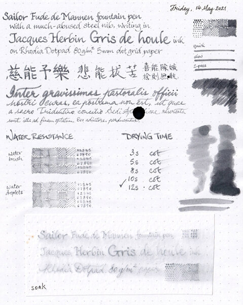
On Rhodia Dotpad 80g/m² paper, using a Sailor Fude de Mannen pen with a bent nib.© A Smug Dill
- 0 B
- x
-
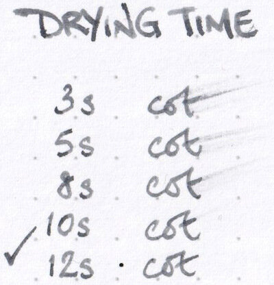
Drying time for Jacques Herbin Gris de Houle ink
A Smug Dill posted a gallery image in FPN Image Albums
-
Water resistance of Jacques Herbin Gris de Houle
A Smug Dill posted a gallery image in FPN Image Albums

-
From the album: Ink review
On Arttec Como Drawing Pad 210gsm paper for mixed media art.© A Smug Dill
- 0 B
- x
-
May I know the lightest gray/grey ink you have tried? My current is J. Herbin in the shade Gris Nuage. I'm in search of the lightest gray/grey ink.
-
Sailor has doubled the number of ink colours in its Manyo line of inks recently, by adding another eight in the second half of 2020, after first introducing the product line in 2019. I don't have any of the first eight, but with COVID inspiring all that panic buying, and a significant discount on offer for pre-orders for the new colours, I ordered the four relatively more subdued and/or sombre ones; and, after much delay, they finally arrived. Chigaya, which is probably the most sombre looking of the lot, was the first bottle I opened. (When I was developing the chromatography strip for this ink, I though a Dementor from the world of Harry Potter was going to come at me. Ridiculous!) The drawing on the bottle label seems to suggest a good range of shading out of a warm grey ink; but, writing on Rhodia Dotpad 80g/m² paper, it just looks mostly like a black ink. The Sailor Fude de Mannen pen I used struggled to write when inked with Diamine Registrar's Ink, but has no problem with Sailor Manyo Chigaya. On the other hand, it doesn't write quite as wetly or broadly as when I used KWZ Ink Warsaw Dreaming in that pen. So, I'll say the 'wetness' of this ink is moderate, somewhere between those other two inks I mentioned. There is some shading, but it is very subtle. There is no sheen that I could see. Water resistance is very good, if the measure is how legible writing would be after a looong soak. However, colour will definitely get lifted off the page on contact with water; and the bluish component of the run-off is apt to stain the area covered by that body of water. All in all, I'd say this is a decent but boring ink; and I can't think of why I would prefer it to, say, Monteverde Black Ash or Standard Bindery Stargaze.
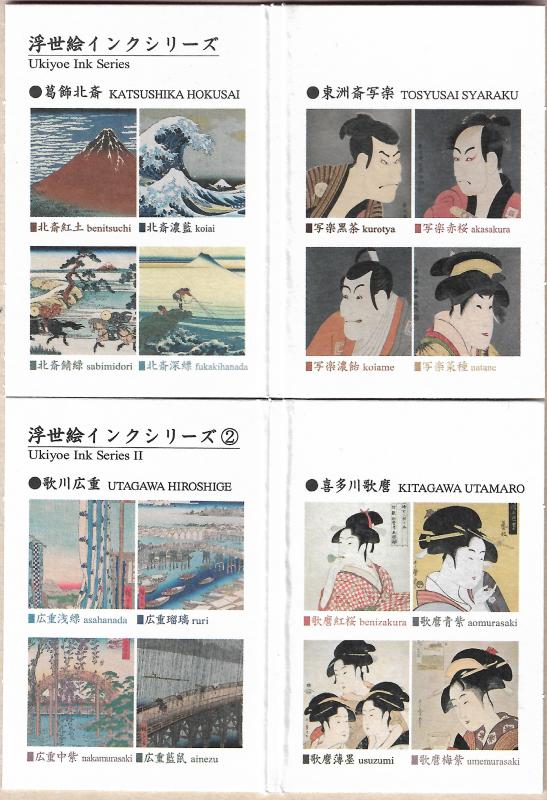
-
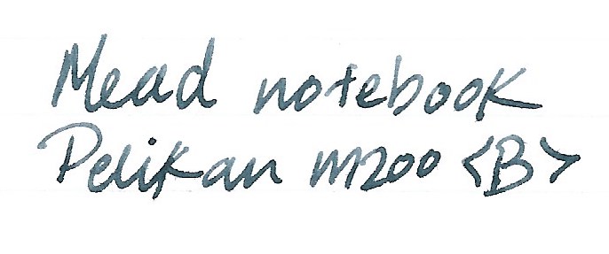
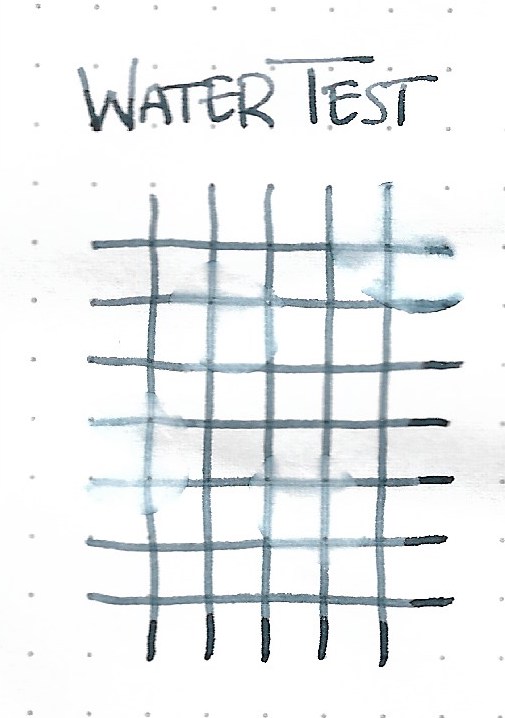
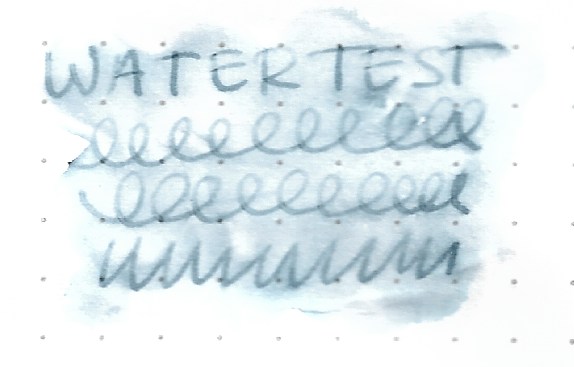
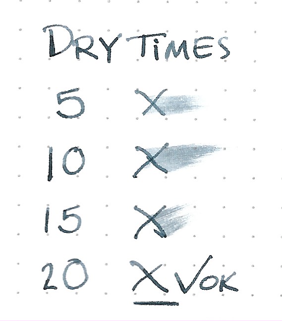
Taccia overview: Taccia is a Taiwanese-American brand started in California, that has been recently been bought by the Nakabayashi company. Nakabayashi is a maker of a long list of home and office products who have, under the Taccia brand, begun making fountain pen inks. All Taccia inks are made in Japan. There is some speculation as to whether Sailor makes the Taccia inks, but I have found no evidence to prove this. What I can say, according the the information I was able to gather is that at the time when Nakabayashi bought Taccia and wanted to release inks under that brand, they entered into an agreement with Sailor for the purposes of expert ink consultation. A couple of the Taccia standard line bear a striking resemblance to Sailor Jentle/Shikiori inks. Outside and within the standard line, they have a few unique inks. Also, Taccia inks I have tried do not have that "Sailor-made smell" you are all so familiar with. The Ukiyo-e Ink Series was released overseas in 2019. In March 2020, a second series of 8 inks was released. These are for Utamara Hiroshige and Kitagawa Utamaro. I saw the release post on the Nagasawa Instagram page and emailed them directly for order. As of this publication, other Japanese bungu retailers have received stocks. They were Y1,600 or USD15 for each 40ml bottle of ink. The below translated names in Japanese and English are credited unchanged to Nagasawa Kobe Stationary store. Second Series Taccia Ukiyo-e Includes: 歌川広重(Hiroshige Utagawa) 1.広重浅縹(Hiroshige asahanada) 2.広重瑠璃(Hiroshige Ruri) 3.広重中紫(Hiroshige Nakamurasaki) 4.広重藍鼠(Hiroshige Ainezu) 喜多川歌麿(Utamaro Kitagawa) 5.歌麿紅桜(Utamaro Beni Zakura) 6.歌麿青紫(Utamaro Aomurasaki) 7.歌麿薄墨(Utamaro Usuzumi) 8.歌麿梅紫(Utamaro Umemurasaki) I’ve only opened one of the inks so far, and that is Taccia Hiroshige Ainezu. Now let’s get into the review. Online images are unhelpful. Taccia's own marketing materials do not give a fair representation of any of the inks I've tried. I would have sworn, from seeing their images and sample writing, that Ainezu was going to be a blue-black ink. I was way off. Ink bottle opening will fit large nibs comfortably, they are 40ml glass bottles with metal caps. The packaging is lovely, and far larger than the bottle needs in space to fit, which is nice, as this means the box artwork is easier to admire. Packaging & Bottle Each bottle comes packaged with a sturdy card. I've included both series below. The good stuff. Tomoe River Paper 52gsm White This is a gray ink, through and through. What I am able to cypher from the Kanji is that Ainezu means indigo-tinged gray. The kanji: 藍鼠 藍 ai / indigo 鼠 nezu / dark gray Ink Characteristics 1. Well-behaved 2. No feathering 3. No bleed-through 4. Acceptably wet 5. Smooth flowing, not gushing 6. Good shading in right pen [light to dark gray] 7. Easy cleaning with a few flushes 8. No staining discovered 9. Unexpected water resistance Other Ink properties you might find interesting is the ink goes on as a super-dark gray, almost black. It lightens as it dries which makes writing easy on the eyes. This is the opposite effect of Montblanc Spider Web Grey, which goes on nearly invisible when wet and dries darker. I prefer the former over the latter. As for the sheen, it is seen in the borders between light and dark, and is red and coppery. It does not overwhelm. The ink also looks quite light or dark depending on the paper and pen used. The shading also varies greatly under these conditions. Rhodia Dotpad Life Bank Paper Mead notebook paper / college ruled There is barely any feathering, which is quite good considering the wetness of the pen (and the terrible quality of the paper). It only shows up on close inspection. Even in this image it is difficult to spot. Water drop test Rhodia Water drown and dab test Rhodia Rubbed in and swirled. Pretty good. Both water tests left for 2+ minutes. Ink also dry for 2 minutes. Dry times Pretty average. Comparison Tomoe River Paper 52gsm Cream That's it! I do believe that we should receive this second set at some point, as we have had everything except for the special editions and the jeans ink available outside of Japan. Finally, of the newer ink manufacturers, Taccia is definitely a personal favorite. And I've been on a gray ink kick, so this was a welcome surprise. To be honest, I would't have really minded if it was another blue-black. I like those too. And that's the end of my first review. Hope you enjoyed this. I may do the remainder once I’ve tried them and if this was helpful to anyone. Happy inking and thank you for your time.
-
Pelikan Edelstein Moonstone - Ink of the Year 2020 In 2011 Pelikan introduced the Edelstein series of high-end inks, available in a variety of colours. The theme of the Edelstein concept is the gemstone - each ink corresponds to the beautiful colour of a gem. The Edelstein line of inks is presented in 50 ml high-value bottles, that are truly beautiful, and worthy of a place on your desk. In this review the spotlight is on Moonstone, the Edelstein Ink of the Year 2020. This is a limited edition ink, that could be gone in the near future, although it's not unheard of for Pelikan to change its mind. Moonstone is a light cool grey with some complexity to it. There is a definite yellow tinge in the undertones, that can come to the surface as a sheen at places where the ink is really saturated. Before diving into this review, be sure to have a look at Lgsoltek's entry that really shows of the ink when using wet pens and broader nibs. In the text below the ink is shown mostly with fine/medium nibs. Moonstone is a very nice grey, but be aware that it is on the light side. When used with dry pens like the Lamy Safari, ink flow is not so good. You get a low-saturated line (almost pencil-like), and writing is not really pleasant with sub-par lubrication. As such, I didn't use my standard Safari test pens for this review, but switched to wetter pens that do more justice to this ink. With wet pens, the flow problem is solved, and you get a nicely saturated line and a really beautiful cool grey colour. The chromatography shows the inherent complexity of this grey, with the yellow undertones and even a hint of blue/purple. The lower part clearly shows that this ink is quite water-proof - the dyes attach very well to the paper. With wet pens, this Edelstein ink is a pleasure to write with. The ink certainly prefers broader nibs - with fine nibs it becomes a bit to unsaturated. My guess is that you should really stay away from the extra-fine nibs - saturation will not be good, and the result will be more like a H pencil. Shading is extremely strong - even a bit too excessive for my personal taste. It's present with all nib sizes, but really pronounced starting at M and above. I'm not a fan of hard shading, so this lowers the attraction of Moonstone for me - but that's of course a personal opinion. To show you the impact of saturation on the ink's look & feel on paper, I made some scribbles where I really saturated portions of a scrap of Tomoe River paper with ink. This gives you a good idea of what the ink is capable of in terms of colour range. Moonstone has a very broad saturation span, going from a wispy barely visible hazy grey to a much more saturated dark grey. This broad saturation span explains the harsh shading you get with this ink. Technically, the ink has issues with flow in dry pens like the Lamy Safari. You really need wet pens and broader nibs to bring out the best from this ink. With the right pen/nib combination, you get a well-behaved ink with good saturation, and good contrast with the paper. Also heavy shading, which in my opinion is a tad too harsh. Moonstone copes well with a wide variety of paper - it even works well with Moleskine paper: no visible feathering, and only a bit of bleed-through. This is an ink that can tolerate even crappy copier paper at the office. This grey ink looks equally good on both white and more yellow paper. No complaints! Another big plus for the office environment: this ink is what I would call waterproof. No smudging, and the text remains very readable even after prolonged contact with water. For more detail, see the water test at the end of this review. I've tested the ink on a wide variety of paper - from crappy Moleskine to high-end Tomoe River. On every small band of paper I show you:An ink swab, made with a cotton Q-tip1-2-3 pass swab, to show increasing saturationAn ink scribble made with a Pelikan M400 with F cursive-italic nibThe name of the paper used, written with a B-nib Platinum 3776 CenturyA small text sample, written with the Pelikan M400 with Fci nibOrigin of the quote, written with a Yard-o-Led with F nibDrying times of the ink on the paper (with the F-nib Yard-o-Led) Writing with different nib sizesThe picture below shows the effect of nib sizes on the writing. Because Moonstone is no good match for my usual Safari test pens, I added a collection of wetter pens with different nib sizes. The top portion is written with the Lamy Safari. As you can see, the ink becomes very light, with an almost pencil-like quality. With the finer Lamy nibs, flow was not good, and the writing felt scratchy and badly lubricated. With the broader Lamy nibs, flow improved, but saturation remains low. The bottom portion shows a variety of wetter pens. With these pens, Moonstone wrote perfectly and the colour of the ink looks much more saturated – a vast improvement! My recommendation: use Moonstone with wet pens and broader nibs. Related inksTo show off related inks, I use my nine-grid format, with the currently reviewed ink at the center. This format shows the name of related inks, a saturation sample, a 1-2-3 swab and a water resistance test - all in a very compact form. This allows you to easily compare the ink with its eight direct neighbours, which I hope will be useful to you. Moonstone looks really similar to a number of other cool greys. Given some of its technical shortcomings, that is a good thing. It's not too hard to find a reasonably close substitute that can handle a broader variety of pens. Inkxperiment – the heart of the mountainI've put myself a challenge to try to produce interesting drawings using only the ink I'm reviewing. For me this is an incredibly fun extension of the hobby, that continuously challenges my drawing skills. From the saturation swab with its broad range, I already expected this to be a great drawing ink. This time, inspiration for the inkxperiment comes from Tolkien's "The Hobbit". I recently watched Peter Jackson's adaptation again: his movie trilogy is a really good interpretation of the book (and I even liked the little artistic extension with the romance between elf and dwarf ;-). The "Heart of the Mountain" refers to the Arkenstone, hidden in the dwarven halls beneath the Lonely Mountain, and jealously guarded by Smaug. I started with a piece of HP photo paper, on which I painted the background using a kitchen sponge and water-diluted ink. I then added the hexagonal rock structures in the foreground with my fountain pen, and shaded them with a felt-tip pen lightly dipped in Moonstone. I then added Smaug, and painted in the background with a Q-tip dipped in a number of water/ink mixtures. Finally I added some finishing touches to the background with an M-nibbed Lamy Safari. As usual, my drawing of real-life subjects is on the level of a 5-year old... no matter, I now call this my naïve explorative style that interprets real-world complexity using basic forms ;-) The resulting drawing shows what can be achieved with Moonstone in an artistic context. As you can see, this Edelstein ink is a real pleasure to draw with. It can handle a very broad tonal range, making it a really nice sketching ink. ConclusionThis Edelstein ink of the year 2020 has a lot going for it: a nice light-grey with some complexity in its undertones and (a bit too heavy) shading. It can also handle a broad variety of paper and is waterproof, making it an excellent choice for the office. The only downside: not an ink for dry pens. You should definitely reserve it for wet pens and broader nibs. With the right pen/nib combination, Moonstone is an ink that I really enjoyed playing with. Technical test results on Rhodia N° 16 notepad paper, written with Lamy Safari, M-nib Back-side of writing samples on different paper types
-
The new Sailor Mouseyo ink! Does anyone have any suggestion for a mix that would yield a shading grey with minimal pink sheen? I have a few (mainly Diamine and Pilot iroshizuku) grey inks here, but I wouldn't know where to begin.
-


12_58_52.thumb.png.e1966e2f738e9054f7f9141326018311.png)
13_46_31.png.8d4da56ca7f0670ab61cf0b0bac800cb.png)
13_46_44.png.e2f3beba9bb3a83bd931d0bd2db4abb6.png)
13_47_32.png.5921629837f65e73fc8dc7b887013dd4.png)
.jpeg.3fb6cefa506627917f519adf776a7696.jpeg)
13_53_04.png.dbc459861d528a392292b1a30af637c1.png)