Search the Community
Showing results for tags 'gulf blue'.
Found 4 results
-
Graf Von Faber-Castell Violet Blue - The Color Of Hydrangeas
Intensity posted a topic in Ink Reviews
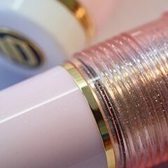
I adore Graf von Faber-Castell Violet Blue ink. When I was looking into getting a bottle, I could not get an accurate impression of the color from on-line photographs. The ink looked different everywhere. One review said it was vibrant. None of that was really accurate when I finally did get my bottle and started writing with it. Violet Blue is a powdery, muted color-shifting ink, translucent and highly shading. It can go from almost pink-lavender to deeper lavender-purple, and even bits of blue. I would say even though it is a blue-lavender, it also has a warmth to it where the sophisticated muted pink element comes through. I've had a Sailor Kobe #57 Hime Ajisai (Hydrangea) and while also beautiful, the Kobe ink is different: more fluorescent fibrancy, more saturation. I prefer this GvFC. When drawing with the ink and using a water brush, the pink is water resistant, and the light blue-lavender lifts off. This ink reminded me strongly of Hydrangeas--the more lavender-pink ones. As it happens, there are lots of hydrangeas in full bloom in my area now, and as I was walking home today I decided to pluck a few flowers and do a photo shoot. The lavender hydrangea flowers are exactly the color of this ink. The pink hydrangea flowers match the water resistant component of this ink very well too. Without further ado, here are some photographs for hydrangea lovers: (Tomoe River 52g in a Hobonichi Cousin planner) Fabriano Bioprima paper: While not as strong of a match, Graf von Faber-Castell is also strongly reminescent of Blue hydrangea flowers in its color range: powdery light blue that shades toward lavender. I also immediately though of blue hydrangeas when I started writing with Gulf Blue. -
desaturated.thumb.gif.5cb70ef1e977aa313d11eea3616aba7d.gif)
How-to: Set, or change, personal info that others can see about me
A Smug Dill posted a blog entry in Sus Minervam docet
It helps to explore this yourself, revisiting once in a while if need be, and keep in mind where each of those personal info fields are entered. Don't leave it until the urge to change something specific to come upon you, and only then bother to ask the question! Invest the time surveying upfront, instead of waste it later waiting for an answer from nobody in particular. Most of the fields shown above are self-evident as to what they are. I think the only ones that could do with explanation are: Security and Privacy: There is only one setting under there, and that is a toggle for whether your online status (including ‘last active’ date or time) is visible to others Content View Behavior: That has nothing to do with what others can see about you, but only where you would like to start reading when accessing content Enable status updates: This toggle enables/disables the public feed on your profile page; if you disable it, then nobody (including you) can post publicly visible ‘status updates’ or any other message against your profile, but if you enable it, then anyone — friend, foe, or complete stranger — can post something there whenever, without waiting for you to initiate and then only reply to what you wrote Notification Settings have nothing to do with what others can see about you, and so is out of scope for this article, and I'm not going to delve into those right now. (You can look here, here, and here to wrap your head around how notifications work with respect to followed content.) N.B. There is a possibility that some of the above settings and data fields may not be available to Bronze members and/or Silver members, but I have no way of testing that or scoping it out. — • — Another way of getting to the Edit Profile dialog, and the way to change your profile photo (or ‘avatar’), is here: — • — Freeform, custom member titles that one enters for oneself are long gone, and have not been a thing since FPN came back from a long hiatus and platform upgrade late in 2020. -
Matching inks to Pelikan Classic M20x pens - shortlist
A Smug Dill posted a gallery image in FPN Image Albums
From the album: Shades of colour
Shortlist of inks with which to fill some of my Pelikan M20x pens© A Smug Dill
- 0 B
- x
-
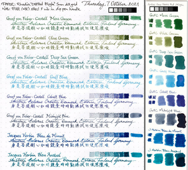
I won't add much to previous fantastic reviews of this ink, such as the ones here: https://www.fountainpennetwork.com/forum/topic/335816-gulf-blue-graf-von-faber-castell/ But I will add my subjective impressions of using this ink and some more scans and photographs. Graf von Faber-Castell makes a luxury line of inks in beautiful, heavy glass bottles that will decorate any writing desk and will draw the eye. Despite the high price, the bottles contain 75ml of ink, so price per ml is actually reasonable. Considering other brands that sell in 20-30ml bottles for lower prices, but you get 2-3 times less ink. The packaging overall is top notch quality (personal note: I love the scent of the thick paper the box is made with, or maybe it's the ink used to print the graphics on the box). In my experience with 10 colors of GvFC ink, all are a varying degree of low lubrication and dryness. Some might be "liquidy" coming off the nib, but the overall ink flow will not be high. Colors like Moss Green, Cobalt Blue, and Hazelnut Brown are more saturated and a bit more lubricated. Deep Sea Green and Gulf Blue have little to no lubrication and are very dry, and so they benefit from juicy pens with smooth nibs. Or else you will feel every imperfection of your nib and texture of the paper you write on. Recently I have come to appreciate dry inks for the look they can provide if they are made of different hues of constituent dyes. This is the same type of dry flow and lack of lubrication one might find with certain translucent, multi-hue Sailor Manyo, Sailor Ink Studio, Troublemaker, and other inks of that nature. I am guessing the lack of surfactants, low saturation, and low lubrication are necessary to achieve color separation within a line, because some dyes flow farther than others, thus separating into gradients. Graf von Faber-Castell Gulf Blue is a multi-hue powder blue ink. It reminds me of blue hydrangea flowers, with areas of pale aqua-sky blue in dry areas and shifting to lavender in more saturated areas. It has a similar idea to Troublemaker Milky Ocean, but Milky Ocean is comparatively more purple-shifted and slightly more saturated. I highly recommend broad or cursive italic/stub nibs for this ink to get the most of the color gradient effect. The wetter your pen, the better, both for the smoother writing experience and for the ink to be more prominent on paper. Here is a scan of a mini-review sheet, paper is ivory-toned Fabriano Bioprima 85g with 4mm dot grid: Graf von Faber-Castell claims their inks are indelible. You can go back and forth about the ISO standard the brand uses, but in practical terms, the ink has some but low water resistance. The purplish line remains behind if you dab the wet writing with a paper towel quickly, and you might be able to read the original writing if the lines were thick enough, as you can see on the scan above (the grid lines are very faint compared to the cursive italic writing). The ink is pale to begin with, and the remaining lines are even more so. Here's a scan of some blue-turquoise inks next to Gulf Blue on ivory-toned Nakabayashi Logical Prime notebook paper: Photographs: On Tomoe River 52g "white" in a Hobonichi Cousin planner: Fabriano Bioprima 85g, using water brushes: Comparison with Troublemaker Milky Ocean: Milky Ocean: Milky Ocean: