Search the Community
Showing results for tags 'olive green'.
Found 13 results
-
desaturated.thumb.gif.5cb70ef1e977aa313d11eea3616aba7d.gif)
How-to: Set, or change, personal info that others can see about me
A Smug Dill posted a blog entry in Sus Minervam docet
It helps to explore this yourself, revisiting once in a while if need be, and keep in mind where each of those personal info fields are entered. Don't leave it until the urge to change something specific to come upon you, and only then bother to ask the question! Invest the time surveying upfront, instead of waste it later waiting for an answer from nobody in particular. Most of the fields shown above are self-evident as to what they are. I think the only ones that could do with explanation are: Security and Privacy: There is only one setting under there, and that is a toggle for whether your online status (including ‘last active’ date or time) is visible to others Content View Behavior: That has nothing to do with what others can see about you, but only where you would like to start reading when accessing content Enable status updates: This toggle enables/disables the public feed on your profile page; if you disable it, then nobody (including you) can post publicly visible ‘status updates’ or any other message against your profile, but if you enable it, then anyone — friend, foe, or complete stranger — can post something there whenever, without waiting for you to initiate and then only reply to what you wrote Notification Settings have nothing to do with what others can see about you, and so is out of scope for this article, and I'm not going to delve into those right now. (You can look here, here, and here to wrap your head around how notifications work with respect to followed content.) N.B. There is a possibility that some of the above settings and data fields may not be available to Bronze members and/or Silver members, but I have no way of testing that or scoping it out. — • — Another way of getting to the Edit Profile dialog, and the way to change your profile photo (or ‘avatar’), is here: — • — Freeform, custom member titles that one enters for oneself are long gone, and have not been a thing since FPN came back from a long hiatus and platform upgrade late in 2020. -
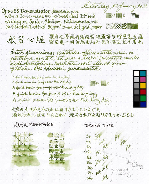
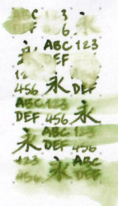
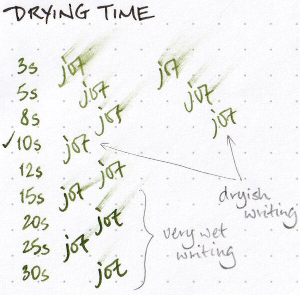
Colour: olive / murky green Flow: moderate, in that I haven't observed it flowing so dryly that it drew my attention, or so wetly that I needed to adjust what I was doing Feathering: Not observed on Rhodia DotPad 80g/m² paper, looking closely at the thinnest hatching lines, and words/glyphs ‘reverse-written’ with the nib upside-down (i.e. the bottom of the feed facing up) Show-through: Low to nil Bleed-through: Not observed Shading: This ink has a lot of range when it comes to shading, but it's unlikely that you'll get the full range along a single pen stroke. Shading is more apparent towards the drier side of the spectrum (i.e. in terms of how much ink per unit area has been deposited); the wetter the stroke, the more subtle the shading is. The shading effect tends to be well-blended, instead of clearly demarcated between light and dark, along a single pen stroke. Sheen: None observed Shimmer: None Drying time: Depends greatly on the wetness of the line or mark. Given the broad range of shades achievable with this ink, and the different colour intensities strongly reflect the wetness of the ink mark, a light-to-medium olive green mark dries completely under 10 seconds, whereas a dark murky green mark may take longer than 30 seconds to dry, on Rhodia DotPad 80g/m² paper. Smudging after fully dry: Didn't happen when I rubbed my thumb over the hatching/stippling panel and the largest Chinese hanzi chharacters Water resistance: Effectively nil My thoughts: A pretty ink for which I have little practical use. I can't ‘afford’ to use it in a wet pen to write in that dark murky green colour that can be achieved, on account of the long drying time; an ink such as Platinum Classic Ink Forest Green would be far more suitable for that, and being water-resistant to boot. This is probably a good drawing ink, but I don't draw in colour all that much at all. As a tester ink, it would be quite apt to tell me how dryly or wetly a pen writes, but then Sailor Shikiori inks are too expensive to use as tester inks.
-
-

-
Sailor Shikiori Wakauguisu - water resistance
A Smug Dill posted a gallery image in FPN Image Albums
-
-
Matching inks to Pelikan Classic M20x pens - shortlist
A Smug Dill posted a gallery image in FPN Image Albums
From the album: Shades of colour
Shortlist of inks with which to fill some of my Pelikan M20x pens© A Smug Dill
- 0 B
- x
-

PIF: 1 Bottle of ink (Penbbs #502)
Detman101 posted a topic in Pay It Forward, Loaner Programs & Group Buys
I realized this morning that i've never done a PIF on this forum. Well, it's time to fix that and start sharing the love over here also. Up for grabs is one full bottle of Penbbs#502 (The Rains). First post claiming it will receive it. I tried to like this ink, but it's just too dark for my use, I only use flex pens and the color doesn't show for me. Perhaps, it will work better for you. -
I am really enjoying using KWZ inks (other than the vanilla scent), and I've been looking into finding my perfect olive green ink. One of my requirements is good water resistance -- it does not need to be 100%, but the writing has to withstand being touched with damp hands or a small spill and still remain easily legible. I hoped KWZ I.G. Green Gold was going to be it, but when my bottle arrived, I've found that it's really more like a somewhat olive-leaning dark green. Not a green-gold as one might imagine (or olive). In a moment of inspiration, I decided to see what will happen if I mix I.G. Green Gold with KWZ Honey. Honey is a translucent and "layerable" honey-caramel color that can shade to off black if piled on. I.G. Green Gold is a very saturated low transparency ink. Both have silver sheen outline, but I.G. Green Gold just barely a hint of it, whereas Honey sheens silver around the letters very easily on good paper. Here are my results. No precipitate or odd behavior found so far. I very much like the first mixture and will be using it from now on in an empty Iroshizuku bottle. KWZ "Olive #1" : KWZ I.G. Green Gold 3/4 : KWZ Honey 1/4 KWZ "Olive #2" : KWZ I.G. Green Gold 2/3 : KWZ Honey 1/3 Both together:
-
Was just at Pelikan's site where they're trumpeting this year's Ink of the Year, Olivine. I believe the new color has been known for a while but this makes it official.
-
-
Robert Oster Signature - Bronze Robert Oster is an Australian ink maker that is well-known for its unique range of colours. On his website, he describes our shared love quite eloquently: “Robert Oster Signature originates from one of the most famous wine producing regions of the world, the Coonawarra district of South Australia, an idyllic setting with great influence on the senses. There is my inspiration. It’s a joy to share it with you.” Well, we are certainly fortunate to have inspiring ink makers like Robert Oster to satiate our thirst for glorious inks. In this review, the center stage is taken by Bronze, a fascinating olive-green ink with a noticeable old-rose undertone that is present just behind the surface, and that gives the ink a really nice vintage look. The name “bronze” is spot-on for this Robert Oster creation – the colour reminds me of these ancient bronze pots with lovely patina you can find at your local museum. This is an ink that really stands out from the crowd – in a good way. The ink contrasts nicely with the paper, but – unfortunately – looks a bit flat when writing with an EF-nib. Starting with F-nibs though, the ink opens up and shows its character, with strong shading in the broader nibs. To show you the impact of saturation on the ink’s look & feel on paper, I made some scribbles where I really saturated portions of the paper with ink. This gives you a good idea of what the ink is capable of in terms of colour range. On heavily saturated parts, Bronze shifts from olive-green towards more of a brown-green colour, with those tantalizing old-rose undertones just beneath the surface (the scan seems to lose these old-rose undertones somewhat, but trust me – they are there, and they are what makes this ink so special). Like most Robert Oster inks, Bronze totally lacks any water resistance. Short exposures to water completely obliterate the text, leaving only some old-rose smudges. This is evident from the chromatography – the ink detaches easily from the paper, as can be seen in the bottom part of the chroma. The ink is reasonably smudge-resistant though… there are some greenish smudges when rubbing a line of text with a most Q-tip cotton swab, but the text itself remains perfectly readable. I’ve tested the ink on a wide variety of paper – from crappy Moleskine to high-end Tomoe River. On every small band of paper I show you:An ink swab, made with a cotton Q-tip1-2-3 pass swab, to show increasing saturationAn ink scribble made with an M-nib fountain penThe name of the paper used, written with a B-nibA small text sample, written with an M-nibDrying times of the ink on the paper (with the M-nib)Robert Oster Bronze behaved perfectly on all paper types, and even wrote surprisingly well on Moleskine paper (although with very noticeable show-through and bleed-through). The ink is equally at home on both white and more yellowish paper. While writing, the ink lays down a rather wet line, but still dries quickly within the 5 to 10 second range (with an M-nib). The initial wetness means that you have to look out for smudging while writing – as such it’s not an ideal ink for lefties. Inkxperiment - bronze landscape I’ve recently started to experiment with ink drawings, keeping things simple and more-or-less abstract due to my lack of drawing skills (which can use lots more practice). But I find it to be a fun extension of the hobby, and have found single-ink drawings a nice challenge. In this drawing I started with completely wet 300 gsm watercolour paper, and applied Bronze with a brush. For the sky I used lots of water while spreading the ink. The highlights in the sky were obtained by blending in some bleach (thank you Nick Stewart for pointing out the possibilities of using bleach on inks). With the background almost dry, I added in the trees, letting the ink spread a bit. When the paper was almost completely dry, I added the fence and some details to the trees. I wouldn’t call it a masterpiece ;-) , but the drawing does show what can be obtained with Bronze in a more artistic setting. ConclusionRobert Oster Bronze is a great olive-green ink with a strong vintage vibe – mostly due to the old-rose component that shimmers beneath the surface. The ink looks good in all nib types, and can handle even low-quality paper fairly well. Unfortunately, the ink has zero water resistance – but I can live with that. Overall, I liked Bronze a lot – it certainly stands out from the crowd. Recommended! Technical test results on Rhodia N° 16 notepad paper, written with Lamy Safari, M-nib Back-side of writing samples on different paper types
-
http://i900.photobucket.com/albums/ac209/jasonchickerson/_FUJ0628.jpg http://i900.photobucket.com/albums/ac209/jasonchickerson/_FUJ0628-3.jpg http://i900.photobucket.com/albums/ac209/jasonchickerson/_FUJ0628-4.jpg http://i900.photobucket.com/albums/ac209/jasonchickerson/_FUJ0628-2.jpg http://i900.photobucket.com/albums/ac209/jasonchickerson/_FUJ0635-Edit.jpg Vert Olive (and Sailor Cigar) with Zebra "G" nib on Original Crown Mill Pure Cotton paper This one has it all. Beautiful, in the sweet spot for wetness, great behavior on all paper, and it dips and draws well. The only drawback to Vert Olive is that you must use it in a broad/wet pen for legibility. My Lamy 2000, which is a 5/10 for wetness and has a custom polished M nib, doesn't make the cut for legibility. Holy smokes, look at that "Vert Olive" in the title. My heart races. Olive drawing is kinda crappy, not due to a flaw in the ink, but because I pushed the limit on the number of washes the OCM Pure Cotton paper can handle. Sailor Cigar was used only for the very darkest of shadows. Care was taken to ensure color accuracy, etc.