Search the Community
Showing results for tags 'stub nib'.
-
Hi there, I've been a silent member of the FPN for 11 years now, it's high time to come out from the closet! I was born and raised in Warsaw, Poland, where I got my first fountain pen as a kid from my daddy. My father is a notary emeritus and he gave me a deep purple Waterman (no idea what model it was, but it was new back then in the 90s and had a steel nib). My Dad always wrote with his Waterman Le Man 100, he owned several of these. He used the havana Waterman ink. In consequentce I was, too, writing only Waterman pens, oblivious to the whole universe of other pen-makers. I looked down to my friend (and penfriend) Ania's Parker which I considered vulgar (hihi). And up to my uncle's Montblanc, but Daddy said, that Montbalncs were delicate, prone to problems and - the bottom line - had the screw system. So I stayed happily with my Waterman, till one day in London I lost it. I was about 16 years old back then and it was a true tragedy... My beloved pen, with which alone I wrote so many letters and pages... Daddy took me to the Waterman boutique in one of Warsaw's shopping malls and he bought me a new Harmonie (black, CT). I really liked this robust and heavy but slim and elegant pen. After maybe two years there was some issue with it, I sent it to Waterman for reparation and got a brand new one instead. In the meantime I was using one old Waterman with a gold nib ground by my Dad to a custom oblique. It scratched a bit but I loved the line variation. And then I went to Italy to continue my philophical studies. In a little exquisite pen shop next to St. Anthony's Basilica in Padua I got my first Lamy Safaris. I was delighted by the calligraphy nibs one could swap at ease! I got several of these pens and used them with different nibs and inks. But my nostalgy for Waterman was growing (in the meantime I lost my old Waterman with the custom ground nib on a train from Warsaw to Vienna, I took it out to write down some insider's pizza recommendations in Venice to some stranger in the compartment and forgot it there). I started searching for Watermans with oblique and stub nibs and realised that one could buy some new old stock Préfaces. I got myself one in black resin and one silver plated with an F nib and a stub nib separately. These were my new favourites, I loved them. After several years in Padua I moved back to Warsaw and then to Cologne, where I live now. Upon my arrival in Cologne a disaster occurred: my whole backpack still packed with valuable fountain pens (the silver-plated Préface and all my Lamys, thanks God the black Préface with the stub nib was not there) got stolen. (Alongside with my laptop and kindle...) Now I own several beautiful Waterman Gentleman pens with different nibs and I like them even more than the Préface. And I use them at home, taking my pink Lamy Safari to the University It writes great and if I loose it, I can rebuy it. So as you see from my lengthy fountain-pen autobiorgaphy, I love fountain pens as writing instruments but I don't really collect them (well, if you exclude 5 different rare finishes of the Gentleman that I have accumulated lately). I love the section inky thoughts and might be tempted to tell you more about the exclusive Diamine Kölsches Rheinwasser Ink that came out recently made for the local pen store Ortloffs. Still, what intetests me most, are archival / waterproof inks. I would love to try out an old Waterman or Pelikan with a flex nib. Best wishes to you all, fellow fountain-pen freaks!
-
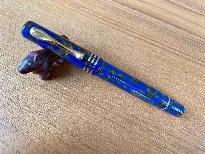
From the album: OldTravelingShoe's Random Pics of Fountain Pens
© (c) 2022 by OldTravelingShoe. All rights reserved.
- 0 B
- x
-
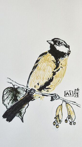
20220729 A Fox in the Harz Mountains.jpg
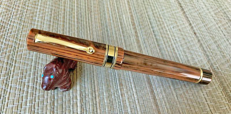
OldTravelingShoe posted a gallery image in FPN Image Albums
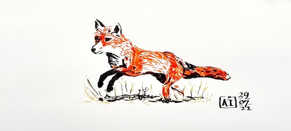
From the album: OldTravelingShoe's Random Pics of Fountain Pens
© (c) 2022 by OldTravelingShoe. All rights reserved.
- 0 B
- x
-
20220729 All the Tools to Draw a Fox.jpg
OldTravelingShoe posted a gallery image in FPN Image Albums
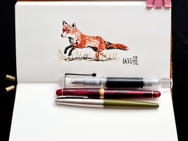
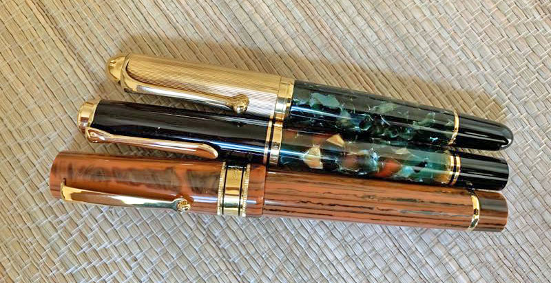
From the album: OldTravelingShoe's Random Pics of Fountain Pens
© (c) 2022 by OldTravelingShoe. All rights reserved.
- 0 B
- x
-
20220727_073652 Great Tit - Harz Mountains TOOLS.jpg
OldTravelingShoe posted a gallery image in FPN Image Albums

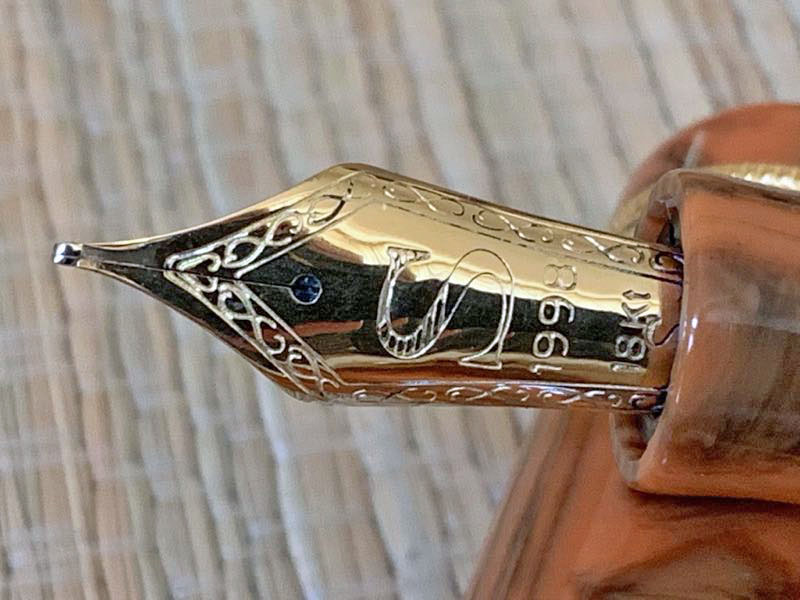
From the album: OldTravelingShoe's Random Pics of Fountain Pens
© (c) 2022 by OldTravelingShoe. All rights reserved.
- 0 B
- x
-
desaturated.thumb.gif.5cb70ef1e977aa313d11eea3616aba7d.gif)
How-to: Set, or change, personal info that others can see about me
A Smug Dill posted a blog entry in Sus Minervam docet
It helps to explore this yourself, revisiting once in a while if need be, and keep in mind where each of those personal info fields are entered. Don't leave it until the urge to change something specific to come upon you, and only then bother to ask the question! Invest the time surveying upfront, instead of waste it later waiting for an answer from nobody in particular. Most of the fields shown above are self-evident as to what they are. I think the only ones that could do with explanation are: Security and Privacy: There is only one setting under there, and that is a toggle for whether your online status (including ‘last active’ date or time) is visible to others Content View Behavior: That has nothing to do with what others can see about you, but only where you would like to start reading when accessing content Enable status updates: This toggle enables/disables the public feed on your profile page; if you disable it, then nobody (including you) can post publicly visible ‘status updates’ or any other message against your profile, but if you enable it, then anyone — friend, foe, or complete stranger — can post something there whenever, without waiting for you to initiate and then only reply to what you wrote Notification Settings have nothing to do with what others can see about you, and so is out of scope for this article, and I'm not going to delve into those right now. (You can look here, here, and here to wrap your head around how notifications work with respect to followed content.) N.B. There is a possibility that some of the above settings and data fields may not be available to Bronze members and/or Silver members, but I have no way of testing that or scoping it out. — • — Another way of getting to the Edit Profile dialog, and the way to change your profile photo (or ‘avatar’), is here: — • — Freeform, custom member titles that one enters for oneself are long gone, and have not been a thing since FPN came back from a long hiatus and platform upgrade late in 2020. -
Hello Everyone, I have a brief window of opportunity to purchase a new Pelikan Souverän M805 Blue-Black fountain pen at a very favorable price. The question is, which nib to choose? I write in cursive and dabble in calligraphy strictly for pleasure. I am retired, so no writing for business or publication is required. Only letters & notes to friends. I have a few gold nib pens, most custom ground from a “B" to a smooth stub, though I also enjoy writing with a fine or extra-fine nib too. I am aware that I can purchase additional nibs later and easily swap them out on the M805. I am also prepared to send a new nib to a nibmeister for customization. And finally, I have read several reviews of this pen that the nibs tend to run to the broad/wet side of the curve. So, having said all of that, the question is, which nib to start out with since I can only afford one at this time? I realize there are probably many more factors that weigh into this decision, but the purpose of my query is not to wade deeply into the minutiae of choosing this nib, I’m just asking for some general advice and opinions from those more experienced than I with this pen. Are the Extra-Fine & Fine nibs true to their names or do they lean more to one step larger? Same question for the Medium nib. Is it suitable for grinding to a good, all-around every day stub/italic, or would I be better starting with the Broad? And finally, what is the general opinion about the all rhodium nib for the M805, or do you think borrowing the two-toned gold/rhodium nib from the M800 looks better on this pen? Additionally, recommendation for a nibmeister to grind an everyday stub/Italic nib would be appreciated. I have some ideas on this myself, but am always interested in the thoughts of others. Thanks very much for taking the time to read this. Any thoughts you may have will be appreciated.
-
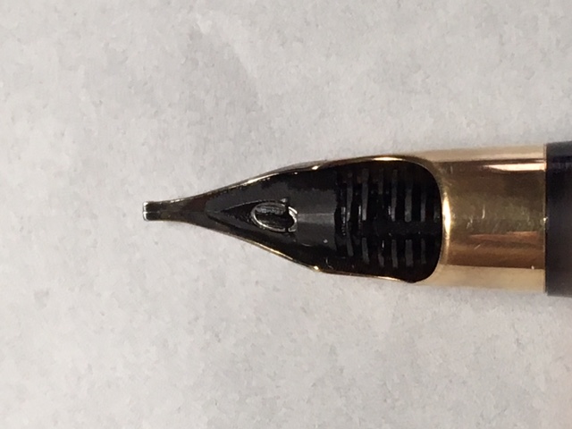
I suppose that at least 25 Croxleys have passed through my hands - maybe more, so I can claim reasonable familiarity with them. Croxleys are not as far as I know, renowned for their nibs, but they are in fact always good; mostly semi-flexible mediums - I have had some that are fine and some that are more than semi-flexible, but I have never seen one like this one: It's a really nice stub, quite broad and close to an italic. The tipping suggests that it is original - i.e. not a re-grind. Has anyone else seen one of these? Rgds Cob
-
To celebrate the store's 70th anniversary, Novelli had Visconti make a celluloid fountain pen with a 14kt gold nib in a limited edition of 70. I ordered one with a stub nib, pretty much as soon as Marco announced it. The pen arrived a couple days ago, and I am very happy with it. Appearance and Design The style of the pen is somewhat old-fashioned in a positive way. The length is the same as that of the Homo Sapiens. The clip is a style that predates the current arc of the Homo Sapiens, I think. The clip is quite springy. For me, the tension is about perfect. The celluloid is dark blue with islands of gold and is much more attractive than what you see in my photos. Manufacturing quality is superb. The pen has a very comfortable section. There is a clear ink window, which i happen to like. Nib and Performance The nib is a 14 kt stub and writes rather wet. It is my first Visconti with a gold nib. The others I own all have the palladium nibs Visconti used for a number of years. I first loaded it with Visconti Blue - a good ink with a good color match for the pen. I then loaded it with Pelikan 4001 Blue-black to see if a very dry ink with provide a crisper line. Both inks performed about the same. The nib is rather springy and smooth writing but with a bit of feed back. The only negative is that there is mild hesitancy in ink flow after a brief break in writing. Ink flows well after the nib is gently flexed. I may (or may not) eventually ask a nibmeister to make it a bit crisper for my italic handwriting. The engraving on the nib is different from Visconti's usual. It is quite simple. I don't know if it has a particular symbolic significance. Filling system The pen has Visconti's well-known power filler, and it works well. As stated above, there is a clear ink window which I find a positive feature. Cost and value This is not an inexpensive pen, but the price is less than that of most of the Homo Sapiens limited editions. For a celluloid pen of this quality, I think the price is almost a bargain. Conclusion This is a handsome pen that is a pleasure to see and use. The only negative is the slightly hesitant ink flow described above. Once you are writing, ink flow is excellent. Overall, I am happy with the pen and feel it is a good value for a high-end fountain pen. David

-

Visconti Celluloid Pen for Novelli's 70th Anniversary: Review posted
dms525 posted a topic in Italy - Europe
I posted a first look review in the FPN FP Reviews Forum: David -
I'm interested in buying a stub nibbed pen to compliment my collection, but I don't know whether I should vintage or modern. Also, which pen has a history of being the best, smoothest stub writer? Your experience, please.
-
Santini Italia is a relatively new company, although there was an older Italian pen manufacturer named "Santini" which may have been the same family. I am not sure what the "1998" engraved on the nib represents, presumably some important milestone in the company's history. The company is owned by Giovanni Santini, and he is the pen maker as well. He was previously involved with Ancora pens. Santini Italia attracted my attention partly because they make their own 18Kt nibs, and they offer a stub nib. They do make some somewhat blingy limited editions but several models that are quite traditional and reasonably priced for pens made with handsome resins, piston filled and fitted with 18Kt gold nibs. So, I thought it was worth ordering one. I ordered directly from the company in Italy. Communication with them was easy and responsive. The pen arrived just a few days ago, so this is a "first look." General size, shape and appearance The Santini Italia "Libra" comes in several colors. The one I ordered is a light brown, wood grain resin. I find it rather handsome. The pen is a traditional "flat top" shape with low peaks on the top of the cap and the other end. It is a large pen, but not quite "oversize." it is about the length of a Pelikan M800 but a millimeter or so greater in diameter. I find that a positive characteristic, since I prefer thicker sections for comfort. The pen's fit and finish seem faultless. One feels it is very well made. The hardware appears to be gold plated. It is quite simple and in good taste. Santini Italia Libra with a Pelikan M800 and an Aurora 88 (both with custom bindes) Santini uncapped compare to a M800. Filling the pen The Libra is a piston filler. It takes about 6 turns to fill it. The capacity, tested with water, is about 1.5ml. It is very smooth to operate. When filling is complete, the end knob turns with a clicking sound, like the piston mechanism in my Delta Santuffos. The nib and writing As stated, the availability of a stub nib at no extra cost was a positive factor in my decision to buy this pen. My assessment revealed both strengths and weaknesses. On initial inspection, I was pleasantly surprised by the width of the nib tip. Most stock stubs on Italian pens are 0.9 to 1.3mm. This one appears to be about 0.8, which is much more usable for my daily italic handwriting. The nib is on the small size for the size of the pen. It is noticeably smaller than the nib of a M800. On closer inspection, I found one of the tines to be torqued slightly, and the tip looked like it had baby bottom. Also, it was on the round end of the "stub" spectrum. I expected writing problems. When I inked the pen, I found it wrote very smoothly with moderate to wet ink flow. On single strokes, the thick/thin line differentiation was about 2:1, but there was minimal thick/thin difference in writing because of how wet the nib is. I will be taking the pen to the San Francisco Pen Show to have the nib tuned and crisped up. I'll update my review afterwards. David
-
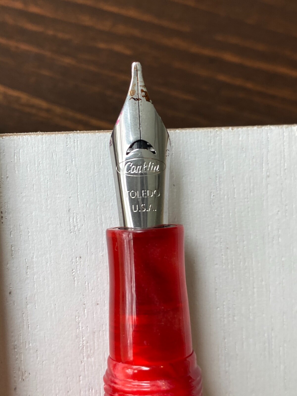
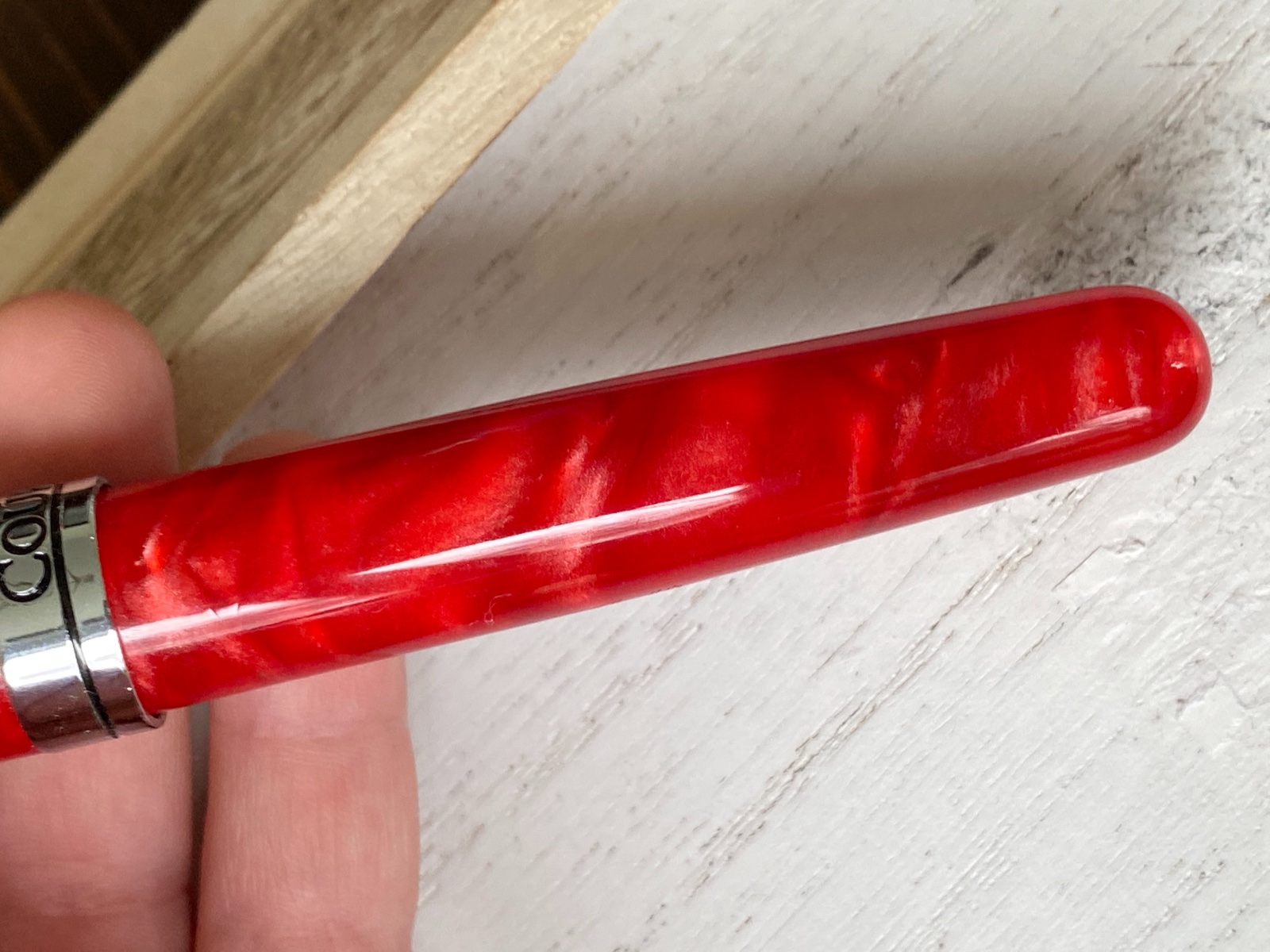
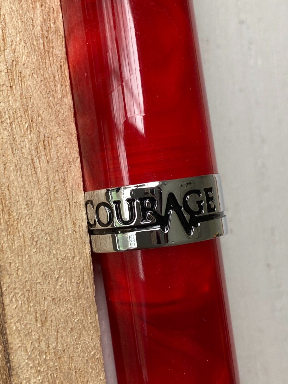
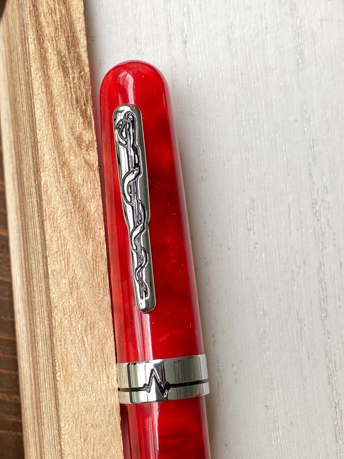
Conklin All American Courage Red Review
collectorofmanythings posted a topic in Fountain Pen Reviews
Today, I am reviewing the Conklin All American Limited Edition Courage Red pen. First of all, in my opinion Conklin get a lot of unnecessary bad press. While brands like Edison get wonderful reviews for their pens which often are around 170 bucks that come with a steel nib, and Conklin which also offers cast resins for sometimes over 100 cheaper, and they get horrible reviews. Now I am not saying that Edison pens aren’t great, because they are, I’m just saying that they are pricey for what they are, and, in my humble opinion, Conklin pens are a steal. If you don’t like the nibs, then you can get a Goulet nib or an Edison nib, and if you want a good nib, you can get an Edison gold nib or a JoWo gold nib from fpnibs.com (who offers the JoWo 14k gold nib at just $115!) in the #6 size. Sorry about that, now let me get back on track. This pen is a limited edition of 1898 pieces (Conklin was founded in 1898) and I personally have #0693. So be sure to get it while you can! Design and Build Quality (8.5/10) This pen is huge. It’s about the size of my hand. Granted, I have relatively small hands, but nevertheless it is huge. I can’t imagine anyone ever posting this pen. I personally don’t like reds and pinks a lot, but this pen really spoke to me because it reminds me of a betta fish I used to have when I was younger. Without that though, I don’t think I would have gotten it. It is medical themed, and it is called the Courage series because of the incredible amount of courage shoes by first responders during the pandemic. The clip has the medical snake around a pole, and then the cap band has a heartbeat in the front with another heartbeat on the back which is used to spell “COURAGE”. The body tapers down to the end. The swirls in this pen are magnificent. The material has such a depth to it, and it has pearlescent whites and thin streaks of black all throughout the semi-translucent red resin. It is just gorgeous and a sight to behold. When you unscrew the cap (which takes about 1.75 turns), it reveals a JoWo steel nib, in my case a 1.1 mm stub. It doesn’t have a lot of decoration, just the Conklin logo and Toledo, U.S.A. . The reason that it is a 8.5 out of 10 is because it’s just so huge. Nib and Writing Experience (7.5/10) The writing experience is pretty good. You can’t write incredibly quickly, or else you’ll get skipping. Otherwise, it works great. Relatively dry, but that can be fixed. Reverse writing is not recommended. Has pretty good line variation. Adds a nice bit of character to your writing. I have nothing wrong with this nib, it’s just like a lot of stubs where you have to be more thoughtful how you are writing. In fact, I like it quite a bit. Thank you for reading this review! As this is only my second review, please leave some constructive criticism! I would appreciate very much. Or, just tell me what you thought if the review! Just please leave a comment so I know what to keep doing and what to improve upon. Here are the pictures:
-
A comparison between Stipula 1.1 steel and 1.1 14k stub nibs
RubenDh posted a topic in Italy - Europe
Hi all I made a comparison of two Stipula stub nibs in the "Of Nibs & Tines" section of this forum. Stipula is very often discussed here, so I thought it would be of general interest to post about it here as well. Link to the comparison: A comparison between Stipula 1.1 steel and 1.1 14k stub nibs - Of Nibs & Tines - The Fountain Pen Network Best Ruben -
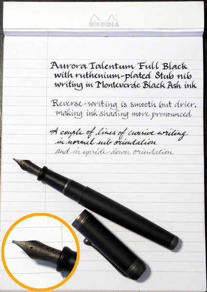
Aurora Talentum Stub nib writing sample in Monteverde Black Ash.jpg
A Smug Dill posted a gallery image in FPN Image Albums
-
Hi folks, I had my eye on a 51 on Ebay that only had four fairly uninformative photographs and fairly minimal description (made in Canada, Parker 51), but the nib looked potentially interesting (though a little out of focus) It could have been blurriness - or a very broad nib. I made an offer of £20, and figured at worst I would have a parts pen. Turned out to be a 1947 vac-fill 51 in reasonable condition, with a seriously broad stub nib. I've only dipped it so far, but it writes really nicely. I'm waiting for a diaphragm & shellac in the post (my last bottle of shellac dried out), and I've been soaking the nib in clean water for the last couple of days. I can't wait to get it up and running! 51 Vac, broad stub nib by Robin Inkysloth, on Flickr 51 Vac, broad stub nib by Robin Inkysloth, on Flickr
-

Fine Writing International Golden Armour Brass Pen
taike posted a topic in China, Korea and Others (Far East, Asia)
Taiwan pen maker (and stationary products importer) Fine Writing International (尚羽堂) has released the 6th generation of their brass pen. The cap is a big part of the story of this pen. This is the first round cap in the series. The others were octagonal. It's also more ornate that previous iterations. It's crazy-cool. The design is inspired by patterns found in Chinese armour. It looks like the Mountain pattern armour (山文铠) which first appeared in the Tang Dynasty. Then there's the lion with the dagger in its mouth on the end of the cap. The concept is that given that the pen is mightier than the sword, it should be helpful to armour-up your pen (and give it a knife-baring mascot). The pen uses a #6 Jowo steel nib and comes with a converter. Eyedroppering is a natural, however. There's a o-ring on the section. I added silicon grease to the section threads. The cap itself is about 25g making the capped pen over 50g. Sans cap it is a much more reasonable weight - with a full barrel of ink. Capped 140mmUncapped 130.5mmSection diameter: 10.3 -11.9mmBarrel diameter: 13mmThe design balances the pen's proportions very well. The size and diameter of the section is comfortable. The length natural. The diameter of the barrel feels right. I got mine with a 1.1 stub. It's also available with EF, F, M, and B nibs. I picked KWZ Brown-Pink. The pen holds 4ml according to the included booklet. Writing with the Golden Armour is a treat. The nib couldn't be smoother and gives gentle but clear line variation. It's wet without being a gusher. The pen wrote perfectly from the first. The weight of the pen calms my writing - as much as that's possible. I find watching the letters form inspiring. Fine Writing International is far from a household name - though they are getting more attention lately. You may have seen their Planets series. I feel fortunate to have had my head up when this pen came along. The pen was just over US$90 direct from Fine Writing International. I understand retailers in the UK and Japan stock this pen. Not sure about the US. But FWI ships internationally as does Taipei retailer TY Lee. More pictures and comments here. -
Leonardo Officina Italiana Momento Zero Positano Numbered Edition
dms525 posted a topic in Fountain Pen Reviews
Last month, I received a Leonardo Officina Italian pen. This was a limited edition (10 made) in redwood ebonite with a 14 kt gold stub nib. It is a piston loader. I posted a detailed review of that pen. (https://www.fountainpennetwork.com/forum/topic/334672-leonardo-officina-italiana-momento-zero-ebonite/?do=findComment&comment=4029696) I liked it so much I bought another, but one of the "numbered" (not "limited") editions. This review will be less detailed, emphasizing the differences. Numbered Edition above, Limited edition below Numbered Edition, uncapped The size and form of these pens is exactly the same. The quality of fit and finish is the same also, as far as I can tell. However, the cap of the Numbered edition unscrews, revealing the end of a captive converter. The section also unscrews, giving access to the converter. As far as I can tell, the converter is not removable, at least not easily. It seems to be standard, good quality converter. Another significant difference is that the Limited edition comes with 14 kt. gold nib while the Numbered edition comes with a steel nib. The Numbered edition comes in several materials - Positano (blue), a "Horn" resin and a black resin. I chose the pen in Positano. The photos I saw online made this material look very similar if not identical to the material Montegrappa used in their Modigliani limited edition writing instruments. Rods of this material are available to pen turners, and I had a custom binde made of this material for a Pelikan M600 by Shawn Newton. Putting that pen next to my new Leonardo shows they are almost (but not quite) identical. Pelikan above, Leonardo below As many of you know, my daily handwriting is in italic script, so most of my fountain pens have italic or stub nibs. I found one of the select few pen shops that carry Leonardo pens that had the model I wanted with a stub nib. This was a bit of a gamble for me, but I found it writes almost identically to the gold stub on my ebonite Limited edition Leonardo. Bottom line: I find this to be a beautiful, well-made pen which is comfortable to use and writes beautifully. With a price that is about one fifth of the Limited edition, it is a real bargain, in my opinion. David -
An obedient nib can do many things, regardless of the purpose for which it was designed. Here I would simply like to show the different scripts of which a stub nib is capable, which vary a lot in style, age, complexity and speed of execution. The nib is a Montegrappa factory stub, fitted on a Extra Otto Shiny Lines. It sometimes seemed to me that some enthusiasts are held back in their desire to experiment with new types of nibs from the fear that these are of too specific use. Considering that a stub is often considered a very "specialist" type of nib, this post would argue in favor of experimentation. A pen can do many things ...
-
Serwex 1362 Red, FPR 1.0mm Stub nib The Serwex 1362 is a cheap ($6), Indian made pen sold by Fountain Pen Revolution. This pen is actually a pretty nice writer. I am always looking for new pens to review!
-
Hi guys! Hope y'all doing well. It was that day again where this 15 year-old teen felt bored writing with a characterless Jinhao 159. So I just pulled out my pen customizing stuff and ground a stub. It turned out beautiful. It is smooth and wet and has enough line variation that makes the nib interesting to write with but still be usable for daily writing. Here are some pictures... I would love to learn more of this art. I also recently did my first paid stub for a friend and that also turned out quite good. P.S. Excuse the crappy pics. I promise to do a full review of the pen with better pictures. I just want my tenth grade final exams to finish as soon as possible. Also the nib looks a bit like an oblique in the photo but believe me its not. Take care, Adit Kamath
-
I have install a pilot plumix's nib into my wing sung 698... so far, it perform rather well after i switch in kakuno's feed.. however when writing with the nib, I can feel alot of feedback... I can feel every single stroke, it almost feel like i'm pressing on the paper (or writing with a pencil)... but i'm not... Is this normal behavior for a steel stub nib? or it is just plumix's nib? thanks..
-
Anyone Around Louisville Who Can Re-Sac This Exquisite Snorkel?
Ezekiel posted a topic in Repair Q&A
Recently saw this nice Snorkel signature set and almost passed it up, until I saw that it has a factory stub nib. Had to get it. The problem: my wife and I are moving overseas in like a week. No time to mail and have a new sac put in, even with rush delivery...right? So, if there's someone around Louisville, KY who can do this, who would be willing to let me drop it off to them and pick it up, I'd be deeply in your debt. Thanks folks!
-

Anyone Know A Cheap Way To Get A #6 Stub Nib?
calvin_0 posted a topic in Fountain & Dip Pens - First Stop
Right now, the cheapest #6 stub nib is nemosine's is which is around 10 bucks.. So I wonder, does anyone else know a cheaper one? I just want to try out a stub nib.. Thanks. -
I have Walh-Eversharp equi-poised fountain pen, it has stub nib. At least I think it is stub, nib leaves wide stroke down and thin sideways. But I just can't make it work with my handwriting! No matter how I try to hold it, it makes it look horrible... Nib is really flexible, wet and smooth. So nothing wrong with the nib, more about "user error". How stub nib should be hold when writing? Do I need to write fast or slow? Also, is there some script that is suitable this kind of nibs? If everything else fails, is it possible to regrind this stub to needlepoint? It has almost no tipping material at all. Also, I don't want to ruin perfectly good nib just because it doesn't fit my writing style. I would really love to learn write with this nib, I love the pen so much and nib is really nice writer, except I don't like the outcome... Some pictures to help clarifying things.