Search the Community
Showing results for tags 'custom'.
-

Torelli "51" Fantasy Demonstrator With 1.3Mm Minuskin Stub
zaddick posted a topic in Fountain Pen Reviews
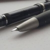
In the world of fountain pens, there are forgettable pens and famous pens…. and then there are the icons. Those are the pens that have a wide appeal and a cult like following. You may love them or not, but there is no denying their impact and the passion they generate amongst devotees. One of these icons is the Parker “51”. There is an abundance of information about these great pens, and I will make no attempt to repeat all the details. I will simply point out that there are two primary filling systems used in the life of the pen – the vacuumatic plunger filler and the aerometric filler. The vac filler was the first system used and I draw this distinction because the pen I am reviewing uses this method. Sometimes iconic pens inspire tributes or fantasy versions where people create a pen they want to see, but it never came from the factory. When this is done with the intention to add character or widen the scope of a pen, I think it has the potential to be a thing of beauty. (When it is done to deceive or to make a pen that is represented as a rare factory original, I find this despicable and blight on our hobby.) There are many folks who have created so called fantasy “51” pens including Ariel Kullock, Paul Rossi, Ralph Prather, and Brad Torelli. Each has their strengths and their products cover a wide range of prices, depending on materials, hours invested, and parts used. While I admire the work or all four men, the pens that appeal the most to me in general are those by Brad Torelli. Although he is a master of many pen skills, plastics are the area of expertise he focused on for this pen. He essentially took standard “51” vac parts and crafted a new barrel, hood and blind cap. In addition, he put new jewels on the top and bottom of the pen to make is a “double jewel” or DJ version of the pen. This particular pen is a demonstrator in a lovely transparent brown, almost the color of a refreshing root beer. I find the color pairs well with the gold cap. The transparency also gives one a real appreciation for the mechanics of these pens. Manually creating a vacuum to pull ink through the collector and breather tube in order to fill the ink chamber – simple but effective. One of the best things about Brad’s pens is the warranty. He likes to say he offers a lifetime guarantee on his work and his materials. The part that always amuses me is that he means his lifetime. I have no desire to publicly share his current age, but he has joked that he probably has 20 good years ahead and then maybe another 5 or 10 so so years (so get that warranty work done!). In all seriousness, I have personal experience with him standing behind his work and going above and beyond what any large manufacturer would do in support of their pens. Besides the giant pain in the rear it is to clean a “51” vac, the other issue for me personally is the limited range of nib widths available. To remedy this I turned to a custom retipped nib from Greg Minuskin. Greg sells a lot of “51” nibs that he retips and stubs in various widths. The one I picked was a fairly broad 1.3MM tip and Brad mounted in into his pen for me. Now I have a demo pen with a tip that is wide enough to suit my preferences. I’ll close by saying that if, like me, you found the Parker “51” a little lacking from the factory the good news is there are artists who can make your desires a reality. I have a soft spot for demo pens, wide stubs, and pens hand made by artisans. This pen met all these criteria in one slim, iconic form factor. -
http://i.imgur.com/BYIdam1.jpg Well, a new Romillo came in today. This time it's a Narcea #9 in green and black ebonite. It's not one of Romillo's standard offerings but he agreed to do a one-off for me. The ebonite looks gorgeous! Very cool of Alvaro to do a one-off for me; he didn't have to do that. http://i.imgur.com/CTx5y1M.jpg It's the smallest pen Romillo offers but it still a good usable size, especially since the nib is so tall. http://i.imgur.com/bzJ6BO9.jpg?1 Each Romillo comes with a certificate and a writing sample. My Narcea is pen #450. http://i.imgur.com/KnRfiTe.jpg Instructions for the eyedropper filling system and several spare o-rings in case the o-ring sealing the section to barrel threads breaks or wears out. http://i.imgur.com/rbipWpN.jpg The Romillo boxes are really nice. Compact but elegant and good at protecting the pen from damage. Also a small bottle of Romillo Blue ink. The bottle is simpler than it used to be. I'm quite excited to try it, it looks beautiful! I've only gotten Romillo Sepia ink in the past. http://i.imgur.com/B1o4pvt.jpg The black felt pen sleeve and eyedropper. http://i.imgur.com/goKslhF.jpg From left: Lamy Safari, Romillo Narcea #9, Romillo Essential #9, Nakaya Piccolo, Romillo Sil #9 http://i.imgur.com/AK1qk2F.jpg Even though the Romillo Narcea #9 is the smallest pen in the Romillo lineup it still has the massive #9 nib. Also a very usable size at 10 millimeters or so bigger than a Piccolo http://i.imgur.com/XPOUEBK.jpg Lamy Safari, Romillo Narcea #9 and Nakaya Piccolo nibs. http://i.imgur.com/tkSxnTn.jpg The Romillo feed seems to have changed as well. I kind of like the older, bigger feed but I doubt it has any functional difference. It's still a gorgeous looking ebonite feed =] http://i.imgur.com/lfD0cEJ.jpg Romillo Narcea and Sil nibs. http://i.imgur.com/CW6HIus.jpg Essential, Narcea, and Sil nibs. These are all #9 nibs but since each nib is handmade and hand engraved, there are some variations in their dimensions and shape. http://i.imgur.com/IIyjIii.jpg Again, I chose to get the solid gold cabochon at the barrel end. Just a small disc of 18kt gold but it's a nice touch I think. Now, I gotta ink this up ...
-
Pilot Custom Heritage 92 Demonstration (Video)
a.zy.lee posted a topic in Fountain & Dip Pens - First Stop
This is a video I made a while back that I thought this community would enjoy. The video is a demonstration on the Pilot Custom Heritage 92 in smoke, with a broad nib. The ink is Noodler's Ottoman Rose which I got as an ink sample. Enjoy! I have more videos like this on my channel: https://www.youtube.com/channel/UC6pAl06Dx2E1WqWof7JnnvA -
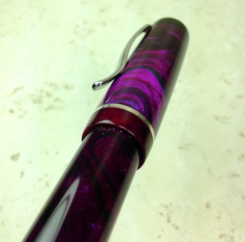
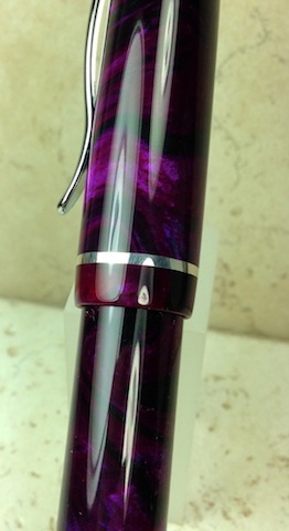
I am a big fan of Brad Torelli's work and I try to pick up interesting pens he has made over the years. I was familiar with his work on fantasy MB pens, fantasy Parker 51s, fantasy Triads, and other fantasy brands like Parker or Scheaffer. I was not aware, however, of his fantasy Pelikan pens as I had never seen any before. I am posting these here in order to share the pens with Pelikan fans. I do not have a lot of Pelikan pens so maybe people are familiar with his custom Pelikans already. I'd love to hear your thoughts. The first pen is based on the M101N but oversized. The pen is nice an compact when capped, but is almost the same length as an M800 when uncapped. The pen is a piston fill with a removable blind cap and a little knob to operate the piston. There is a carved circle on the cap dome, but no Pelikan logo. The pen is a lovely swirled gold acrylic with a complimentary burgundy acrylic. There is a large ink window which makes life easier for me. The hardware is probably gold plated as I did not see a hallmark or karat rating. I think the clip and cap band give off a nice vintage vibe. Of course the heart of the pen is the nib, and this one sports a 14C B from that is M800 sized. A nice flexy nib for a vintage style pen! Compared to a Blue Ocean The second "Torelikan" I picked up is a little more straight forward. It is an M1000 with custom red acrylic. The nib, clip, cap rings, piston knob rings, and the cap top are all original Pelikan parts. I suspect the section is also stock Pelikan. The rest of the pen, however, is a glorious red material that has a lot of depth and really catches the sun as you turn it in the hand. It is hard to capture in pictures (especially on a rainy day), but you can get a good idea of the potential. The pen reminds me of the M600 Red O Red pen from several years ago, but I cannot really compare the color directly. It also does not have the same level of translucence, and I feel like the "granules" in the material are a little finer here vs the RoR. Here are a few shots of the two together to give a sense of relative size. One of the great things about these pens is the fact the nib units are standard Pelikan, and I can easily swap nibs among the several I own. Thanks for looking at the pictures. I hope you found them interesting. If you have any similar pens, please post them here. Your thoughts and comments are welcomed. I don't have much information on when the pens were made, but I can reach out to Brad for answers to questions.
-
Introduction. It all started when I got intrigued by JoWo nibs, reading that they make nibs some for bigger names in the Fountain Pen industry. So I just set about trying to get the cheapest JoWo Gold Nibed pen. Having seen/read a lot of About Fosfor Pens, I contacted Mr.Manoj by the end of December inquiring about JoWo gold nibs and after sorting out some details, advance payment for the Nib, My nib arrived by the Middle of January. Putting all the faith in the Nib,I selected one of the Many Polyresins from the Fosfor Pens site,nothing special here and Sketched a rough drawing of my pen, I’m not a very artistic person. And after a wait of 1 month, I finally received my Pen in the 2nd Week of March. The Pen As seen by the above sketch, the dimensions and shape is pretty accurate. Weight wise, I find it perfectly balanced in the hand and sits perfectly in my hand. When capped, it is top heavy, thanks to the Silver Clip. When uncapped, there is a slight shift of weight towards the barrel end helping it settle well in the finger web space. The cap takes 1 ¾ turns to uncap. I had specifically asked Mr.Manoj for the least number of turns. The section has a bit of a concave to it and forms the perfect diameter for my gripping style. Alternate Grips: My handwriting changes considerably based on where I grip my pens, but it’s not always comfortable with all pens bodies. Fortunately this pen body works well with all my pen grips giving each a characteristic flow. Filling is done by a Schmidt converter but I guess it can be turned in a E.D. The Nib Coming to the thing that started this 3 month long journey, It’s a JoWo #5 18k Broad nib… … and man is it worth it! Amazingly smooth, Amazing Spring and the broad tip has a stub like quality to it. Getting some impressive Line variation considering it’s a Broad. This has made me want to order a Fine and see how much variation that’s going to give! Or maybe I’m one of the lucky ones to get a springy nib. Only gripe is that I didn’t opt for the #6 Nib as I feel it would have suited this size of pen better. I was told the nibs come as a unit and I find that the feed keeps up well with ink flow. Cost: The total cost of the pen was Indian Rupees 6520, or just below a USD.100. I have always been an advocate of the philosophy “ An item is worth what you are willing to pay for it” so I will leave the cost factoring upto the reader. Alternative gold nib (new)pens at this price: Platinum PTL-5000 Platinum 3776 Platinum Balance Considering this one is “one of a kind”, handmade, customized to your specifications/ inputs I’d say the price is well worth it. Conclusion: Honestly I’ve been a silent spectator of the Fountain Pen scene for the past 3 years (when I first got re-introduced to Fountain pens) and never Felt like doing a Review of a pen. This was until my Interactions with Mr.Manoj Deshmukh of Fosfor Pens. The whole process of discussion, planning, waiting has completely changed my opinion of the workmanship that goes into producing each one these pens. That may not be the case with Larger Manufacturers where all the interaction you have is going into a Boutique, dipping a pen and scratching something down on paper. But in there Internet-days even that is a novelty. But when you are associated with an item from Day 1 of its Conceptualization, it truly is an amazing experience. And I fear it’s going to be Addictive. So at the end of the Day I have a beautiful writing instrument. Tomorrow is a new day and a New Sketch for Mr. Manoj.
-
New pen arrived today =] http://i.imgur.com/WPlVzh6.jpg Just got my Romillo Sil #9 in terracotta ebonite! http://i.imgur.com/A4lfSns.jpg It's a slip cap pen similar to the vintage Waterman 12 or other pens in the Waterman 1X series. Really elegant pen, I think. The roll-stopper on the cap is a customization I asked for. You can also order the pen plain or with a clip. http://i.imgur.com/FCr8Nhm.jpg I had asked for the cabochon on my Essential #9 and thought it was a really good touch, so I asked for it again. It's a solid gold emblem embedded into the barrel and has the Romillo logo in deep relief. http://i.imgur.com/crb9RAu.jpg Romillo Sil #9 compared to a Scriptorium Aeterna. The Romillo is ebonite, Scriptorium is celluloid. http://i.imgur.com/2EEbtbW.jpg?1 The pen's certificate. Each Romillo pen comes with this document, which states the pen's number -- my Eo is 379, my Essential is 422, and my Sil is 444. At the bottom is a writing sample with the nib. I ordered a Medium-Fine. http://i.imgur.com/yCQtZER.jpg?1 Instructions for the Sil #9 eyedropper. Alvaro found that the converter can't keep up with the #9 nib and huge ebonite feed so all #9 nib pens are eyedropper-fillers. The #7 nib pens come in both eyedropper and cartridge/converter filling systems. http://i.imgur.com/R291ntx.jpg Huge, gorgeous ebonite feed! Provides a really reliable, wet flow. http://i.imgur.com/ayYKFzp.jpg Sil #9, Essential #9, and Eo #9. http://i.imgur.com/Sg20YqM.jpg Romillo Sil with a Platinum 3776 Century. http://i.imgur.com/iTLI8L6.jpg http://i.imgur.com/GpD9BWZ.jpg Romillo #9 nib and Platinum 3776 Century nib. I actually swapped the Platinum nib with my Nakaya so the Platinum has a Nakaya nib in it right now but they are the same size, shape etc. http://i.imgur.com/P7ebS9v.jpg Romillo #9 nib and JoWo #6 nib in a Scriptorium Aeterna. http://i.imgur.com/sv1uilm.jpg The Romillo nib design, with the wings reaching towards the tip is one of the most attractive I've ever seen. http://i.imgur.com/cFUvarp.jpg Isn't is a lovely shape? Now to decide what to ink it up with ...
-
http://i.imgur.com/XsHnfDL.jpg I got a new pen today! A Romillo Essential #9. It's made of solid blue ebonite, in a really deep shade of blue. The gold roll stop is a customization I asked for. This is my second Romillo and I'm still blown away by all the documents and the whole package. Alvaro did an amazing job on the pen. The roll stopper and disc are set perfectly, the threads are perfectly cut, the nib is massive and gorgeous. I like to support the artisans that the fountain pen community has and we are very lucky to have a lot fantastic ones. Alvaro offers a great product, with great customer service, and craftsmanship that borders on artistry with his nibs. I've only written with the pen a little bit so I can't do a full review yet, but here are some initial impressions. http://i.imgur.com/03xNMJe.jpg Paperwork that came with the pen, along with a writing sample of the nib by Alvaro Romillo. http://i.imgur.com/J6WwXWf.jpg Alvaro's writing sample http://i.imgur.com/goew0bt.jpg Included was a gold and black 5-pen wrap, a bottle of Romillo Sepia ink, and a wooden box with a sliding panel opening. Inside the wooden box was the eyedropper, which is outside of the box in the photo, and a felt pen wrap with the pen inside. http://i.imgur.com/cpR5QZu.jpg Romillo Sepia ink. Romillo ink comes in Black, Blue, and Sepia I believe. It's not available commercially but is included with pen orders. http://i.imgur.com/B3OG5mQ.jpg Instructions for the Essential #9 eyedropper http://i.imgur.com/RwelHX6.jpg Comparison with some other pens that happened to be close by. From top: Nakaya Piccolo, Edison Pearl, Eboya Kyouka (medium-size), Romillo Essential #9, Lamy Safari, and Pilot Vanishing Point. Essential #9 and Eo #9 http://i.imgur.com/v0EzLj6.jpg My first Romillo, an Eo #9 in terracotta ebonite, is a bit heavier and thicker than the Eo #9. The roll stop placement is different too. Very similar in length though. Cabochon in the barrel end. http://i.imgur.com/2rhCX6g.jpg Along with the gold roll stop, I also asked for a solid gold cabochon to be added to the pen. It's a disc made of 18k gold engraved with the Romillo logo. It's a really lovely touch, I think. http://i.imgur.com/j2PbsQH.jpg Romillo #9 nib compared to an Edison/JoWo #6 nib. http://i.imgur.com/4TPp3Xy.jpg I tried to get a close up of the nib engraving. This is the best I could do (sorry!) It has to be one of the most elegant nib engravings there is. The fact that it's done by hand is just incredible. I've inked up the pen with Romillo Sepia ink and it's been lovely. Smooth, with some pleasant feedback, and perfect ink flow.
-
 I'll do a full review after I've had more time to use it but I wanted to share some of Shawn Newton's most recent work. Some of the pictures were taken by me, others by Shawn. Shawn's photos are being used with his permission. http://i.imgur.com/iwZMEoY.jpg A while back I had the idea of having Shawn make me a pen like the Hemingway except with solid 14k trim. Shawn was totally up for it and when he and his jeweler started making nibs, he asked if I wanted one. It was a risk - I was the first customer to buy one of these nibs so I had no idea how it would write. I trusted that Shawn would make sure I got nice writing pen. I wasn't disappointed. http://i.imgur.com/YkkJSi3.jpg All the metal (the nib, and all the trim) are all solid 14k gold. Writing sample http://i.imgur.com/kFL1jCV.jpg This is the coolest part: It writes just like a vintage flex nib. It even has the responsiveness of vintage flex and the tines close quickly after letting up on the pressure. Shawn Newton has an amazing thing to offer with these handmade nibs. The ink used in the writing sample is Iroshizuku Ku-jaku. I have a Romillo Essential #9 with a semi-flexible Fine nib coming in a few weeks - I'm really excited to get to compare the two handmade nibs to one another. http://i.imgur.com/rKQgZKV.jpg Here's a good look at the feed, which Shawn cut by hand out of ebonite. http://i.imgur.com/jYuCmf8.jpg Handmade Newton nib compared to a Bock nib on an Eboya Kyouka, medium-size. Comparison with other pens http://i.imgur.com/RZuiRej.jpg From top: Romillo Eo #9, Edison Pearl with Karanuri urushi, Shawn Newton custom, Eboya Kyouka - medium-size. http://i.imgur.com/tDIDOfq.jpg It's a true piston-filler. Shawn makes the piston-filling mechanisms in-house. Here you can see the blind cap unscrewed.
 -
Hi everyone, this is my first attempt at a fountain pen review and I have decided to review the ASA Bheeshma which is a custom design that ASA pens has made based on my request. Since this is my first effort, please go easy on the brickbats. Constructive criticisms however are always welcome. Introduction The story of Bheeshma has to start with the discussion one day that we were having in the “Fountain Pen Pals India” WhatsApp group when someone introduced me to a picture of a Scriptorium pen in Lava Explosion blank. I was stunned as to how amazingly pretty the material was and how beautiful the pen looked. Without knowing it then, I was smitten and hooked. Days passed and my urge to possess one went up in leaps and bounds. Unable to resist any further, I reached out to Eugene Soto of muttblanks.com to enquire about blanks in larger than five inch sizes for kitless pens. He suggested using two five inch blanks or he could make seven inch blanks as a custom order. I am not sure why, but I chose the second option. Maybe, in my mind I thought since I am venturing into something new then why not stretch the envelope. Anyways, after 3 excruciating weeks of waiting, the blanks finally managed to pass through the hoops of transatlantic flight and customs clearance to land up in my mailbox. The next challenge was what pen to design for the blanks. Given that I had opted for small seven inch blanks, a large pen with clips and all paraphernalia was out of question since we simply didn’t have enough material. Fellow group members and FPNers Vaibhav (@mehandiratta) and Pradeep (@pdg84) chipped in and we decided to make an adaptation of the Onyx design that Pradeep had but with some modifications to the specifications. Vaibhav was kind enough to make a CAD based on the design ideas and the outline of the pen was ready. He even christened the concept Bheeshma based on the powerful thespian from the epic Mahabharata. When it came to the question of the pen being made, there was nobody else I could think of other than Mr. Subramaniam of ASA Pens. Not only had he helped me gain knowledge on all pen related matters, but I knew I could trust him to look after my dream and nurture it like as if it is his own. So off went the blocks to him to get turned (pun intended) into a pen. Design The design is inspired by the Onyx which in itself is inspired by the classic Nakaya Piccolo design. This is a classical design that starts as a cigar shape, tapering down towards the end filial and terminates with small conical end pieces at each side. The cap is flushed with the barrel with a small step down design where the cap and barrel meet. The section design has been patterned on the ASA I-Can / I-Will which in my experience is extremely comfortable. The section gradually tapers from the barrel towards the nib before starting to flare out about 7mm to 8mm before it ends. The design is clipless, i.e., doesn’t have a clip to put in your pocket and is also designed to be used unposted. This allows for a better control over determining the balance point and is set to provide comfortable writing for everyone. Without further ado, I will let the pictures do the talking about the design. . . . . Size and Balance By classical norms this is a large sized pen at 147mm capped. But those of you are familiar with Indian handmade pens would recognize the fact that it can almost be passed off as a medium sized pen amongst its peers. Since the material used is very light, the barrel could be made a bit thicker and stronger without compromising on the weight or balance. The pen is extremely well balanced and can easily provide comfortable writing for extended periods. The section design is the best in the business from ASA and that only adds to the pleasurable writing experience. Please note that the pen has been designed to be used uncapped and that is exactly how I have used it. Nib Originally the pen was designed to accommodate a #5 Jowo nib. But once it was made Mr. Subramaniam insisted that a #6 Jowo/WIN unit would be best fit for it. I am a sucker for large nibs and happily agreed to the recommendation. We finally paired the pen with a dual tone #6 Jowo steel nib with Medium tip. Filling Mechanism I am committed to using pens that accept standard international cartridges and compatible convertors. I find them to provide the best proposition around value, system longevity, convenience and widespread compatibility. Unless there is a compelling justification to do things differently, all my pens tend to have the cartridge convertor mechanism. The ASA Bheeshma is no exception to this rule and has the aforesaid filling mechanism. Build Quality The build quality of this pen is impeccable. The quality of polish is excellent. Given that it is a handmade pen, there are some fine traces of tool marks but they are only visible under minute inspection and the overall build is not much different from a normal injection moulded pen. I am given to understand that normally Lava Explosion or similar aluminite material benefits from a lacquer coating to highlight the shine. I had requested for no such coating and yet I am very happy with the lustre which is evident in the pictures. Writing Experience Mr Subramaniam doesn’t profess to be a nibmeister but on ample occasions he has given ample hints that he does tune some nibs. I am not sure what he has done here but this nib is magic. It is incredibly smooth yet not glassy and leaves a nice wet line on the paper. I had inked the pen with Bril Violet ink to match the ink colour with the pen colour and the combination has worked real well. There are no skips or false starts and the impression it leaves on the paper is of a nice smooth medium line rich in ink. Overall, a superb writer and amongst the better Jowo nibs that I have in my collection. Price and Value Since I had procured the blanks myself, Mr Subramaniam charged me just for the nib and for making the pen. The cost is comparable to the prices of recently launched pens of the ASA Stellar collection. Personally, I found that incredible value since he had to disrupt his normal production schedule and incur significant downtime to get this pen made. Specifications This section is for those of you who thrive on hard numbers. Unfortunately I do not have access to a Vernier calliper or other precision instruments. You would have to settle for the approximate measurements I made using a normal rules and my (admittedly weak) eyes. Length (capped) – 147 mm Length (uncapped) – 143 mm Length (cap) – 62 mm Length (section) – 27 mm Maximum width – 15.5 mm Minimum width – 12.5 mm Maximum section width – 12.5 mm Minimum section width – 9.5 mm Conclusion I am extremely happy with this pen. I started with an abstract desire and my friends and ASA have given it a concrete and excellent shape. Everybody who have written with it have only been impressed with it. It is an excellent design that is very balanced, comfortable, light and ideal for long writing sessions. It would be great if ASA considers bringing it to the market as a regular product.

-
Does anyone here knows a good source for custom made nibs for Safari/ Vista/ Al-star pens? I've seen a couple of photos depicting what appear to be gold-plated nibs and some custom grinds but am not sure where to find them. Anyone can point me in the right direction?
-
Hi All! Here comes a new "ruthless review". My ruthless reviews have a few peculiar features: Concise;Very strict. If a pen costs hundred of euros, no faults are allowed. A good pen gets a 60/100, a great pen an 80/100, an almost perfect one a 90/100. Only a divine pen can have above 90. Add a few peculiar criteria: "Nib appearance", "Usability in shirt pockets", and "Out-of-the-boxness", meaning to what extent a nib was perfect right after leaving the seller. Also, don't care about the box.NOTE: I've introduced a change in this review. Previously I used to rank each of the ten factors on a 0-10 scale, adding up to 100. However, I've decided that some aspects should be made more important. Here they are, ranked by importance and by number of points they get as a result ("Construction" and "Quality of materials" have been merged into one). There's also a bit of logic as to why some factors are more important than others: Criteria 1. "Nib performance" gets a max. of 30 points - Why? Is there anything more important than the nib? A pen is a worthless piece of plastic if the nib does not write well.2. "Appearance and design" gets a max. of 20 points - Why? What good is a FP if it's not beautiful? Note: I hate flashy pens, so a LE Montegrappa would probably get a zero3. "Nib appearance" gets a max. of 10 points - Why? A nib is what you'll most likely see when writing with a FP. It has to be beautiful, otherwise you're going to hate your pen.4. "Cost and value" gets a max. of 10 points - Why? Not among the top-three points because after all, we don't collect FPs because of their cost-value ratio, I guess. 5. "Construction and materials" gets a max. of 10 points - Why? This is quite important but not as much as, say, in a car rating, for we almost all use pen cases anyway.6. "Out-of-the-boxness" gets a max of 5 points - Why? Since most of us know how to do nib-fixing (and a nib meister is never too far), I've reduced the importance of this factor.7. "Filling system and maintenance" gets a max. of 5 points - Why? Hard to rate as it's subject to individual preferences. I'll keep it among the lower-importance factors.8. "Weight and dimensions" gets a max. of 5 points - Why? For me it's almost ininfluential: I like both small and big pens. So it will be a low-importance factor.9. "Clip and usability with shirts" gets a max. of 5 points - Why? Can be very important for some, but irrelenvant for others. So, here's the review! Pilot Custom 74 - Blue with 14k n.5 M nib (pictures here: http://global.rakuten.com/en/store/atn/item/fkk-1000r/) · Nib performance: 30 out of 30 This pen has a magnificently good nib! It's soft, springy, with a bit of feedback but not too much, with a bit of line variation but not so much that you lose control, it's basically the perfect everyday nib. I'm going to keep this inked forever, always ready on my desk. I'm absolutely amazed. · Appearance and design: 15 out of 20 Conservative, not very creative, but with a nice combination between the blue of the body and the gold trims. It makes it classy without being banal. Note: this is not the demonstrator version, but the plain blue one you can get from Rakuten. · Nib appearance: 8 out of 10 This is a small, pretty nib, with some nice scrollwork. The only thing is that it would be nice if it had a rhodium masking in some places to make it bicolor. · Cost and value: 10 out of 10 Ok here comes the awesome part (well, the other awesome part, after the nib): I paid USD 72 for a 14k gold nibbed pen with a fantastic nib, from a world-class manufacturer. Compare it with the USD 150 you pay for a Lamy 2000 with its dull nib, and you get the idea. This Pilot is awesome value for money! · Construction and materials: 6 out of 10 Good, although not the best: the plastic has a slightly cheap feeling, but nowhere close to the cheapness of a Platinum pen. · Out-of-the-boxness: 5 out of 5 This nib's absolute perfection was achieved with no tuning or fixing at all: it was perfect straight OOTB. I didn't even need to flush it! · Filling system and maintenance: 4 out of 5 It's a cartridge/converter pen, which is not great, but 1. hey, it's a USD 72 pen! And 2. the converter is Pilot's famous con-70, which is by far the best converter in the market. So we definitely cannot complain here · Weight and dimensions: 3 out of 5 This pen is a little bit too long for many people, but being super-light-weight, this is not likely to be a major issue. The only complain is that the section is perhaps a bit too thin for some people. · Clip and usability with shirts: 2 out of 5 Pretty bad: the pen is so long that it probably won't fit in many shirt pockets. It's great for jacket inner pockets, though. Final score: 83 out of 100. This, for a ruthless review like these, is a really high score. Trust me, if you've never tried a Pilot n.5 14k gold nib, you must get one. I've never had such a great experience on a daily writer. This is pure pleasure to write with, a perfect nib in an elegant design, with good quality and very convenient price.
-
A bit of a query. I've found I enjoy most of all writing at home with a dip pen; letters, journals, notes and the rest. There are pen holders and ink wells dotted around the house here and there ready to pick up, the kitchen, my writing desk, bedroom... My various holders are all pretty standard affairs, all of different sizes and materials, bone, wood, plastic, pewter. I have been thinking it would be nice to get a custom holder made to the length, weight and diameter I find most comfortable and in some nice materials. I have been toying with the idea of perhaps ebony with a pierced silver overlay and a silver ferrule. I have been keeping my eyes out for antique holders and gold nibs for sale online but have yet to find something that really appeals to me. I don't want a solid silver holder as I think that will be too heavy for lengthy use but I would like silver to be incorporated. I'm not one for gold or mother of pearl either. Bone and silver are a nice combination. So my query or rather queries; Firstly, does anyone know who, in the UK, might make such an animal and, secondly, what other suggestions do people have for designs and a nice combination of materials? Dom Edited to amend 'filigree' to 'pierced', filigree was not what I meant.
-
Hi All I have reviewed a custom made pen from ASA Pens on my blog. Below is an excerpt of the same _________________________________________________________________________________________________________ One fine day we, a group of fountain pen enthusiasts Vaibhav, Tervinder, Rakshit, Sulagno, Pradeep, Prithwijit, Kapil and myself were engaged in discussions to design a pen. The design was going through numerous iterations and me and a fellow fountain pen lover Sulagno liked one of the design prototypes very much. We approached ASA pens with the design and asked for help to make the design a reality. ASA pens took up the task and also procured the last pieces of a vintage acrylic material to be used to create the pen. Thus the ASA royal was born. The pen is based on the evergreen and classy cigar shaped design. The barrel and section are flush with each other and follow a straight line which is only disturbed by the treads for the cap and a flare at the end of section to aid the grip. Apart from the exquisite design of gold coloured clip the pen has a very minimalistic design. It follows the philosophy "Simplicity is the ultimate sophistication" and this worked very well in the pen's design. The construction of the pen is top class and there are no imperfections in the pen. As a result the pen is sheer beauty to look at. The quality of the finish of the pen is awesome too. It’s polished very well and speaks well for the workmanship carried out on the pen. This is large a pen. It is 16cm 6.23") when capped, 14.5cm(5.71") uncapped and 18.8cm(7.4’’) when posted. For my relatively smaller sized hands (17cm from top of index finger to the base of hand) I prefer to use it unposted. The section has a diameter of 12mm and its is very comfortable to hold The weight distribution of the pen also spot on and it’s easy to use the pen for long writing sessions at a stretch. I chose for the pen to be fitted with a gold coloured Medium grind No. 6 Schmidt Steel Nib unit. The nib is a very smooth writer and writes line width of around 0.5mm. The nib though not a flex one has a bit of give under pressure and gives line width of 1mm. The nib lays down a wet medium line. Writing Sample: _______________________________________________________________________________________________________________ Head over to my blog for a detailed review and more pictures. Link This is my first review for a pen so do let me know the feedback.
-
After discussions with a fellow fountain pen enthusiast about the problems with loose and spare nib units for Pilot/Namiki Vanishing Point/Capless pens a solution has been found. I was asked to assist with the design and testing of a custom made cap to fit over the end of the nib unit to protect it from damage, make them easier to transport, and keep them from rolling off tables. Many prototypes have been tested and now a final working product is available. Here are those caps in use: http://i.imgur.com/oDkM3hW.jpg They are available through my friend's Shapeways store: http://www.shapeways.com/designer/ArmillarySphere. They are 3D-printed with a Selective Laser Sintering machine and come in 2 varieties: smooth that match the diameter of the nib unit and fluted to keep the nib unit from rolling. I personally tested them on over 25 VP nib units and they fit every one made from the year 2000 to the present. Earlier nib units have more variation in diameter and fit can not be guaranteed. Check these out. I am glad to be able to help develop this useful VP accessory and I hope that others find as I useful as I do. Note that the 6 packs of caps available are printed together as one piece with small bridges of plastic connecting them together at the ends. This makes them much less expensive per unit. They will need to be cut apart and lightly sanded. The individual caps are ready to use as-is.
-
Con-70 Filling Tips Help Please, Pilot Custom Heritage Posting Nib
Intellidepth posted a topic in Japan - Asia
I have a uni exam in just over a week and will be trialling my Pilot custom heritage posting nib fp under real exam conditions (yes, I'm practicing with it, it's my favourite uni pen). When I refill, or try to, it the converter hardly fills. When it does, it's full of air bubbles. What am I doing wrong please? Or is there some trick I should know? Seems to be writing fine, but I want maximum ink in that converter for the exam (3 hrs of writing). I've already figured out I can't fill the converter separately without the section/nib unit attached to eliminate bubbles like I can with Lamy converters. Details: I finished an Iroshizuku ink blend, rinsed converter and section/nib unit with lots of distilled water (that con-70 is a pest to get clean!) shook out water vigorously, dried it off a bit, and put in Sailor Blue Black (apparently permanent) with a manuf date of May 2008 (bought new at full RRP just a couple of weeks ago from a retail fp store in Brisbane, Aus.) Sailor Blue Black is going to be the everyday ongoing ink for this pen. Thanks! -
Last night, I was dreaming-up unique ideas for TWSBI designs, and I hit upon a concept that merges two of my favorite pen designs into one, while remaining truly TWSBI. I would love to see a skeletonized TWSBI fountain pen. What do I mean? Contemplate for a moment the Montblanc Skeleton 333: http://40.media.tumblr.com/tumblr_kynrh6gLt31qbndmho1_1280.jpg Now contemplate how the TWSBI Diamond 580 or Diamond 580 AL would look with latticework like that, wrapped around perhaps a round (not necessarily Diamond-pattern) barrel, of the same chrome metal as the furniture on other TWSBI pens. http://www.stilografica.it/writable/Penne/TWSBI/TWSBI%20Diamond%20580%20AL%20Clear%20Demo%20Fountain%20Pen%20-%20Penna%20Stilografica.jpg Certainly, it would make the barrel thicker, but perhaps no thicker than a TWSBI Micarta barrel. Thoughts? I would love to see a render, if someone has the technical know-how to put one together.
-
Review: Joseph Da Luz Custom Nib Grind/noodler's Flex Konrad Acrylic
Intellidepth posted a topic in Fountain Pen Reviews
Very long detailed review with large image files. Consider thyself prepared. The disclaimer: no affiliation whatsoever. I requested and paid for this custom nib grind. This review is entirely my own opinion. YMMV. Etcetera. Photo: Drawing Totally amateur drawing with the Da Luz modded nib. (First ever drawing with a flex nib, go easy!) First Impressions After seeing Joseph Da Luz’s (FPN name: FPVIBERIAN) custom nib grind work on Noodler’s flex nibs, I wanted one. My expectations were that it would be a fun nib, but possibly not on par with my favourite vintage Conklin Crescent Toledo #2 Gold Nib. I was wrong. This Da Luz modded nib in a Noodler’s Konrad (acrylic) has now taken first place in my tiny fountain pen flex selection. If you’re looking for your entry-level Spencerian fountain pen with great flex and modern fittings – this is it. On arrival it was inspected, disassembled, flushed (it had been inked for nib trials), dried, then reassembled. I set the ebonite feed up in my usual position for a Konrad Acrylic – about 4mm back from the nib tip. I had wondered whether it would be difficult to get the titanium overfeed in place, but it wasn’t. Easy. Worked first time. (I’d taken a photo of the titanium overfeed’s positioning prior to disassembly, just in case.) Inked it up, and… oh, my, goodness. Immediate joy. Better than anticipated in every way. Finished better than I had hoped for, wrote wider than anticipated, could write finer than anticipated, and was housed in a modern pen body I was already familiar with that could easily and affordably be replaced. -

Scriptorium Pens Custom Made Bard In Royal Society Lava Lamp 75 Alumilite
Diver posted a topic in Fountain Pen Reviews
Well, it is that time once again, another fine instrument just added to the collection. This time, a 100% custom pen hand made by Renee at Scriptorium pens. Yes, I am name-dropping as I am an incredibly happy customer and there is a bit of history with this pen. Still interested? Please read on. Pics at the end courtesy of Scriptorium Pens. My own pen photography is not this good. A little background history: My partner and I have to work great distances apart, myself in the middle of England, my partner in Scotland, thats about 300 miles distance, which means, for the first half of this year at least, we will not see too much of each other. So, in the wee dark hours, I hatched an idea to get my partner (Linda) something really special. At that point I started trawling thru FPN and fell across some pens made by "Scriptorium Pens", in actuality, a wonderful Lady called Renee (sorry can't get the accent on the letter e). After a LONG trawl thru various designs available, clip/nib combinations then finally choice of material I took the plunge. Here is how it happened. First contact: Email to Scriptorium pens with a rough intention, pen model, materials etc etc. Long wait? Nah, SAME DAY, complete with price breakdown, postage and payment method, all clear, nothing hidden. Too easy. Ok, curved ball time. As the pen was for Linda I had to try and work out what size. Yep, every single bit of the pen custom, including the size. Email time. Second contact: A quick email exchange re size and a query about bracketing (black ends). Almost immediate answers (does this lady not sleep)? This is too easy. How does the work commence? Easy. Spec sent, payment made, the pen goes into a work Q and an estimate is given on timescale (which as it turned out was accurate to about a day). What happens while waiting: Most suppliers (won't name them) this is where there is total silence. Not here. Scriptorium has an instagram site. All pens under manufacture are photographed during the process. I got an email to say it was due up next on the lathe, time to watch it grow. One gets to watch the pen grow from a rough block of something that looks like a rough rock develop and bloom into 3 dimensional art. This process is just truly unique and amazing. Once done: Photos are taken and an email sent which is what I would best describe as a sign off, am I happy with the work? Wow. You betcha. Blown away already. Post: Wrapped up securely and full postage tracking from the U.S. to the U.K. I was able to track it's every single movement. On arrival, it went straight into my overnight bag for my trip to Scotland. Wow factor: First we had to break the custom seals. Then ease the box open. Very secure. Inside, bubble wrap, enough to survive a 30 foot drop. Inside that, a tough flexible pen transport case. Inside that a velveteen pouch with a drawstring. Nearly there.... Nothing is going to get damaged in this packaging, nothing. And then the pen. Oh wow. Stunned. First impressions: It is a light pen. It reminds one of the Conway Stewart Churchill/Model 100 in weight, but much better quality. Sorry CS fans, I have 2 of my own, Linda has 3 and this is better quality. Remember this pen is HAND MADE and custom right to the n'th degree. Quality control is everything and I cannot find a single fault or niggle end to end. Even the finish doesn't have any microscopic polish/cleaning marks it is just awesome. Some serious magic has been worked here. Shape: The Bard utilises an almost identical profile to the CS Belliver which I like, but has a bit of extra girth and is a lot more balanced. The pen in the hand: Is worth two in the bush. (oh that is soo bad) Cost: I won't divulge in case I break any forum rules, sorry. The Scriptorium site does however give a reasonable indication and once a spec has been made, a quick email and one gets a full quote. I like that method, no hidden extras and no guessing. Consider, I have had a pen made, to my detailed spec, using the materials of my choice, with solid silver trimmings, nib of choice, and been allowed to watch it being made from the other side of the Atlantic. How does it write: First time every time. Loaded the pen up with Waterman Tender Purple and away it went. Linda had the first scribe and it just flowed beautifully from her hand. 1.5 Stub nib and it just did the business. Nice. Sorry no writing samples, the pen is now 300 miles away from my sticky mitts. Name That pen: Bard. But we have renamed it to Purple Passion. Filled with Waterman Tender Purple. And finally: To the pen pics, but before we go there, I just want to mention that this is not about a pen. It is about a complete and total end to end experience. Anyone can set up shop and sell pens. To work with a customer from design right up until postage at this level of detail is customer service at it's highest point. I know, I have worked in customer service for many many years. Thanks for reading, and a big big shout out to Renee at Scriptorium pens for making our unique piece of 3 dimensional art. Thank you, very very much. I have added a link to the site below in case anyone fancies taking that leap... D.
-
"frosted" Oliver Karma Fp Review. Self Customised Finish.
cjpandya posted a topic in Fountain Pen Reviews
Hello fellow FPNers, So it was a lazy Sunday afternoon and i was in front of my laptop with a cup of freshly brewed coffee. Beside my laptop was lying the Oliver Karma demonstrator. I had bought it quite a while ago and used it quite a lot. As a result. The clear acrylic barrel had developed scratches that scratched the eyes of the viewer. Also, it had not been factory polished from inside the barrel when i had bought it. It had the marks of lathe machine in it. As i sipped my coffee, an idea struck me like a bolt. Perhaps the result of my strong brew! I thought, why not try and give it the "frosted" finish that has recently gained quite some popularity. And off i went to convert my thought into action. The pen itself is an eyedropper as evident. Nothing complicated. Just unscrew the Barrel (Huge 20 turns to open it up!) and ink it up and you are good to go. Initially it burped sometimes. I found out it was due to loose fitting nib and feed. Fixed it up by tightening the nib and feed into the section. The issue was resolved. The nib is okay in writing. Nothing to write home about but not bad either. Just average. Then again, its a 150 Rs pen. Quite decent for the price seeing that you get a hand turned clear acrylic barrel. The original finish. This how it came out after i used a bit of varied degree of sandpapering. The writing sample. My Instagram post (chintan_pandya) -
I want to start grinding nibs, and get enough experience to buy a table for next years Pen Show. (Nearly a year away.) I have pretty much mastered how to grind a very good, smooth stub, but would love to expand into cursive and crisp italics before I learn obliques or Arabic grinds. Does anyone with a good macro lens want to help a teenage fountain pen lover out with some photos of the tipping and maybe a writing sample? Also, if we could talk a little bit about technique, I'm afraid that I am doing it wrong. Thank you in advance for your help! -Austin W. Malone Amateur Writer, Student, and Pen Enthusiast
-
Hello, I am planning on purchasing a Pilot Custom 74 (Black), but want to pick the right nib so I will love my pen as much as possible! Since I have been reading that Asian nibs are one size finer, i have been leaning towards a medium, medium-fine, or broad. I am aiming to get a nib that looks something close to a Lamy Medium. I have also noticed many listings on eBay selling a "soft" nib. Does this mean it is a full flex nib, or that it is a semi-flex nib? If you have any experience with this pen, or Pilot nibs, I would love to hear your feedback! Thanks, Mutton
-
In the (not so) distant future (3 years), I plan on buying an Edison pen for myself as a graduation gift and I want to know if it is really worth it. I see on this forum "ERMAHGERD EDISON PEN, SO BEAUTIFUL AND SMOOTH!!!!", but I plan on fully decking it out and I want to know if it's really worth it compared to similarly priced pens that I would really like. Also, when I mean fully, I mean with gold nib, nice filling system, a small engraving and a few modifications. This would truly be a unique pen and quite sentimental from the start. I estimate it would be around $600-650 USD. OR, would it be better to buy something like a limited edition/vintage pen (eg: Conway Stewart, Visconti) and then have that kind of let it be. I guess the question I'm really asking is "Is the price justified by the sentiment, or should I just get a 'better pen'?" Well, I still have a few years (which when I think about it isn't even that long. AARGH I'm thinking to much) to mull over it; thanks for reading my pent-up stress over fountain pens, and have a fantastically beautiful morning/day/evening/night!
-
I'm just curious about what your favourite Edison pen is or what it would be if you had one. From all those materials and pens. I would have a Huron in Slate Lemon/Lime(Sadly, I am still a high school student, so I am saving up for university). I think that Slate Lemon/Lime is one of my favourite materials I've ever seen. Although, I have never seen a PEN made from it, just the samples. Also, if you have pictures of what it is even better and feel free to share.
-
Here’s an overdue review of my most expensive fountain pen to date and my very first customised pen. I first came across C.E. Levi pens at my very first pen meet 2 years ago (when I was such a newb and ‘ebonite’ itself was a foreign language), the Nox had such a nice finish, so sleek and unassuming and I was sold (emotionally only then). I am not that keen on his modern wood grains or ripples (no offence, I love my Waterman 52 ripple but only because it came from that period in time right?) and despite the lovely Colossus, the high-gloss finish? I can imagine the pen slipping right through my fingers. A fan of Lamy 2000’s futuristic design and seamless curve extending beyond its piston, I was pleasantly surprised to see a brushed attempt at the Colossus. Conflicted between the Nox and brushed finish Colossus, I went for it regardless. Knowing that it’s a heavy pen, I borrowed my friend’s Lamy 2000 for a couple of weeks to get used to a heavy pen. Sorry about the photos, but I tried: Length: 127.5mm Cap diameter: 12.5mm Material: Brass Design: 4/5 I love the simplicity of the design—sleek and modern, imposing yet unassuming—and the double band grooves on the cap. Not meant for posting though. (This could be an idea for future attempts, but without ugly visible grooves please!) Finish: 3/5 I asked for the filler cap to be flushed to the body as well, but I do not understand why that could not be done. The same for the cap, I can tell he tried his best, but when I run my fingernail across, the kink is obvious. But hey, the 2000 is made on a computer-operated machine and this is by hand-operated machine right? With a nitpicking eye, the brushed lines wavers occasionally, okay wait, it wavers rather much upon scrutiny. The cap closes in about 700 degrees, making it almost 2 complete rounds. It squeaks sometimes, but I like the way the cap closes with an invisible pull towards the end and seals up the nib. You’ll never see the cap come loose on you. Knowing the issues of fingerprints and patina beforehand, I was prepared for it and now I like how my pen has been ‘broken in’ with my caresses. Filling system: 4/5 My second button-filler, and we know button-fillers have less capacity. I’m all for that, since I get sick of the colour pretty quick. My paranoia is changing sacs though, is there anyone capable of doing a repair when Levi is no longer around. Case in point, the filling system is so well-integrated in this pen that I’m not sure how the hell I would get water or dampness in this pen as long as I cap both ends. The button-filler might just last forever without a replacement in this one that’s a comfort. Nib: 3.5/5 Awfully glad another friend jumped on the best nib that was offered, so I got the slightly cheaper, second best. A vintage #2 swan nib that is wet, flexible and sweet. Too wet perhaps, it writes fine but it spills ink into my cap and the stains transfers into the grooves. Being full metal, more careless washing could be done I guess but times like this, I want an ultrasonic cleaner for Christmas. I suspect that it’s the fitting of the feed being less than perfect. A heavier shake is all it takes for ink to spill. Weight: 4/5 It is a heavy pen, but it is metal after all. The solid weight complements its character, though I try to dispel the thought that I spent a few hundred quids to buy a brass rod for my hand. I love the Lamy 2000 design but I kept rotating the pen while I write, which doesn’t happen with other pens. Maybe it’s the hooded nib being too shy, for I do not encounter the same issue with the Levi pen. One check of the nib direction every time I uncap is all I need throughout any length of writing. During prolong time gaps between note taking, moisture gathers on the hands and the pen is prone to slipping. Instead of keeping it in a writing pose, I tend to place it horizontally between fingers nowadays. The weight rests quite well in the flesh between my thumb and index and there is hardly any writing fatigue with the pen at its cause. 2 months into its usage and I see micro scratches but they are like the faint patina and micro dirt settling itself into the tiny weeny brushed surface, I embrace this pen as my last purchase of the year but I can’t promise it won’t get itself a cousin in the future. Meanwhile, you can see occasional appearances of it in my Instagram.
-

Reliable Vendors For Pelikan And Lamy Pens
SpinThePen posted a topic in Fountain & Dip Pens - First Stop
Hello FPN! I'm looking to buy a new pelikan m200 or a Lamy 2000 sometime in the near future, but unfortunately I've had some unlucky experiences with my fountain pen purchases (generally, the nib didn't write as smoothly as I would have liked out of the box, or it was extremely dry, which was inconvenient). Because of this, I was wondering if anyone knew of any vendors that sell these pens and are willing to test them or fine tune the nibs before shipping them out. I was planning on buying the m200 from Richard Binder, but he seems to not be selling them anymore. Does anyone have any experience on other sellers like Richard that are willing to make sure the pen works well? Thank you guys for any input that you have!