Search the Community
Showing results for tags 'handwriting'.
-

Handwriting Competition in my local English Schools, 2023
Mercian posted a topic in Handwriting & Handwriting Improvement
Hi all, the following photos were taken in a local supermarket. They are photos of a few of the entries that were submitted to a 2023 ‘Handwriting Competition’ for kids at the schools that are local to me, in the ‘Midlands’ of England. The competition was organised by the local ‘Rotary Club’. I note that the model that these children are being taught is not the one that was taught to me in the 1970s & 1980s. Those of you that have a keen eye for a waspy will notice that this model seems to cause children to have difficulty drawing the glyph for ‘f’ in such a way that it does not look like the glyph for ‘g’. And that some of these entries include spelling mistakes. The images are of writing samples from children who attend various local schools. One of these schools is the Middle School that I actually attended, although I did notice that the local Primary School that I attended had no entries in the display in this local supermarket. I am posting these images here because it engladdenned my heart to see that handwriting is still being taught in my local schools (in the English ‘Midlands’) in 2023 😉 Slàinte, M. -
From the album: Mercian’s Miscellany
I think that this is the handwriting model that I was taught (very briefly!) in my first term of my first year at Middle School in England, in 1980. I don’t know that it is, but then I doubt that my former school, or the local education authority, still retains records of which handwriting model was being taught to children that long ago! 😁 The model was developed by Marion Richardson, and it appeared in her 1946 book Writing and Writing Patterns. https://en.wikipedia.org/wiki/Marion_Richardson I never liked the model’s glyph for minuscule ‘z’ - the one in the model is too-similar to the glyph for the number ‘3’ in my opinion. I have always tried to write my own minuscule ‘z’ like the one in this typeface; a glyph whose shape resembles that of a majuscule ‘N’ that has been rotated 90 degrees clockwise (and decreased in size).
- 0 B
- x
-

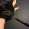
Resting a Fountain Pen at the Correct Angle
Easigraf posted a topic in Fountain & Dip Pens - First Stop
Fountain pen beginner here! I just wanted to get the assurance of more advanced fountain pen users to affirm whether this is a good angle to rest my fountain pen at (I believe it is around the 40 degree range).
-

If you like good handwriting don't look at this. A requested handwriting sample.
Ink Stained Wretch posted a topic in Handwriting & Handwriting Improvement
"This is a requested writing sample. I'm using a Shaeffer fountain pen that Amber Lea Davis gave me. She asked that I inflict, er, I mean show off my penmanship to all of you with this fountain pen. "The ink is all old school Shaeffer. It's a mixture of Shaeffer Jet Black from a cartridge that was totally dried out and some Shaeffer Red ink from a bottle. I poked a hole in the cartridge and let flow the distilled water. After I'd written about half of the 1½ mL cartridge out I added some Canadian Sheaffer Red ink. I did not measure any of the components so I couldn't reproduce this ink, but I like it. It's sort of reminiscent of Noodler's Red/Black ink. "Well, I hope that my handwriting hasn't put any of you off your food. I'll type up a copy of this deathless prosody in case anyone wants to actually read it. "Ink Stained Wretch" Here are two views of the pen that I wrote the above with. It may be a Shaeffer Prelude. We're not sure. And I want to add a big thanks to Amber Lea Davis for giving me this fountain pen. .
-
desaturated.thumb.gif.5cb70ef1e977aa313d11eea3616aba7d.gif)
Objectively, How Thin Or Thick A Line Do You Require Your Nibs To Produce?
A Smug Dill posted a topic in Of Nibs & Tines
Given the absence of authoritative and/or industry standards for nib width grade (Fine, Medium, Broad, etc.) definitions, as well as agreement and common understanding among fountain pen users at large globally, perhaps a better way to look at which nib an individual user and/or buyer 'needs' is to examine the minimum and/or maximum line width(s) in terms of objective measurements, such that it would be fit for a particular purpose (or acceptable as 'general purpose') to him/her. For me personally, I've often stated that my test for a pen and nib's fitness for purpose (as a 'general purpose' writer used in everyday applications) is whether I can write in traditional Chinese legibly within a 5mm grid, which is the most common spacing for line-grid and dot-grid journals and notepads on the market. But what does that actually mean, especially if I have to explain it to someone who is not familiar with the appearance and structure of the most common two or three thousand traditional Chinese characters? I most commonly use the Chinese (as opposed to, say, Sanskrit) text of the Heart Sutra when I do writing samples, just as I typically use the text of the papal bull Inter Gravissimas for writing samples that use Latin-based characters. Let's look at the first character in the Heart Sutra: 觀. 觀 is a fairly commonly used character in Chinese outside of Buddhist sutras and texts; it appears in the Chinese words for objective and its opposite subjective, views, opinion, optimism, appearance, observe, sightseeing, Taoist shrine, and so on. Furthermore, the left half of that character is a component of quite a number of other common Chinese characters such as 歡, 灌 and 鑵. In order for me to write 觀 (and any other Chinese character that contains the left half of it) legibly, I must be able to draw in sixteen parallel, (nearly) horizontal partitions inside the em-space, either deliberately putting ink in a partition or deliberately avoiding putting ink in one. A loose equivalent to that would be being able to draw within the height of the em-space eight distinct, parallel, horizontal lines that are cleanly separated. I also need to factor in enough spacing between two consecutive lines of writing to provide clear delineation, so let's make that nine horizontal lines (and eight 'white' lines of empty space separating them, preferably followed by a ninth as well). Let's assume for now that the whitespace between two parallel lines of ink ought to be at least as wide as the lines themselves, in order to make their separation visually distinct. Therefore, each horizontal line of ink should nominally be no wider than one-seventeenth to one-eighteenth of the grid size being used. Using 5mm grid paper, that works out to approximately 0.28mm. The line width requirement for parallel vertical lines inside the em-space is less stringent; seven to eight lines will generally suffice. (It always makes me wonder why some people think architect nibs, which produce wider horizontal strokes than vertical strokes, are suited to Chinese and/or Japanese writing.) Any pen – in combination with the specific ink and paper used, as well as limited by my own handwriting technique and hand-eye coordination – with which I cannot draw nine distinct parallel lines within the em-space is not fit for the purpose of 'everyday' writing for me. So that's the rule-of-thumb test I tend to use now, including when testing inks to see whether they're acceptable for use with certain pens I have. Also keep in mind that 觀 is hardly one of the most complex or stroke-dense traditional Chinese characters. (It's not even as complex as one of the characters in my given name, which thankfully I don't have to write very often these days.) However, using a character such as 齉 at every turn as the standard for testing could be a little unreasonable; we don't talk or write about nasal blockage every day. Interestingly, even though Japanese fountain pen manufacturers often use inscriptions of F, M, B, etc. on the nibs to denote their width grades, in Japanese the grades are actually denoted 細字 (small characters/ideograms/symbols/glyphs), 中字 (medium-sized characters), 太字 (large characters), etc. correspondingly. In other words, the user nominally selects a nib based on how large his/her handwriting is for a given purpose, and not how wide the nib tipping is or how wide a line it is apt to produce on the page. I'd be happy to agree that, by most people's standards, writing Chinese hanzi or Japanese kanji in a 5mm grid, especially without whole lines of whitespace of that height in between lines of writing to aid legibility, is very small handwriting – 極細字 – which 'translates' to Extra Fine in terms of nib width grade (although I'm often able to do it with Japanese nibs that are classed as F nibs). -
I am interested in why people don’t change their handwriting to accompany their nib size.
collectorofmanythings posted a topic in Fountain & Dip Pens - First Stop
So I just have a little question.. Why don’t people just change the size of their handwriting to accommodate the nib size? I hear so many people say some things like, ”I would love this pen, but it has a medium nib and it makes my handwriting look blobby.” Or, “I just dislike extra-fine nibs so much, they put down too fine a line for my handwriting.” And when I hear this I just wonder, “Well why don’t you write a little bit bigger or smaller?” I am not talking about people complaining about extra-fine nibs being too toothy or broad nibs being too smooth, but the specific things about people’s upset on how it makes their handwriting look blobby or shaky or whatever else. It just seems like people have their handwriting size set in stone, when I know my handwriting personally gets larger or smaller depending on whether I am using a broad or fine nib. Thank you all for your responses, William -
What is the relation between "script" and "cursive"? A long, long time ago, I learned how to write in script. That must have been the in first few grades in Elementary School. 65 or so years later, I still write in script. I see a lot of discussion in the fountain pen enthusiasts community about "cursive" writing and see very little discussion about "script." Are they the same? I've read somewhere that in cursive writing, you don't lift the pen between letters. Is that the only difference? As many members of the board do, I'd like to improve my handwriting. However, I'm not yet ready to take on an entirely different way of writing, such as Spencer.. One step that might help is using lined or dot-grid paper instead of blank paper. Can you recommend a book for re-learning the basics of script?
-

cursive Of possible interest: book READ CURSIVE FAST now on Amazon
KateGladstone posted a topic in Handwriting & Handwriting Improvement
These days, more and more of us know someone who is utterly baffled by cursive handwriting. They will someday need to read something that is in cursive — but they are very unlikely to go to the trouble of learning to write cursive just for the sake of reading it. Even people who have been taught cursive as children often forget it, and find it a baffling mystery by the time they grow up. There are college entrants who’d “had” cursive in school at age 8, who can no longer read it by age 18. (Literally, as adults they cannot read their own childhood schoolwork.) What to do? Perhaps buy them a copy of READ CURSIVE FAST (reviewed in the Spring 2021 PENNANT) … Amazon link: https://www.amazon.com/dp/1735935808/ref=olp_aod_redir_impl1?_encoding=UTF8&aod=1&qid=1619952667&sr=8-1 Sample pages: http://readcursivefast.com/wp-content/uploads/2021/02/RCF_Preview-1.pdf To purchase direct from publisher: https://nationalautismresources.com/read-cursive-fast/ The book’s web-site: ReadCursiveFast.com To purchase direct from me: Readcursivefast.Com/order and https://read-cursive-fast.myshopify.com/ (The info there mentions “pre-order,” but that word will be changed to “order” this week.) If you’re buying from me and want an autographed copy, send your request to me at Kate@ReadCursiveFast.com (my e-mail for book-related business) and put the word “autograph” somewhere in the message, so I can see it when I fulfill direct orders. http://static.ideasunplugged.com/signature/s_036/t_r3LLkJ.jpg?v=69 Yours for better letters, Kate Gladstone author of READ CURSIVE FAST ReadCursiveFast.com CEO, Handwriting Repair/Handwriting That Works DIRECTOR, World Handwriting Contest 165 NORTH ALLEN STREET ―First Floor Albany, NY 12206-1706 USA landline 518-482-6763 mobile 518-928-8101 Handwriting CAN make sense. ________________________________________________________________________________________ IMG_6207.mp4 -
Hello I’ve been using dip pens for handwriting for a very long time now, but I’ve either used whatever nibs the pens came with, if antique, or just picked from whatever nibs came with it if it was a modern calligraphy pen set. I need to get a new one, and I’m trying to think a bit more systematically about nib selection. I handwrite a lot (I hate typing) but my handwriting is rather poor and scribbly, which is one reason I’ve used dip pens for so long - because they force me to slow down a bit and take greater care. I’m certainly no calligrapher. Does anyone have any recommendations for the best nib type for general-purpose handwriting with a dip pen? I need something with a reasonable flow rate and not prone to spatter when writing quickly. Thanks - suggestions much appreciated
-
 Aloha Everyone. This is my first writing sample. Does anyone know what style it is? How can I improve? What style or method should I practice to improve it? Thank you, jim
 -

Reviews Of Books About Pen Writing And Pen Related Topics?
linearM posted a topic in Fountain & Dip Pens - First Stop
I hope this is the appropriate forum for this posting. There do not seem to be reviews of books not directly related to pen and pen history but about other pen related topics. So I thought I’d start one and see if anyone else has books that they would recommend. If anyone has books related to correspondence, pen art, handwriting etc. perhaps you could add them. The book I will start with is More than Words: Illustrated Letters from the Smithsonian’s Archives of American Art by Liza Kirwin. Illustrations in the letters were often done with the same pen, dip end in the 1800’s and fountain pens in the later letters. Frida Kahlo apologizes for a letter written in pencil, she can’t find fountain pen and ink. If you ever wondered what Winslow Homer’s, Andy Warhol’s, Dale Chihuly’s, or Marcel Duchamp’s handwriting looked like this book shows examples. Each letter represented shows how the artist integrated their correspondence with a drawing or sketch. Are there any other books out there that somebody would like to recommend? -

Help Me Assemble Evidence That Handwritten Letters Are Safe Enough.
jonathan7007 posted a topic in The Write Stuff
All: I like sending handwritten communications. Postcards, letters. I'd like to continue doing so. Please contribute any links or resources you know that will support the safety of handwritten personal letters and cards. Here's the one I have (New York Times, March 24, 2020) https://www.nytimes.com/2020/03/24/health/coronavirus-mail-packages.html?searchResultPosition=1 I'd like to have good evidence for anyone that asks me why I'm still sending thank you cards, thoughts, etc. through snail mail. I hope that our shared joy in the handwritten world will uncover some good science or philosophy to support our continued sharing on paper. I know that there is at least one thread here about the packages that come from China or senders in other "hot spots". My question seems a different concern so I started a new thread. If mods or users want to shift this elsewhere on the site, I'd be happy to do that. Sincerely, jonathan7007 -

"steadying" Effect Of Italic Nibs On Cursive Writing?
Cursive Child posted a topic in Handwriting & Handwriting Improvement
Posted this on some older topics, but no responses. I don't have great handwriting, and write cursive. Have been writing with round, smooth, wet nibs mostly. When I started using a (0.6 mm JoWo #6) stub on a weighty (Nemosine Fission) pen, noticed my handwriting is much better. In particular, the slant of my lettering is more consistent. I will try a controlled experiment with the same pen and round nib, but my thesis is that the stub is forcing my hand to write at a more consistent angle. Others have expressed writing better with stubs too, perhaps for the same reason. Does the reasoning follow your experiences, or some other reason I am missing? Certainly, some feedback, as I get with other or finer pens helps to improve the waywardness of my letters, but this stub is very smooth and wet. I am thinking of getting my new Pelikan M805 Fine ground to Cursive Italic - will it give me the same type of benefit? -
http://i1128.photobucket.com/albums/m496/gclef1114/Tutuguans/0212151616a-1.jpg
-
 I'm wondering if I should buy a 0.2mm or 0.3mm (or even 0.5mm) Mechanical Pencil for practicing Spencerian Script... It is suggested in several places that when practicing Spencerian Script I should use a writing utensil that produces as thin a line as possible. However, I'm wondering if 0.2mm or even 0.3mm lines are simply too thin? By the way, if anyone was wondering, this is the pencil I'm going to purchase: https://www.amazon.com/Pentel-Mechanical-Pencil-ORENZ-PP3003/dp/B06VWNYHY3?th=1 The reason I'm using a pencil and not a pen is because I want to use super cheap paper and I don't want to get any feathering, bleed-through, etc. What do you guys think?
 -
http://i1128.photobucket.com/albums/m496/gclef1114/Tutuguans/HenrySweadnerpropertysale.jpg http://i1128.photobucket.com/albums/m496/gclef1114/Tutuguans/PETERSUMANWARRANTOFEXECUTION.jpg
-
Hello everyone here at FPN, this is my first publication this year and I take this opportunity to show you my most recent acquisition. I made this purchase on eBay at a good price and it is a very interesting vintage flexible fountain pen: Measures length: 5 inchesBrand: UnknownPen material: EboniteClip material: SteelOverlay material: I don't knowFilling system: EyedropperInk capacity: 3mlNib: 14K Warranted # 8 flexFlow: Wet It is a fairly light and comfortable pen to use and is quite fun to use and enjoy its flexible nib and its fed is quite generous, but it requires me somewhat decent paper since the feed is wet. Next I will show you the photos of the fountain pen and some writing samples using flex and another without flex.
-
I bought my first fountain pen about a month ago and decided I wanted to improve (in other words relearn) my cursive. I have been enjoying the posts in the handwriting thread and doing a lot of practicing. Here is my improvement in just a few weeks and hopefully Ill keep updating until its perfect! Im currently using Spencerian as a stylistic jumping off point.
-

Old Fashioned D As Found In Old Log Books
Starwalkertexasranger posted a topic in Handwriting & Handwriting Improvement
Hi all, Was looking at some ships' log books on the interwebs and came across the ones depicted below. I noticed that both of them have a particular lower case d, which arches up and over the previous letters. I quite like the effect it gives and was wondering whether it's a feature of a specific font, or frankly any other detail about this style of writing you guys might have. Many thanks in advance! http://www.liverpoolmuseums.org.uk/maritime/archive/highlights/images/unity-log.jpg -

What Happens To Kids' Brains When They Don't Learn Handwriting?
Jordan N posted a topic in Handwriting & Handwriting Improvement
New research is starting to show us the real purpose of handwriting—and it has to do with the way our brains process tasks.An inteview with Hetty Roessingh, Professor at the Werklund School of Education, University of Calgary (Podcast): https://thebigstorypodcast.ca/2019/09/04/what-happens-when-we-stop-learning-how-to-write/ -
Arthritis Hands. Etiquette Of Switching To Print As Needed?
kealani posted a topic in Handwriting & Handwriting Improvement
I occasionally have arthritis flare ups in my hands and fingers. With that, my normally "Business Palmer" cursive turns illegible. However, my printing is very legible and nicely spaced, but much slower than my cursive. It is enjoyable to me to write cursive and to slowly improve . . . .but. . . . I am wondering if it is within good etiquette to switch to print on some letter corresponding for this reason? Then, there might also be the fun challenge to improve my printing style as well which I've never done. Thoughts? Thanks you for you help and thoughts, jim ps: Some people have writing that looks more like printing or printing with flourishes than script and it can look great as well. But I have not tried that for corresponding. -
My Handwriting Journey (An Epiphany!)
jhylkema posted a topic in Handwriting & Handwriting Improvement
For those of just tuning in, I've been into pens for about exactly a year now. I got started when I found out I could go back to school (for freesies!) and figured some nice pens and stationery would make the job of note-taking in class easier, and I wasn't wrong. Anyway, I first started learning to write cursive in grade three in Catholic school and I was awful at it. Absolutely awful. If I had a dollar for every time I'd been literally screamed at about my handwriting by my mother and my teachers, I would have not have to be going back to school today. In fact, I was told I would never amount to anything, and would certainly never be able to get a job in IT, because I had trouble with handwriting, long division, and memorising multiplication tables. (Incidentally, these fights, after which my mother and I wouldn't speak to each other for several days, are a big reason why I initially broke off all contact with that part of my family in the late 1990s, and did so permanently in 2003. I mention this because I'm guessing a lot of other people have had similar experiences, but I digress). Around grade 10, I finally gave up, ditched cursive, and just wrote in block print and have done so to this day. My block printing is nice and readable, except for two things: One, I can't write more than a few lines before my hand cramps up. Two, once that happens, and especially if I'm trying to write fast, my handwriting degenerates to an illegible scrawl. About a month ago, though, I picked up Michael Sull's book on American cursive handwriting. I started doing the drills and very quickly realised the problem: Writing with just fingers is hard. Nobody can do it for more than a short time without hand cramps. However, writing with the help of the wrist, forearm, and shoulder muscles is much easier. Ay, there's the rub. So, here I am re-learning how to write. I'm still very new so I won't be posting my cursive handwriting anytime soon, doubly so since I've developed so many bad habits around writing using only my fingers that will likely take a great deal of blood, sweat, and tears to break. Once I get comfortable enough with cursive to start using it as my daily handwriting again, I want to graduate to some ornamental penmanship and maybe even calligraphy. Does this struggle sound familiar to anyone? And why in the eff don't they teach arm muscle use in school?!? -
Hi fountain pen frends. My name is Martin and I began my fountain pen journey in elementary school, then i lost the connection with fountain pen for many many years. But in 2013 I found accidentally FPN website, and the "sparkle" come back to me I started to write with different fountain pens at least for 4 hours a day. I read a lot of interesting post here, seen many videos on youtube ... I simply love writing with fountain pen, so I decited to make a foutain pen, that will be very special for me. Well, I went to 9 CNC "gurus" and they say that they dont have time for things like this. I was prepare to pay them ofcorse, but their time was much more precious. Then I went to a factory, where they make fountain pens for other brands. They were wery polite and give me some good inforamation, but they say, that the mould for FP is +xxxxeuros and the MOQ is at least 20.000 pieces. At that time, I thougt, that my dreams of having my own fountain pen will never gonna happen. But I did'nt sleep. I write to mr. Bock, who send me test nibs and ink feed sistems with housing. That was my extra motivation. And I reply to him, that when I will have my own brand, I will use only his nibs, and triple sistems. In that time was 3D printing something new, I found an "architect" in London, who make me 3D file from my scatches. And then I ordered my first 3D pen. It came in very bad condition. After approx. 14 updates, I finnaly recive a working prototipe. I was so proud, that I say to myself, that I will make a fountain pen brand. I think is time to say, that I am not special FP master, or guru, and I have a loooot more to learn about fountain pens, but my love or addiction to fountain pen is much stronger than that. So i decited, to give my project on Kickstarter, witch ends on 28th of febraury. (well I don't know if I can post link here, so that admin don't say I am advertisting for free) If you are interested, I will be happy to send you KS link for my Storyteller fountain pens in message. I will apriciate any comment, good or bad. Bad even more, becose, I will have extra reason, to make it evan better. In case, that KS project will be not successful, that will not stop me. In any way, I will make my own brand of fountain pens. I know, that I just did a small step, but I did it. And that is what matters to me. I invested a lot of my time, money and nerves, but if I have had another chance I would do it all the same. I think I learned in this process much more than just tehnical aspect, this experience make my life better in a special way Well, that is my short story If you were wondering, where is the sunny side of Alps, That is small country sLOVEnija. (neighbor of Italy, Austria, Croatia, nad Hungary) P. S. I must ask you - did you ever thought of having your own brand of fountain pen? P.P.S. (Sorry for my "broken" english)
-
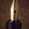
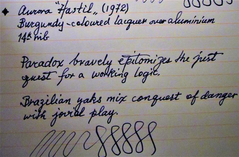
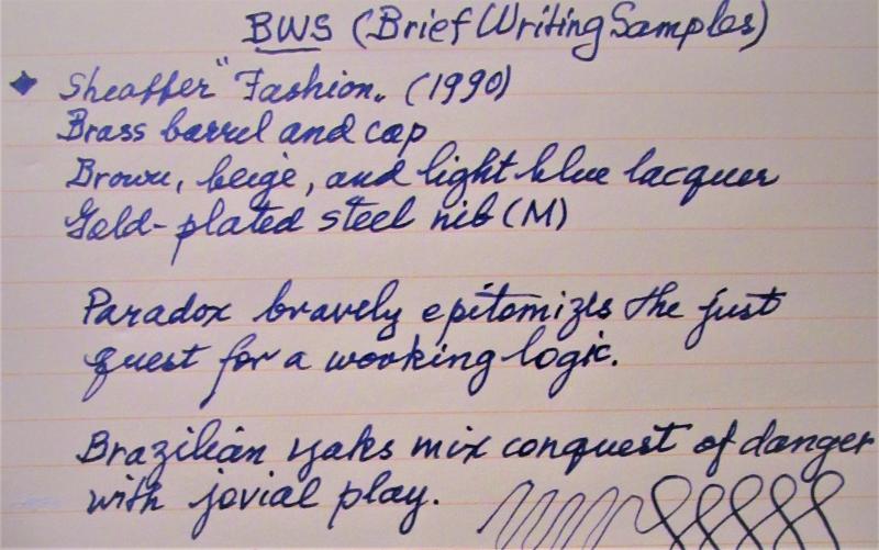
To celebrate the act of writing, here are photo reviews of two 'slim' pens (under 10 mm around at the grip). Notice that, with slip-on caps, 'threads' at the grip are not an issue, so the pens are equally smooth to hold. Also, though the pens may vary in size and shape, they are all about the same in girth, so the feeling of control as one grips the pen is about the same. Performance in this case it seems to me is in the nib itself. Both pens are aging beauties but are still manufactured (the Hastil) or available (the Fashion). The pangrams used are courtesy of Wits 'n Wisecracks: 251 Pangrams for Everyday Use by Millard Port, via Amazon Books. Enjoy this holiday excursion into thinness.
-
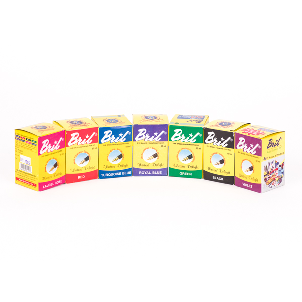
Fountain pen lovers, Bril, India's leading fountain pen ink brand will ship internationally in 2019 and we have just started a Global Handwriting Movement to make children write properly again. Our crowdfunding campaign has awesome perks whether you are an adult who loves world-class, pocket-friendly ink and fountain pens or you want your kids to learn to write the proper way. Do visit our Indiegogo campaign and support us, so we can ensure that the dying art of handwriting is brought back to life again, and our children's lives are enhanced in more ways than one! Thank You! :-) https://www.indiegogo.com/projects/bril-ink-make-children-write-again#/