Search the Community
Showing results for tags 'fosfor'.
Found 15 results
-
I placed this order with Manoj of Fosfor Pens in August, 2018, and elected to have the order fast tracked. The pen was delivered at the end of October, 2019. There may be longer queues for some custom makers, but this one was no picnic! It was, however, well worth the wait. The pen is lovely. Appearance and Design I opted for the King of Pen in Conway Stewart Dartmoor with sterling silver furniture and it is nothing short of stunning. The acrylic has a subtle chatoyance that is eye catching without appearing, to me, ostentatious. The sterling silver fittings are again, a nice subtle touch that compliment the material. As a clone, the design is faultless. It gets no marks for originality, but the execution is admirable. Overall, I'd rate this a solid 9. Construction and Quality The first thing I noticed when I carefully inspected the fit and finish of the pen was the threads: the pen uncapped in two and a half turns, but did so exquisitely smoothly. The threads are also very smooth, so if you grip does drift up the section, they are quite comfortable on your fingers. Manoj is an excellent craftsman, I'm going an 8 here. Weight and Dimensions If you order a King of Pen, you are in for a large pen and this thing is at the outer limits of that descriptor: it is huge. The next largest pen I have owned or used in the Opus 88 Koloro Demonstrator, and this is a bigger pen. It makes the Lamy 2000 look slight. It is not, however, unwieldy; the lightness of the material and the shape combine to make it very comfortable in the hand. It is satisfying substantial, without feeling like a truncheon. Its full dimensions are: 150mm long capped and nearly 17mm at its widest point on the cap. As I wanted a larger pen, I'm going with 10 in this category. Nib and Performance The nib is a Pelikan M1000 fine nib. So it writes like a wet double broad. That's Pelikan for you. No rating as Manoj can't be held responsible for my nib choice… Filling System and Maintenance It's a vacuum filler, which is one of my favourite filling systems. The vacuum, however, does leave a little to be desired. The barrel capacity is enormous on a pen this size, but the vacuum is only sufficient to fill a third of it. It is one of the few times when not sucking enough is a source of disappointment (I am sure you can think of the others). As the nib unit is easily removed, it is straightforward enough to just tip a small bottle of ink directly into the barrel, so it is not a crushing disappointment, But it would have been nice to have some of that Sheaffer grade suction at work. Maintenance wise, it is a dream. Manoj included full instructions and a diagram of how to completely disassemble the pen. So, that's a big plus. Overall, in this section, I think a 6 is fair. Cost and Value Ridiculous. The real cost is the time you are in the queue. The value is fantastic. 9. Conclusion I'm thrilled with this pen. There are a couple of things about it that could be better, but at the price I don't feel that I can complain. Manoj is an excellent communicator and made several adaptations that demonstrated to me the level of his skill and commitment to making a quality writing instrument. So, total score is 42/50 - which feels about right for this pen.

-
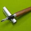
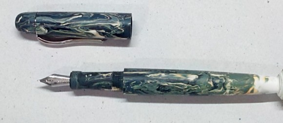
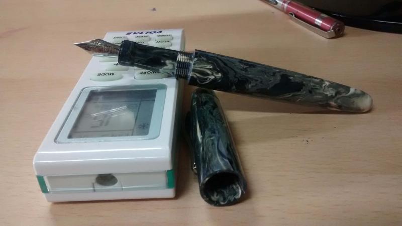
For the past several months, I have been working on a capless safety pen concept. The basic workings of a safety pen are quite simple. But I wanted a workable solution for the capless part of the pen. After months of tinkering, here is the first prototype: The pen uses standard size 5 nib units and standard converter. Nib mechanism is actuated by the end knob. The clip is solid sterling silver cast. Looking forward to comments and feedback.
-
Hi, I posted this review on my blog. https://inkpensblog.wordpress.com/2016/10/03/fosfor-tikona-in-blue-green-acrylic/ Fosfor pens is a reputed custom pen maker in India. Manoj Deshmukh (Mr. fosfor) has built up a reputation as a master craftsman and high quality pen maker. I had put my name in his order book for an Islander and a Tikona in March. After waiting for six months to get to the top of the waiting list, the pens (I added one more pen to the bunch in between) arrived at my desk recently. My unboxing pictures are here Among them was the beautiful and uniquely shaped Fosfor Tikona in Dark Blue-Green Acrylic which Mr. Manoj himself cast. I chose to order the Tikona due to its unique shape. The name "Tikona" means triangle and it is a triangular pen. Similar to Visconti's circled square or squared circle pens, it is a circled triangle kind of pen. The shape is the main thing that drew me to it and of course, Fosfor's reputation in FPN as well. The ordering process was very smooth. I filled up the enquiry form in Fosfor's website and Mr. Manoj responded the very next day. After a couple of emails and a phone call later, I put in a request for a Tikona in dark blue translucent acrylic. The material was created by artist himself as I mentioned earlier. So, he had the complete freedom to tune the colour. The first cast turned out to be too dark and the pen was opaque. So, a different colour combination was tried and I loved the colour and subtle translucency. I loved the frequent updates on twitter and email during the progress of the making. It is a rather girthy pen. The barrel was thicker than I expected. The section of the pen is of normal diameter and the barrel has thickness of about 18mm. The cap threads on to the end of nib section and there is a significant step from the barrel to the section. The polyester cast seems to be really dense as the pen is a bit heavy for an acrylic pen. I needed some help to carry the pen as shown below :-) Even though, I was a bit taken aback by the unexpected girth, I fell in love with it as I wrote a few pages with it. It was very comfortable to write with. Moreover, the pens looked awesome. The material was semi translucent exactly as I wanted it to be. It is not transparent enough to see the converter inside. But, I can see the different shades of the colour on the thicker and thinner parts of the pen. This was what I wanted and I loved it. But, I need to mention some problems as well. The barrel and section have some pits and dark dots/spots. I assume that they are there because of the casting process rather than the turning process as the other Fosfor pens were actually flawless. But, that is the charm of a custom pen from a custom cast acrylic. It came with a standard international cartridge and a silver colour #6 fine Schmidt nib. It had a silver coloured clip to match the nib. I went with the clip thinking that I would carry the pen in my pocket. But, this will live and travel in my pen case due to its size and weight. So, I should have gone with a clipless option in retrospect. The triangular shape would have prevented rolling anyway. Now, comes to the writing experience. The nib wrote very smoothly and the ink flow was very nice. It was one of the smoothest Schmidt nibs that I have used (actually, the Islander's nib was smoother. But, it was a medium nib) . I suspect that Mr. Manoj has done some tuning. It had good ink flow. The ink that I chose for this pen was Noodler's 54th Massachusetts which is a wet ink in my experience ( I had to stop using it in my Pilot VP due to heavy flow). This ink matched the colour of the pen very well as it is blue-green or dark teal when written with a fine nib. (It is almost black with broader nibs) The pen is back heavy due to the heavy barrel. But, I did not feel any fatigue or discomfort when writing down this review. It was almost five A4 pages. I was worried a bit about the deep step on the barrel. One of the corner's of the triangle rested against the webbing between the thumb and the index finger and my normal hold was well below the step. The step touched my thumb sometimes when I tried to hold it higher for faster writing, but it did not bother me. The threads on the section were also very smooth and did not cause any problem. One more peculiarity that I should mention is that the alignment of the corners on the barrel and pen. It requires some tweaking to get the correct alignment after re-inking. As the cap threads are on the section, the section has to positioned/tightened correctly to the barrel so as to keep the cap aligned to the section when it is closed tightly. There is an O' ring between the section and the barrel so that there is some leeway when tightening the section. It takes two or three attempts to adjust the section and correctly align the cap and barrel. The O' ring will help to keep the seal if it needs to be converted to an eyedropper fill pen. In total, it is a wonderful pen. I loved it. I expect it to be an attention grabber due its shape, colour and size. I will be using it very regularly, even though I will not be carrying it around in my pocket, as the nib is very smooth and the pen is very comfortable to hold. I am happy with the finish of the pen and surely will be going back to Fosfor for future purchases. It was actually an awesome experience and privilege to work with a master craftsman on creating this pen or should I say work of art. thanks, Dinuraj
-

Package From Fosfor Pens Arrived - Picture Heavy
dinuraj posted a topic in Fountain & Dip Pens - First Stop
Fosfor pens is a reputed custom pen maker in India. Manoj Deshmukh (Mr. fosfor) has built up a reputation as a master craftsman and high quality pen maker. I had put my name in his order book for a few pens some time back inspired by fellow FPNersPrithwijit's and Vaibhav's commissions from Fosfor. The package arrived today by courier. I am posting some pictures of the unboxing. Will post detailed reviews later (at least that is the plan) The package Opened package Fosfor wooden presentation box and telescopic boxes Fosfor Rajendran in Woodgrain Ebonite. Polished to a mirrorlike finish With No.6 size medium Schmidt nib Islander in Lava Explosion Acrylic The depth in the material is awesome Again with a silver colored no.6 medium schmidt nib I liked the bluer section. The blue-green Tikona. This pen is larger than I expected. Heavier also. Now, all three brothers coming together in a huddle From a lower angle. The total experience was very pleasant and I will be ordering more from Fosfor in the future. I planning to photograph the pens with better equipment and in better setting later. Will talk about the writing experience as well when posting those pictures. thanks, Dinuraj -
I've been a fan of Indian fountain pens for a few years now. My first was a beautiful ebonite Ranga, followed by a few fine pens from ASA. It must have been through visits to FPN that I first learned about Fosfor. I admired from afar the pieces that Manoj created and customized, including his most well known design, the Islander, done in beautiful acrylic he'd cast himself, and other pens made with blanks from the now defunct Conway Stewart's inventory or from exotic woods that he was able to procure. The pen that I began to shape in my mind was the Tikona. I'd never owned a pen that had a triangular body, and inspired by the Nakaya pens, I wanted a clipless version, to take full benefit of the pen's natural no-roll shape. Also thinking along the lines of Nakaya, I'm a fan of the urushi look but I also did not feel the urge to spend a grand amount of money on a single pen. Something with a nod towards the color and transparency of urushi would have to do. The nib would also be an important consideration for me. I like the usual German Bock and Schmidt nibs found on many of the higher-tier fountain pens from India, but I wanted another level of quality. As a fan of Pelikan nibs, I wanted to be able to use an M400 14K nib on a Fosfor pen. I reached out to Manoj, not quite sure if he'd be able to accommodate. To my delight, he had Pelikan M400 and M600 nib units on hand and would be able to use them to customize a Tikona for me. He suggested that his "root beer" resin would be the closest to the reddish urushi look that I coveted (we both understood that no acrylic resin pen would come quite close to emulating the intricate handbrushed layers found on Nakaya urushi pens). Satisfied, I asked him to move forward with the pen, splurging a little with a fast-tracked order so that I wouldn't have to wait behind 18 others. Less than a month later, a pen arrived to me. I held off on a review for another four weeks, so that I can get to truly know the pen before I give my thoughts. Material and ConstructionI love the feel of the polycast resin that Manoj used to make this pen. It's sturdy but not too heavy. Twice already, I accidentally dropped the pen from a few feet in height, and fortunately it remained firmly intact. The surface is smooth, albeit without some imperfections, a few nicks here and there, I believe from the hand-turning process, but barely noticeable. Being a fan of wabi-sabi, I actually kind of like it that it's not a hundred percent smooth. Most of all, the color is gorgeous, dark reddish brown, almost black in most parts, but with subtle lighter colors, too. Especially in the thinner part of the cap, light passes through, giving the pen a wonderful variation to the dark reddish brown. Design and Shape The pen certainly invites looks. Sitting down at cafes, I've noticed people nearby glancing over, curious what this triangular obelisk on my table might be. My pen kimono complements it nicely. Again, I love the triangular shape of the Tikona, and am very glad to have asked Manoj for a clipless version. It doesn't roll when I put it on my desk, and the cap, with some care and mindfulness, can also function as a temporary pen rest. Much like many other pens, including Nakayas that I admire, there is a step, and depending on how you write, you may or may not brush your thumb against the edge of the barrel. If you do hold your pens in a way that may cause this to affect you, talk to Manoj to see if he can change the shape of the pen to better suit your grip. I do sometimes feel the edge, which can feel a little sharp, against my thumb but not so much that it prevents me from writing for a long time with this pen. Another caveat, owing to the triangular shape of the pen, is that there is some trickiness every time you unscrew the section from the barrel. Chances are, you'll have to spend some time giving the barrel a little turn back and forth until the section allows for the cap to properly align with the barrel. It used to take me a few minutes, but having had it for nearly a month, I'm pretty adept at knowing the right positions of the barrel, cap and nib unit (the last only takes one initial adjustment, with slight turns). A proper alignment now takes me no time to achieve, ten or fifteen seconds, tops. Filling Method It appears that my pen had been made to be an eyedropper, but because I'm leery of the spills and leaks that can come from air bubbles, I decided to investigate other options. A converter would not fit, but a more pliable pre-punctured international mini cartridge could be easily squeeze into the section. It sometimes needs a few shakes, but on the whole, the flow has been mostly constant for me, with few hard starts. I usually have a few pre-filled cartridges at the ready, each sealed with a dot from the hot glue gun. NibWhat can I say? I'm truly delighted Manoj was able to customize the section to take Pelikan 200-600 nibs, The vintage M400 14K nib I put in is a pleasure to write with, every time. Smooth, with subtle line variation from the springy nib. I was more than impressed by his lack of hesitation in completing my request. Overall Thoughts Manoj is a rising star in the Indian custom fountain pen scene, and I could easily see why with my Tikona. His craftsmanship is superior, with stunning precision for pens that are handmade. He's truly an artistic problem-solver who'll work with his customers to bring a concept to completion. From the start of the process, he replied promptly and thoroughly to my questions (usually within a day or two), and even sent me preview photos of my pen before he shipped it. I lucked on being able to procure a second Fosfor custom pen, right here in the U.S. It's also a lovely pen, and it affirmed to me that I hadn't simply lucked out with my one Tikona order. I don't believe it will be my final Fosfor acquisition.
-
Review Of Fosfor Rajendran (Aka Desi Kop) With Jowo #8 Gold Nib
Prithwijit posted a topic in Fountain Pen Reviews
Introduction During the early phases of my renewed fascination for all things fountain pens there was one model that reigned supreme amongst my list for grail pens and that was the Sailor King of Pens. Everything about it seemed to be just about perfect – the torpedo shape, the ebonite material and the large sized fabulous Sailor nibs. It was just a matter of time before I got one for myself. Two sailor pens and their less than perfect nibs later, my enthusiasm for the KOP started to wane a bit. I had realized that the tip shape and design of the stock sailor nibs (Naginata Togi or Nagahara special nibs excepted) was something that just didn’t suit my grip. The relatively small sweet spot meant that I quickly ended up in the scratchy zone and calling it feedback wasn’t about to change my opinion. I had also realised that the KOP actually wasn’t a full ebonite what with its plastic feed, plastic section and the section-barrel joint made of metal. When fellow FPNer Sudhir allowed me to write with his stock Broad nibbed Sailor KOP, I seized the opportunity to assess my purchase decision. I decided that while I may still go for a special nib KOP later, right now I would not enjoy a KOP with any stock nib. While that decision was made, I was not about to give up so easily on getting my grail pen even if that meant getting one made to my specs and sourcing everything myself. With unwavering focus, I started procuring everything to get the pen of my dreams – I scoured for the best possible ebonite material available for pen-making and zeroed down on some vintage Italian mottled reddish-brown ebonite from a source in the Europe. For some time I toyed with the idea of going with SEM Cumberland or Eboya, but this one just seemed better.I decided to go with a Jowo #8 nib in western medium with a hand cut ebonite feed from WIN. Rather than going for the stock motifs, I decided to source an absolute plain one so that I can have my own design engraved on it.I wanted a roller clip like on my Omas or Delta rather than the stock KOP clip design. Luckily my pen-maker arranged for gold plated roller clips.In order to make the pen I approached Mr. Manoj Deshmukh of Fosforpens. He had made a few pens for me before and was willing to take up the challenge. I decided to call the pen Rajendran which means King in Sanskrit as a homage to original KOP which inspired it. Design The KOP design is a classic and all of you are well aware of it. So instead of wasting any time typing about it, I will let the pictures do the talking. http://i1097.photobucket.com/albums/g346/prithwijitchakiPrithwijit/Fountain%20Pen%20Reviews/Fosfor%20Rajendran%20Review/IMGP2148_zpsv4kcczjn.jpg http://i1097.photobucket.com/albums/g346/prithwijitchakiPrithwijit/Fountain%20Pen%20Reviews/Fosfor%20Rajendran%20Review/IMGP2142_zpsem9s8tav.jpg Size and Balance At 155mm capped, the KOP/Rajendran is the leader of the oversized pens club. But the ebonite build and absence of metal anywhere other than in the nib and the clip means that the pen is delightfully light. It is nicely balanced and is very comfortable to write for extended periods. Writing with the pen makes you completely forget it’s considerable length and the customized section design adds considerably to the comfort quotient. I don’t write with the cap posted, but it can be done if so desired. But posting such a large pen does result in a slight rearward weight bias. Nib I had looked around for a nib that would be similar in size and stature to the large Sailor nibs used in KOP and finally decided on a #8 sized Jowo nib made of 18K gold material with medium tip. The complete nib unit is sold by WIN through their distributors (Fpnibs and Asapens) and comes with a nicely finned ebonite feed. Unlike most nibs which comes with pre-embossed or engraved motifs, I actively scouted around for a nib that would be absolutely plain with no design. This allowed me to engrave on the nib a small monogram of my own. The design is one that I made myself and it is essentially my initials enclosed inside a tiny shield akin to the coat of arms of yore. http://i1097.photobucket.com/albums/g346/prithwijitchakiPrithwijit/Fountain%20Pen%20Reviews/Fosfor%20Rajendran%20Review/PC20Logo200120JPG_zpsbayvjecq.jpg Image: Monogram design – Initials enclosed inside a shield Manoj doesn’t do engraving himself, but he actually looked around for people who do so and was able to replicate my exact design on the nib. Needless to say, I am elated that my dream has finally been realized and the gamble (of a plain nib) has paid off. http://i1097.photobucket.com/albums/g346/prithwijitchakiPrithwijit/Fountain%20Pen%20Reviews/Fosfor%20Rajendran%20Review/IMGP2138_zpse1q5xpao.jpg Image: Monogram design successfully replicated on the nib – the ultimate customization Filling Mechanism I love cartridge converter pens and that is one of the reasons I like the original KOP as well. The Rajendran beats the stock KOP in this regard by using the standard international system for cartridges and compatible convertors rather than proprietary ones. I like this system better than the original because of the wide compatibility, system life longevity, value and convenience. The ebonite feed of this pen is paired with a Schmidt K5 converter to use bottled inks and it can also accept cartridges from a host of brands. http://i1097.photobucket.com/albums/g346/prithwijitchakiPrithwijit/Fountain%20Pen%20Reviews/Fosfor%20Rajendran%20Review/IMGP2147_zpsiv2mfcoa.jpg Build Quality Manoj has built a reputation for himself as a craftsman with unparalleled focus on quality. He has demonstrated that in all my pens, but has somehow managed to simply surpass all his previous endeavours with this pen. The shape, the fit, the threading, buffing/polishing and the finish are impeccable for a handmade pen. The allowance to tolerances have been kept to a bare minimum and it is obvious that the pen has been made with considerable care to ensure a very high quality product. http://i1097.photobucket.com/albums/g346/prithwijitchakiPrithwijit/Fountain%20Pen%20Reviews/Fosfor%20Rajendran%20Review/IMGP2145_zpsdnklgzno.jpg Writing Experience This where the rubber hits the road. I have always been very happy with Jowo nibs and quite naturally the expectations from this nib was pretty high. I am happy to say that the nib has met its potential and then some. This is a tad wider than #6 Jowo medium nibs but still can comfortably be considered a medium nib. It is smooth, wet and lays down a nice wet line without any skips or false starts. The pen is a superb writer and a better performer than the stock Sailor nibs as far as my grip is concerned. I have been using this pen with Waterman serenity blue for about six weeks now and six fills later, I can safely recommend it to anyone who might be interested. The ebonite feed in this pen was a revelation. There is something about good ebonite feeds that just adds magic to your pens. This feed is very much like those of OMAS and is super wet without being a gusher. The extra lubrication afforded by it makes the writing experience that much more enjoyable. I particularly like the sheen that ebonite feeds seem to exhibit as ink droplets percolate into the fins. The only drawback is that the feed isn’t flight safe like the plastic Jowo feeds and there is some leakage on high altitude flights. Price and Value The Fosfor Rajendran is not a cheap pen. No expenses were spared in procuring the best material, the best nib and the best workmanship and all of this adds to the pens price. I could have bought a few very nice and expensive branded pens for the price I paid for it. But none of them would have been able to offer me the satisfaction and the value that this pens offers. So it is only fair that I make a clear distinction between the value proposition of the pen as made by Fosfor versus the cost of materials that I have procured myself. As a standalone pen shaped like the classic KOP, it is incredibly VFM. I am aware of no other pen maker in India who offers this level of quality and individualization at this price point other than Manoj and Mr. L Subramaniam of ASA Pens. In this particular case, Manoj was simply outstanding in hearing me out, understanding my needs and wishes and what is likely to give me the sense of satisfaction and pleasure. He even went out of his way to procure taps and dies for my special nib. That must have cost him more than what I paid him for4 this pen. Such service and customer orientation remains imprinted in your mind long after the cost is forgotten. Specifications The measurements in this section have not been taken with any precision instrument or laboratory techniques but should suffice to give you a fair idea of the size of the instrument. Length (capped) – 152.5 mm Length (uncapped) – 131 mm Length (cap) – 73.5 mm Length (section) – 20 mm Maximum width – 17.5 mm Maximum section width – 13.7 mm Minimum section width – 12 mm Conclusion Not everyone can understand why I paid substantial amounts on getting a KOP made to my specs rather than getting a stock one. I guess to me the importance of the attributes of the pen far exceeded any brand name it carried. As I look back as to what I have gained over a stock pen by going the custom route, I can safely tabulate quite a few pros - True vintage Italian reddish-brown mottled ebonite rather than stock black or expensive Urushi coated models.A wonderfully wet and nicely finned ebonite feed rather than a plastic one (this may not very important in the overall scheme of things, but would certainly be useful if I ever have to do any heat setting).Complete ebonite body with no plastic or metal parts. This means the pen is very lightweight and supremely balanced despite being oversized.A section that has been designed and sculptured based on my preferences.A nice oversized and dependable (to me) western nib.The “PC Shield” that would not be possible in a normal nib.A nice and smooth roller clip.International standard cartridges and converters instead of proprietary ones.To summarize, I have certainly been able to fulfill my objectives with this pen. It is nice oversized but comfortable and well balanced torpedo shaped pen. The writing is super smooth thanks to the beautiful Jowo nib paired with the wonderful ebonite feed. The roller clip is a wonderful thing to have and Fosfor quality and finishing comes through. This is certainly the right pen for me. Whether it will be the pen for you will depend on what you value in a pen. If you would love a Sailor KOP as a brand then you should certainly go for that instead of this. But of you value your personalization and writing comfort (in such cases where it is applicable), then you can certainly evaluate this option. Useful Links Very good Woodgrain ebonite blanks can be sourced from www.theturnersworkshop.co.uk German nibs of your choice can be sourced from www.beaufortink.co.uk or www.asapens.in Pen made by www.fosforpens.com -
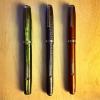
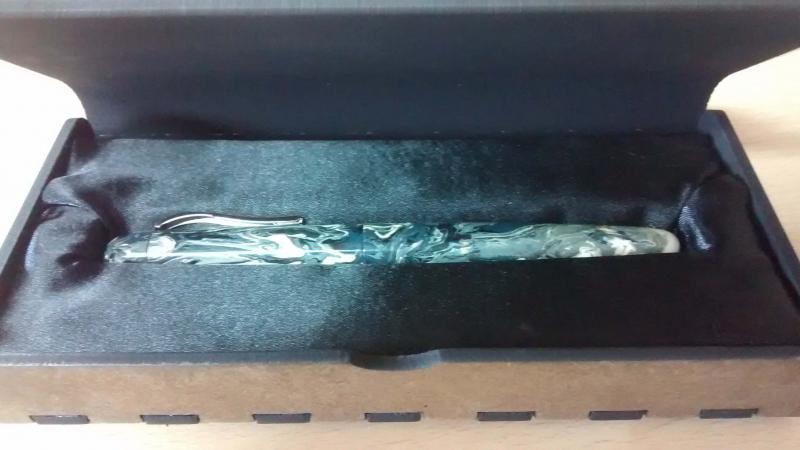
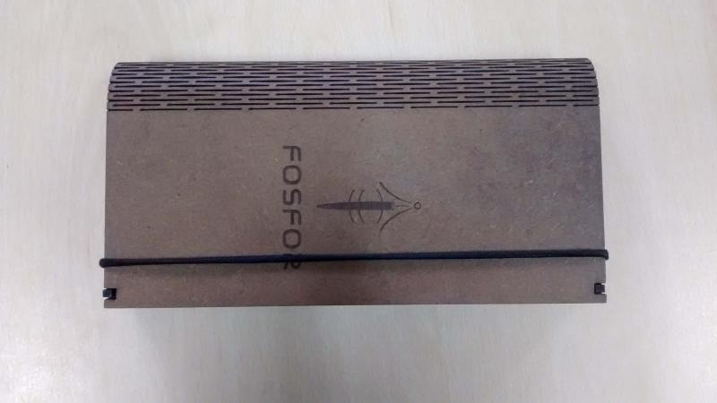
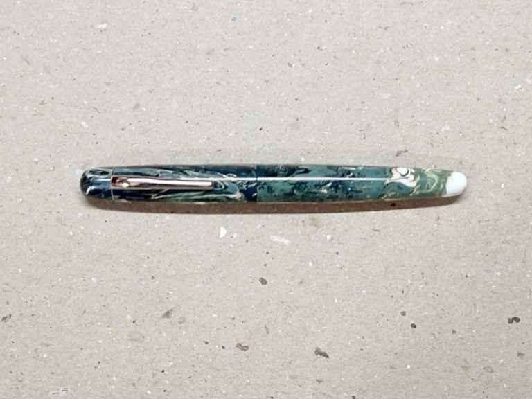
Mr Manoj Deshmukh is an artist who sculpts incredible pens. The acrylic resins he sculpted for me were cast to my request. His pens are large pens with beautiful asthetics and balance. The nibs and filling systems are as desired by you as he offers a very large amount of customisation. I bought three pens from him. All pens have Schmidt B or M nibs. lava and Tikona are Cartridge -Converter fillers. The first was black, red, yellow and gold resin which resembles a lava flow hence the name Lava... The second was Tikona (triangular in Hindi) in blue acrylic.. And the latest is this green and gold acrylic button filler with sterling silver trim... All these pens have cost between US$75 to 80. They are not only a pleasure to write with but also head turners. Here is a pictoral review of these pens. They can be bought at www.fosforpens.com ... The pens come in a beautiful wooden box shaped like a book with lid held down by an elastic band... The Lava... The Fosfor Tikona...a symphony in blue! The latest is this green and gold Button Filler, reminiscent of the 1930s Duofolds and other button fillers...it comes with sterling silver cap rings and clip... These pens are absolutely wonderful and genuine peaces of art since each is a bespoke pen and no 2 are alike perhaps.
-
Introduction Recently my interest in all things fountain pen related has spawned a specific sub-genre - a fascination for experiencing nibs made of different materials such as gold, titanium, palladium, etc. Looking around, it seems that the Bock 250 triple system is the ideal platform for experiencing material differences since they seem to have the widest range of conceivable material options for this particular nib. It is thus hardly surprising that I have embarked on developing a collection of different Bock 250 nibs. To eradicate as many variables as possible, I am getting all of them in medium tip so as to focus solely on experiencing material differences. Amongst the earliest Bock 250 sets, I got a Titanium one thanks to the help of fellow FPNer Tervinder (@romee_win) and his brother Rajdilawar who got it for me from Germany. Just looking at the colour of the Titanium nib convinced me that it will go very well with oxidized silver trims. Since Manoj is the only Indian pen maker that I am aware of who is using silver accoutrements, I approached him with a request to get a pen made. To match the colour of silver trims and titanium nibs, I opted to use Conway Stewart Heather blanks and hence the moniker used for the pen. Design Instead of creating a design from scratch, I shared with Manoj one of the drafts I had of the Azaadi design. This was largely similar in concept except for being slightly larger and having only one broad ring in the cap instead of having two slimmer ones. It is a classic design with simple straight lines for the cap and with only a slight tapering of the barrel. The top of the cap and the bottom of the barrel are flat and polished. The body of the barrel and the cap are polished smooth and shiny. The broad silver hand crafted band on the cap with elaborate motifs add a touch of flair. Just like the Azaadi (and its muse the Churchill), this pen too has the concentric circles on the cap finial to give it a crown like look. The clip and trims used are all made of silver. The turquoise/teal base colour of the heather material and its pearlescent properties nicely complements the muted colour of the silver trims and the titanium nib. Size and Balance At 155mm capped, this is a card carrying member of the oversized pens club. But don’t let the length let you have misconceptions about its heft. Being a completely kitless pen with no metal other than in the nib, clip and bands means it is in-fact surprisingly light. Despite the length, it is nicely balanced and can easily provide comfortable writing for extended periods. The simply sublime section design adds to the comfort quotient. One can post the cap if so desired, but I prefer to use the pen unposted. The excellent Conway Stewart acrylic material is light and yet strong and hence the pen despite being oversize doesn’t compromise on the weight aspect and this contributes a lot towards the overall comfort. Nib The Bock 250 Titan nib in medium width is the heart and soul of the pen. As I had mentioned earlier, this pen exists for the sole purpose of allowing me to experience this nib. From an appearance perspective, this nib looks exactly like any other Bock 250 nib out there. Only the subdued matte grey colour and the Titan branding on the nib below the Bock logo gives you a hint that it is a wolf in sheep’s clothing. The clip nib and bands complement each other nicely thanks to their colour. Filling Mechanism The thing I like about European pens is how most of them use the standard international system for cartridges and compatible convertors. I like this system better than any other because of the wide compatibility, system life longevity, value and convenience. So I am not at all surprised and quite delighted that Bock 250 triple systems adopt the same standard. This pen has paired the nib unit with a Schmidt K5 converter to use bottled inks and can also accept cartridges from a host of brands. Build Quality Manoj is a master craftsman who is known to work on only one pen at a time with an eagle’s eye focus on the details. That naturally translates to hallmark of quality and the pen benefits from the same. The fit and finish and the tolerances are impeccable for a handmade pen. It is obvious that the pen has been made with care and a considerable amount of time has gone into polishing and buffing to ensure a very high quality product. Writing Experience I know all of you are interested about the writing experience more than anything else. I will keep it short and unambiguously state that this nib is simply awesome. The nib is super smooth, appropriately wet and glides over the paper laying down a nice wet line. There are no skips or false starts and overall the pen is a superb writer. The closest analogy I can think of is a couple of Visconti Dreamtouch nibs I have tried and this nib feels exactly the same. Just to ensure that I am not being prematurely exuberant, I have been using this pen in continuous rotation for over a month now all the time keeping it inked with Daytone Blue-Black. I am happy to say, a month of cohabitation has not changed my opinion a bit and I still smile at the prospect of putting the pen to use. Please note that I am well aware that there are likely to be significant unit to unit variations between nibs and your personal experience might vary. So while I am no authority on whether all Bock Titanium nibs are great, the one I have received certainly makes me very happy. Price and Value I will make a distinction between the value proposition of the pen as made by Fosfor and the overall pen’s cost including that of the Titanium nib which I had procured by myself. As far as the standalone pen is concerned, it is incredibly VFM. I may have mentioned this before but I will do it again that I am not aware of any other custom pen-makers who offer this level of quality and individualization at this price point other than Manoj and Mr. L Subramaniam of ASA Pens. They hear you out, try to understand what is it that you wish to achieve and the satisfaction persists long after the cost concerns have receded. Given how happy I am with the Titan nib, it is no wonder that I find the overall pen an amazing value for the quality and beauty that it offers. I am under no illusion however that part of the value perception comes into the picture because I wanted to experience something different in a Titanium nib. There may be quite a few steel nibs that can be tuned equally well (and I may have quite a few of them as well) and your perception of value is likely to be influenced by this fact. To Summarize, the pen is a great value with a properly tuned steel nib and an amazing value with the Titan nib if such a nib is what you are specifically seeking out. Specifications The measurements in this section have not been taken with any precision instrument or laboratory techniques but should suffice to give you a fair idea of the size of the instrument. Length (capped) – 154.5 mm Length (uncapped) – 137 mm Length (cap) – 71 mm Length (section) – 22 mm Maximum width – 14 mm Minimum width – 8.5 mm Maximum section width – 10 mm Minimum section width – 8.25 mm Conclusion I had commissioned this pen with a very specific objective and it has successfully delivered without an iota of doubt. Not only do I like this pen, it has managed to wriggle into my regular list. I rarely ink up the same pen for four successive weeks and this one is breaking all records. It is very comfortable, well balanced and an excellent writer thanks to the wonderful Bock Titan nib. The silver clip and band is a unique Fosfor signature lends the pen a degree of exclusivity. I have no hesitation in recommending this model to others. Useful Links Conway Stewart Heather blanks from www.theturnersworkshop.co.uk Bock 250 Titan nib from www.starbond-europa.de The nib is also available at www.beaufortink.co.uk Pen made by www.fosforpens.com
-
Introduction. It all started when I got intrigued by JoWo nibs, reading that they make nibs some for bigger names in the Fountain Pen industry. So I just set about trying to get the cheapest JoWo Gold Nibed pen. Having seen/read a lot of About Fosfor Pens, I contacted Mr.Manoj by the end of December inquiring about JoWo gold nibs and after sorting out some details, advance payment for the Nib, My nib arrived by the Middle of January. Putting all the faith in the Nib,I selected one of the Many Polyresins from the Fosfor Pens site,nothing special here and Sketched a rough drawing of my pen, I’m not a very artistic person. And after a wait of 1 month, I finally received my Pen in the 2nd Week of March. The Pen As seen by the above sketch, the dimensions and shape is pretty accurate. Weight wise, I find it perfectly balanced in the hand and sits perfectly in my hand. When capped, it is top heavy, thanks to the Silver Clip. When uncapped, there is a slight shift of weight towards the barrel end helping it settle well in the finger web space. The cap takes 1 ¾ turns to uncap. I had specifically asked Mr.Manoj for the least number of turns. The section has a bit of a concave to it and forms the perfect diameter for my gripping style. Alternate Grips: My handwriting changes considerably based on where I grip my pens, but it’s not always comfortable with all pens bodies. Fortunately this pen body works well with all my pen grips giving each a characteristic flow. Filling is done by a Schmidt converter but I guess it can be turned in a E.D. The Nib Coming to the thing that started this 3 month long journey, It’s a JoWo #5 18k Broad nib… … and man is it worth it! Amazingly smooth, Amazing Spring and the broad tip has a stub like quality to it. Getting some impressive Line variation considering it’s a Broad. This has made me want to order a Fine and see how much variation that’s going to give! Or maybe I’m one of the lucky ones to get a springy nib. Only gripe is that I didn’t opt for the #6 Nib as I feel it would have suited this size of pen better. I was told the nibs come as a unit and I find that the feed keeps up well with ink flow. Cost: The total cost of the pen was Indian Rupees 6520, or just below a USD.100. I have always been an advocate of the philosophy “ An item is worth what you are willing to pay for it” so I will leave the cost factoring upto the reader. Alternative gold nib (new)pens at this price: Platinum PTL-5000 Platinum 3776 Platinum Balance Considering this one is “one of a kind”, handmade, customized to your specifications/ inputs I’d say the price is well worth it. Conclusion: Honestly I’ve been a silent spectator of the Fountain Pen scene for the past 3 years (when I first got re-introduced to Fountain pens) and never Felt like doing a Review of a pen. This was until my Interactions with Mr.Manoj Deshmukh of Fosfor Pens. The whole process of discussion, planning, waiting has completely changed my opinion of the workmanship that goes into producing each one these pens. That may not be the case with Larger Manufacturers where all the interaction you have is going into a Boutique, dipping a pen and scratching something down on paper. But in there Internet-days even that is a novelty. But when you are associated with an item from Day 1 of its Conceptualization, it truly is an amazing experience. And I fear it’s going to be Addictive. So at the end of the Day I have a beautiful writing instrument. Tomorrow is a new day and a New Sketch for Mr. Manoj.
-
Review Of Fosfor Islander In Conway Stewart Flecked Amethyst
Prithwijit posted a topic in Fountain Pen Reviews
Introduction Manoj Deshmukh of Fosfor pens (http://www.fosforpens.com) is a master pen turner and I always wanted a pen made by him. Given that the Islander model is considered the flagship of his line, it is only natural that I would like to have one of those in my modest collection. Normally Islanders are made of exotic wood burls or hand cast resin that Manoj personally prepares based on individual preferences. Personally, I am not a big fan of wooden pens and didn’t have much faith in my aesthetic abilities in specifying the right colours to cast the resin. Instead I opted to use Conway Stewart Flecked Amethyst blanks that I had got from Vince Coates (http://www.theturnersworkshop.co.uk). I had always thought that the Flecked Amethyst material would be complemented nicely by the silver trims used in the Islander and decided to round off the look with a solid steel polished Jowo #6 nib in broad tipping. Design The Islander design is quite unique and distinct amongs't the India pen models. The cap portion is cylindrical while the barrel has a cigar like tapering towards the end filial. Both the cap and the barrel are ends are flat and polished. The body of the barrel and the cap are polished smooth and shiny. The cap is flushed with the barrel with no step down where the cap and barrel meet. The most important design element of the Islander and the raison d'être of this pen in my collection is the beautiful hand crafted silver band and clip combination. It is an artisanal product and I am not aware of any other pen with such and unique clip/band combination. The clip is springy and it is curved with a raised bottom for easy clipping. There is intricate hand-made design in the band above the clip and it is made of pure silver. One of the joys of getting a Fosfor pen is the customization in terms of section design that Manoj allows you to do to best suit your preferences and comfort. I opted for modified hourglass design which has proved to be extremely comfortable. In hindsight however, the design may have benefited is the edge at the end of the section was rounded off a bit. Size and Balance At 150mm capped, this is not a small pen. Despite it’s length, it is nicely balanced and can easily provide comfortable writing for extended periods. While the cap can be posted with some effort, I use it unposted as I find the length to be too long when you post the cap. The acrylic material is light and yet strong and hence the pen despite being oversize doesn’t compromise on weight or balance. Nib The standard Islander comes with a choice of Schmidt #6 nibs (Model FH 452) in either F/M/B. Schmidt nibs come with their logo embossed and I wanted a cleaner look on my pen. So I decided to go for a Jowo #6 polished steel nib instead which was devoid of any logo. Since I have many nibs with medium tipping, I opted for a broad tipping on this pen. Filling Mechanism My Islander is a non-proprietary cartridge/converter pen that accepts standard international cartridges and compatible converters and it comes with a Schmidt K5 converter out of the box. As I have mentioned in many of my earlier reviews, this is my favourite filling system since in my opinion it represent the optimum combination of value, system longevity, convenience and widespread compatibility. Build Quality Manoj has a reputation for focusing on the details and the pen clearly benefits from his focus and the resultant build quality is impeccable. One can easily appreciate that the pen has been made with care and a considerable amount of time has gone into producing it. Writing Experience Jowo is generally considered as being amongs't the top two or top three western nib OEMs and their nibs are widely used on a variety of pen brands. Their popularity itself is a testament to their general quality. Needless to say, I have been very satisfied with Jowo nibs in general and have quite a collection of them in different tipping. It is little surprise then that I am very happy with how the Islander performs. The broad Jowo unit is super smooth and glides over the paper laying down a nice wet line. There are no skips or false starts and overall the pen is a superb writer. Price and Value Currently as of December 2015, Islander pens are listed for a price that ranges between $75 and $99 based on the type of wood being used. These prices however are for pens with Schmidt nib units. If you opt for Jowo, then there is a slight price premium. I am not aware of any other custom pen-makers who offer this level of quality and individualization at this price point other than Manoj and Mr. L Subramaniam of ASA Pens. Needless to say, these pens are incredible value and the quality lingers in your hand long after the cost has left your mind. Specifications The measurements in this section have been taken with a simple ruler and may not be precise being subject to some amount of parallax error. Length (capped) – 156 mm Length (uncapped) – 141 mm Length (cap) – 70 mm Length (section) – 24 mm Maximum width – 16 mm Minimum width – 10 mm Maximum section width – 12.5 mm Minimum section width – 10.5 mm Conclusion This is my first Fosfor pen and I am very happy with what I have received. It is very comfortable, well balanced and an excellent writer thanks to its Broad tipped Jowo nib. The silver clip and band is unique and adds a touch of exclusivity. I have no hesitation in recommending this model to others.
-
The review is posted at my blog with more images and handwritten pen samples LINK Islander – In the Wild Well this particular pen, ISLANDER from Fosfor Pens was love at first site when I actually saw it in person at Delhi Pen Meet. I had seen lot of Islanders in the Wood online but never saw one in polycast resin. And Rishminder was the guy at pen meet who had the pen made out of polycast resin in tri colors of Indian Flag and i must complement Manoj Deshmukh of the wonderfully executed job. And trust me friends, it was love at first sight. I ordered the pen that very day and waited patiently for 3 weeks while going through the process of selecting colors, clips and bands. It was an amazing experience dealing with him and thus it lead me to ordering few more pens from him. This review is about Fosfor Islander. (Islander being named because it was first commissioned by a person who lived on an island) DESIGN & BUILT: 05/05 Where shall i start ? Actually i was speechless when I first saw the pen. It’s such a beauty. It arrived in very nice cardboard package which actually is a nice case for this big pen. The pen box is the only area where the branding is done. and you won’t find the branding anywhere else. Islander – Glamor Shot The pen is made of polycast acrylic resin which Manoj Deshmukh of Fosfor pen casts himself and thus you have the flexibility of having the pen in any color mix you want. And I actually wanted something brownish orange with white as a base and Manoj has produced a beauty. Islander – Close Up And as far as finish is concerned, I can find not even a single fault. It’s supremely well finished not even a single lathe mark. I can even go to an extent of saying that the pen is the best finished pen of India. The quality of the resin is superb though I beleive that being acrylic it is brittle. So care is needed in that regards. Its an eye-candy for sure. As far as design is concerned it’s a beautifully designed and executed pen. It’s a straight cylindrical pen with barrel tapering at bottom. The cap top and barrel bottom have soft rounded edges. Below are the few images which might help in design understanding. Islander – Capped Islander – Uncapped The cap top and barrel bottom have sublime protrusion i.e. they are raised. Clip is springy and stiff and like the fact the bottom is raised for easy clipping. The band above the clip is above has intricate design and is made of pure Silver. Islander – Cap top View Islander – Cap Side View – Intricate Silver Band Below are the few images of the pen showing comparison with other pens: Fosfor Islander vs Ranga Model 4C vs Italix Parson’s Essential vs Pilot 78G – Capped Fosfor Islander vs Ranga Model 4C vs Italix Parson’s Essential vs Pilot 78G – Uncapped I love this pen and soooo beautiful. And this has taken place in my top 5 pens with steel nibs. BALANCE: 04/05 It’s a perfectly balanced pen when writing uncapped and unposted. But for me it becomes quite large and uncomfortable when cap is posted at back. Yes the cap posts quite securely. The pen length is 149 mm when capped and 133 when uncapped. Below are the images of the pen showing comparative of writing with cap posted and unposted. Islander – Writing Unposted Islander – Writing Posted Since it's a long pen I don’t think there is no need of posting cap. NIB AND INK FILLING MECHANISM: 05/05 There were lot of nib options like JoWo, Schmidt and Ambitious and I opted for Schmidt silver monotone #6 Medium nib which is tried and tested. Islander – Nib unit angled view Islander – Nib unit top view Islander – Nib unit side view Islander – Nib unit bottom view The ink filling mechanism is via converter and cartridge mechanism. It can also be used as eyedropper. Islander – Cartridge Filling Mechanism Islander – Can be used as eyedropper showing inner side of cap above and barrel below This pen writes beautifully and writes wet and is perfect for shading inks. Below are the few images which shows the handwritten review along with test of wetness and line variation. CONCLUSION: This pen is available starting from 70 USD. And is available in different materials like wood, ebonite, acrylic resin. It is my top favorite pen. No.1 in my top favorite followed closely by Ranga Model 4C. Just to tell you all that this is completely handmade pen. Kudos to Mr. Deshmukh. Thank you.
-
FPN has a very talented pen maker in the form of ManojD who is located in Pune, India. He shows his creations from time to time on FPN. His pen company is called Fosfor pens. A few months back we discussed the possibility of producing some fine fountain pens out of Sandalwood. The highest grade of this wood is local to India, we prize this wood and genuine Indian Sandalwood (Santalum album) will remain fragrant for decades. Sandalwood ballpens are made available through government emporiums to the common public but no one was offering uncoated fragrant sandalwood fountainpens. Manoj took up the challenge to make such a pen for me. He found the sandalwood billets with the provenance hammer marks. My design decisions were : Exposed uncoated wood for fragrance and tactile sensation of the Fine sandalwood.Inner core of the cap and barrel to be fully Ebonite, so that even if the converter leaks, the wood will not stain, if the nib leaks out into the cap, the cap exterior will not stain.Use of a Schmidt nib housing (Choice between JoWo housing and Schmidt).Clipless after much debate, since I wanted a wooden finial and not an Ebonite finial. I am trying to get a jeweller to make me an accommodation clip for this pen.Minimisation of the barrel to section step. The pen was delivered to me a few weeks back. i have been using it extensively at home and will carry it to work once I work out a means to clip it to my shirt pocket(no pen pouches for me) The pictures of the sandal wood billets used for my pen are kindly provided by Manoj. http://i991.photobucket.com/albums/af39/hari3171/ManojDChandan/DSCN4934.jpg The Hammer marks: http://i991.photobucket.com/albums/af39/hari3171/ManojDChandan/DSCN4936.jpg The pen came in a nice wooden box: http://i991.photobucket.com/albums/af39/hari3171/ManojDChandan/IMG_9828.jpg http://i991.photobucket.com/albums/af39/hari3171/ManojDChandan/IMG_9829.jpg http://i991.photobucket.com/albums/af39/hari3171/ManojDChandan/IMG_9830.jpg Cap top: http://i991.photobucket.com/albums/af39/hari3171/ManojDChandan/IMG_9831.jpg Barrel end, he has tried to preserve the hammer mark: http://i991.photobucket.com/albums/af39/hari3171/ManojDChandan/IMG_9832.jpg The pen writes well. http://i991.photobucket.com/albums/af39/hari3171/ManojDChandan/IMG_9833.jpg I was a bit worried about the step in barrel to section so we had an intense round of discussion with sketches flying back and forth, but I am very pleased with the final results. the section length moves the step out of the way for me, in fact, I don't feel it at all. The lightness, texture in hand and aroma of the wood and the pen, is wonderful. I am very pleased with the pen. It was also priced very reasonably for a sandalwood pen, in line with the other offerings on Manoj's website. Thank you Manoj. Cheers! Hari
-
Yes, the twins are here and I love them (Pardon the low quality pictures)! Here they are, - Fosfor Sandalwood with a Franklin Christoph HPS #6 Masuyama Needlepoint Nib - Fosfor Islander in Red Burl with the Franklin Christoph #6 Music Nib The F-C nibs were a gift from a friend and I was given the freedom of choosing the nibs. My limited experience with EF or F nibs (limited to lower end Indian and Japanese nibs) left me wanting more and I was on the lookout for something that I could use for sketching and quick notes (among a few other things). The music nib was to continue to practice some scripts for calligraphy. I've been wanting wooden pens for a while now and there was no better marriage than the F-C Nibs and the Fosfor body that I could think of in India. I must admit that the F-C website was very tempting and I will probably pick something from their offering pretty soon. I haven't uploaded more than a single picture as I am not able to do justice to the pens with my shoddy camera skills. Both Fosfor Pens and Franklin Chirstoph have great sample pictures on their own websites for anyone interested. I'm not good with reviews, but here are my impressions about both the pens and the nibs after a few weeks of usage. Experience with the seller(s) Franklin Christoph: I bought the nib units online and their customer support and sales was great, they have a well oiled process. The nibs units were shipped from their store the day after (or I think the same day given the time zone difference) and they knew the details about shipping, exports, etc. The sales folk at F-C were really helpful about the plethora of questions that I as this was the first time I was getting pen parts shipped into my country. They were always prompt and the whole process of buying the nibs from them was really easy and I did like the little containers that the nib units arrived in. Mike Masuyama's chop on the little card was nice for a first time buyer. Fosfor Pens: I've been commenting and reading Manoj's work (Fosfor Pens) here on FPN and wanted to order one for myself and when these nibs arrived, I shipped them off to him for these two beauties. These are my second set of wood pens, I think I'd rank wood higher than ebonite in terms of personal preference, with acrylic a distant third (so far nothing has made me budge on acrylics), and other plastics/resins being a distinct no. Bring on more of those wood pens I say! Manoj was patient with my finicky emails and decision process and helped me narrow down on these two choices for the pen. He updated me through the process and sent me these two lovely pens a few weeks ago. As I've posted in other threads, I'm a sucker for good packaging, and the boxes and the choice for the box material material made it all the more interesting. The small little pouch with the sandalwood shavings that I got was nice touch!Design, material, build and quality from Fosfor Fosfor Sandalwood: It is the understated look of this design that nailed it for me, the shape and the use of the threads on the cap were a great touch to make the pen look lovely. I opted for the unpolished finish for the sandalwood as I wanted to feel the wood when the pen is used. Yes, there are great risks of staining an unpolished wooden pen (I have stained a ball point sandalwood pen with my clumsiness earlier), but we do live dangerously anyway. The use of the red/brown ebonite is lovely (at some later point I might ask Manoj for an ebonite from this lovely colour itself). The natural wood grains on the pen (the swirl and I think one little burn mark from teh turning process or otherwise) add character to the pen. I did opt for this design as will not be posting the cap while writing. My only grouse with the pen being that when the cap is screwed onto the pen, the brown ebonite casing is visible (it does not protrude or create a gap). I'm only guessing that is either a easthatic choice or a utility choice (to insure against wear and tear of the unpolished sharper edges or probably any ink pooling/leaks). It might have been a good bonus if the swirls on the cap and body aligned when the cap was screwed on. Fosfor Islander: Most of the pens I own are understated or are discreet in nature, so I thought I'll mix it up a little with the silver trimmings on the Islander. Given the need for the natural look of the wood to be retained, I decided to go with the Red Burl offered by Manoj instead of my personal favourite of the Sheesham (with no trimmings) for the Islander. As you can see, the swirls are lovely, the polished finish is great and the black ebonite section provides a nice contrast for the nib and the clip on the cap. The tapering end could probably be used for posting, but I don't like posting my pens and I'm guessing it could lead to the natural wear and tear. Apart from the slight offset for the trimming at the top of the clip the pen is marvellous. The balance of the pen is great and I do love the fact that even after the polish that my brain tells me I'm using a wooden pen. As stated earlier, the aligning swirls on the body and cap would have been a lovely bonus. Performance of the nibs from Franklin Christoph HPS #6 Masuyama Needlepoint Nib: The technical details and pictures are available on F-C's website. I'm surprised by the performance of such a thinly ground nib. I must admit that I was apprehensive about it's performance but after clariyfing details from their sales team and using it for the last few weeks, I have become a big fan. Being and EF nib that is ground by Mike Masuyama to approx .25mm according to their website. As expected of such a finely ground tip, it has a smaller sweet spot. The performance is great and it is a wonderful writer both forwards and backwards! As a testing ground, I've used the Needlepoint on papers varying from 70gsm to 100gsm (and copier type, handmade, more threaded, etc.) and I am surprised at how well it handled all the paper. Though I guess this type of a nib would be best used on copier type of paper to ensure a longer life and better care. It almost feels like a mechanical pencil when using the nib and very unlike the EF nibs that I am used to. Here are few quick drawing samples, Franklin Christoph #6 Music Nib: This nib was offered in both a shadow steel and a polished steel finish. It was greatly tempting to buy the shadow steel finish. The eventual aim for me was to be able to use the nib units in different pens as needed when travelling, etc. Both of the pens I wanted from Fosfor are definitely not the travel with them in your pocket kind which meant that the options for a matching body for the shadow steel nib pen reduces drastically. The horizontal and vertical strokes on this pen are great and it glides over paper. I've tried the nib with a few different inks (locally available Bril, Camlin and Sheaffer Scrip inks) and so far it lays down a consistently wet line. I've had a couple of railroad-like situations (what would you call that for a broad nib?) in about 30 pages of writing/doodling/scribbling which I am attributing to the position/writing angle. The flow keeps up with the nib and my writing speed. Here is a quick 'F' in Old English Engrosser's script, The twins have given me great pleasure over the last few weeks and I'm a little unsure of where this new hobby of mine is leading me.
-
While browsing through the archives of FPN, i came across the review of Fosfor sandalwood pen by hari(https://www.fountainpennetwork.com/forum/topic/273319-my-new-chandan-sandalwood-pen-made-by-fosfor-pens/). I was intrigued by the design and was surprised that an Indian pen maker is making such beautiful pens. Since, I was neither interested in wooden pens nor I could afford them, I put it in the backburner. Then, I again visited the website and was happy to see that Manoj has been offering Polyester resin pens. I mailed him and asked for the details and decided upon a pen. The details are in http://www.fpnibs.com/en/45-fosfor-pens http://fosforpens.blogspot.in/2014/09/in-house-cast-polyester-resin-pens.html PACKAGING: The pen came in a nice box and it feels as if I ordered a much expensive pen. Such customer service is rare in India. DESIGN: The PR pens come in 2 models: Bombay and Bangalore. Within each model, there are different color variants, I chose the storm version. AFAIK, each pen blank is cast in PR and the pens are handturned on a lathe. The pen has come out nice and polished I like the round top design. The threads are well-machined and are not sharp at all. The pen has big step down from the section to barrel. While, I dont feel it, it can bother some people. Specs: Length 150mm / Length uncapped 128mm Maximum diameter 14.5mm Weight 22 g The pen has #5 Schmidt F steel nib. The pen is a C/C type pen. SInce it is a resin pen, It could be converted to an ED pen NIB: The nib is a moderately wet writer. The nib is a smooth nib with a hint of feedback. The nib has some springiness to it. SECTION: This is a big pen, slightly larger than the Lamy Safari. It doesn’t weigh as much and it is a comfortable writer and one can write long periods with it without tiring. This pen cannot be posted securely (From Left: Pilot Mr, ASA I Can, Fosfor Bombay, Hero 359 ) CONCLUSION: The pen has been priced reasonably and affordably for an Indian customer. I am not giving away the price, but lets just say it is in the same ballpark as a Lamy AL-Star(for an Indian that is). Even if the pen is priced 3-4 times the original price, it would have been worth it. At this price, you get a handturned pen with a 3-1 filling system. Leave your comments below
-
First I would like to thank Hari for sharing details about his bespoke Sandalwood Fosfor. His post was the push I need to go ahead and take the plunge. I have been an avid follower of Manoj's work from the beginning and now this pen is a thumping confirmation for me that Fosfor pens have arrived! I received it today and here are a few pictures made in receding light; cannot wait to ink it up.... http://i.imgur.com/Mlbybvx.jpg?1http://i.imgur.com/16rVQ42.jpg?1http://i.imgur.com/AfxEasS.jpg?1http://i.imgur.com/1aZ9gJE.jpg?1http://i.imgur.com/52lF4qN.jpg?1