Search the Community
Showing results for tags 'asa'.
-
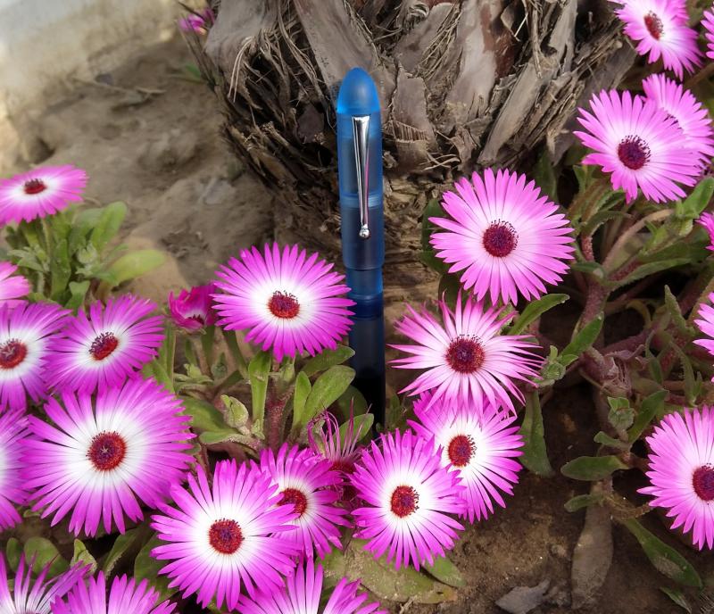
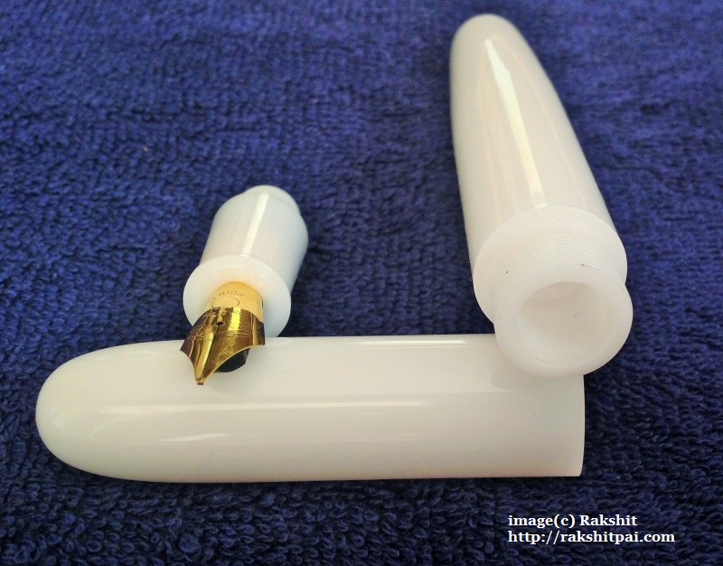
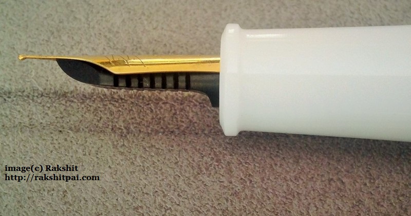
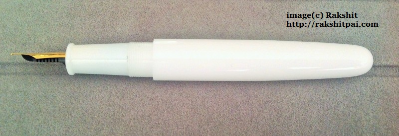
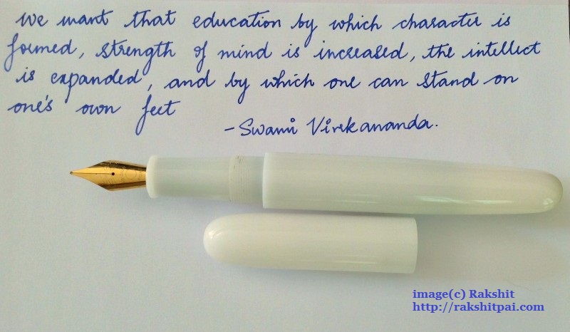
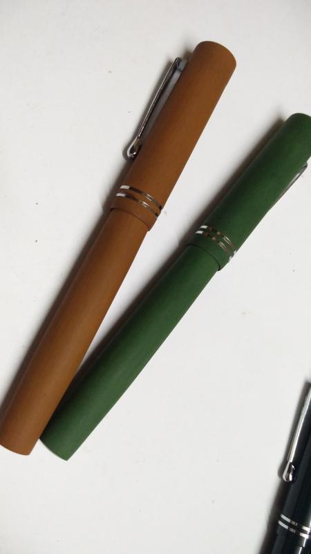
Hello everyone. ASA pens from Chennai is making all the right noises these days, with their beautiful and unique Nauka and Trans-nauka making the rounds and getting praise from everyone. Today I am going to review the first ebonite pen that I bought from ASA, the ‘Writer’, which gets somewhat less attention than their other offerings. My concern before buying any pens from ASA was the size of their pens, most of which are pretty large for my preference. And so one fine day I messaged Mr. Subramanium and he suggested either ‘Writer’ or ‘Genius’ and I settled for the former. I chose ‘Writer’ because this pen has the cap flushed with the body of the pen. This particular design feature seemed appealing to me. The ASA Writer, note the cap flushed with the body and the name inscription lining with ASA branding I didn’t have any idea about ebonite pens before buying this pen and Mr. Subramanium helped a lot in deciding the particulars like the nib, the finish, filling system and the site of inscription. I bought a matte/bakul finish of black ebonite with a German made medium nib-feed unit branded as ‘Versace’. I was very impressed with the pen after I received it and since then it has been one of my most reliable writers. 1. Appearance & Design (9/10): ASA Writer is a beautiful traditional cigar shaped pen with gentle tapering towards the lower end of body. The section also tapers in a smooth fashion. The cap is flushed with the body. The clip is a standard ASA ball end clip with good fit and springiness. The design feature I don’t like is the cap taking almost three turns to open. For a person who continually caps and uncaps his pen, this pen requires much effort in this respect. I have my name inscribed on the cap and that name inscription is in line with the branding just at the top end of the body. That’s a nice little bit of detailing. There is a small ring like protrusion at the top of section, just beneath the nib which probably seals the section to the cap when closed. This doesn’t pose problem while gripping. The matte/bakul finish is very attractive over the body and cap. The section is glossy ebonite. I have been using this pen for long, but the glossy section has not got many scratches. This is a light weight and well balanced pen. No pungent smell from the pen. The Writer, note the glossy section and the ring like structure near the top end of section 2. Construction & Quality (9/10): The ebonite is of good quality. The nib and ebonite feed also feels very well built. I ordered the pen with a schmidt converter which again looks solid. The cap looks thin at the border, and there is no end ring to support it. But it seems very unlikely that the cap will break with regular usage. One negative point is that the threads over section is bound to accumulate some dirt over use. I don't know foe sure, but this may have to do with static electricity formed on ebonite. 3. Weight & Dimensions (7/10): It’s a light weight pen. The dimensions are as follows Pen Length Capped 145 mm Pen Length Uncapped 130 cm. Pen Length Posted 150 mm Average Barrel diameter 14 mm at the section base & 12 mm at taper end Average Section diameter 12 mm at Base and 11mm near Lip Average Cap diameter 15 mm This pen feels very comfortable and well balanced unposted, while it becomes too large and awkward after posting. I never use any of my pen posted except the miniature pens like Pilot petit mini, so that is not an issue for me. it slips easily into hand and writes right away. From left : Sheaffer No nonsense, Waterman Hemisphere deluxe, Waterman Harley Davidson free wheels, ASA writer (all capped) From left : Sheaffer No nonsense, Waterman Hemisphere deluxe, Waterman Harley Davidson free wheels, ASA writer (all posted) 4. Nib & Performance (9/10): The #5 versace nib-feed combo that came with this pen is amazing. It is smooth with very generous flow and good line consistency. I was so impressed with this nib that I ordered my ASA Rainbow Acrylic pen with the same nib and once again I was bowled over by its performance. Later I swapped the nib with a JoWo 1.1 stub nib bought from ASA. This JoWo nib is a beautiful writer as well with perfect smoothness and flow. No feathering or blotting or burping, ink and paper remaining the same as other pens. Both nibs have very little flex. Line variations with 1.1 nib is good. There is no edginess or catching the paper at turns while writing with this stub, even at a high speed. 5. Filling System & Maintenance (10/10): This pen is 3-in-1, which means one can use it as either eyedropper, with a schmidt converter or with standard international cartridges. I have always used this pen with converter as it offers quick hassle free filling and keeps the barrel clean. No burping or any leakage noted when I tried it as an eyedropper. As mentioned earlier, the converter is of very good quality, can be disassembled and cleaned easily and fits perfectly with the body. The cap and clip 6. Cost & Value (9/10): This pen is valued at INR 1500 (38$ ). It’s a pretty impressive considering the beautiful features and 3-in-1 filling system. This has the potential to become one of the daily workhorse of any fountain pen user with little maintenance. Conclusion (Final score, 53/60): I ordered this pen as my first ebonite pen and it turned out pretty good. This pen from ASA has got little recognition, when by all standards it is one of the best pens they have to offer. You can order this pen from their website. Be sure to discuss any doubts with Mr. Subramanium before placing an order. Writing sample Have a nice day. Good bye.
-
Hello Everyone, Today I am going to review ASA Rainbow, a beautiful acrylic fountain pen. ASA have many famous models, and in recent times the Nauka has taken all the limelight. I love my Nauka, but thought of giving some lesser known ASA models their dues first. ASA Rainbow is one of the best looking models from ASA, due to the vibrant acrylic material used to make these pens. What I like most: The looks, what’s more- it’s very comfortable pen for everyday use. What I don’t like- I love this model, so nothing to complain about. 1. Appearance & Design: ASA Rainbow is a medium sized simple cigar shaped pen. There are two varieties – round ended and flat topped. I bought two different colours of this model at different times, but both are round ended. The body is thicker in the middle portion and tapers slightly towards both ends, tapering towards the section is more pronounced than the bottom end. The cap is larger than the body without any tapering. There is one dome shaped finial at the top of the cap which is flushed with the rest of the cap body, thus hiding the clip ring in clipped versions of the pen. There is no ring at the bottom of the cap, though the construction is good and there is very less chance that the cap lip would actually break with regular use. The clip is a simple slender triangular shaped one with a tear drop end. It protrudes a bit too much at the top for my taste before gradually coming back to touch the body of the cap. It’s springy and functional. The section is a slender one with a step like flaring at the distal one third for easy gripping. ASA is imprinted on the top of the clip. No other branding in the body which is a very good decision. What sets these pens apart is the vibrant acrylic materials used to make these pens. I absolutely love these colours; I have one orange-black swirl and one red-black swirl rainbow. The pens look very pretty. One can spend hours on end to look at and appreciate these beautiful patterns and depth of colours in these pens. 2.Construction & Quality: The pen is built well. The material is lightweight. I have no idea whether these will break if someone accidentally drops them on floor and neither I’m much inclined to test for myself. The acrylic has some camphor like smell when put to nose, but under normal circumstances, no smell was perceived. These pens have 3-in-1 filling system, but none of them leaked when used as an eyedropper. There is no burping issues with either with the Schmidt or the Versace nib units compatible with these pens. The cap closes by about three turns, which is a bit too much for me. note the protrusion of clip 3.Weight & Dimensions: the pens are very light, and ideal for long writing sessions. The pen dimensions are as follows Length of the pen capped: 132 mm Length of uncapped pen: Versace nib model- 120 mm, Ambitious nib model- 125 mm. Length of nib: Versace nib model – 20 mm, Ambitious nib model - 25 mm. Posted length: Versace nib model - 162 mm, Ambitious nib model- 167 mm. Diameter of section: Lowest at the step- 11 mm, at the section end- 12 mm Maximum Barrel diameter: 15 mm Section length: 24 mm I use them without posting. They are very good EDC pens . From Left to Right- Waterman Hemisphere, Pilot Metropolitan, Lamy Safari, ASA Rainbow, all capped From Left to Right- Waterman Hemisphere, Pilot Metropolitan, Lamy Safari, ASA Rainbow, all posted 4.Nib & Performance: The pen comes with a Schimdt nib unit by default. I chose another available threaded nib unit called the Versace nib. This nib was also there in my ASA Writer and I am impressed with its performance in both the pens. This Versace named nib is smooth out of the box with a well-controlled medium flow. It has superb feel on paper and there is very less feathering and bleed through even on very cheap papers. It’s a #5 nib, available only with medium tip. This nib fits inside a Jowo housing and as a result one could easily swap a Jowo spare nib with this nib. The ambitious nib in the red pen is a #35 fine flex nib with wet juicy flow and lots of feedback. It has a good ebonite feed, akin to the feeds seen in kim pens. The nib flxes easily with medium pressure, but the feed occasionally cannot keep up, thus resulting in rail-roading. 5. Filling System & Maintenance: This pen is a 3-in-1 system by default, so no complaints there. The red one with ambitious flex nib has a small plastic pipe as a feed tail, so it is meant to be used as an eyedropper. I pulled out the pipe and used it for normal writing with a Schimdt convertor without any problems. I didn’t try flex writing after removing the feed tail though, so cannot comment on that aspect. 6. Cost & Value: It’s a relatively costly pen from ASA at INR 1800 (US $ 48) but considering the beautiful colours, great Schmidt nib and a 3-in-1 filling system, it’s a very well-priced pen. The ambitious nib model cost less. 7. Conclusion: I would love to recommend this pen to all users with any level of experience with fountain pens and a love for beautiful things. My suggestions: A bit slender body would look better or a slightly longer body with current diameter. Few users find this model a bit stocky as a pen. I personally have no complaints. ASA can think of putting cap ring for extra protection to the lip. The clip design can be improved. ASA website ASA Whatsapp no of Mr. Subramaniam - +91 9176607660 ASA email- asapens.in@gmail.com, unik.services@hotmail.com my other reviews (In no particular order): 1. ASA Swan 2. ASA Writer 3. Ranga Thin Bamboo 4. Krishna Butterline Stub nib pen 5. Guider Egg- acrylic and ebonite 6. Kanwrite Desire 7. Kanwrite Heritage 8. Franklin Covey Lexincton Black 9. Gama Kuyil 10. Gama Forever
-

What is the difference between ASA Daily and ASA Patriot and ASA Velvet ?
Srjan posted a topic in India & Subcontinent (Asia)
Can anyone tell me what's the difference between ASA Daily and ASA Patriot and ASA Velvet? They all look similar, all have 3 in 1 filling mechanism, and... Daily has a #5 nib whereas the other two have #6 nibs (I guess). Any other differences? -
INTRODUCTION: Greetings everyone. I'm back after quite some time and this review is long overdue. The ASA Maya was a pen that I fell in love with on the first sight. I read about this pen in Sagar da's review and wanted one of my own. I get how this is Mr Subramanium's design of a dream pen. So I got one Maya from Mr Subramanium and a kind pen friend from Saudi Arabia, gifted me another one. So without further ado, I'll get straight into details. DESIGN & COMFORT: The pen has a nice classic design to it. With a straight cap, and a barrel that first bulges and then tapers towards the ends, both subtly, the pen has a nice aesthetic flair to it. It seems to have a few curves borrowed from Kaweco's Dia 2, while still maintaining the original Indian charm. The section is simple business. Straight, with a touch of taper and ending with a thick block towards the nib. The trim on one of my Maya is chrome coated and on the other, I have sanded this chrome coating to bare brass. I have also given a baakul finish to the section on this Maya. The pen is quite comfortable in the hand. It has ample length and girth for my hands, that I consider to be larger than usual. The material it is made of, i.e. ebonite, is very nice to the touch. Especially on the Maya with the baakul section. Since it is made of ebonite, it is very light in the hand. Here lies my only gripe. I wish it was slightly heavier. A brass ring or two towards the end of the barrel might solve this. CONSTRUCTION & QUALITY: As far as I could find, there are no flaws with the construction of this pen. The threads are slightly rough, but I do know how to smoothen them using some Novus polish. The quality of ebonite is acceptable at this price. The brass trimmed Maya had a lot of pits, spots and discoloring. I used a gel-pen and touched these up. The baakul finish is beautifully done on the chrome trimmed Maya, whereas on the brass one, I had to redo it since the lines were kind of tilted. I can understand that the baakul finish is done by hand, but would appreciate a little more attention over there. NIB & WRITING EXPERIENCE: The chrome trimmed Maya has a Schmidt Fine nib and is a beautiful writer. Depending on the ink, the nib writes from a Japanese fine to a Japanese Fine Medium, which was quite a surprise since this is a nib from the west. It is smooth, with a lot of feedback. its great for controlled writing and handwriting practice. The brass trimmed Maya has a Jowo 1.1 Stub (that I've hand torched to an antique finish that should go well with the brass as it ages). This nib is fun to write with. As most of my Jowo nibs, I found it a bit dry. Its very smooth with a whisper of feedback, which I've smoothed out. It has ample line variation while still being usable for daily writing. (Please ignore wherever I wrote polished ebonite. That was a failed project ) WRAPPING UP: The Mayas are my go to pens for school and I've written 3-hour exams with these without any fatigue. I highly recommend these to anyone who needs a well priced pen for daily, long writing. Mr Subramanium of ASA pens is flexible to work with, and can do customizations without much hesitation. That said, I hope this review was useful to someone out there. Any comments, either here or on PM, are always welcome. I hope do to more reviews in the future
-

Ordering Indian Pens into the U.K. Post-Brexit
Rewpert posted a topic in India & Subcontinent (Asia)
Hey All, I have a number of other hobbies that exist due to small-scale makers and sellers who're all having a heck of a time over the requirements of the new VAT Import Tax Laws introduced by the British. A good number of them are having to refuse to ship to buyers in the U.K. from now on due to the difficulties imposed by the new laws. I was wondering if anyone had any knowledgeable insights into how this will effect the purchasing of fountain pens from the likes of Ratnamson, ASA and Ranga from now on? Perhaps even, being proactive about it, is there anyone in this community of pen aficionados who has the required expertise and generosity of time to perhaps advise Indian pen makers on the new demands of trading with the British and how to best deal with them? Hope everyone is keeping well, 'Rewpert. P.S. - If we could all stay polite and keep politics out of this thread, that would be kind. The FPN is proving to be a quite safe haven from the discourse. There's plenty of room elsewhere on the internet where we can all each other 'Mopheads', 'Brexiteers', and 'Remoaners'. -
Hey folks! A few days ago, I posted a nice baakulized Wality 71JT. Here's the other thing. Three ASA Demonstrators that usually come with the baakul finish, now polished to a mirror like gloss. The interiors were also polished on the caps. I plan to offer aftermarket finishing services soon, once the pandemic has died down. Do let me know how you like them.
-
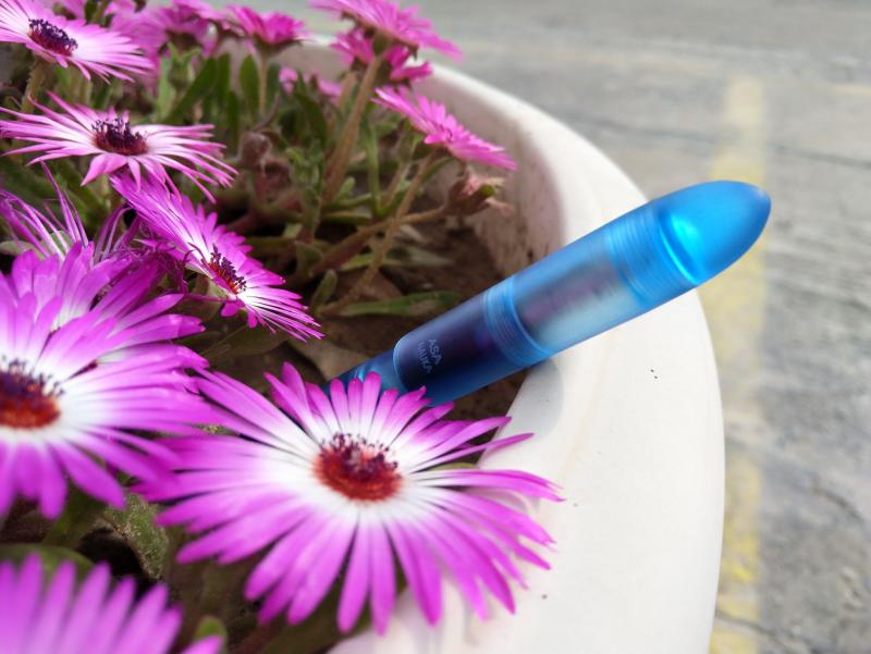
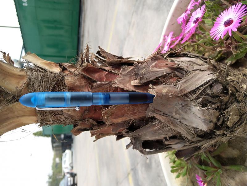
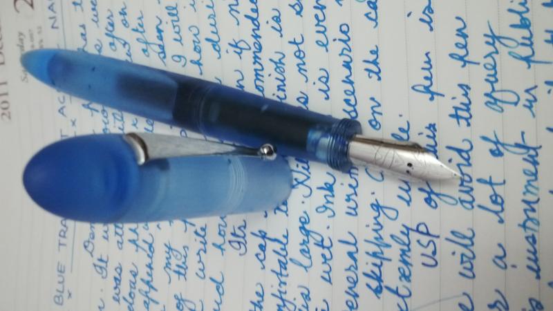
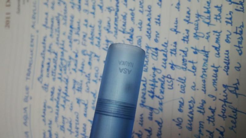
 Hello From past few days I was reading the ASA Nauka Series review by our learned fellow members like Aditkamath26 (Very Good Pics), dinuraj - Marvellous info rich review, Sagarb - Superb Handwriting and Vaibhav (as always very detailed review with sharp pics) and after reading again and again I had decided to go for "ASA Aqua Blue Translucent Acrylic Nauka" . And let me tell you gentleman that though above mentioned people's review tempted me to buy this but I am enjoying this pen completely. Not only me, but my colleague at workplace are as well enjoying the beauty and writing of this pen. From last couple of days this ASA demonstrator is demonstrating itself very well. I believe, all the specs and details are already given in previous reviews, so, I thought that I will write some gibberish for sample and clicked few pics for your viewing pleasure.
-
So today, a little package from India arrived on my doormat; slightly unexpectedly, but only because it was nearly two weeks earlier than anticipated! The packaging was very secure, with a thick outer envelope, double layers of bubble wrap, a plush velvet pen sleeve and finally cellophane over the pen itself; I'm pleased to say it survived the trip from India to the UK entirely unscathed, and as a bonus fit neatly through the letterbox! Mr. Subramanian of ASA Pens was very communicative and helpful, with emails on receipt of the order, processing, and on dispatch. No faults at all with the postage and dispatch! First impressions: this is a Big Pen. Capital B Big. As in, if you thought the Noodler's Neponset was large, this is bigger. Despite this, the pen is pleasantly lightweight for the size and, when filled, balances at nearly the exact midpoint of the length making for a comfortable writer without undue fatigue. Construction: the pen is made of clear acrylic resin throughout. ASA Pens' website states that the pen is entirely hand-turned with no CNC involved, and I have no reason to doubt them; the contouring is smooth throughout and the pen sits very nicely in the hand. The section, cap jewel and end of the barrel are crystal clear, and the barrel and cap are sanded with micromesh to give a pleasantly textured, misty, fogged finish that feels surprisingly warm to the touch for some reason! This is, of course, where the pen gets its name; the nebulous fogged finish gradating into the crystal acrylic like the a galaxy into the vastness of space. The threads are solid throughout, with the section taking over 11 full turns to unscrew from the barrel! Not coming loose any time soon The cap smoothly and firmly screws on in a little over 2/3 of a full rotation. The nib and feed are friction fit, and took a little tinkering to rearrange for optimum writing, but are easily removable for cleaning etc. The trim is chrome throughout, with a very stiff clip: not that this is a pen one would be likely to carry around in a pocket! Stamped (lasered? engraved? heat-embossed?) on the side of the barrel is "ASA Stellar Galactic / India 2015" - this branding is next to invisible when the pen is empty, but shows up once the barrel is filled with ink. Weight: - Capped: 31.0g empty - Uncapped: 20.5g empty - Cap: 11.0g Dimensions: - Length capped: 15.3cm - Length uncapped: 14.0cm - Length posted: don't even bother - Barrel diameter: 16mm at the widest point - Section diameter: 13.5mm in the middle of the taper Nib and feed: my pen came with a standard unbranded IPG nib, with a fairly fine point. There is an option to upgrade to a JoWo nib at checkout for a small extra cost, but I didn't feel this was necessary and indeed the standard nib is smooth with a little more springiness than my other steel-nibbed pens. I believe the feed is ebonite (?), and it easily keeps up with even the fastest of my writing without flinging ink everywhere! On the subject of ink, I measured the volume of the barrel to 1mm below the section threads as 4.1ml, over double the ink capacity of any of my other pens! You could write for days on end with just one fill of this pen. Writing: the pen is a pleasant writer, especially for those with larger hands (like myself!). It's nicely balanced and easily long enough to use comfortably without posting, and frankly the length gets a little absurd if you were to try! The nib is smooth enough to be unnoticeable during writing, and is fairly forgiving of changes in angle. Thoughts and opinions: for a handmade pen that cost me a hair over £20 (Rs ₹ 1,050), including free shipping halfway across the world, I'd say the ASA Galactic is exceptional value for money. If you like demonstrators, big pens, or just fancy something a little unusual, then this could be a worthy addition to your collection. It's great fun to be able to see the huge ink reservoir sloshing around, and the clear section gives a good insight into the capillary action that feeds the nib! However, for people who prefer a smaller or lighter writing instrument, this isn't the one for you I'm afraid. Picture time! http://i.imgur.com/V8pMb70.jpg?2 Showing the texturning of the barrel and cap, with a little glimpse of the logo. http://i.imgur.com/y4G9146.jpg?1 Another view of the unfilled pen showing the engraving. http://i.imgur.com/9Oro9cM.jpg?1 Nib on show! Note the clear section. http://i.imgur.com/2JyPFFZ.jpg?1 All filled up woth Röhrer & Klingner Alt GoldGrün http://i.imgur.com/29X1TeE.jpg?1 Look at how that crystal acrylic blends into the fogged barrel! http://i.imgur.com/7r4Q0ZB.jpg?1 And all filled up. There's a little breather hole in the cap in case you didn't notice earlier. http://i.imgur.com/vXETcPr.jpg?1 A capped size comparison with (left to right) the Noodler's Neponset, Jinhao 159, TWSBI Vac 700, LAMY Safari, Platinum Century, Noodler's Ahab, Pelikan M600 and Kaweco Sport http://i.imgur.com/FDeOXET.jpg?1 And the same, but posted! See what I mean about the length getting a bit ridiculous? http://i.imgur.com/mTclr7c.jpg?2 Finally, a little writing sample. I hope this little review has been of interest; ask away of you've got any more questions about this lovely pen! Cheers all, Alex
-
I'm still finding pens for long writing sessions, and I've discovered that I like large grip sections. Not being in the income bracket for a KOP, I'm looking into something like the Nauka or Maya. My understanding is that the standard pen (with the stock ASA nib) comes with a friction-fit feed. If ordered with a Jowo housing, it's a screw-in. If I plan to eyedropper the pen either way, is there any real advantage to getting the Jowo housing? It's around 28 USD more, which is more than the cost of a nib. If I buy the stock pen, couldn't I swap out the nib anyway if I didn't like ASA's? If anyone has a preference between these pens (or other similar pens! Gama?) I'm all ears. I understand the owner of ASA is recovering from surgery as well — I hope he's back on his feet soon.
-
A few weeks ago on "Fountain Pen Pals India" whatsapp group (which I am a part of), fellow FPN'er Sulagno (@inkstruck) enquired about the possibility of getting a pen made to a certain flush rounded ends design. What followed were a bunch of design ideas from (fellow FPNers in the group) Sulagno (@inkstruck), Vaibhav (@mehandiratta), Pradeep (@pdg84) and Mr. Subramaniam of ASA pens. Vaibhav transferred the design ideas into a CAD illustration and thus the ASA Porus design was born. Mr. Subramaniam of ASA (NAYY) was very happy with the outcome and immediately set out to build a few initial models of the pen. In less than a week the pens were built and delivered. The ASA Porus is a large acrylic pen which comes in 2 flavours. 1. Flush design - where cap and barrel are flush. 2. Step design - there is a step down where the cap and barrel meet. With this model, ASA pen has exceeded all the high expectations that were set by the group. The pen is now on sale at on the ASA pen site here: ASA Porus (NAYY) I chose the flush design and that is what I will be reviewing today. Flush cap and barrel - no clip: 40 mm Ambitious gold plated nib: Beautiful white acrylic cap and barrel. Close up of the "M" grade 40 mm Ambitious nib. The feed, the nib is not too deeply set, this is to my liking. Inside of the barrel, thick barrel walls. The nib and feed properly set: Porus with Lamy Safari: And finally, a writing sample. Ink used is Bril Royal Blue. Paper: 100 GSM JK Cedar. The section is large but is very comfortable to hold. The acrylic material is beautiful, white and feels soft to touch. The 40mm nib does it job of being a nice wet writer. It is a big pen, but the feel is brilliant. Very well balanced. This is the most beautiful fountain pen in my small but quickly expanding collection. Kudos to Mr. Subramaniam of ASA pens of contributing to the design and being kind enough to actually see it to fruition. This I think is a first in the Indian fountain pen industry scene where a group of fountain pen enthusiasts designed a pen and ASA (a FP company) delivered all in a span of 2 weeks
-
Hi All, Sharing some group pictures from the recent Maya Group Buy, specially for Members Fountain Pen Lovers Group, India. I request all those who participated to also share their pictures here.
-
This is a pen I was going to review whether I had a good or bad experience. I'm glad to report that this is a great all-round ebonite pen. The same review is up on my blog along with reviews of some other pens (if anyone is interested). Hope you enjoy reading my review! http://a63.tinypic.com/16ga5ar.jpg I have mentioned above that the design "is" inspired by Mora Stylos' Oldwin Classic. I am not sure about that. It's my guess that it is inspired by that design. I haven't been explicitly told that it is. It could very well be a coincidence that the designs are similar. I do not want to take away from the manufacturer who worked hard on designing and making the pen. http://a68.tinypic.com/34sm3gn.jpg http://a65.tinypic.com/14e7yif.jpg http://a66.tinypic.com/fthmjs.jpg This is the first pen to get 59/60, more than any of the pens I have reviewed so far and it truly deserves it. http://a67.tinypic.com/15xuwaw.jpg http://a66.tinypic.com/2z8rneq.jpg http://a65.tinypic.com/30s7nya.jpg http://a66.tinypic.com/28b6wc4.jpg http://a66.tinypic.com/2eojm74.jpg
-
Introduction: It was not long before that I had bought my first ASA fountain pen that had served as the stepping stone into the vast world of handmade Indian fountain pens. Now, I’m the proud owner of two ASA Naukas- one in Tangerine, and one in the clear acrylic, TransNauka. I’m not known for my patience, so the wait time was really quite a period of impatience, but in the end, the pen makes up for everything. Now, lets get to my first review here .... Aesthetics and design: The pen’s design is reminiscent of a boat, hence the name Nauka (meaning boat in Hindi). The cap is almost cylindrical that has a bulbous dome at the top, which literally glows in my Tangerine Nauka in the right lighting, a bit less so with the TransNauka. The barrel has a significant taper towards the nib, but also has a slightly smaller taper near the end that ends in a point. The section is cylindrical with no taper at all, which really suits my hand. The cap to section threads are located on the top of the section, so that gives the pen almost a Lamy 2000 zeppelin-ish look. The looks of the pens really connect with me. The acrylics are brushed with abrasives. Some people compare this finish to a Franklin-Christoph but that is like comparing apples to oranges, since the F-C is polished on the outside, and rough on the inside, rather than brushed. I would compare it to a Lamy 2000, but slightly subtle. I imagine a Lamy 2000 demonstrator to be like this. In the right lighting, the Naukas glow. The Tangerine feels like a lava lamp. Both my Naukas are clipless and it just looks fantastic without a clip. But, that’s not going to be the case forever. I want to get some snake roll-stoppers for these Naukas, then they will be perfect for me. Construction and Quality: I’m not kidding here, but my TransNauka is flawless, almost to the point of believing that its not handmade, but it really is. My Tangerine on the other hand has a few scuffs here and there, but nothing intolerable. The quality of acrylic used is also quite nice. One issue however has crept in with the TransNauka. The engraving on the cap looks like it was done hurriedly. It isn’t really crisp and clear but has a blurred look. Other than that, I’m more than satisfied. Filling system: The Nauka comes in two variants: a simple eyedropper system, and a 3-in-1 system. Both of mine are the latter. A 3-in-1 system means the pen can be filled with a cartridge, converter or via eyedropper. In case you decide to eyedropper it, do remember to grease the section threads to avoid leakage. As a note, Mr. Subramanium will provide a small box of silicone grease with your pen. If you order the 3-in-1 system, you also receive a Schmidt converter. I don’t like using the converter since during filling, the cap threads are covered in ink and is difficult to remove. However, due to aesthetic reasons, I use a converter in my Tangerine Nauka. Writing comfort: The section of the TransNauka is cylindrical and has a diameter of 12mm. It makes for a comfortable grip for me, because I have unnaturally large hands for a 15 year old. It becomes slightly uncomfortable during really long writing sessions, however, it’s the most comfortable pen I own. This is true for both my Naukas. The pen can be used without posting and is really comfortable that way. The cap isn’t postable at all. Writing experience: The Nauka comes with three kinds of nibs: one are the ASA branded nibs in fine, medium, and broad, and these come with the simple eyedropper variant, two are the Schmidt nib units in fine, medium and broad, three are the JoWo nib units in fine, medium and broad, both available with the 3-in-1 system. Mine are the #6 JoWo nibs. The TransNauka has a fine nib in steel with no plating. It writes really well. It has a distinct feel of feedback, that’s not as unpleasant as my Platinum 14k medium nib. The fine JoWo nib is not really quite a fine. Its almost a fine-medium, that edges more towards the medium. Its wider than my Platinum 14k medium. But it’s a remarkable nib. The Tangerine has a 1.1 stub in steel, with a two-tone finish. This nib is really fun to write. It also has some feedback, but I quite like it. The line variation is also excellent and for me, the nib can be used for daily writing. But both nibs were dry out of the box, which was an easy fix. I have also tried the medium, but it feels characterless to me, so I ground it into a stub and that nib resides in one of my Deccan Advocates. Pricing: The Naukas are priced well. The regular TransNauka cost me 2400 INR without GST. The Tangerine commands a slight premium, at 3200 INR including GST. The international buyers will haver to pay more for many reasons involved, which I am unaware of. In my opinion, the pen is well worth the price, considering its handmade, has a JoWo nib, and is really comfortable. Final Thoughts: In the end, you get a really nice pen, with nice looks, great comfort, and reliable writing at a great price. If it was not for my Platinum 3776 Century Chartres blue, with that medium nib and mind-blowing resin, this would have been my favorite pen. The Naukas are a close second, I look forward to owning two more in the Aqua Blue acrylic and a brushed black ebonite. Only I happen to not have the funds for that. I hope my reviews are helpful to someone, and if they are, then mission accomplished. P.S. The photos were taken with a Nikkon D5300 and edited using Polarr Photo Editor for Windows. And in case you are wondering about the surface that my pens are on in the photos, that is a Pearl Jingle Cajon with an awesome rough finish.
-
Lately ASA has released lot of pens and believe they will be coming up with lot more in near future. And today I am reviewing another great pen by them which is ASA Patriot. My detailed review is also shown at wordpress page here Link ASA Patriot I had my eyes on Gama Eyas / Gama Hawk for a quite a long time because i wanted an ebonite pen with the rounded top and bottoms. I was just about to buy the pen and then ASA came out with this beauty named PATRIOT and i quickly grabbed the same. DESIGN & BUILT: The pen is a regular sized pen and comes in 5 color options, shiny black, matte black, light brown rippled, dark brown rippled and green rippled finish. Its a regular sized pen which comes with JoWo nib options of F, M , B and 1.1 Italic size. The pen that i reviewed today comes with 1.1 Italic nib. ASA Patriot with 1.1 JoWo Itaic nib It has a clean and minimalist design. The pen open in 2 and half turns which I beleive is the highlight of the pen being an Indian pen. The top and bottom of pen are rounded which are quite nicely done and has been paid lot of attention as it is a handmade pen. ASA Patriot - Top of Cap and Bottom of Barrel ASA Patriot - Uncapped The section of the pen is finished in black shiny finish which is quite okay and provides for sturdy grip. However i would have liked it even more if the section would also have been given a matte finish. Below is the image which shows the pen broken down in to parts, which shows the Schmidt K5 converter also. ASA Patriot - Taken apart The Clip is chrome finished and quite sturdy and the O ring of the clip is well hidden by the rounded cap top. (Update: these are push in type clips, thus no O ring )The Also i got an option to engrave my name on the pen and i opted for the same to be done at the cap which really adds to the beauty of pen. ASA Patriot - Sturdy Clip ASA Patriot - Name Engraving As mentioned earlier the pen is the regular sized pen and below are the few images to show the comparison against various pens. ASA I Can vs ASA Patriot vs Pilot Metropolitan vs Sheaffer No Nonsense - Capped ASA I Can vs ASA Patriot vs Pilot Metropolitan vs Sheaffer No Nonsense - Uncapped This is a well designed pen which is just a class apart in built quality. Actually its a no fuss design. For the detailed review and more images along with the writing sample please follow the link : ASA PATRIOT
-
Asa Azaadi Recent Group Buy For India Pictures
subbucal posted a topic in India & Subcontinent (Asia)
Hi All, Recently, we did an India Exclusive Group Buy, for ASA Azaadi. A model which was designed after Conway Stewart Churchill model. Here I am producing a Group Picture of the pens made with Conway Stewart, Omas and Cocktail Blanks, for some of our customers. Thanks for looking. Subramaniam
-
ASA TranNauka - JoWo 1.1 Nib The review is simultaneously posted on my blog here : Link The pen I am about to review has sold in huge nos. and probably one of the best-selling pen of ASA. There was a time when I was after Mr. Subramaniam to make a demonstrator pen with screw in nib units from JoWo/Schmidt but somehow he was not able to procure the good material which could withstand the threading to be done for those units and then we gave up. Then one fine day he informed me that he had procured a new material and will be launching an already successful Nauka in the demonstrator version (which was named TransNauka) and I was too excited for the pen and I told Mr. Subramaniam it would sell in huge nos. and therefore I convinced him that we should do a group buy for the same on FPN (TransNauka Group Buy) and believe me, it was immensely successful. ASA TranNauka – In love with Rains The group buy was so successful that he had to stop taking orders on his website for a fortnight even after the Group Buy was closed because of his limited production capability. I have already reviewed a few pens from ASA as below: ASA Rainbow : LINK ASA Viraat : LINK (Absolutely love this fat pen) ASA Spear : LINK ASA Porus : LINK ASA Patriot : LINK ASA I-Can : LINK ASA Galactic : LINK It’s been three months since I have got this TransNauka and further below is my effort to do a detailed review of the pen. Design : 4.5/05 There is an old age saying: “Beauty lies in the eye of beholder” And to my eyes, this pen is the just pure aesthetic pleasure. It’s a beauty. TransNauka inspires awe when it is inked and I believe it one-ups the already existing Nauka. It’s simple, classic, sublime and is on the lines of Bauhaus Design movement which is a unification of art, craft, and technology. The design of Nauka was inspired by famousMORA STYLOS OLDWIN CLASSIC and in fact, one of the fellow fountain pen connoisseur Prithwijit was the force behind the development of Nauka. ASA TransNauka – Uncapped The pen without cap looks like it’s just one piece as the grip section merges with the barrel in such a form that there is no step down which is generally prevalent in many pens. The pen gradually tapers towards the bottom to an almost pointed end. Similarly, the pen tapers towards the grip section till it meets the threads at the top which holds the cap. ASA TransNauka – Comparative pic when pen uncapped and capped The pen comes only in the brushed matte finish and personally prefer the brushed version better than the polished version as the polished version tends to develop micro abrasions and smudges and also looses shine over the period of time. The cap of the pen unlike the bottom of the barrel is not torpedoed shape at the top rather it is like a hemispherical dome. The pen I bought comes with chrome finish ball-end clip and it also comes sans the clip. The cap is almost 3/4th the size of pen making it a very large pen. ASA TransNauka – Cap and Barrel ASA TransNauka – Cap is 3/4th of Pen when uncapped I found the pen very minimalist with no branding. One thing I believe can be improved is to reduce the gap between the cap finial and nib unit when the pen is closed. The pen is beautiful and is bang for the buck at the price and yeah this beauty is handmade. Built & Construction : 04/05 One look at the pen and you won’t actually believe that this pen completely hand-turned. It’s almost perfectly shaped and finished from the exterior. ASA TransNauka – Lovely Finish One thing I found that as much as the exterior is well finished and shaped, the interior of the barrel was not paid much attention. There are certain undulations in interior (1 or 2 places) of the barrel which result in the formation of O-rings like shape inside the barrel with ink. I received two pens, matte brushed finish and the clear polished one. The clear polished one was all over the places with regards to finish and thus it was not launched officially. This brushed finish is superb barring one area with regards to barrel interior area. The brushed finish is also better because of the fact that it hides the lathe marks and also is not smudge-prone. The quality of material used is quite good but is brittle in nature and thus one has to be careful with regards to handling (against falls). The acrylic used is the hard non-modified PMMA and apt thickness of the material are used in pen and is quite better compared to ones used in TWSBI. ASA TransNauka – Cap View showing material thickness and finish ASA TransNauka – Material thickness in Barrel and Grip Section The pen is quality finished one which needs to be handled carefully and if proper care is taken it will last you ages. I love my TranNauka but I care for every pen that I own. If you are the one who keeps throwing his/her pen here and there then I suggest you go for the ebonite version. Balance & Size : 04/05 The cap of the pen doesn’t post securely and that’s because of the design. But.. But… But… the pen is so big even uncapped @ 135 mm that there is no need for posting. The pen is little heavy towards the nib and I believe this could have been countered by providing solid crystal end at bottom of barrel. Nevertheless, this was no issue for me, it’s a minute difference and some of you won’t even notice. ASA TransNauka – Writing with it – Unposted and Posted Initially, I had trouble adapting to the grip of the pen because of gradual slope of grip section from barrel to top of nib unit but now that I am using the pen since 3 months I have gotten used to it. The grip might also be fat for some because of the design and might not be so good for people with small hands. Now for me, it was okay because I prefer big pens with good girth. The pen is big yet light in weight but one thing I noticed is that when uncapped it is lighter than Ranga Bamboo Demonstrator but almost 4 gms heavier when capped and both are equal in length when uncapped but when capped the TransNauka is larger of the two. ASA TransNauka – Weight – Capped and Uncapped Few specification of the pen are as follows: Length of pen (closed) – 160 mmLength of pen (open and unposted) – 135 mm (including nib)Length of pen (open and posted) – 176 mmLength of Cap – 78 mmMaximum Dia of Cap – 21 mmMaximum Dia of Barrel – 14 mmDia of Barrel ( Near Barrel Bottom) – 8 mmMaximum Dia of Grip Section – 13.5 mmMinimum Dia of Grip Section – 11 mmWeight of Pen with Cap – 27.9 gms (inked)Weight of Pen without Cap – 17.13 gms (inked) Below are the pictures of the pen in comparison with others : ASA TransNauka vs Pilot Custom 823 vs ASA Patriot vs Lamy Safari – Capped ASA TransNauka vs Pilot Custom 823 vs ASA Patriot vs Lamy Safari – Uncapped As clear from above pics its a bit fat compared to others. Nib : 3.5/05 The pen can be bought in a variety of #6 sized nib options from JoWo or Schmidt and in various point widths. The one I have here is JoWo Steel 1.1 Stub nib in Black Oxide finish. ASA TranNauka - Nib Shot in Rain The nib is a screw in nib unit and easily replaceable. The nib that I got was a lemon and was scratchy out of the box. I had to tune it and now it performs the way I want. ASA TransNauka – JoW0 1.1 Nib in Black Oxide Finish ASA Nauka vs Pilot Custom 823 vs ASA Patriot vs Lamy Safari – Nib Comparison Advice to people if you are buying the pen from ASA do avail the option of pen/nib testing this might delay the pen delivery but pen and nib will be checked for writing before dispatch and yeah there are no extra charges for that. Ink Filling Mechanism: 05/05 It can take international long or shot cartridges, international converter and can be used as an ED also. The pen looks best when eye dropper-ed and I applied silicone grease to the threads before using it as ED pen. ASA TransNauka – Using as an ED Pen Ink capacity as an eye dropper is 4 ml and will vary with every pen as it is handmade one. Below are the images of handwritten review of the pen sample writing: ASA TransNauka – Handwritten Review – Page 1 ASA TransNauka – Handwritten Review – Page 2 ASA TransNauka – Handwritten Review – Page 3 ASA TransNauka – Handwritten Review – Page 4 Conclusion : 21/25 The pen was bought at group buy price of Rs. 2200 and it was a steal at that price. And now the prices have increased yet it is a value for money option. Beautiful pen but I won’t recommend this to people with small hands. What I Like: Beautiful Design Handmade Quality Finish- Exterior Good Balance and Size Good Ink Capacity Well PricedWhat I don’t Like: Internal Barrel Finish Poor OTB Nib How to Buy: The pen was bought via group buy on FPN and there will be another group buy in near future for the same. Simultaneously who don’t like waiting for group buys can buy directly from ASA website : LINK. And the last I checked it's available on pre-order only with waiting for 4 weeks. For more reviews you can check my blog here : LINK
-
ASA Azaadi in opal Creating a new ASA Azaadi in opal gave me a four-part tutorial in pen design. I commissioned the Azaadi after reading an account of a stunning similar pen in casein by Prithwijit Chaki, a prolific contributor to the Fountain Pen Network. Inspired by the fine white-on-ivory veins of the casein, I set about looking for a material that would simulate the elegance without the fragility. [/url] Capped, the Azaadi is about 1 centimeter longer than a Lamy Safari. Uncapped, it’s about the same length, and considerably thicker. Lesson No. 1 – Material Selection The Azaadi, as explained by Chaki, is based loosely on the Churchill design of the most recent version of the Conway Stewart company in the United Kingdom. When Conway Stewart closed shop in 2014, Vince Coates of The Turners Workshop in Newcastle purchased the remaining inventory of blanks and rods, and some of these materials are still available. There wasn’t a matching, veined white material, but opal offered a similar, classic quality. Coates shipped the opal to L. Subramaniam at ASA Pens in Chennai, who sometimes makes custom pens with material supplied by his clients. This opal doesn’t look like the gemstone. It includes translucent shades of amber, honey, and ivory, like the biscuit color of stained glass table lamps in the Mission, Arts and Crafts, or Tiffany styles. Whatever is underneath the acrylic opal material is visible, especially if what’s underneath is dark. The Azaadi design typically uses black acrylic for the section and finials. Because the opal material remains relatively thick near the finials, most of the black acrylic underneath is obscured. But at the section, where two sets of threads overlap (the cap to barrel and the barrel to section), the material is extremely thin. At this joint, the black section shows through the opal material. The opal material is translucent, but white teflon tape masks the black section under the barrel-to-cap threads. If I were making the pen again, I would probably select a medium-toned, opaque ivory or amber color for the finials and section. But my error also presented a solution – the white Teflon tape used by plumbers to seal pipe fittings. It’s designed to be an extremely thin, white, sealing dry lubricant. Wrapped in a single layer around the threads between section and barrel, it masks the black section underneath. The tape needs to be replaced with ink changes, like lithium grease in an eyedropper, but it’s not a particularly big deal. Lesson – think not just about material aesthetics, but about how the materials fit together. Lesson No. 2 – Ink Compatibility This pen uses a Jowo No. 6, 1.1 mm italic nib and a Schmidt K-5 cartridge-converter. I’ve used this nib in other pens, and never had an issue with ink lubrication. But this particular Jowo nib is choosy about the ink it prefers. The first ink I selected worked beautifully -- a green-olive-brown color mix created by FPN contributor Chrissy, resembling the wrapper of a “candela” cigar. It uses Noodler’s permanent Bad Blue Heron and three Diamine inks. But then I realized that specks from the permanent ink component could stain the interior of the translucent material and show through to the outside. So I swapped out the ink for a conservative Waterman brown. Too dry. I tried Diamine Saddle Brown, another conservative choice. Too dry. My fourth choice, Pilot Iroshizuku yama guri, works smoothly and beautifully. Lesson – nibs and materials sometimes require different inks. Pilot Iroshizuku yama guri ink flows smoothly in this Jowo 1.1 mm italic nib. Lesson No. 3 – Furniture The ASA Azaadi has been reviewed several times, including Chaki and Sanyal Soumitra. A regular refrain is that the furniture could be better, and they are right. Furniture is the jewelry of the pen, the first thing people notice, setting a tone for everything else. This furniture is adequate, but no match for the elegant workmanship of the rest of the pen. Lesson – clips, bands, and rings make a difference. ASA tolerances and workmanship outclass the metal furniture. Lesson No. 4 – Azaadi The Azaadi is an Indian pen derived loosely from a Conway Stewart design named after Winston Churchill. Chaki explains that the pen was named “Azaadi,” (आजादी in Hindi), meaning "independence, freedom, or liberty.” The name is partly cheeky repartee to Churchill, who strongly opposed Indian independence, and partly a reference to the pen’s launch date on August 15, Independence Day in India. Azaadi also signifies political, spiritual, and intellectual enlightenment, with various spellings in other Indian and Iranian languages. Beyond the dictionary, the concept of azaadi is rooted in the Indian struggle for independence and the role of Netaji (meaning “Respected Leader”) Subhas Chandra Bose between 1920 and 1945. Bose revamped the Indian National Army and opposed the British during World War II, creating an independent, nationalist legacy that ultimately led to a British decision to withdraw from India. Bose's clarion call -- Tum mujhe khoon do, mein tumhe azaadi doonga (Give me blood, and I promise you freedom) -- shows the importance of azaadi. Based on a British design with a British material, constructed in India, named Azaadi in response to Churchill -- the ASA Azaadi pen is a story about a complicated relationship between India and the UK. Lesson – a pen is a symbolic tool of intellectual enlightenment. Pens tell stories, but they can also be the story. In Conclusion – Taking Risks Creating a new custom pen involves risks. My risks were minimal, because the design already had been used in several other iterations. Some things in my version worked perfectly, including the elegance of the opal material, the balance, and the writing comfort of the section and the nib. Some things didn’t, including my first ink choices, the translucent barrel-to-section joint, and the furniture. In other custom pen designs, I’ve seen how some choices work and some don’t. Conclusion – regardless of whether risks result in wins or losses, they offer independence of choice, freedom to make mistakes, and opportunity to learn. Writing sample from another country's declaration of independence. This particular Jowo 1.1 mm italic nib is choosy about the ink it prefers, and permanent inks could stain the interior of the translucent material. Iroshizuku yama guri flows smoothly.
-
ASA GALACTIC REVIEW INTRODUCTION This is my first review here in fountain pen network. So i have decided to keep it brief. Came to know about ASA pens from FPN. Was apprehensive of placing an order mainly because i keep my online purchases limited to major players like Flipkart,amazon,snap deal. But the pen was too tempting and i placed the order. The delivery was prompt and in a neat package. REVIEW The pen is made of transparent frosted acrylic. Its the biggest pen in my collection but it feels great in the hands.You will get used to the bulk very quickly. Its very good even for long stretches of writing. I have to say the design is very minimalist other than the bulk. Its just pure frosted transparent acrylic and looks absolutely great. I prefer to write un-posted and I don't think anyone will find it comfortable to write with such a giant pen posted. The cap is also made of frosted acrylic and it has a small silver coloured clip. It doesn't fit in most of my shirt pockets though. The pen is an eyedropper and its bigger than most and holds gallons of ink. Haven't measured the ink capacity but im sure it will more than satisfy anyone.Its my first eyedropper not counting the cheap ones i used in school .I have been staying away from eyedroppers for ever because of the problems they can give like leaking ,burping. But it does have its advantages too. NIB & PERFORMANCE I opted for the german jowo medium nib provided by ASA pens. It writes butter smooth,just glides on the paper. But i had problems with the ink flow which at times was too much and gushing onto the paper causing ink bleed . I initially used Krishna inks neelkurinhi {purple} and then changed to LAMY turquoise but the problems persisted. Then i browsed through the forums and got the idea of using a very dry ink like Pelikan 4001. I changed the ink to blue black by pelikan and the problems disappeared completely. Could write even on 70 gsm papers without ink bleed. Then came the problem of ink leakage.The ink started leaking in blobs from upper side of nib near the section. I just kept the pen away for a day and from next day it wasnt leaking. There are still blobs of ink appearing after prolonged writing but its not dripping onto the paper.I dont know if it will reappear to a disabling extent. Thing is i dont want to send the pen back to ASA pens as this has almost become my daily writer along with my safari. But if it becomes a persistent problem i will have to contact ASA pens. The writing experience if the pen stays free of problems is absolutely great. You wont feel like putting the pen down.I have to say it might be even better than my Charcoal black safari which is my best pen purely based on writing experience . CONCLUSION An absolutely great pen at a reasonable cost. If it wasnt for the nagging problems i would give it a 10/10. I know eyedroppers are notorious for leakage problems but its still kind of irritating for me when things just wont work. I would give it a 8/10. Will i recommend others to buy? Absolutely. In my opinion if you love fountain pens you just have to try this. PS: please ignore the poor handwriting
-
I know, having read several threads here on FPN, that one needed to be patient in waiting for ones pen to be shipped. Sometimes even twice the given time. I ordered a Maya from ASA April 15 and was told the pen would ship in four weeks. Today, exactly four weeks later, the pen has been posted. I thought you who are expecting a pen might like to know. Thank you Mr Subramaniam!
-
Does anyone know how to contact ASA pens for replacement parts. I managed to break the section on my ASA Translucent Acrylic Nauka Fountain Pen and would like a replacement. I am more than happy to pay for it. I have been in touch through the contact link on the site, but have had no response. Any help is appreciated. http://asapens.in/eshop/fountain-pen
-

Help Me Buy My Next Indian Pen: Guider/ranga/asa?
ssataline posted a topic in India & Subcontinent (Asia)
After purchasing several of the Fountain Pen Revolution Himalayas, my appetite is whetted for more Indian pens. I've read a lot and have narrowed down the selection to these. I'd love customers to weigh in with their recommendations: ASA Translucent Acrylic Nauka Fountain Pen -- because I like, no love, demonstrators. (Did anyone say, "group buy?")http://asapens.in/eshop/fountain-pen/asa-pens-india/asa-translucent-acrylic-nauka-fountain-pen-online Guider Acrylic Fountain Pen (Schmidt Upgrade) -- because I like the greenhttps://fprevolutionusa.com/collections/guider-fountain-pens/products/guider-acrylic-fountain-pen-schmidt-upgrade Either a Ranga acrylic or ebonite swirl -- because I love purple! https://www.ebay.com/itm/RANGA-HANDMADE-COLOUR-ACRYLIC-FOUNTAIN-PEN-MODEL-4CS-20-BEAUTIFUL-COLOURS/132362483655?_trkparms=aid%3D222007%26algo%3DSIM.MBE%26ao%3D1%26asc%3D20140725133649%26meid%3Ddd039b2639d84e5d9306f66572ce7c20%26pid%3D100276%26rk%3D1%26rkt%3D4%26sd%3D152688117461&_trksid=p2060778.c100276.m3476 https://www.ebay.com/itm/RANGA-GIANT-EBONITE-RIPPLE-FOUNTAIN-PEN-MODEL-5-13-SPECIAL-NEW-COLOURS-RARE/132362483754?_trkparms=aid%3D222007%26algo%3DSIM.MBE%26ao%3D2%26asc%3D41376%26meid%3D08dca296596e49329a8fe81120f3f555%26pid%3D100005%26rk%3D2%26rkt%3D6%26sd%3D132362483726&_trksid=p2047675.c100005.m1851 Things to consider: While my hands are medium-sized for a woman, I have arthritis/grip issues and prefer thicker pens, at least .44 cm in the grip section. (The Himalayas are the most comfortable pen I own.) I don't want threads that will get in the way of a good grip. In addition, I don't like much metal, as that tends to be heavy. (My idea of hell is being stuck in the afterlife with just Jinhaos. Or cranky Lamys.) I love stub/calligraphy nibs. I write in huge letters (I do not have fine control to write small) and I enjoy the panache of a nice 1.1. Points then to Ranga and ASA, which will fit pens with Jowo stubs. I'm a writer. The more ink in there, the better. I'm not a tinkerer. I want the damn thing to work well from the get go (and so I will never again buy a Noodler's pen). Looking forward to your wisdom, everyone. Happy New Year!
-
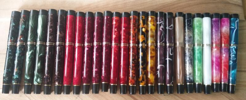
The review is about a pen which was launched on Whatsapp Group of 20 members at that time and I believe was first of its kind launch for a pen. Approximately 50 odd pens were made and beleive me on this all got sold out within half an hour. So beautiful were they to look at first site. They were RAINBOW. The Rainbow is reviewed at my blog in detail : LINK This happens to be an ED model and the updated model with C/C mechanism is soon to be launched at ASA Pens on 23rd September. My other review of ASA pens are as follows: ASA Spear ASA Galactic ASA I-Can ASA Porus ASA Patriot ASA ViraatRainbow is first multicolored acrylic pen from the house of ASA Pens. DESIGN & BUILT: 4 / 5 It’s a simple classic cigar shaped pen with rounded bottom and top. Actually nothing is much happening on the design front. it though is a small pocket sized pen. It is actually the material which is doing all the talk. ASA Rainbow – Swirled Acrylic Material The pen will to begin with eventually will come in following colors when launched. Cherry Red (in pic above) Midnight Blue (Blue and Dark Blue swirls) Black Pearl (White and Black swirls) Fiery Orange (Orange and Black swirls) The color yellow with green swirls might be added later which is being reviewed. ASA Rainbow – Cherry Red and Yellow Swirl To begin with what i really like about this pen is its size and girth. It is small pen but not that slim. Lovely part is the grip section which is the thinnest portion in whole pen. It’s so wonderful to grip and write with this pen. ASA Rainbow – Capped ASA Rainbow – Uncapped ASA Rainbow – Rounded Top and Bottom The pen has silver trims. Actually the pen has only clip as a trim and a nib. No other metal parts were used. its a minimalistic design pen. The clip is sturdy and stiff and not springy at all. fits shirt pockets easily. The pen cap has no breather hole unlike many other Made in India pens. The cap finial is threaded and can be taken out easily also. ASA Rainbow – Cap View ASA Rainbow – Cap inner View ASA Rainbow – Clip Built is amazing and is well finished and polished pen. However I have to add one thing this pen is acrylic and requires maintenance and care to ensure no scratches just by throwing pen on desk or anywhere else. Below are the few images of the pen showing comparison with other pens. Gama Kuyil vs Pilot 78G vs ASA Rainbow BALANCE: 5/5 I love the fact that the small pens don’t have to be necessarily slim and this really goes down well with me. And I love ASA Rainbow also because of its girth too. Its very well balanced pen and feels amazing in your hand whether you write with cap posted or not at the back. ASA Rainbow – Writing Unposted ASA Rainbow – Writing Posted The cap posts very securely and also posting does not add to that much heft. This one is aptly balanced pen. NIB AND INK FILLING MECHANISM: 3.5/5 Our first feedback for this beautiful pen was to make it C/C mechanism pen because ink filled in barrel changes the color of the barrel and darkens it and thus it will be soon launched with C/C mechanism on 23rd September. The nib on the pen in question is Fine-Medium Ambitious 35 mm nib (#6) and is chrome finish. I love the ambitious nibs of size 35 mm and 40 mm. This nib writes with welcome feedback and writes wet. I love the way it writes. The nib has got certain springiness to it. ASA Rainbow – Nib Unit top view ASA Rainbow – Nib Unit side view ASA Rainbow – Nib Unit angled view Though the upcoming pen with C/C filling mechanism will come in following nib options: Schmidt monotone F NibSchmidt monotone M nibSchmidt monotone B nibThis pen has an eye dropper fill mechanism and hold good 3 ml of ink. The feed is made of ebonite and fitted very tight and securely. The removal of nib will require knockout block as the nib is friction fit. ASA Rainbow – Eye dropper fill I recommend people to buyers is to chose pen with option of fountain pen testing at checkout which takes time but you get the pen which writes good out of the box and this facility is being given by ASA pens free of charge. Below are the few images showing hand written review and also certain specification, ASA Rainbow – Page 1 ASA Rainbow – Page 2 ASA Rainbow – Page 3 Conclusion : This is a beauty and I am sure it will outsell any other model ASA pens has launched because this pen has it all going for it when its launched in C/C mechanism. However i would not recommend using this pen as ED as the barrel gets discolored because of the ink not that the ink burps. Go ahead save some money to buy this one. I recommend it. Please check my BLOG for other listings.
-
Hello Everyone, ASA Swan is one of the less advertised models in their website, so its a relatively obscure product from ASA. i found it while browsing their complete catalogue. It is a simple acrylic pen, devoid of any extra appendages. I chose the ASA Swan because of its plain and simple design, lacking any extra ornamentation or glitter. I liked its pristine look and de-glamorized appearance. As if the shiny body itself is speaking of the inherent quality. It’s a very personal choice to keep at least one pen with simplest of features. It was intended to provide the eyes some relief from the pressure of viewing all those too self-conscious gaudy Chinese pens for days on end. But I agree that the same featureless look that caught my attention may not appear attractive to many fountain pen lovers, as was evident from the flak I received from a few of my colleagues when I took it to work. Still I like this pen. Today I am not allotting marks separately as this pen is more of a subjective choice. ASA Swan 1. Appearance & Design: This is a rod shaped pen. The acrylic comes in different colours like white, light blue, green. Contrary to the common features of acrylic pens, these pens have a single coloured body with no ripples, swirls or patterns. That keeps things simpler. There are two kinds of designs, flat ended and round ended. The body tapers gently towards the section and the section has a notch like portion at the distal end, beneath the nib for easy gripping. The cap is a simple cap with ball end clip. Design-wise it may not attract all fountain pen users. It’s a light weight pen. The body and cap 2. Construction & Quality : As usual the construction and material is very good from ASA. The acrylic is of good quality, smooth and the pen feels a quality product in hand. The clip is of good quality with springiness and it doesn’t catch rust even after rough use for sometimes. I bought it for everyday usage, although someone might feel tempted to use it more aesthetically, flashing it as a part of their sophistication and aristocracy. The cap fits on the section with three turns, which is a bit frustrating, but as I am accustomed to ASA products by now, that doesn’t pose many problems. There may be some minute imperfections or asymmetry in shape, but again that’s expected for such products. The threads are well crafted, so there is no tightness or problem while closing and opening the cap. The cap lip doesn’t have any rim, but it shouldn’t crack with normal usage. 3. Weight & Dimensions: The dimensions are as follows Pen Length (Capped) 133 mm Pen Length (Un-capped- with Nib) 120 mm Pen Length (Un-capped- without nib) 101 mm Section Length 25 mm Cap Length 65 mm Cap Dia 15 mm Barrel Dia 14 mm Section Dia 11.5 mm This is a small fountain pen with slightly thicker feel. The balance is good, both in un-posted and posted state. But it’s a bit too much long for my hands while posted. No problem felt with long writing sessions. The Schimdt medium nib....also notice the notch like area for easy grip The Schimdt converter 4. Nib & Performance: It came with a Schimdt monotone medium nib unit, which was smooth but pretty dry. I had to correct it to suite my taste. The nib is a threaded one. One can choose from other no 5 nibs. There is no breather hole. No flex at all. As Schimdt nibs feature regularly in various higher end ebonite and acrylic pens, I presume that many of the users will be perfectly happy with that. If you wish for another nib, that could be arranged by ASA. 5. Filling System & Maintenance: This pen is 3-in-1 filling system. I use it with a schimdt converter as this helps me to keep the pen clean. As eyedropper the pen will hold a generous amount if ink. 6. Cost & Value (9/10): This pen is valued at INR 1250 (31 USD ). Its an affordable pen with great value on the long run. The availability is a bit of a problem as this is not one of their flagship models. I advise others to directly contact ASA for more information. 7. Conclusion: This is a nice little plain monochrome acrylic pen with a good default nib unit. Have a nice day. The whatsapp no of ASA is 9176607660 Email id: asapens.in@gmail.com, unik.services@hotmail.com. Web site: http://asapens.in/eshop/
-
Hello Everyone, Today I am going to review another creation from Mr. Subramanium of ASA pens, named ASA 'Azzadi' . This pen have been reviewed before, but never formally launched by ASA pens in their website, which in my opinion is a big mistake. This is one of the best models created by ASA along with their Nauka model. You can say the beauty of the product compelled me to do a full review and urge Mr. Subramanium from the FPN board to launch this pen and give the world a chance to use this product. now, kindly read the following line carefully: It is comparatively easy to attain and perform at a certain level in any sphere of life, but even minute improvements after that common platform require huge amount of extra efforts. This is true for sports, academics, politics, management, business and obviously pen making. We'll refer back to this line throughout the course of the review. As these pens can be fitted with #6 standard JoWo or Schimdt or Bock nib units, the selling point becomes the design, appearence and materials. We would focus on these parts more than the nibs. 1. Appearance and design: Its a medium sized pen. The pen is a homage to CS Churchill model. It was designed by a few Indian fountain pen enthusiasts, lead by FPN member Prithwijit (@Prithwijit). He successfully created a pen design which gave the feel of a CS pen, but at fraction of the price of original one. I have one piece made of stock blue- dark blue swirl acrylic offered by ASA and another pen made from CS blank. Both looks beautiful and elegant. Its a duofold like design with almost cylindrical appearance. The cap has straight lines with a black coloured ebonite finial. This finial has five concentric circular grooves inspired from the finial of Churchill pens. At the other end there are two metal rings to protect the cap lip. the clip is a simple ball end clip without a clip ring. The golden trims are vintage brass made trims that in my opinion compliments the design better. The body gently tapers both towards the section above and towards the bottom below. At the bottom of the body there is a black ebonite lower finial separated by another golden ring. There is a step down from the body towards section, followed by cap threads on the acrylic material. The section proper is made of black ebonite and starts after the threads, tapers slightly towards nib, and then flares up 5 mm below the margin, creating a nice notch to grip the pen. Both the top and bottom surface of the pen are well polished flat end. Overall the design is rich, attractive and very easy to use. Though this design is inspired, it has its own flair and originality as well. 2. Construction and Quality: The most important part. Here my above statement comes into play. You get what you pay for. I am not going to describe the CS blank in much detail as its a known material in fountain pen community and any user who have commissioned pens with that material can vouch for the quality. The stock acrylic material offered by ASA comes in four colours till now. Blue-dark blue, Red-black, Orange-black and white-black. the dark portion creates swirling patterns on the body. The material has opalescent glow when direct light reflects off it. Its fascinating to look at the depth of the material while turning the pen in hand. I have the blue-dark blue swirl acrylic and its slightly transparent. The polish and finish is very good on both pens. I had expected good finish on CS material as its a common norm and ASA did superb job in turning a very well finished custom product keeping up with their reputation. But, the finish on stock acrylic pen is superb as well, going as far as the material allowed. I have two beautiful pens as far as finish and making is concerned. The construction is good. The pen feels sturdy and well built. I have been using the pens for 2 months now and there is no problem yet. The trims are also made of quality material. The cap secures on the body with slightly more than two turns. The section is secured tightly with body by ten turns. If we consider the clip as 12 o' clock, the ASA Azzadi branding is there on the top of the body at 9 o' clock position. Now the negative points. The cap threads are a bit tight at the end in both the pens, so it might be due to the tools used to create such threads. I would request Mr. Subramanium to look into this. It might not be a big issue, but some people might be influenced by this while comparing this pen with pricey machine made pens. The branding is not to my choice as its almost imperceptible and looks like some impurities or defect. Though these appear simple issues, as I have stated above, minute improvements like these can take up substantial efforts, but once corrected, these improvements can go a long way in establishing any brand. I would also ask him to look into the threading of Schimdt nib units in the section as in one of my pen, the schimdt unit got stuck. JoWo unit in the other pen was easy to remove and replace. The cap rings and lower end rings in both the pens are well fitted. 3. Dimensions: Its a medium sized light weight pen. Length capped- 142 mm Length uncapped- 131 mm Section length (including cap threading)- 30 mm Cap length- 68 mm Top finial- 8 mm Bottom finial- 12 mm Thickest part of body- 13 mm Diameter of notch in section- 10 mm Weight- Medium weight Posting- Not possible or practical 4. Nib & Performance: The pen can be fitted with any standard #6 nib units like JoWo or Schimdt. The nibs perform according to their reputation. \ Its a very well balanced pen, suitable for long writing sessions. 5. Filling System & Maintenance: Its a cartridge converter pen accepting standard Schimdt converters. I would suggest not to use it as Eye dropper as the lower finial can leak in unfortunate cases. Though ASA states that the lower finial is sealed well, still there is no need in my opinion to push this pen to be an ED. There was no leak or burping while using the pen with converters in my 2 months of usage. 6. Cost & Value : This is an awesome pen at the price it is being offered, around 60$. Its beautiful, engaging, sturdily built, and can be used as an EDC pen. There have been some issues raised by a few Indian FPN members regarding missing of deadlines by ASA pens in supplying custom orders and stock pen orders. I am sure Mr. Subramanium will look into this and sort out any malfunctioning in his supply line. Timeliness is a big issue in any business and even in this case, minute improvements might need drastic forward steps for ASA. But yet again, satisfied customers are the basic support of any seller, and he should do everything in his power to make them happy. My Comparison: Kaigelu and Conklin duragraph are other two pens with similar designs that I have used. In my opinion, ASA Azzadi is better than Kaigelu considering the superior customization options and superior nib choices. But when it comes to Duragraph, ASA Azzadi needs to improve its finish even further to compete. The Duragraph material is really amazing and one of its kind. The Conklin nib is also great if you've not received a lemon. I would suggest Mr. Subramanium to try to improve his product further, even if those improvements take much efforts. Whatsapp no of Mr Subramanium (as this pen is not listed on their website)- - +91 91 7660 7660 Their website- ASA My Suggestions to ASA pens: 1. List this pen in main website 2. Look at the threading process for cap 3. Try constantly to improve finish, which he will gladly accept. Thank you.
-

Lack Of Customer Response From Unik Services Re Asa Pens
juangris posted a topic in India & Subcontinent (Asia)
Hello fellow FPN members I have slowly been building up my collection of Indian pens: ASA, Camlin, FPR. Like many other FPN members I am full of praise for them. For Christmas 2016 I persuaded my daughter to buy me an ASA Sniper. When it arrived there was a problem - the screw thread snapped off the nib section. I returned the pen to Mr Subramaniam at UNIK Services. He apologised and promised to resolve the matter quickly. But this correspondence has been going on for almost nine months. I appreciate that these are not mass produced pens, so I've already said that I'm open to discussing an alternative model as a substitute but still no action from UNIK. Should I accept that the money was wasted and just give up on the matter as a hopeless case? Your recommendations? What advice would fellow members offer please? JG