Search the Community
Showing results for tags 'oversize'.
Found 20 results
-
.thumb.jpg.4b37dd6ffcffa13f64fb1de9f17d4a22.jpg)
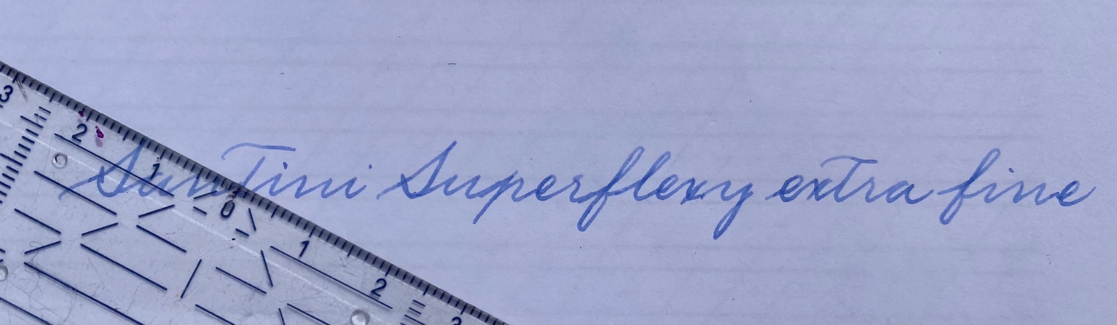
Santini Libra Ebonite with an EF "superflexy" nib - initial impressions
Vintage_BE posted a topic in Fountain Pen Reviews
I have not yet posted a review on FPN, and I am a bit skeptical about reviews of recently acquired pens. I received this pen on 11 March 2021 and nevertheless decided to write a quick review for two reasons. First, I want to join in the praise that several other FPN members have heaped on the company for their stellar customer service and - communication. Second, I’d like to share my (initial) experience with their EF-tipped “superflexy” nib, since there appears to be some confusion as to the availability and characteristics of that nib. I will skip the customary “first impressions” section of the review template since this review is a first impression in its entirety. I bought a Libra Ebonite pen (in the “Lava” design), at the (then discounted) price of €359 (including shipping). Appearance and design: I have enclosed a few pictures. This is an oversize pen (see below for dimensions). As noted in other FPN posts, Santini's color schemes sometimes come across as rather baroque (not to use the term gaudy), however the “Lava” version seems inspired by the vintage “woodgrain” design that was popular with Waterman, Conway Stewart and other brands in the 1920s-1930s. The vintage aspect of the Libra is reinforced by its flat-top design (it reminds me of Conway Stewart’s 55 Duro model). The cap ring is perhaps a bit massive for my taste and the same goes for the “Santini Italia” inscription. The ebonite versions of the Libra (25 of them, when I checked their website, but they may be adding more) are all “limited editions” - i.e. limited to 33 pieces each. The serial number is etched on the top of the cap. In summary, perhaps not a pen to uncap in a meeting where you intend to keep a low profile (but then most meetings are videoconferences nowadays). Construction & quality: Santini advertises their pens as "100% made in Italy". I have no reason to doubt that claim, and my initial impression is one of high quality materials, genuine craftsmanship and careful finishing. No loose or wiggly parts, the ebonite has been polished to high gloss, the cap engages perfectly with the threads. And their nib is something special (see below). Weight and dimensions: The Libra measures 14.6 centimetres capped, 13.5 centimetres uncapped, and sports a hefty barrel that comes to 1.5 centimetres at its widest spot. The section is exceptionally long. Like I wrote, a truly oversized pen. It is slightly longer and significantly heftier than the Pelikan M1000, generally recognised as oversized (see enclosed picture). The ebonite barrel and cap help to keep the weight down (31 grams capped), in spite of the built-in piston component (see below). I have big hands and welcome pens of this size. You could post it but that would make the pen really too large for my taste. Nib & writing performance: This is why I am posting this review. Santini is one of the very few remaining fountain pen companies that manufacture their own nibs. Their website (https://www.santini-italia.com/nib-size-guide.html) gives the impression (perhaps deliberately) that the “superflexy” nib is not available in EF size, and states that the EF tip puts down a line with a width of 0.5mm. I had a (web-) chat with Katrina, one of the family owners and deservedly famous on FPN (and elsewhere) for being exceptionally responsive and flexible (in a commercial sense of course). She confirmed that they would be happy to prepare a superflexy nib with an extra fine tip - without surcharge by the way. The Santini superflexy nib comes with an ebonite feed which is claimed to improve ink flow. It’s difficult to verify such a claim (I do not have a Libra with a plastic feed) but I can confirm that my Libra yields a decent ink flow, in spite of its EF tip. My Libra does have noticeable feedback (as you can expect from any EF sized tip), but that helps to control the nib and does not result in a “draggy” feel. And what about the “superflexy” feature? My Santini nib is flexible, a bit less than the Pilot 912 #10 FA and the Montblanc Calligraphy nib, a bit more than the Jowo “soft” 14K nib (the one with the sideways cut-outs). When used at what I consider to be normal pressure, for writing cursive with a 55° right slant, Santini's superflexy nib does not produce significant line variation - but then almost no contemporary nib does that (the Pilot #10 FA being the exception in my limited experience). You certainly can squeeze line variation out of this nib, when writing vertical script and applying an amount of pressure that (in my view) is hard to sustain for more than a few lines (yes, I am one of those who believe that fountain pens are best used with a very light hand). I hasten to add that the superflexy nib has immediately become one of my favourite writers (and like many FPN members I do write with a rather large number of pens). It has a very pleasant bounce that helps to put down a nicely rounded, flowing script. And - other than what the Santini website states - my extra fine tip actually is an extra fine, and perfectly suited for cursive writing with an x-height of 2.5 mm or even less (see enclosed picture with ruler). In other words, Santini seems to have overdelivered - something I have not yet experienced when purchasing a fountain pen. Once again, this is a first impression after just four weeks of use, but I expect that this nib will remain one of my favourite writers in the longer term. Filling system and maintenance: Santini advertises the Libra as having a “piston filling system” and from the outside it does look exactly like a piston filling pen (without an ink window though). As other FPN members have noticed (see https://www.fountainpennetwork.com/forum/topic/348301-santini-italia-libra/?do=findComment&comment=4388621), the pen encapsulates a Schmidt piston component. That makes it a pen with a “built-in converter”. Compared to a standard converter, the Libra can be filled (and flushed) without having to first unscrew the barrel. However, its capacity is that of a converter, ergo a (bit) less than the capacity of a typical (think Pelikan) piston filler. A standard converter can be taken out of a pen (like a cartridge), which allows for easier flushing/cleaning of the pen. And if a standard converter fails, it can simply be replaced by another one (which usually costs less than €10). That being said, I have been using converters for many years, and have not yet been confronted with one that stopped working. Also, Schmidt is a well-known German quality brand and I have no reason to believe that their piston component is less reliable or sturdy than a classic piston filling system. And if worse comes to worst, Santini has a repair service. If that service is on par with the finishing of their pens, and with their customer service, I would not lose sleep over the continuing functioning of the Libra’s piston filling system. Cost, value and conclusion: at a price of €359 (VAT excl; at a VAT rate of 21% the price would be 434€, and I believe they regularly offer discounts) this is a proposition that is hard to beat. Santini may not (yet) have the reputation and prestige of brands such as Visconti, ASC, Leonardo and Scribo. They do not appear to invest in marketing and I think that they sell most of their products directly to the end customer. But my initial impression is that their pens are of the same (or perhaps superior) material and quality as/than the better known Italian brands. I suspect that this pen will remain one of my better purchases. YMMV of course.
-

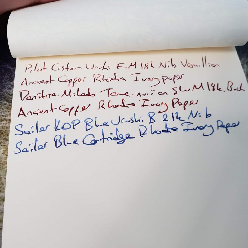
Pens with giant (bigger than #6) nibs?
Beginnersmind0 posted a topic in Fountain & Dip Pens - First Stop
I have a MB 149 and love it! What are some other pens that have nibs that are bigger than the standard #6? I am aware of the Sailor King of Pen nibs, the Pilot custom Urishi, some Conid pens, and the Montegrappa Extra. Are there any other options, perhaps at a more reachable price point? Nib material need not be gold. -
Introduction: Ranga recently held a group buy of this new model on FPN (https://www.fountainpennetwork.com/forum/topic/351924-ranga-handmade-pens-introducing-splendour-model-in-striking-stripes-colours/). Deeming the designs and colour options attractive, I went in for a blue-pink model. I requested Ranga for a customized model which has the cap of the rounded variant and the body of the torpedo, which Mr. Kandan from Ranga was happy to accommodate (on this note, it is always a pleasure dealing with Mr. Kandan). The pen arrived in due time (with the transport time being a bit longer than usual due to onset of nation-wide lockdown). It came in a typical Ranga pen case with an extra "oliver" brand basic plastic pen. the packaging was sans frill and practical, which I like. My thoughts on the pen itself are summarized below. Appearance & Design - This is a imposingly attractive looking pen that commands attention…the stripes are striking, as is the size. The blues and pink/purples really stand out. Design is classic and sans frill – just a rounded cap design with a sensible looking gold clip and a torpedo shaped barrel [as mentioned in the intro – this is a hybrid design – the off-the-shelf designs will have either rounded or torpedo (or flat with conical top) finish on both and bottom]. No finials, cap rings or any other ornamentation. The looks are of reserved elegance letting the acrylic pattern take centerstage. Maybe Ranga could try a variant with a thick cap ring – it may work. The #6 nib does seem proportionately small given the size of the pen. Construction & Quality– It is well-finished to a soft sheen on the acrylic. The build quality is typical of the Ranga stable – sturdy and attentive to detail. There is no wobble when the cap is secured, which, as a new twist (pun completely intended) for Ranga (at least to my experience) takes only one turn to close or open. That’s awesome for something I intend to use always as a desk pen. To nit-pick, do note that since this is a completely hand turned item, you may notice some turning marks when the pen is held to harsh light, like direct sunlight. To me, this adds to the charm of the pen and makes it feel more like a handmade item. Some may find this a minor irritant compared to industrial finishes. Weight & Dimensions This is positively a very-big pen. No seriously, its huge. Right now, it’s the biggest pen I own. However, strangely enough, I wrote through 5 pages of Ginsberg’s Howl just to test for fatigue and there was none. The uncapped weight however, is very manageable given the lack of metal in the barrel (other than the nib), weighing in at much less than an ounce. I do not think it would make any sense to even consider posting (though it is very possible and secure). The dimensions are below: Length; weight (capped): 170 mm (6.7”); 37 gms (1.3 oz) Length; weight (uncapped) : 153mm (6.1”) (measured from tip of nib); 23gms (0.8 oz) Section length : 30mm (1.18”) Section diameter: 13mm to 15mm (0.5 – 0.6 inch) [this information is from Ranga directly. The rest measured by me). Some comparison pictures are below: This is what it looks like next to the TWSBI 580 AL and the Pilot Justus - both quite large pens at around 145-150 mm (5.8-6"") posted. Nib & Performance - It has a very well-tuned Bock nib (I opted for an M) that wrote well right out of the box, both in terms of smoothness (very smooth, with just enough grip on paper to control the handwriting) and flow (wet without being gushy). Only one of the several inks I tried till date - Krishna sea @ night – gave me some problems with hard starts [i badly wanted this ink to pair well since both the base and sheen colours match the pen . But may be this tiny issue will also sort out over time as these things often do]. The #6 nib does look proportionately small for the body – a number #8 would be nice; but the Bock #8s are only in gold (which I deemed too expensive) and Ti (colour whereof would not match the gold clip). Filling System & Maintenance – This is a “3-in-1” filling system (C/CC which can be eye-dropped) which is common for Indian hand turned pens with German units. It comes included with a Schmidt international cartridge which means its easily replaceable down the road, and can be swapped for a whole bunch of cartridges. The body will hold almost 5ml of ink if eye-dropped, which is insane if that’s your thing (I like to keep at least 4-5 pens inked at a time, so prefer CC for the lower ink volume). Cost & Value – I paid the equivalent of about $85 at current exchange rates on the group buy. For an oversized hand turned pen in premium resin with a bock, this was a great deal. Even with the normal (non-group buy) price, it would still be a very good deal. Conclusion – Once more Ranga hasn’t disappointed. The pen is a great addition to my collection, and is a good option for anyone who likes (a) large pens, ( thick sections © striated resin patterns and (d) understated classic designs.
-
So today, a little package from India arrived on my doormat; slightly unexpectedly, but only because it was nearly two weeks earlier than anticipated! The packaging was very secure, with a thick outer envelope, double layers of bubble wrap, a plush velvet pen sleeve and finally cellophane over the pen itself; I'm pleased to say it survived the trip from India to the UK entirely unscathed, and as a bonus fit neatly through the letterbox! Mr. Subramanian of ASA Pens was very communicative and helpful, with emails on receipt of the order, processing, and on dispatch. No faults at all with the postage and dispatch! First impressions: this is a Big Pen. Capital B Big. As in, if you thought the Noodler's Neponset was large, this is bigger. Despite this, the pen is pleasantly lightweight for the size and, when filled, balances at nearly the exact midpoint of the length making for a comfortable writer without undue fatigue. Construction: the pen is made of clear acrylic resin throughout. ASA Pens' website states that the pen is entirely hand-turned with no CNC involved, and I have no reason to doubt them; the contouring is smooth throughout and the pen sits very nicely in the hand. The section, cap jewel and end of the barrel are crystal clear, and the barrel and cap are sanded with micromesh to give a pleasantly textured, misty, fogged finish that feels surprisingly warm to the touch for some reason! This is, of course, where the pen gets its name; the nebulous fogged finish gradating into the crystal acrylic like the a galaxy into the vastness of space. The threads are solid throughout, with the section taking over 11 full turns to unscrew from the barrel! Not coming loose any time soon The cap smoothly and firmly screws on in a little over 2/3 of a full rotation. The nib and feed are friction fit, and took a little tinkering to rearrange for optimum writing, but are easily removable for cleaning etc. The trim is chrome throughout, with a very stiff clip: not that this is a pen one would be likely to carry around in a pocket! Stamped (lasered? engraved? heat-embossed?) on the side of the barrel is "ASA Stellar Galactic / India 2015" - this branding is next to invisible when the pen is empty, but shows up once the barrel is filled with ink. Weight: - Capped: 31.0g empty - Uncapped: 20.5g empty - Cap: 11.0g Dimensions: - Length capped: 15.3cm - Length uncapped: 14.0cm - Length posted: don't even bother - Barrel diameter: 16mm at the widest point - Section diameter: 13.5mm in the middle of the taper Nib and feed: my pen came with a standard unbranded IPG nib, with a fairly fine point. There is an option to upgrade to a JoWo nib at checkout for a small extra cost, but I didn't feel this was necessary and indeed the standard nib is smooth with a little more springiness than my other steel-nibbed pens. I believe the feed is ebonite (?), and it easily keeps up with even the fastest of my writing without flinging ink everywhere! On the subject of ink, I measured the volume of the barrel to 1mm below the section threads as 4.1ml, over double the ink capacity of any of my other pens! You could write for days on end with just one fill of this pen. Writing: the pen is a pleasant writer, especially for those with larger hands (like myself!). It's nicely balanced and easily long enough to use comfortably without posting, and frankly the length gets a little absurd if you were to try! The nib is smooth enough to be unnoticeable during writing, and is fairly forgiving of changes in angle. Thoughts and opinions: for a handmade pen that cost me a hair over £20 (Rs ₹ 1,050), including free shipping halfway across the world, I'd say the ASA Galactic is exceptional value for money. If you like demonstrators, big pens, or just fancy something a little unusual, then this could be a worthy addition to your collection. It's great fun to be able to see the huge ink reservoir sloshing around, and the clear section gives a good insight into the capillary action that feeds the nib! However, for people who prefer a smaller or lighter writing instrument, this isn't the one for you I'm afraid. Picture time! http://i.imgur.com/V8pMb70.jpg?2 Showing the texturning of the barrel and cap, with a little glimpse of the logo. http://i.imgur.com/y4G9146.jpg?1 Another view of the unfilled pen showing the engraving. http://i.imgur.com/9Oro9cM.jpg?1 Nib on show! Note the clear section. http://i.imgur.com/2JyPFFZ.jpg?1 All filled up woth Röhrer & Klingner Alt GoldGrün http://i.imgur.com/29X1TeE.jpg?1 Look at how that crystal acrylic blends into the fogged barrel! http://i.imgur.com/7r4Q0ZB.jpg?1 And all filled up. There's a little breather hole in the cap in case you didn't notice earlier. http://i.imgur.com/vXETcPr.jpg?1 A capped size comparison with (left to right) the Noodler's Neponset, Jinhao 159, TWSBI Vac 700, LAMY Safari, Platinum Century, Noodler's Ahab, Pelikan M600 and Kaweco Sport http://i.imgur.com/FDeOXET.jpg?1 And the same, but posted! See what I mean about the length getting a bit ridiculous? http://i.imgur.com/mTclr7c.jpg?2 Finally, a little writing sample. I hope this little review has been of interest; ask away of you've got any more questions about this lovely pen! Cheers all, Alex
-
I am an avid Vacumatic OS and Maxima collector, but far from being an expert. I usually differentiate an OS or Max by the length of the pen, diameter of the cap, and the larger nib (I.e 9 or 10 feather nib etching as opposed to the 7 or 8 feather). I was cleaning out a Brown OS and discovered that it has a 7-feather etching, but is the same size as the usual OS and Max Nibs. The pen has a made in USA print with a 45 date. Have I been wrong with one of my criterias? Is this just an anomaly with bad Parker QC? I have also come across nibs with 8-feathers on one side of the shaft and 9-feathers on the other. Any help would be appreciated.
-
Hi everyone, I've been waiting a little impatiently for this pen to arrive I've started to get interested in japanese urushi pens recently and wanted to stretch out my collection that is mostly made out of european celluloid pens (ie. omas,montegrappa,pelikan etc.) My first urushi pen was a mikado which I really enjoyed, and was unlike any of the 30ish pens I've owned before. But as it was a fairly well known pen in the community I didn't feel the urge to write a review on it. My first review was on a KOP with blue urushi finish, which is my favourite pen still. My second review is this one, on a pen that is fairly underpresented in this medium Imho. Without further ado, I hereby present you the custom urushi in red finish : Appearance & Design : 9/10 I view this pen as the spiritual successor of the 845, as the resemblance between two models are uncanny. This is like the jumbo version of that pen, swollen in size almost everywhere possible. This is a true oversize pen, bigger in size than both KOP and m1000. The design reminds me somewhat of the big red duofold of yore, I really enjoy this shiny red urushi this pen comes in, it's like a toy pen from far away but has the complexity of urushi lacquer up close . Color is a nice contrast to my tame nuri mikado, which towers above even custom urushi in size . In this model, the urushi is applied only to the mid portion of barrel and mid portion of cap, and the remaining parts (section, finneal etc.) are made out of plastic ( at least it feels that way). This somewhat leaves something to be desired, as from my KOP urushi I was used to the whole urushi looks. The gold rings all around give the pen a more professional look, compared to KOP and mikado, both of which are in the understated spectrum of pens imho. This pen looks really wonderful and as always pictures never do justice to the urushi pens and I think from the visuals department this pen fits perfectly to be the flagship of pilot company. I took out only one point from the scale, as I was spoiled by the work of art urushi on my KOP previously, which has a 3d feeling of depth in its paint that is not present in custom urushi. But make no mistake, the shine of urushi on this pen is nothing less than spectacular. 3 sisters Section is plastic, as is with KOP, but it's not painted here, neither are finneals of cap and barrel. Construction & Quality: 10/10 After using a couple of pilot pens, quality control and construction quality both have their ceilings removed in my point of view. The engravings, clip holder ball, gold rings etc. are top notch and everything is made to fit perfectly, even the barrels fit into section creates an airtight closing, which feels extremely sturdy, more so than KOP, which has the same metal on ebonite barrel-section closing but is of lesser quality imo. This pen is clearly made to last, and I don't imagine this pen making any problems in the near future. I think pilot really made a home run in the quality control department, and I wouldn't be surprised if every custom urushi came out this good out of box, as this type of construction quality is usually an all or non endeavour. Weight & Dimensions : 10/10 I am again cheating in this department , as I have not weighted or measured this pen with a proper tool . But the pictures show how it compares in size vs KOP and mikado, and custom urushi is noticeably heavier than KOP but probably lighter than mikado. I know this sounds like stone age calculus but that's all I got unfortunately . The pen feels right in the hand, and the center of gravity is somewhere close to middle of barrel. For those that enjoy pens similar in size to 149 or KOP, this should feel like a natural fit. Nib & Performance : 10/10 This is the part in which I was genuinely surprised. Having used quite some modern gold pens, I was expecting something similar to m1000 characteristics, probably a little stiffer due to shape of nib, but boy how wrong was I . This nib is definitely soft, probably a little less so than m1000, but the similarities end there imho. The snap back is really genuine, and it feels closer to write with a 912 fa nib more than m1000 imho. The feed was always adequate in my short writing sessions but I didn't write a whole lot until now. I feel better writing with this than all of my oversized nibs, and that is a really hard thing to achieve . Pilot has nailed it in the #8 nib department imho, even though they haven't got any experience there before. Here's a writing sample of all three pens; One can notice how line width of custom urushi is much thinner in some places than mikado while almost same width in other places, the feed was able to keep up with nib during my sessions Edit: I think I have forgot to add a compare & contrast between these pens, as if you have an experience with any one of them, it can be easier to understand how the other two writes. Sailor is the one I have most experience with, as I've been using a medium KOP for more than a year now. That nib is really smooth, like probably one of the smoothest nibs I've ever used. It's closer to fines of european nibs, and there's little line variation, though the flow is never interrupted, even if you write fast and push the nib a little. With some push, you can the shading of the ink more apparent, even if line variation is limited. The second pen I use most is the mikado, which has a bock made 18k medium #8 nib. That nib is probably as soft as sailor, but it has a lot more flex at tip than sailor has. This creates very nice line variation although it feels a little mushy and snap back is not as good as I would like, reminding me of the good old m1000s . That pen dries fairly easily after the fill, so I almost always exclusively use it valve open, and sometimes force feed ink into the feed with the valve, creating an oversaturated passage, and that's quite fun . Being able to change the flow of the feed is a very welcome option, and gets the pen a very nice character, even though the nib is probably a run off the mill bock nib. The line width is similar to european pens, as the nib is european, so it runs closer to the broad KOP nib more than medium nib. That leaves the custom urushi to last, and as it is an f-m nib, (japanese characteristics) it is hard to make a direct comparison here. It is very narrow, like at least a size narrower than kop m or two sizes than dani m. However, the nib has the best line variation of the bunch, and I can't say the nib is soft per se, as it is only the tip that bends when applying pressure, the line easily goes beyond medium, probably matching kop in everyday writing, if you have a heavy hand. The feed is wet, and if this was a broad nib I guess it would be wetter than sailor, but with this tipping it makes the ancient copper shade really nice.This nib has really nice characteristics that is hard for a newbie like me to explain, but I've seen some japanese pages comparing this to a 149 nib, both taken out of the pen. Although they have similar sizes out of section and have same gold percentage, they have many differences and it was quite an interesting read. I'll add it to one of the comments if I find that page. Filling System & Maintenance : 8/10 This pen is a cartrdige/converter and comes with the really nice Con-70 proprieatory converter. Although it should be accepting the newer con-40 without any trouble as well. This is one of the largest converters on sale afaik and it is a real sweetheart to fill and empty. So I think this is a real good alternative to pistons or eyedroppers of other oversize pens. The only nitpick I have is that if this pen was a piston filler or ED, with the massive barrel it has, it probably could fit twice the ink no problem. But as everyone ever used a piston filler before those are harder to clean than converters and if something breaks whole pen needs to be serviced, as if the converter here is broken, a new con70 should cost less than $10. I gave it a 9/10 in this regard. The maintenance issue is a little more complex, as I think if it is kept safe, this pen could easily outlast its middle age owners . However if an unfortunate accident occurs, it will be a little harder to clean up the mess. First of all, this pen is not sold anywhere out of japan, so good luck asking for an exchange from your local b&m store . So if you've got an acquintance in japan maintaining this pen could be a lot easier . I took off some points and gave a 7/10 in this regard. Cost & Value : 8/10 I bought this pen directly from japan and the price was less than half of what I paid for KOP urushi. That puts the price/performance ratio of this pen through the roof, as it is a wonderful pen for ~$800. The thing is again good luck finding this pen let alone finding it for that price . In the more commonplace markets such as rakuten, it can be bought closer to $900 but they state a multiple month waiting list for this specific model. And in western retailers, the black model sells for around $1100, sometimes higher. I think pilot managed to hit a sweet spot with the cost & value of this pen, as incorporating low cost production techniques (converter filler, plastic section etc.) with high cost features ( #8 nib, urushi barrel & cap) they created a pen that is not stupid expensive but really has some of the features of stupidly expensive pens. (looking at you namiki ) The thing is, I really hate it when somewhere around the world some other human being pays a lot less to reach the same product as me while the producer earns the same, and the middle man fills their pockets. I mean no harm for the retailers trying to sell japanese goods as they're selling almost at the same price, which makes me think this is probably more due to the large distributors instead of small retailers. I wish japanese pens could settle a street price all around the world, and we could use their awesome pens more often. Final Thoughts & Conclusion : 55/60 When I added up the final score, I noticed it probably was higher than the score I assigned for KOP, which is my favourite pen . I think this is more due to the fact that I think this is a better pen for a larger population than KOP, as KOP has quite a few shortages that can be dealbreakers for many people. As I have written in the review, pilot has hit many home runs with this pen and this specific finish is an underdog in the oversize pen world, which is a shame as it is a solid all-rounder that is quite more fun to have around than the good old & boring 149 or other slew of black precious! resin pens. I am still a newbie in this forum and appreciate all critics, especially if I can improve myself. Thanks for reading.
-
Hello everyone and thanks for having a look. This will be my first review of a pen so all criticism is more than welcome. As this is my first review I wanted it to be of a pen that is special to me and at the same time not one that is beaten to death(ie. m1000). So that I would have a unique addition to the community and maybe the flaws of my review will be less overt . Anyway, without further ado, here is my review on the fabled kop with a blue urushi: Appearance&Design: 10/10 Marvelous! This is the part that excited me most when I got ahold of this pen. Urushi is the type of material which one needs to see to appreciate. The depth of the material is simply not carried into any digital medium. My experience on urushi pens are very limited but I can say that this pen looks very high quality, even those that have seen a fountain pen for the first time can appreciate the uniqueness of it. This is a rare finish in the japanese urushi pen world as far as I'm concerned, As blue pens that I saw was usually in the roiro migaki finishes, meaning they are much more bright and blue in the true sense of word. This pen always feels like it's in a dim lighted environment, and could reveal more color if it was held to brighter light. As this pen is fairly new I don't expect to take it outdoors any time soon but in the pictures, one can see the room is fairly well lit. The ebonite KOP, which became the donor pen to become this beatiful piece of art, is a fairly straightforward pen in terms of design. A torpedo shaped shiny ebonite pen that has a clip coming out of a seamless cap, there are no parts to talk about except the clip itself; which is unique in shape to sailor and is not remarkable per se. The true value of this pen lies in its urushi finish, which I think pictures will do more justice than my words. For the scaling, I don't know what else deserves a solid 10 if not this pen, with its very well made urushi finish and simple yet elegant design. It's much shinier than the ebonite KOP, which is easier to see in next image Construction & Quality: 10/10 The build and quality control of japanese pens are excellent, from the vantage point of the batch I've dealt with at least. The nib adjustments, ornament alignments, inlays, and engravings are simply superb in most if not all of them, including the commonplace platinums, pilot and sailors. This pen is no exception to this and I cannot find anything out of place, and nothing squeaks or wiggles, and every part works as intended. As this is a very delicate pen, I have not witnessed it to any harsh environment (including sunlight and pesky humans ) but having used a regular KOP for around a year I can say this pen is built to last. (I've have had some unfortunate accidents with ebonite KOP in which I've dropped it from my pocket once and from my table another time, no visible marks and scratches are visible, and pen is in mint shape although it's been rarely left uninked in the past year). So it gets a top score from this field as well. Weight & Dimensions: 10/10 I think this part of the review is the most subjective one as dimensions of a pen is hard to critic objectively. So I'll try to keep this part short and to the point. This is a true oversize pen, similar in size to flagship offerings from other major brands. The nib is very similar in size to flagship nibs as well, slightly shorter than a m1000 nib and around the same length as a bock #8 nib. This pen doesn't tire me for extended periods of writing as the ebonite barrel is very light and the brass section keeps whatever the weight pen has very close to paper. The clip is very good in size and helps keep the pen inside a pocket if you have one in adequate size . Nib & Performance: 10/10 I must say this is a fairly subjective part of this review as well. I am in love with the buttery smoothness of sailor nibs, especially in the KOP size. The iridium tipping on this pen seems to be quiet different from other pens, and is actually somewhat position sensitive. This is a broad nib and writes in a nice and juicy line, probably the owners of pens from european brands would call this a medium line. Anyway, this nib wrote perfect out of the box, as did my previous two sailors, and is part of a habit I tend to expect from japanese manufacturers in general. A solid top score from this part as well . Filling System & Maintenance: 6/10 This is the first part of the review that I think the pen has some objective shortcomings of some sort. All KOPs and most of the sailor pens in sale right now come with a cartridge and converter system that is proprieatory to sailor. This is the most pathetic system I've seen in a fountain pen and I include pens from the 2-10$ range as well. The opening of the converter is too large so it cannot be used separately from the pen, or at least requires some serious dexterity to do so. The capacity of converter is pathetic as well, in the waters of .7 ml. I manage to write 6-7 pages with this converter before I feel the urge to refill(with broad nib), this can sound OK, but this size of pen at least requires an alternative filling mechanism(like DVOS), or a higher quality & capacity converter, like those offered by platinum and pilot. Maintenance is fairly simple however, as the converter separates fairly easily and it doesn't take much to clean from there. The nib is friction fit, and can be taken out fairly simply for a major cleaning. The maintenance of body, section and cap should be quite hard if something bad happens(requiring a visit to the penmaker or an urushi master probably) but this sort of pen shouldn't be taken to adventures IMHO. I don't think I'm being harsh with my score here, as I give a good 8/10 for the maintenance and a poor 4/10 for filling system. Cost & Value: 8/10 After having so many nice things to say about this beauty it hurts me not being able to give a top score for the value but I think it wouldn't be a fair review if I gave this pen 10 points after spending so much on it. If someone told me I would spend close to $2k for a fountain pen I would just laugh before I started this hobby. I don't know what's the MSRP for this pen but it can be found for $1900 in nibs.com as of the writing of this review. I bought it for a little less thanks to favorable exchange rates. I truly believe this pen deserves its cost but as is the case with most handmade works of art, one must pay dearly for a nice product. It is around the 2x of price of a regular ebonite KOP, and instead of buying two of those, I think stretching out for this one is a good idea. But then one spends the cost of three KOPs, and then four, and then five... From left to right; DVOS, KOP urushi, KOP ebonite, M1000 in black, W&E Roseweood I like how pelikan nib autocensors itself . Delta's bock nib seems to be wider than others Final Thoughts & Conclusion : 54/60 I did not include any straight measurments for this review, as I'm pretty sure someone interested in this review did some research on this pen as well. I just wanted to show my appreciation of this pen and share the pros and cons of my favourite pen. Topics related to this specific pen is very rare and I've never pictures of this specific finish apart from retailers. It comes with all the shortcomings of a regular KOP, and if someday Sailor decides to release this pen with a much better converter or better yet in a piston or ED build, this pen can easily get much closer to a perfect score. Thanks for your time and have a nice day .
-

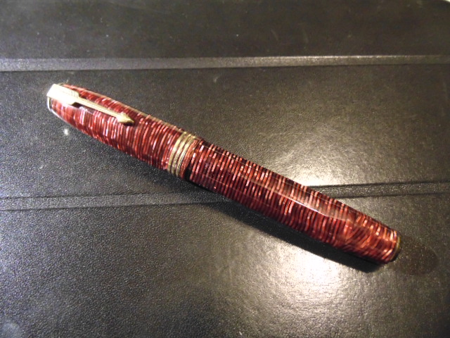
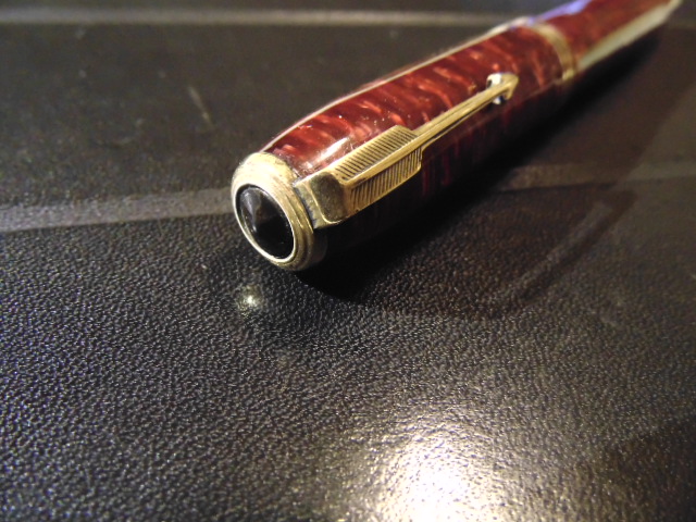
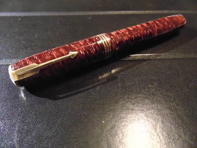
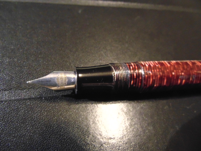
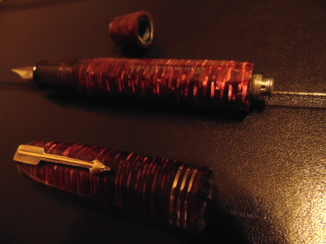
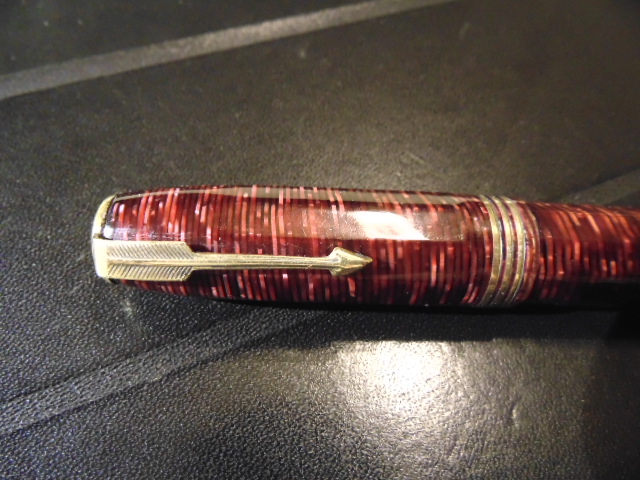
Parker Vacumatic (Faceted!), I Hadn't Get Any Information About It.
JorgeLpzLmg posted a topic in Fountain & Dip Pens - First Stop
Hi!! Two days ago I bougth at Mexico city (where I live) a faceted fountain pen, wich looks as a Parker Vacumatic oversize. I was searching in the web in orden to confirm if it is an authentic Parker, but I didn't get any information or images about faceted Parkers. The pen description is: Barrel engraved: "Parker Vacumatic USA" (the "V" is engraved on the "R") Long with cap: 13.5 centimeters (5 1/4") Barrel diameter: 1.6 centimeters (5/8") Color: Borgoña Faceted barrel and cap Apparently, the original nib was replaced with a "Harley Davidson" nib (!!!). Can you help me to confirm if it is an authentic Parker? If it's an authentic pen, what is the correct nib for it? I'm attaching some pictures. Thanks! Jorge.
-
Introduction:The inception of this pen began with my curiosity of Titanium Nibs and I was able to put together this "customized" pen from my purchases made over a brief visit to the United States. Having read many reviews and opinions about Titanium Nibs online,being a different writing experience from Gold and Steels nibs, I started looking for an An American Vendor for titanium nibs. While doing my research I came to know that they are available in #8 size too. So as everyone knows, "Bigger IS better", I asked around for a #8 Bock Titanium Nib.Thanks to Shawn Newton who pointed me to Karas Kustoms and I was able to order one from them quickly. [bock #6 Gold, Bock #8 Titanium] Next step was to decide on the pen material. Being an Orange Fanatic I always wanted to have an Orange Ebonite Pen. I found some on the ExoticBlanks.com website and ordered 2 rods.They were pretty expensive and there is some uncertainty as to the Country of origin of these Blanks *cough* India *cough*. This pen was made from a single 10 inch rod. Having obtained the nib and blanks, I had to decide on a pen model and the pen manufacturer. The nib being a #8,the pen had to be an oversized pen and the first Indian oversize pen that comes to (my) mind was the A.S.A Galactic. Which I had owned for a while but sold off as it was too big for my grip and was too back heavy.Being a Happy multiple repeat customer of A.S.A Pens in Chennai,India I started looking at other A.S.A Models and found the Popsicle to be of much "manageable" proportions. After a brief chat with Mr. Subramaniam,the owner of A.S.A Pens I was told that the Popsicle could be customized. So to maximize the usage of my "expensive" Orange Ebonite blanks I asked an A.S.A Popsicle to be made but with Flat Ends which I have christened "FlatSicle". I have been using the Flatsicle for almost a month now and here is my review. [Montblanc 149, A.S.A Flatsicle, A.S.A Nauka] Construction:The material feels,and smells, like most of the Indian Ebonite I have handled. Smooth,hard and warm to the touch but ofcourse I have not been able to source Indian Ebonite in Orange Color.The ends have flat polished surfaces.The Clip is pretty basic and can be customised on demand.I went for a chrome clip.The cap has a very minimal step down,of about 1mm,to the barrel which tapers by about 3 mm towards the end of the barrel.The cap takes 3 turns to uncap.The #8 Nib looks well proportionate to the pen body. The section has a very prominent lip towards the nib and tapers up towards the Cap threads and barrel.The step up from section to barrel is about 1mm and not noticable, allowing you to grip the pen higher up,even over the step up.The uncapped pen has the highest diameter at the exact middle of the pen which lends to an almost middle centre of gravity.The section unscrews from the barrel in 10 turns.This is kept so high because this pen can be used an an Eye Dropper (with some Silicone grease) where it holds a massive 5ml of Ink! The pen also takes standard converters for about 1ml of ink. I enjoy the "ritual" of filling ink so I prefer C/C pens over the huge capacity E.D mode.The Pen can be used posted but becomes unwieldy and comical. Some Dimentions of the Pen:Capped Length: 170mmUncapped Length: 128mmPosted Length: 175mmMax Cap Diameter: 17mmMax Barrel Diameter: 16mmMin Barrel Diameter: 13mmSection Diameter: 11-14mm [A.S.A Flatsicle, TWSBI Vac700, A.S.A Nauka, Pelikan Twist, Lamy Al-Star, Parker Duofold Centennial, Caran d'Ache 849, Pilot Metropolitan] Writing Experience:Having used the #8 Titanium nib for almost a month I can see what the fuss is about. It is definitely a very different and unique experience from a Gold or Steel nib. The first thought I got was how similar the "feedback" was to a Mike Masuyama Needle point I got to try at a Pen Show,almost "like a Pencil". This "feedback" I feel to be very dependent on the type of paper used. Another quality of Titanium nibs has been its "soft" nature and to experience just this I got mine in an Extra Fine grade which is a departure from my preference of Medium to Broad Nibs. During regular writing,the nib is soft enough to impart some line variation to almost resemble a Western Medium. Keeping in mind the tendency of titanium nibs to spring, the nib can be pushed to give a Broad Line. I would recommend spending a lot of time getting to know the Point of Spring Back of your nib before attempting any serious "flex". But the general users should be more than satisfied with the "casual" line variation due to the soft nature of the nib. The ebonite feed of the Nib Unit has kept up perfectly with the my extensive Flexy Loopy Loop tests in C/C Mode,I think it would be the same,if not better in E.D Mode. Balance in my hands is right inbetween my finger grip and the web of my hand where the pen rests letter me grip the section at the perfect distance from the lip so that the large nib is right on the paper. In Comparisson to my Montblanc 149,to get the perfect balance,I need to grip the pen over the Cap threads and that can get uncomfortable over time.If I hold the pen at the most comfortable area of the section,the pen gets angeled to a steep degree and making the pen back heavy. So I find the Flatsicle more comfortable than the 149!Compared to the Visconti Casanova, I find the Visconti Very back heavy and honestly I bought it only because I got it for a steal!If only I could compare the Flatsicle with a Popsicle. The Little Things:This Pen is a Monster! Be prepared to get a lot of queries about it and attract a lot of attention.The Orange Ebonite can appear different hues under different Lights and is difficult to Photograph.Nib creep on the Titanium Nib looks very nice (for those who ar'nt O.C.D about it)No,I have not sprung the tines during my Loopy Loop tests.The softness of the Nib allows it to go from an Extra Fine to a Broad line width comfortably.The pen will be a tight fit when clipped in to shallow shirt pockets and tend to "stick out".No issues in Jeans Pockets or Clipped onto the middle of the shirt (between buttons). Conclusion:What started as a curious experiment turned out to be one of my most Enjoyable Pen. Obtaining a #8 Titanium Nib in the U.S seems to be a bit difficult so I would like to thank Shawn Newton for pointing me in the right direction.Thanks to Mr. Subramaniam of A.S.A Pens for letting me "customize" one of his most popular models and doing a good job on working with the Bock #8 Nib. Nibs of this size ar'nt common in India and I'm happy mine was in good hands. As I progress through my Fountain Pen journey I find myself gravitating towards specific models,which have mostly been slim pens or pens with tapered sections and having sold off most of my oversize pens, the A.S.A Flatsicle was a very pleasant surprise as I found it very comfortable for use considering its dimensions. Its pens like these that make you stick around in a hobby.
-
Hi!! Some days ago I bougth at Mexico city (where I live) a faceted fountain pen, wich looks as a Parker Vacumatic oversize. I was searching in the web in orden to confirm if it is an authentic Parker, but I didn't get any information or images about faceted Parkers. The pen description is: Barrel engraved: "Parker Vacumatic USA" (the "V" is engraved on the "R") Long with cap: 13.5 centimeters (5 1/4") Barrel diameter: 1.6 centimeters (5/8") Color: Borgoña Faceted barrel and cap Apparently, the original nib was replaced with a "Harley Davidson" nib (!!!). Some members in the First Stop forum had gave me very interesting information, wich says the pen it's not a genuine Parker. Some people says it's an italian pen. Other people says he has similar pens, but are diferente in the part of the barrel that screw in the cap. Someone more says the engraved is fancy, so it can't be an italian pen. Can somebody in this Parker forum help me whit some aditional information? I'm attaching some pictures. Thanks! Jorge.
-
Visconti is releasing a new Homo Sapiens, hopefully next week. It's made in black polished resin, with palladium rings and trims. Visconti said it's a more practical model, for a daily use, because of the material and the filling system, that here is converter/cartridge, even for the Oversize model. It's a bit less expensive, though. http://www.giardino.it/pens/IMMAGINI/copHSelegance.jpg
-
When I met Tom on the last Köln Penshow in april, he showed me a nice Goldfink in Lapis Lazuli blue. The pen however was too small for me. So we decided he would make an oversized model for me in this beautiful Lapis Lazuli. Now, two months later I took delivery of this marvellous pen. It is a buttonfiller, has a tuned B 8 nib from Bock. The clip has to be changed to a new one with Goldfink engraved. The pen is postable, writes perfect and is usable as a daily writer. Nice job. Enjoy the pictures.
-
Dear FPNers, Here is my take on a Visconti Homo Sapiens maxi with an 23k Pd EF nib. I hope you find the review fun and enjoyable. Wish you a prosperous and fun-filled new year with loads of new pens and paraphernalia. In case there are any problems with pictures you can also view the same review in my blog: http://iwonder-thecartographer.blogspot.in/2015/01/visconti-homo-sapiens-bronze-maxi-review.html Main Motivation Somewhere in late 2009, Florence-based luxury pen maker Visconti announced a nib made out of a 95% Palladium (23k) alloy, in a press-release. Most of the nibs that were commonly available were 18k/21k Gold with a few exceptions (Sailor, Danitrio among others), and this was the first of its kind. And the other side of the snippet showcased a pen christened with the name of ‘Homo Sapiens’ (HS), forged from an almost equal mix of basaltic lava and resin, adorned with bronze and protected from competitors with a patented formulae. The lava came from Mt. Etna (an active volcano) on the east coast of Sicily, Italy. I came to know of this pen three years later while watching an ebay sale though . Visconti (estd. 1988) promised the HS lava to be unbreakable, flameproof (upto 100°C), with a slightly hygroscopic body, fitted with bronze parts with a highly-corrosion resistant titanium power filler. The versions available these days are HS-lava/bronze or steel, a lava/bronze (by Mazzi) 388-limited edition (LE) and a 1000-LE crystal swirl (made up of Acroloid/Sterling Silver). Besides, fountain pens there are also roller-balls and ball-point pens in the HS range, but those are of course not our primary interest. An Italian Job http://s25.postimg.org/4e5nas59r/DSC_1752.jpg Visconti does pay a gentle homage to the evolution of mankind by attaching significance to the Bronze Age, predating by around five thousand years. That’s the period when humans began smelting and mixing of metals like copper and tin to produce alloys like bronze. Also during this period, a system of writing had evolved, however it was majorly through symbols, to convey information. The trim-fittings including the clip are all made out of bronze, for this version of the pen. The variants are steel or sterling silver trims for the other HS pens. http://s25.postimg.org/ghayycgbz/DSC_1753.jpg Out of the well-protected box, this pen comes out with a spring-loaded clip made of bronze, holding a paper-flyer, which tells you the nib specification on one side (23K Pd – 950) and expresses ‘dreamtouch’ as – ‘Do not press! The nib will follow your dreams’. The name of the company VISCONTI is embossed on both sides of the clip on a black background. The bronze in my case has a slight patina developed over the rose-gold sheen, and I am happy with the dated-look. Alternately, there is a deep yellow bronze polishing cloth provided along with the pen to clean the surface-oxidation. The complete capped piece is a bit heavy weighing around 45 grams and is 14.4 cm long. For carrying it in your shirt pocket, you might have to lift the spring loaded clip by a bit, as the clip end does not slip easily. There is a bronze ring at the power filler end and two in the cap itself. Other reviews would tell you that the HS-Steel comes with a piston filler instead of a power-filler (vacuum-plunger). There is a large bronze centre-band at the start of the grip section which says HOMO SAPIENS. The next thing one would notice is the unique locking system of the cap. The quick-locking grooves enable (un)locking with a slight twist (counter) clockwise (fourth of a complete turn). A little twist will reveal the fantastic 23 karat Palladium nib and an inherently earthly grip section. A click sound is heard once you correctly twist-lock the cap. http://s25.postimg.org/ao0wxs4of/DSC_1756.jpg The finial mentions‘Visconti’ with the company logo. This can be customized using their My Pen System to customize a finial with either your initials, zodiac sign or even a gemstone. http://s25.postimg.org/pzapye20f/DSC_1757.jpg HOMO SAPIENS can be seen imprinted on the thick bronze centre-band which starts the cap-locking threads and subsequently the grip section of the pen. I would rather say that the pen is very intelligently designed apart from wielding materials hard to master. http://s25.postimg.org/mxfcaozhr/DSC_1760.jpg The filling system is a vacuum plunger power-filler system with a titanium rod making it highly resistant to ink corrosion. You can unscrew the blind-cap counter-clockwise to the end-stop and then pull out the vacuum plunger if you wish to fill it with ink. The length of an uncapped pen reads a comfortable 13.2 cm with a 25-26 g weight. http://s25.postimg.org/jruqkhgvj/DSC_1763.jpg The nib has a leverage of around 2.6 cm and is a size#6 nib. There are many reports that these dreamtouch nibs being manufactured by Bock, but I am not certain of that. Made up of palladium and adorned with gold, the nib of HS-bronze makes a distinctive statement. Embossed is the company name VISCONTI near the lunarly-eclipsed breather hole . Below around the tail end of the nib, imprinted is the nib width above which lies the mesmerizing specifications ‘23k Pd 950’ and FIRENZE. Firenze refers to Florence, Italy which is the birthplace of both Italian Renaissance and Visconti Pens, thereby, the tagline ‘The Writing Renaissance’. Nib is screw-fit into the grip section but I did not try to take that out. The nib has a bit of flex although there is not much difference for an EF nib when it comes to line variation due to pressure. My nib being an EF was a QC-victim and needed some smoothening with a 12000 Grit buff-stick and 0.3 µm lapping film to get to its true dreamtouch state. http://s25.postimg.org/4x656b7an/DSC_1767.jpg And now it’s truly one dreamtouch pen. Comparison – m805 & c823 (PS-It’s a m805 not a m800, quoted as a dimensional reference only, felt very lazy to correct it ) http://s25.postimg.org/xytbi227j/DSC_1771.jpg Capped the VHS maxi seems to be longer than a m800/5 but shorter than a pilot custom 823. http://s25.postimg.org/hd2v020mn/DSC_1775.jpg Uncapped all of them roughly have a similar length. Writing Post nib-adjustment – butter-smooth, wet-flow and ‘dreamtouch’. Sometimes, it dries up and has somewhat of a hard-start if cap is left open for sometime. http://s25.postimg.org/kzd9qfwdr/DSC_1783.jpg The writing is super-smooth with a wet and free-flow. The EF nib lays a line tad thinner than a pilot 14k medium nib. So, if you want an M you might go for a F nib. Ratings http://s25.postimg.org/tqyj9b0rz/VHS_rating.jpg Overall, the cost of the pen defines the value you place on this unique piece. Though it retails at USD 595 it’s easily available at heavy discounts in both online and offline markets. I also guess the problem of sweating of ink at the edge of the grip section has been fixed and there is no need to grease the nib-threads anymore. I did not notice any sweating of ink at all. Thanks, Sonik.
-
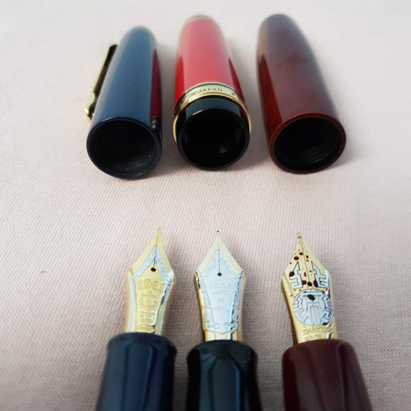
http://i.imgur.com/L1KmlxA.jpg The Danitrio Mikado is the only repeat in my collection. And it's for a good reason. The pen is just an amazing writer and it's ebonite construction makes it incredibly well-balanced. I own one Ao (blue) Roiro-Migaki and one Shu (red) Roiro-Migaki Mikados in the flat-top version, clipless. They also available in the round-top version. Both flat- and round-top version are available with and without clips. http://i.imgur.com/JSkqnd0.jpg The signature is of Koichiro Okazaki, also known as Kogaku. He is a master Maki-e artist commissioned by Danitrio to do both urushi pens as well as Maki-e pens. I love that Danitrio's urushi pens are signed by the artist. It really makes a point of the man who put so much skill and work into making these pens a reality. The signature also just looks pretty cool =] http://i.imgur.com/k6ARh3S.jpg Interestingly, the Bock #8 nib, which most of the bigger Danitrio pens use, has changed slightly over time. The blue one has the older version, while the red one has the newer version. http://i.imgur.com/U5ep2cd.jpg From top: Danitrio Mikado in blue urushi, Danitrio Mikado in red urushi, Danitrio Densho in blue urushi, Danitrio Sho-Genkai in raw ebonite, and a Lamy Safari in charcoal. The Densho is an older pen that I got in a trade and the blue urushi is little lighter. The Densho is also an eyedropper but it has a #6-size nib. It's very light and comfortable and the clip makes it more convenient to carry but I much prefer the looks and writing experience of the Mikado. With it's large ink capacity and clip, it would make a great daily carry. http://i.imgur.com/yhABwkY.jpg The Mikado pens are Japanese eyedroppers, which is an eyedropper with a shut-off valve. You fill the pen with an eyedropper or syringe and when you want to write you unscrew the knob at the end and it opens up the valve. Here you can see the seal that meets with the inside of the section, cutting off ink-flow when the shut-off valve knob is screwed down. http://i.imgur.com/US5q6im.jpg The Mikado is a big pen! But it's very light for it's size and the large grip section is very comfortable for long writing periods. Underneath the Mikado is a Nakaya Piccolo. Nakaya pens are more normal-sized in width but for people who prefer oversized pens, I think Dantrio pens would generally be more comfortable. I'm not really qualified to determine the difference in urushi quality, but to my eyes both Danitrio and Nakaka look fantastic. Danitrio's urushi is done by master Maki-e artists though, which is why they have that nifty signature, that I love so much. http://i.imgur.com/oQtbCOo.jpg Even though the Mikado is really big capped, uncapped it's a very reasonable length. The nib is huge and proportional to it's size. http://i.imgur.com/rODHMY5.jpg http://i.imgur.com/sDqiNn0.jpg Danitrio Sho-Genkai with the old-style Bock #8 nib and Mikado with new-style Bock nib. http://i.imgur.com/i32l0to.jpg A trio of Danitrio eyedroppers. http://i.imgur.com/VhpKpZF.jpg A trio of Dantrio #8-size nibs. http://i.imgur.com/RYYol92.jpg http://i.imgur.com/KWdbwsc.jpg The red urushi is so bright and absolutely flawless. Kogaku, the Maki-e artist, who did the lacquer work on both my Mikado pens, did a fantastic job. http://i.imgur.com/ya2MuQk.jpg http://i.imgur.com/GbE1XuW.jpg Writing sample http://i.imgur.com/2ZUQ3Ik.jpg The fine nib has some slight feedback but is very smooth and a fantastic writer. The medium is just a bit bigger in writing width than the fine and has less feedback. The broad nib is ridiculously smooth and ridiculously wet, and much wider than the medium. It's a fun nib and would make a great starting point to a custom grind. http://i.imgur.com/uue0bLm.jpg From top: Blue Mikado, Red Mikado, Lamy Safari, Raw Ebonite Sho-Genkai, and Blue Densho. My next pen is either going to be a Namiki Emperor or a third Danitrio Mikado in a more exotic finish like Nashiji-nuri or one of the Hanazono collection colors. For my hand, it's just the perfect oversized pen.
-
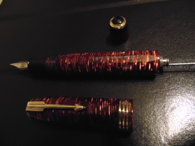
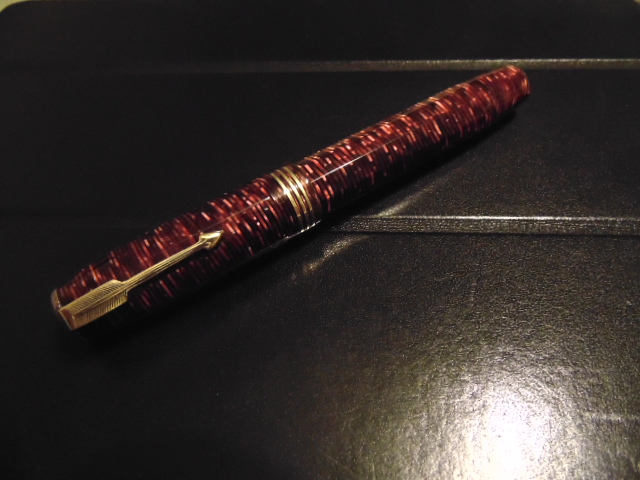
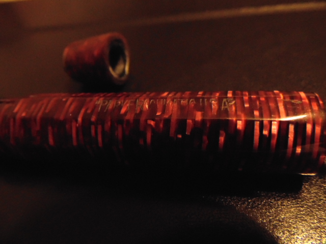
I picked up a golden brown oversize Parker Vacumatic recently at The Hwy. 127 Yard Sale. It has the speedline filler and it has the two tone arrow nib, bottom jewel on the blind cap and a wide band with a small box for a monogram on the cap. The date on the barrel is "0.". However, it is missing the cap screw, arrow clip, and cap jewel. How hard will finding the parts be and what price should I expect to pay when I do find them? Thus far my searches on the net have yielded zero results for the clip and jewel. Any suggestions on sources? Also, is the pen technically an Oversize or a Maxima? Looking forward to seeing it back in writing condition. Thank you, Rob
-
I have decided to part with my laminated golden pearl oversized vac. If there is any interest, the listing can be seen here: http://www.ebay.com/itm/231657250738?ssPageName=STRK:MESELX:IT&_trksid=p3984.m1555.l2649 Thanks for looking!
-
I picked up a golden brown oversize Parker Vacumatic this week at a flea market. It has the two tone arrow nib and bottom jewel on the blind 's and a wide band with a small box for a monogram on the cap. However, it is missing the cap screw, arrow clip, and cap jewel. How hard will finding the parts be and what price should I expect to pay when I do find them? Thus far my searches on the net have yielded zero results for the clip and jewel. Looking forward to seeing it back in writing condition. Thank you, Rob
-

Opinion Wanted - Best Oversized Pen For Arthritis Sufferer?
s.s.miles posted a topic in Fountain & Dip Pens - First Stop
I have been using FPs for some time, and while I haven't found an all-purpose writer I love, I do adore my Platinum #3776 Century w/ music nib for composing/arranging/etc... all those music-type-thingys that constitutes my freelance job. Now I would really like to find a good fountain pen to use in my everyday world of writing notes, jotting down lists of errands and such, but I have begun to develop a rather severe case of Rheumatoid Arthritis, so gripping is becoming more and more difficult by the day. I have decently large hands anyway, so I'm thinking an Oversive is probably the way to go. So my question is this: Is there a pen, or group of pens, you would suggest I look into that has/have a large (but not that Japan Jumbo hugemongous) barrel? I would prefer to keep it in the $300-$500 US range, but would spend more ($750 maybe) for something nearing perfection. So far I've been researching the larger Viscontis, Deltas, and Pelikans, but most of that research has been online, so I really have no idea as to whether or not I am on the right track. Any suggestions would be greatly appreciated. Thanks!! PS-I live in Houston TX, & I know Dromgoole's is a godsend for hands-on research (as long as I don't get too distracted by all the shiny things), but I'd really like to go in with some idea about what direction to start looking. -

A New Version Of The 'reverse Overmax' -- 'streamline Oversize'?
robmorrison posted a topic in Parker
You probably all know about the Parker Vacumatic 'Overmax' -- a pen that combined the features of the 1st generation Oversize Vac with the 2nd generation Maxima. Its shape and threading is that of the earlier pen, the Oversize, yet it has the wide Vac band of the Maxima. It's found only in burgundy, with 1939 or 1940 date codes. I've had 2 or 3 of them and they're really cool. A while ago David I. identified a pen that was exactly the opposite of the Overmax. It was in every way a Maxima, yet it had the triple cap bands of the Oversize. It was gray. The whole logical progression, with photos of the pens, is here. He asks for comment on what the correct name for the pen should be -- the 'Anti-Overmax'? The 'Retromax'? I've found a variation on this pen. It's green. It's Canadian. It looks like a Maxima, with the streamlined cap shape. Yet it has the triple cap bands of the Oversize. It threads with Oversize pens, not with Maximas. Unlike David's Reverse Overmax, though, it has the short blind cap and lockdown filler of the first generation Vacs, not the speedline filler of the 2nd gen. So basically it's an Oversize with a streamlined cap. Black section, striped jewels, Canadian imprints on the back of the clip. Canadian barrel imprint with '51' date code. In the photos below, it's the green pen in the middle. The red Oversize shown is also Canadian, and also has a '51' date code. Has anybody seen one of these? And also, what does the '51' date code mean? Surely not 1951? But maybe so, I don't know. It's Canadian, so the rules don't apply. As I say, my red Oversize also has the '51' date code. It's catalogue dates are 1933-'38 roughly, with USA Oversize pens also found with 1939 and '40 date codes -- all red, I think. http://www.robmorrison.net/1745-1.JPG http://www.robmorrison.net/1745-2.JPG http://www.robmorrison.net/1745-3.JPG http://www.robmorrison.net/1745-4.JPG -
Visconti Fountain Pen Homo Sapiens Steel & Lava Resin -Oversize- 59199
Iguana Sell posted a topic in The Mall
http://www.iguanasell-pics.com/photos/logos/fpn_logo_45_45.png See all our items @ FPN Visconti Fountain Pen Homo Sapiens Steel & Lava Resin -Oversize- 59199Brand New in Box - Warranty by authorised Dealer - Free Shipping CHARACTERISTICS: Brand Visconti Description Visconti fountain Pen Nib 23K Palladium Finish Basaltic lava resin and steel trims. Closure System Safe Hook Lock Filling System Piston Filler Dimensions (capped/uncapped) 14,5cm (5.7") / 13cm (5.1") Line Homo Sapiens Reference 59199 Special features: These pens are dedicated to the development of writing and the huge leap it meant for mankind.Without a doubt this is a one of a kind fountain pen. The body is made of a unique resin composed of basaltic lava (more than 50%) straight from Mount Etna volcano.This new resin is highly resistant to bumps and heat, and its appearence and texture give this pen a primitive yet noble character.The polished steel clip and trims combine magnificently with the black body. This is the first fountain pen to include a 23K palladium nib, which is supposed to provide a more flexible stroke than the 18K gold nib.Another innovative feature can be found in the closure system. The cap is secured by a spring that requires pushing and turning to open or close. CONDITIONS:The item is brand new in original box and comes with all papers and warranty stamped at the moment of the purchase by authorised dealerList price: $515 - Contact us for a personalized offer Payment Methods: PayPalCredit cardGoogle CheckoutMoney Order (We have Bank accounts in the US as well as in Europe)Cash on Delivery (Euro Countries) Free Expedited Shipping (UPS or Fedex) to the US, Canada and European Union. Other countries, $18 (shared shipping costs) ABOUT US: We are an international company with more than three (3) years of experience in e-commerce, duly registered in the US and Europe. We are present on the most important Marketplaces such as eBay and Amazon, ecommerce sites: shopping.com, yahoo shopping... and our own website You can take a look at our eBay feedback here or read the opinions of other forum members: 1 , 2, or 3 CONTACT:To contact us, just write us a pm, orsend us an email to info@iguanasell.com http://iguanasell-pics.com/photos/E009/Visconti-Fountain-Pen-Homo-Sapiens-Steel-&-Lava-Resin-Oversize-59199-59199-1.jpg http://iguanasell-pics.com/photos/E009/Visconti-Fountain-Pen-Homo-Sapiens-Steel-&-Lava-Resin-Oversize-59199-59199-2.jpg http://iguanasell-pics.com/photos/E009/Visconti-Fountain-Pen-Homo-Sapiens-Steel-&-Lava-Resin-Oversize-59199-59199-3.jpg http://iguanasell-pics.com/photos/E009/Visconti-Fountain-Pen-Homo-Sapiens-Steel-&-Lava-Resin-Oversize-59199-59199-4.jpg http://iguanasell-pics.com/photos/E009/Visconti-Fountain-Pen-Homo-Sapiens-Steel-&-Lava-Resin-Oversize-59199-59199-5.jpg http://iguanasell-pics.com/photos/E009/Visconti-Fountain-Pen-Homo-Sapiens-Steel-&-Lava-Resin-Oversize-59199-59199-6.jpg http://iguanasell-pics.com/photos/E009/Visconti-Fountain-Pen-Homo-Sapiens-Steel-&-Lava-Resin-Oversize-59199-59199-7.jpg http://iguanasell-pics.com/photos/E009/Visconti-Fountain-Pen-Homo-Sapiens-Steel-&-Lava-Resin-Oversize-59199-59199-8.jpg http://iguanasell-pics.com/photos/E009/Visconti-Fountain-Pen-Homo-Sapiens-Steel-&-Lava-Resin-Oversize-59199-59199-9.jpg CONDITIONS:The item is brand new in original box and comes with all papers and warranty stamped at the moment of the purchase by authorised dealerList price: $515 - Contact us for a personalized offer. Payment Methods: PayPalCredit cardGoogle CheckoutMoney Order (We have Bank accounts in the US as well as in Europe)Cash on Delivery (Euro Countries)Free Expedited Shipping (UPS or Fedex) to the US, Canada and European Union. Other countries, $18 (shared shipping costs) ABOUT US: We are an international company with more than three (3) years of experience in e-commerce, duly registered in the US and Europe. We are present on the most important Marketplaces such as eBay and Amazon, ecommerce sites: shopping.com, yahoo shopping... and our own website You can take a look at our eBay feedback here or read the opinions of other forum members: 1 , 2, or 3 CONTACT:To contact us, just write us a pm, orsend us an email to info@iguanasell.com More Visconti pens on our website Thanks for looking!----------------------------- Website: www.iguanasell.comJoin our newsletter for special promotions and news http://static.anuncios.ebay.es/images/dailydeals/dm/icon_facebook_24.png Follow us on Facebookhttp://static.anuncios.ebay.es/images/dailydeals/dm/icon_twitter_24.png Follow us on Twitter: @Iguana_sell