Search the Community
Showing results for tags 'maxi'.
Found 4 results
-

In Praise Of The Old Style Visconti Van Gogh “Maxi” Fountain Pen
Quadratus posted a topic in Fountain Pen Reviews
IN PRAISE OF THE OLD STYLE VISCONTI VAN GOGH “MAXI” FOUNTAIN PEN Visconti are a Florentine pen manufacturer founded on 20 October 1988 by two friends who decided to make a business of their passion for fountain pens. The two founders, Luigi Poli and Dante del Vecchio are stars of the long tradition of Italian pen manufacturing. They succeeded in remaining at the top of a highly competitive international market for over 30 years, which is an outstanding achievement when one considers the sad demise of OMAS or Delta. Throughout their history, Visconti have set new standards for imaginative and striking designs, ranging from the very expensive to cheaper “every day” pens, earning a well-deserved devoted following of fountain pen collectors and users. Their “Homo Sapiens” line of pens need no introduction, and most people reading this will own or have seen a “Van Gogh” or “Rembrandt” Visconti pen. Some of the leading online pen reviewers, SBRE BROWN (https://www.youtube.com/user/sbrebrown) and PENULTIMATE DAVE (https://www.youtube.com/channel/UCmPrXpKKggCrGTmAhhMmvBA) have produced many highly entertaining and informative reviews of Visconti pens. In this review, however, I wish to celebrate a now sadly discontinued range of Visconti pens, the “Van Gogh Maxi” which were in production in the first decade of the 2000s (along with their smaller cousins the Van Gogh “Midi” and Mini” versions). The series was also produced as roller ball pens. The larger “maxi” size is one of my favourite pens as it fits my hands beautifully, so I will only be discussing this “maxi” line of the Van Gogh production as this is the type I own. More recently, of course, Visconti have produced a modern line of Van Goghs that are very widely available. They are hugely popular with their bright, fun colours, easily swapped or cleaned steel nibs, filling mechanisms that will accommodate standard size cartridges or converters and general sturdiness. But these are not of the sophistication as their earlier relatives, and they have steel nibs rather than gold nibs, so I will not be covering them in this review. THE VISCONTI VAN GOGH MAXI FOUNTAIN PENS Revealing a collector’s mania side of my character, I have acquired seven Visconti Van Gogh Maxis (VGMs) over the years. They are one of the jewels in my pen collection and are in constant use. I was introduced to the VGMs by Ray Walters, (http://www.vintageandmodernpens.co.uk/http://www.vintageandmodernpens.co.uk/] who is a regular vendor at Pen Shows, on his website and elsewhere. As always, he is charming and persuasive and I think the first pen he sold me was the VGM “Tortoise”. This pen was a discovery and a revelation. I was writing with a pen of different design than the Pelikans and Japanese pens I was used to but with outstanding performance qualities. This purchase was quickly followed by the Musk version: And then, throwing financial discipline to the winds, I also bought the beautiful “Sandal Wood” coloured version from Ray: As I had the income to collect then, I quickly added (from eBay) a Demonstrator version: Later on came a “Starry Night” version: And a “Fantasia”: And finally, an Ivory version (sometime also called a Vanilla, but I think Ivory is more appropriate): There are other colours available, and these sometime turn up on eBay or at Pen Shows. From my online searches, I gather that the other VGM colours are Cappuccino (sometimes called Espresso), Black, plain Green, bright Yellow and Mint Blue. If there are other colours I would be interested to know from readers. Design These pens are in the “oversize” range. They are slightly larger than the Pelikan M800, but slightly girthier and heavier as the weight is increases with the metal central band. Personally I don’t like oversize or very large pens and have therefore never bought the more recent range of large Viscontis like the Homo Sapiens and similar, which I find simply too large and bulky. The VGMs are therefore, for me, at the size limit of what I enjoy writing with, especially as I prefer to post my pens. The pens fit comfortably into my hand while writing (either posted or unposted) As always beauty is in the eye of the beholder, but in my view, these pens are beautiful and very stylish. They have a happy, joyous range of colours with strikingly stylish bodies. Clips Their clips are the signature “Ponte Vecchio” arches and these are very flexible, making them easy to place in a pocket. One controversial aspect of the design is the screw on the top of the cap, which keeps the clip in place. For some this is a serious error in design, detracting from the overall aesthetics with a rather “industrial” and crude intrusion in colourful body. Personally I don’t really notice the screw as I have the cap posted with the clip showing on top, so that the screw always remains in the unseen underside of the pen, but I agree with the critics: Visconti could have produced something more visually pleasing (like the design of the Pineider clips which have a more discreet clip holder mechanism). Locking mechanism The Visconti locking system changed over time. Initially, Visconti used a “3K” twist fastener system, where the cap was secured with a twist locking it on three threads. The system is not really satisfactory: I found that it uncaps inside a pocket which is irritating as then the nib stains ink on a shirt through the inner jacket pocket’s lining. More concerning were reports by some users of cracking of the barrel through the pressure involved in locking the “3K” twist system. So it was discontinued and replaced with threaded locking: Filling system The VGMs have cartridge converter filling systems. The system allows international size cartridges which is helpful as one of the really irritating aspects of Japanese pens or some European pens like Aurora or Lamy is having to use proprietary cartridges! The converters are threaded which makes them secure. They do sometimes have a tendency to “rattle” unless the top section is tightened, which is the case in one of my seven VGMs. Nibs The nib is, of course, the soul of a pen. In this respect, Visconti excelled themselves in producing superlative writing nibs. My own preference is for fine nibs and Visconti’s nibs tend on the wetter side. From my research the VGM nibs ranged from EF, F, M, B and Stub. Generally, the VGMs have 14 carat nibs but I have one 23K Palladium fine nib. These have beautiful decoration as shown below These nibs are wonderful writers. The fine duo tone VGM 14K nibs glide smoothly on the page, with just enough feedback to make the writer conscious of the grain of the paper on which the nib writes. The 23K “Dreamtouch” fine nib is also a joy to write with, although it lacks the flexing quality of the 14K nibs. An added bonus is that these nibs can we swapped between different VGMs, rather like the way Pelikan nibs can be swapped between pens. OVERALL ASSESSMENT These Visconti pens are among the finest pens in my collection (which is mainly composed of Pelikans and Sailors). Their design, joyous range of colours and wonderfully expressive nibs make them a set of pens that give constant pleasure whenever used. Although I would, if pressed, prefer the Pelikan M800 or the Sailor 1911 Large range of pens, these old style Viscontis are a treasure that I cherish. These Viscontis are now sadly discontinued and, in my view, one of the worst decisions taken by the Florentine manufacturer was to produce the modern steel nib Van Gogh series. While these are perfectly decent writing pens, with attractive colouring, they simply cannot match the exquisite precision of the VGM gold nibs and style of their design. If only Visconti would revive them, just as Pelikan has begun to revive old discontinued models!
-
It’s a lazy Sunday afternoon here and the rains have finally arrived. I had reviewed the HS Bronze on a similar afternoon. If you are looking for the HS Bronze review, here it is: HS Bronze Review The Blogger view runs below for the HS Florentine Hills review: The Visconti Homo Sapiens Florentine Hills Review So here goes the review. THE HOMO SAPIENS In late 2009, Florence-based luxury pen maker Visconti announced in a press-release covering a nib made of 95% Palladium (23k) alloy. Commonly available nibs are 14k/18k/21k Gold alloy (Sailor), with a few exceptions (Danitrio & the Japanese karat warriors), and this was the first of its kind perhaps after the Esterbrook or Sheaffer PdAg nibs. The other side of the snippet showcased a pen christened with a name of HomoSapiens(HS), which was forged from an equal mix of basaltic lava and resin, adorned with bronze and protected from competitors by a patent. The lava came from Mt. Etna (one of the active volcanoes) on the east coast of Sicily, Italy. I came to know of the HS a few years later. Visconti (estd. 1988) promised the HS lava to be unbreakable, flameproof (upto 100°C), albeit with a slightly hygroscopic body, oxidation prone bronze trims, but with a corrosion-resistant titanium power filler. The available designs now range from lava plus bronze/steel/black PVD to a 388-limited edition (bronze LE) or some 1000-LEs Crystal Swirls or Florentine Hills or 888-limited-London Fog (made up of Acroloid/Sterling Silver). Besides, fountain pens there are also roller-balls and ball-point pens in the HS range, but those, of course do not concern our primary interest. Initially after getting a HS in bronze, I was always on the lookout for one of these beauties in silver trims. DESIGN (6/6) AN ITALIAN JOB Visconti started the Homo Sapiens in Bronze & Lava as an homage to the evolution of mankind. Bronze Ages predates us by around five thousand years is the period, when humans began smelting and mixing of metals like copper and tin, to produce alloys like bronze. Also during that particular period, a system of writing/recording had evolved, mostly through the use of symbols. The trim-fittings including the HS Bronze clip are all made of bronze. The Florentine Hills carries the same design but is an acrylicdemonstrator fused with ribbons of coloured celluloid suspended within - thereby the nomenclature acryloid. The ribbons range from light green to vivid tinges of yellow and reddish brown. These colours remind of meanderings through vineyards and olive groves, from the beechwood forests to the grassy groves of the countryside. The splendid works of Tuscany art and those picturesque landscapes somehow seem to share quite a common inspiration in spirit. A large silver centre-band at the start of the grip section with a HOMO SAPIENS imprint is followed by the particular LE number of the piece. So it’s typicallyXXX/1000 unless you ended up with the thousandth piece. The overall shape tapers towards the ends where you can enjoy the translucency of vivid green. Looks almost photosynthetic! The cap & blind cap might carry some of those celluloid ribbons, in a more subtle manner. The taper is more pronounced at the plunger end/blind cap rather than in the cap itself. A sterling silver loop embellishes the design at the start of the blind cap. It’s actually the filler collar. You can perhaps see a drop of Yama Budo The unique locking system of the cap is nothing new if you have tried a HS. The quick hook safe lock threads (six) enable disengaging the cap, with a quarter of counter-clockwise twist. That little twist will of course reveal the dazzle of 23 karat Palladium nib and another photosynthetic grip section! A click is heard, once you correctly twist-lock the cap. A view of the inner cap locks..The cap has a spring inside to assist the locking mechanism. The section starts with the upraised locking threads with a faint resemblance to the Greek Key, and then tapers comfortably before ending up with a slightly raised stop. The finial mentions VISCONTI with the company trademark of the mirrored V. As always, the medal is customizable via Visconti's My Pen System with your initials or zodiac sign or gemstone (available from $15 onwards). You can pull out the visconti medallion from the finial by using any magnet and replace it with a gemstone of your choice. VISCONTI is embossed within a dark enamel background on both sides of the Ponte Vecchio clip which is made of sterling silver. The cap itself has a subtle taper towards the finial. Two spaced silver rings adorn the middle of the cap, dazzling within the greener pastures. The clip is spring loaded and you have to lift it to put it in your shirt pocket. The HS Bronze cap seems to have its own allure. FILLING SYSTEM (5/6) A silver loop logically separates the blind-cap, from rest of the barrel. On rotating the blind cap till its end-stop, you will be able to pull out a plunger, much like a tethered sword pulled from its sheath. The inside of the blind cap carries a silver insert to run the threads and so that the acrylic is protected from any damage. The plunger rod is made of Titanium, a metal which has proved to be phenomenally resistant to most corrosive of fluids. Titanium rods are often placed as support inserts by dentists, in order to rebuild broken tooth structures! However, the shining filler collar made of sterling silver shines down condescendingly on the rather dull rod. The filler collar in the HS bronze is made of titanium with a graphite like dull lustre. Once you push in the knob with the nib dipped inside an ink bottle, you can feel a surge of ink inside the pen. An ink capacity of around 2.2 mL doesn't allow your favourite ink to last that long, given a generous flow of even for a fine nib! Here you can observe the secondary ink chamber (double walled), which can be loaded/drained into the main chamber, once you pull back the piston seal. My flight experience has been pleasant with a fully filled secondary chamber. So unless one is taking the HS FH to Mars/ISS, one doesn't have to worry about it. The small chamber lasts quite a few pages with the Fine nib and can be filled once the wetness reflects a paucity of fuel! During longer writing sessions or broad nibs, I keep the piston seal open. NIB - ALL THAT MATTERS (3/6) The giant two-tone nib with an usual iridium tip comes in four main sizes – EF, F, M & B along two special widths – BB (double-broad) & Stub (S). The nib has an leverage of around 2.6 cm and it is a #6 Visconti nib. These dreamtouch nibs are manufactured by Bock. Half of them are probably out of touch due to a tine issue or the other! At the tail end of the nib, lies the nib width, above which embossed are the specifications of 23k Pd 950 and a word FIRENZE. Firenze refers to Florence in Italy which is the birthplace of both Italian Renaissance and Visconti Pens, thereby its borrowed tagline - The Writing Renaissance. Palladium is the dazzling silvery and matches well with the overall trims. Personally though, I prefer the two-tone gold adornment. The silvery finish diverges from the lunar-eclipse breather hole across the inside of the tines and over to the tail. The name VISCONTI lies below the moony breather hole, with splashes of shapes of diamonds, droplets and half-moons to ornament the nib. This one is a fine nib and came with misaligned tines. Now it writes smoothly after adjusting the tines, thankfully I didn't have to send it to Visconti again. The feed is a standard visconti feed with closely spaced fins, carrying the V logo at the delta region. The nib is screw-fit onto the grip section and can be swapped with ease, provided you take care of the tines. It has a bit of flex (which increases with use), although there is not much difference for an EF & F nib, when it comes to line variation with mild pressure. Be careful with over-flexing the palladium nib, it might result in a permanent damage. This nib initially ran wet, though it gave a strong feedback at certain angles due to the right tine, which was misaligned. The right tine stood lower than the left. And the width it lay was close to a true EF. That’s was what bewildered me, how come a Visconti Fine write so thin! I bet it was still better than some of my bad sailor nibs! Post alignment of the tines, the width of the lines increased to a true European fine or a Japanese medium and it now runs with heavy juice. PHYSICS OF IT (6/6) – RELATIVELY SPEAKING With a cylindrical body forged out of acrylic and celluloid & adorned with silver rings, it does give an earthly greenish repose. The overall weight has got a significant contribution from the cap due to the silver clip. A girth of around 1 cm is quite comfortable and it’s one of the most comfortable pens for me. As an analogy, the cap itself could be as heavy as a Pelikan m400 fountain pen. The HS bronze is heavier compared to the FH. Capped Length ~ 14.4 cm Non-posted Length ~ 13.2 cm Non-posted Weight ~ g Nib Leverage ~ 2.6 cm Overall Weight ~ 37.8 g (HS Bronze ~ 43.7 g) Overall Weight (inked) ~ 40.1 g Weight Without Cap ~ 22.8 g (HS Bronze ~ 26.6 g) Comparing capped lengths, the HS (Since HS LEs are Oversize/Maxi) does seem similar to a Pilot Custom 823 (which is not as hefty), a m1000 is there to reference a comparison with the Size#8 nib (its heft is on the higher of HS). ECONOMIC VALUE (4/6) Though the Homo Sapiens Florentine Hills sells around USD 800, it is available for lower street prices. I was able to get the pen at a pretty good price, and I don't want your decision to be coloured by this price, apart from discussing it. Still, I do fail to find a great economic value for a piece of acrylic with some silver(@50 cents/gram), even though it does feel great to hold, write and a pleasure to see. I feel the bronze edition is a rather memorable pen to keep. OVERALL (4.8/6) One thing regarding the misaligned tines, it was an easy fix for me and did not require specialised services. It’s the most common problem across many luxury brands and sometimes it does run worse. Had it been something worse where I would have had to send the nib back, my rating would have been 1/6 on the nib, 1-for the design. I am used to a few large pens, I like the balance and do not find any problem with either the heft or balance of HS. Personally I like the Lava model more, since the materials and workmanship seem much more elegant. There is some line variation as the #6 nib does render springy softness to cushion mild writing pressures. No hard starts, no skips! The Fine nib lays a line which runs true to its European standards and for a cross-reference it runs more like a Japanese Medium nib. The pen feels well balanced for my hands though it does seem to have a short section for gripping. The hook-safe threads might interfere with your grip, if you tend to hold a pen higher. I have used multiple fills of Iroshizuku Yama Budo & GvFC Moss Green inks, and the pen runs rather nicely with Iro. Which pen doesn't Being a wet writer out of the box, the Fine nib lays a nice juice but thinner line, which takes around 35 seconds to dry a GvFC Moss Green (I find Moss Green to dry quicker) on MD Paper. The flex is evident due to the springy nib, which with a gentle pressure delivers thicker strokes, though the range of strokes run broader with increasing nib-width. Personally, I would have saved up for a Conid in acrylic, but the lure or Palladium/Silver/Acryloid vs a Titanium/Acrylic marched right ahead in my head. Perhaps some day else, since titan is already there. REFERENCES HS Bronze ReviewPress Release - 23kt Pd nibTine Adjustment Video (8:00 onwards)- Brian Goulet Thank you for going through the review. You can find some more pen and paraphernalia reviews here. Comments are welcome
-
Dear FPNers, Here is my take on a Visconti Homo Sapiens maxi with an 23k Pd EF nib. I hope you find the review fun and enjoyable. Wish you a prosperous and fun-filled new year with loads of new pens and paraphernalia. In case there are any problems with pictures you can also view the same review in my blog: http://iwonder-thecartographer.blogspot.in/2015/01/visconti-homo-sapiens-bronze-maxi-review.html Main Motivation Somewhere in late 2009, Florence-based luxury pen maker Visconti announced a nib made out of a 95% Palladium (23k) alloy, in a press-release. Most of the nibs that were commonly available were 18k/21k Gold with a few exceptions (Sailor, Danitrio among others), and this was the first of its kind. And the other side of the snippet showcased a pen christened with the name of ‘Homo Sapiens’ (HS), forged from an almost equal mix of basaltic lava and resin, adorned with bronze and protected from competitors with a patented formulae. The lava came from Mt. Etna (an active volcano) on the east coast of Sicily, Italy. I came to know of this pen three years later while watching an ebay sale though . Visconti (estd. 1988) promised the HS lava to be unbreakable, flameproof (upto 100°C), with a slightly hygroscopic body, fitted with bronze parts with a highly-corrosion resistant titanium power filler. The versions available these days are HS-lava/bronze or steel, a lava/bronze (by Mazzi) 388-limited edition (LE) and a 1000-LE crystal swirl (made up of Acroloid/Sterling Silver). Besides, fountain pens there are also roller-balls and ball-point pens in the HS range, but those are of course not our primary interest. An Italian Job http://s25.postimg.org/4e5nas59r/DSC_1752.jpg Visconti does pay a gentle homage to the evolution of mankind by attaching significance to the Bronze Age, predating by around five thousand years. That’s the period when humans began smelting and mixing of metals like copper and tin to produce alloys like bronze. Also during this period, a system of writing had evolved, however it was majorly through symbols, to convey information. The trim-fittings including the clip are all made out of bronze, for this version of the pen. The variants are steel or sterling silver trims for the other HS pens. http://s25.postimg.org/ghayycgbz/DSC_1753.jpg Out of the well-protected box, this pen comes out with a spring-loaded clip made of bronze, holding a paper-flyer, which tells you the nib specification on one side (23K Pd – 950) and expresses ‘dreamtouch’ as – ‘Do not press! The nib will follow your dreams’. The name of the company VISCONTI is embossed on both sides of the clip on a black background. The bronze in my case has a slight patina developed over the rose-gold sheen, and I am happy with the dated-look. Alternately, there is a deep yellow bronze polishing cloth provided along with the pen to clean the surface-oxidation. The complete capped piece is a bit heavy weighing around 45 grams and is 14.4 cm long. For carrying it in your shirt pocket, you might have to lift the spring loaded clip by a bit, as the clip end does not slip easily. There is a bronze ring at the power filler end and two in the cap itself. Other reviews would tell you that the HS-Steel comes with a piston filler instead of a power-filler (vacuum-plunger). There is a large bronze centre-band at the start of the grip section which says HOMO SAPIENS. The next thing one would notice is the unique locking system of the cap. The quick-locking grooves enable (un)locking with a slight twist (counter) clockwise (fourth of a complete turn). A little twist will reveal the fantastic 23 karat Palladium nib and an inherently earthly grip section. A click sound is heard once you correctly twist-lock the cap. http://s25.postimg.org/ao0wxs4of/DSC_1756.jpg The finial mentions‘Visconti’ with the company logo. This can be customized using their My Pen System to customize a finial with either your initials, zodiac sign or even a gemstone. http://s25.postimg.org/pzapye20f/DSC_1757.jpg HOMO SAPIENS can be seen imprinted on the thick bronze centre-band which starts the cap-locking threads and subsequently the grip section of the pen. I would rather say that the pen is very intelligently designed apart from wielding materials hard to master. http://s25.postimg.org/mxfcaozhr/DSC_1760.jpg The filling system is a vacuum plunger power-filler system with a titanium rod making it highly resistant to ink corrosion. You can unscrew the blind-cap counter-clockwise to the end-stop and then pull out the vacuum plunger if you wish to fill it with ink. The length of an uncapped pen reads a comfortable 13.2 cm with a 25-26 g weight. http://s25.postimg.org/jruqkhgvj/DSC_1763.jpg The nib has a leverage of around 2.6 cm and is a size#6 nib. There are many reports that these dreamtouch nibs being manufactured by Bock, but I am not certain of that. Made up of palladium and adorned with gold, the nib of HS-bronze makes a distinctive statement. Embossed is the company name VISCONTI near the lunarly-eclipsed breather hole . Below around the tail end of the nib, imprinted is the nib width above which lies the mesmerizing specifications ‘23k Pd 950’ and FIRENZE. Firenze refers to Florence, Italy which is the birthplace of both Italian Renaissance and Visconti Pens, thereby, the tagline ‘The Writing Renaissance’. Nib is screw-fit into the grip section but I did not try to take that out. The nib has a bit of flex although there is not much difference for an EF nib when it comes to line variation due to pressure. My nib being an EF was a QC-victim and needed some smoothening with a 12000 Grit buff-stick and 0.3 µm lapping film to get to its true dreamtouch state. http://s25.postimg.org/4x656b7an/DSC_1767.jpg And now it’s truly one dreamtouch pen. Comparison – m805 & c823 (PS-It’s a m805 not a m800, quoted as a dimensional reference only, felt very lazy to correct it ) http://s25.postimg.org/xytbi227j/DSC_1771.jpg Capped the VHS maxi seems to be longer than a m800/5 but shorter than a pilot custom 823. http://s25.postimg.org/hd2v020mn/DSC_1775.jpg Uncapped all of them roughly have a similar length. Writing Post nib-adjustment – butter-smooth, wet-flow and ‘dreamtouch’. Sometimes, it dries up and has somewhat of a hard-start if cap is left open for sometime. http://s25.postimg.org/kzd9qfwdr/DSC_1783.jpg The writing is super-smooth with a wet and free-flow. The EF nib lays a line tad thinner than a pilot 14k medium nib. So, if you want an M you might go for a F nib. Ratings http://s25.postimg.org/tqyj9b0rz/VHS_rating.jpg Overall, the cost of the pen defines the value you place on this unique piece. Though it retails at USD 595 it’s easily available at heavy discounts in both online and offline markets. I also guess the problem of sweating of ink at the edge of the grip section has been fixed and there is no need to grease the nib-threads anymore. I did not notice any sweating of ink at all. Thanks, Sonik.
-
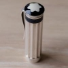
Hi all, I have a question about the nib of Visconti Van Gogh Maxi ... the solid yellow version (Yellow Mandarin?). I have an oportunity to buy this pen almost new for 200€ but it has the fine nib (14K). I tried broad one and it was perfect, little bit stubbish, what I like a lot. So the question is, which type of nib fits in the Maxi? Is it the screw-in unit or the friction fit nib+feeder in the body? Thanks