Search the Community
Showing results for tags 'custom nib'.
-
Chris Lim kindly sent me this pen with his needlepoint nib to test drive properly at length. He is a nibmeister based in Sydney (New South Wales, Australia), an active member of the Fountain Pens Australia group on Facebook who regularly attends group meets in Surry Hills and Parramatta and occasionally meets interstate; and he was the volunteer Pelikan Hubs 2025 Hub Master for Sydney who had to deal with >50kg worth of giveaways Pelikan offered to registered attendees. (For full disclosure: I have no business/commercial relationship with Chris yet, but only met him several times at the FPA group meets in the past few months. I have yet to engage him for a nib grind any on my pens, but on account of what I've seen and tested, I most likely will.) Executive summary: This is truly the finest-writing nib I've ever used, and a sufficiently smooth one with sure ink flow at that. No missed strokes, no skipping, no scratching the surface of smooth fountain pen friendly paper, even when I wrote with intentional line width variation. ┉ I had briefly tested one of Chris Lim's needlepoint nibs (or was this the one?) at a previous group meet, and was very impressed by what I saw. Using just whichever ink that was in the pen and whichever pad of paper that was on hand, with no accounting for paper quality or whether the sizing of the top sheet has been compromised by skin oils or some such, it enabled me to write 鬍鬚髮鬢 inside 5mm-tall square spaces with ease, without inadvertently or inevitably closing the counter-spaces inside the fourth hanzi character which is especially tricky due the exceptionally high horizontal stroke density. Drawing 21 separate, nearly parallel lines inside a 5mm-tall space put the estimated horizontal line width at ~0.1mm. In all these years of my ‘practising’ tiny handwriting and putting down fine lines of ink, I think I've only managed that record number once, reverse-writing with a nib not made for it (and was scratchy as hell as a result, lacerating the paper surface when I tried to do anything more complex than drawing straight lines running east-to-west with it). Chris informed me that the line width of his needlepoint nib grind is in the range of 0.11–0.12mm. Now, with more care and concentration, and under more controlled conditions (e.g. covering the part of the sheet I wasn't writing on at the time) in proper testing, I can confidently say Chris' needlepoint nib grind surpasses everything else I've owned or tried, in its capability to put down the finest lines of ink without skipping and without damaging the paper surface. I thought it was something of a feat when I laid down the entire text of the Heart Sutra (consisting of 260 characters in traditional Chinese, which has higher stroke density than either Japanese kanji or simplified Chinese) in a 3.5mm square grid, while still having some semblance of the proper stroke shapes for the kaishu script, even if at that size it was far from my best handwriting. That would just fit inside the surface area of a credit card, with little room to spare. I've done that with a Platinum 18K gold UEF nib (on a President, not #3776 Century, fountain pen) and with a Pilot Penmanship pen's steel EF nib. They were exhausting exercises, and each attempt took over 30 minutes of utmost concentration to complete. In view of that, fitting all that a 3mm square grid — a 16.7% reduction in size — was an almost impossible challenge. This time around, I had no doubt Chris' needlepoint nib (ground down from an M nib) would let me achieve that stretch target; my early testing with an unidentified turquoise ink that was in the pen, while I casually put down a few dozen hanzi on a notepad perched on the armrest of my recliner, showed me it could do more. After some decent flushing and ultrasonic cleaning of the nib and feed, which removed an interesting mix of colours, I filled the pen with Pelikan 4001 Brilliant Black ink. The mystery ink from before felt somewhat lubricating, but I want to know where on the smooth-to-scratchy spectrum this nib sits, so I chose an ink reputed to be dry-flowing and not known to be lubricating. And I decided to jump straight into the deep end and attempt the previously unthinkable: writing the Heart Sutra (legibly!) in a 2.5mm square grid. I repeatedly choose that as the sample text because it is long but manageable, and that I can write it out entirely from memory, so I can focus on the preset sequence of pen strokes, take note of how it feels to execute them with a particular pen and nib, and monitor my level of exhaustion in case the pen takes an excessive amount of effort to hold and wield with precise control. Also, with several thousand pen strokes packed so tightly into a small area, the cumulative effect of any lacerations to the paper surface would be easily detected by running one's fingertip over the handwriting afterwards. Chris's needlepoint nib grind is quite smooth for such a narrow point, without killing all kinaesthetic feedback that would be required to execute highly precise handwriting or drawing of particular shapes. It even lends itself readily to line width variation in writing both Chinese and English text, both ‘printing’ and in cursive script. As a matter of course, to properly drive such a fine nib, one has to aim for near-nil downward pressure to minimise friction, that being the cause of both kinaesthetic feedback, and the nib digging into the paper to indent and/or scratch. Simply letting the pen ‘write under its own weight’ would not be enough discipline, especially if the pen has a hefty body, e.g. a Diplomat Aero or Rotring Initial; the user would have to continually counteract gravity such that the weight of the pen does not bear down on the paper surface concentrated down to a tiny needlepoint contact area. The decision to put the needlepoint nib on such a lightweight pen as the plastic Kaweco Sport is inspired. Platinum's standard test conditions for its published line width testing for various nib width grades stipulate 50g of downward pressure; personally I think that would be too much, and that is why the company rates its UEF nibs' line width range as being 0.18–0.24mm, but I consistently get narrower lines out of Platinum nibs than what is stated. That was the reason why I put a fresh sheet of blue carbonless transfer paper, with the marking side facing up, under the sheet I was writing on in my first attempt. I needed something to help me monitor the normal force acting on the paper, and calibrate what I needed to do with my arm. The flip side of writing with near-nil downward pressure is that the ink has to flow from the nib with unimpeded capillary action on the slightest physical contact with the paper surface. Any hint of ‘baby's bottom’ or ‘inverted canyon’ on the tipping material's grind would prevent that from happening. Chris's needlepoint nib did not miss a single beat. No hard starts, no skipping, no force required to get the ink flowing. The results are such that I don't think there is any point (pun not intended) in comparing the output of this nib side by side, on the same page using the same ink, with the output of Platinum (14K and 18K gold) UEF nibs, or any of the Japanese ‘Big Three’ brands' EF nibs including the highly regarded (and very competent!) Pilot steel EF nibs on the Penmanship and Kakuno fountain pens. There is simply no contest for being the nib that lays down the finest lines smoothly.
-
I have seen sailor make special edition and custom made pens to many clubs and groups. Any thought of how does the process take place? Has anyone here requested from sailor something similar? What is the minimum number of pens required to order?
- 1 reply
-
- sailor
- special edition
-
(and 3 more)
Tagged with:
-
Question: Gold Plating Service To Customize The Look Of A Steel Nib
jPhoenix posted a topic in Repair Q&A
Hi all, I'm looking for someone who will gold-plate my Lamy Safari Nib and possibly the Clip as well. I'm doing this for cosmetic purposes only. I've seen pictures posted on reddit of this customization, but no information on who offers this service. Any help would be greatly appreciated. Thanks so much.-
- gold plating
- custom nib
-
(and 1 more)
Tagged with:
-
Review: Joseph Da Luz Custom Nib Grind/noodler's Flex Konrad Acrylic
Intellidepth posted a topic in Fountain Pen Reviews
Very long detailed review with large image files. Consider thyself prepared. The disclaimer: no affiliation whatsoever. I requested and paid for this custom nib grind. This review is entirely my own opinion. YMMV. Etcetera. Photo: Drawing Totally amateur drawing with the Da Luz modded nib. (First ever drawing with a flex nib, go easy!) First Impressions After seeing Joseph Da Luz’s (FPN name: FPVIBERIAN) custom nib grind work on Noodler’s flex nibs, I wanted one. My expectations were that it would be a fun nib, but possibly not on par with my favourite vintage Conklin Crescent Toledo #2 Gold Nib. I was wrong. This Da Luz modded nib in a Noodler’s Konrad (acrylic) has now taken first place in my tiny fountain pen flex selection. If you’re looking for your entry-level Spencerian fountain pen with great flex and modern fittings – this is it. On arrival it was inspected, disassembled, flushed (it had been inked for nib trials), dried, then reassembled. I set the ebonite feed up in my usual position for a Konrad Acrylic – about 4mm back from the nib tip. I had wondered whether it would be difficult to get the titanium overfeed in place, but it wasn’t. Easy. Worked first time. (I’d taken a photo of the titanium overfeed’s positioning prior to disassembly, just in case.) Inked it up, and… oh, my, goodness. Immediate joy. Better than anticipated in every way. Finished better than I had hoped for, wrote wider than anticipated, could write finer than anticipated, and was housed in a modern pen body I was already familiar with that could easily and affordably be replaced.- 23 replies
-
- joseph da luz
- da luz
-
(and 8 more)
Tagged with:
-
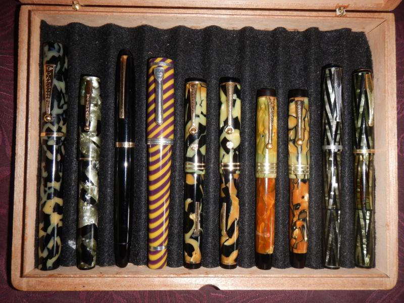
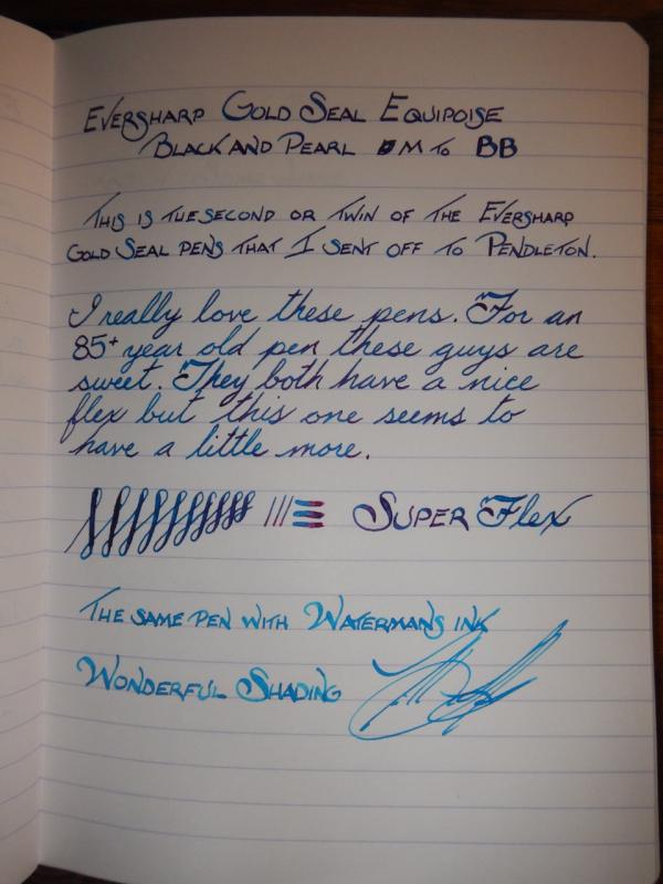
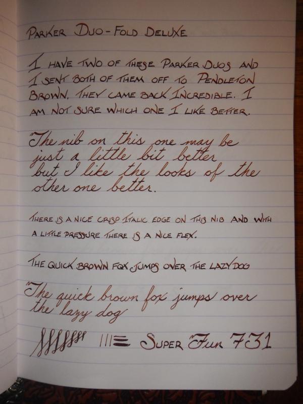
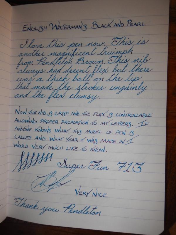
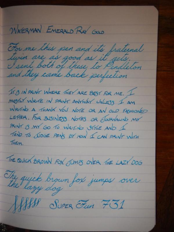
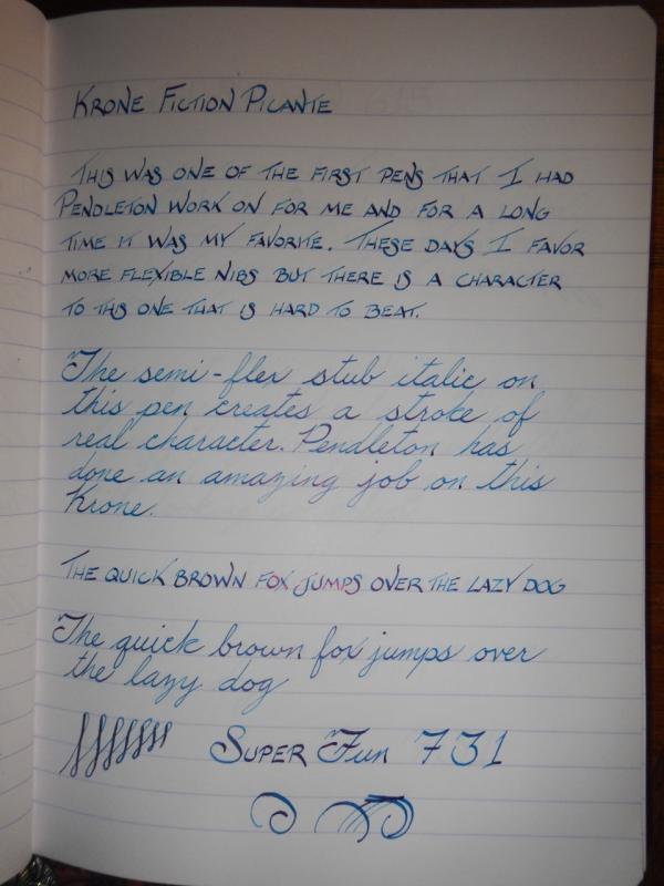
I have been using the nib customization services of Pendleton Brown for a couple of years now. I thought it was past time for me to post some samples of his fine work. In my opinion Pendleton is a living treasure. Invariably when I send him a pen it comes back to me writing much better. Some times it is like a different pen altogether the improvement is so great. I have gotten the full gamut of customization work from him, soft stubs and super crisp italics on both hard and flexible nibs. While all his work is phenomenal my favorite are my flexible crisp Italics. I am posting some of my favorites here. At this point I send almost every new pen I get to Pendleton. I have his GA address saved as a favorite in PayPal. Despite my wholly positive comments here I have no association with Pendleton, financial or otherwise. Feel free to ask me any questions about the attached 20 or so pens.
- 3 replies
-
- nib customization
- italic
- (and 8 more)
-
Aurora Stub Experience With A Pelikan M800 Nib
Sach posted a topic in Fountain & Dip Pens - First Stop
Is it possible to re grind an M800 nib and get a similar experience as one would with an Aurora 88 with a factory stub? I recently bought an Aurora 88 from John Mottishaw, not customised but just a factory stub which he tuned, which has completely blown me away. I've been using M800s almost exclusively for work for about six years now and just wanted to see what all the fuss was about concerning feedback with Aurora nibs. I just find it a fantastic nib to write with, and seems to work with almost any kind of paper that I encounter (I work in a hospital, where paper quality varies a lot!). The trouble is I love the M800 in terms of design generally, but love the Aurora stub nib. Is it possible to regrind a Pelikan M800 to feel like an Aurora? I had a BB M800 nib reground to cursive italic by John Sorowka, and have been mightily impressed with the result. Just wanted to know if I can achive something more like the Aurora by having a regrind, and what would that be? Any help would be very much appreciated...!- 2 replies
-
- aurora nib
- aurora stub
- (and 8 more)
