Search the Community
Showing results for tags 'herbin'.
-
Jacques Herbin – Iris Sagesse Ink Review # 229 --- 🧾 Description This ink is part of a new series available in 10 and 30 ml bottles. It appears that newer bottles in the classic line are now labelled “Jacques Herbin.” This ink is just gorgeous. With dry pens like a Lamy, it writes a pinkish colour and dries into a lovely spring iris blurple. The writing experience is out of this world, especially after reviewing several inks lacking in the lubrication department. It made most of my nibs sing. The ink can stain transparent sections and it’s a pain to clean. I needed a cleaning solution. Despite that, I really enjoyed writing, sketching, and drawing with it. --- 🧪 Chroma --- ✍️ Writing Samples (scan) Quotes: “The greatest thing in the world is to know how to belong to oneself.” Albert Camus, (1913–1960) — philosopher, novelist “Perfection is achieved not when there is nothing more to add, but when there is nothing left to take away.” Jean Giono (1895–1970) — novelist “The beauty of a flower lies in its fragility.” Paul Valéry (1871–1945) — poet, essayist “To see is to forget the name of the thing one sees.” Paul Valéry (1871–1945) — poet, essayist “The greatest thing in the world is to know how to belong to oneself.” Michel de Montaigne (1533–1592) — philosopher, essayist Rhodia / Iroful Midori /Tomoe River 68gsm Note: Tomoe River used here is 68 gsm, not the thinner 52 gsm version commonly referenced in reviews. Hammermill 20lb 📸 Photo Rhodia/ Iroful Midori / Tomoe River 68 gsm Hammermill 20 lb copy paper Closeup 🔍 Comparison Col-O-ring. Scans are approximative. --- 💧 Water Test --- 🎨 Artwork Too Much Sake in the Iris Garden! I copied and combined two different Japanese art forms with my cat & mouse theme. Jacques Herbin Iris Sagesse (purple), Gris Galet (grey), and Vert Forêt (green), Octopus WD Bunny Orange, Uniball Signo White gel pen, Fabriano watercolor paper. Dreaming of Spring I used a mix of water colour and ink with my Cat & Mouse theme. Watercolour, mauve and yellow, Inks: Jacques Herbin Iris Sagesse, Vert Fôret, Girs Galet, Sailor Shikiori Sasabune, Tintenlabor Lärchengold, Fabriano watercolour paper. Iris Miniature: A play of words with iris. Ackerman fountain pen with Leonardt Principal nib, Diamine Grey, Jacques Herbin Iris Sagesse, Bleu Azur, Talens Mixed Media Square Sketchbook. Inktober Prompt 8: Pretend Cat & Mouse love to pretend they are heroes from a different time & age. Inspired by an 18th century painting. Ackerman fountain pen fitted with Leonardt Principal EF nib. Jacques Herbin Iris Sagesse (purple), Inkebara Sand (golden tan), Fanyantan Sakura Blizzard (murky tan), Diamine Grey. --- - Pens Used: Pilot Kakuno EF, Lamy (EF/F/M/B/ Stub 1.1), Hongdian Forrest Blade nib, Noodler’s Nib Creaper with Waterman W2 nib - What I Liked: Lubrication, Lovely colour. - What I Did Not Like: Lack of water resistance. Cleaning. - Writing Experience: Cushiony, pillowy. - Pros: Beautiful rich colour, lubrication. Price, small bottles. - Cons: Can stain and needs cleaning solution. 🧷 Ink Characteristics - Shading: Subtle. - Ghosting: Faint - Bleed Through: A bit on copy paper. - Flow Rate: Wet. - Lubrication: Out of this world. - Nib Dry-out: No. - Start-up: No. - Saturation: Gorgeous. - Sheen: No. - Spread / Feathering / Woolly Line: Did not notice. - Nib Creep / Crud: Did not notice. - Staining (Pen): - Clogging: No. - Cleaning: A pain. Ok with a cleaning solution. - Water Resistance: No. --- 🛒 Availability - Available in 10/30 ml bottles worldwide. --- 💬 Closing I enjoyed using this ink despite its flaws. The lubrication and the vibrancy of the colour were a pleasure to use, and I was sorry to flush my pens. It’s for those who look for a vibrant purple. No fountain pens were hurt in preparing this review. Please don’t hesitate to share your experience, writing samples, or any other comments — the more the merrier.
-
Jacques Herbin – Gris Galet Ink Review # 225 --- 🧾 Description Jacques Herbin Gris Galet (Grey Pebbles) is part of a new series of inks, presented in J Herbin 10 ml and 30 ml bottles. This is the darkest grey ink in the Herbin lineup. The dark green and turquoise visible in the chromatography create a lovely grey that depending on the paper can veer from neutral grey to blue-black. It has lovely shading, ranging from subtle on Rhodia to extreme on Iroful. The ink is wet with slightly below average lubrication depending on the nib size. It sings with B nibs. There is some show-through and bleed-through on copy paper, but despite that it looks gorgeous. I’ve added Logical Notebook Japanese paper to the lineup. 🧪 Chroma --- ✍️ Writing Samples (scan) Quotes: “Everything that endures becomes polished.” — André Gide, French writer “The sea is what remains when everything fades.” — Marguerite Duras, French writer “Pebble shores, slowly polished by the sea, speak a very ancient language.” — Pierre Loti, French novelist “In the depth of winter, I finally learned that there was in me an invincible summer.” — Albert Camus, French writer “The sea is a vast desert where man is never alone.” — Victor Hugo, French writer Rhodia / Iroful Midori /Tomoe River 68gsm/Logical Note: Tomoe River used here is 68 gsm, not the thinner 52 gsm version commonly referenced in reviews. Hammermill 20lb 📸 Photo Rhodia/ Iroful Midori / Tomoe River 68 gsm/Logical Hammermill 20 lb copy paper Close-up 🔍 Comparison Col-O-ring. Scans are approximative. --- 💧 Water Test --- 🎨 Artwork Inktober 52 - Sunset Combining the previous prompt Capricorn and the final one, Sunset It was dawn. Cat was warming himself on the Suḫurmāšu (Goat-fish). His heart skipped a beat at the sight of Princess Mouse of the House of Ur, striding toward the great ziggurat to pray that the floods would temper their exuberance this year. But when her eyes met Cat’s, her step faltered, her faith trembled. The Suḫurmāšu broke the silence. “Today is the sunset of my era. Soon I will be nothing but a myth. Other gods will come, other temples will be built, and I will remain only a constellation.” Cat was saddened to see the Princess in tears. “Do not cry, Princess. Faiths will rise and fall, but love will be eternal.” Jacques Herbin Gris Galet & Vert Cactus, Lennon Tool Bar Cat General, Tintenlabor Mystery ink, Talens Mixed Media Notebook. Breaking News! Mouse was jealous of Cat, who seemed to be hypnotized by a new TV presenter. Jacques Herbin Gris Galet, Tintenlabor Rothorn , Tannenwald, Pelikan Edelstein Apricot Achat, unknown blue ink, Talens Mixed Media Sketchbook. The First Declaration! We all remember our first declaration, the vulnerability, the fear of rejection, the fear of acceptance, the fear of growing. Jacques Herbin Gris Galet (blue grey), Hosia Ink Studio An Nang (light grey with a hint of bronze), Tintenlabor Rothorn (iron gall red), Pelikan Edelstein Apricot Achat (yellow), Talens Mixed Media --- - Pens Used: Pilot Kakuno EF, Lamy (EF/F/M/B/ stub 1.1), Noodler’s Nib creaper with a Waterman W2 vintage flex nib. - What I Liked: Lovely dark grey. Chameleon ink. Shading. - What I Did Not Like: Nothing much. - What Some Might Not Like: - Writing Experience: Lovely. - Pros: Dark grey. Lovely colour, price range, small bottles. - Cons: If I want nitpick, not as lubricated as Bleu Calanque. 🧷 Ink Characteristics - Shading: Yes. Extreme with Iroful, subtle on Rhodia. - Ghosting: Depending nib size and wetness. - Bleed Through: Depending nib size and wetness. - Flow Rate: Wet - Lubrication: Below average to average depending on pen. - Nib Dry-out: Did not notice. - Start-up: Good. - Saturation: Lovely. - Sheen: No. - Spread / Feathering / Woolly Line: Did not notice. - Nib Creep / Crud: Did not notice. - Staining (Pen): No - Clogging: No. - Cleaning: Easy. - Water Resistance: Ok. --- 🛒 Availability - Available in 10/30 ml bottles worldwide. --- 💬 Closing This was a great surprise. I really enjoy the multiple personality of this ink, it’s different colour temperature and shading. It is my favorite grey ink from Herbin. No fountain pens were hurt in preparing this review. Please don’t hesitate to share your experience, writing samples, or any other comments — the more the merrier.
-
Jacques Herbin Rouge Amarante (Red Amaranth) Ink Review # 216 --- 🧾 Description This is one of the 5 new inks by Jacques Herbin presented in the classic J Herbin 10/30 ml bottles. Here are the 5 suspects: Rouge Amarante, (Red Amaranth): Amarante in ancient Greek symbolized the eternal flower of the gods. The sacred Aztec plant with unfading flowers was given this name. Its nutritious grains were used in sacred ceremonies binding the Aztecs to Huitzilopochtli, God of the rising sun, who reincarnated the fallen soldiers as hummingbirds. Because of its similarity to the act of communion, Spanish conquistadors banned its use and tried their best to erase it, like many conquerors do. Ink, depending on nib size, wetness, varies between a home brew wine to a rich burgundy. Ink has slightly below average lubrication with drier pens. The normally scratchy Pilot Kakuno was lovely, Lamy Safari EF/F nibs slightly scratchy. M, B nibs lovely. Ink shines with M to Stub nibs. Shading is well present though disappears with the over wet flex nib. Ink is well-behaved with most nibs on copy paper. Cleaning needs more flushing, it’s a red dye after all. --- 🧪 Chroma --- ✍️ Writing Samples (scan) 1. Voltaire “The amaranth flower grows forever.” 2. Jean-Jacques Rousseau “Amaranth withers only in unworthy hands.” 3. Marcel Proust “The true paradises are the paradises we have lost.” 4. René Char “The essential is constantly threatened by the insignificant.” Rhodia / Iroful Midori /Tomoe River 68gsm Hammermill 20lb 📸 Photo Rhodia/ Iroful Midori / Tomoe River 68 gsm Hammermill 20 lb copy paper 🔍 Comparison Col-O-ring. Scans are approximative. --- 💧 Water Test --- 🎨 Artwork INKTOBER52 PROMPT NO.48 SAGITTARIUS Inspired by a Persian miniature; reinvented with my cat and mouse theme. https://www.invaluable.com/auction-lot/persian-miniatures-anonymous-19th-cent-sagittarius-5074-c-8474dd68ab Jacques Herbin Rouge Amarante, 1798 Bleu Diamant Shimmer ink, Tintenlabor Basalt iron gall ink, Uniball Signo white pen, Talens MIxed Media Notebook. Dream of the Fallen Warriors Cat dreamt of being reborn as an ocelot, calling all hummingbirds to join him in honouring the fallen ancestors of a conquered & forgotten people, known for "cruel" ceremonies. He later reflected: what is crueler, sacrificing on an altar or being sacrificed and forgotten as a culture? Jacques Herbin Rouge Amarante, Vert Cactus, Bleu Calanque, Noodler's Apache Sunset, Tintenlabor Basalt iron gall, Talens Mixed Media Notebook. --- - Pens Used: Pilot Kakuno EF, Lamy (EF/F/M/B/ Stub 1.1) , Flex. - What I Liked: Colour, writing experience, drawing experience. - What I Did Not Like: Lack of water resistance. - Writing Experience: Lovely. - Pros: Beautiful colour, well-behaved. Darker with wetter pens. Small 10 ml bottles. - Cons: Lack of water resistance. 🧷 Ink Characteristics - Shading: Subtle. - Ghosting: Faint - Bleed Through: Only with wet and wide nibs. - Flow Rate: Wet - Lubrication: Quite good. - Nib Dry-out: Did not notice. - Start-up: Good. - Saturation: Deep with wet pens, mild with dry pens. - Sheen: Did not notice. - Spread / Feathering / Woolly Line: Did not notice. - Nib Creep / Crud: Did not notice. - Staining (Pen): I don’t think so. But it might. - Clogging: No. - Cleaning: Needed more flushing than usual. - Water Resistance: It seems that if the ink has cured enough, there might be some water resistance. --- 🛒 Availability - Available in 10/30 ml Herbin ink bottles world-wide. --- 💬 Closing I really enjoyed this ink and was tempted to buy a small bottle. No fountain pens were hurt in preparing this review. Please don’t hesitate to share your experience, writing samples, or any other comments — the more the merrier.
-
Jacques Herbin 1798 Diamant Bleu Ink Review # 213 --- 🧾 Description This is gorgeous, well-lubricated, wet navy ink with silver shimmer. Dry times are quite short on Rhodia. It’s excellent on copy paper with most nibs, but there’ll be some bleed-through with wet pens. The 1798 series celebrates the date Herbin started making inks. The shading is most striking on all the Japanese papers shown below. --- 🧪 Chroma --- ✍️ Writing Samples (scan) Rhodia / Iroful The quotes are: “The blue of the sky is wider than our dreams.” — Victor Hugo “Beauty is a promise of happiness.” — Stendhal “Blue has no dimensions.” — Yves Klein “The real voyage is to see with new eyes.” — Marcel Proust “The heart has its reasons which reason does not know.” — Blaise Pascal Midori /Tomoe River 68gsm Hammermill 20lb 📸 Photo (artificial light) Rhodia/ Iroful Midori / Tomoe River 68 gsm Hammermill 20 lb copy paper Close-up 🔍 Comparison Col-o-Ring paper. Scans are approximate. --- 💧 Water Test --- 🎨 Artwork The curse of the blue diamond Mouse's ancestors lived in the Louvre Palace when it was just a castle. Over the centuries, they amassed many shiny objects during the intrigues, duels, and the Liaisons dangereuses. On one of his explorations, Mouse came upon a unique diamond, the Diamant Bleu. Some say it was a gift brought by Louis IX during the Crusades, that it was cursed, as attested by Nostradamus, Catherine de Medici’s secret soothsayer: when the brilliant blue leaves the darkness, red will follow after. Was it the end of the Valois dynasty under her regency or was it the red of St. Bartholomew’s massacre? Some point to the recent heist of the Crown Jewels of France from the Louvre. Mouse thought that by bringing it to the cat jeweler, he might change the course of history; after all blue is the colour of calm. Jacques Herbin 1798 - Diamant Bleu, 1670 - Opal Nocturne, Tintenlabor Basalt Irongall ink, Talens Mixed Media Notebook. INKTOBER52 PROMPT NO.46 - Sneaker It has been said that when the Portuguese court absconded to Brazil during the Napoleonic Wars, there was no one to care for the many orphans. So when an orphaned Kitty (assuming a Scottish sailor as a father) cried itself out at the shores of Belém Tower in Lisbon and lamented its fate, one of the monks sneaked out a Pastéis de Nata, reserved only for monks and kings. The sweetness of the pastry forged a friendship and changed their fate (fado). Inspired by @catbert's João V! drawings. 🙏 Jacques Herbin 1798 - Bleu Diamant Shimmer ink, J Herbin Bouton d'or, Tintenlabor Basalt iron gall ink. Talens Mixed media notebook. --- - Pens Used: Pilot Kakuno EF, Kaweco Sprt (EF/F/M/B/BB/Stub 1.9) , Noodler’s Nibcreaper fited with a Waterman M2 flex nib. - What I Liked: Wetness, lubrication, colour on most papers, price. - What I Did Not Like: Shimmer, colour on other papers. - What Some Might Not Like: Price, shimmer. - Writing Experience: Excellent. - Pros: Wetness, lubrication, colour. - Cons: Not waterproof, shimmer, price, 🧷 Ink Characteristics - Shading: Good on most papers. - Ghosting: With wet/ wide nibs. - Bleed Through: With wet/ wide nibs. - Flow Rate: Wet - Lubrication: Excellent. - Nib Dry-out: Did not notice. - Start-up: Excellent - Saturation: Saturated. - Sheen: Very faint red sheen where ink puddles. - Spread / Feathering / Woolly Line: Did not notice. - Nib Creep / Crud: Did not notice. - Staining (Pen): - Clogging: No. - Cleaning: I used a pen jacuzzi to clean my pens. But I’m guessing it should be easy to clean. - Water Resistance: None. --- 🛒 Availability - Available in 50 ml bottles worldwide. --- 💬 Closing I’m not a fan of shimmer inks. However, I enjoyed writing with this one, there’s something subtle about silver and navy. And writing with it on Iroful was like a dream in heaven. No fountain pens were hurt in preparing this review. Please don’t hesitate to share your experience, writing samples, or any other comments — the more the merrier.
-
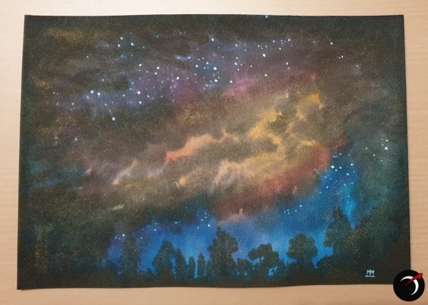
From the album: Stuff by Astronymus
It's titled "Fire in the Sky". The rest is up to the interpretation of the beholder. I just painted what I saw in my mind. No plan, no intention here. And I wanted to test inks on wet paper. It's several J.Herbin 1670 and 1798 inks, which explains the gold and silver metallic sheen, on thick wet watercolor paper. Painted with brushes. Plus normal opaque white for the stars.© astronymus.com
- 0 B
- x
-
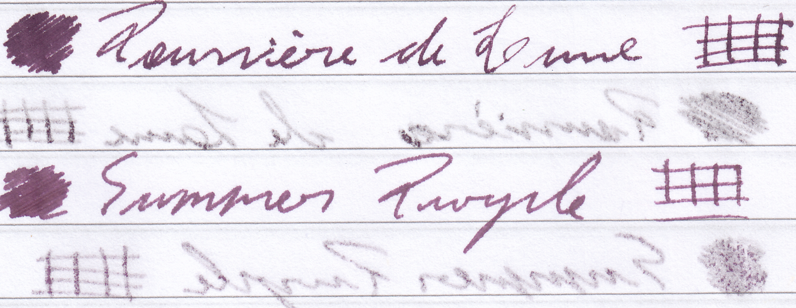
Quick comparison of two similar inks I happened to have. Both write and behave really well, although similarly not great on cheap paper. The swabs are pretty shabby because I only have Summer Purple in cartridge form, so I couldn't get much ink on the cotton swab. I made the Poussiere de Lune swab the same way by getting it from the converter instead of dipping in the bottle. Both are great inks, I might prefer the color of the Herbin slightly more. Hard to tell on such wet fine nibs but the color differences are noticeable when they shade to their lighter tones. School notebook paper, the color difference is a bit more noticeable. Both spread and bleed through almost exactly the same way (56g/cm³)

-
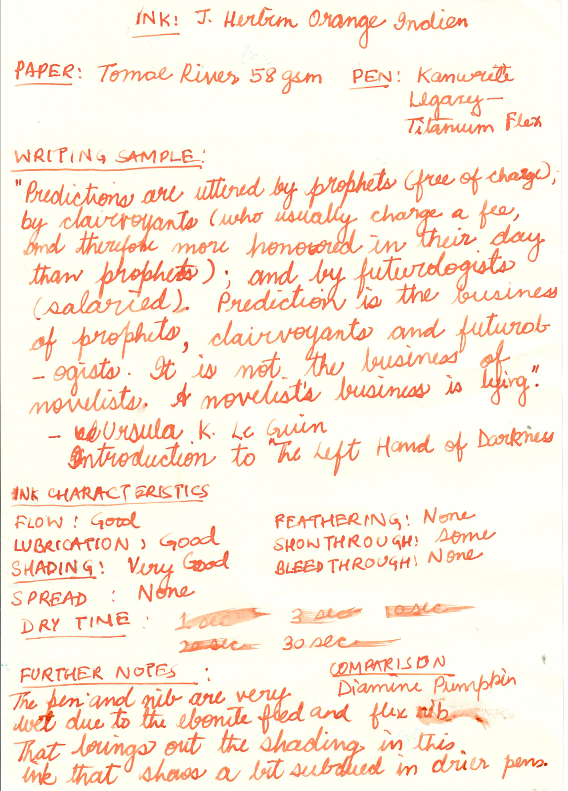
Note: The Diamine Pumpkin comparison looks very similar in the poor scan, but is actually distinct from the Orange Indien. The ink is less red and more orange in reality.
-
desaturated.thumb.gif.5cb70ef1e977aa313d11eea3616aba7d.gif)
Herbin Perle Noire ink, 500ml bottle for A$46 on Amazon.com.au
A Smug Dill posted a topic in Market Watch
Amazon.com.au just dropped the price on 500ml bottles of Herbin Perle Noire ink, sold and shipped by Amazon UK, to $45.92. Includes free delivery to Australia to Prime members here. OK, that isn't cheaper than I could have scored from La Couronne du Comte before it went out of business, with stacked discounts, no GST paid, and (as part of a large enough order) free international shipping; but it comes pretty close. With LCdC now gone, I don't think I can do much better in the near term ordering from any other retailer. -
As someone who has properly studied French, I cringe every single time when people pronounce the French brand J Herbin as 'Shay Herbaaaaaan.' Even S Brown, who seems particulate in the spelling of foreign words, makes this mistake, though I forgive him for that since his doctorate is not anything about language. Please, guys. Stop. I don't know why but if someone pronounces a German word wrong, someone else will correct him immediately, but that's never the case for French. The correct pronunciation is more like 'Shī Airbang.' So J in French is not Shay but sounds more like G; the 'her' in Herbin is pronounced without the 'H' sound; and the 'n' at the end is not pronounced. I'd like to encourage you to watch this short clip. The pronunciation here is on point. https://youtu.be/1DAaJa77ju0 Otherwise, just simply say Jay Her-bin. It's still much better sounding.
-
Pilot Iroshizuku Kiri-same vs Herbin Cacao du Brésil
A Smug Dill posted a gallery image in FPN Image Albums
.jpg.fb9f536b1a0944c4538729b10ffcff79.jpg)
-
Am I the only one who noticed that many inks are dirt cheap at Cult Pens? I can’t be, right?
collectorofmanythings posted a topic in Fountain & Dip Pens - First Stop
I haven’t heard many people talk about this, so I just wanted to make those who are unaware now aware. Here is just a quick thing on some price comparisons. “Retail” price was taken from online fountain pen and ink retailers: DIAMINE 30ml Cult Pens- $2.47 Retail- $7.50 PELIKAN 4001 30ml Cult Pens- $4.82 Retail- $11.75 ROHRER & KLINGNER 50ml Cult Pens- $5 Retail- $11.95 PARKER QUINK 57ml Cult Pens- $5.21 Retail- $11.02 DIAMINE 80ml Cult Pens- $6.21 Retail- $14.95 WATERMAN 50ml Cult Pens- $6.51 Retail- $12 PELIKAN 4001 62.5ml Cult Pens- $7.52 Retail- $16.50 DIAMINE 150th ANNIVERSARY 40ml Cult Pens- $8.15 Retail- $15.50 HERBIN 30ml Cult Pens- $8.40 Retail- $12.95 KAWECO 50ml Cult Pens- $8.41 Retail- $12 CROSS 62.5ml Cult Pens- $9.47 Retail- $16 LAMY CRYSTAL 30ml Cult Pens- $9.99 Retail- $16 JACQUES HERBIN 1670 50ml Cult Pens- $18.39 Retail- $29.50 JACQUES HERBIN 1798 50ml Cult Pens- $21.02 Retail- $29.50 MONTBLANC AROUND THE WORLD IN 80 DAYS BLUE 50ml Cult Pens- $33.66 Retail- $40 I just wanted to tell all of you who weren’t aware. Have a nice day, W. Major -
Three 'taupe' (grey brown) fountain pen inks, two French, one German: J. Herbin La Perle des Encres Cacao du Bresil L'Artisan Pastellier Classique Brun Ours Rohrer & Klingner Schreibtinte Sepia These three colors are very close. Two of them are nearly indistinguishable, at least to me, but there are differences. I'm tentatively planning a combined review of these three similarly-colored inks but, in the meantime, here's a teaser quiz: three writing samples with my normal, quick note-taking hand, all using the same type of pen - 3 different Pilot 78Gs with 'B' nibs, a dry pen with a fairly crisp italic nib that I enjoy a lot - Rhodia paper from a pad, and each writing sample uses a different one of the above three inks. The photos were taken in the same light at nearly the same time (late afternoon indirect sun). The goal of this quiz is to match the ink - Cacao du Bresil, Brun Ours, & Sepia - used with each writing sample: A, B, & C. After you have had a few days to take a guess I will try to post chromatography photos. And your impressions of the inks are welcome and encouraged, of course!
-
Since succumbing to the Hobonichi Cousin last year, I have been enjoying matching my fountain pen ink colour to that of the daily pages. The Japanese versions of this planner has lovely, slightly dusty, faded vintage colours which change for each month. The whole page is printed in that colour - grid, Japanese quote, date and day markets etc. So I thought it would be fun to write using a matching ink - a great excuse for exploring some of the glorious colours now available and a built in excuse for changing inks regularly. This idea was inspired by a blog I saw (sorry, can't remember who) where the writer had done a similar project but using gel pens. I know everyone's experiences of ink colour is different, depending on pen, nib, paper, how heavy-handed your are, phase of the moon (who knows? Maybe) but I thought someone out there may be doing something similar and we could share our thoughts. Anyway, here are my selections so far: January: burnt orange - Monteverde Fire Opal February: bronze brown - my own mix using Platinum mixable inks March: pinky purple - Herbin Larmes de Cassis April: red pink - Colorverse Sea Europa May: bright olive - KWZ green Gold Ii or Monami Olive June: grey green - another custom mix - see above July: grey turquoise - Birmingham Pen Co Fountain Turquoise August: blue grey - another custom mix - see above September: warm brown - Krishna Vaikhari October: grey purple - another custom mix - see above November: pine green - Birmingham Pen Co Fern Hollow Creek December: faded red - another custom mix - see above. As you can see, I've ended up mixing some colours myself - lots of fun, and I'm less happy with some of the other choices so will need to explore further. For example, I find the Herbin colours a bit watery but haven't yet found a similar colour to Larmes de Cassis; the Krishna Vaikhari is a nice colour but not quite yellow enough... I generally stick to relatively easily available inks and would like to expand the brands but I like this selection as a first pass. I should add that I'm using a Pilot Metro with a Plumix EF or F calligraphy nib. If anyone else is doing this, I'd love to see your choices or generally, any thoughts.
-
Hello, I was just wondering if it’s just me or do you guys have a specific pen for a specific notebook? This ink color for this pen color only? I use my pilot kakunos (M,F,EF) with colors black, gris nuage, diamine grey, respectively, for my midori notebook journal. My kawecosport (BB) in the shade earl grey for midori everyday journal. 2 Kawecosport (EF) using Vinta in the shade perya and ubi for midori and rhodia notes. Kaweco perkeo (M) using smokey grey for random scribbles and midori travel journal. Am I the only one? Lol
-
From the Jacques Herbin site: "To celebrate the 350th anniversary of Jacques Herbin’s original brand, we are letting the people who know us best, our fans, choose the new colour of our next anniversary ink. This will form part of the official Jacques Herbin collection. Our ink experts have designed four very distinct shades. The range varies from pastel to dark, soft to flamboyant and tender to lively, each with shimmering and radiant reflections. Each one unique. And to mark this vintage in an even more spectacular way, we decided to create a unique Jacques Herbin ink with both silver and gold glitter that will add sparkle to your writing! So what do you need to do? You have until 16th March to vote and let us know your favourite below. The result will then be verified, and we will reveal the results by email in early April. As if you needed more of a reason to vote, the Jacques Herbin team will then randomly select FIVE voters to exclusively preview the new ink in the luxury of their own home. The winning ink will be available from selected stationery retailers, ink specialists and boutiques for purchase from September 2020." https://www.jacquesherbin.com/en/new-anniversary-ink-survey.html
-
I have always loved and used Herbin Rouille D'Ancre, which, for all its quirks (listed elsewhere) I find to be a unique "Gentleman's Pink". . . . . until I discovered a near doppelganger which, ulp, might be an improvement on the original (although similarly loathed by reviewers on here!). . . . . and then yesterday a third, although this one tends a bit more "rust" . . . . which might also make it the salmon/coral that I have been searching for but not yet found? Still in the heady days of first love here, so I'll report back with clearer spectacles as the roses fall off, but here's a first sample: Another arrangement: I didn't label them as a kind of a quiz! One is the French original, one is from Japan (ergo costly as a US import), and one is from Germany - but which is which? (I'd be happy to tell, if anyone is interested!)
-
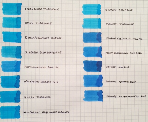
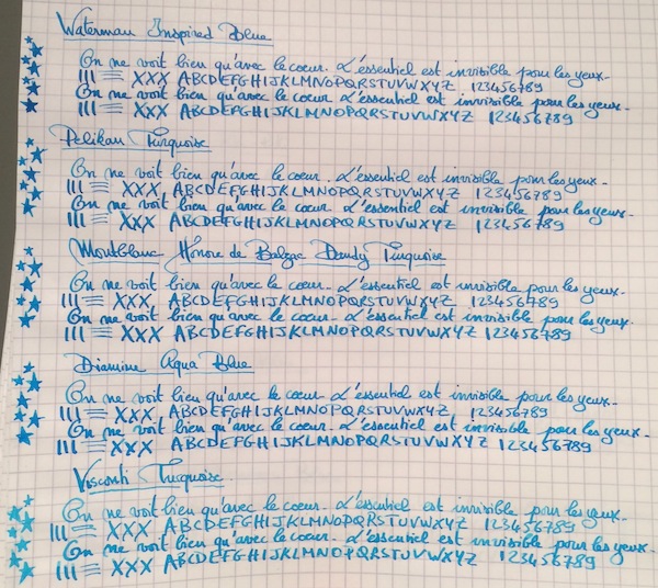
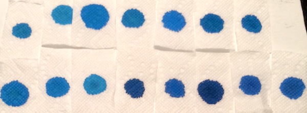
I don’t know if it’s the warm and sunny weather that just hit the northeast after a cold spell, but, more than ever, I’m not ready for summer to end! So to keep the summery vibe going, I thought why not do a comparison of turquoise and “beachy blue" inks. This is by no means a comprehensive review, because I’m missing some great turquoise inks, such as Sheaffer and Lamy Turquoise, but I saw a post come up on the boards with questions about turquoises, so I wanted to share samples of the ones I have. The 15 inks tested are: Caran d’Ache Turquoise, Omas Turquoise, Rohrer & Klingner Blu Mare, J. Herbin Bleu Pervenche, Pilot Iroshizuku Ama-Iro, Waterman Inspired Blue, Pelikan Turquoise, Montblanc Honore de Balzac Dandy Turquoise, Diamine Aqua Blue, Visconti Turquoise, Pelikan Edelstein Topaz, Pilot Iroshizuku Kon-Peki, Diamine Asa Blue, Diamine Florida Blue and Diamine Mediterranean Blue. The writing samples were done using a 1950s 146 and a Pilot Custom 74 B nib ground down to a smooth stub by Mike Masuyama. All samples were tested on Rhodia paper. Ink Swabs: Ink on Paper Towel: Top Row: Caran d’Ache Turquoise, Omas Turquoise, Rohrer & Klingner Blu Mare, J. Herbin Bleu Pervenche, Pilot Iroshizuku Ama-Iro, Waterman Inspired Blue, Pelikan Turquoise Bottom Row: Montblanc Honore de Balzac Dandy Turquoise, Diamine Aqua Blue, Visconti Turquoise, Pelikan Edelstein Topaz, Pilot Iroshizuku Kon-Peki, Diamine Asa Blue, Diamine Florida Blue and Diamine Mediterranean Blue Best Flow and Smoothness: J. Herbin Bleu Pervenche Bleu Pervenche wins hands down for me in this category and is miles ahead of every other ink in this review. With that said, although it has an excellent flow, l wish Bleu Pervenche felt a little smoother (to match the smoothness of my favorite inks). However, this is the only turquoise with a regular spot in my ink rotation. Best Turquoise Color: Rohrer & Klingner Blu Mare This is by far my favorite shade of turquoise. It offers a nice mix of blue and green that leans more towards the blue side (which I prefer). In a wet nib, it is the most vibrant of the turquoise inks tested - so vibrant in fact that it makes me want to pull out a pair of sunglasses . The ink has a good flow (though not as high as Bleu Pervenche) but is missing the high level of smoothness I look for in a go-to ink. However, I love the color so much that I did get a bottle. Best Beachy Blue Color: Pilot Iroshizuku Ama-Iro and Diamine Florida Blue (Tie) I love the color of both of these inks, but I do not own bottles of either. I consider Ama-Iro to a "beachy blue" rather than a turquoise because it needs a little more green to be a true turquoise. I really love its bright, light blue color, which screams summer fun, but didn't enjoy the feeling of writing with the ink enough in the flexy 146 to buy a full bottle especially given its higher price point. I should note that I may have been especially tough on Ama-Iro because I was expecting a higher level of smoothness from an Iroshizuku ink. Florida Blue and Mediterranean Blue are close enough in color that someone looking to keep their ink spending to a minimum wouldn't need to own both. Florida Blue has a better flow, and, since I like wetter inks, I wouldn't think twice about using it over Mediterranean Blue. (Mediterranean blue is not a dry ink but someone looking for less wetness might prefer it; it is also a little lighter and exhibits slightly more shading than its Floridian counterpart.) Highest Sheening Ink (on Rhodia): Pilot Iroshizuku Kon-Peki Kon-Peki is not a monster sheener on Rhodia (like some of the Sailor inks I’ve recently tried) but still offers a subtle and beautiful pink shimmering halo around its blue letters. Some posts have asked how it compares to Edelstein Topaz and, as others have noted, both inks are similar in that they are cerulean blues with pink sheen. (I've noticed that Topaz sheens tremendously on Tomoe River Paper, but in this comparison it barely showed any sheen around the letters.) If I had to choose only one of the two inks, it would be Kon-Peki. The color is brighter and the ink has a better flow. Lowest Performer: Caran d’Ache Turquoise I really did not like this ink and was expecting more from a $30+ ink. It was so thin that it took the fun out of writing with my favorite pen (and I almost stopped the review to change writers). Other notable mentions: Light Turquoise: Visconti and Omas Turquoise (tie) Both inks are on the lighter end of the turquoise spectrum and could be a good option for someone looking for such a shade. I prefer the flow of the Omas but like the color of the Visconti better. (I would have liked for the Visconti to perform more like its brother ink, Visconti Blue, which offers a smoother writing experience.) Dark Beachy Blue: Diamine Asa Blue Asa Blue is a beautiful and interesting color in that it is paradoxically both dark and beachy. It has a good flow but an ok smoothness. Montblanc Dandy Turquoise Alternative: Pelikan Turquoise I love this shade of turquoise and have found that with the right pen and paper combination it can offer wonderful color variation. (I've noticed much more color variation using a Visconti HS.) For anyone who was not able to get a bottle during its limited run, I think that Pelikan Turquoise is a pretty close alternative.
-
Scented Inks — Encre Parfumée
-
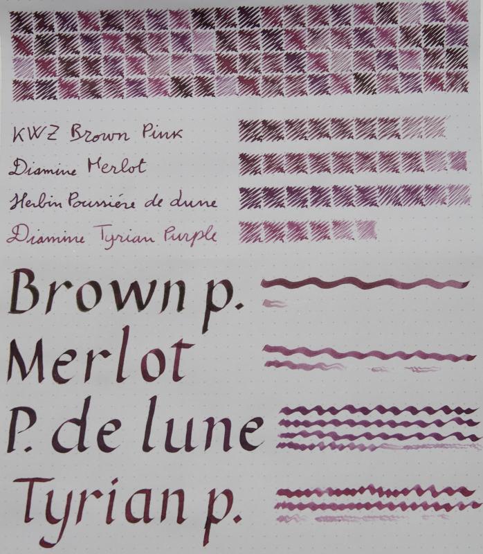
KWZ Brown Pink Diamine Merlot Herbin Poussiere del Lune Diamine Tyrian Purple The KWZ, like many others from Konrad, looks almost black when pooled, with a velvety, matt sheen. It is the most free-flowing of the bunch. The Diamines have a very slight golden sheen, more evident on Tomoe than on this Rhodia; Tyrian Purple is the least saturated of the bunch and exhibits a more pronounced halo effect when used with the flat nib. Poussiere de Lune is more blue than the others. If I had to pick a favourite, it'd be Tyrian Purple
-
I was given some Poussière de Lune for Christmas, which was lovely. But I would prefer it to be a touch redder. I've tried blending it with Sheaffer Skrip Red, and that works, but even at 3 Poussière to 1 Skrip, it's a bit too red. Has anyone played around with something like this? I'm surprised relatively little of the Skrip makes so much difference. The perfect mix for me is probably around 5 or 6 to 1, but before I work on it further, I thought I would ask for some advice...
-
Hey guys! I was pondering whether or not to order a full bottle of KWZ Azure #1 and I made this to help me decide. It didn't look extremely ugly so I decided to share, maybe it can be useful or something
-
Sometimes I get an ink and it exceeds all of my expectations. Everything clicks, and I love it immediately. That happened with J. Herbin's Vert de Gris. It was the last of 5 Herbin inks from my recent order that I opened and tested, as I thought "well, it's just a tealy gray, how special can it be?" I was wrong--it's very special! Vert de Gris, along with Bleu des Profoundeurs, are exceptional recent additions to the standard line-up of J. Herbin inks. Most here are probably well-familiar with J. Herbin inks in one form or another--the brand has been around for a very long time and offers inks in all colors of the rainbow, even with shimmer. The standard line of J. Herbin inks has been known as safe and gentle to fountain pens, even vintage. Saturation tends to be lower (thus easy flushing), and the formulations are advertised to be pH-neutral, though whether all the colors are close to pH-neutral has been contested by some. In any event, I've never had any problems with J. Herbin inks from their standard non-shimmer line, and since I own a bunch of vintage pens, I tend to go for more gentle inks. But gentle does not need to be boring! In fact, this ink is anything but boring. The interesting thing about it is how beautifully rich and matte it looks in high quantity (such as with a flex nib), and its beautiful hue in person. It looks especially good on ivory paper. Water resistance is very respectable--the tealy-blue components wash off leaving highly legible dark gray line, and water does not reduce writing to a smeary mess. If I'm going to fault this ink in one thing, it's that on worse paper it's more feathering prone than some other inks. No problems with feathering on good fountain pen-friendly paper.
-
In the end I won't be getting the Honey, it doesn't seem to be different enough to me.
-
I'm new to this ink, but it was exciting enough that I decided to write a mini review for it. Sorry for my crooked writing--I've been practicing a proper grip, which makes me write in chickenscratch J. Herbin - Rouille D'Ancre is an interesting ink. It's pink? No it's coral. No it's peachy faded red? Wait, let me turn on the table lamp, it looks different again... Yes, it's difficult to categorize. I honestly thought I would be getting a cross between true rose gold and Apple kind of anodized aluminum rose gold, but it's neither. It's always legible and not pale, unless you have a super dry writer. The color makes me happy for some reason, and I want to keep writing with this ink. I personally think it looks best with a pen that gives you some line and flow variation, like a stub nib, a vintage pen, or some kind of flexy nib. In my case, I decided to use it with a great FPR Himalaya that is equipped with an ebonite feed and "ultra flex" steel nib. Drying time is really good. Unless you're leaving globs of ink left and right, it dries very quickly. 10-15 seconds. The appearance on the page is matte. If you use a wet writer, there is some dark edging / outlining effect. The ink has some greenish-cyan components and more yellow-brown components, as can be seen on the paper towel droplet spread and water brush tests. I think the outlining effect is also enhanced due to this turquoise component. No feathering observed on typical fountain-pen-friendly paper, though my newly obtained HP Premium Choice 32lb 100-brightness paper did feather with this ink and J. Herbin Vert Empire. I've tried my best to represent my ink properly, though due to the readily color-shifting property of it, that was was not an easy task. Next to PenBBS "Rose Quartz" ink: (PenBBS Rose Quartz on the top right): Scan (not accurate for Rose Quartz--the photograph above is accurate):
-
I love dark purple ink. Currently I have my Pilot Custom 823 inked up with Poussière de Lune but I almost run out. Im looking into Montblanc Lavender Purple now. I wonder whats the difference? Herbin Poussière de Lune is great for me. Since its dark enough but still have some shade. It is quite nice to take academic notes with. I have the following questions: 1. Is Montblanc darker or lighter? 2. How does the inkflow compare? 3. Saturation? 4. Any side by side comparison? 5. Anything else you would like to elaborate on. Thank you all!