Search the Community
Showing results for tags 'signature'.
-
Robert Oster Signature - Plumb Nut Robert Oster is an Australian ink maker that is well-known for its unique range of colours. On his website he describes our shared love quite eloquently: "Robert Oster Signature originates from one of the most famous wine producing regions of the world, the Coonawarra district of South Australia, an idyllic setting with great influence on the senses. There is my inspiration. It's a joy to share it with you." Well, we are certainly fortunate to have inspiring ink makers like Robert Oster to satiate our thirst for glorious inks. This review focuses on Plumb Nut. A big thank you to Catherine from Sakura for providing me with a sample of this ink to play around with - much appreciated ! Plumb Nut is of the pink variety - an ink that is outside my usual comfort zone. This is not an eye-searing pink however, it leans more to the salmon pink variety with some red-brown undertones. As such it's a more muted wall-flowery type of colour that doesn't try to dominate the stage. Plumb Nut works well in all nib sizes. The ink is easy on the eye, with a good contrast on all paper types, even when using fine nibs. The ink shows some nice shading in broad nibs that really enhances the character of your writing. Such shading is mostly absent with finer nibs though, resulting in a flat and - in my opinion - uninteresting look. This ink is definitely at its best with wet and/or broad nibs. Unfortunately, Plumb Nut really hates water. You typically don't buy Robert Oster inks for their water resistance, but this one is rather extreme. The ink has absolutely zero water resistance. Short exposures to water completely obliterate your writing. This is evident from the chromatography - the ink detaches easily from the paper, as can be seen in the bottom part of the chroma. Surprisingly, the ink performed really well on the smudge test, where I rub a line of ink with a moist Q-tip cotton swab. Here, there was only some mild smudging of the line, leaving the text mostly undisturbed. I’ve tested the ink on a wide variety of paper – from crappy Moleskine to high-end Tomoe River. On every small band of paper I show you:An ink swab, made with a cotton Q-tip1-2-3 pass swab, to show increasing saturationAn ink scribble made with an M-nib fountain penThe name of the paper used, written with a B-nibA small text sample, written with an M-nibDrying times of the ink on the paper (with the M-nib)Plumb Nut behaved perfectly on all paper types, without any feathering. The ink's chemistry clashes with Moleskine paper with a sickly colour as a result. Really strange - and I previously observed a similar effect with Robert's Purple Rock. There must be some chemical component he uses that just doesn't work with Moleskine paper. This is a relatively fast drying ink on most papers, with drying times in the 10 second range. In my opinion, Plumb Nut looks best on white paper, and is less good-looking on more yellow paper. I also show the back-side of the different paper types at the end of the review. No troubles there, except with the Moleskine paper, which shows significant bleed-through. Since only masochistic fountain-pen lovers adore Moleskine paper, this is not much of a problem ;-) Conclusion Robert Oster Plumb Nut is a classy salmon-pink ink with a vintage vibe. The ink looks its best in wet/broad nibs on white and creamy paper. It's not so good-looking in fine nibs and on more yellow paper. Unfortunately, the ink has zero water resistance - the briefest touch of water completely obliterates your writing. I did like the way Plumb Nut looks in drawings, but as a writing ink it is not a good match for me : it's not really my type of colour, and I typically use F/M nibs, which are too fine to bring out this ink's character. But I'm sure there are others out there that this ink will speak to. Technical test results on Rhodia N° 16 notepad paper, written with Lamy Safari, M-nib Back-side of writing samples on different paper types
-
Robert Oster Signature - Verde de Rio Robert Oster is an Australian ink maker that is well-known for its unique range of colours. On his website he describes our shared love quite eloquently: "Robert Oster Signature originates from one of the most famous wine producing regions of the world, the Coonawarra district of South Australia, an idyllic setting with great influence on the senses. There is my inspiration. It's a joy to share it with you." Well, we are certainly fortunate to have inspiring ink makers like Robert Oster to satiate our thirst for glorious inks. In this review the center stage is taken by Verde de Rio - which you might describe as a grass-green ink, and which would fall way short of what this gem represents. Do you believe in ink-love on first sight? Well I didn't ... until now that is. The first time I put Verde de Rio to paper, I got a thrill of excitement. It just feels wonderful when that happens, doesn't it? I know beauty is in the eye of the beholder, and some might just see a nice grass-green ink. For me however, Verde de Rio is a stunning beauty that went straight to the top as my personal ink of the year. This ink is liquid poetry! Verde de Rio is essentially a fresh-looking grass-green ink with yellow undertones, where the green remains dominant. It lays down a wet and relatively saturated line, and can accommodate all nib sizes, even the finer ones. I typically use F or M nibs, so this is a nice take-away. The ink is a real pleasure to write with: you start with a dewy grass-green line that dries relatively quickly into nicely shaded writing. I find the shading simply stunning - it is very present but still subdued. Because the contrast range between light and dark parts remains relatively narrow, you get an aesthetically pleasing shading effect. Really well executed! Unfortunately, Rio de Verde is allergic to water. On the smudge test - rubbing text with a moist Q-tip cotton swab - this quickly becomes apparent. The ink smudges easily, although the writing remains perfectly readable. Water resistance is totally non-existent though - even short exposures to water completely obliterate your writing. On the droplet test and after short exposures to running tap water, all the ink simply vanished. This is clear from the lower part of the chroma - almost no ink remains attached to the paper. The chroma also shows the complex character of the ink - Mr. Oster sure has great mixing skills. I've tested the ink on a wide variety of paper - from crappy Moleskine to high-end Tomoe River. On every small band of paper I show you:An ink swab, made with a cotton Q-tip1-2-3 pass swab, to show increasing saturationAn ink scribble made with an M-nib fountain penThe name of the paper used, written with a B-nibA small text sample, written with an M-nibDrying times of the ink on the paper (with the M-nib)Rio de Verde behaved perfectly on all paper types, with just a tiny bit of feathering on the fountain pen unfriendly Moleskine paper. I really like that the ink has a consistent appearance across the different paper types - not a mean feat. This really is a holy trinity ink - whatever combination of pen and paper you use with this ink, it always manages to look magnificent! Drying times are mostly around the 10-15 second range, with a low of 5 seconds on more absorbent papers. The ink works well with both white and more creamy paper. It looks especially good on Paperblanks paper (good for me, since this is my daily journal of choice). I also show the back-side of the different paper types at the end of the review. No troubles there, except with the Moleskine and Graf von Faber-Castell paper, which show significant bleed-through. With its 100 gsm, you would expect better behaviour from the GFC paper. As it happens, this is a very absorbent paper, that sucks the ink straight in (drying time is near 0 seconds) - the ink then simply appears again on the other side. Conclusion Robert Oster Verde de Rio is my personal favourite ink of the year. It has a stunning grass-green colour that works beautifully with all nib sizes and with all types of paper. It's a nicely wet and reasonably saturated ink, with good contrast and beautiful shading on every paper I tested. A pity that it has zero water resistance. I am really impressed by this creation of the Australian ink master - Verde de Rio is an ink that immediately seduced me. I am certainly biased here, but if you like this type of green, you owe it yourself to give Verde de Rio a try. Highly recommended! Technical test results on Rhodia N° 16 notepad paper, written with Lamy Safari, M-nib Back-side of writing samples on different paper types
-

Philosophy Of Use For Functional "signature Pen", Any Recommendations?
bigkahuna posted a topic in Fountain & Dip Pens - First Stop
Howdy all! I'm looking for input, feedback and knowledge from this great community of FP enthusiasts. If any of this resonates, please share your thoughts and wisdom :-) It occurs to me that the pens I currently own do not meet my desires for a functional "signature pen". The primary use is for the dozens of signatures I write every day for work. It also occurs to me that I've used a Fischer Space Pen or Rite-in-the-Rain ball-point for this purpose for years without knowing any better, so this is a hedonistic pleasure that I'm after. This would make work a little more enjoyable, and I've come up with a few key criteria for such a pen. Please note that these are *my* criteria and I'm not intending to dictate any new definitions/criteria of a "signature pen" to anyone. Here are the criteria I have established so far: 1. Nib must be Western Broad or larger. Roundish stub or conventional spheroid tip for hasty signatures in odd locations (including the hood of a work vehicle, leaning over a co-workers desk or standing over a conference-room table). No crisp italics, cursive italics or anything that might catch paper if I'm not strictly controlling writing angles. Best materials are probably unplated 14K Gold or unplated stainless steel, because... 2. I plan on using Iron Gall ink for this pen, primarily for water resistance and permanence. I've been using R&K Salix and really like it, but I'm in the process of acquiring some other inks (KWZ, Hero 232, ESSRI, Diamine Registrar's). Many of these inks tend to be more "dry" than the my other inks (Pilot, Iroshizu, Diamine, Noodler's), hence my interest in item 3 below... 3. Pen must be Cartridge Converter format, and I plan to use cartridges filled via syringe. I'm afraid (perhaps unjustly) of running a piston fill system with IG ink that might precipitate harmful solids into the barrel's ink chamber and seals. The C/C system must allow a fairly "wet" inkflow rate with IG ink and not suffer from ink starvation with "dry" inks. I think this rules out "standard international" (SI) format. I've had some troubles with SI C/C: the cartridge/feed interface has a relatively small aperture, and seems to work best with a reasonably wet ink to prevent ink starvation. Moreover, the SI cartridges and converters have been prone to detaching inside my pens when subjected to any kind of shock (i.e., they don't seem to attach securely enough). The Pilot C/C system is the one I have the most experience with, and I love the huge cartridge aperture and extremely secure attachment. Not sure about the Platinum and Sailor C/C systems, so I'd welcome any input on those. 4. Pen must be easily disassembled and cleaned. I'm a little bit apprehensive about using IG ink without adequate maintenance intervals. The pen will receive flushes every fill, and detailed cleanings every 2-4 weeks until I can determine a better (hopefully less frequent) maintenance interval. So, I need to be able to get the nib and feed out without risking damage. If I can't meet this particular criteria, I could buy an ultrasonic cleaner if push comes to shove. 5. Screw-on cap. I might carry this pen in the placket of my polo shirt, and I don't want to find the pen inside my shirt underneath huge inkstains. This has already happened to me when I wore a snap-cap pen in my shirt. I post caps whenever possible to minimize loss. 6. Pen weight is not a concern. I enjoy 15 gram pens and 50 gram pens. Not sure how heavy is too heavy, but 50 grams is no problem. 7. Good basic ergonomics and balance, with a grip section diameter of at least 9.5 mm. I have fat powerlifter's fingers. 8. Unobtrusive threads that don't chew my fingers badly. I grip high on the pen, probably higher than most people. Step is okay if not extremely absurd like the step on the TWSBI Vac 700. 9. Professional appearance highly desirable... Innocuous in appearance tolerable. 10. Under $150 if possible, but I've been known to spend lots more than I initially planned on things I really like. I've also found a few prospective pens as follows: 1. The Platinum 3776 Century with C nib (Cosu, Cors or Coarse depending on which source you read... basically a Double Broad nib). This is the least expensive option I've found. 2-4. The Pilot Custom 74, 742 or 743 with BB or C nib. 5. Sailor 1911 with Zoom nib Any other recommendations? I welcome your thoughts and inputs! Kindest Regards, bigkahuna -
Robert Oster Signature - Purple Rock Robert Oster is an Australian ink maker that is well-known for its unique range of colours. On his website he describes our shared love quite eloquently: “Robert Oster Signature originates from one of the most famous wine producing regions of the world, the Coonawarra district of South Australia, an idyllic setting with great influence on the senses. There is my inspiration. It’s a joy to share it with you.” Well, we are certainly fortunate to have inspiring ink makers like Robert Oster to satiate our thirst for glorious inks. In this review I take a closer look at Purple Rock – a mesmerizing grey-purple ink. The colour is stunning, with a definite vintage feel. It writes wet and smooth, and can accommodate all nib sizes with equal grace. The ink shades beautifully without too much contrast between the lighter and darker parts, just as I like it. In swabs, the ink definitely shows its purple character, but in writing it’s more of a dark purple-grey. And it’s that purple component that provides all the magic ! When writing, the ink is laid down in a dark grey line, with the purple undertone surfacing as it dries. This is a really neat effect – you just stop writing while watching the ink change its hue as it dries. Mesmerizing! There’s also some strange magic going on between ink and light. Depending on the light and the angle you’re looking at the paper, the inks’ appearance can change from a dark grey to quite a purple colour. Fascinating, as Mr. Spock would say (but also quite impossible to catch with my scanner). On the smudge test – rubbing text with a moist Q-tip cotton swab – Purple Rock behaved very well – there is only some minor smearing. Water resistance is totally non-existent though – even short exposures to water completely obliterate your writing. On the droplet test and after short exposures to running tap water, all the ink simply vanished. This is clear from the lower part of the chroma – almost no ink remains attached to the paper. The chroma also shows the complex character of the ink – Mr. Oster sure has great mixing skills. I’ve tested the ink on a wide variety of paper – from crappy Moleskine to high-end Tomoe River. On every small band of paper I show you: An ink swab, made with a cotton Q-tip1-2-3 pass swab, to show increasing saturationAn ink scribble made with an M-nib fountain penThe name of the paper used, written with a B-nibA small text sample, written with an M-nibDrying times of the ink on the paper (with the M-nib)Purple Rock behaved perfectly on most paper types. For some reason though, the chemistry of the ink clashes with Moleskine paper, resulting in more of a sickly green-grey – all those lovely purple undertones are just gone ! Hard to believe that this is the same ink. With the Moleskine paper, there’s also significant see-through and bleed-through. Drying times are mostly around the 10-15 second mark. The ink looks beautiful both on the white and the more yellowish paper. Purple Rock’s appearance differs widely across the paper types – from mostly grey on Tomoe River to mostly purple on Fantasticpaper. I also show the back-side of the different paper types, in the same order. Conclusion Robert Oster Purple Rock is a very nice vintage-looking purple-grey. The ink has great dynamics: it changes hue as it dries, and the purple undertones have a fascinating way of changing with the ambient light and the angle you look at the paper. It’s a nice wet and saturated ink, with good contrast on all types of paper, but with no water resistance at all. Overall I’m impressed by this creation of the Australian ink master – definitely an ink to use on a regular basis. If you like greys or purples and/or dusty inks, this ink rightfully deserves a place in your collection. Technical test results on Rhodia N° 16 notepad paper, written with Lamy Safari, M-nib
-
Hello. I'm Esteban, from Costa Rica. This is my first post. This is a great forum, thanks in advance for your responses, and apologies for my english. I've been looking for this info in previous threads, but I didn't find any, I'm sorry if this has been asked before. The main use for my fountain pens is for signing documents. I'm a doctor: I see a patient, I print a report and sign it. I work at different places, some with laser printers and some with inkjet printers. And here's my question: Which are your favorite inks for signing documents? They must be on the black or blue side. They must look professional. They shouldn't have much feathering. They should last. And the tricky part: not boring, at least not much. Thanks a lot. As suggested: Akkerman IJzer-Galnoten bl/zw (blue-black iron gall) (#10) De Atramentis Archive Black De Atramentis Document Blue (heat and steam resistant) Diamine Registrars' Ink Ecclesiastical Stationery Supplies Registrars Ink Montblanc Midnight Blue Montblanc Permanent Black (DIN ISO 14145-2) Montblanc Permanent Blue (DIN ISO 14145-2) Noodler's 54th Massachusetts (B,E,F,W) Noodler's Black (B,E,F,W) Noodler's Blue Steel (not listed) Noodler's Liberty Elisium (F,W) Noodler's Luxury Blue (B,E,F,W, Fluorescent) Noodler's Van Gogh Starry Night (not listed) Noodler's X-Feather (B,E,F,W) Pelikan 4001 Blue-Black Rohrer & Klingner Salix Sailor Jentle Blue-Black Sailor Kiwaguro Nano Carbon (black) Sailor Sei boku Nano Carbon (blue-black) *From Noodler's website: B/Bullletproof, E/Eternal, F/Forgery-resistant, W/Water-resistant.
-
Robert Oster Signature - Grün-Schwarz Robert Oster is an Australian ink maker that is well-known for his unique range of colours. On his website he describes our shared love quite eloquently: “Robert Oster Signature originates from one of the most famous wine producing regions of the world, the Coonawarra district of South Australia, an idyllic setting wit great influence on the senses. There is my inspiration. It’s a joy to share it with you.” Well, we are certainly fortunate to have inspiring ink makers like Robert to satiate our thirst for glorious inks. In this review I take a closer look at Grün-Schwarz – my very first Robert Oster ink. And boy, am I impressed ! This is without question a very very interesting colour – green-black, a rather unusual combination. In swabs the green in the ink is very obvious, in writing the ink leans more towards the dark side (and I mean that in a good way, not in the sense of Darth Vader). The ink feels very “old vintage” to me. A colour that reminds me of ages past – when gentlemen were still wearing pocket watches, cars were little miracles on wheels, and television showed silent movies in black&white. This is a great colour that is sure to give that little extra oomph to your writing. The ink is equeally at home with personal journaling as within a business setting. The ink is also nicely saturated, and writes very well in all nib sizes. Shading is present but subdued – just as I like it. On the smudge test – rubbing text with a moist Q-tip cotton swab – Grün-Schwarz behaved acceptably. There is obvious smearing, but the text remains very legible. Water resistance is totally non-existent though – even short exposures to water completely obliterate your writing. On the droplet test, all that remained where some reddish blobs. In case you’re wondering – this green-black ink has a very complex composition with some reddish dyes included in the mix. As the chromatography shows, Robert Oster really is an ink magician – from the chroma, you would never guess that it derives from a green-black ink. I’ve tested the ink on a wide variety of paper types – from crappy Moleskine to high-end Tomoe River. On every small band of paper I show you: An ink swab, made with a cotton Q-tip1-2-3 pass swab, to show increasing saturationAn ink scribble made with an M-nib fountain penThe name of the paper used, written with a B-nibA small text sample, written with an M-nibDrying times of the ink on the paper (with the M-nib)Grün-Schwarz behaved perfectly on most paper types, with only a hint of feathering on the Moleskine paper and the Faber-Castell paper (which both showed significant show-through and a bit of bleed-through). Drying times are mostly around the 10 second mark. The ink looks beautiful both on the white and the more yellowish paper. The ink’s appearance differs widely across the paper types – from dirty green to almost black. In my opinion, it looks really nice on Tomoe River (very green) and on Original Crown Mill cotton paper (almost black). I also show the back-side of the different paper types, in the same order. Conclusion Robert Oster Grün-Schwarz has a very unusual colour with a strong vintage feel to it. It’s a nice wet and saturated ink, with good contrast on all types of paper. I immediately fell in love with the colour of this ink – a pity though about the total lack of water resistance. Nevertheless, I enjoyed the ink immensely, and will definitely try more of Robert’s creations. Technical test results on Rhodia N° 16 notepad paper, written with Lamy Safari, M-nib
-
Robert Oster Signature Inks are a new line coming out of South Australia and are making enthusiasts sit up and take notice! They are very competitively priced too. So, I acquired a handful of these, thus: Moss Emerald Green Deep Sea Bondi Blue Fire Engine Red Yellow SunsetIn the following short reviews the writing samples are created using an Osmiroid B4 italic nib and an Esterbrook 2048 fitted to a standard XT Esterbrook dip-less pen holder. All writing is by dipping. More time is needed to discover how these inks behave in cartridges, converters or eyedroppers. Swabs and comparisons with other inks will be provided later in the week – I’m all out of Q-tips! Call 911 (or whatever your country's equivalent is) there's a fire on the board! That's a bright and brisk red, a good solid colour. No shading or sheen. Reasonable dry times on Rhodia paper. I like this one, I like it a lot. It's lighter than Diamine Reds Dragon, but it pops more because of this.
-
My signature was never exceptional but devolved over the years into illegible chicken scratch. In the past year or so, I've gotten it back to something neat and legible but nothing noteworthy. If any of you have nice penmanship and are so inclined, I'd love to see my name in signature (cursive) format to get some ideas on how I might adapt it to make it more distinctive and aesthetically pleasing. It needs to be a style/format that can be done without a flex nib and doesn't take a hour of calligraphy! Something pleasant yet functional. My name (aka the raw material for your artistic endeavor): Dylan J. Valliere. (With or without the middle initial is fine.) Thanks! Oh, and I've looked for an online tool with lots of cursive fonts to attempt this same feat by that means and have failed to find a suitable solution. If you know of one, I'd love to hear about it.
-
I first noticed Robert Oster's ink on ebay and wasn't too sure about it. Then I saw someone here had taken the plunge before me and the ink seemed good, so I took the plunge and contacted him. Customer service was truly excellent; he always responded very promptly and politely and was very helpful. I got seven inks in one package by ordering directly from him. I can't give a full picture review here as all my photographs are too big, so I have a picture of a comparison sheet below, after my thoughts. Moss Green: Very nice green with a slight grey aspect. Quite dark and a genuine 'moss' colour. No shading. Orange: This one doesn't come out very well in the picture. It is very bright, no shading and is a little bit like a highlighter ink but is deep enough for normal use. It 'pops'. Lime Green: Really lovely citrus green. Nice and bright with slight yellow hints underneath and a small bit of shading. It gives Kobe's lime a run for its money. Royal Red: A standard red, but quite a nice one. No shading. Looks a little flat on Tomoe. Barossa Grape: lovely murky purple. Very dark; perhaps a little like Ink of the Witch? I have nothing quite like it. Deep Sea: really awesome. Like a slightly more saturated Emerald of Chivor. Nice shading and sheen. It has a tendency to bleed a tiny bit on Tomoe, but I had no problems on Clairefontaine or Rhodia. Jade Green: Very nice murkey green, a touch lighter than Tanna Japonensis if you know that ink. Has shading and a slight brownish/yellow undertone. I simply wanted to add that these inks are really great. They all have quite strong saturation and a wetness on the nib, good flow, decent lubrication, no staining issues (some of them wash out really easily) and reasonably fast dry times. Except for the Deep Sea on Tomoe I had no issues with show through, bleed or feathering. It's the deep saturation for me that makes them really attractive. I liked these inks so much that I'm already narrowing down my list for the next seven in a pack. Highly recommended. flic.kr/p/HHFYdq
-
Robert Oster Signature Inks are a new line coming out of South Australia and are making enthusiasts sit up and take notice! They are very competitively priced too. So, I acquired a handful of these, thus: Moss Emerald Green Deep Sea Bondi Blue Fire Engine Red Yellow SunsetIn the following short reviews the writing samples are created using an Osmiroid B4 italic nib and an Esterbrook 2048 fitted to a standard XT Esterbrook dip-less pen holder. All writing is by dipping. More time is needed to discover how these inks behave in cartridges, converters or eyedroppers. Swabs for comparison with other inks will be provided later in the week – I’m all out of Q-tips! First up, Moss The ink laid down with good wetness from both nibs. Colour is nicely saturated and is very reminiscent of moss, as it should be! Drying times were relatively slow on Rhodia paper, though not that different from other saturated inks. There is plenty of shading and a kind of velvet look to it, but I cannot see much by way of sheen. However, this is a beautiful colour, and one that I am going to really enjoy using in personal correspondence.
-
Robert Oster Signature Inks are a new line coming out of South Australia and are making enthusiasts sit up and take notice! They are very competitively priced too. So, I acquired a handful of these, thus: Moss Emerald Green Deep Sea Bondi Blue Fire Engine Red Yellow SunsetIn the following short reviews the writing samples are created using an Osmiroid B4 italic nib and an Esterbrook 2048 fitted to a standard XT Esterbrook dip-less pen holder. All writing is by dipping. More time is needed to discover how these inks behave in cartridges, converters or eyedroppers. Swabs for comparison with other inks will be provided later in the week – I’m all out of Q-tips! So, it's off to the beach and the clear blue skies... This is a bright blue quite reminiscent of Diamine Asa blue. Not a great deal of shading (no sheen either), but quite pleasant overall. Probably a little too light for my purposes, though I may find a use for it yet! Dry time is similar to Deep Sea - perhaps it's a coastal air thing! Paper is, of course, Rhodia.
-
Robert Oster Signature Inks are a new line coming out of South Australia and are making enthusiasts sit up and take notice! They are very competitively priced too. So, I acquired a handful of these, thus: Moss Emerald Green Deep Sea Bondi Blue Fire Engine Red Yellow SunsetIn the following short reviews the writing samples are created using an Osmiroid B4 italic nib and an Esterbrook 2048 fitted to a standard XT Esterbrook dip-less pen holder. All writing is by dipping. More time is needed to discover how these inks behave in cartridges, converters or eyedroppers. Swabs and comparisons with other inks will be provided later in the week – I’m all out of Q-tips! Okay, here we go, Emerald Wow! Look at the richness of that colour! Again, plenty of shading but no obvious sheen. It's a grey, rainy day here so perhaps with a bit of sunshine the sheen - if any - will show. Dry times were about the same as for the Moss ink. Paper is Rhodia, as it is my usual choice. Love the colour. Never thought I would be a fan of greens but these inks are turning my head for sure!
-
Robert Oster Signature Inks are a new line coming out of South Australia and are making enthusiasts sit up and take notice! They are very competitively priced too. So, I acquired a handful of these, thus: Moss Emerald Green Deep Sea Bondi Blue Fire Engine Red Yellow SunsetIn the following short reviews the writing samples are created using an Osmiroid B4 italic nib and an Esterbrook 2048 fitted to a standard XT Esterbrook dip-less pen holder. All writing is by dipping. More time is needed to discover how these inks behave in cartridges, converters or eyedroppers. Swabs and comparisons with other inks will be provided later in the week – I’m all out of Q-tips! Time to brave the deep, deep oceans with... Simply lovely! The seas around New Zealand often adopt this exact colour. This is very much a blue-green. Some very decent shading but again no noticeable sheen. Others are seeing sheen so perhaps it may simply be a lighting problem here. Drying times were better with this one, completely dry somewhere between 10 and 20 seconds. Paper is again Rhodia.
-
Robert Oster Signature Inks are a new line coming out of South Australia and are making enthusiasts sit up and take notice! They are very competitively priced too. So, I acquired a handful of these, thus: Moss Emerald Green Deep Sea Bondi Blue Fire Engine Red Yellow SunsetIn the following short reviews the writing samples are created using an Osmiroid B4 italic nib and an Esterbrook 2048 fitted to a standard XT Esterbrook dip-less pen holder. All writing is by dipping. More time is needed to discover how these inks behave in cartridges, converters or eyedroppers. Swabs and comparisons with other inks will be provided later in the week – I’m all out of Q-tips! Ah, it's the end of another summer's day... Some nice shading here, though I am not sure if it has the range or depth of Noodler's Apache Sunset - the comparison is inevitable. Average dry times on my Rhodia pad. As I was writing the script I was wondering if this was really my thing. After it was on the page for a while I find I quite like it. It will be interesting to try it on off-white or other coloured papers. And of course there is Tomoe River to think of!
-

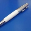
Monteverde Walt Disney Signature Fantasia Blue Agate Rollerball Pen!
PenBoutique posted a topic in The Mall
Walt Disney Fantasia is back only for a limited time!! Retail Price: $325.00 Sale Price: $162.50 Saving:$162.5 (50%) For more information you can contact us by : Phone 1800-263-2736 or 410992-3272 Email Support@penboutique.com Check out our youtube video on this item link is below. https://www.youtube.com/watch?v=Sc2mqQBp7tc
-
Hello, Finally completed the Prelude Signature series. http://s5.postimg.org/85uv1m1t3/Prelude_sign1.jpg http://s5.postimg.org/50a9bej6v/Prelude_sign2.jpg Best regards.
-
Hey there! I am looking for inks which can be used in a professional setting but have a tiny bit of fun with them. For me, these inks should be very dark, so that by not taking a closer look you could mistake them for a blue or even black ink, but at a second glance you can see a tiny pop of color. So almost black, but with something extra. Some inks that could be used as examples: - Noodler's red-black - Mont Blanc British Racing Green - maybe Mont Blanc Albert Einstein I am happy to hear your suggestions, as I am not that knowledgable about all the inks yet, and I am sure you have many good ideas.
-
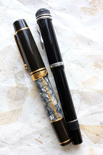
I've used these two pens so much that the signature on the caps is basically gone. I love it though, it reminds me of a used (but yet beautiful) vintage Fender Stratocaster. Jose
-
Hello, Complete newbie to fountain pens and would greatly appreciate your assistance here. Considering buying my first fountain pen and I am leaning towards the Pelikan brand. QUESTIONS 1. Can people give me recommendations on what type of Pelikan pen would be best for signatures? That's the only thing I will be using it for. I'm thinking about 20 times a month and the documents will be business letterheads. 2. Any recommendations on stores in NJ where I may try out the pen first? Thanks for your help!
-

Need Some Advice On Pen For Signature Pls
Lawrence posted a topic in Fountain & Dip Pens - First Stop
Hi all, I currently own a pelikan M400 and a vintage Pelikan 100. The 400 is equipped with a cursive italic medium nib from Richard and the 100 is with the original M nib. I like the cusrive italic nib. It produces nice line variation. But I need to sign quite often. 10 signatures a day in average. I want some pen product thicker and wetter line for signature. So I may need to go to B or BB. May I have some suggestion from you on which particular pen u should not overlook? I am also tempted to try flexible nib but really have no idea whether it will fit my daily usage purpose. As for pen appearance, I am always a tradition and classic guy who previous sutle beauty and elegant dimension. So, no oversize or loud design. The pelikan 100 is my ideal dimension and design. I also found the MB 146 appearing to me too. But I'm open to any other brands that fit my requirement. Many thanks for your help. -
Hi all, I've been thinking about how different nib sizes came about. I'm relatively new to fountain pens, but have seen the huge variety of nibs available to tailor to each persons hand. Out of curiosity I must ask. If manifold nibs and flexible nibs were born out of a need or necessity for practical purposes (which for the above I understand to be primarily accountancy and legal documents respectively), then how did the bold nib come about? I know it's an unusual question, and in current times it's all about preference but who came up with the idea of a big fat line and why? The only practical application that I can think of would be for use in signatures. Was there some common purpose or reason that meant that historically if you could only afford one fountain pen you'd be advised to carry a bold nib? Hope this question makes sense and thanks in advance, Badger
-
 While I was watching the news this evening I caught this image of King Albert of Belgium signing his abdication today in Brussels. I've always believed that even when the use of fountain pens has declined so much that hardly any other than FPN freaks currently use them, they were still displayed in solemn occasions. But if I am not mistaken the writing instrument used by King Albert today IS NOT a fountain pen, is it?
 -
Hi, I am looking for the best pen for signing documents. It should show better my signature. According to articles and advice that I read; ''Signature nibs should be Broad or BB, because a signature should never look tentative or weak - a signature should have visual impact, and convey strength and presence.'' (by yachtsilverswan) So I think EF, F (maybe M) aren't suitable for me? In my opinion the best way try them at pen shop, but I want to learn that which issues (nib, oblique, stub etc.) should I focus? What do you think about this? I am looking for a pen for beautiful signature. I have got a no idea about pens, nib, stub, ink etc. I want a pen for usually signing maybe sometimes take notes or writing. but my priority is signing. So what is the best pen (roller, ball-point, fountain) for you? Of course nib size, stub, oblique or straight etc. What are your suggestions? Thank you very much
-
Hi everyone from Turkey. As you know I am new here I am looking for a pen for good signature and I meet FPN while I was looking at information about my research at internet. I have got a no idea about pens, nib, stub, ink etc. I want a pen for usually signing maybe sometimes take notes or writing. but my priority is signing. So what is the best pen (roller, ball-point, fountain) for you? Of course nib size, stub, oblique or straight etc. Thank you very much