Search the Community
Showing results for tags 'moss'.
Found 5 results
-
Very difficult color to "catch", scanner didn't succeed so it is a picture...
-
-
I first noticed Robert Oster's ink on ebay and wasn't too sure about it. Then I saw someone here had taken the plunge before me and the ink seemed good, so I took the plunge and contacted him. Customer service was truly excellent; he always responded very promptly and politely and was very helpful. I got seven inks in one package by ordering directly from him. I can't give a full picture review here as all my photographs are too big, so I have a picture of a comparison sheet below, after my thoughts. Moss Green: Very nice green with a slight grey aspect. Quite dark and a genuine 'moss' colour. No shading. Orange: This one doesn't come out very well in the picture. It is very bright, no shading and is a little bit like a highlighter ink but is deep enough for normal use. It 'pops'. Lime Green: Really lovely citrus green. Nice and bright with slight yellow hints underneath and a small bit of shading. It gives Kobe's lime a run for its money. Royal Red: A standard red, but quite a nice one. No shading. Looks a little flat on Tomoe. Barossa Grape: lovely murky purple. Very dark; perhaps a little like Ink of the Witch? I have nothing quite like it. Deep Sea: really awesome. Like a slightly more saturated Emerald of Chivor. Nice shading and sheen. It has a tendency to bleed a tiny bit on Tomoe, but I had no problems on Clairefontaine or Rhodia. Jade Green: Very nice murkey green, a touch lighter than Tanna Japonensis if you know that ink. Has shading and a slight brownish/yellow undertone. I simply wanted to add that these inks are really great. They all have quite strong saturation and a wetness on the nib, good flow, decent lubrication, no staining issues (some of them wash out really easily) and reasonably fast dry times. Except for the Deep Sea on Tomoe I had no issues with show through, bleed or feathering. It's the deep saturation for me that makes them really attractive. I liked these inks so much that I'm already narrowing down my list for the next seven in a pack. Highly recommended. flic.kr/p/HHFYdq
-
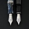
Robert Oster Signature Inks are a new line coming out of South Australia and are making enthusiasts sit up and take notice! They are very competitively priced too. So, I acquired a handful of these, thus: Moss Emerald Green Deep Sea Bondi Blue Fire Engine Red Yellow SunsetIn the following short reviews the writing samples are created using an Osmiroid B4 italic nib and an Esterbrook 2048 fitted to a standard XT Esterbrook dip-less pen holder. All writing is by dipping. More time is needed to discover how these inks behave in cartridges, converters or eyedroppers. Swabs for comparison with other inks will be provided later in the week – I’m all out of Q-tips! First up, Moss The ink laid down with good wetness from both nibs. Colour is nicely saturated and is very reminiscent of moss, as it should be! Drying times were relatively slow on Rhodia paper, though not that different from other saturated inks. There is plenty of shading and a kind of velvet look to it, but I cannot see much by way of sheen. However, this is a beautiful colour, and one that I am going to really enjoy using in personal correspondence.
-
Parker Penman Emerald Vs Graf Von Faber-Castell Moss Green
attika89 posted a topic in Ink Comparisons
http://kepfeltoltes.hu/140807/P1200906_1_www.kepfeltoltes.hu_.jpg http://kepfeltoltes.hu/140807/P1200929_1_www.kepfeltoltes.hu_.jpg Parker Penman Emerald vs Graf von Faber-Castell Moss Green I was planning to do this comparison for a while (about 8 months). Why did it take this long? Good question....and it doesn't even matter I think. Here it is http://kepfeltoltes.hu/140807/IMG_001_www.kepfeltoltes.hu_.jpg On the scans you can spot the difference somewhat easily, but to the naked eye they are very similar. The Emerald is a more vivid green, and the Moss Green is just a bit more "mossy" I'd say. Haha Both of them shade nicely and behave great, no problems at all. http://kepfeltoltes.hu/140807/IMG_01_www.kepfeltoltes.hu_.jpg I love the Maruman paper, because its very smooth, but it bleeds pretty easily with a wetter nib. http://kepfeltoltes.hu/140807/IMG_1_www.kepfeltoltes.hu_.jpg A little bling and a little moss (and some bleed-through, but as I said earlier its just the paper) http://kepfeltoltes.hu/140807/IMG_002_www.kepfeltoltes.hu_.jpg This is on some thinner notebook paper. http://kepfeltoltes.hu/140807/IMG_003_www.kepfeltoltes.hu_.jpg A bit of Clairefontaine. They both can have a nice pinkish/purplish sheen! Penman Emerald http://kepfeltoltes.hu/140807/P1170414_www.kepfeltoltes.hu_.jpg GvFC Moss Green http://kepfeltoltes.hu/140102/P1170560_www.kepfeltoltes.hu_.jpg Some extreme moss sheen remained from an ink drop. http://kepfeltoltes.hu/140416/P1180500_www.kepfeltoltes.hu_.jpg Moss Green on top, Emerald on the bottom. http://kepfeltoltes.hu/140807/IMG_www.kepfeltoltes.hu_.jpg And a little surprising result (at least for me) from the Moss Green (on the left): http://kepfeltoltes.hu/140807/IMG_0007_www.kepfeltoltes.hu_.jpg The is a whole lotta blue in the GvFC. The Emerald also showed a little blue what can be seen on the previous scan. I hope you found this interesting