Search the Community
Showing results for tags 'rohrer&klingner'.
-

Ink Shoot-Out : Rohrer&Klingner Verdigris vs Callifolio Equinoxe(6)
namrehsnoom posted a topic in Ink Comparisons
Ink Shoot-Out : Rohrer & Klingner Verdigris vs L’Artisan Pastellier Callifolio Equinoxe(6) A couple of months ago, I did a review of R&K Verdigris, and was pleasantly surprised by the ink’s colour and performance – it’s truly a classic. When looking at related inks, I noticed that L’Artisan Pastellier Callifolio Equinoxe(6) showed a similar vibe. Both are fabulous inks with great aesthetics and a solid presence on the page. This deserves a more in-depth comparion: I wonder if one of them outshines the other. The morning sun rises above the desert, its first golden rays illuminating the central square of Bartertown. Despite the ungodly hour a large crowd has gathered, and bookmakers are already taking bets. A big fight is on its way. Today, fate and fighting skills will determine who gets to be the new sheriff in town. Two candidates remain: on the left side the giant from Leipzig – Hans “The Crusher” with his ball chain flail. On the right side, the muscleman from France – Jean-Paul “Bone Breaker” carrying his 2m steel pipe. Silence descends when Aunty Entity appears: “Today we choose our new champion, and the Thunderdome will decide. Two men enter, one man leaves!” Enter... the Ink Shoot-Out. A brutal fight spanning five rounds, where two inks engage in fierce battle to determine who is the winner. Today’s fight is a gladiator spectacle: a brutal fight within the confines of the metal cage of the Thunderdome. A huge crowd clings to the dome’s bars… expectations are high for what promises to be a brutal and bone-breaking event. Aunty Entity drops her handkerchief, signaling the start of the first round. May the best ink win… Round 1 – First Impressions This first round is all about peacocking. The champions strut across the ring, impressing the public with their strength and showcasing their weapon mastery. Attacks are meant to explore weaknesses, and to express dominance over the opponent. It’s a wonderful display of battle skills! Both inks show wonderful qualities. Their dark blue colours are simply amazing, with a solid presence on the page and showing lots of depth and character. Both are muted dark blues with good saturation and some lovely shading that is never overdone and always aesthetically pleasing. The force is strong in these two! In this first round, both champions showcase their ability, and both throw serious punches, trying to impress their opponent and explore weaknesses. These champions are on fairly equal footing, but there are obvious differences: Verdigris is what I would call a teal dark-blue – it’s a blue-black by nature, that has strong teal influences. The resulting colour is simply beautiful and great-looking on paper. Equinoxe(6) is more of a dark-blue teal – first and foremost a teal colour, with strong dark-blue leaning undertones. A bit more heavy in the shading, and with a similarly strong presence on the paper. Verdigris is serious and business-like, while Equinoxe(6) expresses more emotion and playfulness. It’s Mr Spock vs Mc Coy … both equally valuable to Kirk, but having totally different characters. This is a great first round, and both inks effortlessly impress the crowd. But neither one manages to outshine its opponent. Starting from wildly different backgrounds, both inks lean towards the dark-blue, showcasing mastery of the paper – saturation, wetness, shading, colour … all combine to make these great inks to use. But in the end, neither ink dominates. As such, this first round ends in a draw. Round 2 – Writing Sample The writing sample was done on a Rhodia N°16 Notepad with 80 gsm paper. Both inks behaved flawlessly, with no feathering and no show-through nor bleed-through. With the EF nib, Verdigris feels a bit wetter-writing, and looks just a little bit more solid on the page. With broad nibs, Verdigris tends to over-saturate – it’s a bit too wet-writing, and leaves a bit too wide a line. Equinoxe(6) is more consistent and shows a same level of wetness and saturation across the nib range. This is especially noticeable in broader nibs. With the EF-nib, Hans The Crusher strikes a glancing blow on his opponent's shoulder. The French champion stumbles a bit, but quickly recovers. With the broad nib, Equinoxe(6) swings his steel pipe at Verdigris’ legs, causing the German giant to fall. But Verdigris turns the fall into a roll, quickly regaining its footing before the French champion can press for an advantage. The crowd is going wild… the fight is getting serious. Hard blows are exchanged. A good thing these fighters are wearing armour, or bones would have been crushed. Both inks work wonders with the paper, writing really well without any technical difficulties. Wetness, saturation, shading … all these are present and work nicely together to enhance your writing. I noticed no feathering, nor any hints of show-through or bleed-through on the Rhodia paper. As such, these inks really measure up to one another. This was a satisfying round, where both champions clearly show what they can do. Either one would make an excellent sheriff, that single-handedly could control a crowd. And the public agrees… they roar their approval, with equal enthousiasm for both inks. Again, no clear winner emerges, and this round also ends in a draw. Round 3 – Pen on Paper This round allows the battling inks to show how they behave on a range of fine writing papers. From top to bottom, we have: Midori notebook paper, Tomoe River 52 gsm, Original Crown Mill cotton paper, Clairefontaine Triomphe 90 gsm and Paperblanks 120 gsm journal paper. All scribbling and writing was done with a Lamy Safari B-nib. Both champions did well, with no show-through nor bleed-through. But this round is not about technicalities, it is about aesthetics and beauty. Are the fighters able to make the paper shine? One thing is immediately apparent: these inks work well with both white and creamy paper. A slight advantage goes to Verdigris: on creamy paper, it just looks a bit more solid. The Callifolio ink feels a bit more playful, more suited for personal journaling. When seriousness is needed, Verdigris seems the obvious choice to me. I also tested the inks on crappy Moleskine paper. Both inks handle that paper really well, with only a tiny amount of feathering. But there is quite some bleed-through – for both inks. I would say that they handle lousy paper equally well: really good behaviour in the writing department, but you will not be able to use the backside of the paper. With that creamy paper, the Rohrer & Klinger ink manages to swing its flail under Equinoxe(6)’s defenses, delivering a bone-crushing blow to the left leg. That clearly hurts! The public groans in empathy. But the French fighter ignores the pain, and continues to nimbly dance around his opponent, using blindingly fast strikes with its steel pipe to explore for weaknesses, which Verdigris masterfully evades. When the bell sounds the end of this round, it’s still clear that both champions have some fight left in them. But in this round, there was that slight breakthrough for Verdigris on the creamy paper. Not a huge thing, but enough for Aunty Entity to grant this round to Verdigris on points. Round 4 – Ink Properties Both inks have fairly long drying times, but for the first time we see a real difference: 20 seconds for the Callifolio ink, but a really long 30 seconds for Verdigris (with M-nib on Rhodia N°16 80 gsm paper). That difference is significant! From the chroma, it’s also obvious that Verdigris has less water resistance. To test this, I dripped water on the grid and let it sit there for 15 minutes, after which I removed the water with a paper towel. In reality, the difference turns out to be less prominent than the chroma suggests. Equinoxe(6) is definitely NOT a water-resistant ink, but there remains a faint grey residue that allows you to reconstruct your writing. With Verdigris, all dyes are flushed away with the water, leaving nothing readable on the page. During this round, the French fighter is in the lead, with solid strikes from his steel pipe that Verdigris can barely avoid. Drying times… bang! The steel pipe connects with Verdigris’ shoulder armour. That hurts! Water resistance… klaboom! The German barely manages to parry a solid steel pipe blow with his flail. He’s clearly on the defensive, and Callifolio Equinoxe(6) totally has the initiative. When the bell sounds, both inks remain standing. But this round is without any doubt a clear win for the French fighter. No bone-breaking hits, but Verdigris has certainly felt the pain. The crowd is going wild… at last the fight is becoming serious. Which ink will remain standing in the end? Round 5 – The Fun Factor Welcome to the final round. Here I give you a purely personal impression of both inks, where I judge which of them I like most when doing some fun stuff like doodling and drawing. And for this round, both inks are simply amazing. I did the drawing on HP Permium Plus Photo paper. The background uses heavily water-diluted ink, applied with a Q-tip. I then painted in the trees, adding more and more ink for the trees in the foreground. For the details in the first row of trees, I used pure ink in a B-nib Safari. The photo paper tends to enhance the ink’s characteristics, and this shows. Verdigris displays a more strongly present blue-black vibe. With Equinoxe(6), the green influence come to the surface and the ink looks definitely more like a teal. Both inks are lovely to draw with, but the Verdigris side of the painting simply looks more beautiful and balanced. At the end of this fifth round, Verdigris’ steel-ball flail extends with tremendous force, hitting the Frenchman squarely on the breastplate. Equinoxe(6) staggers to his knees, clearly suffering from this tremendous blow. The bell sounds, saving the Frenchman from certain defeat. This round is a solid win for Verdigris, and Aunty Entity agrees. The Verdict Both inks are great-looking dark blues, which work well with any type of paper: saturated, wet-writing, lovely shading, beautiful looks. Totally different characters, but true champions each. You can’t go wrong with either of these. But that final round really sealed the deal … Verdigris will be the new sheriff in town and is the winner of this exciting shoot-out. And Equinoxe(6) … well, Aunty Entity decides to be merciful. The Frenchmen can live: you should never waste a good ink!- 9 replies
-
- ink shoot-out
- rohrer&klingner
- (and 5 more)
-
Rohrer & Klingner sketchINK Carmen I was quite a bit excited when I started the review. The colour seemed promising however, in the end the promising colour was due to a not so thoroughly cleaned feed. The colour is quite close to Super5 Delhi which I reviewed prior. I was excited when I saw the reddish blob in the chroma but in the end was disappointed by the colour. It’s another pure orange. Writing samples: As you can see the heading and the F nib is darker but soon after the colour reverted to what it should be. A comparison page between Super5 Delhi and sketchINK Carmen It's really ugly on copy paper. photo: Comparison: Water test: (Left side was under water) And finally a homage at the opera Carmen and the fatal flower that seals the tragic destructive relationship: · Pens used: Pilot Kakuno Ef, Stub , Kaweco Sport (EF/F/M/B,1.9), Kanwrite with an Ahab nib · What I liked: The name, reddish orange hint. · What I did not like: I prefer my oranges on the red side. · What some might not like: Dryish ink, nanopigment ink, · Shading: No. · Ghosting: With very wet pens and have handed writing. .. · Bleed through: Same as above. · Flow Rate: Medium · Lubrication: Dry · Nib Dry-out: Not noticed. · Start-up: No. · Saturation: No. · Shading Potential: Dismal. · Sheen: No. · Spread / Feathering / Woolly Line: No. · Nib Creep / “Crud”: No. · Staining (pen): No. · Clogging: No. · Cleaning: It's a nano pigment ink. They tend to stick to everything, so you might need to use a penflush to be sure. · Water resistance: Excellent. · Availability: 50 ml Please don't hesitate to share your experience, writing samples or any other comments. The more the merrier
- 11 replies
-
- rohrer&klingner
- sketchink
-
(and 5 more)
Tagged with:
-
-
-

Ink Shoot-Out : R&K Isatis Tinctoria vs kyo-iro Soft Snow of Ohara
namrehsnoom posted a topic in Ink Comparisons
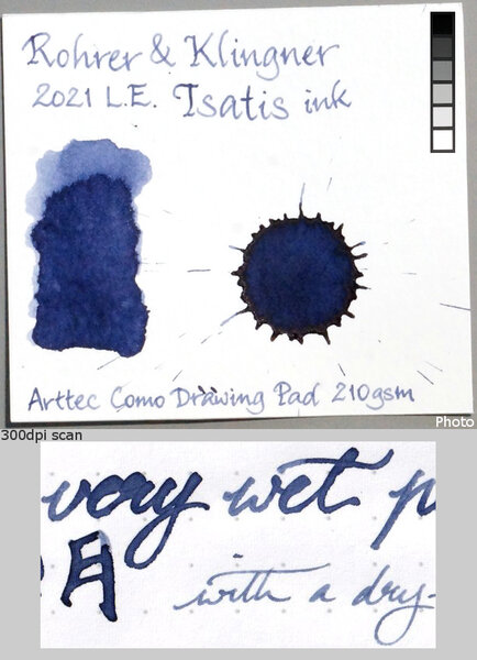
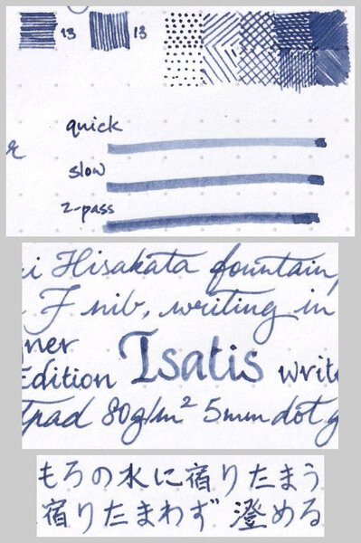
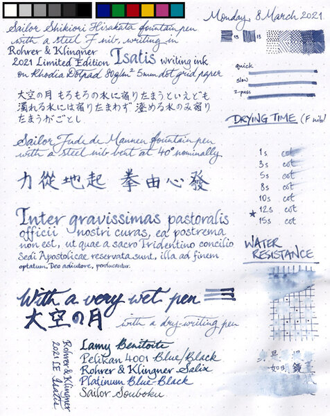
Ink Shoot-Out : Rohrer & Klingner Isatis Tinctoria vs kyo-iro Soft Snow of Ohara I ‘m a big fan of muted and soft-toned inks, and fortunately there are lots of inks out there that fit my taste perfectly. Kyo-iro Soft Snow of Ohara is one of the great ones among them. Recently, fellow member @JulieParadise graciously provided me with a large sample of the Rohrer & Klingner 2021 Limited Edition ink Isatis Tinctoria – a newcomer that joins the ranks of soft & elegant inks. Another great one, and Julie wondered if it could hold its ground against the Soft Snow. This smells like a challenge to a reigning champion. Time to do a detailed comparison, and find out which of these inks I like the most. Enter... the Ink Shoot-Out. A brutal fight spanning five rounds, where world-class champions engage in fierce battle to determine who is the winner. Today’s fighters are martial artists that excel in elegant moves to bring down their opponents. In the left corner, from the city of Leipzig in Germany, our challenger: the Kung-Fu master Isatis Tinctoria. In the right corner, from the city of Kyoto in Japan, comes the renowned Tai-Chi fighter Soft Snow of Ohara. Both champions take their place in the ring under thunderous applause from the crowd. The gong signals the start of the first round. Let the fight begin and may the best ink win… Round 1 – First Impressions The fighters start circling each other in an almost dance-like choreography… soft & elegant moves and countermoves. A weave of energy with some exploratory attacks & feints … a lashing foot-kick that glides off the opponents defense, a lightning-fast arm-strike that is absorbed as by water. This battle ballet is a true feast for the eye. Both champions make a great first impression. These inks are greyed-down blue-purples, with a vintage-style faded look that is tranquil and elegant. They are well-saturated, even in finer nibs, and provide excellent contrast with the paper. Shading is just perfect, without too much contrast between light and darker parts, which adds to the aesthetics of the inks. These truly are worthy champions, but there are some obvious differences: Soft Snow of Ohara is more of a muted indigo-violet, while the Rohrer & Klingner ink is a blue with some purple-leaning undertones. This is most obvious in swabs, but also in writing when both inks are put side-by-side. Both inks share the faded toned-down look, and elegant vintage vibe. Wonderful stuff… Isatis Tinctoria is the drier ink. Not annoyingly so, but with finer nibs you definitely get more feedback from the paper. Soft Snow of Ohara seems a very wet ink in comparison. The kyo-iro ink looks more saturated, especially in broader nibs. Isatis Tinctoria seems to more readily maintain its muted character across the nib range. Both inks make a great first impression. My personal preference leans towards Isatis Tinctoria: I really like its muted character with the hint of purple shining through. But talk to me later, and I may have changed my mind 😉 Both inks are great ones, worthy opponents that showed their mastery during this initial round. The chromatography of both inks looks eerily similar. You would expect much more similarity in the ink’s colours, but with Soft Snow of Ohara you clearly get a more purple-leaning look. From the bottom part of the chroma you can already see that not much ink remains when water is added. Round 2 – Writing Sample The writing sample was done on Rhodia N°16 Notepad with 80 gsm paper. Both inks behaved flawlessly, with no feathering and no show-through or bleed-through. Isatis Tinctoria feels a bit drier than its counterpart, and writes a bit less saturated. Nevertheless, both inks can easily cope with the complete nib range, writing beautifully even with the EF-nib. With broader nibs, Isatis Tinctoria seems to provide a more consistent look – in contrast Soft Snow of Ohara gets more saturated when using broader nibs. Both inks are elegant shaders, even with the finer nibs. It’s not often that you encounter inks that manage to exhibit shading in an EF nib. Both Isatis Tinctoria and Soft Snow of Ohara can pull off this nifty feat. The shading remains aesthetically pleasing as you move to broader nibs. Due to the low contrast in the saturation range of these inks, there is no harsh difference between light and darker parts. Shading thus remains soft and elevates the looks of your writing. Really well executed! For this round, the focus is on writing, and here both inks look equally well on the page. Only minor slip-ups… Isatis Tinctoria feels a bit drier, Soft Snow of Ohara shows less consistency across nib sizes. As such this round ends in a draw – not because the champions were weak… not at all. They both delivered a fine spectacle, showing they are really masters of their martial art. The crowd is loving it! Round 3 – Pen on Paper This round allows the battling inks to show how they behave on a range of fine writing papers. From top to bottom, we have : FantasticPaper, Life Noble, Tomoe River, Original Crown Mill cotton paper and Yamamoto Bank paper. All scribbling and writing was done with a Lamy Safari B-nib. Both champions did well, with no show-through nor bleed-through. But this round is not about technicalities, it is about aesthetics and beauty. Are the fighters able to make the paper shine ? These inks can handle both white and more yellow paper with ease, looking good on either type of paper. Soft Snow of Ohara is a bit stronger in its shading, with more contrast between the light and darker parts. In the scan, both inks look really similar, with just a bit more purple in the kyo-iro ink. This is most obvious with the naked eye and in swabs. In normal writing both inks can look really similar, with the purple dominance of Soft Snow of Ohara only becoming readily apparent when you put the writing samples side by side. But overall there is just one word for these beauties: WOW! In this round the martial art battle is a feast for the eye. Elegant positions that seem to defy gravity, and that give rise to powerful attacks, gracefully deflected by the opponent. A crane position explodes into a powerful leg-kick… the opponent flows like water, absorbing the energy, deflecting it and throwing that energy back in an equally powerful mantis strike. And on and on it goes… The crowd roars its approval and is loving every minute of it. Finally the gong rings, signaling the end of this round. Again, no definite winner emerges… these fighters are really well matched! Round 4 – Ink Properties Being the drier ink, you’d expect Isatis Tinctoria to be the faster drying ink but that is not the case. Both inks exhibit similar drying times in the 10 to 15 second range. Both inks also smudge a little when rubbed with a moist Q-tip cotton swab, with the text itself remaining crisp and clear. Neither ink shows any water resistance. Drip water on your writing, and all the colour dissipates leaving nothing readable on the page. Here both inks are equally weak, and neither of them can impress the public. For this round, neither ink did much to impress the crowd. The champions seem to be saving their strength for the final round, simply circling each other without much enthousiasm. As such this round ends with a draw. The crowd is now getting a bit restless, and is eagerly anticipating the final round. Round 5 – The Fun Factor Welcome to the final round. Here I give you a purely personal impression of both inks, where I judge which of them I like most when doing some fun stuff like doodling and drawing. The drawing was done on HP photo paper, that typically brings out the best from inks. Both inks do exceptionally well, and allow for some nice effects. They both have a fairly medium colour span, that results in subtle colour differences between areas of lower and higher saturation. The contrast is never harsh, which translates to a soft-toned image that looks pleasing to the eye. I really enjoyed using them. From the picture you can see that Soft Snow of Ohara has a deeper saturation point – compare the trees with the underlying rock. With Isatis Tinctoria, you get a more even look, with less differentiation between areas of high and low saturation. In the picture, I used heavily diluted ink (20:1 water to ink ratio) to draw in the background. The rocks were painted in with a Q-tip dipped in ink. For the trees and the sitting champion I used my fountain pen and pure ink. Both champions show their best moves: lightning-fast strikes and intercepts, an elegant choreography of dancing warriors. This is martial arts at its best! The stadium shakes with the applause of the crowd. A truly awesome fight! Both inks work superbly as drawing inks. It’s really a question of personal preference: do you prefer the more purple tones of the Soft Snow of Ohara, or the bluer looks of Isatis Tinctoria ? I have no real preference myself: today I would probably choose Isatis Tinctoria, but tomorrow I might be more drawn to the looks of the kyo-iro ink. It’s difficult to choose between two masterfully executed inks. And the judge follows my lead… both champions did equally well, and showed their immense potential. The Verdict Both inks are muted, soft & elegant beauties, that work well on either pure white or more yellow paper. They are well-saturated, and look great in all nib-sizes. These inks even show shading in EF-nibs! During the fight, the inks showed differing styles (blue vs purple leaning), but equally well executed. Both Isatis Tinctoria and Soft Snow of Ohara truly belong to the great ones! It’s not often that a shoot-out concludes without a winner, but in this case both inks rightfully deserve the crown.- 9 replies
-
- ink shoot-out
- rohrer&klingner
- (and 3 more)
-
desaturated.thumb.gif.5cb70ef1e977aa313d11eea3616aba7d.gif)
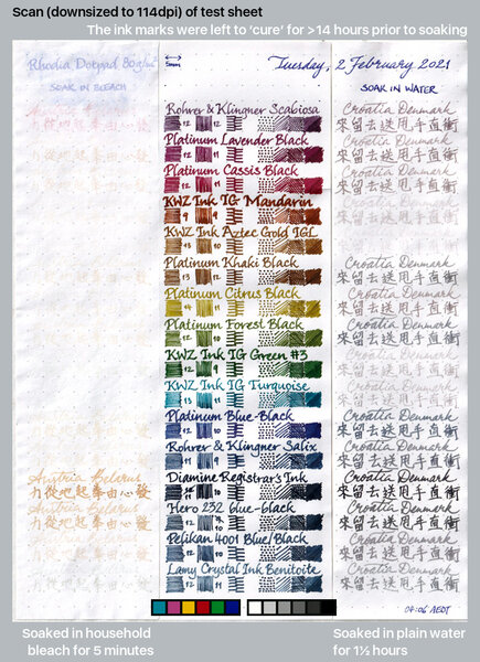
15 iron-gall inks after soaking in water and bleach
A Smug Dill posted a gallery image in FPN Image Albums
From the album: Ink performance testing
Lamy Benitoite was also included at the end, because there seems to be some uncertainty and conjecture online as to whether it has any iron-gall content.© A Smug Dill
- 0 B
- x
- 5 comments
-
- iron-gall
- water resistance
- (and 8 more)
-
This 50ml bottle of Rohrer and Klingner's archival ink was not inexpensive, but performed well beyond my expectations. It writes wet, yet dries quickly. Is absolutely unfazed by water, and works on the cheapest papers. The only downside I have noticed is that while doing the crossword (yes, it works on newsprint!), it did hard start a little if I was too slow on a clue. It can hardly be faulted for that, though... Front: Back:
- 17 replies
-
- rohrer&klingner
- blue
-
(and 3 more)
Tagged with:
-
Rohrer & Klingner is one of my favourite Ink makers. They offer nice and reasonably priced (especially in Europe) standard inks as well as two gall inks (Salix and Scabiosa). It seems the company is a little underrated among fountain pens aficionados. I believe their products should receive more attention. Few months ago the company’s introduced a line of six Dokumentus Inks sold in 50 ml glass bottle. Dokumentus ink is the world's first fountain pen ink that conforms to the requirements of DIN ISO 12757-2 (the standard that determines archival quality). Rohrer and Klingner Dokumetus inks has been certified for use by registrars on official documents, they’re ph-neutral, permanent and archival. Some criteria of this certification require color to remain readable after a defined dose of sunlight and under the influence of water the ink may only extend so far that the text line remain visible. ISO 12757-2 requires legibility and the ability to be stored for long periods of time. These inks should show resistance to water, light, ethanol, hydrochloric acid, ammonia, and bleach. I’ve tried only water. Test was positive. Water won’t do any harm to the text written with one of Dokumentus inks. The line consists of six colors: Braun (Brown) Dunkel Blau (Dark Blue) Grun (Green) Hellblau (Light Blue) Magenta Schwarz (Black) Braun is the best ink of the pack. Not only it has all archival ink properties, it also has stunning colors. That's precisely the kind of brown I enjoy most. Drops of ink on kitchen towel Software ID Tomoe River, Kaweco Sport Classic, broad nib Leuchtturm1917, Kaweco Sport Classic, broad nib Oxford notebook, Hero 5028, stub 1,9 Water resistance (white balance is slightly off - artificial light, shot taken 5 hours after putting this page into water)
-
Am I the only one who noticed that many inks are dirt cheap at Cult Pens? I can’t be, right?
collectorofmanythings posted a topic in Fountain & Dip Pens - First Stop
I haven’t heard many people talk about this, so I just wanted to make those who are unaware now aware. Here is just a quick thing on some price comparisons. “Retail” price was taken from online fountain pen and ink retailers: DIAMINE 30ml Cult Pens- $2.47 Retail- $7.50 PELIKAN 4001 30ml Cult Pens- $4.82 Retail- $11.75 ROHRER & KLINGNER 50ml Cult Pens- $5 Retail- $11.95 PARKER QUINK 57ml Cult Pens- $5.21 Retail- $11.02 DIAMINE 80ml Cult Pens- $6.21 Retail- $14.95 WATERMAN 50ml Cult Pens- $6.51 Retail- $12 PELIKAN 4001 62.5ml Cult Pens- $7.52 Retail- $16.50 DIAMINE 150th ANNIVERSARY 40ml Cult Pens- $8.15 Retail- $15.50 HERBIN 30ml Cult Pens- $8.40 Retail- $12.95 KAWECO 50ml Cult Pens- $8.41 Retail- $12 CROSS 62.5ml Cult Pens- $9.47 Retail- $16 LAMY CRYSTAL 30ml Cult Pens- $9.99 Retail- $16 JACQUES HERBIN 1670 50ml Cult Pens- $18.39 Retail- $29.50 JACQUES HERBIN 1798 50ml Cult Pens- $21.02 Retail- $29.50 MONTBLANC AROUND THE WORLD IN 80 DAYS BLUE 50ml Cult Pens- $33.66 Retail- $40 I just wanted to tell all of you who weren’t aware. Have a nice day, W. Major -
-
- rohrer&klingner
- limited edition
-
(and 2 more)
Tagged with:
-
-
- rohrer&klingner
- limited edition
-
(and 2 more)
Tagged with:
-
-
- rohrer&klingner
- limited edition
-
(and 2 more)
Tagged with:
-
desaturated.thumb.gif.5cb70ef1e977aa313d11eea3616aba7d.gif)
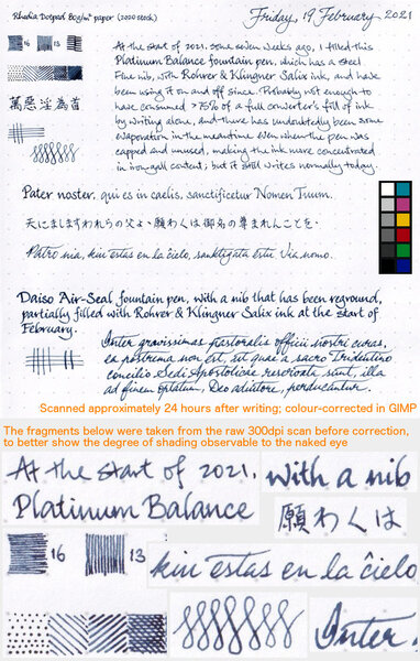
Shading from R&K Salix in writing samples with two different pens
A Smug Dill posted a gallery image in FPN Image Albums
-
- rohrer&klingner
- salix
-
(and 2 more)
Tagged with:
-
desaturated.thumb.gif.5cb70ef1e977aa313d11eea3616aba7d.gif)
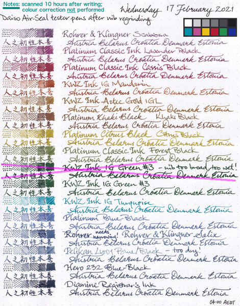
15 iron-gall inks written with Daiso Air-Seal pens after nibs were reground
A Smug Dill posted a gallery image in FPN Image Albums
From the album: Ink performance testing
I couldn't stand how woolly and blobby some of the lines written with the tester pens look, especially in the actual testing pad and notebook (not Rhodia Dotpad) I'm using for the year-long experiment, and so I reground the nibs on all of the pens. Note: Colour correction — which usually makes the image darker overall — in GIMP was not applied after the scan, but I have included the reference colour patches from the same scan. I wanted to show you how dark Diamine Registrar's Ink looks to the scanner, without any doubt as to whether I artificially darkened it or increased the contrast.© A Smug Dill
- 0 B
- x
-
- iron-gall
- diamine registrars
- (and 6 more)
-
desaturated.thumb.gif.5cb70ef1e977aa313d11eea3616aba7d.gif)
15 iron-gall inks written with Daiso Air-Seal pens before nibs were reground
A Smug Dill posted a gallery image in FPN Image Albums
From the album: Ink performance testing
The ‘before’ scan for the test sheet here: All written with Daiso Air-Seal fountain pens like this one:© A Smug Dill
- 0 B
- x
-
- iron-gall
- diamine registrars
- (and 6 more)
-
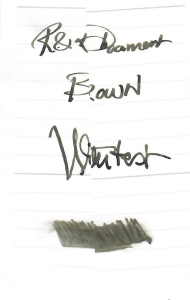
This time last year German ink makers Rohrer & Klingner introduced their first limited edition ink Aubergine. Right on cue the LE ink for 2019 has appeared - Kastanienbraun. This year R&K have conjured up a chestnut brown, or Maroon ink (as the company is mistranslating for the international market). No matter, since to my eyes it is neither a Chestnut nor a Maroon but rather a true brown, the colour of grandmother's cocao powder. Brown inks can be classified as Golden, Redish and the Dark Side. This one lies in the center with a slight tendency to the red. Even when the ink is showing shading the colour remains a constant mid brown. Brown all the way down. Bottle, Wing Sung and Dwell Discourager The ink comes in a sensible bottle and costs a refreshing 12 Euros for 50ml. This is 3 times what their standard-line inks costs on the German market but in this era of 70 Euro Montblanc inks it seems more than reasonable. R&K is a kind of anti-luxury brand - a serious minded East German firm, from the land of Luther - unfrivolous, quality products for decent prices. Put it this way: R&K are not about to introduce an ink line called Sheen Godzilla or Scented Twinkle any time soon. This sober attitude carries through to packaging. "How can we make the LE ink look a little more exclusive without being superficial or environmently unfriendly?”, "I have a idea", said the creative. “Let's package it in a toilet roll. Yes, the kind used for that scratchy, dwell discourager paper in the staff WC." So must the converstation have run. So what of the ink? How does it write? I inked up a wet, medium nib (Waterman Man200) and tried the ink on Moleskine textured paper and Oxford Optik paper as well as torn off pieces of envelope lying around my desk. The performance was excellent, with no excessive feathering on the cheap paper and great shading on the higher quality papers. Oxford Optik, Man200 Then I inked up my everyday brown pen - a fine nib Wing Sung 626. This nib married less well with the ink. It began to feel dry and needed some encouragement to write fluently on the Optik paper. It did fine on the Moleskine. Moleskine WS626 Doodle How does it compare to other inks? I don"t reach often for R&K Sepia; Kastanienbraun is much warmer than that. It's lighter than Diamine Chocolate yet more highly saturated than Saddle Brown. Despite the saturation, R&K dries quickly and has not tendency to smear once dry. It's a nice ink. I will use often. If you like brown inks and have a wet nib you will enjoy it too. Try it on your dry pens too and see if it works for you - but quick R&K LE inks really are limited. Aubergine was hard to obtain by mid December and this will certainly sell just as quickly.
- 27 replies
-
- brown
- rohrer&klingner
-
(and 1 more)
Tagged with:
-
Rohrer&Klingner produces wonderful inks. I think it's the company that's criminally underrated in fountain pen afficionados circles. sketchINK® is a range of 10 inks for fountain pens. They are - as most pigment inks - exceptionally waterproof and lightfast. R&K uses nano pigments to enable an optimal ink flow. However, it has to be said that waterproof inks can cause clotting in fountain pens. Therefore it's reasonable to clean pens filled with it regularly. I bought two of these inks Lilly and Emma. Both are nice and behave fairly well for a pigment ink. Bottle The inks are sold in 50 ml glass bottle. While it's not as nice as some ink bottles are, it's practical. Ink Splash The ink feels well lubricated and flows well. Jinhao nib is quite dry and yet the ink flows well. Drying time is reasonable and water resistance is impressive. Drops of ink on kitchen towel Color ID Color range Copy paper, Jinhao x750, m Fabriano, Jinhao x750, m Rhodia, Jinhao x750, medium Water resistance
-
Rohrer & Klingner is one of my favourite Ink makers. They offer nice and reasonably priced (especially in Europe) standard inks as well as two gall inks (Salix and Scabiosa). It seems the company is a little underrated among fountain pens aficionados. I believe their products should receive more attention. Few months ago the company’s introduced a line of six Dokumentus Inks sold in 50 ml glass bottle. Dokumentus ink is the world's first fountain pen ink that conforms to the requirements of DIN ISO 12757-2 (the standard that determines archival quality). Rohrer and Klingner Dokumetus inks has been certified for use by registrars on official documents, they’re ph-neutral, permanent and archival. Some criteria of this certification require color to remain readable after a defined dose of sunlight and under the influence of water the ink may only extend so far that the text line remain visible. ISO 12757-2 requires legibility and the ability to be stored for long periods of time. These inks should show resistance to water, light, ethanol, hydrochloric acid, ammonia, and bleach. I’ve tried only water. Test was positive. Water won’t do any harm to the text written with one of Dokumentus inks. The line consists of six colors: Braun (Brown) Dunkel Blau (Dark Blue) Grun (Green) Hellblau (Light Blue) Magenta Schwarz (Black) Schwarz wasn't made for me but I believe it's good black ink, especially if you need waterproof black. Given the choice between few water resistant inks I've tried I would list them this way: Kiwa - Guro - Sailor > Darmstadt - Super 5 > Schwarz - Rohrer & Klingner > Carbon Black - Platinum > Black - De Atramentis. Drops of ink on kitchen towel Software ID Tomoe River, Kaweco Sport Classic, broad nib Clairefontaine, Haolilai 908, M Leuchtturm1917, Kaweco Sport Classic, broad nib Oxford notebook, Hero 5028, stub 1,9 Water resistance (white balance is slightly off - artificial light, shot taken 5 hours after putting this page into water)
-
Rohrer&Klingner produces great inks and I consider myself a great fan of the company. While their LE inks aren't easy to buy in Europe, I've managed to secure a bottle of Aubergine. Ink Splash The ink flows well. No hard starts, no skipping. No clogging. Overall, a great purple. Drops of ink on kitchen towel Color ID Copy paper, Kaweco Classic Sport, medium nib Fabriano, no-name chinese pen, fine nib Fabriano, Hero 5032, stub 1.9 Water resistance
-
It took me some time to finish this comparison but here it is. Not flawless, not pefect, but it has plenty of colors to see. To be honest I've never been violet fan. I always liked dark purples but disliked most of violets. It's hanged with time. At the moment I'm quite keen on these hues. I've included 60-63 inks here (the number differs on different papers, I didn't have enough samples of some inks, I've forgotten about one or two inks and haven't included them everywhere). There are some odd-looking inks here that aren't violet/purple like KWZI Blue L51 (I just had a small sample so I included it here). Kung Te-Cheng, Potassium, Purpillusion are more blue than purple. Alt-Bordeaux and Deepwater Obsession can be regarded as burgundy but as I'm not planning (yet) to compare burgunds / bordeaux I've included them here as well. I need to thank Cyber6 here for A LOT of samples. You trully are Ink Smuggler Extraordinaire Ink Splashes http://imagizer.imageshack.us/v2/1024x768q90/674/D57Iib.jpg http://imageshack.com/a/img911/9309/XMowa7.jpg http://imageshack.com/a/img905/9462/Dzf3fY.jpg http://imageshack.com/a/img537/121/srURhs.jpg http://imageshack.com/a/img901/3985/xcEDod.jpg http://imageshack.com/a/img537/4492/NtfODA.jpg http://imageshack.com/a/img538/2685/q8cIq7.jpg http://imageshack.com/a/img673/1967/EnAfQy.jpg http://imageshack.com/a/img674/4319/WdEf3j.jpg http://imageshack.com/a/img631/7922/1S4blW.jpg http://imageshack.com/a/img673/9114/raVPLz.jpg http://imageshack.com/a/img674/3466/vK8xaM.jpg http://imageshack.com/a/img538/7629/ivb3lB.jpg http://imageshack.com/a/img538/2456/dhwe19.jpg http://imageshack.com/a/img745/7901/pw9g05.jpg http://imageshack.com/a/img674/6609/m4k036.jpg GEMS (they were cut from photos taken on a sunny day, you may find the colors bizarre but I like to show them this way even though most of the times we're not writing in a direct sunlight) http://imageshack.com/a/img910/3417/UZX0cP.jpg http://imageshack.com/a/img674/7610/4sDPbR.jpg http://imageshack.com/a/img538/8730/osVcHA.jpg http://imageshack.com/a/img912/9997/NAgsqc.jpg
- 45 replies
-
- akkermandiamine
- montblanc
- (and 7 more)
-
Rohrer & Klingner operates since 1892. At the moment it's the fifth generation of the family that manages the company. I guess that after 122 years they know what they are doing. R&K inks offer amazing quality for amazing price. In my country a bnottle of R&K ink costs 5-6 $. I know it's a bit more expensive in America, yet I believe the price is still reasonable. I find it interesting that Rohrer & Klingner seems to focus mainly on the content and not on the bottles. Inks come in industrial looking bottle taht is quite handy but there's just nothing fancy about it. It's surprising. http://www.rohrer-klingner.de/fileadmin/_migrated/pics/schreibtinte_top_03.jpg Anyway they offer eighteen colors, some stunning, some boring but all have good qualities and are easy to clean. http://imageshack.com/a/img742/3085/WHCjxM.jpg Alt-bordeaux Alt-Goldgrun Blu Mare Blue Permanent Cassia Fernambuc Helianthus Leipziger-Schwarz Magenta Morinda Royal Blue Salix Scabiosa Sepia Smaragdgrun Solferino Verdigris Verdura It's time to re-review this inks. Alt-Goldgrun is one of my all time favourite inks and one of few I've actually managed to use full bottle. Depending on the pen and nib and paper you use effect may vary. One thing is sure though - this ink is still quite unique. Sure, may companies decided to add complex yellow-greens to their lines but I believe Rohrer & Klingner ALt-Goldgrun was one of first such colors on the market. The ink feels very wet and offers great shading. If you look for water resistance in the ink, this one will disappoint you. Apart from that I can only write about it in superlatives. I've heard some people had problem with it feathering but I haven't experienced such misbehaviour. Drops of ink on kitchen towel Chromatography Software ID Color Range Leuchtturm 1917, Kaweco Claasic Sport, B Leuchtturm1917, Kaweco Classic Sport, B Kokuyo Campus Myo, Kaweco Classic Sport, B
-
Rohrer & Klingner is one of my favourite Ink makers. They offer nice and reasonably priced (especially in Europe) standard inks as well as two gall inks (Salix and Scabiosa). It seems the company is a little underrated among fountain pens aficionados. I believe their products should receive more attention. Few months ago the company’s introduced a line of six Dokumentus Inks sold in 50 ml glass bottle. Dokumentus ink is the world's first fountain pen ink that conforms to the requirements of DIN ISO 12757-2 (the standard that determines archival quality). Rohrer and Klingner Dokumetus inks has been certified for use by registrars on official documents, they’re ph-neutral, permanent and archival. Some criteria of this certification require color to remain readable after a defined dose of sunlight and under the influence of water the ink may only extend so far that the text line remain visible. ISO 12757-2 requires legibility and the ability to be stored for long periods of time. These inks should show resistance to water, light, ethanol, hydrochloric acid, ammonia, and bleach. I’ve tried only water. Test was positive. Water won’t do any harm to the text written with one of Dokumentus inks. The line consists of six colors: Braun (Brown) Dunkel Blau (Dark Blue) Grün (Green) Hellblau (Light Blue) Magenta Schwarz (Black) I strongly dislike the color of this green ink. It behaves well though and if you need green bombproof ink it may be the one. Drops of ink on kitchen towel Software ID Tomoe River, Kaweco Sport Classic, broad nib Leuchtturm1917, Kaweco Sport Classic, broad nib Oxford notebook, Hero 5028, stub 1,9 Water resistance (white balance is slightly off - artificial light, shot taken 5 hours after putting this page into water) Quote
-
Rohrer & Klingner is one of my favourite Ink makers. They offer nice and reasonably priced (especially in Europe) standard inks as well as two gall inks (Salix and Scabiosa). It seems the company is a little underrated among fountain pens aficionados. I believe their products should receive more attention. Few months ago the company’s introduced a line of six Dokumentus Inks sold in 50 ml glass bottle. Dokumentus ink is the world's first fountain pen ink that conforms to the requirements of DIN ISO 12757-2 (the standard that determines archival quality). Rohrer and Klingner Dokumetus inks has been certified for use by registrars on official documents, they’re ph-neutral, permanent and archival. Some criteria of this certification require color to remain readable after a defined dose of sunlight and under the influence of water the ink may only extend so far that the text line remain visible. ISO 12757-2 requires legibility and the ability to be stored for long periods of time. These inks should show resistance to water, light, ethanol, hydrochloric acid, ammonia, and bleach. I’ve tried only water. Test was positive. Water won’t do any harm to the text written with one of Dokumentus inks. The line consists of six colors: Braun (Brown) Dunkel Blau (Dark Blue) Grun (Green) Hellblau (Light Blue) Magenta Schwarz (Black) Magenta is too pink for me. Drops of ink on kitchen towel Software ID Tomoe River, Kaweco Sport Classic, broad nib Leuchtturm1917, Kaweco Sport Classic, broad nib Oxford notebook, Hero 5028, stub 1,9 Water resistance (white balance is slightly off - artificial light, shot taken 5 hours after putting this page into water) QuoteMultiQuote
-
Rohrer & Klingner is one of my favourite Ink makers. They offer nice and reasonably priced (especially in Europe) standard inks as well as two gall inks (Salix and Scabiosa). It seems the company is a little underrated among fountain pens aficionados. I believe their products should receive more attention. Few months ago the company’s introduced a line of six Dokumentus Inks sold in 50 ml glass bottle. Dokumentus ink is the world's first fountain pen ink that conforms to the requirements of DIN ISO 12757-2 (the standard that determines archival quality). Rohrer and Klingner Dokumetus inks has been certified for use by registrars on official documents, they’re ph-neutral, permanent and archival. Some criteria of this certification require color to remain readable after a defined dose of sunlight and under the influence of water the ink may only extend so far that the text line remain visible. ISO 12757-2 requires legibility and the ability to be stored for long periods of time. These inks should show resistance to water, light, ethanol, hydrochloric acid, ammonia, and bleach. I’ve tried only water. Test was positive. Water won’t do any harm to the text written with one of Dokumentus inks. The line consists of six colors: Braun (Brown) Dunkel Blau (Dark Blue) Grun (Green) Hellblau (Light Blue) Magenta Schwarz (Black) Hellblau (Light Blue) is kind of OK blue. Nothing exciting except for archival properties. Drops of ink on kitchen towel Software ID Tomoe River, Kaweco Sport Classic, broad nib Leuchtturm1917, Kaweco Sport Classic, broad nib Oxford notebook, Hero 5028, stub 1,9 Water resistance (white balance is slightly off - artificial light, shot taken 5 hours after putting this page into water)
-
Rohrer & Klingner operates since 1892. At the moment it's the fifth generation of the family that manages the company. I guess that after 122 years they know what they are doing. R&K inks offer amazing quality for amazing price. In my country a bnottle of R&K ink costs 5-6 $. I know it's a bit more expensive in America, yet I believe the price is still reasonable. I find it interesting that Rohrer & Klingner seems to focus mainly on the content and not on the bottles. Inks come in industrial looking bottle taht is quite handy but there's just nothing fancy about it. It's surprising. http://www.rohrer-klingner.de/fileadmin/_migrated/pics/schreibtinte_top_03.jpg Anyway they offer eighteen colors, some stunning, some boring but all have good qualities and are easy to clean. Alt-bordeaux Alt-Goldgrun Blu Mare Blue Permanent Cassia Fernambuc Helianthus Leipziger-Schwarz Magenta Morinda Royal Blue Salix Scabiosa Sepia Smaragdgrun Solferino Verdigris Verdura It's time to re-review this inks. Alt-Bordeaux a pleasant wine color that leans strongly toward purple. There's noticeable shading and the flow is moderataly wet. The ink isn't heavily saturated but I'm not sure if I could call it muted or subdued. I guess in some pens it tends to look flat. It is very easy to clean out of your pen. The dry time is medium length, reaching 15 seconds when the ink is used in wet nib on paper like Rhodia. It lacks water resistance but cleans nicely from the pen. Some feathering may be experienced on crappy paper (Moleskine and alikes). Drops of ink on kitchen towel Software ID Color range Tomoe River, Lamy 2000, medium nib Leuchtturm1917, Kaweco Skyline Sport, double broad Maruman, Kaweco Skyline Sport, broad

