Search the Community
Showing results for tags 'verdigris'.
Found 9 results
-

Ink Shoot-Out : Rohrer&Klingner Verdigris vs Callifolio Equinoxe(6)
namrehsnoom posted a topic in Ink Comparisons
Ink Shoot-Out : Rohrer & Klingner Verdigris vs L’Artisan Pastellier Callifolio Equinoxe(6) A couple of months ago, I did a review of R&K Verdigris, and was pleasantly surprised by the ink’s colour and performance – it’s truly a classic. When looking at related inks, I noticed that L’Artisan Pastellier Callifolio Equinoxe(6) showed a similar vibe. Both are fabulous inks with great aesthetics and a solid presence on the page. This deserves a more in-depth comparion: I wonder if one of them outshines the other. The morning sun rises above the desert, its first golden rays illuminating the central square of Bartertown. Despite the ungodly hour a large crowd has gathered, and bookmakers are already taking bets. A big fight is on its way. Today, fate and fighting skills will determine who gets to be the new sheriff in town. Two candidates remain: on the left side the giant from Leipzig – Hans “The Crusher” with his ball chain flail. On the right side, the muscleman from France – Jean-Paul “Bone Breaker” carrying his 2m steel pipe. Silence descends when Aunty Entity appears: “Today we choose our new champion, and the Thunderdome will decide. Two men enter, one man leaves!” Enter... the Ink Shoot-Out. A brutal fight spanning five rounds, where two inks engage in fierce battle to determine who is the winner. Today’s fight is a gladiator spectacle: a brutal fight within the confines of the metal cage of the Thunderdome. A huge crowd clings to the dome’s bars… expectations are high for what promises to be a brutal and bone-breaking event. Aunty Entity drops her handkerchief, signaling the start of the first round. May the best ink win… Round 1 – First Impressions This first round is all about peacocking. The champions strut across the ring, impressing the public with their strength and showcasing their weapon mastery. Attacks are meant to explore weaknesses, and to express dominance over the opponent. It’s a wonderful display of battle skills! Both inks show wonderful qualities. Their dark blue colours are simply amazing, with a solid presence on the page and showing lots of depth and character. Both are muted dark blues with good saturation and some lovely shading that is never overdone and always aesthetically pleasing. The force is strong in these two! In this first round, both champions showcase their ability, and both throw serious punches, trying to impress their opponent and explore weaknesses. These champions are on fairly equal footing, but there are obvious differences: Verdigris is what I would call a teal dark-blue – it’s a blue-black by nature, that has strong teal influences. The resulting colour is simply beautiful and great-looking on paper. Equinoxe(6) is more of a dark-blue teal – first and foremost a teal colour, with strong dark-blue leaning undertones. A bit more heavy in the shading, and with a similarly strong presence on the paper. Verdigris is serious and business-like, while Equinoxe(6) expresses more emotion and playfulness. It’s Mr Spock vs Mc Coy … both equally valuable to Kirk, but having totally different characters. This is a great first round, and both inks effortlessly impress the crowd. But neither one manages to outshine its opponent. Starting from wildly different backgrounds, both inks lean towards the dark-blue, showcasing mastery of the paper – saturation, wetness, shading, colour … all combine to make these great inks to use. But in the end, neither ink dominates. As such, this first round ends in a draw. Round 2 – Writing Sample The writing sample was done on a Rhodia N°16 Notepad with 80 gsm paper. Both inks behaved flawlessly, with no feathering and no show-through nor bleed-through. With the EF nib, Verdigris feels a bit wetter-writing, and looks just a little bit more solid on the page. With broad nibs, Verdigris tends to over-saturate – it’s a bit too wet-writing, and leaves a bit too wide a line. Equinoxe(6) is more consistent and shows a same level of wetness and saturation across the nib range. This is especially noticeable in broader nibs. With the EF-nib, Hans The Crusher strikes a glancing blow on his opponent's shoulder. The French champion stumbles a bit, but quickly recovers. With the broad nib, Equinoxe(6) swings his steel pipe at Verdigris’ legs, causing the German giant to fall. But Verdigris turns the fall into a roll, quickly regaining its footing before the French champion can press for an advantage. The crowd is going wild… the fight is getting serious. Hard blows are exchanged. A good thing these fighters are wearing armour, or bones would have been crushed. Both inks work wonders with the paper, writing really well without any technical difficulties. Wetness, saturation, shading … all these are present and work nicely together to enhance your writing. I noticed no feathering, nor any hints of show-through or bleed-through on the Rhodia paper. As such, these inks really measure up to one another. This was a satisfying round, where both champions clearly show what they can do. Either one would make an excellent sheriff, that single-handedly could control a crowd. And the public agrees… they roar their approval, with equal enthousiasm for both inks. Again, no clear winner emerges, and this round also ends in a draw. Round 3 – Pen on Paper This round allows the battling inks to show how they behave on a range of fine writing papers. From top to bottom, we have: Midori notebook paper, Tomoe River 52 gsm, Original Crown Mill cotton paper, Clairefontaine Triomphe 90 gsm and Paperblanks 120 gsm journal paper. All scribbling and writing was done with a Lamy Safari B-nib. Both champions did well, with no show-through nor bleed-through. But this round is not about technicalities, it is about aesthetics and beauty. Are the fighters able to make the paper shine? One thing is immediately apparent: these inks work well with both white and creamy paper. A slight advantage goes to Verdigris: on creamy paper, it just looks a bit more solid. The Callifolio ink feels a bit more playful, more suited for personal journaling. When seriousness is needed, Verdigris seems the obvious choice to me. I also tested the inks on crappy Moleskine paper. Both inks handle that paper really well, with only a tiny amount of feathering. But there is quite some bleed-through – for both inks. I would say that they handle lousy paper equally well: really good behaviour in the writing department, but you will not be able to use the backside of the paper. With that creamy paper, the Rohrer & Klinger ink manages to swing its flail under Equinoxe(6)’s defenses, delivering a bone-crushing blow to the left leg. That clearly hurts! The public groans in empathy. But the French fighter ignores the pain, and continues to nimbly dance around his opponent, using blindingly fast strikes with its steel pipe to explore for weaknesses, which Verdigris masterfully evades. When the bell sounds the end of this round, it’s still clear that both champions have some fight left in them. But in this round, there was that slight breakthrough for Verdigris on the creamy paper. Not a huge thing, but enough for Aunty Entity to grant this round to Verdigris on points. Round 4 – Ink Properties Both inks have fairly long drying times, but for the first time we see a real difference: 20 seconds for the Callifolio ink, but a really long 30 seconds for Verdigris (with M-nib on Rhodia N°16 80 gsm paper). That difference is significant! From the chroma, it’s also obvious that Verdigris has less water resistance. To test this, I dripped water on the grid and let it sit there for 15 minutes, after which I removed the water with a paper towel. In reality, the difference turns out to be less prominent than the chroma suggests. Equinoxe(6) is definitely NOT a water-resistant ink, but there remains a faint grey residue that allows you to reconstruct your writing. With Verdigris, all dyes are flushed away with the water, leaving nothing readable on the page. During this round, the French fighter is in the lead, with solid strikes from his steel pipe that Verdigris can barely avoid. Drying times… bang! The steel pipe connects with Verdigris’ shoulder armour. That hurts! Water resistance… klaboom! The German barely manages to parry a solid steel pipe blow with his flail. He’s clearly on the defensive, and Callifolio Equinoxe(6) totally has the initiative. When the bell sounds, both inks remain standing. But this round is without any doubt a clear win for the French fighter. No bone-breaking hits, but Verdigris has certainly felt the pain. The crowd is going wild… at last the fight is becoming serious. Which ink will remain standing in the end? Round 5 – The Fun Factor Welcome to the final round. Here I give you a purely personal impression of both inks, where I judge which of them I like most when doing some fun stuff like doodling and drawing. And for this round, both inks are simply amazing. I did the drawing on HP Permium Plus Photo paper. The background uses heavily water-diluted ink, applied with a Q-tip. I then painted in the trees, adding more and more ink for the trees in the foreground. For the details in the first row of trees, I used pure ink in a B-nib Safari. The photo paper tends to enhance the ink’s characteristics, and this shows. Verdigris displays a more strongly present blue-black vibe. With Equinoxe(6), the green influence come to the surface and the ink looks definitely more like a teal. Both inks are lovely to draw with, but the Verdigris side of the painting simply looks more beautiful and balanced. At the end of this fifth round, Verdigris’ steel-ball flail extends with tremendous force, hitting the Frenchman squarely on the breastplate. Equinoxe(6) staggers to his knees, clearly suffering from this tremendous blow. The bell sounds, saving the Frenchman from certain defeat. This round is a solid win for Verdigris, and Aunty Entity agrees. The Verdict Both inks are great-looking dark blues, which work well with any type of paper: saturated, wet-writing, lovely shading, beautiful looks. Totally different characters, but true champions each. You can’t go wrong with either of these. But that final round really sealed the deal … Verdigris will be the new sheriff in town and is the winner of this exciting shoot-out. And Equinoxe(6) … well, Aunty Entity decides to be merciful. The Frenchmen can live: you should never waste a good ink! -
Rohrer and Klingner Verdigris Rohrer and Klinger – founded in 1892 in Leipzig, Germany – is a company that is mainly focusing on inks for all purposes, including fountain pen inks. Their inks come in very recognizable retro-style 50 ml bottles. R&K have produced a number of really good-looking inks, and this Verdigris is one of them. It’s only quite recently that I got a bottle of it and tried it out in my pens. Probably already reviewed ad nauseum, but I’d still like to take a shot at it and give you my own opinion. R&K Verdigris is a blue-black ink at heart, but it goes beyond that. It’s balancing on the boundary between blue-black and teal… there’s some green in the mix, but not enough to cross the border and be called a true teal. I love this type of complexity in inks, where it is difficult to pinpoint the colour at a single glance. The ink is wet and saturated, and thus writes beautifully in very fine nibs. But it’s also an ink with an attitude, that doesn’t work well with lower quality paper. But in my opinion, the Force is strong in this one – a great addition to my ink stash! The chromatography shows a complex mix of dyes – the blue & black tones dominate, but there is also a strong yellow-green component. All this mixes together to a lovely and complex blue-black, that leans towards teal territory. Rohrer & Klingner’s ink-makers sure know their craft! To show you the impact of saturation on the ink’s look & feel on paper, I made some scribbles where I really saturated portions of a piece of 52 gsm Tomoe River paper with ink. This gives you a good idea of what the ink is capable of in terms of colour range. Verdigris has a narrow contrast range – even the lighter parts are already quite saturated. You can expect some subtle shading in dry pens (that typically cover the left side of the spectrum), but with wet pens the shading will mostly be drown out and disappear due to the intense saturation of the ink. Technically, the ink writes wet and well-lubricated with heavy saturation. I also noticed that this Verdigris doesn’t tolerate low-quality paper. Especially with rough-surface paper, the ink gets sucked right into and through the page, resulting in quite some see-through and bleed-through. For me, the sweet spot for this ink is dry pens and/or fine nibs, combined with good-quality paper. In the writing samples below, I use my typical variety of different paper types. This gives you a good feel for what the ink is capable of. On each scrap of paper I show you: An ink swab, made with a cotton Q-tip 1-2-3 pass swab, to show increasing saturation An ink scribble made with an M-nib Safari fountain pen The name of the paper used, written with B-nib Lamy Safari A small text sample, written with the M-nib Lamy Safari Source of the quote, with a Pelikan steel F-nib Drying times of the ink on the paper, with the M-nib Lamy Safari I’ve also added a photo to give you another view on the ink. Scanned images and photos often capture different aspects of the ink’s colour & contrast. That’s why I present them both. In this case, both scan and photo capture the ink’s colour well. The shading is more realistic in the photo (it’s washed out in the scan). Verdigris looks good on all types of paper, both white and more creamy ones. The ink definitely prefers hard-surface and high-quality paper. On more absorbent and lower quality papers (most office-type copy paper), you can see a bit of feathering, and you also get see-through and bleed-through. Drying times are in the 15 second range on most good quality papers. On absorbent copy paper, the ink gets sucked right into the page, with 0-5 second drying times. Writing with different nib sizes The picture below shows the effect of nib sizes on the writing. R&K verdigris can handle all nib-sizes, but looks at its best in finer nibs and/or dry pens (my opinion). With wet pens, the increased saturation burns away any shading, except when using EF/F nibs. I prefer to use this ink with fairly dry fine-nibbed writers – in my opinion that’s the sweet spot for this ink. And the colour looks really serious and business-like. It’s definitely a good candidate for your office pen (provided you use your own notebook with fountain-pen friendly paper). Related inks To show off related inks, I use my nine-grid format, with the currently reviewed ink at the center. This format shows the name of related inks, a saturation sample, a 1-2-3 swab and a water resistance test – all in a very compact format. Diamine Blue Black and L’Artisan Pastellier Callifolio Equinoxe(5) seem to be closest in colour to this Rohrer & Klingner Verdigris. Inkxperiment – Pyramids As a personal challenge, I try to create interesting drawings using only the ink I’m reviewing. It’s a fun extension of the hobby, and these single-ink drawings often present a real challenge. It also gives you an idea of what the ink is capable of in a more artistic setting. Inspiration for this inkxperiment comes from Terry Pratchett’s Pyramids. This book tells the story of prince Teppic of the tiny kingdom of Djelibeybi. A land where the pyramid city of the dead eclipses the city of the living. A land where pyramids accumulate energy during the day, and where the night sky is bright with the light of pyramids flaring off their energy. A land where the gods are real and walk the streets. I tried to capture these ideas in my inkxperiment. I started with an A4 sheet of HP photo paper, and covered two square cut-outs with some paper. I then used heavily water-diluted ink and a piece of paper towel to create the background. Next I stenciled in the pyramid shapes with rubber stamps, and added the flaring beams that release all that pyramid power. Finally I added the Egyptian-themed figures to the square cut-outs, completing the drawing. The king in the top-right cut-out looks a bit childish – non-abstract drawing is definitely not my forte 😉. Nevertheless, the end result gives you a good idea of what can be achieved with this Verdigris in an artistic context. Inkxpired – computational art I love experimenting with pen/ink/paper, and have added another layer as part of the hobby. I’m exploring computational art, inspired by the ink drawings I do during ink reviews. Another fun offshoot of the hobby… and all that starting with a few drops of dye-coloured water on paper. For this computational derivation, I tried to convert the ink drawing to create the impression of a photograph of a mural, painted on a recently excavated temple in the desert. Archeologists are ecstatic - the energy-flaring pyramids are unquestionably there, and serve as proof that the mystical land of Djelibeybi is more than a myth… I started by inverting the colours in the original inkxperiment drawing, and applied a glossy magazine filter to the result. I then toned down the colours using an “old paper” filter, and finally used a cooler colour scheme to achieve that old painted mural effect. I quite like the end result, that summarizes Pratchett’s novel well. Conclusion Rohrer and Klingner make some great inks, and this blue-black Verdigris is no exception. A very nice – but difficult to define – colour that works great for both writing and drawing. Best used with a fine-nibbed pen on good quality paper. Definitely an ink that appeals to me, and a great addition to the ink stash. Technical test results on Rhodia N° 16 notepad paper, written with Lamy Safari, M-nib Back-side of writing samples on different paper types
-
TAG Kyoto – kyo-no-oto – ginkaisyoku TAG is a stationary shop in Kyoto (Japan) that produces some interesting soft watercolour-style inks. With the kyo-no-oto series, they produce a line of inks that replicates traditional Japanese dye colours. According to available online info, the manufacturing process of these kyo-no-oto inks follows traditional dying techniques dating back to the Heian era between the years 794 and 1185. The inks come in 40 ml bottles, packaged in luxurious thick paper with a texture that feels like heavy watercolour paper. In this review I take a closer look at ginkaisyoku, a limited edition subtle blue-grey verdigris-type ink with a silvery-blue shimmer. Yes… this is another ink with glitter, which seems to become increasingly popular with ink makers. If you don’t care about that, just don’t shake the bottle and the glimmer particles won’t bother you. The ink’s name reflects the colour of thin clouds, as referred to in the waka poem that Genji composed, mourning the passing of Fujitsubo: “Being overwhelmed with grief, I’m wondering whether the colour of the thin cloud over the ridges, which is covered by the rays of the setting sun, copied the colour of the sleeves of my mourning dress” (from the 19th chapter of the Tale of Genji). The blue-grey wispy colour of this kyo-no-oto ink is stunningly beautiful, and I was totally in love with it from the moment I laid eyes on it. Unfortunately – as we shall see – that relation quickly turned into a love-hate affair. The ink looks stunning, but has so many technical issues that it’s painful to use with many paper-pen-nib combinations. This is the first kyo-no-oto ink that I found frustrating – I love its appearance, I hate writing with it. The ink writes really dry, unsaturated and with very harsh shading in my usual Safari test pens – not pleasant at all. I had to use much wetter pens for this review to get an acceptable writing experience from this blue-grey ginkaisyoku. Be aware that it takes serious effort to find the right pen for this ink – in my case, I finally found a great match with my Pelikan M205 Demonstrator with a gold Pelikan M cursive-italic nib. With this particular combination, the ink can express itself in all its beauty. To show you the impact of saturation on the ink’s look & feel on paper, I made some scribbles where I really saturated portions of a strip of 52 gsm Tomoe River paper with ink. This gives you a good idea of what the ink is capable of in terms of colour range. As you can see, ginkaisyoku has a really wide colour span. The ink moves from a wispy blue-grey to a much darker verdigris-type colour. The contrast between light & dark parts is fairly extreme. This translates to very harsh shading with many pen/nib combinations. You need a really wet pen that writes a very saturated line in order to tame that shading and get a more balanced appearance. The ink’s chromatography shows a wonderful complexity with different hues of grey, blue and even a bit of yellow in the mix. These all combine to create a verdigris-style colour – a blue-grey with hints of green in the undertones. Just lovely. The bottom part of the chromatography indicates that the dyes easily detach from the paper – this is not a water-resistant ink. I’ve tested the ink on a wide variety of paper – from crappy Moleskine to high-end Tomoe River. On every small band of paper I show you: An ink swab, made with a cotton Q-tip 1-2-3 pass swab, to show increasing saturation An ink scribble made with an M-nib Lamy Safari The name of the paper used, written with a Pelikan M205 Demonstrator with M ci nib A small text sample, written with a Pelikan M405 Silver White with F-nib Source of the quote, with a B-nib Lamy Safari Drying times of the ink on the paper (with the M-nib Safari) I used wetter pens for these writing samples. With my normal Lamy Safari test pens, the ink just feels ugly … scratchy writing, too light in appearance, extremely harsh shading. Even with wet pens, ginkaisyoku remains a heavy shader – so much so that scans of the writing samples just didn’t work. With the scanner, the contrast was blown out of proportion, as you can see below. I therefore use photos to show you the looks of this TAG Kyoto ink on the different paper types. Ginkaisyoku works best on the more absorbent papers without a hard surface. The hard-surface paper tends to result in harsher shading with this ink. Also, not a good ink for use on creamy paper. The yellowish character of the paper will shine through the wispy blue, resulting in a green tinge that detracts from its blue-grey beauty. Ginkaisyoku looks at its best on pure white paper. There is no visible feathering with this ink – it behaves well in this respect even on crappy paper. But with the lower-quality paper you do get quite some see-through and bleed-through. Drying times are mostly around the 5-10 second mark with the Lamy Safari M-nib. Writing with different nib sizes The picture below shows the effect of nib sizes on the writing. Kyo-no-oto ginkaisyoku does not work well with my dry-writing Lamy Safari test pens… scratchy writing, extremely harsh shading… not pleasant at all. The writing experience improves significantly when using wetter pens and broader nibs. Increased saturation of the ink gives two benefits: the ink writes much more smoothly (lubrication improves), and the contrast range becomes less extreme, resulting in much more tolerable shading. Mind you… ginkaisyoku remains a strong-shading ink, even with wet pens. Related inks To compare this grey-blue ginkaisyoku with related inks, I use my nine-grid format with the currently reviewed ink at the center. This format shows the name of related inks, a saturation sample, a 1-2-3 swab and a water resistance test – all in a very compact format. This kyo-no-oto ink looks like no other in my collection, which is cool. It reminds me a bit of a faded version of J. Herbin Vert de Gris. A really nice colour! Inkxperiment – mountain cabin For my ink reviews, I always add a drawing using only the ink I’m working on. This inkxperiment is a great way to illustrate all the colour-range nuances that are present in the ink. The broad contrast range of ginkaisyoku makes it an excellent drawing ink, that can cover a very wide tonal range. And that verdigris-type faded-looking colour is simply beautiful. As always, this colour type makes me think of snowy landscapes. So the subject for this drawing was easy to find… a winter scene with a man and his dog walking through a snow-covered landscape to the mountain cabin, where the warmth of the burning wood in the fireplace is waiting for them. The concept for this drawing started with a quick outline sketch in my journal. I then used an A5 piece of 300 gsm rough watercolour paper, on which I drew a background with water diluted ginkaisyoku. Using paper cut-outs, I drew in the mountains with cotton pads. I then used my Pelikan fountain pen to draw in the mountain cabin, and the man and his dog. Finally, I used a brush with pure ginkaisyoku to paint in the treeline. I finished the drawing by adding some accents to the treeline using my fountain pen. The resulting drawing shows quite well the broad colour range you can extract from this single ink – really impressive. Kyo-no-oto ginkaisyoku truly is a great ink for more artistic purposes. Conclusion TAG Kyoto kyo-no-oto ginkaisyoku is a great-looking ink: the blue-grey colour with its green undertones is stunning! I simply love it. As such, it pains me that the ink behaves so badly with many paper-pen-nib combinations. You really have to hunt for that one combination that works, and that results in a glorious look on the page. Mostly though, you will rip out your hair in despair 😉 But use this ink for drawing, and all these negative thoughts disappear… ginkaisyoku can produce truly beautiful variations in colour. Overall – I have a love/hate relationship with this ink. I totally love the colour and its application in drawings, but cannot recommend this one for normal writing. Technical test results on Rhodia N° 16 notepad paper, written with Pelikan M405 F-nib Back-side of writing samples on different paper types
-
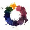
Bluebells, forget-me-nots & periwinkles? I must admit I have never really used blue ink - if I'm going to spend this much money on the stuff I'd rather stand out a bit (nothing ostentatious mind, all, hopefully, in good taste!), but it's really been creeping into my palette this Spring. I rather like this "dappled woodland" look! For me though, there aren't many blues that make a mark used individually, but in combinations like this you can start to see the nuances? Here's a version with the words alongside: "Soft Snow" = of Australia = Robert Oster Summer Storm (works for me as a Winter ink!) The numbers are Kobe's Full Birmingham titles: Allegheny Courthouse Justice Blue Allegheny Observatory Celestial Blue (here in a super extra-fine nib - actually a dark blue a la "Sherlock Holmes"?) Rachael Carson Silent Spring (but I prefer "Rachel's Silence"!)
-
I loved Verdigris since I got it, but haven't used it as much because its Sonnet always evaporating quickly and it came a lot darker. It finally dawned on me to use it with my new m205. Row 1 of other colours: Ama Iro, Kon Peki, Équinoxe 6, Souten, Tsuyu Kusa, Asa Gao, Myosotis, Ajisai. Row 2: Chiku Rin, Vert Empire, Verde Muschiato, Ina Ho, Inti, Lie de Thé, Yama Guri, Perle Noire. Row 3: Mandarin, Fuyu Gaki, Orange Indien, Ancient Copper, Rouge Hematite, Poppy Red, Perle Noire. I never thought I'd like a grey ink but there you have it, part of the switch to the m205 came about as I realized it's one of my favorites, and I have to confess I don't really care for Myosotis in its regular pale self, but with that pen it's inevitable it will get darker, which I actually quite like.
-
So I got a new nib and feed for an old Sonnet from Dutchpen, it wasn't exactly smooth and skipped, but I thought "hey it might be a used nib, can't expect much" but after writing more with it, it's become much smoother and has almost no skipping. Moral of the story: don't give up on a nib. The other nib I got from Forecast pens is the smoothest I've ever tried, apart from my Sailor Pro gear Standard with a 21k nib. These Sonnets can be very enjoyable! The one on the right is using Yama Guri, which I think finally found a good home. That Fabriano Taccia paper is quite nice too.
-
These two inks are fairly similar. Both are dark saturated blue-blacks with a hint of green. Verdigris definitely is a bit greener than Denim but it is hard to be seen for finer nibs. An interesting feature of Verdigris is its color change when drying. There is much more green in the wet ink which mostly disappears when it dries. Let's show some comparative images. Unfortunately, my scanner seems to be unable to catch the subtle color differences. This is on Rhodia paper: http://s8.postimg.org/k5xskpgs1/denim_verdigris_rhodia.jpg And this is on my workhorse paper (cheap Spoko College Block): http://s18.postimg.org/w5p0dz3np/denim_verdigris_spoko.jpg I did not observe significant differences in behavior of these inks. Denim may be a bit drier and has less tendency to bleedthrough. Verdigris is not horrible in this aspect but you can see some bleedthrough of it on the reverse of Spoko paper: http://s21.postimg.org/je6byp4k3/denim_verdigris_spoko_rear.jpg Here are photographs (not scans) of details on the Spoko paper. I believe the subtle color difference is more visible here: http://s22.postimg.org/pwpcee9l9/denim_verdigris_detail_2.jpg http://s22.postimg.org/xl8ekw5xp/denim_verdigris_detail_1.jpg Which one do I like better? Hard to say. The differences seem to be minor to me so I would call it a draw. If you like blue-black inks, both deserve your attention.
-
One if the inks I used to like a few years ago was Diamine Teal. It was a nice alternative to my usual blue inks, especially for informal notes. When I got my bottle of Akkerman Diep-duinwaterblauw I decided to abandon Teal. The difference was not big enough to justify having both. Diep-duinwaterblauw was more on the blue side (my preferences are obvious) and it was moreover waterproof (not that I care much about this but it's good to have at least an ink that's waterproof, e.g. for writing on envelopes). For a green ink I already had and kept Diamine Green-Black, a nice enough colour in a medium nib (I have little use for fine ones with my clumsy writing). So I had a stable collection of inks, until one day in Tilburg, in a well-known specialist shop, I decided to get not just the bottle of Diamine Salamander I'd come for but also one of Rohrer & Klingner Verdigris just because I remembered I'd liked the colour in online reviews. I wasn't disappointed. It's a nice ink with decent behaviour. In the following pictures you can see a hastily written note (apologies for the poor handwriting) in Verdigris and Diep-duinwaterblauw, as well as Green-Black and Salamander for comparison purposes, a pairwise scribble comparison and the ubiquitous cotton bud traces on paper. Any conclusions? Firstly, that Salamander may seem a bit odd in the wrong company. It's one of those colours that depend on context. Secondly, that Verdigris is slightly lighter than Diep-duinwaterblauw but otherwise quite similar (except for water resistance). Am I going to keep Verdigris in addition to Diep-duinwaterblauw? I don't know yet but even if I stick with the Akkerman ink (it's a local product, just a tram trip away, after all), I can certainly recommend Verdigris as a first-rate ink. PS In addition to the apologies for the poor, hasty handwriting, I should add that in reality all inks seem slightly darker than the scans as I see them on my screen.

-
http://i900.photobucket.com/albums/ac209/jasonchickerson/_FUJ0621.jpg http://i900.photobucket.com/albums/ac209/jasonchickerson/_FUJ0623-3.jpg Verdigris (unadulterated) and Zebra "G" nib on Original Crown Mill Pure Cotton paper http://i900.photobucket.com/albums/ac209/jasonchickerson/01626_PhthaloBlueGreenShd-l.jpg Old Holland Pthalo Blue, Green Shade acrylic color swatch (DickBlick) Verdigris was one of my early favorites when I became interested in inks. I quickly got over it, though, when I realized just how unresistant to water it is. Still, it's an interesting ink and looks good diluted, too. Care was taken to ensure color accuracy.