Search the Community
Showing results for tags 'platinum classic ink'.
-
desaturated.thumb.gif.5cb70ef1e977aa313d11eea3616aba7d.gif)
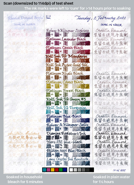
15 iron-gall inks after soaking in water and bleach
A Smug Dill posted a gallery image in FPN Image Albums
From the album: Ink performance testing
Lamy Benitoite was also included at the end, because there seems to be some uncertainty and conjecture online as to whether it has any iron-gall content.© A Smug Dill
- 0 B
- x
- 5 comments
-
- iron-gall
- water resistance
- (and 8 more)
-
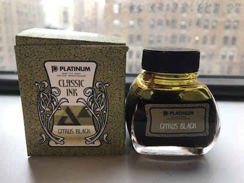
Platinum Citrus Black Review Note: Due to file size constraints, I was unable to add high resolution photos of the inks. For the high resolution images, please click here to be redirected to my blog. Platinum Citrus black is an extremely unique, fascinating ink. A brand new offering from Platinum as part of their Classic Ink series, Citrus black is an iron gall ink with fantastic color and some fascinating features. The ink comes in the standard cardboard Platinum box—which is actually rather ornate as far as ink boxes go. The paper itself is textured and the box is coated in an ink which is a very close facsimile to the ink itself. The 60 mL bottle is likewise well-crafted. It has a wide neck and a nice, easily storable, rounded-cube shape. Inside the bottle is an inner ink-cone whose purpose is supposedly make filling easier at lower levels. If I have one gripe about the bottle, it is this cone. It is so narrow that by the time the nib has gone fully into the cone, there is really only 0.2 – 0.3 mL of ink left to fill—so—a complete fill requires flipping the bottle and refilling the cone two or three times. Fortunately though, the cone is easily removable, so I can’t be all that mad. Now—the ink. Citrus black is easily one of the more fascinating inks I have ever gotten to use. This is all due to its properties as an Iron Gall—namely—its color-shifting. When it goes onto paper, the ink is a bright, candy yellow color. However, within seconds, the ink starts to shift towards a more light-olive shade.For a video of this, click here And, I have to say, the final color is actually quite pleasant. While I wouldn’t necessarily advise it for business correspondence, it is easy on the eyes and perfectly legible (which is a rarity amongst yellow inks). On top of this, the ink also has fascinating shading—parts of characters can go from a pale yellow-olive to a dark green-amber hue. The ink also has some pretty interesting sheening—a gold sparkle—however, it really only shoes if the ink is irrationally heavy on the paper. Although, I have not yet had the chance to test it on Tomoe River, so I will update the review when I manage to get my hands on some. The ink is also quite water resistant—actually, there is a decent chance that the ink will eat through the paper before it ever has a chance to fade. (As is to be expected with an iron gall). And the ink is decently quick drying—it’ll take around 20 seconds. The ink is also very well behaved on less expensive papers. On newsprint, the ink barely feathered (although it did bleed a bit). On cheap copy paper, however, the ink didn’t even bleed through at all. Although, when you write on absorbent papers, the ink goes straight to it’s olive color, so you lose the shifting and the shading. However, there is one extreme negative about the ink—its corrosiveness. I tested this ink in a gold-nibbed Pilot Custom 74, where there were no problems. However, there were quite a few problems in the converter. The CON-20 had started to stain a dark yellow, and the ink looked like it was about ready to start eating away at the converter. Although, this was after leaving this ink in the pen for a week without cleaning. Nevertheless, I would advise caution and not use this pen with steel-nibbed pens—its better to be safe than sorry. On the whole however, I heartily enjoyed this ink, and, if you have a gold nib, I highly recommend giving it a shot. It comes in a 60mL bottle will be available soon from Goulet Pens for $25 in the US or for €24 from La Couronne du Comte in the Netherlands. If you enjoyed this review, please consider visiting my website and subscribing—I promise not to spam your inbox, and every subscription counts.
- 30 replies
-
- platinum
- platinum classic ink
- (and 3 more)
-
Platinum Classic Ink — Cassis Black #15 Review (Note: Due to FPN's compression standards, I've had to compress the images to less-than-favorable quality. To view them in full, high resolution, please click here to be redirected to my blog.) Platinum announced a new series of Iron Gall Inks—the Classic Inks—in January with six colors: Cassis black, Forest black, Citrus black, Khaki black, Sepia black, and Lavender black. And ever since they came out earlier this month, I’ve wanted to give them a try, and I could not have been more happy with them. The first ink of the bunch is Cassis black (#15), a really pleasant magenta-red ink that over time fades darker, and over a period of years, should fade to black. The ink, although sold by Platinum, was actually created by an iron-gall mastermind by the name of pGary who had created a blue-black iron gall for Platinum in the past. Modern iron-gall inks are a bit of an enigma. For the most part, they are safe for use in pens, but often are some of the more high-maintenance inks available, as, without cleaning, they can corrode the metal of a pen or leave a really difficult to remove sediment in the feed. For a really detailed read on IG inks written by the creator of KWZ inks, click here, (I highly recommend it). Anyway, the ink itself comes in a very pleasantly-designed 60 mL bottle—Its shape resembles that of a tall rectangle with convex sides, and it is very nice for storage (similar to Noodlers). The bottle also has a decently wide neck, so most pens should fit inside. However, there is a plastic secondary reservoir which might prove a bit of a challenge for larger pens—although it is quite tall so most nibs should be able to fit inside. Nevertheless, it can be removed if you find it annoying. The ink itself is astonishingly pretty. Going in, I—based off of my previous experiences with iron-gall ink—was rather pessimistic as I thought the ink would be rather dark and dreary. However, the Cassis is almost the opposite. Named for the liquor made from a blackcurrant, the ink is quite colorful and vibrant without being eye-piercing. Cassis black has very nice shading (but no sheen) and is extremely well behaved on almost all papers (I have used it on papers anywhere from Clairefontaine to news-stock and, even on the worst paper possible, it didn’t feather at all and it barely bled through. As a student, this particularly helpful as, often, the paper made available to me is over a rather low caliber—but this ink tackles it without an issue. The ink is also decently water-resistant, and likewise, I found it somewhat difficult to wash is both off my hands and my desk when it spilled (so try to keep it safely inside the pen at all times). However, far and away, the coolest thing about the inks its color change. The ink looks like a bright red from inside a converter. However, after touching paper, the ink rapidly transforms from an almost cherry-candy red to a deep magenta. (The entire process takes about forty seconds or so to go through fully). However, on more absorbent papers, the effect happens immediately so it is not as obvious. On top of this, the ink also shades beautifully in any nib from extra fine to double broad. The ink is currently available only in Japan (I purchased it from Rakuten who ships to the US). However, it seems to be coming soon to the US by way of Goulet Pens. The ink costs ¥2160 on Rakuten or $25.00 from Goulet when available (Goulet also will also have samples for $1.75). If you’ve enjoyed this review, please consider taking a look at my blog and subscribing—every subscription helps immensely and I promise not to spam your inbox. Also, if you subscribe, you’ll also be alerted of giveaways (I plan to give away a couple samples of this ink so click here to be notified. I hope you’ve enjoyed this review.
- 14 replies
-
- platinum
- classic ink
-
(and 3 more)
Tagged with:
-
desaturated.thumb.gif.5cb70ef1e977aa313d11eea3616aba7d.gif)
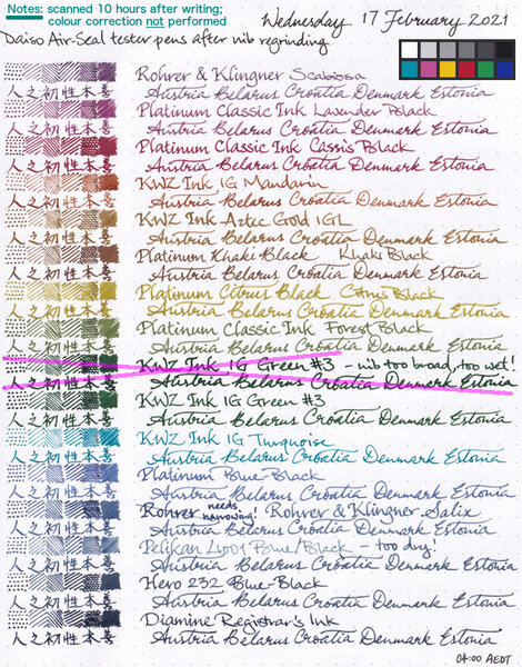
15 iron-gall inks written with Daiso Air-Seal pens after nibs were reground
A Smug Dill posted a gallery image in FPN Image Albums
From the album: Ink performance testing
I couldn't stand how woolly and blobby some of the lines written with the tester pens look, especially in the actual testing pad and notebook (not Rhodia Dotpad) I'm using for the year-long experiment, and so I reground the nibs on all of the pens. Note: Colour correction — which usually makes the image darker overall — in GIMP was not applied after the scan, but I have included the reference colour patches from the same scan. I wanted to show you how dark Diamine Registrar's Ink looks to the scanner, without any doubt as to whether I artificially darkened it or increased the contrast.© A Smug Dill
- 0 B
- x
-
- iron-gall
- diamine registrars
- (and 6 more)
-
desaturated.thumb.gif.5cb70ef1e977aa313d11eea3616aba7d.gif)
15 iron-gall inks written with Daiso Air-Seal pens before nibs were reground
A Smug Dill posted a gallery image in FPN Image Albums
From the album: Ink performance testing
The ‘before’ scan for the test sheet here: All written with Daiso Air-Seal fountain pens like this one:© A Smug Dill
- 0 B
- x
-
- iron-gall
- diamine registrars
- (and 6 more)


