Search the Community
Showing results for tags 'lamy'.
-
-
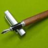
I thought it would be interesting to write up a little comparison between six pens. To wit: the Lamy 2000, the Waterman Carene, the Parker 51, the Wing Sung 601, the Parker 75, and the Pilot VP. Why these six particularly? Well, it seems a frequent question many ask is “What is the best daily writer?” We could ask this question as well with a slant toward office tasks, notes in lectures, etc. I also think many of us fantasize about having one trusty “daily carry” fountain pen that can do pretty much everything, from filling out forms, writing letters, or penning the next great work of literature. There are thousands of different models of fountain pens from dozens of manufacturers to choose from, and many of us enjoy more than one. That being said, it’s an undeniable reality that with the pace of modern life (or, we might say, the pace demanded of us all thanks to our ballpoint-wielding brethren) many of the pens we love are perhaps a bit too fussy for daily writing tasks. Maybe they’re too delicate, or too expensive, or too slow to deploy when you need to get that idea or contact info down NOW, or just prone to drama, either in the form of hard starting, drying out, skipping and railroading, burping ink, or not having the most practical filling system. Therefore when someone says “I love fountain pens and I want to use one on an everyday basis, actually outside my own four walls,” there are a few pens commonly recommended for the job. The Lamy 2000 and Parker 51 probably are recommended most frequently, as being classic/timeless, business-appropriate, designs which are known for their workhorse prowess. The Pilot Vanishing Point is also frequently recommended due to its innovative retractable system, making it very fast to use. The Carene is a bit of a dark horse, but has been called with some justification a “French Lamy 2000,” the Wing Sung is often suggested as a product-improved Parker 51 clone, and the Parker 75, while not often thrown into these discussions, probably should be because it’s a great pen with a lot of the same virtues. There are certainly other common recommendations too, or pens I have left off. I know that at least one person will tell me their antique Duofold or Waterman 52 has never skipped a beat, or they would never dream of leaving their front door without their Visconti Homo Sapiens. Pelikans and Montblancs are popular choices but I find both lacking in one way or another as pens to carry around and write spontaneously with. I’ll expand on this a bit: most of us probably want the feel of a quality writing instrument. A platinum preppy may get the job done but it’s not really going to scratch the itch, at least for me. But I also hesitate to take a resin pen out that cost hundreds, because this pen WILL be used a bit harder than a desk pen, and scratches and scuffs might make us sad. For that matter, ANY pen that costs “a lot” is one to think twice about before tossing in a backpack to face the vicissitudes of daily abuse. The price comfort level will be different for everyone but I think most of us could agree that there’s a lot of great options under about $300, and over that point we might think twice about if we really want to risk dropping, theft, ham-handed colleagues, etc. I personally quite like the Pelikan line, and I like their screw caps -which are pretty quick to deploy because they usually thread on in less than one full rotation, but that unscrewing virtue is also a vice, and the internet abounds with tales of lost or broken pens, and ruined clothes. A good desk pen if you like them, but I can’t say it’s the perfect workhorse. As for Montblanc? Very similar. A good pen, and tailor-made to ride in your suit jacket’s breast pocket and sign a document every so often, but mine dries out easily if I’m using it while conducting an interview, so I can’t say they’re the best design for this particular task. It’s very annoying to write a sentence, and in a couple of minutes go to write something else and the pen requires effort, a scribble, or extra pressure to make it write again, with the alternative to be constantly capping and uncapping. The pens chosen for this roundup are therefore mostly hooded nibs, and all have snap caps or some other quick-deploy feature instead of threads. They come from the U.S., Germany, Japan, France, and China. Another factor to keep in mind with an everyday pen is the filling system. Every single type has pluses and minuses, but I don’t worry overmuch about that dreaded question of “what do I do if I run out of ink?” If I’ve got one pen on me I can easily have two. I can even have one that’s full for no other purpose than as a spare for some hypothetical gargantuan writing session. I keep a bottle of ink and a box of Kleenexes on my desk at work, and at home there is no shortage. In an absolute worst case scenario I can snag the cheap ballpoint someone left on the table… so I don’t feel a daily writer needs Japanese eyedropper-level capacity. But some capacity or versatility is good because, again, we’re talking use under sometimes less than perfect circumstances, not the pen spa in the home office. I’d advise everyone to actually get to know a pen before they start carrying it so they have an idea of its ink capacity and how often they may need to refill. I myself do like Extra Fine pens too, which means my pens will write a lot longer than the same pen fitted with a broad nib. Relevant information because if you like broad nibs you may prioritize capacity much more than I do. Ok on to the pens. The Parker 51. Some say this is the best pen ever made. It writes the first time, every time. It does not dry out when left uncapped for a time, and is a timeless, classic, understated design, which has a bit of retro-futuristic post-deco flair. The cap feels like a quality affair and posts well, while not impacting the pen’s excellent balance and versatile size. If I can sum this pen up in a nutshell, it’s a wonderful workhorse pen that does have a real vintage feel -because this is a vintage pen. The lucite body is unusually tough and not prone to cracking, chipping, or serious scratching, but it feels …like a plastic pen. Combine that with light weight and a nib that’s almost invisible, and you get a pen that while ticking almost all the boxes on paper, is frankly kinda boring. On the other hand, they do write sweetly. It’s the kind of thing you only notice after trying a lot of other pens. If this is your first or, especially, second fountain pen, you would be forgiven for finding this pen terminally uninteresting. Additionally, the filling system is a blessing and a curse. This pen is available with two systems. The later and more common aerometric filler is easy to fill, and the pli-glass sacs are pretty much bulletproof, making this the one vintage pen you can count on to write well with minimal restoration. The older vacumatic pens will probably require a trip to the repairman to get them running. They’re prone to drying out if left unused for days or weeks, and also difficult to flush and change inks, difficult to tell how much ink you got when filling, and difficult to see how much ink you have left. That said, there’s a reason that they took the pen world by storm in the 1940s and continue to be a recommended choice today. This is an “advanced” choice. Probably not a good starter pen but in a few years you’ll probably have one and enjoy it. Not a good choice if you like to change inks and colors either. Buy a bottle of some staid and businesslike blue, black, blue-black, or similar, and dedicate it to your pen. The Wing Sung 601 is a similar pen, with the advantage of having a more interesting vacuum filling system, having an ink window to give you an idea when you’ll be pushing empty, and being available new, for slightly under $20. The downside is that the plastic is said to be prone to cracking, but there’s a steel version available too. My Parker 51s are as a whole more pleasant to write with (nib feel on paper) because the Wing Sungs aren’t totally consistent. I have one that’s sublime, one that’s pretty nice, and a few that are average; overall the Wing Sungs aren’t bad. Mine in extra fine produce some of the prettiest writing of any of my pens. (I can’t argue with the results!)The cap clips are cheap and easily bent, which is annoying on a pen of any price, but overall this pen is hard to argue with. I’d suggest trying one as a prelude to see if you like the feel, before stepping up to the vintage ‘51. I will say that one of my Wing Sungs managed to fill its cap with ink 20 minutes before an extremely important meeting once, which did not endear it to me that day. I’ve heard that my lack of finesse with the filling might have caused this so it’s possible it’s operator error, but it’s hard to completely trust the pen after an incident like that. On the other hand I’ve had one inked up for months untouched (I have several of these) and I just tried it. It wrote perfectly. The next pen in our list is the Parker 75. I don’t often see this pen recommended but took the liberty of throwing it in because it’s got a similar cap to the venerable Parker 51, making it a very easy choice if you need a pen to write something quickly. It’s got the Parker 51’s love-or-hate aerometric filling system, along with the option to take a cartridge, and I think piston and slide converters are around too, which does add some extra versatility. My Parker 75 writes a wet medium, and has never displayed any hard-starting shenanigans. I did leave it uncapped for 10 minutes to test it and there was only a slight hesitancy which made the first stroke of my first capital a bit faint. The nib also has a much more interesting feel to me than the glassier nibs of the Parker 51 and Wing Sung, inviting me to grab this one instead if I want to enjoy my daily writing even more. Because the nib is open and not hooded, there’s more potential to easily tune it to your preferences, and nib units are available if you want to go down that route. The triangular section (slight but it’s there) is pleasant for me -but maybe not for you- and is also a bit on the smaller side, and I also enjoy this pen’s ability to rotate the nib so the writing experience can be further tuned to your preferences. And let’s not forget the iconic styling, most frequently seen in a solid sterling silver body with a crosshatch pattern. This pen is available used at non-exorbitant prices and isn’t a bad option. The real question is if your hand gets along with the section. If so, a very decent and underrated pen for daily use. It feels luxurious and high quality, but only you know if your fingers will like it. The Pilot VP is an odd duck. Actually designed (at least in terms of the mechanism) contemporaneously with the Parker 75, this pen looks and feels like a fancy ballpoint, complete with a big clicky button on the back. Click the button (which does have a nice feeling if you like such things… I’m indifferent personally) and a tiny nib emerges from an ingenious trapdoor hidden in the nose. This pen is bulbous, has a weird clip coming down the pen from the nosecap (so you can clip it to your shirt and still keep the nib safely vertical) and has a brass body, which makes the pen weightier than you might expect. It’s a recipe for either love or hatred. I personally love it. I’m one of those lucky ones who can grab this pen and write with no ergonomic issues whatsoever, and in fact I find the pen utterly comfortable for pages and pages. (This might actually be the most comfortable pen I own. Seriously.) The nib on this one is also a delight, and has a great feel (for me.) I own around 50 pens and this nib, to me, is in the top 5. Highly subjective I know, but it’s great. The downside of this pen is it’s limited capacity. It can take a cartridge or use Pilot’s small piston converter, or pilot’s larger aerometric converter. I usually opt for the aerometric one, myself. My pen is finished in black carbonesque paint, which is an interesting finish. This pen mostly lives a pampered existence but I have to assume that it might chip if the pen were carried a lot outside of a case. This is a pen I might seriously consider buying in an upgraded finish -a bonus is that it’s one of a very few Japanese pens with interchangeable nib units, so you can replace the body, nib, or both, or try different widths. There’s no cap to worry about, and if the feel in hand works for you, this pen is a wonder. It is prone to dry out if left untouched for weeks which means this pen needs to be used like it was designed for. Another bonus here is that you can get functionally identical copies from Majohn and Jinhao for $20-30, making it easy to see if the design works with your fingers. The Waterman Carene is a bit of a departure from the previous pens. It’s a much more modern design, cartridge converter (standard piston type) and has a gorgeous inlaid nib. This pen is a looker, and with its fancy lacquer finishes, striking nib, svelte shape, and extra touches like the spring loaded clip, this pen definitely adds an element of extra refinement to your writing. It’s a very pretty pen, and writes …ok. For me, this pen in M is so utterly smooth on paper, that it’s numb, or kind of “dead” feeling. The F version, on the other hand has not just a little but substantial feedback, making it a chore to write with for paragraphs. I also find I have to consciously grip the pen just a little higher than I normally might instinctively do, and my medium nib still feels a bit clunky. It will do the job, and the cap pulls off and pops on with a strong click, bordering on a snap, but overall writing with this pen just feels like work to me. Added to this feeling is the fact that while the cap will post, others have said that you probably don’t want to do this because the pen body can be scratched. Now I have to find somewhere to set that delicate cap before I write. The cartridge/converter filling system is unusually finicky too. The feed holds a ton of ink which is great for capacity and general performance, but getting a fill can be tricky, and some people have trouble with inky fingers, either from filling or from fingers sliding down onto the nib when writing. Finally, newer Waterman converters don’t last, most other converters don’t fit… leaving you potentially sourcing “vintage” converters for a pen that’s still sold new! This is a pen I want to like but just haven’t warmed up to. It sounds good on paper but it’s fussy. Last we come to the Lamy 2000. If the last pen was a polished Frenchman, this is a direct and to-the-point German. Or, put another way, if Grand Moff Tarkin from Star Wars were shopping for a fountain pen, this is the one he would choose. I wanted to dislike this pen, because my personal aesthetic preferences are far closer to 18th century Baroque than they are to 20th century Bauhaus design. I avoided trying, let alone buying one for years on principle. But let me tell you, this pen is amazing. It’s probably the most practical, well-designed and functional pen out there. For everyday purposes, it has a few virtues that specifically commend it. Every time I uncap this pen, it writes, and its cap is easy to pull off, easy to snap on (with a nice click, too) and readily posts. The spring loaded clip will hold to just about anything, and the makrolon body and texture make for a durable, grippable pen that is robust, doesn’t readily show scratches, and feels very nice. This pen is a piston filler with a very generous ink capacity. Frankly the pen is also a bargain compared to others of its class (gold nib piston fillers), and though its looks are polarizing (they’re growing on me) the overall vibe is subdued and businesslike, which means this pen doesn’t scream “look at me guys, I’m using a fountain pen!” which can sometimes be a desirable trait in professional settings. It’s got a subtle window allowing you to check the ink level, too. Downsides, in addition to the polarizing looks, are the smooth, tapered section and its two tiny “wings” for securing the cap, which protrude in a very low-key but readily feel-able way, meaning some complain that their fingers slide toward the nib and others complain that they feel the cap wings as they grip the pen. Personally, I don’t mind either feature and even appreciate the wings to help me grip and index the pen in my fingers, but this is definitely personal preference. Also, this pen writes very well for me, BUT it’s an “EF” that’s actually a M, maybe even a B, so depending on your preferences finding a nib size that suits you might be difficult. Now, how do these writing instruments compare? For quick access the Pilot VP wins. That button makes the pen instantly available. The Parker 51, Parker 75, Wing Sung 601, and Lamy 2000 tie for a close second, and the Waterman Carene is in third -its cap requires more force. These caps pull off easily enough, and can be retained in the off hand, set on the table, or posted. For subtlety of deployment… I think the Parker 51, 75, Wing Sung and Lamy 2000 all tie for first, the Pilot VP takes second, and the Carene, again, brings up third. The Carene cap makes a louder sound, doesn’t want to stay on when posted (which is maybe questionable anyway) making you deal with the cap in some way… The Pilot is clicky and loud. Nobody will notice the first or second time but in a meeting it can get a little annoying for some of your neighbors. The other caps are silent or subdued and can be equally silently posted if you wish. Visually it’s all about your personal preference. The Carene looks very luxurious with its mottled lacquer (or solid color and contrasting silver cap.) The Lamy is subdued but a piece of modern art. The VP is subdued (but a little wacky when you really look at it.) The Parker 75 exudes class and refinement. The Parker 51 is vintage (with an aura of authenticity if you or your neighbor examines the pen. They’re 50+ years old and don’t seem like copies.) The Wing Sung seems vintage and the details are a little bit cheap. But it looks classy and businesslike nevertheless. Personally I’m going to say the Parker 75 is the clear winner here, but this category is entirely up to you. Writing prowess is tough too because it is so important but can be subjective, boiling down to nib and grip preferences, weight preferences, etc. For me, the pens rank: Parker 51, VP, Lamy, Wing Sung, Parker 75, Carene. But it may be completely different for you. Capacity and filling: I’m going to give the Lamy top marks here for its cavernous piston filler and ink window. The Wing Sung scores second: the modernized vacumatic mechanism is fun and holds a lot of ink, and there’s a window to check it. The Parker 51 is third. The Aerometric units are easy, seem to hold a decent amount of ink. The vacumatic units are fun and also hold a decent amount. Next is the Parker 75. It uses slightly less readily available Parker converters and cartridges but works well and this does make switching inks easier (not a huge priority for me for an everyday workhorse pen.) The VP is easy but capacity is limited and this is a pen that readily dries out if neglected, and the filling system can get cruddy too. Finally the Carene comes in last, because the converters are proprietary-ish, difficult to find, and the section is so cavernous that it holds nearly a cartridge worth of ink on its own, making filling fiddly. Reliability, ie does the pen always write and does it do so in a predictable way, is very important when out and about. The Wing Sung 601 and Lamy 2000 get top marks here. These pens have never failed to work for me. The Wing Sung and Lamy have been inked for months and write every time, even when untouched for a long while. They put down the same amount of ink and it never looks oxidized or discolored. The Parker 51 gets 2nd place. It is very reliable but may dry out if left inked and not touched for months. The Parker 75 comes in third. My medium can be a bit inconsistent… writing wetter as the pen warms up. My accountant nib (xxf) is incredibly consistent though. I’ve had hard starting from the VP depending on my ink choice, and woe betide thee if its been a little while since you used the pen. It probably will work… but it may not, or may require a line of doodling, reverse writing, pressing a bit, wiping the nib with a towelette, or other tricks to coax the nib into life. My Carene has been known to skip, and dry out a bit, and although mine have never given me any ink trouble, they have a reputation for inky fingers, and my friend’s Carene routinely floods its cap. Durability is last mentioned here but may be the most important consideration. I’m going to give top marks to the Parker 51. The lucite plastic is still tough and vibrant, if you get a scratch (you probably won’t) it will just blend in with the pen’s existing patina. Nothing generally goes wrong with these pens. The Wing Sung is in 2nd. Plastic is softer and the clips are easily bent. But the pen is pretty tough and if you should have a tragic accident, you’re out $20…. Which is a very liberating thing. The Lamy 2000 gets 3rd place. It’s got a textured finish which obscures normal scratches and marks, and the makrolon material is fairly durable in its own right and feels solid. Anecdotally though, these pens can break in two at the area where the section and ink window join the body. Not incredibly likely but maybe if you sit on the pen in your back pocket or dump a few textbooks on top of it in your bag, it could happen. It’s said to be more likely if you’re in the habit of completely disassembling the pen for cleaning. The Parker 75 gets 4th. Still a durable pen but dropping one can put unsightly dings in the top or bottom tassies, the open nib is also pretty thin and would not be at all resilient to a drop of any sort, and the plastic threads holding the section to the barrel can apparently sometimes strip out. But the prevailing cisele finish is robust and not easily dented, and a mark would probably add character. The VP and Carene come in last. These pens have painted brass bodies, and they can and do scratch or chip. I treat my pens carefully and haven’t had issues, but this isn’t a desirable trait in a pen that’s getting carried around from room to room in a workplace or school. The VP is at least one piece, but the Carene’s posting issues make it very likely that regular daily use will see scratches develop. Also, metal pens tend to hit harder when they take a tumble onto a tile floor. Maybe that’s not true in terms of physics strictly speaking, but my experience is, heavy metal pens will dent themselves not infrequently, while the plastic one will probably be unscathed or maybe a mild scratch. We all prize different things in a pen. I went into this comparison thinking to myself that the Waterman might well win, at least for me, because on paper it seems like a prettier Lamy 2000. My conclusion after spending about 6 months getting to know, and using all the pens mentioned in this review, is that the Lamy is a way better pen than I thought (but I just don’t use it much due to a nib that’s more broad than I typically need.) And I don’t have to fret about whether I should get the nib ground (spoiler, I did and it’s still too broad) or cultivate a taste for Modernist design to appreciate the Lamy, because…. on a daily, real world basis, the Parker 51 is just as good, actually a bit better. (For my fingers, the Lamy section is nice for a page, the Parker, many pages.) And I have one with a nib that is superlative. The pen cost me $10 (and another $65 to have the Vacumatic system restored.) Any one of these pens could be a good fit for you depending on your particular needs and environment. I’d particularly recommend the Parker 51 (main annoyance is no ink window but my solution is a second pen inked in same color), Lamy 2000 (main annoyance is nib width…. And looks.) Beyond those two, pick up a Wing Sung 601 and a Majohn A1 or Jinhao 10 because, for the price, you owe it to yourself to try them, you won’t cry too much if they’re lost, either. Frankly, my Majohn writes nearly identically to my VP (and nib units are interchangeable) so I’d rather scratch up the $20 pen than the $200 one. The Parker 75 is a good pen and has some hidden virtues. I’d be hesitant to recommend it as a daily pen without trying it out first though. But if you find it comfortable and it’s got a nib you like, it could be a very good daily pen. And the Carene? Well, I wanted to like it but for me this pen is very overrated. It’s not a bad fountain pen in itself, if I didn’t have at least 20 in my collection that are better, including all the other ones in this review.
-
I found here one review of an Onoto K series pen. It is excellent, worth reading as a companion because I do not plan to repeat most of that information. This is more of a comparison and notes on the pens. However, I will recap the series briefly. In 1955, just three years before they gave the pen game away entirely, Onoto released a series in a new style for them, being fairly plain plastics, piston fillers, mainly with hooded nibs, and barrels in the vogue cigar style. They proved to be good pens but, too little, too late as the British were wont to say. The pens were: K1 - Gold clutch cap, ink window, hooded nibK2 - Same as the K1 except with body coloured capK4 - Same as the K2 except the cap was screw rather than clutchK3 - The odd one. It is slimmer (by about 1 mm), slightly shorter in barrel and cap with flattened ends to both, an open No 3 nib, no ink window, and the piston mechanism is able to be serviced, unlike the other three. In remaining respects it was somewhat like the K2 with body coloured clutch cap.Onoto's marketing of the time profiled the pens like this: The K3 and K4 were the same price despite their obvious differences, with the K4 described as a basic pen and the K3 as a conventional pen. The K1 stepped up the price 7% for its gold cap.The most expensive was the K2, up another 12% in price, distinguished as having "extra iridium". So, the numbering follows no price or feature pattern, and the K3 remains quite an oddball among them when you get to the detail. In the following photo I have placed an Aurora 88 and Lamy 2000 for comparison, being similar hooded piston fillers of the era and shortly after. From left to right, Aurora 88, K1, K3, K4, K4, Lamy 2000. Note also clip differences in the K1, K3 and K4. I have not purchased a K2 because its features all exist elsewhere in the K models. Buying a second K4 was somewhat accidental. The Lamy looks huge next to the others, the Aurora (an original 88 with Nikargenta cap) quite comparable if slightly bigger over all. I speculate that the Aurora 88 may have been Onoto's principal model for their pen. Here are the pens with nibs exposed. From left to right, K1, Lamy 2000, K3, Aurora 88, K4 underside of nib, K4 with shroud removed. Note slimness of the K3's section compared with the others. The K3 has a conventional section which unscrews to reveal the barrel internals and piston. The other three pens have a friction fit section which is concealed under a screw-on plastic shroud. Note that after removing the shroud on the K1 on the left, I have not quite re-aligned it correctly. In this case I can screw the shroud a shade tighter. If you have removed the section (you can grease the piston, needed maybe once if ever, but you can not remove or replace it) then unless you have marked carefully you will be up for some repeated un- and re- screwing of the shroud while you rotate the section fractionally until the tightened shroud lines up with the nib. A touch of silicone grease on the friction fit is useful simply to make that a little easier. The K1 nib and feed I own do not appear to be set correctly, or else the K1 is different in one respect. On removing the shroud I can read the nib down to where it says K1 on it, below "De La Rue // 14 ct // Onoto". This part of the nib is inset further on the K4 pens so I can not read below 14 ct. I have not thought finding out a sufficient reason to pull the nib. The K3 sports a standard Onoto No 3 nib, saying "Onoto // 14ct // 3" as usual. I have inked two of these pens and dipped the other two. Pelikan 4001 Königsblau was used in both of the filled pens, for comparison. I dipped the other two in my Random Mix Bottle as an afterthought. Both of the K4 models display a heavier line but the inked grey K4 needs a little tine adjustment (closure), I think. Note the railroading in the closing bracket of "grey". At first that happened to the "i" in Pelikan as well, but enough ink was laid that it soon filled the gap with bleed in the paper. Used after dipping, the maroon K4 seems better behaved. The K1, dipped only and unadjusted at all so far, also looks a bit dodgy with bleeding. Hands-down winner here for me is the K3, the No 3 nib gliding softly to produce a beautiful line, as these nibs usually do. I do not normally post pens, including these Onotos, although to be fair they look elegantly longer if you do. You might gather the K3 is my favourite although I think I will get good service from the others with a little nib work, which is not unexpected in a 60 year old pen. Comparing the Aurora 88, and Lamy 2000, the lack of an ink window is a deficiency of the K3, and I am not keen on the heavy hooding of the other K models. I prefer to see the nib at least a bit, if only not to have to think about rotation alignment of the pen at the first stroke of writing. Writing, none of these nibs (all 14 ct) could be called soft so far as the metal goes. The Lamy is well known to people, a smooth nail. Closest comparison would be with the K1 and K4 Onotos. The Aurora 88 has its characteristic slight toothiness and little in the way of softness either, really, so my narrow writing winner is the K3 even though that too is not a soft nib. This is purely a personal preference. Subject to a little work on two of them, I think all of these will be found to be excellent. The Onoto K-series pens are good buys in that they are simple, robust, light, discreetly elegant and capable of writing very well. The fact you can not service the piston seal other than on the K3 does not seem to have been a problem anywhere to date. Like the two comparison pens, A88 and L2K, they will serve as workhorse pens that no-one should be afraid to take anywhere. They are also inexpensive. Oh, and my favourite colour is the maroon. They also come in black. eta: a couple of extra notes
-
InkFlash - Lamy Dark Lilac InkFlashes are short and quick presentations that show just enough detail to get a feel for the ink. A couple of years ago, @lgsoltek gifted me a bunch of samples to try out. This Lamy Dark Lilac was among them. It's been sitting in my ink stash for a while now, so I'm sure it's a sample of the original 2016 version of this ink. Rhodia DotPad N° 16 A very saturated dark lilac - looks best in dry-writing pens or finer nibs, where you explore the left side of the saturation spectrum. A look at the chromatography Related inks Writing sample on papers good and bad Written with Lamy Safari M-nib. The bleed-through test is done as follows: 1x, 2x and 3x fill of the squares from left to right, to get increasing saturation of the paper. Beware that on the reverse side, the most saturated square appears on the left. Dark Lilac clearly doesn't like lower-quality paper. And finally a quick doodle
-
The UMR-87 ( of the Signo 207) from Uniball is a drop in replacement for the Lamy M66 capless rollerball. I have tried it on the Tipo. The M66 won’t fit the 207 pen however. the refills. UMR-87 mounted in the Tipo. the dimensions. hope this helps!
-
Lamy doesn't need introduction on this board. However as I enjoy writing introductions, here we go. Lamy was created by Josef Lamy who was a German export and branch manager for Parker until 1930, when Parker left the German market due to unsuccessful sales of its Duofold. http://imageshack.com/a/img538/9376/WLiktK.jpg www.lamy.com http://imageshack.com/a/img538/9505/e0y9bn.jpg www.lamy.com Lamy started his own company by acquiring the pen manufacturer Orthos Füllfederhalter-Fabrik producing celluloid pens. For quite few years they were selling conservative looking pens stylised after Pelinan and Montblanc pens. However in 1966 they invited industrial designer Gerd A. Müller to create their new flagship product - Lamy 2000, a classic Bauhaus-inspired design that has remained in production ever since 1966 with no significant change. This pen set the tone for all Lamys to come: forward-looking, innovative design, excellent quality and writing performance. Lamy 2000 is one of my all - time favourite pens. With time I even came to like Lamy Al-Star that looked like an ugly duckling for me when I first saw it. Basically I love their pens. However I wasn't so fond of their inks. They're not bad, they're sold in practical and functional bottle yet the colors really aren't mesmerizing. ANyway the inks are sold in bottle that provides a roll of blotter tape used to clean the pen after filling, or to blot writing. It is specially shaped with a wide neck and a basin to collect ink to aid filling when close to empty. http://imageshack.com/a/img901/2272/o3GrpD.jpg http://miestilografi...t=lamy-tinteros They can also be purchased in cartridges. It seems that lately Lamy came to conclusion they can make money on special edition inks that are introduced together with limited edition Al-Stars and Safaris. That's good, especially that new colors (Copper Orange and Neon Lime) stand out from their rather conservative and - let's face it - boring ink line-up. Black Blue Washable Blue / Black Copper Orange Green Neon Lime Purple Red Turquoise Lamy's green isn't nad ink, it is however not only boring but also ugly :/ Ink Splash http://imageshack.com/a/img537/7746/PelzYK.jpg Drops of ink on kitchen towel http://imageshack.com/a/img903/6540/ZkZcbn.jpg Software ID http://imageshack.com/a/img540/8950/KV6BnC.jpg Oxford recycled, Lamy Al-Star, F and B nibs http://imageshack.com/a/img901/8320/UzVxBQ.jpg http://imageshack.com/a/img673/9620/7ATDSy.jpg http://imageshack.com/a/img540/7341/aeVgfe.jpg http://imageshack.com/a/img537/4408/d8EGwI.jpg
-
Lamy joins a Gemstone Club with their new series of "originally" named inks. As much as I'm excited about new Lamy inks, I loathe their lack of creativity. Call it a pet peeve but when I see another line of inks inspired by gemstonjes, I clench my teeth. Anyway, the bottles and packaging look cool. Ink The ink is strongly saturated. It's intense, strong, and vivid. Also, it behaves well. I would say that if you look for well behaved and strong ink in a similar color, look no more. Drops of ink on kitchen towel Color ID Midori, GvFC Tamitio, M Fabriano, Hero 5032, stub 1.9
-
Hi all, I have been using Rhodia Webnotebooks for my journalling for Some Time now, because the paper in them is very good for fountain-pen use. But I have been toying with the idea of buying one of the notebooks produced by Lamy, not least because I am drawn to their 8mm line-separation with 4mm dot-gridding printed over it. But I seacrhed FPN for discussion/reviews of the Lamy Notebooks, and found very few mentions of them. More worrying for me is the fact that → this thread from 2021 ← is the most-recent mention of these notebooks on here, and it is a lament about the reduced fountain-pen-friendliness of the paper in the notebooks. So, can anyone out there in FPN-land confirm that the paper in these notebooks is, in 2024, still this, lower quality, stuff? Or can anyone perhaps say that the paper has been improved since 2021, and is now fountain-pen friendly? My thanks to you in advance for any information that you can let me have. Slàinte, M.
-

-

-

-

-

-
I've read that Lamy has released special Hanzi nibs in Asia. They seem to be on the "architect" side to aid with Chinese or Japanese writing. I can't write Chinese but I'm curious. Anyone used one? https://www.instagram.com/p/CYc46c2vLFN/ https://www.instagram.com/p/CYfVKvQvUKn/ But since when is there a matte red Safari? 🤔
-
desaturated.thumb.gif.5cb70ef1e977aa313d11eea3616aba7d.gif)
Milligram is having another sale; some offers on LAMY fountain pens are decent I guess
A Smug Dill posted a topic in Market Watch
Milligram sent another marketing email today to let me know it's offering a “further 20% off” items on clearance in the outlet section of its website/business. In Kaweco I'm not really interested (unless the effective price is ≤25% of the local retail price, and with free delivery or in-store collection), but I suppose some of the offers on LAMY fountain pens are decent. For example, I see a LAMY 2000 in brushed stainless steel for AUD $239.60 (and qualifies for free delivery within Australia). I haven't been tracking the prices of and offers on LAMY Dialog 3 models, but $287.60 with a choice of finishes and nib width grades would be among the lowest from authorised retailers of the brand in Australia, I guess? -
I finally bought a Lamy 2000 medium. I was never that huge fan of the Lamy Safari, but recently I found that a Safari with a medium nib, instead of a fine nib writes nicely. I got a good deal on a Lamy 2000 and took the plunge and now I get what all the fuss is about. The nib writes beautifully. It is smooth with just the right amount of feedback. I had heard that some people needed to find some sort of sweet spot to write properly but I have had no problem with it at all. I always thought it would be a good writer, but in fact it also draws well too--not because it has much line variation but because of the way it feels in the hand and the way it catches the paper. I find it expressive or it helps me to be expressive. It also is very beautifully crafted and the so-called space age (circa 1960) material really feels wonderful in the hand. It is so nice that it surprises me that Lamy doesn't make more variations of the pen in the way that Parker did for its 51 line. A demonstrator version would be lovely, if it had the same nib. I have done a much longer review on YouTube at https://youtu.be/jykBdsuPZ7k where I draw my cat Severus and I discuss the relationship of the pen to early 20th Century design. I am curious if other people have joined the cult of Lamy or have resisted.
-

-
I was not part of the craze in 2016 for this ink so I never raced after a bottle, and wasn't going to pay a premium price for one either. Sometime earlier this year someone sent me some samples, and one, was this ink. So it was nice to actually try it. The only time prior that I had used a Lamy ink was a cartridge that came with a pen. Lamy Blue perhaps? It wasn't impressive. This ink is so far from Lamy cartridge ink I can understand what all the fuss was about. This ink was head and shoulders above standard Lamy ink. I don't have a purple/violet that matches this color so I can't offer a substitute. The ink was in my Gate City Belmont for about three weeks, and no staining of the barrel was experienced. There is some shading on some papers, whereas on others it's a more one-dimensional color. There is gold sheen on Tomoe River paper.
-
Has anyone disassembled a Lamy Aion Convertor?
-
There are dozens of listings of new Lamy Dialog 3 and Dialog cc on eBay. All from China. Offered for about $150 and even $125. The only caveat, it seems, is that they do not ship with gift box. Just the usual Lamy sleeve. Here are a few examples: https://www.ebay.com/itm/405060698783 https://www.ebay.com/itm/355821237677 https://www.ebay.com/itm/355821477884 I don't think they are knock-offs.
-
Hi! I'm new to this forum. The only pens that I've owned till now are a couple of Fellowship(an old Indian brand) and a Shaeffer Agio, which gave a lot of anxious days and doubts about my purchase (cosidering it was at least 10x the costliest pen I've ever owned). AFter wrangling with it for a bit (including a novice attempt at grinding!), it now writes excellent. Now, I'd like to make another purchase. I'm confused between the Lamy2k, in extra fine, which is quite costly, and then the Indian Handmades such as a Ranga 9B giant with a JoWo fine nib. I'm very particular about the feel and comfort, so thats a top priority. Also, the Nahvalur's are great looking pens, and I've only heard good about them. Now, what I'm trying to understand is what exactly is the difference between the Ranga/Nahvalur and the Lamy 2k, that people recommend it so much. Would it be justifiable for me to go with L2k or there's not much difference between the Ranga & Lamy. My heart's set on Ranga/Narwhal for they look just gorgeous, but then I don't want to eventually end up with the L2k. I'll be very thankful of any advice/suggestions to a newbie like me.
-
Pen Pit Stop : Lamy CP1 Welcome to the Pen Pit Stop. Here you will find reviews of pens that already have some mileage on them. More specifically, these reviews are of pens that are in my personal collection, and that have been in use for at least a year. I thought it would be fun to do it this way – no new & shiny pens here, but battered vehicles that have been put to work for at least a year. Let’s find out how they have withstood the ravages of time. The fountain pen that arrives at the pit stop today is the “Lamy CP1”. The design of this pen dates back to 1974, and was done by Gerd A. Müller. Yes, that’s the same designer that created the iconic Lamy 2000. And this shows… the same minimalistic looks, the same brushed steel on black design. In my book, this is another timeless classic within the Lamy brand. The pen seems to be made of brass with a black lacquer applied (there’s some contradictory info on this online, but the metal threads inside the barrel do look like brass). The black coating has a matte finish, which looks really good on the pen. A very minimalist writer, without any ornamentation – pure industrial Bauhaus design. I purchased this pen back in June 2015, and use it on a regular basis. This CP1 is a very slim pen: about the same diameter as a pencil. As such, this pen will not be for everyone. If you have larger hands, long writing sessions with this pen might not be optimal. I have small hands, so for me that’s not an issue. Branding on the pen is almost absent. Only a small engraved “LAMY” on the side of the clip gives away the name of the company. The section is made from black plastic, with a series of ringed grooves to provide grip, and feels very comfortable. This CP1 fountain pen uses the standard Lamy Z50 nibs, which can easily be changed, which is a big plus in my book. When I carry the pen to the work place I typically use an EF or F nib, while I enjoy the 1.1 italic nib when I use the pen for personal journaling. All thanks to these easily changeable Z50 nibs. The cap can be posted, but in that case you get a really long pen (too long for my taste). When posted, the cap sits perfectly flush with the body. It snaps on with a soft click. Examining the end of the body, you can see the smartly designed cap-grabbing mechanism, with a slightly raised ridge that grabs the cap. Right under the clip, you can see a small breather hole drilled into the cap. Looking at the inside of the cap, this hole sits a bit above the inner cap that provides the air-tight sealing of the nib (that avoids drying out of the nib when the pen is not in use). The purpose of this hole is to regulate air-pressure when capping/uncapping the pen (it’s a click-on cap). There was a really interesting discussion on this tiny pin-(bleep) hole on FPN back in 2021 - definitely worth reading (yes, we fountain pen enthousiasts can get worked up about such details, which gets you some funny looks from anyone who’s not into the hobby ;-). Pen Look & Feel The design of this pen is top-notch! The matte black finish with the brushed metal clip still looks good after 8 years of use. The small diameter section gives the pen a bit of a retro feel that I really appreciate. The CP1 is a cartridge convertor pen that takes Lamy cartridges (non-standard, but you can find them anywhere). The replaceable Z50 nibs are basic, but look good on the pen’s body. And it’s really nice that you can easily get them in a variety of sizes. The pen has a push-cap mechanism, and can be posted – but it becomes really long and unwieldy in that case. The pictures below illustrate the size of the Lamy CP1 in comparison with a standard Safari. The CP1 is a bit smaller length-wise, and absolutely diminutive when looking at it’s diameter. So maybe not a pen for those of you with bigger hands. This can be easily tested: the CP1’s diameter is the same as that of a pencil, so if writing with a pencil feels comfortable, writing with the CP1 will definitely be OK. Pen Characteristics Build Quality : build quality is superb, with almost invisible seams where parts of the pen blend together. I use the pen on a regular basis, and it still seems good as new. The pen really doesn’t show its age. Weight & Dimensions : although it’s a small pen, it still has some heft to it, due to the metal used in its construction. It’s definitely heavier than a Safari. The pen is large enough that it fits most hands unposted (and if not, you can post it). The diameter is pencil-thin though, and that might not work for everyone. Filling System : this is a cartridge convertor, that uses Lamy’s proprietary cartridges. This shouldn’t be a problem, you can find these cartridges everywhere. If you like to use bottled inks, simply syringe-fill empty cartridges. Nib & Performance : exactly the same nib & feed as the one in the Lamy Safari, using standard Z50 nibs (with come in steel, but you can also buy gold ones). A big plus is that you can easily swab nibs to try out a multitude of sizes. Price : I bought this one as part of a pen+pencil combo, and have no clue what I paid at the time. Today the fountain pen costs about 43 EUR (taxes included). For such a good-looking minimalist pen that’s certainly good value for money. Conclusion The Lamy CP1 is another timeless classic adhering to the minimalist Bauhaus design. A well-constructed pen that still looks good as new today, after 8 years of use. I enjoy its elegant looks with the matte black finish and the brushed metal clip. Totally fits my taste! The big question is: would I buy this pen again? To this, my answer is a resounding: YES. This pen is a beauty – the smaller sibling of the Lamy 2000. Definitely a keeper.
-

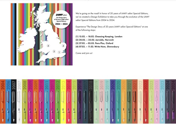
20 years of Lamy Safari Special Editions - 2004-2024 - a touring Design exhibition
Mercian posted a topic in Lamy
Hi all, I looked on the UK shop page of Lamy.com just the other day, and I saw this image: I happen to live not that far from one of the shops shown on the map as hosts of the company’s touring exhibition to celebrate the last 20 years of these editions of the Safari. So of course I only found it after the final date I have posted this image here so that you, dear reader, can check on the Lamy.com ‘shop’ page for your home country, and find out whether the tour is ‘coming to a venue near you’ any time soon. (And also because I’m a whingeing pom, obvs. 😉) Slàinte, M. -
From the album: Mercian’s Miscellany
I live not that far from one of the shops shown on the map in this image. So of course, I only found this on the Lamy.com ‘shop’ page for the UK after the touring display has come and gone© https://shop.lamy.com/en_gb
- 0 B
- x
-
As exercise for a CAD software in 2018 I created a 3D-model of a Safari fountain pen. It's not perfect, but it was a fun thing to do. The model will be made public domain some time in the future. Here's a sneak preview of the model. I'll have to do some final work on the nib before it's ready. Each part can be places separately, like a real pen. And I'll convert it to a broadly used format.