Search the Community
Showing results for tags 'tanzanite'.
Found 13 results
-
Ink Mix – Depuydt Green 2 parts : Pelikan Edelstein Tanzanite 5 parts : Pelikan Edelstein Golden Beryl A colleague of mine is entering retirement shortly, and I wanted to present her with a personalized greeting card for this occasion. And to make it even more personal, I decided to create a special-edition green colour using a mix of the Pelikan Edelstein inks Tanzanite and Golden Beryl. I tried out some combinations in an Ink Shift experiment, and the current mix turned out to be a beautiful muted moss-green. And because it’s a personalized ink, it gets her name: “Depuydt Green.” “Depuydt Green” is brewed by mixing 2 parts of Edelstein Tanzanite with 5 parts of Edelstein Golden Beryl. This mix resulted in a stunning muted grey-moss-green colour that totally fits my taste and that is worthy of the occasion. For the writing samples in this review, I used a mix without the Golden Beryl shimmer particles. For the drawing, Golden Beryl’s golden shimmer was allowed into the mix (and I must admit that it works quite well within this Depuydt Green). See below for a swab with the golden shimmer particles included. This new ink writes fairly wet and well-lubricated in my Safari test pens. Contrast with the paper is excellent, even with EF nibs. This Depuydt Green shades nicely too – not harsh, but with a soft presence and aesthetically very pleasing. I like this mix a lot! To show you the impact of saturation on the ink’s look & feel on paper, I made some scribbles where I really saturated portions of a piece of 52 gsm Tomoe River paper with ink. This gives you a good idea of what the ink is capable of in terms of colour range. Depuydt Green has a medium tonal range. Contrast between light and dark parts is not too harsh, resulting in soft and elegant shading. For me, the sweet spot for this ink lies in the less saturated range – which translates to dry-writing pens and/or finer nibs. I prefer to use this mix with EF/F/M nibs, where the moss-green colour comes out the best. The resulting mix shows fairly good water resistance, undoubtedly inherited from its Tanzanite heritage. Short exposures to water flush away the yellow component dyes, leaving a blue-grey residue behind that remains perfectly readable. This is also clear from the bottom part of the chromatography. This added water resistance makes Depuydt Green a good ink for use at the office. I have tested the ink on a variety of paper – from crappy Moleskine to high-end Tomoe River. Below I show you the ink’s appearance and behaviour on different paper types. On every small band of paper, I show you: An ink swab, made with a cotton Q-tip 1-2-3 pass swab, to show increasing saturation An ink scribble made with an M-nib Safari fountain pen The name of the paper used, written with a B-nib Safari A small text quote, written with the M-nib Safari Source of the quote, written with a Pelikan M200 with M-nib Drying times of the ink on the paper (with the M-nib Safari) The Depuydt Green mix behaved perfectly on most of the paper types I used, with excellent behaviour all-around. It even works with the notoriously bad Moleskine paper: just a tiny bit of feathering, but you still get bleed-through (so you won’t be able to use the backside of the paper). Drying times with the M-nib are fairly short in the 5-10 second range. The ink looks good on both white and cream-coloured paper, but the muted grey-green look works best with pure white paper. The scan above shows a bit too much yellow. I therefore add a photo of the same writing, which is almost spot-on colourwise. Related inks To compare this mix with related inks, I use my nine-grid format with the currently reviewed ink at the center. This format shows the name of related inks, a saturation sample, a 1-2-3 swab and a water resistance test – all in a very compact format. Depuydt Green looks fairly similar to Graf von Faber Castell Olive Green (which has a touch more yellow in the mix). Inkxperiment – A History of ICTS I always enjoy doing a small drawing using only the ink I’m reviewing. In this case, the inkxperiment was used on the invitation card for the thank-you party we’re organizing. The drawing summarizes the history of our university’s IT department. Its origins are pictured in the circles on the left: the University Computing Centre (abbreviated URC in Dutch), the Computer Science group and the Administrative Information Processing group (abbreviated AIV in Dutch). These groups merged over time to form the current IT department (ICTS in Dutch, symbolized by the pyramid on the right – and written out in ASCII code on the pyramid), with Annemie as our CIO. With the help of all our co-workers, we built a smoothly running organization that is prepared for the future. Our department’s one-liner motto’s are enscribed in Pigpen cypher code on the drawing. Oh… and you may have noticed the little fisherman in the drawing … it’s not always work-work-work, we sometimes take a break 😉. For this inkxperiment, I started with an A4 piece of HP photo paper. I taped out the pyramid and some other parts with washi tape, and used water-diluted ink to fill in the background, with a darker region at the bottom. After removing the washi tape, I used a piece of cardboard with pure Depuydt Green (with shimmer particles) to draw in the lines – resulting in a nice shimmer effect. Next I drew the circles on the left and filled circles and pyramid with ink. I added the circuit-board lines with a dip pen and bleach (this ink mix reacts really well with bleach). Finally I drew in my co-workers, and added the capping stone to the ICTS pyramid (which symbolizes the end of a career). The result is a one-image history of our university’s IT department, that also shows what can be achieved with this Depuydt Green ink mix in a more artistic context. In my opinion, this ink is simply great for drawing! Inkxpired – computational art I love experimenting with pen/ink/paper, and have added another layer as part of the hobby. I’m exploring computational art, inspired by the ink drawings I do during ink reviews. Another fun offshoot of the hobby… and all that starting with a few drops of dye-coloured water on paper. For this computational derivation, I applied a couple of filters that zoomed in on the main subject, and added a mosaic of colours, that I toned down to a more muted pallet. The end result is not too bad, but in this case I like the green original more. Conclusion Depuydt Green is an ink mix that really impressed me: it is a stunningly beautiful muted moss-green that works well with all kinds of nibs and papers, and that is especially nice for drawing. Fabulous!
-
InkShift – Pelikan Edelstein Tanzanite to Golden Beryl Just for the fun of it, I occasionally resume my project exploring what happens when you move progressively from one ink colour to another. My hope is that some of these "inkshifts" result in interesting colours that I can use to write/draw with. And besides... it's just fun to watch one ink colour morph into another one. A colleague of mine is entering retirement shortly, and I wanted to present her with a personalized greeting card for this occasion. For this, I am on the look-out for a moss-green style colour. And to make it even more personal, I decided to mix my own. So I turned to my ink-stash looking for some blue and yellow inks. I had a hunch that the blue-black Pelikan Edelstein Tanzanite would mix well with Golden Beryl to create a fairly dark green. Well, only one way to find out, and that is to do the inkshift experiment. In the span between the two starting inks some nice moss-green colours appear. Up to the 1:2 Tanzanite:GoldenBeryl mix there is still too much blue in the mix (not immediately obvious from the scan, but absolutely noticeable to the naked eye). The mixes with 1 part Tanzanite and 2.5/3/4 parts Golden Beryl are more or less alike. I decided to go with the 1:2.5 mix which looks like a nice moss-green colour. This mix is not too dark a green, and has good contrast between the light and darker parts, which translates to an aesthetically pleasing soft shading. And it doesn’t use up too much of the Golden Beryl, which is a useless ink on its own, but a great one for mixing. Above, you can see the progression of the chromas from Tanzanite on the left to Golden Beryl on the right (2:1, 1:1 and 1:2 mixes between the original inks) . It’s quite clear that Tanzanite dominates the spectrum. I continue to enjoy these ink morphing experiments. Fun adventures in ink-land, and more often than not you are rewarded with a mix that beats the original inks. Fun guaranteed!
-
Ink Review : Pelikan Edelstein Tanzanite Pen: Lamy AL-star, M-nib Paper: Rhodia N°16 notepad 80 gsm Review In 2011 Pelikan introduced the Edelstein series of high-end inks, available in a variety of colours. The theme of the Edelstein collection is the gemstone - each colour corresponding to the beautiful colour of a gem. The inks themselves are presented in 50 ml high-value bottles, which are truly beautiful, and worthy of a place on your desk. Here I review Tanzanite, an ink that was added as a standard colour to the Edelstein line-up in 2012. This is the blue-black of the Edelstein inks, a really nice colour that feels at home with all kinds of writing. Myself, I use it equally at home for journaling and at my workplace. The are a number of things that I really appreciate in this ink. First and foremost : it exhibits some really nice shading even with the finest nibs. It's not often that you find an ink with such visible shading in an EF nib. Well, Tanzanite provides, and gives my small handwriting that extra touch ! The ink also writes wonderfully smooth with EF nibs - it's really well lubricated. And with the right paper and the right kind of lighting, it shows a beautiful red-golden sheen with text written with wetter nibs. This ink really delivers - thank you Pelikan ! The ink is remarkably well water-resistant. With running tap water, the text remains perfectly readable even after 30 seconds under the faucet. And even a 15 minute droplet test poses no problem for this ink. As the chromatography shows, the ink has a solid permanent grey-blue base. This water-resistance makes it a really suitable ink for the workplace. Tanzanite behaves well on most good quality paper. For some reason though, it's one of the few inks I have that doesn't behave in a Paperblanks journal - here there is some minor, but annoyingly visible, feathering. A pity, because Paperblanks is my notebook of choice for keeping a daily journal. Rhodia N°16 notepad 80 gsm - drying time 15-20 seconds, no feathering, no show-through or bleed-throughPaperblanks journal paper - drying time 10-15 seconds, some minor but visible feathering, minor show-through, but no bleed-throughGeneric notepad paper 70 gsm - drying time 10-15 seconds, no feathering, some show-through, no bleed-throughMoleskine journal - drying time ~5 seconds, some minor feathering, significant show-through and bleed-throughTomoe River paper - drying time 20-25 seconds, no feathering, visible show-through but no bleed-throughOriginal Crown Mill cotton paper - drying time 15-20 seconds, no feathering, no show-through and no bleed-throughThe ink behaved very well, even on the Moleskine paper (if you use just one side). A pity about the annoyingly visible feathering in the Paperblanks journal. The ink looked particularly stunning on the Original Crown Mill cotton paper where the golden-red sheen is very prominent. Conclusion Pelikan Edelstein Tanzanite is currently my favourite blue-black ink. It writes extremely will with finer nibs, and has a more than decent water-resistance. I particularly like the way it shades, and the golden-red sheen it produces if the circumstances are right. I'm glad this is one of the standard inks of the Edelstein line, so that I'm assured to find a new bottle when my current one has been emptied. my overall score: A+
-
Picky me would like a slightly darker Edelstein Topaz. What do we think about adding a drop or two of Tanzanite? In 5ml sample vials, of course. I don't have either at present. If it's viable I'll get a bottle of Topaz and a sample of Tanzanite. Thank you for your input.
-

Ink Shoot-Out : Mont Blanc Midnight Blue Vs Pelikan Edelstein Tanzanite
namrehsnoom posted a topic in Ink Comparisons
Ink Shoot-Out : Mont Blanc Midnight Blue vs Pelikan Edelstein Tanzanite Pelikan Edelstein Tanzanite was my very first blue-black ink, and one that I like a lot - it's usually to be found as the perfect companion for my Lamy 2000. Then I read visvamitra's review of Mont Blanc Midnight Blue, and found another blue-black that spoke to me. Recently I managed to get my hands on a bottle of the MB ink. A great opportunity to do a detailed comparison, and find out which one of these inks I like the most. Enter... the Ink Shoot-Out. A brutal fight where heavyweight inks do battle for four rounds, to determine who is the winner. In the left corner - the challenger: Mont Blanc Midnight Blue. In the right corner - my current favorite: Pelikan Edelstein Tanzanite. Which champion will remain standing at the end of the fight ? Let's find out... Round 1 - First Impressions For the first round I made my usual swabs and scribbles on Rhodia N°16 80gsm notepad paper. Both inks are a pleasure to use, and exhibit a very professional-looking blue-black color - perfect inks for the workplace and for daily business writing. They also shade nicely, even in smaller nib sizes. But... darn... on this paper, I'm hard pressed to notice any difference. Maybe a small hint that the Tanzanite ink is a bit darker ? Time for a second first impression ;-) For this I used Midori Traveler's Notebook N°13 Refill paper - this is a lightweight paper that's supposed to be close to Tomoe River (and has the advantage of being readily available here in Belgium). Yes... on this paper the Edelstein ink is definitely darker. And a further test on Moleskine paper confirms this - Tanzanite is the darker-blue of the two inks. Both inks are on par with each other, but there are some differences: MB Midnight Blue shows a wider range of hues on different paper types, ranging from a more greyish blue to real dark blue-black. Tanzanite exhibits a more consistent blue-black across papers.I didn't notice any sheening on the Rhodia paper, but on the Midori paper... wow... Tanzanite definitely is a real sheener ! You get a very prominent red-golden sheen where the ink is laid on thickly. The Mont Blanc ink doesn't stand a chance ! Both Midnight Blue and Tanzanite are top-of-the-line inks of their respective brands. And as expected, both are very fine-looking blue-black inks. For me personally, I appreciate the fact that the Edelstein ink is a darker blue-black, with a more consistent color range across different types of paper. And there is absolutely no competition for Tanzanite's splendid red-golden sheen. Knock-out ? No. But this round definitely goes to the Pelikan ink on points. Round 2 - Writing Sample The writing sample was done on Rhodia N°16 Notepad with 80 gsm paper. Both inks behaved flawlessly, with no feathering and no show-through or bleed-through. Both inks also showed good ink-flow and smooth writing with the EF nib. Here I was pleasantly surprised by Tanzanite - usually Edelstein inks are considered to be a bit dry in fine nib sizes, but that's not the case here ! I also like that both inks show decent shading even with the finer nibs. With many inks, shading almost disappears with EF/F nib sizes, losing some of the ink's character. Not so with these inks ! On the crappy Moleskine paper, both Midnight Blue and Tanzanite exhibit some minor feathering, as well as significant show-through and bleed-through. In my opinion, both inks indubitably (hey - not often you get a chance to use a word like this ;-) measure up to each other, and no clear winner appears. As such, this round ends in a draw. Round 3 - Ink Properties Both inks have drying times in the 15-20 second range on the Rhodia paper, with Tanzanite closer to the 15 second range, drying a bit faster than Midnight Blue. Both inks also do fine on the smudge test, where a moist Q-tip cotton swab is drawn across the text lines. There is some smearing, but the text remains perfectly legible. For the droplet test, I dripped water onto the grid and let it sit there for 15 minutes, after which I removed the water droplets with a paper kitchen towel. Midnight Blue is clearly the more water-resistant of the two inks, and did really well on this test. But although Tanzanite did worse, the written word did not disappear and remained perfectly readable. I will absolutely call these inks water-resistant ! The chromatography shows that Midnight Blue leaves a darker footprint after soaking in water - as shown by the bottom part of the picture. The chroma's look really similar, which probably explains why these inks are so alike. In this round, the Mont Blanc ink had a better technique, especially on the droplet test. Again - no knock-out, but this round definitely goes to the challenger - on points. Round 4 - The Fun Factor Welcome to the final round. Here I give you a purely personal impression of both inks, where I judge which of them I like most when doing some fun stuff like doodling and drawing. For this round - I really wished for a clear winner - but that's not to be... The dark-blue color of the inks is well-suited for some gloom-and-doom doodling and drawing. And both inks put their heart into it - nice flow, easy drawing, beautiful gloomy color ... what's not to like ? But in the end, they performed equally well, and no clear winner emerges. I'm sure there will be more of a difference on other papers - where Tanzanite is guaranteed to be a bit darker. Nevertheless, for this round, I call it a draw ! The Verdict Both inks deserve their place at the top of my ink collection. They are beautiful professional-looking dark-blue inks. Both MB Midnight Blue and Pelikan's Tanzanite win a round, with the other rounds ending in a draw. Nevertheless... it's the Belgian judge that gives the points. Although Midnight Blue has some technical advantages, I find Tanzanite the more aesthetically pleasing of the two. You just can't compete with that golden-red sheen ! And Tanzanite has a more consistent behavior across paper types, which I also appreciate. Both champions came out very close. But it's the judge's opinion that round 1 was the decisive one, and that Tanzanite comes out on top and remains the reigning champion ! -
A while back, Pelikan introduced its Edelstein line of "boutique" inks in fancy bottles. I had looked at reviews and found many that were quite dismissive of this line. Perhaps people were expecting a Noodler's or Private Reserve from Pelikan. I don't know if the inks themselves have been re-formulated since their initial launch or not. But because the Edelsteins didn't get no respect, and were quite pricey, I bought other inks that seemed to have a better reputation. Recently I picked up Pelikan Edelstein Tanzanite, as I wanted a fairly "safe" ink for a (for me) pricey Pelikan pen, and I'm a fan of blue-blacks anyway. Well, I think this ink rocks. It has great flow, excellent saturated color, fabulous handling. As I say, I don't know if the ink has changed, but the one review I found people seem to have varying opinions. I like the ink. I don't know how the other inks in the line are, but this one is worthy of consideration. Of course, if you like dark blue ink. As usual, the papers are MvL=Mohawk via Linen, Hij=Hammermill 28lb inkjet, TR=Tomoe River. The colors are fairly close to accurate. The ink is not very water resistant, but the heavy dye load means there's something left on the paper. I don't not have an ink blot for this one, I forgot.
-
I was wondering about super flex nibs so i both a pack of G nibs and tried it on my Jinhao x450 and x740 and i must say i was quite surprised with the results, i am attaching a scanned page and a picture of the pens, the feed did keep up, but if you write fast than i am sure the feed will have trouble. i must say that once installed it is very very hard to get it out. i have used black n red notebook paper, which for me is really really good, it is as good as rhodia.

-
Hello Everyone, I've been looking through this site for many years but only gained the courage to join today I went to a school from ages 9-13 where use of a fountain pen was compulsory. The pen of the day was Parker - but I don't remember owning one at that age. Biros were banned from the school. I quite liked that we had to use a fountain pen. Back then, it was one of the things that set us apart from other local state schools along with having to wear a uniform and learn a musical instrument. I've been fussy about stationery ever since, but only linked my nerdy relationship to pens and paper back to my middle school very recently. I like to have the perfect pens, the perfect inks and the perfect writing pads - perfect for me that is! I don't mind others using different stationery and I don't dictate. I don't need to own an expensive pen to enjoy writing with a fountain pen. Currently, I have some fantastic Chinese pens (Duke Ruby & Jinhao Bookworm Celluloid fountain pens), a lovely Cross Beverley White and a decadent Grifos Cappuccino. I like highly pigmented inks, so my blacks would be Aurora or Lamy. However, I prefer purples/violets though and I'm currently enjoying Diamine Shimmer Purple Pazazz in my Cross & Grifos pens and Private Reserve Tanzanite in my Duke Ruby. When I'm unable to write with a fountain pen (I often have to write on self duplicating paper) I revert to gel ink pens because of the depth of colour of the ink. My writing pads for home and work are A4 Black n Red Wirebound 90gsm notebooks. I don't really have a problem with the ink seeping through to the other side of the page. Now that I've exposed the true extent of my nerdiness, I'll sign off. Many thanks!
-
Hi, I've got several PR inks, they all came in the white boxes and the very simplistic 50mil bottles. Except the Tanzanite. It came without a box and in different bottle, this one (not my photo): http://cdn3.volusion.com/3wzo7.amb3q/v/vspfiles/photos/INK07-2.jpg Now my question is if any of you happen to know the difference between the two, if there is any. My ink has a hint of gold sheen and it's got very peculiar consistency - it's quite thick. I am not saying there's anything wrong with the ink, just curious. Didn't even know there were two types of bottles before.
-
Ok, it's about "Luminous Green" and "Sailor Peche", but I did get your attention, didn't I?
-
 For the last couple of months, I have been searching for the right blue black for my writing needs: it needed to be wet, smooth, dark without looking black and as saturated as possible while still rinsing out easily (with water only) from a vintage celluloid pen. I had tried every shade of dark blue and blue black from my usual go-to brands Herbin, R&K, and Diamine and was ready to attempt mixing my own ink using the recipe of Waterman Blue, Black and Purple that girlieg33k posted in a thread on this site, when my last two blue black samples arrived from the Goulet Pen Company: Caran d’Ache Magnetic Blue and Pelikan Edelstein Tanzanite. This was my first Caran d’Ache ink and my second ink from Edelstein. (I recently tried Topaz and was disappointed for two reasons: 1. I was expecting the Edelstein line to be on the wetter side and 2. Topaz, when dry, was nowhere near as vibrant as what I thought a color named after the gemstone should look like....) Comparison In the wet nib of the 1950s 146 and on Rhodia paper, Magnetic Blue and Tanzanite look very similar with Tanzanite being a little more saturated. Both inks were well behaved and started immediately even when resting the pen uncapped for a minute. Both colors neither feathered nor bled through even when dripped in heaping blobs on the page. Yet, the experience of writing with both inks differed greatly. Magnetic Blue Magnetic Blue reminded me of many of the Montblanc inks I’ve used that look beautiful on the page but that don’t suit my heavier hand. Don’t get me wrong; writing with the ink was not unpleasant, but the ink’s average flow and smoothness failed to meet the expectations I had for a $30 bottle of ink. I did not have the magnetic attraction to this ink that I wanted to have and after playing with it for 20 min I was more than ready to empty it out of my pen. I will say that Magnetic Blue was extremely easy to clean. Tanzanite I was a little nervous about filling Tanzanite in my pen because the pigments clung somewhat menacingly to the walls of the plastic Goulet vials. But, I put my trust in Pelikan's track record and took the plunge. The moment the nib touched the page I was blown away. (Tanzanite performed very differently from its sister ink Topaz.) The ink has a perfect flow that does not feel runny or slippery but rather provides just the right amount of smoothness to allow a nib to flex and dance across the page with ease. If I had to sum up this ink in one word it would be: LUSCIOUS. Unlike with Magnetic Blue, the attraction was definitely there; this was not an ink that I could pull myself away from and rinse out of my pen in order to try a sample from one of the other color families I ordered. Needless to say, I used every drop of Tanzanite before cleaning the pen. So, did the ink pass the cleaning test? YES! In fact, it rinsed out just as easily as Magnetic Blue. Bonus: I thought I was losing it when I started to see a very subtle reddish shimmering halo around some of the letters written in Tanzanite. A day later, I could still see something there. This sheen was nowhere near as intense as the sun-kissed golden puddles of Sargasso Sea, but warranted further investigation. I dipped a q-tip in what was left of the vial and applied it to the page and am pleased to report that it was no mirage; around the edges of the wetter areas the ink formed a coppery sheen! Final Verdict Based on my needs, Tanzanite is the clear winner of the two and the closest ink out of all the samples I’ve tried to my ideal blue black. I will be picking up a bottle before the fall semester starts and am excited to finally have a blue black ink to add to my rotation of colors for this pen!
-
-
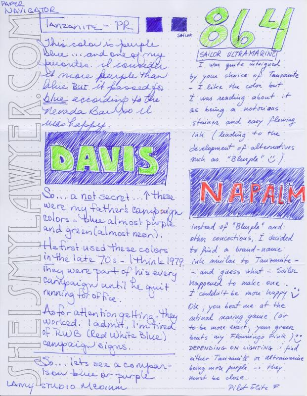
Even though I have done my personal best to keep my local Paradise Pen in business, they will close the doors by June 1. Since all Private Reserve Ink was 50% off, I went and acquired a few bottles for my friend who can only use blue or black at work. Since purples will often sneak past as blue, I acquired a few purples. When we tested the inks to see what she could take to work, I ended up with a few more bottles of ink. For your viewing pleasure - doodles. http://sheismylawyer.com/INK/attachments/2013-05-17-PR-Inks-600.jpg