Search the Community
Showing results for tags 'grey ink'.
-
Jacques Herbin – Gris Galet Ink Review # 225 --- 🧾 Description Jacques Herbin Gris Galet (Grey Pebbles) is part of a new series of inks, presented in J Herbin 10 ml and 30 ml bottles. This is the darkest grey ink in the Herbin lineup. The dark green and turquoise visible in the chromatography create a lovely grey that depending on the paper can veer from neutral grey to blue-black. It has lovely shading, ranging from subtle on Rhodia to extreme on Iroful. The ink is wet with slightly below average lubrication depending on the nib size. It sings with B nibs. There is some show-through and bleed-through on copy paper, but despite that it looks gorgeous. I’ve added Logical Notebook Japanese paper to the lineup. 🧪 Chroma --- ✍️ Writing Samples (scan) Quotes: “Everything that endures becomes polished.” — André Gide, French writer “The sea is what remains when everything fades.” — Marguerite Duras, French writer “Pebble shores, slowly polished by the sea, speak a very ancient language.” — Pierre Loti, French novelist “In the depth of winter, I finally learned that there was in me an invincible summer.” — Albert Camus, French writer “The sea is a vast desert where man is never alone.” — Victor Hugo, French writer Rhodia / Iroful Midori /Tomoe River 68gsm/Logical Note: Tomoe River used here is 68 gsm, not the thinner 52 gsm version commonly referenced in reviews. Hammermill 20lb 📸 Photo Rhodia/ Iroful Midori / Tomoe River 68 gsm/Logical Hammermill 20 lb copy paper Close-up 🔍 Comparison Col-O-ring. Scans are approximative. --- 💧 Water Test --- 🎨 Artwork Inktober 52 - Sunset Combining the previous prompt Capricorn and the final one, Sunset It was dawn. Cat was warming himself on the Suḫurmāšu (Goat-fish). His heart skipped a beat at the sight of Princess Mouse of the House of Ur, striding toward the great ziggurat to pray that the floods would temper their exuberance this year. But when her eyes met Cat’s, her step faltered, her faith trembled. The Suḫurmāšu broke the silence. “Today is the sunset of my era. Soon I will be nothing but a myth. Other gods will come, other temples will be built, and I will remain only a constellation.” Cat was saddened to see the Princess in tears. “Do not cry, Princess. Faiths will rise and fall, but love will be eternal.” Jacques Herbin Gris Galet & Vert Cactus, Lennon Tool Bar Cat General, Tintenlabor Mystery ink, Talens Mixed Media Notebook. Breaking News! Mouse was jealous of Cat, who seemed to be hypnotized by a new TV presenter. Jacques Herbin Gris Galet, Tintenlabor Rothorn , Tannenwald, Pelikan Edelstein Apricot Achat, unknown blue ink, Talens Mixed Media Sketchbook. The First Declaration! We all remember our first declaration, the vulnerability, the fear of rejection, the fear of acceptance, the fear of growing. Jacques Herbin Gris Galet (blue grey), Hosia Ink Studio An Nang (light grey with a hint of bronze), Tintenlabor Rothorn (iron gall red), Pelikan Edelstein Apricot Achat (yellow), Talens Mixed Media --- - Pens Used: Pilot Kakuno EF, Lamy (EF/F/M/B/ stub 1.1), Noodler’s Nib creaper with a Waterman W2 vintage flex nib. - What I Liked: Lovely dark grey. Chameleon ink. Shading. - What I Did Not Like: Nothing much. - What Some Might Not Like: - Writing Experience: Lovely. - Pros: Dark grey. Lovely colour, price range, small bottles. - Cons: If I want nitpick, not as lubricated as Bleu Calanque. 🧷 Ink Characteristics - Shading: Yes. Extreme with Iroful, subtle on Rhodia. - Ghosting: Depending nib size and wetness. - Bleed Through: Depending nib size and wetness. - Flow Rate: Wet - Lubrication: Below average to average depending on pen. - Nib Dry-out: Did not notice. - Start-up: Good. - Saturation: Lovely. - Sheen: No. - Spread / Feathering / Woolly Line: Did not notice. - Nib Creep / Crud: Did not notice. - Staining (Pen): No - Clogging: No. - Cleaning: Easy. - Water Resistance: Ok. --- 🛒 Availability - Available in 10/30 ml bottles worldwide. --- 💬 Closing This was a great surprise. I really enjoy the multiple personality of this ink, it’s different colour temperature and shading. It is my favorite grey ink from Herbin. No fountain pens were hurt in preparing this review. Please don’t hesitate to share your experience, writing samples, or any other comments — the more the merrier.
- 16 replies
-
- jacques herbin
- herbin
-
(and 2 more)
Tagged with:
-
Tintenlabor Basalt Ink Review # 220 --- 🧾 Description Tintenlabor is a Swiss ink company specializing in Iron Gall inks. What differentiates this ink from other brands is that the iron content is disclosed. The samples were sent to me by the Ink-Meister, David. Basalt is a grey-purple ink that oxidizes into a dark grey. It has a 4 g/L iron content. The highest iron content is 6 g/L and the lowest is 1 g/L. I’ve had the privilege of testing many versions of this ink and appreciate the work that goes into developing it, so I may be biased. Ink has excellent lubrication with a caveat. For example, it was cushiony with an EEF Osmiroid Copperplate nib, but slightly scratchy with a Kaweco EF nib. However, with a light touch, the Kaweco EF resistance went away. It is ironic, as the Copperplate nib is needle-nosed with minimal tipping. As it uses the same stabilizing base purple as other Tintenlabor inks, there’s the possibility that this ink will have a longer shelf-life than other iron gall inks. This is one of the best inks for copy paper. Ghosting is faint and there’s minimal bleed-through with only BB, 1.9 nibs. It’s best to use iron gall inks in well-sealed pens that are used regularly and can be taken apart. Cleaning was simple. A few flushes and the pens were clean. However, as I test and review many inks, I added a pinch of pure ascorbic acid powder in the water and then ran it through the pen jacuzzi (ultrasonic cleaner). Never use ammonia-based cleaners with iron gall inks. After having used many pigments, iron gall, shimmer, and dye inks, I can say that the most difficult pens to clean are those with a fixed feed, combined with heavy dyes (purple, pink, blurple) and not IG or pigment inks, so if you’re afraid of IG inks bear this in mind. --- 🧪 Chroma --- ✍️ Writing Samples (scan) 1. “The stones of the earth speak slowly.” — Willa Cather (1873–1947), American novelist. 2. “Geology gives us the story of time written in stone.” — Victor Goldschmidt (1888–1947), Swiss–Norwegian mineralogist; pioneer of modern geochemistry. 3. “Nothing is built on stone; all is built on sand—except our need for stone.” — Jorge Luis Borges (1899–1986), Argentine writer and poet. 4. “What we call chaos is just patterns we haven’t recognized yet.” — Douglas Adams (1952–2001), British novelist. 5. “Stone is more eternal than any human work carved upon it.” — André Malraux (1901–1976), French novelist and art theorist. Rhodia / Iroful Note: Tomoe River used here is 68 gsm, not the thinner 52 gsm version commonly referenced in reviews. I made a mistake with the Borges quote and had to correct it digitally. Midori /Tomoe River 68gsm Hammermill 20lb No scan of the back side of the page. No show-through and minimal bleed-through with very wet pen at parts only. 📸 Photo Rhodia/ Iroful Midori / Tomoe River 68 gsm Wet ink Closeup after oxidation While not visible in photos, the purple tinge is visible to the naked eyes. 🔍 Comparison Col-O-ring. Scans are approximative. --- 💧 Water Test --- 🎨 Artwork Bliss Inspired by a photo of cat by a dear friend. 🙏 Talens Mixed Media Square Pocket Notebook. The Lady and the Hummingbird A nostalgic piece inspired by the myth of Huitzilopochtli, The Aztec god, who returns fallen warriors as hummingbirds to their lovers... Note the beauty of Jacques Herbin inks in contrast and the purple hue of Basalt in washes. Tintenlabor Basalt, Jacques Herbin Rouge Amarante & Vert Cactus. Uniball Signo White Gel pen, Talens Mixed Media Notebook. Gangham Style Party! I've been working on this for some time, playing with different shades of grey. Note how with the wash technique I exposed Diamine Earl Grey’s purple, whereas I kept Basalt’s purple undertones in check by letting it oxidize. Before Cat got to know Mouse, she was a K-pop backup dancer! Tintenlabor Basalt iron gall ink (black), Diamine Earl Grey (purple), Jacques Herbin Gris Galet (background), Lennon Tool Bar Cat General, Pelikan Edelstein Apricot Achat, Talens Mixed Media Notebook. --- - Pens Used: Osmiroid EEF Copperplate flex, Lamy (EF/F/M/B/ Stub 1.1). - What I Liked: Gorgeous color wet, elegant when oxidizes, waterproof, sketching. - What I Did Not Like: Writing with EF Kaweco nib. - What Some Might Not Like: Iron gall ink. Maintenance. - Writing Experience: Excellent. - Pros: Gorgeous dark purple-grey, well-lubricated, excellent on copy paper. - Cons: Tariffs. It might seem boring for writing on good paper. 🧷 Ink Characteristics - Shading: Yes. - Ghosting: No. - Bleed Through: None, or very faint on copy paper. - Flow Rate: Wet. - Lubrication: Excellent. - Nib Dry-out: Did not notice. - Start-up: Excellent. - Saturation: Oxidized to a lovely dark grey, black depending on paper. - Sheen: No. - Spread / Feathering / Woolly Line: Did not notice. - Nib Creep / Crud: Did not notice. - Staining (Pen): No. - Clogging: No. - Cleaning: Easy, unless forgotten in pen. - Water Resistance: Excellent. --- 🛒 Availability - Available directly from the vendor in 30 or 50 ml bottles. https://tintenlabor.mycommerce.shop/products/basalt --- 💬 Closing This ink has been an eye-opener. Maybe because I went through many variations of it and used it both for writing & drawing. If you’re looking for a dark grey-black ink that can handle different types of paper, this could be the one. For those of you who love sketching and drawing, this ink can bring a different flair to your work. It oxidizes quickly on most papers and in washes, one can extract the lovely nostalgic purple from the grey. I was sorry to let this go and hop on to the next review. It is ironic that I who disliked dark greys, have been using and reusing this ink immoderately. Drawing and sketching give a different meaning to fountain pen inks. If, however, you tend to forget your inks in your pens, this ink is not for you. No fountain pens were hurt in preparing this review. Please don’t hesitate to share your experience, writing samples, or any other comments — the more the merrier.
- 12 replies
-
- tintenlabor
- irongall
-
(and 3 more)
Tagged with:
-
Diamine Earl Grey Ink Review # 218 --- 🧾 Description I never thought I would appreciate grey inks. But since I’ve taken up drawing, I can’t get enough of different variations of grey inks. Diamine Earl Grey is lovely warm grey. The ink is wet, with slightly below average lubrication. Best with wet pens and soft nibs. The Ink has no water-resistance and ghosted and bled through copy paper. The ink couldn’t handle the flex nib’s ink demands, despite the ebonite feed. For writing, it’s a neutral grey with a hint of purple and lovely shading, best on Japanese paper and M nibs and above. For drawing and washes, it’s a gorgeous ink with a complex colour. If you're looking for a water proof grey with a purple tinge, Tintenlabor Basalt ( iron gall) and Octopus W&D Fox Grey (pigment ink) are better candidates. --- 🧪 Chroma --- ✍️ Writing Samples (scan) Quotes: “An Earl is but a man who had good fortune in his ancestors.” — Samuel Johnson “Titles do not make men noble; deeds do.” — Ovid “The color of truth is gray.” — André Gide “In the grey light of dawn, truth often looks less heroic.” — John le Carré “Grey has the greatest value—it makes all colors beautiful.” — Giorgio Morandi Rhodia / Iroful Midori /Tomoe River 68gsm Note: Tomoe River used here is 68 gsm. Many older reviews refer to a thinner 52 gsm version, which behaves differently. Hammermill 20lb 📸 Photos Rhodia/ Iroful Midori / Tomoe River 68 gsm Hammermill 20 lb copy paper Closeup 🔍 Comparison Col-O-ring. Scans are approximative. --- 💧 Water Test --- 🎨 Artwork Inktober Monthly Challenge -Scorpio I appropriated and combined the ancient Egyptian goddesses of Bastet (the feline goddess of home, fertility, music, and joyful protection) and Selket (goddess of protection, healing, and the breath of life in death.). With apologies to the long-gone hardworking Egyptian scribes, the hieroglyphs, created by ChatGPT, read: “Protects the mouse the cat from evil scorpion.” Diamine Earl Grey, Karas Customs Vertex with an FPnibs full flex nib, Talens Mixed Media Notebook. A Rose for You Inspired by a photo I took of my cat. Diamine Earl Grey (purple-grey ink), Tintenlabor Encre Royal (purple), Jacques Herbin Vert Cactus, Uniball Signo White Gel, Talens Mixed Media Notebook. Me and my Gang A manga-like take on the artist and his muses. Diamine Earl Grey ink on Talens Mixed Media. Villain Who was the villain : the off-key singer or the one with the perfect pitch? Diamine Earl Grey, Jacques Herbin Rouge Amarante, Vert Cactus, Van Dieman's Here Kitty Kitty, Tintenlabor Basalt, Uniball Signo white gel, Talens Mixed Media Notebook. Merry Grinchmas! Inspired by a photo of my cat and a handwoven Santa made by my wife. Diamine Earl Grey, Noodler's Eel Red Rattler's Red, Jacques Herbin 1798 Bleu Diamant, Uniball Signo white gel, Talens Mixed Media Notebook. --- - Pens Used: Pilot F3A EF, Lamy (EF/F/M/B/ Stub 1.1), Karas Customs with FPnibs full flex and ebonite feed. - What I Liked: Drawing, Ink washes. The purple coming out with wider nibs on Japanese paper. - What I Did Not Like: Lack of water resistance. Nothing special with finer nibs. - Writing Experience: Good. - Pros: Excellent for drawing, washes, price, availability. - Cons: Lack of water resistance. 🧷 Ink Characteristics - Shading: Gorgeous. - Ghosting: Yes, on copy paper. - Bleed Through: Yes - Flow Rate: Wet. - Lubrication: Slightly below average, improve with time. - Nib Dry-out: Did not notice. - Start-up: Good. - Saturation: Yes. - Sheen: Did not notice. - Spread / Feathering / Woolly Line: Did not notice. - Nib Creep / Crud: Did not notice. - Staining (Pen): No. - Clogging: No. - Cleaning: Easy. - Water Resistance: Nope. --- 🛒 Availability - Available in 30/ 80 ml bottles worldwide. --- 💬 Closing I have enjoyed sketching and drawing with this ink. As a writing ink, I have other preferences, but still this one has a lovely, elegant colour and feel. No fountain pens were hurt in preparing this review. Please don’t hesitate to share your experience, writing samples, or any other comments — the more the merrier.
- 21 replies
-
- diamine
- diamine earl grey
-
(and 2 more)
Tagged with:
-
Diamine Grey Ink Review # 209 --- 🧾 Description It’s a pure pencil grey, with below average lubrication, like most greys. I thought flow was wet, but the ebonite feed of the Karas was ink starved at times. Dry times are off. I think the higher ones were done when the feed was saturated. If there’s shading, I don’t see it. There's some show through and bleed through on copy paper. Cleaning was easy-peasy. --- 🧪 Chroma --- ✍️ Writing Samples (scan) Rhodia / Iroful Midori /Tomoe River 68gsm Hammermill 20lb 📸 Photo (artificial light, LED) Rhodia/ Iroful Midori / Tomoe River 68 gsm Hammermill copy paper (20lb) Close-up on Iroful 🔍 Comparison --- 💧 Water Test --- 🎨 Artwork Inktober 2025 - Day24 - Rowdy Inspired by the “rowdy” Stanley Kowalski from A Streetcar Named Desire (1951), reimagined through my cat & mouse theme: Stanley Chatowski & Blanche DuSouris. Talens Mixed Media notebook. Inktober - Day25 - Inferno Cat & mouse fight forest fires. Diamine Grey, Noodler's Apache Sunset, J Herbin Corail des Tropiques, Buton d'or, Talens Mixed Media Notebook. Inktober - Day 27 - Onion (Twist) A square took a free spirit to a diner, not knowing that she would launch the hula-hoop craze in the 50s and change his life forever. Diamine Grey, Tintenlabor Echinacea, Blausee (iron gall inks), Uniball Signo White Gel pen. Pebeo metallic marker Red, Talens Mixed Media notebook. --- - Pens Used: Pilot Elite EF, Lamy (EF/F/M/B/ Stub 1.1), Karas Vertex with FPnib flex and ebonite feed. - What I Liked: Drawing. - What I Did Not Like: Lack of lubrication, dryness, paleness. - What Some Might Not Like: Same as above. - Writing Experience: Depended on the nib, paper combo. But generally, not memorable. - Pros: Neutral darkish grey. - Cons: Same as above. 🧷 Ink Characteristics - Shading: I didn’t see much. - Ghosting: Ok with most nibs. - Bleed Through: Ok with most nibs. - Flow Rate: ok, but couldn’t handle flex nib. - Lubrication: below average. - Nib Dry-out: Did not notice. - Start-up: ok. - Saturation: Medium grey. - Sheen: No. - Spread / Feathering / Woolly Line: Did not notice. - Nib Creep / Crud: Did not notice. - Staining (Pen): No. - Clogging: No. - Cleaning: Easy - Water Resistance: Meh. --- 🛒 Availability - Available in 30/80 ml bottles and cartridges. --- 💬 Closing I don’t appreciate grey inks for writing. Only for drawing. This was darker than Herbin Gris Nuage, but sort of neutral. I wasn’t wowed. If I were to choose one, I would go for Diamine Graphite. No fountain pens were hurt in preparing this review. Please don’t hesitate to share your experience, writing samples, or any other comments — the more the merrier.
- 15 replies
-
- diamine
- diamine grey
-
(and 1 more)
Tagged with:
-
J Herbin Gris Nuage Ink Review # 207 --- 🧾 Description Gris Nuage (Grey Cloud) is a very legible delicious light grey, with below average lubrication, wet and minimal shading. It’s most handsome on white paper. I enjoyed it most with Pilot Elite EF gold nib, and Karas Vertex with a full flex FPNibs with ebonite feed. With Lamy Safari it depended on nib size and paper. With fude nib it was scratchy. It can have a faint reddish halo on Iroful. If you want an expressive grey this can be an ok choice. For drawing, I found it too pale. I prefer darker greys, so I can create different values. --- 🧪 Chroma --- ✍️ Writing Samples (scan) Rhodia / Iroful Midori /Tomoe River 68gsm Hammermill 20lb 📸 Photo Rhodia/ Iroful Midori / Tomoe River 68 gsm Hammermill 20lb Close-up Iroful 🔍 Comparison --- 💧 Water Test --- 🎨 Artwork Silver lining Inspired by French expression, “La tête dans les nuages” (head in the clouds). Pebeo Silver marker and De Atramentis Document Cyan/turquoise mix, Talens Mixed Media. Inktober 2025 - Day 9 - Heavy J Herbin Gris Nuage/ Diamine Grey (the darker grey) Inktober 2025 - Day 12 -Shredded The mouse is having a fit over the cat’s midlife crisis — being “shredded.” J Herbin Gris Nuage, Diamine Grey (mouse). --- - Pens Used: Pilot Elite EF, Lamy (EF/F/M/B) , Jinhao 450 fude, Karas Vertex with FPNIBs extra wet ebonite feed. - What I Liked: Colour, drawing. - What I Did Not Like: Low lubrication with EF/F/B and Fude nibs. - Writing Experience: Depended on nib size, wetness. - Pros: Lovely tinge of grey. Small bottles. - Cons: Low lubrication. Pale 🧷 Ink Characteristics - Shading: Some. - Ghosting: Yes on copy paper. - Bleed Through: Same as above. - Flow Rate: Wet. - Lubrication: Below average. - Nib Dry-out: Did not notice. - Start-up: Did not notice. - Saturation: Pale but legible. - Sheen: Faint reddish on Iroful. - Spread / Feathering / Woolly Line: Faint, stylish with flex nib. Gives a vintage feel. - Nib Creep / Crud: Did not notice. - Staining (Pen): No. - Clogging: No. - Cleaning: Easy. - Water Resistance: Decent. --- 🛒 Availability - Available in 10/30 ml bottles and small international ink cartridges. --- 💬 Closing I was expecting a very pale grey; however, I was surprised by its legibility. With a good pen it can sing, with a dry pen and the wrong nib, it could be awful. For art work it is difficult to create nuance. No fountain pens were hurt in preparing this review. Please don’t hesitate to share your experience, writing samples, or any other comments — the more the merrier.
- 20 replies
-
- j herbin
- gris nuage
-
(and 1 more)
Tagged with:
-
Diamine Graphite Ink Review # 206 --- 🧾 Description Diamine Graphite is wet, dark grey color with green undertones. Shading is minimal, only with M/B) nibs. Color is most intriguing with a Stub nib as the green comes through. But with other nibs it was good, i.e. even with the Japanese EF Pilot Elite. Ink behaves well in general, but there might be some ghosting. Bleed-through will happen if you use a very wet pen. I kept the inks for a month in my pens, so in the end I resorted to cleaning solution and pen jacuzzi to clean the pen. 🛀 I most enjoyed this ink for drawing. As a writing ink I enjoyed it most with a very wet flex pen. --- 🧪 Chroma --- ✍️ Writing Samples (scan) Rhodia / Iroful Midori /Tomoe River 68gsm Hammermill 20lb 📸 Photo Rhodia/ Iroful Midori / Tomoe River 68 gsm Hamnmermill 20 lb 🔍 Comparison --- 💧 Water Test --- 🎨 Artwork One can appreciate Diamine Graphite's impressive tonal range, shifting from deep black to pale greenish blue in art. Inktober 2025 - Day 4 - Murky Inspired by film noir's murky, moody aesthetics. It was inspired by a scene from the Third Man (1949). It also shows off the dynamic range of Diamine Graphite. Karas Customs Vertex with FPnibs ultra-flex, Pilot Kakuno, Water brush, Talens Mixed Media notebook. Inktober 2025 - Day3 - Crown Now who is the king? Diamine Graphite, Tintenlabor Schokolade, Pebeo gold marker Inktober challenge 2025: Day 5 : Deer Diamine Graphite, Hosia Ink Studio Gardenia, Talens Mixed Media Square pocket. --- - Pens Used: Pilot Kakuno EF, Lamy (EF/F/M/B/ Stub 1.1) , Karas Vertex with a Ultralfex bock nib from FPNibs. - What I Liked: Color for artwork, wetness, - What I Did Not Like: I was surprised by the low lubrication with EF/F European nibs. - What Some Might Not Like: Not much shading, lack of water resistance. - Writing Experience: Good with most nibs. The dark grey makes it’s legible, - Pros: Price, colour, artwork. - Cons: Low lubrication with EF/F nibs. 🧷 Ink Characteristics - Shading: minimal. - Ghosting: With some nibs. - Bleed Through: Same as above. - Flow Rate: Wet - Lubrication: Low with EF/F Safari - Nib Dry-out: Did not notice. - Start-up: Great. - Saturation: Dark Grey - Sheen: No - Spread / Feathering / Woolly Line: Did not notice. - Nib Creep / Crud: Did not notice. - Staining (Pen): No. - Clogging: No. - Cleaning: It’s best using an ammonia based cleaning solution. - Water Resistance: Meh! --- 🛒 Availability - Available in 30/80 ml bottles from most vendors. --- 💬 Closing I really enjoy working with this dark grey, complex with green undertones for the 2025 Inktober challenge. As a writing inks, it’s fun for those who must use black inks, but need to rebel. No fountain pens were hurt in preparing this review. Please don’t hesitate to share your experience, writing samples, or any other comments — the more the merrier. :)
- 8 replies
-
- diamine
- diamine graphite
-
(and 1 more)
Tagged with:
-
Kaweco Smokey Grey Ink review #195 --- 🧾 Description I got a pack of cartridges of Smokey Grey. Boy, I was in for a surprise; it refused to write in both pens, even after priming (Kaweco Sport and the Karas Vertex), until I forgot it for a few days. Moral of the story, if you can’t get a sample, pop in the cartridge and let it be. Or syringe it., which worked fine in the Lamy Safari. Ink has low lubrication, and the flow is dry. However, with a Medium Kaweco Sport, when the pen finally wrote it was pleasant. The color reminds me of an HB pencil, However, with a Lamy Safari Ef, it was yucky and pale, more like 4 nib. In the Karas Vertex, however, it was inconsistent—the cartridge just couldn’t keep up with the ebonite feed and the FPNibs flex nib. --- 🧪 Chroma --- ✍️ Writing Samples (scan) Rhodia / Iroful Note that the Karas Vertex is fitted with an FPNIBS, featuring an Ebonite feed with a very generous ink flow. Normally, I add a Japanese Ef nib to line up, here I used the Karas Vertex’s Bock Ef nib. The colour is darker because of the ebonite feed. If you want to see what the Japanese EF looks like, check @LizEF’s excellent review. Midori /Tomoe River 68gsm Hammermill 20lb --- 📸 Photo Rhodia/ Iroful Midori / Tomoe River 68 gsm Hammermill 20lb copy paper 🔍 Comparison I lost my Kaweco swatch, so I redid it again, that’s why it’s repeated twice. --- 💧 Water Test --- 🎨 Artwork Global Warming Talens mixed media paper Memories Inspired by an intricate sketch/gravure with my cat and mouse thematic. Talens Mixed media paper --- - Pens Used: Kaweco Sport (EF/F/M/B/ BB), Karas Vertex FPNibs with ebonite feed. - What I Liked: When it flowed from the cartridge. Sketching. - What I Did Not Like: The cartridge. Ink flow. Not for writing. - What Some Might Not Like: Low lubrication, dry flow, pale colour. - Writing Experience: With the right nib, it was very pleasant. - Pros: Great for sketching. - Cons: Not the best cartridges. 🧷 Ink Characteristics - Shading: Ok. - Ghosting: Faint depending on nib. - Bleed Through: There are spots. Don’t use a wet pen on cheap paper. - Flow Rate: Dry - Lubrication: Scratchy with EF nibs pleasant with a M Kawco nib. - Nib Dry-out: Did not notice. - Start-up: Temperamental with a cartridge. Otherwise ok. - Saturation: Not. - Sheen: No. - Spread / Feathering / Woolly Line: Did not notice. - Nib Creep / Crud: Did not notice. - Staining (Pen): Nope - Clogging: No. - Cleaning: Easy - Water Resistance: Good. --- 🛒 Availability - [ ] Available in 50 ml bottles or cartridges. --- 💬 Closing My experience was tainted by the temperamental cartridges. If I’d known, I would have syringed it right away. No fountain pens were hurt in preparing this review. ;) Please don’t hesitate to share your experience, writing samples, or any other comments — the more the merrier. :)
- 18 replies
-
- kaweko
- smokey grey
-
(and 2 more)
Tagged with:
-
Here's an awesome grey ink with gloomy, attractive blue undertones. http://imagizer.imageshack.us/v2/xq90/909/rR3jMm.jpg
- 22 replies
-
- iroshizuku
- fuyu-syogun
-
(and 5 more)
Tagged with:
-
Graf von Faber-Castell Stone Grey (cartridge) Photo courtesy of Faber-Castell website This was a tough ink review. My initial experience with the cartridge was very unpleasant. I couldn’t make the ink flow in my Kaweco, or Osmiroid (which doesn’t like dry inks) but it worked well in a Jinhao 450. I had to use two cartridges as one burst. So, I checked several reviews, and was surprised that they were talking about a saturated grey, wet and well lubricated ink. So, I took a 3rd cartridge and syringed the ink out in a Lamy Safari, to test for an extra week or so. The experience was very different and pleasant. I used it mostly for sketching, as the written review had been already done. However, when I didn’t use the pen for a week, I had to prime the feed again. However, this ink is no Sailor Doyou (wet and well lubricated), nor it is as wet and saturated as Noodler’s Lexington Gray. I really loved this ink for doing washes, and for drawing. There’s a purple component in the chroma, that shines through in washes. It has a gorgeous Chroma: It’s a lovely pencil grey, that behaves well on copy paper. I would recommend you getting a sample, before investing in a bottle, and using a wet pen. Writing Samples: I didn’t use a Japanese Ef, so I tried to emulate it by reverse writing. It worked fine with three of the papers, probably because I had left the pen alone for a week or so. But stumbled with Rhodia. I tried to salvage it with the Osmiroid which has a needlepoint semi-flex nib. The shading is accentuated to the extreme by the scanner. Not a colour for Midori, yucky yuck Photo: You can see a pencil comparison, which I added after I scanned the review. Comparison: Water test: Left side 10 seconds under running water. Not bad, eh Art Work: You can appreciate the range and the beauty of the colour here, in contrast with J Herbin Vert de gris: · Pens used: Kaweco (EF/F/M/B), Jinhao x450 fude nib, Osmiroid Copperplate nib, Lamy Safari · What I liked: Lovely color, very well-behaved on copy paper. · What I did not like: I had trouble with the cartridge. · What some might not like: Ink is on the dry side, and it’s pricey. · Shading: Yes, but the scan is more extreme than reality · Ghosting: No. · Bleed through: A bit with a #6 fude nib. · Flow Rate: Cartridge, awful. Syringed ink, good. · Lubrication: On the dry side. · Nib Dry-out: Yes between changing nibs. · Start-up: Ok. After a week I had to prime the Safari · Saturation: Pastel · Shading Potential: Yes. · Sheen: No. · Spread / Feathering / Woolly Line: Did not notice. · Nib Creep / “Crud”: Did not notice. · Staining (pen): No. · Clogging: Did not notice. · Cleaning: On the easy side. Though I had to soak the pen overnight. · Water resistance: Very good. · Availability: Cartridges, 75 ml bottles. Please don't hesitate to share your experience, writing samples or any other comments. The more the merrier
- 24 replies
-
- graf von faber catell
- grey ink
-
(and 2 more)
Tagged with:
-
I've been meaning to write up a quick review of my favorite gray ink: Pilot Iroshizuku Fuyu-Syogun, and here it is, finally. Fuyu-Syogun was not a love at first sight/write. No, in fact I thought it was just too pale, bland, and boring. Only after I kept going back to my sample periodically for sketching and doodling did I fall in love with it. And I can't get enough of this ink now, so I got a full bottle. On the photograph below, you can see my less-than-enthusiastic thoughts about this ink in the older writing in the notebook underneath. I don't have a lot of grays--only a few samples and a full bottle of Paper Plume's Oyster Grey (another great ink), but in Fuyu-Syogun I have found a gray that does not make me wish for any other of its family. It behaves perfectly in any pen and on most papers, even cheap absorbent kind (as long as you use a conservative fine nib on the worst paper). Easy to wash out of a pen, great flow, no problems! It has excellent water resistance. The hue is clearly legible and does not look like pencil writing due to the prominent blue-lavender tint, however it has a familiar kind of appearance for those who've taken a lot of pencil notes in the past, only with better shading and longevity. Due to this gray not being a pure gray but rather having a slight tint (I think lavender-blue is the closest description I can think of), the appearance of the ink changes based on the paper you use it with. For instance, on more bright, clean white paper, like Col-o-Ring cardstock rectangles, you see the pure color of this ink. On white Tomoe River (which is actually quite creamy and not pure white), the hue is warmer, and the lavender is less prominent. On Fabriano Bioprima 85g/m2, which is a pale cream, more creamy than Tomoe River White, the ink is more toward dirty bluish hue. I've added a sample card of Birmingham Pen Co.'s "Midnight Blue". It's not the same (higher saturation of blue in that one), but it from a similar family of colors. I did not photograph it, but Montblanc's old formula IG "Midnight Blue" is similar in hue to Fuyu-Syogun once dried and aged a bit, but is significantly darker. One of the properties of this ink I like a lot is the "outlining" (also sometimes called "halo-ing") effect when written with a juicy enough nib or on low-absorbency paper:
- 16 replies
-
- pilot
- iroshizuku
-
(and 2 more)
Tagged with:
-
Does Sailor make a grey --- gray ---- ink? I can not tell by the words I see. C. S.
-
Does Sailor make a grey --- gray ---- ink? I can not tell by the words I see. C. S.
-
I would like to enlist the help of you pen ink connoisseurs. I would like to use a grey ink to take notes with for school ( I want keep colors like black and blue to outline important points) and I am not sure which inks would be the best to use on cheaper paper. I would of course be using a fine nib (Kaweco/bock, might try to get an extra fine nib not sure yet), but I'm not sure which grey inks have the best reputation for not feathering on lower quality paper. I'm not too worried about show through, because it being a lighter color it won't be too bad to look at. I want to stay away from extremely light (Gris Nuage) or anything that is close to black, something that is more graphite looking is preferable. Right now the biggest contender is Noodler's Lexington Grey but i'm not sure how well it works on cheap paper.
-
Glittering in the sun:
- 11 replies
-
- diamine ink
- grey ink
-
(and 1 more)
Tagged with:
-
Hello, I hope I'm posting in the correct category. I'm not very experienced with ink and I'd like to try grey. I flushed one of my new Pilot pens and didn't wait for it to dry before putting in the black cartridge that came with it and I liked the resulting grey ink. My main purpose of this grey ink would be for school notes. I don't use black ink for school because it is hard to distinguish between printed text and annotations. Ideally it should be waterproof because I still haven't figured out how to drink water properly. Will a diluted Noodler's Black/HOD/X-Feather/Borealis/Polar/etc. still be waterproof enough that I can read my notes if my incompetent self spills water all over them? What are the benefits of buying a bottle of grey ink instead of diluting black, aside from reduced bulletproofness? Are there any "recipes" you can recommend? If there is a good reason to avoid dilution that I have overlooked, which waterproof greys can you recommend, aside from Lexington Grey? Thank you!
-
Can anyone recommend any saturated inks with good flow? I know mostly inks are either saturated and quite viscous, or very well flowing and much more wishy washy. I'm looking for saturated inks which also have good flow and and relatively easy to clean/ not damaging to fountain pens. The only one that comes close to me is Iroshizuku Take- Sumi, but I'm sure there must be an even darker black ink, which is still well behaved. Any recommendations? If they have good shading even better.
-
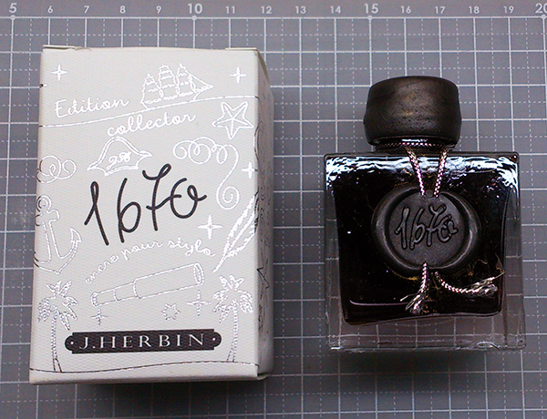
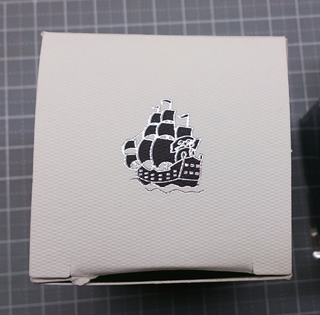
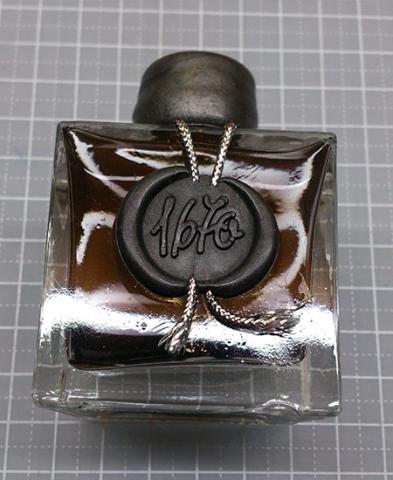
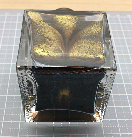
Sorry that the pictures of my last two posts had some problems showing.... This time I'm trying the "Attach files" function and photobucket, hope they both work! (they seem fine in preview, though...) ---------------------------------------------------------------------------------------------------------- J. Herbin 1670 Stormy Grey A grey ink with gold flakes, released in late 2014 by J. Herbin. This is my first bottle of shimmering ink, and I'm sure it will stay on my fascination list for a while. Look at the box and bottle design---even if you are not actually using the ink, it makes perfect decoration on the desk. It's said that the 1670 bottles are handmade, thus imperfectly shaped. I love this. (and I accidentally cracked the seal) There is a thick layer of gold flakes. I tried to take a picture of it but it sank really fast.... ....and formed an interesting pattern.... On cheap calculating paper, with Noodler's Creaper: http://i651.photobucket.com/albums/uu239/chingdamosaic/1670storm08_zpshyqjzjqq.jpg the color is a pure and clean grey, comfortable to read. When it dries, it gets a little brownish or purplish, depends on the paper you use. I didn't give it enough shake, so there weren't a lot of gold flakes here. Only visible at certain angles, http://i651.photobucket.com/albums/uu239/chingdamosaic/1670storm10_zpsbs4vm1rx.jpg or under sun light: http://i651.photobucket.com/albums/uu239/chingdamosaic/1670storm09_zpseoitpgrr.jpg And here is what it looks like if you get too many gold flakes: (with dip pen, on sketch paper) http://i651.photobucket.com/albums/uu239/chingdamosaic/1670storm11_zpsmb6npe2m.jpg You get a thick layer of gold shimmer..... and the grey ink vanishes. BTW, the bottom line is a diluted version; kind of looks purplish. And on another grid paper, with Noodler's Creaper again: http://i651.photobucket.com/albums/uu239/chingdamosaic/1670storm12_zpser4abb8j.jpg close-up 1: the shades http://i651.photobucket.com/albums/uu239/chingdamosaic/1670storm14_zps70ci3zed.jpg close-up 2: shimmer shows when tilting the paper. http://i651.photobucket.com/albums/uu239/chingdamosaic/1670storm15_zpsepobt7qx.jpg close-up 3: more shimmering http://i651.photobucket.com/albums/uu239/chingdamosaic/1670storm16_zpsyzxr4wtn.jpg Water resistance test, on MUJI grid paper with dip pen: http://i651.photobucket.com/albums/uu239/chingdamosaic/1670storm13_zpsovc5rkjo.jpg Unintentional ink drops: http://i651.photobucket.com/albums/uu239/chingdamosaic/1670storm17_zps1o2xdwkp.jpg Doodle with syringe, water, and Noodler's Creaper: http://i651.photobucket.com/albums/uu239/chingdamosaic/1670storm18_zpsfag4kzkd.jpg http://i651.photobucket.com/albums/uu239/chingdamosaic/1670storm20_zps9yair86e.jpg http://i651.photobucket.com/albums/uu239/chingdamosaic/1670storm19_zpsmkwkgzis.jpg http://i651.photobucket.com/albums/uu239/chingdamosaic/1670storm21_zpsnpfbyf37.jpg http://i651.photobucket.com/albums/uu239/chingdamosaic/1670storm22_zpsrnblcjmi.jpg AAAAAND notice the brown/bronze sheen!! (Not gold flakes) I love it but it doesn't appear all the time. And on tissue paper: http://i651.photobucket.com/albums/uu239/chingdamosaic/1670storm23_zpstjul6iae.jpg I'm surprised at the blue and violet hue, because so far these two colors never show on any pen/paper I try with. Conclusion: Very nice ink, with good flow, practical color and beautiful shimmer. Not very hard to clean from the pen. Great decoration on the desk. Recommend!! BUT if you are specifically looking for a "grey ink with gold shimmer," maybe you should check out Diamine Sparkling Shadows first, because I've seen more than one review states that its flow and flakes perform better than J.Herbin Stormy Grey. Thanks for watching this photo-heavy review! I'll end this with an Instagram-filtered pic: For more detailed Chinese review: http://chingdamosaic.blog.fc2.com/blog-entry-55.html
- 25 replies
-
Following on from my thread announcing the launch of Diamine Shimmertastic inks I am happy to post my reviews of them. This one is Sparkling Shadows. This ink is grey with a great gold sheen My reviews show you my experiences with these inks in several of my pens. I’ve experimented by having these inks in my pens for weeks, and have intermittently written with them to see how they start, and how they write. I must say I’m pleasantly surprised. I’ve experienced no feathering with any of them, and they have all behaved really well for me. Diamine recommend that you gently agitate the bottle to mix the particles through the ink before filling your pen. They also recommend that you gently agitate your pen to mix the particles with the ink in your pen when starting a new writing session. I recommend good FP maintenance when using ink that contains particles. I suggest you clean your pens out a little more frequently than you might do with normal ink. These inks will come in 50ml glass bottles, and they have either gold or silver particles in them.
- 1 reply
-
- diamine inks
- shimmer inks
-
(and 3 more)
Tagged with:
-
I have decided to review some of my inks. These aren't necessarily in any particular order. This one is Diamine 150th Anniversary Ink Silver Fox. I would call it a light grey. It doesn't seem to lean towards green or blue specifically. So it's a nice neutral grey. It's a very well behaved ink with some shading. I found it flowed smoothly across the page, and had no problems with lubrication in the 2 pens I used. I must admit I didn't like the nib on the SMT and found it difficult to write with. This ink exhibits no showthrough or bleedthrough on my thick paper, so I tried it on some cheaper paper. It isn't a saturated ink, and a comparison with Montblanc Einstein shows that. The water test on the review form shows this isn't a waterproof ink, but it's reasonably resistant for a short time. Bearing in mind the paper I use is very smooth, and the nib used at that time was an Italic, this ink took 17-18 secs to dry. It flows through the pen well and lubricates the nib well. I saw no skips or hard starts from either of the pens that both stayed uncapped while I swapped and changed, and did swabs and comparisons with other inks. It is currently available in special 40ml cake slice shaped glass bottles. Diamine sell it directly to end-users on their web-site.
-
I found a stash of old reviews that got misplaced during a house move, so this one's a bit old. This ink is really appealing to me. It reminds me of Diamine Eclipse (one of my favorites) and Rohrer & Klingner Leipziger Schwarz, in that it's a very dark, somewhat unsaturated purple at heart. Definitely worth a try! http://imagizer.imageshack.us/v2/xq90/540/pEy9x1.jpg
- 2 replies
-
- scribal workshop
- squidling
-
(and 5 more)
Tagged with:

