Search the Community
Showing results for tags 'green ink'.
-
Jacques Herbin Vert Pré (Meadow Green) Ink Review # 233 --- 🧾 Description As of the posting of this review, all J Herbin inks are now branded Jacques Herbin. This ink belongs to the 40-ink Les Perles des Encres series. It’s a yellow-green with a neon quality. It is legible. Lubrication is slightly below average; water resistance is nil on coated paper. As it’s not a colour I appreciate much, I’ll stop here. --- 🧪 Chroma --- ✍️ Writing Samples (photos only) - Pens Used: Pilot Elite EF, Lamy (EF/F/M/B/ stub 1.1), vintage Sailor flex. Quotes: Translations from the original French are provided for reference only. Rhodia “Until one has loved an animal, a part of one’s soul remains unawakened.” Anatole France, novelist and essayist. Iroful “One does not discover new lands without consenting to lose sight of the shore.” André Gide, novelist and essayist. Midori A5 “What makes the desert beautiful is that somewhere it hides a well.” Antoine de Saint-Exupéry, writer and aviator. Tomoe River 68gsm A5 “The best way to make your dreams come true is to wake up.” Paul Valéry, poet and philosopher. Hammermill “Only the mediocrity of the human spirit could devise a civilization that destroys what it loves.” Jean Giraudoux, playwright and diplomat. Rhodia Iroful Midori Tomoe River 68gsm Note: Tomoe River used here is 68 gsm, not the thinner 52 gsm version commonly referenced in reviews. Hammermill 20lb Closeup h 🔍 Comparison Col-O-ring swatch cards. Scans are approximative. --- 💧 Water Test --- 🎨 Artwork I Feel Pretty! Cat & Mouse go for a ride with the prettiest horse in the world. Kitty Ink Pot Unstoppable Snake, Jacques Herbin Vert Pré, Bleu Azur, Bouquet d'antan (pink), Talens Mixed Media Sketchbook. Makhabesh & Essri Many thanks to @LizEF for creating such memorable characters. Makhabesh lifted its wings while Essri the Snek took a lift the staff to admire Quin being awarded Wizard of the Year. Jinchen Lantau Dream, Kitty Ink Pot Unstoppable Snake, Jacques Herbin Vert Pré, Bleu Azur, Uniball White gel pen, Talens Mixed Media Sketch book. Lift Off? INKTOBER 52, Day 10: Lift Mouse is terrified at the option of a lift off. Kitty Inkpot Unstoppable Snake, Jinchen Lantau Dream, Jacques Herbin: Vert Pré, Bleu Azur, Bouquet d'antan, Orange Indien, Uniball Signo White Gel, Talens Mixed Media Sketchbook. --- - What I Liked: Bright green colour. Available in small bottles. - What I Did Not Like: Colour is too harsh for my liking. - Writing Experience: Ok. 🧷 Ink Characteristics - Shading: Subtle to extreme depending on paper. - Ghosting: Yes, on copy paper. - Bleed Through: Yes on copy paper unless you use an EF nib. - Flow Rate: Wet. - Lubrication: Slightly below average. - Nib Dry-out: Did not notice. - Start-up: No problems. - Saturation: No. - Sheen: No. - Spread / Feathering / Woolly Line: Did not notice. - Nib Creep / Crud: Did not notice. - Staining (Pen): No. - Clogging: No. - Cleaning: More or less easy. - Water Resistance: Not with coated paper. --- 🛒 Availability - Available in 10/30 ml bottles and cartridges worldwide. --- 💬 Closing This is very bright meadow green. Fun after a long cold winter, but too bright for my taste. No fountain pens were harmed in preparing this review. Please don’t hesitate to share your experience, writing samples, or any other comments — the more the merrier.
-
Jacques Herbin Vert Forêt (Forest Green) Ink Review # 230 --- 🧾 Description This is the last ink in the new Jacques Herbin lineup. Here are the swatches of the whole series: It is a dark teal with F and finer nibs; with M to stub nibs it becomes a brighter teal. The wetter and finer the nib, the darker the ink. It is not suited for copy paper and will ghost, bleed through, feather and have some woolly lines. Shading is subtle and paper dependent; lubrication is below average with the Safari, but surprisingly nice with the Pilot F3A, a 1970s pen with a semi-flex nib. The ink has no water resistance. While I’m not a fan of dark greens, I appreciated using it for ink washes, extracting subtle sea-glass shades from the initial dark base colour. --- 🧪 Chroma --- ✍️ Writing Samples (scan) Quotes: Translations from the original French are done by ChatGPT. 1. Jules Renard (French writer and diarist) “The forest precedes man; the desert follows him.” 2. Gaston Bachelard (French philosopher) “The forest is a place where one learns slowness.” 3. Jean Giono (French novelist) “Trees have a slow, patient life, foreign to our human restlessness.” 4. François-René de Chateaubriand (French writer) “Forests are man’s first temples, and their voices are older than the gods.” 5. Maurice Genevoix (French writer) “The forest teaches man what he has forgotten: duration, humility, and patience.” Rhodia / Iroful JEF corresponds to Japanese EF or EEF if you prefer. Midori /Tomoe River 68gsm Note: Tomoe River used here is 68 gsm, not the thinner 52 gsm version commonly referenced in reviews. Hammermill 20lb 📸 Photo Rhodia/ Iroful Midori / Tomoe River 68 gsm Hammermill 20 lb copy paper Closeup 🔍 Comparison Col-O-ring. Scans are approximative. --- 💧 Water Test --- 🎨 Artwork Cat and Mouse Forest I had fun with some fountain pen ink to draw a forest with my cat & mouse theme. Good luck finding the mouse. Jacques Herbin Vert Forêt, Bleu Diamant, Inkebara Sand, Titnelabor Lärchegold, Uniball Signo White gel, Talens Mixed Media Sketchbook. Iris Cat & mouse testing new inks. Tintenlabor Lärchengold, Jacques Herbin Iris Sagesse, Vert Forêt, Talens Mixed Media Square Notebook. --- - Pens Used: Pilot F3A EF semi flex, Lamy (EF/F/M/B/ Stub 1.1), - What I Liked: Drawing with. Ink washes. - What I Did Not Like: Color, lack of lubrication and water-resistance. - Writing Experience: I’ve had better. 🧷 Ink Characteristics - Shading: Subtle and paper/nib dependant. - Ghosting: Yes, on copy paper. - Bleed Through: Same as above. - Flow Rate: Wet - Lubrication: Depends on pens. - Nib Dry-out: Did not notice. - Start-up: Did not notice. - Saturation: Yes. - Sheen: No. - Spread / Feathering / Woolly Line: Yes on copy paper. - Nib Creep / Crud: Did not notice. - Staining (Pen): - Clogging: No. - Cleaning: Needs a bit more effort. It’s a saturated green. - Water Resistance: Nope. --- 🛒 Availability - Available in 10/30 ml bottles worldwide. --- 💬 Closing This is my least favorite ink in this series, so I'm biased. I’m neither a fan of the colour nor the lubrication with the Lamy Safari. If I were to choose one green ink from Herbin, it would be Vert Métropolitaine for its lubrication and more vibrant colour. No fountain pens were hurt in preparing this review. Please don’t hesitate to share your experience, writing samples, or any other comments — the more the merrier.
-
Sailor Shikiori Sasabune Ink Review # 226 --- 🧾 Description Many thanks to @Lithium466 for this sample. Sasabune (笹舟) means “bamboo-leaf boat.” It refers to a small, fragile boat traditionally folded from a bamboo leaf and set afloat on water. Image reference: © PhotoLibrary.jp (Japan) I am smitten by this ink. It’s a pale, legible, muted green. I absolutely love everything about this ink, the gentle shading, hue and how it inspired me to explore Japanese ethos & poetry through art. The ink surprisingly tames the scratchy ultra-extra-fine nib of my Osmiroid, but it was slightly scratchy with the Lamy Safari. If you have wet pens and soft nibs, it would be a better match. The shading is gorgeous. This is an ink for @namrehsnoom. I won’t recommend it for copy paper; you’ll have some show/bleed-through. If I didn’t already have enough greens in this shade, I would’ve grabbed a bottle. --- 🧪 Chroma --- ✍️ Writing Samples (Photo) Quotes: · “Do not seek to follow in the footsteps of the wise; seek what they sought.” — Matsuo Bashō — Japanese poet · “The beauty of an object lies not in its form alone, but in the space it leaves untouched.” — Jun'ichirō Tanizaki — Writer & aesthetic essayist · “A boat drifts because it trusts the river more than itself.” — Shūsaku Endō — Novelist · “To know when to stop is to understand harmony.” — Zeami Motokiyo — Noh playwright & theorist · “The brush reveals the mind more clearly than words ever could.” — Sesshū Tōyō — Ink painter The ink is un-scannable. So you have photos only. Rhodia Iroful Midori Tomoe River 68gsm Note: Tomoe River used here is 68 gsm, not the thinner 52 gsm version commonly referenced in reviews. Hammermill 20 lb copy paper Closeup (Midori) 🔍 Comparison Col-O-ring. Scans are approximative. --- 💧 Water Test --- 🎨 Artwork For Watching the Moon! Title was inspired by a poem by Matsuo Bashō. “Planting bamboo — it becomes a garden for watching the moon.” Fabriano Watercolor paper. Inktober52: Day 4: Cozy Inspired by a still from Tokyo Story by Yasujirō Ozu, transposed to winter. Hosia Ink Studio An Nang (grey, background), Tintenlabor Tannenwald (dark green-black), Sailor Shikiori Sasabune (green),Tintenlabor Lärchengold (brown), Jacques Herbin Gris Galet (cat and cushions), Uni-ball Signo White Gel Pen, Talens Mixed Media Notebook. Princess Kaguya Fountain pen ink art inspired by a still from The Tale of the Princess Kaguya. Sailor Shikiori Sasabune (green), Jacques Herbin Gris Galet, Kitty Ink Spot Lost Rose (purple), Lennon Tool Bar Cat General (brown), Hosia Ink Studio An Nang (light grey), Uni-ball Signo White Gel, Talens Mixed Media Notebook. --- - Pens Used: Osmiroid Copperplate nib, Lamy (EF/F/M/B/ stub 1.1) - What I Liked: Lovely, subtle colour with gorgeous shading for writing and drawing. - What I Did Not Like: I’m still looking. - Writing Experience: Excellent with Osimiord and M onwards nibs. I’m sure with soft F nib it’ll work fine. 🧷 Ink Characteristics - Shading: Gorgeous. - Ghosting: A bit on copy paper. - Bleed Through: A bit on copy paper. - Flow Rate: Wet - Lubrication: Depends on the pen. - Nib Dry-out: Did not notice. - Start-up: Did not notice. - Saturation: Enough. - Sheen: No. - Spread / Feathering / Woolly Line: Did not notice. - Nib Creep / Crud: Did not notice. - Staining (Pen): No. - Clogging: No. - Cleaning: Easy. - Water Resistance: Ok. --- 🛒 Availability - Available in 20 ml bottles. --- 💬 Closing I tested this after Ukikusa. The colour suited me much better. Drawings were much easier to create and was surprised by the range and subtility of the colour. Highly recommend for those who enjoy subtle greens. No fountain pens were hurt in preparing this review. Please don’t hesitate to share your experience, writing samples, or any other comments — the more the merrier.
-
Sailor Manyo Ukikusa Ink Review # 223 --- 🧾 Description Many thanks @Lithium466 for the sample. A bright green by Sailor. Ink has below average lubrication. Has some shading. No water resistance and not suitable for copy paper. As I’m not a fan of bright greens, I wouldn’t say anymore. --- 🧪 Chroma --- ✍️ Writing Samples (scan) Quotes: Note: Translations/paraphrases into English are AI-assisted. Hagiwara Sakutarō (1886–1942) — Japanese poet My heart drifts like floating grass, carried by unseen currents. Kamo no Chōmei (1155–1216) — Japanese writer, poet Human dwellings are fleeting, like bubbles drifting upon the water. Kawabata Yasunari (1899–1972) — Japanese novelist The sadness of things lies in their passing, not in their end. Yosa Buson (1716–1784) — Japanese poet, painter A floating world—yet I stay, watching the rain. Masaoka Shiki (1867–1902) — Japanese poet, literary critic After the rain, the green grows greener—nothing stays. Rhodia / Iroful Scan captures more yellow than I care for. Midori /Tomoe River 68gsm Note: Tomoe River used here is 68 gsm, not the thinner 52 gsm version commonly referenced in reviews. Hammermill 20lb 📸 Photo (LED light) Rhodia/ Iroful Midori / Tomoe River 68 gsm Hammermill 20 lb copy paper Link 🔍 Comparison Col-O-ring. Scans are approximative. --- 💧 Water Test --- 🎨 Artwork Were We Ever There? Cat & mouse tackle impermanence. Fabriano Watercolour paper. INKTOBER52 PROMPT NO.3: Glide Uniball Signo White, Tintenlabor Tannenwald, Talens Mixed Media Sketchbook. --- - Pens Used: Pilot Kakuno EF, Lamy (EF/F/M/B/ Stub 1.1), Noodler's Nib creaper fitted with a Waterman W2 nib - What I Liked: Bright colour. Drawing floating weeds. - What I Did Not Like: Too bright for my taste. - Writing Experience: Ok. - Pros: Lovely bright colour. - Cons: Lack of nuance. 🧷 Ink Characteristics - Shading: Ok. - Ghosting: Yes on copy paper. - Bleed Through: Yes on copy paper. - Flow Rate: Average. - Lubrication: Not much. Needs a wet pen. - Nib Dry-out: No. - Start-up: No problem. - Saturation: Nope. - Sheen: No. - Spread / Feathering / Woolly Line: A bit on copy paper. - Nib Creep / Crud: Did not notice. - Staining (Pen): No. - Clogging: No. - Cleaning: Easy. - Water Resistance: No way. --- 🛒 Availability - Available in 50 ml bottles. --- 💬 Closing If you like bright green inks, this could be one for you. It needs a wet pen and ideally a M or above nib. No fountain pens were hurt in preparing this review. Please don’t hesitate to share your experience, writing samples, or any other comments — the more the merrier.
-
Jacques Herbin Vert Cactus Ink Review # 219 --- 🧾 Description Jacques Herbin Vert Cactus is part of a new series of five inks, available in classic 10 ml and 30 ml J. Herbin bottles. The ink is wet and has lovely lubrication. The colour varies from a yellowish, murky green to a dark murky green, depending on the wetness of the pen and the nib size. If you want a darker version of R&K Alt-Goldgrün, this can be a good candidate. The ink has often surprised me with its dark green colour. For artists, this ink offers a wide range, from dark green to yellow-green, and one can achieve lovely golden greens when diluted. --- 🧪 Chroma --- ✍️ Writing Samples (scan) 1. “A cactus is just a really aggressive cucumber.” — Matthew Inman, American cartoonist. 2. “The whole world is a cactus. It’s impossible to sit down.” — Jacques Dutronc, French singer. 3. “What makes the desert beautiful is that somewhere it hides a well.” — Antoine de Saint-Exupéry, French writer. 4. “The desert tells a different story every time one ventures into it.” — Paulo Coelho, Brazilian novelist. 5. “Colors, like features, follow the changes of the emotions.” — Pablo Picasso, Spanish painter. Rhodia / Iroful Midori /Tomoe River 68gsm Note: Tomoe River used here is 68 gsm, not the thinner 52 gsm version commonly referenced in reviews. Hammermill 20lb 📸 Photo Rhodia/ Iroful Midori / Tomoe River 68 gsm Hammermill 20 lb copy paper Close-up Iroful paper. 🔍 Comparison Col-O-ring. Scans are approximative. --- 💧 Water Test --- 🎨 Artwork Cow-Cat and Cow-Mouse! Cat & Mouse went to play cowboys in the desert. They should have stayed home and kept their illusions intact. An étude exploring Vert Cactus, White clouds added with a Uni-ball Signo gel pen. Talens Mixed Media Notebook. INKTOBER52 PROMPT NO.49 : GATOR Sheriff Kitty was standing off with Bad Green Gator. Mouse was tired of the posturing and was worried of having a sun stroke. Tintenlabor Basalt, Jacques Herbin Vert Cactus, De Atramentis Document Cyan, Uniball Signo White pe., Talens Mixed Media Notebook. My Favourite Gift! Jacques Herbin Vert Cactus & Gris Galet, Noodler's Eel Red Rattler's Red, Apache Sunset, Tintenlabor Mystery ink, Pēbēo Silver marker, Talens Mixed Media Notebook. --- - Pens Used: Pilot F3A EF, Lamy (EF/F/M/B/ Stub 1.1) , - What I Liked: Lovely dark green. Darker version of Alt-Goldgrün. Price, small bottles. - What I Did Not Like: Lack of water resistance. - Writing Experience: Excellent. 🧷 Ink Characteristics - Shading: Subtle, depending on paper and pen. - Ghosting: Yes on copy paper. - Bleed Through: With some pens and nib. - Flow Rate: Wet. - Lubrication: Excellent. - Nib Dry-out: Did not notice. - Start-up: Ok. - Saturation: Dark. - Sheen: No. - Spread / Feathering / Woolly Line: Did not notice. - Nib Creep / Crud: Did not notice. - Staining (Pen): No. - Clogging: No. - Cleaning: Easy. - Water Resistance: None. --- 🛒 Availability - Available in 10/30 ml J Herbin bottles. --- 💬 Closing This is a lovely dark murky green ink with excellent lubrication. IF you want a darker version of R&K Alt-Goldgrün this one will fit the bill. No fountain pens were hurt in preparing this review. Please don’t hesitate to share your experience, writing samples, or any other comments — the more the merrier.
-
Today I’m reviewing a sample of Diamine Cool Green It’s an interesting greenish/turquoise. This shade reminds me of my Viridian Green pigment. I found it had good flow while I was writing with it. I didn’t see any spread or feathering, nor any woolly line with the F nib. I saw a couple of signs of woolly line on the Oxford paper and when I first started writing on the Midori paper with the wet Jinhao M nib. However, that nib had just been dipped into the ink. Sadly, on the review form, I managed to get some water from the water test to run all the way across the page before I blotted it. So some of the writing in the Further Notes/Observations has been water damaged. Cool Green looks quite saturated, especially with my broader nibs. The M and BB nibs also made it look a darker colour. It exhibited plenty of very attractive shading with all of the nibs I used. I found it behaved very well, and I like it. I didn’t experience any clogging or clean-up problems with it. In fact clean-up was very easy. It washes off hands with soap and water. It’s darker and more saturated than Pelikan Edelstein Jade. This isn't sold as a waterproof ink, but it has reasonable water resistance.Bearing in mind the review form paper I use is thick with a quite shiny surface at 100gsm, and I used several different nibs, this ink dried very quickly with the F nib, but as it’s a wet ink it took longer to dry when I used my broader nibs.No smear after dry.It exhibited good flow and I found it very smooth to write with. I saw no skips or hard starts while I did swabs and dry time tests.It is currently available in 80ml glass bottles or 30ml plastic bottles.Diamine sell it directly to end-users on their web-site.It's a reasonable price. Chroma Test
-
Private Reserve Spearmint This is my first review of anything and I am excited to do more!
-
J Herbin Lierre sauvage (Wild Ivy) This is one of my oldest bottles of ink, it more than 10 years old. I thought I’d review it for fun. It’s a flat green, lacking nuance, which is surprising for a Herbin ink. I neither like, nor dislike it and plan to finish it in a brush pen for artwork. Ink has decent water resistance, and with slightly below average lubrication. The intriguing chroma, doesn't translate in the colour: Writing Samples: Ink had more character with the vintage flex. Quotes are form Arthur Rimbaud (1854-1891) French poet from AZquotes. Photo: Comparison: Water test: (after 24 hours) Note how the ink blended through Mnemosyne paper after 10 seconds under running water) And finally an art work done with a brush pen, and different from my usual work, entitled Green Meditation: · Pens used: Pilot Kakuno Ef, Stub, Kaweco Sport (EF/F/M/B), Vintage Conway Stewart 330 flexible oblique nib · What I liked: Drawing with it. · What I did not like: The colour · What some might not like: It does not like copy paper. · Shading: Only with flex. · Ghosting: Yes, on cheap paper. · Bleed through: Same as above with wet pens. · Flow Rate: Wet. · Lubrication: Slightly below average. · Nib Dry-out: Not noticed. · Start-up: Not noticed. · Shading Potential: Only with flex pen. · Sheen: No. · Spread / Feathering / Woolly Line: Not noticed. · Nib Creep / “Crud”: No. · Staining (pen): No. · Clogging: No. · Cleaning: Easy · Water resistance: Surprisingly good. · Availability: cartridges, 10 ml, 30 ml. Please don't hesitate to share your experience, writing samples or any other comments. The more the merrier

-
-
Hello FPNers, I’m a huge fan of shading inks but dislike sheening inks. In the blue-teal-green spectrum (and nowhere else), can you recommend high shading inks that have no sheen? My current champion blue is Colorverse Supernova and my current champion green is Diamine November Rain. But there have to be more! Again, only in the blue-teal-green spectrum. Thanks! Gary
-
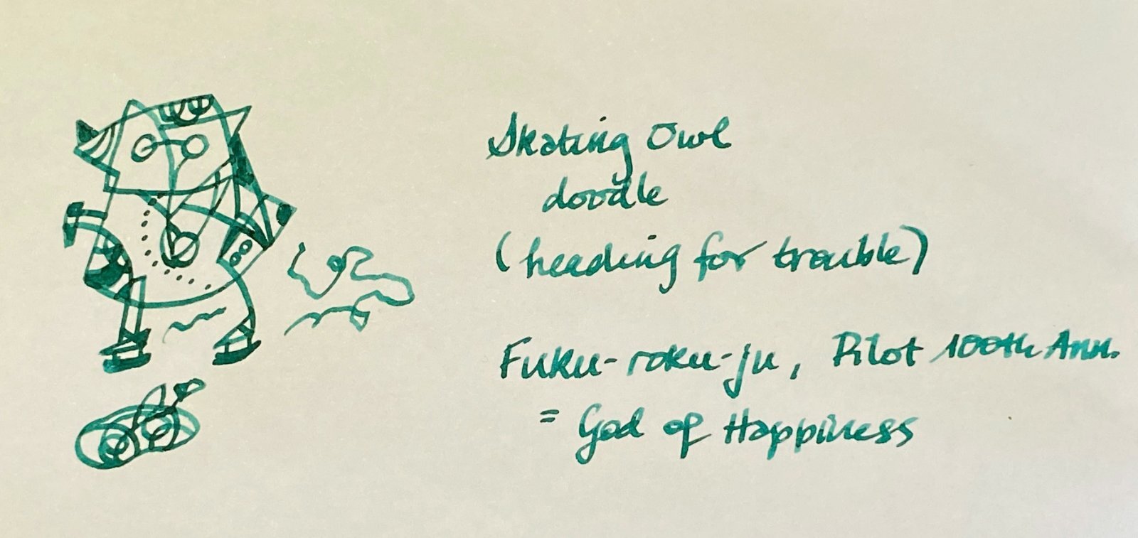
Doodle -- Skating owl coming to hole in the ice. Fukurokuju (Pilot, 100th Anniversary)
-
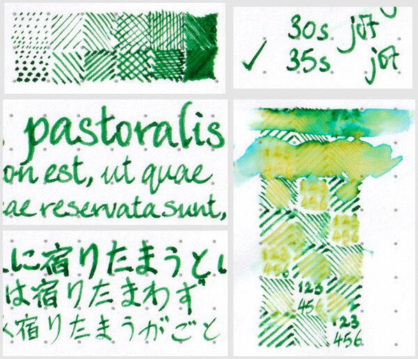
An ink from Colorverse's Season 3 ‘Multiverse’. Pair with Cat shimmer (or ‘glistening’) ink as a retail package. Colour: A lively and cheerful green; stays bright and vivid after drying. Flow and lubrication: [revised] Relatively wet. My usually dry-writing Sailor Fude de Mannen pen write more smoothly with this ink than I expected; and, when I transferred the half-full converter into a new F-nibbed Sailor HiAce Neo — not a model that tends to write wetly or too smoothly out-of-the-box, in my experience — the ~0.2mm-wide lines come out wetter and darker than shown in this review, and wet enough to be a problem writing Chinese ideograms quickly in 5mm-squared space, in spite of the narrowness of the lines, because of how commonly lines intersect and criss-cross, causing pooling of the still-fluid ink on the page from earlier pen strokes. (I haven't timed it yet, but I hate to think how long those lines would take to dry!) Feathering: Not observed on Rhodia Dotpad 80g/m² paper. Show-through: Not observed on Rhodia Dotpad 80g/m² paper. Bleed-through: Not observed on Rhodia Dotpad 80g/m² paper. Drying time: Relatively slow, taking more than 30 seconds on Rhodia Dotpad 80g/m² paper. Water resistance: Low. Shading: Choppy shading along fine or broader lines, but not much that can be easily seen in extra fine lines. Sheen: Not observed on Rhodia Dotpad 80g/m² paper. My verdict: I like the colour a lot. The chromatography is pretty. It's not a Noodler's Ink. That's about all the good things I can think of to say about it, considering that I'm sure there is some Diamine ink colour (or half a dozen) that looks like this and behaves equally well, for about a quarter of the asking price (on a per-millilitre basis).
-

-
-
Since I do not own too many green inks, I cannot show very similar inks to compare. Instead I thought it would be useful to show where it lies in the spectrum between yellow/brown leaning greens like Krishna Ghat-green/ Sailor Tokiwa-Matsu and a teal leaning green like Diamine Aurora Borealis... Overall, I'd say its a pleasant color though not a very uncommon one - nothing screams out as unique or special about the colour or the ink's abilities but it is a nice pleasant green if you want only one green ink, and being Noodler's it is pretty inexpensive. Shame about the feathering though, this is not an ink which you'd pick if you write often on absorbent or average to cheap paper. Even when it doesn't quite feather, it spreads quite bit on absorbent paper. As my pic below shows - the line width of this ink coming out of my PenBBS mini-fude F is wider than even my medium Jowo, Bock or Montegrappa nibs (generally I find the mini fude to write slightly broader than a western fine on down strokes and like a western fine on side strokes). Note that probably 90% of my inks do not feather or spread on this Muji copy paper. Another picture of the feathering on cheap copy paper Note: the color variation in the 'whites' of the papers is native to the papers. I set white balance on a white card and then didn't edit for each picture - but some casts cannot be ruled out.
-
Diamine Teal vs. De Atramentis Pigeon Blue Both these inks are inspired by colour found on birds For the people who have no knowledge of birds. The Bird on the Right is a Parakeet which modelled for Diamine and the bird on the right is a bald eagle which inspired De Atramentis Colour Comparison Just as these birds and their colour are different both inks and birds also have some familiarities The De Atramentis ins seems to be a bit bright like the colour on the Pigeon. The Teal to my eyes is darker Ink Behaviour Both inks are very smooth writers ad well saturated. Neither of these ink feater bleed or show through. Although there is no sheening in neither of these inks they do shade The Pigeon blue seems a little bit better but the diference is neglectible Both inks seem to hold their liquor I smeared both inks with wet fingers but both texts stay legible Availability La Couronne du Comte I guess Dennis and Rik would even travel to the moon to get it for you (just pay them a million or 2) Well it is safe to say that they do almost everything to satisfy their customers… Considering http://www.lacouronneducomte Bankers have Rothshield Ink lovers have the Goulet Pen Company. Rachel and Brian carry the almost* largest assortment of ink on earth an it's near surroundings http://www.gouletpens.com (*almost Dear Amberlea Davis carries the largest assortment in the universe but is not a seller Larry Post of Australia is a Great Supplier of Stationary and Artist Equipments. They carry a lot of De Atramentis Inks http://www.larrypost.com.au/ The same applies to Singapore based Arters of the utterly friendly Yitpeng and WeetekOng http://arters.com.sg Conclusion Both inks have well saturated beautiful blue greenish colours and both behave very well, they are a joy to write with. I cannot pick a favourite…. But I do not have to… I Own Both
-
I just bought a Pelikan M600 in Green. I own several inks that lean on the side of teal or turquoise so I'm looking for my true greens. I'm looking for suggestions / recommendations on green ink.
-
There are few ink brands out there as iconic as Waterman inks. My very first bottle of ink was Waterman South Seas, and many, many years later, Waterman inks are still a favorite brand for me. And Harmonious Green is one of my favorite greens. Many have given the history of this ink currently made in France, so I will dispense with further introductory remarks. Waterman inks feature as stable, glass bottle with an opening large enough for most pens. The bottle contains an ample amount of ink (50mL) and is sold a very reasonable price. I purchased my bottle from Pen Chalet when it was on sale. The ink is a medium green which leans towards blue, and has a lovely burgundy sheen which complements the green very nicely. It is very well behaved and flows smoothly from the pen. For this review, I have used two fountain pens - a Conklin Duragraph with 1.1mm stub nib, and a Pilot Metropolitan with EF nib. The papers used include HP All in One 22 Copy Paper, Tomoe River 52 gsm and Clairfontaine. Waterman Harmonious Green is closer in shade to more emerald greens such as Rohrer & Klingner Smaragdgrun than greener shades such as Leonardo Green. The flow is excellent, and while not heavily lubricated, there is enough lubrication to make even my driest Pilot Metropolitan write smoothly and easily. PROS: Lovely green shade leaning towards blue. Medium saturation Burgundy sheen seen in pooled areas with wider nibs Nice shading in wider nibs; minimal in finer nibs Little to no bleedthrough even on copy paper Minimal showthrough No feathering except on cheap paper Flow is excellent even in dry pens CONS: No water resistance Slightly longer dry time Overall, this is an excellent ink and holds on to its long standing reputation for reliability. If you like this color, I highly recommend getting a bottle. **All photos were taken with an iPhone and the images have not been retouched. You may note a slight pink cast to the paper due to the pink blotter placed behind each page.
-
Today I'm reviewing Diamine Apple Glory ink. Diamine Apple Glory is a nicely saturated bright green dye based ink that leans slightly more towards the blue range of the spectrum than the yellow range. It’s a summery, bright, grassy green colour and is from Diamine Inks standard range. Diamine Apple Glory leans slightly less blue that Diamine Ultra Green and is a very similar colour to J.Herbin Lierre Sauvage, but is more saturated. Kaweco Palm Green and the old discontinued Caran d’Ache Colours of the Earth Amazon are also very similar colours. Flow Rate: Very good. Felt quite wet in the pen & paper combinations I used.Lubrication: Good - It felt smooth across the page in the pens I used.Nib Dry-out: Not noticed.Start-up: Immediate.Saturation: Saturated inkShading Potential: Some shading seen with F and M nibs.Sheen: None seen.Show-Through:Royal recycledOxford paperField NotesTomoe River 52gsmGeneric 80gsm lined padsSpread / Feathering / Woolly Line: Not seen, even on Field Notes.Nib Creep / “Crud”: Not seen, even after over 1 week in the penStaining (pen): Not seen after several days in the pen - easy clean-up with water.Staining (hands): Easy clean-up with bar soap.Clogging: Not seen. Seems unlikely.Water resistance: Not sold as waterproof and has no water resistance.Availability: Available from Diamine Inks web-site and many other outlets.
-
Today I'm reviewing Diamine November Rain ink. Diamine November Rain is a Diamine Exclusive ink made specially for sale in Germany. I’ve seen it for sale on Fountainfeder, Papier & Stift and Seitz-Kreuznach websites as well as on Amazon. It comes in 30ml bottles and 80ml bottles. I only have a sample bottle, so I can’t post a picture of the 80ml glass bottle and box. This is a saturated dark green ink with red sheen. It doesn’t have quite as much sheen as the Organics Studio high sheen inks, but has more sheen than what you would call a “standard” ink. In my opinion, Diamine don’t have a current similar standard ink that is is very similar to November Rain, although Dark Forest is probably the closest. November Rain a blue leaning green. More green than Lamy Petrol and Organics Studio Henry D Thoreau Walden Pond. I would describe it as similar to a dark conifer green forest. The fact that it’s a saturated ink that has good sheen, without having too much sheen, comes with a few benefits: It’s a very nice green colour, whether you can always see the red sheen or not. It easily washes off of my hands with cold water and bar soap (definitely not like Organics Studio Nitrogen, Ralph Emerson, or Henry Thoreau) and it easily flushes out of my converters and pens just using water. It didn’t suffer from any hard starts or non-starts when I put the uncapped pen down to do swab tests, dry times and water resistance. I like that about these inks. It dried quite quickly on most reasonably absorbent papers and once dry it didn’t smudge or smear. I tested for this by rubbing repeatedly across my writing. I saw no green or red on my fingers, and no smudging on the page. I really enjoyed writing with it. With these high sheen inks showthrough and bleedthrough can be a problem. There was showthrough on several of the papers I wrote on, although I could still have written on the reverse of all them with no problem. The red sheen is usually more visible when using pens with wet flow and broader nibs. Flow Rate: Very good.Lubrication: Very good.Nib Dry-out: Not noticed.Start-up: Immediate.Saturation: Highly saturated ink.Shading Potential: Some shading with finer nibs or dry writing pens.Sheen: Good red sheen.Show-Through:Oxford 80gsm lined pad.Royal Recycled.Tomoe River 52gsm - Slight.Rhodia Bloc.Whitelines.Spread / Feathering / Woolly Line: Seen on a couple of papers with my wet B nib.Nib Creep / “Crud”: Not seen.Staining (pen): Not seen after several days in the pen - easy clean-up with water.Staining (hands): Easy clean-up with bar soap.Clogging: Not seen. Seems unlikely.Water resistance: Not sold as waterproof but has some water resistance.Availability: Exclusive to Germany and available from: Fountainfeder, Papier & Stift, Seitz-Kreuznach and Amazon. I found Fountainfeder offers the lowest price including shipping, especially when you buy two 80ml bottles.
-

Ink Tests For The Common Office - Sailor Jentle Tokiwa-Matsu
LordBaggins posted a topic in Ink Reviews
Ink Tests for the Common Office - Sailor Jentle Tokiwa-Matsu Today in my Ink Tests for the Common Office series I am reviewing Sailor Jentle Tokiwa-Matsu, aka Pine Green. When I received this ink in my latest sample-haul, this was the first one I grabbed. I sincerely doubted that I would have cause to use a green ink in the office for anything other than corrections, and only having three pens, I did not think that I would be using it much until my collection inevitably grows. So without further ado, let’s move on to pictures! Chromatography There is a whole lot going on here, from teal-blue, sky-blue, pine-green, a light burnt-umber, and pale-yellow. It's definitely a pretty combo. White-Copy Paper I am beginning to realize that sheen is very, very rarely going to happen on standard office paper. Honestly, that's okay, because for work I don't want too-too much going on to draw attention to the fact that this is neither blue or black. It is slightly on the wetter side of things, and does feather and bleed-through, just slightly less than Namiki Black. As long as you don't swipe/drop water all over the page, or smear the ink, you probably wouldn't notice, at first, that the ink is not an office-standard color. Because of how wet the ink is, I would not recommend this for two-sided documents on standard Staples white copy. As with my previous review, alcohol was not available. Bleach caused the ink to almost disappear, except for the barest of yellow remnants. Photocopy Pursuant to the recommendation of namrehsnoom, I am including an image of what the ink looks like after photocopying. It is interesting to note that smearing and water damage didn't seem to show up much, if at all. If one were able to mop up a spilled drink quickly enough, a b/w photocopy of the document would probably look just fine. This gets me thinking...maybe I should add Dr. Pepper or coffee reaction tests in the future...hmmm. Moving on. Longer Writing Sample - White Copy Yellow Legal Pad In longer writing samples, the bleed-through and show-through start becoming more noticeable, but so does the shading. There was no bleed-through on the Staples yellow legal pad, which is really starting to impress me for cheap paper. Because the yellow paper doesn't suck up the ink as much, smearing was much more prevalent. Staples Copy Shading Yellow Pad Shading Even on cheap paper, the shading shows up, although it is not super noticeable. Final Thoughts: Surprisingly, I feel comfortable using this ink in the office. I would not use this ink for signing my name, however, as water and bleach can mess with longevity too much. And, while I would certainly use this ink for notes on the legal pad, and possibly corrections, I would not use this on any two-sided documents (which, lucky for me, are anathema in my office). If you like more reserved greens, or just want to rebel in inconspicuous ways, I think you might want to give this ink a shot. For this review I used a Xerox 3220 Scanner set to Color at 300dpi, an iPhone 7s back-camera with no filters and set to large, a Brother MFC 8810DW photocopier, and some beautiful, industrial florescent lighting, as one would most often find in these circumstances. Disclaimer: I received this sample from Anderson Pens at my own expense. I am not being compensated for this review, or sponsored in any way. Colors may appear differently on different screens. The images and opinions in this post are mine and mine alone. -
Hello! I've bought some second-hand fountain pens, which arrived the day before ysterday. Most still had some ink in them, a few dried, so I've let them soak for two days. This particular ink was in a still functioning as is pen and kind of struck me: I thought it was Noodler's zhivago at first (little blob below it) but it's a more intense green. It really looks almost black in the darker parts. The previous owner thought it might have been Robert Oyster green black, but wasn't sure since she had over 800 colors.. 😂 Any guesses whether that may be the color? Or any other guesses? I really like it.. 😂 Any help is appreciated!
-
I really like the color and shading of Montblanc Irish Green. I also like its performance on poorer quality paper (from what I've seen in reviews). The one drawback is the $23 price tag which, as a high schooler, I am a bit hesitant to shell out. I was wondering if there are any similar inks out there with very minimal bleedthrough. Permanence or water resistance is preferable but not a must-have. I use a Jinhao with a fine nib if that is of any help. Here is a writing sample from The Pen Habit, if you don't know what it looks like. http://penhabit.com/wp-content/uploads/2013/11/IMG_5595_resized.jpg
-
Today I'm reviewing Diamine Meadow ink. Diamine Meadow is an unsaturated, yellowish green, dye based ink. Its from Diamine Inks standard range. This is a darker and greener shade than J.Herbin Vert Pré/Apple scented and P.I. Chiku rin, and a lighter and less gold/brown shade than R&K Alt. Goldgrün and Sailor Waka uguisu. In fact I dont have an ink really similar as a comparison. I found it quite an unusual ink to write with. Sometimes it shaded a lot and felt wet and lubricated, particularly with my M and B nibs, yet when I first used it in my Lamy 2000 with F nib, it felt drier and less lubricated. It seems to behave quite differently depending on the pen, its nib, and the paper. Flow Rate: Good. Felt wet with my M & B nibs.Lubrication: OK - better with M & B nibs.Nib Dry-out: Not noticed.Start-up: Immediate.Saturation: Unsaturated ink.Shading Potential: An unusual shading ink, quite variable.Sheen: None seen.Show-Through:Tomoe River 52gsm.Tom Bihn Lined.Generic 80gsm lined pads.Spread / Feathering / Woolly Line: Not seen.Nib Creep / Crud: Not seen, even after over 1 week in the pen.Staining (pen): Not seen after several days in the pen - easy clean-up with water.Staining (hands): Easy clean-up with bar soap.Clogging: Not seen. Seems unlikely.Water resistance: Not sold as waterproof but has surprisingly good water resistance.Availability: Available from Diamine Inks web-site and many other outlets.
-
P.W. Akkerman Groenmarkt Smaragd P.W. Akkerman Den Haag Akkerman is a very noble supplier of the finest stationery and writing equipment from all around the world, offering their services all around the world. When I wrote very noble... I mean very noble without exaggeration… There are many companies that supply noble stationery but there are only few who supply the truly noble The Hague Passage which dates back to the early days of the Belle Epoque is a fitting residence for a company that personifies Noblesse Oblige at it’s finest just as the city of the Hague is the epitome of Dutch Noblesse oblige. https://denhaag.com/...ion/428/passage The Hague is not only the seat oft he Dutch parliament but also home of Dutch house of Royals where King Willem Alexander van Oranje-Nassau resides. As Hofleverancier, purveyor to the House of Royals, and who knows how many ambassadors from all around the world, Akkerman can truly state that it supplies the world‘s finest with the finest in stationery The Ink and the Bottles The ink bottles Having a look at the lovely Akkerman Ink bottles it is hard to believe Akkerman only started supplying inks under their own name as from 2010 Well with ink bottles it is like with fine wines… “good wines need no bush” There are ink companies that supply normal inks in noble packages which it is like watering in crystal wine bottle… The bottle thrills, its contents taste like something one definately needs to discard of soon. Without being to philosophical, I truly believe that true nobility is an inner value. Therefore, it is is a pleasure to know that Akkerman’s heavenly Inks are served in such noble bottle which are a most beautiful reminiscence of the golden age of fountain pen writing… As I mentioned above, it is hard to believe that Akkerman started supplying their inks in 2010 only The Ink points 1-5 1 = 5= Fountain Pens: Lamy Italic 1.5 italic / Conklin Duragraph F nib Paper: Waldmühle Reflex Premium Drying time: fast points 5 Flow: very smooth points: 5 Lubrication: smooth in both pens points: 5 Bleeding: absent) Points 5 Shading: medium none points: 3 Waterproof: will survive a drop points: 3 Package: One of the most beautiful points: The Ink. This ink is a smooth and excellent writer. It does not even feather on even the cheapest paper. The colour is Moss or Forest Green it is dark green and shading There is some show through but it is not too strong. Feathering is medium till good. The drying time is very short just 5 seconds which means this an excellent ink for left Hand writers. Funnily the Akerman Lievens Kardinaaal Paars has an even shorter drying tie of only 3 seconds The Ink name All Akkerman "standard" inks are named after typical The Hague streets, locations or expressions. The Groenmarkt is The Hague's central square. In the Middle Ages, the vegetable market was held here and fishermen from Scheveningen would come here to sell their wares. Some of the houses have retained their Art Nouveau façades, while several pedestrian streets run off the square: the Paleispromenade to the north, and to the south, De Passage, a wide covered arcade built in 1885 which is popular with shoppers. More importantly de Groenmarkt is also the location where the entrance of an old and noble shopping mall is located…. Why is that so important…. Akkerman is situated in this lovely mall https://www.viamichelin.co.uk/web/Tourist-Attraction/Den_Haag-2513_AL-Groenmarkt-a5nyv5bf Ink Comparison Availabilty:https://www.vulpennen.nl/en/ Conclusion Yet another superb ink by Akkerman Of course taste is personal but I love dark green inks. This ink has a “antique look2 which I love it for. Writing is smooth and then there is this most lovely bottle, the quicky drying, the smooth writing and the lovely Colour make this ink a Work of Art too. I have also tested Akkerman Lievens Kardinaal Paar from their Dutch Master Collection https://www.fountainpennetwork.com/forum/topic/338322-pw-akkerman-lievens-kardinaal-paars/ I believe I want to buy ALL Akkerman inks I Love them


desaturated.thumb.gif.5cb70ef1e977aa313d11eea3616aba7d.gif)