Search the Community
Showing results for tags 'baystate blue'.
-
Hi everyone, Is anyone else getting more practical with their ink choices? Although I have dozens of ink options, brands, and colors I find myself wanting to ink more with blues, blacks, greens and useable colors over the more whimsical colors like pinks, purples, reds, yellows or oranges. Don't get me wrong, I still love and use a sheen or shade (no shimmers). I just find myself wanting more suitable ink colors for day-to-day usage. Is it just me? My favorite inks to fill pens with recently are Organic Studios Nitrogen, Noodler's Heart of Darkness, Monblanc Irish Green, Diamine Salamander and Diamine Majestic Blue. I also have a Lamy Studio with a fine 14k nib filled with Baystate Blue that I use regularly. I have other pens filled with reds, browns and the purple/pinks, however, they rarely get used and I find aren't practical for everyday writing. I also happen to like Diamine Wagner that my Bordeaux LeGrand is inked with. It's a yellow-ish light/medium green (think olive) and I'd love to find more times to use it. Am I going nuts to want to resort to more basic colored inks? Like I mentioned above, I still use inks with sheen and I really like to see shading. Yet, when it come to colors and situations, the blues, blacks and greens are what I'm reaching for over the (to me) much less useful colors. Don't get me wrong, I love me some Claret and Apache Sunset. Who doesn't like a bit of Imperial Purple or a ribbon of Honey Blast? I just can't find a daily use for them. Sure, I can use them when I do some of my transcribing. But I don't feel the color when I'm doing so. A color switch would be more of a function of a change for the sake of the change. How do I make a color fit what I'm doing? Even if it's just the few times I write for pleasure. What do you think? Where are you at? Has anyone else here moved to more practical ink colors? Happy Holidays
-
.thumb.jpg.04443e5f03b4102bd0ebe62585525308.jpg)
Noodler's Baystate Blue ink versus Krishna Lyrebird Water Sapphire (Water & Bleach Resistance)
PuliMorgan posted a topic in Ink Comparisons
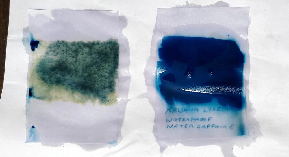
Noodler's Baystate Blue needs no introduction. I am just a few months into the fountain pen hobby, but even I know that there is no other ink that polarizes the fountain pen community as much as the Baystate Blue (BSB). You either hate it or love it. I bought a bottle of this ink because much of my work happens near water tanks and I needed a waterproof ink for signing documents. But after I ordered the BSB on Amazon, I came to know about another water resistant ink that is made by a part time ink and pen making medical doctor named Sreekumar who lives just 3 hours away from my home. He owns Krishna Inks and Krishna Pens. His waterproof ink is beautifully named as Krishna Lyrebird Water Sapphire Blue. So I got a bottle of that too. I now use BSB in office and Krishna Ink at home for signing the documents. The comparison of both inks, including their resistance to water and bleach, follows. 1. Colour The picture compares Krishna Water Sapphire and Baystate Blue with common inks like Lamy Blue, Sheaffer Blue and Camlin Blue on TNPL 80 GSM Platinum Copier paper. Without question, Baystate Blue is the best colour (in my opinion). In fact the BSB actually jumps out of the paper and my amateur photography skill doesn't do justice to its vibrance. All other colours including Krishna Water Sapphire look dull and boring in comparison. 2. Writing Experience I used two identical Camlin Elegante fine nib fountain pens and Rhodia paper to test the writing experience. Baystate Blue is wetter and and gives more line width. Krishna Ink has less flow but is no less smooth. 3. Drying time I again used identical Camlin Elegante fine nibbed pens on Rhodia paper to determine the drying times. Average drying time for both inks is seen to be about 10 seconds on Rhodia. I repeated this test on TNPL 80 GSM copier paper and the drying time was about 8 seconds for both inks. 4. Water Resistance a) Drip Test I dropped nearly equal amounts of water on the handwritten samples and let the water remain for 30 minutes. Photograph shows the condition after 30 minutes. Both inks showed some top layer run off, but BSB is more water resistant to Krishna Water Sapphire. b) Dip Test I dipped swabs of 5 ink different inks on TNPL copier paper in plain tap water filled tumblers. Before dipping: The next picture is taken just a few minutes after dipping. Lamy, Sheaffer and Camlin inks are no longer in the race. 30 minutes later: Krishna Ink is somewhat water resistant and we can still read the text. Baystate Blue is also not waterproof but clearly more water resistant than the Krishna Ink. 5. Bleach Resistance This was the most interesting of all tests. I used the same ink swabs which had undergone the dip test and poured a few drops of 0.5% w/w Harpic bleaching solution over them. 5 minutes after the exposure to the bleach, Baystate Blue had already started dissolving but Krishna Ink was holding up: 1 hour after exposure: Within an hour, Baystate ink was almost gone and the text was no longer visible. Krishna Water Sapphire was still holding up and the text remained legible. 2 hours after exposure: Part of the text written with Krishna Ink was visible even after 2 hours! Krishna Ink thus won the bleach resistance test. 6. Price (in India) Baystate Blue: INR 4888/- (US$ 66.75) on Amazon for 133 ml (4.5 oz) bottle, after a 75% discount. But you get a beautiful Noodler's Charlie pen for free with the ink. Krishna Water Sapphire: Rs 250/- (US$ 3.41) for 30 ml bottle. The math is left to you. 7. Staining Potential Noodler's Baystate Blue is notorious for staining various surfaces. But I have found it to be a non-issue so far. Bleach can easily remove it. Just be careful not to spill it over something that can't be bleached - like the currency notes, fine leather, costly carpets etc. Krishna Ink stains can be removed with water (and soap, if required) if you notice them immediately. But once the ink dries, those stains can be stubborn due to the water and bleach resistance. Be careful while handling either ink. The Verdict I like both the inks. Both Baystate Blue and Krishna Lyrebird Water Sapphire have character. I use both the inks regularly. So which one to buy? The choice is yours.- 13 replies
-
- noodlers
- baystate blue
- (and 7 more)
-
Here's one of the lesser-known Baystate inks, Baystate Cranberry. It was a really big disappointment, considering how much I like Baystate Blue. If you need a similar color that's actually brighter (punchier?), I definitely recommend Diamine Cerise. It's an all-around better ink. http://imagizer.imageshack.us/v2/xq90/537/H1E0Jp.jpg
-
Noodler's Baystate Blue - Does It Change Color Depending On Paper?
RichardR posted a topic in Inky Thoughts
Hey, I really hate to open another topic on Baystate Blue. But I really don't know how to find ALL the BSB threads that are available, and check whether this has already been comented on (For what is worth, I have searched as best I could via Google, here and elsewhere, but I couldn't find an appropriate thread about this). So then, I thought I might ask everybody a question: Does YOUR (sample of) Baystate Blue turn purple on plain, white, copy paper (80-90 gsm), and predominantly on such paper? I don't mean a hint or a tinge of purple - rather bright, saturated, vibrant ... purple. To put a bit more context into it, I must say I just received my 3 oz. bottle of THE ink (ordered on Amazon, shipped by the manufacturer) a few days ago. I made sure to clean the pen extra well (flushed until water ran clear, THEN flushed with minor concentration dish-soap solution and left it in for 24hrs., THEN flushed until water ran clear of bubbles, and left another 24 hrs. with clean water in it, AND finally flushed dry, and left another 24hrs. to ... well, dry out, with nib resting on absorbent tissue paper - so, I guess the pen was .. clean), then loaded it with THE stuff. In case anybody is wondering, the pen is a black HERO 616 mini version with an M nib - I had well researched this ink beforehand (but apparently, still not well enough), so I knew well enough to choose a cheap pen. So far (3 days after) the pen behaves perfectly (with no melted plastic/feeder, or flow modification; it actually behaves better than with Diamine Blue Velvet in it; I do expect the rubber sac of the aerometric filler to be stained, but I couldn't care less; we'll see about the rest). And then I tried it on for size. First, on a glossy paper notebook - white (don't know what paper the supplier used, because the notebook is internal stationery at the HR firm I work at). And it came out ... purple. I felt my throat going dry. Secondly, on plain/cheap A4, 75gsm, ECF (Elementary Chlorine Free), Unpunched, Ecolabel copy paper - obviously, white (generic brand, nothing to do with printer manufacturers). And it came out ... purple. I was gutted. Not far from crying (not really, but still...), considering how many inconvenient properties and risks I am ready to put up with, just for this color. As in this BLUE color, not purple color! Then I needed to scribble something really quick, and the first paper that came to hand was the back of a store receipt (so thin, thermal paper, I would say, and also white), and the closest instrument at hand was the BSB pen. And what do you know - it came out as the perfect, pure, intense and bright cobalt blue I had thought I was buying. Exactly that! Amazed at my discovery, I started scribbling "Test Color" on every paper I had at hand - which means that now I have quite a few books and book covers scribbled on their last page in BSB. And the color stayed blue (albeit with some hints of purple in some cases, but which are BARELY discernible). Also, I checked ALL my results the following day, in plain daylight (on a beautiful sunny day, around noon). And they were unchanged: my (sample of) ink is purple on some papers, and the proper blue on others. And some papers are white, others are cream, and others plain yellow. Thus, it seems that my BSB reacts with the paper and changes hue, for I can think of no other explanations. Now, I know what many will say: Rhodia, Clairefontaine, Tomoe River, etc. And that's all fine - to each his own, but I am not really a fountain pen afficionado, nor do I plan on becoming one (I have only 3 inks, and ... let's see, erm... 7 fountain pens, and I really want to stay at this level). I really place practicality above tastes, and I consider it dandy enough to be using a fountain pen (in spite of the extinct-species/wolly-mammoth looks I get from some...), that I most certainly won't carry Tomoe River pads with me to the meeting room. Nothing wrong with those that will, as I was saying above. My point, however, to anybody reading this, is that performance on plain copy paper is THE deal breaker for ME, as I won't change paper except entirely accidentally. So it doesn't really help me to know how the ink performs on those FP dedicated papers (actually, I already do considering how much research I put into this color), and/or that I should change stationery. And the color is the deal-breaker part of the performance - as I was saying previously, I will put up with many things, but not with a different hue/color, because that makes it a different ink, actually. I have also read about reports that Noodler's inks have some relatively looser Q.C.s (i.e.quality controls), in that performance can vary from one batch to the another, within the same product line (for instance, different batches of BSB might behave differently). So then, I am well aware this could be a batch-related rather than a product-related problem. Being thus aware if that as well, I dare (after a mammoth post) phrase my question anew: Does YOUR (sample of) Baystate Blue turn purple on plain, white, copy paper (80-90 gsm), and predominantly on such paper? N.B.: for those who don't know/don't remember, would you be so kind as to test it a bit on some copy paper, if possible? I know it doesn't really do much for you, but I would really appreciate it, and it would mean A LOT to me to know whether I could still like this ink (that otherwise, I have to confess it, I would love in spite of all its other shortcomings... eh, true love i guess they call it, lol)- 26 replies
-
- noodlers
- baystate blue
-
(and 3 more)
Tagged with:
-

Noodlers Baystate Blue - Giving Away For Free (To The Uk)
laverst1 posted a topic in Great Britain & Ireland - Europe
Hi Anyone want a barely used 3 oz bottle of Noodler's Baystate Blue? I am willing to give it away for free and to pay for postage (to the UK) just to get it out of my house :-) First come, first served. Thanks. -
I've ordered some samples of ink recently one of them being noodlers baystate blue, now I have read that as an ink it can be abit more work than some standard inks in regards to cleaning etc. So I figured that I'd test it in a pen that I wouldn't be overly bothered about if something went wrong and at being less than £3 to replace and being a smoothish writer out the box the preppy sounds perfect for this. Is it a case that the standard platinum converters work in which case I'll order two when I get the one for my 3776, or am I going to have to wait until I've used up the blue/black cartridge in the 3776 and giving that a good clean.
- 11 replies
-
Do you have any pen and ink recommendations for book signings? My book of poetry just came out, and I've done two books signings with my Platinum Plaisir (fine) and Noodler's Baystate Blue. It actually worked out great, but I'd like to try out some other colors and would like to use some nicer pens. I'm a fairly new fountain pen collector, and I'm just starting to experiment with nicer pens. About my experience with the Plaisir/Baystate combo: I loved the bright color, it dried quickly (even though it's not supposed to be fast drying), and didn't smear. The Plaisir did fine, but being a cheaper pen, it writes scratchy. I do have some nicer pens, but I was worried the Baystate Blue would stain the pen (so I didn't have to be concerned if it stained the inexpensive Plaisir). Here are the other pens I have: TWSBI 580AL (M) - Love this pen---ink doesn't dry out in pen if I leave it in a long time, but I think the M nib might be too broad for book signings, and I'm afraid it would be prone to smear/not dry quickly enough. Pilot Urban Premium (M) - Same feelings as about the TWSBI. Noodler's Ahab, Konrad flex, Konrad flex Essex acrylic: I like the Ahab and Flex acrylic, but they are prone to leaking at the nibs and sometimes putting out too much ink. Not happy with the Essex--not reliable, leaks, inconsistent look on paper. Platinum Plaisir (F) - Doesn't dry out in pen, not afraid it will get stained or stolen---but it's scratchy to write with. Pilot Metropolitans (F & M) - Pretty pens, but dry out quickly, nibs get damaged easily, and the writing scratchiness is inconsistent. I went a little crazy on eBay and just got these pens---but I'm nervous about what inks to use in them. Visconti Van Gogh Starry Night - M Platinum Chartres 3776 - F What do you recommend? What types of ink should I look for (dries quickly, water resistant?)? I liked the look of Baystate Blue---but is it safe to use in more expensive pens? I also tend to like purples and teal/turquoise. Nib size? Are there be other types of fountain pens I should consider? Thanks!
- 45 replies
-
- baystate blue
- twsbi 580
- (and 5 more)
-
I LOVE Noodler's Baystate Blue. In my humble opinion, it is the best color of blue for fountain pens. My only complaints about it are: It is not fully bulletproof.It might not be eternal meaning it might not archival nor fade resistant.It bleeds through most of my papers I use including my checks.Rectifying the above are very important to me. I would not be ashamed to try a different brand of ink, but I do really like Noodler's products so I guess I am a Noodler's fanboy I am thinking about ordering a bottle of Noodler's Bad Blue Heron which appears to have what Baystate Blue is missing above other than it is not quite the same color. Noodler's Upper Ganges also might be an alternative, but it does not appear to be as bright as Bad Blue Heron. Noodler's Luxury Blue looks just like Upper Ganges to me, but will glow under UV light which I find kind of cool, but it is not important to me. Noodler's Periwinkle does what Luxury Blue does and kind of looks brighter, but the stock image on the Noodler's Ink website makes it hard to tell. Noodler's Polar Blue looks like Bad Blue Heron with the added possible benefits of being freeze-resistant and lubing piston-fill pens. So my question is what comes close to Baystate Blue that is bulletproof. eternal, and doesn't bleed through most papers? I did a search and found this thread about this subject, but it lists alternatives which are not really pertinent to my question above and things have changed in 6 years: https://www.fountainpennetwork.com/forum/topic/185947-baystate-blue-alternative/ THANKS!
-
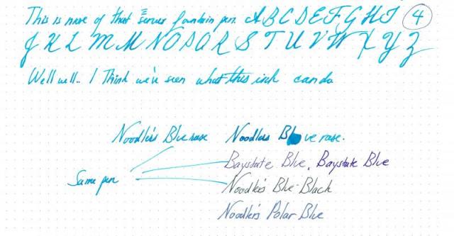
On Lexan (polycarbonate): It looks fabulous with the Platinum Preppy marker pen that it came with. It was an excellent color and it flows terrifically well with the marker pen and on the surface. It dries in seconds. I use it on my wall to write horizontally, and I have yet to have any issues with the marker drying out or skipping or fading out like normal, solvent-based markers do so frequently. On glass: It doesn't dry as quickly as it does on Lexan, but it doesn't run at all. Excellent usability on a glass window or a glass table. (What I use it for.) On Ziploc® bags: It dries, but wipes off. On paper: This is what the bulk of the review is for. Nathan Tardiff's video on this ink was very thorough, and his findings were reproducible by me. Though the ink is advertised on the bottle as a usable fountain pen ink, I'd say the very properties that allow it work so well as a marker ink (especially when writing horizontally) make it a prohibitively wet flowing fountain pen ink. It doesn't feather badly, but you can tell from its constant slight deviations from color uniformity that it benefits from being applied to a non-porous surface. Summary: This isn't really a fountain pen ink, but if you can find the right pen, it might be workable if you want to get double utility from it. As you might be able to see from my tries with the Waterman 12, the Serwex and the Hero 266 (that last fine pen that the other inks were written with), it looks smoothest and best in the Waterman the occasional times when it wasn't overflowing and burping. The Waterman 12 is a great pen, and I have never had burping issues with it as an eyedropper before, and it was burping when it was practically full. The Hero 266 is usually a very powerful pen that writes an even, smooth, fine line, but even the Hero couldn't control the wetness of this. I'm including the comparison with other blue inks so you can see it's relative potential. As you can see, Bluerase is taking it nice and easy while Baystate blue is content shouting louder than everybody else and tearing itself off the page. I also thought that this blue's coolness would pair nicely with Noodler's Baystate Cape Cod Cranberry. What do you think? I suppose if I were an artist, I could probably exploit this.
- 14 replies
-
- baystate blue
- polar blue
-
(and 2 more)
Tagged with:
-
Hello all. I'm soon to be the lucky recipient of a bottle of Baystate Blue. It's hard to get this sort of stuff in the UK, so I'm pretty excited. Anyway, I get the impression that it's a somewhat interesting beast. I have several pens (some, not on this board, might suggest too many) and was wondering which one you lovely people would recommend for this ink. Steel nibs: Pilot MR - only takes standard international cartridges at the moment, but I can pick up a converter pretty easily Jinhao X750 - this seems like a good choice because it's a cheap pen (£3.99) and leaves a big, fat, wet line Parker IM Premium Lamy Safari w/ 1.1 stub - my only concern here is that it's the 2013 neon yellow acid trip version and the bright blue might clash horrifically Gold nibs: Cross Apogee - my first proper FP and one that works well with any ink Parker UK Duofold Junior - great flow, but a bugger to clean Pelikan Souverän M600 - somehow I doubt it'll be going in this pen... Or, do I bite the bullet and buy a new pen to dedicate to it? I'm thinking a Lamy Vista might be an interesting pen for the ink. All opinions gratefully received.
-

Specific Paper Recommendations For Baystate Blue
melodiousb posted a topic in Paper and Pen Paraphernalia
So, I love the color of Baysate Blue, but I've tried it on about half a dozen kinds of paper, and it feathers on everything, even the paper in my favorite notebook at work, which no other ink I've tried has shown feathering in. Does anyone have a recommendation for a specific paper that hasn't produced feathering with Baystate Blue? Thanks.- 8 replies
-
- baystate blue
- feathering
-
(and 1 more)
Tagged with:
-
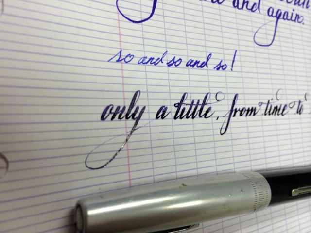
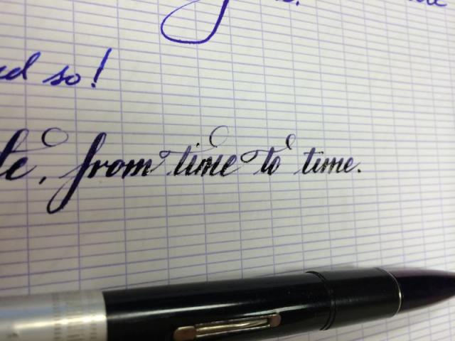
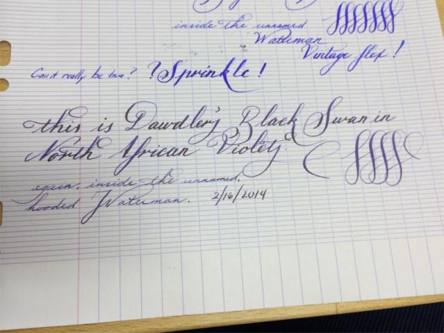
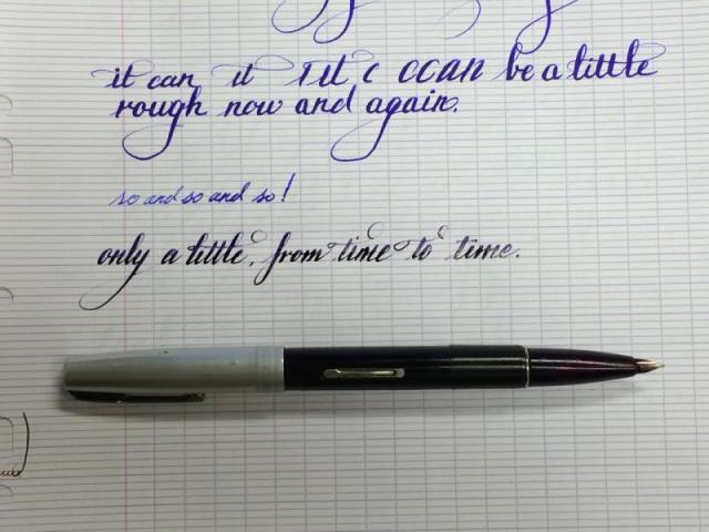
I just cobbled together this nifty Waterman from spare parts. I swapped the nib out of a broken Waterman snorkel-type pen, re-sacked it and had a great pen! Then I put it in my pocket, went to work, and then pulled it out of my pocket to see the barrel was broken right behind the section. BOOM, out came the electrical tape. And then I made some writing samples! What do you think of the Black Swan in North African Violets?
- 3 replies
-
- black swan
- north african violets
- (and 6 more)
-
So i got a bottle of baystate blue.... also got a preppy for obvious reasons... Went well for about 3 days. Wrote great, flowed great, looked great on paper. Then last night, all of a sudden the flow just stopped. .. I noticed the finsin the feed had filled more over the three days, as well as the threads on the barrel even though i iaed silicone grease and an o-ring to convert it to an ED (but not leaking).... I tried wiping the nib (which was covered in the ink,) wiping it with a wet napkin, flossing the tines (best i could without trying to remove tye nib from the feed.... nothing. Tried dropping it nib down into a cup of water and niticed some flow coming out of the nib, so i dried it a bit, but still nothing. Finally, i opened tge barrel and put in 5 or so drops of water. Now after letting it sit, it does write but having bad start issues and will still stop, skip, and all other sorts of annoying things. My question is, what did i do wrong?? Ive heard of people leaving theirs for weeks and picking them up and writing fine!!! :-( im sad because i like the cokor but wont put it in another pen. PLEASE HELP!!!
- 18 replies
-
- baystate blue
- preppy
-
(and 3 more)
Tagged with:
-
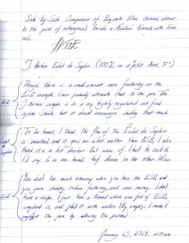
When I first got into fountain pens, I bought ink because I liked the color, or (often) because I liked the philosophy behind the company that made it, (Mr. Tardiff is an individualist after my own heart.) however, I never would have guessed before I found this forum that there could ever, EVER be a fountain pen ink that could be called, for lack of a better term, "controversial". I suppose anything that arouses strong emotions might be worth getting into a tizzy for, and we pick colors because we like them, so I guess I shouldn't be too surprised, considering how strongly practically everyone feels about Baystate Blue. It's got to be the most vibrant, delightful color I own. Well, I'm tired of people ragging on Baystate Blue, so I did this dilution to show that it can be tamed, if you're having trouble with it. As I said, I love the color, but it feathers anywhere from ever-so-slightly to badly on my Clairefontaine (90gsm), Fabriano (85gsm), and Staples Bagasse (the stuff is practically see-through, but handles fountain pen ink well), as well as my hand-picked Norcom notebook material. However, I want to show you that by diluting it, you can make it perform splendidly. I got a sample of Éclat de Saphir a long while ago, and I've been using it in a Pilot Petit1, and from the moment I first saw it, I've been thinking "this looks just like a thinned out Baystate Blue", it doesn't have the vibrancy, but it does have excellent performance on cheap papers (most of what I use at work, sadly) so at last, I did a side by side comparison, and I'm quite happy. The paper I did this on came from a 50¢ Norcom notebook I pulled from Walmart. Good lord. Short of a napkin, it doesn't get much thinner/cheaper than this. Notes: This is not scientific, since I didn't perform these samples in the exact same pen, but the performance is highly comparable, I think. The tiny cutoff is some noodling I did with a few different blues. The "Baystate Blue thinned" is the thinned result. The paper is 90gsm Clairefontaine.
- 13 replies
-
- baystate blue
- eclat de saphir
-
(and 2 more)
Tagged with:


