Search the Community
Showing results for tags 'iroshikuzu'.
Found 7 results
-
Overview - iroshizuku 100th Anniversary inks Pilot celebrated its 100th Anniversary in 2018. And as part of the anniversary package, they also revealed seven new inks in their iroshizuku line. I bought these inks soon after they were released but totally forgot about them. They recently resurfaced, and I plan to do full reviews of them in the (near or not so near future). As an appetizer, I present you with a quick but tasty overview of what to expect. There are seven inks in this anniversary series, based on the lucky number seven. Inspiration comes from the “shichifukujin” or the Seven Lucky Gods. These can be found at temples all over Japan but are especially celebrated during the first seven days of the year. At that time, the “shichifukujin” board the treasure boat “Takarabune” and descend to earth bringing the prospect of luck and good fortune. The beautiful Ukiyo-e woodprint above, created by the artist Hiroshige shows the Seven Lucky Gods aboard their vessel. Ebisu is the god of work and patron of fishermen and tradesmen. He’s typically shown with his fishing rod in one hand, while carrying a large red Tai (red snapper) in the other. Ebisu has come to symbolize business prosperity, and is often spotted in small shrines of shopkeepers. Daikokuten evolved from a warrior god into the god of agriculture and rice. He carries a hammer that grants wishes in one hand, and a bag of treasure in the other. Benzaiten is a patron of artists. She is the goddess of all things that flow – water, music, time… She is credited for bringing the rain needed for a plentiful harvest, making her a provider of great wealth. Bishamonten is the god of warriors and punisher of evildoers. He is the protector of the righteous, rewarding his followers with riches and good fortune. He’s often depicted with a lance in his hand, standing atop a pile of slain devils. Fukurokuju is the god of happiness, wealth and longevity and has the ability to bring back the dead. He is eaily recognizable by his long forehead and walking staff. Jurojin is the god of wisdom, depicted with a walking stick and scroll. This scroll contains all the wisom of the world, and has inscribed on it all the good and bad deeds of mortal men. And finally, there is Hotei – the cheerful god of happiness and contentment. His defining feature is the large sack he carries (and also his round belly). His sack of food is never empty and is used to feed the poor and the needy. Jurojin is my favourite ink from this series, closely followed by hoteison and benzaiten. I already reviewed jurojin, and plan to do full reviews of hoteison and benzaiten. The other inks in the series don’t really speak to me. No full reviews planned for these, but they might appear in short inkflashes.
-
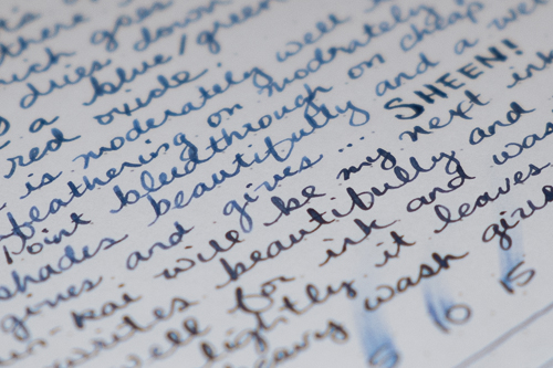
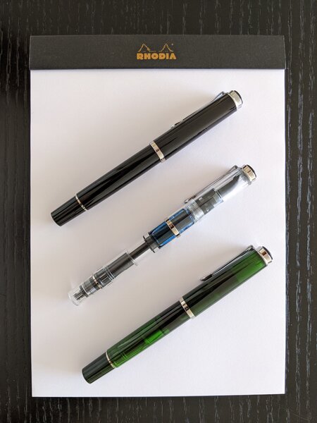
Iroshizuku – jurojin (100th Anniversary) Pilot celebrated its 100th Anniversary in 2018. And as part of the anniversary package they also revealed seven new inks in their iroshizuku line. I bought these inks soon after they were released, but totally forgot about them. They recently resurfaced, and I think it’s time to enter them into my list of inks to review. There are seven inks in this anniversary series, based on the lucky number seven. Inspiration comes from the "shichifukujin" or the Seven Lucky Gods. These can be found at temples all over Japan, but are especially celebrated during the first seven days of the year. At that time, the "shichifukujin" board the treasure boat "Takarabune" and descend to earth bringing the prospect of luck and good fortune. A beatiful Ukiyo-e woodprint by the artist Hiroshige shows the Seven Lucky gods aboard their vessel. "Jurojin" is named after one of these gods – the "god of wisdom", who is known for his love of wine and woman. Jurojin is usually depicted with a long beard, with his walking stick and scroll. The scroll contains all the wisdom in the world and a list of the good and bad deeds of its inhabitants. He is often accompanied by a deer. Jurojin is an intriguing ink: it has a blue-purple – almost lilac – colour with a pastel feel to it. Delicate. Subtle. Refined. Quite a beautiful colour, and one that meanders the border between blue and purple. Look at it once – yes… definitely licac-purple. Look again ten seconds later – no… pastel blue. This is an ink that is shy about its nature, but in a good way. Whether blue or purple moves to the front, the colour retains its soft beauty. I like it a lot. While writing, this iroshizuku ink lays down a wet and fairly dark line that dries quickly to a more pastel-like tone. And all this while you're looking at it – this is a quick-drying ink. Drying times are mostly in the 5-10 second range with my Lamy Safari M-nib test pen. I was actually surprised by this. The ink flows very wet and I expected eternal drying times. Not so. Saturation is alo nicely executed with a fairly narrow range between light and dark parts. This translates to some really lovely shading. Not harsh, but subtle and aesthetically pleasing. And even though this is a soft & delicate ink, contrast with the paper remains good and results in a very readable text. On the smudge test – rubbing text with a moist Q-tip cotton swab – there was very little smearing. Water resistance is quite good too: some of the dyes wash away, but you are left with a perfectly readable light-blue image of your writing. This is clearly visible in the chromatography: the bottom part shows that a lot of ink remains well-attached to the paper. Even a 15-minute soak in water can easily be survived. All this makes it an iroshizuku ink that is well-suited for the workplace. The chroma also excels at showing jurojin's duality: blue and purple are equally well represented, which explains the meandering line that this ink walks between these base colours. This Pilot ink behaved really well on all my test papers, both white and cream. With Moleskine, there was a tiny bit of feathering in the broad nib, but nothing too bad. A bit of bleed-through is present with the low-quality papers in my test set. But overall, the ink works consistently well across all paper types. Technically, a solid ink. I’ve tested the ink on a wide variety of paper – from crappy Moleskine to high-end Tomoe River. On each scrap of paper I show you: An ink swab, made with a cotton Q-tip 1-2-3 pass swab, to show increasing saturation An ink scribble made with a Lamy Safari M-nib fountain pen The name of the paper used, written with a Lamy Safari B-nib A small text sample, written with an Edison Collier F-nib The source of the quote, written with a Pilot 1911 with M-stub Drying times of the ink on the paper (with the M-nib Safari) The writing samples above are photos, which seem to provide the most accuracy in capturing the colour of this ink. Below you’ll find a scan of some writing samples: here the contrast is a tiny bit exaggerated, and fails to fully capture the softness of the shading. Below you can find some enlarged details of writing samples. Notice the tiny amount of feathering with the Moleskine paper. These blowups also offer a zoomed-in view on the soft shading. Due to the limited contrast range of this ink, the shading remains in the background while still being present and embellishing your writing. Writing with different nib sizes The scan below shows the effect of nib sizes on the writing. All samples were written with a Lamy Safari, which is typically a dry pen. I also added some visiting pens, with a combination of nib sizes. It’s clear that iroshizuku jurojin can handle the complete nib range with ease. I especially like this ink with the finer nibs (EF and F). With these, you get a great every-day writing ink that looks very elegant with that pastel-toned blue-purple and that soft – almost invisible – shading. Related inks To allow for a good comparison with related inks, I employ my nine-grid format, with the currently reviewed ink at the center. Each grid cell shows the name of the ink, a saturation sample, a 1-2-3 swab and a water resistance test – all in a very compact format. Surprisingly, I found no other inks that quite match jurojin's colour palette. The related inks are either more blue or more purple. I have found no other ink that walks the blurple line as well as this iroshizuku ink. Inkxperiment – Spring As a personal challenge, I try to create interesting drawings using only the ink I’m reviewing. With these monochromatic pieces, I want to explore all the colour-range nuances that are present in the ink. This is always my favourite part of the review: messing around with the ink and trying to create a drawing that makes it look good … pure quality time! In my region of the world, spring is in the air. And this soft jurojin ink is well-suited to express the freshness of nature awakening from its winter sleep. I tried to capture this feeling in an abstract picture of a tree sprouting new leaves, with its branches still clearly visible. And to remove all doubt, I added the Japanese symbol for "spring" to the drawing 😉 For this drawing I used an A4 piece of HP photo paper, which is my favourite medium for doing inkxperiments. I started with drawing some ellipses and circles to represent the trees, adding some shading with my fountain pen. I got a bit of a chaotic mess, and started adding more structure to complete the drawing. Add a bit of background colour in the tree, add the trunk and branches, some supporting lines to frame the picture. And finally the "spring" symbol as the finishing touch. The resulting piece is still a bit chaotic, but gives you a good idea of what can be achieved with this iroshizuku ink in a more artistic context. Inkxpired – computational art I love experimenting with pen/ink/paper, and have added another layer as part of the hobby. I’m exploring computational art, inspired by the ink drawings I do during ink reviews. Another fun offshoot of the hobby… and all that starting with a few drops of dye-coloured water on paper. I started by removing colour from the background, and using a pencil-drawing effect to create the bottom with the tree's root network. I then converted the picture to a black&yellow format that provides an abstract and crisp look, that much better captures what I had in mind than the original ink drawing. I really prefer this computational version over the original. Conclusion Pilot iroshzuku jurojin is a well-executed ink. Pleasing to look at, and with perfect technical execution. Subtle and elegant. A great everyday writing ink that can easily be used at the office. Technical test results on Rhodia N° 16 notepad paper, written with Lamy Safari, M-nib Backside of writing samples on different paper types
-
Here are 10 blue-black(ish) inks and two “true” blue inks as a comparison. Just for the fun of it. I scanned the sheet and with that most of the inks don’t show their sheen (or it’s not that obvious in the scan) so here are some photos of the inks to showoff some sheen: And for those of you who care about water resistance of inks, here are the inks after 15 seconds water bath:

-
-
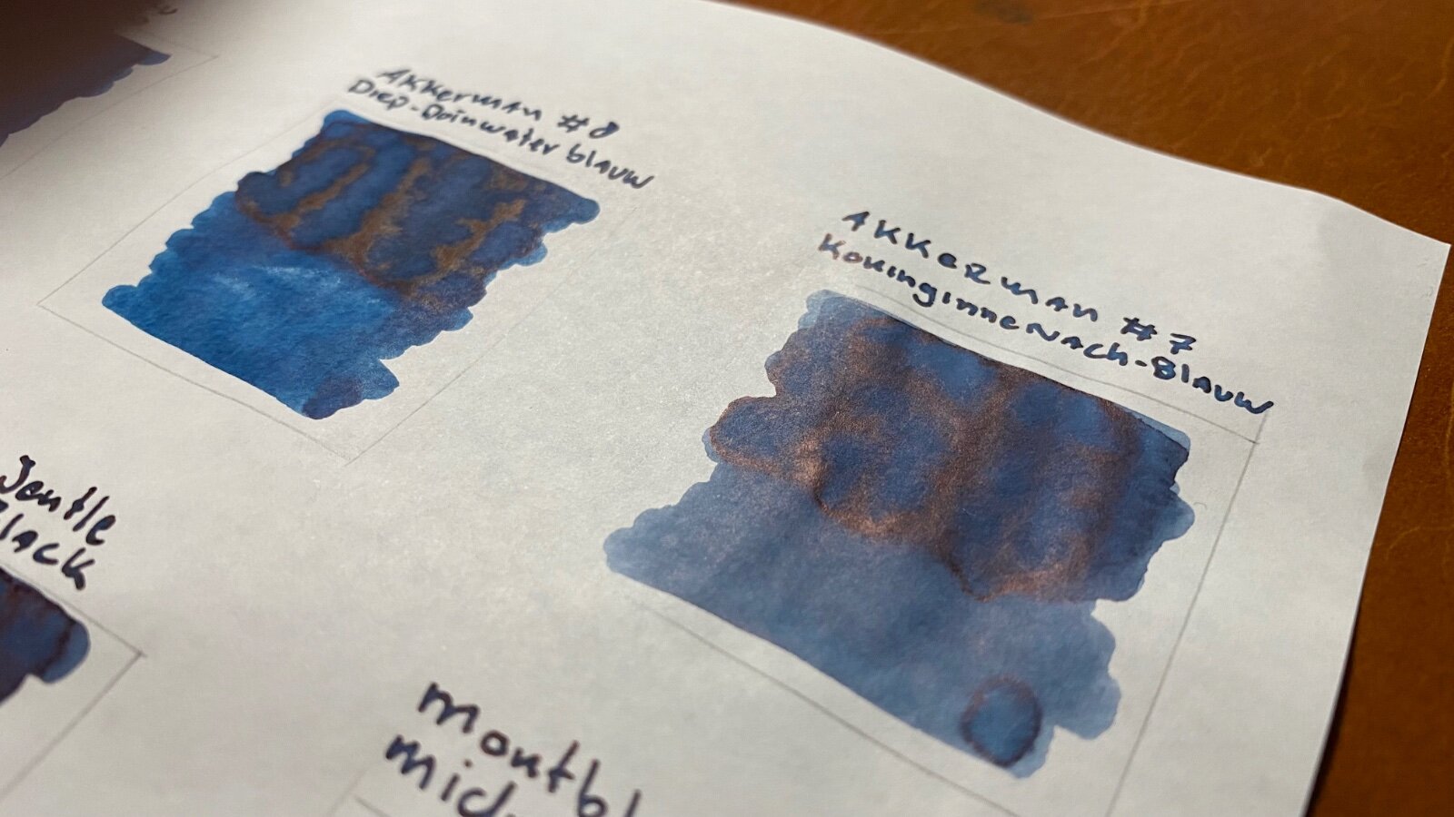
I thought I should put two of my favourite inks next to each other. Pens and ink used: Pilot Custom 823 (f) with Iroshizuku Shin-Kai Montblanc Meisterstück 149 (f) with Montblanc Midnight Blue Paper: 80 gsm Rhodia DotPad In daily writing I carry both pens and they are always inked up with the same inks. In my Tomoe River notebook, I often use them randomly throughout the day. And I noticed that I could only tell which pen the page was written by the linewidth as my fine MB 149 writes more like a medium/broad for my handwriting (which is microscopically small, people tend to tell me). The difference in ink colour does not seem that apparent. I thought it to be fun to put them next to each other to see if there is an actual difference. I did 3 passes of each ink with the fountain pens. The Iroshizuku Shin-Kai seems to have a more blueish tone and with the 3rd pass it turns to a dark (navy?) blue. The Montblanc Midnight Blue has a more greyish look to it and with the 3rd pass it starts to look more on the black side of things. Fun to see the difference as this does not show up that distinctly for me in daily writing. Out of the 100+ ink bottles I always tend to be drawn to the blue (or green)-black kind of inks, my favourites, so far, are (in order): 1. Akkerman #08 Diep-Duinwaterblauw (deep dune water blue) 2. Montblanc Midnight Blue 3. Iroshizuku Shin-Kai 4. Iroshizuku Tsuki-Yo 5. Akkerman #10 IJzer-Galnoten blauw/zwart (Iron Gall) There are some inks on their way to (hopefully) fit my preferences: Diamine Denim, Diamine Blue - Black, Diamine Twilight & Diamine Green Black. Do any of you have recommendations for blue/green-blackish inks I could try?
-
I spent a little bit of time looking here and in the Japan forum, but I did not find a thread that seemed dedicated to Iroshizuku ink. There is of course a lot of discussion of the ink, just nowhere in once place that I was able to find. Mods: I have tagged this thread to ask if maybe I missed an already existing thread. If so, please feel free to merge the comments below into the Iroshizuku thread I somehow missed. If not, I suspect maybe there are enough Iroshizuku fans (and non-fans) and discussion to try and collect a bit in one thread where it might be a fun and informative place for people to sound off on all things Iroshizuku, big and small. Here in Inky Thoughts seems to a good place for such a thread. Iroshizuku is a line of inks by Pilot (24 inks currently, plus the occasional special editions), that come in a nice palette for colors, and there seem to be a fair number of Iroshizuku fans out there, so I thought "surely, there is a dedicated Iroshizuku Ink thread here somewhere", but I was not able to find one (at least not a recently active one). My Iroshizuku thoughts for the day: The overall palette seems a bit blue heavy (even most of the greens at least tint in the blue direction), but every Iroshizuku color I have tried has been a nice experience in subtlety. There are also some fascinating colors in the red/purple/pink/orange hues. There are a couple of grays (one warm-ish, one cool-ish), and only one black (but does one need more than one black? ). For someone like me who likes brown, the Iroshizuku line has nice dark (Yama-guri), medium (Tsukushi), and bright (Ina-ho) browns that in just three inks cover a lot of territory in the brown direction. Sometimes I like something a bit more in the red direction, in which case Pelikan 4001 Brilliant Brown (can be a bit yellow-orange-ish), Diamine Ancient Copper (more orange-red), or Diamine Oxblood (maybe more of a brown-tinted red), but the Iroshizuku browns are a really functional set for me. What are your favorite Iroshizuku inks, and why? Which ones do you find hideous, and why? My top three Iros would be: Yama-guri: I enjoy the warm rich dark brown, and I image sometimes I see a tinge of a green sheen in it that is not at all unpleasant. Shin-kai: because blue-black is my most used ink, and everyone needs at least 5 - 10 different blue-blacks. 😛 Kon-peki: because it is my wife's favorite, and she works in the cobalt metal industry, so a deep cerulean blue makes for a nice metaphor.
-
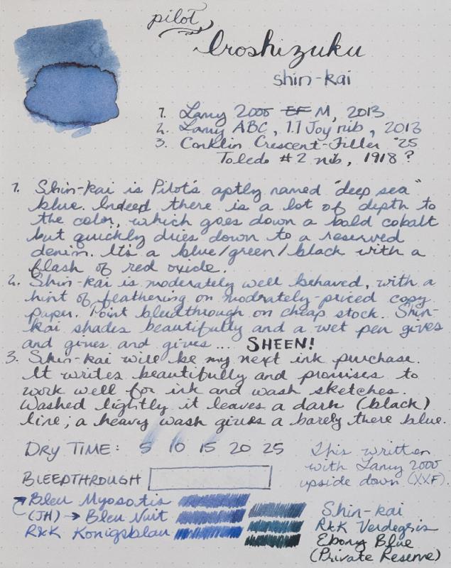
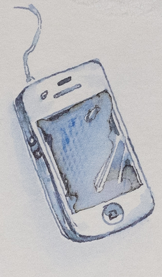
I am not a fan of blue ink. Before I found fountain pens, I used black ballpoint pens. In my pens, I use faded earthtones that lend themselves to ink and wash sketches. Iroshikuzu Shin-kai is the first blue ink I'll buy. It is fantastic. These are photos not scans. This is a difficult ink to describe, much less capture in a photo or scan. However, reasonable care has been taken to ensure color accuracy. As this was a Goulet sample, I haven't had the opportunity to make a proper attempt at sketching with this ink. If there is interest, I'll update later when I've done something worth posting. In the meantime, enjoy a 60 second sketch of my phone. Correction: I wrote in my review that Shin-kai feathers on moderately priced copy paper. It was a fluke. I've now tried it on a number of other cheap papers and no sign of feathering. Fantastic.